The Great Arctic Ice Exchange

This post concerns our paradigm of the Arctic Ocean and its Sea Ice. My view, despite years of watching the waxing and waning of ice extents was subconsciously wrong, and others may share the same misconception.

I owe my enlightenment to a great book by Russian scientists from the Arctic and Antarctic Research Institute (AARI) in St. Petersburg. It’s entitled Climate Change in Eurasian Arctic Shelf Areas, by Ivan Frolov et al. The ebook is behind a paywall, but Dr. Bernaerts graciously provided me a hard copy from his library.

The book is small in volume, but rich in information and insights, so I am taking the time to digest. In reading Chapter 4 I came upon a section entitled: Changes in ice exchange between the Arctic basin, marginal seas and the Greenland Sea. Now I was well aware the export of ice through the Fram Strait and knew of the great 2012 storm that so affected extents that year. But then I read this:

There is extensive sea ice exchange between the Arctic Basin and its marginal seas, which are the major sources of new ice for the Arctic Basin. The Arctic Basin serves as a reservoir for the marginal seas; it both receives large ice masses exported from the seas and supplies the seas with thicker multiyear ice. The direction and intensity of ice exchange depends to a great extent on the wind regime. However, local winds alone do not completely determine this exchange of ice. Ice export from the ice cover of marginal seas depends on sea ice conditions in the central Arctic because the sea ice originating from the marginal seas must have some ability to replace the central Arctic ice cover. Thus, the marginal seas depend to some degree on the intensity of ice export from the Arctic Basin to the Greenland and other subarctic seas. However, ice flow from the basin to the seas during onshore winds is strongly restricted by the shoreline and landfast ice, and ocean circulation also influences this ice exchange.

The Great Arctic Cyclone August 2012

It’s Not an Ice Cap, It’s an Ice Blender

Frolov et al made me realize that all our observations of Arctic ice are in fact snapshots of an ice blender constantly moving ice around the Arctic ocean. When we observe and measure extent in one of the seas, that particular ice was not there previously, and will be gone in the near future, replaced to some extent by ice coming from elsewhere. That is the full implication of Arctic ice lacking a land anchor (like Greenland or Antarctica) and existing as “drift ice”.

Figure 4.12. Mean resulting ice-drift pattern for summer (a) and winter (b) during the warm epoch and the difference between ice-drift vectors during the warm and cold epochs for summer (c) and winter (d).

Figure 4.12. Mean resulting ice-drift pattern for summer (a) and winter (b) during the warm epoch and the difference between ice-drift vectors during the warm and cold epochs for summer (c) and winter (d).

Frolov et al. Provide the statistics regarding the annual dynamics. In the wintertime the shelf seas form “fast ice”, that is ice locked onto the coastlines. Additional ice has nowhere to go but go with the flow north toward the pole or to the neighboring sea. In the summer the flow reverses and the Arctic basin, which received ice from the marginal seas, now sends ice back to replace losses there.

rarebelugada

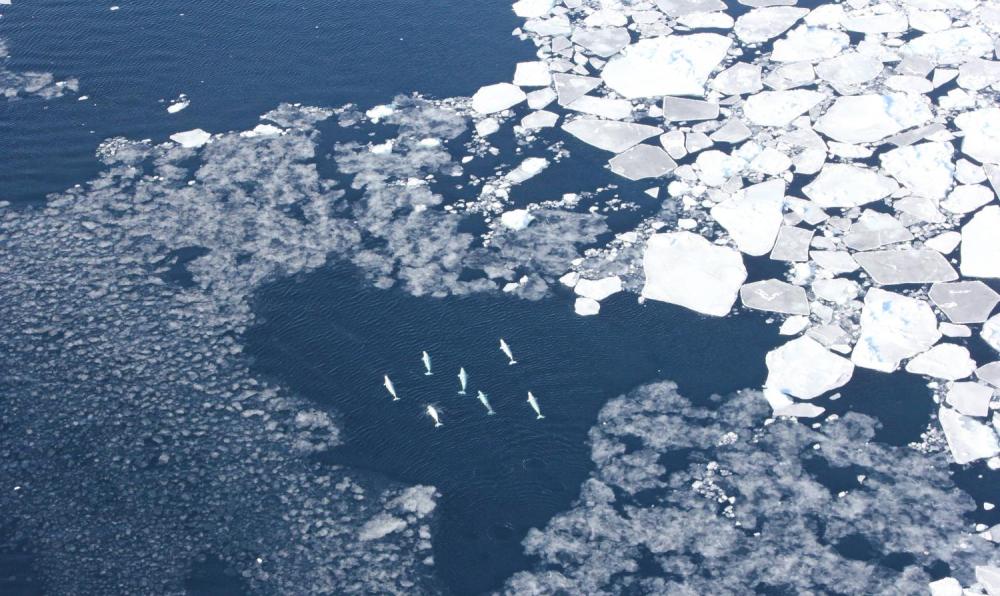
Belugas were observed among West Greenland sea ice. Credit: Kristin Laidre/University of Washington

Which seas get more ice and which get less ice depends mostly on whether the prevailing circulation is cyclonic or anticyclonic. The diagrams show that where there is a strong low pressure area, a cyclonic air flow develops, which moves water and drift ice in a counter-clockwise direction (seen from above). A strong high-pressure system acts in the opposite direction. I like this image the best, but the labels are in French

Considering the Arctic as a whole, a large-scale cyclone such as the massive one in August 2012, breaks up ice, moves it away from western Russian seas, and flushes great chunks of ice south through the Fram Strait into Greenland Sea where they melt. That storm was exceptional in its strength and size, but storms are always at work in the Arctic, and over multiyear periods, we can observe regimes favoring one or the other type of storm.

Frolov et al. point out:

Recent analyses of wind-driven circulation in the Arctic Ocean show that wind-driven ice motion and upper ocean circulation alternate between anticyclonic and cyclonic regimes. Shifts between regimes occur at 5-year to 7-year intervals, resulting in 10-year to 15-year periods. Based on these analyses, these authors proposed an Arctic Ocean Oscillation (AOO) index showing alternation of the cyclonic and anticyclonic regimes.

Table 4.2. Changes in the ice cover area in August from the beginning to the
end of the circulation cycles in Arctic Ocean regions (in 10^3 km2)

Circulation regime Years North European Siberian Arctic
Anticyclonic 1946-1952 +5 —259
1958-1962 +44 —24
1972-1979 +60 —87
1984-1988 +23 —308
Average +34.5 170
Cyclonic 1953-1957 —37 +209
1963-1971 —52 +144
1980-1983 +36 +39
1989-1997 —4 —10
Average 14.2 +95

Table 4.2 shows that in 88% of cases during anticyclonic regimes, sea ice extent increases in the North European Basin and decreases in the Siberian Arctic Seas, while cyclonic circulation has the opposite effect. The absolute value of changes in the Siberian Arctic Seas is more than 5 times higher than in the North European Basin.

Frolov et al. Summarize:

An increase in the recurrence of cyclonic pressure fields over the Arctic Basin at the transition from a cooling to a warming epoch leads to changes in ice cover deformation processes. The cyclonic systems of the multiyear ice drift contribute to ice cover divergence. This process is most prevalent in summer, whereas in winter, especially in relatively thin ice zones, ice compacting is usually observed. Anticyclonic SLP fields have the opposite effect.

According to Gudkovich and Nikolayeva (1963), in a year that westerly and southwesterly winds increase over the eastern Barents Sea during October— December, the setup they create in the Kara Sea increases ice export from this sea toward the north. Dominant easterly and northeasterly winds produce the opposite result. This study also shows that ice export from the eastern East Siberian Sea and the southwestern Chukchi Sea during the period considered is strongly influenced by wind field vorticity in the vicinity of Wrangel Island. Anticyclonic vorticity increases the ice export, and cyclonic vorticity results in additional ice flow from the north.

Ice transported through the Fram Strait.

Frolov et al:

Table 4.4. Correlation coefficients between the long period fluctuations of the
area of ice exported through Fram Strait (October-August) and total ice area of the Arctic Seas Asian shelf in August for the period 1931-2000 at different time lags.

Time lag (years)

Correlation

  0

.43

  1

.56

  2

.67

  3

.75

  4

.80

  5

.81

  6

.80

  7

.77

  8

.72

  9

.66

10

.58

11

.49

12

.39

As shown in Figure 4.14, ice export fluctuations slightly precede corresponding sea ice extent changes in the Arctic Seas. The cross correlation function between the smoothed values of ice export and total sea ice extent exhibits the highest correlation coefficients at time lags (sea ice extent after export) of 4, 5, and 6 years (Table 4.4). Following decreased ice export through Fram Strait in the early 1990s, a tendency for its increase was observed. Based on the time lags shown in Table 4.4, a transition to the phase of increased sea ice extent in the Arctic Seas would be expected at the beginning of the twenty-first century, as confirmed by Figure 4.14a.

figure 4.14. (a) Interannual fluctuations of the total ice area of the Siberian shelf seas in August, and (b) areas of ice exported from the Arctic Basin through Fram Strait. The values of the bold curves are smoothed by a polynomial to the power of 6.

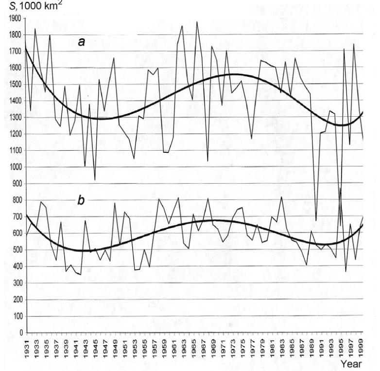
figure 4.14a (a) Interannual fluctuations of the total ice area of the Siberian shelf seas in August, and (b) areas of ice exported from the Arctic Basin through Fram Strait. The values of the bold curves are smoothed by a polynomial to the power of 6.

Figure 4.14a shows long-period changes in the total area of ice export through Fram Strait from October of one year to August of the next year for 1931-2000. An approximation of data by a polynomial to the power of 6 (bold curve) indicates the cyclic character of these changes, with the cycle lasting about 60 years. Figure 4.14a shows that the fluctuations of total sea ice extent of the Arctic Seas of the Siberian shelf (from the Kara to the Chukchi Seas) have a similar character.

It is remarkable that increased ice export through Fram Strait is accompanied by increased sea ice extent in the Arctic Seas, contrary to the opinions of those who assume that ice export to the Greenland Sea increases during climate warming, accompanied by a decrease in sea ice extent in the Arctic Seas.

The average drift and current speed in Fram Strait for the preceding year influences the ice exchange between the Arctic Basin and the Laptev, East Siberian, and Chukchi Seas in winter (October—March). The increased ice export to the Greenland Sea contributes to the increased ice export from these seas to the Arctic Basin, and its decrease results in the opposite effect (Gudkovich and Nikolayeva, 1963).

Summary

The estimates above show that, on average, about 1 million km2 of the ice cover is transported annually from the Arctic Seas to the Arctic Basin, which is comparable to current estimates of the area of ice exported annually from the Arctic Basin to the Greenland Sea. (e.g., Koesner, 1973; Mironov and Uralov, 1991; Vinje, 1986). Given a typical ice thickness value, we can estimate the volume of ice exported to the Arctic Basin during a winter to be approximately 1500-2000 km3. This value is about half as large as the available estimates of ice export to the Greenland Sea in winter (Vinje and Finnekasa, 1986; Alekseev et al., 1997), which can be accounted for by ice growth, ice ridging, and other processes that occur during transport of the ice to Fram Strait.

It is a mistake to think of the Arctic as an ice cap that shrinks and grows in extent.  In fact Arctic ice is constantly in flux, more like a kalidiscope than an solid sheet. And the natural forces within the climate system cause fluctuations on a quasi-60yr oscillation


NASA’s Aqua satellite captured this natural-color image of the storm in the Arctic on August 7, 2012. The storm – which appears as a swirl – is directly over the Arctic in this image. NASA image by Jeff Schmaltz, LANCE/EOSDIS Rapid Response.

Resurging Arctic Ice March 1

It’s official–This leap year February is complete and we can now look at the annual Arctic Ice Extent situation at day 60 with two months in the books.

The Resurgence of Arctic ice is continuing in MASIE, the most accurate dataset, but in SII, the remote sensing dataset, not so much.

The MASIE graph shows an extent matching the ten-year average. At 15.02 M km2, 2016 exceeds 2015 annual maximum of 14.91 recorded on day 62, and this year’s peak ice may well go higher.

This table shows comparisons between MASIE and SII

 Months MASIE
2016
SII
2016
MASIE
2016-2015
SII
2016-2015
 SII – MASIE
Jan 13.922 13.472 -0.019 -0.131 -0.450
Feb 14.804 14.210 0.121 -0.199 -0.593

It is readily shown that SII is severely underestimating this year’s growth of ice compared both to SII 2015 and to MASIE. A monthly differential of nearly 600k km2 has opened up due to SII showing a large decline while MASIE shows a gain compared to last year.

Below is a comparison from MASIE regarding the NH seas comprising the NH statistics.

Ice Extents Ice Extent
Region 2015060 2016060 km2 Diff.
 (0) Northern_Hemisphere 14856201 15018131 161930
 (1) Beaufort_Sea 1070445 1070445 0
 (2) Chukchi_Sea 966006 965989 -17
 (3) East_Siberian_Sea 1087137 1087120 -17
 (4) Laptev_Sea 897845 897809 -36
 (5) Kara_Sea 935023 933890 -1133
 (6) Barents_Sea 701064 529545 -171519
 (7) Greenland_Sea 677415 582658 -94757
 (8) Baffin_Bay_Gulf_of_St._Lawrence 1828321 1588399 -239922
 (9) Canadian_Archipelago 853214 853178 -36
 (10) Hudson_Bay 1260903 1260854 -49
 (11) Central_Arctic 3246891 3208216 -38675
 (12) Bering_Sea 508062 623647 115585
 (13) Baltic_Sea 22187 86770 64583
 (14) Sea_of_Okhotsk 768839 1308697 539858
 (15) Yellow_Sea 0 14137 14137
 (16) Cook_Inlet 5303 3505 -1798

In the table 2016 shows two seas on the Atlantic side lower than this date last year, Barents and Greenland Seas, while the Baltic is much higher, though a smaller size sea.  Barents had grown to almost 600k km2 by day 20, then lost 150k up to day 55, but has now regained half of that loss.

Baffin Bay is down some, but not a large %, while CAA is the same extent.

On the Pacific side, Okhotsk which was the lowest in the last 10 years in 2015 has much more ice now, nearly the highest in 10 years. Bering is also up, so it may be a case of “Goodbye Blob, Hello Normal.”

So is the Winter ending and stopping the ice growth?

Here is my local observation:

Montreal Suburb Street on March 1, 2016

Montreal Suburb Street on March 1, 2016

That’s the snowpack on our street seen from my driveway. And I went cross-country skiing today, an activity normally precluded in March by lack of snow cover and temperatures above freezing. With fresh snowfall last night and -13C this morning, it was one of the best days this season. With a blizzard warning and more snow expected tonight, I’m likely to be back out later this week.

So the report from here: The Siberian Express is on time and going strong.

What’s happening with Arctic ice?

It depends on whose measurements you look at. Before you decide, make sure you have read NOAA is Losing Arctic Ice.

Sea Level Rise and Doggerland

CO2 alarmists want to use Doggerland as a morality tale to scare us about rising sea levels in this century and the next. Because it certainly demonstrates the perils of climate change.  As usual though, they fail to put the past into an historical context, because that would destroy their narrative.

First, what is the story of Doggerland?

(From National Geographic)

When signs of a lost world at the bottom of the North Sea first began to appear, no one wanted to believe them. . .A resourceful amateur paleontologist named Dick Mol persuaded the fishermen to bring him the bones and note the coordinates of where they had found them. In 1985 one captain brought Mol a beautifully preserved human jawbone, complete with worn molars. With his friend, fellow amateur Jan Glimmerveen, Mol had the bone radiocarbon-dated. It turned out to be 9,500 years old, meaning the individual lived during the Mesolithic period, which in northern Europe began at the end of the last ice age some 12,000 years ago and lasted until the advent of farming 6,000 years later. “We think it comes from a burial,” says Glimmerveen. “One that has lain undisturbed since that world vanished beneath the waves, about 8,000 years ago.”

The story of that vanished land begins with the waning of the ice. Eighteen thousand years ago, the seas around northern Europe were some 400 feet lower than today. Britain was not an island but the uninhabited northwest corner of Europe, and between it and the rest of the continent stretched frozen tundra. As the world warmed and the ice receded, deer, aurochs, and wild boar headed northward and westward. The hunters followed. Coming off the uplands of what is now continental Europe, they found themselves in a vast, low-lying plain.

Archaeologists call that vanished plain Doggerland, after the North Sea sandbank and occasional shipping hazard Dogger Bank. Once thought of as a largely uninhabited land bridge between modern-day continental Europe and Britain—a place on the way to somewhere else—Doggerland is now believed to have been settled by Mesolithic people, probably in large numbers, until they were forced out of it thousands of years later by the relentlessly rising sea. A period of climatic and social upheaval ensued until, by the end of the Mesolithic, Europe had lost a substantial portion of its landmass and looked much as it does today.

The most rapid rises of sea level were on the order of three to six feet a century, but because of the variable topography of the land, the flooding would not have been even. In areas as flat as modern-day East Anglia, a six-foot rise could have shifted the coast inland by miles; in hillier places, less. Down in low-lying Doggerland, the rising sea turned inland lakes into estuaries. Gaffney’s digital reconstruction shows that one in particular, the Outer Silver Pit, contains massive sandbanks that could only have been created by fierce tidal currents. At some point the currents would have made it dangerous to cross in a log boat, and eventually, created a permanent barrier to once familiar hunting grounds.

Some 8,200 years ago, after millennia of incrementally rising seas, a massive release of meltwater from a giant glacial lake in North America, called Lake Agassiz, caused sea levels to jump by more than two feet. By slowing the circulation of warm water in the North Atlantic, this influx of frigid water triggered a sudden plunge in temperature, causing Doggerland’s coasts—if any remained—to be battered by frigid winds. If that were not enough, around the same time, a landslide on the seafloor off the coast of Norway, called the Storegga slide, triggered a tsunami that flooded the coastlines of northern Europe.

What about our future?

Alarmists like Jim Hansen are calling for sea levels to rise 3 to 6 feet this century, even 10 feet on an especially feverish day.  But when those rates happened, there were no fossil fuel emissions.  Moreover, that amount of rise is not happening any more.

The flooding of Doggerland coincides with the rapid sea level rise up to about 8000 years ago, and the modern farming period beginning about 6000 years ago.  Sea level has been gently rising a few mm/year up to the present, including the recovery from the Little Ice Age.

Of course anything is possible, but without an acceleration unprecedented in the last 6000 years, the rise will be about a foot/century.

Trump Converts, Running for Pope

h/t Judith Curry

From A-CNN comes this report:

“In shocking news first reported a week ago, businessman Donald Trump has converted to Catholicism and has now declared his candidacy for Pope. Today’s announcement coincides with critical statements Pope Francis made about Mr. Trump not being a Christian. Mr. Trump just held a rally outside of New York City. Although video is not available, A-CNN has just acquired the audio transcript which we are providing below:
Thank you….thank you. You know, when I first started this campaign, people didn’t believe me. First they said, he’s not converting, he’ll never convert. Then I converted. Then they said, he’ll never get baptized, he won’t want the water to mess up his hair. But then I got baptized. Then they said he won’t get confirmed, and I got confirmed. And then they said he’d never run for pope. Well here I am, and I’m running for Pope; and I’m doing very well I must say.

The whole article (here) is a hoot, but here are my favorite parts from the speech “transcript”:

Trump takes Francis to task for ignoring the real problem

You know, it’s a sad thing to say, but the Church is in such bad shape; terrible shape under Francis. The Catholic Church doesn’t win anymore. We just don’t. When is the last time Catholics won anything? Lepanto? When was that, the 1500’s? We don’t win anymore. But, let me just say, Under a Trump papacy, we are going to win again. We are going to win so much. We are going to win so much you are all going to be sick of winning, ok? But right now, it’s terrible. Just the other day, I see the Pope is praising Martin Luther. Martin Luther! Can you believe it?
(Boos)

Our Pope is over there praising Martin Luther; meanwhile millions of Hispanics are converting to Protestantism in Latin America. It’s true. We are losing millions and millions of people to the Protestants and our Pope does nothing. He does nothing. And I have nothing against the Protestants. Many of them are good people. I employ thousands of Protestants. I used to be a Protestant. But their leaders are just too smart for our leaders. We have people in power in the Church today who have no idea what they are doing. They are incompetent. All our leaders do is “dialogue.” We don’t convert anymore, we “dialogue.” What the hell is dialogue? Excuse me, but shouldn’t we be converting these people? If we have the Truth, why aren’t we converting them? But we don’t convert, we “dialogue”, and we lose millions and millions of these people to Protestantism. They are saying if the head of the Catholic Church thinks it’s ok to be Protestant, why convert? Why do we need to convert? Let him convert. Let the Pope convert. That’s what they’re saying. They’re laughing at us. There is no respect there. No respect. When I’m Pope, they are going to respect us again, let me tell you.
(Cheers, applause)

Trump says traditional practices have been abandoned

You ever notice today that all the nuns dress like Hillary? When did that happen? When did nuns start dressing like Hillary? It’s scary. It’s really scary. Anyway, you have some layperson up there and they read the Gospel and say some words and do this and that and then they hand out the Communion that the priest already consecrated. The priest isn’t even there, he just consecrated the hosts. So in other words, he’s disposable. But then they’ll say, but he can hear confessions. He can hear confessions, but who goes to confession? Who goes to confession nowadays? When the Pope says “Who Am I to Judge” who goes to confession?
(Boos)

That is why when I’m Pope we are going to make the priesthood great again.
(Cheers, applause)

We are going to make the priesthood so exclusive. I tell you. So exclusive and so special, you have no idea. We are going to have the best priests, the brightest priests. They will be lining up to enter the seminaries. And the seminaries will be the best seminaries, let me just tell you. No more dopey professors. The seminaries are a mess today, they’re a disgrace. You might as well have Bernie Sanders running our seminaries that’s how bad they are. They’re filled with dopey professors from the 60’s. Their brains are burnt from whatever they smoked. Who knows what they smoked back then, God only knows what they smoked. But they’ll be gone, I promise you, they’ll be gone.
(Cheers, applause)

Trump will make the Mass great again

So anyway, that was my first experience at Mass, folks, and I almost left to tell you the truth. This Mass was bad, I almost left, but then someone told me that this was the “New Mass.” Apparently there was an “Old Mass” and now there is a “New Mass” it’s called the Novus Ordo have you heard of it?
(Boos)

That is apparently what I attended, but I had no idea, I thought it was just the Mass. That it had always been the Mass. But no, this form of the Mass was apparently made up in 1969 by a Pope Paul VI. Sort of like by executive order, if you want to know the truth. He put it in like Obama, even though he had no consensus for it, he puts it in anyway and there you go. Well, I have to tell you folks, under a Trump papacy we are going to repeal and replace the Novus Ordo.
(Wild cheers, applause)

Francis has taken his eye off the ball and follows modern fads

Maybe we go back to Latin. I’m a big fan of the Latin. When we used Latin we were number one. We went to English and now the Muslims outnumber us. They kept Arabic they go to number one, we ditch Latin, we go to number two. I’m just saying. Are there any Trads in the audience? Where are my Trads? Are there any Trads here?
(Cheers, applause)

I have to say that I love the Trads. Under this pope, the Trads get treated like second class citizens. He calls them, what’s the word? “Neo-Pelagians.” “Neo-Pelagians,” you believe that? By the way, why is the Pope always calling us names? He’s always calling us names. He never calls the Muslims names, the Protestants names. But he calls us names. He’s really not a very nice guy in my opinion, ok? He’s actually sort of a nasty guy. Isn’t calling a whole group of Catholics Neo-Pelagians, kind of nasty? And, by the way, did you see the papers today? Today he said I’m not a Christian because I want to build a wall to protect our country’s border? Can you believe it, folks? Just unbelievable.
(Boos)

Trump will keep his focus down to earth

I think we should also maybe build a wall around the Vatican so the pope can’t get on an airplane again, let me tell you. Too many interviews on the airplane. Way too many interviews.
(Cheers, applause)

And isn’t this the pope who’s always talking about the greenhouse gases and the carbon footprint and harming the earth? But yet he keeps flying all over the world on these big 747’s belching all kinds of pollutants all over the place. Why? To give interviews? Do you want your pope flying around giving interviews or making the Church great again? I’d be at the Vatican every day making us win again, let me tell you.

(Cheers, applause)

NOAA Is Losing Arctic Ice

MASIE: “high-resolution, accurate charts of ice conditions”
Walt Meier, NSIDC, October 2015 article in Annals of Glaciology.

Something strange is happening in the reporting of sea ice extents in the Arctic. I am not suggesting that “Something is rotten in the state of Denmark.” That issue about a Danish graph seems to be subsiding, though there are unresolved questions. What if the 30% DMI graph is overestimating and the 15% DMI graph is underestimating?

The MASIE record from NIC shows an average year in progress, with new highs occurring well above the 2015 maximum:

MASIE 2016 to day 56r

Meanwhile from NOAA’s Sea Ice Index (SII) dataset we get this:
The monthly average January 2016 sea ice extent was the lowest in the satellite record, 90,000 square kilometers (35,000 square miles) below the previous record low in 2011.

Why the Discrepancy between SII and MASIE?

The issue also concerns Walter Meier who is in charge of SII, and as a true scientist, he is looking to get the best measurements possible. He and several colleagues compared SII and MASIE and published their findings last October. The purpose of the analysis was stated thus:

Our comparison is not meant to be an extensive validation of either product, but to illustrate as guidance for future use how the two products behave in different regimes.

The Abstract says:
Passive microwave sensors have produced a 35 year record of sea-ice concentration variability and change. Operational analyses combine a variety of remote-sensing inputs and other sources via manual integration to create high-resolution, accurate charts of ice conditions in support of navigation and operational forecast models. One such product is the daily Multisensor Analyzed Sea Ice Extent (MASIE). The higher spatial resolution along with multiple input data and manual analysis potentially provide more precise mapping of the ice edge than passive microwave estimates. However, since MASIE is based on an operational product, estimates may be inconsistent over time due to variations in input data quality and availability. Comparisons indicate that MASIE shows higher Arctic-wide extent values throughout most of the year, largely because of the limitations of passive microwave sensors in some conditions (e.g. surface melt). However, during some parts of the year, MASIE tends to indicate less ice than estimated by passive microwave sensors. These comparisons yield a better understanding of operational and research sea-ice data products; this in turn has important implications for their use in climate and weather models.

http://www.igsoc.org/annals/56/69/a69a694.pdf

The whole document is informative and worth the read.
For instance MASIE is described thus:

Human analysis of all available input imagery, including visible/infrared, SAR, scatterometer and passive microwave, yields a daily map of sea-ice extent at a 4 km gridded resolution, with a 40% concentration threshold for the presence of sea ice. In other words, if a gridcell is judged by an analyst to have >40% of its area covered with ice, it is classified as ice; if a cell has <40% ice, it is classified as open water.

The fact that MASIE employs human judgment is discomforting to climatologists as a potential source of error, so Meier and others prefer that the analysis be done by computer algorithms. Yet, as we shall see, the computer programs are themselves human inventions and when applied uncritically by machines produce errors of their own.

The passive microwave sea-ice algorithms are capable of distinguishing three surface types (one water and two ice), and the standard algorithms are calibrated for thick first-year and multi-year ice (Cavalieri, 1994). When thin ice is present, the algorithms underestimate the concentration of new and thin ice, and when such ice is present in lower concentrations they may detect only open water. The underestimation of concentration and extent of thin-ice regions has been noted in several evaluation studies. . .Melt is another well-known cause of underestimation of sea ice by passive microwave sensors.

The paper by Meier et al. is a good analysis, as far as it goes. In this post I will show the gory details and bring the comparison up to date.

Detailed Comparison between SII and MASIE

Here is a graph comparing SII and MASIE over the last decade and in the last year:


MASIE and SIIr

The green line shows the SII deficit to MASIE each month averaged over the last 10 years. The red line shows a cumulative surplus of ice reported by MASIE running through the 12 months, averaged over the last 10 years. Clearly, the graph shows SII underestimates ice extent most of the year, but by September the discrepancy is minimal. Then a huge surplus of ice is reported by SII each October, which results in SII reporting a higher annual extent than MASIE.

But look at what is happening recently.

The blue line shows the SII monthly deficit to MASIE in 2015, while the purple line shows the MASIE surplus during 2015. SII last year underestimated extents more than previously, and with a smaller correction in October, MASIE shows an annual surplus, the cumulative divergence for 2015 is about 2M km2 above the 10 year average.

And in 2016, SII results are increasingly untrustworthy. January 2016 is 450k km2 down, and February (so far) is 600k km2 less than MASIE.

Conclusions

It is unwise to rely on NOAA’s Sea Ice Index as a sole measurement of Arctic ice extent.

The October SII readings are unbelievable, and resemble an adjustment applied to bring the annual results into line.

The MASIE record is good enough for Walter Meier to analyze it with the objective of making SII closer to MASIE’s accuracy.


seal-of-approval-seal

Addendum:

Here are the tables so you can see the numbers:

2006-2015 2006-2015 2006-2015 2006-2015 MASIE Surplus
Averages MASIE SII SII Deficit
January 13.87 13.78 -0.09 0.09
February 14.79 14.63 -0.15 0.25
March 15.01 14.89 -0.12 0.37
April 14.31 14.31 0.00 0.37
May 12.77 12.96 0.19 0.17
June 10.95 11.19 0.24 -0.07
July 8.40 8.42 0.02 -0.08
August 6.07 5.84 -0.23 0.14
September 4.79 4.88 0.09 0.05
October 6.74 7.69 0.94 -0.89
November 9.98 10.12 0.15 -1.04
December 12.24 12.35 0.11 -1.15
12 month Ave. 10.83 10.92 -0.10
2015 2015 2015 MASIE Surplus
Averages MASIE SII SIIDeficit
January 13.94 13.62 -0.32 0.32
February 14.68 14.43 -0.25 0.57
March 14.67 14.39 -0.28 0.85
April 14.12 13.96 -0.16 1.01
May 12.65 12.65 0.00 1.01
June 10.84 10.97 0.13 0.88
July 8.71 8.77 0.06 0.82
August 5.96 5.61 -0.35 1.17
September 4.68 4.63 -0.05 1.22
October 7.05 7.72 0.67 0.55
November 10.34 10.06 -0.28 0.83
December 12.43 12.27 -0.16 0.99
12 month Ave. 10.84 10.757 0.08
2016 2016 2016
MASIE SII MASIE-SII
January 13.92 13.47 0.45
February 14.77 14.17 0.60

Uncensored: Canadians View Global Warming

A woman walks past a map showing the elevation of the sea in the last 22 years during the World Climate Change Conference 2015 near Paris. A new study asked 5,000 Canadians their opinions on the cause of climate change. (Stephane Mahe/Reuters)

As a Canadian living near Montreal, I was of course curious about this survey:
The distribution of climate change public opinion in Canada
Mildenberger et al. 2015 (here)

CBC created some controversy by switching headlines on its report of the findings.
First the title was:
Climate change: Majority of Canadians don’t believe it’s caused by humans
Then it changed to:
Canadians divided over human role in climate change, study suggests

I’m wondering what really was learned from this survey.

What Was Asked and Answered

With any survey, it is important to look at the actual questions asked and answered. While we do not have access to specific responses, the script for the telephone interviews is available. The first two questions asked about global warming (not climate change).

Survey Questionnaire

1. “From what you’ve read and heard, is there solid evidence that the average temperature on earth has been getting warmer over the past four decades?”
Yes
No
Don’t Know (volunteered)

2. [If yes, solid evidence] “Is the earth getting warmer mostly because of human activity such as burning fossil fuels or mostly because of natural patterns in the earth’s environment?”

Human Activity
Natural Patterns
Combination (volunteered)
Not sure / Refused (volunteered)

The finding reported in the Study:

Our results reveal, for the first time, the enormous diversity of Canadian climate and energy opinions at the local level.

At the national level, 79% of Canadians believe climate change is happening but only 44% think climate change is caused mostly by human activities.

So the 79% who said there’s solid evidence of warming the last 40 years got a followup question: mostly caused by human activity or mostly natural? Slightly more than half said mostly human, thus a result of 44% believing both that it is warming and that humans are mostly to blame.

Now some people were unwilling to decide between mostly human and mostly natural, and volunteered that it was a combination. This fraction of respondents was recorded as partially human caused, and they added 17% to bring the number up to 61%. The remaining 39% combines people who don’t accept evidence on warming and those who think warming is mostly natural or are uncertain about both issues.

From having done opinion surveys in the past, I suspect that many who were uncertain between human or natural causes didn’t want to say “don’t know”, and instead said it was a “combination”. Thus the group counted as “partially human-caused” is a soft number.

My suspicions are reinforced by a question that was asked and not included in this report: “How much do you feel you know about global warming?” Typically about 25% say they know a lot, 60% say they know a little, and the rest less than a little. As we know from other researchers more climate knowledge increases skepticism for many, so it is likely the soft number includes many who feel they really don’t know.

This process does determine a survey result about the size of the population who believes warming is happening and mostly caused by humans.  Everything else is subject to interpretation, including how much is due to land use, urbanization or fossil fuel emissions.  The solid finding is displayed in the diagram below:

Canada Survey Mostly HumanYes, the map shows I am living in a hotbed of global warming believers around Montreal; well, it is 55%, as high as it gets in Canada.

Responses on Carbon Pricing
Now consider the script for the last two questions on policy options

3. “There is a proposed system called cap and trade where the government issues permits limiting the amount of greenhouse gases companies can put out. If a company exceeds their limit, they will have to buy more permits. If they don’t use all of their permits, they will be able to sell or trade them to others who exceed their cap. The idea is that companies will find ways to put out less greenhouse gases because that would be cheaper than buying permits.

Do you strongly support, somewhat support, somewhat oppose or strongly oppose this type of system for your province?”

Strongly support
Somewhat support
Somewhat oppose
Strongly oppose
Not sure / Refused (volunteered)

4. “Another way to lower greenhouse gas emissions is to increase taxes on carbon based fuels such as coal, oil, gasoline and natural gas. Do you strongly support, somewhat support, somewhat oppose or strongly oppose this type of system?”

Strongly support
Somewhat support
Somewhat oppose
Strongly oppose
Not sure / Refused (volunteered)

And the finding is (from the report):
Despite this variation in core beliefs about climate change, we find widespread public support for climate policies. Support is greatest and most consistent for emissions trading. . . The overall pattern is clear: there is majority support for emissions trading in every Canadian district.

We find larger variation in support for a carbon tax across the country. At the national level, support for carbon taxation at 49% is just below a majority, with opposition at 44%.

Now here is the underlying motivation for the survey: to determine the level of support in the Canadian population for government action to increase the price of carbon-based energy. Not surprisingly, people who mostly know only a little about this like the sound of companies footing the bill for policies, more than the government raising my taxes. With a little more knowledge they will understand that cap and trade increases the cost of energy within all of the products and services they use, and therefore raises the price of pretty much everything. It is a hidden tax completely without accountability.

I described in some detail how this is already at work in Quebec by virtue of the province joining California’s carbon market: https://rclutz.wordpress.com/2015/04/15/quebec-joins-california-carbon-market/

Conclusion

No one should be surprised that those conducting this survey think they know the correct answers and want the population to agree with them. The sponsors include numerous organizations advocating for carbon pricing:

Thanks to the Social Sciences and Humanities Research Council of Canada, the Fonds de Recherche du Québec – Société et Culture, the Skoll Global Threats Fund, the Energy Foundation, and the Grantham Foundation for the Protection of the Environment for financial support. Funding for individual survey waves was provided by the Ministère des Relations internationales et de la Francophonie, the Public Policy Forum, Sustainable Prosperity, Canada 2020, l’Institut de l’énergie Trottier and la Chaire d’études politiques et économiques américaines.

And as we have seen with virtually all marketing-type surveys, opinion-makers know that conducting surveys is itself an intervention to raise awareness and concern about the issue


In Praise of Richard Lindzen

Earlier this month, atmospheric physicist and professor emeritus at MIT Richard Lindzen was interviewed by radio host William Frezza, and here is a transcript of that interview. Thanks to Alec Cull and Climate Scepticism for the transcript.

Below are some excerpts, but the whole read is worth it.

Update February 24

Another powerful speech by Lindzen just appeared:

Click to access Global_Warming_and_the_Irrelevance_of_Science-Erice-mod1.pdf

On Temperature Data

If you want a daily measurement, do you take a 6 pm minus 6 am or 12 versus 12, or so on? It all makes a difference – doesn’t make a big difference for the purpose for which these measurements were made, which was not climate.

It was for weather forecasting. And if you look at a weather forecast, you don’t care if it changed two tenths of a degree – you couldn’t measure that, you couldn’t feel that. You want to know: did it go up 10 degrees, 20 degrees, you know – is a cold front coming through? So, for those purposes, for weather forecasts and so on, for people’s lives, these measurements were adequate.

On Global Mean Temperature

By definition, if they’re reporting on global mean temperature anomaly, which is what they use, of course it involves adjustments. You have to process this, you have to take the average, you have to move from it. They also do have adjustments – we know that urban areas introduce warmth and they have formulas that they design to quote correct for it. And again, the problem is not that this is illegitimate but that if you’re worried about tenths of a degree, it’s totally inadequate.

The fact of the matter, if you have adjustments of a few tenths of a degree, it means that they weren’t good to that

The virtue of the satellites is of course they have global coverage. The thermometers have very poor coverage over the oceans – 70% of the Earth. They are not measuring exactly the same thing. They are more consistent over time, but even there, there are many things to correct for – the orbital decay, the other things – and so they also have their own corrections. They are more nearly, I would say, corrections than adjustments, but, you know, there’s semantics mixed in.

On Climate Models

You see, the existing models, for instance, if you restrict yourself to this global mean temperature anomaly – one variable, the others may be way off, but let’s take that one – if they predict too much increase in temperature, they have thus far added aerosols and said those cancel it. So they adjust it to look like the period they – it’s a little like taking an exam and being told the answer in advance.

But the bigger test is: run models forward. And if you do that, virtually every model used by the UN, from 1978 to the present, is overestimating the observed change in temperature..

On the “Pause”

Look, you look at the temperature records for the ground, from the satellites, for anything. And what you see is something flopping around a few tenths of a degree, but no obvious trend for at least 18 years. Now, people are then saying “Well, if I take 2015 and it’s a tenth or two higher than ’98, or something like that, now I can draw a trend line through this that makes it look like it went up a tenth or two of a degree.” The problem with that is: if something is flopping around with a zero mean, and you pick your end points selectively, you can get it go up, get it go down… It’s a distraction.

On the Consensus

So all scientists agree that it’s probably warmer now than it was at the end of the Little Ice Age. Almost all scientists agree that adding CO2 should give you some warming, though it might be very little. But it is propagandists who translate that into “It is dangerous – we must reduce CO2”, etc. That doesn’t even come from the IPCC scientific assessment.

On the Climate Debate

But within the science community, the real division is much more subtle. So I would say IPCC Working Group I, which is the scientific assessment – the general position they adopt is that there is warming, it is mostly due to man in recent years – meaning since about 1960, 1970, not before – and it is potentially dangerous. Okay. And the sceptical position is: there are many causes of the change and it doesn’t look like the sensitivity is enough for it to be serious. So, you know, this is a discussable issue. Neither side is saying catastrophe is round the corner.

On the Funding Monopoly

Government has a monopoly. Science in this country is funded by the government, and that has its implications. Dwight Eisenhower picked this up, many many years ago, when he said, you know, one of the dangers of this is a government contract might be a replacement for scientific results. And indeed, you know, when you get letters asking for letters of recommendation for promotion, some things like that, very often the question is “What kind of fund-raising can we expect from this person?” So these are by no means minor considerations, and young people know that, that they have to bring in funds. This becomes even more important in modern universities, where the area of major growth has been administration.

Conclusion

Good Health and Long Life, Dr. Richard Lindzen.  We need your wisdom and character now more than ever.


Sea Level Rise: Just the Facts

The Maldives–Poster Child for rising Sea Levels

The three most mentioned evils of rising CO2 are Rising Temperatures, Declining Sea Ice and Rising Sea Levels.  Plateaus presently appearing in the first two have been discussed a lot here and elsewhere.  This post gives what you need to know about Sea Level alarms.

Sea level rise (according to NASA)

Global sea level rose about 17 centimeters (6.7 inches) in the last century. The rate in the last decade, however, is nearly double that of the last century.

Dave Burton takes us underneath the hype and exposes the facts.  Below is his post originally at Tom Fuller’s website. David Burton puts it all in perspective from his location on the coast of North Carolina.  Much more info on sea levels is available at Dave’s own website linked below.

Sea-level rise is not accelerating, and has not accelerated since the 1920s.

There are about sixty good-quality, 100+ year records of sea-level around the world, and they all show the same thing: there has been no statistically significant acceleration (increase) in the rate of sea-level rise in the last 85 years or more. That means anthropogenic CO2 emissions do not measurably affect sea-level rise, and predictions of wildly accelerated sea-level rise are based on superstition, not science.

Here are two very high quality sea-level measurement records, one from the Pacific and one from the Atlantic:

With atmospheric CO2 at 0.040% by volume, globally averaged sea-level rise at the coasts is just under +1.5 mm/year.

When atmospheric CO2 was at 0.031% by volume, globally averaged sea-level rise at the coasts was just under +1.5 mm/year.

The difference is that climate alarmists think the current +1.5 mm/year is catastrophic and caused by human release of CO2, and the +1.5 mm/year 85 years ago was natural and inconsequential.

However, the similarity between the two numbers — the catastrophic 1.5 mm/yr and the inconsequential 1.5 mm/yr — has confused even some liberals into backing away from the One True Climate Faith. Even President Obama’s former Undersecretary for Science, Steven Koonin, has written that:

“Even though the human influence on climate was much smaller in the past, the models do not account for the fact that the rate of global sea-level rise 70 years ago was as large as what we observe today.”

Sea-level didn’t actually rise 3.39 mm last year, at the coasts.

That 3.39 mm number is from satellite altimetry measurements of the open ocean, inflated by the addition of model-derived GIA estimates. It has little relation to anything that matters.

Most fundamentally, satellite altimeters measure the wrong thing. Their measurements are distorted by “sea-level rise” caused by thermal expansion when the upper layer of the ocean warms. But that is a strictly local effect, which doesn’t affect the quantity of water in the oceans, and doesn’t affect sea-level elsewhere (e.g., at the coasts).

Sea-level rise only matters at the coasts, but satellite altimeters are incapable of measuring sea-level at the coasts. Tide gauges measure sea-level at the coasts, where it matters, and their data is of much higher quality.
The best tide-gauge records of sea-level measurements are nearly ten times as long as the combined satellite measurement record, and twenty times as long as any single satellite measurement record, and the tide-gauge records are trustworthy.

The satellite measurements of sea-level are not. They are subject to a long list of potential distortions, and vary considerably from one satellite to another.

Steve Case has documented how U.Col. has revised their satellite “measurements” of sea-level over the years:

The Envisat numbers were revised even more dramatically. Subsequent revisions to data up to ten years after it was recorded approximately tripled the rate of sea-level rise “measured” by Envisat.

NASA is aware of the problems with satellite measurements, and they’ve proposed a new mission called the Geodetic Reference Antenna in SPace (GRASP) to try to improve matters. However, that mission has not been funded.

References and additional information is here: http://www.sealevel.info/

Footnote February 23, 2016

Dave Burton warned us above about superstitious sea level rises to come.  Prime example comes in Scientific American article gone viral in mass media.  The abstract of the study:

We present the first, to our knowledge, estimate of global sea-level (GSL) change over the last ∼3,000 years that is based upon statistical synthesis of a global database of regional sea-level reconstructions. GSL varied by ∼±8 cm over the pre-Industrial Common Era, with a notable decline over 1000–1400 CE coinciding with ∼0.2 °C of global cooling. The 20th century rise was extremely likely faster than during any of the 27 previous centuries. Semiempirical modeling indicates that, without global warming, GSL in the 20th century very likely would have risen by between −3 cm and +7 cm, rather than the ∼14 cm observed. Semiempirical 21st century projections largely reconcile differences between Intergovernmental Panel on Climate Change projections and semiempirical models.

My bolding is to draw attention to the basis in models not observations.  Further they say half the projected rise is due to thermal expansion which is a local effect not appearing at the coastline or on tidal gauges.

In ancient times people built idols in their own images and worshiped them to ensure more favorable weather and prosperity. Today those icons take the form of computer models whose prophecies are sure to scare the bejesus out of us.


Speak Up for MASIE

Recently when accessing MASIE for the daily ice extent update, I noticed this statement in the left margin of the home page:

NSIDC has received support to develop MASIE ice extent but not to maintain MASIE. We are actively seeking support to maintain the product over the long term. If you find MASIE helpful, please let us know with a quick message to NSIDC User Services.

So I sent them a message of appreciation:

To: nsidc@nsidc.org<nsidc@nsidc.org>;

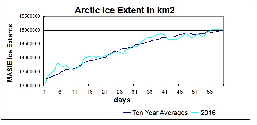
Your dataset is invaluable since it represents multiple sources, including satellite passive microwave sensors, and is more precise in defining ice edges. I have been following MASIE for years, and was pleased to see the dataset for the last ten years released in November 2015. This ice extent record based on navigational observations is a vital resource for comparisons, not only with the satellite measurements, but also with the longer-term history of ice charts from Russia, Denmark, Norway and Canada.

Thank you, and please keep up the excellent work.

Ron Clutz
Blogsite: Science Matters
https://rclutz.wordpress.com/category/arctic-sea-ice/

I received a nice reply and word that my message was forwarded to the team leader.

Any others wanting to see this dataset maintained might also want to communicate their interest.

“If you see something, Say something.”

Icy Arctic Mid February

Update below February 22, 2016

Needless to say, “Ice Free” never happened.  It is true that in the last ten years, August and September monthly extents declined slightly, but the other ten months have increased more than twice as much.  So the over all trend has been slightly upward.

Here is the current image from NASA:

Figure 2: Color-coded map of the daily sea ice concentration in the Northern Hemisphere for the indicated recent date along with the contours of the 15% edge during the years with the least extent of ice (in red) and the greatest extent of ice (in yellow) during the period from November 1978 to the present. The extents in km2 for the current and for the years of minimum and maximum extents are provided below the image. The different shades of gray over land indicate the land elevation with the lightest gray being the highest elevation. Source: NASA


For comparison, here is the ice chart from MASIE:


The comparable MASIE image is showing about 500k km2 more ice than the NASA image. Through mid February, 2016 is following the average winter ice growth over the last ten years, and is greater than 2015 which had a maximum below average. The NSIDC Ice Index is running behind MASIE by about 600k km2.

masie 2016 jan and feb to 48It remains to be seen in March how this year’s maximum will compare to other years.

Update February 22, 2016

Some additional information on the MASIE ice product:

MASIE: Human analysis of all available input imagery, including visible/infrared, SAR, scatterometer and passive microwave, yields a daily map of sea-ice extent at a 4 km gridded resolution, with a 40% concentration threshold for the presence of sea ice. In other words, if a gridcell is judged by an analyst to have >40% of its area covered with ice, it is classified as ice; if a cell has <40% ice, it is classified as open water.

The passive microwave sea-ice algorithms are capable of distinguishing three surface types (one water and two ice), and the standard algorithms are calibrated for thick first-year and multi-year ice (Cavalieri, 1994). When thin ice is present, the algorithms underestimate the concentration of new and thin ice, and when such ice is present in lower concentrations they may detect only open water. The underestimation of concentration and extent of thin-ice regions has been noted in several evaluation studies

Melt is another well-known cause of underestimation of sea ice by passive microwave sensors.

Meier et al. How do sea-ice concentrations from operational data compare with passive microwave estimates? Implications for improved model evaluations and forecasting

Click to access a69a694.pdf