Oceans Matter: Reflecting on writings by Dr. Arnd Bernaerts

Updated on April 9 and 11 at bottom of post.

In response to my water world post, I was shown the wonderful phrase coined by Dr. Bernaerts:

“Climate is the continuation of oceans by other means”.

In was in 1992 he wrote in Nature appealing to the Rio conference to use the UN Convention on the Law of the Seas (UNCLOS) to better manage human impacts on the oceans, and thereby address climate concerns. Needless to say, that call fell on deaf ears.

He later elaborates: “Presumably science would serve the general public better when they would listen to Leonardo da Vinci (1452-1519) who said: “Water is the driver of nature”. Some say that nature rules climate, but water rules the nature on this earth, and the water on earth is so synonymous with the oceans and seas that it can be said: Climate is the continuation of the oceans by other means.”

Dr. Bernaerts is certainly a man worthy of respect and admiration–an expert in maritime law, a passionate marine conservationist, and an historian of naval warfare. All of these are subjects where I have little background knowledge and much to learn.

I see him as a spokesman for ocean scientists, whose views have been little considered in the IPCC rush to judgment upon CO2. Dr. Bernaerts says quite a lot about this at his website: http://www.whatisclimate.com/

It takes some time to understand how his material is organized, with several websites to explore, but there’s lots of data, naval history, graphs and charts to peruse and expand one’s understanding.

An Overview

My comments here are a first attempt to understand his point of view with respect to climate change. Bernaerts makes this observation:

“In the mid 20th Century there had been a 35-year lasting period of global cooling, which had started between 1940 and 1945. The reasoning for causation given by climate science is rather limited, and hardly sufficient. Cooling was evident in the Pacific as well. Could naval war in the Pacific over just three years have contributed to trigger a climatic shift in the North Pacific? If it was not naval war, which mechanism caused the large discontinuity in the mid-twentieth century in observed global-mean surface temperatures? Was it a “natural event”, or by what kick off was this process set in motion?”

While admitting answers are not definitive, he goes on to assert:
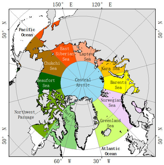
“In the North Atlantic and its adjacent seas the naval war in Northern Europe definitely contributed highly. This is due to a much higher extension of the northern North Atlantic towards the pole, and the sensible structure of the warm Gulf Current system that flows through colder water up to the Arctic Ocean . One has to assume that any substantial climatic shift generated in the North Atlantic will inevitably show its impact on the North Pacific as well.”

This leads into a discussion of the PDO:

“While naval activities, just like any wind, have an impact on the upper sea surface layer concerning the temperature and salinity structure, the vastness of the North Pacific in extension and volume, makes it hard to assume any relevance between WWII and the observed climate shift in the early 1940s. But as long as the reason for the shift has not been evidently established, naval war activities need to be regarded as an option, and should not have been ignored. The question is about the impact human activities may have on climate, and this should be known completely as soon as possible. For this reason this investigation restricts the scope on the so-called Pacific Decadal Oscillation (PDO).”

“Until now no mechanism has been identified to explain the shifts. They are rare, and occurred only six times over the last 300 years: 1750, 1905, 1946, 1977, 1998, and 2008 (Biondi, 2001). Concerning the last century N. Mantua identifies two full PDO cycles: with cool PDO regimes from 1890-1924 and again from 1947-1976, while warm PDO regimes dominated from 1925-1946 and from 1977 through (at least) the mid-1990’s (Mantua, 2000), whereby timing may vary according to the researcher, e.g. saying that a warm phase lasted from 1925–42 that turned into a cold PDO cycle from 1943–76 (Zhang, 1996).”

Although the sea surface temperature (SST) data taken during WWII should only be used with caution (Bernaerts, 1996), they need nevertheless be assessed with regard to timing. But the shift in SST and SAT (surface air temperature), show a different time, first in the Europe/Atlantic area (between 1940 and 1942), and in the North Pacific between 1942 and 1945. The set of given SST graphics indicate, at best that pre WWII warming continued maximally until about 1942.”

Elsewhere he theorizes that the stirring action of great and increasing numbers of propeller-driven vessels releases ocean heat into the air, beyond what naturally occurs. He doesn’t claim this is proven, but rather it has been ignored and not studied. He also believes that future cooling is as likely as warming, contrary to what consensus scientists expect.

I appreciate Dr. Bernaerts’ perspective and will be reading more of his extensive work.

Update April 11:  Recent Analyses

Offshore Wind-parks and mild Winters.
Contribution from Ships, Fishery, Wind-parks etc.
25th February, 2015

Click to access k-.pdf

After a moderate March now a cold April? April 4, 2015
http://climate-ocean.com/2015/K-m2.html

Update: Comments by Dr. Bernaerts and myself

Ron; Your essay is highly appreciated. Thanks a lot! As COP Paris is approaching quickly, your presentation is very helpful for raising more interest and discussion on ‘oceans make climate’, about which I would be ready and happy to assist you in exploring my research material, and concepts of the various analyses, as it may otherwise “take some time to understand how his material is organized….” covering the last quarter century.
With best regards
Arnd

Ron Clutz · April 9

Dr. Bernaerts, thanks for your comment. I am glad my overview of your work was not too far off.

As you can see from my posts here, I am a generalist with a scientific curiosity. Truth be told, I paid zero attention to global warming prior to COP Copenhagen. At that event was the spectacle of nations pledging reductions in fossil fuel emissions, and the pledged amounts totaled up to forecast temperatures at the end of the century.

Amazing! When did we so well understand the climate system to project the future in hundredths of degrees? So I started reading, and soon learned it was a circus act, or even worse a side-show con game. My point: The notion of CO2 as the “climate control knob” offended my sensibility that such a complex reality could be so simply explained.

At the time, I could only say to my friends (who think I am obsessing over this issue) that we are only experiencing natural variability. That is true enough, but I and others like me need an alternative theory of what drives changes in the climate.

That is why your phrase struck me. In the water world post, I noted that global SSTs fluctuate in the same periods as the IPO, and the same patterns appear in surface temperature records. This suggests that the oceans are the source of natural variability, and I believe that is your premise.

Here’s what I want to learn from you. What is the theory, the mechanisms and the evidence for your assertion: Oceans make the climate. Please point me to the writings. Remember that I am a generalist who needs to grasp the core principles underneath the complexity of your specialized knowledge.

Looking forward to your response.

Dr. Bernaerts responds here:

https://rclutz.wordpress.com/2015/04/09/understanding-how-oceans-have-driven-climate-change/

Searching for Potable Water

Report: Majority Of Earth’s Potable Water Trapped In Coca-Cola Products

According to top experts, the new report marks the first comprehensive attempt to measure the planet’s freshwater reserves and determine exactly how much of it is currently locked inside sources such as Coke, Diet Coke, Caffeine-Free Coke, Dr. Pepper, Barq’s root beer, and other Coca-Cola beverages, making it impossible to use as drinking water, or for bathing or cooking.

“By harnessing the freshwater that exists inside these remarkably abundant beverages, we could more than double access to safe drinking sources worldwide,” said Ghosh.

“Our own country has enough water in its Vanilla Coke Zero to fill Lake Michigan, but in its current state that water is useless to us,” he added.

In an examination of the ongoing drought in California, the report concludes that if it can one day be tapped, the potable water contained within the supply of Sprite in Los Angeles alone will meet the needs of the entire state for years to come.

Full article is here: http://www.theonion.com/articles/report-majority-of-earths-potable-water-trapped-in,38356/

I missed this when it was published beginning of this month. Mind you, with the Onion, it is always April 1st.

Climate Report from the Water World

In 1995 many people saw the cli-sci-fi (Climate Science Fiction) thriller based on polar ice melting and all land surface covered with water.

But that hypothetical world is not the subject of this post, rather it is our very own planet earth just as it is today.

We humans, parochial as we are, imagine the earth’s surface to be land because that is where we live. In fact, the earth’s surface is 71% water, and the Northern Hemisphere (NH) consists of 30% water and 20% land, while the SH is a whopping 41% water and only 9% land. I was reminded of this fact recently while looking at Australian temperature records. The image below shows the effect of living on a piece of land upon a water world.

“Warming over Australia has been consistent with warming in the surrounding oceans.”

Indeed, how could it be otherwise for an island continent surrounded by water? The graph above shows a gentle rising of sea surface temperatures (SST) following the end of the Little Ice Age, overlaid with various ocean shifts (ENSO, AMO, NAO, etc.). Since 84% of Australians live within 50 km of the coast, and weather stations tend to be located where people live, it’s not surprising that the land surface temperature records mimic the sea surface variations.

But the effect is not limited to Australia. Climate research centers estimate global mean surface temperatures weighted according to grids, so those metrics are dominated by the ocean SSTs. 2014 was warm because of the mild undeclared El Nino, which persists today and gives hope to those wanting a record warm year in 2015.

But this is not about CO2. It has everything to do with water heated by shortwave solar radiation, stored and circulating in complex patterns, driven by the temperature differential between the equator and the poles. Scientists are gaining insight into the temperature dynamics of our water world.

The Pacific Makes Waves Worldwide

Among the oceans, the Pacific is the gorilla whose fluctuations drive changes across the water world. Short-term ENSO events ripple globally, and in the longer-term, there are effects from the Interdecadal Pacific Oscillation (IPO), not to be confused with an Initial Public Offering. Here are some recent research findings:

“From 1920 to 2012, there are roughly two warm IPO phases (1924–1945 and 1977–1998, with warm SSTs in the central and eastern tropical Pacific) and two cold IPO phases (1946–1976 and 1999–2012, with cold SSTs in the same region). The most recent cold IPO phase is still continuing. We found that phase switches of the IPO are concurrent with major climate transitions over the globe, including abrupt shifts in SST, SLP, T and P.”

“Annual surface air temperature is positively correlated with the IPO index (i.e., higher T during warming IPO phases such as 1924–1945 and 1977–1998) over western North America except its Southwest, mid-latitude central and eastern Asia, and central and northern Australia, but the correlation is negative over northeastern North America, northeastern South America, southeastern Europe, and northern India. Annual precipitation tends to be higher (lower) during warm (cold) IPO phases such as 1924–1945 and 1977–1998 (1946–1976 and 1999–2012) over southwestern North America, northern India, and central Argentina, while it is the opposite over the maritime continent including much of Australia, southern Africa, and northeastern Asia (Fig. 4b).”

“Besides the direct impacts on decadal variations in T and P, we also found some decadal modulations of ENSO’s influence on T and P on multi-year timescales by the IPO over northeastern Australia, northern India, southern Africa and western Canada.”

“Thus, the IPO is an ENSO-like low-frequency mode not just in its SST and SLP patterns (Zhang et al. 1997), but also in its impacts on T and P and atmospheric fields. These results imply that many of the surface and atmospheric processes associated with ENSO also apply to the IPO phase changes, with the warm (cold) IPO phase resembling El Nino (La Nina). Our results also suggest that it is important to predict IPO’s phase change for decadal climate predictions.”

From: The influence of the Interdecadal Pacific Oscillation on Temperature and Precipitation over the Globe Bo Dong • Aiguo Dai 2015 http://www.cgd.ucar.edu/cas/adai/papers/DongDai-CD2015-IPO.pdf

So let’s see how those warming and cooling periods show up in the SST historical records. HadSST3 dataset is available here:
http://www.metoffice.gov.uk/hadobs/hadsst3/data/download.html

I analyzed the annual global record and got the following results:

HadSST3 Global Temperature Anomaly Trends

1924-1945 0.171 C/decade
1945-1977 -0.028 C/decade
1977-1998 0.150 C/decade
1998-2014 0.054 C/decade
1924-2014 0.057 C/decade

If those trends look familiar, it’s because you see the same pattern in any of the global surface temperature datasets.

Conclusion:

Living on our water world means our temperatures and precipitation fluctuate according to ocean circulations and oscillations, especially ENSO and IPO patterns in the Pacific basin.

Climate is the continuation of oceans by other means. Dr. Arnd Bernaerts

Note:

I think SSTs are a reasonable proxy for natural variability over the last century or so. The long-term trend is 0.5C/century with multi-decadal periods as high as +1.7C/century, and as low as -0.3C/century. The latter one was enough to cause an ice age scare.

In advance of COP Paris, some want to project warming of +1.5C as requiring action. We’ve been there twice already recently, and much warmer still in the distant past.

Analysis of NOAA Arctic Sea Ice extent since 1979

For climate analysis we consider the average monthly extents for March and for September of each year in the satellite record, and the differences (the melt extent). Though we would prefer a longer record, these are currently the most popular data. Several observations:

March averages (annual maximums) do not vary greatly: 15.48 M Km2 is the average extent, with a range of 16.45 to 14.43 M Km2. 2/3 of the years are between 15 and 16M.

September averages (annual minimums) vary much more: 6.40 M Km2 is the average, with a range of 7.88 to 3.63 M Km2. Standard deviation is +/- 1.07 M Km2.


Note: The largest September extent (7.88) in the record occurred in 1996, the same year of the smallest melt extent: 7.25. And the smallest September extent (3.63) occurred in 2012, due to the largest melt in the record, 11.8M. The March extents of those two years were nearly the same.

The Arctic ice extent time series appears to consist of three periods:
1979 to 1996 Annual minimums mostly above average
1997 to 2006 Annual minimums around average
2007 to 2014 Annual minimums below average

Averages March Sept Diff (Melt)
1979 to 1996 15.8 7.2 8.6
1997 to 2006 15.3 6.2 9.0
2007 to 2014 15.0 4.5 10.5

Since 2005 the combination of below average March extents, combined with above average melts has produced September extents below 6 M Km2 each year.

It is now evident that 2012 was an outlier (probably due to the unusual storm activity). That year’s melt of 11.8 was 28% above the average melt of 9.09 and more than 1 M km2 larger than the second largest melt in 2008.

The pivotal decade was 1997 to 2006, preceded by slightly declining extents, and followed by much lower extents. What any of this has to do with CO2 and air temperatures is not obvious.

Data is here:
ftp://sidads.colorado.edu/DATASETS/NOAA/G02135/Mar/N_03_area.txt
ftp://sidads.colorado.edu/DATASETS/NOAA/G02135/Sep/N_09_area.txt

Comparing NOAA to MASIE Arctic Ice Extent 

Some might be interested to compare MASIE results with NOAA Sea Ice Index, since NOAA is a typical reference for Arctic Ice news. NOAA uses only passive microwave readings, while MASIE includes other sources, such as satellite images and field observations.

For comparison, MASIE shows about 700,000 Km2 more ice extent than NOAA both at maximum and minimum. This is usually explained by microwave sensors seeing melt water on top of ice the same as open water.

For the years 2007 to 2014 inclusive, each year MASIE shows higher maximums than NOAA, on average 5% higher. In each of those same years MASIE shows higher minimums than NOAA, on average 15% higher. The melt extent is more comparable: NOAA shows an average annual loss of 70.5 %, while MASIE shows an average loss of 67.5%.

NIC Ice Charts


Climatologists say the NIC estimates are “conservative.” By this they mean NIC’s priority is shipping safety, and so, when in doubt, under mixed ice and water conditions, ice charts show ice. NIC people do not make predictions about sea ice, they only report what is there, according to their multiple sources.

On the other hand, principals at both NASA and NOAA have said on the record that the Arctic will soon be ice-free, and it will be the fault of CO2. Could it be when in doubt, under mixed conditions, they report water in places where NIC shows ice? That would explain the discrepancies in estimates of ice extent

Note: NOAA has bureaucratic authority over NIC and advises against using NIC records for climate analysis. Last year, NIC results became available only on a rolling 30-day basis, so that estimates older than the current period are no longer available. Noticing this policy change, I began building a spreadsheet to capture the history for my own analysis. Since mid November, 2014, NIC ice extent reports have been unavailable at the MASIE webpage.

Update on April 2: NSIDC now says MASIE will be back after April.

Update November  2015: MASIE dataset is now available from January 1, 2006 to the present.


Everything You Wanted to Know about Measuring Arctic Ice (But Were Afraid to Ask)

There are several research centers that monitor Arctic ice extent, especially NSIDC (USA), DMI (Denmark), JAXA (Japan), and NANSEN (Norway). All start with the same data from passive microwave sensors on NASA satellites. Slight differences arise from different algorithms used to process the inputs into ice extent estimates.

Operational ice charts are an alternative measure of Arctic sea ice extent. These are prepared daily by Canada, Russia and US maritime authorities to assist ships navigating in Arctic waters. For example, the US National Ice Center (NIC) provides an index called MASIE (Multisensor Analyzed Sea Ice Extent). NIC charts are based upon not only passive microwave numbers, but also satellite imagery and reports from planes and ships operating in the regions. Operational ice charts are the most detailed pre-satellite records, with the Russian archives being the oldest.

What’s the Issue?

On another blog, a climate person put it to me this way:

“Based on what I’ve read if I had no other source, or were heading out in a boat, I would most certainly use the operational indices such as NIC. For climate change trends, I’d go with NSIDC, JAXA … Do you know of any climate scientists that prefer NIC?”

Measuring anything in the Arctic is problematic due to the conditions. And any technology has limitations and uncertainties. Thus it is useful to have more than one estimate of ice extent. Comparisons of the two types of data show the passive microwave results underestimate ice extent, especially during the late summer minimum. The difficulty is mistaking surface melt water for open water, failing to discern the ice underneath.

“Passive microwave sensors from the U.S. Defense Meteorological Satellite Program have long provided a key source of information on Arctic-wide sea ice conditions, but suffer from some known deficiencies, notably a tendency to underestimate ice concentrations in summer. With the recent release of digital and quality controlled ice charts extending back to 1972 from the U.S. National Ice Center (NIC), there is now an alternative record of late twentieth century Northern Hemisphere sea ice conditions to compare with the valuable, but imperfect, passive microwave sea ice record.”

“This analysis has been based on ice chart data rather than the more commonly analyzed passive microwave derived ice concentrations. Differences between the NIC ice chart sea ice record and the passive microwave sea ice record are highly significant despite the fact that the NIC charts are semi-dependent on the passive microwave data, and it is worth noting these differences. We compare the ice chart data to ice concentrations from the NASA Team algorithm which, along with the Bootstrap algorithm [Comiso, 1995], has proved to be perhaps the most popular used for generating ice concentrations [Cavalieri et al.,1997]. We find a baseline difference in integrated ice concentration coverage north of 45N of 3.85% ± 0.73% during November to May (ice chart concentrations are larger). In summer, the difference between the two sources of data rises to a maximum of 23% peaking in early August, equivalent to ice coverage the size of Greenland.“ ( My Bold) Source: Late twentieth century Northern Hemisphere sea-ice record from U.S. National Ice Center ice charts. 

The differences are even greater for Canadian regions.

“More than 1380 regional Canadian weekly sea-ice charts for four Canadian regions and 839 hemispheric U.S. weekly sea-ice charts from 1979 to 1996 are compared with passive microwave sea-ice concentration estimates using the National Aeronautics and Space Administration (NASA) Team algorithm. Compared with the Canadian regional ice charts, the NASA Team algorithm underestimates the total ice-covered area by 20.4% to 33.5% during ice melt in the summer and by 7.6% to 43.5% during ice growth in the late fall.”

From: The Use of Operational Ice Charts for Evaluating Passive Microwave Ice Concentration Data, Agnew and Howell

Or, if you don’t like what the US or Canada puts in their ice charts, you can get a third, independent perspective from Russia. The AARI has been studying and mapping the polar regions for a very long time, currently one of them chairs the ETSI and they maintain a global sea ice database (the other one is at NSIDC). Their ice charts can be accessed here.

A warning note: The Russians are not alarmed by what they see in the Arctic.

“In winter, the newly formed ice actively grows up to a 1.2 meter thick layer, while the coastal ice grows up to 2.0 meters. Consequently, the Arctic sea ice layer does not change significantly. Moreover, according to Genrikh Alekseev, in the summer, ice melts in various seas unequally. This year, the seas through which the Northern Shipping Route passes are covered with an unusually thicker ice layer. The Barents Sea is covered by a thin ice layer, but the amount of ice in the Kara, Laptev, East-Siberian and Chukotskiy seas exceeds the level of 2007. The conditions in the Arctic in the warm summer can be considered abnormal, but the Northern Shipping Route has not been completely freed from ice yet. This means icebreakers will be needed in the future, says the scientist.”

The extreme melting of ice in the summer 2012 is most likely the last gesture that the warming is ending. In fact, ice is a product of climate, and when comparing the graphs of the air temperature and melting ice, one can see that they coincide, Genrikh Alekseev said.

Conclusion:

Operational ice charts are more variable due to human error in their production.

Climatologists prefer passive microwave indices of ice extent because they are consistently wrong.

One wonders about their preference if satellites were overestimating ice. For myself I am glad for two mostly independent measures, one done by people who only want to get it right that day.

Note: As of March 2015, NSIDC has been showing MASIE off-line since mid November 2014. They say NIC results will be back in April.

Update on April 2: NSIDC now says MASIE will be back after April.

Arctic Sea Ice Factors

An early-spring sunset over the icy Chukchi Sea near Barrow (Utqiaġvik), Alaska, documented during the OASIS field project (Ocean_Atmosphere_Sea Ice_Snowpack) on March 22, 2009. Image credit: UCAR, photo by Carlye Calvin.

Alarmists are always claiming the Arctic Sea Ice is the “canary in the coal mine.” Wrong. Arctic ice extent varies a lot for a lot of reasons. Predictions of its disappearing because of rising CO2 are another attempt to use a natural process as proof that global warming is dangerous and linked to fossil fuel emissions.

The Long View of NH Sea Ice

First some historical context for how NH ice extent varies over decades and centuries.

Figure 16-3: Time series of April sea-ice extent in Nordic Sea (1864-1998) given by 2-year running mean and second-order polynomial curves. Top: Nordic Sea; middle: eastern area; bottom: western area (after Vinje, 2000). IPCC Third Assessment Report

“The extent of ice in the Nordic Seas measured in April has been subject to a reduction of ~33% over the past 135 yr. Nearly half of this reduction is observed over the period ~1860–1900, prior to the warming of the Arctic. Decadal variations with an average period of 12–14 yr are observed for the whole period. The observation series indicates that less than 3% of the variance with respect to time can be explained for a series shorter than 30 yr, less than 18% for a series shorter than 90 yr, and less than 42% for the whole 135-yr long series. While the mean annual reduction of the April ice extent is decelerating by a factor of 3 between 1880 and 1980, the mean annual reduction of the August ice extent is proceeding linearly.”

“The August ice extent in the Eastern area has been more than halved over the past 80 yr. A similar meltback has not been observed since the temperature optimum during the eighteenth century. This retrospective comparison indicates accordingly that the recent reduction of the ice extent in the Eastern area is still within the variation range observed over the past 300 yr.”

Anomalies and Trends of Sea-Ice Extent and Atmospheric Circulation in the Nordic Seas during the Period 1864–1998 by TORGNY VINJE, Norwegian Polar Institute, Oslo, Norway

http://journals.ametsoc.org/doi/pdf/10.1175/1520-0442(2001)014%3C0255%3AAATOSI%3E2.0.CO%3B2

Multiple Factors Affecting Sea Ice Extent

The references below, among many others, show that the factors causing Arctic Ice to lessen, when that was happening, have nothing to do with air temperatures which is the only way CO2 could have an effect (theoretically). The melting is much more the result of water circulations, especially when warm Atlantic water from the south is able, or not, to get into the Arctic Ocean.

“Regional Arctic sea ice variations result from atmospheric circulation changes and in particular from ENSO and North Atlantic Oscillation (NAO) events. Patterns of Arctic surface air temperature changes and trends are consistent with regional changes in sea ice extent. A dominant mode of Arctic variability is the Arctic Oscillation (AO), and its strong positive phase during the 1990s may account for much of the recent decrease in Arctic ice extent. The AO explains more than half of the surface air temperature trends over much of the Arctic.”
http://onlinelibrary.wiley.com/enhanced/doi/10.1029/2003GL018031/

“The variation in the ice extent caused by a 1C change in the ocean temperature since 1860 compares with about 90% of the concurrent total ice extent variation observed in the eastern area. The net effect of atmospheric temperatures seems accordingly to be relatively small over the same period of time. This concurs with the large difference in the individual heat capacity.”

http://journals.ametsoc.org/doi/pdf/10.1175/1520-0442(2001)014%3C0255%3AAATOSI%3E2.0.CO%3B2

“So why does circulation matter? Two reasons. First off, you can see warm water entering on the Pacific and Atlantic connections and cold water leaving via Canada and Greenland / Fram Strait. During a Glacial, that circulation stops. With a mile of ice over Canada, that exit is closed. With ocean levels 100 meters lower, folks can walk from Russia to Alaska. (Well, they do it sometimes now over the ice, but it will be easier and less seasonal during a Glacial).”

“So look again. No Bering Sea warm intrusion. No Canadian cold drain. No Beaufort Gyre when the ice is deep, since there will be no wind driven circulation under the ice. The Asian current toward the Bering Sea will end. The entire Asian warm river drain into the Arctic likely freezes up and doesn’t happen – which raises the interesting question of where does it go then? But that is for another day. Like asking where the Alaskan rivers drain then, or are they just glaciers at that point?”

“In short, what is left is just the North Atlantic Drift (aka Gulf Stream for Americans) warming a small patch near Europe and some cold water near Greenland. As Scotland was under ice in the last Glacial, even that North Atlantic Drift circulation likely didn’t get very far north.”
https://chiefio.wordpress.com/2014/05/04/arctic-flushing-and-interglacial-melt-pulses/

In addition to water circulation effects, sea ice extent is influenced by clouds and winds.

“Researchers have found that the high amounts of cloud in the early summer lead to low concentrations of sea ice in the late summer. This relationship between cloud cover and sea ice is so strong that it can explain up to 80 per cent of the variation in sea ice over as much as 60 per cent of the the sea ice area.”

http://www.reportingclimatescience.com/news-stories/article/high-cloud-levels-drive-low-arctic-sea-ice.html

“We have shown evidence that low level winds over the Arctic, play an important role in mediating the rate of retreat of sea ice during summer. Anomalous anticyclonic flow over the interior of the Arctic directed toward the Fram Strait favors rapid retreat and vice versa. We have argued that the relative rankings of the September SIE for the years 2007, 2010 and 2011 are largely attributable to the differing rates of decrease of SIE during these summers, which are a consequence of year-to-year differences in the seasonal evolution of summertime winds over the Arctic. . . It is not clear why anticyclonic wind anomalies have been prevalent in recent years. ”

Click to access 2012GL051330.pdf

Conclusion:

Like most things in the climate, Arctic sea ice extent is determined by many interacting factors.  Among those many influences, the weakest case is claiming CO2 as a driving force.

Do-It-Yourself Climate Analysis

This article was first posted at Watts Up With That on July 12, 2014

People in different places are wondering: What are temperatures doing in my area? Are they trending up, down or sideways? Of course, from official quarters, the answer is: The globe is warming, so it is safe to assume that your area is warming also.

But what if you don’t want to assume and don’t want to take someone else’s word for it. You can answer the question yourself if you take on board one simplifying concept:

“If you want to understand temperature change,
  you should analyze the changes, not the temperatures.”

Analyzing temperature change is in fact much simpler and avoids data manipulations like anomalies, averaging, gridding, adjusting and homogenizing. Temperature Trend Analysis starts with recognizing that each micro-climate is distinct with its unique climate patterns. So you work on the raw, unadjusted station data produced, validated and submitted by local meteorologists. This is accessed in the HADCRUT3 dataset made public in July 2011. Of course, there are missing datapoints which cause much work for climatologists. Those are not a big deal for trend analysis.

The dataset includes 5000+ stations around the world, and only someone adept with statistical software running on a robust computer could deal with all of it. But the Met Office provides it in folders that cluster stations according to their WMO codes.
http://www.metoffice.gov.uk/research/climate/climate-monitoring/land-and-atmosphere/surface-station-records

I am not the first one to think of this. Richard Wakefield did similar analyses in Ontario years ago, and Lubos Motl did trend analysis on the entire HADCRUT3 in July 2011. With this simplifying concept and a template, it is possible for anyone with modest spreadsheet skills and a notebook computer to answer how area temperatures are trending. I don’t claim this analysis is better than those done with multimillion dollar computers, but it does serve as a “sanity check” against exaggerated claims and hype.

The method involves creating for each station a spreadsheet that calculates a trend for each month for all of the years recorded. Then the monthly trends are averaged together for a lifetime trend for that station. To be comparable to others, the station trend is presented as degrees per 100 years. A summary sheet collects all the trends from all the sheets to provide trend analysis for the geographical area of interest.

I have built an Excel workbook to do this analysis, and as a proof of concept, I have loaded in temperature data for Kansas . Kansas is an interesting choice for several reasons:

1) It’s exactly in the middle of the US with little change in elevation;
2) Kansas has a manageable number of HCN stations:
3) It has been the subject lately of discussion about temperature processing effects;
4) Kansas legislators are concerned and looking for the facts; and
5) As a lad, my first awareness of extreme weather was the tornado in OZ, after which Dorothy famously said: “We’re not in Kansas anymore, Toto.”

For the Kansas example, we see that BEST shows on its climate page that the State has warmed 1.98 +/-0.14°C since 1960. That looks like temperatures will be another 2°C higher in the next 50 years, and we should be alarmed.

Well, the results from temperature trend analysis tell a different story.
From the summary page of the workbook:

Area State of Kansas, USA
History 1843 to 2011
Stations 26
Average Length 115 Years
Average Trend 0.70 °C/Century
Standard Deviation 0.45 °C/Century
Max Trend 1.89 °C/Century
Min Trend -0.04 °C/Century

So in the last century the average Kansas station has warmed 0.70+/-0.45°C , with at least one site cooling over that time. The +/- 0.45 deviation shows that climate is different from site to site even when all are located on the same prairie.

And the variability over the seasons is also considerable:

Month °C/century Std Dev
Jan 0.59 1.30
Feb 1.53 0.73
Mar 1.59 2.07
Apr 0.76 0.79
May 0.73 0.76
June 0.66 0.66
July 0.92 0.63
Aug 0.58 0.65
Sep -0.01 0.72
Oct 0.43 0.94
Nov 0.82 0.66
Dec 0.39 0.50

Note that February and March are warming strongly, while September is sideways . That’s good news for farming, I think.

Temperature change depends on your location and time of the year. The rate of warming here is not extreme and if the next 100 years is something like the last 100, in Kansas there will likely be less than a degree C added.

Final points:

When you look behind the summary page at BEST, it reports that the Kansas warming trend since 1910 is 0.75°C +/-0.08, close to what my analysis showed. So the alarming number at the top was not the accumulated rise in temperatures, it was the Rate for a century projected from 1960. The actual observed century rate is far less disturbing. And the variability across the state is considerable and is much more evident in the trend analysis. I had wanted to use raw data from BEST in this study, because some stations showed longer records there, but for comparable years, the numbers didn’t match with HADCRUT3.

Not only does this approach maintain the integrity of the historical record, it also facilitates what policy makers desperately need: climate outlooks based on observations for specific jurisdictions. Since the analysis is bottom-up, micro-climate trends can be compiled together for any desired scope: municipal, district, region, province, nation, continent.

This example analyzed monthly average temperatures at a set of stations. This study used HADCRUT3, but others are done with CRUTEM4 and GHCN. The same technique can be applied to temperature minimums and maximums, or to adjusted and unadjusted records. And since climate is more than temperatures, one could also study precipitation histories, or indeed any weather measure captured in a time series.

The trend analysis workbook is provided below. It was the first iteration and the workbook was refined and enhanced in subsequent studies, also posted at this blog.

HADCRUT3 Kansas TTA

Analyzing Temperature Change using World Class Stations

This article was first posted on July 28, 2014 at Watts Up With That.

This is a study to see what the world’s best stations (a subset of all stations I selected as “world class” by criteria) are telling us about climate change over the long term. There are three principle findings.

To be included, a station needed at least 200 years of continuous records up to the present. Geographical location was not a criterion for selection, only the quality and length of the histories. 247 years is the average length of service in this dataset extracted from CRUTEM4.

The 25 stations that qualified are located in Russia, Norway, Denmark, Sweden, Netherlands, Germany, Austria, Italy, England, Poland, Hungary, Lithuania, Switzerland, France and Czech Republic. I am indebted to Richard Mallett for his work to identify the best station histories, to gather and format the data from CRUTEM4.

The Central England Temperature (CET) series is included here from 1772, the onset of daily observations with more precise instruments. Those who have asserted that CET is a proxy for Northern Hemisphere temperatures will have some support in this analysis: CET at 0.38°C/Century nearly matches the central tendency of the group of stations.

1. A rise of 0.41°C per century is observed over the last 250 years.

Area WORLD CLASS STATIONS
History 1706 to 2011
Stations 25
Average Length 247 Years
Average Trend 0.41 °C/Century
Standard Deviation 0.19 °C/Century
Max Trend 0.80 °C/Century
Min Trend 0.04 °C/Century

The average station shows an accumulated rise of about 1°C over the last centuries. The large deviation, and the fact that at least one station has almost no warming over the centuries, shows that warming has not been extreme, and varies considerably from place to place.

2. The warming is occurring mostly in the coldest months.

The average station reports that the coldest months, October through April are all warming at 0.3C or more, while the hottest months are warming at 0.2C or less.

Month °C/Century Std Dev
Jan 0.96 0.31
Feb 0.37 0.27
Mar 0.71 0.27
Apr 0.33 0.28
May 0.18 0.25
June 0.13 0.30
July 0.21 0.30
Aug 0.16 0.26
Sep 0.16 0.28
Oct 0.34 0.27
Nov 0.59 0.23
Dec 0.76 0.27

In fact, the months of May through September warmed at an average rate of 0.17C/Century, while October through April increased at an average rate of 0.58C/Century, more than 3 times higher. This suggests that the climate is not getting hotter, it has become less cold. That is, the pattern suggests milder winters, earlier springs and later autumns, rather than hotter summers.

3. An increase in warming is observed since 1950.

In a long time series, there are likely periods when the rate of change is higher or lower than the rate for the whole series. In this study it was interesting to see period trends around three changepoints:
1.1850, widely regarded as the end of the Little Ice Age (LIA);
2.1900, as the midpoint between the last two centuries of observations;
3.1950 as the date from which it is claimed that CO2 emissions begin to cause higher temperatures.

For the set of stations the results are:

°C/Century Start End
-0.38 1700’s 1850
 0.95 1850 2011
-0.14 1800 1900
 1.45 1900 1950
 2.57 1950 2011

From 1850 to the present, we see an average upward rate of almost a degree, 0.95°C/Century, or an observed rise of 1.53°C up to 2011. Contrary to conventional wisdom, the aftereffects of the LIA lingered on until 1900. The average rate since 1950 is 2.6°C/Century, higher than the natural rate of 1.5°C in the preceding 50 years. Of course, this analysis cannot identify the causes of the 1.1°C added to the rate since 1950. However it is useful to see the scale of warming that might be attributable to CO2, among other factors.

Conclusion

Of course climate is much more than surface temperatures, but the media are full of stories about global warming, hottest decade in history, etc. So people do wonder: “Are present temperatures unusual, and should we be worried?” In other words, “Is it weather or a changing climate?” The answer in the place where you live depends on knowing your climate, that is the long-term weather trends.

Note: These trends were calculated directly from the temperature records without applying any adjustments, anomalies or homogenizing. The principle is: To understand temperature change, analyze the changes, not the temperatures.

Along with this post I provide below the World Class TTA workbook for readers to download for their own use and to check the data and calculations.

World Class TTA

Climate Thinking Out of the Box

CMIP5 vs RSS

It seems that climate modelers are dealing with a quandary: How can we improve on the unsatisfactory results from climate modeling?

Shall we:
A.Continue tweaking models using classical maths though they depend on climate being in quasi-equilibrium; or,
B.Start over from scratch applying non-equilibrium maths to the turbulent climate, though this branch of math is immature with limited expertise.

In other words, we are confident in classical maths, but does climate have features that disqualify it from their application? We are confident that non-equilibrium maths were developed for systems such as the climate, but are these maths robust enough to deal with such a complex reality?

It appears that some modelers are coming to grips with the turbulent quality of climate due to convection dominating heat transfer in the lower troposphere. Heretofore, models put in a parameter for energy loss through convection, and proceeded to model the system as a purely radiative dissipative system. Recently, it seems that some modelers are striking out in a new, possibly more fruitful direction. Herbert et al 2013 is one example exploring the paradigm of non-equilibrium steady states (NESS). Such attempts are open to criticism from a classical position, but may lead to a breakthrough for climate modeling.

That is my layman’s POV. Here is the issue stated by practitioners, more elegantly with bigger words:

“In particular, it is not obvious, as of today, whether it is more efficient to approach the problem of constructing a theory of climate dynamics starting from the framework of hamiltonian mechanics and quasi-equilibrium statistical mechanics or taking the point of view of dissipative chaotic dynamical systems, and of non-equilibrium statistical mechanics, and even the authors of this review disagree. The former approach can rely on much more powerful mathematical tools, while the latter is more realistic and epistemologically more correct, because, obviously, the climate is, indeed, a non-equilibrium system.”

Lucarini et al 2014

Click to access 1311.1190.pdf

Here’s how Herbert et al address the issue of a turbulent, non-equilibrium atmosphere. Their results show that convection rules in the lower troposphere and direct warming from CO2 is quite modest, much less than current models project.

“Like any fluid heated from below, the atmosphere is subject to vertical instability which triggers convection. Convection occurs on small time and space scales, which makes it a challenging feature to include in climate models. Usually sub-grid parameterizations are required. Here, we develop an alternative view based on a global thermodynamic variational principle. We compute convective flux profiles and temperature profiles at steady-state in an implicit way, by maximizing the associated entropy production rate. Two settings are examined, corresponding respectively to the idealized case of a gray atmosphere, and a realistic case based on a Net Exchange Formulation radiative scheme. In the second case, we are also able to discuss the effect of variations of the atmospheric composition, like a doubling of the carbon dioxide concentration.

The response of the surface temperature to the variation of the carbon dioxide concentration — usually called climate sensitivity — ranges from 0.24 K (for the sub-arctic winter profile) to 0.66 K (for the tropical profile), as shown in table 3. To compare these values with the literature, we need to be careful about the feedbacks included in the model we wish to compare to. Indeed, if the overall climate sensitivity is still a subject of debate, this is mainly due to poorly understood feedbacks, like the cloud feedback (Stephens 2005), which are not accounted for in the present study.”

Abstract from:
Vertical Temperature Profiles at Maximum Entropy Production with a Net Exchange Radiative Formulation
Herbert et al 2013

Click to access 1301.1550.pdf

In this modeling paradigm, we have to move from a linear radiative Energy Budget to a dynamic steady state Entropy Budget. As Ozawa et al explains, this is a shift from current modeling practices, but is based on concepts going back to Carnot.

“Entropy of a system is defined as a summation of “heat supplied” divided by its “temperature” [Clausius, 1865].. Heat can be supplied by conduction, by convection, or by radiation. The entropy of the system will increase by equation (1) no matter which way we may choose. When we extract the heat from the system, the entropy of the system will decrease by the same amount. Thus the entropy of a diabatic system, which exchanges heat with its surrounding system, can either increase or decrease, depending on the direction of the heat exchange. This is not a violation of the second law of thermodynamics since the entropy increase in the surrounding system is larger.

Carnot regarded the Earth as a sort of heat engine, in which a fluid like the atmosphere acts as working substance transporting heat from hot to cold places, thereby producing the kinetic energy of the fluid itself. His general conclusion about heat engines is that there is a certain limit for the conversion rate of the heat energy into the kinetic energy and that this limit is inevitable for any natural systems including, among others, the Earth’s atmosphere.

Thus there is a flow of energy from the hot Sun to cold space through the Earth. In the Earth’s system the energy is transported from the warm equatorial region to the cool polar regions by the atmosphere and oceans. Then, according to Carnot, a part of the heat energy is converted into the potential energy which is the source of the kinetic energy of the atmosphere and oceans.

Thus it is likely that the global climate system is regulated at a state with a maximum rate of entropy production by the turbulent heat transport, regardless of the entropy production by the absorption of solar radiation This result is also consistent with a conjecture that entropy of a whole system connected through a nonlinear system will increase along a path of evolution, with a maximum rate of entropy production among a manifold of possible paths [Sawada, 1981]. We shall resolve this radiation problem in this paper by providing a complete view of dissipation processes in the climate system in the framework of an entropy budget for the globe.

The hypothesis of the maximum entropy production (MEP) thus far seems to have been dismissed by some as coincidence. The fact that the Earths climate system transports heat to the same extent as a system in a MEP state does not prove that the Earths climate system is necessarily seeking such a state. However, the coincidence argument has become harder to sustain now that Lorenz et al. [2001] have shown that the same condition can reproduce the observed distributions of temperatures and meridional heat fluxes in the atmospheres of Mars and Titan, two celestial bodies with atmospheric conditions and radiative settings very different from those of the Earth.”

THE SECOND LAW OF THERMODYNAMICS AND THE GLOBAL CLIMATE SYSTEM: A REVIEW OF THE MAXIMUM ENTROPY PRODUCTION PRINCIPLE
Hisashi Ozawa et al 2003

Click to access Ozawa.pdf