Climate Thinking Out of the Box

CMIP5 vs RSS

It seems that climate modelers are dealing with a quandary: How can we improve on the unsatisfactory results from climate modeling?

Shall we:
A.Continue tweaking models using classical maths though they depend on climate being in quasi-equilibrium; or,
B.Start over from scratch applying non-equilibrium maths to the turbulent climate, though this branch of math is immature with limited expertise.

In other words, we are confident in classical maths, but does climate have features that disqualify it from their application? We are confident that non-equilibrium maths were developed for systems such as the climate, but are these maths robust enough to deal with such a complex reality?

It appears that some modelers are coming to grips with the turbulent quality of climate due to convection dominating heat transfer in the lower troposphere. Heretofore, models put in a parameter for energy loss through convection, and proceeded to model the system as a purely radiative dissipative system. Recently, it seems that some modelers are striking out in a new, possibly more fruitful direction. Herbert et al 2013 is one example exploring the paradigm of non-equilibrium steady states (NESS). Such attempts are open to criticism from a classical position, but may lead to a breakthrough for climate modeling.

That is my layman’s POV. Here is the issue stated by practitioners, more elegantly with bigger words:

“In particular, it is not obvious, as of today, whether it is more efficient to approach the problem of constructing a theory of climate dynamics starting from the framework of hamiltonian mechanics and quasi-equilibrium statistical mechanics or taking the point of view of dissipative chaotic dynamical systems, and of non-equilibrium statistical mechanics, and even the authors of this review disagree. The former approach can rely on much more powerful mathematical tools, while the latter is more realistic and epistemologically more correct, because, obviously, the climate is, indeed, a non-equilibrium system.”

Lucarini et al 2014

Click to access 1311.1190.pdf

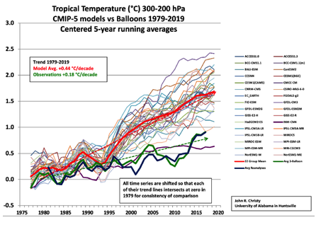
Here’s how Herbert et al address the issue of a turbulent, non-equilibrium atmosphere. Their results show that convection rules in the lower troposphere and direct warming from CO2 is quite modest, much less than current models project.

“Like any fluid heated from below, the atmosphere is subject to vertical instability which triggers convection. Convection occurs on small time and space scales, which makes it a challenging feature to include in climate models. Usually sub-grid parameterizations are required. Here, we develop an alternative view based on a global thermodynamic variational principle. We compute convective flux profiles and temperature profiles at steady-state in an implicit way, by maximizing the associated entropy production rate. Two settings are examined, corresponding respectively to the idealized case of a gray atmosphere, and a realistic case based on a Net Exchange Formulation radiative scheme. In the second case, we are also able to discuss the effect of variations of the atmospheric composition, like a doubling of the carbon dioxide concentration.

The response of the surface temperature to the variation of the carbon dioxide concentration — usually called climate sensitivity — ranges from 0.24 K (for the sub-arctic winter profile) to 0.66 K (for the tropical profile), as shown in table 3. To compare these values with the literature, we need to be careful about the feedbacks included in the model we wish to compare to. Indeed, if the overall climate sensitivity is still a subject of debate, this is mainly due to poorly understood feedbacks, like the cloud feedback (Stephens 2005), which are not accounted for in the present study.”

Abstract from:
Vertical Temperature Profiles at Maximum Entropy Production with a Net Exchange Radiative Formulation
Herbert et al 2013

Click to access 1301.1550.pdf

In this modeling paradigm, we have to move from a linear radiative Energy Budget to a dynamic steady state Entropy Budget. As Ozawa et al explains, this is a shift from current modeling practices, but is based on concepts going back to Carnot.

“Entropy of a system is defined as a summation of “heat supplied” divided by its “temperature” [Clausius, 1865].. Heat can be supplied by conduction, by convection, or by radiation. The entropy of the system will increase by equation (1) no matter which way we may choose. When we extract the heat from the system, the entropy of the system will decrease by the same amount. Thus the entropy of a diabatic system, which exchanges heat with its surrounding system, can either increase or decrease, depending on the direction of the heat exchange. This is not a violation of the second law of thermodynamics since the entropy increase in the surrounding system is larger.

Carnot regarded the Earth as a sort of heat engine, in which a fluid like the atmosphere acts as working substance transporting heat from hot to cold places, thereby producing the kinetic energy of the fluid itself. His general conclusion about heat engines is that there is a certain limit for the conversion rate of the heat energy into the kinetic energy and that this limit is inevitable for any natural systems including, among others, the Earth’s atmosphere.

Thus there is a flow of energy from the hot Sun to cold space through the Earth. In the Earth’s system the energy is transported from the warm equatorial region to the cool polar regions by the atmosphere and oceans. Then, according to Carnot, a part of the heat energy is converted into the potential energy which is the source of the kinetic energy of the atmosphere and oceans.

Thus it is likely that the global climate system is regulated at a state with a maximum rate of entropy production by the turbulent heat transport, regardless of the entropy production by the absorption of solar radiation This result is also consistent with a conjecture that entropy of a whole system connected through a nonlinear system will increase along a path of evolution, with a maximum rate of entropy production among a manifold of possible paths [Sawada, 1981]. We shall resolve this radiation problem in this paper by providing a complete view of dissipation processes in the climate system in the framework of an entropy budget for the globe.

The hypothesis of the maximum entropy production (MEP) thus far seems to have been dismissed by some as coincidence. The fact that the Earths climate system transports heat to the same extent as a system in a MEP state does not prove that the Earths climate system is necessarily seeking such a state. However, the coincidence argument has become harder to sustain now that Lorenz et al. [2001] have shown that the same condition can reproduce the observed distributions of temperatures and meridional heat fluxes in the atmospheres of Mars and Titan, two celestial bodies with atmospheric conditions and radiative settings very different from those of the Earth.”

THE SECOND LAW OF THERMODYNAMICS AND THE GLOBAL CLIMATE SYSTEM: A REVIEW OF THE MAXIMUM ENTROPY PRODUCTION PRINCIPLE
Hisashi Ozawa et al 2003

Click to access Ozawa.pdf

Energy and Poverty

Energy and Poverty are obviously tied together.

“Access to cleaner and affordable energy options is essential for improving the livelihoods of the poor in developing countries. The link between energy and poverty is demonstrated by the fact that the poor in developing countries constitute the bulk of an estimated 2.7 billion people relying on traditional biomass for cooking and the overwhelming majority of the 1.4 billion without access to grid electricity. Most of the people still reliant on traditional biomass live in Africa and South Asia.

The relationship is, in many respects, a vicious cycle in which people who lack access to cleaner and affordable energy are often trapped in a re-enforcing cycle of deprivation, lower incomes and the means to improve their living conditions while at the same time using significant amounts of their very limited income on expensive and unhealthy forms of energy that provide poor and/or unsafe services.”

Click to access GEA_Chapter2_development_hires.pdf

The moral of this is very clear. Where energy is scarce and expensive, people’s labor is cheap and they live in poverty. Where energy is reliable and cheap, people are paid well to workl and they have a better life.

Temperatures According to Climate Models

In December 2014, Willis Eschenbach posted GMT series generated by 42 CMIP5 models, along with HADCRUT4 series, all obtained from KNMI.

CMIP5 Model Temperature Results in Excel


The dataset includes a single run showing GMT from each of 42 CMIP5 models. Each model estimates monthly global mean temperatures in degrees Kelvin backwards to 1861 and forwards to 2101, a period of 240 years. The dataset from CMIP5 models includes 145 years of history to 2005, and 95 years of projections from 2006 onward.

The estimated global mean temperatures are considered to be an emergent property generated by the model. Thus it is of interest to compare them to measured surface temperatures. The models produce variability year over year, and on decadal and centennial scales.

These models can be thought of as 42 “proxies” for global mean temperature change. Without knowing what parameters and assumptions were used in each case, we can still make observations about the models’ behavior, without assuming that any model is typical of the actual climate. Also the central tendency tells us something about the set of models, without necessarily being descriptive of the real world.

What temperatures are projected by the average model?

Periods HADCRUT4 ALL SERIES ALL MINUS HADCRUT4
1850-1878 0.035 0.051 0.016
1878-1915 -0.052 0.024 0.076
1915-1944 0.143 0.050 -0.093
1944-1976 -0.040 -0.008 0.032
1976-1998 0.194 0.144 -0.050
1998-2014 0.053 0.226 0.173
1850-2014 0.049 0.060 0.011

The rates in the table are C/decade. Over the entire 240 years time series, the average model has a warming trend of 1.26C per century. This compares to UAH global trend of 1.38C, measured by satellites since 1979.

However, the average model over the same period as UAH shows a rate of +2.15C/cent. Moreover, for the 30 years from 2006 to 2035, the warming rate is projected at 2.28C. These estimates are in contrast to the 145 years of history in the models, where the trend shows as 0.41C per century.

Clearly, the CMIP5 models are programmed for the future to warm more than 5 times the rate as the past.

Is one model better than the others?

In presenting the CMIP5 dataset, Willis raised a question about which of the 42 models could be the best one. I put the issue this way: Does one of the CMIP5 models reproduce the temperature history convincingly enough that its projections should be taken seriously?

I identified the models that produced an historical trend nearly 0.5K/century over the 145 year period, and those whose trend from 1861 to 2014 was in the same range. Then I looked to see which of the subset could match the UAH trend 1979 to 2014.

Out of these comparisons the best performance was Series 31, which Willis confirms is output from the INMCM4 model. Rates in the table below are C/decade.

Periods HADCRUT4 SERIES 31 31 MINUS HADCRUT4
1850-1878 0.035 0.036 0.001
1878-1915 -0.052 -0.011 0.041
1915-1944 0.143 0.099 -0.044
1944-1976 -0.040 0.056 0.096
1976-1998 0.194 0.098 -0.096
1998-2014 0.053 0.125 0.072
1850-2014 0.049 0.052 0.003

Note that this model closely matches HADCrut4 over 60 year periods, but shows variances over 30 year periods. That is, shorter periods of warming in HADCrut4 run less warm in the model, and shorter periods of cooling in HADCrut4 run flat or slightly warming in the model. Over 60 years the differences offset.

It shows warming 0.52K/century from 1861 to 2014, with a plateau from 2006 to 2014, and 0.91K/century from 1979-2014. It projects 1.0K/century from 2006 to 2035 and 1.35K/century from now to 2101. Those forward projections are much lower than the consensus claims, and not at all alarming

In contrast with Series 31, the other 41 models typically match the historical warming rate of 0.05C by accelerating warming from 1976 onward and projecting it into the future. For example, while UAH shows warming of 0.14/decade from 1979-2014, CMIP5 models estimates average 0.215/decade, ranging from 0.088 to 0.324/decade.

For the next future climate period, 2006-2035, CMIP5 models project an average warming of 0.28C/decade, ranging from 0.097 to 0.375/decade.

The longer the plateau continues, the more overheated are these projections by the models.

What’s different about the best model?

Above, I showed how one CMIP5 model produced historical temperature trends closely comparable to HADCRUT4. That same model, INMCM4, was also closest to Berkeley Earth and RSS series.

Curious about what makes this model different from the others, I consulted several comparative surveys of CMIP5 models. There appear to be 3 features of INMCM4 that differentiate it from the others.

1.INMCM4 has the lowest CO2 forcing response at 4.1K for 4XCO2. That is 37% lower than multi-model mean.

2.INMCM4 has by far the highest climate system inertia: Deep ocean heat capacity in INMCM4 is 317 W yr m^-2 K^-1, 200% of the mean (which excluded INMCM4 because it was such an outlier)

3.INMCM4 exactly matches observed atmospheric H2O content in lower troposphere (215 hPa), and is biased low above that. Most others are biased high.

So the model that most closely reproduces the temperature history has high inertia from ocean heat capacities, low forcing from CO2 and less water for feedback. Why aren’t the other models built like this one?

Conclusions:

In the real world, temperatures go up and down. This is also true of HADCRUT4. In the world of climate models, temperatures only go up. Some variation in rates of warming, but always warming, nonetheless.

Not all models are created equal, and the ensemble average is far from reality and projects unreasonable rates of future warming. It would be much better to take the best model and build upon its success.

Excel workbook is here: CMIP5 VS hADCRUT

Lawrence Lab Report: Proof of Global Warming?

It’s important to deconstruct this study because it is touted in the press as silencing “Climate Deniers” and as giving scientific proof of the greenhouse gas effect, once and for all. For example, a CBC article said this:

“A recent experiment at the Lawrence Berkeley National Laboratory in California has directly measured the warming effect of our carbon emissions, using data from instruments that measure the infrared radiation being reflected back to the ground by the atmosphere – the so-called greenhouse effect.
They found that the amount of radiation coming down increased between 2000 and 2010 in step with the rise of carbon dioxide in the atmosphere. So, the effect is real. And since we are continuing to increase our carbon emissions, change will continue to happen, like it or not, both warm and cold.”

The media was agog over this paper, saying that it measures the warming effect of CO2 in the atmosphere, and is proof of the greenhouse gas effect.

This paper claims to prove rising CO2 in the atmosphere increases down-welling infra-red radiation (DWIR), thereby warming the earth’s surface. The claim is based on observations from 2 sites, in Alaska and Oklahoma. Let’s examine the case made.

Observation: In Alaska and Oklahoma CO2 and DWIR are both increasing.
Claim: Additional CO2 is due to fossil fuel emissions.
Claim: Higher DWIR is due to higher CO2 levels.
Claim: Global DWIR is rising.
Claim: Global surface temperatures are rising.
LL Conclusion: Fossil fuel emissions are causing Global surface temperatures to rise

There are several issues that undermine the report’s conclusion.

Issue: What is the source of rising CO2?
Response: Natural sources of CO2 overwhelm human sources.

The sawtooth pattern of seasonal CO2 concentrations is consistent with release of CO2 from the oceans. Peaks are in March when SH oceans are warmest (60% of world oceans), and valleys are in September when NH oceans are warmest. In contrast biosphere activities peak in January in SH and July in NH.

CO2 content of the oceans is 50 times that of the atmosphere, resulting in the sawtooth extremes. Human emissions are ~5 to 7 Gigatons compared to ~150 Gigatons from natural sources.

Issue: What is the effect of H2O and CO2 on DWIR?
Response: H2O provides 90% of IR activity in the atmosphere.

The long term increase in DWIR can be explained by increasing cloudiness, deriving from evaporation when the sunlight heats the oceans. A slight change in H2O vapor overwhelms the effect of CO2 activity, and H2O varies greatly from place to place, while the global average is fairly constant.

Issue: What is the global trend of DWIR?
Response: According CERES satellites, DWIR has decreased globally since 2000, resulting in an increasing net IR loss upward from the surface.

Globally, Earth’s surface has strongly strengthened its ability to cool radiatively from 2000 to 2014 (by about 1.5 W/m2 or ~1 W/m2 per decade) according to CERES. The increased upward heat loss from the surface is matched by decreasing trend of DWIR globally. And this is in spite of significantly increasing atmospheric content of both CO2 and H2O (WV & clouds) + allegedly rising temps since 2000.

Conclusion:
The rise in CO2 is almost all from natural sources, not fossil fuel emissions.
IR activity is almost all from H2O, not from CO2.
Global DWIR is lower this century, and the surface heat loss is less impeded than before.
Global surface temperatures are not rising with rising fossil fuel emissions.

In fact, you need only apply a little critical intelligence to this paper, and it falls like a house of cards. Are there no journalists with thinking caps allowed to write about this stuff?

Is It Warmer Now than a Century ago? It Depends.

This study was first published on August 20, 2014 at No Tricks Zone. The dataset ends with 2013 records.

In a previous study of World Class station records, the effects of urban development could not be discounted since the 25 long service records come from European cities. This is a study to see what the best sites in the US can tell us about temperature trends in the last century. There are two principal findings below.

Surfacestations.org provides a list of 23 stations that have the CRN#1 Rating for the quality of the sites. I obtained the records from the latest GHCNv3 monthly qcu report, did my own data quality review and built a Temperature Trend Analysis workbook.

As it happens, the stations are spread out across the continental US (CONUS): NW: Oregon, North Dakota, Montana; SW: California, Nevada, Colorado, Texas; MW: Indiana, Missouri, Arkansas, Louisiana; NE: New York, Rhode Island, Pennsylvania; SE: Georgia, Alabama, Mississippi, Florida.

The records themselves vary in quality of coverage, but are all included here because of their CRN#1 rating. The gold medal goes to Savannah for 100% monthly coverage, with a single missing daily observation since 1874. Pensacola was a close second among the four stations with perfect monthly coverage. Most stations were missing less than 20 months with coverages above 95%.

1. First Class US stations show little warming in the last century.

Area FIRST CLASS US STATIONS
History 1874 to 2013
Stations 23
Average Length 118 Years
Average Trend 0.16 °C/Century
Standard Deviation 0.66 °C/Century
Max Trend 1.18 °C/Century
Min Trend -1.93 °C/Century

The average station shows a rise of about 0.16°C/Century. The large deviation, and the fact that multiple stations had cooling rates shows that warming has not been extreme, and varies considerably from place to place. The observed warming for this group is less than half the rate reported in the European study.

2. Temperature trends are local, not global.

Most remarkable about these stations is the extensive local climate diversity that appears when station sites are relatively free of urban heat sources. 35% (8 of 23) stations reported cooling over the century. Indeed, if we remove the 8 warmest records, the rate flips from +0.16°C to -0.14°C.

And the multidecadal patterns of warming and cooling were quite variable from place to place. Averages over 30-year periods suggest how unusual these patterns are.

For the set of stations the results are:

°C/Century Start End
0.78 Start 1920
-1.21 1921 1950
-1.11 1951 1980
1.51 1981 2013
0.99 1950 2013

The first period varied in length from each station’s beginning to 1920. Surprisingly the second period cooled in spite of the 1930s. Warming appears mostly since 1980. As mentioned above, within these averages are many differing local patterns.

Conclusion:

Question: Is it warmer now than 100 years ago?
Answer: It depends upon where you live. The best observations from US stations show a barely noticeable average warming of 0.16°C / Century. And 35% of stations showed cooling at the same time that others were warming more than the average.

Note about Data Quality.

The attached workbook for Truman Dam & Reservoir is an example of my data quality review method. There are sheets showing the incoming qcu values, removal of flags and errors, audit of outliers (values exceeding 2 St. Dev.) and CUSUM and 1st Differences analyses to test for systemic bias. Note that Truman missed out entirely on warming from 1956 to 2002, in contrast to the conventional notion of global warming from the 1970s to 2000.

Truman Dam & Reservoir also provides a cautionary tale about temperature analysis. The station’s annual averages appear to rise dramatically from 2003 to present. On closer inspection, that period is missing values for 6 Decembers, 8 Januarys and 5 Februarys. So the annual warming is mostly the result of missing data-points.

This shows why analyzing the temperatures themselves can be misleading. By relying only on the station’s monthly slopes, TTA analysis effectively places missing values on the trend line of the existing values.

Note about Fall et al. (2011).

This was the first study to use CRN 1 to 5 ratings to look at US temperature trends in relation to station siting quality. Much discussed at the time was the finding of CRN 1&2 showing warming of 0.155 C/Decade for the period 1979 to 2008. The comparable finding from this analysis is 0.151 C/Decade for CRN 1 stations.

Little noticed was Figure 10 on page 10 of Fall et al. That graph shows that CRN 1&2 rate of warming Tavg unadjusted was about 0.2 C/Century for the period 1895 to 2008. This analysis shows a comparable 0.16 C for CRN 1 for the same period up to 2013.

Excel Workbook is here: First Class US TTA

Truman Dam and Reservoir is here: 238466

Auditing the Abuse of Temperature Records

What I don’t get is the disrespect of the adjusters for the reality of micro climates. BEST acknowledges that >30% of US records show a cooling trend over the last 100 years. Why can’t reported cooling be true?

I did a 2013 study of the CRN top rated US surface stations. Most remarkable about them is the extensive local climate diversity that appears when station sites are relatively free of urban heat sources. 35% (8 of 23) of the stations reported cooling over the century. Indeed, if we remove the 8 warmest records, the rate flips from +0.16°C to -0.14°C. In order to respect the intrinsic quality of temperatures, I calculated monthly slopes for each station, and combined them for station trends.

Recently I updated that study with 2014 data and compared adusted to unadjusted records. The analysis shows the effect of GHCN adjustments on each of the 23 stations in the sample. The average station was warmed by +0.58 C/Century, from +.18 to +.76, comparing adjusted to unadjusted records. 19 station records were warmed, 6 of them by more than +1 C/century. 4 stations were cooled, most of the total cooling coming at one station, Tallahassee.  So for this set of stations, the chance of adjustments producing warming is 19/23 or 83%.

In the Quest for the mythical GMST, these records have to be homogenized, and also weighted for grid coverage, resulting in cooling being removed as counter to the overall trend.

The pairwise homogenization technique assumes that two local climates move in tandem. Thus, if one of them diverges, it must be adjusted back in line.  But I question that premise. It’s obvious that a mountaintop site will typically show lower temps than a nearby sea level site. But it is wrong to assume that changes at one should be consistent with changes in the other. Not only are the absolute readings different, the patterns of changes are also different. Infilling does violence to the local climate realities. It is perfectly normal that one place can have a cooling trend at the same time another place is warming.

Weather stations measure the temperature of air in thermal contact with the underlying terrain. Each site has a different terrain, and for a host of landscape features documented by Pielke Sr., the temperature patterns will differ, even in nearby locations. However, if we have station histories (and we do), then trends from different stations can be compared to see similarities and differences..

In summary, temperatures from different stations should not be interchanged or averaged, since they come from different physical realities. The trends can be compiled to tell us about the direction, extent and scope of temperature changes.

What Paul Homewood, Steven Goddard, Booker and others are doing is a well-respected procedure in financial accounting. The Auditors must determine if the aggregate corporation reports are truly representative of the company’s financial condition. In order to test that, samples of component operations are selected and examined to see if the reported results are accurate compared to the facts on the ground.

Discrepancies such as those we’ve seen from NCDC call into question the validity of the entire situation as reported. The stakeholders must be informed that the numbers presented are misrepresenting the reality. The Auditor must say of NCDC something like: “We are of the opinion that NCDC statements of global surface temperatures do not give a true and fair view of the actual climate reported in all of the sites measured.”

The several GHCN samples analyzed so far show that older temperatures have been altered so that the figures are lower than the originals. In some cases, more recent temperatures have been altered to become higher than the originals. Alternatively, recent years of observations are simply deleted. The result is a spurious warming trend of 1-2F, the same magnitude as the claimed warming from rising CO2. How is this acceptable public accountability? More like “creative accounting.” Once a researcher believes that rising CO2 causes rising temperatures, and since CO2 keeps rising, then temperatures must continue to rise, cooling is not an option. In fact 2015 dare not be cooler than 2014.

We are learning from this that GHCN only supports the notion of global warming if you assume that older thermometers ran hot and today’s thermometers run cold. Otherwise the warming does not appear in the original records; they have to be processed, like tree proxies. Not only is the heat hiding in the oceans, even thermometers are hiding some.

Once you accept that facts and figures in the historical record are changeable, then you enter Alice’s Wonderland, or the Soviet Union, where it was said: “The future is certain; only the past keeps changing.” The apologists for NCDC confuse data and analysis. The temperature readings are facts, unchangeable. If someone wants to draw comparisons and interpret similarities and differences, that’s their analysis, and they must make their case from the data to their conclusions. Usually, when people change the record itself it’s because their case is weak.

My submission to the International Temperature Data Review project has gone to the panel.

https://rclutz.wordpress.com/2015/04/26/temperature-data-review-project-my-submission/

About US CRN Station Ratings

The USCRN rating system classifies the sites of weather stations with ratings from 1 to 5 (1 being the best)

From the USHCRN manual:

The USCRN will use the classification scheme below to document the “meteorological measurements representativity” at each site.  This scheme, described by Michel Leroy (1998), is being used by Meteo-France to classify their network of approximately 550 stations. The classification ranges from 1 to 5 for each measured parameter. The errors for the different classes are estimated values.

  • Class 1 – Flat and horizontal ground surrounded by a clear surface with a slope below 1/3 (<19deg). Grass/low vegetation ground cover <10 centimeters high. Sensors located at least 100 meters from artificial heating or reflecting surfaces, such as buildings, concrete surfaces, and parking lots. Far from large bodies of water, except if it is representative of the area, and then located at least 100 meters away. No shading when the sun elevation >3 degrees
  • Class 2 – Same as Class 1 with the following differences. Surrounding Vegetation <25 centimeters. Artificial heating sources within 30m. No shading for a sun elevation >5deg.
  • Class 3 (error 1C) – Same as Class 2, except no artificial heating sources within 10 meters.
  • Class 4 (error >= 2C) – Artificial heating sources <10 meters.
  • Class 5 (error >= 5C) – Temperature sensor located next to/above an artificial heating source, such a building, roof top, parking lot, or concrete surface.

Click to access X030FullDocumentD0.pdf

Starting in 2007, the Surfacestations.org project undertook to make field inspections of weather stations to classify them according to the CRN criteria. The website provides the names of 23 stations that have the CRN#1 Rating for the quality of the sites, along with all stations that have been rated thus far.

http://www.surfacestations.org/USHCN_stationlist.htm

As it happens, the CRN#1 stations are spread out across the continental US (CONUS): NW: Oregon, North Dakota, Montana; SW: California, Nevada, Colorado, Texas; MW: Indiana, Missouri, Arkansas, Louisiana; NE: New York, Rhode Island, Pennsylvania; SE: Georgia, Alabama, Mississippi, Florida.

Climate Change Legislation

Recently US Senators considered a number of amendments to their Keystone pipeline bill, but none of them were in the proper format, or actually addressed the issue.

An appropriate legislative motion would read like this:

Whereas, Extent of global sea ice is at or above historical averages;

Whereas, Populations of polar bears are generally growing;

Whereas, Sea levels have been slowly rising at the same rate since the Little Ice Age ended 150 years ago;

Whereas, Oceans will not become acidic due to buffering from extensive mineral deposits and marine life is well adapted to pH fluctuations that do occur;

Whereas, Extreme weather events have not increased in recent decades and such events are more associated to periods of cooling rather than warming;

Whereas, Cold spells, not heat waves, are the greater threat to human life and prosperity;

Therefore, This chamber agrees that climate is variable and prudent public officials should plan for future periods both colder and warmer than the present. Two principle objectives will be robust infrastructure and cheap, reliable energy.

Comment:

The underlying issue is the assumption that the future can only be warmer than the present. Once you accept the notion that CO2 makes the earth’s surface warmer (an unproven conjecture), then temperatures can only go higher since CO2 keeps rising. The present plateau in temperatures is inconvenient, but actual cooling would directly contradict the CO2 doctrine. Some excuses can be fabricated for a time, but an extended period of cooling undermines the whole global warming mantra.

It’s not a matter of fearing a new ice age. That will come eventually, according to our planet’s history, but the warning will come from increasing ice extent in the Northern Hemisphere. Presently US infrastructure is not ready to meet a return of 1950s weather, let alone something unprecedented. Public policy must include preparations for cooling since that is the greater hazard. Cold harms the biosphere: plants, animals and humans. And it is expensive and energy intensive to protect life from the ravages of cold. Society can not afford to be in denial about the prospect of the plateau ending with cooling.

New chemical Element Discovered

The new element is Governmentium (Gv). It has one neutron, 25 assistant neutrons, 88 deputy neutrons and 198 assistant deputy neutrons, giving it an atomic mass of 312, the heaviest of all.  These 312 particles are held together by forces called morons, which are surrounded by vast quantities of lefton-like particles called peons.

Since Governmentium has no electrons or protons, it is inert. However, it can be detected, because it impedes every reaction with which it comes into contact. A tiny amount of Governmentium can cause a reaction normally taking less than a second to take from four days to four years to complete.

Governmentium has a normal half-life of 3-6 years. It does not decay but instead undergoes a reorganization in which a portion of the assistant neutrons and deputy neutrons exchange places.  In fact, Governmentium’s mass will actually increase over time, since each reorganization will cause more morons to become neutrons, forming isodopes.

This characteristic of moron promotion leads some scientists to believe that Governmentium is formed whenever morons reach a critical concentration. This hypothetical quantity is referred to as critical morass.

When catalyzed with money, Governmentium becomes Administratium, an element that radiates just as much energy as Governmentium since it has half as many peons but twice as many morons. All of the money is consumed in the exchange, and no other byproducts are produced. It tends to concentrate at certain points such as government agencies, large corporations, and universities. Usually it can be found in the newest, best appointed, and best maintained buildings.

Scientists point out that administratium is known to be toxic at any level of concentration and can easily destroy any productive reaction where it is allowed to accumulate. Attempts are being made to determine how administratium can be controlled to prevent irreversible damage, but results to date are not promising.

Credit: William DeBuvitz, http://www.lhup.edu/~dsimanek/administ.htm

The Permafrost Bogeyman

The permafrost Methane bogeyman disappears in the light of the facts.

1) When there was warming in places like Alaska, atmospheric methane did not increase.

2) Permafrost depletion in the NH stopped since 2005.

3) When permafrost thaws, vegetation grows and removes more CO2 than is released by the melting. The region acts as a sink, not a source of CO2.

4) Past warm periods (Medieval and Holocene warmings) did not produce increases in methane.

So scientists with models are stirring up alarm about thawing of Siberian permafrost. But there are scientists in Siberia monitoring the situation. What do they say?

“Indeed above at the surface it has gotten warmer, but that’s just part of a normal cycle. The permafrost is rock hard, And that is how it is going to stay. There’s no talk of thawing.” Michali Grigoryev
http://notrickszone.com/2012/11/19/russian-arctic-scientist-permafrost-changes-due-to-natural-factors-its-going-to-be-colder/

“It seems that the permafrost should be melting if the temperature is rising. However, many areas are witnessing the opposite. The average annual temperature is getting higher, but the permafrost remains and has even started to spread. Why? An important factor is the snow cover. Global warming reduces it, therefore making the heat insulator for the permafrost thinner. Then even weak frosts are enough to freeze the ground deeper below the surface.”

Nikolai Osokin is a glaciologist at the Institute of Geography, the Russian Academy of Sciences.

http://en.rian.ru/analysis/20070323/62485608.html
“The Russian Academy of Sciences has found that the annual temperature of soils (with seasonable variations) has been remaining stable despite the increased average annual air temperature caused by climate change. If anything, the depth of seasonal melting has decreased slightly.”

“This is just another scare story . . . This ecological structure is balanced and is not about to harm people with gas discharges.”
Vladimir Melnikov is the director of the world’s only Institute of the Earth’s Cryosphere. The Russian Academy of Sciences’ Institute is located in the Siberian city of Tyumen and investigates the ways in which ground water becomes ice and permafrost.

“The boundaries of the Russian permafrost zone remain virtually unchanged. At the same time, the permafrost is several hundred meters deep. For methane, other gases and hydrates to escape to the surface, it would have to melt at tremendous depths, which is impossible.”
Yuri Izrael, director of the Institute of Climatology and Ecology of the Russian Academy of Sciences.

http://en.rian.ru/analysis/20050822/41201605-print.html

Runaway warming from permafrost thawing has not happened before, is not happening now, but we should believe it will happen if we don’t do something?