“The reports of my death are greatly exaggerated.” Mark Twain
Lots of stories predicting (hoping) that Arctic ice will go lower than 2012 and resuscitate the Arctic “death spiral”. And we can surely predict that Peter Wadhams will predict a September Arctic minimum of 1M km2, as he does every year.
But there’s a long way to go before then, and some historical context is in order.
September Minimum Outlook
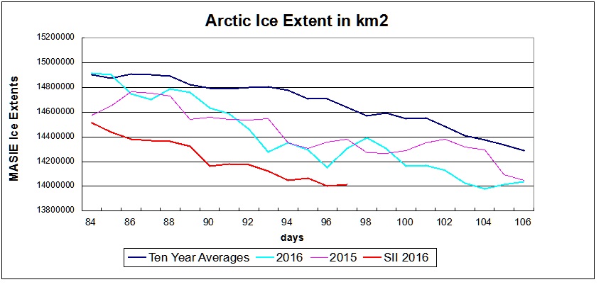
Historically, where will ice be remaining when Arctic melting stops? Over the last 10 years, on average MASIE shows the annual minimum occurring about day 260. Of course in a given year, the daily minimum varies slightly a few days +/- from that.
For comparison, here are sea ice extents reported from 2007, 2012, 2014 and 2015 for day 260:
Arctic Regions
2007
2012
2014
2015
Central Arctic Sea
2.67
2.64
2.98
2.93
BCE
0.50
0.31
1.38
0.89
Greenland & CAA
0.56
0.41
0.55
0.46
Bits & Pieces
0.32
0.04
0.22
0.15
NH Total
4.05
3.40
5.13
4.44
Notes: Extents are in M km2. BCE region includes Beaufort, Chukchi and Eastern Siberian seas. Greenland Sea (not the ice sheet). Canadian Arctic Archipelago (CAA). Locations of the Bits and Pieces vary.
As the table shows, low NH extents come mainly from ice losses in Central Arctic and BCE. The great 2012 cyclone hit both in order to set the recent record. The recovery since 2012 shows in 2014, with some dropoff last year, mostly in BCE.
Summary
We are only beginning the melt season, and the resulting minimum will depend upon the vagaries of weather between now and September. At the moment, 2016 was slightly higher than 2015 in March and is trending toward a similar April extent. Also 2016 melt season is starting without the Blob, with a declining El Nino, and a cold blob in the North Atlantic. It is too early to put Arctic Ice on life support. Meanwhile we can watch and appreciate the beauty of the changing ice conditions.
The melt season is under way, and ice extents are shrinking in the usual places: Barents, Bering, Baffin Bay and Okhotsk. Nothing much is happening elsewhere.
As of day 2016 106
km2 max lost
% loss sea max
(0) Northern_Hemisphere
1039707
6.9%
(1) Beaufort_Sea
5246
0.5%
(2) Chukchi_Sea
949
0.1%
(3) East_Siberian_Sea
0
0.0%
(4) Laptev_Sea
0
0.0%
(5) Kara_Sea
9892
1.1%
(6) Barents_Sea
141054
23.5%
(7) Greenland_Sea
0
0.0%
(8) Baffin_Bay_Gulf_of_St._Lawrence
370444
22.5%
(9) Canadian_Archipelago
2532
0.3%
(10) Hudson_Bay
2945
0.2%
(11) Central_Arctic
8171
0.3%
(12) Bering_Sea
144767
18.8%
(13) Baltic_Sea
75572
77.4%
(14) Sea_of_Okhotsk
596646
45.6%
(15) Yellow_Sea
55182
100.0%
(16) Cook_Inlet
5150
100.0%
It should be noted that Greenland Sea set a new max yesterday, and Central Arctic has risen lately near to its max on January 6. Those seas are more likely to sustain ice extent through the September minimum.
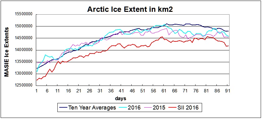
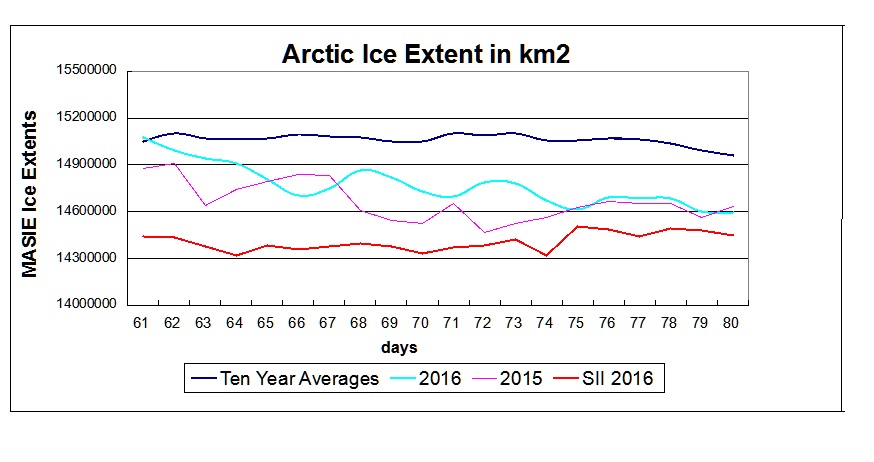
The graph of MASIE data shows 2016 is virtually tied with 2015 and both are below the ten-year average. SII started to be unreliable after day 97.
Looking at specific seas comparing this year and last:
Ice Extents
2015
2016
Ice Extent
Region
2015106
2016106
km2 Diff.
(0) Northern_Hemisphere
14049007
14037892
-11115
(1) Beaufort_Sea
1070445
1065199
-5246
(2) Chukchi_Sea
966006
965040
-966
(3) East_Siberian_Sea
1087137
1087120
-17
(4) Laptev_Sea
897845
897809
-36
(5) Kara_Sea
918774
925096
6323
(6) Barents_Sea
391374
458325
66951
(7) Greenland_Sea
579909
659712
79804
(8) Baffin_Bay_Gulf_of_St._Lawrence
1570273
1274139
-296134
(9) Canadian_Archipelago
853214
850646
-2568
(10) Hudson_Bay
1258284
1257926
-358
(11) Central_Arctic
3219523
3237378
17855
(12) Bering_Sea
649827
623466
-26361
(13) Baltic_Sea
9568
22011
12443
(14) Sea_of_Okhotsk
574873
712050
137177
Clearly the main difference in 2016 is more rapid melting in Baffin Bay, and Bering Sea down slightly. Many seas are similar, and some are higher including Barents, Greenland and Okhotsk (a lot).
Summary:
Fasten your seat belts–Arctic melt season is underway. Alarmists are rooting for more water, less ice, thinking that proves fossil fuels are warming the planet (it doesn’t). Normal people figure some ice loss is a good thing, because it means the next ice age is another year further away. Too much ice loss is bad because it may lead ignorant politicians to make stupid energy policies.
Anyway, the melt season is always entertaining and unpredictable, with unforeseen weather events overturning expected results. Stay tuned.
They refer to extent of 1 mm melting of the surface, and note an event in 2012 where 95% of the sheet had 1 mm or more melt water. Snow fall accumulates into ice, and also as the sheet grows, there is some calving of the surplus, also resulting in losses, but not in reducing the total ice.
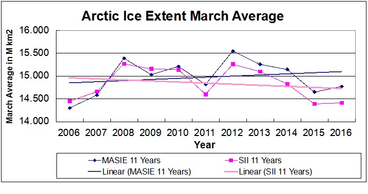
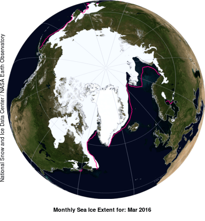
Sorry to be serious on April 1. I am not a fan of ice charts restricted to one month, for reasons illustrated in the post Ice House of Mirrors (some humor there in honor of this day.) But March monthly average sets the baseline for the year’s melt season, and so there is considerable attention and significance attached to the month just concluded.
Here is a chart showing March 2016 compared to the previous ten Marches according to two different indices of Sea Ice Extent: MASIE (Multisensor Analyzed Sea Ice Extent) produced by the National Ice Center and SII (Sea Ice Index) produced by NOAA (both accessed at NSIDC).
It is evident that the March annual maximum is trending slightly upward in MASIE and slightly downward in SII. Note that the indices were quite similar the first five years. Then since 2010, SII has declined quite strongly.
Note on Sea Ice Resolution:
Northern Hemisphere Spatial Coverage
Sea Ice Index from NOAA is based on 25 km cells and 15% ice coverage. That means if a grid cell 25X25, or 625 km2 is estimated to have at least 15% ice, then 625 km2 is added to the total extent. In the mapping details, grid cells vary between 382 to 664 km2 with latitudes. And the satellites’ Field of View (FOV) is actually an ellipsoid ranging from 486 to 3330 km2 depending on the channel and frequency. More info is here.
MASIE is based on 4 km cells and 40% ice coverage. Thus, for MASIE estimates, if a grid cell is deemed to have at least 40% ice, then 16 km2 is added to the total extent.
The significantly higher resolution in MASIE means that any error in detecting ice cover at the threshold level affects only 16 km2 in the MASIE total, versus at least 600 km2 variation in SII. A few dozen SII cells falling below the 15% threshold is reported as a sizeable loss of ice in the Arctic.
Putting NOAA Reports in Context
With the background above, we can interpret NOAA`s meaning when they report (here) that 2016 winter ice extent is the smallest on record. That refers to the annual maximum daily extent they observed on March 24. Climatology usually uses the March average to indicate the year’s maximum (given the volatility of daily readings). As we can see, 2016 March average was higher than 2015, virtually tied with 2006 and just below 2011. SII showed March ice to be 364k km2 less than MASIE.
NOAA: “The extent in 2016 was 431,000 square miles (1.12 million square kilometers) below the 1981–2010 average, which is like carving away an area of ice the combined size of Texas, Oklahoma, Arkansas, and most of Louisiana.”
In other words, 2016 is below average by about the size of 2000 grid cells in their system, or 1.5% out of 136,192.
As an example, consider how this March compares in the two indices.
In the graph MASIE shows 2016 starting the month at average extent, then declining and then recovering. 2016 ended below average in extent and comparable to 2015. Meanwhile SII showed much less extent, rising to a late maximum and then declining sharply to be 400k km2 less at day 91.
Results for the first quarter of the year show the large differences between the two indices. SII portrays this winter as abnormally low, while MASIE shows an average year, slightly higher than 2015.
Looking at the extents in the various seas making up the NH Sea Ice, it is clear that all are typical, with three exceptions. Compared to 2015, Barents and Baffin Bay are down (Barents lost 100k km2 in the last five days), while Okhotsk surplus more than offsets the losses elsewhere.
Summary:
As the divergence of SII increases, it becomes less clear what it is really measuring.
The tables below give the reported ice extents in M km2:
Month
2016
2016
MASIE
SII
SII Deficit
Averages
MASIE
SII
2016-2015
2016-2015
SII-MASIE
Jan
13.922
13.472
-0.019
-0.131
-0.450
Feb
14.804
14.210
0.121
-0.199
-0.593
Mar
14.769
14.405
0.101
0.038
-0.364
New Russian Nuclear Icebreaker “Yamal”, sharing the name of the infamous hockey stick tree.
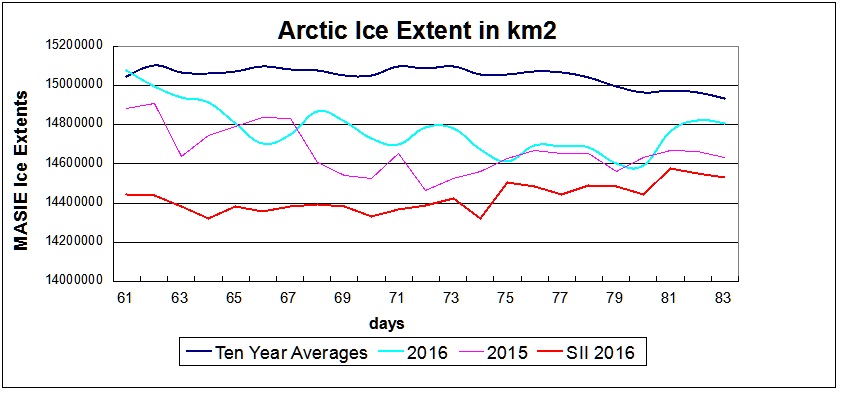
A stunning turnaround by Arctic Sea Ice. In March Madness terms we could say: “We have a ballgame!.” Those saying Arctic ice would be a big loser in 2016 may have to eat crow.
Yesterday NH ice extent grew dramatically to take a slight lead over the ten year average for day 84, and is 99% of 2016 maximum set on day 61. At 14.91 M km2 that is 330k km2 more than 2015 and 350k km2 more than SII is showing.
Yesterday MASIE showed a new high extent for 2016 in strategically located Barents Sea. Also the Central Arctic grew to a virtual tie with its maximum set early January 2016. All seas gained ice or held their maximums, except for a small loss in Okhotsk.
’
Earlier I compared this month in the Arctic to the March Madness of the NCAA basketball tournament, with intense competition and surprising results. In the first half of March, the ocean water was scoring at will against the ice pack, and warnings of huge losses were announced.
In the second half, however, the ice is making a comeback, and the March outcome is still in doubt. This is important because March average extent sets the baseline for the melt season to come.
MASIE shows significant gains in the last week, while SII has grown to set a new maximum for the year on day 81. Notably, Barents has gained back 228k km2, Greenland Sea added 81k and Bering Sea 138k, and the Central Arctic 90k. While Okhotsk has lost ice, as readers already know, Okhotsk Sea is actually outside the Arctic Circle and will melt out completely. Barents and Greenland Seas are located at the nexus of the Arctic and the North Atlantic and impact greatly the Arctic ocean as a whole. Bering is also important positioned at the Pacific gateway into the Arctic.
For more on discrepancies between MASIE and SII see here.
Update March 26
Some have expressed concern that high pressure over the Arctic could accelerate the flow of ice out through the Fram Strait. That is an important consideration. In a recent post I pointed to work by Russian scientists showing that in fact the removal of ice bergs through Fram opens up area in the Central Arctic for more ice to form. Their analysis says that after an acceleration of Fram ice loss, 4 to 6 years later there is an overall increase in ice extent, especially in the Siberian seas.
Guess what? The massive cyclone in 2012 pushed out lots of ice, and here we are 4 years later with ice growth appearing.
Earlier I compared this month in the Arctic to the March Madness of the NCAA basketball tournament, with intense competition and surprising results. In the first half of March, the ocean water was scoring at will against the ice pack, and warnings of huge losses were announced.
In the second half, however, the ice is making a comeback, and the March outcome is still in doubt. This is important because March average extent sets the baseline for the melt season to come. At this point, 3/4 through March, MASIE shows the average monthly extent below the ten-year average but higher than 2015.
MASIE shows significant gains in the last week, while SII has grown to set a new maximum for the year 2 days ago. Notably, Barents has gained back about 150k km2, Greenland Sea added 70k and Bering Sea 110k, while Okhotsk has lost 100k. As readers already know, Okhotsk Sea is actually outside the Arctic Circle and will melt out completely. While Barents and Greenland Seas are located at the nexus of the Arctic and the North Atlantic and impact greatly the Arctic ocean as a whole. Bering is also important positioned at the Pacific gateway into the Arctic.
For more on discrepancies between MASIE and SII see here.
With the Arctic Oscillation (AO) expected to hover around neutral over the next two weeks, Arctic ice extent is unpredictable.
Updating Arctic ice extents for the first 20 days of March the peak ice month. Lots of changes and surprises, just like the NCAA basketball tournament.
MASIE shows March 2 as the daily annual maximum, both on average over ten years, and in 2015. March 1, 2016 was the daily max, and SII shows an extent that day lower by 635k km2. (SII refers to Sea Ice Index produced by NOAA@NSIDC)
As March has progressed, this year and last MASIE shows ice has declined. Meanwhile MASIE ten year average held steady, and 2016 SII added extent in the last week. The gap between MASIE and SII is narrowing in 2016, though SII extents still average almost 400k km2 less for March.
Ice Extents
2015
2016
Ice Extent
Region
2015080
2016080
km2 Diff.
(0) Northern_Hemisphere
14634556
14593011
-41545
(1) Beaufort_Sea
1070445
1070445
0
(2) Chukchi_Sea
966006
965989
-17
(3) East_Siberian_Sea
1087137
1087120
-17
(4) Laptev_Sea
897845
897809
-36
(5) Kara_Sea
920392
916674
-3719
(6) Barents_Sea
548675
396037
-152638
(7) Greenland_Sea
666601
557940
-108661
(8) Baffin_Bay_Gulf_of_St._Lawrence
1829904
1599833
-230072
(9) Canadian_Archipelago
853214
853178
-36
(10) Hudson_Bay
1260903
1260871
-33
(11) Central_Arctic
3248013
3191707
-56306
(12) Bering_Sea
657014
642235
-14779
(13) Baltic_Sea
14462
42460
27998
(14) Sea_of_Okhotsk
606552
1108734
502182
Comparing 2016 on day 80 with 2015 shows the important ice deficits are on the European and Canadian sides: Barents (even lower than last year), along with Greenland Sea, and Baffin Bay. In contrast to 2015, Okhotsk is much more normal this year and almost offsets the losses elsewhere.
With AER and CPC showing the Arctic Oscillation neutral presently, and 14-day forecasts for more of the same, no one knows what to expect. We can only watch and see.
The warm March sun is melting the snow and ice in our neighborhood, so it seems like a good time to talk about the sun and Arctic climate change.
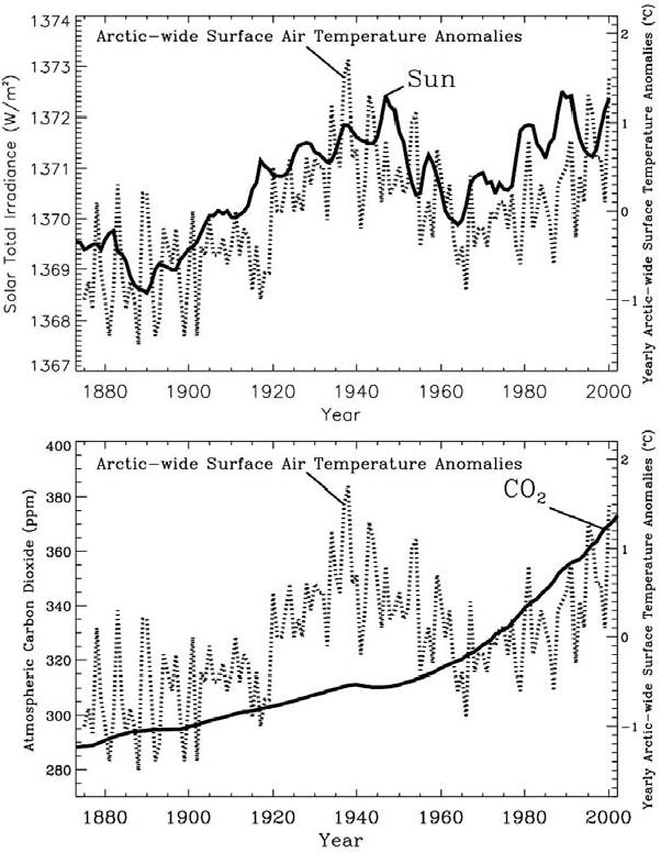
Figure 6.5. Annual-mean Arctic-wide air temperature anomaly time series (dotted line) correlated with estimated total solar irradiance (solid line in the top panel) from the model by Hoyt and Schatten, and with the mixing ratio of atmospheric carbon dioxide (solid line in the bottom panel) From Frovlov et al. 2009
Again, I am relying on a book by Frolov et al. Climate Change in Eurasian Arctic Shelf Seas, Centennial Ice Cover Observations (with some additional more recent material below).
Of course, the most direct effect of the sun on ice is in the summer:
Short-wave solar radiation is the most significant summer-season forcing, or, more precisely, the part of it that depends on albedo and absorption by the ice cover and the sea. Due to changes in albedo not related to greenhouse gases of anthropogenic origin, this heat balance constituent can vary by several dozen W/m2 in polar regions, or one order of magnitude greater than the most optimistic assessments of the influence of greenhouse gases. P 121
And the internal oscillations of the ocean-ice-atmosphere system were discussed extensively in a previous post here:
It was noted in Sections 4.1 and 4.2 that air temperature at mid and high latitudes primarily depends on dynamic processes in the atmosphere (Alekseev, 2000; Alekseev et al., 2003; Vorobiev and Smirnov, 2003). They influence air temperature due to both advective processes and the impact of cloudiness, which depend on the type of baric system in play. In winter, this influence is particularly high in areas where anticyclones are common. Weakening of anticyclones results in increasing temperature and cloudiness. Variation in cloudiness is one of the main causes of climate change is indicated by Sherstyukov (2008). p 119
Frolov et al. explore the connection between solar activity and these atmospheric processes. They are not jumping to conclusions and recognize that uncertainty surrounds the mechanisms between Solar Activity (SA) and Arctic ice variability.
The variation of temperature matches the TSI curve far better than it matches the CO2 curve. However, the Hoyt and Schatten model for TSI is just one of many, and other models lead to very different patterns for TSI vs. year. Furthermore, climate modelers would argue that the temperature curve in the second warming epoch represents the continuation of the first warming epoch, interrupted by a period from about 1940 to about 1980 when increasing aerosol concentrations outweighed the effect of increasing greenhouse gases. Therefore, Figure 6.5 is just one representation of many that could be derived. Nevertheless, if Figure 6.5 were taken at face value, the temperature and TSI variation charts would suggest the presence of both a positive “100-year” trend and quasi 60-year cyclic oscillations.
While Figure 6.5 is suggestive, the fact remains that we really do not know how TSI varied prior to the advent of satellite measurements around 1980. Figure 6.5 demonstrates that the form of the variability of Arctic surface temperatures during the 20th century resembles the variability of the Hoyt and Schatten model for TSI. This is suggestive that variations in TSI may have been an important factor in 20th century climate change. Though the total variance of TSI from 1880 to 2000 according to Hoyt and Schatten was 384 W/m2, the simple spreading of this flow over the spherical area of the Earth is incorrect. As we show in this work, a significant part of TSI variance influences the high-latitude regions. Furthermore, as was noted in Section 5.4, Budyko (1969) concluded by calculations that solar constant variations of several tenths of % are sufficient to induce essential climate changes.
In seeking a relationship between solar variability and climate change, we may consider TSI and SA (Solar Activity). The connection between TSI and climate is direct; TSI represents the fundamental heat input from the Sun that drives our climate. However, although SA represents fundamental aspects of the dynamics of the Sun, its connection to the total power emitted by the Sun is not quite clear. SA includes energetic particle emission, electromagnetic emission in the UV and higher frequency ranges and magnetic fields. It is manifested in the Earth’s phenomena in the form of polar lights, magnetic storms, radio-communication blackouts, etc. A number of different indices are used to measure the level of SA, particularly sunspot indices (Wolf number, etc.), the intensity of solar wind, and various magnetic indices. Even though variations in TSI associated with changes in SA may be small, the impact on higher latitudes is significantly amplified by the interaction of charged solar wind particles with the Earth’s magnetic field. As shown in our work, evidence exists that variability of SA is connected to Arctic climate variations. Frolov et al. 2009 pp. 124
Conclusion
The Earth’s climate is affected by internal and external factors. The internal factors include natural hydro-meteorological, geological, and biological processes, as well as self-oscillation phenomena related to interactions in the ocean-sea ice-atmosphere-glaciers system. In addition, anthropogenic impacts are also considered to be internal factors; they are caused by the increase in concentration of greenhouse gases in the atmosphere because of human activity. External factors include solar activity, tidal and nutation phenomena, variability of the Earth’s rotation speed, fluctuations in the solar constant, fluxes of energy and charged particles from space, and other astronomical factors. p.133
Addendum
Some may claim the Hoyt and Schatten model is outdated, so I provide recent comparable results from Jan Erik Solheim October 2014 here.
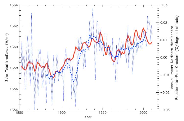
Figure 4: Annual-mean EPTG over the entire Northern Hemisphere (°C/latitude; dotted blue line) and smoothed 10-yr running mean (dashed blue line) versus the estimated TSI of Hoyt and Schatten (Soon and Legates, 2013)
The reconstruction by D. Hoyt and K. Schatten (1993) updated with the ACRIM data (Scafetta, 2013) gives a remarkable good correlation with the Central England temperature back to 1700. It also shows close correlation with the variation of the surface temperature at three drastically different geographic regions with the respect to climate: USA, Arctic and China.
The excellent relationship between the TSI and the Equator-to-Pole (Arctic) temperature gradient (EPTG) is displayed in figure 4. Increase in TSI is related to decrease in temperature gradient between the Equator and the Arctic. This may be explained as an increase in TSI results in an increase in both oceanic and atmospheric heat transport to the Arctic in the warm period since 1970.
White sea ice in the Arctic melting from the sun, and also reflecting back solar energy.
The finals of the CMQ Canoe Race were held on Feb. 7, 2016 Over 50 teams from Quebec, Canada, France and the United States navigated the frozen waters of the Saint-Lawrence River between Quebec City and Lévis.
The annual contest between the ocean and the ice is about to heat up.
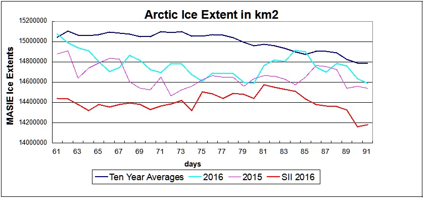
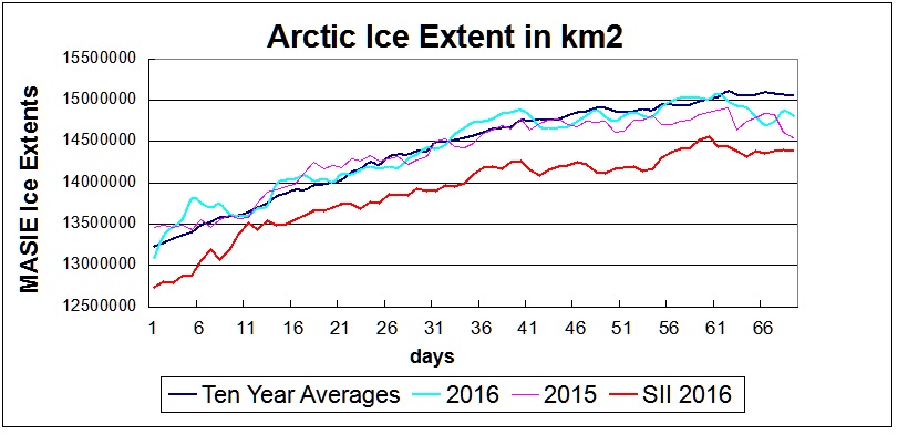
March is the peak month for Arctic ice extent, and the daily max may already be in the books. MASIE shows these maximum extents:
2016 day 61 15.08 M km2
2015 day 62 14.91 M km2
Ave. day 62 15.10 M km2
As the graph shows, 2016 is trending below the 10 yr. Average and higher than last year. Comparing the estimates with SII (Sea Ice Index from NOAA) shows how much lower are extents from that source. SII max was 14.56 on day 60. So far, SII March average is about 500k km2 behind MASIE. Since March on average is quite flat over the month, SII has time to catch up, provided it starts showing some increases or a slower decline.
For more on discrepancies between MASIE and SII see here.
This table looks in detail at day 69 km2 extent this year and last:
Region
2015069
2016069
km2 Diff.
(0) Northern_Hemisphere
14542121
14816687
274566
(1) Beaufort_Sea
1070445
1070445
0
(2) Chukchi_Sea
966006
965989
-17
(3) East_Siberian_Sea
1087137
1087120
-17
(4) Laptev_Sea
897845
897809
-36
(5) Kara_Sea
916436
904761
-11675
(6) Barents_Sea
449499
479659
30160
(7) Greenland_Sea
591426
589934
-1492
(8) Baffin_Bay_Gulf_of_St._Lawrence
1915854
1644582
-271272
(9) Canadian_Archipelago
853214
853178
-36
(10) Hudson_Bay
1260903
1260854
-49
(11) Central_Arctic
3228809
3184280
-44529
(12) Bering_Sea
561278
641530
80252
(13) Baltic_Sea
15672
64882
49210
(14) Sea_of_Okhotsk
721406
1168782
447376
Overall, 2016 is 275k km2 higher. The main difference is in Baffin Bay, which is more than offset by Sea of Okhotsk and Bering Sea. Barents is slightly higher than last year, which is still much lower than average. Comparing the two years, last March had a double dip from Okhotsk and Barents low extents, along with early melting from Bering. Only one of them is low this year, though we must watch out for Baffin Bay. Baltic Sea has a lot of ice, though a smaller basin.
Reminder: All of the marginal seas will typically melt out by September.
MASIE: “high-resolution, accurate charts of ice conditions”
Walt Meier, NSIDC, October 2015 article in Annals of Glaciology.
This post concerns our paradigm of the Arctic Ocean and its Sea Ice. My view, despite years of watching the waxing and waning of ice extents was subconsciously wrong, and others may share the same misconception.
I owe my enlightenment to a great book by Russian scientists from the Arctic and Antarctic Research Institute (AARI) in St. Petersburg. It’s entitled Climate Change in Eurasian Arctic Shelf Areas, by Ivan Frolov et al. The ebook is behind a paywall, but Dr. Bernaerts graciously provided me a hard copy from his library.
The book is small in volume, but rich in information and insights, so I am taking the time to digest. In reading Chapter 4 I came upon a section entitled: Changes in ice exchange between the Arctic basin, marginal seas and the Greenland Sea. Now I was well aware the export of ice through the Fram Strait and knew of the great 2012 storm that so affected extents that year. But then I read this:
There is extensive sea ice exchange between the Arctic Basin and its marginal seas, which are the major sources of new ice for the Arctic Basin. The Arctic Basin serves as a reservoir for the marginal seas; it both receives large ice masses exported from the seas and supplies the seas with thicker multiyear ice. The direction and intensity of ice exchange depends to a great extent on the wind regime. However, local winds alone do not completely determine this exchange of ice. Ice export from the ice cover of marginal seas depends on sea ice conditions in the central Arctic because the sea ice originating from the marginal seas must have some ability to replace the central Arctic ice cover. Thus, the marginal seas depend to some degree on the intensity of ice export from the Arctic Basin to the Greenland and other subarctic seas. However, ice flow from the basin to the seas during onshore winds is strongly restricted by the shoreline and landfast ice, and ocean circulation also influences this ice exchange.
The Great Arctic Cyclone August 2012
It’s Not an Ice Cap, It’s an Ice Blender
Frolov et al made me realize that all our observations of Arctic ice are in fact snapshots of an ice blender constantly moving ice around the Arctic ocean. When we observe and measure extent in one of the seas, that particular ice was not there previously, and will be gone in the near future, replaced to some extent by ice coming from elsewhere. That is the full implication of Arctic ice lacking a land anchor (like Greenland or Antarctica) and existing as “drift ice”.
Figure 4.12. Mean resulting ice-drift pattern for summer (a) and winter (b) during the warm epoch and the difference between ice-drift vectors during the warm and cold epochs for summer (c) and winter (d).
Frolov et al. Provide the statistics regarding the annual dynamics. In the wintertime the shelf seas form “fast ice”, that is ice locked onto the coastlines. Additional ice has nowhere to go but go with the flow north toward the pole or to the neighboring sea. In the summer the flow reverses and the Arctic basin, which received ice from the marginal seas, now sends ice back to replace losses there.
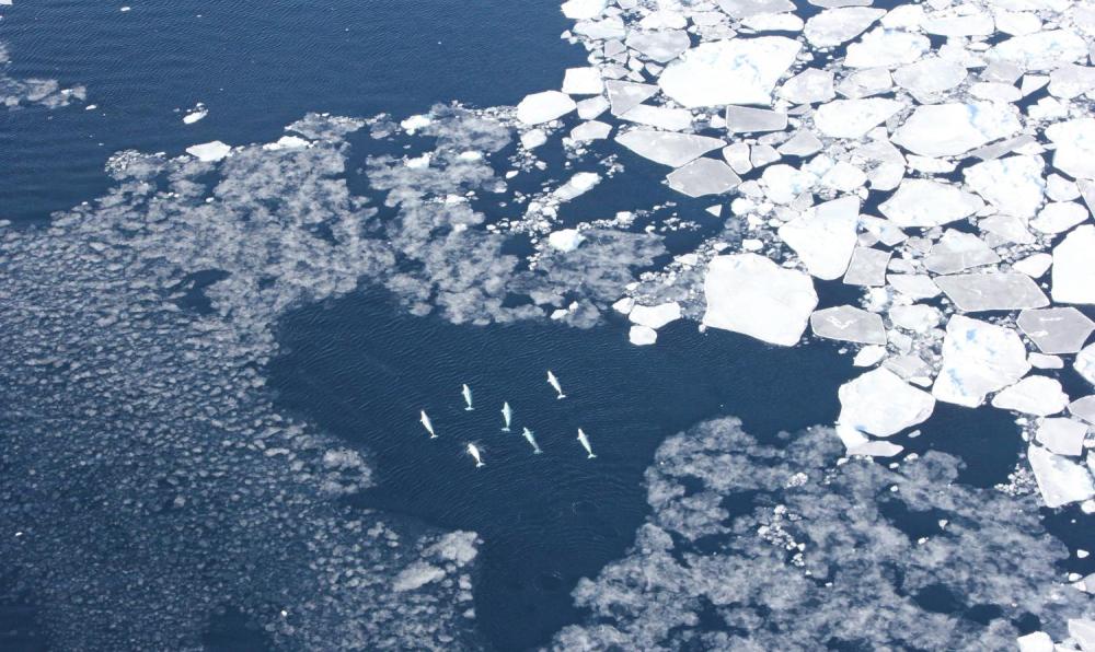
Belugas were observed among West Greenland sea ice. Credit: Kristin Laidre/University of Washington
Which seas get more ice and which get less ice depends mostly on whether the prevailing circulation is cyclonic or anticyclonic. The diagrams show that where there is a strong low pressure area, a cyclonic air flow develops, which moves water and drift ice in a counter-clockwise direction (seen from above). A strong high-pressure system acts in the opposite direction. I like this image the best, but the labels are in French
Considering the Arctic as a whole, a large-scale cyclone such as the massive one in August 2012, breaks up ice, moves it away from western Russian seas, and flushes great chunks of ice south through the Fram Strait into Greenland Sea where they melt. That storm was exceptional in its strength and size, but storms are always at work in the Arctic, and over multiyear periods, we can observe regimes favoring one or the other type of storm.
Frolov et al. point out:
Recent analyses of wind-driven circulation in the Arctic Ocean show that wind-driven ice motion and upper ocean circulation alternate between anticyclonic and cyclonic regimes. Shifts between regimes occur at 5-year to 7-year intervals, resulting in 10-year to 15-year periods. Based on these analyses, these authors proposed an Arctic Ocean Oscillation (AOO) index showing alternation of the cyclonic and anticyclonic regimes.
Table 4.2. Changes in the ice cover area in August from the beginning to the
end of the circulation cycles in Arctic Ocean regions (in 10^3 km2)
Circulation regime
Years
North European
Siberian Arctic
Anticyclonic
1946-1952
+5
—259
1958-1962
+44
—24
1972-1979
+60
—87
1984-1988
+23
—308
Average
+34.5
—170
Cyclonic
1953-1957
—37
+209
1963-1971
—52
+144
1980-1983
+36
+39
1989-1997
—4
—10
Average
—14.2
+95
Table 4.2 shows that in 88% of cases during anticyclonic regimes, sea ice extent increases in the North European Basin and decreases in the Siberian Arctic Seas, while cyclonic circulation has the opposite effect. The absolute value of changes in the Siberian Arctic Seas is more than 5 times higher than in the North European Basin.
Frolov et al. Summarize:
An increase in the recurrence of cyclonic pressure fields over the Arctic Basin at the transition from a cooling to a warming epoch leads to changes in ice cover deformation processes. The cyclonic systems of the multiyear ice drift contribute to ice cover divergence. This process is most prevalent in summer, whereas in winter, especially in relatively thin ice zones, ice compacting is usually observed. Anticyclonic SLP fields have the opposite effect.
According to Gudkovich and Nikolayeva (1963), in a year that westerly and southwesterly winds increase over the eastern Barents Sea during October— December, the setup they create in the Kara Sea increases ice export from this sea toward the north. Dominant easterly and northeasterly winds produce the opposite result. This study also shows that ice export from the eastern East Siberian Sea and the southwestern Chukchi Sea during the period considered is strongly influenced by wind field vorticity in the vicinity of Wrangel Island. Anticyclonic vorticity increases the ice export, and cyclonic vorticity results in additional ice flow from the north.
Ice transported through the Fram Strait.
Frolov et al:
Table 4.4. Correlation coefficients between the long period fluctuations of the area of ice exported through Fram Strait (October-August) and total ice area of the Arctic Seas Asian shelf in August for the period 1931-2000 at different time lags.
Time lag (years)
Correlation
0
.43
1
.56
2
.67
3
.75
4
.80
5
.81
6
.80
7
.77
8
.72
9
.66
10
.58
11
.49
12
.39
As shown in Figure 4.14, ice export fluctuations slightly precede corresponding sea ice extent changes in the Arctic Seas. The cross correlation function between the smoothed values of ice export and total sea ice extent exhibits the highest correlation coefficients at time lags (sea ice extent after export) of 4, 5, and 6 years (Table 4.4). Following decreased ice export through Fram Strait in the early 1990s, a tendency for its increase was observed. Based on the time lags shown in Table 4.4, a transition to the phase of increased sea ice extent in the Arctic Seas would be expected at the beginning of the twenty-first century, as confirmed by Figure 4.14a.
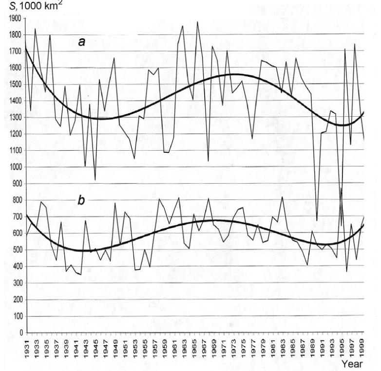
figure 4.14a (a) Interannual fluctuations of the total ice area of the Siberian shelf seas in August, and (b) areas of ice exported from the Arctic Basin through Fram Strait. The values of the bold curves are smoothed by a polynomial to the power of 6.
Figure 4.14a shows long-period changes in the total area of ice export through Fram Strait from October of one year to August of the next year for 1931-2000. An approximation of data by a polynomial to the power of 6 (bold curve) indicates the cyclic character of these changes, with the cycle lasting about 60 years. Figure 4.14a shows that the fluctuations of total sea ice extent of the Arctic Seas of the Siberian shelf (from the Kara to the Chukchi Seas) have a similar character.
It is remarkable that increased ice export through Fram Strait is accompanied by increased sea ice extent in the Arctic Seas, contrary to the opinions of those who assume that ice export to the Greenland Sea increases during climate warming, accompanied by a decrease in sea ice extent in the Arctic Seas.
The average drift and current speed in Fram Strait for the preceding year influences the ice exchange between the Arctic Basin and the Laptev, East Siberian, and Chukchi Seas in winter (October—March). The increased ice export to the Greenland Sea contributes to the increased ice export from these seas to the Arctic Basin, and its decrease results in the opposite effect (Gudkovich and Nikolayeva, 1963).
Summary
The estimates above show that, on average, about 1 million km2 of the ice cover is transported annually from the Arctic Seas to the Arctic Basin, which is comparable to current estimates of the area of ice exported annually from the Arctic Basin to the Greenland Sea. (e.g., Koesner, 1973; Mironov and Uralov, 1991; Vinje, 1986). Given a typical ice thickness value, we can estimate the volume of ice exported to the Arctic Basin during a winter to be approximately 1500-2000 km3. This value is about half as large as the available estimates of ice export to the Greenland Sea in winter (Vinje and Finnekasa, 1986; Alekseev et al., 1997), which can be accounted for by ice growth, ice ridging, and other processes that occur during transport of the ice to Fram Strait.
It is a mistake to think of the Arctic as an ice cap that shrinks and grows in extent. In fact Arctic ice is constantly in flux, more like a kalidiscope than an solid sheet. And the natural forces within the climate system cause fluctuations on a quasi-60yr oscillation
NASA’s Aqua satellite captured this natural-color image of the storm in the Arctic on August 7, 2012. The storm – which appears as a swirl – is directly over the Arctic in this image. NASA image by Jeff Schmaltz, LANCE/EOSDIS Rapid Response.
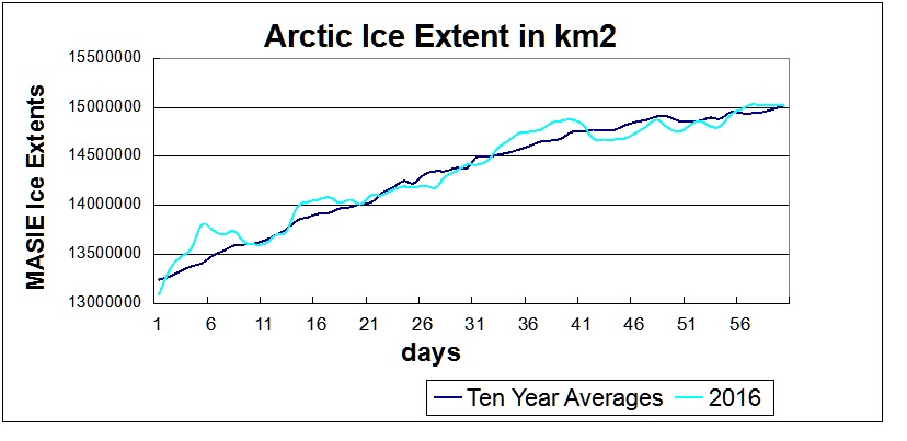
It’s official–This leap year February is complete and we can now look at the annual Arctic Ice Extent situation at day 60 with two months in the books.
The Resurgence of Arctic ice is continuing in MASIE, the most accurate dataset, but in SII, the remote sensing dataset, not so much.
The MASIE graph shows an extent matching the ten-year average. At 15.02 M km2, 2016 exceeds 2015 annual maximum of 14.91 recorded on day 62, and this year’s peak ice may well go higher.
This table shows comparisons between MASIE and SII
Months
MASIE
2016
SII
2016
MASIE
2016-2015
SII
2016-2015
SII – MASIE
Jan
13.922
13.472
-0.019
-0.131
-0.450
Feb
14.804
14.210
0.121
-0.199
-0.593
It is readily shown that SII is severely underestimating this year’s growth of ice compared both to SII 2015 and to MASIE. A monthly differential of nearly 600k km2 has opened up due to SII showing a large decline while MASIE shows a gain compared to last year.
Below is a comparison from MASIE regarding the NH seas comprising the NH statistics.
Ice Extents
Ice Extent
Region
2015060
2016060
km2 Diff.
(0) Northern_Hemisphere
14856201
15018131
161930
(1) Beaufort_Sea
1070445
1070445
0
(2) Chukchi_Sea
966006
965989
-17
(3) East_Siberian_Sea
1087137
1087120
-17
(4) Laptev_Sea
897845
897809
-36
(5) Kara_Sea
935023
933890
-1133
(6) Barents_Sea
701064
529545
-171519
(7) Greenland_Sea
677415
582658
-94757
(8) Baffin_Bay_Gulf_of_St._Lawrence
1828321
1588399
-239922
(9) Canadian_Archipelago
853214
853178
-36
(10) Hudson_Bay
1260903
1260854
-49
(11) Central_Arctic
3246891
3208216
-38675
(12) Bering_Sea
508062
623647
115585
(13) Baltic_Sea
22187
86770
64583
(14) Sea_of_Okhotsk
768839
1308697
539858
(15) Yellow_Sea
0
14137
14137
(16) Cook_Inlet
5303
3505
-1798
In the table 2016 shows two seas on the Atlantic side lower than this date last year, Barents and Greenland Seas, while the Baltic is much higher, though a smaller size sea. Barents had grown to almost 600k km2 by day 20, then lost 150k up to day 55, but has now regained half of that loss.
Baffin Bay is down some, but not a large %, while CAA is the same extent.
On the Pacific side, Okhotsk which was the lowest in the last 10 years in 2015 has much more ice now, nearly the highest in 10 years. Bering is also up, so it may be a case of “Goodbye Blob, Hello Normal.”
So is the Winter ending and stopping the ice growth?
Here is my local observation:
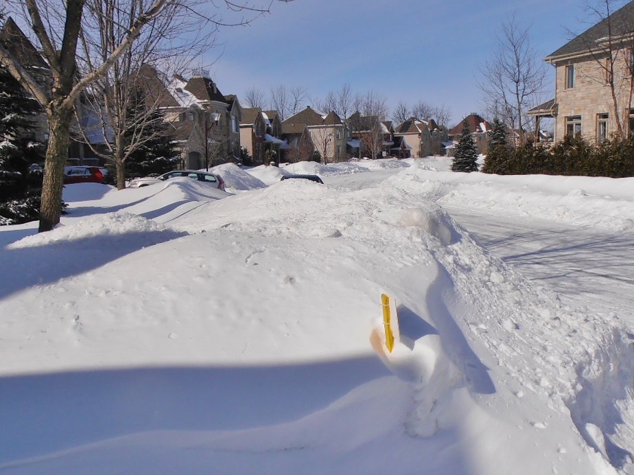
Montreal Suburb Street on March 1, 2016
That’s the snowpack on our street seen from my driveway. And I went cross-country skiing today, an activity normally precluded in March by lack of snow cover and temperatures above freezing. With fresh snowfall last night and -13C this morning, it was one of the best days this season. With a blizzard warning and more snow expected tonight, I’m likely to be back out later this week.
So the report from here: The Siberian Express is on time and going strong.
What’s happening with Arctic ice?
It depends on whose measurements you look at. Before you decide, make sure you have read NOAA is Losing Arctic Ice.