Real Science Guy: Climate Crisis Imaginary

Daniel W. Nebert writes at American Thinker Today’s ‘Climate Crisis’ Is a Fairy Tale.  Excerpts in italics with my bolds and added images.

For the past 35 years, the United Nations’ Intergovernmental Panel on Climate Change (IPCC) has warned us that emissions from the burning of fossil fuels, predominantly carbon dioxide (CO2), are causing dangerous global warming. This myth is blindly accepted — even by many of my science colleagues who know virtually nothing about climate. As a scientist, my purpose here is to help expose this fairy tale.

The global warming story is not a benign fantasy. It is seriously damaging Western economies. In January 2021, the White House ridiculously declared that “climate change is the most serious existential threat to humanity.” From there, America went from energy independence back to energy dependence. Another consequence has been the appearance of numerous companies whose goal is to “sequester CO2” as well as “sequester carbon” from our atmosphere. However, this so-called “solution” is scientifically impossible. Life on Earth is based on carbon! CO2 is plant food, not a pollutant!

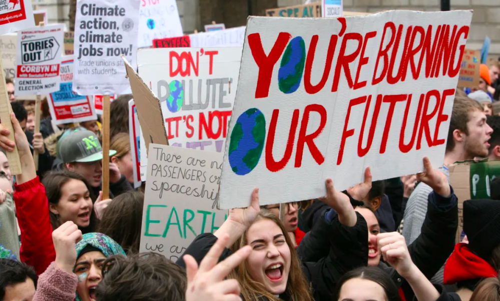
Generations have been brainwashed for decades into believing this imaginary “climate crisis,” from kindergarten through college, and in mainstream media and social media. Indoctrinated young teachers feel comfortable teaching this misinformation to students. Dishonest climate scientists feel justified in spreading disinformation because they need governmental support for salaries and research.

The evidence contradicting the climate apocalypse is vast.

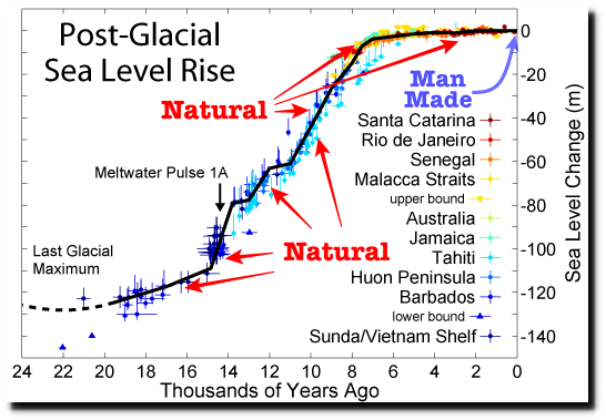
Some comes from analysis of Greenland and Antarctica ice, in which air trapped at various depths reveals CO2 levels of past climate. Proxy records from marine sediment, dust (from erosion, wind-blown deposition of sediments), and ice cores provide a record of past sea levels, ice volume, seawater temperature, and global atmospheric temperatures.

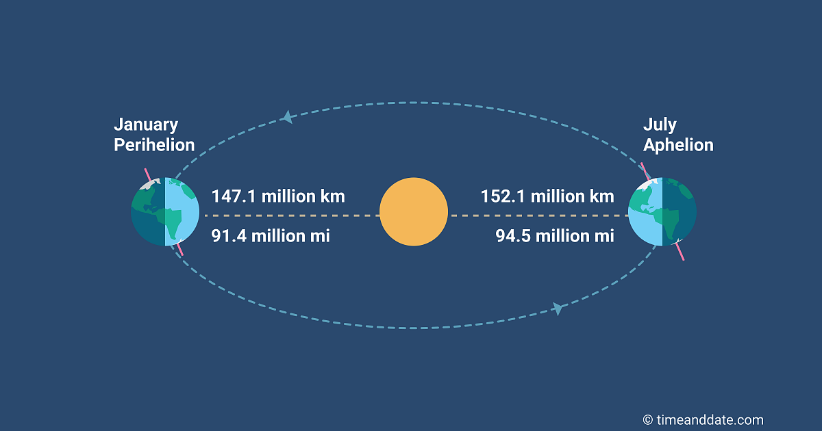
From his seminal work while a prisoner of war during WWI, Serbian mathematician Milutin Milankovitch explained how climate is influenced by variations in the Earth’s asymmetric orbit, axial tilt, and rotational wobble — each going through cycles lasting as long as 120,000 years.

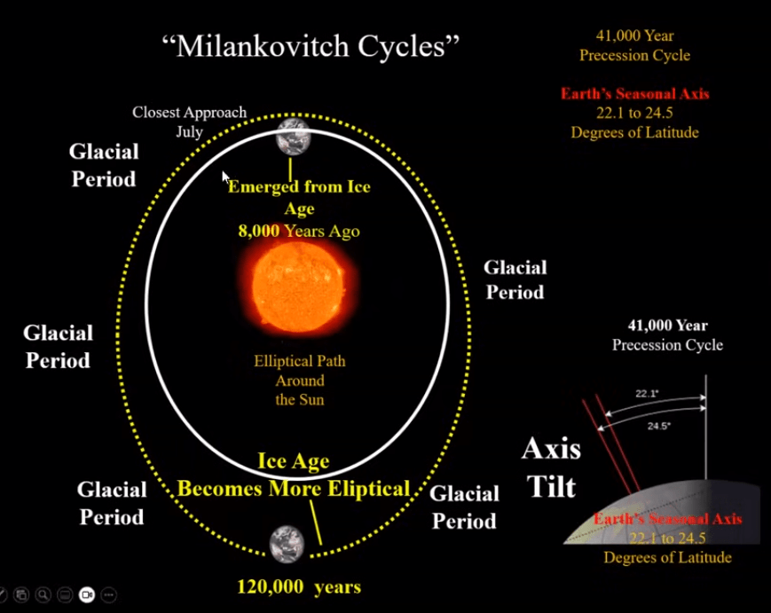
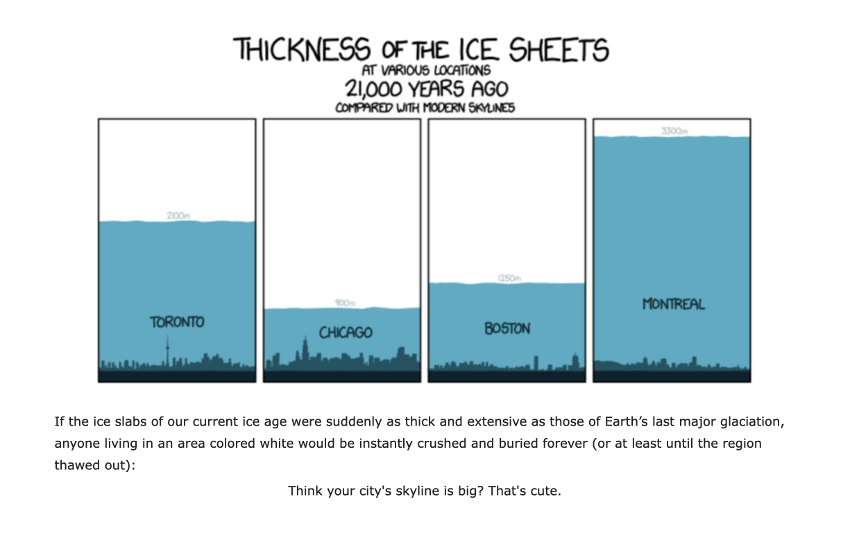
It is widely recognized that Glacial Periods of about 95,000 years, interspersed with Interglacial Periods of approximately 25,000 years, correspond with Milankovitch Cycles. Multiple incursions of glaciers occurred during the Pleistocene, an epoch lasting from about 2.6 million to 11,700 years ago, when Earth’s last Glacial Period ended. Around 24,000 years ago, present-day Lake Erie was covered with ice a mile thick.

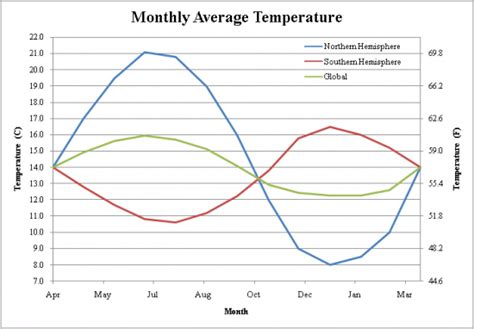
Within each Interglacial Period, there’ve been warming periods, or “Mini-Summers.” For example, within the current Holocene Interglacial, there have been warmer periods known as the Minoan (1500–1200 B.C.), Roman (250 B.C.–A.D. 400), and Medieval (A.D. 900–1300). Our Modern Warming Period began with the waning of the Little Ice Age (1300–1850). Today’s Mini-Summer is colder so far than all previous Mini-Summers of the last 8,500 years.

How did CO2 get blamed for global warming? French physicist Joseph Fourier (1820s) proposed that energy from sunlight must be balanced by energy radiated back into space. Irish physicist John Tyndall (1850s) performed laboratory experiments on “greenhouse gases” (GHGs), including water vapor; he proposed that CO2 elicited an important effect on temperature. However, it’s impossible to do appropriate experiments — unless the roof of your laboratory is at least six miles high. Swedish chemist Svante Arrhenius (1896) proposed that “warming is proportional to the logarithm of CO2 concentration.” Columbia University geochemist Wallace Broecker (1975) and Columbia University adjunct professor James Hansen (1981) wrote oft-cited articles in Science magazine, both overstating the perils of CO2 causing dangerous global warming — without providing scientific proof.

Most of Earth’s energy comes from the sun. Absorption of sunlight causes molecules of objects or surfaces to vibrate faster, increasing their temperature. This energy is then re-radiated by land and oceans as longwave, infrared radiation (heat). Princeton University physicist Will Happer defines a GHG as that which absorbs negligible incoming sunlight but captures a substantial fraction of thermal radiation as it is re-radiated from Earth’s surface and atmospheric GHGs back into space.

The gases of nitrogen, oxygen and argon — constituting 78%, 21%, and 0.93%, respectively, of the atmosphere — show negligible absorption of thermal radiation and therefore are not GHGs. Important GHGs include water (as high as 7% in humid tropics and as little as 1% in frigid climates), CO2 (0.042%, or 420 parts per million [ppm] by volume), methane (0.00017%), and nitrous oxide (0.0000334%, or 334 ppm). Water vapor (clouds) has at least a hundred times greater warming effect on Earth’s temperature than all other GHGs combined.

As atmospheric CO2 increases, its GHG effect decreases: CO2’s warming effect is 1.5°C between zero and 20 ppm, 0.3°C between 20 and 40 ppm, and 0.15°C between 40 and 60 ppm. Every doubling of atmospheric CO2 from today’s levels decreases radiation back into space by a mere 1%. For most of the past 800,000 years, Earth’s atmospheric CO2 has ranged between about 180 ppm and 320 ppm; below 150 ppm, Earth’s plants could not exist, and all life would be extinguished.

Today’s global atmospheric CO2 levels are ~420 ppm. Even at these levels, plants are “partially CO2-starved.” In fact, standard procedures for commercial greenhouse growers include elevating CO2 to 800­–1200 ppm; this enhances growth and crop yield ~20–50%. As shown by satellite since 1978, increased atmospheric CO2 has helped “green” the Earth by more than 15 percent, substantially enhancing crop production.

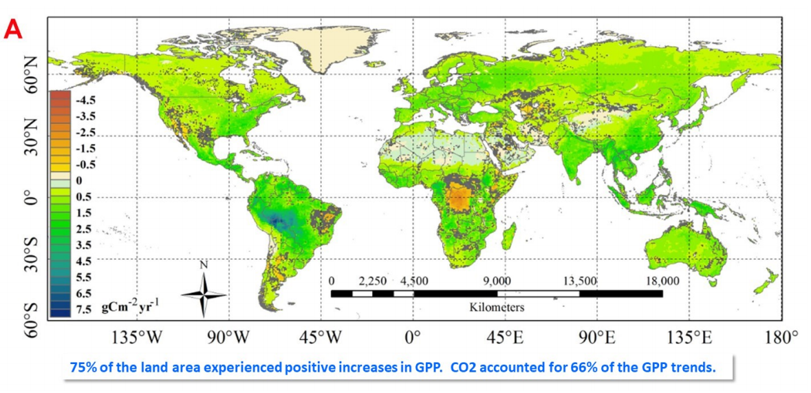
Spatial pattern of trends in Gross Primary Production (1982- 2015). Source: Sun et al. 2018.

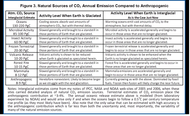
If global atmospheric CO2 was ~280 ppm in 1750, and it’s ~420 ppm today, what’s the source of this 140-ppm increase? Scientists estimate that human-associated industrial emissions might have contributed 135 ppm — with “natural causes” accounting for the remaining 5 ppm.

But did processes throughout earth’s history stop
when humans began burning hydrocarbons?

In Earth’s history, the highest levels of atmospheric CO2 (6,000–9,000 ppm) occurred about 550–450 million years ago, which caused plant life to flourish. CO2 levels in older nuclear submarines routinely operated at 7,000 ppm, whereas newer subs keep CO2 in the 2,000- to 5,000-ppm range. Meanwhile, ice core data over the last 800,000 years show no correlation between global warming or cooling cycles and atmospheric CO2 levels.

CO2 in our lungs reaches 40,000–50,000 ppm, which induces us to take our next breath. Each human exhales about 2.3 pounds of CO2 per day, which means Earth’s 8 billion people produce daily 18.4 billion pounds of CO2. But humans represent only 1/40 of all CO2-excreting life on Earth. Multiplying 18.4 billion pounds by 40 gives us 736 billion pounds of CO2 per day. This approximates the overall CO2 excreted by the total animal and fungal biomass on the planet.

Daily emissions from worldwide industry in 2020 were estimated to be 16 million metric tons of CO2 equivalents. If one metric ton is 2,200 pounds, then “total industrial emissions” amount to 35,200,000,000 (35.2 billion) pounds of CO2 per day. This means that the entire animal and fungal biomass (736 billion pounds) puts out more than 20 times as much CO2 as all industrial emissions (35.2 billion pounds)!

Can any clear-thinking person comprehend the facts above and still create a company with idiotic plans to “sequester CO2” or “sequester carbon”? Scientifically, “net zero” and “carbon footprint” are meaningless terms. There is no “climate crisis.”

If you try to find these facts on the web, good luck! Out of every 10 hits on any climate topic, you’ll be lucky to find one or two sites with truthful scientific data.

The door of a nearby classroom displays a poster of Abraham Lincoln with the caption: “Don’t believe everything you read on the internet.” It is advice that our 16th president surely would have offered — had he lived to see the rise of this global warming quasi-religion.

Daniel W. Nebert is professor emeritus in Gene-Environment Interactions at the University of Cincinnati. He thanks Professor Will Happer (one of the CO2 Coalition directors) for valuable discussions.

See Also

Ian Plimer Asks, “What Climate Crisis?”

Climatists Deniers of Reality


Hot Climate Models Not Fit For Policymaking

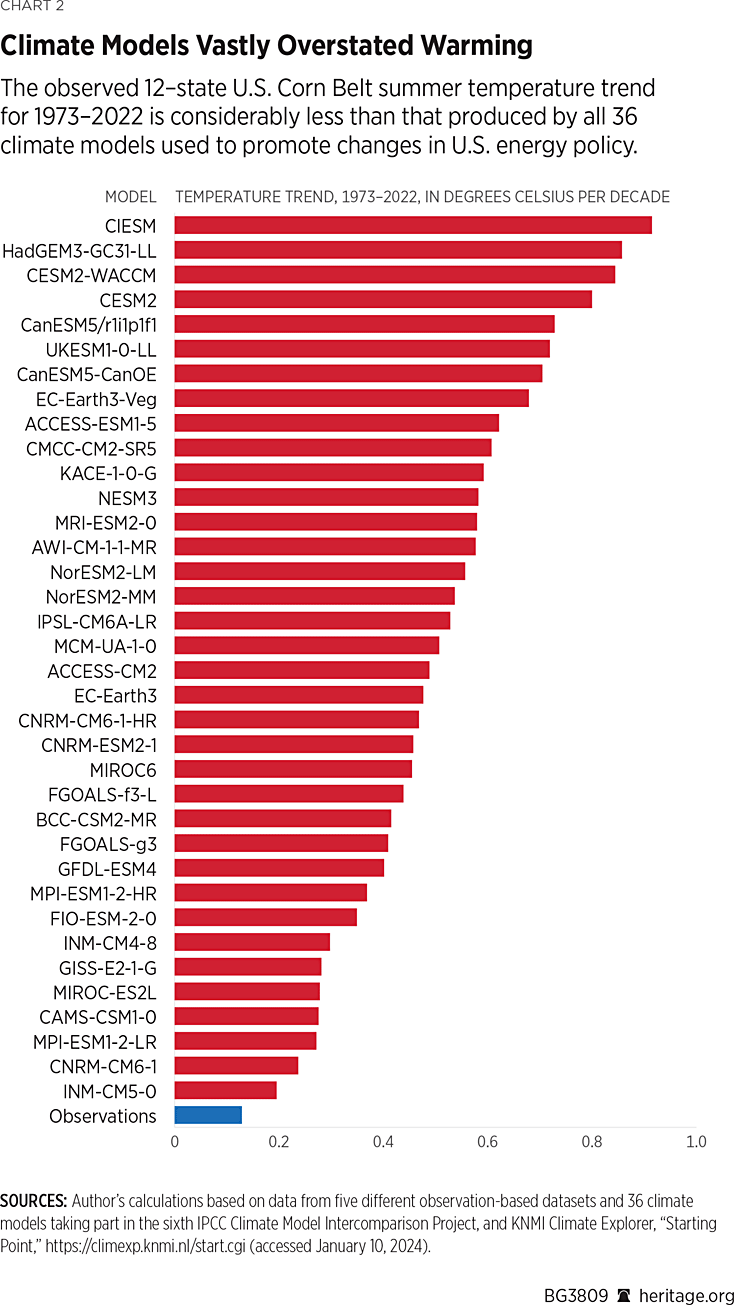
Roy Spencer has published a study at Heritage
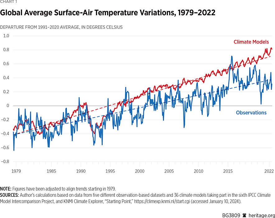
 Global Warming: Observations vs. Climate Models.  Excerpts in italics with my bolds.

Summary

Warming of the global climate system over the past half-century has averaged 43 percent less than that produced by computerized climate models used to promote changes in energy policy. In the United States during summer, the observed warming is much weaker than that produced by all 36 climate models surveyed here. While the cause of this relatively benign warming could theoretically be entirely due to humanity’s production of carbon dioxide from fossil-fuel burning, this claim cannot be demonstrated through science. At least some of the measured warming could be natural. Contrary to media reports and environmental organizations’ press releases, global warming offers no justification for carbon-based regulation.

KEY TAKEAWAYS
  1. The observed rate of global warming over the past 50 years has been weaker than that predicted by almost all computerized climate models.
  2. Climate models that guide energy policy do not even conserve energy, a necessary condition for any physically based model of the climate system.
  3. Public policy should be based on climate observations—which are rather unremarkable—rather than climate models that exaggerate climate impacts.

For the purposes of guiding public policy and for adaptation to any climate change that occurs, it is necessary to understand the claims of global warming science as promoted by the United Nations Intergovernmental Panel on Climate Change (IPCC).  When it comes to increases in global average temperature since the 1970s, three questions are pertinent:

  1. Is recent warming of the climate system materially attributable to anthropogenic greenhouse gas emissions, as is usually claimed?
  2. Is the rate of observed warming close to what computer climate models—used to guide public policy—show?
  3. Has the observed rate of warming been sufficient to justify alarm and extensive regulation of CO2 emissions?

While the climate system has warmed somewhat over the past five decades,
the popular perception of a “climate crisis” and resulting calls for economically
significant regulation of CO2 emissions is not supported by science.

Discussion Points

Temperature Change Is Caused by an Imbalance Between Energy Gain and Energy Loss.

Recent Warming of the Climate System Corresponds to a Tiny Energy Imbalance.

Climate Models Assume Energy Balance, but Have Difficulty Achieving It.

Global Warming Theory Says Direct Warming from a Doubling of CO2 Is Only 1.2°C.

Climate Models Produce Too Much Warming.

Climate models are not only used to predict future changes (forecasting), but also to explain past changes (hindcasting). Depending on where temperatures are measured (at the Earth’s surface, in the deep atmosphere, or in the deep ocean), it is generally true that climate models have a history of producing more warming than has been observed in recent decades.

This disparity is not true of all the models, as two models (both Russian) produce warming rates close to what has been observed, but those models are not the ones used to promote the climate crisis narrative. Instead, those producing the greatest amount of climate change usually make their way into, for example, the U.S. National Climate Assessment,  the congressionally mandated evaluation of what global climate models project for climate in the United States.

The best demonstration of the tendency of climate models to overpredict warming is a direct comparison between models and observations for global average surface air temperature, shown in Chart 1.

In this plot, the average of five different observation-based datasets (blue) are compared to the average of 36 climate models taking part in the sixth IPCC Climate Model Intercomparison Project (CMIP6). The models have produced, on average, 43 percent faster warming than has been observed from 1979 to 2022. This is the period of the most rapid increase in global temperatures and anthropogenic greenhouse gas emissions, and also corresponds to the period for which satellite observations exist (described below). This discrepancy between models and observations is seldom mentioned despite that fact that it is, roughly speaking, the average of the models (or even the most extreme models) that is used to promote policy changes in the U.S. and abroad.

Summertime Warming in the United States

While global averages produce the most robust indicator of “global” warming, regional effects are often of more concern to national and regional governments and their citizens. For example, in the United States large increases in summertime heat could affect human health and agricultural crop productivity. But as Chart 2 shows, surface air temperatures during the growing season (June, July, and August) over the 12-state Corn Belt for the past 50 years reveal a large discrepancy between climate models and observations, with all 36 models producing warming rates well above what has been observed and the most extreme model producing seven times too much warming.  

The fact that global food production has increased faster than population growth in the past 60 years suggests that any negative impacts due to climate change have been small. In fact, “global greening” has been documented to be occurring in response to more atmospheric CO2, which enhances both natural plant growth and agricultural productivity, leading to significant agricultural benefits.

These discrepancies between models and observations are never mentioned when climate researchers promote climate models for energy policy decision-making. Instead, they exploit exaggerated model forecasts of climate change to concoct exaggerated claims of a climate crisis.

Global Warming of the Lower Atmosphere

While near-surface air temperatures are clearly important to human activity, the warming experienced over the low atmosphere (approximately the lowest 10 kilometers of the “troposphere,” where the Earth’s weather occurs) is also of interest, especially given the satellite observations of this layer extending back to 1979.

Satellites provide the only source of geographically complete coverage of the Earth, except very close to the North and South Poles.

Chart 3 shows a comparison of the temperature of this layer as produced by 38 climate models (red) and how the same layer has been observed to warm in three radiosonde (weather balloon) datasets (green), three global reanalysis datasets (which use satellites, weather balloons, and aircraft data; black), and three satellite datasets (blue).

Conclusion

Climate models produce too much warming when compared to observations over the past fifty years or so, which is the period of most rapid warming and increases in carbon dioxide in the atmosphere. The discrepancy ranges from over 40 percent for global surface air temperature, about 50 percent for global lower atmospheric temperatures, and even a factor of two to three for the United States in the summertime. This discrepancy is never mentioned when those same models are used as the basis for policy decisions.

Also not mentioned when discussing climate models is their reliance on the assumption that there are no natural sources of long-term climate change. The models must be “tuned” to produce no climate change, and then a human influence is added in the form of a very small, roughly 1 percent change in the global energy balance. While the resulting model warming is claimed to prove that humans are responsible, clearly this is circular reasoning. It does not necessarily mean that the claim is wrong—only that it is based on faith in assumptions about the natural climate system that cannot be shown to be true from observations.

Finally, possible chaotic internal variations will always lead to uncertainty in both global warming projections and explanation of past changes. Given these uncertainties, policymakers should proceed cautiously and not allow themselves to be influenced by exaggerated claims based on demonstrably faulty climate models.

Roy W. Spencer, PhD, is Principal Research Scientist at the University of Alabama in Huntsville.


Arctic Grows a Month of Ice in 3 Weeks January 2024

Impressive Arctic ice recovery continued in January, growing a month’s worth in just three weeks, as seen in the animation below:

In three weeks of January 2024, the Arctic added nearly a full Wadham of ice (1M km2). The animation shows Hudson Bay (lower right) freezing completely.  Just above Hudson, you can see the Gulf of St. Lawrence icing over, and Baffin Bay adding ice, extending fast ice all the way to Newfoundland, now up to 64% of its annual maximum.

At the extreme and lower left, Okhotsk and Bering Seas also grow rapidly. Okhotsk grew ice extent up to 914k, 81% of its max last March.  Bering grew up to 514k km2, 68% of its max.  At the top Kara freezes over and Barents and Greenland Seas add ice to their margins.The graph below shows the January ice recovery.

Note the average January ends at 14.36 km2 while 2024 has already reached 14.33 km2, up from 13.39 km2 at the start, and presently  288k km2 above average. SII started slightly lower than MASIE and tracked quite closely since. Note that other recent years have varied below the 18-year average at month end.

The table below shows year-end ice extents in the various Arctic basins compared to the 18-year averages and some recent years.

Region 2024022 Day 22 2024-Ave. 2018022 2024-2018
 (0) Northern_Hemisphere 14333601 14045488  288112  13505957 827644 
 (1) Beaufort_Sea 1070983 1070317  667  1070445 538 
 (2) Chukchi_Sea 966006 965999  965971 35 
 (3) East_Siberian_Sea 1087137 1087131  1087120 18 
 (4) Laptev_Sea 897845 897837  897845
 (5) Kara_Sea 932571 910022  22549  891776 40795 
 (6) Barents_Sea 712531 530554  181977  322465 390067 
 (7) Greenland_Sea 703581 601855  101726  465828 237753 
 (8) Baffin_Bay_Gulf_of_St._Lawrence 1050488 1239519  -189031  1330666 -280179 
 (9) Canadian_Archipelago 854860 853382  1479  853109 1752 
 (10) Hudson_Bay 1260903 1260695  209  1260838 66 
 (11) Central_Arctic 3230107 3203377  26730  3165195 64912 
 (12) Bering_Sea 513853 600796  -86943  343164 170689 
 (13) Baltic_Sea 93892 56072  37820  44364 49528 
 (14) Sea_of_Okhotsk 914275 720482  193793  782100 132175 

This year’s ice extent is 288k km2 or 2.1% above average.  Only Baffin Bay and Bering have deficits to average, more than offset by surpluses elsewhere, espcially Greenland, Barents and Okhotsk seas. Many of the others are already maxed out.


Illustration by Eleanor Lutz shows Earth’s seasonal climate changes. If played in full screen, the four corners present views from top, bottom and sides. It is a visual representation of scientific datasets measuring Arctic ice extents and NH snow cover.


Fear of Climate Crisis Solved

John Tamny explains the root cause of fears about global warming/climate change in his Real Clear Markets article Warming and Left Wing Professors Worry You? You Must Be Rich.  Excerpts in italics with my bolds and added images.

The 20th century called and it wants the word crisis back, the first half of the 20th century in particular. Back then crises were truly terrifying. Think two world wars that exterminated tens of millions of people, genocides of Jews and Armenians, global economic depression, tax rates that topped out at 90 percent, and so much more.

Looking for a Job During the Great Depression. Hulton Archive / Getty Images

Fast forward to the present, and on relatively a quiet day (of which there are thankfully many) one of the most commonly expressed fears on the left concerns global warming born of fossil-fuel consumption. Without presuming to comment on the science here, what a luxurious worry. Back before innovators connected oil to the automation of work formerly done by humans, to cars, and eventually machines capable of cooling and/or warming our homes, weather extremes rendered the indoors and outdoors equally dreadful.

It’s too easily forgotten that air conditioners weren’t a market good until the 1930s, and once on the market, they retailed from $10,000 to $50,000. Fear of excess warmth or cooling care of appliances was well in the future, and worry about outdoor temperatures a likely byproduct of technology that made the indoors so livable. Put another way, if you fear warming or cooling outdoors it’s likely because you suffer neither indoors.

What does the past say about the present? It first signals that worry is hardly a modern concept. There’s always something. In our case, the somethings that have us up at night would have been viewed as positively luxurious by people who had worries of the world war, mass genocide, and back-breaking work kind that didn’t afford a lot of learning of any type. This isn’t to dismiss what has so many up in arms today, but it is to say that our “crises” are truly modern, and a rather bullish effect of immense prosperity.

See also 

Ungrateful Millennials Richer than Rockefeller

Arctic Flash Freezing Start to 2024

Many noticed the Gore effect during COP28 when Arctic ice extents grew rapidly to catch up and exceed normal. Now in the first 10 days of January Arctic ice is growing way faster than normal. On the left, both Bering and Okhotsk seas are now ~65% of their maxes. Kara at top is 100% of max and Barents next to Kara is 83% of max. Overall, the Arctic has already reached 93% of last year’s Mid March maximum.

A Lufthansa aircraft at the snow-covered Munich airport on Saturday. Photograph: Karl-Josef Hildenbrand/AP

Coincidently, COP28 also triggered heavy snow bringing chaos to southern Germany causing Munich to suspend flights to anywhere, including Dubai. Now January is breaking the glazed ceiling outstriping past conditions.

The graph below shows the gains in ice extent the first 10 days of January 2024, the 18 year average and some other recent years, as well as SII (Sea Ice Index).

MASIE and SII are both well above the 18 year average, and almost 10 days ahead of it. 2024 is on the verge of breaking 14M km2, just 400k km2 short of normal extents at end of January.  

The table below shows the distribution of ice in the Arctic Ocean basins.

Region 2024010 Day 10 2024-Ave. 2007010 2024-2007
 (0) Northern_Hemisphere 13940138 13508235  431903  13334598 605540 
 (1) Beaufort_Sea 1070966 1070352  614  1069711 1255 
 (2) Chukchi_Sea 966006 965221  785  966006
 (3) East_Siberian_Sea 1087137 1087131  1087137
 (4) Laptev_Sea 897845 897836  897845
 (5) Kara_Sea 934227 914139  20088  909703 24524 
 (6) Barents_Sea 593194 463310  129884  363027 230166 
 (7) Greenland_Sea 722914 577267  145647  576959 145955 
 (8) Baffin_Bay_Gulf_of_St._Lawrence 941219 1088951  -147732  934564 6655 
 (9) Canadian_Archipelago 854860 853418  1442  852767 2094 
 (10) Hudson_Bay 1260903 1249501  11402  1260839 65 
 (11) Central_Arctic 3233482 3202675  30807  3204750 28732 
 (12) Bering_Sea 492428 503203  -10775  606863 -114435 
 (13) Baltic_Sea 128886 33634  95252  3303 125582 
 (14) Sea_of_Okhotsk 729537 565328  164209  585350 144187 

Note that Arctic ice now nearly 14M km2 and  432k km2 above average, or 3.2%.  As shown in the table above, the only deficit to average is in Baffin Bay,  Offsetting are surpluses elsewhere, especially in Greenland sea, along with Barents and Okhotsk seas. Really, the only regions left to grow much up to max are Baffin Bay, Bering and Okhotsk seas.


Climate Models Hide the Paleo Incline

Figure 1. Anthropgenic and natural contributions. (a) Locked scaling factors, weak Pre Industrial Climate Anomalies (PCA). (b) Free scaling, strong PCA

In  2009, the iconic email from the Climategate leak included a comment by Phil Jones about the “trick” used by Michael Mann to “hide the decline,” in his Hockey Stick graph, referring to tree proxy temperatures  cooling rather than warming in modern times.  Now we have an important paper demonstrating that climate models insist on man-made global warming only by hiding the incline of natural warming in Pre-Industrial times.  The paper is From Behavioral Climate Models and Millennial Data to AGW Reassessment by Philippe de Larminat.  H/T No Tricks Zone. Excerpts in italics with my bolds.

Abstract

Context. The so called AGW (Anthropogenic Global Warming), is based on thousands of climate simulations indicating that human activity is virtually solely responsible for the recent global warming. The climate models used are derived from the meteorological models used for short-term predictions. They are based on the fundamental and empirical physical laws that govern the myriad of atmospheric and oceanic cells integrated by the finite element technique. Numerical approximations, empiricism and the inherent chaos in fluid circulations make these models questionable for validating the anthropogenic principle, given the accuracy required (better than one per thousand) in determining the Earth energy balance.

Aims and methods. The purpose is to quantify and simulate behavioral models of weak complexity, without referring to predefined parameters of the underlying physical laws, but relying exclusively on generally accepted historical and paleoclimate series.

Results. These models perform global temperature simulations that are consistent with those from the more complex physical models. However, the repartition of contributions in the present warming depends strongly on the retained temperature reconstructions, in particular the magnitudes of the Medieval Warm Period and the Little Ice Age. It also depends on the level of the solar activity series. It results from these observations and climate reconstructions that the anthropogenic principle only holds for climate profiles assuming almost no PCA neither significant variations in solar activity. Otherwise, it reduces to a weak principle where global warming is not only the result of human activity, but is largely due to solar activity.

Discussion

GCMs (short acronym for AOCGM: Atmosphere Ocean General Circulation Models, or for Global Climate model) are fed by series related to climate drivers. Some are of human origin: fossil fuel combustion, industrial aerosols, changes in land use, condensation trails, etc. Others are of natural origin: solar and volcanic activities, Earth’s orbital parameters, geomagnetism, internal variability generated by atmospheric and oceanic chaos. These drivers, or forcing factors, are expressed in their own units: total solar irradiance (W m–2), atmospheric concentrations of GHG (ppm), optical depth of industrial or volcanic aerosols (dimless), oceanic indexes (ENSO, AMO…), or by annual growth rates (%). Climate scientists have introduced a metric in order to characterize the relative impact of the different climate drivers on climate change. This metric is that of radiative forcings (RF), designed to quantify climate drivers through their effects on the terrestrial radiation budget at the top of the atmosphere (TOA).

However, independently of the physical units and associated energy properties of the RFs, one can recognize their signatures in the output and deduce their contributions. For example, volcanic eruptions are identifiable events whose contributions can be quantified without reference to either their assumed radiative forcings, or to physical modeling of aerosol diffusion in the atmosphere. Similarly, the Preindustrial Climate Anomalies (PCA) gathering the Medieval Warm Period (MWP) and the Little Ice Age (LIA), shows a profile similar to that of the solar forcing reconstructions. Per the methodology proposed in this paper, the respective contributions of the RF inputs are quantified through behavior models, or black-box models.

Now, Figures 1-a and 1-b presents simulations obtained from the models identified under two different sets of assumptions, detailed in sections 6 and 7 respectively.

Figure 1. Anthropgenic and natural contributions. (a) Locked scaling factors, weak Pre Industrial Climate Anomalies (PCA). (b) Free scaling, strong PCA

In both cases, the overall result for the global temperature simulation (red) fits fairly well with the observations (black).  Curves also show the forcing contributions to modern warming (since 1850). From this perspective, the natural (green) and anthropogenic (blue) contributions are in strong contradiction between panels (a) and (b). This incompatibility is at the heart of our work.

Simulations in panel (a) are calculated per section 6, where the scaling multipliers planned in the model are locked to unity, so that the radiative forcing inputs are constrained to strictly comply with the IPCC quantification. The remaining parameters of the black-box model are adjusted in order to minimize the deviation between the observations (black curve) and the simulated outputs (red). Per these assumptions, the resulting contributions (blue vs. green) comply with the AGW principle. Also, the conformity of the results with those of the CMIP supports the validity of the type of behavioral model adopted for our simulations.

Paleoclimate Temperatures

Although historically documented the Medieval Warm Period (MWP) and the Little Ice Age (LIA) don’t make consensus about their amplitudes and geographic extensions [2, 3]. In Fig. 7.1-c of the First Assessment Report of IPCC, a reconstruction from showed a peak PCA amplitude of about 1.2 °C [4]. Then later on, a reconstruction by the so-called ‘hockey stick graph’, was reproduced five times in the IPCC Third Assessment Report (2001), wherein there was no longer any significant MWP [5].

After, 2003 controversies reference to this reconstruction had disappeared from subsequent IPCC reports:it is not included among the fifteen paleoclimate reconstructions covering the millennium period listed in the fifth report (AR5, 2013) [6]. Nevertheless, AR6 (2021) revived a hockey stick graph reconstruction from a consortium initiated by a network “PAst climate chanGES” [7,8]. The IPCC assures (AR6, 2.3.1.1.2): “this synthesis is generally in agreement with the AR5 assessment”.

Figure 2 below puts this claim into perspective. It shows the fifteen reconstructions covering the preindustrial period accredited by the IPCC in AR5 (2013, Fig. 5.7 to 5.9, and table 5.A.6), compiled (Pangaea database) by [7]. Visibly, the claimed agreement of the PAGES2k reconstruction (blue) with the AR5 green lines does not hold.

Figure 2. Weak and strong preindustrial climate anomalies, respectively from AR5 (2013) in green and AR6 (2021) in blue.

Conclusion

In section 8 above, a set of consistent climate series is explored, from which solar activity appears to be the main driver of climate change. To eradicate this hypothesis, the anthropogenic principle requires four simultaneous assessments:

♦  A strong anthropogenic forcing, able to account for all of the current warming.
♦  A low solar forcing.
♦  A low internal variability.
♦  The nonexistence of significant pre-industrial climate anomalies, which could indeed be explained by strong solar forcing or high internal variability.

None of these conditions is strongly established, neither by theoretical knowledge nor by historical and paleoclimatic observations. On the contrary, our analysis challenges them through a weak complexity model, fed by accepted forcing profiles, which are recalibrated owning to climate observations. The simulations show that solar activity contributes to current climate warming in proportions depending on the assessed pre-industrial climate anomalies.

Therefore, adherence to the anthropogenic principle requires that when reconstructing climate data, the Medieval Warming Period and the Little Ice Age be reduced to nothing, and that any series of strongly varying solar forcing be discarded. 

Background on Disappearing Paleo Global Warming

The first graph appeared in the IPCC 1990 First Assessment Report (FAR) credited to H.H.Lamb, first director of CRU-UEA. The second graph was featured in 2001 IPCC Third Assessment Report (TAR) the famous hockey stick credited to M. Mann.

Rise and Fall of the Modern Warming Spike


Fear Not for Arctic Ice New Year 2024

Impressive Arctic ice recovery continued in December as seen in the animation below:

The month of December 2023 shows Hudson Bay (lower right) starting with some western shore ice and ending 92% ice covered, adding in that basin ~800k km2. Just above Hudson, you can see the Gulf of St. Lawrence icing over, and Baffin Bay adding ice as well, now up to 50% of its annual maximum.

At the extreme and lower left, Okhotsk and Bering Seas also start with little shore ice. Okhotsk grew ice extent from 57k km2 up to 530k, 62% of its max last March.  Bering grew from 48k up to 478k km2, 56% of its max.  At the top Kara freezes over and Barents and Greenland Seas add ice to their margins. The graph below shows the December ice recovery. (Day 365 coming, and may be delayed by holiday.)

Note the average year adds 2M km2 while 2023 added ~2.5M, now 361k km2 above average. SII started 200k km2 lower than MASIE and ended up with the same deficit. Note that the other years are not far from the 17-year average at year end.

The table below shows year-end ice extents in the various Arctic basins compared to the 17-year averages and some recent years.

Region 2023364 Day 364 2023-Ave. 2007364 2023-2007
 (0) Northern_Hemisphere 13335688 12974817  360871  13049737 285951 
 (1) Beaufort_Sea 1070966 1070352  614  1069711 1255 
 (2) Chukchi_Sea 966006 963344  2662  965971 35 
 (3) East_Siberian_Sea 1087137 1087133  1087120 17 
 (4) Laptev_Sea 897845 897841  897845
 (5) Kara_Sea 923106 880831  42275  871851 51255 
 (6) Barents_Sea 423772 415592  8179  334577 89194 
 (7) Greenland_Sea 739662 579776  159886  666135 73528 
 (8) Baffin_Bay_Gulf_of_St._Lawrence 911691 965051  -53360  1074827 -163136 
 (9) Canadian_Archipelago 854860 853421  1439  852556 2304 
 (10) Hudson_Bay 1165656 1234412  -68757  1260856 -95201 
 (11) Central_Arctic 3218074 3205662  12412  3199726 18348 
 (12) Bering_Sea 472476 391321  81155  373942 98534 
 (13) Baltic_Sea 44969 27442  17527  9972 34997 
 (14) Sea_of_Okhotsk 530117 377911  152206  371241 158876 

This year’s ice extent is 361k km2 or 2.8% above average.  Only Baffin Bay and Hudson have deficits to average, more than offset by surpluses elsewhere, espcially Greenland, Bering and Okhotsk seas. Many of the others are already maxed out.

Comparing Arctic Ice at End of Years

At  the bottom is a discussion of statistics on year-end Arctic Sea Ice extents.  The values are averages of the last five days of each year.  End of December is a neutral point in the melting-freezing cycle, midway between September minimum and March maximum extents.

Background from Previous Post Updated to Year-End 2023

Some years ago reading a thread on global warming at WUWT, I was struck by one person’s comment: “I’m an actuary with limited knowledge of climate metrics, but it seems to me if you want to understand temperature changes, you should analyze the changes, not the temperatures.” That rang bells for me, and I applied that insight in a series of Temperature Trend Analysis studies of surface station temperature records. Those posts are available under this heading. Climate Compilation Part I Temperatures

This post seeks to understand Arctic Sea Ice fluctuations using a similar approach: Focusing on the rates of extent changes rather than the usual study of the ice extents themselves. Fortunately, Sea Ice Index (SII) from NOAA provides a suitable dataset for this project. As many know, SII relies on satellite passive microwave sensors to produce charts of Arctic Ice extents going back to 1979.  The current Version 3 has become more closely aligned with MASIE, the modern form of Naval ice charting in support of Arctic navigation. The SII User Guide is here.

There are statistical analyses available, and the one of interest (table below) is called Sea Ice Index Rates of Change (here). As indicated by the title, this spreadsheet consists not of monthly extents, but changes of extents from the previous month. Specifically, a monthly value is calculated by subtracting the average of the last five days of the previous month from this month’s average of final five days. So the value presents the amount of ice gained or lost during the present month.

These monthly rates of change have been compiled into a baseline for the period 1980 to 2010, which shows the fluctuations of Arctic ice extents over the course of a calendar year. Below is a graph of those averages of monthly changes up to and including this year. Those familiar with Arctic Ice studies will not be surprised at the sine wave form. December end is a relatively neutral point in the cycle, midway between the September Minimum and March Maximum.

The graph makes evident the six spring/summer months of melting and the six autumn/winter months of freezing.  Note that June-August produce the bulk of losses, while October-December show the bulk of gains. Also the peak and valley months of March and September show very little change in extent from beginning to end.

The table of monthly data reveals the variability of ice extents over the last 4 decades.

The values in January show changes from the end of the previous December, and by summing twelve consecutive months we can calculate an annual rate of change for the years 1979 to 2023.

As many know, there has been a decline of Arctic ice extent over these 40 years, averaging 70k km2 per year. But year over year, the changes shift constantly between gains and losses, ranging up to +/- 500k km2.  Since 1989 the average yearend gain/loss is nearly zero, -0.033k km2 to be exact.

Moreover, it seems random as to which months are determinative for a given year. For example, much ado was printed about 2023 losing more ice than usual June through September. But then the final 3 months of 2023 more than made up for those summer losses, resulting in a sizeable gain for the year.

As it happens in this dataset, October has the highest rate of adding ice. The table below shows the variety of monthly rates in the record as anomalies from the 1980-2010 baseline. In this exhibit a red cell is a negative anomaly (less than baseline for that month) and blue is positive (higher than baseline).

Note that the  +/ –  rate anomalies are distributed all across the grid, sequences of different months in different years, with gains and losses offsetting one another.  As noted earlier,  in 2023 the outlier negative months were June through September where unusual amounts of ice were lost.  Then unusally strong gains in October and December resulted in a large annual gain, compared to the baseline. The bottom line presents the average anomalies for each month over the period 1979-2021.  Note the rates of gains and losses mostly offset, and the average of all months in the bottom right cell is virtually zero.

A final observation: The graph below shows the Yearend Arctic Ice Extents for the last 34 years.

Year-end Arctic ice extents (last 5 days of December) show three distinct regimes: 1988-1998, 1998-2010, 2010-2022. The average year-end extent 1989-2010 is 13.4M km2. In the last decade, 2011 was 13.0M km2, and six years later, 2017 was 12.3M km2. 2021 rose back to 13.06  2022 slipped back to 12.6M, and 2023 is back up to 13.0M. So for all the the fluctuations, the net is zero, or a gain of half a Wadham (0.5M) from 2010. Talk of an Arctic ice death spiral is fanciful.

These data show a noisy, highly variable natural phenomenon. Clearly, unpredictable factors are in play, principally water structure and circulation, atmospheric circulation regimes, and also incursions and storms. And in the longer view, today’s extents are not unusual.


Illustration by Eleanor Lutz shows Earth’s seasonal climate changes. If played in full screen, the four corners present views from top, bottom and sides. It is a visual representation of scientific datasets measuring Arctic ice extents.


No, NATO Chief, Climates Don’t Start Wars, People do

In his American Thinker article Chris J. Krisinger reports on another distortion proclaimed at COP28  World Leaders’ Terror of Climate Change.  Excerpts in italics with my bolds and added images.

[During his Air Force career, Colonel Krisinger served as military advisor to the assistant secretary of state for European affairs at the Department of State while working from the NATO Policy Office.  He is a graduate of the U.S. Air Force Academy and the Naval War College and was also a National Defense Fellow at Harvard University. ]

Playing to what amounted to a friendly home crowd at the Dubai U.N. Climate Change Conference (COP28), NATO secretary-general Jens Stoltenberg went there to deliver a message touting a relationship between global security and climate change, while emphasizing the necessity of shifting military resources to combat global warming.

In his speech, set against a backdrop of the Ukraine war, he was adamant about the influence of climate change on international security with conflict actually undermining “our capability to combat climate change because resources that we should have used to combat climate change are spent on our protecting our security with our military forces.”  He would even become apologetic about the Alliance’s reliance on fossil fuel–intensive military machinery, telling the audience, “If you look at big battle tanks and the big battleships and fighter jets, they are very advanced and great in many ways, but they’re not very environmentally friendly.  They pollute a lot, so we need to get down the emissions.”

Stoltenberg’s address at COP28 comes not long after President Biden’s September declaration in Vietnam that “the only existential threat humanity faces even more frightening than a nuclear war is global warming.”  Then, just two days after the October 7 attack on Israel, instead of talking about hostages and the U.S. response, National Security Council spokesman John Kirby went in front of TV cameras defending that statement: “the president believes wholeheartedly that climate change is an existential threat to all of human life on the planet.”

But do world events — present or past — justify such inordinate interest by political leaders in climate change shaping the global security environment who go so far as to deem it an “existential threat to humankind”?  Does the still uncertain and arguable science of climate change cross a threshold to influence, even justify, Alliance or national decision-making to link defense and security policy, actions, and investments?  World events reminds us it does not.

The current century’s major conflicts — Iraq, Afghanistan, Assad’s Syria, Ethiopia’s Tigray war, Yemen’s and South Sudan’s civil wars, and more recently Ukraine and Israel’s war against Hamas — have no compelling environmental or climatological links, just as all other international conflicts in the post-WWII era did not.  ISIL, which once controlled large swaths of some of the planet’s most inhospitable desert areas in Syria and Iraq, professed no regard for “climate change” in its worldview, nor has Hamas or Hezbollah today, both of which also inhabit arid, hot desert lands.

Arguably, no conflict in human history, modern or otherwise, has a causal
(or effectual) relationship with climate change, despite the planet
undergoing periods of both warming and cooling.

Today’s foremost security threats — e.g., great power competition, cyber-attacks, piracy, weapons of mass destruction, terrorism, nuclear proliferation, financial crises, dictatorships, nationalism, drug-trafficking, insurgencies, revolutions, Iran, North Korea, etc. — all continue to fester.  None can be persuasively linked to climate change, even as a worsening effect.  Further, climate change does not appear to drive the agendas or motives of global antagonists like Putin, Xi, Al-Shabaab, the Taliban, Kim, Khomeini, Assad, al-Qaeda, cartels, Hezb’allah, Hamas, the Houthis, Boko Haram, or others.

Instead, consider that environmental factors rarely incite
conflict within or between nations.  

In fact, the opposite — international cooperation — is the more likely outcome in concert with the human race’s innate ability to adapt to its environment.  The climate-security link Stoltenberg wants us to accept can be greatly overstated and instead aimed to serve political agendas and economics more than addressing real security threats.  What climate advocates further ignore or overlook is the slow, gradual process over years, decades, even centuries by which environmental phenomena occur, while ignoring empirical evidence of the pace, causes, and drivers of current events.  Climate change is not the catalyst determining whether conflict occurs or its severity.

Of more practical importance is that, should a military response be required,
military forces must be prepared to operate and prevail in
whatever weather extremes are encountered at that moment. 
 

Their equipment and resources must best perform their military function, regardless of environmental sensibilities.  In one telling example, if U.S. or NATO forces had been required to operate in Russia in 2012 along similar routes as the Wehrmacht in 1941 and Napoleon in 1812, they would have encountered worse cold and weather than in either of those campaigns, so infamously ravaged by winter.

In fact, Russia endured its harshest winter in over 70 years and had not experienced such a long cold spell since 1938, with temperatures 10–15 degrees below seasonal norms nationwide.  Like Russia, China’s 2012 winter temperatures were the lowest in almost three decades, cold enough to freeze coastal waters and trap hundreds of ships in ice.  Even today, had the COP28 conference been held at a European location, Stoltenberg may have become snowbound while traveling, with more of the continent under snow cover in December’s first week than in any year for more than a decade.

A Lufthansa aircraft at the snow-covered Munich airport on Saturday, Dec. 2, 2023. Photograph: Karl-Josef Hildenbrand/AP

A NATO alliance currently facing epic regional challenges cannot lose focus on core security and defense priorities or its profound grasp of the true origins, causes, and motives for human conflict.  Both military and political leaders cannot be distracted from true security threats — i.e., antagonists and competitors willfully and purposefully directing adversarial, often military, actions against a member nation with malicious intent — or not be prepared to operate and prevail in whatever weather or climatic conditions are encountered at that time.

With such clarity — absent the narrative, politics, uncertainty, and rhetoric of climate changeNATO, its member nations, and their leaders can then best direct its substantial enterprise towards those more numerous, serious, and pressing security threats facing the Alliance.

Background Food, Conflict and Climate

From data versus models department, a recent study contradicts claims linking human conflict to climate change by means of food shortages. From Dartmouth College March 1, 2018 comes Food Abundance and Violent Conflict in Africa.  by Ore Koren.  American Journal of Agricultural Economics, 2018; Synopsis is from Science Daily (here) with my bolds.

Food abundance driving conflict in Africa, not food scarcity

The study refutes the notion that climate change will increase the frequency of civil war in Africa as a result of food scarcity triggered by rising temperatures and drought. Most troops in Africa are unable to sustain themselves due to limited access to logistics and state support, and must live off locally sourced food. The findings reveal that the actors are often drawn to areas with abundant food resources, whereby, they aim to exert control over such resources.

To examine how the availability of food may have affected armed conflict in Africa, the study relies on PRIO-Grid data from over 10,600 grid cells in Africa from 1998 to 2008, new agricultural yields data from EarthStat and Armed Conflict Location and Event Dataset, which documents incidents of political violence, including those with and without casualties. The data was used to estimate how annual local wheat and maize yields (two staple crops) at a local village/town level may have affected the frequency of conflict. To capture only the effects of agricultural productivity on conflict rather than the opposite, the analysis incorporates the role of droughts using the Standardized Precipitation Index, which aggregates monthly precipitation by cell year.

The study identifies four categories in which conflicts may arise over food resources in Africa, which reflect the interests and motivations of the respective group:

  1. State and military forces that do not receive regular support from the state are likely to gravitate towards areas, where food resources are abundant in order to feed themselves.
  2. Rebel groups and non-state actors opposing the government may be drawn to food rich areas, where they can exploit the resources for profit.
  3. Self-defense militias and civil defense forces representing agricultural communities in rural regions, may protect their communities against raiders and expand their control into other areas with arable land and food resources.
  4. Militias representing pastoralists communities live in mainly arid regions and are highly mobile, following their cattle or other livestock, rather than relying on crops. To replenish herds or obtain food crops, they may raid other agriculturalist communities.

These actors may resort to violence to seek access to food, as the communities that they represent may not have enough food resources or the economic means to purchase livestock or drought-resistant seeds. Although droughts can lead to violence, such as in urban areas; this was found not to be the case for rural areas, where the majority of armed conflicts occurred where food crops were abundant.

Food scarcity can actually have a pacifying effect.“Examining food availability and the competition over such resources, especially where food is abundant, is essential to understanding the frequency of civil war in Africa,” says Ore Koren, a U.S. foreign policy and international security fellow at Dartmouth College and Ph.D. candidate in political science at the University of Minnesota. “Understanding how climate change will affect food productivity and access is vital; yet, predictions of how drought may affect conflict may be overstated in Africa and do not get to the root of the problem. Instead, we should focus on reducing inequality and improving local infrastructure, alongside traditional conflict resolution and peace building initiatives,” explains Koren.

Summary:

In Africa, food abundance may be driving violent conflict rather than food scarcity, according to a new study. The study refutes the notion that climate change will increase the frequency of civil war in Africa as a result of food scarcity triggered by rising temperatures and drought.

Reading the study itself shows considerable rigor in sorting out dependent and independent variables.  It is certain that armed conflicts destroy food resources, while it is claimed that food shortages from climate events like drought cause the conflicts in the first place.  From Koren:

Moreover, in addition to illustrating the validity of this mechanism by the process of elimination—that is, by empirically accounting for a variety of alternative mechanisms— figure 2 further highlights the interactions between economic inequality, food resources, and conflict. Here, nonparametric regression plots—which do not enforce a modeling structure on the data and hence provide a more flexible method of visualizing relationships between different factors—show the correlations of local yields and conflict with respect to economic development as approximated using nighttime light levels. As shown, conflict occurs more frequently in cells with more crop productivity, but relatively low levels of economic development, where—based on anecdotal evidence at least—limitations on food access are more likely (Roncoli, Ingram, and Kirshen 2001).

In Addition

https://rclutz.wordpress.com/2017/07/14/updated-climates-dont-start-wars-people-do/


After COP28: What Transition From Hydrocarbons?

How Do You Want Your Energy ‘Transition’?

Mario Loyola wrote at The Wall Street Journal The Impossible Energy ‘Transition’.  Excerpts in italics with my bolds.

After two weeks of negotiation, the United Nations climate conference in Dubai agreed last week to “transition away” from fossil fuels. Left unanswered is whether governments are supposed to do that by reducing supply, reducing demand or both. A lot rides on the answer, but neither would affect the climate much.

In the demand-side scenario, technology saves the day with cost-competitive renewables. This is the vision of the International Energy Agency, according to which the more rapid the transition from fossil fuels, the more precipitous the decline in fossil-fuel prices. In its “Net Zero Emissions” scenario, oil demand drops faster than supply this decade, pushing oil prices below $30 a barrel soon after 2030, which corresponds to $1-a-gallon gasoline.

Yet even with fossil-fuel prices near historic highs, effective renewable substitutes are nowhere near cost-competitive. They’d have to get cheaper still to compete with $30-a-barrel oil. And in developed countries, especially the U.S., it’s impossible to get permits quickly enough for the staggering amount of renewable capacity that would be needed.

In the supply-side approach, governments would slash oil production or impose rationing, hoping to make fossil fuels so expensive that renewables are the only option. This is the dark vision of “Stop Oil” and Greta Thunberg. But as long as renewable substitutes aren’t immediately available and oil and gas remain necessary, a small reduction in supply causes prices to soar. That means windfall profits for energy companies, scarcity for everyone else, and electoral danger for the governments responsible. Ms. Thunberg claims that climate change is a “death sentence” for the poor, but the poor are far more vulnerable to disruptions in energy supply. In the 1970s, an oil boycott aimed at the U.S. caused famines in Africa.

Putting into context the desire to stop consumption of fossil fuels. The graph shows that global Primary Energy (PE) consumption from all sources has grown continuously over nearly 6 decades. Since 1965 oil, gas and coal (FF, sometimes termed “Thermal”) averaged 88% of PE consumed, ranging from 93% in 1965 to 82% in 2022. Note that in 2020, PE dropped 21 EJ (4%) below 2019 consumption, then increased 31 EJ in 2021. WFFC for 2020 dropped 24 EJ (5%), then in 2021 gained back 26 EJ to slightly exceed 2019 WFFC consumption. (Source: Energy Institute)

While the stop-oil view was popular at Dubai, there were enough adults in the room to keep the conference from committing to it. “There is no science out there, or no scenario out there, that says that the phaseout of fossil fuel is what’s going to achieve 1.5 C” (the Paris Agreement’s proposed limit on 21st-century temperature increases), said conference president Ahmed al Jaber, “unless you want to take the world back into caves.” Saudi Energy Minister Abdulaziz bin Salman dared countries to try to choke off the oil supply: “Let them do that themselves. And we will see how much they can deliver.”

Poor countries are clear-eyed about the danger of energy poverty. “We are not going to compromise with the availability of power for growth,” said India’s minister for power, R.K. Singh. China has more coal plants under construction than are in operation in the U.S. Few rich countries have announced plans to stop drilling for oil or gas, and none of those are major producers. Even President Biden ran away from increasing the gasoline tax as soon as prices went above $3 a gallon in the summer of 2021.

The administration’s answer to this conundrum is to defer political consequences via the regulatory state. The Environmental Protection Agency has proposed to require that all coal and natural-gas plants shut down or adopt unproven zero-carbon technologies by 2038. Another EPA proposal would require 62% of all cars sold in America to be fully electric by 2032.

Assuming they survive court challenges and future administrations, they would impose soaring prices and reduced mobility on Americans. They would have almost no impact on global temperatures unless other countries, including China and India, also commit to energy poverty. The question is how much damage these policies will do before they’re abandoned.

Mr. Loyola teaches environmental law at Florida International University and is a senior research fellow at the Heritage Foundation.

Foornote:  Advice from Berkeley Earth

Winter Solstice Teaches Us About Climate Change

With Winter Solstice due this week (December 21) the shortest NH day of the year demonstrates the sun’s role in seasonal climate change.  I am reposting an analysis looking into global warming in relation to our empirical knowledge of solar orbital patterns.

From Previous Post When Is It Warming?

On June 21, 2015 E.M. Smith made an intriguing comment on the occasion of Summer Solstice (NH) and Winter Solstice (SH):

“This is the time when the sun stops the apparent drift in the sky toward one pole, reverses, and heads toward the other. For about 2 more months, temperatures lag this change of trend. That is the total heat storage capacity of the planet. Heat is not stored beyond that point and there can not be any persistent warming as long as winter brings a return to cold.

I’d actually assert that there are only two measurements needed to show the existence or absence of global warming. Highs in the hottest month must get hotter and lows in the coldest month must get warmer. BOTH must happen, and no other months matter as they are just transitional.

I’m also pretty sure that the comparison of dates of peaks between locations could also be interesting. If one hemisphere is having a drift to, say, longer springs while the other is having longer falls, that’s more orbital mechanics than CO2 driven and ought to be reflected in different temperature trends / rates of drift.” Source: Summer Solstice is here at chiefio

Monthly Temps NH and SH

Notice that the global temperature tracks with the seasons of the NH. The reason for this is simple. The NH has twice as much land as the Southern Hemisphere (SH). Oceans have greater heat capacity and thus do not change temperatures as much as land does. So every year when there is almost a 4 °C swing in the temperature of the Earth, it follows the seasons of the NH. This is especially interesting because the Earth gets the most energy from the sun in January presently. That is because of the orbit of the Earth. The perihelion is when the Earth is closest to the sun and that currently takes place in January.

sun-distances

Observations and Analysis:

At the time my curiosity was piqued by Chiefio’s comment, so I went looking for data to analyze to test his proposition. As it happens, Berkeley Earth provides data tables for monthly Tmax and Tmin by hemisphere (NH and SH), from land station records. Setting aside any concerns about adjustments or infilling I did the analysis taking the BEST data tables at face value. Since land surface temperatures are more variable than sea surface temps, it seems like a reasonable dataset to analyze for the mentioned patterns. In the analysis below, all years refers to data for the years 1877 through 2013.

Tmax Records

NH and SH long-term trends are the same 0.07C/decade, and in both there was cooling before 1979 and above average warming since. However, since 1950 NH warmed more strongly, and mostly prior to 1998, while SH has warmed strongly since 1998. (Trends below are in C/yr.)

 Tmax Trends NH Tmax SH Tmax
All years 0.007 0.007
1998-2013 0.018 0.030
1979-1998 0.029 0.017
1950-1979 -0.003 -0.003
1950-2013 0.020 0.014

Summer Comparisons:

NH summer months are June, July, August, (6-8) and SH summer is December, January, February (12-2). The trends for each of those months were computed and the annual trends subtracted to show if summer months were warming more than the rest of the year (Trends below are in C/yr.).

Month less Annual NH
Tmax
NH Tmax NH Tmax SH Tmax SH Tmax SH Tmax
Summer Trends

6

7 8 12 1

2

All years -0.002 -0.004 -0.004 0.000 0.003 0.002
1998-2013 0.026 0.002 0.006 0.022 0.004 -0.029
1979-1998 0.003 -0.004 -0.003 -0.014 -0.029 0.001
1950-1979 -0.002 -0.002 -0.005 0.004 0.005 -0.005
1950-2013 -0.002 -0.003 -0.002 -0.002 -0.002 -0.002

NH summer months are cooler than average overall and since 1950. Warming does appear since 1998 with a large anomaly in June and also warming in August.  SH shows no strong pattern of Tmax warming in summer months. A hot December trend since 1998 is offset by a cold February. Overall SH summers are just above average, and since 1950 have been slightly cooler.

Tmin Records

Both NH and SH show Tmin rising 0.12C/decade, much more strongly warming than Tmax. SH shows average warming persisting throughout the record, slightly higher prior to 1979. NH Tmin is more variable, showing a large jump 1979-1998, a rate of 0.25 C/decade (Trends below are in C/yr.).

 Trends NH Tmin SH Tmin
All years 0.012 0.012
1998-2013 0.010 0.010
1979-1998 0.025 0.011
1950-1979 0.006 0.014
1950-2013 0.022 0.014

Winter Comparisons:

SH winter months are June, July, August, (6-8) and NH winter is December, January, February (12-2). The trends for each of those months were computed and the annual trends subtracted to show if winter months were warming more than the rest of the year (Trends below are in C/yr.).

Month less Annual NH Tmin NH Tmin NH Tmin SH Tmin SH Tmin SH Tmin
Winter Trends

12

1 2 6 7

8

All years 0.007 0.008 0.007 0.005 0.003 0.004
1998-2013 -0.045 -0.035 -0.076 -0.043 -0.024 -0.019
1979-1998 -0.018 -0.005 0.024 0.034 0.008 -0.008
1950-1979 0.008 0.005 0.007 0.008 0.012 0.013
1950-2013 0.001 0.007 0.008 -0.001 -0.002 0.002

NH winter Tmin warming is stronger than SH Tmin trends, but shows quite strong cooling since 1998. An anomalously warm February is the exception in the period 1979-1998.  Both NH and SH show higher Tmin warming in winter months, with some irregularities. Most of the SH Tmin warming was before 1979, with strong cooling since 1998. June was anomalously warming in the period 1979 to 1998.

Summary

Tmin did trend higher in winter months but not consistently. Mostly winter Tmin warmed 1950 to 1979, and was much cooler than other months since 1998.

Tmax has not warmed in summer more than in other months, with the exception of two anomalous months since 1998: NH June and SH December.

Conclusion:

I find no convincing pattern of summer Tmax warming carrying over into winter Tmin warming. In other words, summers are not adding warming more than other seasons. There is no support for concerns over summer heat waves increasing as a pattern.

It is interesting to note that the plateau in temperatures since the 1998 El Nino is matched by winter months cooler than average during that period, leading to my discovering the real reason for lack of warming recently.

The Real Reason for the Pause in Global Warming?

These data suggest warming trends are coming from less cold overnight temperatures as measured at land weather stations. Since stations exposed to urban heat sources typically show higher minimums overnight and in winter months, this pattern is likely an artifact of human settlement activity rather than CO2 from fossil fuels.

uhi_profile-rev-big

Thus the Pause (more correctly the Plateau) in global warming is caused by end of the century completion of urbanization around most surface stations. With no additional warming from additional urban heat sources, temperatures have remained flat for more than 15 years.

Note on Data:

I thought about updating this analysis, but discovered that the BEST tables have not been updated since 2018.  The sources have also moved, now located here:

https://berkeleyearth.org/temperature-region/southern-hemisphere

https://berkeleyearth.org/temperature-region/northern-hemisphere

Happy Winter Solstice

Winter Solstice farolito labyrinth in Santa Fe