Figure 5 , W J Davis (2017)
The Relationship between Atmospheric Carbon Dioxide Concentration and Global Temperature for the Last 425 Million Years by W. Jackson Davis describes the evidence why earth temperatures are decoupled from CO2 throughout 425 Million years of history. Excerpts in italics with my bolds.
Abstract:
Assessing human impacts on climate and biodiversity requires an understanding of the relationship between the concentration of carbon dioxide (CO2) in the Earth’s atmosphere and global temperature (T). Here I explore this relationship empirically using comprehensive, recently-compiled databases of stable-isotope proxies from the Phanerozoic Eon (~540 to 0 years before the present) and through complementary modeling using the atmospheric absorption/ transmittance code MODTRAN.
Atmospheric CO2 concentration is correlated weakly but negatively
with linearly-detrended T proxies over the last 425 million years.
Of 68 correlation coefficients (half non-parametric) between CO2 and T proxies encompassing all known major Phanerozoic climate transitions, 77.9% are non-discernible (p > 0.05) and 60.0% of discernible correlations are negative. Marginal radiative forcing (ΔRFCO2), the change in forcing at the top of the troposphere associated with a unit increase in atmospheric CO2 concentration, was computed using MODTRAN. The correlation between ΔRFCO2 and linearly-detrended T across the Phanerozoic Eon is positive and discernible, but only 2.6% of variance in T is attributable to variance in ΔRFCO2.
Spectral analysis, auto- and cross-correlation show that proxies for T, atmospheric CO2 concentration and ΔRFCO2 oscillate across the Phanerozoic, and cycles of CO2 and ΔRFCO2 are antiphasic. A prominent 15 million-year CO2 cycle coincides closely with identified mass extinctions of the past, suggesting a pressing need for research on the relationship between CO2, biodiversity extinction, and related carbon policies.
This study demonstrates that changes in atmospheric CO2 concentration did not cause temperature change in the ancient climate.
Introduction
The role of atmospheric CO2 in climate includes short- and long-term aspects. In the short term, atmospheric trace gases including CO2 are widely considered to affect weather by influencing surface sea temperature anomalies and sea-ice variation, which are key leading indicators of annual and decadal atmospheric circulation and consequent rainfall, drought, floods and other weather extremes [33–37]. Understanding the role of atmospheric CO2 in forcing global temperature, therefore has the potential to improve weather forecasting.
In the long term, the Intergovernmental Panel on Climate Change (IPCC) promulgates a significant role for CO2 in forcing global climate, estimating a “most likely” sensitivity of global temperature to a doubling of CO2 concentration as 2–4 °C [29–31]. Policies intended to adapt to the projected consequences of global warming and to mitigate the projected effects by reducing anthropogenic CO2 emissions are on the agenda of local, regional and national governments and international bodies.
The compilation in the last decade of comprehensive empirical databases containing proxies of Phanerozoic temperature and atmospheric CO2 concentration enables a fresh analytic approach to the CO2/T relationship. The temperature-proxy databases include thousands of measurements by hundreds of investigators for the time period from 522 to 0 Mybp [28,38,39], while proxies for atmospheric CO2 from the Phanerozoic Eon encompass 831 measurements reported independently by hundreds of investigators for the time period from 425 to 0 Mybp [40]. Such an unprecedented volume of data on the Phanerozoic climate enables the most accurate quantitative empirical evaluation to date of the relationship between atmospheric CO2 concentration and temperature in the ancient climate, which is the purpose of this study.
I report here that proxies for temperature and atmospheric CO2 concentration
are generally uncorrelated across the Phanerozoic climate,
showing that atmospheric CO2 did not drive the ancient climate.
The concentration of CO2 in the atmosphere is a less-direct measure of its effect on global temperature than marginal radiative forcing, however, which is nonetheless also generally uncorrelated with temperature across the Phanerozoic. The present findings from the Phanerozoic climate provide possible insights into the role of atmospheric CO2 in more recent glacial cycling and for contemporary climate science and carbon policies. Finally, I report that the concentration of atmospheric CO2 oscillated regularly during the Phanerozoic and peaks in CO2 concentration closely match the peaks of mass extinctions identified by previous investigators. This finding suggests an urgent need for research aimed at quantifying the relationship between atmospheric CO2 concentration and past mass extinctions. I conclude that that limiting anthropogenic emissions of CO2 may not be helpful in preventing harmful global warming, but may be essential to conserving biodiversity.
Discussion of Temperature versus Atmospheric Carbon Dioxide
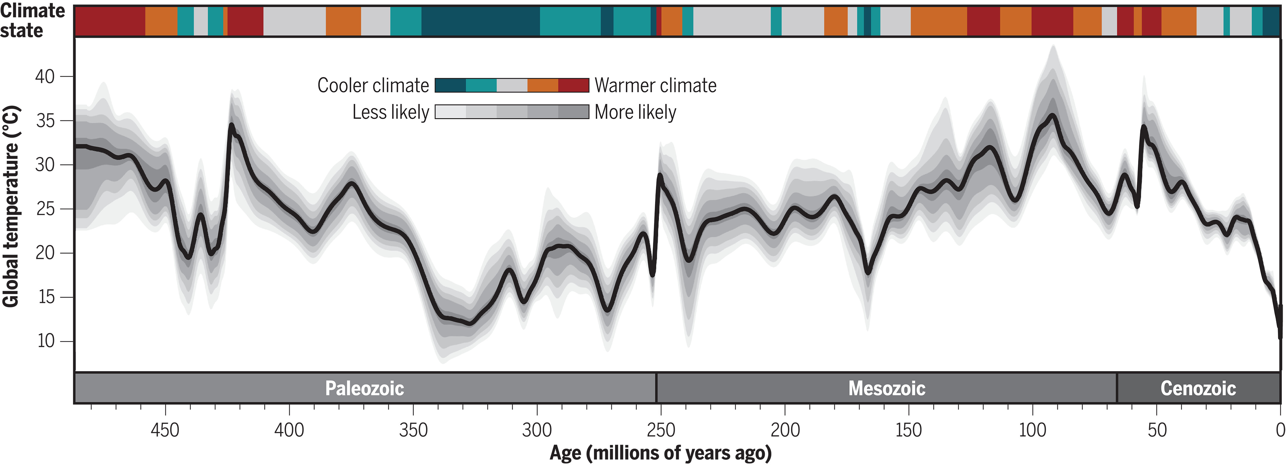
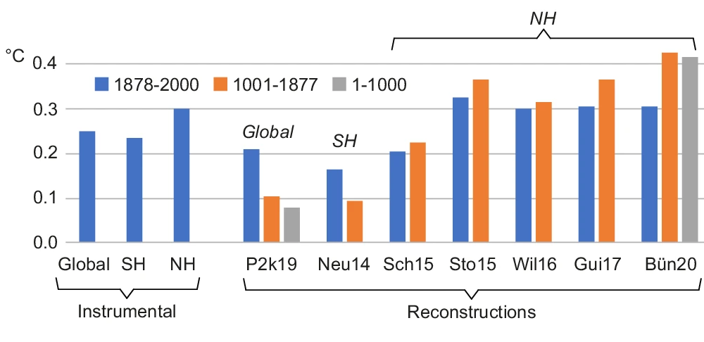
Temperature and atmospheric CO2 concentration proxies plotted in the same time series panel (Figure 5) show an apparent dissociation and even an antiphasic relationship. For example, a CO2 concentration peak near 415 My occurs near a temperature trough at 445 My. Similarly, CO2 concentration peaks around 285 Mybp coincide with a temperature trough at about 280 My and also with the Permo-Carboniferous glacial period (labeled 2 in Figure 5). In more recent time periods, where data sampling resolution is greater, the same trend is visually evident. The atmospheric CO2 concentration peak near 200 My occurs during a cooling climate, as does another, smaller CO2 concentration peak at approximately 37 My. The shorter cooling periods of the Phanerozoic, labeled 1–10 in Figure 5, do not appear qualitatively, at least, to bear any definitive relationship with fluctuations in the atmospheric concentration of CO2.
[My Comment: Antiphasic in this context refers to times when temperatures are rising while CO2 is declining, and also periods when temperatures are falling while CO2 is going higher. These negative correlations are to be expected if temperature is the leading variable and CO2 the dependent variable.]
Regression of linearly-detrended temperature proxies (Figure 3b, lower red curve) against atmospheric CO2 concentration proxy data reveals a weak but discernible negative correlation between CO2 concentration and T (Figure 6). Contrary to the conventional expectation, therefore, as the concentration of atmospheric CO2 increased during the Phanerozoic climate, T decreased. This finding is consistent with the apparent weak antiphasic relation between atmospheric CO2 concentration proxies and T suggested by visual examination of empirical data (Figure 5). The percent of variance in T that can be explained by variance in atmospheric CO2 concentration, or conversely, R2 × 100, is 3.6%. Therefore, more than 95% of the variance in T is explained by unidentified variables other than the atmospheric concentration of CO2.
Regression of non-detrended temperature against atmospheric CO2 concentration shows a weak but discernible positive correlation between CO2 concentration and T. This weak positive association may result from the general decline in temperature accompanied by a weak overall decline in CO2 concentration.
The correlation coefficients between the concentration of CO2 in the atmosphere and T were computed also across 15 shorter time segments of the Phanerozoic.
These time periods were selected to include or bracket the three major glacial periods of the Phanerozoic, ten global cooling events identified by stratigraphic indicators, and major transitions between warming and cooling of the Earth designated by the bar across the top of Figure 5. The analysis was done separately for the most recent time periods of the Phanerozoic, where the sampling resolution was highest (Table 1), and for the older time periods of the Phanerozoic, where the sampling resolution was lower (Table 2).
For the most highly-resolved Phanerozoic data (Table 1), 12/15 (80.0%) Pearson correlation coefficients computed between atmospheric CO2 concentration proxies and T proxies are non-discernible (p > 0.05). Of the three discernible correlation coefficients, all are negative, i.e., T and atmospheric CO2 concentration are inversely related across the corresponding time periods.
For the less highly-resolved older Phanerozoic data (Table 2), 14/20 (70.0%) Pearson correlation coefficients computed between atmospheric CO2 concentration and T are non-discernible. Of the six discernible correlation coefficients, two are negative. For the less-sampled older Phanerozoic (Table 2), 17/20 (85.0%) Spearman correlation coefficients are non-discernible. Of the three discernible Spearman correlation coefficients, one is negative.
Combining atmospheric CO2 concentration vs. T correlation coefficients
from both tables, 53/68 (77.9%) are non-discernible, and of
the 15 discernible correlation coefficients, nine (60.0%) are negative.
These data collectively support the conclusion that the atmospheric concentration of CO2 was largely decoupled from T over the majority of the Phanerozoic climate.
The finding that periodograms of atmospheric CO2 concentration proxies and T proxies exhibit different frequency profiles implies that atmospheric CO2 concentration and T oscillated at different frequencies during the Phanerozoic, consistent with disassociation between the respective cycles. This conclusion is corroborated by auto- and cross-correlation analysis.
If ΔRFCO2 is a more direct indicator of the impact of CO2 on temperature than atmospheric concentration as hypothesized, then the correlation between ΔRFCO2 and T over the Phanerozoic Eon might be expected to be positive and statistically discernible. This hypothesis is confirmed (Figure 9). This analysis entailed averaging atmospheric CO2 concentration in one-My bins over the recent Phanerozoic and either averaging or interpolating CO2 values over the older Phanerozoic (Methods). Owing to the relatively large sample size, the Pearson correlation coefficient is statistically discernible despite its small value (R = 0.16, n = 199), with the consequence that only a small fraction (2.56%) of the variance in T can be explained by variance in ΔRFCO2 (Figure 9). Even though the correlation coefficient between ΔRFCO2 and T is positive and discernible as hypothesized, therefore, the correlation coefficient can be considered negligible and the maximum effect of ΔRFCO2 on T is for practical purposes insignificant (<95%).
Conclusions
The principal findings of this study are that neither the atmospheric concentration
of CO2 nor ΔRFCO2 is correlated with T over most of the ancient (Phanerozoic) climate.
Over all major climate transitions of the Phanerozoic Eon, about three-quarters of 136 correlation coefficients computed here between T and atmospheric CO2 concentration, and between T and ΔRFCO2, are non-discernible, and about half of the discernible correlations are negative. Correlation does not imply causality, but the absence of correlation proves conclusively the absence of causality [63]. The finding that atmospheric CO2 concentration and ΔRFCO2 are generally uncorrelated with T, therefore, implies either that neither variable exerted significant causal influence on T during the Phanerozoic Eon or that the underlying proxy databases do not accurately reflect the variables evaluated.
The generally weak or absent correlations between the atmospheric concentration of CO2 and T,and between ΔRFCO2 and T, imply that other, unidentified variables caused most (>95%) of the variance in T across the Phanerozoic climate record. The dissimilar structures of periodograms for T and atmospheric CO2 concentration found here also imply that different but unidentified forces drove independent cyclic fluctuations in T and CO2. Since cycles in atmospheric CO2 concentrationoccur independently of temperature cycles, the respective rhythms must have a different etiology. It has been suggested that volcanic activity and seafloor spreading produce periodic CO2 emissions from the Earth’s mantle ([69] and references therein) which could in principle increase radiative forcing of temperature globally.
The present findings corroborate the earlier conclusion based on study of the Paleozoic climate that “global climate may be independent of variations in atmospheric carbon dioxide concentration.” [64] (p. 198). The present study shows further, however, that past atmospheric CO2 concentration oscillates on a cycle of 15–20 My and an amplitude of a few hundred to several hundreds of ppmv. A second longer cycle oscillates at 60–70 My. As discussed below, the peaks of the ~15 My cycles align closely with the times of identified mass extinctions during the Phanerozoic Eon, inviting further research on the relationship between atmospheric CO2 concentration and mass extinctions during the Phanerozoic.
My Added Comment
Some climatists will admit that CO2 changes did not cause ancient climate changes, but then assert that everything shifted when humans began burning hydrocarbons and releasing CO2. Somehow natural processes ceased and now only warming can occur due to CO2 added by humans. On the contrary, we can look more recently at the recovery from the LIA (Little Ice Age) to see the same antiphasic pattern described in the above paper.
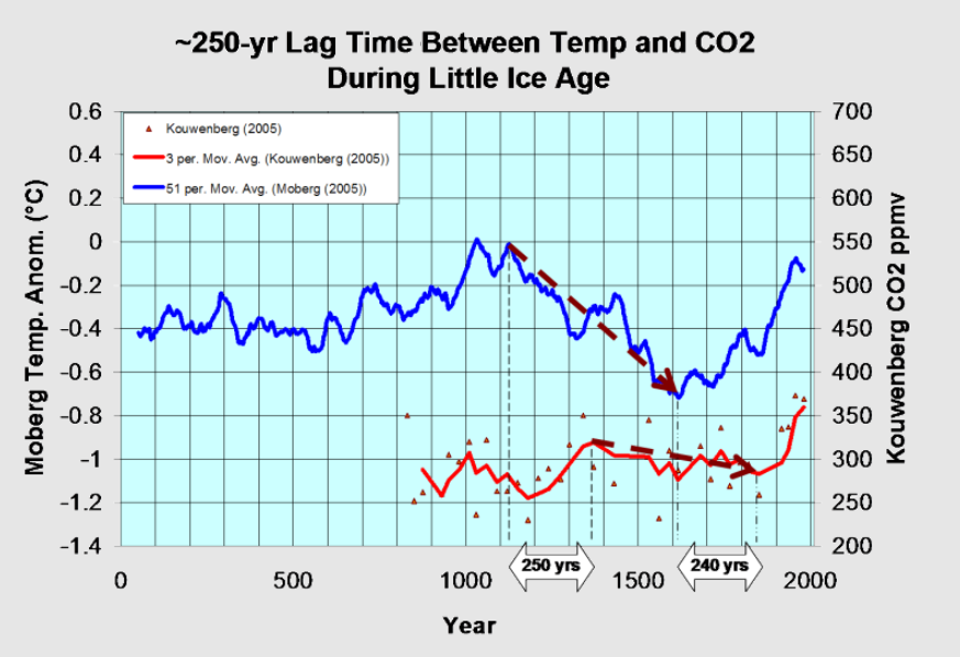
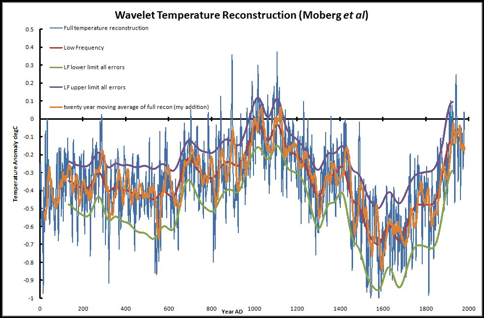
Moberg is a highly respected recontruction of NH temperatures over the last 2000 years. It shows peak warming after 1000, followed by a sharp cooling hitting bottom by 1600. Kouwenberg is a CO2 time series based on plant stomata proxies. For 250 years during the cooling, CO2 was rising, and then later CO2 was declining for 240 years while temperatures were rising.
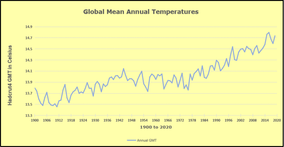
As for the 20th century, consider the graph from climate4you (KNMI Climate Explorer)

Even with modern instrumental temperature records, correlation is inconsistent between temperature and CO2. Much ado is made about the happenstance of positive linking between the 1990s to 2007, while ignoring the negative relation earlier, and a weak connection since. The latter period is obviously driven by oceanic ENSO activity rather than CO2 radiation.
Background Post
What If Climate is Self-Regulating?
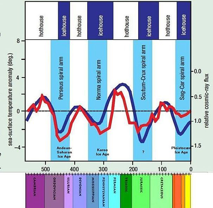
Cosmic radiation and temperature through Phanerozoic according to Nir Shaviv and Jan Veizer.
There is no charge for content on this site, nor for subscribers to receive email notifications of postings.
 Thomas D. Williams, Ph.D. reports at Climate Change Dispatch Unchristian: Pope Francis Says Climate Deniers Are ‘Stupid’, Skepticism ‘Perverse’. Excerpts in italics with my bolds and added images.


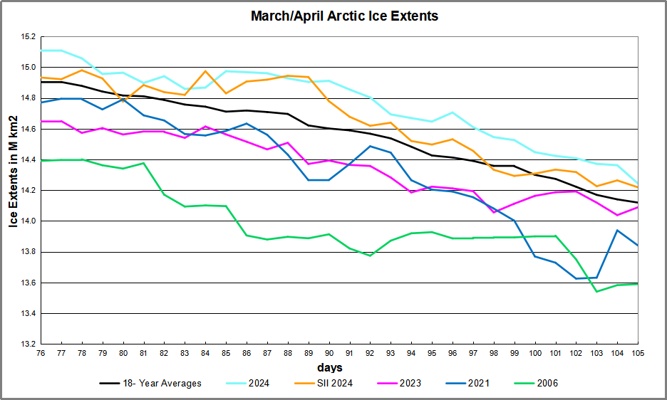

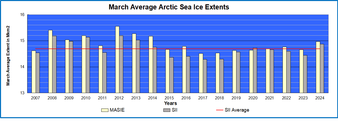
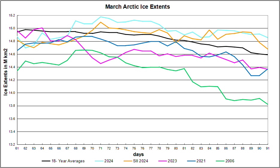
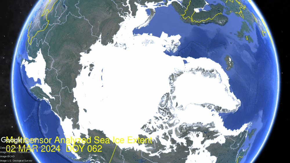
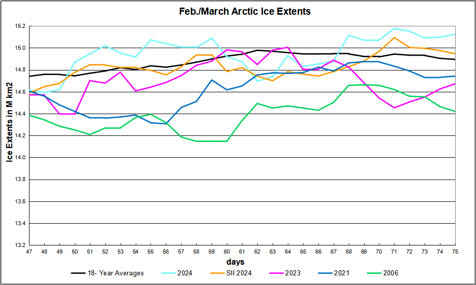
 The table below shows the distribution of Sea Ice on day 105 across the Arctic Regions, on average, this year and 2006.