When Arctic ice is melting in summer until mid-September, warmists stoke fears about ice disappearing in the North. In fact, the pattern of Arctic ice seen in historical perspective is not alarming. People are over-thinking and over-analyzing Arctic Ice extents, and getting wrapped around the axle (or should I say axis). So let’s keep it simple and we can all readily understand what is happening up North.
I have noticed at some other blogs people complain about my monthly Arctic ice updates focusing on extents starting in 2007. This post will show why that time period is entirely reasonable as a subject for analysis. I will use the ever popular NOAA dataset derived from satellite passive microwave sensors. It sometimes understates the ice extents, but everyone refers to it and it is complete from 1979 to present. Here’s what NOAA reports (in M km2):
We are frequently told that only the March maximums and the September minimums matter, since the other months are only transitional between the two. So the graph above shows the mean ice extent, averaging the two months March and September.
If I were adding this to the Ice House of Mirrors, the name would be The X-Ray Ice Mirror, because it looks into the structure of the time series. For even more clarity and simplicity, here is the table:
NOAA NH Annual Average Ice Extents (in M km2). Sea Ice Index v3.0 (here)
Year
Average
Change
Rate of Change
1979
11.697
1996
11.353
-0.344
-0.020 per year
2007
9.405
-1.949
-0.177 per year
2022
9.728
+0.323
+0.022 per year
The satellites involve rocket science, but this does not. There was a small loss of ice extent over the first 17 years, then a dramatic downturn for 11 years, 9 times the rate as before. That was followed by the current 15-year plateau with a slight gain comparable to the beginning loss. All the fuss is over that middle period, and we know what caused it. A lot of multi-year ice was flushed out through the Fram Strait, leaving behind more easily melted younger ice. The effects from that natural occurrence bottomed out in 2007.
Kwok et al say this about the Variability of Fram Strait ice flux:
The average winter area flux over the 18-year record (1978–1996) is 670,000 km2, 7% of the area of the Arctic Ocean. The winter area flux ranges from a minimum of 450,000 km2 in 1984 to a maximum of 906,000 km2 in 1995. . .The average winter volume flux over the winters of October 1990 through May 1995 is 1745 km3 ranging from a low of 1375 km3 in the 1990 flux to a high of 2791 km3 in 1994.
Some complain it is too soon to say Arctic Ice is recovering, or that 2007 is a true change point. The same people were quick to jump on a declining period after 1996 as evidence of a “Death Spiral.”
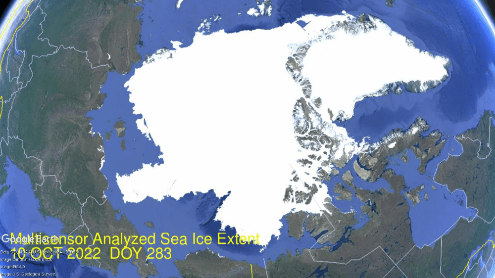
Impressive Arctic ice recovery continued in December as seen in the animation below:
The month of December 2022 shows Hudson Bay (lower right) starting with some western shore ice and ending ice covered, adding in that basin 1.25M km2. Just above Hudson, you can see the Gulf of St. Lawrence icing over, and Baffin Bay adding ice as well, now up to 49% of its annual maximum.
At the extreme left Okhotsk Sea also starts with little shore ice and grows from 53k km2 up to 393k km2, reaching down to Japan. At the top Kara freezes over and Barents and Greenland Seas add ice to their margins. The graph below shows the December ice recovery.
Note the average year adds 2M km2 and 2022 was matching that until the last week or so. Not surprising when the polar vortex pushed freezing Arctic air as far south as Texas and Florida, incursion of warm southern air into the Arctic inhibited further ice growth. SII tracked MASIE with somewhat lower extent toward the end.
The table below shows year-end ice extents in the various Arctic basins compared to the 16-year averages and some recent years.
Region
2022365
Day 365 Average
2022-Ave.
2020365
2022-2020
(0) Northern_Hemisphere
12864130
13071346
-207216
12765491
98639
(1) Beaufort_Sea
1070966
1070354
612
1070689
277
(2) Chukchi_Sea
966006
964526
1481
966006
0
(3) East_Siberian_Sea
1087137
1087133
5
1087120
17
(4) Laptev_Sea
897845
897840
5
897827
18
(5) Kara_Sea
864832
886899
-22067
879232
-14400
(6) Barents_Sea
270677
438702
-168025
371122
-100445
(7) Greenland_Sea
674210
582086
92124
592839
81371
(8) Baffin_Bay_Gulf_of_St._Lawrence
889961
994988
-105027
867509
22452
(9) Canadian_Archipelago
854843
853370
1473
854597
245
(10) Hudson_Bay
1254256
1237220
17036
1257919
-3663
(11) Central_Arctic
3222361
3204794
17567
3159881
62481
(12) Bering_Sea
373249
405344
-32095
249522
123727
(13) Baltic_Sea
22409
32724
-10315
7986
14423
(14) Sea_of_Okhotsk
393473
388636
4837
479972
-86498
This year’s ice extent is 207k km2 or 1.6% below average. Only Baffin Bay and Barents Sea have sizeable deficits to average, while Greenland Sea shows a surplus. Other Arctic basins are already maxed out or are near their average for this date.
Comparing Arctic Ice at End of Years
At the bottom is a discussion of statistics on year-end Arctic Sea Ice extents. The values are averages of the last five days of each year. End of December is a neutral point in the melting-freezing cycle, midway between September minimum and March maximum extents.
Background from Previous Post Updated to Year-End 2022
Some years ago reading a thread on global warming at WUWT, I was struck by one person’s comment: “I’m an actuary with limited knowledge of climate metrics, but it seems to me if you want to understand temperature changes, you should analyze the changes, not the temperatures.” That rang bells for me, and I applied that insight in a series of Temperature Trend Analysis studies of surface station temperature records. Those posts are available under this heading. Climate Compilation Part I Temperatures
This post seeks to understand Arctic Sea Ice fluctuations using a similar approach: Focusing on the rates of extent changes rather than the usual study of the ice extents themselves. Fortunately, Sea Ice Index (SII) from NOAA provides a suitable dataset for this project. As many know, SII relies on satellite passive microwave sensors to produce charts of Arctic Ice extents going back to 1979. The current Version 3 has become more closely aligned with MASIE, the modern form of Naval ice charting in support of Arctic navigation. The SII User Guide is here.
There are statistical analyses available, and the one of interest (table below) is called Sea Ice Index Rates of Change (here). As indicated by the title, this spreadsheet consists not of monthly extents, but changes of extents from the previous month. Specifically, a monthly value is calculated by subtracting the average of the last five days of the previous month from this month’s average of final five days. So the value presents the amount of ice gained or lost during the present month.
These monthly rates of change have been compiled into a baseline for the period 1980 to 2010, which shows the fluctuations of Arctic ice extents over the course of a calendar year. Below is a graph of those averages of monthly changes up to and including this year. Those familiar with Arctic Ice studies will not be surprised at the sine wave form. December end is a relatively neutral point in the cycle, midway between the September Minimum and March Maximum.
The graph makes evident the six spring/summer months of melting and the six autumn/winter months of freezing. Note that June-August produce the bulk of losses, while October-December show the bulk of gains. Also the peak and valley months of March and September show very little change in extent from beginning to end.
The table of monthly data reveals the variability of ice extents over the last 4 decades.
The values in January show changes from the end of the previous December, and by summing twelve consecutive months we can calculate an annual rate of change for the years 1979 to 2022.
As many know, there has been a decline of Arctic ice extent over these 40 years, averaging 70k km2 per year. But year over year, the changes shift constantly between gains and losses, ranging up to +/- 500k km2.
Moreover, it seems random as to which months are determinative for a given year. For example, much ado was printed about June and July 2021 melting faster than expected resulting in higher losses of ice extents. But then the final 3 months of 2021 more than made up for those summer losses
As it happens in this dataset, October has the highest rate of adding ice. The table below shows the variety of monthly rates in the record as anomalies from the 1980-2010 baseline. In this exhibit a red cell is a negative anomaly (less than baseline for that month) and blue is positive (higher than baseline).
Note that the +/ – rate anomalies are distributed all across the grid, sequences of different months in different years, with gains and losses offsetting one another. For example in 2022 the outlier months were June and September where unusual amounts of ice were lost. Despite above average gains Oct.–Dec., the year ended with a large negative anomaly. June 2021 lost more ice than the baseline, but about the same as 2017, and not as much as 2012. The gains in Oct.-Dec. 2021 were ~1M km2 above baseline, but were exceeded by the same months in 2019 and 2020. The bottom line presents the average anomalies for each month over the period 1979-2021. Note the rates of gains and losses mostly offset, and the average of all months in the bottom right cell is virtually zero.
A final observation: The graph below shows the Yearend Arctic Ice Extents for the last 32 years.
Year-end Arctic ice extents (last 5 days of December) show three distinct regimes: 1988-1998, 1998-2010, 2010-2022. The average year-end extent 1989-2010 is 13.4M km2. In the last decade, 2011 was 13.0M km2, and six years later, 2017 was 12.3M km2. 2021 rose back to 13.06 2022 slipped back to 12.6M. So for all the the fluctuations, the net is zero, or a slight gain from 2010. Talk of an Arctic ice death spiral is fanciful.
These data show a noisy, highly variable natural phenomenon. Clearly, unpredictable factors are in play, principally water structure and circulation, atmospheric circulation regimes, and also incursions and storms. And in the longer view, today’s extents are not unusual.
Illustration by Eleanor Lutz shows Earth’s seasonal climate changes. If played in full screen, the four corners present views from top, bottom and sides. It is a visual representation of scientific datasets measuring Arctic ice extents.
A review of the new book Tickets For The Ark, by Rebecca Nesbit
Earlier this month, a “landmark U.N. biodiversity agreement” was adopted by delegates from 190 countries at the Fifteenth Conference of Parties (COP15) of the U.N. Convention on Biological Diversity in Montreal.The chief goal of the new Global Biodiversity Framework (GBF) is that “the integrity, connectivity and resilience of all ecosystems are maintained, enhanced, or restored, substantially increasing the area of natural ecosystems by 2050.” The GBF asserts that around 25 percent of assessed plant and animal species are threatened, suggesting that around 1 million species may already face eventual extinction unless action is taken.
The GBF specifies that by 2030, 30 percent of Earth’s lands, oceans, coastal areas, and inland waters are “effectively conserved” and that restoration be completed or underway on at least 30 percent of degraded terrestrial, inland waters, and coastal and marine ecosystems. Currently, 17 percent and 10 percent of the world’s terrestrial and marine areas respectively are under protection. In addition, the GBF aims to reduce annual subsidies harmful to biodiversity (e.g., biofuels, fisheries, fossil fuels) by $500 billion; and to cut food waste in half by 2030.
Ecologist Rebecca Nesbit in her new book, Tickets For The Ark: From Wasps to Whales – How Do We Choose What To Save?, launches a sustained frontal attack on the “myth of wild nature.”
Nesbit hammers home the absolutely correct point that there is no objective scientific standard providing some kind of value-neutral ecological baseline toward which conservation should aim. Since there is no goal or end state toward which any particular ecosystem is heading, who is to say that landscapes and ecosystems modified by human activities are somehow inferior?
“Ideas about pristine nature invoke a state that nature was in before humans affected it,” Nesbit notes. “The trouble is that humans have played a role in shaping nature for roughly 2.5 million years.” She explains that species and ecosystems do not have intrinsic value. Instead, humans confer value on them. This realization “should be liberating,” she argues, because it makes us “free to discuss logically what we should save and why, and not just fight an anti-extinction battle that is doomed to failure.” Nesbit notes that “The resources we dedicate to conservation will never be enough to prevent all extinctions, and we are forced to choose our priorities.” As she makes plain, it’s tradeoffs all of the way down.
Consequently, her goal isn’t to tell readers how we should choose what to save. Instead, she provides a series of case studies showing that human choices guided by our ethical and aesthetic values are inevitable regarding biological conservation.
Let’s take a look at a few of the conservation tradeoffs that Nesbit highlights. For example, due to centuries of sheep grazing, the prehistoric birch forests that once covered Norway’s craggy mountains have been replaced by meadows. Many Norwegians prefer the hiking and skiing opportunities and magnificent views made possible by sheep meadows to dense birch forests. “This recent baseline for what the natural world should look like has no more moral relevance than a prehistoric baseline, yet it is the form of nature that Norway now aspires to protect,” she notes.
Another example is the effort to preserve the flightless brown and white striped Guam rail. That bird was driven to near extinction by introducing brown tree snakes to the island, which ate its chicks and eggs. In 1987, the 22 remaining rails were put in a captive breeding facility. The good news is that rails from the captive breeding project have now been released on snake-free islands near Guam where they have established self-sustaining populations.
Nesbit, however, asked the biologists overseeing rail conservation what happened to the Guam rail louse that lived only on that species. As standard practice, the conservationists had cleared the captured birds of their parasites, thus bringing about the extinction of that parasitic insect. Is the rail more valuable than the louse? And who says so? Conservationists cannot avoid such questions as they choose among species to try to save some from extinction.
Conflicts of values are inherent in conservation.
“The people who benefit from wildlife protection are seldom the ones who pay the price,” Nesbit observes. “Different people and wildlife benefit from different management, so inevitably there will be opposing outlooks. But it’s an advance if, at least, we recognize that there is no historic baseline to aspire towards.” She illustrates how opposing outlooks played out in with the case of seals versus salmon in Scotland’s Moray Firth.
Seals compete with local fishers for the salmon, so fishers were licensed by the Scottish government to kill seals. On the other hand, tour operators argued for protecting the seals that thousands of visitors came to see in the wild. While no one side was entirely happy, a series of stakeholder discussions led to an agreement in which fishers could cull “rogue” seals.
“Dispensing with the idea that there is an objective ‘natural’ state of nature opens up huge possibilities for what conservation can achieve,” she argues.
Among the possibilities is using biotechnology to install a blight-resistant wheat gene in American chestnuts. Literally, billions of these forest giants succumbed to an introduced fungus in the 20th century. The new blight-resistant trees could be restored to their native range in the Appalachian Mountains. Even more ambitiously, biotechnology could combine the recently decoded genetics of extinct wooly mammoths with those of Asian elephants to restore them to the Arctic.
Also, Nesbit urges us to free “ourselves from the shackle of believing that species ‘belong’ only in their past ranges” so that we can “open up possibilities for assisted colonizations.” Conservationists could move creatures threatened with extinction in their home ranges to others where they would be protected and allowed to thrive. For example, Nesbit notes that Chinese water deer are declining in their native Asian range but are expanding in various parts of Europe.
Nesbit also stands firmly against eco-colonialism.
The GBF’s goal of protecting 30 percent of the world’s landscapes and seascapes must not become instances of what Nesbit calls “fortress conservation,” in which local people are banished from their lands and livelihoods. “With Indigenous lands representing about a quarter of the Earth’s land surface, there is huge potential for synergy between wildlife conservation and upholding Indigenous rights,” argues Nesbit. She cites a recent World Bank study that found community-managed forests are more effective at reducing deforestation than strictly protected areas. Hopefully, the signatories to the GBF will uphold its commitments toward “recognizing and respecting the rights of indigenous peoples and local communities, including over their traditional territories.”
Nesbit concludes, “Now that we have shaken off the idea of an unobtainable ‘pure’ nature, we can embrace the possibilities that come from celebrating nature in its many forms. We’re not doomed to simply mourn a paradise lost, we’re free to create a new form of paradise.” Let’s get at it.
Source: Phanerozoic_Biodiversity.png Author: SVG version by Albert Mestre
Footnote: A Sample of Math Humor
After Noah sent out the dove that returned, and landed the ark, he released the animals two by two and told them: “Go forth and multiply.” Noah checked on the progress of the various species, and discovered that two snakes had not reproduced. When confronted, the snakes responded: “We can’t multiply. We’re adders.”
Noah pondered the dilemma, then went to cut trees in the forest. After building a table with the wood, he again addressed the snakes. ” You no longer have an excuse. Even adders can multiply on a log table.”
BizNews TV interviewed Dr. John Christy last week as shown in the video above. For those who prefer to read what was said, I provide a lightly edited transcript below in italics with my bolds and added images. BN refers to questions from the interviewer and JC refers to responses from Christy.
BN: Joining me today is Dr John Christy, climate scientist at the University of Alabama in Huntsville and Alabama State climatologist since 2000. Dr Christy, thank you so much for your time. You’ve described yourself as a climate nerd and apparently you were 12 when your unwavering desire to understand weather and climate started. Why climate?
JC: Well I think it was more like 10 years old when I was fascinated with some unusual weather events that happened in my home area of California. So that began a fascination for me, and I wanted to try to figure out why things happen the way they did. Why did one year have more rain–that’s a big story in California, does it rain or not–and another year would be very dry. Why were the mountains covered with snow in one April and not another. In fact I have here April 1967 that I recorded as a teenager. This has been a passion of mine forever, and as it turns out now that I’m as old as I am, I still can’t figure out why one year is wetter than the other.
BN: Well you seem to be getting a lot closer than most people would. I think it was in 1989 when you and NASA scientist Roy Spencer pioneered a new method of measuring and monitoring temperature recordsvia satellites, since that time up until now. Why did you feel you needed to develop a new method to begin with, and how did it differ in terms of the readings of established methods at the time?
JC: Well the issue was we only had surface temperature measurements and they are scattered over the world. They don’t cover much of the world at all, actually mainly just the land regions and scattered places on the ocean. And the measurement itself is not that robust. The stations move, the instruments changed through time, and so it’s a very difficult thing to detect. In fact a small little change in the area right around the station can really affect the temperature of that station
So Roy Spencer and Dick Mcknight came up with an idea about looking at some satellite data. This is the temperature of the deep layer of the atmosphere, so this is like the surface to about 8000 meters. And so if we could see the temperature of that bulk atmospheric layer, we would have a very robust measurement, and the microwave sensors on the NOAA Polo orbiting satellites did precisely that. And so we were the first to really put those data into a simple data set that had the temperature, at that time, for month by month since about November 1978.
BN: Okay, and how do readings differ from the climate science at the time?
JC:First of all they differed because we had a global measurement. We really did see the entire Globe from satellite, because the orbit of that satellite is polar and the Earth spins around underneath. So every day we have 14 orbits as the Earth spins around underneath. We see the entire planet so that’s one big difference.
The other one is that the actual result did not show as much warming as what the surface temperatures showed. And we’re doing even more work now to demonstrate that a lot of the surface stations are spuriously affected by the growth of an infrastructure around them. And so there’s kind of a false warming signal there. You don’t get the background climate signal with surface temperature measurements; you get a bit of what’s happening in the local area.
BN: Your research has to do with testing the theories posited by climate model forecasts, so you don’t actually do any modeling yourself. But what criteria do you use to test these theories?
JC: That’s a very good question, because in climate you hear all kinds of claims and theories being thrown out there. For a lot of people who don’t really understand the climate system it’s a quick and easy answer just to say: Oh humans caused that, you know it’s global warming, something like that is the answer. When in fact the climate system is very complex, so we look at these claims and Roy Spencer and I are just a few of the people around the world that actually build data sets from scratch. I mean we start with the photon counts of the satellite radiometers, or the original paper records of 19th century East Africa, for example. We do all this from scratch so that we can test the claims that people make.
Once we build the data set, we test it to make sure we have confidence in the data set, that it’s telling us a truth about what’s happening over time. And then we check the claim. So for example, we make surface temperature data sets that go back to the 19th century. Someone will say: Well this is now the hottest decade, or that more records happen this decade than in the past. And we can demonstrate, in the United States especially, that’s not the case. You would need to go back to the 1930s if you want to see real record temperatures that occurred at that time.
And for climate models we like to use the satellite data set since it’s a robust deep layer measurement; it’s measuring lots of mass of the atmosphere, the heat content really. That’s a direct value we can get out of the climate model, so we are comparing Apples to Apples: What the satellite produces and observes is what the climate model also generates, and we can compare them one to one.
In a paper Ross McKitrick and I wrote a couple of years ago, we found that 100 of the climate models we’re warming the atmosphere faster than it was actually warming. So that’s not a good result if you’re trying to test your theory of how the climate works with the model against what actually happens.
BN: How much do you think the deeply over-exaggerated predictions of Doom and Gloom have to do with the methodology substantiated by confirmation bias?
JC: That’s an interesting question because we’re a bit confused as well. We have been publishing these papers since 1994 that have demonstrated models warm too much relative to the actual climate, and yet we don’t see an improvement in climate models and trying to match reality with their model output. Now I think a number of modelers understand that: yes the there is a difference there and the models are just too hot. But what is the process that’s gone wrong in the models is a difficult question for these folks. Because models have hundreds of places you can turn a little knob, change a coefficient, and that will change the result. It’s not a physical thing, it’s not based on physics; it’s the model parameterizations— the little pieces of the model that try to represent an actual part of the atmosphere. For example, when do clouds form? That’s a pretty big question. How much humidity in the atmosphere is required to create a cloud? Because once the cloud forms it reflects sunlight and cools the Earth. So that’s it that’s one of the big questions.
So in testing the models we like to use the bulk atmospheric temperature; it’d a very direct measurement that models produce and so we can then say there’s a problem here with climate models.
BN: To what degree did your observation on data differ from their forecasts?
Generally it’s about a factor of two. At times it’s been more, but on average the latest models (CMIP6) for the Deep layer of the atmosphere are warming about twice too fast, and that’s a real problem. I think when now we’re looking at over 40 years with which we can test these models, and they’re already that far off.
Figure 8: Warming in the tropical troposphere according to the CMIP6 models. Trends 1979–2014 (except the rightmost model, which is to 2007), for 20°N–20°S, 300–200 hPa.
So we should not use them to to tell us what’s going to happen in the future since they haven’t even gotten us to the right place in the last 40 years.
BN: Given that your real world data refuted what the forecasts were every time for decades, why then (and I recognize that this is conjecture) why are, let’s say, 97 or 99 % of scientists so firmly behind climate crisis narrative?
JC: Yeah I don’t know how many are really fully behind that crisis climate narrative. I saw a recent survey where about 55 percent might have been of the opinion that the climate warming was going to be a problem. Warming itself is not a problem: I mean the Earth has been warmer in the past than it is today, so the Earth has survived that before. And I don’t think putting extra plant food in the atmosphere is going to be a real problem for us to overcome. I do think the world is going to warm some from the extra CO2, but there are a lot of benefits that come from that.
You’re you’re dealing with a question about human nature and funding and so on. I think we all know that the more dramatic the story is, especially in the political world, the more attention you will get. Therefore your work can be highlighted and that helps you with funding and attention and so on. And part of what’s going on here. Then there’s the other real stronger political narrative: that there are groups and in the world political Elite that like to have a narrative that scares people, so that they can then offer a solution. And so it’s a simple way to say: elect me to this office and I will be able to solve this problem.
Then you are facing people like us who actually produce the data and we can report on extreme events and so on and say: Well you know there isn’t any change in these extreme events, so what’s the problem you’re trying to solve? And then we look at the other side of that issue and say: Okay if you actually implement this regulation or this law, it’s not going to make any difference on the climate end, so it’s a you kind of lose on two ends on that story.
BN: You’re a distinguished professor of atmospheric science and also director of Earth Sciences also at Alabama in Huntsville, these are prominent positions. How have you managed to hold on to them with climate views that are so divergent from the norm?
JC: Well the environment in the state of Alabama is different than what you have in Washington. I’m from California way across the country, and I tell people that one of the reasons I like to live in Alabama because in Alabama you can call a duck a duck; that you can just be direct about what’s going on and and you’re not going to be given the evil eye or cast out. As it is now in the climate establishment, you know, saying that all the models are warming too much and that there is not a disaster arising that causes great consternation.Because the narrative has been built over the last 30 years that we are supposed to be in a catastrophe. To come out and say, well here’s the data and the data show there is no catastrophe looming; we’re doing fine, the world is doing fine, human life is thriving in places it’s allowed to. So what’s the problem here you’re trying to solve.
BN:Did you ever manage to get your findings to policy makers that have influence to do something about it?
[An important proof against the CO2 global warming claim was included in John Christy’s testimony 29 March 2017 at the House Committee on Science, Space and Technology. The text and diagram below are from that document which can be accessed here.
IPCC Assessment Reports show that the IPCC climate models performed best versus observations when they did not include extra GHGs and this result can be demonstrated with a statistical model as well.
Figure 5. Simplification of IPCC AR5 shown above in Fig. 4. The colored lines represent the range of results for the models and observations. The trends here represent trends at different levels of the tropical atmosphere from the surface up to 50,000 ft. The gray lines are the bounds for the range of observations, the blue for the range of IPCC model results without extra GHGs and the red for IPCC model results with extra GHGs.The key point displayed is the lack of overlap between the GHG model results (red) and the observations (gray). The nonGHG model runs (blue) overlap the observations almost completely.
JC: Well, I’ve been to Congress 20 times, testified before hearings. So the information is there and available, but I can’t force Congress to make legislation that matches the real world. The Congressional world is a political world, and things happen there that are kind of out of my reach and ability to influence.
BN: According to your research, you’ve also said that the climate models underestimate negative feedback loops. Can you explain to me what is this mechanism and the effect of overestimation of the loops on understanding climate for what it is?
JC: That’s a very complicated issue, and I don’t understand it all for sure, but we can say just from some general results and general observation what’s going on here. One of those General observations is that when a climate model warms up the atmosphere one degree Kelvin, it sends out 1.4 watts per metersquared so the air atmosphere warms up and energy escapes to space 1.4 watts. When we use actual observations of the atmosphere, when the real atmosphere warms up one Kelvin it sends out 2.6 watts of energy. That’s almost twice as much so that tells you right there that the climate models are retaining or holding on to energy that the real world allows to escape when it warms. So that’s a negative feedback: as the atmosphere warms for a bit the real real world knows how to let that heat escape; whereas the models don’t and they retain it and that’s why they keep building up heat over time.
BN: What other variables do you look at?
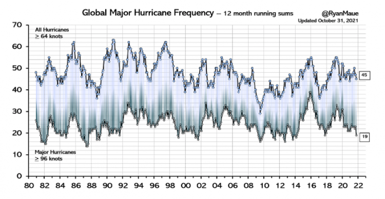
JC: The state climatologists I deal a lot get very practical questions that people ask. They want to know: is it getting hot or is it getting wetter. Are rain storms getting heavier and are the Hurricanes getting worse and so on. I actually wrote a booklet called a practical guide to climate change in Alabama. But it covers a lot of the country as well. It’s free, you can download it from the first page of my website The Alabama State climatologist. I answer a lot of these very practical questions and as we go down the list: droughts are not getting worse over time, heavy rainstorms are not getting worse over time, here in the Southeast in fact. Ross McKitrick and I also had a paper where we went back to 1878 and demonstrated that the trends are not significant. Hurricanes are not going up at all; in fact 2022 is going to be one of the quietest that we’ve had in a while. Tornadoes are not becoming more numerous, heat waves are not becoming worse. So one after another, the weather that people really care about, that if it changes could cause problem or catastrophe, we find those events are not changing, they’ve always been around.[Title below in red is link to Christy’s booklet.]
BN: Some of the biggest critics of climate skeptics say: okay yeah it’s not fair one extreme weather event doesn’t say much, but they argue that there are very particular trends that have been on the increase. Recently have you observed this at all?
JC: That’s exactly the kind of thing we build data sets to discover. For example there is a story, and there is some evidence for it, that in the last hundred years there’s been an increase in in heavy rain events in part of our country, not all of it just part of the country. So I built a data set that went back in fact back to the 1860s. And we looked at that very carefully, and found that when you go back far enough, there were a lot of heavy events back then. And so over the long time period of 140 years or more we don’t see an upward trend. It’s unusual in that sample of time 140 years that we don’t see a change in those kind of events. So that’s why I think it has great value to build these data sets so you can specifically answer the question and the claim that is being made
One of the worst ones was made by the New York Times when they were talking about how many record high temperatures occurred in a recent heat wave around the country. So I looked at that carefully, and they were allowing stations to be included that only had 30 years or even less than 30 years of data. Some had a hundred years but a lot of them just had 30 years. Well when you become very systematic, you say: I’m only going to allow stations that have a hundred years so that every station that measured in 2022 can be compared with the entire time series. Then their story falls apart because the 1930s and the 50s were so hot in our country that they still hold the records for the number of high temperature events.
The scary thing for me is that as much as it completely falls apart, there’s no logic to it,
yet it’s still firmly stands as what most people believe.
You have to credit those in the climate establishment and the media or whoever is behind all this, that they have been successful in scaring people about the climate. Because now you find that even in grade school textbooks. Almost every new story that comes out, and this is where this establishment is very good, they make sure every story has some kind of line in it about climate change. They don’t ever go back and talk to someone who actually builds these data sets who says is that really the worst it’s been was 120 years ago. They just make those claims.
Other than the fact that sea level is rising a bit, the extreme events are just not there to really cause problems now. We are in a problem of having greater damages occur because of extreme events, and mainly because we’ve just built so much more stuff and placed It In harm’s way. Our coastlines are crowded with Condominiums, entertainment parks and retirement villages, and so on. There’s so many more of them that when a hurricane does come, it’s going to wipe out a lot more and so for the absolute value of those damages has gone up. But the number of hurricanes, their strength and so on, the background climate has not caused that problem. It’s just that we like to build things in places that are dangerous.
We have records of sea level rise, and it’s on the order of about an inch per decade, except in places where the land’s sinking. You can find that on the Louisiana Gulf Coast and places like that, but otherwise it’s about an inch per decade. I tell folks that an inch per decade, two and a half centimeters a decade is not your problem. It’s 10 feet in six hours from the next hurricane that’s your problem. If you can withstand a rise of sea level of 10 feet in six hours then you’re probably going to be okay. But if you can’t then a hurricane can really cause problems, and so we just have more exposure to that kind of his situation now than we’ve had before.
BN: What about the trend with sea level rise? Should we be worried about future Generations having to deal with issues that might not affect us in our lifetime but eventually will threaten their lives?
I think your listeners would need to understand that sea level is a dynamic variable–It goes up, it goes down. It has been over a hundred meters lower than today just in the last 25,000 years, and there was a period from about 15 000 years ago to 8 000 years ago where the sea level rose about 12 centimeters per decade for seven thousand years. That’s a lot more than two and a half centimeters a decade as it’s doing now, so the world has managed to deal with rising sea levels before. If we go back to the last warm period about 130 000 years ago, the sea level then was higher than it is now by about five meters or so. So just naturally we would expect at least another five meters of sea level; it won’t happen tomorrow, it won’t happen this Century. But slowly it will likely continue to rise and so that should be placed in your thinking if you’re building a dock for say a military port or something you want to last a long time. Put a cushion in there, a way to handle another half meter of seat level rise in the next hundred years, and you should be okay.
BN: About your temperature records: How much has the Earth warmed let’s say over the last four years?
JC: Yes. With this November we finished 43 years of measurements. In that time the temperature has risen half a degree Celsius. And you might want to look at other things about the world. World agricultural production has expanded tremendously. Nations are now exporting grain more than they had before, because people are pretty smart and figure out how to do things better all the time. Growing food is one thing they figured out how to do better as time passed, so the climate warming of a half degree has not caused a a major catastrophe at all. Wealth has increased around the planet, now some governments are trying to prevent you from growing your wealth, but that’s a hard thing to stop people who like to have food; they like to have conveniences in their life and that’s hard to pass laws that say you can’t enjoy the life the way you want to.
BN:How much of the warming are you reliably able to say is as a result of human activity?
JC: Okay. The answer is none in the sense that you said reliably. I can’t come up with an answer for that reliably. Warming from humans assumes warming that is not due to El Nino; or warming that’s not due to volcanic suppression of temperatures earlier in the record, which comes up to about a tenth of a degree per decade.
Are there other factors that we can say for sure have played a role in the incremental warming of the planet over the last few decades. We see that we’ve had a couple of volcanoes in the first half of that period Eyjafjallajökull and Pinatubo and those cool the planet in the first half of that 40 years. So that tilted the trend up and that’s where I come up with a one-tenth per decade is the warming rate, which means the climate is not very sensitive to carbon dioxide or greenhouse gas warming. It’s probably half or even less as sensitive as models tend to report.
BN: So if CO2 exposure or insertion into the atmosphere were to double what would the results be?
JC: I actually had a little paper on that and we’re kind of expecting maybe about 2070 or 2080 it will be double from what it was back in 1850. And the warming of that amount uh will be about a degree, 1.3 C is what I calculated. The general rule I found about people is they don’t mind an extra degree on their temperature. In fact if you look at the United States the average American experiences a much warmer temperature now than they did a hundred years ago. Because the average American has moved South; the average American has moved to much warmer climates–California, Arizona Texas, Alabama, Florida and so on. Because cold is not a whole lot of fun. You know, skiing, snowmobiling and ice fishing and so on, that’s fine. But the average person likes it to be warm and so that’s why many people in our country have moved to warmer areas. So I don’t think that 1.3 Kelvin is going to matter much whether people really care about those extreme events and so on.
BN: What do you your temperature records tell you about previous hotter temperatures?
JC: Since 1979, what we see is an upward trend in the in the global temperature that I think is manageable. But it goes up and down the 1997-98 El Nino was a big event and in 2016 El Nino was a big event. We also see the downs that come from a volcano that might go off and cool off the planet. Those are bigger effects than that small trend that’s going up. The global temperature can change by two tenths of a degree from month to month when we’re talking about a tenth per decade. Then people say, you know a month to month we can handle but we can’t handle 20 years worth of a small change. That just doesn’t make sense and and the real world evidence is pretty clear that that humans have done extremely well as our planet has been warming a little bit, whether it’s natural or not.
BN: Can you tell me about the Milankovich Cycles?
Milankovich Cycles are the orbital cycles of the earth orbit around the Sun and its tilt of the axis and the distance from the Sun. It is not a perfect circular orbit around the sun, it’s kind of an ellipse and it changes through time. All those factors work together to put a little bit more solar energy in certain places and less than others. These cycles are likely related to the Ice Ages we talk about.
If you can melt the snow in Canada in the summer, then you won’t have an ice age. So the snow falls in the winter and if you can’t melt the snow in Canada in the summer because the Earth is tilted away a bit in July and August. Then the snow hangs around all summer long, the next winter more snow that piles up the next summer it doesn’t melt and so on the next year. You get this mechanism that adds and extends snow cover leading to an ice age
So the tilt of the axis and other parameters I just mentioned can moderate how much sunlight comes in the summertime in Canada. And it’s up to 100 watts per meter squared which is a lot of energy difference over time. That’s probably the strongest theory that has a good amount of evidence that those orbital changes can cause huge changes in the climate from ice ages to the current interglacial.
BN: There’s claims that the way that humans are living is causing daily Extinction of two to three hundred different species. Is this a natural course of Evolution?
JC: You know 99 % of the species that have ever lived are extinct, so extinction is is pretty natural. Obviously humans cause some extinctions. When you destroy the environment of a small place and that was the only place that particular species lived then yes you know humans caused that extinction Did climate change from humans cause any extinctions? I think that jury is still out because most species love the extra carbon dioxide. Plants do specifically and then everything that eats plants loves that, so you might want to say the extra carbon dioxide actually helped in some sense the whole biosphere.
But I think that what humans do to the surface and to water, if it’s not clean properly and if you just really poison the surface in the air, then that can cause some real problems for the species that are living out there. And that’s why we have rules about not putting poison in air or in the water.
BN: Does that qualify as climate change?
JC: No. To say carbon dioxide is a poison, you really have to scratch your head on that because plants love the stuff. It invigorates the biosphere. When did all of this Greenery evolve and the corals occur and grow and develop? it was when there was two to four or five times as much CO2 as is in the air now. Carbon dioxide invigorates the biosphere, so we’re just actually putting back carbon dioxide that had been in the atmosphere earlier. And I don’t think the world is going to have much problem with that in terms of its biosphere. The issue is about the climate going to become so bad that some things can’t handle it and I don’t really see the evidence for that happening.
BN: Critics of your views on climate have argued that you undercut your credibility by making claims that exceed your data and that you’re unwilling to agree with different findings. How do you respond to that?
JC: Show me a finding and let me look at it and if it’s a valid finding, fine I’ll agree with it. But you know you can find anything on the web these days about claims that someone might make but you show me the evidence. Let me see what you’re complaining about and we can have a discussion about that. I just had a paper published last week on snowfall in the western states of the United States that shows for the main snowfall regions there is no trend in snowfall. The amount of snow that’s falling right now is the same as it was 120 years ago. So snow is still falling out in the western mountains of the United States–that’s evidence, that’s data. And so when someone claims that oh my, snowfall is going away out in the west, I said well well here look at this evidence from real station data that people recorded back in 1890 to now.
So I can answer that question with real information. You don’t see many people like me in debates because they’re not offered to me. In fact I’ve been uninvited you know. Someone on a particular panel would say hey let’s get this guy to come here and speak to us, and then I receive the disinvitation because I was not going to go along with the theme of their climate change as a catastrophe presentation
BN: You referred to times in the past that CO2 levels were significantly higher than they are now. Do records show any negative effects as a result of such high CO2?
JC: Well when you say negative, that’s almost a moral question: good or bad that the dinosaurs went extinct? I think they’d the dinosaurs would have an opinion about that. Let me rephrase: If it had to be on those levels today would it negatively impact Humanity? We see carbon dioxide has increased as humans are producing energy so that their lives can be enhanced. There’s a direct relationship between how much carbon or energy you’re able to use and carbon is the main source today and your ability to thrive.
Think about it we didn’t leave the Stone Age because we ran out of rocks. We left the Stone Age because something better came along, you know, Iron, Bronze and so on. In terms of energy we didn’t leave the wood and dung age because we ran out of trees or excrement, we found a better source that was carbon: coal, oil and so on. And transportation: we didn’t leave the horse and buggy age because we ran out of horses. It was because Henry Ford made a vehicle that was cheap and affordable. My great grandfather who was in destitute poverty in Oklahoma in the 1930s had a Model T. And another thing about Henry Ford: He didn’t go around getting the government to kill all the horses so you’d have to buy his cars. Horses were still available for the poorest people you know. And he didn’t make the government go out and build gas stations or drill for oil, that was done at the market for the private level.
But today we have a government that says this is what we want for the energy structure, and so we’re going to be using your taxpayer money to put out all these charging stations and force you to buy electric cars or at least subsidize them tremendously, and put up all these windmills and so on at Great expense and great environmental wreckage.
I can assure you that without energy life is brutal and short, and so energy is a thing that has caused our lifespans to double so that children no longer fear about diseases that used to wipe out Millions. Because of the advances that energy has brought through electricity and experimentation and all the sciences that we have developed now. All that’s based upon that access to energy.
So yes developing countries are going to get their energy, they’re going to find the energy they need. I’m not making this as a prediction, just using this as an observation. Right now it’s carbon that’s the cheapest and most effective and very high density. So we will see these countries use carbon to advance and we should not stand in their way. Because they want to live like us who already have pretty big carbon Footprints.
If you want to have some comfort in that, remember the carbon dioxide we’re putting back into the atmosphere is invigorating the biosphere and it also represents people living longer and better lives. Just no question that as energy is made available and affordable people live longer and better lives. I think that’s going to ultimately be the the inertia that’s going to carry forward this issue past all the preaching about carbon dioxide problems.
Environmentalists would argue that they’re not against electricity and prosperity, they’re just advocating for a better cleaner way to do it. It’s a tremendous misconception that a windmill or a solar panel can somehow give you cleaner and more reliable energy than what you have now. That’s just not true. To build a windmill, there’s tremendous environmental wreckage that you have to go through in terms of all the minerals you have to yank out of the earth and process. And processing takes energy by the way. And then building all these transmission lines. The energy is so diffuse, it is so weak in wind and solar that you have to gather up huge amounts of land to put it together. Robert Price said it well when he called it the iron law of power: the weaker the source of energy the more stuff and material you need to gather it, to concentrate it and to make it useful.
You have to spend huge amounts of dollars in environmental cost to make a windmill or make a solar panel, which by the way doesn’t last forever. So this carbon that already has a tremendous amount of energy in a very small dense space means that its environmental footprint is much much smaller than what you have with solar or wind. In fact it’s about one to a thousand or two thousand in terms of the square footage you need.
Look at windmill and solar panel farms. Not only are they just ugly but they cause tremendous environmental damage in their construction and maintenance. What are the long-term effects decades from now? If we just continue to get our energy from fossil fuels how bad can it get?
Well start with how good it can get. People will have access to affordable energy so they’re going to live longer and they’re going to live better lives when you have access to this. The impact on the climate is about the only thing you can think of. Well the sea level is going to continue to rise since it’s been rising for several hundred years, and at a manageable rate by the way. And the atmosphere might warm some more, but certainly not in terms of some catastrophic effect that will cause us to lose our ability to thrive.
I’m just very optimistic that people are clever and they can figure out how to adapt to whatever is going to happen. The real issues I deal with as a state climatologist are the extreme events that we know are going to happen that you’re not ready for. I mean that flood that happened 50 years ago is going to come back again. And it’s going to cause some real problems if you don’t build your infrastructure and put your houses or industry where they can be safe. If you don’t build up on the coast too much, so then you won’t be clobbered by a hurricane or something like that. It’s these kind of natural extreme events to which we’re far more vulnerable right now, rather than some small and gradual change that the climate system might undergo.
BN: I did read somewhere that someone has said, and I’m sure you must get it a lot, whether you get any funding from the fossil fuel industry. Do you?
JC: No I do not, and I made that decision way back in the early 1990s. I might make a fossil fuel company mad by some of them information I would produce, but so be it. I can put my head to bed at night and not be worried about: Did I accommodate some agenda somewhere? I’m just after what observations say. Can I build the best observational data sets to answer the questions of climate that we have, and that’s what I want to do.
BN: I suppose one of the biggest tragedies about it would be that it would discredit the real science and the fundamental research that you’re doing. Just that it’ll be a non-starter because people will immediately dismiss it.
JC: That’s unfortunate because the perception then is that, well if a fossil fuel company paid someone to do some research they really wanted to know the answer about something and this person was completely honest did the work properly and provided the answer to the fossil fuel companies is as. Well that answer would be tainted because it came from a fossil fuel company. Well hello: Think about what environmental advocacy groups and pressure groups do all of the time. They pay tremendous sums to people so they can come up with an answer that gives them their leverage in claiming this is a catastrophic problem. So I can at least take that perception off the table.
BN: Lastly are you aware of any ways in which geoengineering could possibly be affecting the natural balance of things? Is it being done more than we’re aware of and could it backfire?
JC: Anytime humansdo something they’re going to have an impact, no question about that. So you could call it geoengineering but inadvertently we have made some desert valleys cooler because now we irrigate crops. We have taken water that fell someplace and moved it to another place. So that’s a bit of geoengineering there. And by the way a lot of those places feed a lot of the world, so you can’t say it’s bad I suppose.
But the other question about geoengineering is:
Can we do something to prevent a perceived problem here?
And that’s the real danger I think, because you don’t know the consequences when you start tinkering with a very complex and dynamic system. And so I would say stay away from that. Suppose someone did a big geoengineering experiment and something bad happened somewhere. Well that country would sue the world and say: look you made this bad thing happen to us you are liable. And so then we’re getting nowhere in terms of preventing some problem on the planet.
The animation shows the last two weeks of Arctic ice recovery from November 29 to December 13, 2022. On the lower far right, Hudson Bay starts this period at 550k km2 ice extent and grows to 1.2M km2 (from 44% to 96% of its maximum). On the far left Sea of Okhotsk starts with 42k km2 and grows to 380k km2 of ice extent, now at 45% of its max last March. In the center Beaufort Sea reaches its max.
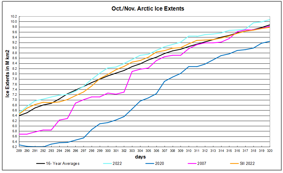
The graph below shows Mid December daily ice extents for 2022 compared to 16 year averages, and some years of note. As of yesterday, Arctic ice extent topped 12 Wadhams, or 12M km2.
The black line shows so far during this period on average Arctic ice extents increased ~1.0M km2, while 2022 (cyan line) started December 200k km2 in deficit, reaching then holding a surplus to average for the last six days. The Sea Ice Index in orange (SII from NOAA) lagged MASIE this month, but also topped 12M km2 on day 247. Both 2007 and 2020 had much lower extents early in December, making up most of the deficit later on.
Why is this important? All the claims of global climate emergency depend on dangerously higher temperatures, lower sea ice, and rising sea levels. The lack of additional warming is documented in a post Still No Global Warming March 2022
The table below shows the distribution of Sea Ice on day 347 across the Arctic Regions, on average, this year and 2007.
Region
2022347
Day 347 Average
2022-Ave.
2007347
2022-2007
(0) Northern_Hemisphere
12151093
12003311
147782
11428288
722805
(1) Beaufort_Sea
1070966
1069874
1092
1062676
8290
(2) Chukchi_Sea
895943
906386
-10443
677993
217949
(3) East_Siberian_Sea
1087137
1085009
2129
1053584
33553
(4) Laptev_Sea
897845
897835
10
897845
0
(5) Kara_Sea
801884
845212
-43328
800920
964
(6) Barents_Sea
221598
331366
-109768
236964
-15366
(7) Greenland_Sea
587354
544864
42489
488595
98758
(8) Baffin_Bay_Gulf_of_St._Lawrence
792277
806543
-14266
782889
9388
(9) Canadian_Archipelago
854843
853331
1512
852556
2286
(10) Hudson_Bay
1203872
1046825
157047
1209339
-5467
(11) Central_Arctic
3214028
3204979
9049
3186190
27837
(12) Bering_Sea
119070
225887
-106817
54836
64234
(13) Baltic_Sea
11482
9900
1582
2898
8584
(14) Sea_of_Okhotsk
379132
166880
212251
119667
259464
The overall surplus to average is 148k km2, (2%). Main deficits in Bering and Barents seas are more than offset by surpluses elsewhere, especially Okhotsk and Hudson Bay. 2022 ice extent exceeds that of 2007 by 3/4 Wadham, most of the difference being in Chukchi and Okhotsk.
Illustration by Eleanor Lutz shows Earth’s seasonal climate changes. If played in full screen, the four corners present views from top, bottom and sides. It is a visual representation of scientific datasets measuring Arctic ice extents.
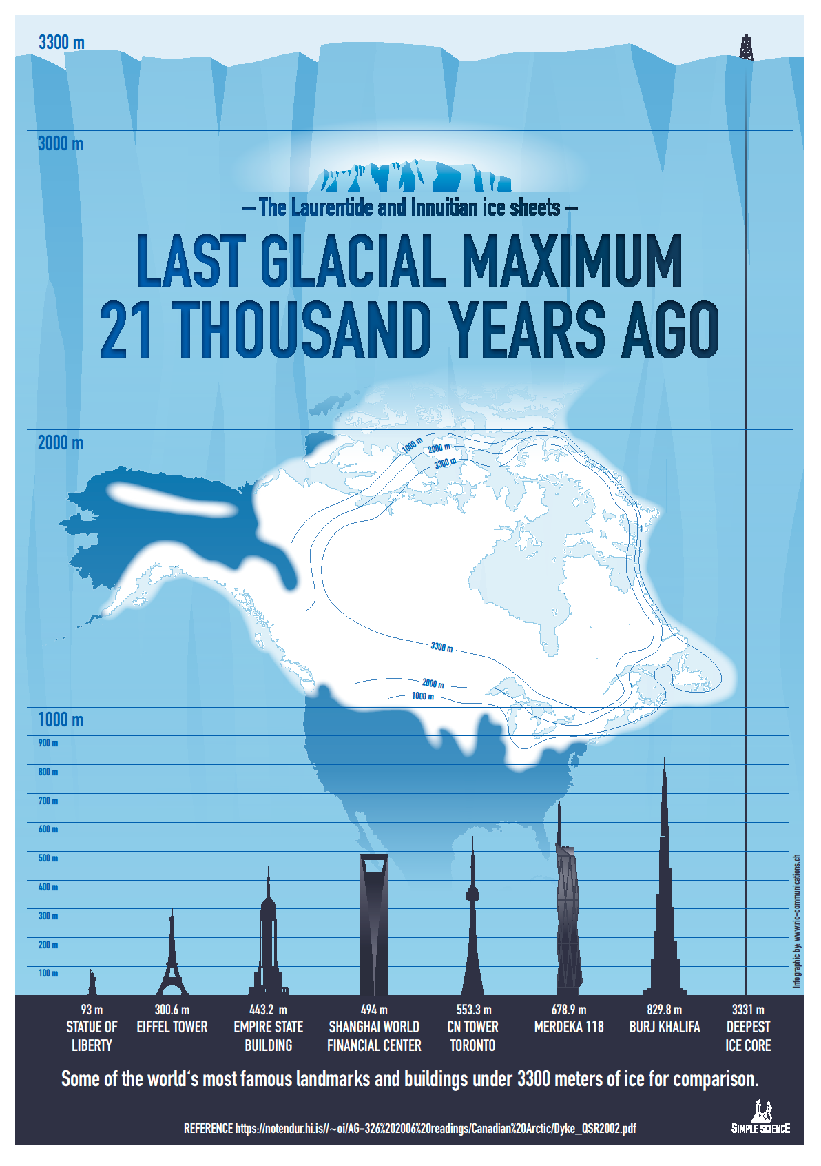
The diagram at the top shows how grateful we should be for living in today’s climate instead of a glacial icehouse. (H/T Raymond Inauen) For most of its history Earth has been frozen rather than the mostly green place it is today. And the reference is to the extent of the North American ice sheet during the Last Glacial Maximum (LGM).
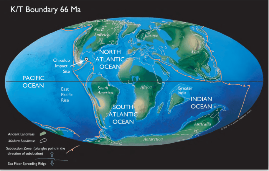
To see this geologically recent glacial period in perspective, consider the maps created by paleo climatologist Christopher Scotese, leader of the Paleomap Project.
The animation below shows how the planet surface changed over the past millions of years (Ma means Millions of years Ago).
Note that in 66 Ma Earth was a “hothouse” with little ice and green polar land masses. By 50 Ma cooling resulted in polar ice caps and glaciers. By 14 Ma both Greenland and Antarctica are ice covered. 18Ka a severe “icehouse” world is evidenced by the Laurentian icecap. Then the Modern world appears with the ice retreating, but still covering the two poles. Continental drifts are also shown by India starting as an island and later joining Asia, and by Africa isolated but later approaching Europe.
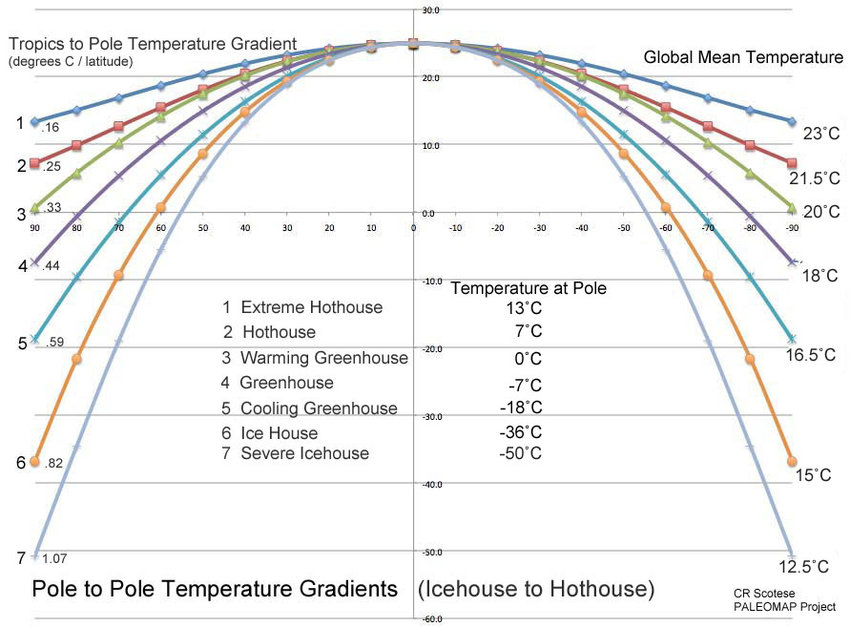
For further context consider that geologists refer to our time as a “Severe Icehouse World”, among the various conditions in earth’s history, as diagramed below by Christopher Scotese. Referring to the Global Mean Temperatures, it appears after many decades, we are slowly rising to “Icehouse World”, which would seem to be a good thing.
As of 2015 earth is showing a GMT of 14.4C, compared to pre-industrial GMT of 13.8C. According to the best geological evidence from millions of years of earth’s history, that puts us in the category “Severe Icehouse.” So, thankfully we are warming up, albeit very slowly. Moreover, progress toward a warming world means flattening the profile at the higher latitudes, especially the Arctic. Equatorial locations remain at 23C throughout the millennia, while the gradient decreases in a warmer world.
We have many, many centuries to go before the earth can warm up to the “Greenhouse” profile, let alone get to “Hothouse.” Regional and local climates at higher latitudes will see slightly warming temperatures and smaller differences from equatorial climates. These are facts based on solid geological evidence, not opinions or estimates from computer models.
It is still a very cold world, but we are moving in the right direction. Stay the course.
Instead of fear mongering over a bit of warming, we should celebrate our good fortune, and do our best for humanity and the biosphere. Matthew Ridley takes it from there in a previous post.
Background from previous post The Goodness of Global Warming
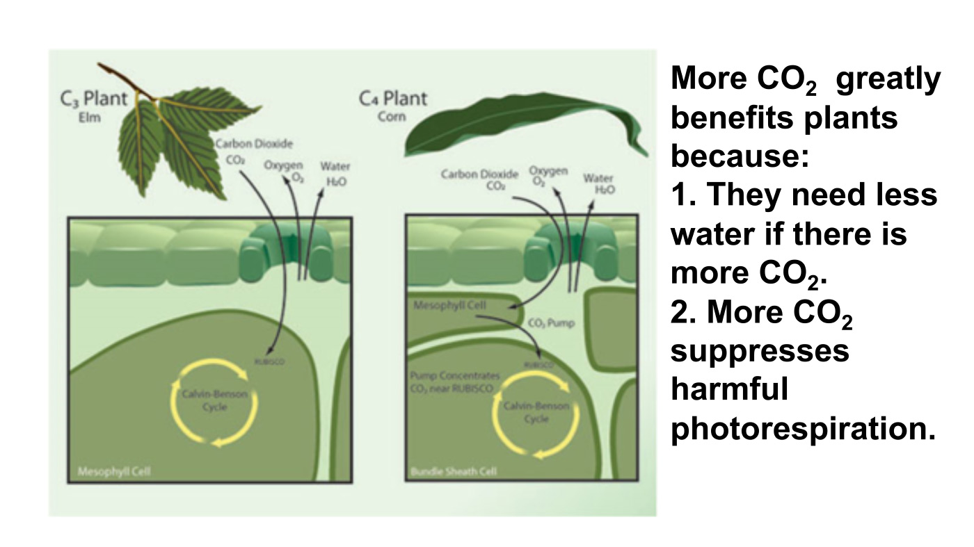
LAI refers to Leaf Area Index.
As noted in other posts here, warming comes and goes and a cooling period may now be ensuing. See No Global Warming, Chilly January Land and Sea. Matt Ridley provides a concise and clear argument to celebrate any warming that comes to our world in his Spiked article Why global warming is good for us. Excerpts in italics with my bolds and added images.
Climate change is creating a greener, safer planet.
Global warming is real. It is also – so far – mostly beneficial. This startling fact is kept from the public by a determined effort on the part of alarmists and their media allies who are determined to use the language of crisis and emergency. The goal of Net Zero emissions in the UK by 2050 is controversial enough as a policy because of the pain it is causing. But what if that pain is all to prevent something that is not doing net harm?
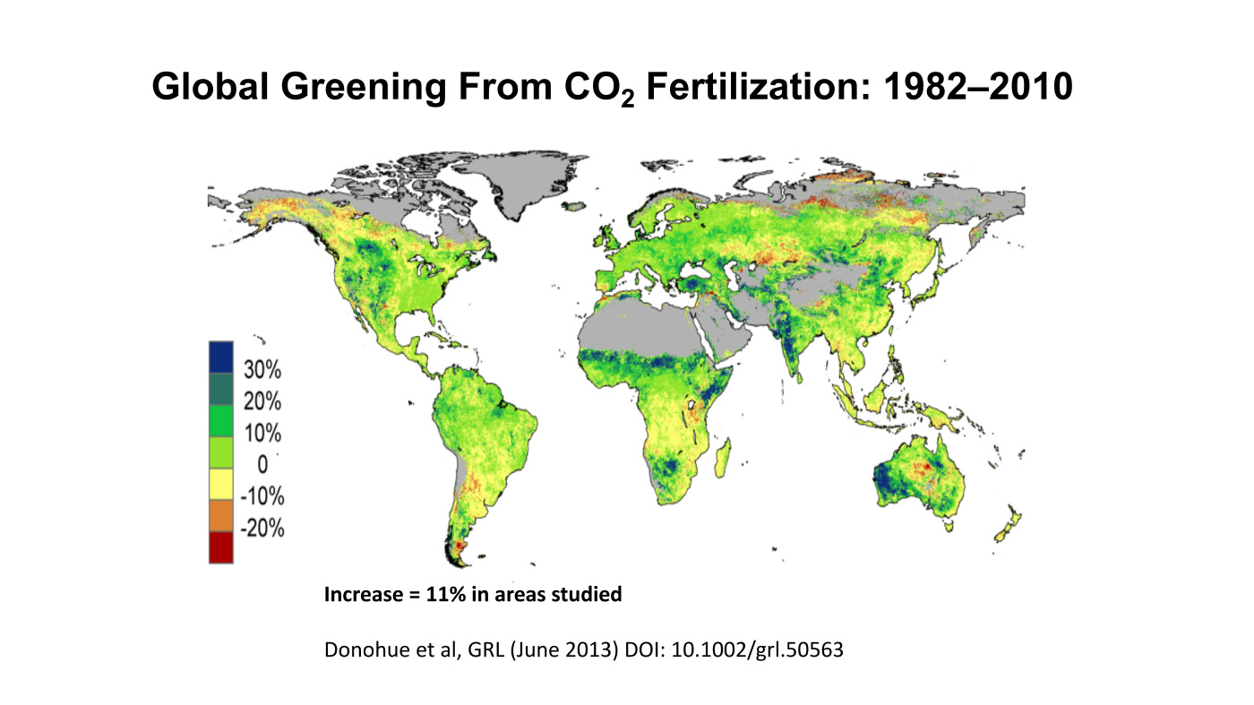
The biggest benefit of emissions is global greening, the increase year after year of green vegetation on the land surface of the planet. Forests grow more thickly, grasslands more richly and scrub more rapidly. This has been measured using satellites and on-the-ground recording of plant-growth rates. It is happening in all habitats, from tundra to rainforest. In the four decades since 1982, as Bjorn Lomborg points out, NASA data show that global greening has added 618,000 square kilometres of extra green leaves each year, equivalent to three Great Britains. You read that right: every year there’s more greenery on the planet to the extent of three Britains. I bet Greta Thunberg did not tell you that.
The cause of this greening? Although tree planting, natural reforestation, slightly longer growing seasons and a bit more rain all contribute, the big cause is something else. All studies agree that by far the largest contributor to global greening – responsible for roughly half the effect – is the extra carbon dioxide in the air. In 40 years, the proportion of the atmosphere that is CO2 has gone from 0.034 per cent to 0.041 per cent. That may seem a small change but, with more ‘food’ in the air, plants don’t need to lose as much water through their pores (‘stomata’) to acquire a given amount of carbon. So dry areas, like the Sahel region of Africa, are seeing some of the biggest improvements in greenery. Since this is one of the poorest places on the planet, it is good news that there is more food for people, goats and wildlife.
But because good news is no news, green pressure groups and environmental correspondents in the media prefer to ignore global greening. Astonishingly, it merited no mentions on the BBC’s recent Green Planet series, despite the name. Or, if it is mentioned, the media point to studies suggesting greening may soon cease. These studies are based on questionable models, not data (because data show the effect continuing at the same pace). On the very few occasions when the BBC has mentioned global greening it is always accompanied by a health warning in case any viewer might glimpse a silver lining to climate change – for example, ‘extra foliage helps slow climate change, but researchers warn this will be offset by rising temperatures’.
Another bit of good news is on deaths. We’re against them, right? A recent study shows that rising temperatures have resulted in half a million fewer deaths in Britain over the past two decades. That is because cold weather kills about ’20 times as many people as hot weather’, according to the study, which analyses ‘over 74million deaths in 384 locations across 13 countries’. This is especially true in a temperate place like Britain, where summer days are rarely hot enough to kill. So global warming and the unrelated phenomenon of urban warming relative to rural areas, caused by the retention of heat by buildings plus energy use, are both preventing premature deaths on a huge scale.
Summer temperatures in the US are changing at half the rate of winter temperatures and daytimes are warming 20 per cent slower than nighttimes. A similar pattern is seen in most countries. Tropical nations are mostly experiencing very slow, almost undetectable daytime warming (outside cities), while Arctic nations are seeing quite rapid change, especially in winter and at night. Alarmists love to talk about polar amplification of average climate change, but they usually omit its inevitable flip side: that tropical temperatures (where most poor people live) are changing more slowly than the average.
My Mind is Made Up, Don’t Confuse Me with the Facts. H/T Bjorn Lomborg, WUWT
But are we not told to expect more volatile weather as a result of climate change? It is certainly assumed that we should. Yet there’s no evidence to suggest weather volatility is increasing and no good theory to suggest it will. The decreasing temperature differential between the tropics and the Arctic may actually diminish the volatility of weather a little.
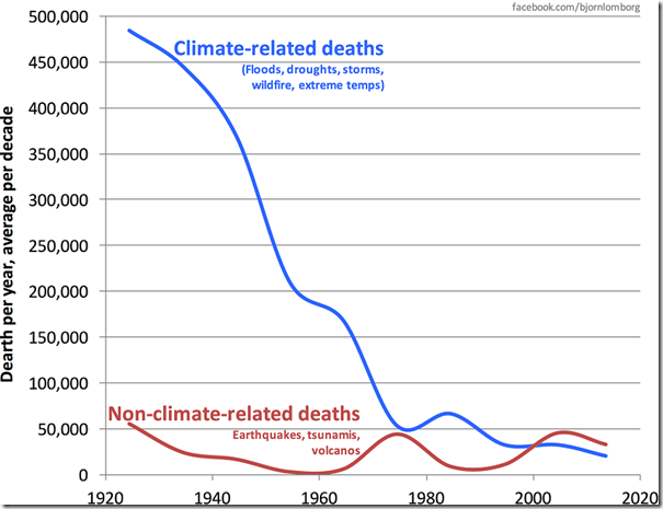
Indeed, as the Intergovernmental Panel on Climate Change (IPCC) repeatedly confirms, there is no clear pattern of storms growing in either frequency or ferocity, droughts are decreasing slightly and floods are getting worse only where land-use changes (like deforestation or building houses on flood plains) create a problem. Globally, deaths from droughts, floods and storms are down by about 98 per cent over the past 100 years – not because weather is less dangerous but because shelter, transport and communication (which are mostly the products of the fossil-fuel economy) have dramatically improved people’s ability to survive such natural disasters.
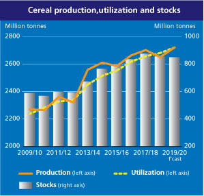
The effect of today’s warming (and greening) on farming is, on average, positive: crops can be grown farther north and for longer seasons and rainfall is slightly heavier in dry regions. We are feeding over seven billion people today much more easily than we fed three billion in the 1960s, and from a similar acreage of farmland. Global cereal production is on course to break its record this year, for the sixth time in 10 years.
Nature, too, will do generally better in a warming world. There are more species in warmer climates, so more new birds and insects are arriving to breed in southern England than are disappearing from northern Scotland. Warmer means wetter, too: 9,000 years ago, when the climate was warmer than today, the Sahara was green. Alarmists like to imply that concern about climate change goes hand in hand with concern about nature generally. But this is belied by the evidence. Climate policies often harm wildlife:biofuels compete for land with agriculture, eroding the benefits of improved agricultural productivity and increasing pressure on wild land; wind farms kill birds and bats; and the reckless planting of alien sitka spruce trees turns diverse moorland into dark monoculture.
Meanwhile, real environmental issues are ignored or neglected because of the obsession with climate. With the help of local volunteers I have been fighting to protect the red squirrel in Northumberland for years. The government does literally nothing to help us, while it pours money into grants for studying the most far-fetched and minuscule possible climate-change impacts. Invasive alien species are the main cause of species extinction worldwide (like grey squirrels driving the red to the margins), whereas climate change has yet to be shown to have caused a single species to die out altogether anywhere.
Of course, climate change does and will bring problems as well as benefits. Rapid sea-level rise could be catastrophic. But whereas the sea level shot up between 10,000 and 8,000 years ago, rising by about 60 metres in two millennia, or roughly three metres per century, todaythe change is nine times slower: three millimetres a year, or a foot per century, and with not much sign of acceleration. Countries like the Netherlands and Vietnam show that it is possible to gain land from the sea even in a world where sea levels are rising. The land area of the planet is actually increasing, not shrinking, thanks to siltation and reclamation.
Environmentalists don’t get donations or invitations to appear on the telly if they say moderate things. To stand up and pronounce that ‘climate change is real and needs to be tackled, but it’s not happening very fast and other environmental issues are more urgent’ would be about as popular as an MP in Oliver Cromwell’s parliament declaring, ‘The evidence for God is looking a bit weak, and I’m not so very sure that fornication really is a sin’. And I speak as someone who has made several speeches on climate in parliament.
No wonder we don’t hear about the good news on climate change.
Parliamentary Budget Officer Yves Giroux on Parliament Hill in Ottawa in 2020. PHOTO BY ADRIAN WYLD/THE CANADIAN PRESS FILES
The Parliamentary Budget Officer (PBO)recently released a report on the effects of greenhouse gas emissions on Canadian GDPgrowth over the next 80 years. I’ve written previously about the recent economics literature investigating the link (or lack thereof) between global warming and economic growth. It’s a fascinating topic and I’ve been actively working with on it one of our PhD students for several years. While I would quibble with some aspects of the PBO report, the overall conclusions are not out of line with mainstream thinking on the topic.
Which is why the findings are so astonishing and radical compared
to what the government has been saying.
The PBO estimated what would happen to the Canadian economy between now and 2100 if temperatures and precipitation change as expected due to greenhouse gases. The report’s authors consider two scenarios — first, if emission-reduction policies stall at today’s levels and nobody complies with their Paris commitments and, second, if countries comply with all their Paris commitments in full and on time. Under the first scenario Canada’s GDP in 2100 will be 6.6 per cent smaller than it otherwise would be.
Let’s pause there for a moment: 6.6 per cent after 80 years is a very small number. Canada has set out ambitious economic growth plans based on high levels of immigration and continued efforts to boost productivity and income. Suppose this results in two per cent real GDP growth from 2021 to 2100. That would mean Canada’s economy will grow by 388 per cent over those 80 years.
According to the PBO, if we do nothing about global warming,
it will instead grow by about 381 per cent.
In other words, the PBO projects that the impact of climate change will be small relative to other drivers, including population change, technology and many other aspects of socioeconomic development. Where have I heard that before?
In the UN Intergovernmental Panel on Climate Change’s 5th Assessment Report, released in 2013, that’s where. In the Working Group II volume, Chapter 10, the report concluded: “For most economic sectors the impact of climate change will be small relative to the impacts of other drivers. Changes in population, age, income, technology, relative prices, lifestyle, regulation, governance, and many other aspects of socioeconomic development will have an impact on the supply and demand of economic goods and services that is large relative to the impact of climate change.”
Yes, you read that right. The IPCC concluded, not very long ago, that while greenhouse gases have warmed the climate and will continue to do so, the effects will be small compared to pretty much every other driver of change in the century ahead. This is the opposite of an “emergency” or “crisis.”
Then the PBO asked what would change if everyone meets their Paris targets. Instead of being 6.6 per cent smaller in 2100, it estimates the economy will be 5.8 per cent smaller. In other words, the benefit attributable to the Paris agenda is that the economy will be 0.8 per cent larger 80 years from now. This is a minuscule difference.
And we have to ask: what if the policies cost more than 0.8 per cent of GDP? We can be absolutely certain that they will. In a studyElmira Aliakbari and I coauthored last year for the Fraser Institute, we showed that just the carbon tax alone, which won’t suffice to get us to the Paris target, will cause GDP to shrink by at least twice that amount by 2030. Our GDP loss estimates were in line with many other studies done inside and outside of government for comparable-size emission cuts under the Kyoto Protocol 20 years ago.
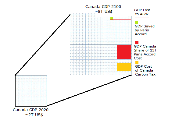
Projection Parameters:
Canada GDP grows at 2% yearly compounded to 2100 = 388%
Effects of AGW reduce 2100 GDP by 7%
Fulfilling Paris Accord raises 2100 GDP by 1%
Canada share of $21T Paris Accord cost, est. $500B
Cost of Canada Carbon Tax est.1.8% GDP by 2030, 14% by 2100
The PBO, based on advice from Environment and Climate Change Canada, the federal department in charge, worked on the assumption that Canada will warm (on average) by 2.5 degrees Celsius compared to today. I think that’s an overestimate but, as before, let’s assume it’s true. Its analysis says that the result will be that Canada’s economy grows (on average) not by 2.0 per cent a year but by 1.983 per cent per year, a difference less than a rounding error in the national economic accounts. And if we incur the enormous costs of complying with Paris, the economic benefit will be that we grow on average by 1.986 per cent instead, three one-thousands of a per cent more. At the cost of policies that will take orders of magnitude more off our growth rate.
One of the annoying bits of jargon that goes around climate policy circles is the phrase “the cost of inaction.” As in, “we have to do something, doing nothing is not an option, the cost of inaction is too large.” The cost of inaction is the foregone benefit of the action, and according to the PBO, it’s not large at all. In fact, it’s tiny. Because compared to everything else we’ll deal with this century, the impacts of climate change will be small.
That is the radical but correct conclusion of experts at both the IPCC and the PBO.
It’s time government leaders started paying attention.
Ross McKitrick is a professor of economics at the University of Guelph and senior fellow of the Fraser Institute.
Those who oppose economically destructive “climate” policies – like those promoted by the Biden administration and at the recent United Nations COP27 conference – will continue to fail to stop the advance of these policies so long as they continue to accept the false claim that warming of the planet and carbon dioxide emissions are harmful.
They are not. On balance, global warming and CO2 emission are beneficial.
Before getting to why that is, however, it is crucial to understand why accepting the false climate claim is so harmful.
When the destructiveness of climate policies is shown, the response is that the policies nevertheless are necessary to address what President Biden refers to as the “existential threat” of global warming and increased CO2 emissions.
When it is noted that these climate policies will at most microscopically and insignificantly reduce temperatures and CO2 emissions, climate policy mandarins push for even more draconian policies.
The result has been that since the 1990s, climate policies have become increasingly destructive and wasteful. Even worse, their continued intensification appears unlikely to be stopped until the public and policymakers are persuaded that global warming and CO2 emissions are not harmful. As Margaret Thatcher famously said: “First you win the argument, then you win the vote.”
To win this argument, it is necessary to focus on the scientific facts.
A warming planet saves lives.
Analyses of millions of deaths in recent decades in numerous countries, published in the British medical journal The Lancet, show that cooler temperatures killed nine times (July 2021 study) to seventeen times (In May 2015 study) more people than warmer temperatures. The planet’s recent modest warming (by 1.00 degree Celsius on average since 1880, as calculated by NASA) thus has been saving millions of lives.
A 2015 study by 22 scientists from around the world found that cold kills over 17 times more people than heat.
CO2 emissions do not pollute and instead are environmentally beneficial.
In 2017, over 300 scientists, including Richard Lindzen of MIT and William Happer of Princeton, signed a statement that made this point: “carbon dioxide is not a pollutant. To the contrary, there is clear evidence that increased atmospheric carbon dioxide is environmentally helpful to food crops and other plants that nourish all life. It is plant food, not poison.” Every one of us, indeed, also exhales carbon dioxide with every breath.
Spatial pattern of trends in Gross Primary Production (1982- 2015). Source: Sun et al. 2018.
Since 1920, deaths each year from natural disasters have decreased by over 90 percent.
And this happened, data from EM-DAT – The International Disaster Database presented by The University of Oxford show, not only as the planet has warmed, but as world population has quadrupled.
Global warming has not increased hurricanes.
A NOAA report, updated on November 28, 2022, states that “there is essentially no long-term trend in hurricane counts. The evidence for an upward trend is even weaker if we look at U.S. landfalling hurricanes, which even show a slight negative trend beginning from 1900 or from the late 1800s.”
The same report sums it up in bold: “We conclude that the historical Atlantic hurricane data at this stage do not provide compelling evidence for a substantial greenhouse warming-induced century-scale increase in: frequency of tropical storms, hurricanes, or major hurricanes, or in the proportion of hurricanes that become major hurricanes.”
Global warming also does not increase land burned by fires.
As environmental statistician Bjorn Lomberg has shown using data from the Journal of Geophysical Research: Biogeosciences, Remote Sensing of Environment, and Earth’s Future, the percentage of global land burned per year in 1905-2021 has been declining.
Sea levels are rising – but only by a small fraction of an inch each year.
An EPA report updated on August 1, 2022, states: “When averaged over all of the world’s oceans, absolute sea level has risen at an average rate of 0.06 inches per year from 1880 to 2013,” including a slightly increased rate since 1993 of “0.12 to 0.14 inches per year.”
The UN climate models that President Biden, John Kerry, and other climate doomsters use to predict future global temperatures are so speculative and unreliable that they have been unable even to reproduce the 20th century’s temperature changes. This is a key point in the must-read book by Obama Department of Energy Under Secretary for Science Steven Koonin, Unsettled: What Climate Science Tells Us, What It Doesn’t, and Why It Matters.
These kinds of facts should persuade the public and policymakers to stop accepting the false claim that global warming and CO2 emissions are harmful.
When this false claim is no longer widely accepted, policymakers will stop imposing climate policies that particularly impoverish the world’s poor.
They will stop holding international boondoggles like COP27 and that demand vast climate-related foreign aid programs.
They will stop spending hundreds of billions of dollars on domestic climate sinkholes.
And they will stop using purported “social cost of carbon” factors (even though the true social cost of carbon is zero) to regulatorily restrict domestic fossil fuel production, transportation, and use.
The animation shows Arctic ice recovery from October 10 to October 31, 2022. On the lower center right, Canadian Arctic Archipelago (CAA) freezes over entirely more than doubling up to 832k km2, 97% of its maximum. Center bottom Beaufort Sea closes off the NW passage, reaching 1 Wadham in just that basin, 95% of its max. On the left, the Russian shelf seas fill with ice, closing off the Northern Sea Route. Laptev and East Siberian seas reached 100% of their maxes, together adding 2 Wadhams of ice extent.
The graph below shows Mid November daily ice extents for 2022 compared to 16 year averages, and some years of note. As of yesterday, Arctic ice extent tops 10 Wadhams, or 10M km2.
The black line shows during this period on average Arctic ice extents increase ~3.5M km2 from ~6.4M km2 up to ~9.9M km2. The 2022 cyan MASIE line started the month 90k km2 above average and on day 320 increased its surplus to 200k km2. The Sea Ice Index in orange (SII from NOAA) tracked MASIE the entire month with slightly lower extents. 2007 started with an 700k km2 deficit, but ended virtually average. 2020 had the lowest extent in the record, starting 1.1M km2 down and ending 600k km2 in deficit.
Why is this important? All the claims of global climate emergency depend on dangerously higher temperatures, lower sea ice, and rising sea levels. The lack of additional warming is documented in a post Still No Global Warming March 2022
The table below shows the distribution of Sea Ice on day 320 across the Arctic Regions, on average, this year and 2007.
Region
2022320
Day 320 Average
2022-Ave.
2007320
2022-2007
(0) Northern_Hemisphere
10072814
9872802
200012
9824193
248621
(1) Beaufort_Sea
1051741
1065159
-13418
1059182
-7441
(2) Chukchi_Sea
606810
653669
-46859
519486
87324
(3) East_Siberian_Sea
1087137
1077200
9937
1055581
31557
(4) Laptev_Sea
897845
897567
278
897845
0
(5) Kara_Sea
716470
671740
44729
774297
-57827
(6) Barents_Sea
121787
166029
-44242
149482
-27695
(7) Greenland_Sea
463580
470580
-7000
533946
-70365
(8) Baffin_Bay_Gulf_of_St._Lawrence
693335
527100
166236
545899
147437
(9) Canadian_Archipelago
854843
851090
3753
852539
2304
(10) Hudson_Bay
315416
250421
64995
244531
70885
(11) Central_Arctic
3178409
3176760
1649
3163043
15366
The overall surplus to average is 200k km2, (2%). Small deficits in Chukchi and Barents seas are more than offset by surpluses elsewhere, especially Baffin and Hudson Bays and Kara sea. 2022 ice extent exceeds that of 2007 by 1/4 Wadham, most of the difference being in Chukchi and Baffin Bay.
Illustration by Eleanor Lutz shows Earth’s seasonal climate changes. If played in full screen, the four corners present views from top, bottom and sides. It is a visual representation of scientific datasets measuring Arctic ice extents.
The animation shows the last 3 weeks of Arctic ice recovery, from October 10 to October 31, 2022. On the lower center right, Canadian Arctic Archipelago (CAA) freezes over entirely more than doubling up to 832k km2, 97% of its maximum. Center bottom Beaufort Sea closes off the NW passage, reaching 1 Wadham in just that basin, 95% of its max. On the left, the Russian shelf seas fill with ice, closing off the Northern Sea Route. Laptev and East Siberian seas reached 100% of their maxes, together adding 2 Wadhams of ice extent.
The graph below shows October daily ice extents for 2022 compared to 16 year averages, and some years of note.
The black line shows during October on average Arctic ice extents increase ~3.4M km2 from ~5.0M km2 up to ~8.4M km2. The 2022 cyan MASIE line started the month 145k km2 above average and on day 304 increased its surplus to 327k km2. The Sea Ice Index in orange (SII from NOAA) tracked MASIE the entire month with slightly lower extents. 2007 started October with an 800k km2 deficit, but ended just 200k km2 below average. 2020 had the lowest extent in the record, ending October 1.76M km2 in deficit.
Why is this important? All the claims of global climate emergency depend on dangerously higher temperatures, lower sea ice, and rising sea levels. The lack of additional warming is documented in a post Still No Global Warming March 2022
The table below shows the distribution of Sea Ice on day 304 across the Arctic Regions, on average, this year and 2007.
Region
2022304
Day 304 Average
2022-Ave.
2007304
2022-2007
(0) Northern_Hemisphere
8707579
8404827
302753
8175072
532507
(1) Beaufort_Sea
1017033
953449
63585
1038126
-21093
(2) Chukchi_Sea
460109
454653
5456
242685
217425
(3) East_Siberian_Sea
1085823
927639
158184
835071
250751
(4) Laptev_Sea
897737
839256
58481
887789
9947
(5) Kara_Sea
390948
478957
-88009
311960
78988
(6) Barents_Sea
38855
86254
-47399
52823
-13968
(7) Greenland_Sea
430536
411663
18872
443559
-13023
(8) Baffin_Bay_Gulf_of_St._Lawrence
378895
248578
130317
289374
89522
(9) Canadian_Archipelago
832064
758077
73987
817220
14844
(10) Hudson_Bay
21011
72517
-51507
48845
-27835
(11) Central_Arctic
3130729
3162928
-32199
3206345
-75616
The overall surplus to average is 303k km2, (4%). Note large surpluses of ice in Beaufort and East Siberian seas, as well as in Laptev, CAA and Baffin Bay. The main deficits to average are in Kara, Barents and Hudson Bay, more than offset by surpluses elsewhere. Note that 2022 ice extent exceeds that of 2007 by more than half a Wadham, most of the difference being in Chukchi, East Siberian, Kara and Baffin Bay.
Illustration by Eleanor Lutz shows Earth’s seasonal climate changes. If played in full screen, the four corners present views from top, bottom and sides. It is a visual representation of scientific datasets measuring Arctic ice extents.

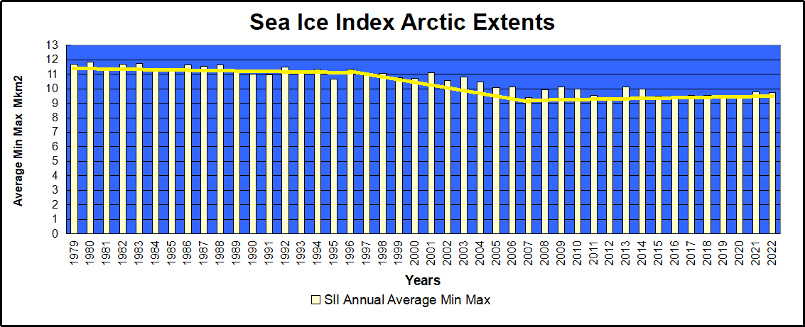


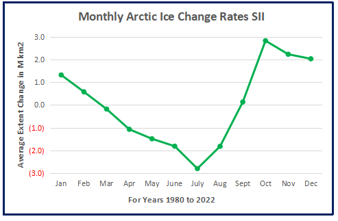

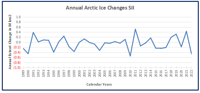

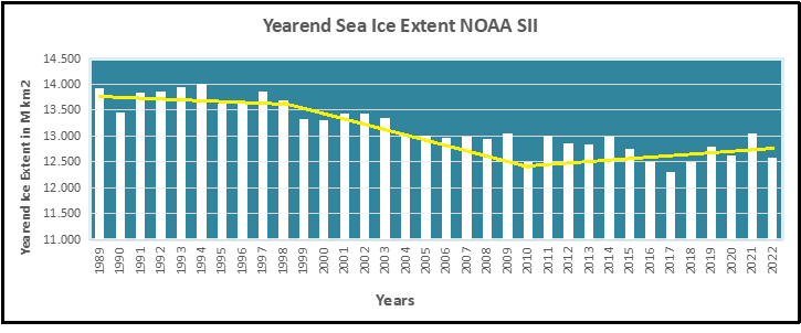


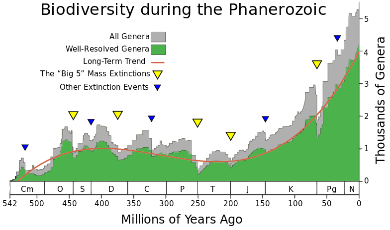

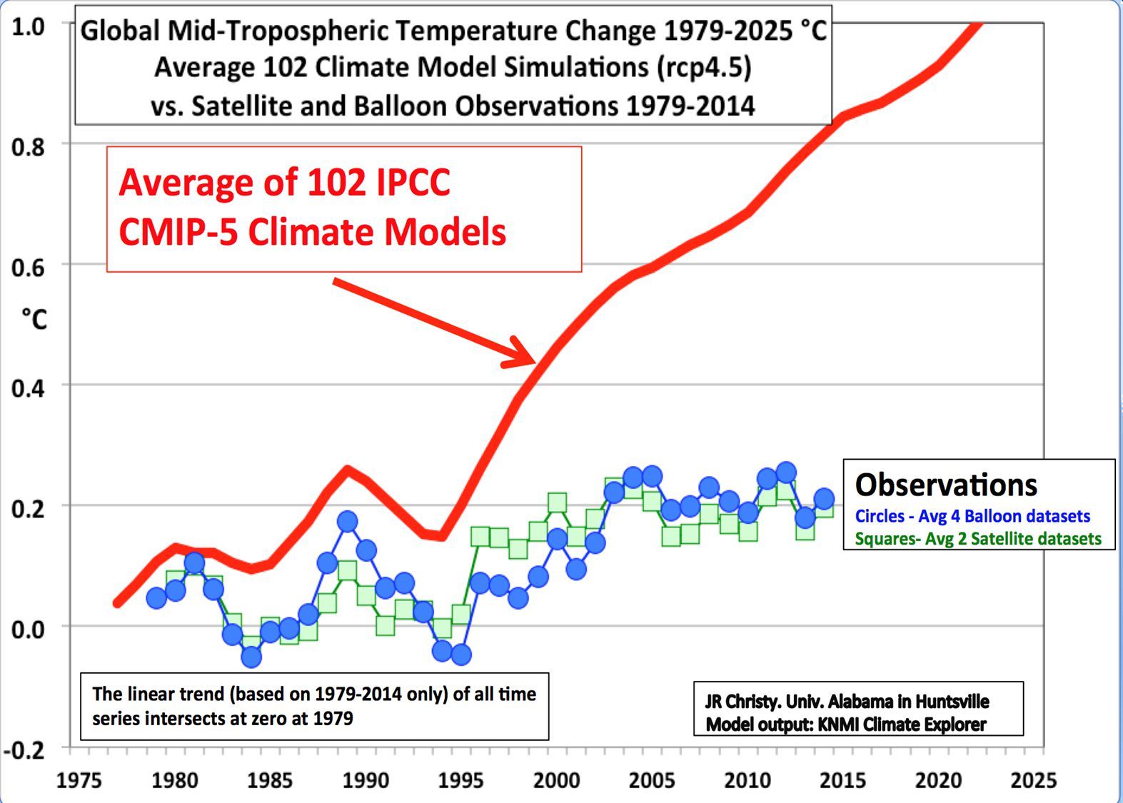
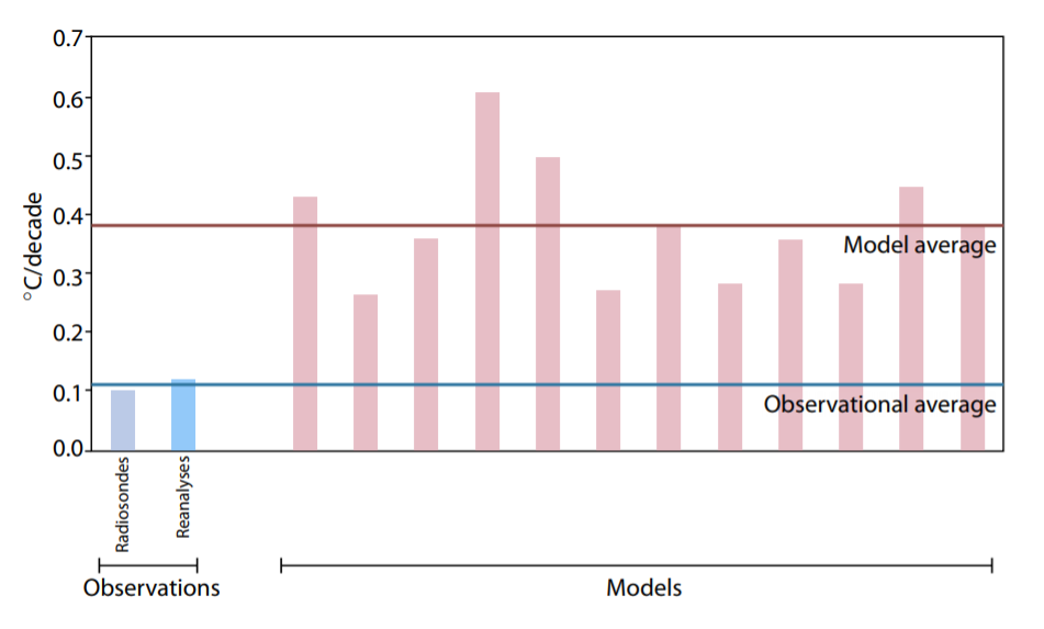
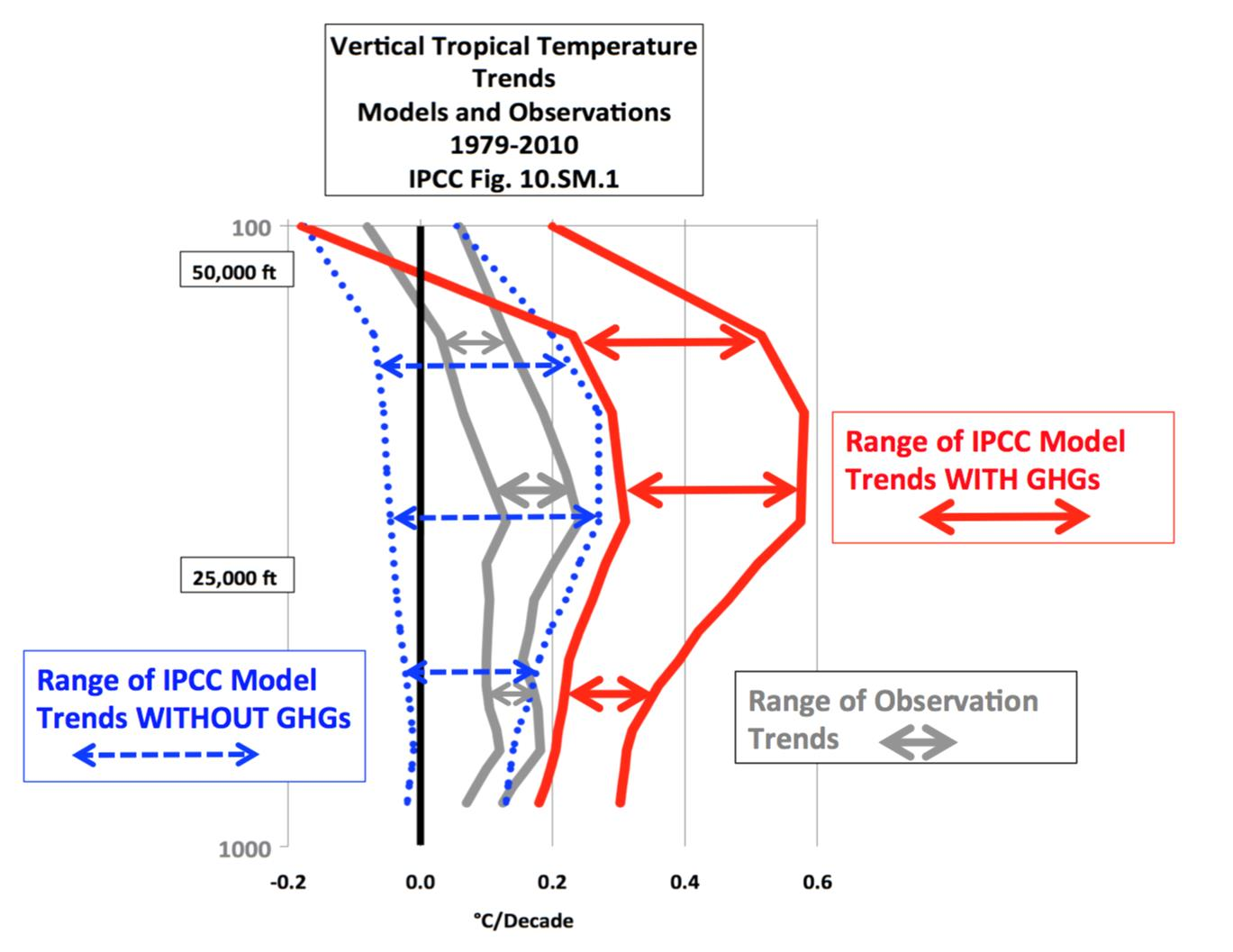
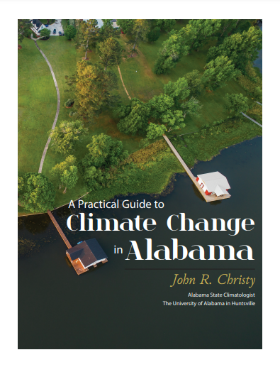
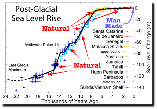
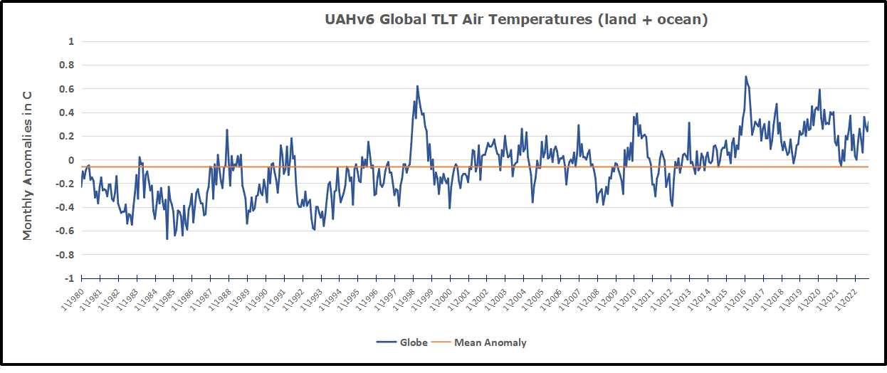
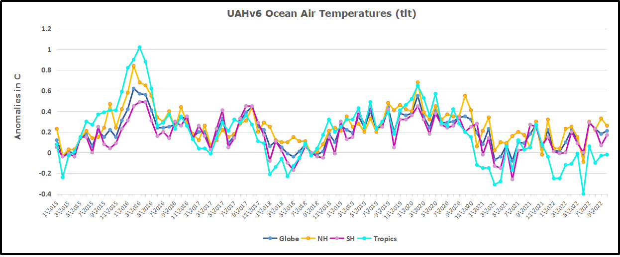
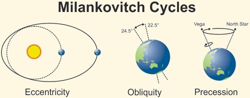


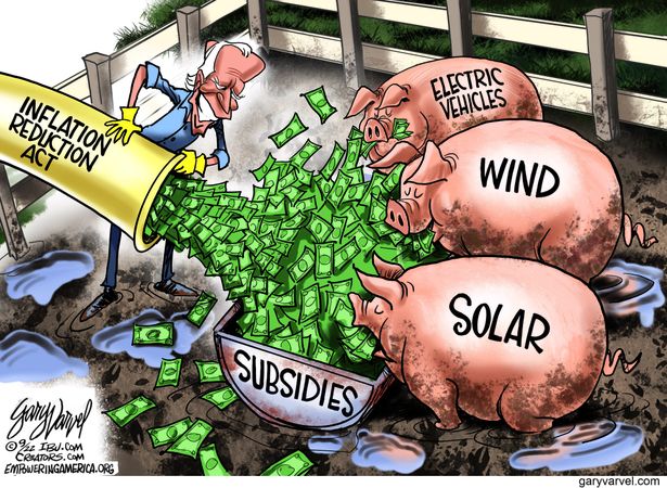

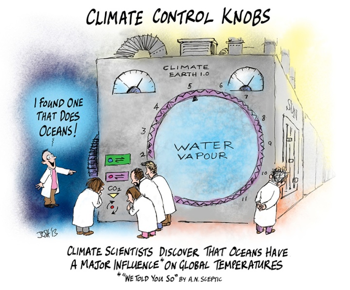

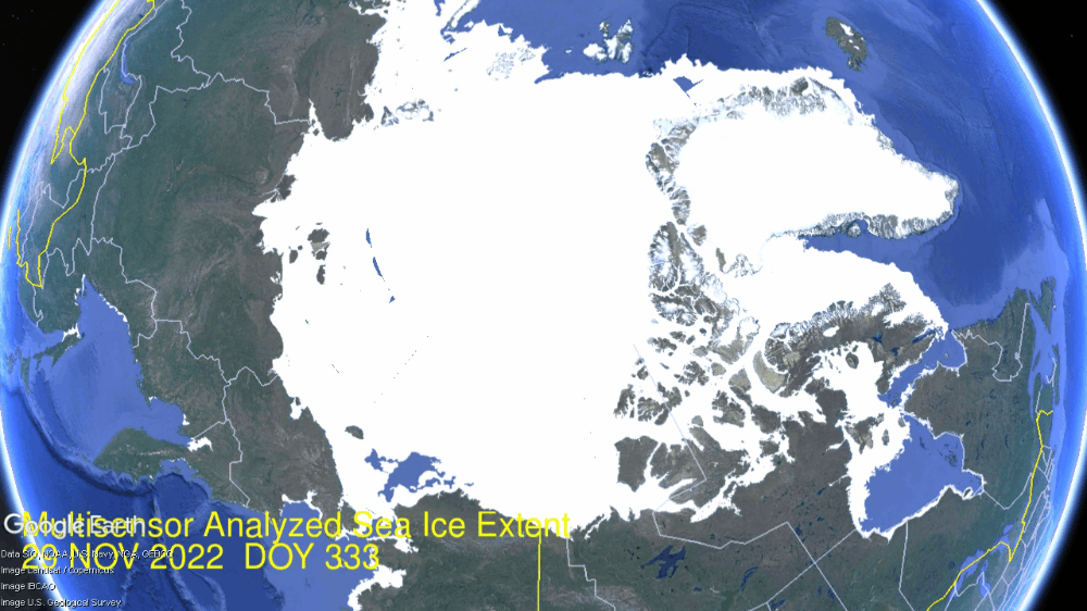
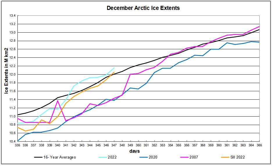
 The table below shows the distribution of Sea Ice on day 347 across the Arctic Regions, on average, this year and 2007.