An recent article is The Crucial Question That Requires Asking: Is There a Climate Problem? As David Simon explains, so many take the “climate problem” as a given without looking at the evidence. Excerpts in italics with my bolds and images.
In “Coronavirus and the Climate,” Wall Street Journal columnist Walter Russell Mead swallows the big lie about global warming.
Mead’s column posted on June 15 begins by sharing a projection that draconian coronavirus lockdown measures will reduce 2020 global CO2 emissions by about the amount that the United Nations Environment Program has determined is supposedly needed annually “if the world is to have any chance of keeping the average temperature from rising more than 1.5 degrees Celsius.”
Mead then laments that most of these measures “aren’t economically sustainable.” Teleworking adopted during the lockdown may become the norm for many rather than the exception, but “[a] campaign to ‘cut the commute’ globally won’t solve the climate problem.”
But Mead never considers the key question: is there is a “climate problem”? He simply accepts as undeniable scientific truth that keeping the earth’s temperature from rising more than 1.5 degrees is necessary to prevent catastrophic harm.
The scientific evidence does not support this proposition. There are speculative, pseudo-scientific projections and models that purport to show that global warming will lead to climate doom. But actual scientific data instead show that global warming has not been harmful and presents no danger to future generations.
First, rather than imperiling human life, the data show that global warming saves lives.
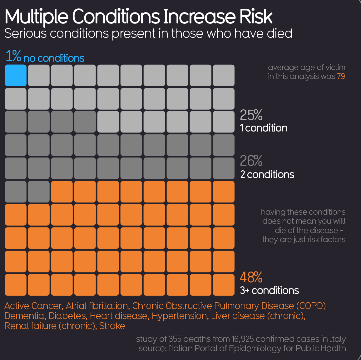
A 2015 study by 22 scientists from around the world found that cold kills over 17 times more people than heat.
The scientists examined over 74 million deaths in Australia, Brazil, Canada, China, Italy, Japan, South Korea, Spain, Sweden, Taiwan, Thailand, the United Kingdom, and the United States in 1985-2012. The data they compiled show that cold caused 7.29 percent of these deaths, while heat caused only 0.42 percent. The data also show that “moderately hot and cold temperatures” caused 88.85 percent of the temperature-related deaths, while “extreme” temperatures caused only 11.15 percent. See Climate Medicine

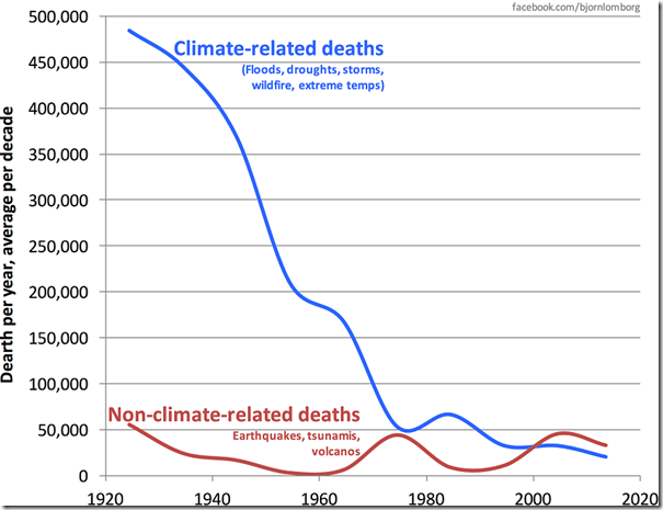
Second, the number of natural disaster deaths declined by over 80 percent as the earth’s temperature has been rising.
NASA data show that since 1920, the earth’s temperature has risen by 1.25 degrees Celsius. Since 1920, world population also has quadrupled from less than two billion to over seven and half billion. Yet during this period, EM-DAT (The International Disaster Database) data show that the number of people killed by natural disasters has declined from almost 55,000 per year to less than 10,000 per year. See Data vs. Models #3: Disasters
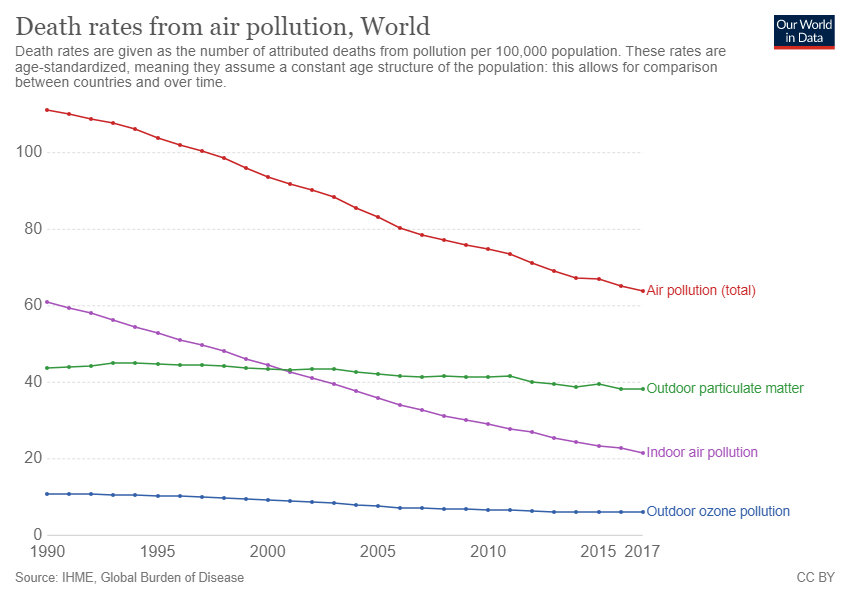
Third, the global air pollution death rate has fallen by almost 50 percent since 1990.
University of Oxford economist Max Roser and researcher Hannah Ritchie show in Our World in Data that “since 1990 the number of deaths per 100,000 people have nearly halved,” declining from 111.28 to 63.82.
Fourth, even the Cassandras acknowledge that any impact on the nation’s economy is likely to be minimal.
The National Bureau of Economic Research estimated in 2019 that if the earth’s temperature rises by 0.01 degrees Celsius per year through 2100, total U.S. GDP in 2100 will be 1.88 percent lower in 2100 than it would otherwise be.
Yet based on the Congressional Budget Office’s estimate of a 1.4 percent annual real long-term potential labor force productivity growth rate, the nation’s per person GDP will be about 204 percent higher by 2100. With the reduction that NBER estimates based on global warming, GDP per person would be an almost indistinguishable 200 percent higher.
The NBER’s extreme case projection that if the earth’s temperature rises by 0.04 degrees Celsius per year through 2100 (five times the actual rate of increase since 1880), total U.S. GDP will be 10.52 percent lower in 2100 than it would otherwise be, similarly would leave GDP per person about 172 percent higher.
In other words, after taking account of the supposedly harmful impact of global warming, U.S. income per person in 2100 will be about triple today’s level.
See Also Crunching Climate $$$
Don’t swallow the big lie. Check the data. Global warming has not been harmful and presents no danger to future generations.
More Data Against Claims of a Climate Problem: Eleven Empty Climate Claims
From a previous post, below are a series of rebuttals of the 11 most common climate alarmists’ claims such as those made in the recently released Fourth National Climate Assessment Report.[2] The authors of these rebuttals are all recognized experts in the relevant fields. H/T Joseph D’Aleo for compiling work by many experts at his website ACRESEARCH Fact Checking Climate Claims. Excerpts in italics with my bolds.
For each alarmist claim, a summary of the relevant rebuttal is provided below along with a link to the full text of the rebuttal, which includes the names and the credentials of the authors of each rebuttal.
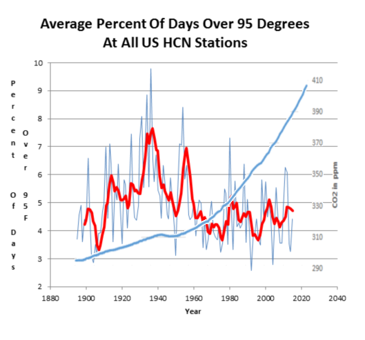
Claim: Heat Waves are increasing at an alarming rate and heat kills.
Fact: They have been decreasing since the 1930s in the U.S. and globally.
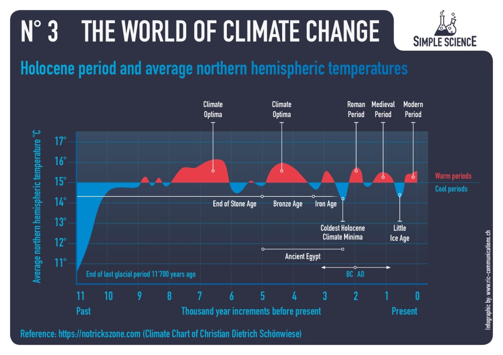
There has been no detectable long-term increase in heat waves in the United States or elsewhere in the world. Most all-time record highs here in the U.S. happened many years ago, long before mankind was using much fossil fuel. Thirty-eight states set their all-time record highs before 1960 (23 in the 1930s!). Here in the United States, the number of 100F, 95F and 90F days per year has been steadily declining since the 1930s. The Environmental Protection Agency Heat Wave Index confirms the 1930s as the hottest decade.
 Detailed Rebuttal and Authors: Heat Waves (08/19/19)
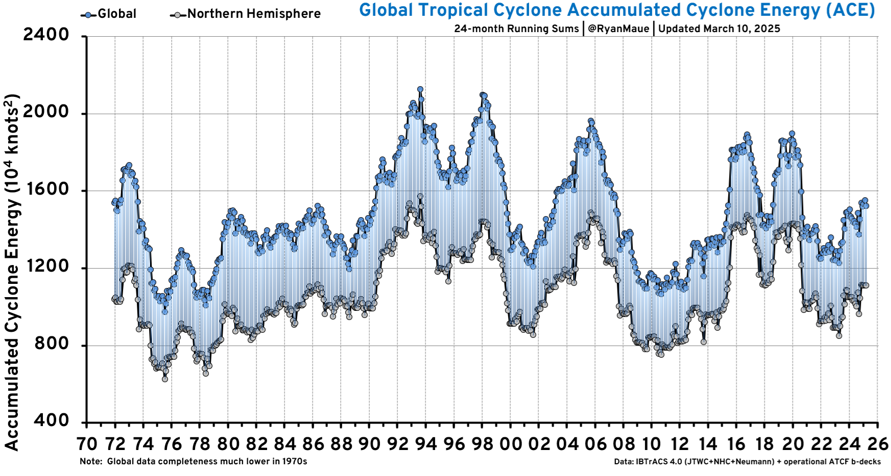
Claim: Global warming is causing more hurricanes and stronger hurricanes.
Fact: Hurricane activity is flat to down since 1900, landfalls in the US are declining
The long-term linear trend in the number and intensity of global hurricane activity has remained flat or down. Hurricane activity does vary year-to-year and over longer periods as short-term ocean cycles like El Nino/La Nina and multidecadal cycles in the Pacific (PDO) and Atlantic (AMO) ocean temperature regimes favor changes in activity levels and some basins over others.
Credible data show this is true despite much better open ocean detection than before the 1960s when many short-lived storms at sea would have been missed as there were no satellites, no aircraft reconnaissance, no radar, no buoys and no automated weather stations.
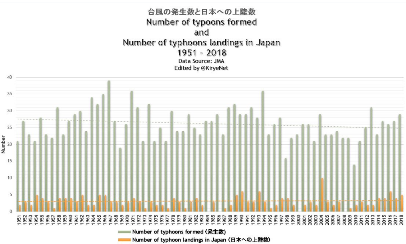
Detailed Rebuttal and Authors: AC Rebuttal Hurricanes (10/19/19).
Claim: Global warming is causing more and stronger tornadoes.
Fact: The number of strong tornadoes have declined over the last half century
Tornadoes are failing to follow “global warming” predictions. Strong tornadoes have seen a decline in frequency since the 1950s. The years 2012, 2013, 2014, 2015 and 2016 all saw below average to near record low tornado counts in the U.S. since records began in 1954. 2017 rebounded only to the long-term mean. 2018 ranked well below the 25thpercentile. Tornadoes increased this spring as extreme cold and late snow clashed with southeast warmth to produce a series of strong storms with heavy rains and severe weather including tornadoes. May ranked among the biggest months and the season rebounded after 7 quiet years above the 50th percentile.

Detailed Rebuttal and Authors: AC Rebuttals Tornadoes (08/20/19)
Claim: Global warming is increasing the magnitude and frequency of droughts and floods.
Fact: Droughts and floods have not changed since we’ve been using fossil fuels
Our use of fossil fuels to power our civilization is not causing droughts or floods. NOAA found there is no evidence that floods and droughts are increasing because of climate change.
The number, extend or severity of these events does increase dramatically for a brief period of years at some locations from time to time but then conditions return to more normal. This is simply the long-established constant variation of weather resulting from a confluence of natural factors.
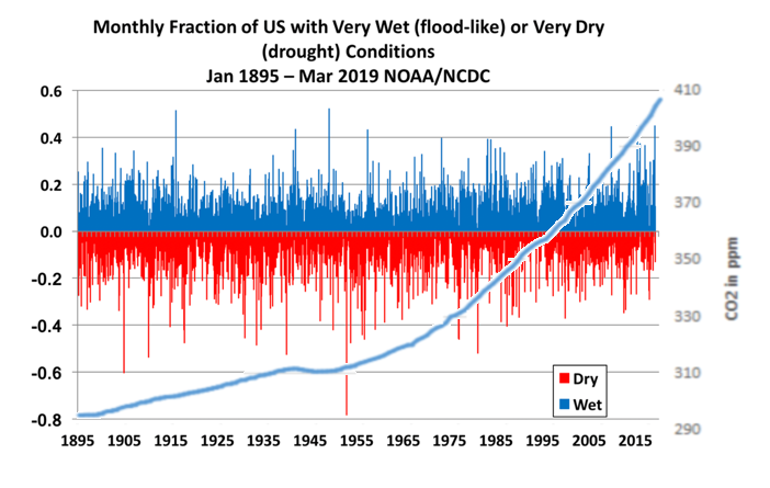 Detailed Rebuttal and Authors: AC Rebuttals Droughts and Floods (08/22/19
Claim: Global Warming has increased U.S. Wildfires.
Fact: Wildfires have been decreasing since 1800s. The increase in damage in recent years is due to population growth in vulnerable areas and poor forest management.
Wildfires are in the news almost every late summer and fall. The National Interagency Fire Center has recorded the number of fires and acreage affected since 1985. This data show the number of fires trending down slightly, though the acreage burned had increased before leveling off over the last 20 years.
The NWS tracks the number of days where conditions are conducive to wildfires when they issue red-flag warnings. It is little changed.
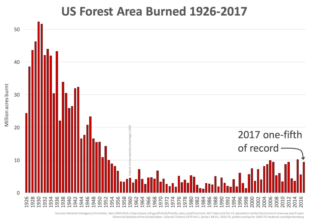
Detailed Rebuttal and Authors: AC Rebuttal Wildfires 080719
Claim: Global warming is causing snow to disappear.
Fact: Snowfall is increasing in the fall and winter in the Northern Hemisphere and North America with many records being set.
This is one claim that has been repeated for decades even as nature showed very much the opposite trend with unprecedented snows even in the big coastal cities. Every time they repeated the claim, it seems nature upped the ante more.
Alarmists have eventually evolved to crediting warming with producing greater snowfall, because of increased moisture but the snow events in recent years have usually occurred in colder winters with high snow water equivalent ratios in frigid arctic air.

Detailed Rebuttal and Authors: AC Rebuttal Snow (09/19/19)
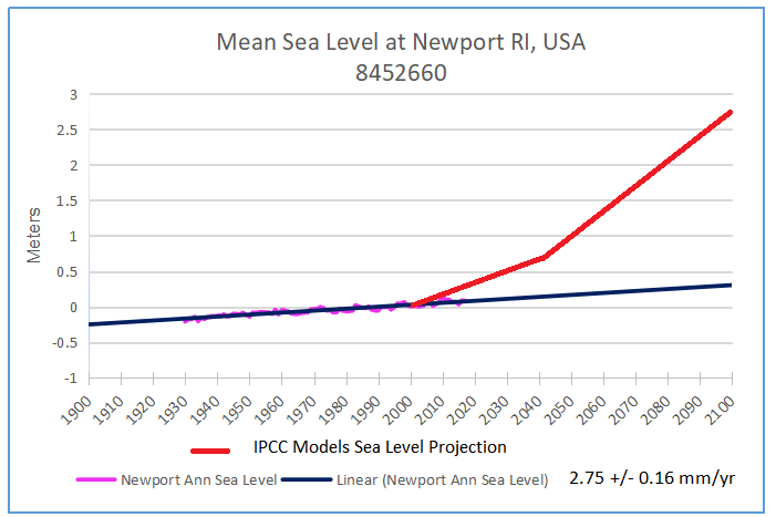
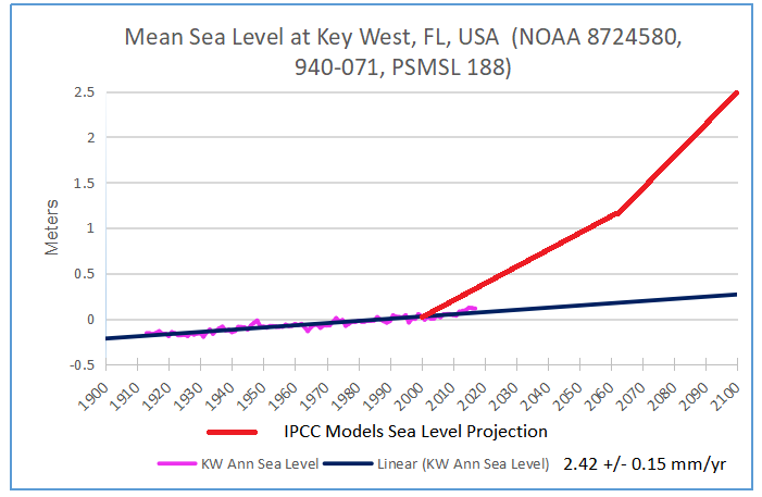
Claim: Global warming is resulting in rising sea levels as seen in both tide gauge and satellite technology.
Fact: The rate of global sea level rise on average has fallen by 40% the last century. Where it is increasing – local factors such as land subsidence are to blame.
This claim is demonstrably false. It really hinges on this statement: “Tide gauges and satellites agree with the model projections.” The models project a rapid acceleration of sea level rise over the next 30 to 70 years. However, while the models may project acceleration, the tide gauges clearly do not.
All data from tide gauges in areas where land is not rising or sinking show instead a steady linear and unchanging sea level rate of rise from 4 up to 6 inches/century, with variations due to gravitational factors. It is true that where the land is sinking as it is in the Tidewater area of Virginia and the Mississippi Delta region, sea levels will appear to rise faster but no changes in CO2 emissions would change that.
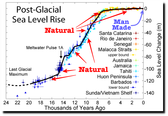
Detailed Rebuttal and Authors: Rebuttal – Sea Level (01/18/19)
Claim: Arctic, Antarctic and Greenland ice loss is accelerating due to global warming.
Fact: The polar ice varies with multidecadal cycles in ocean temperatures. Current levels are comparable to or above historical low levels
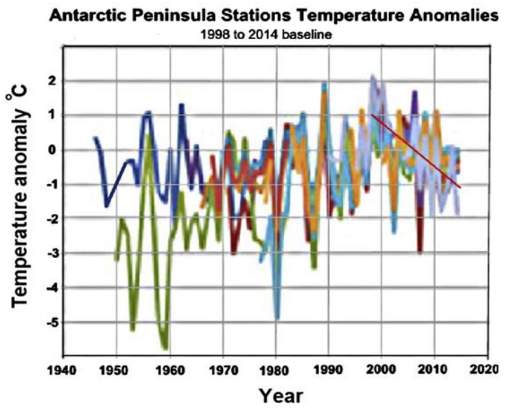
Satellite and land surface temperature records and sea surface temperatures show that both the East Antarctic Ice Sheet and the West Antarctic Ice Sheet are cooling, not warming and glacial ice is increasing, not melting. Satellite and land surface temperature measurements of the southern polar area show no warming over the past 37 years. Growth of the Antarctic ice sheets means the sea level rise is not being caused by melting of polar ice and, in fact, is slightly lowering the rate of rise. Satellite Antarctic temperature records show 0.02C/decade cooling since 1979. The Southern Ocean around Antarctica has been getting sharply colder since 2006. Antarctic sea ice is increasing, reaching all-time highs. Surface temperatures at 13 stations show the Antarctic Peninsula has been sharply cooling since 2000.
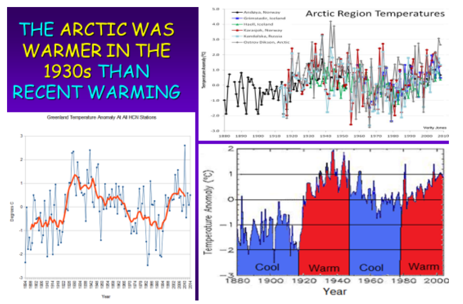
Arctic temperature records show that the 1920s and 1930s were warmer than in the 2000s. Official historical fluctuations of Arctic sea ice begin with the first satellite images in 1979. That happens to coincide with the end of the recent 1945–1977 global cold period and the resulting maximum extent of Arctic sea ice. During the warm period from 1978 until recently, the extent of sea ice has diminished, but increased in the past several years. The Greenland ice sheet has also grown with cooling after an anomalously warm 2012.
Detailed Rebuttal and Authors: AC Rebuttal Arctic, Antarctic and Greenland (05/19/19)
Claim: Global warming responsible for record July warmth in Alaska.
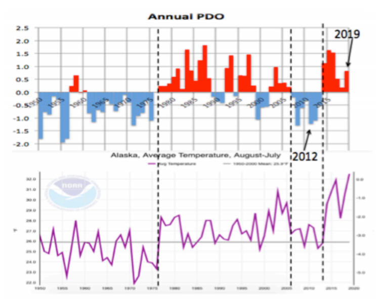
Fact: Alaska July 2019 heat records resulted from a warm North Pacific and reduced ice in the Bering Sea late winter due to strong storms. The opposite occurred with record cold in 2012.
Alaska climate (averages and extremes) varies over time but the changes can be explained by natural variability in the North Pacific Ocean, which controls the climate regime in downstream land areas. These ocean temperature regimes (modes of the Pacific Decadal Oscillation or PDO) improves season-to-season and year-to-year climate forecasts for North America because of its strong tendency for multi-season and multi-year persistence. The PDO correlates well with tendencies for El Nino and La Nina, which have a major impact on Alaska and much of North America.
See Rebuttal: AC Rebuttal- Alaska’s hot July caused by global warming (08/21/19)
Claim: Rising atmospheric CO2 concentrations are causing ocean acidification, which is catastrophically harming marine life.
Fact: When life is considered, ocean acidification is often found to be a non-problem, or even a benefit.
The ocean chemistry aspect of the ocean acidification hypothesis is rather straightforward, but it is not as solid as it is often claimed to be. For one thing, the work of a number of respected scientists suggests that the drop in oceanic pH will not be nearly as great as the IPCC and others predict. And, as with all phenomena involving living organisms, the introduction of life into the analysis greatly complicates things. When a number of interrelated biological phenomena are considered, it becomes much more difficult, if not impossible, to draw such sweeping negative conclusions about the reaction of marine organisms to ocean acidification. Quite to the contrary, when life is considered, ocean acidification is often found to be a non-problem, or even a benefit. And in this regard, numerous scientific studies have demonstrated the robustness of multiple marine plant and animal species to ocean acidification—when they are properly performed under realistic experimental conditions.
Detailed Rebuttal and Author: AC Rebuttal – Ocean Acidification (02/04/19)
Claim: Carbon pollution is a health hazard.
Fact: Carbon dioxide (CO2) is an odorless invisible trace gas that is plant food and it is essential to life on the planet. It is not a pollutant.
The term “carbon pollution” is a deliberate, ambiguous, disingenuous term, designed to mislead people into thinking carbon dioxide is pollution. It is used by the environmentalists to confuse the environmental impacts of CO2 emissions with the impact of the emissions of unwanted waste products of combustion. The burning of carbon-based fuels (fossil fuels – coal, oil, natural gas – and biofuels and biomass) converts the carbon in the fuels to carbon dioxide (CO2), which is an odorless invisible gas that is plant food and it is essential to life on the planet.
 Detailed Rebuttal and Authors: AC Rebuttal Health Impacts (02/04/19)
Claim: CO2-induced climate change is threatening global food production and harming natural ecosystems.
Fact: The vitality of global vegetation in both managed and unmanaged ecosystems is better off now than it was a hundred years ago, 50 years ago, or even a mere two-to-three decades ago thanks in part to CO2.
Such claims are not justified; far from being in danger, the vitality of global vegetation in both managed and unmanaged ecosystems is better off now than it was a hundred years ago, 50 years ago, or even a mere two-to-three decades ago.
With respect to managed ecosystems (primarily the agricultural enterprise), yields of nearly all important food crops have been rising for decades (i.e., the Green Revolution). Reasons for these increases are manifold, but they have mainly occurred in response to continuing advancements in agricultural technology and scientific research that have expanded the knowledge or intelligence base of farming (e.g., fertilizers, pesticides, irrigation, crop selection and breeding, computers, machinery and other devices).
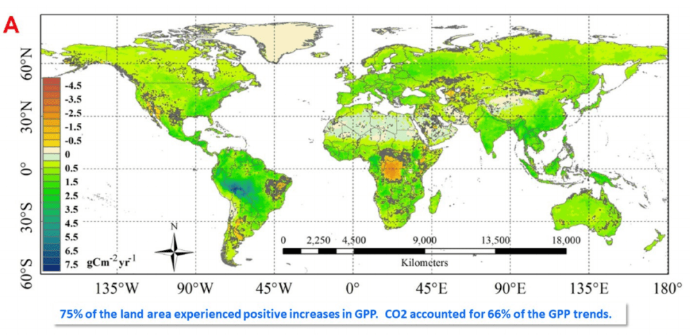
Spatial pattern of trends in Gross Primary Production (1982- 2015). Source: Sun et al. 2018.
Detailed Rebuttal and Authors: AC Rebuttal Agriculture and NaturalEcosystems_Idso020619 (1)
Conclusion:
The well-documented invalidation of the “three lines of evidence” upon which EPA attributes global warming to human -caused CO2 emissions breaks the causal link between such CO2 emissions and global warming.
This in turn necessarily breaks the causal chain between CO2 emissions and the alleged knock-on effects of global warming, such as loss of Arctic ice, increased sea level, and increased heat waves, floods, droughts, hurricanes, tornadoes, etc. These alleged downstream effects are constantly cited to whip up alarm and create demands for ever tighter CO2 regulation. EPA explicitly relied on predicted increases in such events to justify the Endangerment Finding supporting its Clean Power Plan. But as shown above, there is no evidence to support such claims, and copious empirical evidence that refutes them.

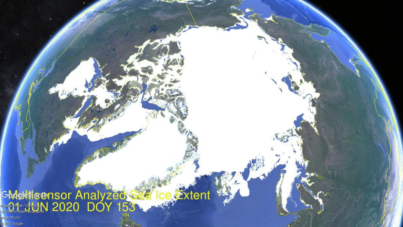 The image above shows melting of Arctic sea ice extent over the month of June 2020. As usual the process of declining ice extent follows a LIFO pattern: Last In First Out. That is, the marginal seas are the last to freeze and the first to melt. Thus at the top center and right of the image, the Pacific basins of Bering and Okohtsk seas lost what little ice they had. Meanwhile at extreme left, Hudson Bay ice retreats 300k km2 from north to south. Note center left Baffin Bay loses 320k km2 of ice during the month. The most dramatic melting is in the Russian shelf seas at the center right. Laptev and Kara Seas combined to lose 600k km2 of ice extent. The central mass of Arctic ice is intact with some fluctuations back and forth, and as well Greenland Sea and CAA (Canadian Arctic Archipelago) were slow to melt in June
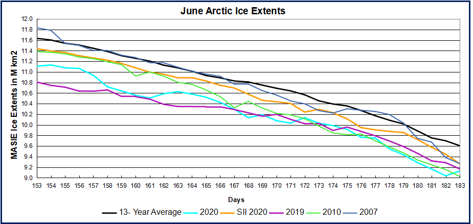 Note that the MASIE NH ice extent 13 year average loses about 2M km2 during June, down to 9.6M km2. MASIE 2019 started nearly 500k km2 lower and lost ice at a similar rate, ending 476 km2 below average. The most interesting thing was the wide divergence between SII and MASIE reports during June, SII starting the month about 500k km2 higher before narrowing at the end to exceed MASIE by 133k km2. I inquired whether NIC had experienced any measurement issues, but their response indicated nothing remarkable. It is unusual for MASIE to be the lower estimate of the two.