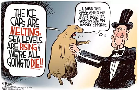
 As we’ve seen many times before, this week Climate Crisis Central put out a scary story about glaciers melting, and captive news outlets dutifully amplified the narrative. For example, from my news aggregator:
Global satellite data shows how much every glacier on Earth is melting Metro.co.uk
Researchers claim glacier melting has accelerated all around the world Slashgear
Our disappearing glaciers / World will lose 10% of glacier ice even if it hits climate targets The Guardian
A Massive Study of Nearly Every Glacier on Earth Just Revealed a Devastating Trend ScienceAlert
Glacier melt is speeding up, raising seas – study RTE
Global glacier melt is speeding up Swiss Info
Study of nearly every glacier on Earth shows ice loss is speeding up Live Science
Climate change: Accelerated global glacier mass loss in the twenty-first century(Nature) Nature Asia
Glacier melt is speeding up, raising seas: global study France 24
Expert reaction to study looking at global glacier mass loss in the 21st century Science Media Centre
Global glacier retreat has accelerated ETH Zurich
Glacier retreat leading to ‘humanitarian crisis’, says top scientist The Independent
World’s Glaciers Melting Faster Than Ever, With Alaska’s Rate Among ‘Highest on the Planet’ NBC Connecticut
Etc., Etc., Etc.
Yes glaciers individually and seasonally advance and retreat over time, and many people depend on the meltwater to survive. The hype is deceptive in several aspects. Typically, present glacier extents are put into hysterical rather than historical context. Also, the amounts of ice lost are never referenced to the total existing ice mass observed over time. Finally, the attribution of local temperature trends to fossil fuels emissions is presumed without evidence of causation. Some examples of sound scientific analyses provide an antidote to the glaciermania.
Alpine Glaciers Wax and Wane, Don’t Panic

Prof. em. Christian Schlüchter is a geologist and has studied the glaciers of the Alps in great detail. He reports the findings of very old timber in and below glaciers and what those trees taught him about the glacial epochs of the Alps. One of the most intuitive finds of Schlüchter’s is this huge tree trunk, found at a glacier tongue (see the most beautiful glacier snout behind!).
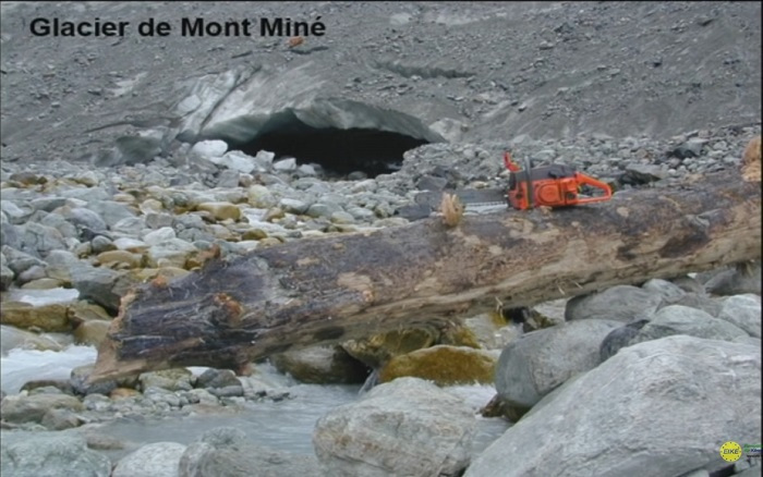
This place nowadays is clearly above the limit of vegetation and still there is this tree which attracted Schlüchter’s curiosity and fuelled his research: How old is it? Where and under what conditions has it grown and why is it here.
The key message from his slides is that all of these records were left in times when the alpine glacier extent was smaller than in 2005.
Warm periods: more life
The timberline was at least 300 meters higher which indicates a minimum of 1.8° C higher temperatures. An example of this gives Hannibal, who managed to cross the Alps with elephants because the higher regions were much less covered by ice than in recent centuries.
Warm periods: more civilization
As his summary, Schlüchter gave the following facts:
- More than 50% of the last 11000 years alpine glaciers were smaller than 2005
- This fact he baptized, “dominance of the Hannibalistic world”
- Alpine glaciers have shown huge dynamics
- Events of glacier growth were fast and short
- The little ice age (from the end of the medieval warm period to about 1850) was the longest glacier extension since the last ice age 12000 years ago
- Every warming followed an accelerated glacier growth
And more recent news Alpine glaciers are not going away: Alps Winter Warming “Not Significant”…”Astonishing Contrast Between Official Measurements And Public Opinion”
Austrian researcher skeptic Günther Aigner examined 12 mountains stations across the Alps, spanning Switzerland, Germany and Austria, in order to find out how winter temperatures have developed over the past 50 years. The temperature data from 12 mountain stations in the European Alps show no winter warming in over 30 years, contradicting alarmist claims.
For more on presentations at the 2019 Munich Climate Realism conference that was interrupted by Antifa thugs see post Munich Climate Conference 2019
Alaska Great for Picking Cherries

Background from 2017 post Glaciermania
The Weather Network (who do a decent job on local weather forecasting) are currently raving about Glaciers:
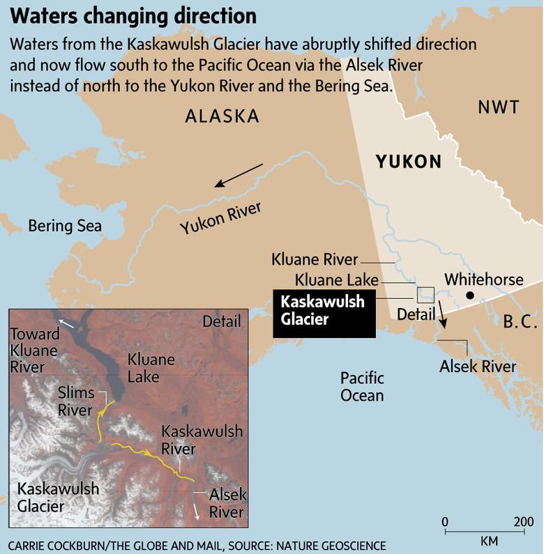
You know climate change is getting serious when rivers are resorting to piracy.
Canadian geomorphologist Dr. Daniel Shugar and his team headed to the Yukon last year to study changes in the flow of the Slims River, only to find out the river was gone.
The Slims, which was fed by the Kaskawulsh glacier, has become the victim of the first case of what’s known as river piracy in modern recorded history.
The team’s investigation soon turned up the culprit – the retreat of the Kaskawulsh Glacier, which has been retreating thanks to more than a century of climate warming.
What Actually Happened
For context and scientific perspective we can turn to papers like this one: Contemporary Glacier Processes and Global Change: Recent Observations from Kaskawulsh Glacier and the Donjek Range, St. Elias Mountains
One of the most iconic and best studied outlet glaciers of the St. Elias Mountains, Kaskawulsh Glacier was the focus of much glaciological research during the Icefield Ranges Research Project between the 1960s and early 1970s and contemporary studies suggest that the glacier is temperate throughout. The current area of Kaskawulsh Glacier is ~1095 km2. Ice thicknesses range from 539 m near the topographic divide with the upper Hubbard Glacier and ~500 m at the confluence of the north and central arms at ~1750 m asl to 778 m at ~1600 m asl. The equilibrium line altitude is estimated from 2007 late summer satellite imagery as 1958 m asl, and it appears to have changed little since the 1970s.
The size of Kaskawulsh Glacier has varied considerably through time, with radiocarbon dating suggesting that it expanded by tens of kilometres into the Shakwak Valley (currently occupied by Kluane Lake) ~30 kya during the Wisconsinan Glaciation. In the historical past, Borns and Goldthwait (1966) mapped three sets of Little Ice Age moraines in the glacier forefield on the basis of distinctive variations in vegetation cover, morphology, and the ages of trees and shrubs.
Kaskawulsh Glacier was advancing by the early 1500s and reached its maximum recent position by approximately AD 1680. A recent study based on tree-ring dates suggests that the Slims River lobe reached its greatest Little Ice Age extent in the mid-1750s, whereas the Kaskawulsh River lobe reached its maximum extent around 1717. However, it appears that the glacier did not start retreating from this position until the early to middle 1800s. The recent discovery of a Geological Survey of Canada map of the glacier terminus from 1900 to 1904 indicates that the glacier was still in a forward position at that time, suggesting that most of the terminus retreat occurred in the 20th century.
Recent studies conducted by researchers at the University of Alaska and the University of Ottawa indicate that ice losses from Kaskawulsh Glacier have continued through the latter half of the 20th century and first decade of the 21st century, although evidence for any recent acceleration in loss rates is equivocal.
Of the 19 glacierized regions of the world outside of the ice sheets, the region including the St. Elias Mountains made the second highest glaciological contribution to global sea level during the period 1961 – 2000. Only Arctic Canada is expected to exceed this region in sea-level contribution over the 21st century.
The St. Elias Mountains exhibit high interannual variability in ice mass change, which is due in part to the abundance of surge-type and tidewater glaciers in different stages of their respective cycles. Ice dynamics can be a confounding influence when attempting to isolate the effects of climate as an external driver of glacier change.
About the Two Gorilla Glaciers
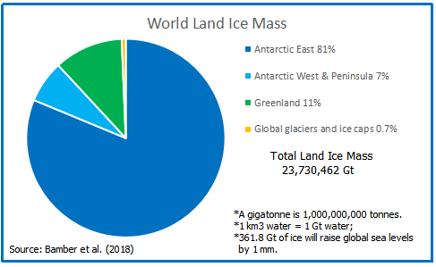
A webpage What is the global volume of land ice and how is it changing? at Antarctic Glaciers.org provides some basic statistics for perspective on land ice. They provide this table:
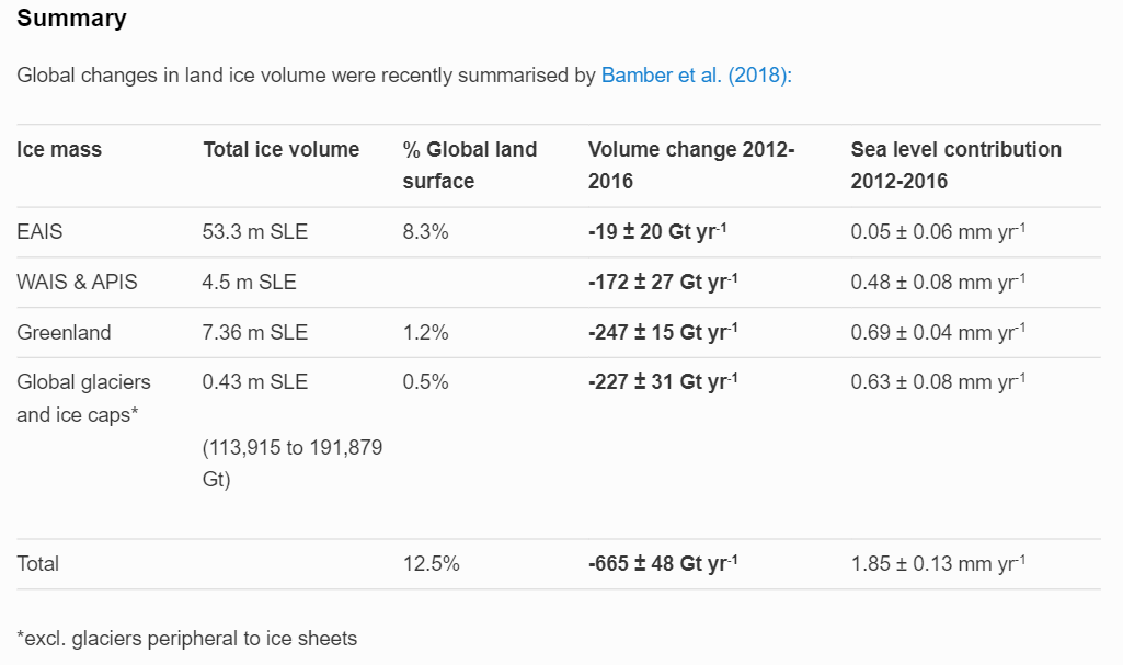
Notice what they’ve done with this graphic. A different measure of ice volume hides the proportion of ice melt, covering up how myopic and lop-sided is the alarmist case. Let’s look at the same table revised with comparable metrics.
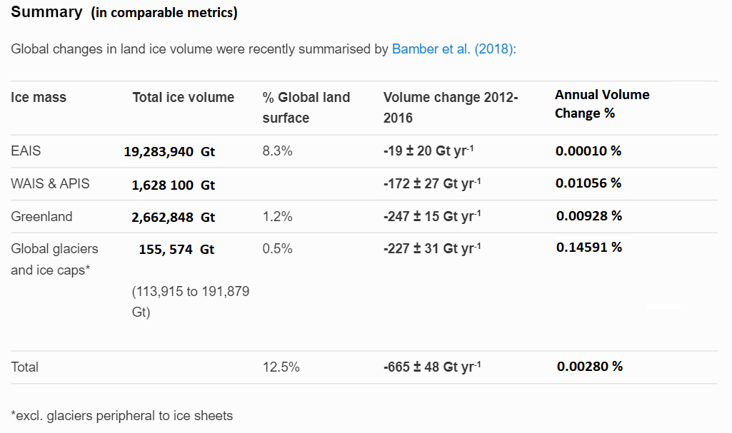
Now the realities are obvious 99% of the world land ice is on top of Antarctica (88%) and Greenland (11%). All the fuss in the media above concerns fluctuations in less than 1% of glacier mass. Secondly, the bottom line is should present melt rates continue ( a big if ) the world would lose 3% of land ice in 1000 years. Note also the wide range of estimates of the smallest category of glaciers, and also the uncertain reported volume change for East Antarctica. Note that the melt rates are for 2012 to 2016, leaving out lower previous rates and periods when ice mass gained.
Add to this a recent analysis NASA Surface Station Data Show East Antarctica NOT WARMING Past 4 Decades…Cooling Trend.
See also Blinded by Antarctica Reports
As for Greenland ice sheet, read the recent research at post Oh No! Greenland Melts in Virtual Reality “Experiments”. Excerpts below:
The scare du jour is about Greenland Ice Sheet (GIS) and how it will melt out and flood us all. It’s declared that GIS has passed its tipping point, and we are doomed. Typical is the Phys.org hysteria: Sea level rise quickens as Greenland ice sheet sheds record amount: “Greenland’s massive ice sheet saw a record net loss of 532 billion tonnes last year, raising red flags about accelerating sea level rise, according to new findings.”
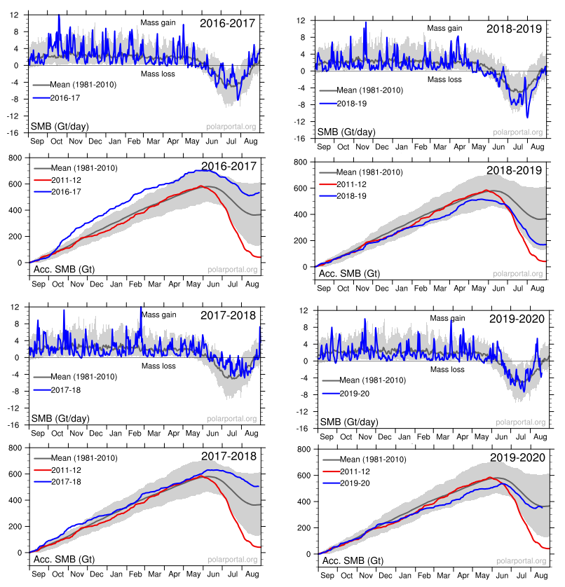
Panic is warranted only if you treat this as proof of an alarmist narrative and ignore the facts and context in which natural variation occurs. For starters, consider the last four years of GIS fluctuations reported by DMI and summarized in the eight graphs above. Note the noisy blue lines showing how the surface mass balance (SMB) changes its daily weight by 8 or 10 gigatonnes (Gt) around the baseline mean from 1981 to 2010. Note also the summer decrease between May and August each year before recovering to match or exceed the mean.
The other four graphs show the accumulation of SMB for each of the last four years including 2020. Tipping Point? Note that in both 2017 and 2018, SMB ended about 500 Gt higher than the year began, and way higher than 2012, which added nothing. Then came 2019 dropping below the mean, but still above 2012. Lastly, this year is matching the 30-year average. Note also that the charts do not integrate from previous years; i.e. each year starts at zero and shows the accumulation only for that year. Thus the gains from 2017 and 2018 do not result in 2019 starting the year up 1000 Gt, but from zero.
Summary
So it is a familiar story. A complex naturally fluctuating situation, in this case glaciers, is abused by activists to claim support for their agenda. I have a lot of respect for glaciologists; it is a deep, complex subject, and the field work is incredibly challenging. And since “glacial” describes any process where any movement is imperceptible, I can understand their excitement over something happening all of a sudden.
But I do not applaud those pandering to the global warming/climate change crowd. They seem not to realize they debase their own field of study by making exaggerated claims and by “jumping the shark.”
Meanwhile real scientists are doing the heavy lifting and showing restraint and wisdom about the limitations of their knowledge.
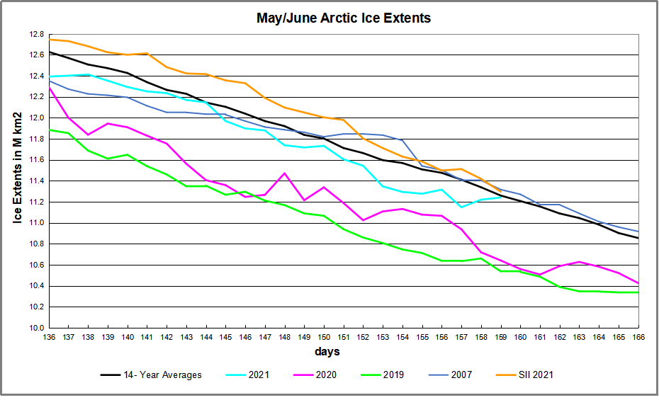


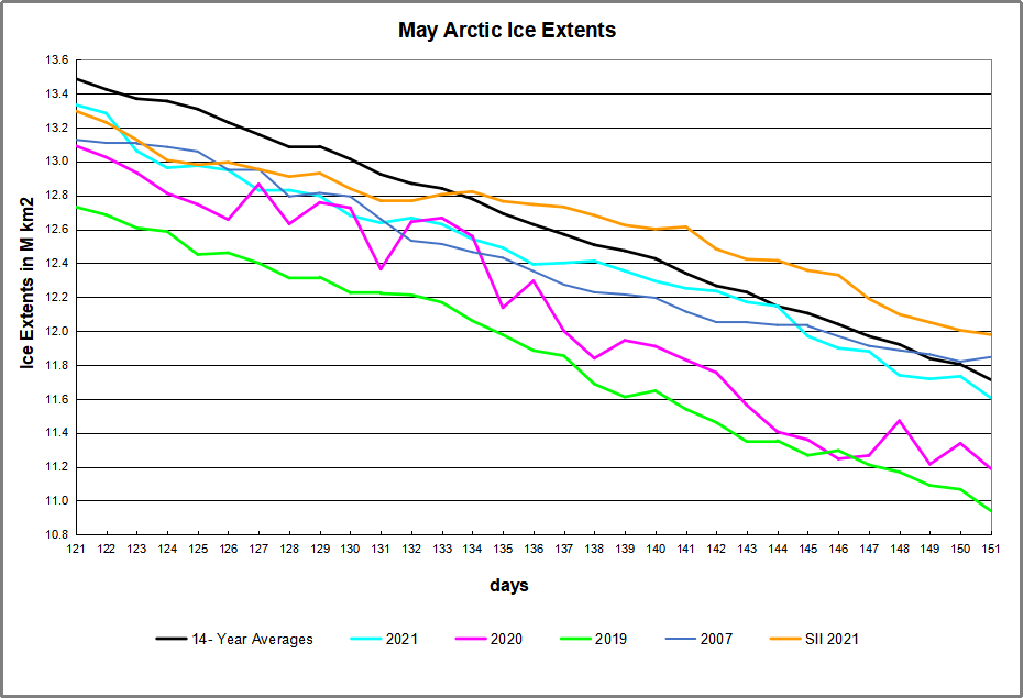
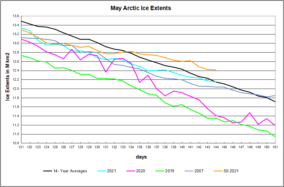
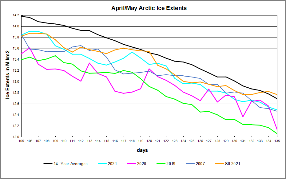

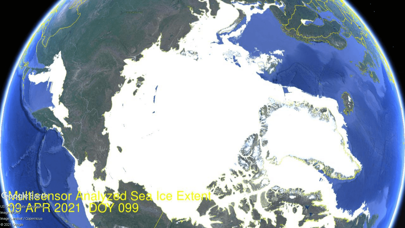
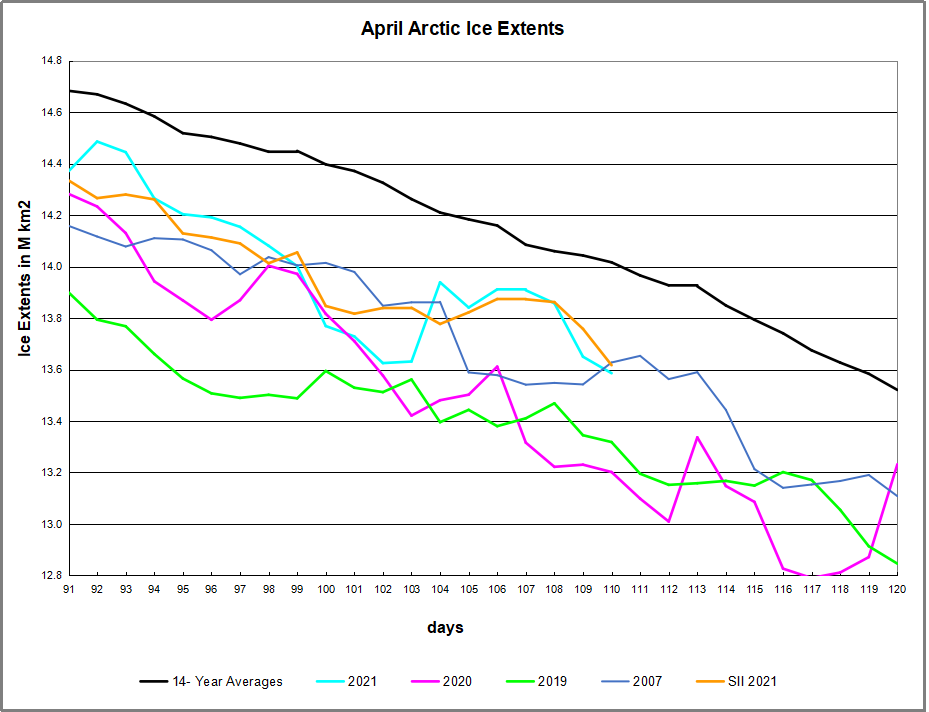
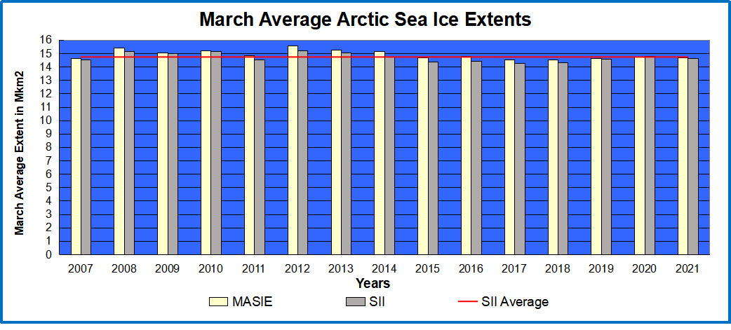
 The graph above shows ice extent through April comparing 2021 MASIE reports with the 14-year average, other recent years and with SII. The average April drops about 1.1M km2 of ice extent. This year MASIE showed two sharp drops and two recoveries, the last one coming close to average day 118. SII showed a less than average April loss of ~870k km2. In the end MASIE 2021 matched 2020, and higher then 2007.