 Previous Post Updated with 2020 Statistics
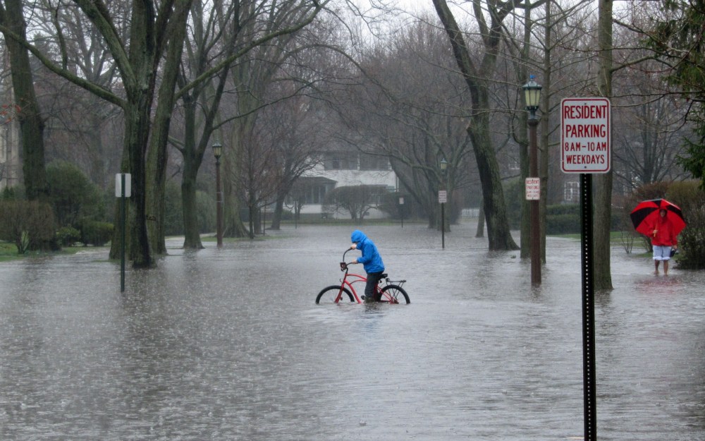
In 2018 climatists applied their considerable PR skills and budgets swamping the media with warnings targeting major coastal cities, designed to strike terror in anyone holding real estate in those places. Example headlines included:
Sea level rise could put thousands of homes in this SC county at risk, study says The State, South Carolina
Taxpayers in the Hamptons among the most exposed to rising seas Crain’s New York Business
Adapting to Climate Change Will Take More Than Just Seawalls and Levees Scientific American
The Biggest Threat Facing the City of Miami Smithsonian Magazine
What Does Maryland’s Gubernatorial Race Mean For Flood Management? The Real News Network
Study: Thousands of Palm Beach County homes impacted by sea-level rise WPTV, Florida
Sinking Land and Climate Change Are Worsening Tidal Floods on the Texas Coast Texas Observer
Sea Level Rise Will Threaten Thousands of California Homes Scientific American
300,000 coastal homes in US, worth $120 billion, at risk of chronic floods from rising seas USA Today
That last gets the thrust of the UCS study Underwater: Rising Seas, Chronic Floods, and the Implications for US Coastal Real Estate (2018)
Sea levels are rising. Tides are inching higher. High-tide floods are becoming more frequent and reaching farther inland. And hundreds of US coastal communities will soon face chronic, disruptive flooding that directly affects people’s homes, lives, and properties.
Yet property values in most coastal real estate markets do not currently reflect this risk. And most homeowners, communities, and investors are not aware of the financial losses they may soon face.
This analysis looks at what’s at risk for US coastal real estate from sea level rise—and the challenges and choices we face now and in the decades to come.
The report and supporting documents gave detailed dire warnings state by state, and even down to counties and townships. As example of the damage projections is this table estimating 2030 impacts:
| State |
Homes at Risk |
Value at Risk |
Property Tax at Risk |
Population in
at-risk homes |
| AL |
3,542 |
$1,230,676,217 |
$5,918,124 |
4,367 |
| CA |
13,554 |
$10,312,366,952 |
$128,270,417 |
33,430 |
| CT |
2,540 |
$1,921,428,017 |
$29,273,072 |
5,690 |
| DC |
– |
$0 |
$0 |
– |
| DE |
2,539 |
$127,620,700 |
$2,180,222 |
3,328 |
| FL |
20,999 |
$7,861,230,791 |
$101,267,251 |
32,341 |
| GA |
4,028 |
$1,379,638,946 |
$13,736,791 |
7,563 |
| LA |
26,336 |
$2,528,283,022 |
$20,251,201 |
63,773 |
| MA |
3,303 |
$2,018,914,670 |
$17,887,931 |
6,500 |
| MD |
8,381 |
$1,965,882,200 |
$16,808,488 |
13,808 |
| ME |
788 |
$330,580,830 |
$3,933,806 |
1,047 |
| MS |
918 |
$100,859,844 |
$1,392,059 |
1,932 |
| NC |
6,376 |
$1,449,186,258 |
$9,531,481 |
10,234 |
| NH |
1,034 |
$376,087,216 |
$5,129,494 |
1,659 |
| NJ |
26,651 |
$10,440,814,375 |
$162,755,196 |
35,773 |
| NY |
6,175 |
$3,646,706,494 |
$74,353,809 |
16,881 |
| OR |
677 |
$110,461,140 |
$990,850 |
1,277 |
| PA |
138 |
$18,199,572 |
$204,111 |
310 |
| RI |
419 |
$299,462,350 |
$3,842,996 |
793 |
| SC |
5,779 |
$2,882,357,415 |
$22,921,550 |
8,715 |
| TX |
5,505 |
$1,172,865,533 |
$19,453,940 |
9,802 |
| VA |
3,849 |
$838,437,710 |
$8,296,637 |
6,086 |
| WA |
3,691 |
$1,392,047,121 |
$13,440,420 |
7,320 |
The methodology, of course is climate models all the way down. They explain:
Three sea level rise scenarios, developed by the National Oceanic and Atmospheric Administration (NOAA) and localized for this analysis, are included:
- A high scenario that assumes a continued rise in global carbon emissions and an increasing loss of land ice; global average sea level is projected to rise about 2 feet by 2045 and about 6.5 feet by 2100.
- An intermediate scenario that assumes global carbon emissions rise through the middle of the century then begin to decline, and ice sheets melt at rates in line with historical observations; global average sea level is projected to rise about 1 foot by 2035 and about 4 feet by 2100.
- A low scenario that assumes nations successfully limit global warming to less than 2 degrees Celsius (the goal set by the Paris Climate Agreement) and ice loss is limited; global average sea level is projected to rise about 1.6 feet by 2100.
Oh, and they did not forget the disclaimer:
Disclaimer
This research is intended to help individuals and communities appreciate when sea level rise may place existing coastal properties (aggregated by community) at risk of tidal flooding. It captures the current value and tax base contribution of those properties (also aggregated by community) and is not intended to project changes in those values, nor in the value of any specific property.
The projections herein are made to the best of our scientific knowledge and comport with our scientific and peer review standards. They are limited by a range of factors, including but not limited to the quality of property-level data, the resolution of coastal elevation models, the potential installment of defensive measures not captured by those models, and uncertainty around the future pace of sea level rise. More information on caveats and limitations can be found at http://www.ucsusa.org/underwater.
Neither the authors nor the Union of Concerned Scientists are responsible or liable for financial or reputational implications or damages to homeowners, insurers, investors, mortgage holders, municipalities, or other any entities. The content of this analysis should not be relied on to make business, real estate or other real world decisions without independent consultation with professional experts with relevant experience. The views expressed by individuals in the quoted text of this report do not represent an endorsement of the analysis or its results.
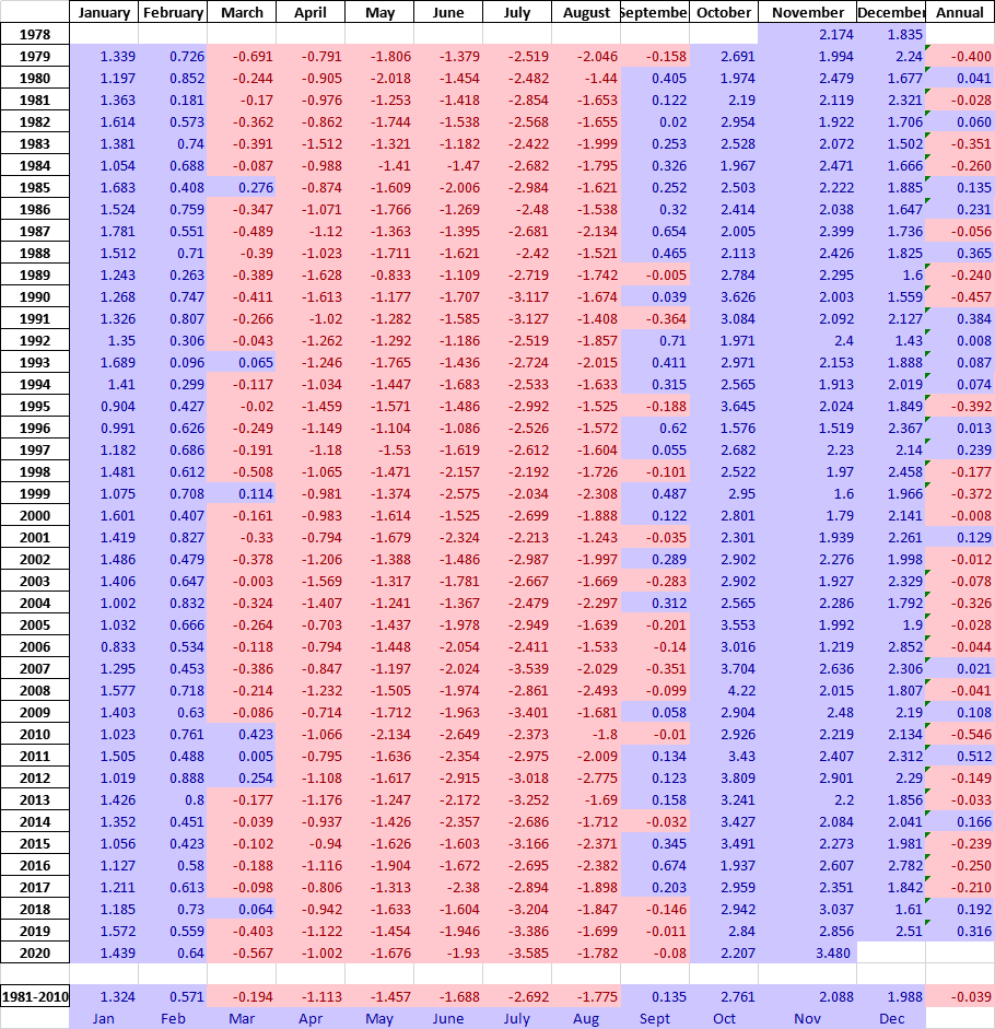
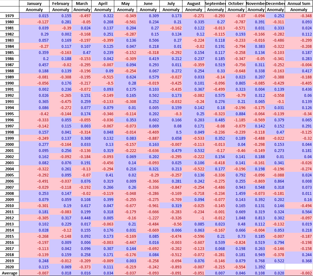
The need for a disclaimer becomes evident when looking into the details. The NOAA reference is GLOBAL AND REGIONAL SEA LEVEL RISE SCENARIOS FOR THE UNITED STATES NOAA Technical Report NOS CO-OPS 083
Since the text emphasizes four examples of their scenarios, let’s consider them here. First there is San Francisco, a city that sued oil companies over sea level rise. From tidesandcurrents comes this tidal gauge record
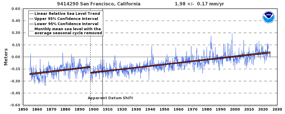 It’s a solid, long-term record providing more than a century of measurements from 1900 through 2020. The graph below compares the present observed trend with climate models projections out to 2100.

Since the record is set at zero in 2000, the difference in 21st century expectation is stark. Instead of the existing trend out to around 20 cm, models project 2.5 meters rise by 2100.
New York City is represented by the Battery tidal gauge:
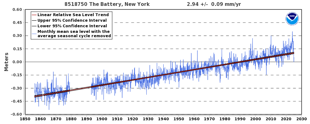
Again, a respectable record with a good 20th century coverage. And the models say:
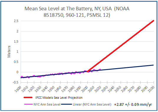
The red line projects 2500 mm rise vs. 287 mm, almost a factor of 10 more. The divergence is evident even in the first 20 years.
Florida comes in for a lot of attention, especially the keys, so here is Key West:
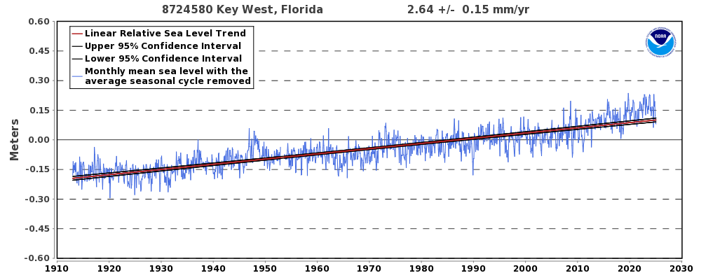
A similar pattern to NYC Battery gauge, and here is the projection:
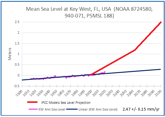
The pattern is established: Instead of a rise of about 25 cm, the models project 250 cm.
Finally, probably the worst case, and already well-known to all is Galveston, Texas:
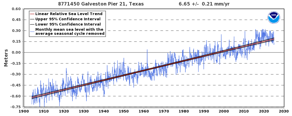
The water has been rising there for a long time, so maybe the models got this one close.
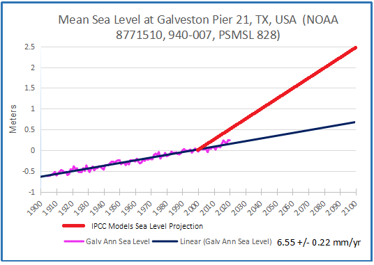 The gap is less than the others since the rising trend is much higher, but the projection is still nearly four times the past. Galveston is at risk, all right, but we didn’t need this analysis to tell us that.
A previous post Unbelievable Climate Models goes into why they are running so hot and so extreme, and why they can not be trusted.
Footnote Regarding Alarms in Other Places
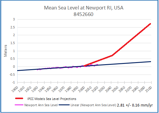
Recently there was a flap over future sea levels at Rhode Island, so I took a look at Newport RI, the best tidal gauge record there. Same Story: Observed sea levels already well below projections that are 10 times the tidal gauge trend.
Another city focused upon urban flooding is Philadelphia. As with other coastal settlements, claims of sea level rise from global warming are unfounded.
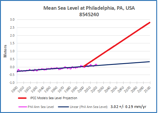
Philadelphia is a great example where a real concern will not be addressed by reducing CO2 emissions. See Urban Flooding: The Philadelphia Story