They are at it again: Our future will be filled with death and destruction according to climate models. The latest doomsday scenario is that every summer in the future will be hotter than the one before, brought to you by CNN: “All the Fear All the Time.”
If you think it’s hot now, you haven’t seen anything yet. A new study predicts that parts of the world will “smash” temperature records every year in the coming century due to climate change, “pushing ecosystems and communities beyond their ability to cope.”
The scientists who authored the study, published in the journal Nature Climate Change on Monday, used 22 climate models to game out exactly how hot these summer temperatures would be. They determined that by the end of the 21st century, future temperature events “will be so extreme that they will not have been experienced previously.”
The temperature increase is directly tied to rising global greenhouse gas emissions, the authors say.
The world is already seeing record setting temperatures and while warming hasn’t been uniform, earlier studies have shown that the planet has been in a warming trend, generally.
Heat waves will be deadly. Heat stroke, breathing issues, heart attacks, asthma attacks, kidney problems are all a big concern for people when the temperatures increase, according to the US Centers for Disease Control and Prevention.
Higher temperatures can also make air pollution worse, make water scarce and cause crops to fail, leading to malnutrition and starvation.
In 2014, the World Health Organization predicted 250,000 more people will die annually between 2030 and 2050 due to climate change. More recent studies predict that this is a “conservative estimate.”
If, however, countries meet goals of limiting global temperature rise less than 2 degrees Celsius, as set out in the Paris agreement, that scenario would be much less likely.
Footnote: A second separate heat wave alarm study was published and trumpeted in the Seattle Times. (H/T kakatoa, comment below) Cliff Mass does his usual thorough review pointing out problems both in the estimating of future temperatures and in calculating projected deaths from heat waves.
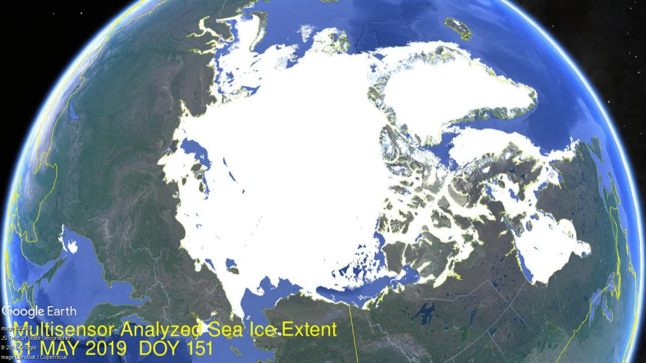
In the first half of June 2019, the shift from ice to water is unusually lop-sided in two respects. The image above, supported by the table later on shows that in the last two weeks water has opened up faster on the Pacific side, and much slower on the Atlantic side, with the exception of Baffin Bay. The other surprise is that MASIE shows much less ice than does SII, a reversal of the typical situation.
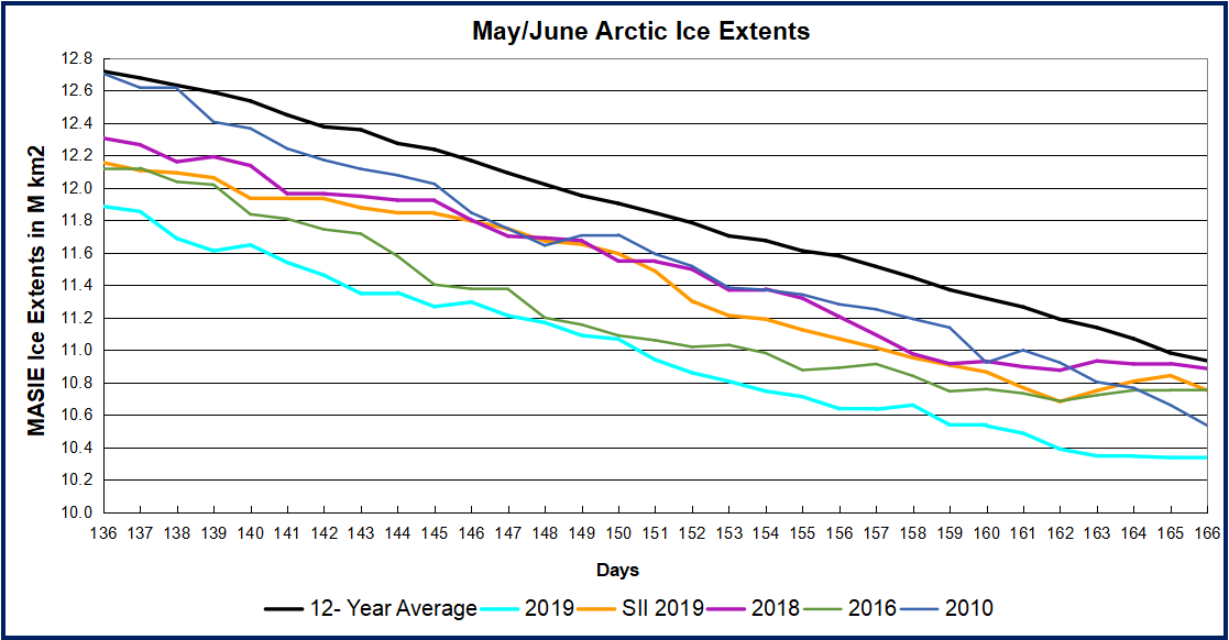
The graph below shows the surprising discrepancy between MASIE and SII appearing in May and continuing in June.
Note that the NH ice extent 12 year average declined from 12.7M km2 to 10.9M km2 during in the last 30 days. MASIE 2019 shows about the same decline from 11.9M km2 to 10.3M km2. That track matched 2016 in May, but is now closest to 2010 and below other years. Interestingly SII showed a much slower rate of ice extent loss, starting nearly the same as MASIE, but ended this period 400k km2 higher. and close to average and 2018.
I have no explanation for the differential between MASIE and SII. Note that ice extents in both datasets are levelling off mid-June.
Region
2019166
Day 166 Average
2019-Ave.
2010166
2019-2010
(0) Northern_Hemisphere
10340833
10933549
-592716
10534077
-193244
(1) Beaufort_Sea
761369
968193
-206823
933194
-171824
(2) Chukchi_Sea
680432
799211
-118778
839873
-159441
(3) East_Siberian_Sea
1049046
1054090
-5045
1068901
-19856
(4) Laptev_Sea
750164
778536
-28372
772185
-22021
(5) Kara_Sea
671900
722641
-50741
717539
-45640
(6) Barents_Sea
261587
215180
46408
138264
123324
(7) Greenland_Sea
549038
568045
-19007
524612
24426
(8) Baffin_Bay_
Gulf_of_St._Lawrence
558105
733399
-175294
667457
-109352
(9) Canadian_Archipelago
787036
798742
-11706
766642
20394
(10) Hudson_Bay
1014530
1004832
9698
826781
187749
(11) Central_Arctic
3229461
3221030
8431
3206453
23008
(12) Bering_Sea
17768
33002
-15234
21317
-3550
(13) Baltic_Sea
0
7
-7
0
0
(14) Sea_of_Okhotsk
9381
35292
-25911
83076
-73695
The table shows where the ice is distributed to make the 5.4% defict to average. Beaufort and Chukchi Seas are more than half of the NH deficit to average, while Baffin has lost 175k km2 to average.
Illustration by Eleanor Lutz shows Earth’s seasonal climate changes. If played in full screen, the four corners present views from top, bottom and sides.
Everett Piper writes in the Washington Post Times The party of science deniers. Excerpts In italics with my bolds.
This past Wednesday, May 29, former Vice President Al Gore spoke to the graduating seniors at Harvard University. A summary of his talk? There is an “assault on science” that threatens “the capacity of the human species to endure” on planet Earth.
Mr. Gore proceeded to warn both students and faculty at Wednesday’s annual Class Day convocation, stressing that “reason” and “rational debate” were under threat from what he called “ideology of authoritarianism” by those who disagree with him and his political agenda.
Science “is now being slandered as a conspiracy based on a hoax,” Mr. Gore said. “The subordination of the best scientific evidence is yet another strategy for controlling policy by distorting and suppressing the best available information.”
This is the man who told us in 2006 that we had “ten years to save the planet” and that the Arctic would be ice-free by summer of 2014. In case you haven’t checked lately, that has not happened, nor are we even close.
This is the man who, at the same time, said the gulf stream would slow down and cause untold climate devastation as the result. News flash: Current scientific data actually shows the gulf stream has had zero decrease and may actually be speeding up.
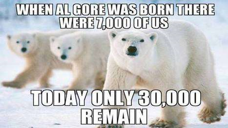
This is the man who warned polar bears would become extinct in just a handful of years because of their loss of habitat. Update: The facts show polar bear numbers are now at an all-time high.
This is the same man who told all of us “sea levels could rise by as much as 20 feet in the near future” when, in fact, current data shows that for decades the pace has been about 3mm per year and has not changed. That’s about the height of two dimes.
This is the same guy who prophesied the rise of CO2 levels would devastate the planet and cause untold human suffering, when in reality, the modest rise in CO2 we actually have experienced has resulted in a global greening that has relieved human poverty around the world.
This is a man who predicted the devastation of low-lying Pacific Island nations such as Tuvalu because of rising sea-levels when in fact Tuvalu and some other island nations have actually grown in landmass since Mr. Gore’s doom and gloom pronouncements.
Al Gore is the man who has not only ignored the scientific facts of all the above, but who also is aligned with the party that now has the temerity to deny the biological fact of a female, and thereby pretend that any male can become a female just because he “feels” like it.
This is the same guy who, for decades, has turned a blind eye to the CDC data on sexually transmitted diseases and who promotes a political agenda that has resulted in over 25 percent of our nation’s millennial-aged women now carrying an STD.
This is the same guy who pretends to be pro-woman while denying the fact that women are real and not merely the imagination of dysphoric men who want to pretend and play make-believe.
This is a man who apparently doesn’t understand that it is logically and scientifically impossible to be a feminist if you persist in denying the empirical fact of the feminine.
Mr. Gore’s pseudo-science doesn’t stop with his ignorance of climatology, physiology, sexuality and biology. He demonstrates his ignorance in matters of economics as well. By ignoring the empirical proof that socialism has never, ever, resulted in anything other than the loss of human freedom and human flourishing, he seems oblivious to the fact that if there ever was a political and economic model that smacks of the “ideological authoritarianism” of which he now warns, it is his own.
In testimony before Congress this past year, Judith Curry, former chairman of the School of Earth and Atmospheric Sciences at the Georgia Institute of Technology, said this of Mr. Gore’s political agenda and that of his blind followers: “This behavior risks destroying science’s reputation for honesty. It is this objectivity and honesty which gives science a privileged seat at the table. Without this objectivity and honesty, scientists become regarded as another lobbyist group.”
Ms. Curry’s comment is spot on. Science dies at the hands of its supposed champions when they prove themselves more interested in political power than simply telling the truth.
If Aesop taught us anything, it is this: Crying “wolf” over and over again always proves one simple fact in the end — Truth “is being slandered as a conspiracy based on a hoax.”
• Everett Piper, the former president of Oklahoma Wesleyan University, is a columnist for The Washington Times and author of “Not A Day Care: The Devastating Consequences of Abandoning Truth” (Regnery 2017).
The image above shows that ice began to disappear in earnest during May. On day 120 (April 30), Bering and Okhotsk Seas (left bottom and far left) were already mostly water. Elsewhere the first 10 days added some water, and then more rapidly in the last 20 days. The Central Arctic core is intact, including East Siberian and Laptev Sea on the Russian side (left) and Canadian Archipelago (center right) and Hudson Bay (far right).
Meanwhile Beaufort and Chukchi (bottom center) are opening up, along with Baffin (center below Greenland).
The graph below shows a surprising discrepancy between MASIE and SII appearing in May.
Note that the NH ice extent 12 year average declined from 13.6M km2 to 11.8M km2 during May. MASIE 2019 shows about the same decline from 12.7M km2 to 10.9M km2. That track matches 2016, but well below other years. Interestingly SII showed a much slower rate of ice extent loss, starting nearly the same as MASIE, but ended the month 600k km2 higher. and matching 2018. Some thoughts later on why the discrepancy and the below average extent this year.
Region
2019151
Day 151 Average
2019-Ave.
2007151
2019-2007
(0) Northern_Hemisphere
10939662
11844796
-905134
11846659
-906997
(1) Beaufort_Sea
848114
1000716
-152602
1059461
-211347
(2) Chukchi_Sea
738661
872393
-133732
894617
-155956
(3) East_Siberian_Sea
1059805
1069104
-9299
1069198
-9393
(4) Laptev_Sea
820403
831752
-11349
754651
65752
(5) Kara_Sea
760439
849220
-88780
895678
-135239
(6) Barents_Sea
268245
330718
-62473
323801
-55556
(7) Greenland_Sea
500951
575983
-75031
591919
-90968
(8) Baffin_Bay_Gulf_of_St._Lawrence
756455
931604
-175149
934257
-177802
(9) Canadian_Archipelago
789111
748381
40730
818055
-28944
(10) Hudson_Bay
1103650
1104185
-535
1077744
25906
(11) Central_Arctic
3224969
3218320
6649
3230109
-5141
(12) Bering_Sea
27192
135798
-108606
112353
-85161
(13) Baltic_Sea
0
188
-188
0
0
(14) Sea_of_Okhotsk
40429
105988
-65559
83076
-42647
The table shows where the ice is distributed to make the 7.6% defict to average. The Pacific Basins of Bering and Okhotsk are ~170k km2 of the difference. Baffin is 175k km2 below average. Chukchi and Beaufort are the other two large contributors to the 905k km2 deficit.
What’s Going on with Arctic Ice in May?
From Susan Crockford at Polar Bear Science
This is the time year when declining sea ice gets some people all worked up. However, declining ice is normal at this time of year and there is always variation in where the most open water appears first. At this time of year, there isn’t much ice ‘melt’ going on. Rather, what we are seeing is the opening up of shore leads and polynyas by winds.
A polynya (po·lyn·ya) is an area of year-round open water surrounded by heavier, thicker sea ice cover. Polynyas are marine oases in the Arctic, their nutrient-rich waters providing a place to feed, mate and overwinter for a wide range of species.
The North Water Polynya is fed by freshwater from melting ice caps in Greenland and Canada that mix with Pacific water columns snaking through underwater channels in the Northwest Passage and Lancaster Sound. These icy waters merge with a warmer Atlantic current and are carried up the west coast of Greenland.
Dr. Judah Cohen AER Arctic Oscillation and Polar Vortex Analysis and Forecasts
May 24, 2019 says:
Last year at this time, the Arctic was dominated by below normal geopotential height anomalies and this year the Arctic is dominated by above normal geopotential height anomalies. High heights/blocking in the Arctic favors troughing and cooler temperatures in the mid-latitudes and in that regard the high heights in the Arctic, especially on the North Atlantic side, favor troughing and relatively cool temperatures in Europe. If high heights/blocking in the Arctic especially near Greenland, can persist for much of the summer then parts of Europe could experience below normal temperatures this summer.
All forecasts predict a relatively warm summer for East Asia. Again, I think the trend is your friend in East Asia as well and the warm forecast is likely to verify. However as in Europe, persistent high heights/blocking to the north could flip the summer from hot to cool at least regionally.
Finally, if polar cap geopotential height anomalies remain on the warm/positive side for much of the summer, this could result in accelerated sea ice loss relative to recent summers.
They say all politics is local; so is all weather.
So on behalf of my fellow Westerners, I have to ask: What’s up with all this cold weather? It may not be a crisis yet, but in the two weeks leading up to Memorial Day — the traditional start of summer activities — much of the country has been donning sweaters and turning up the heat.
I know, I know. Weather is not climate, and you can’t generalize from anecdotal evidence of localized weather conditions to a unified theory of thermal dynamics, but isn’t that exactly what the climate alarmists have done, on a larger scale, for the past 25 years?
Getting Coors Field ready for Colorado Rockies to play baseball.
Haven’t we been brainwashed by political scientists (oops! I mean climate scientists!) to believe that the Earth is on the verge of turning into “Venus: The Sequel.” You know, catastrophic overheating from greenhouse gases, rising oceans, death and mayhem — oh, yeah, and the world ending in 12 years if we don’t ban carbon or something.
But despite the best fake climate data and the scariest computer simulations, Mother Nature doesn’t seem to be cooperating with the global-warming scare scenario. Sure, there is warm weather in other parts of the country, but here in Montana we have been desperately seeking spring. Instead of enjoying our beautiful outdoors, we are stuck in perennial chill mode, shivering under our blankets and wondering if it will snow in late May.
Cars pile up in the snow, Denver, May 21, 2019
In Denver, they didn’t have to wonder. Last Tuesday that area got more than three inches of the white stuff, the most at this late date since 1975. They also matched the record low of 31 degrees. Snow also hit Minnesota, Arizona and California. Yosemite had as much as two feet of snow fall.
Should we start to panic? Roll out computer models to explain why our tootsie toes are turning blue? Maybe we could get rich by promoting the end of the world — even if it’s by ice instead of fire. But let’s face it, intelligent people already know that climate changes on a regular basis and that mankind deals with it just as other species do — by adapting. Technically, we are currently between ice ages, so if it gets a little cold, here’s some advice — get used to it! And if it gets a little warmer? Be grateful! Ice ages are much more deadly than any old heat wave.
Fact of the matter is that for the past few years, real scientists have been warning us that sunspot activity is currently at an unusually low level. In February, there was not even one sunspot recorded, and history tells us that fewer sunspots means colder weather. That’s why current predictions call for cooling weather for the next 20-30 years till the sunspot cycle ticks upward again.
OK, the climate terrorists tell us, you may be right about the next 30 years but that doesn’t mean global warming won’t resume a few years after that. Well, no, but what they won’t tell you is that during the period of increased warming in the late 20th century, sunspot activity was at an 8,000-year high. That was the conclusion of a study in 2004 led by Sami Solanki of the Max Planck Institute in Germany.
So let me get this straight. When sunspot activity is at millennially high levels, Earth gets warmer. When sunspot activity drops to negligible levels, Earth gets cooler. Sounds like a pattern, doesn’t it? In fact, it sounds like something that would interest real scientists.
So why don’t climate scientists just admit that humans don’t control climate, and get on with the business of recording data and analyzing it? That’s easy to explain. Because you can’t mandate massive changes in human behavior if the sun dictates terrestrial temperature variations. The sun doesn’t care what Democratic propagandists say, and all the carbon in the world won’t put one little ol’ sunspot on the surface of our nearest star, so you can expect the sun to be dismissed as irrelevant. Carbon is king.
After all, who ya gonna believe? Al Gore or your own lying thermometer?
Journalists are finally exposing the rot inside the news mass media. Sharyl Attkisson resigned as an investigative corespondent from CBS News and wrote at Epoch Times How Media Narratives Became More Important Than Facts. Excerpt in italics with my bolds.
I was among the first to really pay attention to the increasingly effective operations to shape and censor news—the movements to establish narratives rather than follow facts—and to see the growing influence of smear operations, political interests, and corporate interests on the news.
We agree there is terrific journalism being committed on a daily basis at organizations from The New York Times to local news stations. However, we agree that national media has also largely become co-opted by powerful interests who understand how to direct the news landscape in a way that services certain narratives and agendas.
Case in Point Global Warming vs. Maple Syrup
Eric Felten describes how this works in his article at Real Clear Investigations Why This NY Times Maple Syrup Story Tastes Odd. His exquisite takedown of a recent NYT essay linking AGW to maple syrup should be gracing a page in the NY Times, except for narrative being the mission, not truth. Excerpt below in italics with my bolds.
Climate change is at it again, ruining everything good. This time around it’s maple syrup that is at risk, according to the New York Times, which on Saturday had the alarming headline, “Warming Climate May Slow the Flow of Maple.” Or at least it would be alarming if it weren’t for the tell-tale word “may.” If a warming climate were actually slowing the flow of the sap that makes for syrup, you can be sure the Times would declare it clearly. To say it “may” slow the flow suggests that it isn’t actually happening, at least not yet.
King Philippe and Queen Mathilde of Belgium sample maple syrup in Ottawa last year.
But one would hate to be unfair to Kendra Pierre-Louis, the reporter who typed up the doom and gloom for the Times. Perhaps she has evidence supporting her warning of dire syrup consequences—statistics, even. Let’s see how she marshals her facts and makes her case.
“In fact, climate change is already making things more volatile for syrup producers,” Pierre-Louis laments in her front-page article. “[M]aple production fell by 54 percent in Ontario and by 12.5 percent in Canada over all.” The cause was “an unusually warm spring.” Well that’s some pretty compelling data, or would be if it were from 2018, or perhaps 2017 or even 2016. But no, that’s not even close. To find a year in which there was unseasonably warm weather that affected the maple crop, Pierre-Louis had to go all the way back to 2012, which is the year the Times cites as the “fact” for climate change’s impact on syrup producers. The Times finds room to return to that year again later in the article.
Isn’t it a bit odd that the New York Times cites 2012 for its evidence of climate change? After all, were the paper looking for a bad production year, the most recent one would be a perfect example: 2018 was an off year for maple syrup production in Quebec, the province that produces the vast majority of Canadian syrup. In 2016 Canada produced a record 12.16 million gallons of maple products; 2017 was another banner year, with Canada delivering a new record of 12.51 million gallons. But last year was a relatively bad one, with maple production falling in Canada to 9.8 million gallons, a significant drop — indeed, a drop more substantial than that in 2012. And yet for some perplexing reason, the Times fails to mention the drop in 2018, let alone the statistics showing record production in the previous years.
If we’re worried about maple syrup production, wouldn’t you think that the recent decline would be more newsworthy, or at the very least worth including in the article, if not making it the lede?
It doesn’t take much digging to find what’s wrong with 2018 as an example of climate change hobbling the syrup trade. Yes, weather was to blame for 2018’s bad results. It just wasn’t the right sort of weather. Here’s how Halifax Today reported on last year’s maple results: “Quebec — which produces about 72 per cent of the world’s maple syrup — produced 40.4 million litres, down 22.4 percent from 2017 due to unusually late snow and cold.”
Unusual cold? That’s right. As the official government Statistics Canada explains in its report on “Maple products, 2018,” in “Quebec, production was hurt by unusually late snow and cold, while the decrease in New Brunswick was the result of a long and severe winter followed by a short spring.” This year could prove to be another disappointment for Canadian maple farmers. In late February Canada’s CBC reported, “Local syrup farms say the recent cold temperatures are leaving taps dry.” Could it be that the New York Times neglected to mention the maple syrup decline of 2018 and the slow start to 2019 because the reductions were caused by abnormal cold rather than warming?
One should find that hard to believe. Because for that to be true, one would have to believe that the Times is willing to cherry-pick data in an effort to mislead its readers. Surely the newspaper of record has more respect for itself than to play such a cheap trick on its customers. RealClearInvestigations reached out to the Times’s reporter via her website for comment but received no response.
The evidence piles up that the Times is playing fast and loose with the facts. Take the suggestion by the Times that climate change is limiting the number of days when maple trees can be successfully tapped. “More Narrow Window for Syrup Production,” reads the newspaper’s sub-headline. The weather determines the sap flow, after all, and University of Vermont “sugar maple expert” Mark Isselhardt told the Times that “[e]very day that you don’t get sap flow has the potential to really impact the total yield for that operation.”
But is the production window actually narrowing?
Surely the sugar maple expert at the University of Vermont, in telling the Times about the window when sap is ripe for collecting, had at his fingertips the latest data, which are readily available. The USDA’s National Agricultural Statistics Service keeps figures — helpfully broken down by state — on maple syrup production in the United States. Among the information collected are data on the “Maple Syrup Season,” that elusive window. The figures for the last four years are readily available. In 2015, the season for the U.S. as a whole was 26 days. In 2016 it was 33 days. In 2017 it was 37 days and in 2018 the window expanded again, this time to 42 days. The figures for Vermont — which we can assume our University of Vermont maple expert is particularly familiar with — show the state’s maple syrup season widening: 26 days in 2015; 44 days in 2016; 46 days in 2017; and 52 days in 2018.
What about the suggestion in the New York Times that the production window is not only shrinking, but moving, as climate change causes “season creep”? The newspaper quotes the executive director of the New York Maple Producers Association, who says that when she was a kid, 50 years ago, the start of the tapping season was mid-March. “This year,” according to the Times, “they were tapping in late January.”
Were they really? In upstate New York, the last week in January this year was marked by brutally cold temperatures. A normal high temperature for late January in Buffalo is 31 degrees. Though there were days in that ballpark during the month — and one mid-month day actually made it to 47 degrees — late January was for the most part frigid. The high temperature in Buffalo Jan. 30 was 11 degrees. On the 31st the thermometer peaked at 7 degrees.
This last winter’s extreme cold persisted well into February in Canada, where the deep freeze kept the maple sap from flowing. It wasn’t until the middle of March that sap started to trickle from the trees north of the border.
How did the New York Times get things so wrong? Is it carelessness? Or is there an ideological agenda at play, one that requires the reporting and writing to lead to a preestablished conclusion? On Twitter, the NYT reporter calls herself Kendra “Gloom is My Beat” Pierre-Louis. That is no doubt a gesture at self-aware humor. But it also suggests that her reporting is skewed: If you see gloom as your beat, by definition you ignore information that doesn’t advance the narrative of impending doom. And then there is the larger institutional bias. Pierre-Louis is officially a “climate reporter” for the Times; she leads NYT-branded “student journeys” to places such as Iceland (cost: $8,190 per high-schooler for 15 days) to teach the risks of a warming planet. In other words, the Times has a business built in part around Pierre-Louis that depends on her being a warning voice on warming.
Those sounding the alarm about climate change do a lot of fretting over what may happen 50 to 100 years from now. Fair enough — or at least it would be if those delivering the warnings were in more of a habit of playing it straight. It would be much easier to credit their predictions of future catastrophes if they were more honest about what is actually, observably, happening right now.
Footnote:
It should be noted that the NY Times has a long history of botching science stories, including but not limited to climate change. Bernie Lewin gives several examples in his book on environmental scares, and of course it was NYT who headlined the global warming claims of Jim Hansen. When objective historians look back on these fear-mongering days, NY Times will be seen as a leading traitor against the public interest.
The image above shows the disappearing ice in the two Pacific basins over the last 16 days of April. Okhotsk on the left melted steadily, losing 400k km2 of ice during this period, with only 260k km2 or 20% of its March maximum remaining. Bering Sea on the right actually gained 150k km2 ice extent up to 315k km2, before losing 215k km2 in the last four days, with only 100k km2 of ice left.
Meanwhile the Arctic core, Russian ice shelves and Canadian Archipelago remain frozen The image above shows ice extent waxing and waning at the margins, especially in Bafffin Bay left of Greenland, and in Greenland Sea in the center. Barents Sea on the right ended up about the same as it started this period.
The graph below shows how the April Arctic extents compared to the 12 year average and to some years of interest. MASIE shows NH ice extents 800k km2 below the 12 year average at both the beginning and end of April. SII ended the month slightly higher. At this point 2019 is also tracking below 2018 and 2007. The deficit is mostly due to open water in the Pacific basins. The green line shows the average NH extents excluding Bering and Okhotsk ice, The purple line shows the same for 2019, excluding B&O ice. On day 90, the 12 year average included 1.7M km2 of B&O ice, which dropped to 0.9M by day 120. In contrast 2019 started the month with 1.3M km2 of B&O ice, with only 0.3M left at month end. As the table below will show, the over all deficit to average is 800k km2, and 550k km2 is due to Bering and Okhotsk melting.
Region
2019120
Day 120 Average
2019-Ave.
2007120
2019-2007
(0) Northern_Hemisphere
12845831
13636708
-790876
13108068
-262237
(1) Beaufort_Sea
1070463
1068049
2414
1059189
11273
(2) Chukchi_Sea
908742
957319
-48578
949246
-40504
(3) East_Siberian_Sea
1082230
1085731
-3500
1080176
2054
(4) Laptev_Sea
897845
891192
6653
875661
22184
(5) Kara_Sea
921837
912762
9075
864664
57173
(6) Barents_Sea
564996
551830
13166
396544
168452
(7) Greenland_Sea
544988
647270
-102283
644438
-99450
(8) Baffin_Bay_Gulf_of_St._Lawrence
1128210
1256132
-127923
1147115
-18905
(9) Canadian_Archipelago
853337
847923
5414
838032
15305
(10) Hudson_Bay
1255410
1243542
11868
1222074
33336
(11) Central_Arctic
3245152
3237039
8114
3241034
4118
(12) Bering_Sea
100108
515469
-415361
475489
-375381
(13) Baltic_Sea
9715
22746
-13032
14684
-4969
(14) Sea_of_Okhotsk
261111
396325
-135214
295743
-34632
Other than B&O losing ice, the other sizeable deficits to average are coming from Baffin Bay and Greenland Sea. Of course, all of these basins will be ice-free as usual before September.
The last thing we expect mid-spring is snow. Yet that’s just what we have. As the Weather Channel reports, “It may be late April, but Winter Storm Xyler will make you forget that it is spring in the Midwest this weekend as it is expected to bring some unusually heavy late season snowfall.”
Snow is heading to New York as well, despite the state’s all-out effort to combat global warming by attempting to ban plastic straws and now hot dogs. From the New York Post, “Upstate NY may get up to 3 inches of snow this weekend.”
Across the country in Denver, the weather won’t be much different, as The Denver Channel reports, “Mild through the weekend, cold, rain and snow next week!” What’s going on? I thought the planet was heating up, with melting icecaps, rising sea levels, and less than 12 years before the earth burns to a crisp?
We have been hearing this song and dance for several decades now. The global warming chicken littles keep telling us that snow is a thing of the past and we had better get used to it, along with a warming planet.
In 2000, British newspaper The Independent ran this headline, “Snowfalls are just a thing of the past.” In 2014, The New York Times ran a sequel headline, “The end of snow?”
Yet here we are, at the end of April, planting our gardens and facing snow in much of the country. If this is evidence of global warming, then Bernie Sanders’s popularity is evidence that the Democrat Party has shifted to the right. Good luck selling that.
One important factor always neglected by the climate warriors is the Sun, a ball of fire a million times larger than the Earth, the source of life on Earth, as well as destruction if the fires ever were extinguished, or expanded. If we were a few million miles closer to or further from the Sun, life on Earth would cease to exist. Just look at Venus and Mars, neighboring planets either too hot or too cold, respectively, for life as we know it.
Even the Earth’s tilt toward or away from the Sun is enough to cause our seasons, with large temperature variations and the difference between food production or not. Yet climate warriors ignore the Sun, instead focusing on human activity, driving SUV’s, flying in airplanes, and running our air conditioners.
Sunspots, according to the National Weather Service, “Are areas where the magnetic field is about 2,500 times stronger than Earth’s, much higher than anywhere else on the Sun.” Sunspots are quite large, about the size of the Earth, and are several thousand degrees cooler than the surrounding Sun surface.
Sunspots lead to solar flares, surface explosions which “release as much energy as a billion megatons of TNT.” These flares emit x-rays and magnetic fields which blast the Earth as geomagnetic storms, disrupting power grids and satellites, and warming the Earth.
Sunspots are not random but instead follow an 11-year cycle, from a minimum to a maximum. Sometimes the cycles last longer, for unknown reasons, with a 70-year period of near zero sunspot activity from 1645 to 1715, called the Maunder Minimum, or Little Ice Age. Enough of science class, how is this relevant now?
As reported by the Express, we are now entering one of these 11 year cycles as the Sun enters a solar minimum. As they report,
During a solar maximum, the Sun gives off more heat and is littered with sunspots. Less heat in a solar minimum is due to a decrease in magnetic waves.
Fewer magnetic waves equates to the Sun being slightly cooler, and experts are expecting the solar minimum to deepen even further before it gets warmer.
With less magnetic waves coming from the Sun, cosmic rays find it easier to penetrate Earth’s atmosphere and are more noticeable to scientists.
While cosmic rays have little effect on our planet, one of the reasons scientists monitor them is to see when the Sun has entered a solar minimum.
Now, with cosmic rays at an all-time high, scientists know the Sun is about to enter a prolonged cooling period.
The bottom line is that decreasing sunspot activity translates to a cooling planet, contrary to the doomsday non-scientific pronouncements of Al Gore and Alexandria Occasional-Cortex. Sunspot activity typically follows an 11-year cycle, but as noted above, there may be other perhaps longer cycles as occurred in the 1600s leading to a 70-year mini ice age.
Then there are even longer climatic cycles, with real ice ages occurring every 100,000 years. These glaciations end with a 10,000 year inter-glacial warming period, the current such warming period soon ending, as distinguished scientist S. Fred Singer wrote in American Thinker.
Clearly there are factors at play in climate cycles that we barely understand and certainly cannot control. Some play out in shorter time spans, which we as humans can observe directly. Others are on a far longer and grander scale than human existence, much less our individual life spans, which are merely the blink of an eye by comparison.
Aside from solar activity and sunspots, there are volcanic eruptions emitting more greenhouse gas per eruption than years of worldwide human activity. What other forces are at play? That’s for scientists to discover. Our solar system is a mere speck in the Milky Way Galaxy, which is another speck in the vast universe.
It’s the ultimate in hubris to believe climate revolves solely around human activity. Yet politicians, rather admitting the obvious, that we don’t know far more than we do know, blame an ever-changing climate on everything from flatulent cows to processed meats.
Much like the Russian collusion hoax, the left creates a narrative to fit their agenda, putting conclusions before research and discovery. Instead they would be better served by applying the scientific method of observing, formulating a hypothesis, testing it against observations, modifying and refining the hypothesis, until after extensive testing it accurately predicts future events.
Otherwise it’s just more blather and fear mongering, just as we heard for over two years with Russian collusion fantasies that turned out to be nothing. Just as late April snow, in the eyes of the left, is further evidence of a warming planet.
A previous post (reprinted further on) took issue with climatists exploiting fear of flooding in Philly. This post adds more context disputing these attempts to blame urban flooding on sea level rise and to claim reducing CO2 emissions provides some sort of protection.
Background
Hydro engineers know that urban flooding is a complex problem with multiple factors beyond the effect from sea level. This paper by James Andrew Griffiths et al. presents the situation faced by all coastline cities: Modelling the impact of sea-level rise on urban flood probability in SE China. Excerpts in italics with my bolds
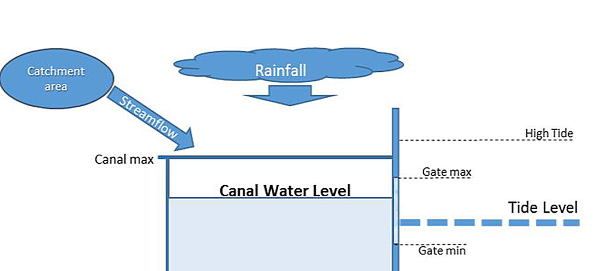
Estimating the likelihood of flooding in urban areas poses a greater challenge than in natural landscapes as land-surfaces are more heterogeneous and consist of many more runoff pathways. Data acquisition and process identification are also more difficult in urban areas as networks undergo more frequent and rapid change. To reduce complexity therefore, a lumped-parameter model can be used to represent hydrologically connected areas, rather than individual streets.
This diagram presents the typical situation.
The drainage systems of cities on China’s East coast generally consist of networks of channels or canals that are fed by streams from the surrounding catchments. The canal network is protected from tidal intrusion by a combination of sluice-gates, weirs and large flood-gates. Water is released from the system between high tides until a minimum water level is reached. If catchment runoff exceeds the rate of drainage from the system (for example during extreme rainfall) there is a risk of canal capacity exceedance and flooding. During normal operating conditions, a minimum water-level is preserved in canals to ensure sufficient water for irrigation, recreation or commercial use.
In summary, Urban drainage systems in coastal cities in SE China are characterized by often complex canal and sluice-gate systems that are designed to safely drain pluvial flooding whilst preventing tidal inundation. However, the risk of coastal flooding in the region is expected to increase over the next 50–100 years, as urban areas continue to expand and sea-levels are expected to rise. To assess the impact of projected sea-level rise on this type of urban drainage system, a one-dimensional model and decision support tool was developed. The model indicated that although sea-level rise represents a significant challenge, flood probability will continue to be most influenced by rainfall. Events that are significant enough to cause flooding will most likely be minimally impacted by changes to the tidal frame. However, it was found that a sea-level rise of up to 1.2 m by 2010 would result in increased drainage times and higher volumes of over-topping when flooding occurs.
Philadelphia is a Career Flood Fighter
Just like Rocky Balboa atop the Art Museum steps, Philadelphia has long contended with flood events and has always to be prepared. There have been 65 Philly floods since 1769, most recently in 2014. The city floods when water level in the Schuylkill basin goes over 11 feet, according to Historical Floods: Schuylkill River at Philadelphia, Pennsylvania from NOAA.
The table below shows the most severe events, 15 in all from 1869 to 2014, along with the crest level in feet and the measured streamflow in cubic feet per second.
Date of Flood
Crest (ft)
Streamflow (cfs)
Category
CO2 ppm
10/04/1869
17.00
135,000
Major
287.5
3/1/1902
14.80
98,000
Moderate
296.6
8/24/1933
14.70
96,200
Moderate
308.9
7/9/1935
14.10
82,000
Moderate
309.7
8/9/1942
13.10
71,500
Moderate
310.7
6/2/1946
14.57
94,600
Moderate
310.3
11/25/1950
14.32
89,800
Moderate
311.3
8/19/1955
14.32
90,100
Moderate
313.7
9/13/1971
13.28
70,300
Moderate
326.4
6/23/1972
14.65
103,000
Moderate
327.5
1/19/1996
13.36
79,000
Moderate
362.6
9/17/1999
14.10
92,500
Moderate
368.4
10/1/2010
13.05
76,300
Moderate
389.2
8/28/2011
13.56
83,900
Moderate
391.2
5/1/2014
13.91
88,300
Moderate
397.2
I have also provided the CO2 atmospheric concentrations for the flood dates, as reported by NASA. Climatists advocate reducing CO2 emissions as a policy to prevent urban flooding. However, the correlation between CO2 in ppm and Philly flood crests is -.58 and -.42 with streamflow. So the severity of Philly flooding has decreased while CO2 has risen. Perhaps burning more fossil fuels would be the prudent action.
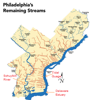
Mahbubur Meenar, a professor of community and regional planning at Temple, says that much of the flooding we see happens because of the city’s drainage system. In about 2/3 of the city, stormwater and wastewater — whatever comes out of your house or office building — drains through the same system. This happens because, well, the city is old. It’s so old, and so ingrained in the city’s infrastructure that it would be prohibitively expensive, if not impossible, to change.
On normal days, the drainage system works fine. Wastewater goes through and is treated before making its way to one of the rivers. But rain throws a wrench into the process. It flows into the same drains and mixes with the wastewater. The extra water can rise and flow onto the streets. Litter and fallen leaves don’t help, either. They can gather in the drains and make it more likely for flooding.
Another variable: Especially around Center City there are few natural resources that can capture water, i.e. streams and creeks. Nearly all of them have been filled in and turned into sewers. Dock Street is probably the best known example. That brick street in Society Hill used to be a creek. Dozens more have experienced the same fate, mostly in Center City and the neighborhoods closest to it. Check it out. The red lines indicate former bodies of water that have been filled in:
Creeks Flood Philly PHILLYH2O.ORG
If those creeks were still around, they could collect rainwater. Without them, stormwater lingers on the streets and has to go somewhere else — and in Philadelphia that’s through the drains where wastewater is already going.
“Depending on all these things,” Meenar said, “the road gets flooded.”
To some extent, there’s not much the Water Department can do. It can’t restore all of Philadelphia’s creeks or overhaul the city’s infrastructure, particularly in the oldest parts of the city where stormwater and wastewater drain together. But the Water Department is working on green stormwater infrastructure to combat the problem. There have been some inroads throughout the city’s neighborhoods — things like green roofs, rain gardens and even man-made wetlands. They are designed to collect stormwater.
The primary purpose of these measures actually has to do with keeping our rivers clean. Stormwater that hits Philly’s streets can pick up chemicals harmful to our rivers and to us if it ends up in our drinking water. By storing the stormwater for a while, it can be released into a system where it will be properly treated, rather than flowing directly into the Schuylkill or Delaware.
The secondary effect for green stormwater infrastructure is that it helps prevent flooding. Not all of the water is rushing into drains at once.
“They try to store water as long as possible and then slowly release it to the drain,” Meenar said.
So that’s how the City is dealing with flooding from rainstorms. Besides rain and severe storms, of course, Philadelphia’s 3,000 miles of leaky pipes can cause flooding, too. That’s an entirely different problem, though.
For example, just today Philadelphia NBC TV affiliate aired a segment declaring Climate Change Studies Show Philly Underwater. Previously Philly CBS station had their piece shown below.
All of this fearmongering over sea level rise is a coordinated campaign to terrorize coastal dwellers and landowners. UCS (Union of Concerned Scientists) together with Climate Central are collaborating to do a drip, drip, drip water torture treatment exploiting the public addiction to television.
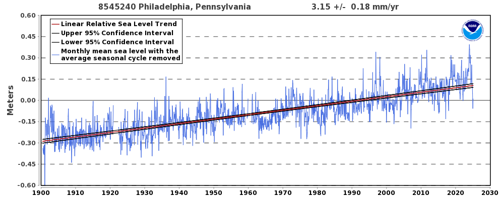
Philadelphia, PA – Station ID: 8545240
What They Are Not Telling People
From NOAA Tides and currents comes this long record of service by the tidal guage at Philadelphia.
In records running back to 1900, Philadelphia has never seen waterfront flooding that reaches 4 feet above the local high tide line. But under a mid-range sea level rise scenario, floods within the Delaware Estuary exceeding 4 feet are more likely than not to take place by 2040, less than one 30-year mortgage cycle away. Under a low-range scenario, chances are just below even; and under a high-range scenario, they reach 3 in 4. At the other end of the spectrum, under high-range projections, there is roughly a 4 in 5 chance of floods above 9 feet by the end of the century.
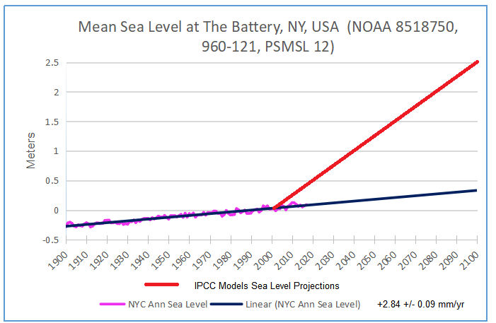
Putting the projections together with the observational record gives this graph. Both the record and projection are zero at year 2000. If the past trend continues, a further rise of 30 cm would be observed by 2100. If Climate Central model-based projection is true, the red line shows 122 cm rise by 2040, and 274 cm by 2100. So alarmists are projecting in 20 years, Philadelphia will get four times the rise that occurred in the last 100 years. Even now, in 2019, the projection is off by 50 cm, and observations are going down.
Not to worry, UCS provides this Disclaimer:
Neither the authors nor the Union of Concerned Scientists are responsible or liable for financial or reputational implications or damages to homeowners, insurers, investors, mortgage holders, municipalities, or other any entities. The content of this analysis should not be relied on to make business, real estate or other real world decisions without independent consultation with professional experts with relevant experience. The views expressed by individuals in the quoted text of this report do not represent an endorsement of the analysis or its results.
None of that uncertainty appears in the TV clips. And even worse, computing technology and desktop publishing are being exploited not to empower people, but to terrify them. An entire web page is devoted to Google Earth images photoshopped to show chunks of Philadelphia under water. Here’s what Philly could look like in 2100 if sea levels rise
Conclusion
More and more, the media are pushing people into the Hobbesian Choice. Thomas Hobbes (1544–1631) believed that man must choose between living in a state of nature (a life which is “solitary, poor, nasty, brutish, and short”) or suffering under an arbitrary and absolute government. And the media content forces another awful decision: Either believe nothing (or the opposite) of what you read or see on TV, or go into full panic mode.
Footnote
The hottest temperatures ever reported in Phoenix came in January 2015, when Fox 10 weatherman Cory McCloskey faced a malfunctioning temperature map on live television. “Wow, 750 degrees in Gila Bend right now,” he said, without breaking a sweat. “And 1,270 in Ahwatukee. Now, I’m not authorized to evacuate, but this temperature seems pretty high.” More than 6 million people have watched the blooper on YouTube.
For example, just today Philadelphia NBC TV affiliate aired a segment declaring Climate Change Studies Show Philly Underwater. Previously Philly CBS station had their piece shown below.
All of this fearmongering over sea level rise is a coordinated campaign to terrorize coastal dwellers and landowners. UCS (Union of Concerned Scientists) together with Climate Central are collaborating to do a drip, drip, drip water torture treatment exploiting the public addiction to television.
What They Are Not Telling People
From NOAA Tides and currents comes this long record of service by the tidal guage at Philadelphia.
In records running back to 1900, Philadelphia has never seen waterfront flooding that reaches 4 feet above the local high tide line. But under a mid-range sea level rise scenario, floods within the Delaware Estuary exceeding 4 feet are more likely than not to take place by 2040, less than one 30-year mortgage cycle away. Under a low-range scenario, chances are just below even; and under a high-range scenario, they reach 3 in 4. At the other end of the spectrum, under high-range projections, there is roughly a 4 in 5 chance of floods above 9 feet by the end of the century.
Putting the projections together with the observational record gives this graph. Both the record and projection are zero at year 2000. If the past trend continues, a further rise of 30 cm would be observed by 2100. If Climate Central model-based projection is true, the red line shows 122 cm rise by 2040, and 274 cm by 2100. So alarmists are projecting in 20 years, Philadelphia will get four times the rise that occurred in the last 100 years. Even now, in 2019, the projection is off by 50 cm, and observations are going down.
Not to worry, UCS provides this Disclaimer:
Neither the authors nor the Union of Concerned Scientists are responsible or liable for financial or reputational implications or damages to homeowners, insurers, investors, mortgage holders, municipalities, or other any entities. The content of this analysis should not be relied on to make business, real estate or other real world decisions without independent consultation with professional experts with relevant experience. The views expressed by individuals in the quoted text of this report do not represent an endorsement of the analysis or its results.
None of that uncertainty appears in the TV clips. And even worse, computing technology and desktop publishing are being exploited not to empower people, but to terrify them. An entire web page is devoted to Google Earth images photoshopped to show chunks of Philadelphia under water. Here’s what Philly could look like in 2100 if sea levels rise
Conclusion
More and more, the media are pushing people into the Hobbesian Choice. Thomas Hobbes (1544–1631) believed that man must choose between living in a state of nature (a life which is “solitary, poor, nasty, brutish, and short”) or suffering under an arbitrary and absolute government. And the media content forces another awful decision: Either believe nothing (or the opposite) of what you read or see on TV, or go into full panic mode.
Footnote
The hottest temperatures ever reported in Phoenix came in January 2015, when Fox 10 weatherman Cory McCloskey faced a malfunctioning temperature map on live television. “Wow, 750 degrees in Gila Bend right now,” he said, without breaking a sweat. “And 1,270 in Ahwatukee. Now, I’m not authorized to evacuate, but this temperature seems pretty high.” More than 6 million people have watched the blooper on YouTube.


:format(webp)/cdn.vox-cdn.com/uploads/chorus_image/image/58274155/Screen_Shot_2018_01_10_at_10.17.06_AM.0.png)
 Context