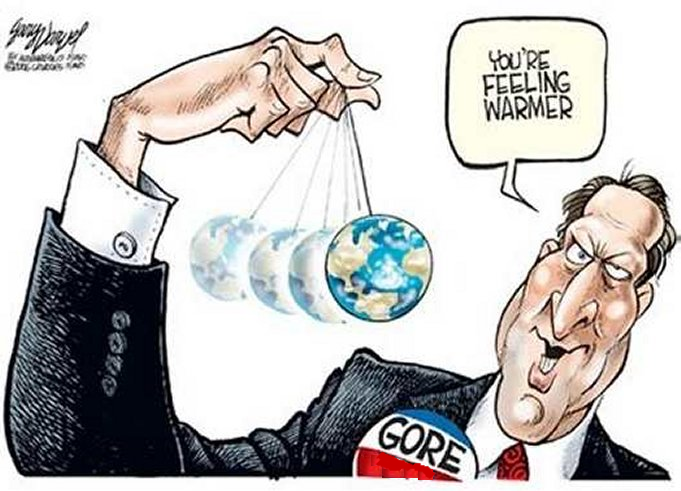
Tipping Points Confuse Social and Earth Science

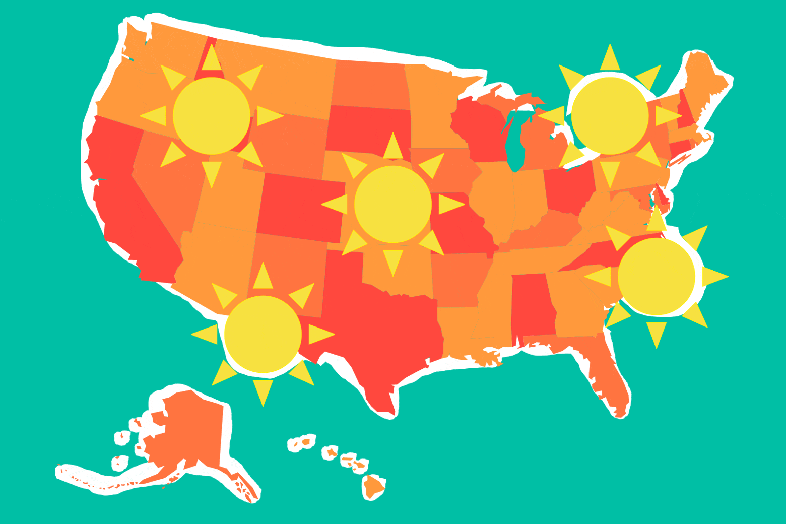
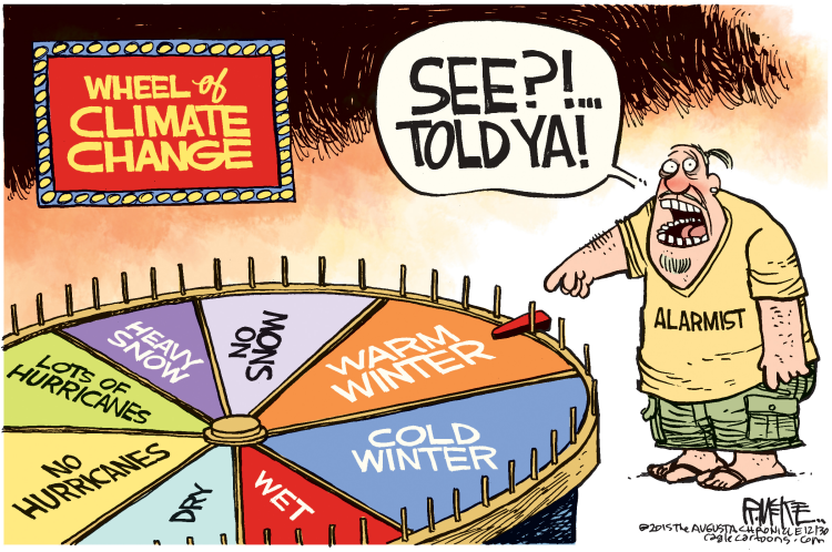
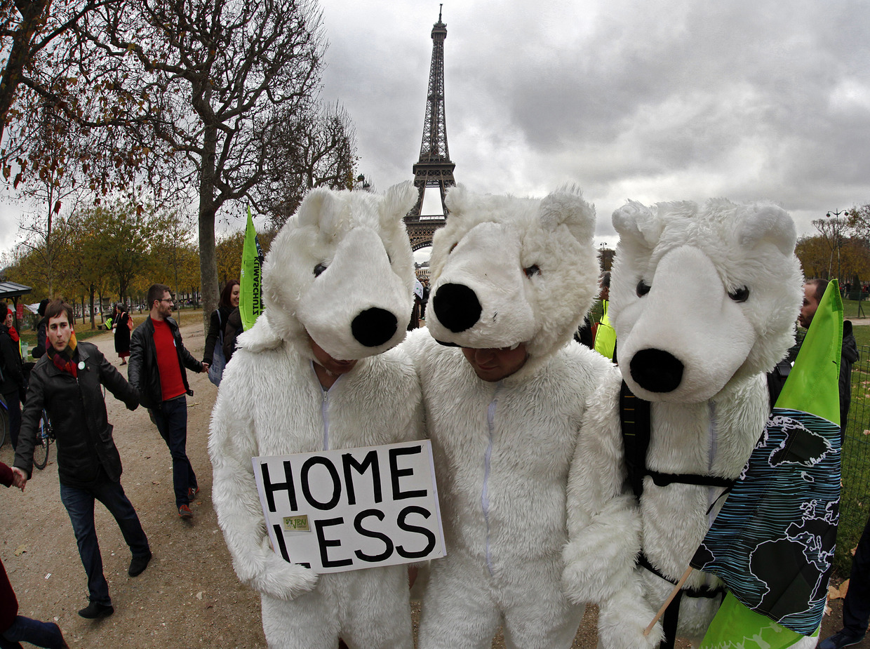
In the drive to push public opinion over the top regarding global warming/climate change, the media is increasingly filled with references to climate “tipping points.” For example, some months ago an IPCC spokesperson claimed a climate disaster is now happening each and every week. And the media abounds with reports to press home the point. Here are some of the current disasters caused by climate change, ripped (as they say) from the headlines.
Birds are shrinking as the climate warms
Climate change-related deaths and damage on the rise
Europe Could Face Annual Extreme Heat Waves Due to Climate Change
Food Prices Expected To Jump Next Year Due To Climate Change
Climate change taking serious toll on human health: WHO report
Climate Crisis Causing Hunger for Millions of Africans
How climate change is causing more premature births
Et cetera, et cetera. (A complete list would provide more than one disaster for every week of the year.)
IOW, as Pys.org reported, all this hype may make this year the tipping point: The year the world woke up to the climate emergency.
Background on the Use of “Tipping Points”
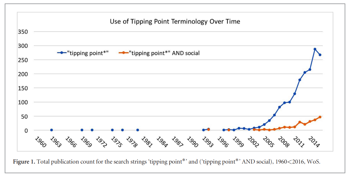
The context for understanding the rise of the “tipping point” notion is provided by a 2018 paper in Environmental Research Letters Defining tipping points for social-ecological systems scholarship—an interdisciplinary literature review. As the title suggests the researchers are not studying the earth, but rather people’s perceptions about the earth. This growing field of environmental psychology confirms how “climate change” muddles social and physical sciences. Excerpts in italics with my bolds
Abstract
The term tipping point has experienced explosive popularity across multiple disciplines over the last decade. Research on social-ecological systems (SES) has contributed to the growth and diversity of the term’s use. The diverse uses of the term obscure potential differences between tipping behavior in natural and social systems, and issues of causality across natural and social system components in SES. This paper aims to create the foundation for a discussion within the SES research community about the appropriate use of the term tipping point, especially the relatively novel term ‘social tipping point.’
We review existing literature on tipping points and similar concepts (e.g. regime shifts, critical transitions) across all spheres of science published between 1960 and 2016 with a special focus on a recent and still small body of work on social tipping points. We combine quantitative and qualitative analyses in a bibliometric approach, rooted in an expert elicitation process.
Historical Analysis and Concerns
We find that the term tipping point became popular after the year 2000—long after the terms regime shift and critical transition—across all spheres of science. We identify 23 distinct features of tipping point definitions and their prevalence across disciplines, but find no clear taxonomy of discipline-specific definitions. Building on the most frequently used features, we propose definitions for tipping points in general and social tipping points in SES in particular.
Being located at the intersection between the social and natural sciences, SES researchers need to tread carefully when borrowing concepts from other disciplines. Such a move often involves the crossing of ontological boundaries, where the metaphorical use of a concept can mask important differences between two objects of study. The two phenomena included in the analogy should be similar in the sense that they can be characterized by common laws or principles. The success of the analogy depends on whether attributes of tipping points in the target domain can be tested and assessed similar to the one in the source domain (Daniel 1955, Gentner 1983). However, SES research pays little attention to whether the presumed observation of tipping behavior in a social system is conceptually equal or (partly) different than tipping processes in an ecological system. It remains unknown whether tipping points in natural systems, such as a lake or the climate, display the same underlying mechanisms as tipping points in social systems, such as in financial markets or political institutions.
The tipping point concept traces its origins back to scientific papers in chemistry (Hoadley 1884) and mathematics (Poincare´ 1885), which refer to a qualitative change in a system described mathematically as a bifurcation. Bifurcation theory is still used today in mathematics, physics, complex systems science, and related fields.
In the social sciences, tipping points originated much later to address neighborhood dynamics of racial segregation in political science (Grodzins 1957), sociology/urban planning (Wolf 1963), and economics (Schelling 1978). Social scientists began to develop similar concepts of social change without the tipping point language. For example, sociologist Mark Granovetter (1978) uses the term threshold to understand the differences in individuals’ decisions to engage in a collective behavior, such as rioting.
Whether or not it can be attributed to Malcolm Gladwell’s book The Tipping Point (2000), starting around 2005, the term was widely adopted among climate scientists (Russill and Nyssa 2009, Kopp et al 2016) to describe rapid, non-linear change in parts of the climate system. Previously this phenomenon had been referred to with different terminology, such as critical points, but now climate scientists embraced tipping point language, with three papers using tipping point terminology to focus on ice sheet dynamics in the Arctic (Holland et al 2006, Lindsay and Zhang 2005, Winton 2006). A 2008 paper introduced the idea of tipping elements in the climate system, defined as subsystems of the climate system that can experience abrupt change,‘triggering a transition to a new state.’
The historical account of the movement of the concept from its origins in mathematics and chemistry to the social sciences, popular discourse and back to mathematical modeling in the climate sciences raises important scientific questions.
The increasingly frequent use of the concept of tipping points in both the natural and social sciences could be scientifically questionable: sociological and political tipping points might be very different phenomena than climatic tipping points, even if both natural and social systems may be subject to rapid qualitative change. If institutional tipping and ecosystem tipping are different ‘things in nature’— different ontological entities—scientific language should not treat them as the same. Scientific language should clarify rather than veil potential differences between tipping points in different fields.
Phenomena in nature—the objects of tipping point research Different fields of science deploy tipping point terminology to study vastly different real-world phenomena. In the natural sciences (Ecology, Climate and Earth System Science), scholars are primarily interested in the tipping of ecological systems, e.g. the eutrophication of lakes, and of larger Earth System components, also called climate tipping elements (e.g. Arctic ice sheets). This research crosses multiple scales of interest, but focuses on a shared mechanism of change: positive, self-reinforcing feedbacks moving a system into a different stability domain. Key research challenges include the limited reversibility of a system to its previous state and significant predictive challenges related to tipping points.
Conclusions
To conclude, we have proposed a unifying definition for tipping points, building on the most frequent themes identified in our analysis: a tipping point is a threshold at which small quantitative changes in the system trigger a non-linear change process that is driven by system-internal feedback mechanisms and inevitably leads to a qualitatively different state of the system, which is often irreversible. This definition establishes a minimum set of four constitutive features of tipping points that apply across disciplines:
-
- multiple stable states;
- non-linear change;
- feedbacks as driving mechanism;
- limited reversibility.
If these four essential characteristics are given, the use of the term tipping point is justified. However, whether it is possible to apply these tools to social and social-ecological change phenomena remains unclear and is a subject that requires future research.
Our research found that the tipping point concept is applied to a vast array of change processes, ranging from ice sheet dynamics to societal transformations, which might mask ontological differences between these diverse phenomena. Concerned about the pattern of terminological replacement—the use of tipping point language instead of previously existing terms—and its potential effects on the quality of science, we encourage researchers to critically assess their terminological choices and avoid ‘conceptual amnesia’.
My Comment
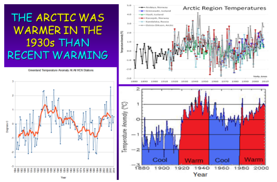
Besides the issue of confusing natural and social processes, the paper only touched tangentially on three related problems applying this terminology to global warming/climate change. Firstly, in the natural world there are shifts between multiple stable states, in some cases reversing back and forth in cyclical patterns. For example, paleoclimatologists have mapped the earth’s oscillations between “hot house” and “ice house.”

Secondly, headlines like those above always portray change as negative and destructive. In both natural and social tipping points there can be desirable, transformative shifts, not just adverse, gloomy results.
 Thirdly, as Brothers Judd warn, there is less than meets the eye in claims of tipping points. From their review of Gladwell’s book:
As a general matter Gladwell’s Tipping Point idea, like Darwin’s idea of Evolution, is grounded more in literary metaphor than in science. If you ask, as Gladwell does, why Hush Puppies suddenly became fashionable again after years of declining or stagnant sales, the answer must be that they hit a Tipping Point. If you ask why they stayed unpopular for so long, the answer must be there were no Tipping Points during that time. Why did the book Divine Secrets of the Ya-Ya Sisterhood become a best seller, while Rebecca Wells’s previous books hadn’t, or other (better) novels didn’t ? One hit a Tipping Point, the others didn’t. But this doesn’t really add anything to our understanding of the human behavior and desires that fueled the crazes nor does it help us to determine how to tip other products and processes in the future. Gladwell’s argument, like all pseudoscience, is a closed loop–if something tips then it hit a Tipping Point; if it doesn’t, then it didn’t. Rather than explaining what happened, the metaphor, once accepted, stifles intelligent analysis. The fact that something happened comes to seem a sufficient explanation and a justification for saying that the process occurred; the actual elements of this theoretical process need never be demonstrated, nor tested; it’s as if the circular beauty of the metaphor precludes questioning its validity.
Finally, as the critique shows, tipping points are like climate change itself: Applying labels to something that has already happened, with no predictive utility.


 Detailed Rebuttal and Authors:


 Detailed Rebuttal and Authors: AC