Bering Ice Lost and Found

2019/03/06 GCOM-W/AMSR2 [Okhotsk] Sea Ice Concentration Source: JAXA. Note Hokkaido Island, Japan, under the white triangle tip.

This week has news reports frightened about the early melting of ice in Bering Sea.  This post is to reassure everyone that the lost ice has been found, most of it just next door in Okhotsk sea.

The Pacific basins of Bering and Okhotsk display opposing ice patterns this year.

The last two weeks saw open water growing on the right in Bering Sea, now down to 140k km2, one-fourth of its maximum extent.  Meanwhile, Okhotsk on the left grew steadily, now pressing down on Hokkaido Island, producing the southernmost Arctic Ice to be found. The graph below shows how 2019 compares to the 12 year average, after taking the Bering anomaly out of the picture.

The chart runs from mid-February to mid-March, showing how 2019 NH ice extent peaked above average on day 54, declined for a week, then rose again recently.  The effect of Bering ice loss appears in the gaps between NH extents with and without Bering ice.  Note that the black and green lines show Bering has contributed about 700k km2 to the overall total, and that increases to 800k km2 by day 76.

2019 NH included about 500k km2 from Bering on day 32, but the Bering extent has steadily decreased, now only 140k km2.  Thus 2019 w/o Bering is 270k km2 greater than NH average w/o Bering at this time, with another 10 days or so for additional ice to form.

The table below shows ice extents in the various basins on day 64.

Region 2019064 Day 064 
Average
2019-Ave. 2018064 2019-2018
 (0) Northern_Hemisphere 14706623 15022070 -315447 14461393 245231
 (1) Beaufort_Sea 1070498 1070200 297 1070445 53
 (2) Chukchi_Sea 943452 965931 -22479 965161 -21709
 (3) East_Siberian_Sea 1087137 1087133 4 1087120 18
 (4) Laptev_Sea 897845 897842 3 897845 0
 (5) Kara_Sea 934558 927864 6694 934055 503
 (6) Barents_Sea 781551 642119 139431 598121 183430
 (7) Greenland_Sea 553335 639443 -86108 548263 5072
 (8) Baffin_Bay_Gulf_of_St._Lawrence 1575867 1538064 37803 1610374 -34507
 (9) Canadian_Archipelago 853337 853037 300 853109 229
 (10) Hudson_Bay 1260903 1259978 925 1260838 66
 (11) Central_Arctic 3246782 3218361 28421 3150790 95993
 (12) Bering_Sea 140439 716013 -575574 286010 -145571
 (13) Baltic_Sea 64749 106825 -42077 166155 -101407
 (14) Sea_of_Okhotsk 1285797 1063174 222622 1008051 277746

The Bering deficit is 575k km2 or just 20% of the 12 year average.  Surpluses in Okhotsk, Baffin, Central Arctic and Barents do not completely offset, so the NH total is 315k km2 or 2% below average.

Taking a boat trip from Hokkaido Island to see Okhotsk drift ice is a big tourist attraction, as seen in the short video below.  Al Gore had them worried back then, but not now.

Drift ice in Okhotsk Sea at sunrise.

Weather is Not Climate (again): Marine Heat Waves

Currently, the fashion is to prove global warming/climate change by pointing to “extreme” weather events. This week we have a new candidate for alarms: Marine Heat Waves. For example:

Suffering in the heat—the rise in marine heatwaves is harming ocean species Phys.org08:40

Marine heat waves threaten fish, corals SBS00:28

Ocean heat waves remake Pacific and Caribbean habitats Ars Technica06:56

Study: More Marine Heat Waves Threaten Fish, Corals Voice of America20:55 Mon, 04 Mar

More marine heatwaves threaten fish and corals — study Gulf Times16:55 Mon, 04 Mar

Ocean Heat Waves Are Threatening Marine Life The New York Times13:55 Mon, 04 Mar

Background

Variation in sea surface temperatures is not new. Cliff Mass of U. Washington, Seattle, educated us some years ago regarding a persistent patch of N. Pacific warm water he named: “The BLOB.” A series of posts at his blog covered this event starting in Autumn 2013, waxing and waning until finally disappearing in 2018. Most informative is The Blob Strengthens Excerpts in italics with my bolds.

The original BLOB, named by Washington State Climatologist Nick Bond, formed the previous winter (2013-2014). The BLOB was defined as a persistent region of anomalously warm water in the northeast Pacific. With the air reaching the Northwest generally passing over the BLOB, the result was warmer than normal temperatures.

And by the first week of this month, the BLOB seems to have returned, and with it, its evil twin, El Nino, indicated by the warm waters in the eastern tropical Pacific. Now we have a problem. Note that the temperatures in the BLOB are 2-3 C (roughly 4-5F) above normal.

The effects of the BLOB have become more than a little evident to everyone living in our region. Temperatures are way above normal because of the warming effects of the ocean…it is hard for our minimum temperatures to fall much below the ocean temperatures this time of the year. Want to see evidence of this? Here are the surface air temperatures at Seattle Tacoma Airport for the last 4 weeks, with the average highs and lows shown. We have been warmer than normal, with minimum temperatures consistently 3-4F above normal.

The BLOB itself is not an independent player. It has been forced by an anomalous atmospheric circulation, including anomalous high pressure (ridging) centered north of our region (see map showing the height (pressure) anomalies (difference from normal) at 500 hPa (about 18,000ft) for the last 30 days. Yellow indicates higher heights than normal.

An article from that time (2016) at Climate Central took mainly the alarmist view, but also quoted a reasonable statement from Cliff Mass. California Drought, Marine Heat More Likely With Warming

“The atmospheric variability that forced the warm blob is the same that forced the drought,” said Emanuele Di Lorenzo, an ocean and climate dynamics professor at Georgia Tech who coauthored the analysis, published in Nature Climate Change. “This atmospheric variability is increasing under greenhouse gases.”

The new findings could help scientists predict when similar marine heatwaves and droughts will strike in the future. They also suggest such heatwaves will become more common and intense, which could mean greater drought risks in the West. (By increasing evaporation and reducing snowfall, warmer temperatures are already making Western droughts worse.)

“This could potentially provide predictability,” said Cliff Mass, a University of Washington atmospheric sciences professor who wasn’t involved with the research. “This is natural variability that we’re dealing with.”

What Are “Marine Heat Waves?” (From Marine Heat Waves.org)

We use a recently developed definition of marine heatwaves (Hobday et al. 2016). A marine heatwave is defined a when seawater temperatures exceed a seasonally-varying threshold (usually the 90th percentile) for at least 5 consecutive days. Successive heatwaves with gaps of 2 days or less are considered part of the same event.

Marine heatwaves can be caused by a whole range of factors, and not all factors are important for each event. The most common drivers of marine heatwaves include ocean currents which can build up areas of warm water and air-sea heat flux, or warming through the ocean surface from the atmosphere. Winds can enhance or suppress the warming in a marine heatwave, and climate modes like El Niño can change the likelihood of events occurring in certain regions.

[Note: the phrase about the atmosphere warming the ocean is misleading. The ocean has 1000 times the heat capacity of the air, and the heat transfer is upward. From Columbia U. on the Ocean/Atmosphere Heat Flux:

Solar heating of the ocean on a global average is 168 watts per square meter

Net infrared radiation cools the ocean, on a global average by 66 watts per square meter.

On global average the oceanic heat loss by conduction is only 24 watts per square meter. (If the ocean were colder than the atmosphere (which of course happens) the air in contact with the ocean cools, becoming denser and hence more stable, more stratified. As such the conduction process does a poor job of carrying the atmosphere heat into the cool ocean.)

On global average the heat loss by evaporation is 78 watts per square meter. (The largest heat loss for the ocean is due to evaporation, which links heat exchange with hydrological cycle.) ]

The trigger for the current concern is Marine heatwaves threaten global biodiversity and the provision of ecosystem services published March 4, 2019 at Nature Climate Change. Dan A. Smale is lead author with 17 co-authors. The media were quick to misinterpret the study and claim a link to burning of fossil fuels.  Excerpts in italics with my bolds.

Abstract: The global ocean has warmed substantially over the past century, with far-reaching implications for marine ecosystems. Concurrent with long-term persistent warming, discrete periods of extreme regional ocean warming (marine heatwaves, MHWs) have increased in frequency. Here we quantify trends and attributes of MHWs across all ocean basins and examine their biological impacts from species to ecosystems. Multiple regions in the Pacific, Atlantic and Indian Oceans are particularly vulnerable to MHW intensification, due to the co-existence of high levels of biodiversity, a prevalence of species found at their warm range edges or concurrent non-climatic human impacts. The physical attributes of prominent MHWs varied considerably, but all had deleterious impacts across a range of biological processes and taxa, including critical foundation species (corals, seagrasses and kelps). MHWs, which will probably intensify with anthropogenic climate change, are rapidly emerging as forceful agents of disturbance with the capacity to restructure entire ecosystems and disrupt the provision of ecological goods and services in coming decades.

My Comments

The authors managed to produce an hockey stick graph by means of attaching an high-resolution instrumental record to low-resolution proxy estimates of the past. The method is described in the paper:

Global time series and regional trends in total MHW days were derived using a combination of satellite-based, remotely sensed SSTs and in situ-based seawater temperatures. First, total MHW days were calculated globally over 1982–2015 at 1/4° resolution from the National Oceanic and Atmospheric Administration (NOAA) Optimum Interpolation SST V2 high-resolution data. Then, proxies for total MHW days globally over 1900–2016 were developed on the basis of five monthly gridded SST datasets (HadISST v.1.1, ERSST v.5, COBE 2, CERA-20C and SODA si.3). A final proxy time series was calculated by averaging across the five datasets. The five monthly datasets were used since no global daily SST observations are available before 1982.

The three peaks in the modern record are clearly the result of the major El Ninos 1997, 2009 and 2015. And it is likely that mining the daily satellite records since 1982 identified marine heat waves that would not show up in the proxy monthly datasets.

Conclusion

This is another example of a natural process that threatens our livelihoods but which we struggle to predict and to adapt. As with other short-term weather events, humankind has a great stake in better understanding in order to forecast, prepare and manage adapations as required. There have always been major variations in warming and cooling sea surface temperatures. And yet the Global average anomalies vary by a few tenths of a degree celsius, with significant difference in the two hemispheres. This implies both that marine heat waves are offset by cold waves elsewhere, and that the well-mixed CO2 molecules are not to blame.

See Also: On Climate “Signal” and Weather “Noise”

Empirical Evidence: Oceans Make Climate

Pacific Ice Seesaw Feb. 2019


10 Days in Pacific Arctic:
The above image shows the pacific ice seesaw returning at the end of February.  Bering Sea on the right was at 95% of 2018 maximum and then lost  180k km2 in ten days, now at 65 % of max.  Meanwhile on the left Okhotsk Sea gained 70k km2, and is now 106% of 2018 maximum.

The graph below shows February progress in ice extent recovery.As noted before, the month started with a slight decline, then ice grew rapidly for 18 days peaking on day 54 above the 12 yr. average, and above the previous two years.  Then ice retreated the last five days with the February monthly average ending  240k km2 or 2% below average. SII lags MASIE by ~100k km2 for the month.

The next two weeks will show whether 2019 is maxed out, or whether the ice extent catches up to the average which flatlines over that period.

The table below shows the distribution of ice in the various Arctic basins.

Region 2019059 Day 059 
Average
2019-Ave. 2018059 2019-2018
 (0) Northern_Hemisphere 14625288 15006867 -381579 14485052 140236
 (1) Beaufort_Sea 1070498 1070200 297 1070445 53
 (2) Chukchi_Sea 960221 965872 -5651 965971 -5750
 (3) East_Siberian_Sea 1087137 1087133 4 1087120 18
 (4) Laptev_Sea 897845 897842 3 897845 0
 (5) Kara_Sea 931672 929289 2383 922905 8767
 (6) Barents_Sea 684894 625620 59274 544938 139956
 (7) Greenland_Sea 513404 628938 -115534 473064 40340
 (8) Baffin_Bay_Gulf_of_St._Lawrence 1570308 1539346 30962 1786606 -216298
 (9) Canadian_Archipelago 853337 853036 302 853109 229
 (10) Hudson_Bay 1260903 1260611 293 1260838 66
 (11) Central_Arctic 3231172 3213214 17958 3065181 165991
 (12) Bering_Sea 250169 710647 -460479 336065 -85896
 (13) Baltic_Sea 39687 110466 -70780 123280 -83594
 (14) Sea_of_Okhotsk 1260392 1067746 192646 1069898 190494

The table shows how 2019 is matching the 12-year average almost everywhere.  Barents Sea has caught up and edged ahead of average, and much higher than last year.  Greenland Sea is below average but higher than 2018.  The overall deficit is due to Bering ice down 460k km2 to average, only partially offset by a surplus of 193k km2 in Okhotsk.

cg524a47d218458

Footnote:  At his AER blog  Arctic Oscillation and Polar Vortex Analysis and Forecasts Dr. Judah Cohen writes on Feb. 25 regarding this cold winter in the Arctic. Excerpts in italics with my bolds.

As I have written many times in the blog this fall and winter season the influence of a significant stratospheric PV disruption typically lasts on the order of four to eight weeks. It certainly looks like the PV split from early January has gone the distance and has persisted for a full eight weeks or possibly even a little longer. Based on the latest polar cap geopotential heights (PCHs) forecast the whole event is winding down over the next week or so. Therefore, I think that we can start to draft the obituary for this event.

The stratosphere-troposphere coupling differed from last year’s PV split and other previous similar events but certainly not all. Though the “dripping” of warm PCHs occurred periodically, there were long gaps between “drips” where the tropospheric PCHs even turned cold for an appreciable period. Also, the AO and NAO never turned strongly negative nor was there any persistent period where both indices remained in negative territory. This is in strong contrast to last winter. As I wrote in last week’s blog, I think at least part of the reason might be the relatively cold central Arctic this winter compared with the last several winters where the Arctic was near or at record warm.

Though despite what could be considered atypical or less traditional stratosphere-troposphere coupling following the stratospheric PV split, I would argue there were still some impressive impacts on the weather. Maybe those impacts were more discernable and more impressive across North America than Eurasia, but both continents had record cold and snow.

So, what to expect as the stratosphere-troposphere coupling event wraps up. For Europe, temperatures are already mild and with the AO predicted to remain positive and could potentially turn even more strongly positive if the cold PCHs couple all the way to the surface, it is hard for me to see a return to any kind of prolonged cold this month. Across North America it is more complicated. Cold temperatures are predicted to be expansive across the continent and even record cold is possible over the next week or so. In addition, snow cover is relatively extensive and, in many locations, unusually deep especially on either side of the US-Canadian border. I don’t expect the cold air across in North America to simply disappear anytime soon, but if the if the cold PCHs couple all the way to the surface, this would favor the cold temperatures being mostly confined to western North America. I also feel that circulation and temperature anomalies in the stratosphere suggest a relatively cold western North America and relatively mild eastern North America especially Eastern US. And despite the cold start to March in the Eastern US the models are predicting a return to mild conditions by the middle of March.


On Sea Ice Thickness

ice Charts from AARI showing ice extents by duration. Appearing in brown is Multi-year ice (surviving at least one melt season).

At the recent post Arctic Ice Surpasses 2018 Maximum, I was asked about measures of sea ice thickness and estimates of volume, combining extents (or concentrations) with thickness.  My response:

Agencies like DMI produce model-driven estimates of Arctic sea ice thickness. I limit my analysis to extents because they are observation-driven.

DMI says this:  “The figures are based on calculations using the DMI operational coupled ocean- and sea-ice model HYCOM-CICE. The total sea-ice volume is a product of the sea-ice concentration and its thickness.”

“Today, the sea-ice concentration is in general well estimated using satellite products, while the sea-ice thickness is poorly known. The model gives a realistic estimate of the total amount of sea-ice within the Arctic.” (concentration means extent). FWIW, DMI estimates of Arctic thickness have increased over the last decade.

It’s a complicated business to get remote signals of thickness, which varies with drifting and compaction from storms and currents.  Another way to get at the issue appears in the animation above with AARI ice charts.  They are derived from satellite imagery, configured so that the brown color represents multi-year ice that survived at least one melt season.   The animation shows the last 11 years had some low years, especially 2008, 2009 and 2013, with higher years since.  And obviously the locations of older ice are variable.

Of course there are other sea ice volume modelled products such PIOMAS.  For an insight into how complicated is estimating sea ice thickness from remote sensors see this article Estimating Arctic sea ice thickness and volume using CryoSat-2 radar altimeter data

Arctic Ice Surpasses 2018 Maximum

Atlan2019036to051
Sea Ice Extends on the Atlantic Side: 
The animation above shows the last two weeks on the Atlantic side, with Kara achieving its annual maximum and Barents growing ice up to 86% of its max last March. In the upper right the ice solidifies down to Svalbard and fast ice forms along the mainland.  On the left, Baffin ice thickens along the Labrador coast and  a large mass forms along Newfoundland. The Gulf of St. Lawrence is nearly iced over.  Below is the ice recovery on the Pacific side.

BerOk2019036to051

Bering on the right retreats and then recovers to stay at 95% of its 2018 maximum.  Meanwhile Okhotsk on the left shows a surge of sea ice, gaining almost 400k km2 over these two weeks.  Bering is well below the 12 year average, while Okhotsk has already passed its 2018 maximum and is 22% above the 12 year average.

The graph below shows February progress in ice extent recovery.
ArcticIce2019051

2019 ice extents declined slightly to start the month, then grew rapidly in the last two weeks to nearly match the 12-year average (2007 to 2018 inclusive).  SII lags MASIE by 100k km2 at this date. 2019 is presently matching 2017, and has nearly 500k km2 more ice than 2018.

Interestingly, 2019 extent has already surpassed 14.75 M km2, the 2018 maximum reached on day 74.  Note in the graph that 2017 peaks on day 53, the maximum extent that year.  The average maximum is 15.07 M km2 on day 62, so 2019 has 11 days more to reach that level.

The table below shows the distribution of ice in the various Arctic basins.

Region 2019051 Day 051 
Average
2019-Ave. 2018051 2019-2018
 (0) Northern_Hemisphere 14785938 14847524 -61587 14303929 482009
 (1) Beaufort_Sea 1070498 1070200 297 1070445 53
 (2) Chukchi_Sea 965972 964755 1217 955104 10868
 (3) East_Siberian_Sea 1087137 1087133 4 1087120 18
 (4) Laptev_Sea 897845 897842 3 897845 0
 (5) Kara_Sea 934970 920340 14629 917650 17319
 (6) Barents_Sea 685511 606250 79261 537870 147642
 (7) Greenland_Sea 564543 619655 -55112 440813 123730
 (8) Baffin_Bay_Gulf_of_St._Lawrence 1527391 1487134 40257 1731868 -204477
 (9) Canadian_Archipelago 853337 853036 302 853109 229
 (10) Hudson_Bay 1260903 1260717 186 1260838 66
 (11) Central_Arctic 3239858 3210652 29205 3154998 84860
 (12) Bering_Sea 428805 724586 -295781 211528 217277
 (13) Baltic_Sea 54788 107524 -52735 85965 -31177
 (14) Sea_of_Okhotsk 1194028 977205 216823 1059514 134514

The table shows how 2019 is matching the 12-year average almost everywhere.  Barents has edged 13% ahead of average, and is much higher than last year.  The slight overall deficit is mainly due to Bering ice down nearly 300k km2 to average, only partly offset by the surplus in Okhotsk and Central Arctic.

cg524a47d218458

Footnote:  At his AER blog  Arctic Oscillation and Polar Vortex Analysis and Forecasts Dr. Judah Cohen writes on February 18 regarding this cold winter in the Arctic and NH.  Excerpts in italics with my bolds.

screen-shot-2019-02-18-at-1.21.38-pm

Figure ii. Analysis of surface temperature anomalies ffrom 18 November 2018 until 15 February 2019. Taken from https://www.esrl.noaa.gov/psd/map/clim/glbcir_rnl.shtml.

This winter once again we had what I would refer to as a highly anomalous stratospheric PV split but not as extreme as 2009 and the temperature anomalies for the winter, or certainly post the PV split are probably not going to look that terribly different from 2009. The largest negative departures are likely to be in western North America and Siberia. I will show the winter temperature anomalies with the AER forecast posted in November and from the dynamical models but for today’s blog a quick and dirty surface temperature plot from NOAA will do (Figure ii). The most striking temperature anomalies are what I would consider as a couplet – strong positive temperature anomalies in the Barents-Kara Seas and strong negative temperature anomalies in Siberia. This temperature couplet has been the most consistent feature of Northern Hemisphere winters of probably the past 15-20 years. This gets to the heart of the debate does Arctic change influence mid-latitude weather. I think I have been as emphatic as anybody on the planet that the answer is yes, and this winter will only strengthen my conviction. The other continental region that is likely to have negative departures is Canada and since the PV spit the largest negative departures are centered in Western Canada.

figureiii_02182019

Since November, I have consistently stated that the largest sea ice anomalies and consequently the largest positive atmospheric temperature anomalies will be in the Barents-Kara Seas. I have also discussed how surprising I find it how cold the remainder of the Arctic has been this winter. As an example, I show in Figure iii the global temperature anomalies from yesterday February 17th the https://climatereanalyzer.org/. The Arctic positive temperature departure is 0.9°C equal to the NH and global temperature departure. This is a far cry from recent winters when the Arctic has warmed at a rate six times the rate of the remainder of the globe. Ironically the globe is currently experiencing Antarctic amplification and not Arctic amplification contrary to expectations.

My thoughts about March haven’t changed much since last week. The stratosphere has worked well as a predictor of North American temperature anomalies and for the most part they seem to support a continuation of cold temperatures focused in western North America. Despite this it is my own experience that cold air focused in western North America tends to shift east with time especially in the late winter. Therefore, based on this empirical observation I was expecting possibly a return to more sustained cold in the eastern US as winter winds down. This is now being predicted by both the GFS and ECMWF models. It is my experience that models may be too quick to predict a pattern change but they are often correct in anticipating the pattern change. But even assuming the eastern US turns colder, will it persist for more than just a few days? My confidence in such an outcome would increase if the Arctic finally warms something that has not really happened so far this winter.


Cold Waves and CO2

To put this year’s winter cold into perspective, there is an informative article by Jon Erdman at weather.com America’s Coldest Outbreaks January 17 2018 Excerpts with my bolds and showing CO2 concentrations at the referenced dates. Note  that temperatures are in degrees Fahrenheit.

The Clear Number 1  February 1899: Atmospheric CO2 295 ppm.
The cold wave during the first two weeks of February 1899 is by far and away the gold standard for cold outbreaks in U.S. history.

What made this outbreak worthy of its lofty status was the magnitude, areal coverage and longevity of the cold.

For the first and only time on record, every state in the Union (recall, there were only 45 states at the time) dipped below zero. Subzero cold invaded parts of south-central Texas, the Gulf Coast beaches and northwest Florida.

Tallahassee, Florida, dipped to -2 degrees on Feb. 13, 1899, the only subzero low in the city’s history. This remains the all-time record low for the Sunshine State.

All-time record lows were set in a dozen states, from the Plains to the Ohio Valley, Southeast and District of Columbia. In addition to Florida, state record lows in Louisiana (-16 in Minden), Nebraska (-47 in Camp Clarke) and Ohio (-39 in Milligan) still stand today.

Dozens of cities still hold onto their all-time record low from this cold wave, including Atlanta (-9), Grand Rapids, Michigan (-24), and Wichita, Kansas (-22). Temperatures as frigid as -61 degrees (Montana), -59 degrees (Minnesota) and -50 degrees (Wisconsin) were recorded.

The Mississippi River froze solid north of Cairo, Illinois, and ice not only clogged the river in New Orleans, but also flowed into the Gulf of Mexico a few days after the heart of the cold outbreak.

Ice jams triggered floods along parts of the Ohio, Tennessee, Cumberland and James Rivers. Ice skating was the activity of choice as the San Antonio River froze.

Lacking snow cover, the ground froze to a depth of 5 feet in Chicago, damaging water, gas and other pipes.

New York City engineers found trusses on the Brooklyn Bridge had contracted 14 feet due to the cold, according to Extreme American Weather, by Tim Vasquez. Due to frozen aqueducts from Catskills reservoirs, the city of Newark was forced to draw water from other rivers and bays.

Adding insult to injury, a massive snowstorm punctuated the cold outbreak from the Gulf Coast to New England Feb. 11-14.

Cape May, New Jersey, picked up 34 inches of snow, the nation’s capital was buried by 21 inches and 15.5 inches fell in New York City, overwhelming city crews and isolating suburbs.

In Florida, snow fell in Fort Myers, Tampa saw measurable snow for one of only two times in its history, and Jacksonville picked up 1.9 inches of snow. New Orleans was blanketed by 3 inches of snow.

Here are some other notable cold outbreaks since the massive 1899 outbreak.

Winter 2013-2014 Atmospheric CO2 399 ppm

Ice builds up along Lake Michigan as temperatures dipped well below zero on January 6, 2014 in Chicago, Illinois. Chicago hit a record low of -16 degree Fahrenheit as an arctic air mass brought the coldest temperatures in about two decades into the city.
(Scott Olson/Getty Images)

– December 2013 – February 2014 was among the top 10 coldest such periods on record in seven Midwest states.

– An early January 2014 outbreak brought the coldest temperatures of the 21st century, to date, for some cities.

– The winter was among the top five snowiest on record in at least 10 major cities.

Late January-Early February 1996 Atmospheric CO2 363 ppm

– Minnesota state record: -60 degrees near Tower on Feb. 2, 1996. WCCO radio’s Mike Lynch broadcasted live from Tower that morning, during which he blew soap bubbles which then froze on the ground as a crowd watched.

– All Minnesota public schools shut down.

– Fears of natural gas shortage in northern Illinois prompted requests to reduce consumption.

Mid-Late January 1994 Atmospheric CO2 359 ppm
– 14 cities set all-time record lows, including Indianapolis (-27), Cleveland (-20) and Harrisburg, Pennsylvania (-22). Pittsburgh (-22) beat its previous all-time record set during the February 1899 outbreak.

– Both Pittsburgh (52 hours) and Cleveland (56 hours) set their record stretch of subzero cold.

– Indiana state record low set: -36 degrees at New Whiteland on Jan. 19

– 35 counties in Ohio plunged to -30 degrees or colder on Jan. 19.

– Worcester, Massachusetts, had seven straight days with subzero lows, a record stretch.

– Crown Point, New York, dipped to -48 degrees on Jan. 27.

– Coldest month on record in Caribou, Maine, with an average temperature of -0.7 degrees.

December 1990 Atmospheric CO2 356 ppm
– Most destructive freeze in California since 1949. Fifty percent of California’s citrus crop damaged.

– Record 18-day freeze streak in Salt Lake City

– 2,000 children stranded in Seattle schools due to heavy snow on Dec. 18

– Randolph, Utah, bottomed out at -45 degrees on Dec. 22.

December 1989 Atmospheric CO2 354 ppm
– All-time record lows in Kansas City (-23), Topeka, Kansas (-26), Lake Charles, Louisiana (-4), and Wilmington, North Carolina (0).

– First Christmas Day snow (trace) on record in Tallahassee. Miami had a rare freeze while Key West dipped to 44 degrees.

– 14 inches of snow fall at Myrtle Beach, South Carolina, on Christmas Eve.

– At the time, it was the fourth coldest December on record for the entire U.S.

President Reagan Inauguration – Jan. 1985 Atmospheric CO2 346 ppm
Due to the cold, President Ronald Reagan takes the oath of office for his second term as President in the Capitol Rotunda on Jan. 21, 1985.

– 13.2 inches of snow in San Antonio, Texas (Jan. 12), crushed the previous 24-hour snow record, there. Austin and Houston (3 inches each) also were blanketed by this snowstorm.

– All-time record lows were set in Chicago (-27), Jacksonville, Florida (7), and Macon, Georgia (-6)

– State record lows were set in Virginia (-30 at Mountain Lake) and North Carolina (-34 atop Mt. Mitchell).

– $1.2 billion in damage to Florida’s citrus crop

– Ronald Reagan’s second inauguration was the coldest Inauguration Day on record (7 degrees). The ceremony was moved indoors and parade cancelled.

Late December 1983 Atmospheric CO2 343 ppm
– $2 billion damage to agriculture, mainly due to freezing temperatures in central and northern Florida.

– As measured using the old formula, wind chills reached 100 degrees below zero over much of North Dakota on Dec. 22.

– Williston, North Dakota tied its all-time record low (-50) on Dec. 23. (Check out the hourly observations from that day.)

– Sioux Falls, South Dakota, remained below zero from the morning of Dec. 16 until Christmas Day afternoon.

– Over 125 daily low-temperature records were broken on Christmas Day. Tampa’s Christmas Day high was only 38 degrees.

Remembering the “Freezer Bowl AFC Championship game in Cincinnati, Ohio on Jan. 10, 1982.

January 1982 Atmospheric CO2 341 ppm
– 85 deaths were attributed to the cold wave, according to the National Climatic Data Center.

– Chicago’s O’Hare and Midway Airports set all-time record lows (-26).

– Milwaukee, Wisconsin, plunged to -26 degrees on Jan. 17, their coldest temperature in 111 years.

– Montgomery, Alabama (-2), Jackson, Mississippi (-5), and Atlanta (-5) each plunged below zero.

– Snow at rush hour on Jan. 11 slickened streets, stranding motorists in Atlanta.

– Natural gas lines froze, and up to 7 million experienced brownouts, according to Tim Vasquez.

– The second coldest game in National Football League history, the “Freezer Bowl”, was played in Cincinnati, where a kickoff temperature of -9 degrees greeted the warm-weather San Diego Chargers.

– Hundreds of cases of frostbite were treated at the stadium, including Bengals quarterback Kenny Anderson’s frosbitten ear.

Tonawanda, New York – Post Blizzard of 1977
Photo of a house almost completely buried in snow in the aftermath of the “Blizzard of ’77” in Tonawanda, New York.  (Jeff Wurstner/Wikipedia)

January 1977 Atmospheric CO2 334 ppm
– 69 first-order weather stations shivered through their record coldest month, according to Weather Underground’s Christopher Burt.

– South Carolina state record set: -20 degrees near Long Creek

– Temperatures did not rise above freezing the entire month in a swath from eastern Iowa to western Pennsylvania northward, according to Burt.

– Snow fell as far south as Miami and Homestead, Florida, the farthest south occurrence of snow in the U.S. Two inches of snow fell in Winter Haven, Florida.

– 35 percent of Florida’s citrus crop was damaged; rolling blackouts were needed in Florida due to heavy power demand.

– President Jimmy Carter walked 1.5 miles in the Inauguration Parade with temperatures just below freezing on Jan. 20.

– The “Buffalo Blizzard of ’77” added a foot of snow to the 33 inches of snow on the ground, accompanied by wind gusts to 75 mph, producing snow drifts up to 30 feet high, paralyzing the city.

January 1949 Atmospheric CO2 311 ppm
Coldest month on record in Boise, Idaho, and Spokane, Washington.

– Coldest winter at virtually every weather station in California, Nevada, Idaho and Oregon, according to Burt.

– A series of blizzards in the Great Basin and Plains claimed 150,000 sheep and cattle, isolating ranches from Wyoming to South Dakota.

– The Army airlifted supplies to snowbound ranchers.

– Snow fell in San Diego. One of only three measurable snowfalls on record in Downtown Los Angeles, as well.

– All-time record low set in San Antonio, Texas (0 degrees).

Winter of 1935-1936 Atmospheric CO2 310 ppm
– Coldest Plains winter of record.

– Low temperatures dropped below -50 degrees on four separate days in Malta, Montana.

– Parshall, North Dakota, plunged to -60 degrees on Feb. 15, still the state record low today.

– Langdon, North Dakota, remained below zero for an incredible 41 straight days, the longest stretch on record in the Lower 48 states, according to Burt.

Winter of 2019 Atmospheric CO2 409 ppm


Ice builds up along the shore of Lake Michigan as temperatures dipped to lows around -20 degrees on January 31st, 2019, in Chicago, Illinois. Businesses and schools closed, Amtrak suspended service into the city, more than a thousand flights were canceled, and mail delivery was suspended as the city coped with record-setting low temperatures.  (Photo: Scott Olson/Getty Images)


A cyclist rides through the falling snow in the Financial District, January 30th, 2019, in New York City
(Photo: Drew Angerer/Getty Images)


Frost forms on the back of Galloway cows on February 1st, 2019, in Crainlarich in Scotland. Temperatures plummeted to -15 degrees Celsius on the coldest night of the year. (Photo: Jeff J. Mitchell/Getty Images)

Summary

Clearly CO2 neither causes nor prevents outbreaks of arctic cold invading North America. Concerning ourselves with GHGs is no substitute for ensuring reliable, affordable energy and robust infrastructure.

Jonathan Erdman is a senior meteorologist at weather.com and has been an incurable weather geek since a tornado narrowly missed his childhood home in Wisconsin at age 7.

edc2b929c8ec9c162f76f86c1df59ec3

Icy Arctic January 2019

eur2019016to028
Kara and Barents Seas Chilling Out: 
The animation above shows the last two weeks on the Atlantic side, with Kara achieving its annual maximum and Barents growing ice up to 75% of its max last March. Those two regions are the last to cool down this year. In the upper right the ice solidifies next to Svalbard and fast ice forms along the mainland. Icing begins in the Baltic.  In the center Greenland Sea ice reaches out toward Iceland.  On the left, Baffin ice thickens along the Labrador coast and is filling the Gulf of St. Lawrence.  Below is the ice recovery on the Pacific side.
alsk2019016to028

As we will see in the numbers below, Bering on the right has 100k km2 more ice now than  a year ago, though still lagging the 12-year average.  Okhotsk on the left is almost average and is reaching well south in its basin.

The graph below shows January progress in ice extent recovery.
arcticice2019028

2019 ice extents are tracking slightly lower than the 12-year average (2007 to 2018 inclusive).  SII lags MASIE by 157k km2 at this date. 2019 presently has 300k km2 more ice than 2017, and 500k km2 more ice than 2018

The table below shows the distribution of ice in the various Arctic basins.

Region 2019028 Day 029 
Average
2019-Ave. 2018028 2019-2018
 (0) Northern_Hemisphere 14216967 14304896 -87929 13720485 496482
 (1) Beaufort_Sea 1070498 1070200 297 1070445 53
 (2) Chukchi_Sea 966006 965999 7 965971 35
 (3) East_Siberian_Sea 1087137 1087133 4 1087120 18
 (4) Laptev_Sea 897845 897842 3 897845 0
 (5) Kara_Sea 935023 904103 30921 864752 70271
 (6) Barents_Sea 594754 552640 42114 448388 146366
 (7) Greenland_Sea 559919 588686 -28767 502182 57738
 (8) Baffin_Bay_Gulf_of_St._Lawrence 1355417 1335964 19453 1357109 -1693
 (9) Canadian_Archipelago 853337 853036 302 853109 229
 (10) Hudson_Bay 1260903 1259599 1305 1260838 66
 (11) Central_Arctic 3206769 3208914 -2145 3176440 30330
 (12) Bering_Sea 557702 657897 -100194 414234 143468
 (13) Baltic_Sea 84454 79993 4462 37674 46780
 (14) Sea_of_Okhotsk 765952 777348 -11397 718922 47030

The table shows how 2019 is matching the 12-year average almost everywhere.  Barents and Kara Seas have caught up and edged ahead of average, and are much higher than last year.  The slight overall deficit is due to Bering ice down 100k km2 to average, while being 143k km2 more than last year.

cg524a47d218458

Footnote:  At his AER blog  Arctic Oscillation and Polar Vortex Analysis and Forecasts Dr. Judah Cohen writes yesterday on this cold winter in the Arctic. Excerpts in italics with my bolds.

The Arctic has warmed at least as twice as fast as any other region of the globe and the accelerating warming of the Arctic relative to the rest of the globe but especially the Northern Hemisphere (NH) mid-latitudes is known as Arctic amplification. The cause of Arctic amplification is surprisingly complex and not well understood but the cause is at least partially related to Arctic sea ice and snow cover melt. Certainly, heading into this winter, I was very confident that we would observe an anomalously warm Arctic this winter especially coming off of last winter where the Arctic was record warm (see Figure i) and sea ice was record low extent.

But the Arctic was surprisingly cold last summer that prevented a new record low minimum for sea ice extent in September. Since then it has been at least strategically cold in regions across the Arctic this fall and winter that allowed sea ice to grow more extensive this winter in the Arctic basin compared to recent winters except in the Barents-Kara Seas. But even more surprising to me has been how cold the Arctic has consistently been this winter, especially when compared to recent winters. The only region in the Arctic Ocean basin that has been consistently warm is the Barents-Kara Seas.


Polar Vortex Update Jan. 23

Figure i. Animation of observed 10 mb geopotential heights (contours) and geopotential height anomalies (m; shading) for 15 December 2018 – 18 January 2019. Source: Dr. Judah Cohen

Excerpts from AER Arctic Oscillation blog by Judah Cohen, January 21, 2019 in italics with my bolds.

There is increasing confidence that the stratosphere and troposphere are going to couple by any accepted metric. The GFS forecast clearly shows downward propagation of positive polar cap geopotential height anomalies from the stratosphere to the troposphere, the surface AO is predicted to turn decisively negative and high latitude blocking is the norm rather than exception over the next two weeks. Also, warm temperatures are predicted across the North American Arctic including Alaska and Greenland. Therefore, relatively cold temperatures are expected to be widespread across the Northern Hemisphere (NH) including Northern Asia, Northern Europe and Eastern North America. Relatively warm temperatures are also expected in the Barents-Kara seas, the region of the Arctic with the greatest negative sea ice extent anomalies. I would expect the relatively cold pattern to last at a minimum of four weeks and up to eight weeks.

There is some question based on the latest model runs how long the relatively cold pattern will persist. Of course, there is the possibility that after a relatively cold couple of weeks the pattern turns overall milder pattern for the remainder of the winter. But as I have discussed many times the coupling from the stratosphere to the troposphere is described as “dripping paint.” That is because the downward propagation or coupling doesn’t come at once but in pieces. Therefore, the turn to colder and possibly snowier conditions are often episodic and not continuous. So, if there is a transition to milder weather it would be a relaxation of the overall colder pattern and not a complete reversal. I would just add that this has been an extreme event in the stratosphere and sometimes an extreme event in the stratosphere does not translate into an extreme event in the troposphere and that could be true for this event as well.

With the help of my colleague Karl Pfeiffer I created an animation of the ongoing PV disruption from mid -December through last Friday shown in Figure i. Some readers have stated in the past that they enjoy the animations and here is an extended version. Maybe they are not much more than bubble game for the brain, but I am always fascinated by PV splits.

The predicted NH temperature pattern is classic negative AO with cold temperature widespread across northern Eurasia including Europe and eastern North America. And unlike recent winters, temperatures are not relatively mild across the pan-Arctic but locally in Alaska and Greenland, again classic mild locations during negative AO regimes. I do think that the warm Arctic/cold continents pattern is distinct from the negative AO pattern as argued in Cohen et al. 2018. In my opinion the upcoming predicted NH temperature pattern projects more strongly onto the negative AO than the warm Arctic/cold continents pattern. One distinction in my mind is the continuous stripe of cold temperatures along the Eurasian north slope or the land areas adjacent to the Arctic ocean, they are solidly below normal in the negative AO pattern but mild in the warm Arctic/cold continents pattern. Also, as I argued in an earlier blog the timing of the troposphere-stratosphere coupling nicely matches the timing expected based on extensive October Siberian snow cover extent. Waiting for the remainder of the winter before passing judgement but so far this winter the relationship is strong.

Currently the stratospheric PV remains split into two pieces or daughter vortices. The major daughter vortex is now centered over Hudson Bay and a minor daughter vortex is centered over the Urals with ridging centered near the North Pole (Figure 12). The daughter vortex over the Urals is predicted to drift west across Siberia and fill with time while the other daughter vortex over Hudson Bay remains nearly stationary. However, the anomalous warmth in the polar stratosphere is gone and is a sign that the stratospheric PV is recovering. The cold temperatures in the stratosphere are focused in Siberia and western North America and could be a sign where the coldest temperatures at the surface may be focused as well during the month of February, something to watch.

Niagara Falls January 21, 2019 h/t Mike Clegg

Niagara Falls January 21, 2019 h/t yorkeryan


Climate Ideology = Bad Nutritional Advice

Climate Quakery

Media Alarms: Eating Meat Heats the Planet

You may have noticed a media theme over recent months linking meat eating with climate change. The following examples come from the usual suspects.

Eating meat has ‘dire’ consequences for the planet National Geographic

Huge reduction in meat-eating ‘essential’ to avoid climate breakdown The Guardian

Eating Less Meat Essential to Curb Climate Change UN University

How Your Diet Can Save the Planet Fortune

Here Comes the Meat Tax;Paying more for environmentally harmful foods may be inevitable.The Atlantic

Combat climate change by cutting beef and lamb production CNN

World must slash meat consumption to save climate Phys,org

Will China’s Growing Appetite for Meat Undermine Its Efforts to Fight Climate Change? SmithsonianMag

Skip the steak? Curb meat consumption to combat climate change Global News

Massive reduction in meat consumption and changes to farming vital to guarantee future food supply The Independent

Climate change: Report says ‘cut lamb and beef’ BBC News

A Radical Plan to Slow Climate Change: Eat Less Meat Bloomberg

Should there be a ‘meat tax’ to fight climate change? DW

Tackling the world’s most urgent problem: meat UN Environment

Your meals are speeding up climate change, but there’s a way to eat sustainably CBC

image

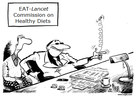
The origin of these alarms are studies published in Lancet, once highly reputed but recently given over to climate ideology rather than objective science. Most recently is Food in the Anthropocene: the EAT–Lancet Commission on healthy diets from sustainable food systems  The preceding Lancet study stated this main finding:

Following environmental objectives by replacing animal-source foods with plant-based ones was particularly effective in high-income countries for improving nutrient levels, lowering premature mortality (reduction of up to 12% [95% CI 10–13] with complete replacement), and reducing some environmental impacts, in particular greenhouse gas emissions (reductions of up to 84%). However, it also increased freshwater use (increases of up to 16%) and had little effectiveness in countries with low or moderate consumption of animal-source foods. (here).

Two Major Objections

This post raises two objections to these claims. Firstly is an article exposing the Lancet biases and contradicting the the nutritional findings and recommendations therein. Secondly is an article exploding the link between raising animals and climate change.

Georgia Ede MD writes in Psychology Today EAT-Lancet’s Plant-based Planet: 10 Things You Need to Know. Excerpts in italics below with my bolds. Title is link to full text which is recommended reading.  Georgia Ede, MD, is a Harvard-trained psychiatrist and nutrition consultant practicing at Smith College. She writes about food and health on her website DiagnosisDiet.com.

We all want to be healthy, and we need a sustainable way to feed ourselves without destroying our environment. The well-being of our planet and its people are clearly in jeopardy, therefore clear, science-based, responsible guidance about how we should move forward together is most welcome.

Unfortunately, we are going to have to look elsewhere for solutions, because the EAT-Lancet Commission report fails to provide us with the clarity, transparency and responsible representation of the facts we need to place our trust in its authors. Instead, the Commission’s arguments are vague, inconsistent, unscientific, and downplay the serious risks to life and health posed by vegan diets.

1. Epidemiology = mythology
The vast majority of human nutrition research—including the lion share of the research cited in the EAT-Lancet report— is conducted using the tragically flawed methodology of nutrition epidemiology. Nutrition epidemiology studies are not scientific experiments; they are wildly inaccurate, questionnaire-based guesses (hypotheses) about the possible connections between foods and diseases. This approach has been widely criticized as scientifically invalid [see here and here], yet continues to be used by influential researchers at prestigious institutions, most notably Dr. Walter Willett. An epidemiologist himself, he wrote an authoritative textbook on the subject and has conducted countless such studies, including a recent, widely-publicized paper tying low-carbohydrate diets to early death. In my reaction to that study, I explain in plain English why epidemiological techniques are so untrustworthy, and include a sample from an actual food questionnaire for your amusement.

Even if you think epidemiological methods are sound, at best they can only generate hypotheses that then need to be tested in clinical trials. Instead, these hypotheses are often prematurely trumpeted to the public as implicit fact in the form of media headlines, dietary guidelines, and well-placed commission reports like this one. Tragically, more than 80% of these guesses are later proved wrong in clinical trials. With a failure rate this high, nutrition epidemiologists would be better off flipping a coin to decide which foods cause human disease. The Commission relies heavily on this methodology, which helps to explain why their recommendations often fly in the face of biological reality.

bigstock-organic-meat-51515758

2. Red meat causes heart disease, diabetes, cancer…and spontaneous combustion
The section of the report dedicated to protein blames red meat for heart disease, stroke, type 2 diabetes, obesity, cancer and early death. It contains 16 references, and every single one is an epidemiological study. The World Health Organization report tying red meat to colon cancer was also mentioned, and that report is almost entirely based on epidemiology as well. [Read my full analysis of the WHO report here]. The truth is that there is no human clinical trial evidence tying red meat to any health problem. I certainly haven’t found any—and if there were, I think this Commission surely would have mentioned it.

3. Protein is essential…but cancerous
The commissioners write:

“Protein quality (defined by effect on growth rate) reflects the amino acid composition of the food source, and animal sources of protein are of higher quality than most plant sources. High-quality protein is particularly important for growth of infants and young children, and possibly in older people losing muscle mass in later life.” [page 8]

Translation: Complete proteins are good because they contain every essential amino acid. All animal proteins are naturally complete, whereas most plant proteins are incomplete. Watch how the authors wriggle their way out of this inconvenient truth in the next sentence:

“However, a mix of amino acids that maximally stimulate cell replication and growth might not be optimal throughout most of adult life because rapid cell replication can increase cancer risk.” [page 8]

Translation: Complete proteins are bad because they cause cancer.

The sole reference for this absurd suggestion that complete proteins cause cancer is a paper about mutations causing cancer in which the terms “protein,” “amino acid,” and “meat” each occur a grand total of zero times, suggesting that the Commission’s suggestion is pure…suggestion. Furthermore, if obtaining all of the essential amino acids we need causes cancer, shouldn’t we also worry about complete proteins from plant sources like tofu or beans with rice?

4. Omega-3s are essential…good luck with that
“Fish has a high content of omega-3 fatty acids, which have many essential roles…Plant sources of alpha-linolenic acid [ALA] can provide an alternative to omega-3 fatty acids, but the quantity required is not clear.” [page 11]

If the Commission doesn’t know how much plant ALA a person needs to consume to meet requirements, then how does it know that plants provide a viable alternative to omega-3s from animal sources?

The elephant in the room here is that all omega-3s are not created equal. Only animal foods (and algae, which is neither a plant nor an animal) contain the forms of omega-3s our bodies use: EPA and DHA. Plants only contain ALA, which is extremely difficult for our cells to convert into EPA and DHA. According to this 2018 review, we transform anywhere between 0% and 9% of the ALA we consume into the DHA our cells require.

Instead of being vague, why not responsibly warn people that trying to obtain omega-3 fatty acids from plants alone may place their health at risk?

protein-foods

5. Vitamins and minerals are essential…so take supplements
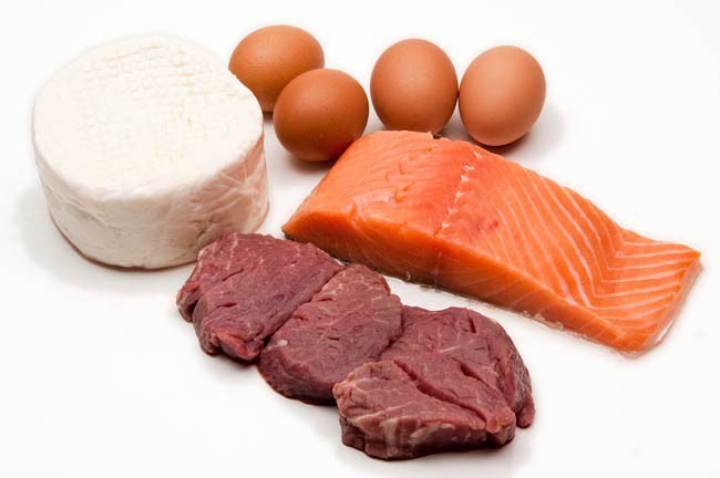
The drumbeat heard throughout the report is that animal foods are dangerous and that a vegan diet is the holy grail of health, yet EAT-Lancet commissioners repeatedly find themselves in the awkward position of having to acknowledge the nutritional superiority of the very animal foods they recommend avoiding.

If the commissioners are concerned that red meat is dangerous (which is only true on Planet Epidemiology), why not recommend other naturally iron-rich animal foods such as duck, oysters, or chicken liver for these growing young women, as these foods would also provide the complete proteins needed for growth? What about the 10-22% of non-teen reproductive age women in the U.S. who suffer from iron deficiency? And why a “multimineral preparation” rather than a simple iron supplement? Are they implying that other minerals may be lacking in their plant-based diet?

Unfortunately, the nutritional inadequacy of plant-based diets goes beyond B vitamins. Plant foods lack several key nutrients, and some of the nutrients they do contain come in less bioavailable forms. Furthermore, many plant foods contain “anti-nutrients” that interfere with nutrient absorption. This means that just because a plant food contains a nutrient doesn’t mean we can access it.

An important example is that grains, beans, nuts and seeds—the staple foods of plant-based diets—contain phytate, a mineral magnet which substantially interferes with absorption of essential minerals like zinc, calcium, iron, and magnesium. And thanks to oxalates—mineral-binding compounds found in a wide variety of plant foods—virtually none of the iron in spinach makes it into Popeye’s muscles.

Only animal foods contain every nutrient we need in its proper, most accessible form. To learn more about nutrient availability and how it affects brain health, read this article.

eat-lancet commission

6. Making up numbers is fun and easy
How did the commissioners arrive at the recommended quantities of foods we should eat per day…7 grams of this, 31 grams of that? Numbers like these imply that something’s been precisely measured, but in many cases, it’s plain that they simply pulled a number out of thin air.

The commissioners attempt to defend themselves from criticism on this issue by stating:

“We have a high level of scientific certainty about the overall direction and magnitude of associations described in this Commission, although considerable uncertainty exists around detailed quantifications.” [page 7]

If they are this uncertain about the details, how can they in good conscience prescribe such specific quantities of food? Why not say they don’t know? Most people will not read this report—they will interpret the values in this table as medical advice.

7. Epidemiology is gospel…unless we don’t like the results
Any researcher will tell you that clinical trials—actual scientific experiments—are considered a much higher level of evidence than epidemiological studies, yet Willett’s group not only relies heavily on epidemiological studies, it favors them over clinical trials when it suits their agenda:

“We have used an intake of eggs at about 13 g/day, or about 1.5 eggs per week, for the reference diet, but higher intake might be beneficial for low-income populations with poor dietary quality.” [page 11]

Why recommend only 1.5 eggs per week when epidemiological studies found that 1 egg per day was perfectly fine? And why skew your recommendations against low-income people, which make up a significant portion of the global population?

There is a remarkable paragraph on page 9 (too long to quote here) arguing that red meat was found to increase risk of death in epidemiological studies conducted in Europe and the USA, but not in Asia, where red meat (mainly pork) was associated with a decreased risk of death. Rather than grappling with this seeming contradiction, they simply dismiss the Asian findings as invalid, wondering if perhaps Asian countries haven’t been rich long enough for the risk to show up yet.

Wait, what?

8. Everyone should eat a vegan diet, except for most people
Although their diet plan is intended for all “generally healthy individuals aged two years and older,” the authors admit it falls short of providing proper nutrition for growing children, adolescent girls, pregnant women, aging adults, the malnourished, and the impoverished—and that even those not within these special categories will need to take supplements to meet their basic requirements.

Sadder still is the fact that the majority of people in this country and in many other countries around the world are no longer metabolically healthy, and this high-carbohydrate plan doesn’t take them into consideration.

For those of us with insulin resistance (aka “pre-diabetes”) whose insulin levels tend to run too high, the Commission’s high-carbohydrate diet—based on up to 60% of calories from whole grains, in addition to fruits and starchy vegetables—is potentially dangerous. . . If the Commission read its own report it would find support for the notion that those of us with metabolic damage could be better off increasing our meat intake and decreasing our carbohydrate intake.

ben_header-1

9. Pay no attention to the money behind the curtain
As an advocate of meat-inclusive diets, I have often been assumed to have financial ties to the meat industry (which I do not), but how many people stop to question the financial (and professional) incentives that may influence doctors promoting plant-based diets? We all have personal beliefs and we all need to make a living, but honesty with oneself and transparency with the public should be paramount. The Nutrition Coalition has compiled a list of Dr. Willett’s potential conflicts of interest here.

The EAT Foundation, which collaborated with The Lancet to produce this report, was founded by Norwegian billionaire and animal rights activist Gunhild Stordalen. EAT recently helped to launch “FReSH” (Food Reform for Sustainability and Health), a global partnership of about 40 corporations, including Barilla (pasta), Unilever (meat alternatives and vegetable oils), Kellogg’s (cereals) and Pepsico (sugary beverages). Make of this what you will.

10. No to choices, yes to taxes?
How does EAT-Lancet propose to achieve its dream of a plant-based world? Many suggestions are put forth, but two are worth emphasizing: the elimination or restriction of consumer choices, and taxation. The EAT Foundation describes itself as:

“a non-profit startup dedicated to transforming our global food system through sound science, impatient disruption and novel partnerships.”

Sound science? Clearly not. But impatient disruption—what does that mean?

Regardless of how you feel about taxation as a tool for social change, consider the Commission’s own numerous exceptions to the plant-based rules, including pregnant women, children, the malnourished and the impoverished. Should we really support making animal foods—the only nutritionally complete foods on the planet—even more expensive for vulnerable populations? The notion of taxation is followed by a vague reference to the possibility of “cash transfer” social safety nets for women and children. This section of the report is representative of its overall elitist and paternalistic tone.

I believe, because I’m convinced by the science, that animal foods are essential to optimal human health. This is an uncomfortable biological reality we all have to wrestle with as creatures of conscience. Finding ways to support excellent health and quality of life for the creatures we depend on for our sustenance and vitality is one of our most important callings as caring stewards of our planet and all of its inhabitants. But I’m also a firm believer in personal choice. We each need to become experts in what works best for our own bodies. Eat and let eat, I say. It seems clear that EAT-Lancet commissioners are neither supporters of personal choice nor the transparent distribution of accurate nutrition information that would empower people to weigh the risks and benefits of various diets for themselves.

Summary on EAT-Lancet

The EAT-Lancet report has the feel of a royal decree, operating under the guise of good intentions, seeking to impose its benevolent will on all subjects of planet Earth. It is well worth challenging the presumed authority of this group of 37 “experts,” because it wields tremendous power and influence, has access to billions of dollars, and is likely to affect your choices, your health, and your checkbook in the near future.

Capitalizing on our current public health and environmental crises, the EAT-Lancet Commission pronounces itself as the authority on the science of nutrition, exploits our worst fears, and seeks to dictate our food choices in accordance with its members’ personal, professional and possible commercial interests.

To the best of my knowledge, there has never been a human clinical trial designed to test the health effects of simply removing animal foods from the diet, without making any other diet or lifestyle changes such as eliminating refined carbohydrates and other processed foods. Unless and until such research is conducted demonstrating clear benefits to this strategy, the assertion that human beings would be healthier without animal foods remains an untested hypothesis with clear risks to human life and health. Prescribing plant-based diets to the planet without including straightforward warnings of these risks and offering clear guidance as to how to minimize them is scientifically irresponsible and medically unethical, and therefore should not form the basis of public health recommendations.

daisy-methane

And What About the Environmental Benefits

Frank M. Mitloehner is Professor of Animal Science and Air Quality Extension Specialist, University of California, Davis.  He writes at the Conversation Yes, eating meat affects the environment, but cows are not killing the climate.  Excerpts in italics with my bolds.

A key claim underlying these arguments holds that globally, meat production generates more greenhouse gases than the entire transportation sector. However, this claim is demonstrably wrong, as I will show. And its persistence has led to false assumptions about the linkage between meat and climate change.

My research focuses on ways in which animal agriculture affects air quality and climate change. In my view, there are many reasons for either choosing animal protein or opting for a vegetarian selection. However, foregoing meat and meat products is not the environmental panacea many would have us believe. And if taken to an extreme, it also could have harmful nutritional consequences.

Many people continue to think avoiding meat as infrequently as once a week will make a significant difference to the climate. But according to one recent study, even if Americans eliminated all animal protein from their diets, they would reduce U.S. greenhouse gas emissions by only 2.6 percent. According to our research at the University of California, Davis, if the practice of Meatless Monday were to be adopted by all Americans, we’d see a reduction of only 0.5 percent.

Moreover, technological, genetic and management changes that have taken place in U.S. agriculture over the past 70 years have made livestock production more efficient and less greenhouse gas-intensive. According to the FAO’s statistical database, total direct greenhouse gas emissions from U.S. livestock have declined 11.3 percent since 1961, while production of livestock meat has more than doubled.

Removing animals from U.S. agriculture would lower national greenhouse gas emissions to a small degree, but it would also make it harder to meet nutritional requirements. Many critics of animal agriculture are quick to point out that if farmers raised only plants, they could produce more pounds of food and more calories per person. But humans also need many essential micro- and macronutrients for good health.

The world population is currently projected to reach 9.8 billion people by 2050. Feeding this many people will raise immense challenges. Meat is more nutrient-dense per serving than vegetarian options, and ruminant animals largely thrive on feed that is not suitable for humans. Raising livestock also offers much-needed income for small-scale farmers in developing nations. Worldwide, livestock provides a livelihood for 1 billion people.

Climate change demands urgent attention, and the livestock industry has a large overall environmental footprint that affects air, water and land. These, combined with a rapidly rising world population, give us plenty of compelling reasons to continue to work for greater efficiencies in animal agriculture. I believe the place to start is with science-based facts.

cg57e4a5185d54e

Background:  Previous Post on The Rise of Climate Medicine

With Bonn COP23 set to start next week, the media is awash with claims that climate change is an international public health crisis.  For example, in just one day from Google news:

Climate change isn’t just hurting the planet – it’s a public health emergency–The Guardian

Climate change’s impact on human health is already here — and is ‘potentially irreversible,’ report says –USA TODAY

Climate Change Is Bad for Your Health–New York Times

From heat stress to malnutr­ition, climate change is already making us sick–The Verge

As Richard Lindzen predicted, everyone wants on the climate bandwagon, because that is where the money is.  Medical scientists are pushing for their share of the pie, as evidenced by the Met office gathering on Assessing the Global Impacts of Climate and Extreme Weather on Health and Well-Being (following Paris COP).  Not coincidentally, the 2nd Global Conference on Health and Climate was held July 7-8, 2016 in Paris.  Now we have the American Public Health Association declaring:

2017 is the Year of Climate Change and Health

“We’re committed to making sure the nation knows about the effects of climate change on health. If anyone doesn’t think this is a severe problem, they are fooling themselves.” — APHA Executive Director Georges Benjamin, in The Washington Post

The new field of Climate Medicine is evidenced by a slew of new organizations and studies.  In addition to numerous agencies set up within WHO and the UN, and governmental entities (such as the Met Office), there are many NGOs, such as:

Health Care Without Harm
Health and Environment Alliance
Health and Climate Foundation
Climate and Health Council
United States National Association of County and City Health Officials
Care International
Global Gender and Climate Alliance / Women’s Environment and   Development Organization
International Federation of Medical Students’ Associations
Climate Change and Human Health Programme, Columbia U.
Center for Health and the Global Environment, Harvard
National Center for Epidemiology and Population Health, ANC Canberra
Centre for Sustainability and the Global Environment, U of Wisconsin
Environmental Change Institute, Oxford
London School of Tropical Medicine and Hygiene, London, UK
International Human Dimensions Programme on Global Environmental Change, US National Academies of Science
US Climate and Health Alliance
Etc, etc., etc.

Of course, they are encouraged and abetted by the IPCC.

human-health1

From the Fifth Assessment Report:

Until mid-century, projected climate change will impact human health mainly by exacerbating health problems that already exist (very high confidence). Throughout the 21st century, climate change is expected to lead to increases in ill-health in many regions and especially in developing countries with low income, as compared to a baseline without climate change (high confidence). By 2100 for RCP8.5, the combination of high temperature and humidity in some areas for parts of the year is expected to compromise common human activities, including growing food and working outdoors (high confidence). {2.3.2}

In urban areas climate change is projected to increase risks for people, assets, economies and ecosystems, including risks from heat stress, storms and extreme precipitation, inland and coastal flooding, landslides, air pollution, drought, water scarcity, sea level rise and storm surges (very high confidence). These risks are amplified for those lacking essential infrastructure and services or living in exposed areas. {2.3.2}

Feared Climate Health Impacts Are Unsupported by Scientific Research

NIPCC has a compendium of peer-reviewed studies on this issue and provides these findings (here)

Key Findings: Human Health
• Warmer temperatures lead to a decrease in temperature-related mortality, including deaths associated with cardiovascular disease, respiratory disease, and strokes. The evidence of this benefit comes from research conducted in every major country of the world.

• In the United States the average person who died because of cold temperature exposure lost in excess of 10 years of potential life, whereas the average person who died because of hot temperature exposure likely lost no more than a few days or weeks of life.

• In the U.S., some 4,600 deaths are delayed each year as people move from cold northeastern states to warm southwestern states. Between 3 and 7% of the gains in longevity experienced over the past three decades was due simply to people moving to warmer states.

• Cold-related deaths are far more numerous than heat-related deaths in the United States, Europe, and almost all countries outside the tropics. Coronary and cerebral thrombosis account for about half of all cold-related mortality.

• Global warming is reducing the incidence of cardiovascular diseases related to low temperatures and wintry weather by a much greater degree than it increases the incidence of cardiovascular diseases associated with high temperatures and summer heat waves.

• A large body of scientific examination and research contradict the claim that malaria will expand across the globe and intensify as a result of CO2 -induced warming.

• Concerns over large increases in vector-borne diseases such as dengue as a result of rising temperatures are unfounded and unsupported by the scientific literature, as climatic indices are poor predictors for dengue disease.

• While temperature and climate largely determine the geographical distribution of ticks, they are not among the significant factors determining the incidence of tick-borne diseases.

• The ongoing rise in the air’s CO2 content is not only raising the productivity of Earth’s common food plants but also significantly increasing the quantity and potency of the many healthpromoting substances found in their tissues, which are the ultimate sources of sustenance for essentially all animals and humans.

• Atmospheric CO2 enrichment positively impacts the production of numerous health-promoting substances found in medicinal or “health food” plants, and this phenomenon may have contributed to the increase in human life span that has occurred over the past century or so.

• There is little reason to expect any significant CO2 -induced increases in human-health-harming substances produced by plants as atmospheric CO2 levels continue to rise.

Source: Chapter 7. “Human Health,” Climate Change Reconsidered II: Biological Impacts (Chicago, IL: The Heartland Institute, 2014).
Full text of Chapter 7 and references on Human health begins pg. 955 of the full report here

ambulance chasers

Summary

Advances in medical science and public health have  benefited billions of people with longer and higher quality lives.  Yet this crucial social asset has joined the list of those fields corrupted by the dash for climate cash. Increasingly, medical talent and resources are diverted into inventing bogeymen and studying imaginary public health crises.

Economists Francesco Boselloa, Roberto Roson and Richard Tol conducted an exhaustive study called Economy-wide estimates of the implications of climate change: Human health

After reviewing all the research and crunching the numbers, they concluded that achieving one degree of global warming by 2050 will, on balance, save more than 800,000 lives annually.

Not only is the warming not happening, we would be more healthy if it did.

Oh, Dr. Frankenmann, what have you wrought?

Footnote:  More proof against Climate Medicine

From: Gasparrini et al: Mortality risk attributable to high and low ambient temperature: a multicountry observational study. The Lancet, May 2015

Cold weather kills 20 times as many people as hot weather, according to an international study analyzing over 74 million deaths in 384 locations across 13 countries. The findings, published in The Lancet, also reveal that deaths due to moderately hot or cold weather substantially exceed those resulting from extreme heat waves or cold spells.

“It’s often assumed that extreme weather causes the majority of deaths, with most previous research focusing on the effects of extreme heat waves,” says lead author Dr Antonio Gasparrini from the London School of Hygiene & Tropical Medicine in the UK. “Our findings, from an analysis of the largest dataset of temperature-related deaths ever collected, show that the majority of these deaths actually happen on moderately hot and cold days, with most deaths caused by moderately cold temperatures.”

Now in 2017, Lancet sets the facts aside in order to prostrate itself before the global warming altar:

Christiana Figueres, chair of the Lancet Countdown’s high-level advisory board and former executive secretary of the UN Framework Convention on Climate Change, said, “The report lays bare the impact that climate change is having on our health today. It also shows that tackling climate change directly, unequivocally and immediately improves global health. It’s as simple as that.’’


Arctic Icing on All Sides Now


2019 with bears
With the usual fits and starts, the Arctic has now frozen solid in the central and Russian basins, and ice extents are recovering on all sides, Pacific, European and Canadian.  The laggards have been Kara and Barents Seas, but progress there is shown below.
barents2019001to018

Kara on the left is virtually iced over, while Barents ice has reached out to claim the eastern coast of Svalbard in the center.  On the right Greenland Sea ice is extending toward Iceland. Compared to 2018 March maximums, Kara is 99%, Greenland Sea is 98% and Barents is 60% of maximum. The image below shows 2019 ice recovery on the Canadian side.
baffin2019001to018

Upper left is Greenland sea ice reaching toward Iceland.  In the center Baffin Bay is growing ice southward down the Greenland coast.  On the right, ice extent has grown along Labrador to touch Newfoundland, and start filling in the Gulf of St. Lawrence. Baffin Bay/Gulf St. Lawrence is now 70% of 2018 March max, which was one of the higher extent years for that basin. Finally we return below to the Pacific ice recovery.
berok2019001to018

As reported previously, ice extent has rebounded here coinciding with the dissipating warm water Blob in North Pacific.  Bering Sea on the right started first and is now 17% greater than maximum last March.  Okhotsk sea ice has picked up the pace and is now 58% of March max.

arcticice2019018

In January, 2018 ice extents tracked the 12 year average (2007 to 2018 inclusive), at times pausing and then surging.  SII 2019 is showing slightly less ice, averaging 100k km2 lower.  As of yesterday, this year has gained about 500k km2 more ice than either 2017 or 2018.

algore_ice_gone_by_2013