The post below updates the UAH record of air temperatures over land and ocean. Each month and year exposed again the growing disconnect between the real world and the Zero Carbon zealots. It is as though the anti-hydrocarbon band wagon hopes to drown out the data contradicting their justification for the Great Energy Transition. Yes, there is warming from an El Nino buildup coincidental with North Atlantic warming, but no basis to blame it on CO2.
As an overview consider how recent rapid cooling completely overcame the warming from the last 3 El Ninos (1998, 2010 and 2016). The UAH record shows that the effects of the last one were gone as of April 2021, again in November 2021, and in February and June 2022 At year end 2022 and continuing into 2023 global temp anomaly matched or went lower than average since 1995, an ENSO neutral year. (UAH baseline is now 1991-2020).
For reference I added an overlay of CO2 annual concentrations as measured at Mauna Loa. While temperatures fluctuated up and down ending flat, CO2 went up steadily by ~60 ppm, a 15% increase.
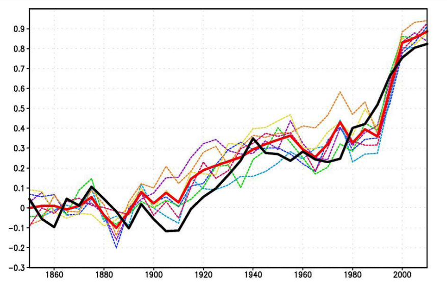
Furthermore, going back to previous warmings prior to the satellite record shows that the entire rise of 0.8C since 1947 is due to oceanic, not human activity.
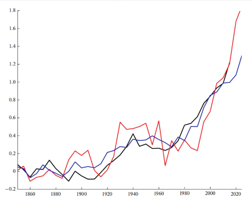
The animation is an update of a previous analysis from Dr. Murry Salby. These graphs use Hadcrut4 and include the 2016 El Nino warming event. The exhibit shows since 1947 GMT warmed by 0.8 C, from 13.9 to 14.7, as estimated by Hadcrut4. This resulted from three natural warming events involving ocean cycles. The most recent rise 2013-16 lifted temperatures by 0.2C. Previously the 1997-98 El Nino produced a plateau increase of 0.4C. Before that, a rise from 1977-81 added 0.2C to start the warming since 1947.
Importantly, the theory of human-caused global warming asserts that increasing CO2 in the atmosphere changes the baseline and causes systemic warming in our climate. On the contrary, all of the warming since 1947 was episodic, coming from three brief events associated with oceanic cycles.
Update August 3, 2021
Chris Schoeneveld has produced a similar graph to the animation above, with a temperature series combining HadCRUT4 and UAH6. H/T WUWT
August 2023 Update El Nino plus North Atlantic Set Summer High
With apologies to Paul Revere, this post is on the lookout for cooler weather with an eye on both the Land and the Sea. While you will hear a lot about 2020-21 temperatures matching 2016 as the highest ever, that spin ignores how fast the cooling set in. The UAH data analyzed below shows that warming from the last El Nino had fully dissipated with chilly temperatures in all regions. After a warming blip in 2022, land and ocean temps dropped again with 2023 starting below the mean since 1995. Now in August EL Nino has peaked with a major Tropical ocean air spike in concert with North Atlantic high temps.
UAH has updated their tlt (temperatures in lower troposphere) dataset for August 2023. Posts on their reading of ocean air temps this month preceded updated records from HadSST4. I last posted on SSTs using HadSST4 World’s Oceans Warming July 2023. This month also has a separate graph of land air temps because the comparisons and contrasts are interesting as we contemplate possible cooling in coming months and years. Sometimes air temps over land diverge from ocean air changes. For example in May 2023, ocean temps in all regions moved upward, while Tropical and NH land air temps dropped sharply.
In August, as shown later on, Global ocean air reached a slightly higher peak led by NH, but with Tropics easing down. OTOH Land air temps moderated, with a NH rise offset by a drop in SH. along with slightly lower Tropics. Thus the land + ocean Global UAH temperature is now nearly matching the 2016 peak.
Note: UAH has shifted their baseline from 1981-2010 to 1991-2020 beginning with January 2021. In the charts below, the trends and fluctuations remain the same but the anomaly values change with the baseline reference shift.
Presently sea surface temperatures (SST) are the best available indicator of heat content gained or lost from earth’s climate system. Enthalpy is the thermodynamic term for total heat content in a system, and humidity differences in air parcels affect enthalpy. Measuring water temperature directly avoids distorted impressions from air measurements. In addition, ocean covers 71% of the planet surface and thus dominates surface temperature estimates. Eventually we will likely have reliable means of recording water temperatures at depth.
Recently, Dr. Ole Humlum reported from his research that air temperatures lag 2-3 months behind changes in SST. Thus the cooling oceans now portend cooling land air temperatures to follow. He also observed that changes in CO2 atmospheric concentrations lag behind SST by 11-12 months. This latter point is addressed in a previous post Who to Blame for Rising CO2?
After a change in priorities, updates are now exclusive to HadSST4. For comparison we can also look at lower troposphere temperatures (TLT) from UAHv6 which are now posted for August. The temperature record is derived from microwave sounding units (MSU) on board satellites like the one pictured above. Recently there was a change in UAH processing of satellite drift corrections, including dropping one platform which can no longer be corrected. The graphs below are taken from the revised and current dataset.
The UAH dataset includes temperature results for air above the oceans, and thus should be most comparable to the SSTs. There is the additional feature that ocean air temps avoid Urban Heat Islands (UHI). The graph below shows monthly anomalies for ocean air temps since January 2015.
Note 2020 was warmed mainly by a spike in February in all regions, and secondarily by an October spike in NH alone. In 2021, SH and the Tropics both pulled the Global anomaly down to a new low in April. Then SH and Tropics upward spikes, along with NH warming brought Global temps to a peak in October. That warmth was gone as November 2021 ocean temps plummeted everywhere. After an upward bump 01/2022 temps reversed and plunged downward in June. After an upward spike in July, ocean air everywhere cooled in August and also in September.
After sharp cooling everywhere in January 2023, all regions were into negative territory. Note the Tropics matched the lowest, but since have spiked sharply upward +1.25C, with the largest increases in May, June and July 2023. NH also warmed 0.6C in the last 3 months, while SH ocean air rose 0.5C since February. Global Ocean air August 2023 is now matching 2016, which had higher Tropics and NH peaks followed by cooling. The strength of the El Nino will determine the latter half of this year.
Land Air Temperatures Tracking Downward in Seesaw Pattern
We sometimes overlook that in climate temperature records, while the oceans are measured directly with SSTs, land temps are measured only indirectly. The land temperature records at surface stations sample air temps at 2 meters above ground. UAH gives tlt anomalies for air over land separately from ocean air temps. The graph updated for August is below.
Here we have fresh evidence of the greater volatility of the Land temperatures, along with extraordinary departures by SH land. Land temps are dominated by NH with a 2021 spike in January, then dropping before rising in the summer to peak in October 2021. As with the ocean air temps, all that was erased in November with a sharp cooling everywhere. After a summer 2022 NH spike, land temps dropped everywhere, and in January, further cooling in SH and Tropics offset by an uptick in NH.
Remarkably, in 2023, SH land air anomaly shot up 1.5C, from -0.56C in January to +0.93 in July, then dropped to 0.53 in August. Tropical land temps are up 1.3 since January and NH Land air temps rose 0.8. The consolidated rise resembles the upward spikes starting in September 2015.
The Bigger Picture UAH Global Since 1980
The chart shows monthly Global anomalies starting 01/1980 to present. The average monthly anomaly is -0.06, for this period of more than four decades. The graph shows the 1998 El Nino after which the mean resumed, and again after the smaller 2010 event. The 2016 El Nino matched 1998 peak and in addition NH after effects lasted longer, followed by the NH warming 2019-20. An upward bump in 2021 was reversed with temps having returned close to the mean as of 2/2022. March and April brought warmer Global temps, later reversed.
With the sharp drops in Nov., Dec. and January 2023 temps, there was no increase over 1980. Now in 2023 the buildup to the August peak exceeds the sharp April peak of the El Nino 1998 event. It is matching the February peak in 2016. Where it goes from here, up or down, remains to be seen.
TLTs include mixing above the oceans and probably some influence from nearby more volatile land temps. Clearly NH and Global land temps have been dropping in a seesaw pattern, nearly 1C lower than the 2016 peak. Since the ocean has 1000 times the heat capacity as the atmosphere, that cooling is a significant driving force. TLT measures started the recent cooling later than SSTs from HadSST3, but are now showing the same pattern. Despite the three El Ninos, their warming has not persisted prior to 2023, and without them it would probably have cooled since 1995. Of course, the future has not yet been written.
Yong Tuition is an extensive series of videos by a math and physics tutor whose professional identity is Y. C. Zhong based in Queensland Australia. The recent video below briefly covers the history of climatism describing several errors that have rendered the hypothesis untenable. For those who prefer to read I provide a transcript from the closed captions in italics with my bolds. At the end is a synopsis of a linked June 2023 paper published by Y.C. Zhong in Progress in Physics.
Welcome to Yong Tuition. Let’s continue discussing basic issues in atmospheric physics that you may or may not know but would be delighted to. Watch this short talk in plain language for ordinary people. Please Like, make Comment, Subscribe, and activate your Bell so that you wouldn’t miss any development and dramas in my ongoing climate research.
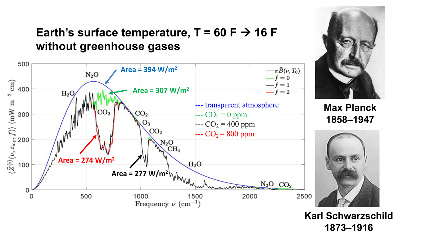
Greenhouse effect has been taught at schools, frequently heard in the mass media, superficially explained by many climate believers, and occasionally discussed by well-trained climate researchers and theoretical physicists. But what can you remember the most?
♦ The 33 K global warming by the greenhouse gases? ♦ The perfectly right CO2 concentration 300 ppm just before the Industrial Revolution? ♦ The stratospheric cooling predicted by Manabe and Wetherald in 1967? ♦ The runway greenhouse effect advocated by James Hanson for his grandchildren?
I will consider them all in light of the latest zero surface (radiation) hypothesis as you might have known by now. By the way, the zero surface radiation hypothesis is actually not merely a hypothesis. Rather, it is a direct corollary from the zeroth law of thermodynamics. So, are you ready? Let’s go and have fun.
In history, Fourier was one of the first thinkers who thought the apparent diurnal temperature difference between the Earth and the moon might be due to the atmosphere. Instead of developing a thermodynamic model, he drew people’s attention to a possible obscure radiation by the Earth’s surface apart from that from the Sun.
in 1836, Pouillet, another Frenchman, argued that the equilibrium temperature of the atmosphere must be higher than the temperature of outer space but lower than the temperature of the Earth’s surface, which is not true unless he meant the average temperature of the atmosphere.
In 1861, Tyndall first observed the infrared absorption by gases in a pipe, including water vapor and CO2, by using boiling water as a source, called the Leslie Cube. All of a sudden, the radiative transfer in the atmosphere had become the focus of the studying climate, while Fourier’s thermal insulator atmosphere was gradually forgotten.
In particular,Tyndall’s observation has been interpreted as a direct evidence for the atmospheric infrared absorption from the surface of the Earth, often called the terrestrial radiation, although the source was separated from the gas pipe in Tyndall’s experiment. In other words, the gas and the infrared source had different temperatures. It is due to this subtle difference, I believe, that the time bomb was installed at the core of climate modeling by many.
In 1896, Arrhenius proposed his climate model in line with this misconception by merely considering the so-called radiative equilibrium. To do so, he was obliged to physically separate the gaseous model atmosphere and the condensed matter surface of the Earth. As a result, he completely omitted thermal conducting, convection, and mass transfer between the surface and the atmosphere as shown in this diagram.
This is the first problem of the greenhouse effect hypothesis. As a result, it has been taken for granted by many climate researchers that the surface must constantly emit infrared radiation at the intensity around 390 watt per meter-squared as a black body does, from which over 95 percent of the terrestrial radiation was assumed to be absorbed by water vapor, CO2, and ozone in the atmosphere. While the radiative equilibrium formulated by Arrhenius is called the greenhouse effect, these infrared absorbers in the atmosphere are now called the greenhouse gases.
How does the greenhouse effect work? Here is a diagram from an online talks by Sara Harris, which represent the typical viewpoint of the consensus on this issue. First, Sara was correct to conclude the global mean surface temperature should be 288 K in the absence of the atmosphere, by treating the Earth as a black body. Then, by adding a reflective layer, but without any infrared absorbers hovering about the black body, she obtained the surface temperature would be 255 K. So far, this number 255K, instead of 288 K, has been widely considered as the surface temperature in the absence of the greenhouse gases.
This is the second problem of the greenhouse effect hypothesis. By adding the infrared absorbers, or the so-called greenhouse gases, it was argued by both Sara Harris and Sabine Hossenfelder that the CO2 can block the upward surface radiation and re-emit back to the surface. As a result, the cold surface could be heated up by the greenhouse gases. What A Magical Tale for children!
So, they claimed quantitatively that the surface temperature would reach to exactly 288 K when the CO2 concentration was 300 ppm. This is known as the Greenhouse Effect Type 1, in which the CO2 concentration 300 ppm seems just perfectly right in raising the surface temperature exactly by 33 K, together with the water vapor of course.
This is the third problem of the greenhouse effect hypothesis. Based on this problematic idea, it was speculated that the radiative equilibrium in the climate system would be destroyed whenever the CO2 concentration in ppm is different from the magic number 300. This speculation is called greenhouse effect type 2.
In history, both Arrhenius and Manabe and of course his supervisor Wetherald based on this idea to predict both the possible global warming and the global cooling when the CO2 concentration is doubled or halved, respectively. What could happen to air temperature near the ground? I’m sure you must have been told many times, 1.5 K, 3.6 K, or even 7 K by the end of this century, or even recently the Earth is getting boiling. “Yes and it’s the area, the era of global boiling has arrived.”
But how did the climate researchers get these numbers? In short, based on stratospheric cooling. Back in the 1960s, it was first predicted, by calculations, by Manabe and Wetherald that the stratosphere, which is above the troposphere, might become colder as the CO2 concentration increased over there. Hence the term stratospheric cooling became a fashion, even Freeman Dyson talked about it. “For the stratospheric cooling is something we really know a lot about, because that’s easy to calculate. It’s a direct effect of carbon dioxide which cools the stratosphere just by radiation. It’s independent of weather and it’s very large….” although he distanced himself from this notion during his final years on this planet.
Why cooling instead of warming? Well, they argued that if any atmospheric constituent emits, the space around them would become colder because some thermal energy is being sent away, although they didn’t say where the thermal energy comes from. If it is true the outgoing infrared radiation by our planet would be reduced because, according to Stefan-Boltzmann law, the atmospheric radiation intensity is proportional to its temperature to the power of four. This idea is indicated by the green curve here which represents the outer flow infrared radiation, but notice the electromagnetic waves are described as a kind of fluid in space, which is absurd by the way.
The tale continues. In a long run, an imbalance in radiation in the stratosphere would occur above the tropopause, just the isothermic layer immediately above the troposphere. By treating electromagnetic waves as a kind of moving heated fluid, of course, one could argue that the air temperature in the troposphere would increase, because more incoming heated fluid than the outgoing fluid as shown in this diagram.
Nowadays, it is believed by many that the global warming between two and seven Kelvin would be just a matter of time and humans’ reaction. Furthermore, as the CO2 concentration continues increasing, there is another alarming scenario namely the run(a)way greenhouse effect. As you know, a runway in an airport is used for an airplane to take off from the ground to the sky, the runway used in front of the greenhouse effect here is a metaphor for extremely rising global warming due to increasing CO2 that might completely vaporize water in the ocean and the turns the Earth into a Venus-like planet, sounds horrible.
Nevertheless, all of the predicted climate scenarios associated with either the radiative equilibrium or radiative imbalance have been formulated based on the strong and constant surface infrared radiation at its thermal equilibrium temperature. This would be true if, and only if, the condensed-matter surface could be physically isolated from the emitting layer of the greenhouse gases as Arrhenius suggested over a century ago.
So, what are the repercussions when there is no such a surface radiation?First, without the surface radiation, therefore, it can be foreseen that the infrared absorption by the so-called greenhouse gases would be significantly reduced no matter how much CO2 is in the atmosphere. Second, without the surface radiation upward all the time, the surface temperature can be stabilized with the least action given the internal and external heat sources.
Think about it. No radiation absorption by CO2 from the surface, no downward back radiation by the greenhouse gases, the efficiency of the climate system would be much higher which would be the First Choice by the nature. Recently, however, Sabine Hosenfelder told her viewers and fans that it is the absorbed infrared radiation by the greenhouse gases from the surface that can keep the surface warm and stable. “The incoming radiation from the Sun goes through the atmosphere and hits the surface. It’s converted into infrared radiation and that heats the atmosphere from below…”
But this can hardly be true. The troposphere is in fact warmed up by means of general circulation of the air that is driven by gravity-constraint convection and pressure-difference driven advection.None of them are radiative processes. She might have convinced herself by analogy of caloric theory for heat and phlogiston for fire.
Similarly, the runway greenhouse effect is as absurd as to use a paper bag to contain a fire, even Sir John Houghton, the former chairman of the IPCC Scientific Advisory Group, thought it was unlikely.
Third, return to the greenhouse effect type 1. If there is no surface infrared radiation, how can CO2 make the tropospheric warmer by blocking nothing? This implies CO2 and other so-called greenhouse gases can hardly act like a blanket to keep the surface warm, just as one cannot keep his body warm in the winter night by hanging his blanket at the roof.
Many people nowadays might have only thought of fishes in water, but forgotten that, like fishes, we humans are also submerged in the sea of air, rather than a vacuum. Indeed, it is nitrogen and oxygen molecules in the air layer physically attached to the surface that keeps the surface temperature stable day and night.
Fourth. Let me talk about the predicted stratospheric cooling by Manabe and Wetherald. Recently, I have evaluated their published data and found the imbalance in the outgoing radiation is just 1.2 watt per metersquare due to CO2 doubling, which is three times less than the value 3.7 watt per meter square used by the IPCC and many climate researchers. I will discuss this in detail soon.
Basically, this implies either the CO2 concentration in the stratosphere or the CO2 emissivity was overestimated by Manabe and Wetherald. This new finding seems consistent with Manabe’s recently remarks on the observed stratospheric cooling. In the lower parts of the stratosphere the observed cooling could be partially due to ozone. Besides, to me, it would appear strange why there was no reported observation in the higher altitudes where they predicted stratospheric cooling to be more significantly much larger and hence easier to be measured.
Fifth. Using the original definition of radiative forcing, RF equal to I sub s minus OLR, it is apparent that the radiativeforcing would be always equal to the OLR, the outgoing long wave radiation, in magnitude though opposite in sign when the surface radiation is zero. Or the sum of radiative forcing and the OLR is zero.
What does this mean? Simple. The so-called “greenhouse effect” simply denotes the total absorbed solar radiation by the atmosphere, including the solar radiation at the surface that is completely transformed into the internal thermal energy of the atmosphere by convection, conduction, and the mass transfer involving latent heat. Whenever the planet is overheated, the OLR is spontaneously turned on. So, no surface radiation blocking, no back radiation into the surface. Above all, the “radiative forcing” actually originates from the radiation by the sun rather than from the surface. If you can understand this logic, then you won’t have much trouble to explain those problems listed above.
Problem 1. Like other careless climate researchers, both Sabine and Sara made the same terrible mistake. How? Because they must have naively thought the real atmosphere and the surface could be physically separated as Arrhenius first suggested.
Problem 3. Because they imagined global warming by the greenhouse effect type 1 is just a 10 K rather than 33 K, to use CO2 concentration 300 ppm as just the right number is just a joke, isn’t it? As I noticed that Sabine Hossenfelder has tried to make her talks humorous, I hope one day she would tell her fans that she was kidding. It’s unlikely though, as she has become a saleswoman rather than a professional researcher.
In summary, the presence of the Real atmosphere on the Real surface implies they are at thermal equilibrium, which was first overlooked by Pouillet in 1836 and the climate researchers after him. No surface radiation appears as the natural choice for the climate stability. Any surplus in the infrared absorption by the atmosphere can be spontaneously emitted to space rather than making the surface warmer. As I said earlier, no one can contain a fire by using a paper bag. Thank you for your viewing.
Y.C. Zhong Letter to Progress in Physics June 2023
Based on the observed equilibrium at the surface of the earth, it is argued that almost no infrared radiation would be emitted by the surface of the earth that is in physical contact with the nearest isothermic air layer. By assuming the outgoing longwave radiation is the cumulative upward thermal radiation by the air, an analytic formula with four dependent observables is proposed which is used for the first time to calculate the effective air emissivities at different lapse rates in the troposphere. Given the observed global mean outgoing longwave radiation 239W m−2and the stable tropospheric lapse rate 6.5 Tkm−1, the calculated effective air emissivity near the surface is 0.135, in agreement with early experimental observations.
Discussion and conclusion
To explore the implications of the zero surface radiation hypothesis, the outgoing thermal radiation by the air is formulated and quantitatively calculated in the absence of the surface infrared radiation. Based on the calculation, it appears that long-term global climate stability might be simply explained in relation to the tropospheric lapse rate, adjustable by changing the water vapor in the troposphere, that provides a natural mechanism to control the OLR for the earth to re-emit the absorbed solar radiation back to outer space while keeping the global mean surface temperature constant.
Further, it is revealed that the four coupled variables, namely OLR, effective air emissivity, the tropospheric lapse rate, and the surface temperature, are linearly dependent on each other, as shown in (10) and (11). So far, the linear dependence of the monthly mean OLR on the sea surface temperature (SST )has been observed on several locations [7]. But the theoretical interpretations in terms of water vapor feedback and speculated emergent properties seem complicated and confined to the cloud-free observations [8]. By way of contrast, (11) is simply deduced from the hypothesis that the surface radiation is zero.
Without invoking the greenhouse effect, it seems the current global energy balance can be quantitatively explained, i.e. the solar shortwave radiation at the surface, 161 W m−2, is completely transferred into the atmosphere by means of convection and conduction. And then is thermally radiated by the atmosphere into outer space, together with the shortwave absorption by the atmosphere at 78 W m−2. Which makes the OLR at the top of the atmosphere equal to 161 +78 =239 W m−2 as observed [3].
Further experimental observations both in lab and in space are necessary for further evaluating this proposed description with fundamental implications for understanding the long-term global climate stability.
The best context for understanding decadal temperature changes comes from the world’s sea surface temperatures (SST), for several reasons:
The ocean covers 71% of the globe and drives average temperatures;
SSTs have a constant water content, (unlike air temperatures), so give a better reading of heat content variations;
Major El Ninos have been the dominant climate feature in recent years.
HadSST is generally regarded as the best of the global SST data sets, and so the temperature story here comes from that source. Previously I used HadSST3 for these reports, but Hadley Centre has made HadSST4 the priority, and v.3 will no longer be updated. HadSST4 is the same as v.3, except that the older data from ship water intake was re-estimated to be generally lower temperatures than shown in v.3. The effect is that v.4 has lower average anomalies for the baseline period 1961-1990, thereby showing higher current anomalies than v.3. This analysis concerns more recent time periods and depends on very similar differentials as those from v.3 despite higher absolute anomaly values in v.4. More on what distinguishes HadSST3 and 4 from other SST products at the end. The user guide for HadSST4 is here.
The Current Context
The chart below shows SST monthly anomalies as reported in HadSST4 starting in 2015 through July 2023. A global cooling pattern is seen clearly in the Tropics since its peak in 2016, joined by NH and SH cycling downward since 2016.
Note that in 2015-2016 the Tropics and SH peaked in between two summer NH spikes. That pattern repeated in 2019-2020 with a lesser Tropics peak and SH bump, but with higher NH spikes. By end of 2020, cooler SSTs in all regions took the Global anomaly well below the mean for this period. In 2021 the summer NH summer spike was joined by warming in the Tropics but offset by a drop in SH SSTs, which raised the Global anomaly slightly over the mean.
Then in 2022, another strong NH summer spike peaked in August, but this time both the Tropic and SH were countervailing, resulting in only slight Global warming, later receding to the mean. Oct./Nov. temps dropped in NH and the Tropics took the Global anomaly below the average for this period. After an uptick in December, temps in January 2023 dropped everywhere, strongest in NH, with the Global anomaly further below the mean since 2015.
Now comes El Nino as shown by the upward spike in the Tropics since January, the anomaly more than doubling from 0.38C to 0.94C. Now in July 2023, all regions rose, especially NH up from 0.7C to now 1.3C, pulling up the global anomaly to a new high for this period.
Comment:
The climatists have seized on this unusual warming as proof of their Zero Carbon agenda, without addressing how impossible it would be for CO2 warming the air to raise ocean temperatures. It is the ocean that warms the air, not the other way around. Recently Steven Koonin had this to say about the phonomenon confirmed in the graph above:
El Nino is a phenomenon in the climate system that happens once every four or five years. Heat builds up in the equatorial Pacific to the west of Indonesia and so on. Then when enough of it builds up it surges across the Pacific and changes the currents and the winds. As it surges toward South America it was discovered and named in the 19th century It is well understood at this point that the phenomenon has nothing to do with CO2.
Now people talk about changes in that phenomena as a result of CO2 but it’s there in the climate system already and when it happens it influences weather all over the world. We feel it when it gets rainier in Southern California for example. So for the last 3 years we have been in the opposite of an El Nino, a La Nina, part of the reason people think the West Coast has been in drought.
It has now shifted in the last months to an El Nino condition that warms the globe and is thought to contribute to this Spike we have seen. But there are other contributions as well. One of the most surprising ones is that back in January of 2022 an enormous underwater volcano went off in Tonga and it put up a lot of water vapor into the upper atmosphere. It increased the upper atmosphere of water vapor by about 10 percent, and that’s a warming effect, and it may be that is contributing to why the spike is so high.
A longer view of SSTs
Open image in new tab to enlarge.
The graph above is noisy, but the density is needed to see the seasonal patterns in the oceanic fluctuations. Previous posts focused on the rise and fall of the last El Nino starting in 2015. This post adds a longer view, encompassing the significant 1998 El Nino and since. The color schemes are retained for Global, Tropics, NH and SH anomalies. Despite the longer time frame, I have kept the monthly data (rather than yearly averages) because of interesting shifts between January and July.1995 is a reasonable (ENSO neutral) starting point prior to the first El Nino.
The sharp Tropical rise peaking in 1998 is dominant in the record, starting Jan. ’97 to pull up SSTs uniformly before returning to the same level Jan. ’99. There were strong cool periods before and after the 1998 El Nino event. Then SSTs in all regions returned to the mean in 2001-2.
SSTS fluctuate around the mean until 2007, when another, smaller ENSO event occurs. There is cooling 2007-8, a lower peak warming in 2009-10, following by cooling in 2011-12. Again SSTs are average 2013-14.
Now a different pattern appears. The Tropics cooled sharply to Jan 11, then rise steadily for 4 years to Jan 15, at which point the most recent major El Nino takes off. But this time in contrast to ’97-’99, the Northern Hemisphere produces peaks every summer pulling up the Global average. In fact, these NH peaks appear every July starting in 2003, growing stronger to produce 3 massive highs in 2014, 15 and 16. NH July 2017 was only slightly lower, and a fifth NH peak still lower in Sept. 2018.
The highest summer NH peaks came in 2019 and 2020, only this time the Tropics and SH were offsetting rather adding to the warming. (Note: these are high anomalies on top of the highest absolute temps in the NH.) Since 2014 SH has played a moderating role, offsetting the NH warming pulses. After September 2020 temps dropped off down until February 2021. In 2021-22 there were again summer NH spikes, but in 2022 moderated first by cooling Tropics and SH SSTs, then in October to January 2023 by deeper cooling in NH and Tropics.
Now in 2023 the Tropics flipped from below to well above average, while NH has produced a summer peak with July higher than any previous year. In fact, the summer warming peaks in NH have occurred in August or September, so this July number is likely to go even higher.
What to make of all this? The patterns suggest that in addition to El Ninos in the Pacific driving the Tropic SSTs, something else is going on in the NH. The obvious culprit is the North Atlantic, since I have seen this sort of pulsing before. After reading some papers by David Dilley, I confirmed his observation of Atlantic pulses into the Arctic every 8 to 10 years.
Contemporary AMO Observations
Through January 2023 I depended on the Kaplan AMO Index (not smoothed, not detrended) for N. Atlantic observations. But it is no longer being updated, and NOAA says they don’t know its future. So I find only the Hadsst AMO dataset has data through April. It differs from Kaplan, which reported average absolute temps measured in N. Atlantic. “Hadsst AMO follows Trenberth and Shea (2006) proposal to use the NA region EQ-60°N, 0°-80°W and subtract the global rise of SST 60°S-60°N to obtain a measure of the internal variability, arguing that the effect of external forcing on the North Atlantic should be similar to the effect on the other oceans.” So the values represent differences between the N. Atlantic and the Global ocean.
The chart above confirms what Kaplan also showed. As August is the hottest month for the N. Atlantic, its varibility, high and low, drives the annual results for this basin. Note also the peaks in 2010, lows after 2014, and a rise in 2021. An annual chart below is informative:
Note the difference between blue/green years, beige/brown, and purple/red years. 2010, 2021, 2022 all peaked strongly in August or September. 1998 and 2007 were mildly warm. 2016 and 2018 were matching or cooler than the global average. 2023 started out slightly warm, and now in May and June has spiked to match 2010.
The pattern suggests the ocean may be demonstrating a stairstep pattern like that we have also seen in HadCRUT4.
The purple line is the average anomaly 1980-1996 inclusive, value 0.18. The orange line the average 1980-202306, value 0.38, also for the period 1997-2012. The red line is 2013-202306, value 0.64. As noted above, these rising stages are driven by the combined warming in the Tropics and NH, including both Pacific and Atlantic basins.
Summary
The oceans are driving the warming this century. SSTs took a step up with the 1998 El Nino and have stayed there with help from the North Atlantic, and more recently the Pacific northern “Blob.” The ocean surfaces are releasing a lot of energy, warming the air, but eventually will have a cooling effect. The decline after 1937 was rapid by comparison, so one wonders: How long can the oceans keep this up?
Footnote: Why Rely on HadSST4
HadSST is distinguished from other SST products because HadCRU (Hadley Climatic Research Unit) does not engage in SST interpolation, i.e. infilling estimated anomalies into grid cells lacking sufficient sampling in a given month. From reading the documentation and from queries to Met Office, this is their procedure.
HadSST4 imports data from gridcells containing ocean, excluding land cells. From past records, they have calculated daily and monthly average readings for each grid cell for the period 1961 to 1990. Those temperatures form the baseline from which anomalies are calculated.
In a given month, each gridcell with sufficient sampling is averaged for the month and then the baseline value for that cell and that month is subtracted, resulting in the monthly anomaly for that cell. All cells with monthly anomalies are averaged to produce global, hemispheric and tropical anomalies for the month, based on the cells in those locations. For example, Tropics averages include ocean grid cells lying between latitudes 20N and 20S.
Gridcells lacking sufficient sampling that month are left out of the averaging, and the uncertainty from such missing data is estimated. IMO that is more reasonable than inventing data to infill. And it seems that the Global Drifter Array displayed in the top image is providing more uniform coverage of the oceans than in the past.
USS Pearl Harbor deploys Global Drifter Buoys in Pacific Ocean
Steven Koonin shared his honest and wise perspective on global warming/climate change in the interview above. For those who prefer reading, an excerpted transcript from the closed captions provides the highlights in italics with my bolds and added images.
PR: Welcome to uncommon knowledge; I’m Peter Robinson. Now a professor at New York University and a fellow at the Hoover Institution, Steven Koonin received a Bachelor of Science degree at Caltech and a doctorate in physics at MIT during a career in which he published more than 200 peer-reviewed scientific papers and a textbook on computational physics. Dr Koonin rose to become Provost of Caltech. In 2009 President Obama appointed him under Secretary of science at the Department of Energy a position Dr Koonin held for some two and a half years. During that time he found himself shocked by the misuse of climate science in politics and the press. In 2021 Dr Koonin published Unsettled. What climate science tells us, what it doesn’t and why it matters.
In Unsettled you write of a 2014 workshop for the American physical society, which means it’s you and a bunch of other people who I cannot even begin to follow. Serious professional scientists such as you and several colleagues were asked to subject current climate science to a stress test: to push it, to prod, to test it to see how good it was. From Unsettled I’m quoting you now Steve:
“ I’m a scientist; I work to understand the world through measurements and observations. I came away from the workshop not only not only surprised but shaken by the realization that climate science was far less mature than I had supposed.”
Let’s start with the end of that. What had you supposed?
SK: Well I had supposed that humans were warming the globe; carbon dioxide was accumulating in the atmosphere causing all kinds of trouble, melting ice caps, warming oceans and so on. And the data didn’t support a lot of that. And the projections of what would happen in the future relied on models that were, let’s say, shaky at best.
PR: All right. Former Senator John Kerry is now President Biden’s special Envoy for climate. Let me quote from John Kerry in a 2021 address to the UN Security Council:
“Net zero emissions by 2050 or earlier is the only way that science tells us we can limit this planet’s warming to 1.5 degrees Celsius. Why is that so crucial? Because overwhelming evidence tells us that anything more will have catastrophic implications. We are Marching forward in what is tantamount to a mutual suicide pact.”
Overwhelming evidence science tells us. What’s wrong with that?
SK: Well you should look at the actual science which I suspect that Ambassador Kerry has not done. The U.N puts out assessment reports every five or six years. Those are by the IPCC the Intergovernmental Panel for Climate Change and are meant to survey, assess and summarize the state of our knowledge about the climate. The most recent one came out about a year ago in 2022, the previous one in 2014 or so.
Those reports are massive to read; the latest one is three thousand pages and it took 300 scientists a couple years to write. And you really need to be a scientist to understand them. I have a background in theoretical physics, I can understand this stuff. But still it took me a couple years to really understand what goes on. Now Ambassador Kerry and other politicians certainly have not done that.
Likely he’s getting his information from the summary for policy makers, or more likely for an even further boiled down version. And as you boil down the good assessment into the summary, into more condensed versions, there’s plenty of room for mischief. That Mischief is evident when you compare what comes out the end of that game of telephone with what the actual science really is.
PR: All right: what we know and what we don’t. Let’s start with what we know. I’m quoting you again Steve from Unsettled “Not everything you’ve heard about climate science is wrong.” In particular you grant in this book two of the central premises or conclusions of climate science that the Press is always telling us about. here’s one and again I’m going to quote you:
“Surely we can all agree that the globe has gotten warmer
over the last several decades.”
SK: No debunking. In fact it’s gotten warmer over the last four centuries Now that’s a different assertion, but it’s equally supported by the assessment reports. We’ll have to come back to that because the time scale is important. It’s one thing to say this about in my own lifetime the the the climate of the the surface of this planet, and it’s an entirely different thing to say beginning 150 years before this nation was founded temperatures began to rise.
PR: Yes, it’s a different statement but it’s equally true and has some bearing on the warming that we’ve seen over the last century. Here’s the premise that you do grant again I’m going to quote Unsettled
“There is no question that our emission of greenhouse gases in particular CO2 is exerting a warming influence on the planet.” We’re pumping CO2 into the atmosphere, CO2 is a greenhouse gas it must be having some effect of course.”
Absolutely that’s as far as you’re willing to go. But then you say so actually those are pretty two benign premises that you grant: the Earth has been warming and it’s been warming for a long time. CO2 is a greenhouse gas and it must be having some effect it’s coming from human activities and it’scoming from Humanity, mostly fossil fuels. Now now on to what we don’t know okay again from Unsettled
“Even though human influences could have serious consequences for the climate, they are small in relation to the climate system as a whole. That sets a very high bar for projecting the consequences of human influences.”
That is so counter to the general understanding that informs the headlines, particularly this hot summer we’ve had . So explain that.
SK:Human influences as described in the IPCC are a one percent effect on the radiation flow–the flow of heat radiation and sunlight in the atmosphere. That means your understanding had better be at the one percent level or better if you’re going to predict how the climate system is going to respond. And the one percent makes sense because the changes in temperature we’re talking about are three degrees Kelvin right whereas the average temperature of the earth is about 300 degrees Kelvin.
PR:So human influences are a one percent effect on a complicated chaotic multi-scale system for which we have poor observations You seem to you seem to quite relaxed about the original science
SK: The underlying science is expressed in the data and expressed in the research literature the journals the research papers that people produce the conference proceedings and so on. The IPCC takes those and assesses and summarizes them and in general it does a pretty good job at that level. And there’s not going to be much politics in that although they might quibble among themselves about adjectives and adverbs; this is extremely certain or this is unlikely or highly unlikely and so on. But by and large it’s pretty good, this is done by fellow Professionals in a professional manner
Now things begin to go wrong. The next step is because nobody who isn’t deeply in the field is going to read all that stuff, so there is a formal process to create a summary for policy makers which is initially drafted by the governments not by the scientists. Well it’s not of course all of them, there’s some subcommittee to do the summary for policy makers and that gets drafted and passed by the scientists for comment. In the end it’s the governments who have approved the summary for policy makers line by line and that’s where the disconnect happens.
For the disconnect I’ll give you an example. Look at the most recent report and the summary for policy makers is talking about deaths from extreme heat incremental deaths and it says that you know extreme heat or heat waves have contributed to uh mortality okay and that’s a true statement But they forgot to tell you that the warming of the planet decreases the incidence of extreme cold events. And since nine times as many people around the globe die from extreme cold than from extreme heat, the warming from the planet has actually cut the number of deaths from extreme temperatures by a lot. That’s not in there at all.
So the statement was completely factual, but factually incomplete
in a way meant to alarm, not to inform.
And then John Kerry stands up and gives a speech. Maybe he read the SPM I don’t know or his staff read it and probably some of their talking points. And so you get Kerry saying that, you get the Secretary General of the U.N Gutierrez saying, we’re on a highway to climate hell with our foot on the accelerator. But they’re Preposterous of course, even by the IPCC reports they’re Preposterous. The climate scientists are negligent for not speaking up and saying that’s not okay.
PR: Another one of the things going wrong you write about in a way that I have never seen anyone write about computer models. I have never seen anybody make computer models interesting. So congratulations Steve you did something special as far as I know in the entire Corpus of English language.
Here I’m going to quote from a piece you published in the Wall Street Journal not long ago:
“Projections of future climate and weather events rely on models demonstrably unfit for the purpose.”
SK: Well, to make a projection of future climate you need to build this big complicated computer model which is really one of the grand computational challenges of all time.
This is not something I wrote a textbook in 1980s when the first PCS came out about how to do modeling on computers with physics. I do know what I’m talking about okay. And then you have to feed into the model what you think future emissions are going to be and the IPCC has five or six different scenarios, High emissions ,low emissions. If you take a particular scenario and feed it into the roughly 50 different models that exist that are developed by groups around the world
So Caltech has a model, Harvard has a model, yeah Oxford. But the Chinese have several models, the Russians and so on. When you feed the same scenario into those different models you get a range of answers. The range is as big as the change you’re trying to describe itself okay, And we can go into the reasons why there is that uncertainty, and in the latest generation of models about 40 percent of them were deemed to be too sensitive to be of much use.
Too sensitive meaning that when you add the carbon dioxide in and the temperature goes up too fast compared to what we’ve seen already. So that’s really disheartening the world’s best models are trying as hard as they can, and they get it very wrong at least 40 percent of the time.
This is not only my assessment you can look at papers published by Tim Palmer and Bjorn Stevens who are serious modelers in the consensus. And their own phrases are that these models are not fit for purpose. at least at the regional or more detailed Global level .
PR: Quoting Unsettled again, and this is one of the most astonishing passages in the book. Writing about the effects of the increases in computing power over the years:
“Having better tools and information to work with should make the models more accurate
and more in line with each other. This has not happened.
The spread in results among different computer models is increasing.”
This one you’re going to have to explain to me. As our modeling power, as our processing power increases, we should be closing in on reliable conclusions and yet they seem to be receding faster than we can approach them. if I got that correct that’s right how can that be
SK: Because as the models become more sophisticated that means either you made the boxes a little bit smaller in the model the grid boxes so there are more of them or you made more sophisticated your description.
The whole globe is sort of divided into 10 millionslabs really. The average size of a grid box in the current generation is 100 kilometers 60 miles okay and within that 60 miles there’s a lot that goes on that we can’t describe explicitly in the computer because clouds are maybe five kilometers bigand Rain happens here and not there within the grid box we can’t describe all that.
One day we’ll be able to , but not really very soon and let me explain why. The current grid boxes are 100 kilometers so you might say well why not make them 10. well suddenly the number of boxes has gone up by a hundred okay so you need a hundred times more powerful computer but it’s worse than that because the time steps have to be smaller also because things shouldn’t move more than a grid box in one time step and so the processing power actually goes up as the cube of the grid size and so if you want to go from 100 kilometers to 10 kilometers that’s a factor of 10. the processing power required goes up by a factor of a thousand and it’s going to be a long time before we got a computer that’s a thousand times more powerful than what we have.
PR: You and I are speaking in the middle of August I just started collecting headlines thinking I’ll just read this to Steve and see what he says about it.
CBS News this past May “Scientists say climate change is making hurricanes worse.”
Koonin in Unsettled: “Hurricanes and tornadoes show no changes attributable to human influences.”
[The graph above shows exhibit 2a from Truchelut and Staehling overlaid with the record of atmospheric CO2 concentrations. From NOAA combining Mauna Loa with earlier datasets.] To determine Integrated Storm Activity Annually over the Continental U.S. (ISAAC) from 1900 through 2017, we summed this landfall ACE spatially over the entire continental U.S. and temporally over each hour of each hurricane season. We used the same methodology to calculate integrated annual landfall ACE for five additional geographic subsets of the continental U.S.
Well what do you think you’re doing taking on CBS?
SK: Well you know what science does CBS know? The media gets their information from reporters who have no or very little scientific training. (PR: you mean you didn’t graduate people from Caltech who went to work there?) Probably one or so and they do a good job. But they have reporters on a climate beat who have to produce stories the more dramatic the better: If it bleeds It leads. and so you get that kind of stuff I quote
When I say something about hurricanes, I quote right from the IPCC reports and it doesn’t say that at all. Actually the most recent report said it based on a paper which was subsequently corrected
PR:Floods here’s a 2020 headline this is from an article or press release published by the UN environment program quote climate change this is the U.N now not the IPCC but it is a U.N agency:
UNEP: “Climate change is making record-breaking floods.”
Steve Koonin in Unsettled: “We don’t know whether floods globally are increasing, decreasing or doing nothing at all.”
SK: I would say the U.N needs to be consistent and and they should check their press release against the IPCC reports before they say anything.
When I wrote unsettled I tried very hard to stick with the gold standard which was the IPCC report at the time or the subsequent research literature I had available to me when I wrote the book only the fifth assessment report which came out in 2014 as we’ve discussed.
The sixth assessment report came out about a year ago and I’m proud to say there’s essentially nothing in there now that needs to be changed in the paperback edition. I will do an update of course but the paperback edition is not going to be totally rewritten.
PR: All right agriculture. Here’s a 2019 headline
New York Times: “Climate change threatens world’s food supply United Nations warns.”
Steve Koonin in Unsettled: “Agricultural yields have surged during the past Century even as the globe has warmed. And projected price impactsfrom future human induced climate changes through 2050 should hardly be noticeable among ordinary market dynamics.”
SK: It’s not what I said but what the IPCC said. Take current media and almost any climate story, I can write a very effective counter-– it’s like shooting fish in a barrel. I’ve got I’ve actually gotten to the point where I say oh no not another one do I have to do that too. So this is endemic to a media that is ill-informed and has an agenda to set.
The agenda is to promote alarm and induce governments to decarbonize.
I think that probably the primary agenda is to get clicks and eyeballs but and you know there are organizations it’s wonderful there’s an organization called Covering Climate Now which is a non-profit membership organization it’s got the guardian it’s got various other media NPR I believe and their mission is to promote the narrative. They will not allow anything to be broadcast or written that is counter to the narrative The Narrative is: We’ve already broken the climate.
PR: These are headlines in July of 2023. This is last month here as you and I tape this.
New York Times on July 6th: ” Heat records are broken around the globe as Earth warms fast from north to south. Temperatures are surging as greenhouse gases combined with the effects of El Nino.“
New York Times on July 18: “Heat waves grip three continents as climate change warms Earth. Across North America, Europe and Asia hundreds of millions endured blistering conditions. A U.S official called it a threat to all humankind.”
Wall Street Journal on July 25th: “July heat waves nearly impossible without climate change study says. Record temperatures have been fueled by decades of fossil fuel emissions.”
New York Times on July 27th; “This looks like Earth’s warmest month, hotter ones appear to be in store. July is on track to break all records for any month scientists say, as the planet enters an extended period of exceptional warmth.”
Unsettled came out in April 2021 so we will forgive you not knowing in April 2021 what would happen last month July of 2023. But now July 2023 is in the record books, and doesn’t it prove that climate science is settled?
SK: That statement together with all those headlines confuse weather and climate. So weather is what happens every day or maybe even every season; climate the official definition is a multi-decade average of weather properties. That’s what the IPCCand another U.N agency, the World Meteorological organization (WMO) says.
We have satellites that are continually monitoring the temperature of the atmosphere and they report out every month what the monthly temperature is or more precisely what the monthly temperature anomaly is namely how much warmer or colder is it than the average what would have been expected for that month. We have data that go back to about 1979. so we have good monthly measures of the global temperature on the lower atmosphere for 40 something years.
You see month-to-month variations of course but a long-term Trend that’s going up no question about it. I I won’t get the number exactly right, but it’s going up at about 0.13 degrees per decade all right. That’s some combination of natural variability and greenhouse gases. Human influences are more general and then every couple years you see a sharp Spike going up, and that’s El Nino. It’s weather, and so it goes up and then goes back down.
So there’s a long-term Trend which is greenhouse gases and natural variability and then there’s this natural Spike every once in a while, but an eruption goes off you see something, El Ninos happen you see something. And so on the last month in July there was another Spike in the anomaly the anomalies about as large as we’ve ever seen but not unprecedented okay
The real question is why did it Spike so much right? Nothing to do with CO2
CO2 is kind of the well human influences a kind of the base on which this uh phenomenon occurs so because the the CO2 even if you stipulate that CO2 is causing some large proportion of this warming, it’s a slow steady process you would not expect to see spikes you wouldn’t expect to see sudden step functions absolutely not all right and there are various reasons people hypothesize we don’t know yet why we’ve seen the spike in the last month
PR: You better take just a moment to explain what is El Nino
SK: El Nino is a phenomenon in the climate system that happens once every four or five years heat builds up in the equatorial Pacific to the west of Indonesia and so on and then when enough of it builds up it kind of surges across the Pacific and changes the currents and the winds uh as it surges toward South America all right it was discovered in the 19th century and it kind of well understood at this point 19th century means that phenomenon has nothing to do with CO2.
Now people talk about changes in that phenomena as a result of CO2 but it’s there in the climate system already and when it happens it influences weather all over the world we feel it we feel it it gets Rainier in Southern California for example and so on so we had it we we have been in the opposite of an El Nino, a La Nina for the last 3 years, part of the reason people think the West Coast has been in drought and it is Shifting.
It has now shifted in the last months to an El Nino condition that warms the globe and is thought to contribute to this Spike we have seen. But there are other contributions as well one of the most surprising ones is that back in January of 22 an enormous underwater volcano went off in Tonga and it put up a lot of water vapor into the upper atmosphere. It increased the upper atmosphere of water vapor by about 10 percent, and that’s a warming effect and it may be that that is contributing to why the spike is so high. so you’re let me go
PR: Back to New York since you spent you spent July there. I happened to visit in July and we have Canadian wildfires and the Press telling us that the wildfires are because of climate change. And for the first time anybody I know could remember smoke is so heavy and it gets blown into New York And this sky feels as though there’s a solar eclipse taking place for three days it’s so dark in New York
Meanwhile New York is hot it’s really hot and we’re reading reports that Europe is hot and there’s sweltering even in Madrid, a culture built around heat in the midday where they take siestas. Even in Madrid they don’t quite know how to handle this heat and it’s perfectly normal for people to say wait a minute this is getting scary. It feels for the first time as though the Earth is threatening, it’s unsafe in New York of all places where you didn’t have to worry about earthquakes. But the other thing you didn’t have to worry about was breathing the air, but suddenly you can’t breathe the air it feels uncomfortable it’s scary. And you’re saying and your response to that is what?
SK: So we have two responses. First we have a very short memory for weather. Go back in the archives or the newspapers and you can read from even the 19th century on the East Coast descriptions of so-called yellow days when the atmosphere was clouded by smoke from Canadian fires. So look at the historical record first and if it happened before human influences were significant you got a much higher bar to clear to say that’s CO2.
Secondly, there’s a lot of variability. Here in California we had two decades of drought and the governor was screaming New Normal. New Normal. And then what happened last year: historical record torrential rains because people forgot about the 1860 some odd event where the Central Valley was under many feet of water.
PR: So climate is not weather and the weather can really fool you. all right Steve some last questions. From Unsettled:
“Humans have been successfully adapting to changes in climate for millennia. Today’s society can adapt to climate changes whether they are natural phenomena or the result of human influences.”
So you draw the distinction between adapting to climate change on the one hand and the John Kerry approach on the other which is trying to stop climate change. Explain that distinction and why you favor one over the other
SK: Okay. I would take issue though with your description of Kerry’s approach. It’s not trying to stop climate change, it’s to reduce human influences on the climate. Because the climate will keep changing even if we reduce emissions carry the night okay then I would even dream all right go ahead.
Let me talk about adaptation a little bit and give you some examples that are probably not well known, at least it wasn’t really known to me until I looked into it. If you go back to 1900 and you look from 1900 till today the globe warmed by about 1.3 degrees Celsius. That’s This Global temperature record that everybody more or less agrees upon . And before we get to the consequences, the other statement is that the IPCC projects about the same amount of warming over the next hundred years. You might ask what’s going to happen over the next hundred years as that warming happens.
We can look at the past to get some sense of how we might fare,
okay not perfect, but a good indication.
Since 1900 until now:
♦ The global population has gone up by a factor of five, we’re now 8 billion people. ♦ The average lifespan or life expectancy went from 32 years to 73 years ♦ The GDP per capita in constant dollars went up by a factor of seven ♦ The literacy rate went up by a factor of four ♦ The nutrition etc etc
The greatest flourishing of human well-being ever as the globe warmed by 1.3 degrees. And the kicker of course is that the death rate from extreme weather events fell by a factor of 50, due to better prediction, better resilience of infrastructure, and so on. So to think that another 1.3 or 1.4 whatever degrees over the next century is going to significantly derail that beggars belief.
Okay so not an existential threat perhaps some drag on the economy a little bit; the IPCC says not very much at all. So the notion that the world is going to end unless we stop Greenhouse Gas Energy is just nonsense. This is not a mutual suicide pact, not at all.
PR: On August 16th of last year a year ago President Biden signed legislation that included some 360 billion of climate spending, at least the Biden Administration claimed it was climate spending over the next decade. President Biden:
“The American people won and the climate deniers lost and the inflation reduction act takes the most aggressive action to combat climate change ever.”
Curiously enough, they called it the inflation reduction act while it seems to have prompted inflation rather than reduced it. Good legislation or not?
SK: It would be if it focused on useful adaptation, but it’s aimed at mitigation by and large, namely reducing emissions. I think there are parts of it that are good in particular the spur to innovate. New technologies are the only way we’re going to reduce emissions if that is the goal. We need to develop Energy Technologies that are no more expensive than fossil fuels technologies
PR: But our low emission or zero emission goals? Let’s take that one. Because here I have the Provost of Caltech, let’s ask what tech what we can reasonably hope and what we cannot reasonably hope. Can we reasonably hope you and I are talking after 10 days after the internet went crazy with some claim of cold fusion, no it was room temperature superconductivity. Is this a problem we can crack?
SK: So I think it’s going to be really difficult there is one existing solution and that’s nuclear power fission right we know about Fusion separately Fission exists yes uh it can be done right; it’s more expensive than other methods, because of the regulatory order and it’s got a large lead time, but also because at least in the U.S we build every plant to a custom design. So one of the things I helped catalyze when I was in the department of energy was small modular reactors. These are about a tenth the size of the big ones, you can build them in a factory put them on a flatbed truck and this is not a crazy dream. Venture money is going on and there are companies that are on the verge of putting out a test deployment of of commercially constructed power plants.
So why isn’t John Kerry going to one of these hot new startups and doing a photo shoot? I don’t follow Ambassador okay, but you know the nuclear word that is a political hot potato in some quarters. Not to get too much into politics, but I think there is a faction of the left wing that just sees that as anathema and not a solution at all. Meanwhile the Chinese are doing it.
So I like the technology parts of the IRA I do not like the subsidies for wind and solar. One of the things you didn’t mention was I was Chief scientist for BP the oil company for five years. So I learned the energy industry. I never had to make any money in it, but I helped to strategize and kind of systematize thinking for them. So I know from the inside about subsidies to solar and wind. Everybody thinks that’s a solution, but of course wind and solar are intermittent sources of electricity: solar obviously doesn’t produce at night or when it’s cloudy, wind does not produce when the wind doesn’t blow. If you’re going to build a grid that’s entirely wind and solar you better have some way of filling in the times when they’re not producing.
Now if it’s only eight hours or 12 hours you’re trying to fill in, not so hard you can build batteries and so on. But if you need to fill in a couple weeks such as times in Europe, Texas and California when the wind has become still and the solar is clouded out. So you need something else right and that might be batteries although I think that’s unlikely. Gas with carbon capture or nuclear is going to be at least as capable as the wind and solar and since the wind and solar feeds are the cheapest the backup system is going to be more expensive, so you wind up running two parallel systems making electricity at least twice as expensive.
So I say that wind and solar can be an ornament on the real electrical system
but they can never be the backbone of the system.
Let me explain the biggest problem in trying to reduce emissions is not the one and a half billion people in the developed world; it’s the six and a half billion people who don’t have enough energy. And you’re telling them that because of some vague distant threat that we in the developed world are worried about, that they’re going to have to pay more for energy or get more less reliable sources. They should be able to make their own choices about whether they’re willing to tolerate whatever threat there might be from the climate versus having round-the-clock lighting, having adequate Refrigeration, having transportation and so on. Millions of people in India, six and a half billion people worldwide right absolutely they’re energy starved.
Three billion people on the planet of the 8 billion use less electricity every year than the average U.S refrigerator. So first fix that problem, which is existential and immediate and solvable, and then we can talk about some vague climate thing that might happen 50 years from now.
But scientists must tell the truth, absolutely completely lay it all out,
and we’re not getting that out of the scientific establishment.
PR: Unsettled has been out for more than two years now how have your colleagues responded?
SK: Many colleagues who are not climate scientists say thanks for writing the book it gives me a framework to think about these things and points me to some of the problems that we’re seeing in the popular discussion. I got some rather awful reviews from mainstream climate scientists which disappointed me. Not because they found anything wrong in the book, they didn’t. But the quality of the discussion, the ad hominem attacks, the putting words in my mouth and so on, that wasn’t so good. Their argument was, Steve Koonin you’re one of us ; you shouldn’t be saying this. It may be true but you shouldn’t be saying it. Steve how could you?
First of all I’ve been involved in science advice in other aspects of public policy particularly National Defense together with some Stanford former colleagues now passed on. And I was taught that you tell the whole truth and you let the politicians make the value judgments and the cost Effectiveness trade-offs. My sense of that balance is no better than anybody else’s, but I can bring to the table the scientific facts. If you trust democracy, you trust people to elect politicians who can over time make a mistake here, they’ll make a mistake there.
But over time you trust them. Now there are colleagues who say: No don’t tell them the truth we can’t trust them to make the right decision. That’s fundamentally what’s going on. I know scientists who know better than everybody else, and you know it’s even worse because these are scientists in the developed world. And if you ask the scientists in Nigeria or India and so on, you get a very different values calculus, that the primary concern is getting enough energy for folks.
PR: According to a Harris poll in January 2022 a little over a year year and a half ago now 84% of teenagers in the United States agree with both of the two following statements. they agree with:
♦ Climate change will impact everyone in my generation through Global political instability. ♦ If we don’t address climate change today it will be too late for future Generations making some parts of the planet unlivable.
John Kerry, Al Gore, Greta Thunberg and on and on, and countless voices warning that climate change represents a genuine danger to life on the planet. And now millions of Young Americans are really scared. Surely this has some role to play in what we see the the suicidal ideation and the increasing unhappiness.
SK: I’m sure there are all kinds of social factors but surely this is part of what’s going on. There are two immoralities here. One is the immoral treatment of the developing World which we talked about. The other immorality is scaring the bejesus out of the younger generation. And it’s doubly dangerous because it’s mostly in the west and not in China or India. I’ve tried. I go out and talk in universities and of course the audiences I talk to tend to be quantitative and factually driven. So the minds get opened up if the eyes get opened up.
I think in the U.S the problem will eventually solve itself because the route we are headed down is starting to impact people’s daily lives. Electricity is getting more expensive, you won’t be able to buy an internal combustion car in 10 or 15 years. If you’re here in California, people are going to say wait a second, as they already are in Europe, in UK , Germany, France. And I think there will be a falling down to Earth of all of this at some point and we will get more sensible.
PR:Let’s say your audience now is not a colleague of yours but is an 18 to 24 year old American pretty bright, maybe in college maybe not, but bright. Reads newspapers or at least reads them online. Speaking to that person speaking to an American kid or young adult: Do you need, do they need to be scared?
SK:No absolutely not. I would quote the 1900 to now flourishing as an example. And I would say, you probably believe that hurricanes are getting worse, and then point them to the IPCC line. And say you know you were misinformed about that by the media, don’t you think that there are other things about which you’ve been misinformed. You can read the book and find out many of them, and then go ask your climate friends how come it says one thing in the IPCC report but you’re telling me something else.
The post below updates the UAH record of air temperatures over land and ocean. Each month and year exposed again the growing disconnect between the real world and the Zero Carbon zealots. It is as though the anti-hydrocarbon band wagon hopes to drown out the data contradicting their justification for the Great Energy Transition. Yes, there is warming from an El Nino buildup coincidental with North Atlantic warming, but no basis to blame it on CO2.
As an overview consider how recent rapid cooling completely overcame the warming from the last 3 El Ninos (1998, 2010 and 2016). The UAH record shows that the effects of the last one were gone as of April 2021, again in November 2021, and in February and June 2022 At year end 2022 and continuing into 2023 global temp anomaly matched or went lower than average since 1995, an ENSO neutral year. (UAH baseline is now 1991-2020).
For reference I added an overlay of CO2 annual concentrations as measured at Mauna Loa. While temperatures fluctuated up and down ending flat, CO2 went up steadily by ~60 ppm, a 15% increase.
Furthermore, going back to previous warmings prior to the satellite record shows that the entire rise of 0.8C since 1947 is due to oceanic, not human activity.
The animation is an update of a previous analysis from Dr. Murry Salby. These graphs use Hadcrut4 and include the 2016 El Nino warming event. The exhibit shows since 1947 GMT warmed by 0.8 C, from 13.9 to 14.7, as estimated by Hadcrut4. This resulted from three natural warming events involving ocean cycles. The most recent rise 2013-16 lifted temperatures by 0.2C. Previously the 1997-98 El Nino produced a plateau increase of 0.4C. Before that, a rise from 1977-81 added 0.2C to start the warming since 1947.
Importantly, the theory of human-caused global warming asserts that increasing CO2 in the atmosphere changes the baseline and causes systemic warming in our climate. On the contrary, all of the warming since 1947 was episodic, coming from three brief events associated with oceanic cycles.
Update August 3, 2021
Chris Schoeneveld has produced a similar graph to the animation above, with a temperature series combining HadCRUT4 and UAH6. H/T WUWT
July 2023 Update El Nino plus North Atlantic Spikes Hit Summer Highs
With apologies to Paul Revere, this post is on the lookout for cooler weather with an eye on both the Land and the Sea. While you will hear a lot about 2020-21 temperatures matching 2016 as the highest ever, that spin ignores how fast the cooling set in. The UAH data analyzed below shows that warming from the last El Nino had fully dissipated with chilly temperatures in all regions. After a warming blip in 2022, land and ocean temps dropped again with 2023 starting below the mean since 1995. Now in July EL Nino appears in a major Tropical ocean air spike in concert with North Atlantic high temps.
UAH has updated their tlt (temperatures in lower troposphere) dataset for July 2023. Posts on their reading of ocean air temps this month preceded updated records from HadSST4. I last posted on SSTs using HadSST4 North Atlantic Warming June 2023. This month also has a separate graph of land air temps because the comparisons and contrasts are interesting as we contemplate possible cooling in coming months and years. Sometimes air temps over land diverge from ocean air changes. For example in May 2023, ocean temps in all regions moved upward, while Tropical and NH land air temps dropped sharply.
In July, as shown later on, Global ocean air jumpted upward led by rising temps in all regions, led by Tropics and NH. Land air temps augmented this warming also with spikes in all regions. Thus the land + ocean Global UAH temperature is now nearly matching the 2016 peak.
Note: UAH has shifted their baseline from 1981-2010 to 1991-2020 beginning with January 2021. In the charts below, the trends and fluctuations remain the same but the anomaly values change with the baseline reference shift.
Presently sea surface temperatures (SST) are the best available indicator of heat content gained or lost from earth’s climate system. Enthalpy is the thermodynamic term for total heat content in a system, and humidity differences in air parcels affect enthalpy. Measuring water temperature directly avoids distorted impressions from air measurements. In addition, ocean covers 71% of the planet surface and thus dominates surface temperature estimates. Eventually we will likely have reliable means of recording water temperatures at depth.
Recently, Dr. Ole Humlum reported from his research that air temperatures lag 2-3 months behind changes in SST. Thus the cooling oceans now portend cooling land air temperatures to follow. He also observed that changes in CO2 atmospheric concentrations lag behind SST by 11-12 months. This latter point is addressed in a previous post Who to Blame for Rising CO2?
After a change in priorities, updates are now exclusive to HadSST4. For comparison we can also look at lower troposphere temperatures (TLT) from UAHv6 which are now posted for July. The temperature record is derived from microwave sounding units (MSU) on board satellites like the one pictured above. Recently there was a change in UAH processing of satellite drift corrections, including dropping one platform which can no longer be corrected. The graphs below are taken from the revised and current dataset.
The UAH dataset includes temperature results for air above the oceans, and thus should be most comparable to the SSTs. There is the additional feature that ocean air temps avoid Urban Heat Islands (UHI). The graph below shows monthly anomalies for ocean air temps since January 2015.
Note 2020 was warmed mainly by a spike in February in all regions, and secondarily by an October spike in NH alone. In 2021, SH and the Tropics both pulled the Global anomaly down to a new low in April. Then SH and Tropics upward spikes, along with NH warming brought Global temps to a peak in October. That warmth was gone as November 2021 ocean temps plummeted everywhere. After an upward bump 01/2022 temps reversed and plunged downward in June. After an upward spike in July, ocean air everywhere cooled in August and also in September.
After sharp cooling everywhere in January 2023, all regions were into negative territory. Note the Tropics matched the lowest, but since have spiked sharply upward +1.25C, with the largest increases in May, June and July 2023. NH also warmed 0.6C in the last 3 months, while SH ocean air rose 0.5C since February. Global Ocean air July 2023 is second only to 2016, which had Feb./March peaks followed by cooling. The strength of the El Nino will determine the latter half of this year.
Land Air Temperatures Tracking Downward in Seesaw Pattern
We sometimes overlook that in climate temperature records, while the oceans are measured directly with SSTs, land temps are measured only indirectly. The land temperature records at surface stations sample air temps at 2 meters above ground. UAH gives tlt anomalies for air over land separately from ocean air temps. The graph updated for June is below.
Here we have fresh evidence of the greater volatility of the Land temperatures, along with extraordinary departures by SH land. Land temps are dominated by NH with a 2021 spike in January, then dropping before rising in the summer to peak in October 2021. As with the ocean air temps, all that was erased in November with a sharp cooling everywhere. After a summer 2022 NH spike, land temps dropped everywhere, and in January, further cooling in SH and Tropics offset by an uptick in NH.
Remarkably, in 2023, SH land air anomaly shot up 1.5C, from -0.56C in January to +0.93 in July. Tropical land temps are up 1.25 since January and NH Land air temps rose 0.7. The consolidated rise resembles the upward spikes starting in September 2015.
The Bigger Picture UAH Global Since 1980
The chart shows monthly Global anomalies starting 01/1980 to present. The average monthly anomaly is -0.06, for this period of more than four decades. The graph shows the 1998 El Nino after which the mean resumed, and again after the smaller 2010 event. The 2016 El Nino matched 1998 peak and in addition NH after effects lasted longer, followed by the NH warming 2019-20. An upward bump in 2021 was reversed with temps having returned close to the mean as of 2/2022. March and April brought warmer Global temps, later reversed.
With the sharp drops in Nov., Dec. and January 2023 temps, there was no increase over 1980. Now in 2023 the buildup to the July peak resembles closely the sharp July peak of the El Nino 1998 event. It is second only to the March peak in 2016. Where it goes from here, up or down, remains to be seen.
TLTs include mixing above the oceans and probably some influence from nearby more volatile land temps. Clearly NH and Global land temps have been dropping in a seesaw pattern, nearly 1C lower than the 2016 peak. Since the ocean has 1000 times the heat capacity as the atmosphere, that cooling is a significant driving force. TLT measures started the recent cooling later than SSTs from HadSST3, but are now showing the same pattern. Despite the three El Ninos, their warming has not persisted prior to 2023, and without them it would probably have cooled since 1995. Of course, the future has not yet been written.
Atlantic Meridional Overturning Circulation (AMOC). Red colours indicate warm, shallow currents and blue colours indicate cold, deep return flows. Modified from Church, 2007, A change in circulation? Science, 317(5840), 908–909. doi:10.1126/science.1147796
Leave it to CNN to jump the shark with scary claims Excerpts in italics with my bolds.
A new study published Tuesday in the journal Nature, found that the Atlantic Meridional Overturning Current – of which the Gulf Stream is a part – could collapse around the middle of the century, or even as early as 2025.
Scientists uninvolved with this study told CNN the exact tipping point for the critical system is uncertain, and that measurements of the currents have so far showed little trend or change. But they agreed these results are alarming and provide new evidence that the tipping point could occur sooner than previously thought.
Of course some commented as cheerleaders, but many cautioned against exaggeration and speculation. The RAPID programme (see diagram at top) measures daily flows of water at several depths between the North Atlantic and Arctic oceans, and its scientific coordinator, Prof Meric Srokosz, National Oceanography Centre, University of Southampton, said:
While the possible collapse of the AMOC with significant climatic impacts is a concern, providing a warning of its collapse is problematic as a long set of observations is required. In this paper the warning depends on using proxy AMOC data (here based on sea surface temperature, SST) as direct continuous AMOC measurements are only available since 2004. The warning comes from applying statistical techniques to a long time series (over a century) of proxy AMOC data, but the warning is only as good as the proxy data are in representing the true AMOC. So, this warning needs to be treated with caution as there is no consensus as to which proxies can accurately capture the behaviour of the AMOC over the long term.”
Prof Penny Holliday, Head of Marine Physics and Ocean Circulation at the National Oceanography Centre, and Principal Investigator for OSNAP, an international programme researching AMOC processes, variability and impacts, said:
“Confidence in the validity of the conclusions are undermined by our knowledge that sea surface temperature of the North Atlantic subpolar gyre is not a clear indicator of the state of the AMOC, and that there is no evidence that the AMOC has dramatically weakened in the past 50-75 years. A collapse of the AMOC would profoundly impact every person on Earth but this study overstates the certainly in the likelihood of it taking place within the next few years.”
Does the press release accurately reflect the science?
“On the whole it does – the title of the paper is more sensational than the actual statements within it, and the press release does make that clear. However there are two statements that are not accurate as follows:
‘The strength of the AMOC has only been monitored continuously since 2004 and these observations have shown AMOC to be weakening’
“This is stated in the paper but it is not correct information. The observations since 2004 show that the AMOC goes through fluctuations of being in a stronger or weaker state that last for about 10 years. The observations since 2004 show the subtropical AMOC getting slower from 2004 to 2012, but gradually becoming stronger since then. The only data from AMOC observations shown in the paper are from 5 sparse ship surveys and are used out of context – the authors use them to argue for a severe decline in the AMOC, but that interpretation has long been discredited in the scientific literature (including in the reference they cite for it).
‘The authors found early warning signals of a critical transition of the AMOC system and suggest that it could shut down or collapse as early as 2025 and no later than 2095.’
“This is not quite as the paper states. In the paper the time period of potential collapse depends on choices they have made in how they construct the time series of sea surface temperature which they use as evidence for change. They present three versions of the temperature records, and the three resulting model predictions suggests a collapse is ‘likely’ at any time from 2024 to 2180. The 2025-2095 is the period of time their statistical model predicts that a full or partial collapse is most likely.
How does this work fit with the existing evidence?
“The conclusions are different to the consensus derived from climate projections as described by the IPCC AR6 assessment. The averaged AMOC projections from climate models under all the IPCC emissions scenarios all show an AMOC decline, but not a collapse (a “high confidence” conclusion). Some individual climate model runs do show a future collapse in the AMOC, so the possibility cannot be entirely ruled out.
Are there any important limitations to be aware of?
“There are some questionable assertions and decisions in the methods as follows. The authors state confidently that the sea surface temperature (SST) of the North Atlantic subpolar gyre can be used as a proxy for the strength of the AMOC. The validity of an SST proxy for AMOC strength is a matter of ongoing scientific debate however, because it is based on model behaviour and is not proven using real-world data.
There is solid evidence that there is no such clear relationship,
especially on timescales of less than 30 years.
“I believe the authors have overstated the pattern of subpolar North Atlantic SST change by subtracting two (and three) times the global mean surface temperature trend. This is not the usual approach for highlighting North Atlantic regional temperature trend (instead it is more usual to subtract just 1 x the global trend). The choice means that some of the SST data they use in the statistical model has exaggerated decline since the 1970s when the global SST began to sharply rise. In the version of the statistical model for which the global mean SST trend is removed, the predicted likely time of a partial or complete collapse becomes later and over a wider window of time.
“As mentioned above, the actual observations of AMOC since 2004 have long-since discredited the evidence that the authors are using to validate their modified SST temperature record. The 5 data points they show in the paper were collected several years apart by ship surveys, and it is well known and well established that they give a highly misleading impression of AMOC decline. All the observational evidence we have shows no evidence of dramatic decline in the AMOC over the past 50-75 years.
How uncertain are the uncertainties?
“The authors say that the model’s 95% confidence interval is 2025-2095. This is a measure of statistical uncertainty and they state in the discussion that they cannot rule out slowing rather than a collapse, as well as listing other reservations and caveats. Because of the limitations of their use of modified SST as a proxy for AMOC, the uncertainty in the stated message in the title and abstract is high.
What are the implications in the real world?
“The potential for the AMOC system of currents to collapse under global warming is a high impact, low likelihood scenario, and policymakers and planners do need to be aware of it. NOC and international partners are investing in ongoing observations of the AMOC in order to determine how closely changes in AMOC contribute to changes in SST and consequential climate and social and economic impacts on people. The strength of the out-of-sight ocean currents of the AMOC has surprisingly direct impacts on food, water and energy security, infrastructure risk, biodiversity, and human health. The paper demonstrates that decades of observations are needed to be able to detect a major tipping point in the AMOC, and the authors call for continued measurements of these great Atlantic ocean currents for long enough to do so.
Prof. Dr. Jochem Marotzke, Director of the Department Ocean in the Earth System, Max-Planck-Institute for Meteorology, Hamburg, Germany, said:
“The work provides no reason to change the assessment of the 6th IPCC Assessment Report: ‘There is medium confidence that there will be no abrupt collapse before 2100′. The statement so confidently made in this paper that collapse will occur in the 21st century has feet of clay. The maths are solid, but the starting point is highly dubious: the essential equation – marked with (1) in the paper – relies on the simplified models representing bifurcation – i.e. AMOC collapse – also being correct. But the more comprehensive models do not show this very bifurcation. In this respect, the paper does not live up to its self-imposed claim: ‘The strategy is to infer the evolution of the AMOC solely on observed changes in mean, variance and autocorrelation.’
The interpretation relies to an enormous extent on the authors’ theoretical
understanding being correct, and there are huge doubts about that.
“It must be added that there is considerable doubt as to whether surface temperature measurements are a valid proxy for the AMOC. Again, the paper addresses these uncertainties inadequately.
“When reporting about this study, it is important to include the key aspects in which this paper fails to include the scientific uncertainties.
Prof Niklas Boers, Professor of Earth System Modelling at the Technical University of Munich, said:
“I do not agree with the outcome of this study. While the qualitative statement that the AMOC has been losing stability in the course of the last century is true and supported by the data, uncertainties are too high to reliably estimate a time of tipping. In particular, the uncertainties in the heavily oversimplified model assumptions by the authors are too high. Moreover, the uncertainties in the underlying datasets are huge and would make the extrapolation carried out by the authors far too uncertain to actually report a year or even a decade for the AMOC tipping.”
Fig. 1. Schematic of the major warm (red to yellow) and cold (blue to purple) water pathways in the NASPG (North Atlantic subpolar gyre ) credit: H. Furey, Woods Hole Oceanographic Institution): Denmark Strait (DS), Faroe Bank Channel (FBC), East and West Greenland Currents (EGC and WGC, respectively), NAC, DSO, and ISO.
CO2 Coalition explains. Nobel Laureate (Physics 2022) Dr. John Clauser was to present a seminar on climate models to the IMF on Thursday and now his talk has been summarily cancelled. According to an email he received last evening, the Director of the Independent Evaluation Office of the International Monetary Fund, Pablo Moreno, had read the flyer for John’s July 25 zoom talk and summarily and immediately canceled the talk. Technically, it was “postponed.”
Dr. Clauser had previously criticized the awarding of the 2021 Nobel Prize for work in the development of computer models predicting global warming and told President Biden that he disagreed with his climate policies. Dr. Clauser has developed a climate model that adds a new significant dominant process to existing models. The process involves the visible light reflected by cumulus clouds that cover, on average, half of the Earth. Existing models greatly underestimate this cloud feedback, which provides a very powerful, dominant thermostatic control of the Earth’s temperature.
More recently, he addressed the Korea Quantum Conference where he stated, “I don’t believe there is a climate crisis” and expressed his belief that “key processes are exaggerated and misunderstood by approximately 200 times.” Dr. Clauser, who is recognized as a climate change skeptic, also became a member of the board of directors of the CO2 Coalition last month, an organization that argues that carbon dioxide emissions are beneficial to life on Earth.
Current climate models demonstrate large discrepancy in equilibrium climate sensitivity (ECS). The effects of cloudiness parameterization changes on the ECS of the INM-CM4-8 climate model were investigated. This model shows the lowest ECS among CMIP6 models. Reasonable changes in the parameterization of the degree of cloudiness yielded ECS variability of 1.8–4.1 K in INM-CM4-8, which was more than half of the interval for the CMIP6 models.
The three principal mechanisms responsible for the increased ECS were increased cloudiness dissipation in warmer climates due to the increased water vapor deficit in the non-cloud fraction of a cell, decreased cloudiness generation in the atmospheric boundary layer in warm climates, and the instantaneous cloud response to CO2 increases due to stratification changes.
Introduction
In CMIP6 the lowest and highest ECS (Equilibrium Climate Sensitivity) values are 1.8 and 5.6 K, respectively (Zelinka et al., 2020). Climate response to some external forcing produces feedbacks. Positive feedback enhances the response to forcing, negative feedback weakens it. Analysis of climate feedback shows that cloud feedback is the principal reason for the broad range of ECS (Zelinka et al., 2020). Clouds (especially low clouds) are significantly reduced with global warmingin models with high ECS, resulting in positive feedback. Models with low sensitivity show small cloudiness changes with global warming; some models feature an increase in low clouds in warmer climates, creating a negative feedback.
Clouds produce shortwave and longwave radiative effects. The shortwave cloud radiative effect (SW CRE) is generally negative, because cloudiness reflects solar radiation that would otherwise be absorbed by the climate system. The shortwave effect is usually strongest for low clouds that have high amounts of liquid water and high albedos. The longwave cloud radiative effect (LW CRE) is generally positive, because cloud tops are usually much colder than the surface of the Earth; thus, thermal radiation from the cloud top is much lower than that from the surface. Negative/positive CRE produces cooling/warming from clouds.
The goal of this study is that we turn off some mechanisms responsible for large-scale cloud evolution that lead to increase or decrease ECS, and ECS is changed by the factor of more than 2. The role of a chosen mechanism in decrease or increase of ECS can be clearly seen. At the same time, all model versions show preindustrial climate with systematic biases compared to that for the version used in CMIP6. A realistic way of estimating the impact of change in parameterization on cloud feedback by keeping the cloud mean state realistic in all model versions and running 4xCO2 experiments rather than uniform +4K experiments are used in this study.
Table 1. Summary of Model Versions
Note. Equilibrium climate sensitivity ECS (K), effective radiation forcing ERF (W m−2), climate feedback parameter λ (W m−2 K−1), shortwave cloud radiative feedback СRFSW, longwave cloud radiative feedback СRFLW, net cloud radiative feedback СRFNET (W m−2 K−1) and instantaneous cloud radiative forcing change ΔCREINST (Wm−2).
The ECS estimation method is commonly used in CMIP5 and CMIP6 and was proposed by Gregory et al. (2004). The two model runs performed were the control run, in which all forcings were fixed at preindustrial levels, and the run where the concentration of CO2 in the atmosphere was four times higher than in the control run (4CO2 run). The initial state for both runs was the same and taken from a sufficiently long control run. Each run had a length of 150 years. Subsequently, the global mean difference of GMST and the heat balance at the top of atmosphere (THB) for 4CO2 and the control run were calculated for each model year.
Results of the sensitivity experiments performed with the five climate model versions.
Version 1 shows a very low ECS of 1.8 K due to a low negative climate feedback parameter value of −1.46 W m−2 K−1 (interval from −0.6 to −1.8 W m−2 K−1 for CMIP5 and CMIP6) and a low ERF value of 2.7 W m−2 (intervals of 2.6–4.4 and 2.7–4.3 W m−2 for CMIP5 and CMIP6, respectively, Zelinka et al., 2020). The low ECS was accompanied by mostly negative CRF in both the SW and LW spectral intervals (Figure 2 below).
Figure 2 Shortwave (top), longwave (middle) and net (bottom) cloud radiation feedback (Wm−2 K−1) for model version 1 (purple), 2 (yellow), 3 (red), 4(green), and 5 (blue). Data are multiplied by cosine of latitude.
The parameterization replacement scheme for cloudiness in version 2 dramatically changed all the parameters, and the ECS more than doubled to 3.8 K. ERF increased to 3.8 W m−2, without changes to the radiation code because ΔCREINST changed from −0.88 W m−2 to −0.13 W m−2. Additionally, the climate feedback parameter increased from −1.46 W m−2 K−1 to −1.0 W m−2 K−1. In version 2, global warming was associated with decreased cloudiness at all levels. The net cloud radiative feedback became positive. Version 2 yielded significantly increased net and SW cloud radiative feedbacks at all latitudes compared with version 1. Analysis of the sensitivity experiment results of versions 3–5 helps understand the mechanisms of these significant changes.
Version 3 features a suppressed mechanism of high tropical cloudiness due to decreased convective mass flux and higher ECS than version 2 (4.1 K); however, the change is not very pronounced. The LW CRF in the tropics increases in version 3 compared to version 2. The decrease in SW CRE is not very pronounced; therefore, increased net CRF increases ECS. This confirms our hypothesis that suppressing the decrease in tropical cloudiness should increase ECS and that the impact of this mechanism on ECS is noticeable but not very strong.
ECS is noticeably lower in version 4 (2.9 K) than in version 2. Thus, the mechanism of the decrease in boundary layer cloudiness due to decreased cloudiness generation by boundary layer turbulence is crucial for ECS. SW and LW CRF decreased in version 4 compared to version 2, primarily in the tropics and subtropics.
The mechanism of increased cloud dissipation under global warming conditions was suppressed in version 5, ECS was reduced to 2.5 K, and the climate feedback parameter decreased to −1.56 W m−2 K−1. Additionally, the SW CRF decreased in version 5 compared with version 4, primarily in the tropics and subtropics. In this version, all the mechanisms that decrease clouds with increased temperature, as raised in the previous section, are suppressed. The principal reason for the ECS difference between versions 1 and 5 is the instantaneous adjustment rather than the feedback (see Table 1). ΔCREINST values in versions 1 and 5 were −0.88 and 0.16 W m−2, respectively.
Conclusion
All model versions demonstrate similar model bias values for annual mean CRE, near-surface temperature, and precipitation; thus, determining a relation between present-day climate simulation model quality and ECS is difficult. Version 1 has slightly better quality (because it is a CMIP6 version) due to extensive tuning. The cloudiness scheme used in version 1 contained the dependence of low clouds on stratification. An increase in CO2 leads to more stable stratification and more low clouds and may be the primary cause of the low ECS. Bretherton (2015) and Geoffroy et al. (2017) obtained similar results. The decrease in clouds in warmer climates due to the mixing of cloud air with the unsaturated environment was also stated in a review by Gettelman and Sherwood (2016). Our results confirm those by Bony et al. (2006), Brient and Bony (2012), and others that a significant change in the response of low clouds to global warming leads to significant changes in cloud radiative feedback and ECS.
Comment
The main finding is: If warming increases low clouds, then SW (incoming solar radiation) is reduced, counteracting the warming, in effect a negative feedback. That is consistent with Clauser’s position.
The best context for understanding decadal temperature changes comes from the world’s sea surface temperatures (SST), for several reasons:
The ocean covers 71% of the globe and drives average temperatures;
SSTs have a constant water content, (unlike air temperatures), so give a better reading of heat content variations;
A major El Nino was the dominant climate feature in recent years.
HadSST is generally regarded as the best of the global SST data sets, and so the temperature story here comes from that source. Previously I used HadSST3 for these reports, but Hadley Centre has made HadSST4 the priority, and v.3 will no longer be updated. HadSST4 is the same as v.3, except that the older data from ship water intake was re-estimated to be generally lower temperatures than shown in v.3. The effect is that v.4 has lower average anomalies for the baseline period 1961-1990, thereby showing higher current anomalies than v.3. This analysis concerns more recent time periods and depends on very similar differentials as those from v.3 despite higher absolute anomaly values in v.4. More on what distinguishes HadSST3 and 4 from other SST products at the end. The user guide for HadSST4 is here.
The Current Context
The chart below shows SST monthly anomalies as reported in HadSST4 starting in 2015 through June 2023. A global cooling pattern is seen clearly in the Tropics since its peak in 2016, joined by NH and SH cycling downward since 2016.
Note that in 2015-2016 the Tropics and SH peaked in between two summer NH spikes. That pattern repeated in 2019-2020 with a lesser Tropics peak and SH bump, but with higher NH spikes. By end of 2020, cooler SSTs in all regions took the Global anomaly well below the mean for this period. In 2021 the summer NH summer spike was joined by warming in the Tropics but offset by a drop in SH SSTs, which raised the Global anomaly slightly over the mean.
Then in 2022, another strong NH summer spike peaked in August, but this time both the Tropic and SH were countervailing, resulting in only slight Global warming, later receding to the mean. Oct./Nov. temps dropped in NH and the Tropics took the Global anomaly below the average for this period. After an uptick in December, temps in January 2023 dropped everywhere, strongest in NH, with the Global anomaly further below the mean since 2015.
Now comes El Nino as shown by the upward spike in the Tropics since January, the anomaly doubling from 0.38C to now at 0.87C. Now in June 2023, all regions rose, especially NH up from 0.7C to now 1.1C, pulling up the global anomaly to a new high for this period.
A longer view of SSTs
The graph above is noisy, but the density is needed to see the seasonal patterns in the oceanic fluctuations. Previous posts focused on the rise and fall of the last El Nino starting in 2015. This post adds a longer view, encompassing the significant 1998 El Nino and since. The color schemes are retained for Global, Tropics, NH and SH anomalies. Despite the longer time frame, I have kept the monthly data (rather than yearly averages) because of interesting shifts between January and July.1995 is a reasonable (ENSO neutral) starting point prior to the first El Nino.
The sharp Tropical rise peaking in 1998 is dominant in the record, starting Jan. ’97 to pull up SSTs uniformly before returning to the same level Jan. ’99. There were strong cool periods before and after the 1998 El Nino event. Then SSTs in all regions returned to the mean in 2001-2.
SSTS fluctuate around the mean until 2007, when another, smaller ENSO event occurs. There is cooling 2007-8, a lower peak warming in 2009-10, following by cooling in 2011-12. Again SSTs are average 2013-14.
Now a different pattern appears. The Tropics cooled sharply to Jan 11, then rise steadily for 4 years to Jan 15, at which point the most recent major El Nino takes off. But this time in contrast to ’97-’99, the Northern Hemisphere produces peaks every summer pulling up the Global average. In fact, these NH peaks appear every July starting in 2003, growing stronger to produce 3 massive highs in 2014, 15 and 16. NH July 2017 was only slightly lower, and a fifth NH peak still lower in Sept. 2018.
The highest summer NH peaks came in 2019 and 2020, only this time the Tropics and SH were offsetting rather adding to the warming. (Note: these are high anomalies on top of the highest absolute temps in the NH.) Since 2014 SH has played a moderating role, offsetting the NH warming pulses. After September 2020 temps dropped off down until February 2021. In 2021-22 there were again summer NH spikes, but in 2022 moderated first by cooling Tropics and SH SSTs, then in October to January 2023 by deeper cooling in NH and Tropics.
Now in 2023 the Tropics flip from below to above average, and NH starts building up for a summer peak with June already comparable to previous years. In fact, the summer warming peaks in NH have occurred in August or September, so this June number is likely to go higher, perhaps the highest of all.
What to make of all this? The patterns suggest that in addition to El Ninos in the Pacific driving the Tropic SSTs, something else is going on in the NH. The obvious culprit is the North Atlantic, since I have seen this sort of pulsing before. After reading some papers by David Dilley, I confirmed his observation of Atlantic pulses into the Arctic every 8 to 10 years.
Contemporary AMO Observations
Through January 2023 I depended on the Kaplan AMO Index (not smoothed, not detrended) for N. Atlantic observations. But it is no longer being updated, and NOAA says they don’t know its future. So I find only the Hadsst AMO dataset has data through April. It differs from Kaplan, which reported average absolute temps measured in N. Atlantic. “Hadsst AMO follows Trenberth and Shea (2006) proposal to use the NA region EQ-60°N, 0°-80°W and subtract the global rise of SST 60°S-60°N to obtain a measure of the internal variability, arguing that the effect of external forcing on the North Atlantic should be similar to the effect on the other oceans.” So the values represent differences between the N. Atlantic and the Global ocean.
The chart above confirms what Kaplan also showed. As August is the hottest month for the N. Atlantic, its varibility, high and low, drives the annual results for this basin. Note also the peaks in 2010, lows after 2014, and a rise in 2021. An annual chart below is informative:
Note the difference between blue/green years, beige/brown, and purple/red years. 2010, 2021, 2022 all peaked strongly in August or September. 1998 and 2007 were mildly warm. 2016 and 2018 were matching or cooler than the global average. 2023 started out slightly warm, and now in May and June has spiked to match 2010.
The pattern suggests the ocean may be demonstrating a stairstep pattern like that we have also seen in HadCRUT4.
The purple line is the average anomaly 1980-1996 inclusive, value 0.18. The orange line the average 1980-202306, value 0.38, also for the period 1997-2012. The red line is 2013-202306, value 0.64. As noted above, these rising stages are driven by the combined warming in the Tropics and NH, including both Pacific and Atlantic basins.
Summary
The oceans are driving the warming this century. SSTs took a step up with the 1998 El Nino and have stayed there with help from the North Atlantic, and more recently the Pacific northern “Blob.” The ocean surfaces are releasing a lot of energy, warming the air, but eventually will have a cooling effect. The decline after 1937 was rapid by comparison, so one wonders: How long can the oceans keep this up?
Footnote: Why Rely on HadSST4
HadSST is distinguished from other SST products because HadCRU (Hadley Climatic Research Unit) does not engage in SST interpolation, i.e. infilling estimated anomalies into grid cells lacking sufficient sampling in a given month. From reading the documentation and from queries to Met Office, this is their procedure.
HadSST4 imports data from gridcells containing ocean, excluding land cells. From past records, they have calculated daily and monthly average readings for each grid cell for the period 1961 to 1990. Those temperatures form the baseline from which anomalies are calculated.
In a given month, each gridcell with sufficient sampling is averaged for the month and then the baseline value for that cell and that month is subtracted, resulting in the monthly anomaly for that cell. All cells with monthly anomalies are averaged to produce global, hemispheric and tropical anomalies for the month, based on the cells in those locations. For example, Tropics averages include ocean grid cells lying between latitudes 20N and 20S.
Gridcells lacking sufficient sampling that month are left out of the averaging, and the uncertainty from such missing data is estimated. IMO that is more reasonable than inventing data to infill. And it seems that the Global Drifter Array displayed in the top image is providing more uniform coverage of the oceans than in the past.
USS Pearl Harbor deploys Global Drifter Buoys in Pacific Ocean
There continues to be a lot of discussions (arguments?) and confusing statements regarding the Green House Gas theory of global warming, in legacy and social media. So to clear the air I am reposting a concise explanation of the theory and a summary of various independant attempts to find empirical evidence supporting it.
Overview
Many people commenting both for and against reducing emissions from burning fossil fuels assume it has been proven that rising GHGs including CO2 cause higher atmospheric temperatures. That premise has been tested and found wanting, as this post will describe. First below is a summary of Global Warming Theory as presented in the scientific literature. Then follows discussion of several unsuccessful attempts to find evidence of the hypothetical effects from GHGs in the relevant datasets. Concluding is the alternative theory of climate change deriving from solar and oceanic fluctuations.
Scientific Theory of Global Warming
The theory is well described in an article by Kristian (okulaer) prefacing his analysis of “AGW warming” fingerprints in the CERES satellite data. How the CERES EBAF Ed4 data disconfirms “AGW” in 3 different ways by okulaer November 11, 2018. Excerpts below with my bolds. Kristian provides more detailed discussion at his blog (title in red is link).
Background: The AGW Hypothesis
For those of you who aren’t entirely up to date with the hypothetical idea of an “(anthropogenically) enhanced GHE” (the “AGW”) and its supposed mechanism for (CO2-driven) global warming, the general principle is fairly neatly summed up here.
I’ve modified this diagram below somewhat, so as to clarify even further the concept of “the raised ERL (Effective Radiating Level)” – referred to as Ze in the schematic – and how it is meant to ‘drive’ warming within the Earth system; to simply bring the message of this fundamental premise of “AGW” thinking more clearly across. Then we have the “doubled CO2” (t1) scenario, where the ERL has been pushed higher up into cooler air layers closer to the tropopause:
So when the atmosphere’s IR opacity increases with the excess input of CO2, the ERL is pushed up, and, with that, the temperature at ALL ALTITUDE-SPECIFIC LEVELS of the Earth system, from the surface (Ts) up through the troposphere (Ttropo) to the tropopause, directly connected via the so-called environmental lapse rate, i.e. the negative temperature profile rising up through the tropospheric column, is forced to do the same.
The Expected GHG Fingerprints
How, then, is this mechanism supposed to manifest itself?
Well, as the ERL, basically the “effective atmospheric layer of OUTWARD (upward) radiation”, the one conceptually/mathematically responsible for the All-Sky OLR flux at the ToA, and from now on, in this post, dubbed rather the EALOR, is lifted higher, into cooler layers of air, the diametrically opposite level, the “effective atmospheric layer of INWARD (downward) radiation” (EALIR), the one conceptually and mathematically responsible for the All-Sky DWLWIR ‘flux’ (or “the atmospheric back radiation”) to the surface, is simultaneously – and for the same physical reason, only inversely so – pulled down, into warmer layers of air closer to the surface. This latter concept was explained already in 1938 by G.S. Callendar. Feldman et al., 2015, (as an example) confirm that this is still how “Mainstream Climate Science (MCS)” views this ‘phenomenon’:
The gist being that, when we make the atmosphere more opaque to IR by putting more CO2 into it, “the atmospheric back radiation” (all-sky DWLWIR at sfc) will naturally increase as a result, reducing the radiative heat loss (net LW) from the surface up. And do note, it will increase regardless of (and thus, on top of) any atmospheric rise in temperature, which would itself cause an increase. Which is to say that it will always distinctly increase also RELATIVE TO tropospheric temps (which are, by definition, altitude-specific (fixed at one particular level, like ‘the lower troposphere’ (LT))). That is, even when tropospheric temps do go up, the DWLWIR should be observed to increase systematically and significantly MORE than what we would expect from the temperature rise alone. Because the EALIR moves further down.
Conversely, at the other end, at the ToA, the EALOR moves the opposite way, up into colder layers of air, which means the all-sky OLR (the outward emission flux) should rather be observed to systematically and significantly decrease over time relative to tropospheric temps. If tropospheric temps were to go up, while the DWLWIR at the surface should be observed to go significantly more up, the OLR at the ToA should instead be observed to go significantly less up, because the warming of the troposphere would simply serve to offset the ‘cooling’ of the effective emission to space due to the rise of the EALOR into colder strata of air.
What we’re looking for, then, if indeed there is an “enhancement” of some “radiative GHE” going on in the Earth system, causing global warming, is ideally the following:
OLR stays flat, while TLT increases significantly and systematically over time; TLT increases systematically over time, but DWLWIR increases significantly even more. Effectively summed up in this simplified diagram.
Figure 4. Note, this schematic disregards – for the sake of simplicity – any solar warming at work.
However, we also expect to observe one more “greenhouse” signature.
If we expect the OLR at the ToA to stay relatively flat, but the DWLWIR at the sfc to increase significantly over time, even relative to tropospheric temps, then, if we were to compare the two (OLR and DWLWIR) directly, we’d, after all, naturally expect to see a fairly remarkable systematic rise in the latter over the former (refer to Fig.4 above).
Which means we now have our three ways to test the reality of an hypothesized “enhanced GHE” as a ‘driver’ (cause) of global warming.
Three Tests for GHG Warming in the Sky
The null hypothesis in this case would claim or predict that, if there is NO strengthening “greenhouse mechanism” at work in the Earth system, we would observe:
1. The general evolution (beyond short-term, non-thermal noise (like ENSO-related humidity and cloud anomalies or volcanic aerosol anomalies))* of the All-Sky OLR flux at the ToA to track that of Ttropo (e.g. TLT) over time; 2. The general evolution of the All-Sky DWLWIR at the surface to track that of Ttropo (Ts + Ttropo, really) over time; 3. The general evolution of the All-Sky OLR at the ToA and the All-Sky DWLWIR at the surface to track each other over time, barring short-term, non-thermal noise.
* (We see how the curve of the all-sky OLR flux at the ToA differs quite noticeably from the TLT and DWLWIR curves, especially during some of the larger thermal fluctuations (up or down), normally associated with particularly strong ENSO events. This is because there are factors other than pure mean tropospheric temperatures that affect Earth’s final emission flux to space, like the concentration and distribution (equator→poles, surface→tropopause/stratosphere) of clouds, water vapour and aerosols. These may (and do) all vary strongly in the short term, significantly disrupting the normal temperature↔flux (Stefan-Boltzmann) connection, but in the longer term, they display a remarkable tendency to even out, leaving the tropospheric temperature signal as the only real factor to consider when comparing the OLR with Ttropo (TLT). Or not. The “AGW” idea specifically contends, resting on the premise, that these other factors (and crucially also including CO2, of course) do NOT even out over time, but rather accrue in a positive (‘warming’) direction.)
Missing Fingerprint #1
The first point above we have already covered extensively. The combined ERBS+CERES OLR record is seen to track the general progression of the UAHv6 TLT series tightly, both in the tropics and near-globally, all the way from 1985 till today (the last ~33 years), as discussed at length both here and here.
Since, however, in this post we’re specifically considering the CERES era alone, this is how the global OLR matches against the global TLT since 2000: Figure 5.
This is simply the monthly CERES OLR flux data properly scaled (x0.266), enabling us to compare it more directly to temperatures (W/m2→K), and superimposed on the UAH TLT data. Watch how closely the two curves track each other, beyond the obvious noise. To highlight this striking state of relative congruity, we remove the main sources of visual bias in Fig.5 above. Notice, then, how the red OLR curve, after the 4-year period of fairly large ENSO-events (La Niña-El Niño-La Niña) between 2007/2008 and 2011/2012, when the cyan TLT curve goes both much lower (during the flanking La Niñas) and much higher (during the central El Niño), quickly reestablishes itself right back on top of the TLT curve, just where it used to be prior to that intermediate stretch of strong ENSO influence. And as a result, there is NO gradual divergence whatsoever to be spotted between the mean levels of these two curves, from the beginning of 2000 to the end of 2015.
Missing Fingerprint #2
The second point above is just as relevant as the first one, if we want to confirm (or disconfirm) the reality of an “enhanced GHE” at work in the Earth system. We compare the tropospheric temperatures with the DWLWIRsfc ‘flux’, that is, the apparent atmospheric thermal emission to the surface:
Figure 9. Note how the scaling of the flux (W/m2) values is different close to the surface than at the ToA. Here at the DWLWIR level, down low, we divide by 5 (x0.2), while at the OLR level, up high, we divide by 3.76 (x0.266).
We once again observe a rather close match overall. At the very least, we can safely say that there is no evidence whatsoever of any gradual, systematic rise in DWLWIR over the TLT, going from 2000 to 2018. If we plot the difference between the two curves in Fig.9 to obtain the “DWLWIR residual”, this fact becomes all the more evident:
Figure 10.
Remember now how the idea of an “enhanced GHE” requires the DWLWIR to rise significantly more than Ttropo (TLT) over time, and that its “null hypothesis” therefore postulates that such a rise should NOT be seen. Well, do we see such a rise in the plot above? Nope. Not at all. Which fits in perfectly with the impression we got at the ToA, where the TLT-curve was supposed to rise systematically up and away from the OLR-curve over time, but didn’t – no observed evidence there either of any “enhanced GHE” at work.
Missing Fingerprint #3
Finally, the third point above is also pretty interesting. It is simply to verify whether or not the CERES EBAF Ed4 ‘radiation flux’ data products are indeed suggesting a strengthening of some radiatively defined “greenhouse mechanism”. We sort of know the answer to this already, though, from going through points 1 and 2 above. Since neither the OLR at the ToA nor the DWLWIR at the surface deviated meaningfully from the UAHv6 TLT series (the same one used to compare with both, after all), we expect rather by necessity that the two CERES ‘flux products’ also shouldn’t themselves deviate meaningfully overall from one another. And, unsurprisingly, they don’t:
Figure 14. Difference plot (“DWLWIR residual”)
Again, it is so easy here to allow oneself to be fooled by the visual impact of that late – obviously ENSO-related – peak, and, in this case, also a definite ENSO-based trough right at the start (you’ll plainly recognise it in Fig.14); another perfect example of how one’s perception and interpretation of a plot is directly affected by “the end-point bias”. Don’t be fooled:
If we expect the OLR at the ToA to stay relatively flat, but the DWLWIR at the sfc to increase significantly over time, even relative to tropospheric temps, then, if we were to compare the two (OLR and DWLWIR) directly, we’d […] naturally expect to see a fairly remarkable systematic rise in the latter over the former (refer to Fig.4 above).
Looking at Fig.14, and taking into account the various ENSO states along the way, does such a “remarkable systematic rise” in DWLWIR over OLR manifest itself during the CERES era?
I’m afraid not …
Five Lines of Evidence Against GHG Warming Hypothesis
The above analysis showing lack of GHG warming in the CERES data is added to four other atmospheric heat radiation studies.
1. In 2004 Ferenc MIskolczi studied the radiosonde datasets and found that the optical density at the top of the troposphere does not change with increasing CO2, since reducing H2O maintains optimal radiating efficiency. His publication was suppressed by NASA, and he resigned from his job there. He has elaborated on his findings in publications as recently as 2014. See: The Curious Case of Dr. Miskolczi
2. Ronan and Michael Connolly studied radiosonde data and concluded in 2014:
“It can be seen from the infra-red cooling model of Figure 19 that the greenhouse effect theory predicts a strong influence from the greenhouse gases on the barometric temperature profile. Moreover, the modeled net effect of the greenhouse gases on infra-red cooling varies substantially over the entire atmospheric profile.
However, when we analysed the barometric temperature profiles of the radiosondes in this paper, we were unable to detect any influence from greenhouse gases. Instead, the profiles were very well described by the thermodynamic properties of the main atmospheric gases, i.e., N 2 and O 2 , in a gravitational field.”
While water vapour is a greenhouse gas, the effects of water vapour on the temperature profile did not appear to be related to its radiative properties, but rather its different molecular structure and the latent heat released/gained by water in its gas/liquid/solid phase changes.
For this reason, our results suggest that the magnitude of the greenhouse effect is very small, perhaps negligible. At any rate, its magnitude appears to be too small to be detected from the archived radiosonde data.” Pg. 18 of referenced research paper
3. An important proof against the CO2 global warming claim was included in John Christy’s testimony 29 March 2017 at the House Committee on Science, Space and Technology. The text and diagram below are from that document which can be accessed here.
IPCC Assessment Reports show that the IPCC climate models performed best versus observations when they did not include extra GHGs and this result can be demonstrated with a statistical model as well.
Figure 5. Simplification of IPCC AR5 shown above in Fig. 4. The colored lines represent the range of results for the models and observations. The trends here represent trends at different levels of the tropical atmosphere from the surface up to 50,000 ft. The gray lines are the bounds for the range of observations, the blue for the range of IPCC model results without extra GHGs and the red for IPCC model results with extra GHGs.The key point displayed is the lack of overlap between the GHG model results (red) and the observations (gray). The nonGHG model runs (blue) overlap the observations almost completely.
4. 2021 Finding from William Happer
The updating of this previous post is timely following on Dr. William Happer’s additional test of Global Warming Theory, the notion that rising CO2 causes dangerous warming of earth’s climate. A synopsis of that presentation is at Climate Change and CO2 Not a Problem. For the purpose of this discussion I will add at the end Happer’s finding that additional CO2 (from any and all sources) shows negligible effect in the radiative profile of the atmosphere.
The full discussion of this slide is in the linked synopsis at the top. In summary here, Happer points to the black line of CO2 infrared absorption at 400 ppm, compared to CO2 IR absorption at 800 ppm.
The important point here is the red line. This is what Earth would radiate to space if you were to double the CO2 concentration from today’s value. Right in the middle of these curves, you can see a gap in spectrum. The gap is caused by CO2 absorbing radiation that would otherwise cool the Earth. If you double the amount of CO2, you don’t double the size of that gap. You just go from the black curve to the red curve, and you can barely see the difference. The gap hardly changes.
The message I want you to understand, which practically no one really understands, is that doubling CO2 makes almost no difference.
An Alternative Theory of Natural Climate Change
Dan Pangburn is a professional engineer who has synthesized the solar and oceanic factors into a mathematical model that correlates with Average Global Temperature (AGT). On his blog is posted a monograph Cause of Global Climate Change explaining clearly his thinking and the maths. I provided a post with some excerpts and graphs as a synopsis of his analysis, in hopes others will also access and appreciate his work on this issue. See Quantifying Natural Climate Change
Footnote on the status of an hypothetical effect too small to be measured: Bertrand Russell’s teapot
Open image in new tab to enlarge.
Postscript: For an explanation why CO2 has negligible effect on thermal properties of the atmosphere, and why all W/m2 are not created equal, see: Light Bulbs Disprove Global Warming
Previous posts (linked at end) discuss how the climate model from RAS (Russian Academy of Science) has evolved through several versions. The interest arose because of its greater ability to replicate the past temperature history. The model is part of the CMIP program which will soon go the next step to CMIP7, and is one of the first to test with a new climate simulation.
This synopsis is made possible thanks to the lead author, Evgeny M. Volodin, providing me with a copy of the article published May 11, 2023 in Izvestiya, Atmospheric and Oceanic Physics. Those with institutional research credentials can access the paper at Simulation of Present-Day Climate with the INMCM60 Model by E. M. Volodin, et al. (2023). Excerpts are in italics with my bolds and added images and comment.
Abstract
A simulation of the present-day climate with a new version of the climate model developed at the Institute of Numerical Mathematics of the Russian Academy of Sciences (INM RAS) is considered. This model differs from the previous version by a change in the cloud and condensation scheme, which leads to a higher sensitivity to the increase in СО2. The changes are also included in the calculation of aerosol evolution, the aerosol indirect effect, land snow, atmospheric boundary-layer parameterization, and some other schemes.
The model is capable of reproducing near-surface air temperature, precipitation, sea-level pressure, cloud radiative forcing, and other parameters better than the previous version. The largest improvement can be seen in the simulation of temperature in the tropical troposphere and at the polar tropopause and surface temperature of the Southern Ocean. The simulation of climate changes in 1850 2021 by the two model versions is discussed.
Introduction
A new version has been developed on the basis of the climate system model described in [1]. It was shown [2] that introducing changes only to the cloud parameterization would produce climate models with different equilibrium sensitivities to a doubling of СО2, in a range of 1.8 to 4.1 K. The INMCM48 version has the lowest sensitivity of 1.8 K among Coupled Model Intercomparison Project Phase 6 (CMIP6) models. The natural question then arises as to how parameterization changes that increase the equilibrium sensitivity affect the simulation of modern climate and of its changes observed in recent decades.
The INMCM48 version simulates modern climate quite well, but it has some systematic biases common to many of the current climate models, and biases specific only to this model. For example, most climate models overestimate surface temperatures and near surface air temperatures at southern midlatitudes and off the east coast of the tropical Pacific and Atlantic oceans and underestimate surface air temperatures in the Arctic (see, e.g., [3]). A typical error of many current models, as well as of INMCM48, is the cold polar tropopause and the warm tropical tropopause, resulting in an overestimation of the westerlies in the midlatitude stratosphere. Possible sources of such systematic biases are the errors in the simulation of cloud amount and optical properties.
In the next version, therefore, changes were first made in cloud parameterization. Furthermore, the INMCM48 exhibited systematic biases specific solely to it. These are, for example, the overestimation of sea-level pressure, as well as of geopotential at any level in the troposphere, over the North Pacific. The likely reason for such biases seems to be related to errors in the heat sources located southward, over the tropical Pacific.
In this study, it is shown how changes in physical parameterizations,
including clouds, affect systematic biases in the simulation of
modern climate and its changes observed in recent decades.
Model and Numerical Experiments
The INMCM60 model, like the previous INMCM48 [1], consists of three major components: atmospheric dynamics, aerosol evolution, and ocean dynamics. The atmospheric component incorporates a land model including surface, vegetation, and soil. The oceanic component also encompasses a sea-ice evolution model. Both versions in the atmosphere have a spatial 2° × 1° longitude-by-latitude resolution and 21 vertical levels up to 10 hPa. In the ocean, the resolution is 1° × 0.5° and 40 levels.
The following changes have been introduced into the model
compared to INMCM48.
Parameterization of clouds and large-scale condensation is identical to that described in [4], except that tuning parameters of this parameterization differ from any of the versions outlined in [3], being, however, closest to version 4. The main difference from it is that the cloud water flux rating boundary-layer clouds is estimated not only for reasons of boundary-layer turbulence development, but also from the condition of moist instability, which, under deep convection, results in fewer clouds in the boundary layer and more in the upper troposphere. The equilibrium sensitivity of such a version to a doubling of atmospheric СО2 is about 3.3 K.
The aerosol scheme has also been updated by including a change in the calculation of natural emissions of sulfate aerosol [5] and wet scavenging, as well as the influence of aerosol concentration on the cloud droplet radius, i.e., the first indirect effect [6]. Numerical values of the constants, however, were taken to be a little different from those used in [5]. Additionally, the improved scheme of snow evolution taking into account refreezing and the calculation of the snow albedo [7] were introduced to the model. The calculation of universal functions in the atmospheric boundary layer in stable stratification has also been changed: in the latest model version, such functions assume turbulence at even large gradient Richardson numbers [8].
A numerical model experiment to simulate a preindustrial climate was run for
180 years, not including the 200 years when equilibrium was reached.
All climate forcings in this experiment were held at their 1850 level. Along with a preindustrial experiment, a numerical experiment was run to simulate climate change in 1850–2029, for which forcings for 1850–2014 were prescribed consistent with observational estimates [9], while forcings for 2015–2029 were set according to the Shared Socioeconomic Pathway (SSP3-7.0) scenario [10].
To verify the simulation of present-day climate, the data from the experiment with a realistic forcing change for 1985–2014 were used and compared against the European Centre for Medium-Range Weather Forecasts (ECMWF) Reanalysis fifth generation (ERA5) data [11], the Global Precipitation Climatology Project, version 2.3 (GPCP 2.3) precipitation data [12], and the Clouds and the Earth’s Radiant Energy System (CERES) Energy Balanced and Fitted Edition 4.1 (CERES-EBAF 4.1) top-of-atmosphere (TOA) outgoing radiation fluxes [13].
The root-mean-square deviation of the annual and monthly averages of modeled and observed fields was used as a measure for the deviation of model data from observations, for which the observed fields were interpolated into a model grid. For calculating the sea-level pressure and 850-hPa temperature errors, grid points with a height over 1500 m were excluded. The modeled surface air temperatures were compared with the Met Office Hadley Center/Climatic Research Unit version 5 (HadCRUT5) dataset [14].
Results
Below are some results of the present-day climate simulation. Because changes in the model were introduced mainly into the scheme of atmospheric dynamics and land surface and there were no essential changes in the oceanic component, we shall restrict our discussion to atmospheric dynamics.
Table 1 demonstrates that the norms of errors in most fields were reduced. Changing the calculation of cloud cover and properties has improved the cloud radiative forcing, and the norm of errors for both longwave and shortwave forcing decreased by 10–20% in the new version compared to its predecessor. The global average of short-wave cloud radiative forcing is –47.7 W/m2 in the new version, –40.5 W/m2 in the previous version, and about –47 W/m2 in CERES-EBAF. The average TOA longwave radiative forcing is 29.5 W/m2 in the new version, 23.2 W/m2 in the previous version, and 28 W/m2 in CERES-EBAF. Thus, the average longwave and shortwave cloud radiative forcing in the new model version has proven to be much closer to observations than in the previous version.
From Table 1, the norm of the systematic bias has decreased significantly for 850-hPa temperatures and 500-hPa geopotential height. It was reduced mainly because average values of these fields approached observations, whereas the averages of both fields in INMCM48 were underestimated.
Figure 3 Volodin et al (2023)
We now consider the simulation of climate changes for 1850–2021. The 5-year mean surface temperature from HadCRUT5 (black), INMCM48 (blue), and INMCM60 (red) is shown in Fig. 3. The average for the period 1850 to 1899 is subtracted for each of the three datasets. The model data are slightly extended to the future, so that the most recent value matches the 2025–2029 average. It can be seen that warming in both versions by 2010 is about 1 K, approximately consistent with observations. The observed climate changes, such as the warmer 1940s and 1950s and the slower warming, or even a small cooling, in the 1960s and 1970s, are also obtained in both model versions. However, the warming after 2010–2014 turns out to be far larger in the new version than in the previous one, with differences reaching 0.5 K in 2025–2029. The discrepancies between the two versions are most distinct in the rate of temperature rise from 1990–1994 to 2025–2029. In INMCM48, the temperature rises by about 0.8 K, while the increase for INMCM60 is about 1.5 K. The discrepancy appears to have been caused primarily by a different sensitivity of the models, but a substantial contribution may also come from natural variability, so a more reliable conclusion could be made only by running ensemble numerical experiments.
Figure 4 Volodin et al. (2023)
Figure 4 displays the difference in surface air temperature from HadCRUT5 (top), the new version (midddle) , and the previous version (bottom) in 2000–2021 and 1979–1999. It is the interval where the warming was the largest, as is seen in Fig. 3. The observational data show that the largest warming, above 2 K, was in the Arctic, there was a warming of about 1 K in the Northern Hemisphere midlatitudes, and there was hardly any warming over the Southern Ocean. The pattern associated with a transition of the Pacific Decadal Oscillation (PDO) from the positive phase to the negative one appears over the Pacific Ocean. The new model version simulates a temperature rise at high and middle northern latitudes more closely to observations, whereas the previous version underestimates the rise in temperature in that region.
At the same time, over the tropical oceans where the observed warming is small, the data from the previous model version agree better with observations, while the new version overestimates warming.Both models failed to reproduce the Pacific Ocean temperature changes resulting from a positive to negative phase transition of PDO, as well as near zero temperature changes at southern midlatitudes. Large differences of temperature change in the Atlantic sector of the Arctic, where there is some temperature decrease in the INMCM48 model and substantial increase in the INMCM60, are most probably caused by natural climate fluctuations in this region, so a reliable conclusion regarding the response of these model versions to observed forcing could also be drawn here only by running ensemble numerical experiments.
Conclusions
The INMCM60 climate model is able to simulate present-day climate better than the previous version The largest decrease can be seen in systematic biases connected with an overestimation of surface temperatures at southern midlatitudes, an underestimation of surface air temperatures in the Arctic, and an underestimation of polar tropopause and tropospheric temperatures in the tropics. The simulation of the cloud radiative forcing has also improved.
Despite different equilibrium sensitivities to doubled СО2, both model versions show approximately the same global warming by 2010–2015, similar to observations. However, projections of global temperature for 2025–2029 already differ between the two model versions by about 0.5 K. A more reliable conclusion regarding the difference in the simulation of current climate changes by the two model versions could have been made by running ensemble simulations, but this is likely to be done later because of the large amount of computational time and computer resources it will take.
My Comments
Note that INMCM60 runs hotter than version 48 and HadCRUT5. However, as the author points out, this is only a single simulation run, and a truer result will come later from an ensemble of multiple runs. There were several other references to tetnative findings awaiting ensemble runs yet to be done.
For example see the comparable ensemble performance of the previous version (then referred to as INMCM5)
Figure 1. The 5-year mean GMST (K) anomaly with respect to 1850–1899 for HadCRUTv4 (thick solid black); model mean (thick solid red). Dashed thin lines represent data from individual model runs: 1 – purple, 2 – dark blue, 3 – blue, 4 – green, 5 – yellow, 6 – orange, 7 – magenta. In this and the next figures numbers on the time axis indicate the first year of the 5-year mean.
2. Secondly, this study confirms the warming impacts of cloud parameters that appear in all the CMIP6 models. They all run hotter primarily because of changes in cloud settings. The author explains how INMCM60 performance improved in various respects, but it came with increased CO2 sensitivity. That value rose from 1.8C per doubling to 3.3C, shifting the model from lowest to middle of the range of CMIP6 models. (See Climate Models: Good, Bad and Ugly)
Figure 8: Warming in the tropical troposphere according to the CMIP6 models. Trends 1979–2014 (except the rightmost model, which is to 2007), for 20°N–20°S, 300–200 hPa.
The HadCRUT5 data show about a 0.1C increase in annual global temperatures compared to HadCRUT4.6. There are two reasons for this.
The change in sea surface temperatures moving from HadSST3 to HadSST4 The interpolation of nearby station data into previously empty grid cells.
Here I look into how large each effect is. Shown above is a comparison of HadCRUt4.6 with HadCRUT5.
Coincidentally or not, with the temperature standard shifting to HadCrut 5, model parameters shifted to show more warming to match. Skeptics of climate models are not encouraged by seeing warming added into the temperature record, followed by models tuned to increase CO2 warming.
4. The additional warming in both the model and in HadCRUT5 is mostly located in the Arctic. However, those observations include a warming bias derived from using datasets of anomalies rather than actual temperature readings.
Clive Best provides this animation of recent monthly temperature anomalies which demonstrates how most variability in anomalies occur over northern continents.
The main problem with all the existing observational datasets is that they don’t actually measure the global temperature at all. Instead they measure the global average temperature ‘anomaly’. . .The use of anomalies introduces a new bias because they are now dominated by the larger ‘anomalies’ occurring at cold places in high latitudes. The reason for this is obvious, because all extreme seasonal variations in temperature occur in northern continents, with the exception of Antarctica. Increases in anomalies are mainly due to an increase in the minimum winter temperatures, especially near the arctic circle.
A study of temperature trends recorded at weather stations around the Arctic showed the same pattern as the rest of NH. See Arctic Warming Unalarming
5. The CMIP program specifies that participating models include CO2 forcing and exclude solar forcing. Aerosols are the main parameter for tuning models to match. Scafetta has shown recently that models perform better when a solar forcing proxy is included. See Empirical Proof Sun Driving Climate (Scafetta 2023)
• The role of the Sun in climate change is hotly debated with diverse models.
• The Earth’s climate is likely influenced by the Sun through a variety of physical mechanisms.
• Balanced multi-proxy solar records were created and their climate effect assessed.
• Factors other than direct TSI forcing account for around 80% of the solar influence on the climate.
• Important solar-climate mechanisms must be investigated before developing reliable GCMs.
This issue may well become crucial if we go into a cooling period due to a drop in solar activity.
Summation
I appreciate very much the diligence and candor shown by the INM team in pursuing this monumental modeling challenge. The many complexities are evident, as well as the exacting attention to details in the attempt to dynamically and realistically represent Earth’s climate. It is also clear that clouds continue to be a major obstacle to model performance, both hindcasting and forecasting. I look forward to their future results.
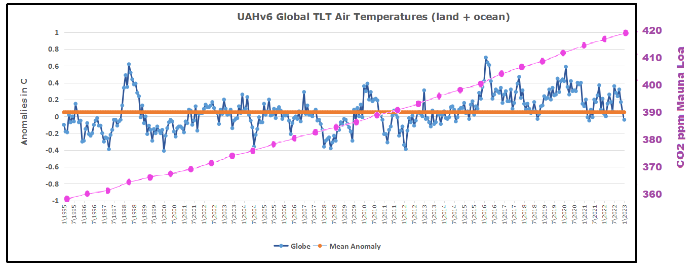


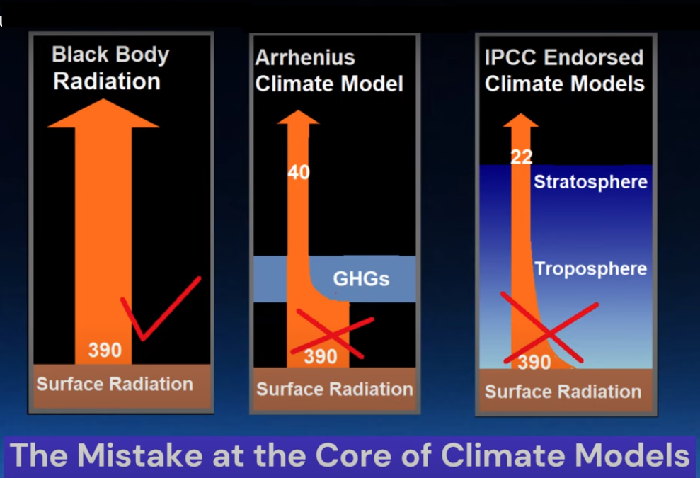


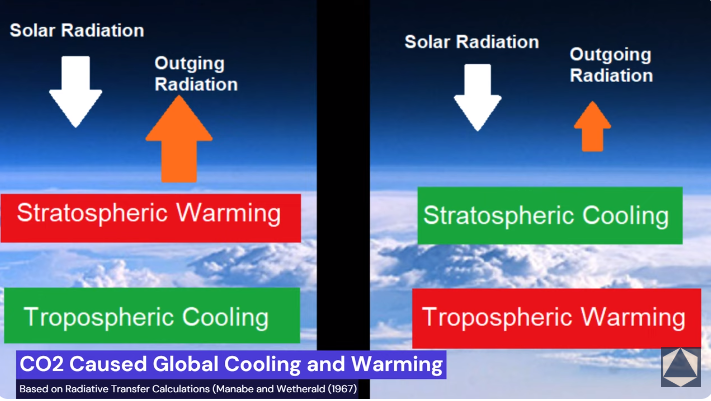
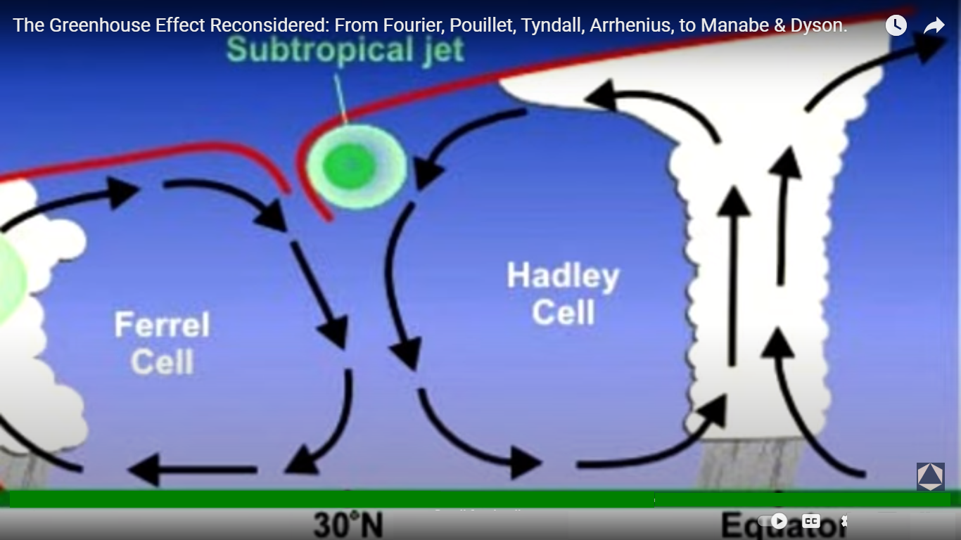


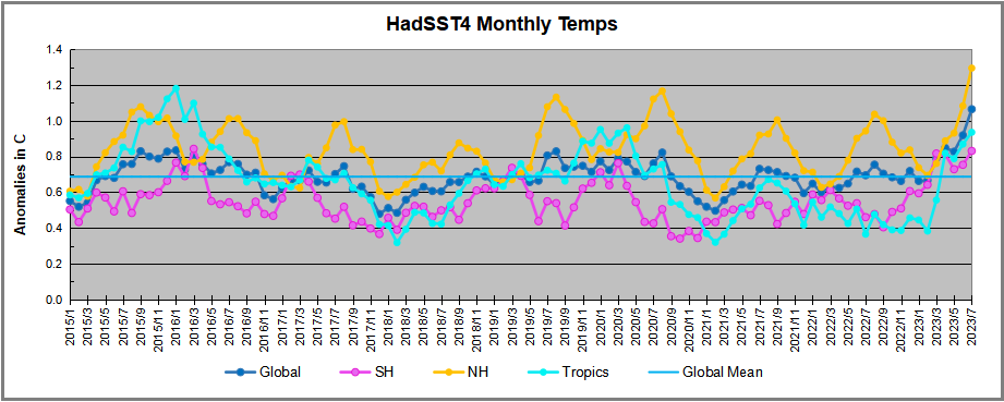
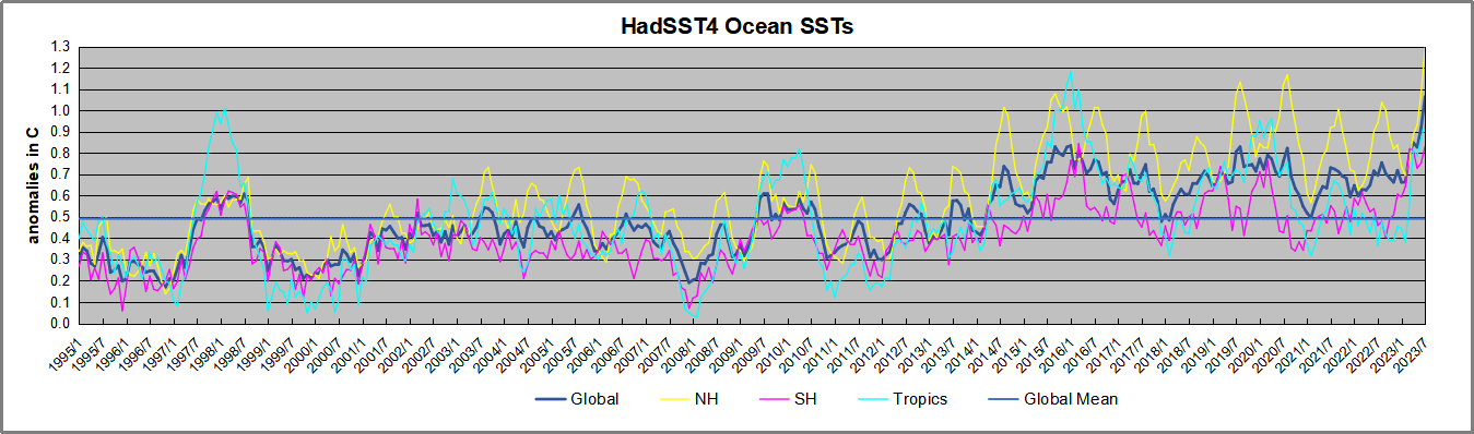
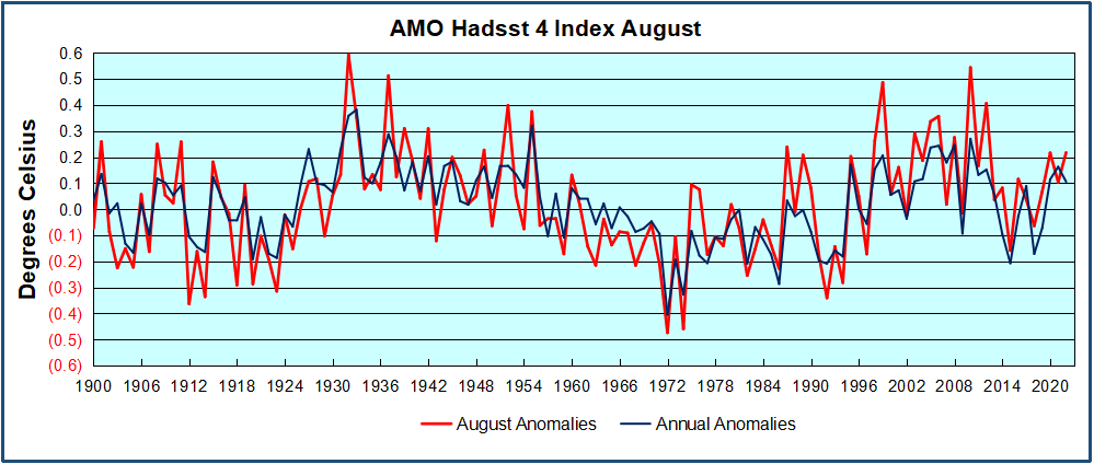
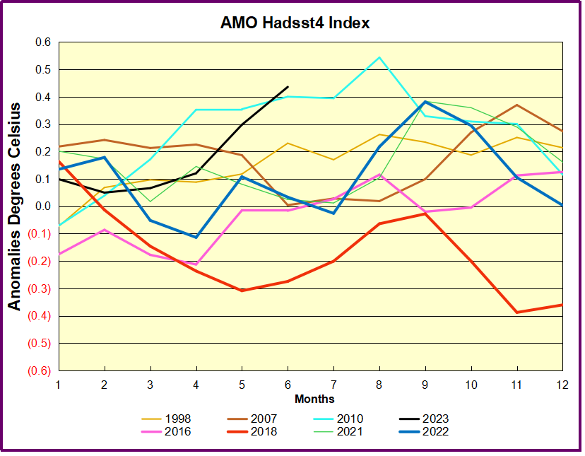
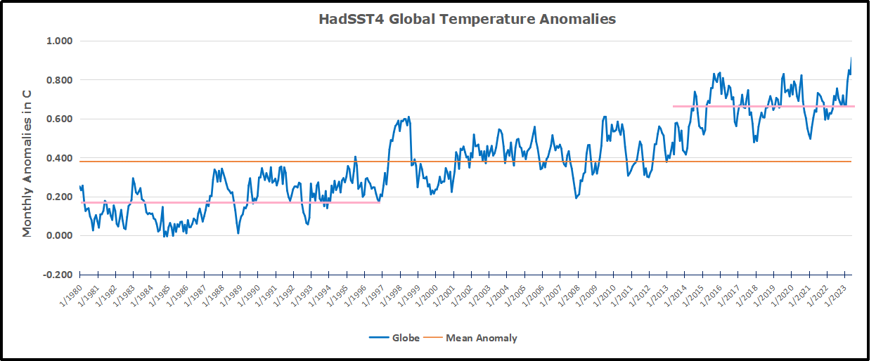


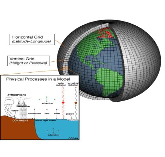
.PNG)
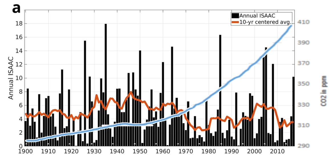


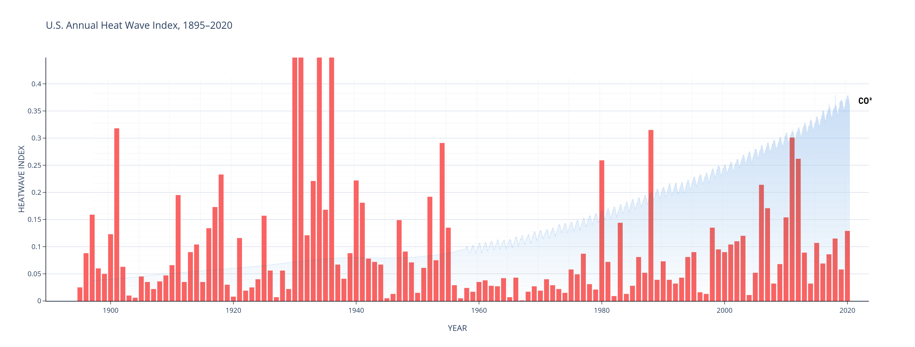


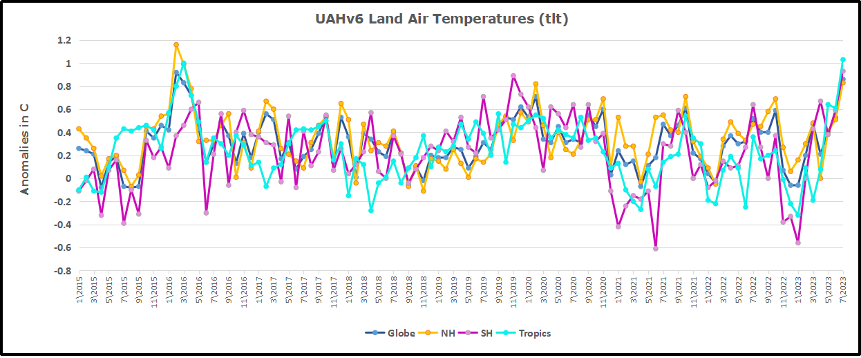
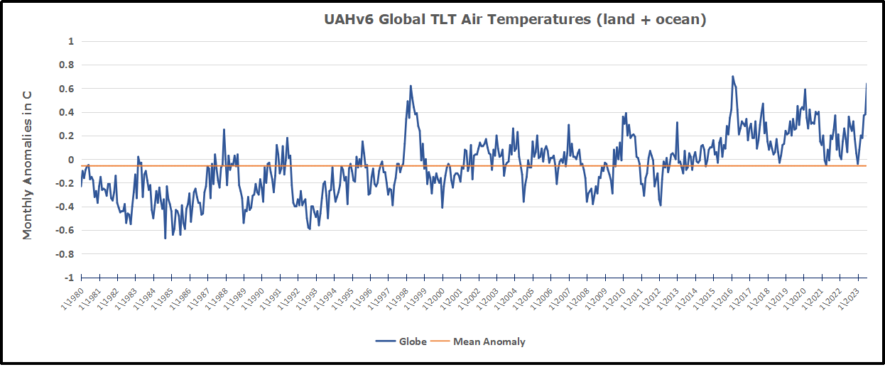
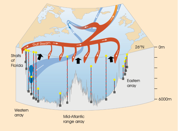


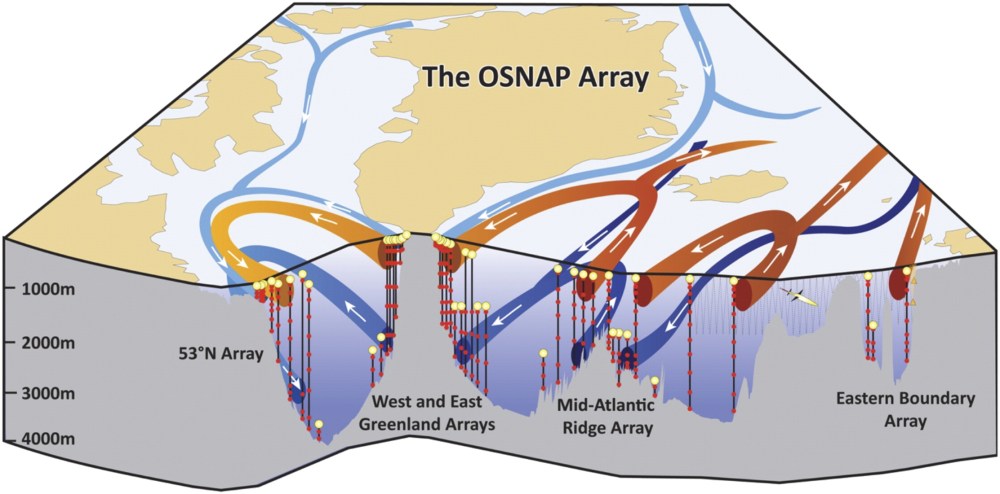
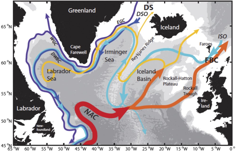

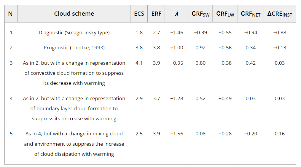

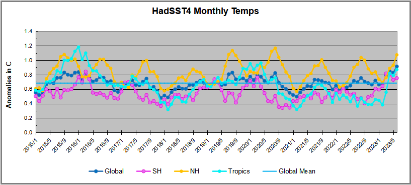
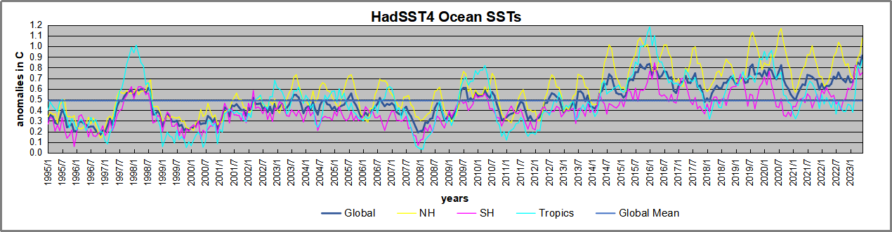

 Then we have the “doubled CO2” (t1) scenario, where the ERL has been pushed higher up into cooler air layers closer to the tropopause:
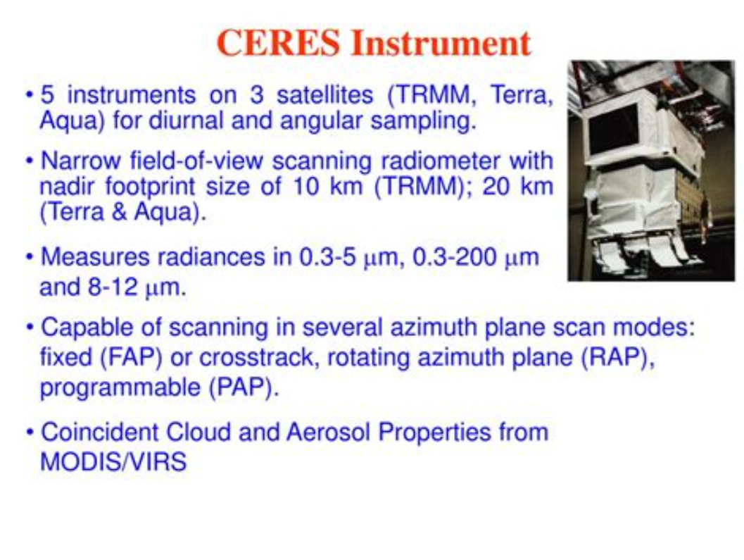
 Figure 5.
 Figure 10.