Raymond at RiC-Communications has produced the above poster on the theme expounded in a previous post In Celebration of Our Warm Climate, reprinted below. The above image is available in high resolution pdf format at his website The last ice age and its impact.
Legacy and social media keep up a constant drumbeat of warnings about a degree or two of planetary warming without any historical context for considering the significance of the alternative. A poem of Robert Frost comes to mind as some applicable wisdom:
The diagram at the top shows how grateful we should be for living in today’s climate instead of a glacial icehouse. (H/T Raymond Inauen) For most of its history Earth has been frozen rather than the mostly green place it is today. And the reference is to the extent of the North American ice sheet during the Last Glacial Maximum (LGM).
For further context consider that geologists refer to our time as a “Severe Icehouse World”, among the various conditions in earth’s history, as diagramed by paleo climatologist Christopher Scotese. Referring to the Global Mean Temperatures, it appears after many decades, we are slowly rising to “Icehouse World”, which would seem to be a good thing.
Instead of fear mongering over a bit of warming, we should celebrate our good fortune, and do our best for humanity and the biosphere. Matthew Ridley takes it from there in a previous post.
Background from previous post The Goodness of Global Warming
LAI refers to Leaf Area Index.
As noted in other posts here, warming comes and goes and a cooling period may now be ensuing. See No Global Warming, Chilly January Land and Sea. Matt Ridley provides a concise and clear argument to celebrate any warming that comes to our world in his Spiked article Why global warming is good for us. Excerpts in italics with my bolds and added images.
Climate change is creating a greener, safer planet.
Global warming is real. It is also – so far – mostly beneficial. This startling fact is kept from the public by a determined effort on the part of alarmists and their media allies who are determined to use the language of crisis and emergency. The goal of Net Zero emissions in the UK by 2050 is controversial enough as a policy because of the pain it is causing. But what if that pain is all to prevent something that is not doing net harm?
The biggest benefit of emissions is global greening, the increase year after year of green vegetation on the land surface of the planet. Forests grow more thickly, grasslands more richly and scrub more rapidly. This has been measured using satellites and on-the-ground recording of plant-growth rates. It is happening in all habitats, from tundra to rainforest. In the four decades since 1982, as Bjorn Lomborg points out, NASA data show that global greening has added 618,000 square kilometres of extra green leaves each year, equivalent to three Great Britains. You read that right: every year there’s more greenery on the planet to the extent of three Britains. I bet Greta Thunberg did not tell you that.
The cause of this greening? Although tree planting, natural reforestation, slightly longer growing seasons and a bit more rain all contribute, the big cause is something else. All studies agree that by far the largest contributor to global greening – responsible for roughly half the effect – is the extra carbon dioxide in the air. In 40 years, the proportion of the atmosphere that is CO2 has gone from 0.034 per cent to 0.041 per cent. That may seem a small change but, with more ‘food’ in the air, plants don’t need to lose as much water through their pores (‘stomata’) to acquire a given amount of carbon. So dry areas, like the Sahel region of Africa, are seeing some of the biggest improvements in greenery. Since this is one of the poorest places on the planet, it is good news that there is more food for people, goats and wildlife.
But because good news is no news, green pressure groups and environmental correspondents in the media prefer to ignore global greening. Astonishingly, it merited no mentions on the BBC’s recent Green Planet series, despite the name. Or, if it is mentioned, the media point to studies suggesting greening may soon cease. These studies are based on questionable models, not data (because data show the effect continuing at the same pace). On the very few occasions when the BBC has mentioned global greening it is always accompanied by a health warning in case any viewer might glimpse a silver lining to climate change – for example, ‘extra foliage helps slow climate change, but researchers warn this will be offset by rising temperatures’.
Another bit of good news is on deaths. We’re against them, right? A recent study shows that rising temperatures have resulted in half a million fewer deaths in Britain over the past two decades. That is because cold weather kills about ’20 times as many people as hot weather’, according to the study, which analyses ‘over 74million deaths in 384 locations across 13 countries’. This is especially true in a temperate place like Britain, where summer days are rarely hot enough to kill. So global warming and the unrelated phenomenon of urban warming relative to rural areas, caused by the retention of heat by buildings plus energy use, are both preventing premature deaths on a huge scale.
Summer temperatures in the US are changing at half the rate of winter temperatures and daytimes are warming 20 per cent slower than nighttimes. A similar pattern is seen in most countries. Tropical nations are mostly experiencing very slow, almost undetectable daytime warming (outside cities), while Arctic nations are seeing quite rapid change, especially in winter and at night. Alarmists love to talk about polar amplification of average climate change, but they usually omit its inevitable flip side: that tropical temperatures (where most poor people live) are changing more slowly than the average.
My Mind is Made Up, Don’t Confuse Me with the Facts. H/T Bjorn Lomborg, WUWT
But are we not told to expect more volatile weather as a result of climate change? It is certainly assumed that we should. Yet there’s no evidence to suggest weather volatility is increasing and no good theory to suggest it will. The decreasing temperature differential between the tropics and the Arctic may actually diminish the volatility of weather a little.
Indeed, as the Intergovernmental Panel on Climate Change (IPCC) repeatedly confirms, there is no clear pattern of storms growing in either frequency or ferocity, droughts are decreasing slightly and floods are getting worse only where land-use changes (like deforestation or building houses on flood plains) create a problem. Globally, deaths from droughts, floods and storms are down by about 98 per cent over the past 100 years – not because weather is less dangerous but because shelter, transport and communication (which are mostly the products of the fossil-fuel economy) have dramatically improved people’s ability to survive such natural disasters.
The effect of today’s warming (and greening) on farming is, on average, positive: crops can be grown farther north and for longer seasons and rainfall is slightly heavier in dry regions. We are feeding over seven billion people today much more easily than we fed three billion in the 1960s, and from a similar acreage of farmland. Global cereal production is on course to break its record this year, for the sixth time in 10 years.
Nature, too, will do generally better in a warming world. There are more species in warmer climates, so more new birds and insects are arriving to breed in southern England than are disappearing from northern Scotland. Warmer means wetter, too: 9,000 years ago, when the climate was warmer than today, the Sahara was green. Alarmists like to imply that concern about climate change goes hand in hand with concern about nature generally. But this is belied by the evidence. Climate policies often harm wildlife:biofuels compete for land with agriculture, eroding the benefits of improved agricultural productivity and increasing pressure on wild land; wind farms kill birds and bats; and the reckless planting of alien sitka spruce trees turns diverse moorland into dark monoculture.
Meanwhile, real environmental issues are ignored or neglected because of the obsession with climate. With the help of local volunteers I have been fighting to protect the red squirrel in Northumberland for years. The government does literally nothing to help us, while it pours money into grants for studying the most far-fetched and minuscule possible climate-change impacts. Invasive alien species are the main cause of species extinction worldwide (like grey squirrels driving the red to the margins), whereas climate change has yet to be shown to have caused a single species to die out altogether anywhere.
Of course, climate change does and will bring problems as well as benefits. Rapid sea-level rise could be catastrophic. But whereas the sea level shot up between 10,000 and 8,000 years ago, rising by about 60 metres in two millennia, or roughly three metres per century, todaythe change is nine times slower: three millimetres a year, or a foot per century, and with not much sign of acceleration. Countries like the Netherlands and Vietnam show that it is possible to gain land from the sea even in a world where sea levels are rising. The land area of the planet is actually increasing, not shrinking, thanks to siltation and reclamation.
Environmentalists don’t get donations or invitations to appear on the telly if they say moderate things. To stand up and pronounce that ‘climate change is real and needs to be tackled, but it’s not happening very fast and other environmental issues are more urgent’ would be about as popular as an MP in Oliver Cromwell’s parliament declaring, ‘The evidence for God is looking a bit weak, and I’m not so very sure that fornication really is a sin’. And I speak as someone who has made several speeches on climate in parliament.
No wonder we don’t hear about the good news on climate change.
The post below updates the UAH record of air temperatures over land and ocean. But as an overview consider how recent rapid cooling has now completely overcome the warming from the last 3 El Ninos (1998, 2010 and 2016). The UAH record shows that the effects of the last one were gone as of April 2021, again in November 2021 and February 2022. (UAH baseline is now 1991-2020).
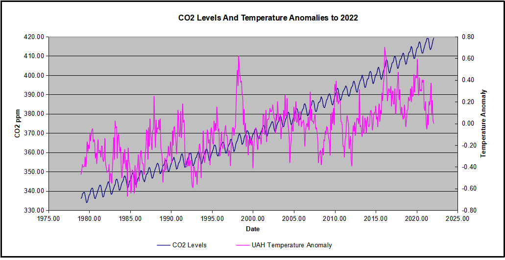
For reference I added an overlay of CO2 annual concentrations as measured at Mauna Loa. While temperatures fluctuated up and down ending flat, CO2 went up steadily by ~55 ppm, a 15% increase.
Furthermore, going back to previous warmings prior to the satellite record shows that the entire rise of 0.8C since 1947 is due to oceanic, not human activity.
The animation is an update of a previous analysis from Dr. Murry Salby. These graphs use Hadcrut4 and include the 2016 El Nino warming event. The exhibit shows since 1947 GMT warmed by 0.8 C, from 13.9 to 14.7, as estimated by Hadcrut4. This resulted from three natural warming events involving ocean cycles. The most recent rise 2013-16 lifted temperatures by 0.2C. Previously the 1997-98 El Nino produced a plateau increase of 0.4C. Before that, a rise from 1977-81 added 0.2C to start the warming since 1947.
Importantly, the theory of human-caused global warming asserts that increasing CO2 in the atmosphere changes the baseline and causes systemic warming in our climate. On the contrary, all of the warming since 1947 was episodic, coming from three brief events associated with oceanic cycles.
Update August 3, 2021
Chris Schoeneveld has produced a similar graph to the animation above, with a temperature series combining HadCRUT4 and UAH6. H/T WUWT
With apologies to Paul Revere, this post is on the lookout for cooler weather with an eye on both the Land and the Sea. While you will hear a lot about 2020-21 temperatures matching 2016 as the highest ever, that spin ignores how fast the cooling set in. The UAH data analyzed below shows that warming from the last El Nino was fully dissipated with chilly temperatures in all regions. Last month both land and ocean showed slightly milder temps
UAH has updated their tlt (temperatures in lower troposphere) dataset for March 2022. Previously I have done posts on their reading of ocean air temps as a prelude to updated records from HadSST3 (which is now discontinued). So I have separately posted on SSTs using HadSST4 2021 Ends with Cooler Ocean TempsThis month also has a separate graph of land air temps because the comparisons and contrasts are interesting as we contemplate possible cooling in coming months and years. Sometimes air temps over land diverge from ocean air changes, while last month showed that both air over land and ocean rose slightly.
Note: UAH has shifted their baseline from 1981-2010 to 1991-2020 beginning with January 2021. In the charts below, the trends and fluctuations remain the same but the anomaly values change with the baseline reference shift.
Presently sea surface temperatures (SST) are the best available indicator of heat content gained or lost from earth’s climate system. Enthalpy is the thermodynamic term for total heat content in a system, and humidity differences in air parcels affect enthalpy. Measuring water temperature directly avoids distorted impressions from air measurements. In addition, ocean covers 71% of the planet surface and thus dominates surface temperature estimates. Eventually we will likely have reliable means of recording water temperatures at depth.
Recently, Dr. Ole Humlum reported from his research that air temperatures lag 2-3 months behind changes in SST. Thus the cooling oceans now portend cooling land air temperatures to follow. He also observed that changes in CO2 atmospheric concentrations lag behind SST by 11-12 months. This latter point is addressed in a previous post Who to Blame for Rising CO2?
After a change in priorities, updates are now exclusive to HadSST4. For comparison we can also look at lower troposphere temperatures (TLT) from UAHv6 which are now posted for March. The temperature record is derived from microwave sounding units (MSU) on board satellites like the one pictured above. Recently there was a change in UAH processing of satellite drift corrections, including dropping one platform which can no longer be corrected. The graphs below are taken from the revised and current dataset.
The UAH dataset includes temperature results for air above the oceans, and thus should be most comparable to the SSTs. There is the additional feature that ocean air temps avoid Urban Heat Islands (UHI). The graph below shows monthly anomalies for ocean temps since January 2015.
Note 2020 was warmed mainly by a spike in February in all regions, and secondarily by an October spike in NH alone. In 2021, SH and the Tropics both pulled the Global anomaly down to a new low in April. Then SH and Tropics upward spikes, along with NH warming brought Global temps to a peak in October. That warmth was gone as November 2021 ocean temps plummeted everywhere. A upward bump 01/2022 was reversed in 02/2022 and now temps rise again in 03/2022. Last month warming in the Tropics and NH was moderated by SH ocean air remaining cool.
Land Air Temperatures Tracking Downward in Seesaw Pattern
We sometimes overlook that in climate temperature records, while the oceans are measured directly with SSTs, land temps are measured only indirectly. The land temperature records at surface stations sample air temps at 2 meters above ground. UAH gives tlt anomalies for air over land separately from ocean air temps. The graph updated for March is below.
Here we have fresh evidence of the greater volatility of the Land temperatures, along with extraordinary departures by SH land. Land temps are dominated by NH with a 2021 spike in January, then dropping before rising in the summer to peak in October 2021. As with the ocean air temps, all that was erased in November with a sharp cooling everywhere. Land temps dropped sharply for four months, even more than did the Oceans. Now in March all land regions warmed pulling up the global anomaly.
The Bigger Picture UAH Global Since 1980
The chart shows monthly anomalies starting 01/1980 to present. The average monthly anomaly is -0.07, for this period of more than four decades. The graph shows the 1998 El Nino after which the mean resumed, and again after the smaller 2010 event. The 2016 El Nino matched 1998 peak and in addition NH after effects lasted longer, followed by the NH warming 2019-20. A small upward bump in 2021 has been reversed with temps having returned again to the mean. Today we are at nearly the same temperature as 1980, with virtually no accumulation of global warming.
TLTs include mixing above the oceans and probably some influence from nearby more volatile land temps. Clearly NH and Global land temps have been dropping in a seesaw pattern, nearly 1C lower than the 2016 peak. Since the ocean has 1000 times the heat capacity as the atmosphere, that cooling is a significant driving force. TLT measures started the recent cooling later than SSTs from HadSST3, but are now showing the same pattern. It seems obvious that despite the three El Ninos, their warming has not persisted, and without them it would probably have cooled since 1995. Of course, the future has not yet been written.
Figure 1. Graph showing the number of volcanoes reported to have been active each year since 1800 CE. Total number of volcanoes with reported eruptions per year (thin upper black line) and 10-year running mean of same data (thick upper red line). Lower lines show only the annual number of volcanoes producing large eruptions (>= 0.1 km3 of tephra or magma) and scale is enlarged on the right axis; thick red lower line again shows 10-year running mean. Global Volcanism Project Discussion
In discussion with Kip Hansen, it occurred to me that the process and equation could be explained by the steady recovery from the LIA (Little Ice Age). That reminded me of this relevant discussion about the causes of the LIA, what ended it, and why the warming recovery from it may now be over.
Update August 2, 2019
University of Bern confirms in a recent announcement that volcanoes triggered the depths of the LIA (Little Ice Age). Their article is Volcanoes shaped the climate before humankind. H/T GWPF. However, they spin the story in support of climate alarm (emergency, whatever), rather than making the more obvious point that recent warming was recovering to roughly Medieval Warming levels after the abnormal cooling disruption from volcanoes. Excerpt in italics with my bolds.
“The new Bern study not only explains the global early 19th century climate, but it is also relevant for the present. “Given the large climatic changes seen in the early 19th century, it is difficult to define a pre-industrial climate,” explains lead author Stefan Brönnimann, “a notion to which all our climate targets refer.” And this has consequences for the climate targets set by policymakers, who want to limit global temperature increases to between 1.5 and 2 degrees Celsius at the most. Depending on the reference period, the climate has already warmed up much more significantly than assumed in climate discussions. The reason: Today’s climate is usually compared with a 1850-1900 reference period to quantify current warming. Seen in this light, the average global temperature has increased by 1 degree. “1850 to 1900 is certainly a good choice but compared to the first half of the 19th century, when it was significantly cooler due to frequent volcanic eruptions, the temperature increase is already around 1.2 degrees,” Stefan Brönnimann points out.”
Bern seems preoccupied with targets and accounting, while others are concerned to understand the role of volcanoes in natural climate change. A previous post gives a more detailed explanation, thanks to a suggestion I received.
The LIA Warming Rebound Is Over
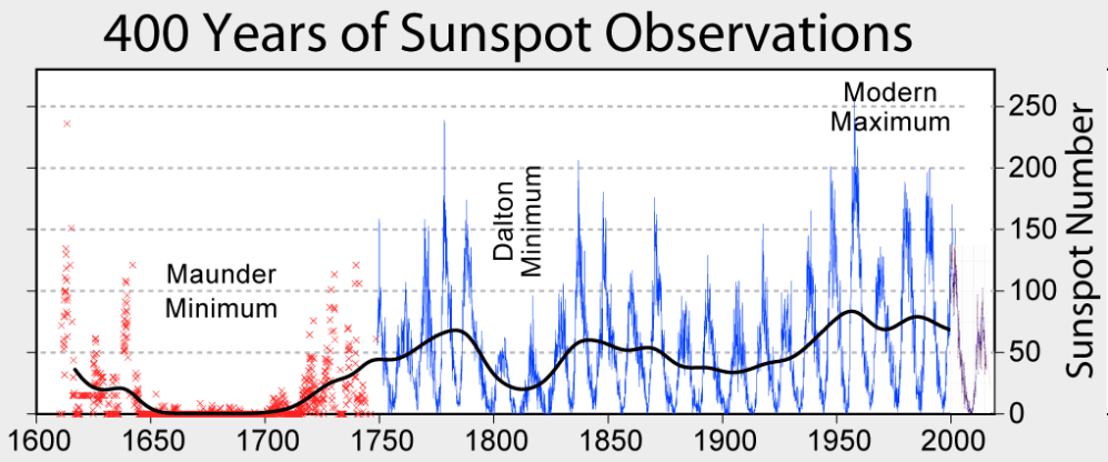
Thanks to Dr. Francis Manns for drawing my attention to the role of Volcanoes as a climate factor, particularly related to the onset of the Little Ice Age (LIA), 1400 to 1900 AD. I was aware that the temperature record since about 1850 can be explained by a steady rise of 0.5C per century rebound overlaid with a quasi-60 year cycle, most likely oceanic driven. See below Dr. Syun Akasofu 2009 diagram from his paper Two Natural Components of Recent Warming. When I presented this diagram to my warmist friends, they would respond, “But you don’t know what caused the LIA or what ended it!” To which I would say, “True, but we know it wasn’t due to burning fossil fuels.” Now I find there is a body of evidence suggesting what caused the LIA and why the temperature rebound may be over. Part of it is a familiar observation that the LIA coincided with a period when the sun was lacking sunspots, the Maunder Minimum, and later the Dalton.
Not to be overlooked is the climatic role of volcano activity inducing deep cooling patterns such as the LIA. Jihong Cole-Dai explains in a paper published 2010 entitled Volcanoes and climate. Excerpt in italics with my bolds.
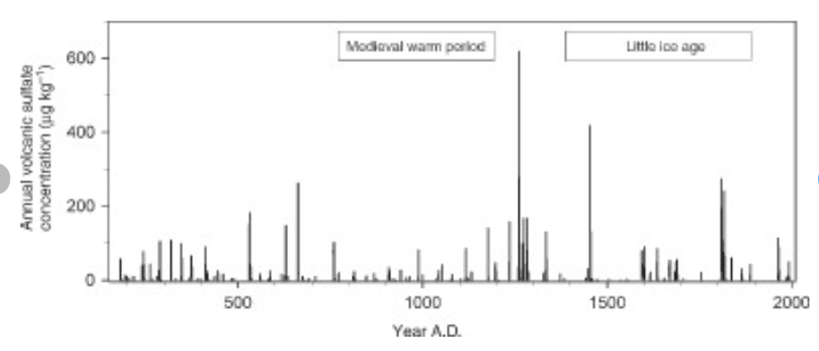
There has been strong interest in the role of volcanism during the climatic episodes of Medieval Warm Period (MWP,800–1200 AD) and Little Ice Age (LIA, 1400–1900AD), when direct human influence on the climate was negligible. Several studies attempted to determine the influence of solar forcing and volcanic forcing and came to different conclusions: Crowley and colleagues suggested that increased frequency of stratospheric eruptions in the seventeenth century and again in the early nineteenth century was responsible in large part for LIA. Shindell et al. concluded that LIA is the result of reduced solar irradiance, as seen in the Maunder Minimum of sunspots, during the time period. Ice core records show that the number of large volcanic eruptions between 800 and 1100 AD is possibly small (Figure 1), when compared with the eruption frequency during LIA. Several researchers have proposed that more frequent large eruptions during the thirteenth century(Figure 1) contributed to the climatic transition from MWP to LIA, perhaps as a part of the global shift from a warmer to a colder climate regime. This suggests that the volcanic impact may be particularly significant during periods of climatic transitions.
Weighted annual average concentration of volcanic sulfate for the period of 176–2005 AD in a South Pole, Antarctica ice core (Cole-Dai, manuscript in preparation).
How volcanoes impact on the atmosphere and climate
The major component of volcanic eruptions is the matter that emerges as solid, lithic material or solidifies into large particles, which are referred to as ash or tephra. These particles fall out of the atmosphere very rapidly, on timescales of minutes to a few days, and thus have no climatic impacts but are of great interest to volcanologists, as seen in the rest of this encyclopedia. When an eruption column still laden with these hot particles descends down the slopes of a volcano, this pyroclastic flow can be deadly to those unlucky enough to be at the base of the volcano. The destruction of Pompeii and Herculaneum after the AD 79 Vesuvius eruption is the most famous example.
Volcanic eruptions typically also emit gases, with H2O, N2, and CO2 being the most abundant. Over the lifetime of the Earth, these gases have been the main source of the Earth’s atmosphere and ocean after the primitive atmosphere of hydrogen and helium was lost to space. The water has condensed into the oceans, the CO2 has been changed by plants into O2 or formed carbonates, which sink to the ocean bottom, and some of the C has turned into fossil fuels. Of course, we eat plants and animals, which eat the plants, we drink the water, and we breathe the oxygen, so each of us is made of volcanic emissions. The atmosphere is now mainly composed of N2 (78%) and O2 (21%), both of which had sources in volcanic emissions.
Of these abundant gases, both H2O and CO2 are important greenhouse gases, but their atmospheric concentrations are so large (even for CO2 at only 400 ppm in 2013) that individual eruptions have a negligible effect on their concentrations and do not directly impact the greenhouse effect. Global annually averaged emissions of CO2 from volcanic eruptions since 1750 have been at least 100 times smaller than those from human activities. Rather the most important climatic effect of explosive volcanic eruptions is through their emission of sulfur species to the stratosphere, mainly in the form of SO2, but possibly sometimes as H2S. These sulfur species react with H2O to form H2SO4 on a timescale of weeks, and the resulting sulfate aerosols produce the dominant radiative effect from volcanic eruptions.
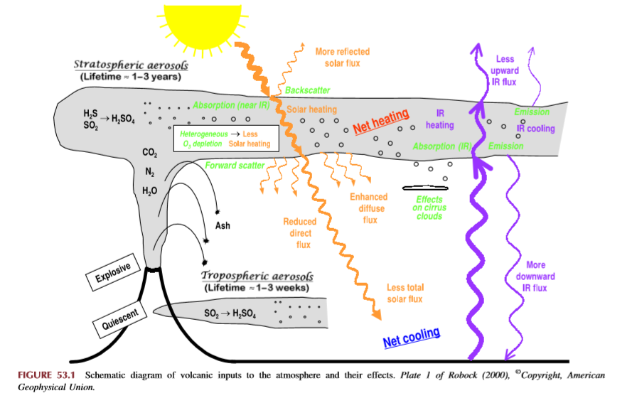
The major effect of a volcanic eruption on the climate system is the effect of the stratospheric cloud on solar radiation (Figure 53.1). Some of the radiation is scattered back to space, increasing the planetary albedo and cooling the Earth’s atmosphere system. The sulfate aerosol particles (typical effective radius of 0.5 mm, about the same size as the wavelength of visible light) also forward scatter much of the solar radiation, reducing the direct solar beam but increasing the brightness of the sky. After the 1991 Pinatubo eruption, the sky around the sun appeared more white than blue because of this. After the El Chicho´n eruption of 1982 and the Pinatubo eruption of 1991, the direct radiation was significantly reduced, but the diffuse radiation was enhanced by almost as much. Nevertheless, the volcanic aerosol clouds reduced the total radiation received at the surface.
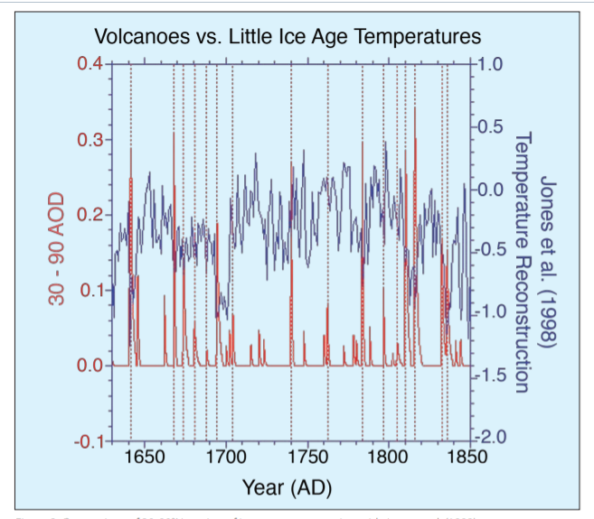
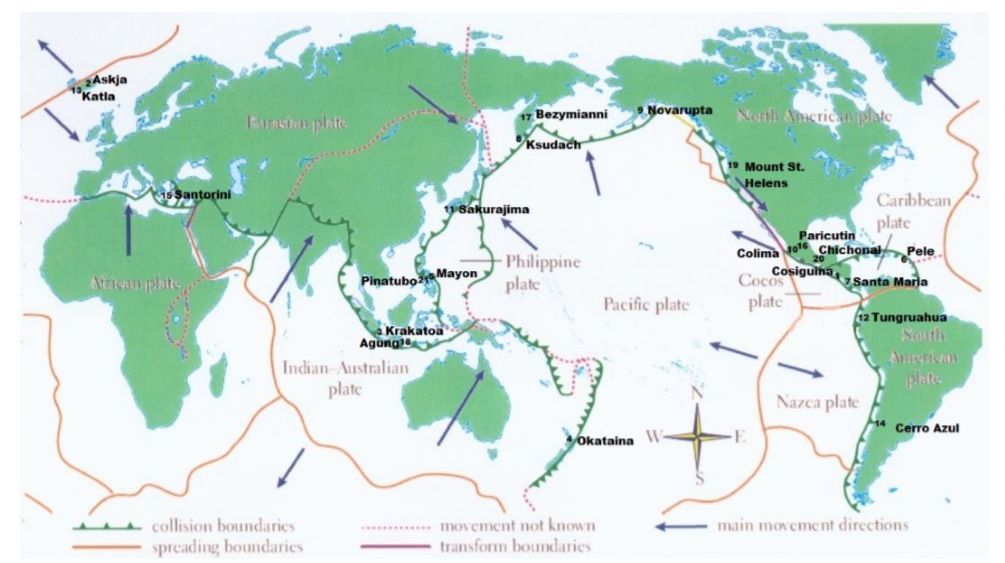
Although solar variability has often been considered the primary agent for LIA cooling, the most comprehensive test of this explanation (Hegerl et al., 2003) points instead to volcanism being substantially more important, explaining as much as 40% of the decadal-scale variance during the LIA. Yet, one problem that has continually plagued climate researchers is that the paleo-volcanic record, reconstructed from Antarctic and Greenland ice cores, cannot be well calibrated against the instrumental record. This is because the primary instrumental volcano reconstruction used by the climate community is that of Sato et al. (1993), which is relatively poorly constrained by observations prior to 1960 (especially in the southern hemisphere).
Here, we report on a new study that has successfully calibrated the Antarctic sulfate record of volcanism from the 1991 eruptions of Pinatubo (Philippines) and Hudson (Chile) against satellite aerosol optical depth (AOD) data (AOD is a measure of stratospheric transparency to incoming solar radiation). A total of 22 cores yield an area-weighted sulfate accumulation rate of 10.5 kg/km2 , which translates into a conversion rate for AOD of 0.011 AOD/ kg/km2 sulfate. We validated our time series by comparing a canonical growth and decay curve for eruptions for Krakatau (1883), the 1902 Caribbean eruptions (primarily Santa Maria), and the 1912 eruption of Novarupta/Katmai (Alaska)
We therefore applied the methodology to part of the LIA record that had some of the largest temperature changes over the last millennium.
Figure 2: Comparison of 30-90°N version of ice core reconstruction with Jones et al. (1998) temperature reconstruction over the interval 1630-1850. Vertical dashed lines denote levels of coincidence between eruptions and reconstructed cooling. AOD = Aerosol Optical Depth.
The ice core chronology of volcanoes is completely independent of the (primarily) tree ring based temperature reconstruction. The volcano reconstruction is deemed accurate to within 0 ± 1 years over this interval. There is a striking agreement between 16 eruptions and cooling events over the interval 1630-1850. Of particular note is the very large cooling in 1641-1642, due to the concatenation of sulfate plumes from two eruptions (one in Japan and one in the Philippines), and a string of eruptions starting in 1667 and culminating in a large tropical eruption in 1694 (tentatively attributed to Long Island, off New Guinea). This large tropical eruption (inferred from ice core sulfate peaks in both hemispheres) occurred almost exactly at the beginning of the coldest phase of the LIA in Europe and represents a strong argument against the implicit link of Late Maunder Minimum (1640-1710) cooling to solar irradiance changes.
Figure 1: Comparison of new ice core reconstruction with various instrumental-based reconstructions of stratospheric aerosol forcing. The asterisks refer to some modification to the instrumental data; for Sato et al. (1993) and the Lunar AOD, the asterisk refers to the background AOD being removed for the last 40 years. For Stothers (1996), it refers to the fact that instrumental observations for Krakatau (1883) and the 1902 Caribbean eruptions were only for the northern hemisphere. To obtain a global AOD for these estimates we used Stothers (1996) data for the northern hemisphere and our data for the southern hemisphere. The reconstruction for Agung eruption (1963) employed Stothers (1996) results from 90°N-30°S and the Antarctic ice core data for 30-90°S.
During the 18th century lull in eruptions, temperatures recovered somewhat but then cooled early in the 19th century. The sequence begins with a newly postulated unknown tropical eruption in midlate 1804, which deposited sulfate in both Greenland and Antarctica. Then, there are four well-documented eruptions—an unknown tropical eruption in 1809, Tambora (1815) and a second doublet tentatively attributed in part to Babuyan (Philippines) in 1831 and Cosiguina (Nicaragua) in 1835. These closely spaced eruptions are not only large but have a temporally extended effect on climate, due to the fact that they reoccur within the 10-year recovery timescale of the ocean mixed layer.
The ocean has not recovered from the first eruption so the second eruption drives the temperatures to an even lower state.
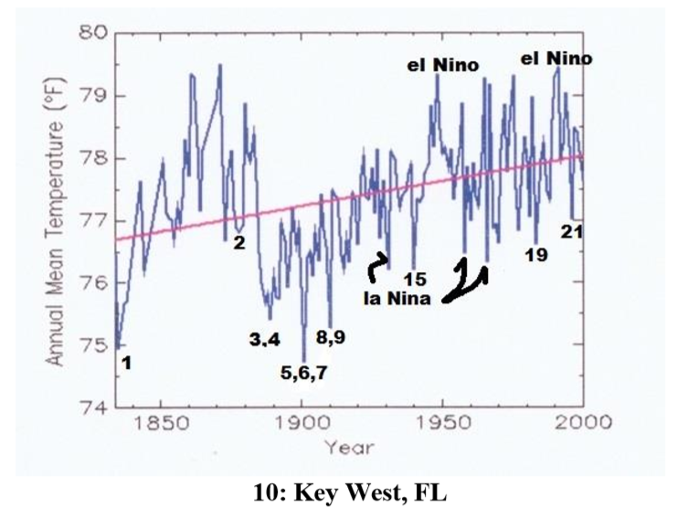
Abstract: Contrary to popular media and urban mythology the global warming we have experienced since the Little Ice Age is likely finished. A review of 10 temperature time series from US cities ranging from the hottest in Death Valley, CA, to possible the most isolated and remote at Key West, FL, show rebound from the Little Ice Age (which ended in the Alps by 1840) by 1870. The United States reached temperatures like modern temperatures (1950 – 2000) by about 1870, then declined precipitously principally caused by Krakatoa, and a series of other violent eruptions. Nine of these time series started when instrumental measurement was in its infancy and the world was cooled by volcanic dust and sulphate spewed into the atmosphere and distributed by the jet streams. These ten cities represent a sample of the millions of temperature measurements used in climate models. The average annual temperatures are useful because they account for seasonal fluctuations. In addition, time series from these cities are punctuated by El Nino Southern Oscillation (ENSO).
As should be expected, temperature at each city reacted differently to differing events. Several cities measured the effects of Krakatoa in 1883 while only Death Valley, CA and Berkeley CA sensed the minor new volcano Paricutin in Michoacán, Mexico. The Key West time series shows rapid rebound from the Little Ice Age as do Albany, NY, Harrisburg, PA, and Chicago. IL long before the petroleum-industrial revolution got into full swing. Recording at most sites started during a volcanic induced temperature minimum thus giving an impression of global warming to which industrial carbon dioxide is persuasively held responsible. Carbon dioxide, however, cannot be proven responsible for these temperatures. These and likely subsequent temperatures could be the result of regression to the normal equilibriumtemperatures of the earth (for now). If one were to remove the volcanic punctuation and El Nino Southern Oscillation (ENSO) input many would display very little alarming warming from 1815 to 2000. This review illustrates the weakness of linear regression as a measure of change. If there is a systemic reason for the global warming hypothesis, it is an anthropogenic error in both origin and termination. ENSO compliments and confirms the validity of NOAA temperature data. Temperatures since 2000 during the current hiatus are not available because NOAA has closed the public website.
Example of time series from Manns. Numbers refer to major named volcano eruptions listed in his paper. For instance, #3 was Krakatoa
The cooling effect is said to have lasted for 5 years after Krakatoa erupted – from 1883 to 1888. Examination of these charts, However, shows that, e.g., Krakatoa did not add to the cooling effect from earlier eruptions of Cosaguina in 1835 and Askja in 1875. The temperature charts all show rapid rebound to equilibrium temperature for the region affected in a year or two at most.
Fourteen major volcanic eruptions, however, were recorded between 1883 and 1918 (Robock, 2000, and this essay). Some erupted for days or weeks and some were cataclysmic and shorter. The sum of all these eruptions from Krakatoa onward effected temperatures early in the instrumental age. Judging from wasting glaciers in the Alps, abrupt retreat began about 1860).
Manns Conclusions: 1)Four of these time series (Albany, Harrisburg, Chicago and Key West) show recovery to the range of today’s temperatures by 1870 before the eruption of Askja in 1875. The temperature rebounded very quickly after the Little Ice Age in the northern hemisphere.
2)Volcanic eruptions and unrelated huge swings shown from ENSO largely rule global temperature. Volcanic history and the El Nino Southern Oscillation (ENSO) trump all other increments of temperature that may be hidden in the lists.
3)The sum of the eruptions from Krakatoa (1883) to Katla (1918) and Cerro Azul (1932) was a cold start for climate models.
4)It is beyond doubt that academic and bureau climate models use data that was gathered when volcanic activity had depressed global temperature. The cluster from Krakatoa to Katla (1883 -1918) were global.
5)Modern events, Mount Saint Helens and Pinatubo, moreover, were a fraction of the event intensity of the late 19th and early 20th centuries eruptions.
6) The demise of frequent violent volcanos has allowed the planet to regress toward a norm (for now).
The forecast above did not mention the January 15, 2022 major eruption of Hunga Ha’apai volcano in Tonga.
Summary
These findings describe a natural process by which a series of volcanoes along with a period of quiet solar cycles ended the Medieval Warm Period (MWP), chilling the land and inducing deep oceanic cooling resulting in the Little Ice Age. With much less violent volcanic activity in the 20th century, coincidental with typically active solar cycles, a Modern Warm Period ensued with temperatures rebounding back to approximately the same as before the LIA.
This suggests that humans and the biosphere were enhanced by a warming process that has ended. The solar cycles are again going quiet and are forecast to continue that way. Presently, volcanic activity has been routine, showing no increase over the last 100 years. No one knows how long will last the current warm period, a benefit to us from the ocean recovering after the LIA. But future periods are as likely to be cooler than to be warmer compared to the present.
The best context for understanding decadal temperature changes comes from the world’s sea surface temperatures (SST), for several reasons:
The ocean covers 71% of the globe and drives average temperatures;
SSTs have a constant water content, (unlike air temperatures), so give a better reading of heat content variations;
A major El Nino was the dominant climate feature in recent years.
HadSST is generally regarded as the best of the global SST data sets, and so the temperature story here comes from that source. Previously I used HadSST3 for these reports, but Hadley Centre has made HadSST4 the priority, and v.3 will no longer be updated. HadSST4 is the same as v.3, except that the older data from ship water intake was re-estimated to be generally lower temperatures than shown in v.3. The effect is that v.4 has lower average anomalies for the baseline period 1961-1990, thereby showing higher current anomalies than v.3. This analysis concerns more recent time periods and depends on very similar differentials as those from v.3 despite higher absolute anomaly values in v.4. More on what distinguishes HadSST3 and 4 from other SST products at the end. The user guide for HadSST4 is here.
The Current Context
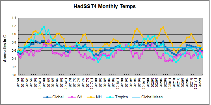
The 2021 year end report below showed rapid cooling in all regions. The anomalies then continued in 2022 to remain well below the mean since 2015. This Global Cooling was also evident in the UAH Land and Ocean air temperatures (Still No Global Warming, Cool February Land and Sea )
The chart below shows SST monthly anomalies as reported in HadSST4 starting in 2015 through February 2022. A global cooling pattern is seen clearly in the Tropics since its peak in 2016, joined by NH and SH cycling downward since 2016.
Note that higher temps in 2015 and 2016 were first of all due to a sharp rise in Tropical SST, beginning in March 2015, peaking in January 2016, and steadily declining back below its beginning level. Secondly, the Northern Hemisphere added three bumps on the shoulders of Tropical warming, with peaks in August of each year. A fourth NH bump was lower and peaked in September 2018. As noted above, a fifth peak in August 2019 and a sixth August 2020 exceeded the four previous upward bumps in NH.
After three straight Spring 2020 months of cooling led by the tropics and SH, NH spiked in the summer, along with smaller bumps elsewhere. Then temps everywhere dropped for six months, hitting bottom in February 2021. All regions were well below the Global Mean since 2015, matching the cold of 2018, and lower than January 2015. Then the spring and summer brought more temperate waters and a July return to the mean anomaly since 2015. After an upward bump in August, the 2021 yearend Global temp anomaly dropped below the mean, driven by sharp declines in the Tropics and NH. Now in 2022 all regions remain cool and the Global anomaly remain lower than the mean for this period.
A longer view of SSTs
To enlarge image double-click or open in new tab.
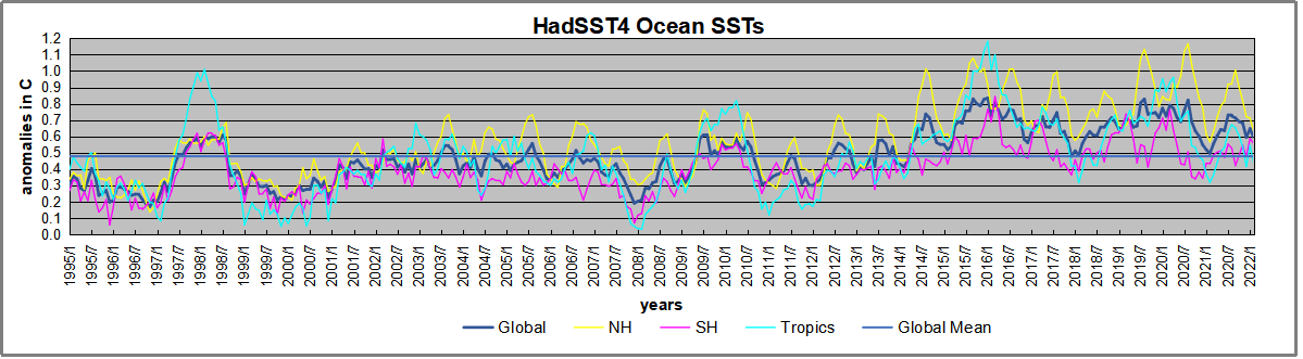
The graph above is noisy, but the density is needed to see the seasonal patterns in the oceanic fluctuations. Previous posts focused on the rise and fall of the last El Nino starting in 2015. This post adds a longer view, encompassing the significant 1998 El Nino and since. The color schemes are retained for Global, Tropics, NH and SH anomalies. Despite the longer time frame, I have kept the monthly data (rather than yearly averages) because of interesting shifts between January and July.1995 is a reasonable (ENSO neutral) starting point prior to the first El Nino. The sharp Tropical rise peaking in 1998 is dominant in the record, starting Jan. ’97 to pull up SSTs uniformly before returning to the same level Jan. ’99. For the next 2 years, the Tropics stayed down, and the world’s oceans held steady around 0.5C above 1961 to 1990 average.
Then comes a steady rise over two years to a lesser peak Jan. 2003, but again uniformly pulling all oceans up around 0.5C. Something changes at this point, with more hemispheric divergence than before. Over the 4 years until Jan 2007, the Tropics go through ups and downs, NH a series of ups and SH mostly downs. As a result the Global average fluctuates around that same 0.5C, which also turns out to be the average for the entire record since 1995.
2007 stands out with a sharp drop in temperatures so that Jan.08 matches the low in Jan. ’99, but starting from a lower high. The oceans all decline as well, until temps build peaking in 2010.
Now again a different pattern appears. The Tropics cool sharply to Jan 11, then rise steadily for 4 years to Jan 15, at which point the most recent major El Nino takes off. But this time in contrast to ’97-’99, the Northern Hemisphere produces peaks every summer pulling up the Global average. In fact, these NH peaks appear every July starting in 2003, growing stronger to produce 3 massive highs in 2014, 15 and 16. NH July 2017 was only slightly lower, and a fifth NH peak still lower in Sept. 2018.
The highest summer NH peaks came in 2019 and 2020, only this time the Tropics and SH are offsetting rather adding to the warming. (Note: these are high anomalies on top of the highest absolute temps in the NH.) Since 2014 SH has played a moderating role, offsetting the NH warming pulses. After September 2020 temps dropped off down until February 2021, then all regions rose to bring the global anomaly above the mean since 1995 June 2021 backed down before warming again slightly in July and August 2021, then cooling slightly in September. The present level compares with 2014.
What to make of all this? The patterns suggest that in addition to El Ninos in the Pacific driving the Tropic SSTs, something else is going on in the NH. The obvious culprit is the North Atlantic, since I have seen this sort of pulsing before. After reading some papers by David Dilley, I confirmed his observation of Atlantic pulses into the Arctic every 8 to 10 years.
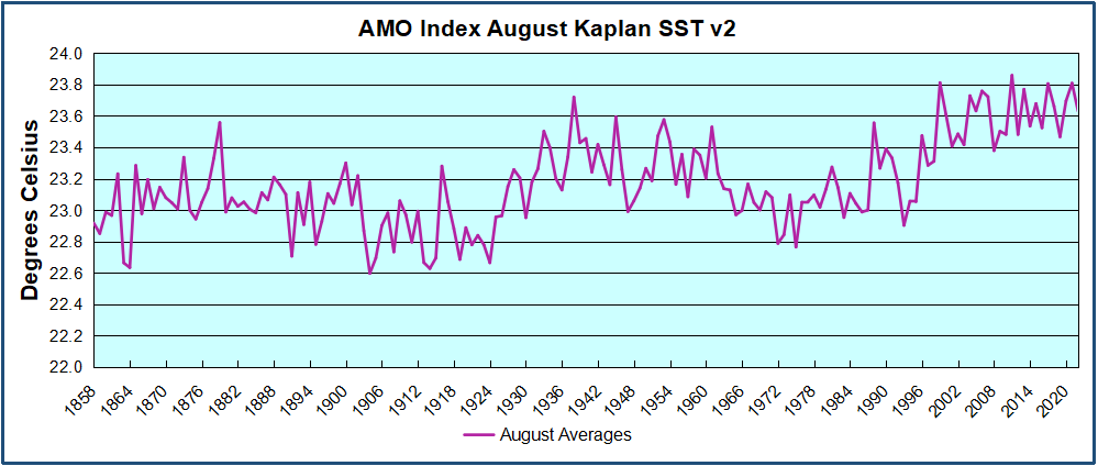
But the peaks coming nearly every summer in HadSST require a different picture. Let’s look at August, the hottest month in the North Atlantic from the Kaplan dataset.
The AMO Index is from from Kaplan SST v2, the unaltered and not detrended dataset. By definition, the data are monthly average SSTs interpolated to a 5×5 grid over the North Atlantic basically 0 to 70N. The graph shows August warming began after 1992 up to 1998, with a series of matching years since, including 2020, dropping down in 2021. Because the N. Atlantic has partnered with the Pacific ENSO recently, let’s take a closer look at some AMO years in the last 2 decades.
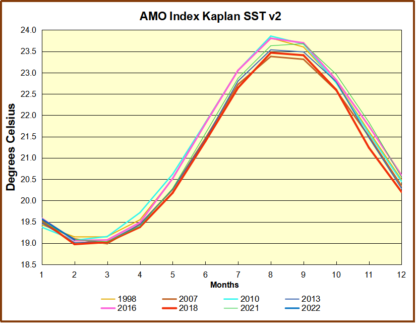
This graph shows monthly AMO temps for some important years. The Peak years were 1998, 2010 and 2016, with the latter emphasized as the most recent. The other years show lesser warming, with 2007 emphasized as the coolest in the last 20 years. Note the red 2018 line is at the bottom of all these tracks. The heavy blue line shows that 2022 started warm, and now is in the middle of the tracks.
Summary
The oceans are driving the warming this century. SSTs took a step up with the 1998 El Nino and have stayed there with help from the North Atlantic, and more recently the Pacific northern “Blob.” The ocean surfaces are releasing a lot of energy, warming the air, but eventually will have a cooling effect. The decline after 1937 was rapid by comparison, so one wonders: How long can the oceans keep this up? If the pattern of recent years continues, NH SST anomalies may rise slightly in coming months, but once again, ENSO which has weakened will probably determine the outcome.
Footnote: Why Rely on HadSST4
HadSST is distinguished from other SST products because HadCRU (Hadley Climatic Research Unit) does not engage in SST interpolation, i.e. infilling estimated anomalies into grid cells lacking sufficient sampling in a given month. From reading the documentation and from queries to Met Office, this is their procedure.
HadSST4 imports data from gridcells containing ocean, excluding land cells. From past records, they have calculated daily and monthly average readings for each grid cell for the period 1961 to 1990. Those temperatures form the baseline from which anomalies are calculated.
In a given month, each gridcell with sufficient sampling is averaged for the month and then the baseline value for that cell and that month is subtracted, resulting in the monthly anomaly for that cell. All cells with monthly anomalies are averaged to produce global, hemispheric and tropical anomalies for the month, based on the cells in those locations. For example, Tropics averages include ocean grid cells lying between latitudes 20N and 20S.
Gridcells lacking sufficient sampling that month are left out of the averaging, and the uncertainty from such missing data is estimated. IMO that is more reasonable than inventing data to infill. And it seems that the Global Drifter Array displayed in the top image is providing more uniform coverage of the oceans than in the past.
USS Pearl Harbor deploys Global Drifter Buoys in Pacific Ocean
This post is about proving that CO2 changes in response to temperature changes, not the other way around, as is often claimed. In order to do that we need two datasets: one for measurements of changes in atmospheric CO2 concentrations over time and one for estimates of Global Mean Temperature changes over time.
Climate science is unsettling because past data are not fixed, but change later on. I ran into this previously and now again in 2021 and 2022 when I set out to update an analysis done in 2014 by Jeremy Shiers (discussed in a previous post reprinted at the end). Jeremy provided a spreadsheet in his essay Murray Salby Showed CO2 Follows Temperature Now You Can Too posted in January 2014. I downloaded his spreadsheet intending to bring the analysis up to the present to see if the results hold up. The two sources of data were:
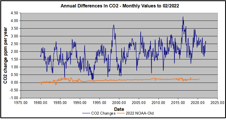
Uploading the CO2 dataset showed that many numbers had changed (why?).
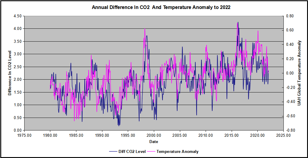
The blue line shows annual observed differences in monthly values year over year, e.g. June 2020 minus June 2019 etc. The first 12 months (1979) provide the observed starting values from which differentials are calculated. The orange line shows those CO2 values changed slightly in the 2020 dataset vs. the 2014 dataset, on average +0.035 ppm. But there is no pattern or trend added, and deviations vary randomly between + and -. So last year I took the 2020 dataset to replace the older one for updating the analysis.
Now I find the NOAA dataset in 2021 has almost completely new values due to a method shift in February 2021, requiring a recalibration of all previous measurements. The new picture of ΔCO2 is graphed below.
The method shift is reported at a NOAA Global Monitoring Laboratory webpage, Carbon Dioxide (CO2) WMO Scale, with a justification for the difference between X2007 results and the new results from X2019 now in force. The orange line shows that the shift has resulted in higher values, especially early on and a general slightly increasing trend over time. However, these are small variations at the decimal level on values 340 and above. Further, the graph shows that yearly differentials month by month are virtually the same as before. Thus I redid the analysis with the new values.
Global Temperature Anomalies (ΔTemp)
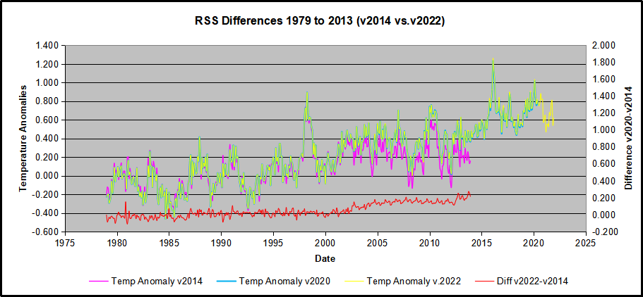
The other time series was the record of global temperature anomalies according to RSS. The current RSS dataset is not at all the same as the past.
Here we see some seriously unsettling science at work. The purple line is RSS in 2014, and the blue is RSS as of 2020. Some further increases appear in the gold 2022 rss dataset. The red line shows alterations from the old to the new. There is a slight cooling of the data in the beginning years, then the three versions mostly match until 1997, when systematic warming enters the record. From 1997/5 to 2003/12 the average anomaly increases by 0.04C. After 2004/1 to 2012/8 the average increase is 0.15C. At the end from 2012/9 to 2013/12, the average anomaly was higher by 0.21. The 2022 version added slight warming over 2020 values.
RSS continues that accelerated warming to the present, but it cannot be trusted. And who knows what the numbers will be a few years down the line? As Dr. Ole Humlum said some years ago (regarding Gistemp): “It should however be noted, that a temperature record which keeps on changing the past hardly can qualify as being correct.”
Given the above manipulations, I went instead to the other satellite dataset UAH version 6. UAH has also made a shift by changing its baseline from 1981-2010 to 1991-2020. This resulted in systematically reducing the anomaly values, but did not alter the pattern of variation over time. For comparison, here are the two records with measurements through February 2022.
CO2 observed and Global Temperatures observed up to 2022.
Comparing UAH temperature anomalies to NOAA CO2 changes.
Here are UAH temperature anomalies compared to CO2 monthly changes year over year.
Changes in monthly CO2 synchronize with temperature fluctuations, which for UAH are anomalies now referenced to the 1991-2020 period. As stated above, CO2 differentials are calculated for the present month by subtracting the value for the same month in the previous year (for example June 2021 minus June 2020). Temp anomalies are calculated by comparing the present month with the baseline month.
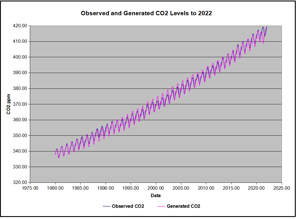
The final proof that CO2 follows temperature due to stimulation of natural CO2 reservoirs is demonstrated by the ability to calculate CO2 levels since 1979 with a simple mathematical formula:
For each subsequent year, the co2 level for each month was generated
CO2 this month this year = a + b × Temp this month this year + CO2 this month last year
Jeremy used Python to estimate a and b, but I used his spreadsheet to guess values that place for comparison the observed and calculated CO2 levels on top of each other.
In the chart calculated CO2 levels correlate with observed CO2 levels at 0.9979 out of 1.0000. This mathematical generation of CO2 atmospheric levels is only possible if they are driven by temperature-dependent natural sources, and not by human emissions which are small in comparison, rise steadily and monotonically.
Previous Post: What Causes Rising Atmospheric CO2?
This post is prompted by a recent exchange with those reasserting the “consensus” view attributing all additional atmospheric CO2 to humans burning fossil fuels.
The IPCC doctrine which has long been promoted goes as follows. We have a number over here for monthly fossil fuel CO2 emissions, and a number over there for monthly atmospheric CO2. We don’t have good numbers for the rest of it-oceans, soils, biosphere–though rough estimates are orders of magnitude higher, dwarfing human CO2. So we ignore nature and assume it is always a sink, explaining the difference between the two numbers we do have. Easy peasy, science settled.
What about the fact that nature continues to absorb about half of human emissions, even while FF CO2 increased by 60% over the last 2 decades? What about the fact that in 2020 FF CO2 declined significantly with no discernable impact on rising atmospheric CO2?
These and other issues are raised by Murray Salby and others who conclude that it is not that simple, and the science is not settled. And so these dissenters must be cancelled lest the narrative be weakened.
The non-IPCC paradigm is that atmospheric CO2 levels are a function of two very different fluxes. FF CO2 changes rapidly and increases steadily, while Natural CO2 changes slowly over time, and fluctuates up and down from temperature changes. The implications are that human CO2 is a simple addition, while natural CO2 comes from the integral of previous fluctuations. Jeremy Shiers has a series of posts at his blog clarifying this paradigm. See Increasing CO2 Raises Global Temperature Or Does Increasing Temperature Raise CO2 Excerpts in italics with my bolds.
The following graph which shows the change in CO2 levels (rather than the levels directly) makes this much clearer.
Note the vertical scale refers to the first differential of the CO2 level not the level itself. The graph depicts that change rate in ppm per year.
There are big swings in the amount of CO2 emitted. Taking the mean as 1.6 ppmv/year (at a guess) there are +/- swings of around 1.2 nearly +/- 100%.
And, surprise surprise, the change in net emissions of CO2 is very strongly correlated with changes in global temperature.
This clearly indicates the net amount of CO2 emitted in any one year is directly linked to global mean temperature in that year.
For any given year the amount of CO2 in the atmosphere will be the sum of
all the net annual emissions of CO2
in all previous years.
For each year the net annual emission of CO2 is proportional to the annual global mean temperature.
This means the amount of CO2 in the atmosphere will be related to the sum of temperatures in previous years.
So CO2 levels are not directly related to the current temperature but the integral of temperature over previous years.
The following graph again shows observed levels of CO2 and global temperatures but also has calculated levels of CO2 based on sum of previous years temperatures (dotted blue line).
Summary:
The massive fluxes from natural sources dominate the flow of CO2 through the atmosphere. Human CO2 from burning fossil fuels is around 4% of the annual addition from all sources. Even if rising CO2 could cause rising temperatures (no evidence, only claims), reducing our emissions would have little impact.
Legacy and social media keep up a constant drumbeat of warnings about a degree or two of planetary warming without any historical context for considering the significance of the alternative. A poem of Robert Frost comes to mind as some applicable wisdom:
The diagram at the top shows how grateful we should be for living in today’s climate instead of a glacial icehouse. (H/T Raymond Inauen) For most of its history Earth has been frozen rather than the mostly green place it is today. And the reference is to the extent of the North American ice sheet during the Last Glacial Maximum (LGM).
For further context consider that geologists refer to our time as a “Severe Icehouse World”, among the various conditions in earth’s history, as diagramed by paleo climatologist Christopher Scotese. Referring to the Global Mean Temperatures, it appears after many decades, we are slowly rising to “Icehouse World”, which would seem to be a good thing.
Instead of fear mongering over a bit of warming, we should celebrate our good fortune, and do our best for humanity and the biosphere. Matthew Ridley takes it from there in a previous post.
Background from previous post The Goodness of Global Warming
LAI refers to Leaf Area Index.
As noted in other posts here, warming comes and goes and a cooling period may now be ensuing. See No Global Warming, Chilly January Land and Sea. Matt Ridley provides a concise and clear argument to celebrate any warming that comes to our world in his Spiked article Why global warming is good for us. Excerpts in italics with my bolds and added images.
Climate change is creating a greener, safer planet.
Global warming is real. It is also – so far – mostly beneficial. This startling fact is kept from the public by a determined effort on the part of alarmists and their media allies who are determined to use the language of crisis and emergency. The goal of Net Zero emissions in the UK by 2050 is controversial enough as a policy because of the pain it is causing. But what if that pain is all to prevent something that is not doing net harm?
The biggest benefit of emissions is global greening, the increase year after year of green vegetation on the land surface of the planet. Forests grow more thickly, grasslands more richly and scrub more rapidly. This has been measured using satellites and on-the-ground recording of plant-growth rates. It is happening in all habitats, from tundra to rainforest. In the four decades since 1982, as Bjorn Lomborg points out, NASA data show that global greening has added 618,000 square kilometres of extra green leaves each year, equivalent to three Great Britains. You read that right: every year there’s more greenery on the planet to the extent of three Britains. I bet Greta Thunberg did not tell you that.
The cause of this greening? Although tree planting, natural reforestation, slightly longer growing seasons and a bit more rain all contribute, the big cause is something else. All studies agree that by far the largest contributor to global greening – responsible for roughly half the effect – is the extra carbon dioxide in the air. In 40 years, the proportion of the atmosphere that is CO2 has gone from 0.034 per cent to 0.041 per cent. That may seem a small change but, with more ‘food’ in the air, plants don’t need to lose as much water through their pores (‘stomata’) to acquire a given amount of carbon. So dry areas, like the Sahel region of Africa, are seeing some of the biggest improvements in greenery. Since this is one of the poorest places on the planet, it is good news that there is more food for people, goats and wildlife.
But because good news is no news, green pressure groups and environmental correspondents in the media prefer to ignore global greening. Astonishingly, it merited no mentions on the BBC’s recent Green Planet series, despite the name. Or, if it is mentioned, the media point to studies suggesting greening may soon cease. These studies are based on questionable models, not data (because data show the effect continuing at the same pace). On the very few occasions when the BBC has mentioned global greening it is always accompanied by a health warning in case any viewer might glimpse a silver lining to climate change – for example, ‘extra foliage helps slow climate change, but researchers warn this will be offset by rising temperatures’.
Another bit of good news is on deaths. We’re against them, right? A recent study shows that rising temperatures have resulted in half a million fewer deaths in Britain over the past two decades. That is because cold weather kills about ’20 times as many people as hot weather’, according to the study, which analyses ‘over 74million deaths in 384 locations across 13 countries’. This is especially true in a temperate place like Britain, where summer days are rarely hot enough to kill. So global warming and the unrelated phenomenon of urban warming relative to rural areas, caused by the retention of heat by buildings plus energy use, are both preventing premature deaths on a huge scale.
Summer temperatures in the US are changing at half the rate of winter temperatures and daytimes are warming 20 per cent slower than nighttimes. A similar pattern is seen in most countries. Tropical nations are mostly experiencing very slow, almost undetectable daytime warming (outside cities), while Arctic nations are seeing quite rapid change, especially in winter and at night. Alarmists love to talk about polar amplification of average climate change, but they usually omit its inevitable flip side: that tropical temperatures (where most poor people live) are changing more slowly than the average.
My Mind is Made Up, Don’t Confuse Me with the Facts. H/T Bjorn Lomborg, WUWT
But are we not told to expect more volatile weather as a result of climate change? It is certainly assumed that we should. Yet there’s no evidence to suggest weather volatility is increasing and no good theory to suggest it will. The decreasing temperature differential between the tropics and the Arctic may actually diminish the volatility of weather a little.
Indeed, as the Intergovernmental Panel on Climate Change (IPCC) repeatedly confirms, there is no clear pattern of storms growing in either frequency or ferocity, droughts are decreasing slightly and floods are getting worse only where land-use changes (like deforestation or building houses on flood plains) create a problem. Globally, deaths from droughts, floods and storms are down by about 98 per cent over the past 100 years – not because weather is less dangerous but because shelter, transport and communication (which are mostly the products of the fossil-fuel economy) have dramatically improved people’s ability to survive such natural disasters.
The effect of today’s warming (and greening) on farming is, on average, positive: crops can be grown farther north and for longer seasons and rainfall is slightly heavier in dry regions. We are feeding over seven billion people today much more easily than we fed three billion in the 1960s, and from a similar acreage of farmland. Global cereal production is on course to break its record this year, for the sixth time in 10 years.
Nature, too, will do generally better in a warming world. There are more species in warmer climates, so more new birds and insects are arriving to breed in southern England than are disappearing from northern Scotland. Warmer means wetter, too: 9,000 years ago, when the climate was warmer than today, the Sahara was green. Alarmists like to imply that concern about climate change goes hand in hand with concern about nature generally. But this is belied by the evidence. Climate policies often harm wildlife:biofuels compete for land with agriculture, eroding the benefits of improved agricultural productivity and increasing pressure on wild land; wind farms kill birds and bats; and the reckless planting of alien sitka spruce trees turns diverse moorland into dark monoculture.
Meanwhile, real environmental issues are ignored or neglected because of the obsession with climate. With the help of local volunteers I have been fighting to protect the red squirrel in Northumberland for years. The government does literally nothing to help us, while it pours money into grants for studying the most far-fetched and minuscule possible climate-change impacts. Invasive alien species are the main cause of species extinction worldwide (like grey squirrels driving the red to the margins), whereas climate change has yet to be shown to have caused a single species to die out altogether anywhere.
Of course, climate change does and will bring problems as well as benefits. Rapid sea-level rise could be catastrophic. But whereas the sea level shot up between 10,000 and 8,000 years ago, rising by about 60 metres in two millennia, or roughly three metres per century, todaythe change is nine times slower: three millimetres a year, or a foot per century, and with not much sign of acceleration. Countries like the Netherlands and Vietnam show that it is possible to gain land from the sea even in a world where sea levels are rising. The land area of the planet is actually increasing, not shrinking, thanks to siltation and reclamation.
Environmentalists don’t get donations or invitations to appear on the telly if they say moderate things. To stand up and pronounce that ‘climate change is real and needs to be tackled, but it’s not happening very fast and other environmental issues are more urgent’ would be about as popular as an MP in Oliver Cromwell’s parliament declaring, ‘The evidence for God is looking a bit weak, and I’m not so very sure that fornication really is a sin’. And I speak as someone who has made several speeches on climate in parliament.
No wonder we don’t hear about the good news on climate change.
The post below updates the UAH record of air temperatures over land and ocean. But as an overview consider how recent rapid cooling has now completely overcome the warming from the last 3 El Ninos (1998, 2010 and 2016). The UAH record shows that the effects of the last one were gone as of April 2021, again in November, 2021 and now in January and February 2022. (UAH baseline is now 1991-2020).
For reference I added an overlay of CO2 annual concentrations as measured at Mauna Loa. While temperatures fluctuated up and down ending flat, CO2 went up steadily by ~55 ppm, a 15% increase.
Furthermore, going back to previous warmings prior to the satellite record shows that the entire rise of 0.8C since 1947 is due to oceanic, not human activity.
The animation is an update of a previous analysis from Dr. Murry Salby. These graphs use Hadcrut4 and include the 2016 El Nino warming event. The exhibit shows since 1947 GMT warmed by 0.8 C, from 13.9 to 14.7, as estimated by Hadcrut4. This resulted from three natural warming events involving ocean cycles. The most recent rise 2013-16 lifted temperatures by 0.2C. Previously the 1997-98 El Nino produced a plateau increase of 0.4C. Before that, a rise from 1977-81 added 0.2C to start the warming since 1947.
Importantly, the theory of human-caused global warming asserts that increasing CO2 in the atmosphere changes the baseline and causes systemic warming in our climate. On the contrary, all of the warming since 1947 was episodic, coming from three brief events associated with oceanic cycles.
Update August 3, 2021
Chris Schoeneveld has produced a similar graph to the animation above, with a temperature series combining HadCRUT4 and UAH6. H/T WUWT
February Update Cool Ocean and Land Air Temps Continue
With apologies to Paul Revere, this post is on the lookout for cooler weather with an eye on both the Land and the Sea. While you will hear a lot about 2020-21 temperatures matching 2016 as the highest ever, that spin ignores how fast is the cooling setting in. The UAH data analyzed below shows that warming from the last El Nino is now fully dissipated with chilly temperatures in all regions. Last month both land and ocean continued cool.
UAH has updated their tlt (temperatures in lower troposphere) dataset for February 2022. Previously I have done posts on their reading of ocean air temps as a prelude to updated records from HadSST3 (still not updated from October). So I have separately posted on SSTs using HadSST4 2021 Ends with Cooler Ocean TempsThis month also has a separate graph of land air temps because the comparisons and contrasts are interesting as we contemplate possible cooling in coming months and years. Sometimes air temps over land diverge from ocean air changes, and last month showed air over land dropping slightly while ocean air rose.
Note: UAH has shifted their baseline from 1981-2010 to 1991-2020 beginning with January 2021. In the charts below, the trends and fluctuations remain the same but the anomaly values change with the baseline reference shift.
Presently sea surface temperatures (SST) are the best available indicator of heat content gained or lost from earth’s climate system. Enthalpy is the thermodynamic term for total heat content in a system, and humidity differences in air parcels affect enthalpy. Measuring water temperature directly avoids distorted impressions from air measurements. In addition, ocean covers 71% of the planet surface and thus dominates surface temperature estimates. Eventually we will likely have reliable means of recording water temperatures at depth.
Recently, Dr. Ole Humlum reported from his research that air temperatures lag 2-3 months behind changes in SST. Thus the cooling oceans now portend cooling land air temperatures to follow. He also observed that changes in CO2 atmospheric concentrations lag behind SST by 11-12 months. This latter point is addressed in a previous post Who to Blame for Rising CO2?
After a change in priorities, updates to HadSST4 now appear more promptly. For comparison we can also look at lower troposphere temperatures (TLT) from UAHv6 which are now posted for February. The temperature record is derived from microwave sounding units (MSU) on board satellites like the one pictured above. Recently there was a change in UAH processing of satellite drift corrections, including dropping one platform which can no longer be corrected. The graphs below are taken from the new and current dataset.
The UAH dataset includes temperature results for air above the oceans, and thus should be most comparable to the SSTs. There is the additional feature that ocean air temps avoid Urban Heat Islands (UHI). The graph below shows monthly anomalies for ocean temps since January 2015.
Note 2020 was warmed mainly by a spike in February in all regions, and secondarily by an October spike in NH alone. In 2021, SH and the Tropics both pulled the Global anomaly down to a new low in April. Then SH and Tropics upward spikes, along with NH warming brought Global temps to a peak in October. That warmth was gone as November 2021 ocean temps plummeted everywhere. Note the sharp drop in the Tropics the last 3 months, and NH erasing its upward bump in December. 01/2022 closely resembles 01/2015 and 02/2022 is the same.
Land Air Temperatures Tracking Downward in Seesaw Pattern
We sometimes overlook that in climate temperature records, while the oceans are measured directly with SSTs, land temps are measured only indirectly. The land temperature records at surface stations sample air temps at 2 meters above ground. UAH gives tlt anomalies for air over land separately from ocean air temps. The graph updated for February is below.
Here we have fresh evidence of the greater volatility of the Land temperatures, along with extraordinary departures by SH land. Land temps are dominated by NH with a 2020 spike in February, followed by cooling down to July and a second spike in November. Note the mid-year spikes in SH winter months. In December 2020 all of that was wiped out. Then 2021 followed a similar pattern with NH spiking in January, then dropping before rising in the summer to peak in October 2021. As with the ocean air temps, all that was erased in November with a sharp cooling everywhere. Land temps dropped sharply the last four months, even more than did the Oceans. Note 02/2022 Global and NH land dropped further pulling down the Global land anomaly lower than 01/2015.
The Bigger Picture UAH Global Since 1980
The chart shows monthly anomalies starting 01/1980 to present. The average monthly anomaly is -0.07, for this period of more than four decades. The graph shows the 1998 El Nino after which the mean resumed, and again after the smaller 2010 event. The 2016 El Nino matched 1998 peak and in addition NH after effects lasted longer, followed by the NH warming 2019-20. A small upward bump in 2021 has been reversed with temps now returning again to the mean. Today we are at nearly the same temperature as 1980, with virtually no accumulation of global warming.
TLTs include mixing above the oceans and probably some influence from nearby more volatile land temps. Clearly NH and Global land temps have been dropping in a seesaw pattern, nearly 1C lower than the 2016 peak. Since the ocean has 1000 times the heat capacity as the atmosphere, that cooling is a significant driving force. TLT measures started the recent cooling later than SSTs from HadSST3, but are now showing the same pattern. It seems obvious that despite the three El Ninos, their warming has not persisted, and without them it would probably have cooled since 1995. Of course, the future has not yet been written.
There’s renewed interest in this interchange between William Happer and David Karoly conducted by The Best Schools in their Civil Global Warming Dialogue. Excerpts below are from William Happer’s Major Statement, which is no longer available. Instead, there is an extensive William Happer Interview on Global Warming from September 7, 2021. The David Karoly Interview is available from Andy May’s website.
William Happer’s Major Statement at the Best Schools Global Warming Dialogue is CO₂ will be a major benefit to the Earth.
Some people claim that increased levels of atmospheric CO2 will cause catastrophic global warming, flooding from rising oceans, spreading tropical diseases, ocean acidification, and other horrors. But these frightening scenarios have almost no basis in genuine science. This Statement reviews facts that have persuaded me that more CO2 will be a major benefit to the Earth.
Discussions of climate today almost always involve fossil fuels. Some people claim that fossil fuels are inherently evil. Quite the contrary, the use of fossil fuels to power modern society gives the average person a standard of living that only the wealthiest could enjoy a few centuries ago. But fossil fuels must be extracted responsibly, minimizing environmental damage from mining and drilling operations, and with due consideration of costs and benefits. Similarly, fossil fuels must be burned responsibly, deploying cost-effective technologies that minimize emissions of real pollutants such as fly ash, carbon monoxide, oxides of sulfur and nitrogen, heavy metals, volatile organic compounds, etc.
Extremists have conflated these genuine environmental concerns with the emission of CO2, which cannot be economically removed from exhaust gases. Calling CO2 a “pollutant” that must be eliminated, with even more zeal than real pollutants, is Orwellian Newspeak.[3] “Buying insurance” against potential climate disasters by forcibly curtailing the use of fossil fuels is like buying “protection” from the mafia. There is nothing to insure against, except the threats of an increasingly totalitarian coalition of politicians, government bureaucrats, crony capitalists, thuggish nongovernmental organizations like Greenpeace, etc.
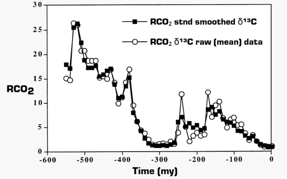
Figure 1. The ratio, RCO2, of past atmospheric CO2 concentrations to average values (about 300 ppm) of the past few million years, This particular proxy record comes from analyzing the fraction of the rare stable isotope 13C to the dominant isotope 12C in carbonate sediments and paleosols. Other proxies give qualitatively similar results.[
Life on Earth does better with more CO2. CO2 levels are increasing
Fig. 1 summarizes the most important theme of this discussion. It is not true that releasing more CO2 into the atmosphere is a dangerous, unprecedented experiment. The Earth has already “experimented” with much higher CO2 levels than we have today or that can be produced by the combustion of all economically recoverable fossil fuels.
Radiative cooling of the Earth and The Role of Water and Clouds
Without sunlight and only internal heat to keep warm, the Earth’s absolute surface temperature T would be very cold indeed. A first estimate can be made with the celebrated Stefan-Boltzmann formula
J= εσT^4 [Equation 1 ]
where J is the thermal radiation flux per unit of surface area, and the Stefan-Boltzmann constant (originally determined from experimental measurements) has the value σ = 5.67 × 10⁻⁸ W/(m2K4). If we use this equation to calculate how warm the surface would have to be to radiate the same thermal energy as the mean solar flux, Js = F/4 = 340 W/m2, we find Ts = 278 K or 5 C, a bit colder than the average temperature (287 K or 14 C) of the Earth’s surface,[19] but “in the ball park.”
Figure 5. The temperature profile of the Earth’s atmosphere.[20] This illustration is for mid-latitudes, like Princeton, NJ, at 40.4o N, where the tropopause is usually at an altitude of about 11 km. The tropopause is closer to 17 km near the equator, and as low as 9 km near the north and south poles.
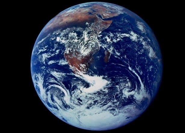
These estimates can be refined by taking into account the Earth’s atmosphere. In the Interview we already discussed the representative temperature profile, Fig. 5. The famous “blue marble” photograph of the Earth,[21] reproduced in Fig. 6, is also very instructive. Much of the Earth is covered with clouds, which reflect about 30% of sunlight back into space, thereby preventing its absorption and conversion to heat. Rayleigh scattering (which gives the blue color of the daytime sky) also deflects shorter-wavelength sunlight back to space and prevents heating.
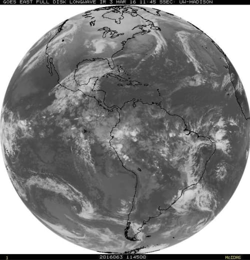
Today, whole-Earth images analogous to Fig. 6 are continuously recorded by geostationary satellites, orbiting at the same angular velocity as the Earth, and therefore hovering over nearly the same spot on the equator at an altitude of about 35,800 km.[23] In addition to visible images, which can only be recorded in daytime, the geostationary satellites record images of the thermal radiation emitted both day and night.
Figure 7. Radiation with wavelengths close to the 10.7 µ (1µ = 10-6m), as observed with a geostationary satellite over the western hemisphere of the Earth.[23] This is radiation in the infrared window of Fig. 4, where the surface can radiate directly to space from cloud-free regions.
Fig. 7 shows radiation with wavelengths close to 10.7 µ in the “infrared window” of the absorption spectrum shown in Fig. 4, where there is little absorption from either the main greenhouse gas, H2O, or from less-important CO2.Darker tones in Fig. 7 indicate more intense radiation. The cold “white” cloud tops emit much less radiation than the surface, which is “visible” at cloud-free regions of the Earth. This is the opposite from Fig. 6, where maximum reflected sunlight is coming from the white cloud tops, and much less reflection from the land and ocean, where much of the solar radiation is absorbed and converted to heat.
As one can surmise from Fig. 6 and Fig. 7, clouds are one of the most potent factors that control the surface temperature of the earth. Their effects are comparable to those of the greenhouse gases, H2O and CO2, but it is much harder to model the effects of clouds. Clouds tend to cool the Earth by scattering visible and near-visible solar radiation back to space before the radiation can be absorbed and converted to heat. But clouds also prevent the warm surface from radiating directly to space. Instead, the radiation comes from the cloud tops that are normally cooler than the surface. Low-cloud tops are not much cooler than the surface, so low clouds are net coolers. In Fig. 7, a large area of low clouds can be seen off the coast of Chile. They are only slightly cooler than the surrounding waters of the Pacific Ocean in cloud-free areas.
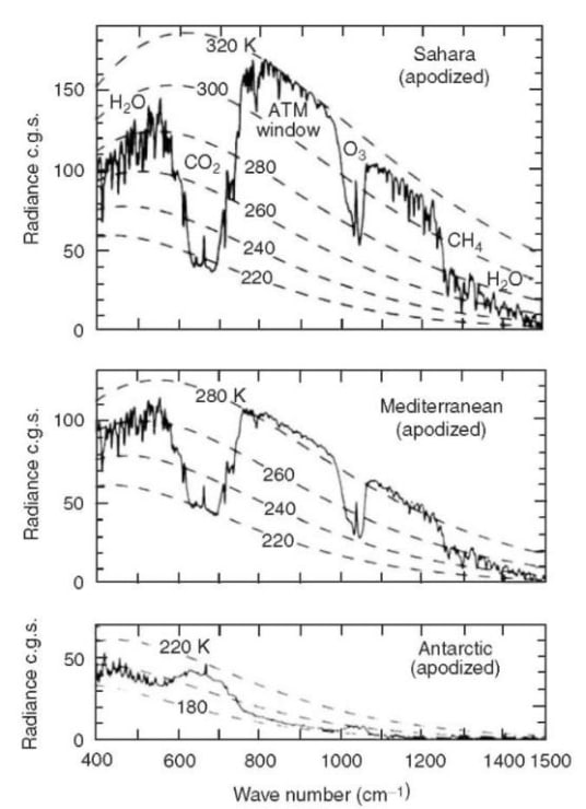
Figure 8. Spectrally resolved, vertical upwelling thermal radiation I from the Earth, the jagged lines, as observed by a satellite.[28] The smooth, dashed lines are theoretical Planck brightnesses, B, for various temperatures. The vertical units are 1 c.g.s = 1 erg/(s cm2 sr cm-1) = 1 mW/(m2 sr cm-1).
Except at the South Pole, the data of Fig. 8 show that the observed thermal radiation from the Earth is less intense than Planck radiation from the surface would be without greenhouse gases. Although the surface radiation is completely blocked in the bands of the greenhouse gases, as one would expect from Fig. 4, radiation from H2O and CO2 molecules at higher, colder altitudes can escape to space. At the “emission altitude,” which depends on frequency ν, there are not enough greenhouse molecules left overhead to block the escape of radiation. The thermal emission cross section of CO2 molecules at band center is so large that the few molecules in the relatively warm upper stratosphere (see Fig. 5) produce the sharp spikes in the center of the bands of Fig. 8. The flat bottoms of the CO2 bands of Fig 8 are emission from the nearly isothermal lower stratosphere (see Fig. 5) which has a temperature close to 220 K over most of the Earth.
It is hard for H2O molecules to reach cold, higher altitudes, since the molecules condense onto snowflakes or rain drops in clouds. So the H2O emissions to space come from the relatively warm and humid troposphere, and they are only moderately less intense than the Planck brightness of the surface. CO2 molecules radiate to space from the relatively dry and cold lower stratosphere. So for most latitudes, the CO2 band observed from space has much less intensity than the Planck brightness of the surface.
Concentrations of H2O vapor can be quite different at different locations on Earth. A good example is the bottom panel of Fig. 8, the thermal radiation from the Antarctic ice sheet, where almost no H2O emission can be seen. There, most of the water vapor has been frozen onto the ice cap, at a temperature of around 190 K. Near both the north and south poles there is a dramatic wintertime inversion[30] of the normal temperature profile of Fig. 5. The ice surface becomes much colder than most of the troposphere and lower stratosphere.
Cloud tops in the intertropical convergence zone (ITCZ) can reach the tropopause and can be almost as cold as the Antarctic ice sheet. The spectral distribution of cloud-top radiation from the ITCZ looks very similar to cloud-free radiation from the Antarctic ice, shown on the bottom panel of Fig. 8.
Convection
Radiation, which we have discussed above, is an important part of the energy transfer budget of the earth, but not the only part. More solar energy is absorbed in the tropics, near the equator, where the sun beats down nearly vertically at noon, than at the poles where the noontime sun is low on the horizon, even at midsummer, and where there is no sunlight at all in the winter. As a result, more visible and near infrared solar radiation (“short-wave radiation” or SWR) is absorbed in the tropics than is radiated back to space as thermal radiation (“long-wave radiation” or LWR). The opposite situation prevails near the poles, where thermal radiation releases more energy to space than is received by sunlight. Energy is conserved because the excess solar energy from the tropics is carried to the poles by warm air currents, and to a lesser extent, by warm ocean currents. The basic physics is sketched in Fig. 11.[35]
Figure 11. Most sunlight is absorbed in the tropics, and some of the heat energy is carried by air currents to the polar regions to be released back into space as thermal radiation. Along with energy, angular momentum — imparted to the air from the rotating Earth’s surface near the equator — is transported to higher northern and southern latitudes, where it is reabsorbed by the Earth’s surface. The Hadley circulation near the equator is largely driven by buoyant forces on warm, solar-heated air, but for mid latitudes the “Coriolis force” due to the rotation of the earth leads to transport of energy and angular momentum through slanted “baroclinic eddies.” Among other consequences of the conservation of angular momentum are the easterly trade winds near the equator and the westerly winds at mid latitudes.
Equilibrium Climate Sensitivity
If increasing CO2 causes very large warming, harm can indeed be done. But most studies suggest that warmings of up to 2 K will be good for the planet,[38] extending growing seasons, cutting winter heating bills, etc. We will denote temperature differences in Kelvin (K) since they are exactly the same as differences in Celsius (C). A temperature change of 1 K = 1 C is equal to a change of 1.8 Fahrenheit (F).
If a 50% increase of CO2 were to increase the temperature by 3.4 K, as in Arrhenius’s original estimate mentioned above, the doubling sensitivity would be S = 3.4 K/log2(1.5) = 5.8 K. Ten years later, on page 53 of his popular book, Worlds in the Making: The Evolution of the Universe,[40] Arrhenius again states the logarithmic law of warming, with a slightly smaller climate sensitivity, S = 4 K.
Convection of the atmosphere, water vapor, and clouds all interact in a complicated way with the change of CO2 to give the numerical value of the doubling sensitivity S of Eq. (21). Remarkably, Arrhenius somehow guessed the logarithmic dependence on CO2 concentration before Planck’s discovery of how thermal radiation really works.
More than a century after Arrhenius, and after the expenditure of many tens of billions of dollars on climate science, the official value of S still differs little from the guess that Arrhenius made in 1912: S = 4 K.
Could it be that the climate establishment does not want to work itself out of a job?
Overestimate of Sensitivity
Contrary to the predictions of most climate models, there has been very little warming of the Earth’s surface over the last two decades. The discrepancy between models and observations issummarized by Fyfe, Gillett, and Zwiers, as shown in the Fyfe Fig.1 above.
At this writing, more than 50 mechanisms have been proposed to explain the discrepancy of Fyfe Fig.1. These range from aerosol cooling to heat absorption by the ocean. Some of the more popular excuses for the discrepancy have been summarized by Fyfe, et al. But the most straightforward explanation for the discrepancy between observations and models is that the doubling sensitivity, which most models assume to be close to the “most likely” IPCC value, S = 3 K, is much too large.
If one assumes negligible feedback, where other properties of the atmosphere change little in response to additions of CO2, the doubling efficiency can be estimated to be about S = 1 K, for example, as we discussed in connection with Eq. (19). The much larger doubling sensitivities claimed by the IPCC, which look increasingly dubious with each passing year, are due to “positive feedbacks.” A favorite positive feedback is the assumption that water vapor will be lofted to higher, colder altitudes by the addition of more CO2, thereby increasing the effective opacity of the vapor. Changes in cloudiness can also provide either positive feedback which increases S or negative feedback which decreases S. The simplest interpretation of the discrepancy of Fig. 13 and Fig. 14 is that the net feedback is small and possibly even negative. Recent work by Harde indicates a doubling sensitivity of S = 0.6 K.[46]
Figure 17. The analysis of satellite observations by Dr. Randall J. Donohohue and co-workers[53] shows a clear greening of the earth from the modest increase of CO2 concentrations from about 340 ppm to 400 ppm from the year 1982 to 2010. The greening is most pronounced in arid areas where increased CO2 levels diminish the water requirement of plants.
Benefits of CO2
More CO2 in the atmosphere will be good for life on planet earth. Few realize that the world has been in a CO2 famine for millions of years — a long time for us, but a passing moment in geological history. Over the past 550 million years since the Cambrian, when abundant fossils first appeared in the sedimentary record, CO2 levels have averaged many thousands of parts per million (ppm), not today’s few hundred ppm, which is not that far above the minimum level, around 150 ppm, when many plants die of CO2 starvation.
All green plants grow faster with more atmospheric CO2. It is found that the growth rate is approximately proportional to the square root of the CO2 concentrations, so the increase in CO2 concentrations from about 300 ppm to 400 ppm over the past century should have increased growth rates by a factor of about √(4/3) = 1.15, or 15%. Most crop yields have increased by much more than 15% over the past century. Better crop varieties, better use of fertilizer, better water management, etc., have all contributed. But the fact remains that a substantial part of the increase is due to more atmospheric CO2.
But the nutritional value of additional CO2 is only part of its benefit to plants. Of equal or greater importance, more CO2 in the atmosphere makes plants more drought-resistant. Plant leaves are perforated by stomata, little holes in the gas-tight surface skin that allow CO2 molecules to diffuse from the outside atmosphere into the moist interior of the leaf where they are photosynthesized into carbohydrates.
In the course of evolution, land plants have developed finely tuned feedback mechanisms that allow them to grow leaves with more stomata in air that is poor in CO2, like today, or with fewer stomata for air that is richer in CO2, as has been the case over most of the geological history of land plants.[51] If the amount of CO2 doubles in the atmosphere, plants reduce the number of stomata in newly grown leaves by about a factor of two. With half as many stomata to leak water vapor, plants need about half as much water. Satellite observations like those of Fig. 17 from R.J. Donohue, et al.,[52] have shown a very pronounced “greening” of the Earth as plants have responded to the modest increase of CO2 from about 340 ppm to 400 ppm during the satellite era. More greening and greater agricultural yields can be expected as CO2 concentrations increase further.
Climate Science
Droughts, floods, heat waves, cold snaps, hurricanes, tornadoes, blizzards, and other weather- and climate-related events will complicate our life on Earth, no matter how many laws governments pass to “stop climate change.” But if we understand these phenomena, and are able to predict them, they will be much less damaging to human society. So I strongly support high-quality research on climate and related fields like oceanography, geology, solar physics, etc. Especially important are good measurement programs like the various satellite measurements of atmospheric temperature[59] or the Argo[60] system of floating buoys that is revolutionizing our understanding of ocean currents, temperature, salinity, and other important properties.
But too much “climate research” money is pouring into very questionable efforts, like mitigation of the made-up horrors mentioned above. It reminds me of Gresham’s Law: “Bad money drives out good.”[61] The torrent of money showered on scientists willing to provide rationales, however shoddy, for the war on fossil fuels, and cockamamie mitigation schemes for non-existent problems, has left insufficient funding for honest climate science.
Summary
The Earth is in no danger from increasing levels of CO2. More CO2 will be a major benefit to the biosphere and to humanity. Some of the reasons are:
As shown in Fig. 1, much higher CO2 levels than today’s prevailed over most last 550 million years of higher life forms on Earth. Geological history shows that the biosphere does better with more CO2.
As shown in Fig. 13 and Fig. 14, observations over the past two decades show that the warming predicted by climate models has been greatly exaggerated. The temperature increase for doubling CO2 levels appears to be close to the feedback-free doubling sensitivity of S =1 K, and much less than the “most likely” value S = 3 K promoted by the IPCC and assumed in most climate models.
As shown in Fig. 12, if CO2 emissions continue at levels comparable to those today, centuries will be needed for the added CO2 to warm the Earth’s surface by 2 K, generally considered to be a safe and even beneficial amount.
Over the past tens of millions of years, the Earth has been in a CO2 famine with respect to the optimal levels for plants, the levels that have prevailed over most of the geological history of land plants. There was probably CO2 starvation of some plants during the coldest periods of recent ice ages. As shown in Fig. 15–17, more atmospheric CO2 will substantially increase plant growth rates and drought resistance.
There is no reason to limit the use of fossil fuels because they release CO2 to the atmosphere. However, fossil fuels do need to be mined, transported, and burned with cost-effective controls of real environmental problems — for example, fly ash, oxides of sulfur and nitrogen, volatile organic compounds, groundwater contamination, etc.
Sometime in the future, perhaps by the year 2050 when most of the original climate crusaders will have passed away, historians will write learned papers on how it was possible for a seemingly enlightened civilization of the early 21st century to demonize CO2, much as the most “Godly” members of society executed unfortunate “witches” in earlier centuries.
Dr. William Happer Background: Co-Founder and current Director of the CO2 Coalition, Dr. William Happer, Professor Emeritus in the Department of Physics at Princeton University, is a specialist in modern optics, optical and radiofrequency spectroscopy of atoms and molecules, radiation propagation in the atmosphere, and spin-polarized atoms and nuclei.
From September 2018 to September 2019, Dr. Happer served as Deputy Assistant to the President and Senior Director of Emerging Technologies on the National Security Council.
He has published over 200 peer-reviewed scientific papers. He is a Fellow of the American Physical Society, the American Association for the Advancement of Science, and a member of the American Academy of Arts and Sciences, the National Academy of Sciences and the American Philosophical Society. He was awarded an Alfred P. Sloan Fellowship in 1966, an Alexander von Humboldt Award in 1976, the 1997 Broida Prize and the 1999 Davisson-Germer Prize of the American Physical Society, and the Thomas Alva Edison Patent Award in 2000.
Footnote on History of Debates on Global Warming/Climate Change see:
Climate Realism in Germany interviewed John Christy last year, as shown in the video above. For those who prefer reading, I provide a lightly edited transcript below in italics with my bolds and added images.
CR: Professor John Christy, thank you for joining me. Can you please tell me a bit about your background and who you are?
JC: Okay i was actually born and raised in California, the other side of the United States in a desert area of Fresno county. I went to school as a math major and then later as an atmospheric science major and received a PhD in atmospheric sciences from the University of Illinois. And I’ve been at the University of Alabama in Huntsville ever since I graduated here 35 years ago.
CR: So you’re you’re a researcher. Are you teaching or you do both?
JC: I do both research and teaching. I spend most of my time primarily on the research. It’s a field with research where you view data. My research is mostly on data analysis in terms of trying to build climate data sets from scratch. It’s so that we can have a record of how they were built and what they actually mean.
CR: You’ve been involved with a measurement of the of the climate so to speak, the measurement of temperature and moisture, water vapor and so forth. And you’ve actually been one of the pioneers in doing so. Can you tell me a little bit about how it all started and how it evolved until now with the satellite data?
JC: All right. Around 1988 or so there was a lot of information coming out stating that the globe was warming rapidly, and congressional hearings were held. But we knew that those data were based upon ground stations which were pretty sparse and not very well calibrated. And my colleague Roy Spencer being a satellite expert, we were able to take data from NOAA satellites that orbit the earth from pole to pole. They see the entire earth and take a deep layer of the atmosphere and get the temperature of that rather than something just right at the surface. We actually were able to measure the temperature of the entire troposphere from the surface to about 10 kilometers in altitude. That’s the bulk of the atmosphere, so if you know the temperature of that, you will know if there really is a change in what’s going on. We began that study in 1989 and published in 1990 and are still carrying on with satellites today.
CR: So your work with Roy Spencer, are you still colleagues or do you work together? How does it play out?
JC: Yes I’m the Director of the Earth System Science center here at the University of Alabama in Huntsville. And Roy is one of my chief scientists, so we work together right here in the same building.
CR: So you you collect the data from the satellites but you also use weather balloons. Is that still a thing with available balloons now we have the satellites?
JC: Oh weather balloons can do something satellites can’t. Weather balloons take precise temperature and humidity and wind readings at very discrete levels. Satellites see big layers, and so if you want to get the fine resolution in the vertical, you do need balloons. So we will continue to have balloon data.
CR: So how does does it work with balloons in practical terms? How often are they released and how how big a network do you have for people who release it?
JC: Well of course balloons are only released where people live and so that’s going to be at best a few islands out in the oceans and various places on the continents. United States and Europe and China have lots of balloon data but most of the rest of the continents do not. So we do have kind of a sparse network of balloons and that’s a little problem. So in comparing with satellites we take what the satellite sees at that same point where the balloon was released. And so we’re able to do a real direct comparison between the two.
CR: How long does the data go back for the balloons? Are they the same as the satellite record?
JC:The satellites start in late 1978, while the balloons go back about 20 years earlier, about 1957 or so. It’s enough coverage to where you have some sense of a global temperature.
CR: So would you say that the land-based weather stations are not really a good data set to conclude anything about the climate, like for the trends? Or are they useful for us to some extent?
JC: In terms of climate for long-term changes, the surface data set has a lot of problems. The great problem is that much of the major continents are not observed. There were only a few stations in Africa and South America. These are big continents, and lots of Asia is missing in the early part of the 19th century. So you don’t have much information there to make a temperature measurement for the globe.
CR: So the satellite doesn’t really come to play until the 1980s. Does that mean that we cannot really trust the data from from from prior that period?
JC: Well a lot of people try to work out the problems of the surface data set, and so we have some reasonable results from what they show. I believe that they probably exaggerate the warming over land because of the fact the weather stations are established where people live. And over the last 150 years people have created roads and parking lots and buildings and so on, and those affect the surface temperature measurements by warming them up a bit.
CR: So in the last 150 years the globe had been warming around one degree Celsius. Could it be less than that?
JC: I think it could be less than that but not too much, maybe a quarter degree less.
CR: So so you can still use the data to some extent?
JC: Yes I think what you see in the surface temperature data set is a very clear rise from 1910 or so to about 1940-1945, and then a leveling off until about 1970-75 and then a rise since that time. That’s probably a pretty good representation of what actually happened on the global climate.
CR: With some degree of uncertainty I guess?
JC: Yes and there is a big uncertainty. You know I like to build data sets to study the climate to tell us what the climate has done. The real big question is: Why did it do so? You can ask the question: Why did the earth warm from 1910 to 1945? It certainly wasn’t due to humans. So it would indicate that, I like to say Mother Nature, or natural variability can cause the global temperature to change.
CR: And that happened a bit before in the past. Do we have enough coverage of the world? I know that satellite data doesn’t include the arctic region. Is that correct?
JC: The satellite data we use to have a good enough and dense coverage for the polar regions extends to about 85 north and 85 south. So that’s a very tiny bit of the polar cap. That is not measured well enough, and so we don’t include that. But 99 percent of the globe we have enough coverage to get an accurate idea of what’s going on.
CR: Would you like more satellites?
JC: Well we can always use more satellites, mainly so that we can intercalibrate between them. You can imagine the satellite orbits pole to pole as the earth rotates underneath it and so the satellite has about 14 orbits per day that it sees everywhere around the earth. So it sees very systematically. One of the best things about a satellite is it uses one thermometer and it measures the globe systematically every day, and so we get a nice geographical coverage. And we do not have to worry about the fact that in surface temperature measurements you might have a spot here a spot there and then the station goes away and another one comes in or gets moved and so on. We don’t have those issues with the satellite data.
CR: But I’ve been reading about satellites when you launch them they have to be calibrated once in a while. Does that give some place for error in the measurement or are they very accurate?
JC: You know generally any data set is going to have some error. What we do is calibrate one satellite against another or against two others if there are three up there at the same time. So we can tell which one might be off and that has actually helped us discover the types of drifts that occur in the satellite data. So we’re able to correct for those and we put our error range plus or minus 0.05 degrees C per decade. So over the last four decades that would be a change in temperature we know within two-tenths of a degree. And the change hasn’t been much in the last forty years.
CR: What is interesting is the trend I guess, not the actual measurement for each each day.
JC: Yes, the change over time is what people are really concerned about. We can say the average temperature of the layer from zero to ten thousand feet is about 260 kelvin or about minus 13 Celsius. But that doesn’t mean a lot to people. When you say, oh it changed by one degree from 40 years ago to today, people can relate to that.
CR: The policies about the climate especially in the western part of the world actually hang upon IPCC’s climate models. How well does do those fit to the observations that you use, that you do see every day?
JC: The short answer is not very well. And we have tested many of these models through the years. We’ve really zeroed in on a part of the atmosphere that is very critical, that being the tropical atmosphere up around eight to ten kilometers or so. Because in that layer the earth releases a tremendous amount of heat. You can think of it like a vent that opens and releases heat and closes keeping the heat in. We found with climate models that they put a lot of water vapor and high clouds there that act to close the vent. When we look at the satellite data, it shows heat allowed to escape much more readily than models do. So the models keep the heat in, like closing that vent, and therefore the earth warms up faster than it should. When we compare the temperature of that layer with the actual measurements, the models tend to warm two to three times too rapidly. That’s a huge error.
CR: Is that by any means a scientific issue to be overcome, or do you see that the climate models they’re using have to be redone?
JC: Right. We have published these results, other people have published the same results, showing that the climate models are warming way too rapidly in the tropical atmosphere. And so one thing to do would be for models to figure out how to keep the humidity, the water vapor up there, from getting so moist. Because that’s what the models are doing, making that level too moist which acts like a blanket or like closing the vent in other words.
If you remove that water vapor to some extent, it will allow the heat to escape to space. And here’s just one little calculation we did. In the real world when the earth temperature warms up one degree, you have about 2.6 watts of energy leaving. So the atmospheric temperature warms up one degree and the atmosphere sheds 2.6 watts. The same calculation from the climate models showed 1.4 watts. In other words, when the climate models warm up the atmosphere, they don’t release as much heat and so that heat is retained in the system and causes that extra warming that we see in the climate models.
And for policymaking as I mentioned earlier that just shouldn’t be the case because climate models should not be used for policy if they cannot model the system correctly.
Figure 8: Warming in the tropical troposphere according to the CMIP6 models. Trends 1979–2014 (except the rightmost model, which is to 2007), for 20°N–20°S, 300–200 hPa. Source: John Christy (2019)
CR: So in your mind why is it they are so wrong, what are they doing wrong? You mentioned they accentuated the water vapor, but what what is fundamentally wrong with the models?
JC: Well I don’t know exactly how this works in the climate models. When you require the humidity, the percentage of moisture to be constant, then if you warm up the atmosphere a little bit, you increase the amount of water vapor there to keep the humidity constant. Warmer air holds a lot more water vapor than cold air, and so if you increase the temperature that means you have to increase the water vapor, which means you’re closing the vent and increasing the temperature even more.
To sum up in a very simple statement: The climate models don’t agree with what has happened in the past, and they don’t agree with each other about what’s going to happen in the future. So why would you use them for climate policy?
The policies are built upon this theory that when you raise co2 you you warm the climate a little bit atmosphere and then the water vapor will start to increase in the atmosphere and that will trap even more heat, and that’s gonna gonna make a warming spiral.
CR: Has that happened in the historyof the earth?
JC: That’s a good point. If you look at the long history of the earth system, say for example when corals evolved about 60 million years ago or so. The earth had four times as much co2 as it does now. So in terms of life on the planet, co2 is food it’s wonderful for life. If we put more life, more co2 in the atmosphere the biological world would love it. In fact I was talking to some folks in the farming industry and they are creating fertilizers and so on to increase yield. They are able now to increase the yield of crops to the limit of what co2 is in the atmosphere. And they just can’t increase them any further because there needs to be more co2 for the plant to grow even better. Plants evolved at a much higher level of co2, so it’s no wonder why they are so happy when we increase it a little bit.
CR: So you you don’t see the current level of co2, the rising of the co2 wherever it comes from, as a problem climate wise?
JC: That’s right. I don’t see that the cost of rising co2 concentrations is that important. It’s certain that the plant world loves it. And you could also say there’s something else involved here. That rising co2 represents the fact people are living longer and better lives. And that’s a huge benefit that carbon energy has allowed people’s lifespans and the quality of their life to increase dramatically in the last hundred years.
At the same time because of our wealth, we’ve been able to mitigate the damages and the deaths from climate events you might have seen some of the charts that show deaths from climate events are down 95% in the past 100 years, because we are wealthier and use energy to protect ourselves from the climate.
CR: I guess one degree warmer climate will only benefit this growth because it’s easier to grow crops when it’s warm than when it’s cold.
JC: Yes, when you do a full accounting of the benefits of extra co2, you will find that you end up with a positive. If you put more co2 in the atmosphere that actually makes the living standards of people rise even more, and the biological world advance even more.
But is there a threshold so to speak. Let’s say as a guess co2 level have been rising about 100 parts per million over the last 100 years or so. It doesn’t seem that extreme. But could it in theory trigger some some kind of rapid warming if we release a huge amount of co2 by burning all the fossil fuels? Could could it do some damage?
Well there are a lot of scary stories out there about reaching some kind of tipping point. But it turns out that the way carbon dioxide acts in terms of a radiative gas, the amount of energy it absorbs decreases in its incremental effect. So if you double co2 there is one effect; if you double it again that effect is less than half of what the first doubling was. So you have this approaching a limit when there is no additional climate impact from extra co2.
And these amounts of co2 will always be below any kind of threshold that would be cause it to be a pollution or problem. In fact if you can go into a lecture hall and take a co2 monitor, you will find it’s around a thousand parts per million. So a thousand parts per million is not a problem. for uh
CR: Do we know the the threshold for where where co2 doesn’t really do any anything more or is it still debatable?
JC: That is debatable because of how these feedbacks work that i mentioned earlier. Some people think that the feedbacks will always be positive as in adding extra water vapor making the temperature go up and up. That’s a positive feedback. We just don’t know enough about how those feedbacks will happen, but we can look at the past and see that they happen very gradually. And we see that the atmosphere has negative feedbacks too. The atmosphere has ways to shed that extra heat which keeps the planet from shooting off into some kind of runaway warming.
CR: I guess a lot of that water vapor will go into clouds and rain back that is cooling too.
JC: Yes, we have been trying to determine the sensitivity of the climate to co2 for decades.
CR: Are we are we close to finding a current answer?
JC: That is a very sore point among climate models as you probably know. Through the years the climate sensitivity from doubling co2 has ranged from: Will it warm up 1.5 degrees or 4.5 degrees Celsius. That’s been the kind of range, and the latest models show an even wider range going up to 5.6 so. The answer from the scientific community is: We don’t know what’s going on because every time we have a new model, we get a completely different result. And right now they vary over a factor of three, which is a huge error range for any kind of science. a factor of three
We have calculations with real data, with empirical data where we know how much extra forcing was put on the climate system. And then compare what the temperature response is over the past several decades. We get a number right at the bottom of that range about 1.5 to 1.7, which has very little impact in terms of climate events on the planet.
CR: So if co2 is not the dominant factor in a climate system, what is the dominant factor?
JC: Well, you have to talk about dominant factors on many time scales. On a year or two time scales we know that would be volcanic eruptions or el nino, la nina ocean circulations. As you go into century scale you have to talk about how the oceans change in their circulation, and is that going on right now.
Those things may be fooling us about what carbon dioxide might be doing. And that is the real crux of the issue. How can you know the impact of the extra carbon dioxide when mother nature is also playing big roles and causing changes. It’s very difficult to extract one from the other.
CR: I’ve seen a research recently with some physicists who who saw a link between the sun’s solar cycle and the la nina el nino. In their paper they used 22 year cycle of the sun and they actually see a link. Is that something you also find in your research or are you just focusing on the atmosphere?
JC: Well I’ve looked just at the last 40 years with our satellite data and for the stratosphere, way up in the atmosphere we see a very strong link between the solar variations and the temperature up there. But down in the troposphere it’s much harder to find just on a 40-year time scale. But on the longer time scales I have seen some results that show that the variation in the strength of the sunspot cycle, or really the solar irradiated flux that comes into the earth, does have a relationship with the land surface temperature. And so that’s another mother nature factor, those natural factors that confuse us when we try to figure out the carbon dioxide signal.
CR: There’s many factors in play all the time and they can make each other stronger, can make each other bigger.
JC: So we cannot forget the factor of internal variability. Apart from the sun or volcanoes, just within the climate system itself, there is the capability to organize itself and create hot periods and cold periods. If you look back in history you will see that just naturally the climate can have these large variations.
CR: Is that due to the ocean atmosphere connection or is it atmosphere layer who plays the role? Where does it come from?
JC: These kind of variations I believe are primarily driven by the ocean circulation and atmosphere response. But I have to say the atmosphere also has impact on the oceans so it is a two-way street Why do so many indicators show that the earth was warmer a thousand years ago? Especially in many regions it was just warmer a thousand years ago than today, and yet the sun really hasn’t changed that much in that time period. So what other kind of natural variations would have occurred to create that warm period?
CR: You have been involved in the IPCC as a lead author a long time ago. Why did you leave that organization?
JC: Well the IPCC is not something you leave. The IPCC is something to which you are invited and I was invited to be a lead author because of the work on the satellite data and other temperature data sets I had built and published. That report that was the TAR or the third assessment report. IPCC has not allowed any skeptical scientists to be part of the authorship team since then. And so when they say we have the consensus of scientists, they have the consensus of the scientists they picked. So if you agree with the consensus then you get picked to be a author. And as you can imagine you end up with a document that agrees with this consensus.
CR: So have you been involved in any of the any of the conclusions?
JC: I have been a reviewer. I volunteered to be a reviewer but we found through the last couple of cycles that they really don’t pay attention to our reviewer comments if they are skeptical or challenge the views that IPCC wants to make.
I will say that there are some good things about the IPCC. If you go into the very thick document that outlines a lot of the individual results and research efforts, you will find some very good material there. It’s the summary statements that come out that the press feeds on. So the research details are pretty much ignored because they just want a dramatic story to tell.
CR: When I see the data that the global temperatures have risen from 1980 to around 2000 it seems to me there’s a kind of leveling off just like in the 1960s era. But co2 is still climbing as it it used to do. Has anyone come up with a explanation for this stagnation of temperature?
JC: The only explanation that really works is the the internal natural variability of the climate system. The system within itself can make warmer periods and colder periods happen. The el ninos and la ninas, those spikes every few years that last one or two years, pretty much balanced out in in the last 40 years. So that you have a trend overall of about 1.5 degrees per century. And that’s much lower than what the climate models have been indicating. They’re generally running about 2.5 to 3 degrees per century.
CR: There’s been a huge debate about whether this huge rise in co2 is due to human activity alone. What do you think about that?
JC: The humans have certainly caused most of it and they have some very good information about how that happens. One of the interesting ones is to look at the oxygen level in the atmosphere and the oxygen level has declined a very tiny bit that matches the increase in co2. When you burn carbon you oxidize it so carbon becomes co2 and you take that oxygen out of the atmosphere. So that’s one of the examples showing that the rise is almost certainly due to human progress.
I should say people don’t go out and burn carbon because they’re just bad people. We burn carbon because it helps our lives, it provides the energy that gives us longer and better lives. And more and more of the world wants to do that, in China and other countries.
CR: And we humans are kind of a tropical species we don’t thrive well in cold area, we don’t have energy and shelter so I guess we are smart animals
JC: Yes we have figured out that climate is dangerous. It’s always dangerous and we figured out how to make it safe. There’s a reason why not many people live in the arctic region and a lot of people live near the equator. So I tell the story that in the United States that over the last 120 years the temperature has changed about four degrees for the average American. Well that’s because a lot of Americans have moved to the south where it’s warmer. So the average American lives in a much warmer climate.
CR: Is is that due to poverty or something else or it just is easier to thrive in a warmer climate?
JC: I think it’s because warmer climates are just much easier to live with. You can go outside many more days a year and enjoy your outdoor activities because you’re a warm person now. Someone from Wisconsin in the United States says I love ice fishing and so they like the cold weather and that’s fine. and then they have a summer house in Texas.
CR: in your point of view what would be the most important to research within the next 5 to 10 years to have a better understanding of the climate system? What are the missing puzzles we need to solve?
JC: I think there’s always work to be done on the observational data sets especially especially a hundred years ago or so. But in terms of the science question, we need to know what happens in the in the upper atmosphere regarding the moist thermodynamics. How does water vapor change, how do clouds change? Those are the keys to understanding why in the real world when the earth warms up it releases a lot of heat but in the model world it doesn’t release that heat and retains it and keeps it hot on the surface.
CR: Is that something we are close to understanding or is it still a long time before we really have a big picture?
JC: That’s a very good question because this same mistake has been going on for 40 years and you would think that that modelers would really make a big effort to try to dial back to reduce that problem. But we just don’t see it.
CR: Is that because of the political influence in the science?
JC: You know that can’t be ruled out that. When you have a model that tells a terrifying story you get attention. And that helps you with future funding and efforts, and also helps you get published. Because publishers like to present scary things because that’s what people buy.
CR: I’ve spoken to a few scientists as you and they they all like see this trend that when you want to research something and if it could be a little bit skeptic towards the so-called consensus, it’s pretty hard to get funding. Do you think that this political control over science has threatened the public credibility of science?
JC: Yes I think that it has happened that climate science has been corrupted to a large extent. The funding agencies will fund those scientists who are looking at climate problems and and how bad the climate can get. They’re pretty much unwilling to fund skeptical type questions that people like me ask. We do have some funding, but if you look at the total picture, the amount of funding towards skeptics is well under five percent. So it’s a tough road to go up against that kind of money.
CR: I guess that’s why you don’t see that many skeptical articles being released, because they really don’t have the money to do the research.
Europe just made a big agreement to lower the carbon emissions to 70 % of of the current level by 2035. In your point of view would that make any difference to the climate if the whole of Europe managed to do that? Would that change the temperature? Will we be able to measure the effect in terms of the climate?
JC: There won’t be any effect. I actually did the calculation if we completely eliminated the United States from the earth: no people, no car, s nothing. And the impact was very tiny, less than a tenth of a degree by 2050. So, no it’s not going to have an effect especially when the rest of the world wants to have the energy like we have. They want to have a life that’s long and that’s prosperous like we have. And so they will be using energy more and more and so Europe and the United States are not driving the bus on this.
CR: So we’re pretty much out of the picture now. What what kind of actions does it take to tip the scale to make an impact? Because 100 parts per million seems a very tiny bit of increase. Would it matter if the whole world stopped to work?
JC: You know I can’t imagine that world but suppose in our imagination that carbon dioxide was just stopped. That wouldn’t have much effect on the climate because there’s so much co2 in the atmosphere already and so it wouldn’t change the curve very much. And the climate would not notice much at all.
Actually most of the policies they make in the U.S. and in Europe doesn’t have much effect on the climate system. If the climate models are right, and I don’t think they are, and we use these policies you’re talking about, the global temperature is going to be affected by hundreds of degrees not even a tenth of a degree because we’re still emitting. We’re only just taking down our emissions a little bit with great pain by the way. And you have to balance that with what kind of suffering are you causing. You know I lived in africa and i can tell you that without energy, life is brutal and short. Those people are people just like us and they want to have a lifestyle where they can live long and prosper. And we should not be the people to tell them they can’t. If in fact if you look at the real numbers they aren’t following any of our advice. They are moving forward with progress.
CR: It seems this climate consensus, you know this worry about the climate is only the western world, U.S. maybe Australia maybe Japan, but it seems like the rest of Asia just really don’t care, they just go along and do what they’ve always been doing.
JC: The way i heard expressed one time is when you have food on the table you can worry about climate change. When you don’t have food on the table you never worry about climate change, you worry about putting food on the table.
CR: Actually in in Europe especially in Denmark and in Germany we have have the highest energy prices in the world due to huge funding for renewable energy. And the number of energy poverty especially in Germany is rising like rocket because more more people cannot afford to to heat their homes. So it has a big effect on even modern society.
JC: You would think that policymakers would understand that that if you raise the price of energy you just raise the price of everything. And really what you’ve done is create millions of jobs in China and India. So you’re working toward a system of full employment for China and Southeast Asia and less employment in Europe.
CR: If you had the power, if those policies shouldn’t be in effect, what would you change? if not that big priority in co2, what would you prioritize instead?
JC: Well you know I hadn’t thought about being a president of the world so that I could initiate policies. But I would roll back the regulations, especially those regulations that benefit the renewables. I would want them to stand on their own that they produce electricity at a price that people can afford. And let natural gas come more into play. And if renewables can’t compete with natural gas, then they should go away. It’s just a market economy, that’s a free market system where whatever is best and most competitive is that which survives. And that that’s what people want: to have the most affordable way to meet their demands.
So that’s probably the biggest thing. I would take a look at all those regulations that benefit renewables. When they have had benefits for decades and still cannot produce electricity at the amount and cost that we need.
CR: There really isn’t in my point of view any alternative to fossil fuels, maybe nuclear energy, but eventually it will run out so we have to think about something in the future if not nuclear.
JC: Here’s what I would say about that. We didn’t leave the stone age because we ran out of rocks. And we didn’t leave the wood age because we ran out of trees. It’s because something better came along. We will leave the carbon age when something better comes along and I suppose it’s going to be something like nuclear because that has huge base load capability. It can produce lots of power and it’s very small in terms of its area that affects the planet. While these renewables require great amounts of area and they need the minerals that are used to build them. It’s a very environmentally damaging situation and then the waste that they create is huge and a big problem that we’re seeing now.
I think that we will be leaving the carbon age this century because we will find better ways to use nuclear. The way I see it there will be the types of reactors that can be deployed and built rapidly and provide just continuous power that we can use.
As noted in other posts here, warming comes and goes and a cooling period may now be ensuing. See No Global Warming, Chilly January Land and Sea. Matt Ridley provides a concise and clear argument to celebrate any warming that comes to our world in his Spiked article Why global warming is good for us. Excerpts in italics with my bolds and added images.
Climate change is creating a greener, safer planet.
Global warming is real. It is also – so far – mostly beneficial. This startling fact is kept from the public by a determined effort on the part of alarmists and their media allies who are determined to use the language of crisis and emergency. The goal of Net Zero emissions in the UK by 2050 is controversial enough as a policy because of the pain it is causing. But what if that pain is all to prevent something that is not doing net harm?
The biggest benefit of emissions is global greening, the increase year after year of green vegetation on the land surface of the planet. Forests grow more thickly, grasslands more richly and scrub more rapidly. This has been measured using satellites and on-the-ground recording of plant-growth rates. It is happening in all habitats, from tundra to rainforest. In the four decades since 1982, as Bjorn Lomborg points out, NASA data show that global greening has added 618,000 square kilometres of extra green leaves each year, equivalent to three Great Britains. You read that right: every year there’s more greenery on the planet to the extent of three Britains. I bet Greta Thunberg did not tell you that.
The cause of this greening? Although tree planting, natural reforestation, slightly longer growing seasons and a bit more rain all contribute, the big cause is something else. All studies agree that by far the largest contributor to global greening – responsible for roughly half the effect – is the extra carbon dioxide in the air. In 40 years, the proportion of the atmosphere that is CO2 has gone from 0.034 per cent to 0.041 per cent. That may seem a small change but, with more ‘food’ in the air, plants don’t need to lose as much water through their pores (‘stomata’) to acquire a given amount of carbon. So dry areas, like the Sahel region of Africa, are seeing some of the biggest improvements in greenery. Since this is one of the poorest places on the planet, it is good news that there is more food for people, goats and wildlife.
But because good news is no news, green pressure groups and environmental correspondents in the media prefer to ignore global greening. Astonishingly, it merited no mentions on the BBC’s recent Green Planet series, despite the name. Or, if it is mentioned, the media point to studies suggesting greening may soon cease. These studies are based on questionable models, not data (because data show the effect continuing at the same pace). On the very few occasions when the BBC has mentioned global greening it is always accompanied by a health warning in case any viewer might glimpse a silver lining to climate change – for example, ‘extra foliage helps slow climate change, but researchers warn this will be offset by rising temperatures’.
Another bit of good news is on deaths. We’re against them, right? A recent study shows that rising temperatures have resulted in half a million fewer deaths in Britain over the past two decades. That is because cold weather kills about ’20 times as many people as hot weather’, according to the study, which analyses ‘over 74million deaths in 384 locations across 13 countries’. This is especially true in a temperate place like Britain, where summer days are rarely hot enough to kill. So global warming and the unrelated phenomenon of urban warming relative to rural areas, caused by the retention of heat by buildings plus energy use, are both preventing premature deaths on a huge scale.
Summer temperatures in the US are changing at half the rate of winter temperatures and daytimes are warming 20 per cent slower than nighttimes. A similar pattern is seen in most countries. Tropical nations are mostly experiencing very slow, almost undetectable daytime warming (outside cities), while Arctic nations are seeing quite rapid change, especially in winter and at night. Alarmists love to talk about polar amplification of average climate change, but they usually omit its inevitable flip side: that tropical temperatures (where most poor people live) are changing more slowly than the average.
My Mind is Made Up, Don’t Confuse Me with the Facts. H/T Bjorn Lomborg, WUWT
But are we not told to expect more volatile weather as a result of climate change? It is certainly assumed that we should. Yet there’s no evidence to suggest weather volatility is increasing and no good theory to suggest it will. The decreasing temperature differential between the tropics and the Arctic may actually diminish the volatility of weather a little.
Indeed, as the Intergovernmental Panel on Climate Change (IPCC) repeatedly confirms, there is no clear pattern of storms growing in either frequency or ferocity, droughts are decreasing slightly and floods are getting worse only where land-use changes (like deforestation or building houses on flood plains) create a problem. Globally, deaths from droughts, floods and storms are down by about 98 per cent over the past 100 years – not because weather is less dangerous but because shelter, transport and communication (which are mostly the products of the fossil-fuel economy) have dramatically improved people’s ability to survive such natural disasters.
The effect of today’s warming (and greening) on farming is, on average, positive: crops can be grown farther north and for longer seasons and rainfall is slightly heavier in dry regions. We are feeding over seven billion people today much more easily than we fed three billion in the 1960s, and from a similar acreage of farmland. Global cereal production is on course to break its record this year, for the sixth time in 10 years.
Nature, too, will do generally better in a warming world. There are more species in warmer climates, so more new birds and insects are arriving to breed in southern England than are disappearing from northern Scotland. Warmer means wetter, too: 9,000 years ago, when the climate was warmer than today, the Sahara was green. Alarmists like to imply that concern about climate change goes hand in hand with concern about nature generally. But this is belied by the evidence. Climate policies often harm wildlife:biofuels compete for land with agriculture, eroding the benefits of improved agricultural productivity and increasing pressure on wild land; wind farms kill birds and bats; and the reckless planting of alien sitka spruce trees turns diverse moorland into dark monoculture.
Meanwhile, real environmental issues are ignored or neglected because of the obsession with climate. With the help of local volunteers I have been fighting to protect the red squirrel in Northumberland for years. The government does literally nothing to help us, while it pours money into grants for studying the most far-fetched and minuscule possible climate-change impacts. Invasive alien species are the main cause of species extinction worldwide (like grey squirrels driving the red to the margins), whereas climate change has yet to be shown to have caused a single species to die out altogether anywhere.
Of course, climate change does and will bring problems as well as benefits. Rapid sea-level rise could be catastrophic. But whereas the sea level shot up between 10,000 and 8,000 years ago, rising by about 60 metres in two millennia, or roughly three metres per century, todaythe change is nine times slower: three millimetres a year, or a foot per century, and with not much sign of acceleration. Countries like the Netherlands and Vietnam show that it is possible to gain land from the sea even in a world where sea levels are rising. The land area of the planet is actually increasing, not shrinking, thanks to siltation and reclamation.
Environmentalists don’t get donations or invitations to appear on the telly if they say moderate things. To stand up and pronounce that ‘climate change is real and needs to be tackled, but it’s not happening very fast and other environmental issues are more urgent’ would be about as popular as an MP in Oliver Cromwell’s parliament declaring, ‘The evidence for God is looking a bit weak, and I’m not so very sure that fornication really is a sin’. And I speak as someone who has made several speeches on climate in parliament.
No wonder we don’t hear about the good news on climate change.
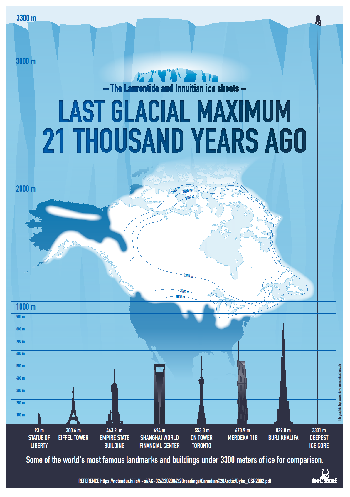
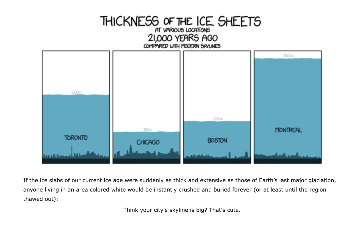
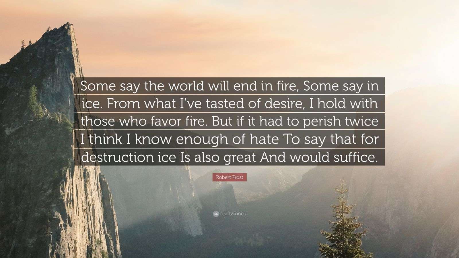

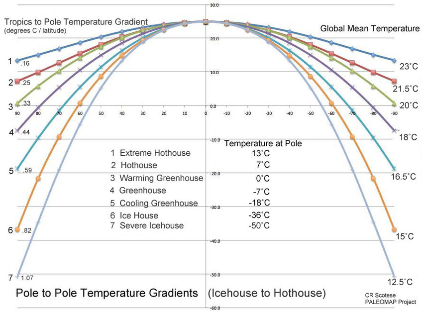

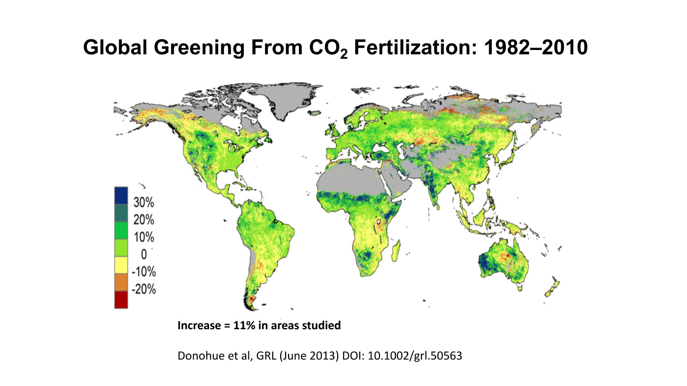
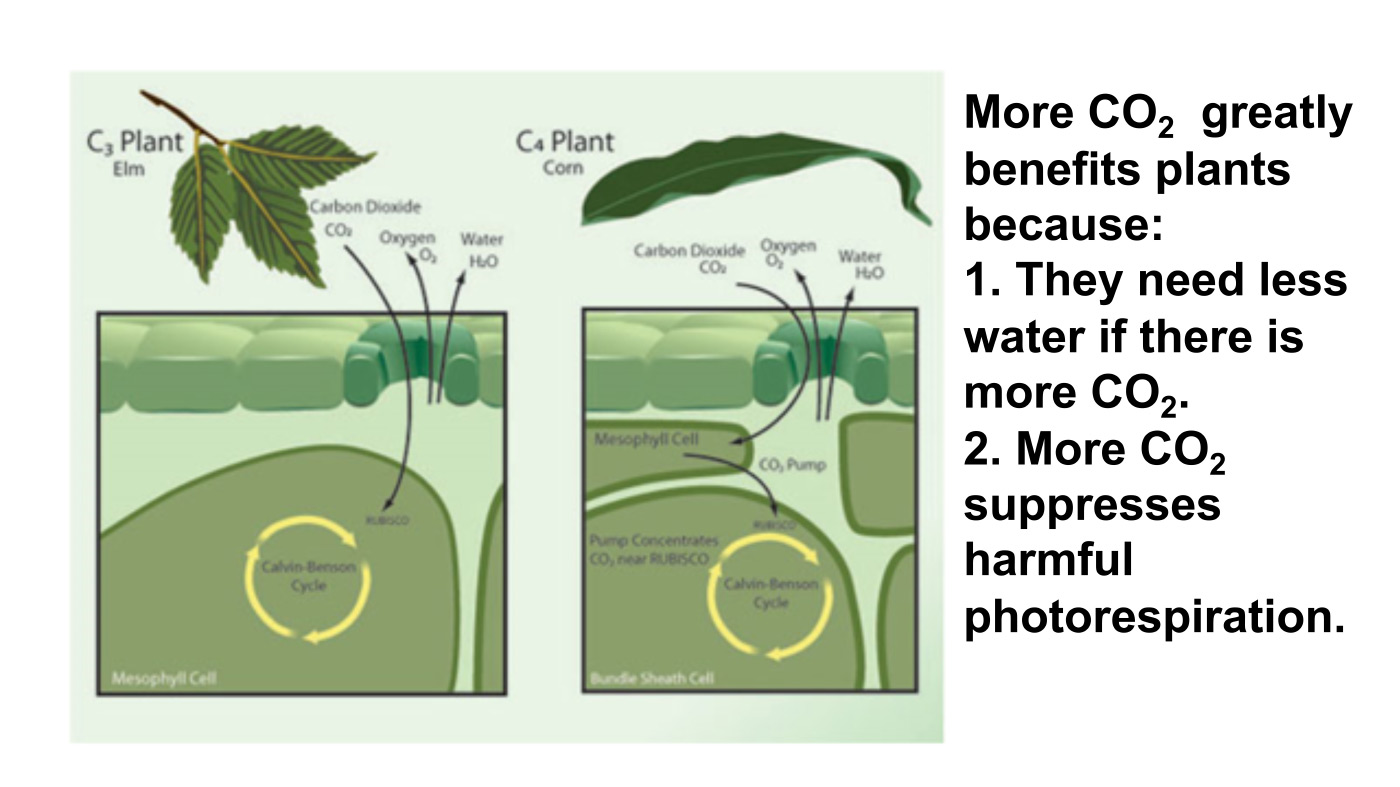
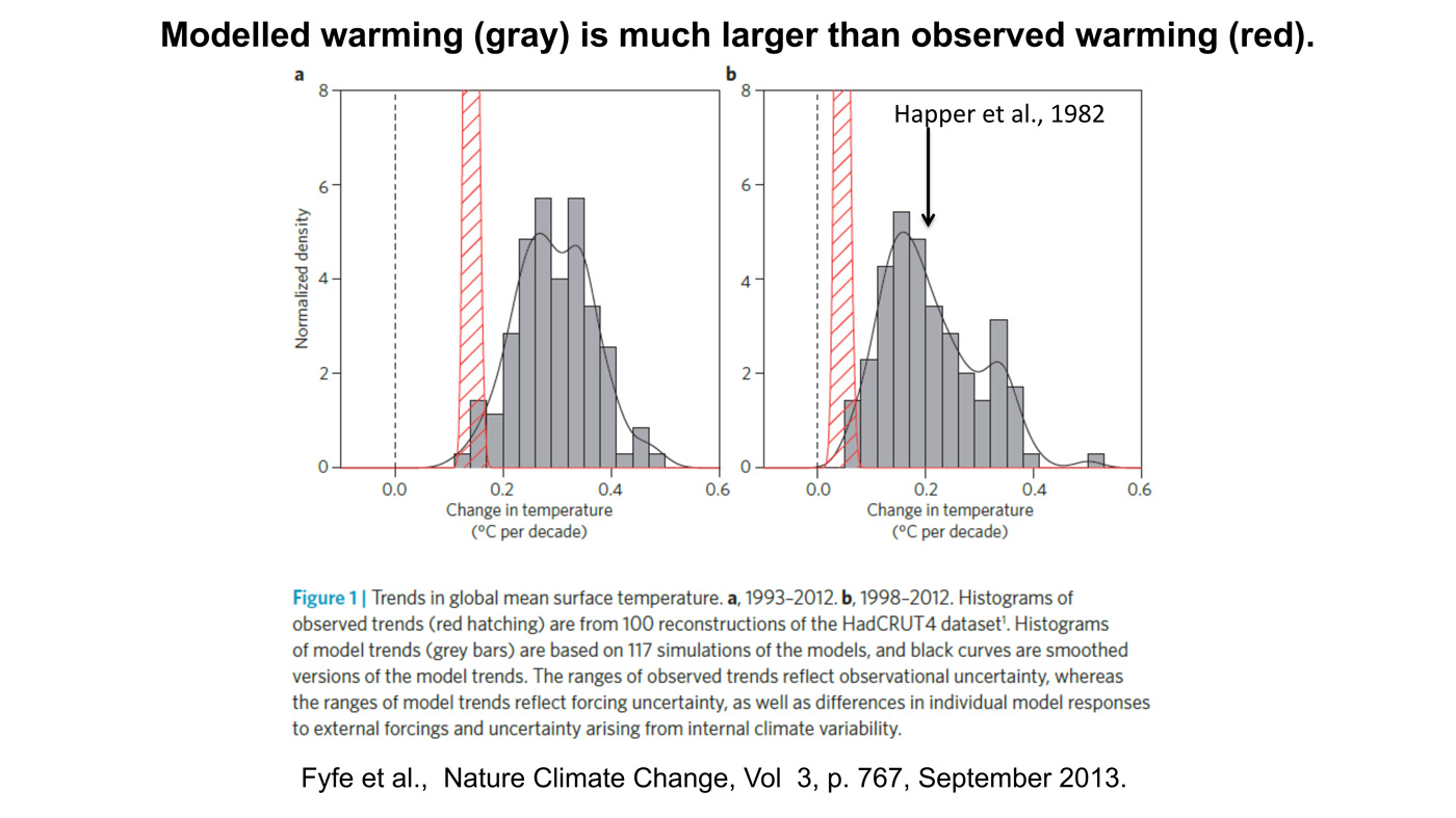
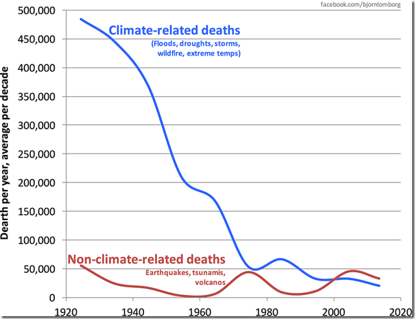
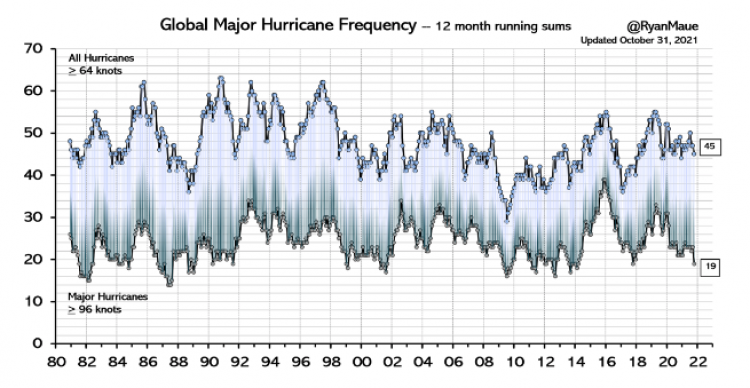

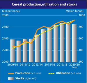


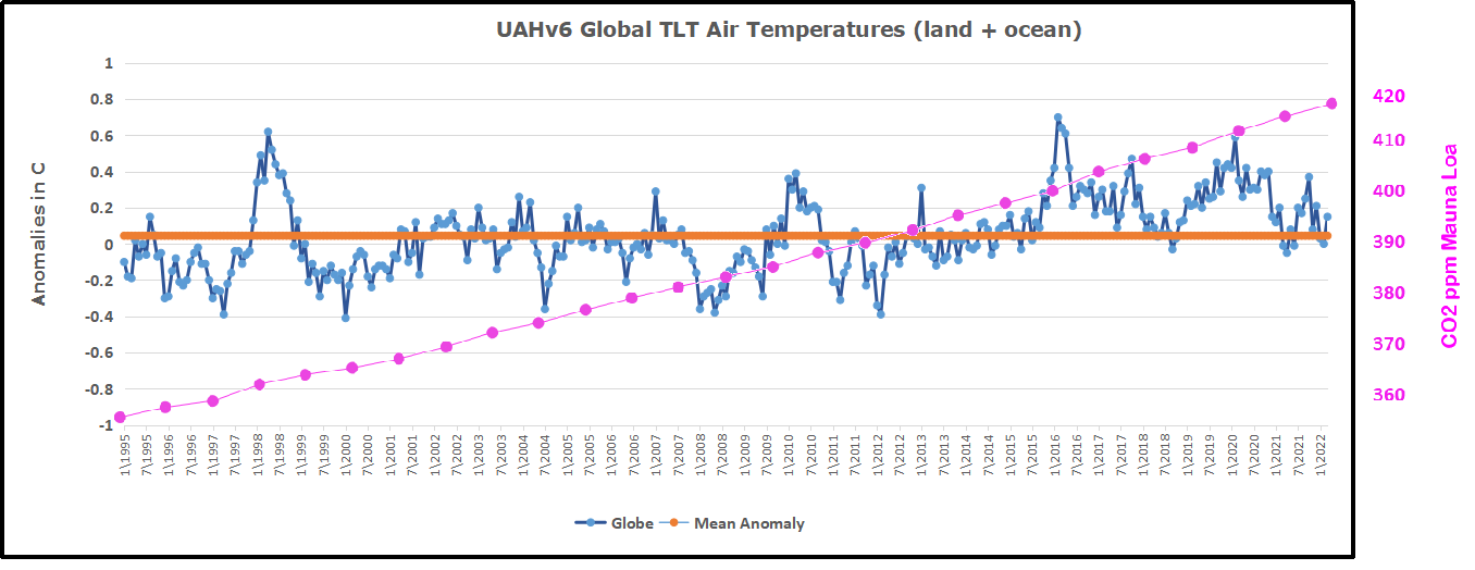


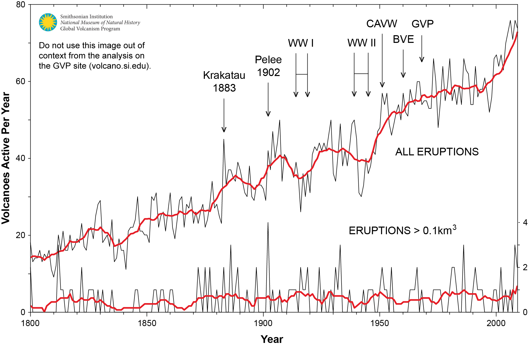
 When I presented this diagram to my warmist friends, they would respond, “But you don’t know what caused the LIA or what ended it!” To which I would say, “True, but we know it wasn’t due to burning fossil fuels.” Now I find there is a body of evidence suggesting what caused the LIA and why the temperature rebound may be over. Part of it is a familiar observation that the LIA coincided with a period when the sun was lacking sunspots, the Maunder Minimum, and later the Dalton.