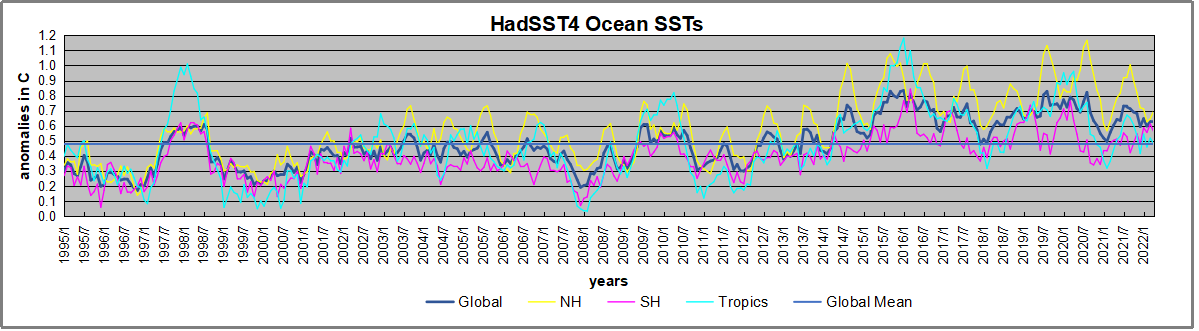
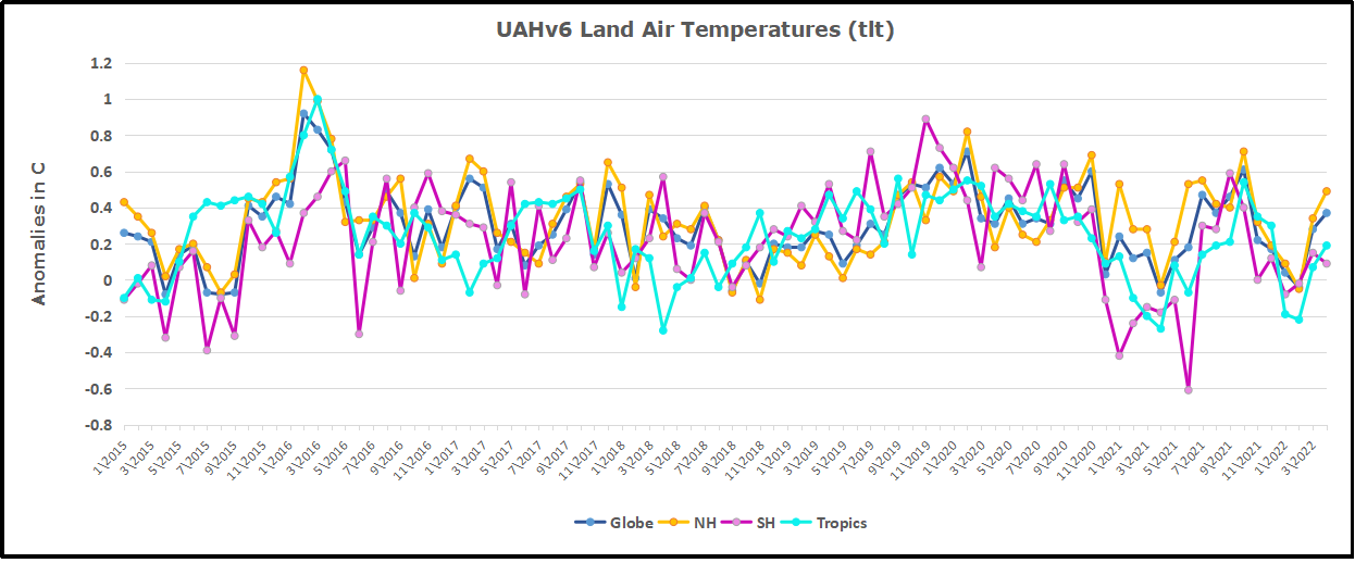
June 2022 Heat Records Silly Season Again

Photo illustration by Slate. Photos by Thinkstock.

A glance at the news aggregator shows the silly season is in full swing.  A partial listing of headlines recntly proclaiming the hottest whatever.

  • Temperatures hit 43C in Spain’s hottest spring heatwave in decades The Independent
  • How to sleep during a heatwave, according to experts The Independent
  • Climate crisis focus of NASA chief’s visit The University of Edinburgh
  • Video: US hit by floods, mudslides, wildfires resembling ‘an erupting volcano’ and a record heatwave in two days Sky News
  • Rising beaches suggest Antarctic glaciers are melting faster than ever New Atlas
  • Dangerous heat grips US through midweek as wildfires explode in West The Independent
  • In hottest city on Earth, mothers bear brunt of climate change Yahoo! UK & Ireland
  • ‘Earthworms on steroids’ are spreading like wild in Connecticut The Independent
  • The Guardian view on an Indian summer: human-made heatwaves are getting hotter The Guardian
  • UK weather: Britain could bask in warmest June day ever with 35C on Friday Mail Online
  • Climate Change Causes Melting Permafrost in Alaska Nature World News
  • Spain in grip of heatwave with temperatures forecast to hit 44C The Guardian

Time for some Clear Thinking about Heat Records (Previous Post)

Here is an analysis using critical intelligence to interpret media reports about temperature records this summer. Daniel Engber writes in Slate Crazy From the Heat

The subtitle is Climate change is real. Record-high temperatures everywhere are fake.  As we shall see from the excerpts below, The first sentence is a statement of faith, since as Engber demonstrates, the notion does not follow from the temperature evidence. Excerpts in italics with my bolds.

It’s been really, really hot this summer. How hot? Last Friday, the Washington Post put out a series of maps and charts to illustrate the “record-crushing heat.” All-time temperature highs have been measured in “scores of locations on every continent north of the equator,” the article said, while the lower 48 states endured the hottest-ever stretch of temperatures from May until July.

These were not the only records to be set in 2018. Historic heat waves have been crashing all around the world, with records getting shattered in Japan, broken on the eastern coast of Canada, smashed in California, and rewritten in the Upper Midwest. A city in Algeria suffered through the highest high temperature ever recorded in Africa. A village in Oman set a new world record for the highest-ever low temperature. At the end of July, the New York Times ran a feature on how this year’s “record heat wreaked havoc on four continents.” USA Today reported that more than 1,900 heat records had been tied or beaten in just the last few days of May.

While the odds that any given record will be broken may be very, very small, the total number of potential records is mind-blowingly enormous.

There were lots of other records, too, lots and lots and lots—but I think it’s best for me to stop right here. In fact, I think it’s best for all of us to stop reporting on these misleading, imbecilic stats. “Record-setting heat,” as it’s presented in news reports, isn’t really scientific, and it’s almost always insignificant. And yet, every summer seems to bring a flood of new superlatives that pump us full of dread about the changing climate. We’d all be better off without this phony grandiosity, which makes it seem like every hot and humid August is unparalleled in human history. It’s not. Reports that tell us otherwise should be banished from the news.

It’s true the Earth is warming overall, and the record-breaking heat that matters most—the kind we’d be crazy to ignore—is measured on a global scale. The average temperature across the surface of the planet in 2017 was 58.51 degrees, one-and-a-half degrees above the mean for the 20th century. These records matter: 17 of the 18 hottest years on planet Earth have occurred since 2001, and the four hottest-ever years were 2014, 2015, 2016, and 2017. It also matters that this changing climate will result in huge numbers of heat-related deaths. Please pay attention to these terrifying and important facts. Please ignore every other story about record-breaking heat.

You’ll often hear that these two phenomena are related, that local heat records reflect—and therefore illustrate—the global trend. Writing in Slate this past July, Irineo Cabreros explained that climate change does indeed increase the odds of extreme events, making record-breaking heat more likely. News reports often make this point, linking probabilities of rare events to the broader warming pattern. “Scientists say there’s little doubt that the ratcheting up of global greenhouse gases makes heat waves more frequent and more intense,” noted the Times in its piece on record temperatures in Algeria, Hong Kong, Pakistan, and Norway.

Yet this lesson is subtler than it seems. The rash of “record-crushing heat” reports suggest we’re living through a spreading plague of new extremes—that the rate at which we’re reaching highest highs and highest lows is speeding up. When the Post reports that heat records have been set “at scores of locations on every continent,” it makes us think this is unexpected. It suggests that as the Earth gets ever warmer, and the weather less predictable, such records will be broken far more often than they ever have before.

But that’s just not the case. In 2009, climatologist Gerald Meehl and several colleagues published an analysis of records drawn from roughly 2,000 weather stations in the U.S. between 1950 and 2006. There were tens of millions of data points in all—temperature highs and lows from every station, taken every day for more than a half-century. Meehl searched these numbers for the record-setting values—i.e., the days on which a given weather station saw its highest-ever high or lowest-ever low up until that point. When he plotted these by year, they fell along a downward-curving line. Around 50,000 new heat records were being set every year during the 1960s; then that number dropped to roughly 20,000 in the 1980s, and to 15,000 by the turn of the millennium.

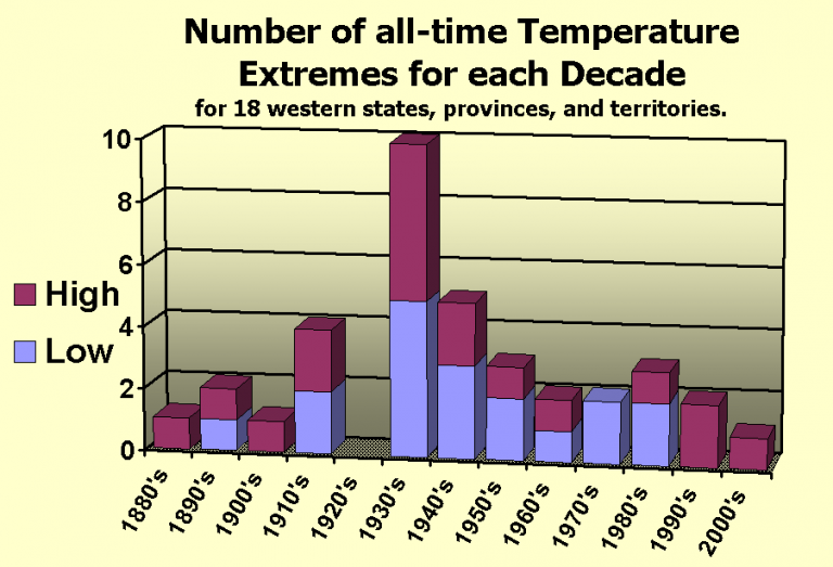
From Meehl et al 2009.

This shouldn’t be surprising. As a rule, weather records will be set less frequently as time goes by. The first measurement of temperature that’s ever taken at a given weather station will be its highest (and lowest) of all time, by definition. There’s a good chance that the same station’s reading on Day 2 will be a record, too, since it only needs to beat the temperature recorded on Day 1. But as the weeks and months go by, this record-setting contest gets increasingly competitive: Each new daily temperature must now outdo every single one that came before. If the weather were completely random, we might peg the chances of a record being set at any time as 1/n, where n is the number of days recorded to that point. In other words, one week into your record-keeping, you’d have a 1 in 7 chance of landing on an all-time high. On the 100th day, your odds would have dropped to 1 percent. After 56 years, your chances would be very, very slim.

The weather isn’t random, though; we know it’s warming overall, from one decade to the next. That’s what Meehl et al. were looking at: They figured that a changing climate would tweak those probabilities, goosing the rate of record-breaking highs and tamping down the rate of record-breaking lows. This wouldn’t change the fundamental fact that records get broken much less often as the years go by. (Even though the world is warming, you’d still expect fewer heat records to be set in 2000 than in 1965.) Still, one might guess that climate change would affect the rate, so that more heat records would be set than we’d otherwise expect.

That’s not what Meehl found. Between 1950 and 2006, the rate of record-breaking heat seemed unaffected by large-scale changes to the climate: The number of new records set every year went down from one decade to the next, at a rate that matched up pretty well with what you’d see if the odds were always 1/n. The study did find something more important, though: Record-breaking lows were showing up much less often than expected. From one decade to the next, fewer records of any kind were being set, but the ratio of record lows to record highs was getting smaller over time. By the 2000s, it had fallen to about 0.5, meaning that the U.S. was seeing half as many record-breaking lows as record-breaking highs. (Meehl has since extended this analysis using data going back to 1930 and up through 2015. The results came out the same.)

What does all this mean? On one hand, it’s very good evidence that climate change has tweaked the odds for record-breaking weather, at least when it comes to record lows. (Other studies have come to the same conclusion.) On the other hand, it tells us that in the U.S., at least, we’re not hitting record highs more often than we were before, and that the rate isn’t higher than what you’d expect if there weren’t any global warming. In fact, just the opposite is true: As one might expect, heat records are getting broken less often over time, and it’s likely there will be fewer during the 2010s than at any point since people started keeping track.

This may be hard to fathom, given how much coverage has been devoted to the latest bouts of record-setting heat. These extreme events are more unusual, in absolute terms, than they’ve ever been before, yet they’re always in the news. How could that be happening?

While the odds that any given record will be broken may be very, very small, the total number of potential records that could be broken—and then reported in the newspaper—is mind-blowingly enormous. To get a sense of how big this number really is, consider that the National Oceanic and Atmospheric Administration keeps a database of daily records from every U.S. weather station with at least 30 years of data, and that its website lets you search for how many all-time records have been set in any given stretch of time. For instance, the database indicates that during the seven-day period ending on Aug. 17—the date when the Washington Post published its series of “record-crushing heat” infographics—154 heat records were broken.

That may sound like a lot—154 record-high temperatures in the span of just one week. But the NOAA website also indicates how many potential records could have been achieved during that time: 18,953. In actuality, less than one percent of these were broken. You can also pull data on daily maximum temperatures for an entire month: I tried that with August 2017, and then again for months of August at 10-year intervals going back to the 1950s. Each time the query returned at least about 130,000 potential records, of which one or two thousand seemed to be getting broken every year. (There was no apparent trend toward more records being broken over time.)

Now let’s say there are 130,000 high-temperature records to be broken every month in the U.S. That’s only half the pool of heat-related records, since the database also lets you search for all-time highest low temperatures. You can also check whether any given highest high or highest low happens to be a record for the entire month in that location, or whether it’s a record when compared across all the weather stations everywhere on that particular day.

Add all of these together and the pool of potential heat records tracked by NOAA appears to number in the millions annually, of which tens of thousands may be broken. Even this vastly underestimates the number of potential records available for media concern. As they’re reported in the news, all-time weather records aren’t limited to just the highest highs or highest lows for a given day in one location. Take, for example, the first heat record mentioned in this column, reported in the Post: The U.S. has just endured the hottest May, June, and July of all time. The existence of that record presupposes many others: What about the hottest April, May and June, or the hottest March, April, and May? What about all the other ways that one might subdivide the calendar?

Geography provides another endless well of flexibility. Remember that the all-time record for the hottest May, June, and July applied only to the lower 48 states. Might a different set of records have been broken if we’d considered Hawaii and Alaska? And what about the records spanning smaller portions of the country, like the Midwest, or the Upper Midwest, or just the state of Minnesota, or just the Twin Cities? And what about the all-time records overseas, describing unprecedented heat in other countries or on other continents?

Even if we did limit ourselves to weather records from a single place measured over a common timescale, it would still be possible to parse out record-breaking heat in a thousand different ways. News reports give separate records, as we’ve seen, for the highest daily high and the highest daily low, but they also tell us when we’ve hit the highest average temperature over several days or several weeks or several months. The Post describes a recent record-breaking streak of days in San Diego with highs of at least 83 degrees. (You’ll find stories touting streaks of daily highs above almost any arbitrary threshold: 90 degrees, 77 degrees, 60 degrees, et cetera.) Records also needn’t focus on the temperature at all: There’s been lots of news in recent weeks about the fact that the U.K. has just endured its driest-ever early summer.

“Record-breaking” summer weather, then, can apply to pretty much any geographical location, over pretty much any span of time. It doesn’t even have to be a record—there’s an endless stream of stories on “near-record heat” in one place or another, or the “fifth-hottest” whatever to happen in wherever, or the fact that it’s been “one of the hottest” yadda-yaddas that yadda-yadda has ever seen. In the most perverse, insane extension of this genre, news outlets sometimes even highlight when a given record isn’t being set.

Loose reports of “record-breaking heat” only serve to puff up muggy weather and make it seem important. (The sham inflations of the wind chill factor do the same for winter months.) So don’t be fooled or flattered by this record-setting hype. Your summer misery is nothing special.

Summary

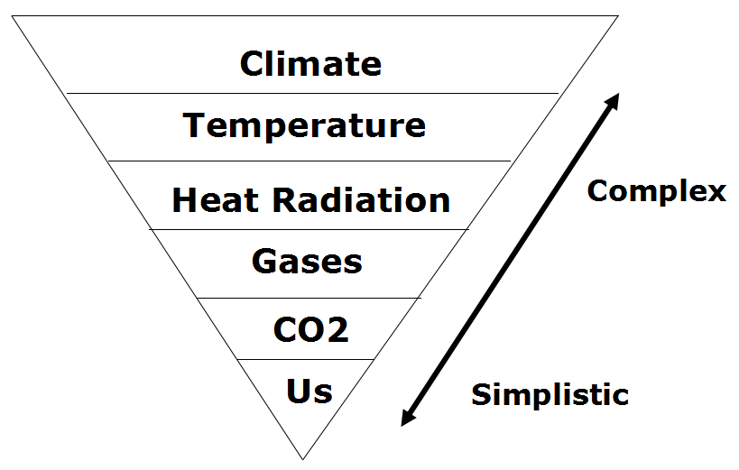
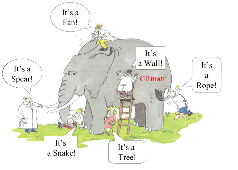
This article helps people not to confuse weather events with climate.  My disappointment is with the phrase, “Climate Change is Real,” since it is subject to misdirection.  Engber uses that phrase referring to rising average world temperatures, without explaining that such estimates are computer processed reconstructions since the earth has no “average temperature.”  More importantly the undefined “climate change” is a blank slate to which a number of meanings can be attached.

Some take it to mean: It is real that rising CO2 concentrations cause rising global warming.  Yet that is not supported by temperature records.
Others think it means: It is real that using fossil fuels causes global warming.  This too lacks persuasive evidence.

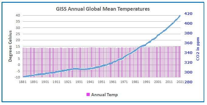
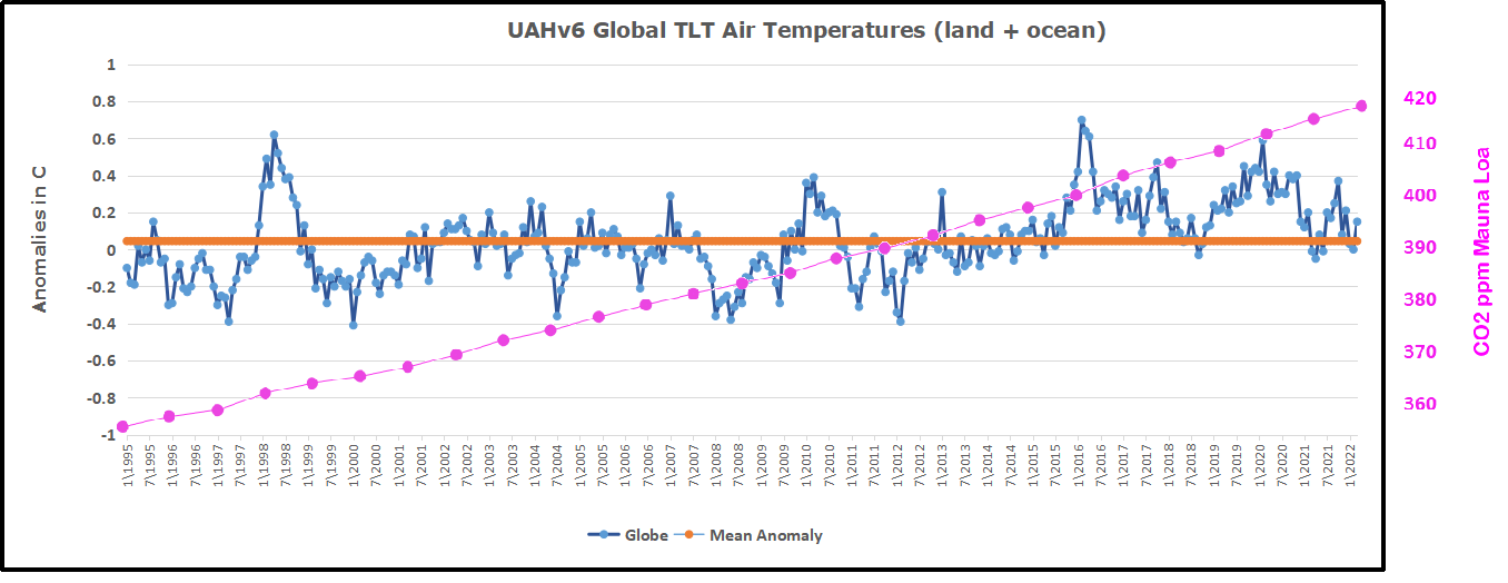
Since 1965 the increase in fossil fuel consumption is dramatic and monotonic (with 2020 an exception), steadily increasing by 218% from 146 to 463 exajoules. Meanwhile the GMT record from Hadcrut shows multiple ups and downs with an accumulated rise of 0.9C over 55 years, 7% of the starting value.

Others know that Global Mean Temperature is a slippery calculation subject to the selection of stations.

Graph showing the correlation between Global Mean Temperature (Average T) and the number of stations included in the global database. Source: Ross McKitrick, U of Guelph

Global warming estimates combine results from adjusted records.
Conclusion

The pattern of high and low records discussed above is consistent with natural variability rather than rising CO2 or fossil fuel consumption. Those of us not alarmed about the reported warming understand that “climate change” is something nature does all the time, and that the future is likely to include periods both cooler and warmer than now.
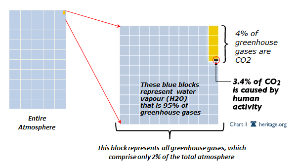
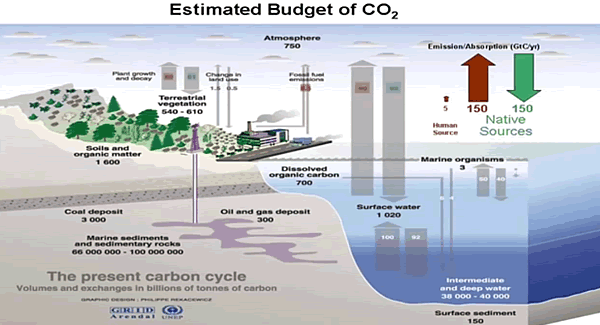
Background Reading:

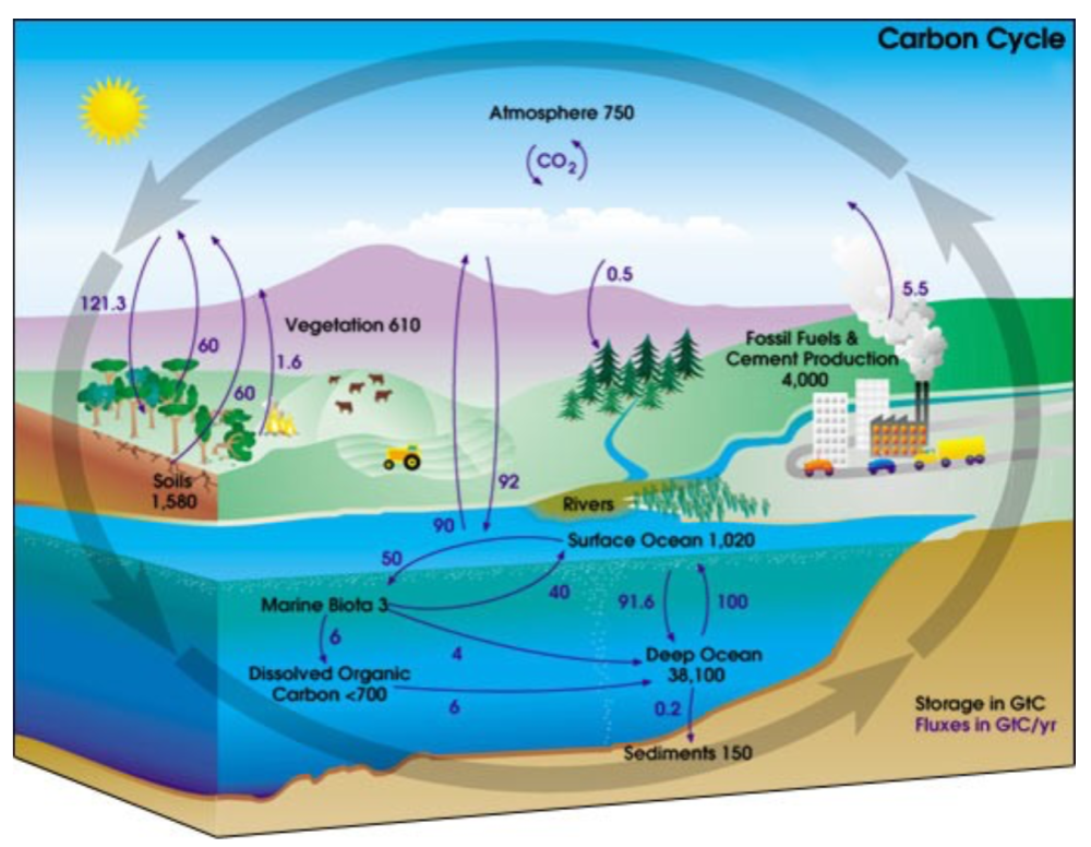
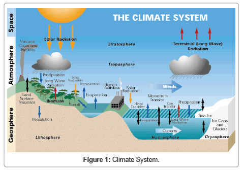
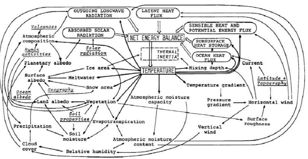
The Climate Story (Illustrated)

2021 Update: Fossil Fuels ≠ Global Warming

Man Made Warming from Adjusting Data

What is Global Temperature? Is it warming or cooling?

NOAA US temp 2019 2021

Temps Cause CO2 Changes, Not the Reverse. June 2022 Update

Science is based on predictive power.  For example, astronomers demonstrate they know how the solar system works when they accurately predict eclipses of the sun and moon.

This post is about proving that CO2 changes in response to temperature changes, not the other way around, as is often claimed.  In order to do  that we need two datasets: one for measurements of changes in atmospheric CO2 concentrations over time and one for estimates of Global Mean Temperature changes over time.

For a possible explanation of natural warming and CO2 emissions see Little Ice Age Warming Recovery May be Over

Climate science is unsettling because past data are not fixed, but change later on.  I ran into this previously and now again in 2021 and 2022 when I set out to update an analysis done in 2014 by Jeremy Shiers (discussed in a previous post reprinted at the end).  Jeremy provided a spreadsheet in his essay Murray Salby Showed CO2 Follows Temperature Now You Can Too posted in January 2014. I downloaded his spreadsheet intending to bring the analysis up to the present to see if the results hold up.  The two sources of data were:

Temperature anomalies from RSS here:  http://www.remss.com/missions/amsu

CO2 monthly levels from NOAA (Mauna Loa): https://www.esrl.noaa.gov/gmd/ccgg/trends/data.html

Changes in CO2 (ΔCO2)

Uploading the CO2 dataset showed that many numbers had changed (why?).

The blue line shows annual observed differences in monthly values year over year, e.g. June 2020 minus June 2019 etc.  The first 12 months (1979) provide the observed starting values from which differentials are calculated.  The orange line shows those CO2 values changed slightly in the 2020 dataset vs. the 2014 dataset, on average +0.035 ppm.  But there is no pattern or trend added, and deviations vary randomly between + and -.  So last year I took the 2020 dataset to replace the older one for updating the analysis.

Now I find the NOAA dataset in 2021 has almost completely new values due to a method shift in February 2021, requiring a recalibration of all previous measurements.  The new picture of ΔCO2 is graphed below.

The method shift is reported at a NOAA Global Monitoring Laboratory webpage, Carbon Dioxide (CO2) WMO Scale, with a justification for the difference between X2007 results and the new results from X2019 now in force.  The orange line shows that the shift has resulted in higher values, especially early on and a general slightly increasing trend over time.  However, these are small variations at the decimal level on values 340 and above.  Further, the graph shows that yearly differentials month by month are virtually the same as before.  Thus I redid the analysis with the new values.

Again, note that these are annual differences by month, i.e. the value for May 2022 is the reported CO2 concentration in May 2022 minus the May 2021 CO2.  Note also how the differences have declined sharply the last two years.

Global Temperature Anomalies (ΔTemp)

The other time series was the record of global temperature anomalies according to RSS. The current RSS dataset is not at all the same as the past.

Here we see some seriously unsettling science at work.  The purple line is RSS in 2014, and the blue is RSS as of 2020.  Some further increases appear in the gold 2022 rss dataset. The red line shows alterations from the old to the new.  There is a slight cooling of the data in the beginning years, then the three versions mostly match until 1997, when systematic warming enters the record.  From 1997/5 to 2003/12 the average anomaly increases by 0.04C.  After 2004/1 to 2012/8 the average increase is 0.15C.  At the end from 2012/9 to 2013/12, the average anomaly was higher by 0.21. The 2022 version added slight warming over 2020 values.

RSS continues that accelerated warming to the present, but it cannot be trusted.  And who knows what the numbers will be a few years down the line?  As Dr. Ole Humlum said some years ago (regarding Gistemp): “It should however be noted, that a temperature record which keeps on changing the past hardly can qualify as being correct.”

Given the above manipulations, I went instead to the other satellite dataset UAH version 6. UAH has also made a shift by changing its baseline from 1981-2010 to 1991-2020.  This resulted in systematically reducing the anomaly values, but did not alter the pattern of variation over time.  For comparison, here are the two records with measurements through May 2022. UAH dataset for temperatures in the lower troposphere (TLT).

Comparing UAH temperature anomalies to NOAA CO2 changes.

Here are UAH temperature anomalies compared to CO2 monthly changes year over year.

Changes in monthly CO2 synchronize with temperature fluctuations, which for UAH are anomalies now referenced to the 1991-2020 period.  As stated above, CO2 differentials are calculated for the present month by subtracting the value for the same month in the previous year (for example May 2022 minus May 2021).   Temp anomalies are calculated by comparing the present month with the baseline month. Note the dropping temperatures over the last two years, slightly preceding CO2 descending.

The final proof that CO2 follows temperature due to stimulation of natural CO2 reservoirs is demonstrated by the ability to calculate CO2 levels since 1979 with a simple mathematical formula:

For each subsequent year, the co2 level for each month was generated

CO2  this month this year = a + b × Temp this month this year  + CO2 this month last year

Jeremy used Python to estimate a and b, but I used his spreadsheet to guess values that place for comparison the observed and calculated CO2 levels on top of each other.

In the chart calculated CO2 levels correlate with observed CO2 levels at 0.9985 out of 1.0000.  This mathematical generation of CO2 atmospheric levels is only possible if they are driven by temperature-dependent natural sources, and not by human emissions which are small in comparison, rise steadily and monotonically.

Previous Post:  What Causes Rising Atmospheric CO2?

nasa_carbon_cycle_2008-1

This post is prompted by a recent exchange with those reasserting the “consensus” view attributing all additional atmospheric CO2 to humans burning fossil fuels.

The IPCC doctrine which has long been promoted goes as follows. We have a number over here for monthly fossil fuel CO2 emissions, and a number over there for monthly atmospheric CO2. We don’t have good numbers for the rest of it-oceans, soils, biosphere–though rough estimates are orders of magnitude higher, dwarfing human CO2.  So we ignore nature and assume it is always a sink, explaining the difference between the two numbers we do have. Easy peasy, science settled.

What about the fact that nature continues to absorb about half of human emissions, even while FF CO2 increased by 60% over the last 2 decades? What about the fact that in 2020 FF CO2 declined significantly with no discernable impact on rising atmospheric CO2?

These and other issues are raised by Murray Salby and others who conclude that it is not that simple, and the science is not settled. And so these dissenters must be cancelled lest the narrative be weakened.

The non-IPCC paradigm is that atmospheric CO2 levels are a function of two very different fluxes. FF CO2 changes rapidly and increases steadily, while Natural CO2 changes slowly over time, and fluctuates up and down from temperature changes. The implications are that human CO2 is a simple addition, while natural CO2 comes from the integral of previous fluctuations.  Jeremy Shiers has a series of posts at his blog clarifying this paradigm. See Increasing CO2 Raises Global Temperature Or Does Increasing Temperature Raise CO2 Excerpts in italics with my bolds.

The following graph which shows the change in CO2 levels (rather than the levels directly) makes this much clearer.

Note the vertical scale refers to the first differential of the CO2 level not the level itself. The graph depicts that change rate in ppm per year.

There are big swings in the amount of CO2 emitted. Taking the mean as 1.6 ppmv/year (at a guess) there are +/- swings of around 1.2 nearly +/- 100%.

And, surprise surprise, the change in net emissions of CO2 is very strongly correlated with changes in global temperature.

This clearly indicates the net amount of CO2 emitted in any one year is directly linked to global mean temperature in that year.

For any given year the amount of CO2 in the atmosphere will be the sum of

  • all the net annual emissions of CO2
  • in all previous years.

For each year the net annual emission of CO2 is proportional to the annual global mean temperature.

This means the amount of CO2 in the atmosphere will be related to the sum of temperatures in previous years.

So CO2 levels are not directly related to the current temperature but the integral of temperature over previous years.

The following graph again shows observed levels of CO2 and global temperatures but also has calculated levels of CO2 based on sum of previous years temperatures (dotted blue line).

Summary:

The massive fluxes from natural sources dominate the flow of CO2 through the atmosphere.  Human CO2 from burning fossil fuels is around 4% of the annual addition from all sources. Even if rising CO2 could cause rising temperatures (no evidence, only claims), reducing our emissions would have little impact.

Resources:

CO2 Fluxes, Sources and Sinks

Who to Blame for Rising CO2?

Fearless Physics from Dr. Salby

In this video presentation, Dr. Salby provides the evidence, math and charts supporting the non-IPCC paradigm.

Footnote:  As CO2 concentrations rose, BP shows Fossil Fuel consumption slumped in 2020

See also 2022 Update: Fossil Fuels ≠ Global Warming

Zero Carbon False Pretenses

19170447-global_warming_1.530x298

Legal Definition of false pretenses: false representations concerning past or present facts that are made with the intent to defraud another.  Marriam-Webster.

As we will see below, the zero carbon campaign relies on a series of false representations, primarily from omitting realities contradictory to the CO2 scare narrative.

In the aftermath of Glasgow COP, many have noticed how incredible were the pronouncements and claims from UK hosts as well as other speakers intending to inflame public opinion in support of the UN agenda.  No one in the media applies any kind of critical intelligence examining the veracity of facts and conclusions trumpeted before, during and after the conference.  In the interest of presenting an alternate, unalarming paradigm of earth’s climate, I am reposting a previous discussion of how wrongheaded is the IPCC “consensus science.”

Background

With all the fuss about the “Green New Deal” and attempts to blame recent cold waves on rising CO2, it is wise to remember the logic of the alarmist argument.  It boils down to two suppositions:

Rising atmospheric CO2 makes the planet warmer.

Rising emissions from humans burning fossil fuels makes atmospheric CO2 higher.

The second assertion is challenged in a post: Who to Blame for Rising CO2?

This post addresses the first claim.  Remember also that all of the so-called “lines of evidence” for global warming do not distinguish between human and natural causes.  Typically the evidence cited falls into these categories:

Global temperature rise
Warming oceans
Shrinking ice sheets
Glacial retreat
Decreased snow cover
Sea level rise
Declining Arctic sea ice
Extreme events

However, all of these are equivocal, involving signal and noise issues. Note also that all of them are alleged impacts from the first one.  And in any case, the fact of any changes does not in itself prove human causation.  That attribution rests solely on unvalidated climate models.  Below is a discussion of the reductionist mental process by which climate complexity and natural forces are systematically excluded to reach the pre-determined conclusion.

Original Post:  Climate Reductionism


Reductionists are those who take one theory or phenomenon to be reducible to some other theory or phenomenon. For example, a reductionist regarding mathematics might take any given mathematical theory to be reducible to logic or set theory. Or, a reductionist about biological entities like cells might take such entities to be reducible to collections of physico-chemical entities like atoms and molecules.
Definition from The Internet Encyclopedia of Philosophy

Some of you may have seen this recent article: Divided Colorado: A Sister And Brother Disagree On Climate Change

The reporter describes a familiar story to many of us.  A single skeptic (the brother) is holding out against his sister and rest of the family who accept global warming/climate change. And of course, after putting some of their interchanges into the text, the reporter then sides against the brother by taking the word of a climate expert. From the article:

“CO2 absorbs infrared heat in certain wavelengths and those measurements were made first time — published — when Abraham Lincoln was president of the United States,” says Scott Denning, a professor of atmospheric science at Colorado State University. “Since that time, those measurements have been repeated by better and better instruments around the world.”

CO2, or carbon dioxide, has increased over time, scientists say, because of human activity. It’s a greenhouse gas that’s contributing to global warming.

“We know precisely how the molecule wiggles and waggles, and what the quantum interactions between the electrons are that cause everyone one of these little absorption lines,” he says. “And there’s just no wiggle room around it — CO2 absorbs heat, heat warms things up, so adding CO2 to the atmosphere will warm the climate.”

Denning says that most of the CO2 we see added to the atmosphere comes from humans — mostly through burning coal, oil and gas, which, as he puts it, is “indirectly caused by us.”

When looking at the scientific community, Denning says it’s united, as far as he knows.

earth-science-climatic-change-Climate-System-3-114-g001

A Case Study of Climate Reductionism

Denning’s comments, supported by several presentations at his website demonstrate how some scientists (all those known to Denning) engage in a classic form of reductionism.

The full complexity of earth’s climate includes many processes, some poorly understood, but known to have effects orders of magnitude greater than the potential of CO2 warming. The case for global warming alarm rests on simplifying away everything but the predetermined notion that humans are warming the planet. It goes like this:

Our Complex Climate

Earth’s climate is probably the most complicated natural phenomenon ever studied. Not only are there many processes, but they also interact and influence each other over various timescales, causing lagged effects and multiple cycling. This diagram illustrates some of the climate elements and interactions between them.

Flows and Feedbacks for Climate Models

The Many Climate Dimensions

Further, measuring changes in the climate goes far beyond temperature as a metric. Global climate indices, like the European dataset include 12 climate dimensions with 74 tracking measures. The set of climate dimensions include:

  • Sunshine
  • Pressure
  • Humidity
  • Cloudiness
  • Wind
  • Rain
  • Snow
  • Drought
  • Temperature
  • Heat
  • Cold

And in addition there are compound measures combining temperature and precipitation. While temperature is important, climate is much more than that.  With this reduction, all other dimensions are swept aside, and climate change is simplified down to global warming as seen in temperature measurements.

Climate Thermodynamics: Weather is the Climate System at work.

Another distortion is the notion that weather is bad or good, depending on humans finding it favorable. In fact, all that we call weather are the ocean and atmosphere acting to resolve differences in temperatures, humidities and pressures. It is the natural result of a rotating, irregular planetary surface mostly covered with water and illuminated mostly at its equator.

The sun warms the surface, but the heat escapes very quickly by convection so the build-up of heat near the surface is limited. In an incompressible atmosphere, it would *all* escape, and you’d get no surface warming. But because air is compressible, and because gases warm up when they’re compressed and cool down when allowed to expand, air circulating vertically by convection will warm and cool at a certain rate due to the changing atmospheric pressure.

Climate science has been obsessed with only a part of the system, namely the atmosphere and radiation, in order to focus attention on the non-condensing IR active gases. The climate is framed as a 3D atmosphere above a 2D surface. That narrow scope leaves out the powerful non-radiative heat transfer mechanisms that dominate the lower troposphere, and the vast reservoir of thermal energy deep in the oceans.

As Dr. Robert E Stevenson writes, it could have been different:

“As an oceanographer, I’d been around the world, once or twice, and I was rather convinced that I knew the factors that influenced the Earth’s climate. The oceans, by virtue of their enormous density and heat-storage capacity, are the dominant influence on our climate. It is the heat budget and the energy that flows into and out of the oceans that basically determines the mean temperature of the global atmosphere. These interactions, plus evaporation, are quite capable of canceling the slight effect of man-produced CO2.”

The troposphere is dominated by powerful heat transfer mechanisms: conduction, convection and evaporation, as well as physical kinetic movements.  All this is ignored in order to focus on radiative heat transfer, a bit player except at the top of the atmosphere.

There’s More than the Atmosphere

Once the world of climate is greatly reduced down to radiation of infrared frequencies, yet another set of blinders is applied. The most important source of radiation is of course the sun. Solar radiation in the short wave (SW) range is what we see and what heats up the earth’s surface, particularly the oceans. In addition solar radiation includes infrared, some absorbed in the atmosphere and some at the surface. The ocean is also a major source of heat into the atmosphere since its thermal capacity is 1000 times what the air can hold. The heat transfer from ocean to air is both by way of evaporation (latent heat) and also by direct contact at the sea surface (conduction).

Yet conventional climate science dismisses the sun as a climate factor saying that its climate input is unvarying. That ignores significant fluctuations in parts of the light range, for example ultraviolet, and also solar effects such as magnetic fields and cosmic rays. Also disregarded is solar energy varying due to cloud fluctuations. The ocean is also dismissed as a source of climate change despite obvious ocean warming and cooling cycles ranging from weeks to centuries. The problem is such oscillations are not well understood or predictable, so can not be easily modeled.

With the sun and the earth’s surface and ocean dismissed, the only consideration left is the atmosphere.

The Gorilla Greenhouse Gas

Thus climate has been reduced down to heat radiation passing through the atmosphere comprised of gases. One of the biggest reductions then comes from focusing on CO2 rather than H20. Of all the gases that are IR-active, water is the most prevalent and covers more of the spectrum.

The diagram below gives you the sense of proportion.

GHG blocks

The Role of CO2

We come now to the role of CO2 in “trapping heat” and making the world warmer. The theory is that CO2 acts like a blanket by absorbing and re-radiating heat that would otherwise escape into space. By delaying the cooling while solar energy comes in constantly, CO2 is presumed to cause a buildup of heat resulting in warmer temperatures.

How the Atmosphere Processes Heat

There are 3 ways that heat (Infrared or IR radiation) passes from the surface to space.

1) A small amount of the radiation leaves directly, because all gases in our air are transparent to IR of 10-14 microns (sometimes called the “atmospheric window.” This pathway moves at the speed of light, so no delay of cooling occurs.

2) Some radiation is absorbed and re-emitted by IR active gases up to the tropopause. Calculations of the free mean path for CO2 show that energy passes from surface to tropopause in less than 5 milliseconds. This is almost speed of light, so delay is negligible. H2O is so variable across the globe that its total effects are not measurable. In arid places, like deserts, we see that CO2 by itself does not prevent the loss of the day’s heat after sundown.

3) The bulk gases of the atmosphere, O2 and N2, are warmed by conduction and convection from the surface. They also gain energy by collisions with IR active gases, some of that IR coming from the surface, and some absorbed directly from the sun. Latent heat from water is also added to the bulk gases. O2 and N2 are slow to shed this heat, and indeed must pass it back to IR active gases at the top of the troposphere for radiation into space.

In a parcel of air each molecule of CO2 is surrounded by 2500 other molecules, mostly O2 and N2. In the lower atmosphere, the air is dense and CO2 molecules energized by IR lose it to surrounding gases, slightly warming the entire parcel. Higher in the atmosphere, the air is thinner, and CO2 molecules can emit IR into space. Surrounding gases resupply CO2 with the energy it lost, which leads to further heat loss into space.

This third pathway has a significant delay of cooling, and is the reason for our mild surface temperature, averaging about 15C. Yes, earth’s atmosphere produces a buildup of heat at the surface. The bulk gases, O2 and N2, trap heat near the surface, while IR active gases, mainly H20 and CO2, provide the radiative cooling at the top of the atmosphere. Near the top of the atmosphere you will find the -18C temperature.

Sources of CO2

Note the size of the human emissions next to the red arrow.

A final reduction comes down to how much of the CO2 in the atmosphere is there because of us. Alarmists/activists say any increase in CO2 is 100% man-made, and would be more were it not for natural CO2 sinks, namely the ocean and biosphere. The claim overlooks the fact that those sinks are also sources of CO2 and the flux from the land and sea is an order of magnitude higher than estimates of human emissions. In fact, our few Gigatons of carbon are lost within the error range of estimating natural emissions. Insects produce far more CO2 than humans do by all our activity, including domestic animals.

Why Climate Reductionism is Dangerous

Reducing the climate in this fashion reaches its logical conclusion in the Activist notion of the “450 Scenario.”  Since Cancun, IPCC is asserting that global warming is capped at 2C by keeping CO2 concentration below 450 ppm. From Summary for Policymakers (SPM) AR5

Emissions scenarios leading to CO2-equivalent concentrations in 2100 of about 450 ppm or lower are likely to maintain warming below 2°C over the 21st century relative to pre-industrial levels. These scenarios are characterized by 40 to 70% global anthropogenic GHG emissions reductions by 2050 compared to 2010, and emissions levels near zero or below in 2100.

Thus is born the “450 Scenario” by which governments can be focused upon reducing human emissions without any reference to temperature measurements, which are troublesome and inconvenient. Almost everything in the climate world has been erased, and “Fighting Climate Change” is now code to mean accounting for fossil fuel emissions.

Conclusion

All propagandists begin with a kernel of truth, in this case the fact everything acting in the world has an effect on everything else. Edward Lorenz brought this insight to bear on the climate system in a ground breaking paper he presented in 1972 entitled: “Predictability: Does the Flap of a Butterfly’s Wings in Brazil Set Off a Tornado in Texas?”  Everything does matter and has an effect. Obviously humans impact on the climate in places where we build cities and dams, clear forests and operate farms. And obviously we add some CO2 when we burn fossil fuels.

But it is wrong to ignore the major dominant climate realities in order to exaggerate a small peripheral factor for the sake of an agenda. It is wrong to claim that IR active gases somehow “trap” heat in the air when they immediately emit any energy absorbed, if not already lost colliding with another molecule. No, it is the bulk gases, N2 and O2, making up the mass of the atmosphere, together with the ocean delaying the cooling and giving us the mild and remarkably stable temperatures that we enjoy. And CO2 does its job by radiating the heat into space.

Since we do little to cause it, we can’t fix it by changing what we do. The climate will not stop changing because we put a price on carbon. And the sun will rise despite the cock going on strike to protest global warming.

Footnote: For a deeper understanding of the atmospheric physics relating to CO2 and climate, I have done a guide and synopsis of Murry Salby’s latest textbook on the subject:  Fearless Physics from Dr. Salby

UAH Shows May Reversed April Warming Blip

The post below updates the UAH record of air temperatures over land and ocean.  But as an overview consider how recent rapid cooling  completely overcame the warming from the last 3 El Ninos (1998, 2010 and 2016).  The UAH record shows that the effects of the last one were gone as of April 2021, again in November 2021 and February 2022. (UAH baseline is now 1991-2020).

For reference I added an overlay of CO2 annual concentrations as measured at Mauna Loa.  While temperatures fluctuated up and down ending flat, CO2 went up steadily by ~55 ppm, a 15% increase.

Furthermore, going back to previous warmings prior to the satellite record shows that the entire rise of 0.8C since 1947 is due to oceanic, not human activity.

gmt-warming-events

The animation is an update of a previous analysis from Dr. Murry Salby.  These graphs use Hadcrut4 and include the 2016 El Nino warming event.  The exhibit shows since 1947 GMT warmed by 0.8 C, from 13.9 to 14.7, as estimated by Hadcrut4.  This resulted from three natural warming events involving ocean cycles. The most recent rise 2013-16 lifted temperatures by 0.2C.  Previously the 1997-98 El Nino produced a plateau increase of 0.4C.  Before that, a rise from 1977-81 added 0.2C to start the warming since 1947.

Importantly, the theory of human-caused global warming asserts that increasing CO2 in the atmosphere changes the baseline and causes systemic warming in our climate.  On the contrary, all of the warming since 1947 was episodic, coming from three brief events associated with oceanic cycles. 

Update August 3, 2021

Chris Schoeneveld has produced a similar graph to the animation above, with a temperature series combining HadCRUT4 and UAH6. H/T WUWT

image-8


mc_wh_gas_web20210423124932

See Also Worst Threat: Greenhouse Gas or Quiet Sun?

May Update NH Land and SH Ocean Warming Reversed

banner-blog

With apologies to Paul Revere, this post is on the lookout for cooler weather with an eye on both the Land and the Sea.  While you will hear a lot about 2020-21 temperatures matching 2016 as the highest ever, that spin ignores how fast the cooling set in.  The UAH data analyzed below shows that warming from the last El Nino was fully dissipated with chilly temperatures in all regions.  Last month NH land and SH ocean showed temps matching March, reversing an upward blip in April.

UAH has updated their tlt (temperatures in lower troposphere) dataset for May 2022.  Previously I have done posts on their reading of ocean air temps as a prelude to updated records from HadSST3 (which is now discontinued). So I have separately posted on SSTs using HadSST4 April Cool Ocean Temps.  This month also has a separate graph of land air temps because the comparisons and contrasts are interesting as we contemplate possible cooling in coming months and years. Sometimes air temps over land diverge from ocean air changes.  However, last month showed that while air temps over Tropical ocean warmed slightly,  strong cooling over NH and SH, both land and sea, brought the Global anomaly down, back to March 2022 level. 

Note:  UAH has shifted their baseline from 1981-2010 to 1991-2020 beginning with January 2021.  In the charts below, the trends and fluctuations remain the same but the anomaly values change with the baseline reference shift.

Presently sea surface temperatures (SST) are the best available indicator of heat content gained or lost from earth’s climate system.  Enthalpy is the thermodynamic term for total heat content in a system, and humidity differences in air parcels affect enthalpy.  Measuring water temperature directly avoids distorted impressions from air measurements.  In addition, ocean covers 71% of the planet surface and thus dominates surface temperature estimates.  Eventually we will likely have reliable means of recording water temperatures at depth.

Recently, Dr. Ole Humlum reported from his research that air temperatures lag 2-3 months behind changes in SST.  Thus the cooling oceans now portend cooling land air temperatures to follow.  He also observed that changes in CO2 atmospheric concentrations lag behind SST by 11-12 months.  This latter point is addressed in a previous post Who to Blame for Rising CO2?

After a change in priorities, updates are now exclusive to HadSST4.  For comparison we can also look at lower troposphere temperatures (TLT) from UAHv6 which are now posted for May.  The temperature record is derived from microwave sounding units (MSU) on board satellites like the one pictured above. Recently there was a change in UAH processing of satellite drift corrections, including dropping one platform which can no longer be corrected. The graphs below are taken from the revised and current dataset.

The UAH dataset includes temperature results for air above the oceans, and thus should be most comparable to the SSTs. There is the additional feature that ocean air temps avoid Urban Heat Islands (UHI).  The graph below shows monthly anomalies for ocean temps since January 2015.

Note 2020 was warmed mainly by a spike in February in all regions, and secondarily by an October spike in NH alone. In 2021, SH and the Tropics both pulled the Global anomaly down to a new low in April. Then SH and Tropics upward spikes, along with NH warming brought Global temps to a peak in October.  That warmth was gone as November 2021 ocean temps plummeted everywhere. A upward bump 01/2022 was reversed in 02/2022 before temps rose again in 03/2022.  Last month ocean temps in both NH and SH dropped sharply, pulling down the Global anomaly, despite some Tropical warming.

Land Air Temperatures Tracking Downward in Seesaw Pattern

We sometimes overlook that in climate temperature records, while the oceans are measured directly with SSTs, land temps are measured only indirectly.  The land temperature records at surface stations sample air temps at 2 meters above ground.  UAH gives tlt anomalies for air over land separately from ocean air temps.  The graph updated for May is below.

Here we have fresh evidence of the greater volatility of the Land temperatures, along with extraordinary departures by SH land.  Land temps are dominated by NH with a 2021 spike in January,  then dropping before rising in the summer to peak in October 2021. As with the ocean air temps, all that was erased in November with a sharp cooling everywhere. Land temps dropped sharply for four months, even more than did the Oceans. March and April saw some warming, reversed In May when all land regions cooled pulling down the global anomaly.

The Bigger Picture UAH Global Since 1980

The chart shows monthly Global anomalies starting 01/1980 to present.  The average monthly anomaly is -0.06, for this period of more than four decades.  The graph shows the 1998 El Nino after which the mean resumed, and again after the smaller 2010 event. The 2016 El Nino matched 1998 peak and in addition NH after effects lasted longer, followed by the NH warming 2019-20.   A small upward bump in 2021 has been reversed with temps having returned close to the mean as of 2/2022.  March and April brought warmer Global temps, reversed in May and with little indication for another El Nino this summer.

TLTs include mixing above the oceans and probably some influence from nearby more volatile land temps.  Clearly NH and Global land temps have been dropping in a seesaw pattern, nearly 1C lower than the 2016 peak.  Since the ocean has 1000 times the heat capacity as the atmosphere, that cooling is a significant driving force.  TLT measures started the recent cooling later than SSTs from HadSST3, but are now showing the same pattern.  It seems obvious that despite the three El Ninos, their warming has not persisted, and without them it would probably have cooled since 1995.  Of course, the future has not yet been written.


Climate Dissonance: Ocean Warming or Cooling?

Climatists are manifesting cognitive dissonance, or maybe factional conflict.  They simultaneously claim the ocean current warming the North Atlantic is slowing down bringing colder weather, while also claiming the increasing ocean heat content is warming the ocean faster than ever.  The cooling alarm was noted and rebutted in a recent No Tricks Zone article 3 New Studies Show Atlantic Tipping Point Unrealistic…”Muted Response”…”Changes To Be Viewed With Caution”.

My own critique of the alarm was this post: The Cooling Also Not Our Fault

Turning Attention from the Freezing to the Overheating Ocean

The Ocean Heat scare was included in the recent UN Climate report, alongside four other claims I rebutted in the post UN False Alarms from Key Climate Indicators.The Ocean Heat Content is more complex, requiring this post of its own. The key message was this:

Ocean heat was record high. The upper 2000m depth of the ocean continued to warm in 2021 and it is expected that it will continue to warm in the future – a change which is irreversible on centennial to millennial time scales. All data sets agree that ocean warming rates show a particularly strong increase in the past two decades. The warmth is penetrating to ever deeper levels. Much of the ocean experienced at least one ‘strong’ marine heatwave at some point in 2021.

Figure 4. 1960–2021 ensemble mean time series and ensemble standard deviation (2 standard deviations, shaded) of global OHC anomalies relative to the 2005–2017 average for the 0–300 m (grey), 0–700 m (blue), 0–2 000 m (yellow) and 700–2 000 m (green) depth layers. The ensemble mean is an update of the outcome of a concerted international data and analysis effort.

Context and Background Information

Media alarms are rampant relying mostly on a publication Record-Setting Ocean Warmth Continued in 2019 in Advances in Atmospheric Sciences
Authors: Lijing Cheng, John Abraham, Jiang Zhu, Kevin E. Trenberth, John Fasullo, Tim Boyer, Ricardo Locarnini, Bin Zhang, Fujiang Yu, Liying Wan, Xingrong Chen, Xiangzhou Song, Yulong Liu, Michael E. Mann.

Reasons for doubting the paper and its claims go well beyond the listing of so many names, including several of the usual suspects. No, this publication is tarnished by its implausible provenance. It rests upon and repeats analytical mistakes that have been pointed out, but true believers carry on without batting an eye.

It started with Resplandy et al in 2018 who became an overnight sensation with their paper Quantification of ocean heat uptake from changes in atmospheric O2 and CO2 composition in Nature October 2018, leading to media reports of extreme ocean heating. Nic Lewis published a series of articles at his own site and at Climate Etc. in November 2018, leading to the paper being withdrawn and eventually retracted. Those authors acknowledged the errors and did the honorable thing at the time, resulting the paper’s retraction 25 September 2019.

Then a revised version of the paper was published 27 December 2019 with the same title and stands today.  The 2019 abstract is exactly the same as the 2018 abstract (retracted), except for one sentence.

♦  2018:  We show that the ocean gained 1.33 ± 0.20 × 10^22 joules of heat per year between 1991 and 2016, equivalent to a planetary energy imbalance of 0.83 ± 0.11 watts per square metre of Earth’s surface.

♦  2019:  We show that the ocean gained 1.29 ± 0.79 × 10^22 Joules of heat per year between 1991 and 2016, equivalent to a planetary energy imbalance of 0.80 ± 0.49 W watts per square metre of Earth’s surface.

Figure 1. Argo float operation. There are about 3,500 floats in the ocean, and a total of ~10,000 floats have been used over the period of operation.

In the discussion and graphs, readers should note that 1 Zettajoule (ZJ) = 1 x 10^21 joules, and that these are energy units, not temperatures. Willis Eschenbach did a fine analysis of this OHC issue, since it depends mostly upon ARGO float measurements. From that essay:

The first thing that I wanted to do was to look at the data using more familiar units. I mean, nobody knows what 10^22 joules means in the top two kilometres of the ocean. So I converted the data from joules to degrees C. The conversion is that it takes 4 joules to heat a gram of seawater by 1°C (or 4 megajoules per tonne per degree). The other information needed is that there are 0.65 billion cubic kilometres of ocean above 2,000 metres of depth, and that seawater weighs about 1.033 tonnes per cubic metre.

The first thing is to note that 3500 floats are sampling 0.65 billion cubic km of the ocean, and the record began in 2005. The next thing is to appreciate the impact of increasing energy upon the ocean temperature.

Yes, those are ocean warming increments of a few 1/100ths of a degree kelvin.  Applying the math to Resplandy et al., we should also note the ranges of uncertainty in these estimates (ocean temps to 1/100 of a degree, really?)

Resplandy 2018: Claim 103 to 153 ZJ/decade, or warming between 0.03 to 0.05 C/decade.

Resplandy 2019:  Claim  50 to 208 ZJ/decade, or warming between 0.02 to 0.07 c/decade

And the Climate Show Goes On

Benny Peiser of GWPF objected in writing to IPCC, saying inter alia:

Your report (SROCC, p. 5-14) concludes that
” The rate of heat uptake in the upper ocean (0-700m) is very likely higher in the 1993-2017 (or .2005-2017) period compared with the 1969-1993 period (see Table 5.1).”

We would like to point out that this conclusion is based to a significant degree on a paper
by Cheng et al. (2019) which itself relies on a flawed estimate by Resplandy et al. (2018).
An authors’ correction to this paper and its ocean heat uptake (OHU) estimate was under
review for nearly a year, but in the end Nature requested that the paper be retracted
(Retraction Note, 2019).

That was not the only objection. Nic Lewis examined Cheng et al. 2019 and found it wanting. That discussion is also at Climate Etc. Is ocean warming accelerating faster than thought? The authors replied to Lewis’ critique but did not refute or correct the identified errors.

Now in 2022 the same people have processed another year of data in the same manner and then proclaim the same result. The only differences are the addition of several high profile alarmists and the subtraction of Resplandy et al. from the References.  It looks like the group is emulating MIchael Mann’s blueprint:  The Show Must Go On.  The Noble cause justifies any and all means.

Show no weaknesses, admit no mistakes, correct nothing, sue if you have to.

Footnote: Q: Is the Ocean Warming or Cooling?  A: Nobody Knows.

To enlarge, open image in new tab.


How We Got to Climate Crisis Hysteria

Background from previous post Rise and Fall of CAGW

On January 8, 2018 Ross Pomeroy published  at RealClearScience an interesting article The Six Stages of a Failed Psychological Theory

The Pomeroy essay focuses on theories in the field of psychology and describes stages through which they rise, become accepted, challenged and discarded. It has long seemed to me that global warming/climate change theory properly belongs in the field of social studies and thus should demonstrate a similar cycle.

Formerly known as CAGW (catastrophic anthropogenic global warming), the notion of “climate change” is logically a subject of social science rather than physical science. “Climate Change” is a double abstraction: it refers to the derivative (change) in our expectations (patterns) of weather. Thus studies of “Climate Change” are properly a branch of Environmental Sociology.

As a social psychology theory, CAGW/climate change bundles together three interdependent assertions.

From the beginning the claimed science, impacts and policies were bundled, which makes CAGW theory unusual. Psychological theories do not typically give rise to activism for changes in social and political policies. Thus the six stages above focus on the rise and fall of a scientific conclusion, with little or no reference to impacts and policies. At the end of this post are links to resources regarding these latter two points.

Examples of Failed Psychology Theories: The “Backfire Effect” and others

Ross Pomeroy (my bolds):
With the publication of his exhaustingly researched and skillfully reported article, “LOL Something Matters,” science writer Daniel Engber convincingly demonstrated that the “backfire effect,” the notion that contradictory evidence only strengthens entrenched beliefs, does not hold up under rigorous scientific scrutiny. Bluntly stated, the “backfire effect” probably isn’t real.

The debunking of this longstanding psychological theory follows similar academic takedowns of ego depletion, social priming, power posing, and a plethora of other famous findings. Indeed, much of what we “know” in psychology seems to be false.

There’s a good reason for this: psychology, as a discipline, is a house made of sand, based on analyzing inherently fickle human behavior, held together with poorly-defined concepts, and explored with often scant methodological rigor. Indeed, there’s a strong case to be made that psychology is barely a science.

How Theories Advance and Collapse

Seeing how disarray defines psychology, it makes perfect sense that the field’s leading theories are vulnerable to collapse. Having watched this process play out a number of times, a clear pattern has emerged. Let’s call it the “Six Stages of a Failed Psychological or Sociological Theory.”

Stage 1: The Flashy Finding. An intriguing report is published with subject matter that lends itself to water cooler conversation, say, for example, that sticking a pen in your mouth to force a smile makes things seem funnier. Media outlets provide gushing coverage.

Stage 1 CAGW Theory

For Climate Change, by many accounts the flashy finding was James Hansen’s famous 1988 testimony in the US Senate. Hansen’s claim to detect global warming was covered by all the main television network news services and it won for him a New York Times front page headline: “Global warming has begun, expert tells Senate.”

While Hansen’s appearance was a PR coup, he actually jumped the gun.  By 1995 IPCC scientists had not yet agreed that humans are causing global warming.  The story of that problem and the subsequent claim of first detection by John Houghton and Ben Santer is described in detail in Bernie Lewin’s fine historical account. (My synopsis is linked at the end.)

So in this sense, the actual Flashy Finding was published by Santer et al. just before Rio COP in Nature July 1996 entitled: A search for human influences on the thermal structure of the atmosphere
B. D. Santer, K. E. Taylor, T. M. L. Wigley, T. C. Johns, P. D. Jones, D. J. Karoly, J. F. B. Mitchell, A. H. Oort, J. E. Penner, V. Ramaswamy, M. D. Schwarzkopf, R. J. Stouffer & S. Tett  From the abstract:

The observed spatial patterns of temperature change in the free atmosphere from 1963 to 1987 are similar to those predicted by state-of-the-art climate models incorporating various combinations of changes in carbon dioxide, anthropogenic sulphate aerosol and stratospheric ozone concentrations. The degree of pattern similarity between models and observations increases through this period. It is likely that this trend is partially due to human activities, although many uncertainties remain, particularly relating to estimates of natural variability.

An article published the same month in World Climate Report was entitled:“Clearest Evidence” For Human “Fingerprint?” Results clouded if more complete data used  The WCR essay concluded:

We are frankly rather amazed that this paper could have emerged into the refereed literature in its present state; that is not to say that the work is bad, but that there are serious questions—similar to ours—that the reviewers should have asked.

The inescapable conclusions:

1. The vast majority of the “fingerprints” of the greenhouse effect are found way up in the atmosphere, especially in the stratosphere.

2. The “detection” models that were used either don’t predict very much future warming or were run with the wrong greenhouse effect and produce absurd results when the right numbers are put in.

3.And finally, down here in the lower atmosphere, the evidence is much more smudged and is based upon a highly selected set of data that, when viewed in toto, shows something dramatically different than what the paper purports.

The period that Santer et al. studied corresponds precisely with a profound warming trend in this region. But when all of the data (1957 to 1995) are included, there’s no trend whatsoever! We don’t know what to call this, but we believe that at least one of the 13 prestigious authors on this paper must have known this to be the case.

Stage 2: The Fawning Replications. Other psychologists, usually in the early stages of their careers, leap to replicate the finding. Most of their studies corroborate the effect. Those that don’t are not published, perhaps because the researchers don’t want to step on any toes, or because journal editors would prefer not to publish negative findings.

Stage 2 CAGW Theory

Following the human detection claim, the media increasingly filled its time and pages with reports of “multiple lines of evidence” proving CAGW.  Typically these consisted of :

Global temperature rise
Warming oceans
Shrinking ice sheets
Glacial retreat
Decreased snow cover
Sea level rise
Declining Arctic sea ice
Extreme events
Ocean acidification

However, all of these are equivocal, involving signal and noise issues.  And in any case, the fact of any changes does not in itself prove human causation.

Overview of the structure of a state-of-the-art climate model. From the NOAA website.

As suggested by the Santer et al. flashy finding, the claim of human causation was based upon climate models.  And the effort to substantiate that claim was primarily a campaign to construct and experiment with GCMs.  From History of climate modeling by Paul N. Edwards .

Like ripples moving outward from the three pioneering groups (GFDL, UCLA, and NCAR), modelers, dynamical cores, model physics, numerical methods, and GCM computer code soon began to circulate around the world. By the early 1970s, a large number of institutions had established new general circulation modeling programs. In addition to those discussed above, the most active climate modeling centers today include Britain’s Hadley Centre, Germany’s Max Planck Institute, Japan’s Earth Simulator Centre, and the Goddard Institute for Space Studies in the United States..

How many GCMs and climate modeling groups exist worldwide? The exact number can be expanded or contracted under various criteria. About 33 groups submitted GCM output to the Atmospheric Model Intercomparison Project (AMIP) in the 1990s.A few years later, however, only about 25 groups contributed coupled AOGCM outputs to the Coupled Model Intercomparison Project (CMIP)—reflecting the greater complexity and larger computational requirements of coupled models.  Notably, while the AMIP models included entries from Russia, Canada, Taiwan, China, and Korea, all of the CMIP simulations came from modeling groups based in Europe, Japan, Australia, and the USA, the historical leaders in climate modeling.

The difficulties and uncertainties with climate models have been long understood, and have not been overcome  through the decades, as indicated by the failure to reduce the range estimates of climate sensitivity to CO2.  From Modeling climatic effects of anthropogenic carbon dioxide emissions: unknowns and uncertainties Willie Soon et al.

Specifically, we review common deficiencies in general circulation model (GCM) calculations of atmospheric temperature, surface temperature, precipitation and their spatial and temporal variability. These deficiencies arise from complex problems associated with parameterization of multiply interacting climate components, forcings and feedbacks, involving especially clouds and oceans. We also review examples of expected climatic impacts from anthropogenic CO2 forcing.

Given the host of uncertainties and unknowns in the difficult but important task of climate modeling, the unique attribution of observed current climate change to increased atmospheric CO2 concentration, including the relatively well-observed latest 20 yr, is not possible. We further conclude that the incautious use of GCMs to make future climate projections from incomplete or unknown forcing scenarios is antithetical to the intrinsically heuristic value of models. Such uncritical application of climate models has led to the commonly held but erroneous impression that modeling has proven or substantiated the hypothesis that CO2 added to the air has caused or will cause significant global warming.

Christy 2019 fig7

Figure 7 (Christy 2019): Tropical mid-tropospheric temperatures, models vs. observations.
Models in pink, against various observational datasets in shades of blue. Five-year averages
1979–2017. Trend lines cross zero at 1979 for all series.

Stage 3: A Consensus Forms. The finding is now taken for granted, regularly appearing in pop psychology stories and books penned by writers like Malcolm Gladwell or Jonah Lehrer. Millions of people read about it and “armchair” explain it to their friends and family.

Stage 3 CAGW Theory  

The Claims of 97% Consensus of scientists on the question of CAGW stem from five papers, conveniently referenced on NASA’s website (though none of them were written by NASA scientists).

The first claim of 97% came from a survey sample of 77 climate scientists who said “Yes” to 2 statements: “It has warmed since 1850.”; “Human activity has contributed to the warming.” That survey questionnaire was deliberately not sent to those known to be skeptical: scientists not employed by government or universities; astronomers; solar scientists; physicists; meteorologists.

Another paper noted by NASA on their website is by W. R. L. Anderegg, at the time a PhD student in the department of Biology at Stanford University. He went on to become a professor at Princeton and Utah Universities in the field of ecology and biological sciences, studying the effects of global warming on forests.

Two papers were produced by John Cook  who has an undergraduate education in physics from the University of Queensland and a post-graduate honors year studying solar physics, worked as a self-employed cartoonist before founding a website pushing climate alarmism. For this he was given the title of the Climate Communication Fellow for the Global Change Institute at the University of Queensland. He is currently completing a PhD in cognitive psychology, researching how people think about climate change.

Finally, a key paper was from Naomi Oreskes who received her PhD degree in the Graduate Special Program in Geological Research and History of Science at Stanford in 1990. Her fields are History of Science and Economic Geology, and she is a prominent activist for IPCC activities.

All five of these papers have been extensively criticized in the peer-reviewed literature for their poor quality. For example:

Regarding Anderegg et al. and climate change credibility, PNAS, Dec. 28, 2010 by Lawrence Bodenstein

The study by Anderegg et al. (1) employed suspect methodology that treated publication metrics as a surrogate for expertise.

In the climate change (CC) controversy, a priori, one expects that the much larger and more “politically correct” side would excel in certain publication metrics. They continue to cite each other’s work in an upward spiral of self-affirmation.

Here, we do not have homogeneous consensus absent a few crackpot dissenters. There is variation among the majority, and a minority, with core competency, who question some underlying premises. It would seem more profitable to critique the scientific evidence than count up scientists, publications, and the like.

Regarding purely scientific questions, it may be justified to discount nonexperts. However, here, dissenters included established climate researchers. The article undermined their expert standing and then, extrapolated expertise to the more personal credibility. Using these methods to portray certain researchers as not credible and, by implication, to be ignored is highly questionable. Tarring them as individuals by group metrics is unwarranted.

Publication of this article as an objective scientific study does a true disservice to scientific discourse. Prominent scientific journals must focus on scientific merit without sway from extracurricular forces. They must remain cautious about lending their imprimatur to works that seem more about agenda and less about science, more about promoting a certain dogma and less about using all of the evidence to better our understanding of the natural world.

A more complete list of published papers refuting these studies is here: All “97% Consensus” Studies Refuted by Peer-Review

More inclusive surveys with more pointed questions show much more diverse opinions. Most scientists agree it has warmed since 1850, the end of the Little Ice Age. Geologists have evidence that the earth was warmer than now during the Medieval Warm Period, more warm during the Roman Warm Period, warmer still in the Minoan period. So the overall trend is a cooling over the last 11,500 years.

Most agree that human land use, such as making dams, farming, building cities, airports and highways, all affect the climate in those locations. The idea that rising CO2 is causing dangerous warming is controversial, with dissenters a large minority.

Stage 4: The Rebuttal. After a few decades, a new generation of researchers look to make a splash by questioning prevailing wisdom. One team produces a more methodologically-sound study that debunks the initial finding. Media outlets blare the “counterintuitive” discovery.

Stage 4 CAGW Theory  

There have been many rebuttals of CAGW theory and in the blogosphere they are proclaimed and shared among skeptics.  But it is still rare for mass media outlets to acknowledge any finding that contradicts the prevailing “consensus” view of CAGW.  On the multiple lines of evidence, the NIPCC series of reports provide references to a trove of peer-reviewed literature that do not support CAGW.  The most recent report is Climate Change Reconsidered II and the list of scientists, authors and reviewers includes people who have objected to CAGW over the years.

An important proof against the CO2 global warming claim was included in John Christy’s testimony 29 March 2017 at the House Committee on Science, Space and Technology. The text below is from that document which can be accessed here.

Figure 5. Simplification of IPCC AR5 shown above in Fig. 4. The colored lines represent the range of results for the models and observations. The trends here represent trends at different levels of the tropical atmosphere from the surface up to 50,000 ft. The gray lines are the bounds for the range of observations, the blue for the range of IPCC model results without extra GHGs and the red for IPCC model results with extra GHGs.The key point displayed is the lack of overlap between the GHG model results (red) and the observations (gray). The nonGHG model runs (blue) overlap the observations almost completely.

Main Point: IPCC Assessment Reports show that the IPCC climate models performed best versus observations when they did not include extra GHGs and this result can be demonstrated with a statistical model as well.

More discussion on this rebuttal is at Warming from CO2 Unlikely

See also Global Warming Theory and the Tests It Fails 

But the mass media is still in thrall of the catastrophic theory (bad news is good for business).

Stage 5: Proper Replications Pour In. Research groups attempt to replicate the initial research with the skepticism and precise methodology that should’ve been used in the first place. As such, the vast majority fail to find any effect.

Stage 5 CAGW Theory

In the case of climate change, the rewards are all skewed in favor of CAGW.  Not only is that bundle of beliefs politically correct, the monopoly of research funding for consensus projects leaves contrarian scientists high and dry.  And to the degree that the case rests on complex and expensive computer climate models, few centers are in a position to challenge the conventional wisdom, and almost none would be rewarded for doing so.

Despite this, every year there are hundreds of new research papers published challenging CAGW.  Kenneth Richard at No Tricks Zone has done yeoman work compiling and summarizing and linking to such studies. His most recent review is Hundreds More Papers Published In 2021 Support A Skeptical Position On Climate Alarm

The papers are sorted into four categories of views questioning climate alarm.

N(1) Natural mechanisms play well more than a negligible role (as claimed by the IPCC) in the net changes in the climate system, which includes temperature variations, precipitation patterns, weather events, etc., and the influence of increased CO2 concentrations on climatic changes are less pronounced than currently imagined.

N(2) The warming/sea levels/glacier and sea ice retreat/hurricane and drought intensities…experienced during the modern era are neither unprecedented or remarkable, nor do they fall outside the range of natural variability, as clearly shown in the first 150 graphs (from 2017) on this list.

N(3) The computer climate models are not reliable or consistently accurate, and projections of future climate states are little more than speculation as the uncertainty and error ranges are enormous in a non-linear climate system.

N(4) Current emissions-mitigation policies, especially related to the advocacy for renewables, are often ineffective and even harmful to the environment, whereas elevated CO2 and a warmer climate provide unheralded benefits to the biosphere (i.e., a greener planet and enhanced crop yields).

As for climate models, there is a single center (the Russian Institute of Numerical Mathematics), working on GCMs that produce unalarming results.  Out of 33 CMIP5 generation models the INMCM4 appears in the earlier graph above as the only one tracking close to temperature observations.  And reports of the upgrade to INMCM5 appear promising.  For more on this topic:

Climate Models: Good, Bad and Ugly

Stage 6: The Theory Lives On as a Zombie. Despite being debunked, the theory lingers on in published scientific studies, popular books, outdated webpages, and common “wisdom.” Adherents in academia cling on in a state of denial – their egos depend upon it.

Stage 6 CAGW Theory 

Clearly, we are still a long ways from CAGW going to zombie status.  There is still way too much money and fame attached to climate advocacy. But it is fair to say that the position of CAGW has become more precarious.  The presence of a skeptical US President, and the withdrawal of funding and political support for alarmists makes it possible for others to express doubts and explore flaws in the consensus theory.  The collapse of green energy schemes in places like Germany and Australia may also portend the onset of stage six.

Of course, the only sure sign of a theory’s failure is when it becomes the butt of jokes and ridicule in mainstream media.  For that I do appreciate the work of cartoonist Rick McKee of the Augusta Chronicle:

More humor at Cavemen Climate Comics for Sunday

Background Articles

The Flashy Finding: Progressively Scaring the World (Lewin book synopsis)

The Fawning Replications: Climate Models Explained

A Consensus Forms: Talking ClimateNASA and Climate Dogma

The Rebuttal: Fossil Fuels ≠ Global Warming

Proper Replications: Climate Reductionism

Zombie CAGW:  World of Hurt from Climate Policies

Postscript: Charles MacKay on Collective Delusions

Of course the classical masterwork in this field is the book Extraordinary Popular Delusions And The Madness Of Crowds By Charles MacKay 1841.  Title is link to full pdf text.  Excerpts below with my bolds.

In the present state of civilization, society has often shown itself very prone to run a career of folly from the last-mentioned cases. This infatuation has seized upon whole nations in a most extraordinary manner. France, with her Mississippi madness, set the first great example, and was very soon imitated by England with her South Sea Bubble. At an earlier period, Holland made herself still more ridiculous in the eyes of the world, by the frenzy which came over her people for the love of Tulips. Melancholy as all these delusions were in their ultimate results, their history is most amusing. A more ludicrous and yet painful spectacle, than that which Holland presented in the years 1635 and 1636, or France in 1719 and 1720, can hardly be imagined.

Some delusions, though notorious to all the world, have subsisted for ages, flourishing as widely among civilized and polished nations as among the early barbarians with whom they originated, — that of duelling, for instance, and the belief in omens and divination of the future, which seem to defy the progress of knowledge to eradicate entirely from the popular mind. Money, again, has often been a cause of the delusion of multitudes. Sober nations have all at once become desperate gamblers, and risked almost their existence upon the turn of a piece of paper. To trace the history of the most prominent of these delusions is the object of the present pages. Men, it has been well said, think in herds; it will be seen that they go mad in herds, while they only recover their senses slowly, and one by one.

MacKay’s study was exhaustive for its time, comprising three volumes;

VOL I. Considered National Delusions, including:
THE MISSISSIPPI SCHEME
THE SOUTH SEA BUBBLE
THE TULIPOMANIA.
RELICS.
MODERN PROPHECIES.
POPULAR ADMIRATION FOR GREAT THIEVES.
INFLUENCE OF POLITICS AND RELIGION ON THE HAIR AND BEARD.
DUELS AND ORDEALS
THE LOVE OF THE MARVELLOUS AND THE DISBELIEF OF THE TRUE.
POPULAR FOLLIES IN GREAT CITIES
THE O.P. MANIA.
THE THUGS, or PHANSIGARS.

VOL. II described Peculiar Follies, including:
THE CRUSADES
THE WITCH MANIA.
THE SLOW POISONERS.
HAUNTED HOUSES.

VOL. III compiled more general popular madnesses under three categories:
BOOK I: Philosophical Delusions, down through history with particular recent attention to Alchemists
BOOK II: Fortune Telling
BOOK III: The Magnetisers, a fad only subsiding when the book was written.

April Cool Ocean Temps


The best context for understanding decadal temperature changes comes from the world’s sea surface temperatures (SST), for several reasons:

  • The ocean covers 71% of the globe and drives average temperatures;
  • SSTs have a constant water content, (unlike air temperatures), so give a better reading of heat content variations;
  • A major El Nino was the dominant climate feature in recent years.

HadSST is generally regarded as the best of the global SST data sets, and so the temperature story here comes from that source. Previously I used HadSST3 for these reports, but Hadley Centre has made HadSST4 the priority, and v.3 will no longer be updated.  HadSST4 is the same as v.3, except that the older data from ship water intake was re-estimated to be generally lower temperatures than shown in v.3.  The effect is that v.4 has lower average anomalies for the baseline period 1961-1990, thereby showing higher current anomalies than v.3. This analysis concerns more recent time periods and depends on very similar differentials as those from v.3 despite higher absolute anomaly values in v.4.  More on what distinguishes HadSST3 and 4 from other SST products at the end. The user guide for HadSST4 is here.

The Current Context

The 2021 year end report below showed rapid cooling in all regions.  The anomalies then continued in 2022 to remain well below the mean since 2015.  This Global Cooling was also evident in the UAH Land and Ocean air temperatures (Still No Global Warming, Milder March Land and Sea).

The chart below shows SST monthly anomalies as reported in HadSST4 starting in 2015 through March 2022.  A global cooling pattern is seen clearly in the Tropics since its peak in 2016, joined by NH and SH cycling downward since 2016. 

Note that higher temps in 2015 and 2016 were first of all due to a sharp rise in Tropical SST, beginning in March 2015, peaking in January 2016, and steadily declining back below its beginning level. Secondly, the Northern Hemisphere added three bumps on the shoulders of Tropical warming, with peaks in August of each year.  A fourth NH bump was lower and peaked in September 2018.  As noted above, a fifth peak in August 2019 and a sixth August 2020 exceeded the four previous upward bumps in NH.

After three straight Spring 2020 months of cooling led by the tropics and SH, NH spiked in the summer, along with smaller bumps elsewhere.  Then temps everywhere dropped for six months, hitting bottom in February 2021.  All regions were well below the Global Mean since 2015, matching the cold of 2018, and lower than January 2015. Then spring and summer 2021 brought more temperate waters and a July return to the mean anomaly since 2015.  After an upward bump in August, the 2021 yearend Global temp anomaly dropped below the mean, driven by sharp declines in the Tropics and NH.

Now in 2022 all regions remain cool.  In April 2022 NH warmed slightly, offset by cooling in SH and the Tropics, so the Global anomaly remained unchanged and  lower than the mean for this period. 

A longer view of SSTs

To enlarge image double-click or open in new tab.

The graph above is noisy, but the density is needed to see the seasonal patterns in the oceanic fluctuations.  Previous posts focused on the rise and fall of the last El Nino starting in 2015.  This post adds a longer view, encompassing the significant 1998 El Nino and since.  The color schemes are retained for Global, Tropics, NH and SH anomalies.  Despite the longer time frame, I have kept the monthly data (rather than yearly averages) because of interesting shifts between January and

July.1995 is a reasonable (ENSO neutral) starting point prior to the first El Nino.  The sharp Tropical rise peaking in 1998 is dominant in the record, starting Jan. ’97 to pull up SSTs uniformly before returning to the same level Jan. ’99.  For the next 2 years, the Tropics stayed down, and the world’s oceans held steady around 0.5C above 1961 to 1990 average.

Then comes a steady rise over two years to a lesser peak Jan. 2003, but again uniformly pulling all oceans up around 0.5C.  Something changes at this point, with more hemispheric divergence than before. Over the 4 years until Jan 2007, the Tropics go through ups and downs, NH a series of ups and SH mostly downs.  As a result the Global average fluctuates around that same 0.5C, which also turns out to be the average for the entire record since 1995.

2007 stands out with a sharp drop in temperatures so that Jan.08 matches the low in Jan. ’99, but starting from a lower high. The oceans all decline as well, until temps build peaking in 2010.

Now again a different pattern appears.  The Tropics cool sharply to Jan 11, then rise steadily for 4 years to Jan 15, at which point the most recent major El Nino takes off.  But this time in contrast to ’97-’99, the Northern Hemisphere produces peaks every summer pulling up the Global average.  In fact, these NH peaks appear every July starting in 2003, growing stronger to produce 3 massive highs in 2014, 15 and 16.  NH July 2017 was only slightly lower, and a fifth NH peak still lower in Sept. 2018.

The highest summer NH peaks came in 2019 and 2020, only this time the Tropics and SH are offsetting rather adding to the warming. (Note: these are high anomalies on top of the highest absolute temps in the NH.)  Since 2014 SH has played a moderating role, offsetting the NH warming pulses. After September 2020 temps dropped off down until February 2021, then all regions rose to bring the global anomaly above the mean since 1995  June 2021 backed down before warming again slightly in July and August 2021, then cooling slightly in September.  The present level compares with 2014.

What to make of all this? The patterns suggest that in addition to El Ninos in the Pacific driving the Tropic SSTs, something else is going on in the NH.  The obvious culprit is the North Atlantic, since I have seen this sort of pulsing before.  After reading some papers by David Dilley, I confirmed his observation of Atlantic pulses into the Arctic every 8 to 10 years.

But the peaks coming nearly every summer in HadSST require a different picture.  Let’s look at August, the hottest month in the North Atlantic from the Kaplan dataset.

The AMO Index is from from Kaplan SST v2, the unaltered and not detrended dataset. By definition, the data are monthly average SSTs interpolated to a 5×5 grid over the North Atlantic basically 0 to 70N. The graph shows August warming began after 1992 up to 1998, with a series of matching years since, including 2020, dropping down in 2021.  Because the N. Atlantic has partnered with the Pacific ENSO recently, let’s take a closer look at some AMO years in the last 2 decades.

This graph shows monthly AMO temps for some important years. The Peak years were 1998, 2010 and 2016, with the latter emphasized as the most recent. The other years show lesser warming, with 2007 emphasized as the coolest in the last 20 years. Note the red 2018 line is at the bottom of all these tracks. The heavy blue line shows that 2022 started warm, but in March went below all the tracks and in April remains near the bottom.

Summary

The oceans are driving the warming this century.  SSTs took a step up with the 1998 El Nino and have stayed there with help from the North Atlantic, and more recently the Pacific northern “Blob.”  The ocean surfaces are releasing a lot of energy, warming the air, but eventually will have a cooling effect.  The decline after 1937 was rapid by comparison, so one wonders: How long can the oceans keep this up? If the pattern of recent years continues, NH SST anomalies may rise slightly in coming months, but once again, ENSO which has weakened will probably determine the outcome.

Footnote: Why Rely on HadSST4

HadSST is distinguished from other SST products because HadCRU (Hadley Climatic Research Unit) does not engage in SST interpolation, i.e. infilling estimated anomalies into grid cells lacking sufficient sampling in a given month. From reading the documentation and from queries to Met Office, this is their procedure.

HadSST4 imports data from gridcells containing ocean, excluding land cells. From past records, they have calculated daily and monthly average readings for each grid cell for the period 1961 to 1990. Those temperatures form the baseline from which anomalies are calculated.

In a given month, each gridcell with sufficient sampling is averaged for the month and then the baseline value for that cell and that month is subtracted, resulting in the monthly anomaly for that cell. All cells with monthly anomalies are averaged to produce global, hemispheric and tropical anomalies for the month, based on the cells in those locations. For example, Tropics averages include ocean grid cells lying between latitudes 20N and 20S.

Gridcells lacking sufficient sampling that month are left out of the averaging, and the uncertainty from such missing data is estimated. IMO that is more reasonable than inventing data to infill. And it seems that the Global Drifter Array displayed in the top image is providing more uniform coverage of the oceans than in the past.

uss-pearl-harbor-deploys-global-drifter-buoys-in-pacific-ocean

USS Pearl Harbor deploys Global Drifter Buoys in Pacific Ocean


UAH Shows NH Land and SH Sea Warming in April

The post below updates the UAH record of air temperatures over land and ocean.  But as an overview consider how recent rapid cooling  completely overcame the warming from the last 3 El Ninos (1998, 2010 and 2016).  The UAH record shows that the effects of the last one were gone as of April 2021, again in November 2021 and February 2022. (UAH baseline is now 1991-2020).

For reference I added an overlay of CO2 annual concentrations as measured at Mauna Loa.  While temperatures fluctuated up and down ending flat, CO2 went up steadily by ~55 ppm, a 15% increase.

Furthermore, going back to previous warmings prior to the satellite record shows that the entire rise of 0.8C since 1947 is due to oceanic, not human activity.

gmt-warming-events

The animation is an update of a previous analysis from Dr. Murry Salby.  These graphs use Hadcrut4 and include the 2016 El Nino warming event.  The exhibit shows since 1947 GMT warmed by 0.8 C, from 13.9 to 14.7, as estimated by Hadcrut4.  This resulted from three natural warming events involving ocean cycles. The most recent rise 2013-16 lifted temperatures by 0.2C.  Previously the 1997-98 El Nino produced a plateau increase of 0.4C.  Before that, a rise from 1977-81 added 0.2C to start the warming since 1947.

Importantly, the theory of human-caused global warming asserts that increasing CO2 in the atmosphere changes the baseline and causes systemic warming in our climate.  On the contrary, all of the warming since 1947 was episodic, coming from three brief events associated with oceanic cycles. 

Update August 3, 2021

Chris Schoeneveld has produced a similar graph to the animation above, with a temperature series combining HadCRUT4 and UAH6. H/T WUWT

image-8


mc_wh_gas_web20210423124932

See Also Worst Threat: Greenhouse Gas or Quiet Sun?

April Update NH Land and SH Ocean Warmer

banner-blog

With apologies to Paul Revere, this post is on the lookout for cooler weather with an eye on both the Land and the Sea.  While you will hear a lot about 2020-21 temperatures matching 2016 as the highest ever, that spin ignores how fast the cooling set in.  The UAH data analyzed below shows that warming from the last El Nino was fully dissipated with chilly temperatures in all regions.  Last month NH land and SH ocean showed warmer temps.

UAH has updated their tlt (temperatures in lower troposphere) dataset for April 2022.  Previously I have done posts on their reading of ocean air temps as a prelude to updated records from HadSST3 (which is now discontinued). So I have separately posted on SSTs using HadSST4 2021 Ends with Cooler Ocean Temps  This month also has a separate graph of land air temps because the comparisons and contrasts are interesting as we contemplate possible cooling in coming months and years. Sometimes air temps over land diverge from ocean air changes.  For example last month showed that air temps over NH and Tropics Land rose, while NH and Tropics Ocean temps were unchanged.   Meanwhile SH ocean temps rose sharply, while SH Land cooled somewhat.

Note:  UAH has shifted their baseline from 1981-2010 to 1991-2020 beginning with January 2021.  In the charts below, the trends and fluctuations remain the same but the anomaly values change with the baseline reference shift.

Presently sea surface temperatures (SST) are the best available indicator of heat content gained or lost from earth’s climate system.  Enthalpy is the thermodynamic term for total heat content in a system, and humidity differences in air parcels affect enthalpy.  Measuring water temperature directly avoids distorted impressions from air measurements.  In addition, ocean covers 71% of the planet surface and thus dominates surface temperature estimates.  Eventually we will likely have reliable means of recording water temperatures at depth.

Recently, Dr. Ole Humlum reported from his research that air temperatures lag 2-3 months behind changes in SST.  Thus the cooling oceans now portend cooling land air temperatures to follow.  He also observed that changes in CO2 atmospheric concentrations lag behind SST by 11-12 months.  This latter point is addressed in a previous post Who to Blame for Rising CO2?

After a change in priorities, updates are now exclusive to HadSST4.  For comparison we can also look at lower troposphere temperatures (TLT) from UAHv6 which are now posted for April.  The temperature record is derived from microwave sounding units (MSU) on board satellites like the one pictured above. Recently there was a change in UAH processing of satellite drift corrections, including dropping one platform which can no longer be corrected. The graphs below are taken from the revised and current dataset.

The UAH dataset includes temperature results for air above the oceans, and thus should be most comparable to the SSTs. There is the additional feature that ocean air temps avoid Urban Heat Islands (UHI).  The graph below shows monthly anomalies for ocean temps since January 2015.

Note 2020 was warmed mainly by a spike in February in all regions, and secondarily by an October spike in NH alone. In 2021, SH and the Tropics both pulled the Global anomaly down to a new low in April. Then SH and Tropics upward spikes, along with NH warming brought Global temps to a peak in October.  That warmth was gone as November 2021 ocean temps plummeted everywhere. A upward bump 01/2022 was reversed in 02/2022 before temps rose again in 03/2022.  Last month ocean temps in NH and Tropics  were little changed, but an upward bump in SH pulled up the Global anomaly. 

Land Air Temperatures Tracking Downward in Seesaw Pattern

We sometimes overlook that in climate temperature records, while the oceans are measured directly with SSTs, land temps are measured only indirectly.  The land temperature records at surface stations sample air temps at 2 meters above ground.  UAH gives tlt anomalies for air over land separately from ocean air temps.  The graph updated for April is below.

Here we have fresh evidence of the greater volatility of the Land temperatures, along with extraordinary departures by SH land.  Land temps are dominated by NH with a 2021 spike in January,  then dropping before rising in the summer to peak in October 2021. As with the ocean air temps, all that was erased in November with a sharp cooling everywhere. Land temps dropped sharply for four months, even more than did the Oceans.  In March all land regions warmed pulling up the global anomaly. April saw SH land cooling slightly, while NH and the Tropics combined to further increase Global Land air temps.


The Bigger Picture UAH Global Since 1980

The chart shows monthly anomalies starting 01/1980 to present.  The average monthly anomaly is -0.07, for this period of more than four decades.  The graph shows the 1998 El Nino after which the mean resumed, and again after the smaller 2010 event. The 2016 El Nino matched 1998 peak and in addition NH after effects lasted longer, followed by the NH warming 2019-20.   A small upward bump in 2021 has been reversed with temps having returned close to the mean as of 2/2022.  March and April brought warmer Global temps, but with little indication for another El Nino. 

TLTs include mixing above the oceans and probably some influence from nearby more volatile land temps.  Clearly NH and Global land temps have been dropping in a seesaw pattern, nearly 1C lower than the 2016 peak.  Since the ocean has 1000 times the heat capacity as the atmosphere, that cooling is a significant driving force.  TLT measures started the recent cooling later than SSTs from HadSST3, but are now showing the same pattern.  It seems obvious that despite the three El Ninos, their warming has not persisted, and without them it would probably have cooled since 1995.  Of course, the future has not yet been written.


Ocean SSTs Still Cool March 2022


The best context for understanding decadal temperature changes comes from the world’s sea surface temperatures (SST), for several reasons:

  • The ocean covers 71% of the globe and drives average temperatures;
  • SSTs have a constant water content, (unlike air temperatures), so give a better reading of heat content variations;
  • A major El Nino was the dominant climate feature in recent years.

HadSST is generally regarded as the best of the global SST data sets, and so the temperature story here comes from that source. Previously I used HadSST3 for these reports, but Hadley Centre has made HadSST4 the priority, and v.3 will no longer be updated.  HadSST4 is the same as v.3, except that the older data from ship water intake was re-estimated to be generally lower temperatures than shown in v.3.  The effect is that v.4 has lower average anomalies for the baseline period 1961-1990, thereby showing higher current anomalies than v.3. This analysis concerns more recent time periods and depends on very similar differentials as those from v.3 despite higher absolute anomaly values in v.4.  More on what distinguishes HadSST3 and 4 from other SST products at the end. The user guide for HadSST4 is here.

The Current Context

The 2021 year end report below showed rapid cooling in all regions.  The anomalies then continued in 2022 to remain well below the mean since 2015.  This Global Cooling was also evident in the UAH Land and Ocean air temperatures (Still No Global Warming, Milder March Land and Sea).

The chart below shows SST monthly anomalies as reported in HadSST4 starting in 2015 through March 2022.  A global cooling pattern is seen clearly in the Tropics since its peak in 2016, joined by NH and SH cycling downward since 2016. 

Note that higher temps in 2015 and 2016 were first of all due to a sharp rise in Tropical SST, beginning in March 2015, peaking in January 2016, and steadily declining back below its beginning level. Secondly, the Northern Hemisphere added three bumps on the shoulders of Tropical warming, with peaks in August of each year.  A fourth NH bump was lower and peaked in September 2018.  As noted above, a fifth peak in August 2019 and a sixth August 2020 exceeded the four previous upward bumps in NH.

After three straight Spring 2020 months of cooling led by the tropics and SH, NH spiked in the summer, along with smaller bumps elsewhere.  Then temps everywhere dropped for six months, hitting bottom in February 2021.  All regions were well below the Global Mean since 2015, matching the cold of 2018, and lower than January 2015. Then the spring and summer brought more temperate waters and a July return to the mean anomaly since 2015.  After an upward bump in August, the 2021 yearend Global temp anomaly dropped below the mean, driven by sharp declines in the Tropics and NH. Now in 2022 all regions remain cool and the Global anomaly remains lower than the mean for this period.

A longer view of SSTs

To enlarge image double-click or open in new tab.

The graph above is noisy, but the density is needed to see the seasonal patterns in the oceanic fluctuations.  Previous posts focused on the rise and fall of the last El Nino starting in 2015.  This post adds a longer view, encompassing the significant 1998 El Nino and since.  The color schemes are retained for Global, Tropics, NH and SH anomalies.  Despite the longer time frame, I have kept the monthly data (rather than yearly averages) because of interesting shifts between January and July.1995 is a reasonable (ENSO neutral) starting point prior to the first El Nino.  The sharp Tropical rise peaking in 1998 is dominant in the record, starting Jan. ’97 to pull up SSTs uniformly before returning to the same level Jan. ’99.  For the next 2 years, the Tropics stayed down, and the world’s oceans held steady around 0.5C above 1961 to 1990 average.

Then comes a steady rise over two years to a lesser peak Jan. 2003, but again uniformly pulling all oceans up around 0.5C.  Something changes at this point, with more hemispheric divergence than before. Over the 4 years until Jan 2007, the Tropics go through ups and downs, NH a series of ups and SH mostly downs.  As a result the Global average fluctuates around that same 0.5C, which also turns out to be the average for the entire record since 1995.

2007 stands out with a sharp drop in temperatures so that Jan.08 matches the low in Jan. ’99, but starting from a lower high. The oceans all decline as well, until temps build peaking in 2010.

Now again a different pattern appears.  The Tropics cool sharply to Jan 11, then rise steadily for 4 years to Jan 15, at which point the most recent major El Nino takes off.  But this time in contrast to ’97-’99, the Northern Hemisphere produces peaks every summer pulling up the Global average.  In fact, these NH peaks appear every July starting in 2003, growing stronger to produce 3 massive highs in 2014, 15 and 16.  NH July 2017 was only slightly lower, and a fifth NH peak still lower in Sept. 2018.

The highest summer NH peaks came in 2019 and 2020, only this time the Tropics and SH are offsetting rather adding to the warming. (Note: these are high anomalies on top of the highest absolute temps in the NH.)  Since 2014 SH has played a moderating role, offsetting the NH warming pulses. After September 2020 temps dropped off down until February 2021, then all regions rose to bring the global anomaly above the mean since 1995  June 2021 backed down before warming again slightly in July and August 2021, then cooling slightly in September.  The present level compares with 2014.

What to make of all this? The patterns suggest that in addition to El Ninos in the Pacific driving the Tropic SSTs, something else is going on in the NH.  The obvious culprit is the North Atlantic, since I have seen this sort of pulsing before.  After reading some papers by David Dilley, I confirmed his observation of Atlantic pulses into the Arctic every 8 to 10 years.

But the peaks coming nearly every summer in HadSST require a different picture.  Let’s look at August, the hottest month in the North Atlantic from the Kaplan dataset.

The AMO Index is from from Kaplan SST v2, the unaltered and not detrended dataset. By definition, the data are monthly average SSTs interpolated to a 5×5 grid over the North Atlantic basically 0 to 70N. The graph shows August warming began after 1992 up to 1998, with a series of matching years since, including 2020, dropping down in 2021.  Because the N. Atlantic has partnered with the Pacific ENSO recently, let’s take a closer look at some AMO years in the last 2 decades.

This graph shows monthly AMO temps for some important years. The Peak years were 1998, 2010 and 2016, with the latter emphasized as the most recent. The other years show lesser warming, with 2007 emphasized as the coolest in the last 20 years. Note the red 2018 line is at the bottom of all these tracks. The heavy blue line shows that 2022 started warm, but now is below all the tracks pictured.

Summary

The oceans are driving the warming this century.  SSTs took a step up with the 1998 El Nino and have stayed there with help from the North Atlantic, and more recently the Pacific northern “Blob.”  The ocean surfaces are releasing a lot of energy, warming the air, but eventually will have a cooling effect.  The decline after 1937 was rapid by comparison, so one wonders: How long can the oceans keep this up? If the pattern of recent years continues, NH SST anomalies may rise slightly in coming months, but once again, ENSO which has weakened will probably determine the outcome.

Footnote: Why Rely on HadSST4

HadSST is distinguished from other SST products because HadCRU (Hadley Climatic Research Unit) does not engage in SST interpolation, i.e. infilling estimated anomalies into grid cells lacking sufficient sampling in a given month. From reading the documentation and from queries to Met Office, this is their procedure.

HadSST4 imports data from gridcells containing ocean, excluding land cells. From past records, they have calculated daily and monthly average readings for each grid cell for the period 1961 to 1990. Those temperatures form the baseline from which anomalies are calculated.

In a given month, each gridcell with sufficient sampling is averaged for the month and then the baseline value for that cell and that month is subtracted, resulting in the monthly anomaly for that cell. All cells with monthly anomalies are averaged to produce global, hemispheric and tropical anomalies for the month, based on the cells in those locations. For example, Tropics averages include ocean grid cells lying between latitudes 20N and 20S.

Gridcells lacking sufficient sampling that month are left out of the averaging, and the uncertainty from such missing data is estimated. IMO that is more reasonable than inventing data to infill. And it seems that the Global Drifter Array displayed in the top image is providing more uniform coverage of the oceans than in the past.

uss-pearl-harbor-deploys-global-drifter-buoys-in-pacific-ocean

USS Pearl Harbor deploys Global Drifter Buoys in Pacific Ocean


Earth Day 2022: Stop Media Climate Disinformation

Climate hysteria is like a seasonal sickness.  Each year a contagion of anxiety and fear is created by disinformation going viral in both legacy and social media in the run up to the autumnal COP, most recently Glasgow last November.  Now that climatists have put themselves at the controls of the formidable US federal government,  the public has been hugely hosed with alarms.  Springtime brings Earth Day, when the distress signals typically go full tilt.  So individuals need to inoculate themselves against the false claims, in order to build some herd immunity against the nonsense the media continues to promulgate. This post is offered as a means to that end.

Media Climate Hype is a Cover Up

Back in 2015 in the run up to Paris COP, French mathematicians published a thorough critique of the raison d’etre of the whole crusade. They said:

Fighting Global Warming is Absurd, Costly and Pointless.

  • Absurd because of no reliable evidence that anything unusual is happening in our climate.
  • Costly because trillions of dollars are wasted on immature, inefficient technologies that serve only to make cheap, reliable energy expensive and intermittent.
  • Pointless because we do not control the weather anyway.

The prestigious Société de Calcul Mathématique (Society for Mathematical Calculation) issued a detailed 195-page White Paper presenting a blistering point-by-point critique of the key dogmas of global warming. The synopsis with links to the entire document is at COP Briefing for Realists

Even without attending to their documentation, you can tell they are right because all the media climate hype is concentrated against those three points.

Finding: Nothing unusual is happening with our weather and climate.
Hype: Every metric or weather event is “unprecedented,” or “worse than we thought.”

Finding: Proposed solutions will cost many trillions of dollars for little effect or benefit.
Hype: Zero carbon will lead the world to do the right thing.  Anyway, the planet must be saved at any cost.

Finding: Nature operates without caring what humans do or think.
Hype: Any destructive natural event is blamed on humans burning fossil fuels.

How the Media Throws Up Flak to Defend False Suppositions

The Absurd Media:  Climate is Dangerous Today, Yesterday It was Ideal.

Billions of dollars have been spent researching any and all negative effects from a warming world: Everything from Acne to Zika virus.  A recent Climate Report repeats the usual litany of calamities to be feared and avoided by submitting to IPCC demands. The evidence does not support these claims. An example:

 It is scientifically established that human activities produce GHG emissions, which accumulate in the atmosphere and the oceans, resulting in warming of Earth’s surface and the oceans, acidification of the oceans, increased variability of climate, with a higher incidence of extreme weather events, and other changes in the climate.

Moreover, leading experts believe that there is already more than enough excess heat in the climate system to do severe damage and that 2C of warming would have very significant adverse effects, including resulting in multi-meter sea level rise.

Experts have observed an increased incidence of climate-related extreme weather events, including increased frequency and intensity of extreme heat and heavy precipitation events and more severe droughts and associated heatwaves. Experts have also observed an increased incidence of large forest fires; and reduced snowpack affecting water resources in the western U.S. The most recent National Climate Assessment projects these climate impacts will continue to worsen in the future as global temperatures increase.

Alarming Weather and Wildfires

But: Weather is not more extreme.


And Wildfires were worse in the past.
But: Sea Level Rise is not accelerating.

post-glacial_sea_level

Litany of Changes

Seven of the ten hottest years on record have occurred within the last decade; wildfires are at an all-time high, while Arctic Sea ice is rapidly diminishing.

We are seeing one-in-a-thousand-year floods with astonishing frequency.

When it rains really hard, it’s harder than ever.

We’re seeing glaciers melting, sea level rising.

The length and the intensity of heatwaves has gone up dramatically.

Plants and trees are flowering earlier in the year. Birds are moving polewards.

We’re seeing more intense storms.

But: Arctic Ice has not declined since 2007.

But: All of these are within the range of past variability.In fact our climate is remarkably stable, compared to the range of daily temperatures during a year where I live.

And many aspects follow quasi-60 year cycles.

The Impractical Media:  Money is No Object in Saving the Planet.

Here it is blithely assumed that the court can rule the seas to stop rising, heat waves to cease, and Arctic ice to grow (though why we would want that is debatable).  All this will be achieved by leaving fossil fuels in the ground and powering civilization with windmills and solar panels.  While admitting that our way of life depends on fossil fuels, they ignore the inadequacy of renewable energy sources at their present immaturity.


An Example:
The choice between incurring manageable costs now and the incalculable, perhaps even irreparable, burden Youth Plaintiffs and Affected Children will face if Defendants fail to rapidly transition to a non-fossil fuel economy is clear. While the full costs of the climate damages that would result from maintaining a fossil fuel-based economy may be incalculable, there is already ample evidence concerning the lower bound of such costs, and with these minimum estimates, it is already clear that the cost of transitioning to a low/no carbon economy are far less than the benefits of such a transition. No rational calculus could come to an alternative conclusion. Defendants must act with all deliberate speed and immediately cease the subsidization of fossil fuels and any new fossil fuel projects, and implement policies to rapidly transition the U.S. economy away from fossil fuels.

But CO2 relation to Temperature is Inconsistent.

But: The planet is greener because of rising CO2.

But: Modern nations (G20) depend on fossil fuels for nearly 90% of their energy.

But: Renewables are not ready for prime time.

People need to know that adding renewables to an electrical grid presents both technical and economic challenges.  Experience shows that adding intermittent power more than 10% of the baseload makes precarious the reliability of the supply.  South Australia is demonstrating this with a series of blackouts when the grid cannot be balanced.  Germany got to a higher % by dumping its excess renewable generation onto neighboring countries until the EU finally woke up and stopped them. Texas got up to 29% by dumping onto neighboring states, and some like Georgia are having problems.

But more dangerous is the way renewables destroy the economics of electrical power.  Seasoned energy analyst Gail Tverberg writes:

In fact, I have come to the rather astounding conclusion that even if wind turbines and solar PV could be built at zero cost, it would not make sense to continue to add them to the electric grid in the absence of very much better and cheaper electricity storage than we have today. There are too many costs outside building the devices themselves. It is these secondary costs that are problematic. Also, the presence of intermittent electricity disrupts competitive prices, leading to electricity prices that are far too low for other electricity providers, including those providing electricity using nuclear or natural gas. The tiny contribution of wind and solar to grid electricity cannot make up for the loss of more traditional electricity sources due to low prices.

These issues are discussed in more detail in the post Climateers Tilting at Windmills

The Irrational Media:  Whatever Happens in Nature is Our Fault.

An Example:

Other potential examples include agricultural losses. Whether or not insurance
reimburses farmers for their crops, there can be food shortages that lead to higher food
prices (that will be borne by consumers, that is, Youth Plaintiffs and Affected Children).
There is a further risk that as our climate and land use pattern changes, disease vectors
may also move (e.g., diseases formerly only in tropical climates move northward).36 This
could lead to material increases in public health costs

But: Actual climate zones are local and regional in scope, and they show little boundary change.

But: Ice cores show that it was warmer in the past, not due to humans.

The hype is produced by computer programs designed to frighten and distract children and the uninformed.  For example, there was mention above of “multi-meter” sea level rise.  It is all done with computer models.  For example, below is San Francisco.  More at USCS Warnings of Coastal Floodings

In addition, there is no mention that GCMs projections are running about twice as hot as observations.

Omitted is the fact GCMs correctly replicate tropospheric temperature observations only when CO2 warming is turned off.

Figure 5. Simplification of IPCC AR5 shown above in Fig. 4. The colored lines represent the range of results for the models and observations. The trends here represent trends at different levels of the tropical atmosphere from the surface up to 50,000 ft. The gray lines are the bounds for the range of observations, the blue for the range of IPCC model results without extra GHGs and the red for IPCC model results with extra GHGs.The key point displayed is the lack of overlap between the GHG model results (red) and the observations (gray). The nonGHG model runs (blue) overlap the observations almost completely.

In the effort to proclaim scientific certainty, neither the media nor IPCC discuss the lack of warming since the 1998 El Nino, despite two additional El Ninos in 2010 and 2016.

Further they exclude comparisons between fossil fuel consumption and temperature changes. The legal methodology for discerning causation regarding work environments or medicine side effects insists that the correlation be strong and consistent over time, and there be no confounding additional factors. As long as there is another equally or more likely explanation for a set of facts, the claimed causation is unproven. Such is the null hypothesis in legal terms: Things happen for many reasons unless you can prove one reason is dominant.

Finally, advocates and IPCC are picking on the wrong molecule. The climate is controlled not by CO2 but by H2O. Oceans make climate through the massive movement of energy involved in water’s phase changes from solid to liquid to gas and back again. From those heat transfers come all that we call weather and climate: Clouds, Snow, Rain, Winds, and Storms.

Esteemed climate scientist Richard Lindzen ended a very fine recent presentation with this description of the climate system:

I haven’t spent much time on the details of the science, but there is one thing that should spark skepticism in any intelligent reader. The system we are looking at consists in two turbulent fluids interacting with each other. They are on a rotating planet that is differentially heated by the sun. A vital constituent of the atmospheric component is water in the liquid, solid and vapor phases, and the changes in phase have vast energetic ramifications. The energy budget of this system involves the absorption and reemission of about 200 watts per square meter. Doubling CO2 involves a 2% perturbation to this budget. So do minor changes in clouds and other features, and such changes are common. In this complex multifactor system, what is the likelihood of the climate (which, itself, consists in many variables and not just globally averaged temperature anomaly) is controlled by this 2% perturbation in a single variable? Believing this is pretty close to believing in magic. Instead, you are told that it is believing in ‘science.’ Such a claim should be a tip-off that something is amiss. After all, science is a mode of inquiry rather than a belief structure.

Summary:  From this we learn three things:

Climate warms and cools without any help from humans.

Warming is good and cooling is bad.

The hypothetical warming from CO2 would be a good thing.