Climate Audit of the IPCC AR6 Hockey Stick

image

Stephen McIntyre has an interesting post today at his blog Climate Audit The IPCC AR6 Hockeystick  Excerpts in italics with my bolds.

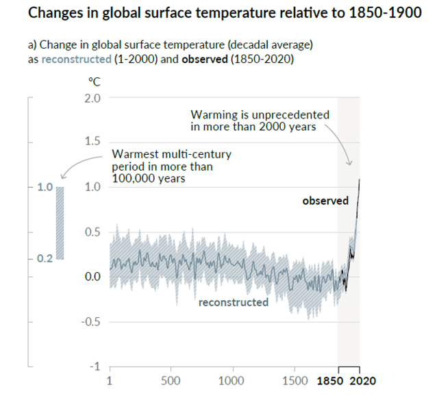
Although climate scientists keep telling us that defects in their “hockey stick” proxy reconstructions don’t matter – that it doesn’t matter whether they use data upside down, that it doesn’t matter if they cherry pick individual series depending on whether they go up in the 20th century, that it doesn’t matter if they discard series that don’t go the “right” way (“hide the decline”), that it doesn’t matter if they used contaminated data or stripbark bristlecones, that such errors don’t matter because the hockey stick itself doesn’t matter – the IPCC remains addicted to hockey sticks: lo and behold, Figure 1a of its newly minted Summary for Policy-makers contains what else – a hockey stick diagram. If you thought Michael Mann’s hockey stick was bad, imagine a woke hockey stick by woke climate scientists. As the climate scientists say, it’s even worse that we thought.

Curiously, this leading diagram of the Summary of Policy-Makers does not appear in the Report itself. (At least, I was unable to locate it in Chapter 2.) However, it is clearly the progeny of PAGES2K Consortium (Nature 2019) and Kaufman et al (2020), both of which I commented on briefly on Twitter (see here).

It’s hard to know where to begin.

The idea/definition of a temperature “proxy” is that it has some sort of linear or near-linear relationship to temperature with errors being white noise or low-order red noise. In other words, if you look at a panel of actual temperature “proxies”, you would expect to see series that look pretty similar and consistent.

But that’s not what you see with the data used by the IPCC. You’d never know this from the IPCC report or even from the cited articles, since authors of these one- and two-millennium temperature reconstructions scrupulously avoid plotting any of the underlying data. It’s hard for readers unfamiliar with the topic to fully appreciate the extreme inconsistency of underlying “proxy” data, given the faux precision of the IPCC diagram.

Many of the series discussed in this post, including nearly all of any HS-shaped series, have been previously discussed in Climate Audit blog posts (tag/pages2k) from 2, 5, 10 or even 15 years ago or in tweets from 2019 and 2020 (see here).

This post will be a work in progress for a few days, as I have some sections on special issues that I will try to add as I have time.CPS (to my knowledge) in all prior reconstructions by non-woke authors is an average of scaled data that has been oriented ex ante by known properties of the proxy. I.e. it won’t flip over an alkenone temperature estimate simply because it goes the wrong way. But this salutary property is not maintained in Neukom’s bastardized implementation of CPS – a bastardization that ought to have been resisted by reviewers somewhere along the line. PAGES2K produced temperature reconstructions by seven different methods, all of which yielded somewhat similar results to CPS – strongly suggesting that these other methods also flip series like Cape Ghir.

It’s not as though PAGES2K made a composite from 257 series that are two millennia long, all or a majority having a HS shape. One series in this sample does look a lot like the IPCC stick and will be discussed at length below, but the others look very different.

Four of the series in the sample are very short – three of them are actually shorter than the instrumental record. These are all coral Sr or coral d18O series, which make up 25% of the PAGES2019 data set. The extremely short records illustrated above are typical, indeed almost universal, in this class of proxy. They do have a pronounced trend in the instrumental period. This contrasts with the lack of trend that one sees in the two long proxies in the middle column above – a tree ring series from Mt Read, Tasmania (also used in MBH98) and a 1983 ice core series by Fisher from Devon Ice Cap on Baffin Island (also available to 1990s vintage multiproxy studies).

The short coral series do not contribute information to the medieval and earlier periods which one is trying to compare to the modern period. So what is their function? Do they contribute anything other than painting a moustache on the non-descript longer series?

The tree ring series in this sample are rather short; the screening procedures have somewhat concentrated series with slight upticks. (The stripbark bristlecone chronologies that were so prominent in the Mann et al Hockey Stick continue to be used in PAGES2019 – as discussed below.) I discussed the series in the left column with large uptick (Asi_MUSPIG aka paki033) in a 2019 tweet thread here. I located the underlying ring width measurements at NOAA and re-calculated the tree ring “chronology” using standard methodology – see below. The high-frequency details match, showing that the underlying measurement data is apples-to-apples. No chronology from original authors is archived at NOAA: so how did PAGES2K manage to get such a hockey stick? I have no idea.

The most “interesting” series in this sample batch is the borehole temperature reconstruction that has such an uncanny resemblance to the eventual IPCC reconstruction. By coincidence (or not), I wrote about this borehole temperature reconstruction (from WAIS Divide, Antarctica) in February 2019, a few months before publication of PAGES 2019 – see here – scroll down – for a more thorough analysis.

I’ve written multiple posts on the mathematics of borehole inversion calculations, which purport to estimate temperatures for thousands of years into the past from modern day temperatures measured downhole. These calculations require the inversion of a multicollinear matrix (with determinant close to 0). As far as I’m concerned, nearly all the details that specialists pontificate about are a sort of Chladni pattern artifact.

But that’s another story. Here the problem was much stranger. A few years earlier, I had (circuitously) managed to obtain a copy of the code used to calculate this borehole inversion (which is not archived anywhere.) The code showed that they had deleted the top 15 meters of the core from their calculation.

I’ve had a LOT of trouble getting the underlying borehole temperatures for some famous series. (The 2006 NAS panel cited one such result, but the original author (a US government employee) refused to make the data available, and, to my knowledge, it remains unavailable.) However, in this case, the underlying downhole temperatures had been archived, including the values had been deleted. Needless to say, they went down. An inversion using all the data would not have resulted in the impressive Hockey Stick in the PAGES2019 dataset, but a substantial recent decline.

Note that the blade on the hockey stick in this IPCC series is entirely dependent on the choice of 15 meters as a cutoff point for the borehole inversion. A choice of 20 meters would have probably eliminated the blade altogether.

The fact that the top portion of the core has to be excluded because of seasonal effects also creates a strange irony: the layers at 15 meters at WAIS date back to the 1960s. So IPCC has ended up relying on a series that purports to reconstruct temperature up to 2007, but without using any of the ice core dating from ~1965 to 2007. The calculation is entirely done from ice core layers dated prior to the 1960s. Does this seem reliable to any of you? Doesn’t to me.

Furthermore, the WAIS Divide borehole temperature reconstruction yields a totally different result than the widely replicated and well understood d18O isotope series.

Given the questions and defects surrounding the WAIS borehole inversion series, it is absurd that this series (a singleton, to boot) should be used in a policy-relevant document. That the final IPCC diagram is so similar to this garbage series also makes one wonder about what is happening under the hood of the multivariate calculations.

A Third Batch: PAGES2019 North American Tree Rings

North American tree rings (including some Arctic series) make up ~25% of PAGES2019 proxies. Here’s a random sample.The majority are short and rather non-descript – nothing like the final IPCC diagram.

There are one series with an enormous hockey stick: Mackenzie Delta (Porter 2013); and two series (“GB [Great Basin]” and nv512) with noticeable closing upticks. Sharp-eyed readers may have already figured out some of this story.

I discussed the Mackenzie Delta super-stick of Porter et al (2013), a new entry to hockey stick fabrication technology, in July 2019 here on Twitter. It comes from Yukon, Canada, an area that, in a 2004 study by d’Arrigo et al, had been a type location for the classic “divergence problem” – ring widths going down, while temperatures went up. So how did Porter et al manage to get a super-stick that had eluded Jacoby and d’Arrigo, long-time searchers for hockey sticks in tree ring data and not shy about picking cherries in order to make cherry pie?

They took “hide the decline” to extremes that had never been contemplated by prior practitioners of this dark art. Rather than hiding the decline in the final product, they did so for individual trees: as explained in the underlying article, they excluded the “divergent portions” of individual trees that had temerity to have decreasing growth in recent years. Even Briffa would never have contemplated such woke radical measures.

Stripbark Bristlecone Chronologies

As noted above, sharp-eyed readers may recall the identifier nv512. It is one of the classic Graybill stripbark bristlecone chronologies (Pearl Peak), which we had observed to dominate both the MBH98 PC1 and the final MBH98 reconstruction. It (and other key stripbark sites) was listed in McIntyre and McKitrick (2005 GRL) Table 1:

Readers will also recall that the 2006 NAS Panel recommended that “stripbark” chronologies be “avoided” in temperature reconstructions. Although the climate community has professed to implement the recommendations of the NAS Panel, they are addicted to stripbark chronologies, the properties of which are well known. Five different PAGES2019 series use stripbark bristlecones (three from original Graybill versions): nv512 (Pearl Peak); nv513 (Mount Washington); ca529 (Timber Gap Upper); SFP (an update of San Francisco Peaks, incorporating az510) and GB (a composite of Pearl Peak, Mount Washington and Sheep Mountain, using both Graybill and updated information).

In 2018, I looked at how North American tree ring networks had changed since MBH98. The one constant was the addiction of paleoclimatologists to stripbark chronologies– a phenomenon that I had commented on long before Climategate (citing Clapton et al and Paeffgen et al), much to the annoyance of dendros, but the comment remains as true now as it was then.

Conclusion

I discussed many of these problems in July 2019, within a couple of days of publication of the underlying article (see here). While I don’t necessarily expect IPCC reviewers to be paying rapt attention to my twitter feed, one surely presumes that IPCC climate scientists, who are employed full time on these topics, to be competent enough to notice things that I was able to observe in my first day or so of looking at PAGES2019. But their obtuseness never ceases to amaze.

SH Land and Ocean Uptick July 2021


The post below updates the UAH record of air temperatures over land and ocean.  But as an overview consider how recent rapid cooling  completely overcame the warming from the last 3 El Ninos (1998, 2010 and 2016).  The UAH record shows that the effects of the last one were gone as of April 2021. (UAH baseline is now 1991-2020). Now in July there is an uptick mainly due to SH land and ocean warming.

UAH Global 1995to202107w CO2
For reference I added an overlay of CO2 annual concentrations as measured at Mauna Loa. While temperatures fluctuated up and down ending flat, CO2 went up steadily by ~55 ppm by 2020, a 15% increase.

Furthermore, going back to previous warmings prior to the satellite record shows that the entire rise of 0.8C since 1947 is due to oceanic, not human activity.

gmt-warming-events

The animation is an update of a previous analysis from Dr. Murry Salby.  These graphs use Hadcrut4 and include the 2016 El Nino warming event.  The exhibit shows since 1947 GMT warmed by 0.8 C, from 13.9 to 14.7, as estimated by Hadcrut4.  This resulted from three natural warming events involving ocean cycles. The most recent rise 2013-16 lifted temperatures by 0.2C.  Previously the 1997-98 El Nino produced a plateau increase of 0.4C.  Before that, a rise from 1977-81 added 0.2C to start the warming since 1947.

Importantly, the theory of human-caused global warming asserts that increasing CO2 in the atmosphere changes the baseline and causes systemic warming in our climate.  On the contrary, all of the warming since 1947 was episodic, coming from three brief events associated with oceanic cycles. 

July Update Ocean and Land Air Temps Continue Down

banner-blog

With apologies to Paul Revere, this post is on the lookout for cooler weather with an eye on both the Land and the Sea.  While you will hear a lot about 2020 temperatures matching 2016 as the highest ever, that spin ignores how fast has the cooling set in.  The UAH data analyzed below shows that warming from the last El Nino is now fully dissipated with chilly temperatures setting in all regions.  The peak NH summer month of July saw some warming in all regions, most pronounced in the SH.

UAH has updated their tlt (temperatures in lower troposphere) dataset for July.  Previously I have done posts on their reading of ocean air temps as a prelude to updated records from HADSST3. This month also has a separate graph of land air temps because the comparisons and contrasts are interesting as we contemplate possible cooling in coming months and years. Again last month showed air temps over land moved up sharply, while oceans warmed mildly.

Note:  UAH has shifted their baseline from 1981-2010 to 1991-2020 beginning with January 2021.  In the charts below, the trends and fluctuations remain the same but the anomaly values change with the baseline reference shift.

Presently sea surface temperatures (SST) are the best available indicator of heat content gained or lost from earth’s climate system.  Enthalpy is the thermodynamic term for total heat content in a system, and humidity differences in air parcels affect enthalpy.  Measuring water temperature directly avoids distorted impressions from air measurements.  In addition, ocean covers 71% of the planet surface and thus dominates surface temperature estimates.  Eventually we will likely have reliable means of recording water temperatures at depth.

Recently, Dr. Ole Humlum reported from his research that air temperatures lag 2-3 months behind changes in SST.  Thus the cooling oceans now portend cooling land air temperatures to follow.  He also observed that changes in CO2 atmospheric concentrations lag behind SST by 11-12 months.  This latter point is addressed in a previous post Who to Blame for Rising CO2?

After a technical enhancement to HadSST3 delayed updates Spring 2020, May resumed a pattern of HadSST updates toward the following month end.  For comparison we can look at lower troposphere temperatures (TLT) from UAHv6 which are now posted for July.  The temperature record is derived from microwave sounding units (MSU) on board satellites like the one pictured above. Recently there was a change in UAH processing of satellite drift corrections, including dropping one platform which can no longer be corrected. The graphs below are taken from the new and current dataset.

The UAH dataset includes temperature results for air above the oceans, and thus should be most comparable to the SSTs. There is the additional feature that ocean air temps avoid Urban Heat Islands (UHI).  The graph below shows monthly anomalies for ocean temps since January 2015.

UAH Oceans 202107
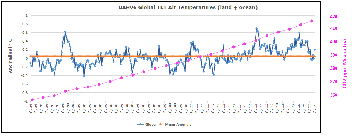
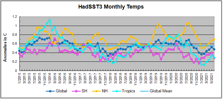
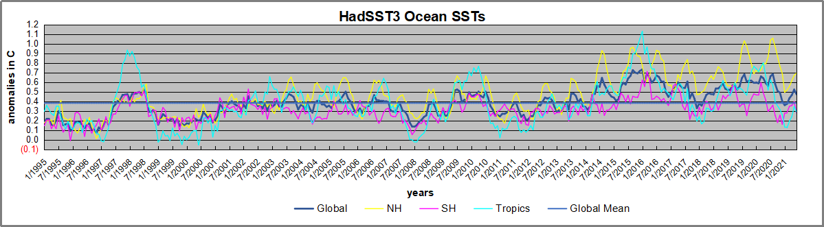
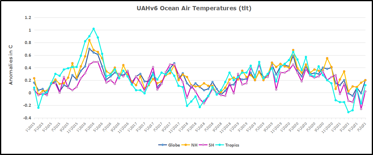
Note 2020 was warmed mainly by a spike in February in all regions, and secondarily by an October spike in NH alone. End of 2020 November and December ocean temps plummeted in NH and the Tropics. In January SH dropped sharply, pulling the Global anomaly down despite an upward bump in NH. An additional drop in March had SH matching the coldest in this period. March drops in the Tropics and NH made those regions at their coldest since 01/2015.  In June 2021 despite an uptick in NH, the Global anomaly dropped back down due to a record low in SH along with a Tropical cooling.  Now in July SH and the Tropics have gone up sharply, pulling up the Global anomaly.  The NH spikes in previous summers appears less likely in 2021.

Land Air Temperatures Tracking Downward in Seesaw Pattern

We sometimes overlook that in climate temperature records, while the oceans are measured directly with SSTs, land temps are measured only indirectly.  The land temperature records at surface stations sample air temps at 2 meters above ground.  UAH gives tlt anomalies for air over land separately from ocean air temps.  The graph updated for July is below.
UAH Land 202107Here we have fresh evidence of the greater volatility of the Land temperatures, along with extraordinary departures by SH land.  Land temps are dominated by NH with a 2020 spike in February, followed by cooling down to July.  Then NH land warmed with a second spike in November.  Note the mid-year spikes in SH winter months.  In December all of that was wiped out.

Then January 2021 showed a sharp drop in SH, but a rise in NH more than offset, pulling the Global anomaly upward.  In February NH and the Tropics cooled further, pulling down the Global anomaly, despite slight SH land warming.  March continued to show all regions roughly comparable to early 2015, prior to the 2016 El Nino.  Then in April NH land dropped sharply along with the Tropics, bringing Global Land anomaly down by nearly 0.2C.  Now a remarkable divergence with NH rising in May and June, while SH drops sharply to a new low, along with Tropical cooling. With NH having most of the land mass, the Global land anomaly ticked upward.

Now in July SH jumped up nearly 1C from -o.6 to +0.3, causing a spike in Global land anomaly despite little change in NH.

The Bigger Picture UAH Global Since 1995
UAH Global 1995to202107
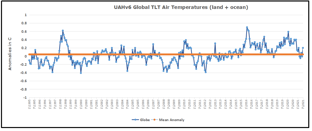
The chart shows monthly anomalies starting 01/1995 to present.  The average anomaly is 0.04, since this period is the same as the new baseline, lacking only the first 4 years.  1995 was chosen as an ENSO neutral year.  The graph shows the 1998 El Nino after which the mean resumed, and again after the smaller 2010 event. The 2016 El Nino matched 1998 peak and in addition NH after effects lasted longer, followed by the NH warming 2019-20, with temps now returning again to the mean with an uptick in July.

TLTs include mixing above the oceans and probably some influence from nearby more volatile land temps.  Clearly NH and Global land temps have been dropping in a seesaw pattern, more than 1C lower than the 2016 peak.  Since the ocean has 1000 times the heat capacity as the atmosphere, that cooling is a significant driving force.  TLT measures started the recent cooling later than SSTs from HadSST3, but are now showing the same pattern.  It seems obvious that despite the three El Ninos, their warming has not persisted, and without them it would probably have cooled since 1995.  Of course, the future has not yet been written.


World of Climate Change Infographics

Raymond of RiC-Communications studio created infographics on CO2 for improving public awareness.  He produced 13 interesting slides which are presented in the post World of CO2 Infographics  A second project was created on a related theme The World of Climate Change comprising six charts, including one regarding Alpine glacier studies by two prominent geologists.  In addition, Raymond was able to consult the work of  these two experts in their native German language.

This project is The World of Climate Change

Infographics can be helpful, in making things simple to understand. Climate change is a complex topic with a lot of information and statistics. These simple step by step charts are to better understand what is occurring naturally and what could be caused by humans. What is cause for alarm and what isn’t cause for alarmism if at all. Only through learning is it possible to get the big picture so as to make the right decisions for the future.

Images are available at these links:

The+World+of+CO2 CO2 charts

The+World+of+Climate+Change Charts

World+of+Ice+Ages Charts

The+World+of+Energy Charts

– N° 1 600 million years of global temperature change
– N° 2 Earth‘s temperature record for the last 400,000 years
– N° 3 Holocene period and average northern hemispheric temperatures
– N° 4 140 years of global mean temperature
– N° 5 120 m of sea level rise over the past 20‘000 years
– N° 6 Eastern European alpine glacier history during the Holocene period.


03_infographic_wocc-1

04_infographic_wocc

Summer Temperatures (May – September) A rise in temperature during a warming period will result in a glacier losing more surface area or completely vanishing. This can happen very rapidly in only a few years or over a longer period of time. If temperatures drop during a cooling period and summer temperatures are too low, glaciers will begin to grow and advance with each season. This can happen very rapidly or over a longer period in time. Special thanks to Prof. em. Christian Schlüchter / (Quartärgeologie, Umweltgeologie) Universität Bern Institut für Geologie His work is on the Western Alps and was so kind to help Raymond make this graphic as correct as possible.

Comment:

This project explored information concerning how aspects of the world climate system have changed in the past up to the present time.  Understanding the range of historical variation and the factors involved is essential for anticipating how future climate parameters might fluctuate.

For example:

The Climate Story (Illustrated) looks at the temperature record.

H20 the Gorilla Climate Molecule looks at precipitation patterns.

Data vs. Models #2: Droughts and Floods looks at precipitation extremes.

Data vs. Models #3: Disasters looks at extreme weather events.

Data vs. Models #4: Climates Changing looks at boundaries of defined climate zones.

And in addition, since Chart #5 features the Statue of Liberty, here are the tidal gauge observations there compared to climate model projections:

NYC past & projected 2020

World of CO2 Infographics

Raymond of RiC-Communications studio collaborated with me and content experts in order to produce high quality infographics on CO2 for improving public awareness.  This post presents the thirteen charts he has produced on this topic. I find them straightforward and useful, and appreciate his excellent work on this. Project title is link to RiC-Communications.  Thanks again to Raymond for recovering access to his work after reorganizing his website.

This project is: The world of CO2

Infographics can be helpful, in making things simple to understand. CO2 is a complex topic with a lot of information and statistics. These simple step by step charts should help to give you an idea of CO2’s importance. Without CO2, plants wouldn’t be able to live on this planet. Just remember, that if CO2 falls below 150 ppm, all plant life would cease to exist.

Images are available at these links:

The+World+of+CO2 CO2 charts

The+World+of+Climate+Change Charts

World+of+Ice+Ages Charts

The+World+of+Energy Charts

– N° 1 Earth‘s atmospheric composition
– N° 2 Natural sources of CO2 emissions
– N° 3 Global anthropogenic CO2 emissions
– N° 4 CO2 – Carbon dioxide molecule
– N° 5 The global carbon cycle
– N° 6 Carbon and plant respiration
– N° 7 Plant categories and abundance (C3, C4 & CAM Plants)
– N° 8 Photosynthesis, the C3 vs C4 gap
– N° 9 Plant respiration and CO2
– N° 10 The logarithmic temperature rise of higher CO2 levels.
N° 11 Earths atmospheric composition in relationship to CO2
– N° 12 Human respiration and CO2 concentrations.
– N° 13 600 million years of temperature change and atmospheric CO2
– N° 14 The Composition of the Human Body

WCO2 fig1

WCO2 fig2

WCO2 fig3

WCO2 fig4

WCO2 fig5

WCO2 fig6

WCO2 fig7

WCO2 fig8

WCO2 fig9

WCO2 fig10

WCO2 fig11

WCO2 fig12

WCO2 fig13

CO2 plays an important roll for the survival of our planet. Carbon Dioxide is essential for plant photosynthesis and rise of CO2 can be directly linked to the greening of the plant. At the moment climate change and global warming are being presented as a global threat to our species.

According to environmentalists, sea levels and temperatures will rise, resulting in a global breakdown for human civilization. This is based on climate models and numerous environmental studies around the world. According to the IPCC our carbon footprint needs to be reduced. The use of natural gas, oil, coal and any other fossil fuels need to be reduced to zero. The anthropogenic (man-made) influence has to be eliminated to save the planet.

According to some climate models, the planets temperature will increase to a level that will cause drought and famine for a large portion of the population in the very near future. In the future our energy needs will have to be cut so much so that all travel will need to be cut back completely.

In the future only environment friendly approved energy resources will be permitted such as, wind energy, solar energy, geothermal, biomass and hydroelectric as clean alternatives. This would deprive developing nations the possibility of building an economy and developed nations of keeping their economies.

See Also World of Climate Change Infographics

And in Addition

Note that the illustration #10 assumes (as is the “consensus”) that doubling atmospheric CO2 produces a 1C rise in GMT (Global Mean Temperature).  Even if true, the warming would be gentle and not cataclysmic.  Greta and XR are foolishly thinking the world goes over a cliff if CO2 hits 430ppm.  I start to wonder if Greta really can see CO2 as she claims.

CO2 and COPs

It is also important to know that natural CO2 sources and sinks are estimated with large error ranges.  For example this table from earlier IPCC reports:

Below are some other images I find meaningful, though they lack Raymond’s high production values.

CO2 Changes Follow Temp Changes, Not the Reverse 2021 Update

This post is about proving that CO2 changes in response to temperature changes, not the other way around, as is often claimed.  In order to do  that we need two datasets: one for measurements of changes in atmospheric CO2 concentrations over time and one for estimates of Global Mean Temperature changes over time.

Climate science is unsettling because past data are not fixed, but change later on.  I ran into this previously and now again in 2021 when I set out to update an analysis done in 2014 by Jeremy Shiers, which I discussed in a previous post reprinted at the end.  Jeremy provided a spreadsheet in his essay Murray Salby Showed CO2 Follows Temperature Now You Can Too posted in January 2014. I downloaded his spreadsheet intending to bring the analysis up to the present to see if the results hold up.  The two sources of data were:

Temperature anomalies from RSS here:  http://www.remss.com/missions/amsu

CO2 monthly levels from NOAA (Mauna Loa): https://www.esrl.noaa.gov/gmd/ccgg/trends/data.html

Changes in CO2 (ΔCO2)

Uploading the CO2 dataset showed that many numbers had changed (why?).

The blue line shows annual observed differences in monthly values year over year, e.g. June 2020 minus June 2019 etc.  The first 12 months (1979) provide the observed starting values from which differentials are calculated.  The orange line shows those CO2 values changed slightly in the 2020 dataset vs. the 2014 dataset, on average +0.035 ppm.  But there is no pattern or trend added, and deviations vary randomly between + and -.  So last year I took the 2020 dataset to replace the older one for updating the analysis.

Now I find the NOAA dataset in 2021 has almost completely new values due to a method shift in February 2021, requiring a recalibration of all previous measurements.  The new picture of ΔCO2 is graphed below.

Co2 Monthly Diffs New and Old2021

The method shift is reported at a NOAA Global Monitoring Laboratory webpage, Carbon Dioxide (CO2) WMO Scale, with a justification for the difference between X2007 results and the new results from X2019 now in force.  The orange line shows that the shift has resulted in higher values, especially early on and a general slightly increasing trend over time.  However, these are small variations at the decimal level on values 340 and above.  Further, the graph shows that yearly differentials month by month are virtually the same as before.  Thus I redid the analysis with the new values.

Global Temperature Anomalies (ΔTemp)

The other time series was the record of global temperature anomalies according to RSS. The current RSS dataset is not at all the same as the past.

To enlarge open image in new tab.

Here we see some seriously unsettling science at work.  The gold line is 2020 RSS and the purple is RSS as of 2014.  The red line shows alterations from the old to the new.  There is a slight cooling of the data in the beginning years, then the two versions pretty much match until 1997, when systematic warming enters the record.  From 1997/5 to 2003/12 the average anomaly increases by 0.04C.  After 2004/1 to 2012/8 the average increase is 0.15C.  At the end from 2012/9 to 2013/12, the average anomaly was higher by 0.21.

RSS continues that accelerated warming to the present, but it cannot be trusted.  And who knows what the numbers will be a few years down the line?  As Dr. Ole Humlum said some years ago (regarding Gistemp): “It should however be noted, that a temperature record which keeps on changing the past hardly can qualify as being correct.”

Given the above manipulations, I went instead to the other satellite dataset UAH version 6. UAH has also made a shift by changing its baseline from 1981-2010 to 1991-2020.  This resulted in systematically reducing the anomaly values, but did not alter the pattern of variation over time.  For comparison, here are the two records with measurements through June 2021.

CO2 Observed Temps Observed

Comparing UAH temperature anomalies to NOAA CO2 changes.

Here are UAH temperature anomalies compared to CO2 changes.

Changes in monthly CO2 synchronize with temperature fluctuations, which for UAH are anomalies now referenced to the 1991-2020 period.  As stated above, CO2 differentials are calculated for the present month by subtracting the value for the same month in the previous year (for example June 2021 minus June 2020).   Temp anomalies are calculated by comparing the present month with the baseline month.

The final proof that CO2 follows temperature due to stimulation of natural CO2 reservoirs is demonstrated by the ability to calculate CO2 levels since 1979 with a simple mathematical formula:

For each subsequent year, the co2 level for each month was generated

CO2  this month this year = a + b × Temp this month this year  + CO2 this month last year

Jeremy used Python to estimate a and b, but I used his spreadsheet to guess values that place for comparison the observed and calculated CO2 levels on top of each other.

CO2 Observed and Calculated2021

In the chart calculated CO2 levels correlate with observed CO2 levels at 0.9983 out of 1.0000.  This mathematical generation of CO2 atmospheric levels is only possible if they are driven by temperature-dependent natural sources, and not by human emissions which are small in comparison, rise steadily and monotonically.

Previous Post:  What Causes Rising Atmospheric CO2?

nasa_carbon_cycle_2008-1

This post is prompted by a recent exchange with those reasserting the “consensus” view attributing all additional atmospheric CO2 to humans burning fossil fuels.

The IPCC doctrine which has long been promoted goes as follows. We have a number over here for monthly fossil fuel CO2 emissions, and a number over there for monthly atmospheric CO2. We don’t have good numbers for the rest of it-oceans, soils, biosphere–though rough estimates are orders of magnitude higher, dwarfing human CO2.  So we ignore nature and assume it is always a sink, explaining the difference between the two numbers we do have. Easy peasy, science settled.

What about the fact that nature continues to absorb about half of human emissions, even while FF CO2 increased by 60% over the last 2 decades? What about the fact that so far in 2020 FF CO2 has declined significantly with no discernable impact on rising atmospheric CO2?

These and other issues are raised by Murray Salby and others who conclude that it is not that simple, and the science is not settled. And so these dissenters must be cancelled lest the narrative be weakened.

The non-IPCC paradigm is that atmospheric CO2 levels are a function of two very different fluxes. FF CO2 changes rapidly and increases steadily, while Natural CO2 changes slowly over time, and fluctuates up and down from temperature changes. The implications are that human CO2 is a simple addition, while natural CO2 comes from the integral of previous fluctuations.  Jeremy Shiers has a series of posts at his blog clarifying this paradigm. See Increasing CO2 Raises Global Temperature Or Does Increasing Temperature Raise CO2 Excerpts in italics with my bolds.

The following graph which shows the change in CO2 levels (rather than the levels directly) makes this much clearer.

Note the vertical scale refers to the first differential of the CO2 level not the level itself. The graph depicts that change rate in ppm per year.

There are big swings in the amount of CO2 emitted. Taking the mean as 1.6 ppmv/year (at a guess) there are +/- swings of around 1.2 nearly +/- 100%.

And, surprise surprise, the change in net emissions of CO2 is very strongly correlated with changes in global temperature.

This clearly indicates the net amount of CO2 emitted in any one year is directly linked to global mean temperature in that year.

For any given year the amount of CO2 in the atmosphere will be the sum of

  • all the net annual emissions of CO2
  • in all previous years.

For each year the net annual emission of CO2 is proportional to the annual global mean temperature.

This means the amount of CO2 in the atmosphere will be related to the sum of temperatures in previous years.

So CO2 levels are not directly related to the current temperature but the integral of temperature over previous years.

The following graph again shows observed levels of CO2 and global temperatures but also has calculated levels of CO2 based on sum of previous years temperatures (dotted blue line).

Summary:

The massive fluxes from natural sources dominate the flow of CO2 through the atmosphere.  Human CO2 from burning fossil fuels is around 4% of the annual addition from all sources. Even if rising CO2 could cause rising temperatures (no evidence, only claims), reducing our emissions would have little impact.

Resources:

CO2 Fluxes, Sources and Sinks

Who to Blame for Rising CO2?

Fearless Physics from Dr. Salby

In this video presentation, Dr. Salby provides the evidence, math and charts supporting the non-IPCC paradigm.

Footnote:  As CO2 concentrations rose, BP shows Fossil Fuel consumption slumped in 2020

See also 2021 Update: Fossil Fuels ≠ Global Warming

June 2021 Ocean Temps Stay Cool


The best context for understanding decadal temperature changes comes from the world’s sea surface temperatures (SST), for several reasons:

  • The ocean covers 71% of the globe and drives average temperatures;
  • SSTs have a constant water content, (unlike air temperatures), so give a better reading of heat content variations;
  • A major El Nino was the dominant climate feature in recent years.

HadSST is generally regarded as the best of the global SST data sets, and so the temperature story here comes from that source, the latest version being HadSST3.  More on what distinguishes HadSST3 from other SST products at the end.

The Current Context

The year end report below showed 2020 rapidly cooling in all regions.  The anomalies have continued to drop sharply well below the mean since 1995.  This Global Cooling was also evident in the UAH Land and Ocean air temperatures ( See March 2021 Ocean Chill Deepens) 

The chart below shows SST monthly anomalies as reported in HadSST3 starting in 2015 through June 2021. After three straight Spring 2020 months of cooling led by the tropics and SH, NH spiked in the summer, along with smaller bumps elsewhere.  Then temps everywhere dropped the last six months, hitting bottom in February 2021.  All regions were well below the Global Mean since 2015, matching the cold of 2018, and lower than January 2015. Now the spring is bringing more temperate waters and a return to the mean anomaly since 2015.  June Global SST anomaly cooled off back to April due to dropping temps in SH and the Tropics.  NH continued its summer rise, but only slightly and well below the last two Junes.

Hadsst062021
A global cooling pattern is seen clearly in the Tropics since its peak in 2016, joined by NH and SH cycling downward since 2016.  

Note that higher temps in 2015 and 2016 were first of all due to a sharp rise in Tropical SST, beginning in March 2015, peaking in January 2016, and steadily declining back below its beginning level. Secondly, the Northern Hemisphere added three bumps on the shoulders of Tropical warming, with peaks in August of each year.  A fourth NH bump was lower and peaked in September 2018.  As noted above, a fifth peak in August 2019 and a sixth August 2020 exceeded the four previous upward bumps in NH.

In 2019 all regions had been converging to reach nearly the same value in April.  Then  NH rose exceptionally by almost 0.5C over the four summer months, in August 2019 exceeding previous summer peaks in NH since 2015.  In the 4 succeeding months, that warm NH pulse reversed sharply. Then again NH temps warmed to a 2020 summer peak, matching 2019.  This has now been reversed with all regions pulling the Global anomaly downward sharply, tempered by warming in March to May, and now dropping below the global mean anomaly since 2015.

And as before, note that the global release of heat was not dramatic, due to the Southern Hemisphere offsetting the Northern one.  Note the May warming was strongest in the Tropics, though the anomaly is quite cool compared to 2016.

A longer view of SSTs

The graph below  is noisy, but the density is needed to see the seasonal patterns in the oceanic fluctuations.  Previous posts focused on the rise and fall of the last El Nino starting in 2015.  This post adds a longer view, encompassing the significant 1998 El Nino and since.  The color schemes are retained for Global, Tropics, NH and SH anomalies.  Despite the longer time frame, I have kept the monthly data (rather than yearly averages) because of interesting shifts between January and July.


Hadsst1995to 062021

1995 is a reasonable (ENSO neutral) starting point prior to the first El Nino.  The sharp Tropical rise peaking in 1998 is dominant in the record, starting Jan. ’97 to pull up SSTs uniformly before returning to the same level Jan. ’99.  For the next 2 years, the Tropics stayed down, and the world’s oceans held steady around 0.2C above 1961 to 1990 average.

Then comes a steady rise over two years to a lesser peak Jan. 2003, but again uniformly pulling all oceans up around 0.4C.  Something changes at this point, with more hemispheric divergence than before. Over the 4 years until Jan 2007, the Tropics go through ups and downs, NH a series of ups and SH mostly downs.  As a result the Global average fluctuates around that same 0.4C, which also turns out to be the average for the entire record since 1995.

2007 stands out with a sharp drop in temperatures so that Jan.08 matches the low in Jan. ’99, but starting from a lower high. The oceans all decline as well, until temps build peaking in 2010.

Now again a different pattern appears.  The Tropics cool sharply to Jan 11, then rise steadily for 4 years to Jan 15, at which point the most recent major El Nino takes off.  But this time in contrast to ’97-’99, the Northern Hemisphere produces peaks every summer pulling up the Global average.  In fact, these NH peaks appear every July starting in 2003, growing stronger to produce 3 massive highs in 2014, 15 and 16.  NH July 2017 was only slightly lower, and a fifth NH peak still lower in Sept. 2018.

The highest summer NH peaks came in 2019 and 2020, only this time the Tropics and SH are offsetting rather adding to the warming. (Note: these are high anomalies on top of the highest absolute temps in the NH.)  Since 2014 SH has played a moderating role, offsetting the NH warming pulses. After September 2020 temps dropped off down until February 2021, then all regions rose to bring the global anomaly above the mean since 1995, before backing down in June 2021.

What to make of all this? The patterns suggest that in addition to El Ninos in the Pacific driving the Tropic SSTs, something else is going on in the NH.  The obvious culprit is the North Atlantic, since I have seen this sort of pulsing before.  After reading some papers by David Dilley, I confirmed his observation of Atlantic pulses into the Arctic every 8 to 10 years.

But the peaks coming nearly every summer in HadSST require a different picture.  Let’s look at August, the hottest month in the North Atlantic from the Kaplan dataset.
AMO Aug and Dec 2021
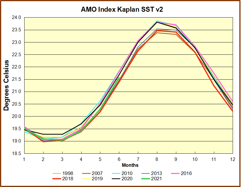
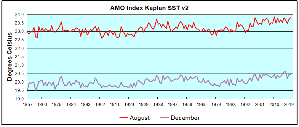
The AMO Index is from from Kaplan SST v2, the unaltered and not detrended dataset. By definition, the data are monthly average SSTs interpolated to a 5×5 grid over the North Atlantic basically 0 to 70N. The graph shows August warming began after 1992 up to 1998, with a series of matching years since, including 2020.  Because the N. Atlantic has partnered with the Pacific ENSO recently, let’s take a closer look at some AMO years in the last 2 decades.

AMO decade 062021
This graph shows monthly AMO temps for some important years. The Peak years were 1998, 2010 and 2016, with the latter emphasized as the most recent. The other years show lesser warming, with 2007 emphasized as the coolest in the last 20 years. Note the red 2018 line is at the bottom of all these tracks. The black line shows that 2020 began slightly warm, then set records for 3 months. then dropped below 2016 and 2017, peaked in August ending below 2016. Now in 2021, AMO is tracking the coldest years, warming slightly in May and June.

Summary

The oceans are driving the warming this century.  SSTs took a step up with the 1998 El Nino and have stayed there with help from the North Atlantic, and more recently the Pacific northern “Blob.”  The ocean surfaces are releasing a lot of energy, warming the air, but eventually will have a cooling effect.  The decline after 1937 was rapid by comparison, so one wonders: How long can the oceans keep this up? If the pattern of recent years continues, NH SST anomalies may rise slightly in coming months, but once again, ENSO which has weakened will probably determine the outcome.

Footnote: Why Rely on HadSST3

HadSST3 is distinguished from other SST products because HadCRU (Hadley Climatic Research Unit) does not engage in SST interpolation, i.e. infilling estimated anomalies into grid cells lacking sufficient sampling in a given month. From reading the documentation and from queries to Met Office, this is their procedure.

HadSST3 imports data from gridcells containing ocean, excluding land cells. From past records, they have calculated daily and monthly average readings for each grid cell for the period 1961 to 1990. Those temperatures form the baseline from which anomalies are calculated.

In a given month, each gridcell with sufficient sampling is averaged for the month and then the baseline value for that cell and that month is subtracted, resulting in the monthly anomaly for that cell. All cells with monthly anomalies are averaged to produce global, hemispheric and tropical anomalies for the month, based on the cells in those locations. For example, Tropics averages include ocean grid cells lying between latitudes 20N and 20S.

Gridcells lacking sufficient sampling that month are left out of the averaging, and the uncertainty from such missing data is estimated. IMO that is more reasonable than inventing data to infill. And it seems that the Global Drifter Array displayed in the top image is providing more uniform coverage of the oceans than in the past.

uss-pearl-harbor-deploys-global-drifter-buoys-in-pacific-ocean

USS Pearl Harbor deploys Global Drifter Buoys in Pacific Ocean


Imperfect Climate Scientists

josh-knobs

Tom Chivers writes with insight as Unherd’s science editor Can we trust the climate scientists?  Excerpts in italics with my bolds.

The reaction to Steven Koonin’s book highlights just how toxic this debate has become

There’s a problem with writing about science — any science — which is that scientists are human like the rest of us. They are not perfect disembodied truth-seeking agents but ordinary, flawed humans navigating social, professional and economic incentive structures.

Most notably, scientists, like people, are social. If they exist in a social or professional circle that believes X, it is hard to say not-X; if they have professed to believe Y, they won’t want to look silly and admit not-Y. It might even be hard to get research funded or published if it isn’t in line with what the wider group believes.

All this makes it very hard, as an outsider, to assess some scientific claims. You can ask some expert, but they will be an expert within the social and professional milieu that you’re looking at, and who will likely share the crony beliefs of that social and professional milieu. All of which often makes it hard to disentangle why scientists do and say the things they do. Especially when it comes to scientific claims that are politically charged, claims on hot-button topics like race, sex, poverty — and of course climate.

I couldn’t help thinking about that as I was reading Steven Koonin’s new book, Unsettled. Koonin is (as it says, prominently, on the front of the book) the “former Undersecretary for Science, US Department of Energy, under the Obama administration”. The publishers are obviously very keen to stress the Obama link: “…under the Trump administration” might not have carried the same heft.

Koonin came to public attention a few years ago, after he wrote a controversial opinion piece for the Wall Street Journal headlined “Climate science is not settled”. It was a response to what he considered the widely held opinion among policymakers and the wider public that, in fact, climate science is settled. His particular concern was that we can’t yet accurately predict what the future climate shifts will be. The book itself is best thought of as the extended version of that op-ed, with added graphs.

Climate Science is not Settled:  We can break down his thesis into, roughly, three areas.

One, is that despite “the mainstream narrative among the media and policymakers”, it is hard to be sure that the climate has changed in meaningful ways due to human influence. In particular, floods, rainfall, droughts, storms, and record high temperatures have not become more common, and although the climate is unambiguously warming and sea levels have gone up, it’s hard to confidently separate human influence from natural variability.

Two, he says, climate models are highly uncertain and struggle to successfully predict the past, let alone the future, so we shouldn’t trust confident claims about the climate future. And if we do accept the IPCC’s predictions, they aren’t of imminent catastrophe. Instead, they point to slow change to which humanity can easily adapt, and, broadly speaking, to humanity continuing to prosper.

And three, he continues, there is basically nothing we can do about it anyway, partly because carbon dioxide hangs around in the atmosphere for so long, but mainly because the developing world is developing fast, and using ever more carbon to do so, and actually that’s a good thing.

These are — according to Koonin — all, by and large, only what the IPCC assessment reports and other major climate analyses say.

The public conversation, which he says is full of doom and apocalypse and unwarranted certainty, has become unconnected from the state of the actual science. And he blames scientists — and policymakers, the media and the public — for that disconnection.

cg5d8c4e469b40d

So is he right? Certainly he has a case when it comes to Point One: I think he is correct that the media narrative about climate change is not especially well correlated with the IPCC’s own central assessments. For instance, I think it’s fair to say that the recent floods in London, China and Germany have been held up as examples of a changing climate. But the IPCC’s most recent assessment report, 2014’s AR5, found studies showing evidence for “upward, downward or no trend in the magnitude of floods” (see p214 of the AR5 Physical Science Basis document; be warned it’s a big PDF), and concluded that they were unable to be sure whether, globally, river floods had become more or less likely.

Similarly, I think there is a perception among many commentators and policymakers that storms, hurricanes, and droughts are all more common as a result of climate change, but the IPCC’s own report (see p.53 of AR5) has “low confidence” that those things are more common than they were 100 years ago. I know some scientists think the IPCC is overoptimistic, but it is the closest we have to consensus climate science.

9650f-0pf9ogs-iuk1tfti0

That said, there is some fairness in accusing Koonin of cherrypicking. He spends a lot of time arguing about extreme daily temperatures, convincingly (to my mind) debunking a claim in the 2017 Climate Science Special Report (CSSR), the flagship US government climate science assessment, that US extreme daily temperature records have gone up. In fact, CSSR is comparing the ratio of extreme high temperatures to extreme low temperatures, and what in fact has happened is that extreme low temperatures have become less common. Which is interesting.

But the IPCC does think extreme daily temperatures have gone up globally (see p53 again). In his chapter on “Hyping the Heat”, Koonin doesn’t mention the IPCC, and the IPCC outranks the CSSR. His detective work is interesting, but he is fighting a henchman, not the end-of-level boss. Maybe the IPCC is wrong as well, but we don’t learn that here.

On Point Two, I don’t feel competent to assess the models; certainly it seems highly plausible to me that there are enormous uncertainties in predicting something as inherently chaotic as the climate, especially when to do so you first have to predict something as inherently chaotic as people. But my non-expert understanding is that broadly speaking the models have been getting it about right.

That said, I think he is right that, if you were to ask the average person in my social circle, you would hear that climate change will lead to catastrophe in the near future. And I think that is overstating what the IPCC reports actually say. For instance, it is true that the IPCC predicts more people will go hungry than otherwise would have: it says that almost 140 million children will be undernourished, in a world where climate change goes unmitigated, compared to 113 million in a world where there is no climate change (see p730 of this IPCC report). But that is still fewer than went hungry in 2000 – almost 150 million, out of a much smaller population. The IPCC predicts that a world with climate change will be worse than one without; but not so much worse that other things, such as economic growth and technological progress, won’t broadly keep the big things, like life expectancy and human health, improving. That does seem worth saying.

And Koonin’s Point Three is worth making too. If India were to increase its per capita emissions to those of Japan, “one of the lowest emitting of the developed countries”, he says, then that change alone would raise global emissions by 25%1. Realistically, we’re not going to be able to stop India — or China, or Brazil, or Mexico, or any of the other middle-income countries — from developing, and development at the moment means carbon.

More importantly: we don’t want them to stop developing. Richer countries have healthier, longer-lived citizens and are better able to cope with a changing climate. Even huge, swingeing cuts to Western emissions — politically unrealistic — would only go some way to offsetting the inevitable growth in the developing world. Those cuts may be worth doing, but there are limits to how much good they can do.

But even if Koonin is right about almost everything — if the best guess of the science is that we’re heading towards things merely getting better more slowly, rather than getting worse — then I think he’s missing a major point. That is, climate change models are uncertain. In fact Koonin claims they’re even more uncertain than we think. So they could easily be erring on the side of optimism.

And the one thing we should have learnt from the Covid pandemic is that it’s not enough to say “the most likely outcome is that it’ll be fine, so let’s act as if it’ll be fine.” The correct thing to say is “the most likely outcome is that it’ll be fine, but if there’s a 10% chance that it’ll be completely awful, then we need to prepare for that 10% chance.” Reducing greenhouse gas emissions in the developed world reduces the chance of some unforeseen but plausible disaster: as a happy bonus, it makes our cities more pleasant places in which to live. It will come at some cost, but hopefully not too high, because green technology is getting so cheap and effective these days.

Reviews by climate scientists have been unimpressed. “I would normally ignore a book by a non-climate scientist,” starts one review, which goes on to not ignore it. Another accuses him of cherry-picking his fights (not entirely unfairly, as I said). A third says the book is “distracting, irrelevant, misguided, misleading and unqualified”.

But none that I’ve read really addresses the nitty-gritty of his arguments — which is hard to do in a 900-word review, of course, but still. They usually pick some line out of the first chapter or two, disagree with it, and then say the whole book is therefore rubbish. But I wanted a bit more meat to the objections.

The third review, for instance, quotes Koonin as saying “The warmest temperatures in the US have not risen in the past fifty years,” and then asks “According to what measure?” Well, Koonin tells you the measure, at length: absolute record extreme daily temperatures. Maybe he’s wrong, but he does answer that in the book. (And your next sentence is “Highest annual global averages?” He’s talking about the US! You just quoted that bit!)

Similarly, it complains that Koonin says that the sea is only rising about a foot per century, saying “The trouble is that while seas have risen eight to nine inches since 1880, more than 30 percent of that increase has occurred during the last two decades.” But again: Koonin addresses this, for pretty much an entire chapter. His point is that most of the rest of the rise came during an (unexplained by climate models, according to him) period of rapid warming from 1910 to 1940, before human influence should have been relevant. That, he says, is good evidence that natural variation is driving the current acceleration. Is he right? I don’t know. But the reviewer is not attacking Koonin’s argument at its strongest point.

In fact, none of them seem to: they just want to dismiss the book. They attack Koonin’s credibility and credentials, his temperament. They say he was only hired by the Obama Energy Department because of his contrarian views; they call him a “climate denier”, which seems de trop since he accepts most of the central claims of the climate consensus. The response felt more like a circling of the wagons than a serious effort to counter a serious argument. After all, it is unpleasant to hear reasons why you might be wrong about something: cognitive dissonance is painful.

I started this book confident that climate change is a serious concern, and I finished it only slightly less confident; Koonin has not persuaded me. But I’m glad Unsettled, flawed though it is, has been written. As I said at the beginning, science in a politically charged environment is very hard to assess. Scientists are as prone to groupthink and motivated reasoning as anyone else, and I know very well that there are some who feel they need to keep heterodox views quiet. The reviews, which make so little effort to engage with the substance of the arguments, do not reassure me that climate science is a uniquely groupthink-free discipline.

One thing Koonin suggests is a so-called “Red Teaming” of climate scientists: getting scientists to act as adversarial critics of the existing consensus, a method used by superforecasters, among others, to improve their accuracy by actively hunting out flaws in their reasoning. Science can only progress if assumptions are tested. Red teams in climate institutions — any institutions — seem like a good idea, and I’d support them.

Whether it’s possible or not, of course, is tricky to say. The climate debate is so highly charged, so borderline toxic, that it might be difficult for any climate scientist to take on the red-team role without making their own life more difficult. According to Koonin, one senior climate scientist told him “I agree with pretty much everything you wrote, but I don’t dare say that in public.” The old “in my emails, everyone agrees with me” line is hardly a new one, but it wouldn’t surprise me if there’s a bit of truth in it.

But if the Catholic Church was able to stomach someone advocating for the Devil, then climate science should be able to stomach one doing it for the sceptics. And in the meantime, this book does an acceptable job.

ramirez

Footnote:  I encourage you to read the comments at the Unherd website.  For example this from Norman Powers:

I feel that’s a bit unfair to Tom. Reading the arguments of people who disagree, thinking about them carefully and weighing up debate is a large part of critical thinking, and he does all those things in this article. Just because he hasn’t arrived at the same conclusions as you (yet?) doesn’t make it not critical thinking.

Moreover, the social factors that apply to scientists apply to journalists as well. Do you think it’s easy for Chivers to talk about climatology and criticize climatologists so directly? He basically says none of their reviews of the book even meet basic standards of coherence, let alone being convincing. There aren’t many media outlets that would pay for such journalism, regardless of the truth.

Beyond your criticism of the author I feel all your points are well made.

For me, what really shook my belief in climatology to the core was the discovery that the temperature record itself is the output of modelling. Yes, you read that right. Not merely predictions about the future or truly ancient temperatures come out of models. Temperatures recorded by thermometer, in Europe and the USA, in the past 100 years or even just the past decade, are also the output of models. Although the raw data is given as an input the models proceed to heavily modify it; the outputs are then presented as “the history of temperature” without making it obvious what’s happened.

One of the consequences of this is that temperature time series often have multiple “versions”, reflecting the fact that the model software evolves over time. These new versions invariably seem to create warming when the prior versions didn’t show it. This has been going on for decades. They have a variety of justifications, all of which sound plausible on first glance, some of which seem less plausible on deeper analysis.
But. At school I was taught in no uncertain terms that in science you are not allowed to edit your raw data. All the marks for science assignments were allocated to the methodological correctness, and if you did an experiment and the data didn’t line up with the theory but what you did followed the rules, you wouldn’t be marked down (of course, in practice, if you failed to replicate a simple and famous experiment you probably did make a mistake somewhere so the distinction rarely mattered).

This was their way of teaching us that the rules are there for a reason, and that scientists aren’t allowed to tamper with their data post-facto. That’s taboo. Except, not in climatology. The risks are obvious: climatologists only really have one theory, so data that shows temperatures not going up undermines the entire community. Once the Rubicon has been crossed and model outputs are being substituted for real data, it’s very easy for people to try lots of different ways to “fix” errors in the data and then select only the ones that line up with what everyone knows “should” be happening. Over time this process keeps repeating until the theories become unfalsifiable.

467f811268662bd69a332801360d6973-political-cartoons-embedded-image-permalink

Beware Energy Balance Cartoons

Figure 1. The global annual mean energy budget of Earth’s climate system (Trenberth and Fasullo, 2012.)

Recently in a discussion thread a warming proponent suggested we read this paper for conclusive evidence. The greenhouse effect and carbon dioxide by Wenyi Zhong and Joanna D. Haigh (2013) Imperial College, London. Indeed as advertised the paper staunchly presents IPCC climate science. Excerpts in italics with my bolds.

IPCC Conception: Earth’s radiation budget and the Greenhouse Effect

The Earth is bathed in radiation from the Sun, which warms the planet and provides all the energy driving the climate system. Some of the solar (shortwave) radiation is reflected back to space by clouds and bright surfaces but much reaches the ground, which warms and emits heat radiation. This infrared (longwave) radiation, however, does not directly escape to space but is largely absorbed by gases and clouds in the atmosphere, which itself warms and emits heat radiation, both out to space and back to the surface. This enhances the solar warming of the Earth producing what has become known as the ‘greenhouse effect’. Global radiative equilibrium is established by the adjustment of atmospheric temperatures such that the flux of heat radiation leaving the planet equals the absorbed solar flux.

The schematic in Figure 1, which is based on available observational data, illustrates the magnitude of these radiation streams. At the Earth’s distance from the Sun the flux of radiant energy is about 1365Wm−2 which, averaged over the globe, amounts to 1365/4 = 341W for each square metre. Of this about 30% is reflected back to space (by bright surfaces such as ice, desert and cloud) leaving 0.7 × 341 = 239Wm−2 available to the climate system. The atmosphere is fairly transparent to short wavelength solar radiation and only 78Wm−2 is absorbed by it, leaving about 161Wm−2 being transmitted to, and absorbed by, the surface. Because of the greenhouse gases and clouds the surface is also warmed by 333Wm−2 of back radiation from the atmosphere. Thus the heat radiation emitted by the surface, about 396Wm−2, is 157Wm−2 greater than the 239Wm−2 leaving the top of the atmosphere (equal to the solar radiation absorbed) – this is a measure of ‘greenhouse trapping’.

Why This Line of Thinking is Wrong and Misleading
Principally, the Earth is not a disk illuminated 24/7 by 1/4 of solar radiant energy. 

That disk in the cartoon denies the physical reality of a rotating sphere, and completely distorts the energy dynamics.  Christos Vournas addresses this issue directly in deriving his planetary temperature equation that corresponds to NASA satellite measurements of planets and moons in our solar system.  Previous posts provide background for this one focusing on the radiant heating of the rotating water planet we call Earth (though Ocean would be more accurate).  See How to Calculate Planetary Temperatures and Earthshine and Moonshine: Big Difference.  

i285978589391372458._szw1280h1280_-1

Φ – is the dimensionless Solar Irradiation accepting factor. It recognizes that a sphere’s surface absorbs the incident solar irradiation not as a disk of the same diameter, but accordingly to its spherical shape. For a smooth spherical surface Φ = 0,47

The classical blackbody surface properties

A blackbody planet surface is meant as a classical blackbody surface approaching.  Here are the blackbody’s properties:

1. Blackbody does not reflect the incident on its surface radiation. Blackbody absorbs the entire radiation incident on its surface.

2. Stefan-Boltzmann blackbody emission law is:   Je = σ*Τe⁴

Notice:

Te is the blackbody’s temperature (surface) at every given moment. When the blackbody is not irradiated, the classical blackbody gradually cools down, gradually emitting away its accumulated energy.  The classical blackbody concept assumes blackbody’s surface being warmed by some other incoming irradiation source of energy – see the Sun’s paradigm.  Sun emits like a blackbody, but it emits its own inner energy source’s energy. Sun is not considered as an irradiation receiver. And sun has a continuous stable temperature.

Therefore we have here two different blackbody theory concepts.

a. The blackbody with the stable surface temperature due to its infinitive inner source (sun, stars).
b. The blackbody with no inner energy source.

This blackbody’s emission temperature relies on the incoming outer irradiation only.

Also in the classical blackbody definition it is said that the irradiation incident on the blackbody is totally absorbed, warms the blackbody and achieves an equilibrium emission temperature Te.  It is an assumption.

This assumption, therefore, led to the next assumption: the planet like a blackbody emitting behavior.  And, consequently, it resulted to the planet’s Te equation, in which it is assumed that planet’s surface is interacting with the incoming irradiation as being in a uniform equilibrium temperature.

Consequently it was assumed that planet’s surface had a constant equilibrium temperature (which was only the incident solar irradiation dependent value) and the only thing the planet’s surface did was to emit in infrared spectrum out to space the entire absorbed solar energy.

3. When irradiated, the blackbody’s surface has emission temperature according to the Stefan-Boltzmann Law:

Te = (Total incident W /Total area m² *σ)¹∕ ⁴ K

σ = 5,67*10⁻⁸ W/m²K⁴, the Stefan-Boltzmann constant.

Notice: This emission temperature is only the incoming irradiation energy depended value. Consequently when the incoming irradiation on the blackbody’s surface stops, at that very moment the blackbody’s emission temperature disappears.  It happens because no blackbody’s surface accumulates energy.

4. Blackbody interacts with the entire incident on the blackbody’s surface radiation.

5. Blackbody’s emission temperature depends only on the quantity of the incident radiative energy per unit area.

6. Blackbody is considered only as blackbody’s surface physical properties. Blackbody is only a surface without “body”.

7. Blackbody does not consist from any kind of a matter. Blackbody has not a mass. Thus blackbody has not a specific heat capacity.  Blackbody’s cp = 0.

8. Blackbody has surface dimensions. So blackbody has the radiated area and blackbody has the emitting area.

9. The entire blackbody’s surface area is the blackbody’s emitting area.

10. The blackbody’s surface has an infinitive conductivity.

11. All the incident on the blackbody’s surface radiative energy is instantly and evenly distributed upon the entire blackbody’s surface.

12. The radiative energy incident on the blackbody’s surface the same very instant the blackbody’s surface emits this energy away.

A Real Planet is Not a Blackbody

But what happens there on the rotating real planet’s surface?

The rotating real planet’s surface, when it turns to the sunlit side, is an already warm at some temperature, from the previous day, planet’s surface.

Thus, when assuming the planet’s surface behaving as a blackbody, we face the combination of two different initial blackbody surfaces.

a. The one with an inner energy source.

And

b. The one warmed by an outer irradiation.

The Real Planet’s Surface Properties:

1. The planet’s surface has not an infinitive conductivity. Actually the opposite takes place. The planet’s surface conductivity is very small, when compared with the solar irradiation intensity and the planet’s surface infrared emissivity intensity.

2. The planet’s surface has thermal behavior properties. The planet’s surface has a specific heat capacity, cp.

3. The incident on the planet solar irradiation is not being distributed instantly and evenly on the entire planet’s surface area.

4. Planet does not accept the entire solar irradiation incident in planet’s direction. Planet accepts only a small fraction of the incoming solar irradiation. This happens because of the planet’s albedo, and because of the planet’s smooth and spherical surface reflecting qualities, which we refer to as “the planet’s solar irradiation accepting factor Φ”.

Planet reflects the (1-Φ + Φ*a) portion of the incident on the planet’s surface solar irradiation.  And  Planet absorbs only the Φ(1 – a) portion of the incident on the planet’s surface solar irradiation.

Here “a” is the planet’s average albedo and “Φ” is the planet’s solar irradiation accepting factor.

For smooth planet without thick atmosphere, Earth included, Φ=0,47

5. Planet’s surface has not a constant intensity solar irradiation effect. Planet’s surface rotates under the solar flux. This phenomenon is decisive for the planet’s surface infrared emittance distribution.

The real planet’s surface infrared radiation emittance distribution intensity is a planet’s rotational speed dependent physical phenomenon.

Vournas fig1

Φ factor explanation

The Φ – solar irradiation accepting factor – how it “works”. It is not a planet specular reflection coefficient itself.

There is a need to focus on the Φ factor explanation. Φ factor emerges from the realization that a sphere reflects differently than a flat surface perpendicular to the Solar rays.

It is very important to understand what is really going on with planets’ solar irradiation reflection.

There is the specular reflection and there is the diffuse reflection.

The planet’s surface Albedo “a” accounts for the planet’s surface diffuse reflection. Albedo is defined as the ratio of the scattered SW to the incident SW radiation, and it is very much precisely measured (the planet Bond Albedo).

So till now we didn’t take in account the planet’s surface specular reflection. A smooth sphere, as some planets are, are invisible in space and have so far not been detected and the specular reflection not measured . The sphere’s specular reflection cannot be seen from the distance, but it can be seen by an observer situated on the sphere’s surface.

i285978589389395456._szw1280h1280_

Thus, when we admire the late afternoon sunsets on the sea we are blinded from the brightness of the sea surface glare. It is the surface specular reflection that we see then.

Jsw.absorbed = Φ*(1-a) *Jsw.incoming

For a planet with albedo a = 0 (completely black surface planet) we would have

Jsw.reflected = [1 – Φ*(1-a)]*S *π r² =

Jsw.reflected = (1 – Φ) *S *π r²

For a planet which captures the entire incident solar flux (a planet without any outgoing specular reflection) we would have Φ = 1

Jsw.absorbed = Φ*(1-a) *Jsw.incoming

Jsw.reflected = a *Jsw.incoming

And

For a planet with Albedo a = 1 , a perfectly reflecting planet

Jsw.absorbed = 0 (no matter what is the value of Φ)

In general:  The fraction left for hemisphere to absorb is  Jabs = Φ (1 – a ) S π r²

We have Φ for different planets’ surfaces varying  0,47 ≤ Φ ≤ 1

And we have surface average Albedo “a” for different planets’ varying  0 ≤ a ≤ 1

Notice:

Φ is never less than 0,47 for planets (spherical shape).

Also, the coefficient Φ is “bounded” in a product with (1 – a) term, forming the Φ(1 – a) product cooperating term. Thus Φ and Albedo are always bounded together.

The Φ(1 – a) term is a coupled physical term.

The Φ(1 – a) term “translates” the absorption of a disk into the absorption of a smooth hemisphere with the same radius.

When covering a disk with a hemisphere of the same radius the hemisphere’s surface area is 2π r². The incident Solar energy on the hemisphere’s area is the same as on the disk:  Jdirect = π r² S

But the absorbed Solar energy by the hemisphere’s area of 2π r² is:  Jabs = Φ*( 1 – a) π r² S

It happens because a smooth hemisphere of the same radius “r” absorbs only the Φ*(1 – a)S portion of the directly incident on the disk of the same radius Solar irradiation.

In spite of hemisphere having twice the area of the disk, it absorbs only the Φ*(1 – a)S portion of the directly incident on the disk Solar irradiation.

Gaseous Planets

Φ = 1 for gaseous planets, as Jupiter, Saturn, Neptune, Uranus, Venus, Titan.

Gaseous planets do not have a surface to reflect radiation. The solar irradiation is captured in the thousands of kilometers gaseous abyss. The gaseous planets have only the albedo “a”.

Heavy Cratered Planets

Φ = 1 for heavy cratered planets, as Calisto and Rhea ( not smooth surface planets, without atmosphere ).

The heavy cratered planets have the ability to capture the incoming light in their multiple craters and canyons. The heavy cratered planets have only the albedo “a”.

That is why the albedo “a” and the factor “Φ” we consider as different values. Both of them, the albedo “a” and the factor “Φ” cooperate in the

Energy in = Φ(1 – a) left side of the Planet Radiative Energy Budget.

Conclusively, the Φ -Factor is not the planet specular reflection portion itself.

The Φ -Factor is the Solar Irradiation Accepting Factor (in other words, Φ is the planet surface shape and roughness coefficient).

Bottom Line

What is going on here is that instead of Jabs.earth = 0,694* 1.361 π r² ( W ) we should consider Jabs.earth = 0,326* 1.361 π r² ( W ).

Averaged on the entire Earth’s surface we obtain:

Jsw.absorbed.average = [ 0,47*(1-a)*1.361 W/m² ] /4 =

= [ 0,47*0,694*1.361W/m² ] /4 = 444,26 W/m2 /4 = 111,07 W/m²

Jsw.absorbed.average = 111,07 W/m² or 111 W/m²

Example:  Comparing Earth and Europa

Earth / Europa satellite measured mean temperatures 288 K and 102 K comparison
All the data below are satellites measurements. All the data below are observations.

Planet Earth Europa
Tsatmean  288 K 102 K
R 1 AU 5.2044 AU
1/R² 1 0,0369
N 1 1/3.5512 rot/day
a 0.3 0.63
(1-a) 0.7 0.37
coeff 0.91469 0.3158

We could successfully compare Earth /Europa ( 288 K /102 K ) satellite measured mean temperatures because both Earth and Europa (moon of Jupiter) have two identical major features.

Φearth = 0,47 because Earth has a smooth surface and Φeuropa = 0,47 because Europa also has a smooth surface.

cp.earth = 1 cal/gr*°C, it is because Earth has a vast ocean. Generally speaking almost the whole Earth’s surface is wet. We can call Earth a Planet Ocean.  Europa is an ice-crust planet without atmosphere, Europa’s surface consists of water ice crust, cp.europa = 1cal/gr*°C.

The table below shows how well the universal equation estimates temperatures of planets and moons measured by NASA.

Planet Φ Te.correct  [(β*N*cp)¹∕ ⁴]¹∕ ⁴ Tmean  Tsat
Mercury  0.47 364 0.8953 325.83 340
Earth  0.47 211 1.3680 287.74 288
Moon  0.47 224 0.9978 223.35 220
Mars  0.47 174 1.2270 213.11 210
Io  1 95.16 1.1690 111.55 110
Europa  0.47 78.83 1.2636 99.56 102
Ganymede 0.47 88.59 1.2090 107.14 110
Calisto  1 114.66 1.1471 131.52 134 ±11
Enceladus  1 55.97 1.3411 75.06 75
Tethys  1 66.55 1.3145 87.48 86 ± 1
Titan  1 84.52 1.1015 96.03 93.7
Pluto  1 37 1.1164 41.60 44
Charon  1 41.9 1.2181 51.04 53
My Comment:

This post explains why it is an error to treat Earth (or any planetary body) as a classic blackbody in either the absorption of incident energy or in the emission of radiation.  Thus the typical energy balance cartoons are not funny, they are false and misleading.  A further error arises in claiming that greenhouse gases like CO2 in the atmosphere cause surface warming by trapping Earth radiation and slowing the natural cooling.  This fallacy is addressed directly in a previous post Why CO2 Can’t Warm the Planet.

The table above and graph below show that Earth’s warming factor is correctly calculated despite ignoring any effect from its thin atmosphere.

i285978589399740131._szw1280h1280_-1

Earthshine and Moonshine: Big Difference

earth moon highres

A previous post elaborated a rigorous equation from Christos Vournas for calculating surface temperatures of planets or moons, for comparison with NASA satellite measurements of such bodies in our solar system.  That post is How to Calculate Planetary Temperatures.

The image above presents the huge disparity in day and night temperatures between Earth and its Moon, and notes the role of ocean heat transport.  But as I have learned from Christos, there is much more to the story, and this post discusses these deeper implications.  He adds the rotational factor and its impact upon the radiation emitted by both bodies, ie. Earthshine and Moonshine (though obviously it is not simply visible light).  Excerpts from Vournas are in italics with my bolds.

moon-earth-980x520-1

Moon and Earth – so close to each other – and so much different…

Moon is in our immediate neighborhood

Moon rotates around its axis at a slow rate of 29.5 days.  The day on the Moon is 14.75 earth days long, and the night on the Moon is also 14.75 Earth days long. 

Moon is in our immediate neighborhood. So Moon is at the same distance from the sun, as Earth, R=1 AU (astronomical unit).  The year average solar irradiation intensity on the top of atmosphere for Moon and Earth is the same

So = 1361 W/m².

We say “on the top of the atmosphere”, it means the solar intensity which reaches a celestial body and then falls on it. For certain then, during these 14.75 earth days long lunar day the Moon’s surface gets warmed at much higher temperatures than the Earth.

There is the Planet Surface Rotational Warming Phenomenon

I’ll try here in few simple sentences explain the very essence of how the planet rotational warming Phenomenon occurs.

Lets consider two identical planets F and S at the same distance from the sun.  Let’s assume the planet F spins on its axis Faster, and the planet S spins on its axis Slower.  Both planets F and S get the same intensity solar flux on their sunlit hemispheres. Consequently both planets receive the same exact amount of solar radiative energy.

The slower rotating planet’s S sunlit hemisphere surface gets warmed at higher temperatures than the faster rotating planet’s F sunlit hemisphere. The surfaces emit at σT⁴ intensity – it is the Stefan-Boltzmann emission law.

Thus the planet S emits more intensively from the sunlit side than the planet F.  There is more energy left for the planet F to accumulate then.  That is what makes the faster rotating planet F on the average a warmer planet.

That is how the Planet Surface Rotational Warming Phenomenon occurs.

And it becomes very cold on the Moon at night

Moon gets baked hard during its 14,75 earth days long lunar day.  And Moon also emits hard from its very hot daytime surface.  What else can the very hot surface do but to emit hard, according to the Stefan-Boltzmann emission Law.  The very hot surface emits in fourth power of its very high absolute temperature.

Jemit ~ T⁴

A warm object in space loses heat via emission. The hotter is the object, the faster it loses heat.  So there is not much energy left to emit during the 14.75 earth days long lunar night.

The Table below shows the implications:

Planet Tsat mean Rotations Tmin Tmax
Mercury 340 K 1/176 100K 700K
Earth 288 K 1
Moon 220 Κ 1/29.5 100K 390K
Mars 210 K 0.9747 130K 308K
Comparing Mars and Mercury

The closest to the sun planet Mercury receives 15.47 times stronger solar irradiation intensity than the planet Mars does.  However on the Mercury’s dark side Tmin.mercury = 100 K, when on the Mars’ dark side Tmin.mars = 130 K.

These are observations, these are from satellites the planets’ temperatures measurements.  And they cannot be explained otherwise but by the planet Mars’ 171.5 times faster rotation than planet Mercury’s spin.

Earth-Moon temperatures comparison -why the differences

The faster (than Moon) Earth’s rotation smooths the average heat. The higher (than Moon) Earth’s surface specific heat capacity(oceanic waters vs dry regolith), also smooths the average heat. Consequently the daytime Earth’s surface temperature (compared to Moon) lessens, and the nighttime Earth’s surface temperature (compared to Moon) rises. Earth receives the same amount of solar heat (per unit area) from sun as Moon – for the same albedo. And Earth emits the same amount of solar heat, as the Moon does.

But something else very interesting happens.

It is the difference between Earth’s and Moon’s emitting temperatures. At the daytime Earth’s surface is warmed at a much lower temperatures and therefore at the daytime Earth’s surface emits IR radiation at a much lower intensities. So the intensity of Earth’s daytime IR radiation is much lower (than Moon’s).

As a result, there is a great amount of energy – compared to Moon – “saved” on Earth during the daytime emission..  This “saved” energy should be emitted by Earth’s surface during the nighttime then. At the night-time Earth’s surface is warmer than Moon’s and therefore Earth’s surface at night-time is at a higher temperatures.  So the intensity of Earth’s night-time IR radiation is higher.

There is always a balance.  The energy in = the energy out

But again something else very interesting happens.

In order to achieve that balance Earth’s night-time IR emitting intensity should be much higher than the night-time IR emitting intensity of the Moon.  Now we should take notice of the nonlinearity of the Stefan-Boltzmann emission law. Consequently the night-time temperatures on Earth rise higher (compared to Moon) than the daytime temperatures on Earth lessens.

So the average Earth’s surface temperature is warmer (compared to the Moon). Thus Earth’s Tmean.earth = 288 K and Moon’s Tmean.moon = 220 K

The faster rotation and the higher specific heat capacity does not make sun to put more energy in the Earth’s surface. What the faster rotation and the higher specific heat capacity do is to modify the way Earth’s surface emits, the same amount as Moon, of energy (per unit area).

Earth emits IR radiation at lower temperatures during the daytime and at higher temperatures at night-time. Because of the nonlinearity of this process according to the Stefan-Boltzmann emission law, Earth ends up to have on average warmer surface than Moon.

The night-time temperatures on Earth rise higher (compared to Moon) than the day-time temperatures on Earth lessens. Earth receives (for the same albedo and per unit area) the same amount of solar energy as the Moon . This energy is “welcomed” on each planet and processed in a unique way for each planet.

To illustrate the above conclusions I’ll try to demonstrate on the Earth-Moon temperatures comparison rough example:

Surface temperatures

.min……mean……max

Tmin↑↑→T↑mean ←T↓max

Moon…100 K…220 K …390 K

Δ………..+84 K +68 K….- 60 Κ

Earth…184K↑↑.288 K↑.330 K↓

So we shall have for the faster rotating Earth, compared to the Moon:

Tmin↑↑→ T↑mean ← T↓max

+84↑↑→ +68↑mean ← -60↓

The faster a planet rotates (n2>n1) the higher is the planet’s average (mean) temperature T↑mean.

Note:  To emphasize we should mention that Moon’s max and min temperatures are measured on Moon’s equator, and Earth’s max and min temperatures are not.  Earth’s max and min temperatures are measured on continents, and not on oceanic waters. Otherwise the Δmin would have been even bigger and the Δmax would have been much smaller.

This rough example nevertheless illustrates that for the faster rotating and covered with water (higher cp) Earth compared with Moon the average temperature should be higher.

The planet’s faster rotation and the planet’s higher specific heat capacity “cp” not only smooths, but also processes ( Δmin > Δmax ), the same incoming solar heat, but in a different emission pattern.

Earth is warmer because Earth rotates faster and because Earth’s surface is covered with water

We had to answer these two questions:

1. Why Earth’s atmosphere doesn’t affect the Global Warming?

It is proven now by the Planet’s Mean Surface Temperature Equation calculations. There aren’t any atmospheric factors in the Equation. Nevertheless the Equation produces very reasonable results:

Tmean.earth = 287,74 K,  calculated by the Equation, which is the same as the Tsat.mean.earth = 288 K, measured by satellites.

Tmean.moon = 223,35 K, calculated by the Equation, which is almost identical with the Tsat.mean.moon = 220 K, measured by satellites.

2. What causes the Global Warming then?

The Global Warming is happening due to the orbital forcing.

And… what keeps Earth warm at Tmean.earth = 288 K, when Moon is at Tmean.moon = 220 K? Why Moon is on average 68 oC colder? It is very cold at night there and it is very hot during the day…

Earth is warmer because Earth rotates faster and because Earth’s surface is covered with water.

Does the Earth’s atmosphere act as a blanket that warms Earth’s surface?

No, it does not.

.

How to Calculate Planetary Temperatures

i285978589399740131._szw1280h1280_

In the second graph we have the Ratio of Planet Measured Temperature to the Corrected Blackbody Temperature (Tsat /Te.correct). Link [30] In this graph we use in (Tsat /Te.correct) the planet corrected blackbody temperatures – which are the planet effective temperatures Te.correct corrected by the use of the Φ -factor. The Φ = 0,47 for smooth surface planets and moons, and the Φ = 1 for the rough surface planets and moons. As we can see, in the second graph, the red dot planets and the green dot planets have stretched in a linear functional relation according to their Warming Factor = (β*N*cp)^1/16 values. The bigger is the planet’s or moon’s Warming Factor, the higher is the (Tsat /Te.correct) ratio. It is obviously a linearly related function.

On a recent comment thread at Climate Etc. Christos Vournas provided a link to his blog. After spending time reading his articles I made this post to introduce aspects of his studies and thinking that I find persuasive. His home page sets the theme The Planet Surface Rotational Warming Phenomenon. Below are just a few excerpts from Vournas’ blog in italics with my bolds.

[Note:  I have added two additional posts on Vournas findings Earthshine and Moonshine: Big Difference  and Beware Energy Balance Cartoons]

Introduction

My name is Christos J. Vournas, M.Sc. mechanical engineer, living in Athens Greece. I launched this site to have an opportunity to publish my scientific discoveries on the Climate Change.  I have been studying the Planet Earth’s Climate Change since November 2015;

First I discovered the Reversed Milankovitch Cycle.

Then I found the faster a planet rotates (n2>n1) the higher is the planet’s average (mean) temperature T↑mean.

Φ – the next discovery – is the dimensionless Solar Irradiation accepting factor – very important

The further studies led me to discover the Rotating Planet Spherical Surface Solar Irradiation Absorbing-Emitting Universal Law and the Planet’s Without-Atmosphere Mean Surface Temperature Equation.

The Planet Surface Rotational Warming Phenomenon

It is well known that when a planet rotates faster its daytime maximum temperature lessens and the night time minimum temperature rises.

But there is something else very interesting happens. When a planet rotates faster it is a warmer planet. (It happens because Tmin↑↑ grows higher than T↓max goes down)

The faster a planet rotates (n2>n1) the higher is the planet’s average (mean) temperature T↑mean:

Tmin↑↑→ T↑mean ← T↓max

The understanding of this phenomenon comes from a deeper knowledge of the Stefan-Boltzmann Law. It happens so because when rotating faster a planet’s surface has a new radiative equilibrium temperatures to achieve.

which20moons20have20atmospheres

A Planet Without-Atmosphere Mean Surface Temperature Equation

A Planet Without-Atmosphere Mean Surface Temperature Equation derives from the incomplete Te equation which is based on the radiative equilibrium and on the Stefan-Boltzmann Law.

Using the new equation, the new estimate Tmean closely matches the estimate surface temperatures from satellite observations:

Planet Te.incomp Tmean Tsat.mean
Mercury 437,30K 323,11K 340K
Earth 255K 287,74K 288K
Moon 271K 221,74K 220K
Mars 209,91K 213,59K 210K

We have moved further from the incomplete effective temperature equation

Te = [ (1-a) S / 4 σ ]¹∕ ⁴

(which is in common use right now, but actually it is an incomplete planet Te equation and that is why it gives us very confusing results)

a – is the planet’s surface average albedo

S – is the solar flux, W/m²

σ = 5,67*10⁻⁸ W/m²K⁴, the Stefan-Boltzmann constant

We have discovered the Planet Without-Atmosphere Mean Surface Temperature Equation

Tmean = [ Φ (1-a) S (β*N*cp)¹∕ ⁴ /4σ ]¹∕ ⁴ (1)

The Planet Without-Atmosphere Mean Surface Temperature Equation is also based on the radiative equilibrium and on the Stefan-Boltzmann Law.

The Equation is being completed by adding to the incomplete Te equation the new parameters Φ, N, cp and the constant β.

Φ – is the dimensionless Solar Irradiation accepting factor

Φ – is the dimensionless Solar Irradiation accepting factor.  It is a realizing that a sphere’s surface absorbs the incident solar irradiation not as a disk of the same diameter, but accordingly to its spherical shape.  For a smooth spherical surface Φ = 0,47

i285978589391372458._szw1280h1280_

N – rotations /day, is the planet’s axial spin

cp – cal /gr*oC, is the planet’s surface specific heat capacity

β = 150 days*gr*oC/rotation*cal – is the Rotating Planet Surface Solar Irradiation Absorbing-Emitting Universal Law constant.

The Planet Without-Atmosphere Mean Surface Temperature Equation is also based on the radiative equilibrium and on the Stefan-Boltzmann Law.

But the New Equation doesn’t consider planet behaving as a blackbody, and the New Equation doesn’t state planet having a uniform surface temperature.

Interesting, very interesting what we see here:

Planet Tsat mean Rotations Tmin Tmax
Mercury 340 K 1/176 100K 700K
Earth 288 K 1
Moon 220 Κ 1/29,5 100K 390K
Mars 210 K 0,9747 130K 308K

Earth and Moon are at the same distance from the Sun R = 1 AU.

Earth and Mars have almost the same axial spin N = 1rotation /day.

Moon and Mars have almost the same satellite measured average temperatures 220 K and 210 K.

Mercury and Moon have the same minimum temperature 100 K.

Mars’ minimum temperature is 130 K, which is much higher than for the closer to the Sun Mercury’s and Moon’s minimum temperature 100 K.

The planet’s effective temperature old Te = [ (1-a) S /4σ ]¹∕ ⁴ incomplete equation gives very confusing results.

And the faster rotating Earth and Mars appear to be relatively warmer planets.

We ended up to the following remarkable results

To be honest with you, at the beginning, I was surprised myself with these results.

You see, I was searching for a mathematical approach…

We use more major parameters for the planet’s surface temperature equation.

Planet is a celestial body with more major features when calculating planet effective temperature to consider. The planet without-atmosphere effective temperature calculating formula has to include all the planet’s basic properties and all the characteristic parameters.

3. The planet’s axial spin N rotations/day.

4. The thermal property of the surface (the specific heat capacity cp).

5. The planet’s surface solar irradiation accepting factor Φ ( the spherical surface’s primer solar irradiation absorbing property ).

Altogether these parameters are combined in the Planet’s Without-Atmosphere Surface Mean Temperature Equation:

Tmean.planet = [ Φ (1-a) So (1/R²) (β*N*cp)¹∕ ⁴ /4σ ]¹∕ ⁴ (1)

Earth’s Without-Atmosphere Mean Surface Temperature Equation
Tmean.earth

So = 1.361 W/m² (So is the Solar constant)

Earth’s albedo: aearth = 0,306

Earth is a rocky planet, Earth’s surface solar irradiation accepting factor Φearth = 0,47 (Accepted by a Smooth Hemisphere with radius r sunlight is S*Φ*π*r²(1-a), where Φ = 0,47)

β = 150 days*gr*oC/rotation*cal – is a Rotating Planet Surface Solar Irradiation Absorbing-Emitting Universal Law constant

N = 1 rotation /per day, is Earth’s sidereal rotation spin

cp.earth = 1 cal/gr*oC, it is because Earth has a vast ocean.

Generally speaking almost the whole Earth’s surface is wet. We can call Earth a Planet Ocean.

σ = 5,67*10⁻⁸ W/m²K⁴, the Stefan-Boltzmann constant

Earth’s Without-Atmosphere Mean Surface Temperature Equation Tmean.earth is:

Tmean.earth = [ Φ (1-a) So (β*N*cp)¹∕ ⁴ /4σ ]¹∕ ⁴

Τmean.earth = [ 0,47(1-0,306)1.361 W/m²(150 days*gr*oC/rotation*cal *1rotations/day*1 cal/gr*oC)¹∕ ⁴ /4*5,67*10⁻⁸ W/m²K⁴ ]¹∕ ⁴ =

Τmean.earth = [ 0,47(1-0,306)1.361 W/m²(150*1*1)¹∕ ⁴ /4*5,67*10⁻⁸ W/m²K⁴ ]¹∕ ⁴ =

Τmean.earth = ( 6.854.897.370,96 )¹∕ ⁴ = 287,74 K

Tmean.earth = 287,74 Κ

And we compare it with the

Tsat.mean.earth = 288 K, measured by satellites.

These two temperatures, the calculated one, and the measured by satellites are almost identical.

Conclusions:

The equation produces remarkable results.

A Planet Without-Atmosphere Surface Mean Temperature Equation gives us a planet surface mean temperature values very close to the satellite measured planet mean temperatures.

It is a Stefan-Boltzmann Law Triumph! And it is a Milankovitch Cycle coming back! And as for NASA, all these new discoveries were possible only due to NASA satellites planet temperatures precise measurements!

The calculated planets’ temperatures are almost identical with the measured by satellites.

The 288 K – 255 K = 33 oC difference does not exist in the real world.

The air density is some 1,23 kg/m³, and it is a very thin atmosphere of 1 bar at sea level.… In Earth’s very thin atmosphere  there are on average 1% H₂O and 0,04% CO₂.  Those two are trace gases in Earth’s very thin atmosphere. H₂O and CO₂ very tiny contents in earth’s atmosphere are not capable to absorb the alleged huge “absorbed by atmosphere 70%-85% outgoing IR radiation” portion.

The Earth’s atmosphere is very thin. There is not any measurable Greenhouse Gasses Warming effect on the Earth’s surface.

Postscript:  Reversed Milankovitch Cycle

i285978589391487343._szw1280h1280_

i285978589391487304._szw1280h1280_

Of course climate changes.  And of course the planet’s rotational spin is almost constant.  Also Earth has a very thin atmosphere; Earth has a very small greenhouse phenomenon in its atmosphere and it doesn’t warm the planet.

The cause of climate change is not the Earth’s atmosphere. The cause of climate change is orbital.  Milutin Milankovitch has explained everything 100 years ago.

The ( Ṃ ↓ ) represents the Original Milankovitch Cycle grapheme.  And the ( Ẇ ↑ ) represents the Reversed Milankovitch Cycle grapheme.

( Ṃ ↓ ) – supposedly this is the Original Milankovitch Cycle. Please take notice of the dot under ( Ṃ ↓ ).  The dot’s position represents the present time, when Planet Earth is in Original Milankovitch Cycle Minima:  The Original Milankovitch Cycle shows a cooling trend.

( Ẇ ↑ ) The Reversed Milankovitch Cycle shows a warming trend.

Milankovitch had to reverse his cycle to match the instrumental data. But he didn’t have time.  It was a critical mistake in Milankovitch’s assumptions.  Now it is time for us to make the necessary correction. 100 years have passed, Milankovitch agrees, if it is necessary, for us to make a correction.

When comparing with the Perihelion point, which is at January 2, the solar irradiance Earth receives now is 7% less. As a result we have at the North Hemisphere much cooler summers and much warmer winters.  In 10.000 (ten thousand) years from now, Earth’s axis will be pointing at star Vega, instead of Polaris at which it points now. So in 10.000 years the Winter Solstice will occur when Earth is in Aphelion (it happens now with Earth in Perihelion).

As a result in 10.000 years we would have at the North Hemisphere much warmer summers and much cooler winters. A shift of 7% in the Hemispheres’ insolation intensity will happen.  Instead of the Southern Hemisphere (as it happens now) with its vast oceans accumulative capacity… there would be a +7% stronger insolation on the North Hemisphere’s plethora of continental areas.

We know continents do not accumulate heat so much effectively as oceans do, thus Earth will gradually cool down, until a New Ice Age commences!

As for the current warming phase – we still receive the +7% solar energy onto Southern Hemisphere’s oceans… and oceans willingly accumulate the excess solar energy…It happens so during the current Winter Solstices, when Earth is still tilted towards sun with its Southern Hemisphere’s vast oceanic waters.

The warming trend we observe now started some 6.500 years ago. It is a very slow process. The MWP ( the Medieval Warm Period ) is a confirmation of the existence of a long warming trend.  The LIA ( the Little Ice Age ) was observed as a colder atmosphere and more snowy winters. Also the glaciers were increasing.

On the other hand oceans continued accumulating heat.  It is a very long cycle. We are observing the Reversed Milankovitch Cycle culmination period. It will last about a millennia and a half and then there will be a cooling trend.

Right now Planet Earth is in an orbital forced warming trend. And these are culmination times.  The very slow warming trend will continue for about a 1,5 millennia on. Then slowly and gradually the Global Temperatures will become cooler.