The best context for understanding decadal temperature changes comes from the world’s sea surface temperatures (SST), for several reasons:
The ocean covers 71% of the globe and drives average temperatures;
SSTs have a constant water content, (unlike air temperatures), so give a better reading of heat content variations;
A major El Nino was the dominant climate feature in recent years.
HadSST is generally regarded as the best of the global SST data sets, and so the temperature story here comes from that source, the latest version being HadSST3. More on what distinguishes HadSST3 from other SST products at the end.
The Current Context
The chart below shows SST monthly anomalies as reported in HadSST3 starting in 2015 through February 2018. Note that higher temps in 2015 and 2016 were first of all due to a sharp rise in Tropical SST, beginning in March 2015, peaking in January 2016, and steadily declining back below its beginning level. Secondly, the Northern Hemisphere added three bumps on the shoulders of Tropical warming, with peaks in August of each year. Also, note that the global release of heat was not dramatic, due to the Southern Hemisphere offsetting the Northern one.
A global cooling pattern has persisted, seen clearly in the Tropics since its peak in 2016, joined by NH and SH dropping since last August. An upward bump occurred last October, and again in January 2018. Now the cooling has resumed in February with only the NH showing a slight increase. As will be shown in the analysis below, 0.4C has been the average global anomaly since 1995 and this month remains lower at 0.349C. SH erased the January bump while the tropics reached a new low of 0.155 for this period.
Global and NH SSTs are the lowest since 3/2014, while SH and Tropics SSTs are the lowest since 3/2012.
A longer view of SSTs
The graph below is noisy, but the density is needed to see the seasonal patterns in the oceanic fluctuations. Previous posts focused on the rise and fall of the last El Nino starting in 2015. This post adds a longer view, encompassing the significant 1998 El Nino and since. The color schemes are retained for Global, Tropics, NH and SH anomalies. Despite the longer time frame, I have kept the monthly data (rather than yearly averages) because of interesting shifts between January and July.
Open image in new tab for sharper detail.
1995 is a reasonable starting point prior to the first El Nino. The sharp Tropical rise peaking in 1998 is dominant in the record, starting Jan. ’97 to pull up SSTs uniformly before returning to the same level Jan. ’99. For the next 2 years, the Tropics stayed down, and the world’s oceans held steady around 0.2C above 1961 to 1990 average.
Then comes a steady rise over two years to a lesser peak Jan. 2003, but again uniformly pulling all oceans up around 0.4C. Something changes at this point, with more hemispheric divergence than before. Over the 4 years until Jan 2007, the Tropics go through ups and downs, NH a series of ups and SH mostly downs. As a result the Global average fluctuates around that same 0.4C, which also turns out to be the average for the entire record since 1995.
2007 stands out with a sharp drop in temperatures so that Jan.08 matches the low in Jan. ’99, but starting from a lower high. The oceans all decline as well, until temps build peaking in 2010.
Now again a different pattern appears. The Tropics cool sharply to Jan 11, then rise steadily for 4 years to Jan 15, at which point the most recent major El Nino takes off. But this time in contrast to ’97-’99, the Northern Hemisphere produces peaks every summer pulling up the Global average. In fact, these NH peaks appear every July starting in 2003, growing stronger to produce 3 massive highs in 2014, 15 and 16, with July 2017 only slightly lower. Note also that starting in 2014 SH plays a moderating role, offsetting the NH warming pulses. (Note: these are high anomalies on top of the highest absolute temps in the NH.)
What to make of all this? The patterns suggest that in addition to El Ninos in the Pacific driving the Tropic SSTs, something else is going on in the NH. The obvious culprit is the North Atlantic, since I have seen this sort of pulsing before. After reading some papers by David Dilley, I confirmed his observation of Atlantic pulses into the Arctic every 8 to 10 years as shown by this graph:
The data is annual averages of absolute SSTs measured in the North Atlantic. The significance of the pulses for weather forecasting is discussed in AMO: Atlantic Climate Pulse
But the peaks coming nearly every July in HadSST require a different picture. Let’s look at August, the hottest month in the North Atlantic from the Kaplan dataset.Now the regime shift appears clearly. Starting with 2003, seven times the August average has exceeded 23.6C, a level that prior to ’98 registered only once before, in 1937. And other recent years were all greater than 23.4C.
Summary
The oceans are driving the warming this century. SSTs took a step up with the 1998 El Nino and have stayed there with help from the North Atlantic, and more recently the Pacific northern “Blob.” The ocean surfaces are releasing a lot of energy, warming the air, but eventually will have a cooling effect. The decline after 1937 was rapid by comparison, so one wonders: How long can the oceans keep this up?
To paraphrase the wheel of fortune carnival barker: “Down and down she goes, where she stops nobody knows.”
Postscript:
In the most recent GWPF 2017 State of the Climate report, Dr. Humlum made this observation:
“It is instructive to consider the variation of the annual change rate of atmospheric CO2 together with the annual change rates for the global air temperature and global sea surface temperature (Figure 16). All three change rates clearly vary in concert, but with sea surface temperature rates leading the global temperature rates by a few months and atmospheric CO2 rates lagging 11–12 months behind the sea surface temperature rates.”
Footnote: Why Rely on HadSST3
HadSST3 is distinguished from other SST products because HadCRU (Hadley Climatic Research Unit) does not engage in SST interpolation, i.e. infilling estimated anomalies into grid cells lacking sufficient sampling in a given month. From reading the documentation and from queries to Met Office, this is their procedure.
HadSST3 imports data from gridcells containing ocean, excluding land cells. From past records, they have calculated daily and monthly average readings for each grid cell for the period 1961 to 1990. Those temperatures form the baseline from which anomalies are calculated.
In a given month, each gridcell with sufficient sampling is averaged for the month and then the baseline value for that cell and that month is subtracted, resulting in the monthly anomaly for that cell. All cells with monthly anomalies are averaged to produce global, hemispheric and tropical anomalies for the month, based on the cells in those locations. For example, Tropics averages include ocean grid cells lying between latitudes 20N and 20S.
Gridcells lacking sufficient sampling that month are left out of the averaging, and the uncertainty from such missing data is estimated. IMO that is more reasonable than inventing data to infill. And it seems that the Global Drifter Array displayed in the top image is providing more uniform coverage of the oceans than in the past.
USS Pearl Harbor deploys Global Drifter Buoys in Pacific Ocean
You don’t need a supercomputer to predict how the weather above your head is likely to change over the next few hours – this has been known across cultures for millennia. By keeping an eye on the skies above you, and knowing a little about how clouds form, you can predict whether rain is on the way.
And moreover, a little understanding of the physics behind cloud formation highlights the complexity of the atmosphere, and sheds some light on why predicting the weather beyond a few days is such a challenging problem.
So here are six clouds to keep an eye out for, and how they can help you understand the weather.
1. Cumulus
Clouds form when air cools to the dew point, the temperature at which the air can no longer hold all its water vapour. At this temperature, water vapour condenses to form droplets of liquid water, which we observe as a cloud. For this process to happen, we require air to be forced to rise in the atmosphere, or for moist air to come into contact with a cold surface.
On a sunny day, the sun’s radiation heats the land, which in turn heats the air just above it. This warmed air rises by convection and forms Cumulus. These “fair weather” clouds look like cotton wool. If you look at a sky filled with cumulus, you may notice they have flat bases, which all lie at the same level. At this height, air from ground level has cooled to the dew point. Cumulus clouds do not generally rain – you’re in for fine weather.
2. Cumulonimbus
While small Cumulus do not rain, if you notice Cumulus getting larger and extending higher into the atmosphere, it’s a sign that intense rain is on the way. This is common in the summer, with morning Cumulus developing into deep Cumulonimbus (thunderstorm) clouds in the afternoon.
Near the ground, Cumulonimbus are well defined, but higher up they start to look wispy at the edges. This transition indicates that the cloud is no longer made of water droplets, but ice crystals. When gusts of wind blow water droplets outside the cloud, they rapidly evaporate in the drier environment, giving water clouds a very sharp edge. On the other hand, ice crystals carried outside the cloud do not quickly evaporate, giving a wispy appearance.
Cumulonimbus are often flat-topped. Within the Cumulonimbus, warm air rises by convection. In doing so, it gradually cools until it is the same temperature as the surrounding atmosphere. At this level, the air is no longer buoyant so cannot rise further. Instead it spreads out, forming a characteristic anvil shape.
3. Cirrus
Cirrus form very high in the atmosphere. They are wispy, being composed entirely of ice crystals falling through the atmosphere. If Cirrus are carried horizontally by winds moving at different speeds, they take a characteristic hooked shape. Only at very high altitudes or latitudes do Cirrus produce rain at ground level.
But if you notice that Cirrus begins to cover more of the sky, and gets lower and thicker, this is a good indication that a warm front is approaching. In a warm front, a warm and a cold air mass meet. The lighter warm air is forced to rise over the cold air mass, leading to cloud formation. The lowering clouds indicate that the front is drawing near, giving a period of rain in the next 12 hours.
4. Stratus
Stratus is a low continuous cloud sheet covering the sky. Stratus forms by gently rising air, or by a mild wind bringing moist air over a cold land or sea surface. Stratus cloud is thin, so while conditions may feel gloomy, rain is unlikely, and at most will be a light drizzle. Stratus is identical to fog, so if you’ve ever been walking in the mountains on a foggy day, you’ve been walking in the clouds.
5. Lenticular
Our final two cloud types will not help you predict the coming weather, but they do give a glimpse of the extraordinarily complicated motions of the atmosphere. Smooth, lens-shaped Lenticular clouds form as air is blown up and over a mountain range.
Once past the mountain, the air sinks back to its previous level. As it sinks, it warms and the cloud evaporates. But it can overshoot, in which case the air mass bobs back up allowing another Lenticular cloud to form. This can lead to a string of clouds, extending some way beyond the mountain range. The interaction of wind with mountains and other surface features is one of the many details that have to be represented in computer simulators to get accurate predictions of the weather.
6. Kelvin-Helmholtz
And lastly, my personal favourite. The Kelvin-Helmholtzcloud resembles a breaking ocean wave. When air masses at different heights move horizontally with different speeds, the situation becomes unstable. The boundary between the air masses begins to ripple, eventually forming larger waves.
Kelvin-Helmholtz clouds are rare – the only time I spotted one was over Jutland, western Denmark – because we can only see this process taking place in the atmosphere if the lower air mass contains a cloud. The cloud can then trace out the breaking waves, revealing the intricacy of the otherwise invisible motions above our heads.
I just found out, thanks to Francis Menton, that a third skeptical brief was submitted to Judge Alsup in reference to his tutorial. The thrust apparently is to show that the temperature record does not support the claim that recent variability is anything out of the ordinary.
The third friend of the court brief was by The Concerned Household Electricity Consumers Council, which presented work of many scientists, most notably James Wallace III, Joseph D’Aleo, John Christie, and Craig Idso. Menton’s explanation below from his article.
Not to downplay the work of my co-amici, but we are the one of the three groups that emphatically made the essential scientific point that the most credible data as to world temperatures, properly analyzed, preclude rejection of the null hypothesis that natural factors are the predominant if not only cause of the observed warming. As stated in our submission:
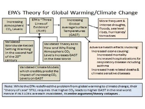
The conclusion of the work is that each of EPA’s “lines of evidence” has been invalidated by the best empirical evidence, and therefore the attribution of any observed climate change, including global warming, to rising atmospheric CO2 concentrations has not been established.
And, further on in our presentation:
[T]hese natural factor impacts fully explain the trends in all relevant temperature data sets over the last 50 or more years. This research, like Wallace (2016), found that rising atmospheric concentrations did not have a statistically significant impact on any of the (14) temperature data sets that were analyzed. Wallace 2017 concludes that, “at this point, there is no statistically valid proof that past increases in atmospheric CO2 concentrations have caused what have been officially reported as rising, or even record setting, temperatures.”
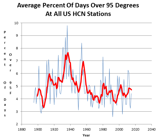
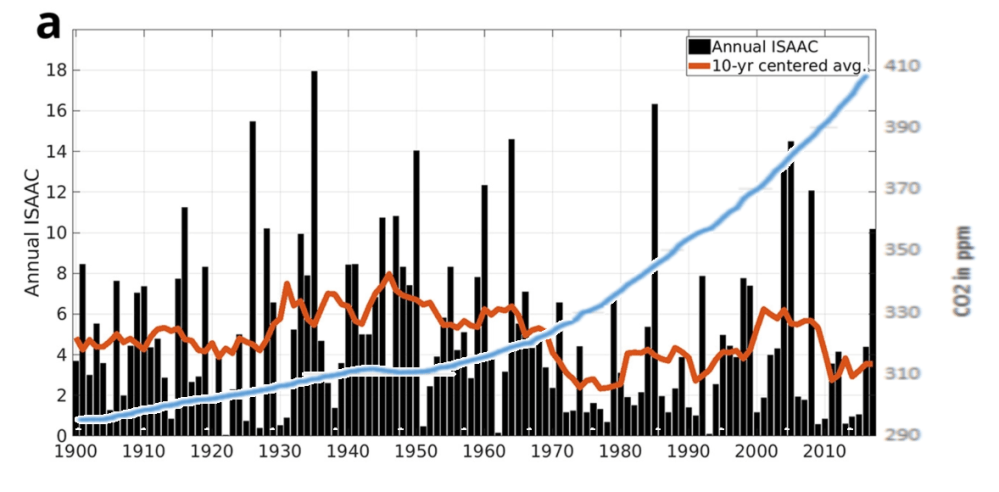
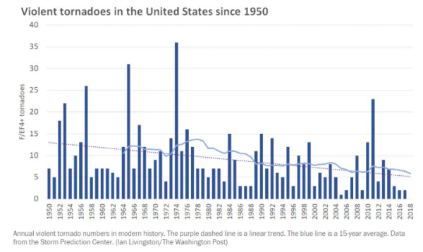
The post The Climate Story (Illustrated) provides a set of graphics making the same argument: The temperature record does not support climate alarm.
Independently the prestigious Société de Calcul Mathématique (Society for Mathematical Calculation) has written a detailed 195-page White Paper that presents a blistering point-by-point critique of the key dogmas of global warming, starting with the temperature record. See Bonn COP23 Briefing for Realists
Thanks to an article at Wired, we get a first glimpse into what transpired at the March 21 courtroom tutorial called by Federal District court Judge Alsup. From a science perspective, it looks at the moment like a missed opportunity. The oil company lawyers sat in silence, allowing Chevron’s lead attorney to speak for them, and he mainly quoted from IPCC documents. The calculation seems to be taking a position that we didn’t know more and not any sooner than the IPCC came to conclusions in their series of assessment reports. The plaintiffs let alarmist scientists present on their behalf, and can now claim their opinions were not refuted.
Outside the usual procedural kabuki of the courtroom, the truth is no one really knew what to expect from this court-ordered “tutorial.” For a culture based in large measure on precedent, putting counsel and experts in a room to hash out climate change for a trial—putting everyone on the record, in federal court, on what is and is not true about climate science—was literally unprecedented.
What Alsup got might not have been a full on PowerPoint-powered preview of the trial. But it did reveal a lot about the styles and conflicts inherent in the people who produce the carbon and the people who study it.
The other petrochemists put forth Theodore Boutrous, an AC-130 gunship of a lawyer who among other things got the US Supreme Court to overturn the California law against same-sex marriage. Here, retained specifically by Chevron, Boutrous argued what seemed to be climate change’s chapter-and-verse. He extolled the virtues of the several IPCC reports, 2013 most recently, and quoted them liberally. Boutrous talked about how the reports’ conclusions have gotten more and more surefooted about “anthropogenic” causes of climate change—it’s people!—and outcomes like sea level rise. “From Chevron’s perspective, there’s no debate about climate science,” Boutrous said. “Chevron accepts what this scientific body—scientists and others—what the IPCC has reached consensus on.”
Still, over the course of the morning, Boutrous nevertheless tried to neg the IPCC in two specific ways. One was a classic: He challenged the models that climate scientists use to attempt to predict the future. These computer models, Boutrous said, are “increasingly complex. That can make the modeling more powerful.” But with great power comes great potential wrongness. “Because it’s an attempt to represent things in the real world, the complexity can bring more risk.” He assured the court that Chevron agreed with the IPCC approach—posting up a slide pulled from an IPCC report that showed the multicolored paths of literally hundreds of models, using different emissions scenarios and essentially describing the best case and worst case (and a bunch of in-between cases). It looked like a blast of fireworks emerging from observed average temperature, headed chaotically up and to the right.
So here comes the crux of the thing—a question not of whether climate change is real, but whether you can ascribe blame for it. Leaning heavily on more IPCC quotes, Boutrous showed slides and statistics saying that climate change is a global problem that doesn’t differentially affect the West Coast of North America and isn’t caused by any one emitter. Or even any one source of emissions. Anthropogenic emissions are driven by things like population size, economic activities, lifestyle, energy use, land use patterns, and technology and climate policy, according to the IPCC. “The IPCC does not say it’s the extraction and production of oil,” Boutrous said. “It’s economic activity that creates the demand for energy and that leads to emissions.”
If that seems a little bit like the “guns don’t kill people; people kill people” of petrochemical capitalism, well, Judge Alsup did start the morning by saying today was a day for science, not politics.
So what knives did the representatives of the state of California bring to this oil-fight? Here’s where style is interesting. California didn’t front lawyers. For the science tutorial, the municipalities fronted scientists—people who’d been first authors on chapters in the IPCC reports from which Boutrous quoted, and one who’d written a more recent US report and a study of sea level rise in California. They knew their stuff and could answer all of Judge Alsup’s questions … but their presentations were more like science conference fodder than well-designed rhetoric.
For example, Myles Allen, leader of the Climate Research Program at the University of Oxford, gave a detailed, densely-illustrated talk on the history and science of climate change…but he also ended up in an extended back and forth with Alsup about whether Svante Arrhenius’ 1896 paper hypothesizing that carbon dioxide in Earth’s atmosphere warmed the planet explicitly used the world “logarithmic.” Donald Wuebbles, an atmospheric scientist at the University of Illinois and co-author of the Nobel Prize-winning 2007 IPCC report, mounted a grim litany of all the effects scientists can see, today, of climate, but Alsup caught him up asking for specific things he disagreed with Boutrous on—a tough game since Boutrous was just quoting the IPCC.
Then Alsup and Wuebbles took a detour into naming other renewable power sources besides solar and wind. “Nuclear would not put out any CO2, right? We might get some radiation as we drive by, but maybe in retrospect we should have taken a hard look at nuclear?” Alsup interrupted. “No doubt solar is good where you can use it, but do you really think it could be a substitute for supplying the amount of power America used in the last 30 years?”
“I think solar could be a significant factor of our energy future,” Wuebbles said. “I don’t think there’s any one silver bullet.”
In part, one might be tempted to put some blame on Alsup here. You might remember him from such trials as Uber v. Waymo, where he asked for a similar tutorial on self-driving car technology. Or from Oracle v. Google, a trial for which Alsup taught himself a little of the programming language Java so he’d understand the case better. Or from his intercession against the Trump administration’s attempt to cancel the Deferred Action for Childhood Arrivals program, protecting the immigration status of so-called Dreamers. “He’s kind of quirky and not reluctant to do things kind of outside the box,” said Deborah Sivas, Director of the Environmental and Natural Resource Law & Policy Program at Stanford Law School. “And I think he sees this as a precedent-setting case, as do the lawyers.”
It’s possible, then, to infer that Alsup was doing more than just getting up to speed on climate change on Wednesday. The physics and chemistry are quite literally textbook, and throughout the presentations he often seemed to know more than he was letting on.He challenged chart after chart incisively, and often cut in on history. When Allen brought up Roger Revelle’s work showing that oceans couldn’t absorb carbon—at least, not fast enough to stave off climate change, Alsup interrupted.
“Is it true that Revelle initially thought the ocean would absorb all the excess, and that he came to this buffer theory a little later?” Alsup asked.
“You may know more of this history than I do,” Allen said.
But on the other hand, some of what the litigators seemed to not know sent the scientists in the back in literal spasms. When Boutrous couldn’t answer Alsup’s questions about the specific causes of early 20th-century warming (presumably before the big industrial buildup of the 1950s), Allen and Wuebbles, sitting just outside the gallery, clenched fists and looked like they were having to keep from shouting out the answer. Later, Alsup acknowledged that he’d watched An Inconvenient Truth to prepare, and Boutrous said he had, too.
All of which makes it hard to tell whether bringing scientists to this table was the right move. And maybe that has been the problem all along. The interface where utterly flexible law and policy moves against the more rigid statistical uncertainties of scientific observation has always been contested space. The practitioners of both arts seem foreign to each other; the cultural mores differ.
Maybe that’s what this “tutorial” was meant for. As Sivas says, the facts aren’t really in doubt here. Or rather, most of them aren’t, and maybe Alsup will use today as a kind of discovery process, a way to crystalize the difference between uncertainty in science and uncertainty under the law. “That’s what judges do. They decide the credibility of one expert over another,” Sivas says. “That doesn’t mean it’s scientific truth. It means it’s true as a legal claim.”
The skeptical scientific brief was filed by esteemed scientists Happer, Koonin and Lindzen, but its effect is not yet evident. More details are at Cal Climate Tutorial: The Meat
Prevous posts provided the context regarding the Climate Tutorial requested by Judge Alsup in the lawsuit case filed by California cities against big oil companies: Cal Court to Hear Climate Tutorial
This post goes into the meat and potatoes of that submission with excerpts from Section II: Answers to specific questions (my bolds)
Question 1: What caused the various ice ages (including the “little ice age” and prolonged cool periods) and what caused the ice to melt? When they melted, by how much did sea level rise?
The discussion of the major ice ages of the past 700 thousand years is distinct from the discussion of the “little ice age.” The former refers to the growth of massive ice sheets (a mile or two thick) where periods of immense ice growth occurred, lasting approximately eighty thousand years, followed by warm interglacials lasting on the order of twenty thousand years. By contrast, the “little ice age” was a relatively brief period (about four hundred years) of relatively cool temperatures accompanied by the growth of alpine glaciers over much of the earth.
The last glacial episode ended somewhat irregularly. Ice coverage reached its maximum extent about eighteen thousand years ago. Melting occurred between about twenty thousand years ago and thirteen thousand years ago, and then there was a strong cooling (Younger Dryas) which ended about 11,700 years ago. Between twenty thousand years ago and six thousand years ago, there was a dramatic increase in sea level of about 120 meters followed by more gradual increase over the following several thousand years. Since the end of the “little ice age,” there has been steady increase in sea-level of about 6 inches per century.
As to the cause of the “little ice age,” this is still a matter of uncertainty. There was a long hiatus in solar activity that may have played a role, but on these relatively short time scales one can’t exclude natural internal variability. It must be emphasized that the surface of the earth is never in equilibrium with net incident solar radiation because the oceans are always carrying heat to and from the surface, and the motion systems responsible have time scales ranging from years (for example ENSO) to millennia.
The claim that orbital variability requires a boost from CO2 to drive ice ages comes from the implausible notion that what matters is the orbital variations in the global average insolation (which are, in fact, quite small) rather than the large forcing represented by the Milankovitch parameter. This situation is very different than in the recent and more modest shorter-term warming, where natural variability makes the role of CO2 much more difficult to determine.
Question 2: What is the molecular difference by which CO2 absorbs infrared radiation but oxygen and nitrogen do not?
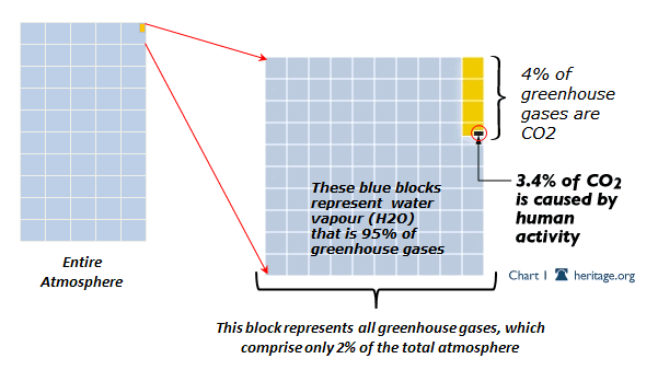
Molecules like CO2, H2O, CO or NO are called a greenhouse-gas molecules, because they can efficiently absorb or emit infrared radiation, but they are nearly transparent to sunlight. Molecules like O2 and N2 are also nearly transparent to sunlight, but since they do not absorb or emit thermal infrared radiation very well, they are not greenhouse gases. The most important greenhouse gas, by far, is water vapor. Water molecules, H2O, are permanently bent and have large electric dipole moments.
Question 3: What is mechanism by which infrared radiation trapped by CO2 in the atmosphere is turned into heat and finds its way back to sea level?
Unscattered infrared radiation is very good at transmitting energy because it moves at the speed of light. But the energy per unit volume stored by the thermal radiation in the Earth’s atmosphere is completely negligible compared to the internal energy of the air molecules.
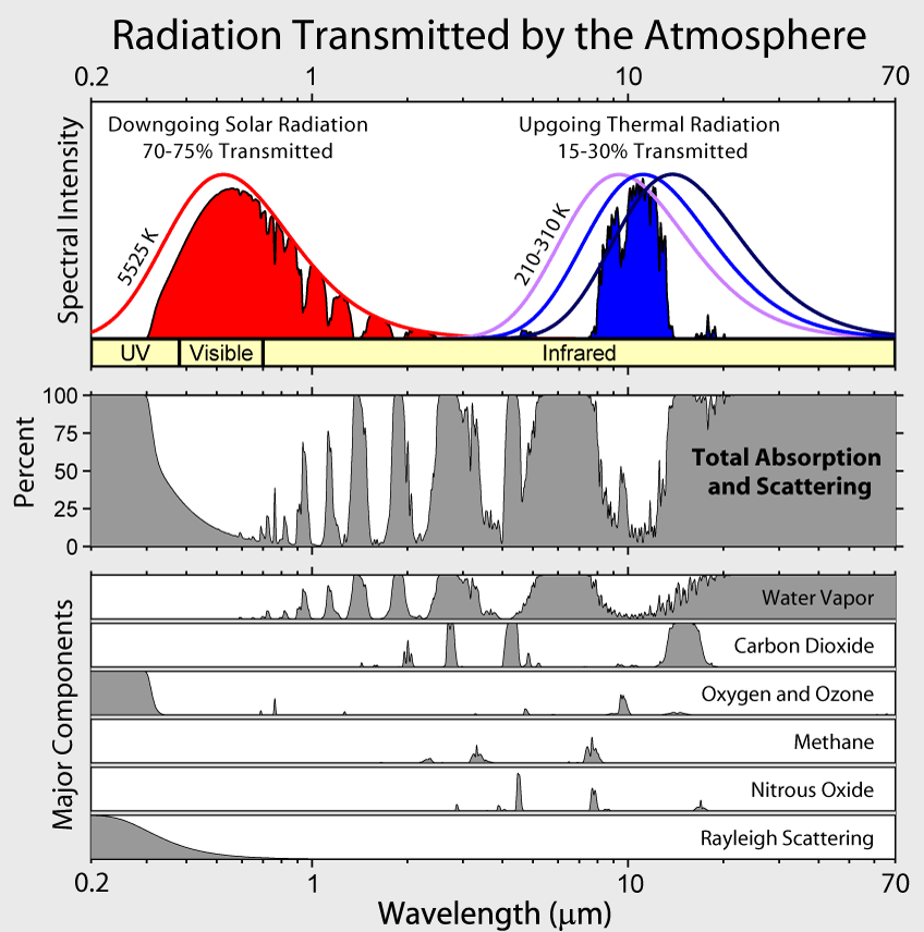
Although CO2 molecules radiate very slowly, there are so many CO2 molecules that they produce lots of radiation, and some of this radiation reaches sea level. The figure following shows downwelling radiation measured at the island of Nauru in the Tropical Western Pacific Ocean, and at colder Point Barrow, Alaska, on the shore of the Arctic Ocean.
So the answer to the last part of the question, “What is the mechanism by which … heat … finds its way back to sea level?” is that the heat is radiated to the ground by molecules at various altitudes, where there is usually a range of different temperatures. The emission altitude is the height from which radiation could reach the surface without much absorption, say 50% absorption. For strongly absorbed frequencies, the radiation reaching the ground comes from low-altitude molecules, only a few meters above ground level for the 667 cm-1 frequency at the center of the CO2 band. More weakly absorbed frequencies are radiated from higher altitudes where the temperature is usually colder than that of the surface. But occasionally, as the data from Point Barrow show, higher-altitude air can be warmer than the surface.
Closely related to Question 3 is how heat from the absorption of sunlight by the surface gets back to space to avoid a steadily increasing surface temperature. As one might surmise from the figure, at Narau there is so much absorption from CO2 and by water vapor, H2O, that most daytime heat transfer near the surface is by convection, not by radiation.Especially important is moist convection, where the water vapor in rising moist air releases its latent heat to form clouds. The clouds have a major effect on radiative heat transfer. Cooled, drier, subsiding air completes the convection circuit. Minor changes of convection and cloudiness can have a bigger effect on the surface temperature than large changes in CO2 concentrations.
Question 4: Does CO2 in the atmosphere reflect any sunlight back into space, such that the reflected sunlight never penetrates the atmosphere in the first place?
The short answer to this question is “No”, but it raises some interesting issues that we discuss below.
Molecules can either scatter or absorb radiation. CO2 molecules are good absorbers of thermal infrared radiation, but they scatter almost none. Infrared radiant energy absorbed by a CO2 molecule is converted to internal vibrational and rotational energy. This internal energy is quickly lost in collisions with the N2 and O2 molecules that make up most of the atmosphere. The collision rates, billions per second, are much too fast to allow the CO2 molecules to reradiate the absorbed energy, which takes about a second. CO2 molecules in the atmosphere do emit thermal infrared radiation continuously, but the energy is almost always provided by collisions with N2 and O2 molecules, not by previously absorbed radiation. The molecules “glow in the dark” with thermal infrared radiation.
The figure shows that water vapor is by far the most important absorber. It can absorb both thermal infrared radiation from the Earth and shorter-wave radiation from the Sun. Water vapor and its condensates, clouds of liquid or solid water (ice), dominate radiative heat transfer in the Earth’s atmosphere; CO2 is of secondary importance.
If Question 4 were “Do clouds in the atmosphere reflect any sunlight back into space, such that the reflected sunlight never penetrates the atmosphere in the first place?” the answer would be “Yes”. It is common knowledge that low clouds on a sunny day shade and cool the surface of the Earth by scattering the sunlight back to space before it can be absorbed and converted to heat at the surface.
The figure shows that very little thermal radiation from the surface can reach the top of the atmosphere without absorption, even if there are no clouds. But some of the surface radiation is replaced by molecular radiation emitted by greenhouse molecules or cloud tops at sufficiently high altitudes that the there are no longer enough higher-altitude greenhouse molecules or clouds to appreciably attenuate the radiation before it escapes to space. Since the replacement radiation comes from colder, higher altitudes, it is less intense and does not reject as much heat to space as the warmer surface could have without greenhousegas absorption.
As implied by the figure, sunlight contains some thermal infrared energy that can be absorbed by CO2. But only about 5% of sunlight has wavelengths longer than 3 micrometers where the strongest absorption bands of CO2 are located. The Sun is so hot, that most of its radiation is at visible and near-visible wavelengths, where CO2 has no absorption bands.
Question 5: Apart from CO2, what happens to the collective heat from tail pipe exhausts, engine radiators, and all other heat from combustion of fossil fuels? How, if at all, does this collective heat contribute to warming of the atmosphere?
After that energy is used for heat, mobility, and electricity, the Second Law of Thermodynamics guarantees that virtually all of it ends up as heat in the climate system, ultimately to be radiated into space along with the earth’s natural IR emissions. [A very small fraction winds up as visible light that escapes directly to space through the transparent atmosphere, but even that ultimately winds up as heat somewhere “out there.”]
How much does this anthropogenic heat affect the climate? There are local effects where energy use is concentrated, for example in cities and near power plants. But globally, the effects are very small. To see that, convert the global annual energy consumption of 13.3 Gtoe (Gigatons of oil equivalent) to 5.6 × 10^20 joules. Dividing that by the 3.2 × 10^7 seconds in a year gives a global power consumption of 1.75 × 10^13 Watts. Spreading that over the earth’s surface area of 5.1 × 10^14 m2 results in an anthropogenic heat flux of 0.03 W/m2 . This is some four orders of magnitude smaller than the natural heat fluxes of the climate system, and some two orders of magnitude smaller than the anthropogenic radiative forcing.
Question 6: In grade school many of us were taught that humans exhale CO2 but plants absorb CO2 and return oxygen to the air (keeping the carbon fiber). Is this still valid? If so why hasn’t plant life turned the higher levels of CO2 back into oxygen? Given the increase in population on earth (four billion), is human respiration a contributing factor to the buildup of CO2?
If all of the CO2 produced by current combustion of fossil fuels remained in the atmosphere, the level would increase by about 4 ppm per year, substantially more than the observed rate of around 2.5 ppm per year, as seen in the figure above. Some of the anthropogenic CO2 emissions are being sequestered on land or in the oceans.
There is evidence that primary photosynthetic productivity has increased somewhat over the past half century, perhaps due to more CO2 in the atmosphere. For example, the summerwinter swings like those in the figure above are increasing in amplitude. Other evidence for modestly increasing primary productivity includes the pronounced “greening” of the Earth that has been observe by satellites. An example is the map above, which shows a general increase in vegetation cover over the past three decades.
The primary productivity estimate mentioned above would also correspond to an increase of the oxygen fraction of the air by 50 ppm, but since the oxygen fraction of the air is very high (209,500 ppm), the relative increase would be small and hard to detect. Also much of the oxygen is used up by respiration.
The average human exhales about 1 kg of CO2 per day, so the 7 billion humans that populate the Earth today exhale about 2.5 x 10^9 tons of CO2 per year, a little less than 1% of that is needed to support the primary productivity of photosynthesis and only about 6% of the CO2 “pollution” resulting from the burning of fossil fuels. However, unlike fossil fuel emissions, these human (or more generally, biological) emissions do not accumulate in the atmosphere, since the carbon in food ultimately comes from the atmosphere in the first place.
Question 7: What are the main sources of CO2 that account for the incremental buildup of CO2 in the atmosphere?
The CO2 in the atmosphere is but one reservoir within the global carbon cycle, whose stocks and flows are illustrated by Figure 6.1 from IPCC AR5 WG1:
There is a nearly-balanced annual exchange of some 200 PgC between the atmosphere and the earth’s surface (~80 Pg land and ~120 Pg ocean); the atmospheric stock of 829 Pg therefore “turns over” in about four years.
Human activities currently add 8.9 PgC each year to these closely coupled reservoirs (7.8 from fossil fuels and cement production, 1.1 from land use changes such as deforestation). About half of that is absorbed into the surface, while the balance (airborne fraction) accumulates in the atmosphere because of its multicentury lifetime there. Other reservoirs such as the intermediate and deep ocean are less closely coupled to the surface-atmosphere system.
Much of the natural emission of CO2 stems from the decay of organic matter on land, a process that depends strongly on temperature and moisture. And much CO2 is absorbed and released from the oceans, which are estimated to contain about 50 times as much CO2 as the atmosphere. In the oceans CO2 is stored mostly as bicarbonate (HCO3 – ) and carbonate (CO3 – – ) ions. Without the dissolved CO2, the mildly alkaline ocean with a pH of about 8 would be very alkaline with a pH of about 11.3 (like deadly household ammonia) because of the strong natural alkalinity.
Only once in the geological past, the Permian period about 300 million years ago, have atmospheric CO2 levels been as low as now. Life flourished abundantly during the geological past when CO2 levels were five or ten times higher than those today.
Question 8: What are the main sources of heat that account for the incremental rise in temperature on earth?
The only important primary heat source for the Earth’s surface is the Sun. But the heat can be stored in the oceans for long periods of time, even centuries. Variable ocean currents can release more or less of this stored heat episodically, leading to episodic rises (and falls) of the Earth’s surface temperature.
Incremental changes of the surface temperature anomaly can be traced back to two causes: (1) changes in the surface heating rate; (2) changes in the resistance of heat flow to space. Quasi periodic El Nino episodes are examples of the former. During an El Nino year, easterly trade winds weaken and very warm deep water, normally blown toward the coasts of Indonesia and Australia, floats to the surface and spreads eastward to replace previously cool surface waters off of South America. The average temperature anomaly can increase by 1 C or more because of the increased release of heat from the ocean. The heat source for the El Nino is solar energy that has accumulated beneath the ocean surface for several years before being released.
On average, the absorption rate of solar radiation by the Earth’s surface and atmosphere is equal to emission rate of thermal infrared radiation to space. Much of the radiation to space does not come from the surface but from greenhouse gases and clouds in the lower atmosphere, where the temperature is usually colder than the surface temperature, as shown in the figure on the previous page. The thermal radiation originates from an “escape altitude” where there is so little absorption from the overlying atmosphere that most (say half) of the radiation can escape to space with no further absorption or scattering. Adding greenhouse gases can warm the Earth’s surface by increasing the escape altitude. To maintain the same cooling rate to space, the temperature of the entire troposphere, and the surface, would have to increase to make the effective temperature at the new escape altitude the same as at the original escape altitude. For greenhouse warming to occur, a temperature profile that cools with increasing altitude is required.
Over most of the CO2 absorption band (between about 580 cm-1 and 750 cm-1 ) the escape altitude is the nearly isothermal lower stratosphere shown in the first figure. The narrow spike of radiation at about 667 cm-1 in the center of the CO2 band escapes from an altitude of around 40 km (upper stratosphere), where it is considerably warmer than the lower stratosphere due heating by solar ultraviolet light which is absorbed by ozone, O3. Only at the edges of the CO2 band (near 580 cm-1 and 750 cm-1 ) is the escape altitude in the troposphere where it could have some effect on the surface temperature. Water vapor, H2O, has emission altitudes in the troposphere over most of its absorption bands. This is mainly because water vapor, unlike CO2, is not well mixed but mostly confined to the troposphere.
Summary
To summarize this overview, the historical and geological record suggests recent changes in the climate over the past century are within the bounds of natural variability. Human influences on the climate (largely the accumulation of CO2 from fossil fuel combustion) are a physically small (1%) effect on a complex, chaotic, multicomponent and multiscale system. Unfortunately, the data and our understanding are insufficient to usefully quantify the climate’s response to human influences. However, even as human influences have quadrupled since 1950, severe weather phenomena and sea level rise show no significant trends attributable to them. Projections of future climate and weather events rely on models demonstrably unfit for the purpose. As a result, rising levels of CO2 do not obviously pose an immediate, let alone imminent, threat to the earth’s climate.
The covering letter and the submission itself are here. Below are excerpts of introductory and overview comments.
The Court has invited a tutorial on global warming and climate change, which is set to occur March 21, 2018. The Court also identified specific questions to be addressed at the tutorial. Pursuant to Civil L.R. 7-11, Professors William Happer, Steven E. Koonin, and Richard S. Lindzen respectfully ask the Court to accept their presentation (attached to this motion as Exhibit A) in response to the Court’s questions. The professors would be honored to participate directly in the tutorial if the Court desires.
The Court’s specified questions include topics that have been the subject of the professors’ study and analysis for decades. These men have been thought and policy leaders in the scientific community and in the administrations of two different U.S. Presidents. They have extensive research experience with the specific issues the Court identified. As such, they offer a valuable perspective on these issues. The attached presentation contains three sections: (1) an overview; (2) responses to the Court’s questions; and (3) biographies of the professors.
Overview from the Submission
Our overview of climate science is framed through four statements:
1. The climate is always changing; changes like those of the past half-century are common in the geologic record, driven by powerful natural phenomena
2. Human influences on the climate are a small (1%) perturbation to natural energy flows
3. It is not possible to tell how much of the modest recent warming can be ascribed to human influences
4. There have been no detrimental changes observed in the most salient climate variables and today’s projections of future changes are highly uncertain
We offer supporting evidence for each of these statements drawn almost exclusively from the Climate Science Special Report (CSSR) issued by the US government in November, 2017 or from the Fifth Assessment Report (AR5) issued in 2013-14 by the UN’s Intergovernmental Panel on Climate Change or from the refereed primary literature.
To summarize this overview, the historical and geological record suggests recent changes in the climate over the past century are within the bounds of natural variability. Human influences on the climate (largely the accumulation of CO2 from fossil fuel combustion) are a physically small (1%) effect on a complex, chaotic, multicomponent and multiscale system. Unfortunately, the data and our understanding are insufficient to usefully quantify the climate’s response to human influences. However, even as human influences have quadrupled since 1950, severe weather phenomena and sea level rise show no significant trends attributable to them. Projections of future climate and weather events rely on models demonstrably unfit for the purpose. As a result, rising levels of CO2 do not obviously pose an immediate, let alone imminent, threat to the earth’s climate.
The submission includes detailed responses to each of the judge’s questions and are well worth reading.
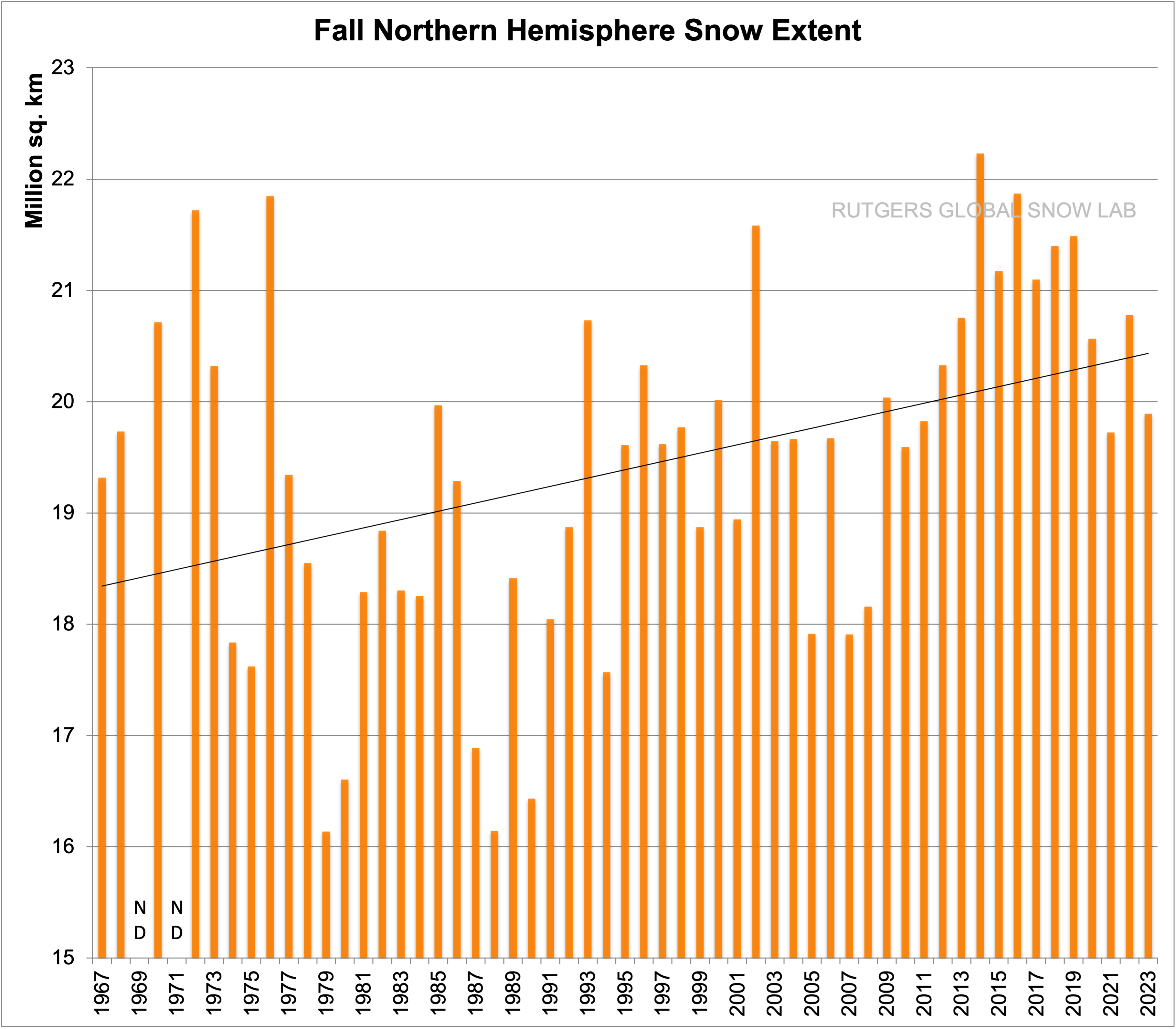
Over land the northern hemisphere Globsnow snow-water-equivalent SWE product and over sea the OSI-SAF sea-ice concentration product. Credit: Image courtesy of Finnish Meteorological Institute
Excerpts below include both factual and speculative content (with my bolds.)
The new Arctic Now product shows with one picture the extent of the area in the Northern Hemisphere currently covered by ice and snow. This kind of information, which shows the accurate state of the Arctic, becomes increasingly important due to climate change.
In the Northern Hemisphere the maximum seasonal snow cover occurs in March. “This year has been a year with an exceptionally large amount of snow, when examining the entire Northern Hemisphere. The variation from one year to another has been somewhat great, and especially in the most recent years the differences between winters have been very great,” says Kari Luojus, Senior Research Scientist at the Finnish Meteorological Institute.
The information has been gleaned from the Arctic Now service of the Finnish Meteorological Institute, which is unique even on a global scale. The greatest difference compared with other comparable services is that traditionally they only tell about the extent of the ice or snow situation.
“Here at the Finnish Meteorological Institute we have managed to combine data to form a single image. In this way we can get a better situational picture of the cryosphere — that is, the cold areas of the Northern Hemisphere,” Research Professor Jouni Pulliainen observes. In addition to the coverage, the picture includes the water value of the snow, which determines the water contained in the snow. This is important information for drafting hydrological forecasts on the flood situation and in monitoring the state of climate and environment in general.
Information on the amount of snow is also sent to the Global Cryosphere Watch service of the World Meteorological Organisation (WMP) where the information is combined with trends and statistics of past years. Lengthy series of observation times show that the total amount of snow in the Northern Hemisphere has declined in the spring period and that the melting of the snow has started earlier in the same period. Examination over a longer period (1980-2017) shows that the total amount of snow in all winter periods has decreased on average.
Also, the ice cover on the Arctic Ocean has grown thinner and the amount and expanse of perennial ice has decreased. Before 2000 the smallest expanse of sea ice varied between 6.2 and 7.9 million square kilometres. In the past ten years the expanse of ice has varied from 5.4 to 3.6 million square kilometres. Extreme weather phenomena — winters in which snowfall is sometimes quite heavy, and others with little snow, will increase in the future. (Speculation for sure.)
Here is the MASIE chart from yesterday, confirming extensive snow this year:
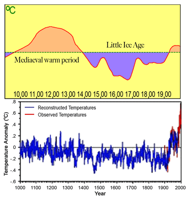
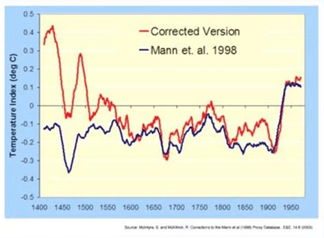
The first graph appeared in the IPCC 1990 First Assessment Report (FAR) credited to H.H.Lamb, first director of CRU-UEA. The second graph was featured in 2001 IPCC Third Assessment Report (TAR) the famous hockey stick credited to M. Mann.
A previous post Rise and Fall of CAGW described the process that began with Hansen’s flashy Senate testimony in 1988, later supported by Santer’s flashy paper in 1996. This post traces a second iteration that ensued following Michael Mann’s production of the infamous Climate Hockey Stick graph in 1998. The image at the top comes from the 2001 IPCC TAR (Third Assessment Report) signifying the immediate embrace of this alarmist tool by consensus climatists. The message of the graph was to assert a spike in modern warming unprecedented in the last 1000 years. This claim of a “Modern Warming Spike” required a flat temperature profile throughout the Middle Ages (since 1000 AD).
The background to the process steps (image below) from Ross Pomeroy’s paper is provided followed by text and references for the rise and fall of the theory intended to erase Medieval Warming comparable to the present day. Sources of material are listed at the end and included here with my bolds.
How Theories Advance and Collapse
Seeing how disarray defines psychology, it makes perfect sense that the field’s leading theories are vulnerable to collapse. Having watched this process play out a number of times, a clear pattern has emerged. Let’s call it the “Six Stages of a Failed Psychological or Sociological Theory.”
Stage 1: The Flashy Finding. An intriguing report is published with subject matter that lends itself to water cooler conversation, say, for example, that sticking a pen in your mouth to force a smile makes things seem funnier. Media outlets provide gushing coverage.
Stage 1 Modern Warming Spike Theory
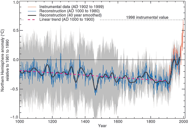
Figure 2.20: Millennial Northern Hemisphere (NH) temperature reconstruction (blue) and instrumental data (red) from AD 1000 to 1999, adapted from Mann et al. (1999). Smoother version of NH series (black), linear trend from AD 1000 to 1850 (purple-dashed) and two standard error limits (grey shaded) are shown. Source: IPCC Third Assessment Report
Since the IPCC believes that the warming from 1975 to 1998 was mainly man-made, but not the warming in earlier centuries, it would like to be able to demonstrate that recent warming is ‘unprecedented’. But it isn’t. Temperatures in many parts of the world appear to be lower than they were in the Medieval Warm Period (MWP, c. 900-1400), and also in the earlier Roman Warm Period (c. 200 BC – 600 AD). During the MWP the Vikings tilled now-frozen farms in Greenland and were buried there in ground that is now permafrost (archaeology.org). Hundreds of peer-reviewed articles show that the MWP was a global phenomenon (Idso & Singer, 2009, 69-94; wattsupwiththat.com; co2science.org), and was not confined to parts of the northern hemisphere, as the IPCC likes to assert.
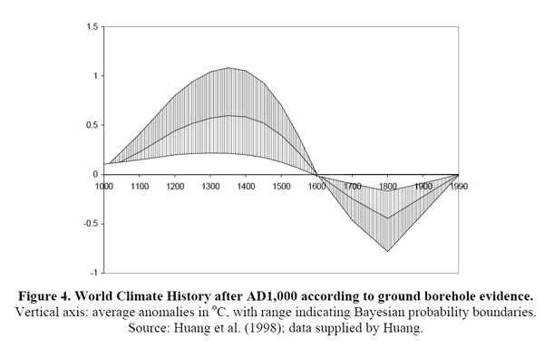
Those wanting to “get rid of” the MWP run into the problem that it shows up strongly in the data. Shortly after Deming’s article appeared, a group led by Shaopeng Huang of the University of Michigan completed a major analysis of over 6,000 borehole records from every continent around the world. Their study went back 20,000 years. The portion covering the last millennium is shown in Figure 4.
The similarity to the IPCC’s 1995 graph is obvious. The world experienced a “warm” interval in the medieval era that dwarfs 20th century changes. The present-day climate appears to be simply a recovery from the cold years of the “Little Ice Age.”
Huang and coauthors published their findings in Geophysical Research Letters 6 in 1997. The next year, Nature published the first Mann hockey stick paper, commonly called “MBH98.”7 Mann et al. followed up in 1999 with a paper in GRL (“MBH99”) extending their results from AD1400 back to AD1000.8 In early 2000 the IPCC released the first draft of the TAR. The hockey stick was the only paleoclimate reconstruction shown in the Summary, and was the only one in the whole report to be singled out for repeated presentation. The borehole data received a brief mention in Chapter 2 but the Huang et al. graph was not shown. A small graph of borehole data taken from another study and based on a smaller sample was shown, but it only showed a post-1500 segment, which, conveniently, trended upwards.
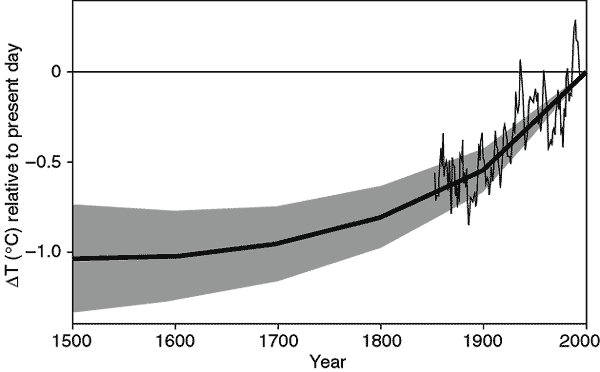
Figure 2.19: Reconstructed global ground temperature estimate from borehole data over the past five centuries, relative to present day. Shaded areas represent ± two standard errors about the mean history (Pollack et al., 1998). Superimposed is a smoothed (five-year running average) of the global surface air temperature instrumental record since 1860 (Jones and Briffa, 1992). Source: IPCC Third Assessment Report WG 1
Stage 2: The Fawning Replications. Other psychologists, usually in the early stages of their careers, leap to replicate the finding. Most of their studies corroborate the effect. Those that don’t are not published, perhaps because the researchers don’t want to step on any toes, or because journal editors would prefer not to publish negative findings.
Stage 2 Modern Warming Spike Theory
As the hockey stick began to appear in the scientific literature, it emerged that 1998 was the warmest year in Phil Jones’s 150-year record of thermometer data. The length of the hockey stick blade just grew. Those in charge of publicizing the work of climate scientists and making the case for man-made climate change were understandably excited. Controversial science swiftly morphed into a propaganda tool.
The World Meteorological Organization put the hockey stick on the cover of its 1999 report on climate change. Then IPCC chiefs decided to give it pride of place in their 2001 IPCC report. Moreover, based on the hockey stick, they stated that “it is likely that the 1990s was the warmest decade and 1998 the warmest year during the past thousand years”. That attracted attention — and trouble. The doubts expressed in that paper title about “uncertainties and limitations” were melting away.
1999 WMO statement on the Climate.
An article in the Guardian (here) describes the struggle leading to victory for the Hockey Stick.
Emails exchanged in September 1999 reveal intense disagreement about whether Mann’s hockey stick should go into the IPCC summary for policymakers – the only bit of the report that usually gets read outside the scientific community – or whether other reconstructions using tree ring data alone should get priority. One of the main tree-ring constructions was by Briffa. The emails also expose major tensions between a desire for scrupulous honesty about uncertainties, and the desire for a simple story to tell the policymakers. The IPCC’s core job is to present a “consensus” on the science, but in this critical case there was no easy consensus.
The tensions were summed up in an email sent on 22 September 1999 by Met Office scientist Chris Folland, in which he alerted key researchers that a diagram of temperature change over the past thousand years “is a clear favourite for the policy makers’ summary”
But there were two competing graphs – Mann’s hockey stick and another, by Jones, Briffa and others. Mann’s graph was clearly the more compelling image of man-made climate change. The other “dilutes the message rather significantly,” said Folland. “We want the truth. Mike [Mann] thinks it lies nearer his result.” Folland noted that “this is probably the most important issue to resolve in chapter 2 at present.”
Mann, Jones and Briffa eventually settled their differences. And the hockey stick was given pride of place in the IPCC report. Folland says: “My recollection is that the final version [of the IPCC summary], which contains the hockey stick, satisfied Keith and everyone else in the end — after the usual vigorous scientific debate.” And after the three came under attack from climate sceptics, all reference to these past spats disappeared from the emails as they faced a common foe.
Stage 3: A Consensus Forms. The finding is now taken for granted, regularly appearing in pop psychology stories and books penned by writers like Malcolm Gladwell or Jonah Lehrer. Millions of people read about it and “armchair” explain it to their friends and family.
Stage 3 Modern Warming Spike Theory
In its 2001 Third Assessment Report, the IPCC used the iconic ‘hockey stick’ graph to try and show that modern warming was indeed ‘unprecedented’. The graph was produced by Michael Mann (now at Penn State University in the US), Ray Bradley and Malcolm Hughes (MBH), and published in Nature and Geophysical Research Letters in 1998 and 1999. At that time, the standard view was that the Medieval Warm Period and subsequent Little Ice Age (c. 1400-1850) were global events. But some climatologists saw the MWP as an embarrassment and spoke of the need to ‘get rid of it’. MBH’s temperature reconstruction did exactly that: it showed 900 years of gradually declining temperatures followed by a dramatic increase in the 20th century. The hockey stick played a central role in mobilizing political and public opinion in favour of drastic action to curb greenhouse gas emissions.
Al Gore with a version of the Hockey Stick graph in the 2006 movie An Inconvenient Truth
“As soon as the IPCC Report came out, the hockey stick version of climate history became canonical. Suddenly it was the “consensus” view, and for the next few years it seemed that anyone publicly questioning the result was in for a ferocious reception.” Ross McKitrick.What is the ‘Hockey Stick’ Debate About?
Stage 4: The Rebuttal. After a few decades, a new generation of researchers look to make a splash by questioning prevailing wisdom. One team produces a more methodologically-sound study that debunks the initial finding. Media outlets blare the “counterintuitive” discovery.
Stage 4 Modern Warming Spike Theory
The hockey stick was based on historical temperature proxies (mainly tree rings), with the 20th-century instrumental temperature record tacked on the end. Incredibly, although the MBH articles were peer reviewed, nobody tried to replicate and verify the work, even though it overturned well-established views on climate history. It was only several years later that Steve McIntyre, a Canadian mathematician and retired mining consultant, began to investigate the matter.Mann did his best to obstruct him; he refused to release his computer code, saying that ‘giving them the algorithm would be giving in to the intimidation tactics that these people are engaged in’.
McIntyre, with the help of economist Ross McKitrick, went on to write several articles in 2003 and 2005, exposing the flaws in the hockey-stick reconstruction. They showed that the shape of the graph was determined mainly by suspect bristlecone/foxtail tree-ring data, and that Mann’s computer algorithm was so biased that it could produce hockey sticks even out of random noise; in short, Mann’s statistical methods ‘mined’ for hockey-stick signals in the proxy data, which were then assigned exaggerated weight in the reconstruction – thereby giving a whole new meaning to the term ‘Man(n)-made warming’!
In 2006 McIntyre & McKitrick’s criticisms were upheld by two expert committees in the US – the National Academy of Sciences (NAS) panel and a congressional panel headed by statistician Edward Wegman. Wegman pointed out that the palaeoclimate field is dominated by ‘a tightly knit group of individuals who passionately believe in their thesis’, and that ‘the work has been sufficiently politicized that they can hardly reassess their own public positions without losing credibility’.
McKitrick wrote in 2005:
Since our work has begun to appear we have enjoyed the satisfaction of knowing we are winning over the expert community, one at a time. Physicist Richard Muller of Berkeley studied our work last year and wrote an article about it:
“[The findings] hit me like a bombshell, and I suspect it is having the same effect on many others. Suddenly the hockey stick, the poster-child of the global warming community, turns out to be an artifact of poor mathematics.”
In an article in the Dutch science magazine Natuurwetenschap & Techniek, Dr. Rob van Dorland of the Dutch National Meteorological Agency commented “It is strange that the climate reconstruction of Mann passed both peer review rounds of the IPCC without anyone ever really having checked it. I think this issue will be on the agenda of the next IPCC meeting in Peking this May.”
In February 2005 the German television channel Das Erste interviewed climatologist Ulrich Cubasch, who revealed that he too had been unable to replicate the hockey stick (emphasis added):
He [Climatologist Ulrich Cubasch] discussed with his coworkers – and many of his professional colleagues – the objections, and sought to work them through… Bit by bit, it became clear also to his colleagues: the two Canadians were right. …Between 1400 and 1600, the temperature shift was considerably higher than, for example, in the previous century. With that, the core conclusion, and that also of the IPCC 2001 Report, was completely undermined.
Recently Steve MacIntyre and I received an email from Dr. Hendrik Tennekes, retired director of the Royal Meteorological Institute of the Netherlands. He wrote to convey comments he wished to be communicated publicly: “The IPCC review process is fatally flawed. The behavior of Michael Mann is a disgrace to the profession.”
The original MBH graph compared to a corrected version produced by MacIntyre and McKitrick after undoing Mann’s errors.
Stage 5: Proper Replications Pour In. Research groups attempt to replicate the initial research with the skepticism and precise methodology that should’ve been used in the first place. As such, the vast majority fail to find any effect.
Stage 5 Modern Warming Spike Theory
The IPCC dealt with the devastating rebuttal by hiding the hockey stick within a spaghetti graph of various paleo proxies to diffuse the issue, while still claiming unprecedented modern warming.
In the IPCC’s 2007 Fourth Assessment Report, the hockey stick was included in a ‘spaghetti diagram’ alongside six other temperature reconstructions, which showed greater variability in the past but still no pronounced MWP. These ‘independent’ studies are the work of Mann’s colleagues and make use of the same flawed proxies as well as dubious statistical techniques (Montford, 2010, 266-308). The data were carefully cherry-picked to exclude tree-ring series that showed a prominent MWP (climateaudit.files.wordpress.com). Palaeoclimatologist Rosanne D’Arrigo actually told the NAS panel that cherry-picking was necessary if you wanted to make cherry pie (i.e. hockey sticks). And Jan Esper has stated: ‘The ability to pick and choose which samples to use is an advantage unique to dendroclimatology’ – a statement that would make any reputable scientist shudder (Montford, 236, 288-9).
Sixteen of the articles cited in AR4 failed to meet the IPCC’s own publication deadlines for cited references; all of them were written by IPCC contributing authors in support of the AGW cause. The most notable case is a paper by Eugene Wahl and Caspar Ammann. The authors of chapter 6 desperately needed this paper to counter McIntyre & McKitrick’s criticisms of the hockey stick, as the authors claimed to have validated Mann’s results. The leaked emails show that members of the Team pressurized Climatic Change editor Stephen Schneider to ensure that the paper was processed quickly enough to meet IPCC deadlines, though this was not entirely successful. Wahl and Ammann referred to arguments in another unpublished paper they had written, which was not even submitted until well after the first paper had gone forward for IPCC review. Jones advised the authors to be dishonest: ‘try and change the Received date! Don’t give those skeptics something to amuse themselves with’ (1189722851). Both papers finally appeared in September 2007. The authors conceded that the hockey stick failed a key test for statistical significance, but claimed it passed another test and promised to provide details in their Supplementary Information. When this was finally made available a year later, it became clear that torturous statistical manipulations were required to enable the test to be passed (Montford, 2010, 201-19, 338-42, 424-6; bishophill.squarespace.com). The shenanigans involved in the Wahl & Ammann saga are quite breathtaking.
But the credibility of the hockey stick claims was attacked repeatedly:
Stage 6: The Theory Lives On as a Zombie. Despite being debunked, the theory lingers on in published scientific studies, popular books, outdated webpages, and common “wisdom.” Adherents in academia cling on in a state of denial – their egos depend upon it.
Stage 6 Modern Warming Spike Theory
There are still hardcore alarmist blogs that defend the hockey stick graph, but IPCC itself has dropped it without explicitly disowning it.
About 1000 years ago, large parts of the world experienced a prominent warm phase which in many cases reached a similar temperature level as today or even exceeded present-day warmth. While this Medieval Warm Period (MWP) has been documented in numerous case studies from around the globe, climate models still fail to reproduce this historical warm phase. The problem is openly conceded in the most recent IPCC report from 2013 (AR5, Working Group 1) where in chapter 5.3.5. the IPCC scientists admit (pdf here):
“Continental-scale surface temperature reconstructions show, with high confidence, multi-decadal periods during the Medieval Climate Anomaly (950 to 1250) that were in some regions as warm as in the mid-20th century and in others as warm as in the late 20th century.” pg.386
“The timing of warm and cold periods is mostly consistent across reconstructions (in some cases this is because they use similar proxy compilations) but the magnitude of the changes is clearly sensitive to the statistical method and to the target domain (land or land and sea; the full hemisphere or only the extra-tropics; Figure 5.7a). Even accounting for these uncertainties, almost all reconstructions agree that each 30-year (50-year) period from 1200 to 1899 was very likely colder in the NH than the 1983–2012 (1963–2012) instrumental temperature NH reconstructions covering part or all of the first millennium suggest that some earlier 50-year periods might have been as warm as the 1963–2012 mean instrumental temperature, but the higher temperature of the last 30 years appear to be at least likely the warmest 30-year period in all reconstructions (Table 5.4). However, the confidence in this finding is lower prior to 1200, because the evidence is less reliable and there are fewer independent lines of evidence. There are fewer proxy records, thus yielding less independence among the reconstructions while making them more susceptible to errors in individual proxy records. The published uncertainty ranges do not include all sources of error (Section 5.3.5.2), and some proxy records and uncertainty estimates do not fully represent variations on time scales as short as the 30 years considered in Table 5.4. Considering these caveats, there is medium confidence that the last 30 years were likely the warmest 30-year period of the last 1400 years.” Pg.410
Meanwhile a multitude of studies confirm that medieval warming was widespread and not limited to regions in the Northern Hemisphere, as Mann and others have claimed. For example the MWP Mapping Project led by Dr. Sebastian Luening, Prof. Dr. Fritz Vahrenholt (authors of ‘The neglected sun‘).
red: MWP warming
blue: MWP cooling (very rare)
yellow: MWP more arid
green: MWP more humid
grey: no trend or data ambiguous
Most of western North America and Africa were experiencing drought conditions during the MWP (except some areas in Southwest Africa). In contrast, Australia and the Carribean was more humid. Globally, 99% of all paleoclimatic temperature studies compiled in the map so far show a prominent warming during the MWP. This includes Antarctica and the Arctic.
Conclusion:
“Regarding the Hockey Stick of IPCC 2001 evidence now indicates, in my view, that an IPCC Lead Author working with a small cohort of scientists, misrepresented the temperature record of the past 1000 years by (a) promoting his own result as the best estimate, (b) neglecting studies that contradicted his, and (c) amputating another’s result so as to eliminate conflicting data and limit any serious attempt to expose the real uncertainties of these data.” – John Christy, Examining the Process concerning Climate Change Assessments, Testimony 31 March 2011
Todays temperatures are cooler than the Medieval Warming Period, which was preceded by an even warmer Roman Warm Period, which followed an even warmer Minoan Warm Period. We are in an Interglacial age about 11,500 years old, and the overall trend is cooling.
Figure 37. Holocene global temperature change reconstruction. a. Red curve, global average temperature reconstruction from Marcott et al., 2013, figure 1. The averaging method does not correct for proxy drop out which produces an artificially enhanced terminal spike, while the Monte Carlo smoothing eliminates most variability information. b. Black curve, global average temperature reconstruction from Marcott et al., 2013, using proxy published dates, and differencing average. Temperature anomaly was rescaled to match biological, glaciological, and marine sedimentary evidence, indicating the Holocene Climate Optimum was about 1.2°C warmer than LIA. c. Purple curve, Earth’s axis obliquity is shown to display a similar trend to Holocene temperatures. Source: Marcott et al., 2013.
Source:Judith Curry Nature Unbound III: Holocene climate variability (Part A)
A previous post explained how methane has been hyped in support of climate alarmism/activism. Now we have an additional campaign to disparage hydropower because of methane emissions from dam reservoirs. File this under “They have no shame.” Excerpts below with my bolds.
“The hydropower related emissions started in the Mekong in mid-1960’s when the first large reservoir was built in Thailand, and the emissions increased considerably in early 2000’s when hydropower development became more intensive. Currently the emissions are estimated to be around 15 million tonnes of CO2e per year, which is more than total emissions of all sectors in Lao PDR in year 2013,” says Dr Timo Räsänen who led the study. The GHG emissions are expected to increase when more hydropower is built. However, if construction of new reservoirs is halted, the emissions will decline slowly in time.
The study, published in BioScience, looked at the carbon dioxide (CO2), methane (CH4), and nitrous oxide (N2O) emitted from 267 reservoirs across six continents. In total, the reservoirs studied have a surface area of more than 77,287 square kilometers (29,841 square miles). That’s equivalent to about a quarter of the surface area of all reservoirs in the world, which together cover 305,723 sq km – roughly the combined size of the United Kingdom and Ireland.
“The new study confirms that reservoirs are major emitters of methane, a particularly aggressive greenhouse gas,” said Kate Horner, Executive Director of International Rivers, adding that hydropower dams “can no longer be considered a clean and green source of electricity.”
In fact, methane’s effect is 86 times greater than that of CO2 when considered on this two-decade timescale. Importantly, the study found that methane is responsible for 90% of the global warming impact of reservoir emissions over 20 years.
Alarmists are Wrong about Hydropower
Now CH4 is proclaimed the primary culprit held against hydropower. As usual, there is a kernel of truth buried beneath this obsessive campaign: Flooding of biomass does result in decomposition accompanied by some release of CH4 and CO2. From HydroQuebec: Greenhouse gas emissions and reservoirs
Impoundment of hydroelectric reservoirs induces decomposition of a small fraction of the flooded biomass (forests, peatlands and other soil types) and an increase in the aquatic wildlife and vegetation in the reservoir.
The result is higher greenhouse gas (GHG) emissions after impoundment, mainly CO2 (carbon dioxide) and a small amount of CH4 (methane).
However, these emissions are temporary and peak two to four years after the reservoir is filled.
During the ensuing decade, CO2 emissions gradually diminish and return to the levels given off by neighboring lakes and rivers.
Hydropower generation, on average, emits 50 times less GHGs than a natural gas generating station and about 70 times less than a coal-fired generating station.
The Facts about Tropical Reservoirs
Activists estimate Methane emissions from dams and reservoirs across the planet, including hydropower, are estimated to be significantly larger than previously thought, approximately equal to 1 gigaton per year.
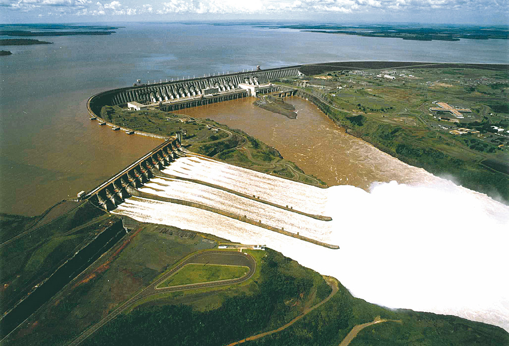
Activists also claim that dams in boreal regions like Quebec are not the problem, but tropical reservoirs are a big threat to the climate. Contradicting that is an intensive study of Brazilian dams and reservoirs, Greenhouse Gas Emissions from Reservoirs: Studying the Issue in Brazil
The Itaipu Dam is a hydroelectric dam on the Paraná River located on the border between Brazil and Paraguay. The name “Itaipu” was taken from an isle that existed near the construction site. In the Guarani language, Itaipu means “the sound of a stone”. The American composer Philip Glass has also written a symphonic cantata named Itaipu, in honour of the structure.
Five Conclusions from Studying Brazilian Reservoirs
1) The budget approach is essential for a proper grasp of the processes going on in reservoirs. This approach involves taking into account the ways in which the system exchanged GHGs with the atmosphere before the reservoir was flooded. Older studies measured only the emissions of GHG from the reservoir surface or, more recently, from downstream de-gassing. But without the measurement of the inputs of carbon to the system, no conclusions can be drawn from surface measurements alone.
2) When you consider the total budgets, most reservoirs acted as sinks of carbon in the short run (our measurements covered one year in each reservoir). In other words, they received more carbon than they exported to the atmosphere and to downstream.
3) Smaller reservoirs are more efficient as carbon traps than the larger ones.
4) As for the GHG impact, in order to determine it, we should add the methane (CH4) emissions to the fraction of carbon dioxide (CO2) emissions which comes from the flooded biomass and organic carbon in the flooded (terrestrial) soil. The other CO2 emissions, arising from the respiration of aquatic organisms or from the decomposition of terrestrial detritus that flows into the reservoir (including domestic sewage), are not impacts of the reservoir. From this sum, we should deduct the amount of carbon that is stored in the sediment and which will be kept there for at least the life of the reservoir (usually more than 80 years). This “stored carbon” ranges from as little as 2 percent of the total carbon output to more than 25 percent, depending on the reservoirs.
5) When we assess the GHG impacts following the guidelines just described, all of FURNAS’s reservoirs have lower emissions than the cleanest European oil plant. The worst case – Manso, which was sampled only three years after the impoundment, and therefore in a time in which the contribution from the flooded biomass was still very significant – emitted about half as much carbon dioxide equivalents (CO2 eq) as the average oil plant from the United States (CO2 eq is a metric measure used to compare the emissions from various greenhouse gases based upon their global warming potential, GWP. CO2 eq for a gas is derived by multiplying the tons of the gas by the associated GWP.) We also observed a very good correlation between GHG emissions and the age of the reservoirs. The reservoirs older than 30 years had negligible emissions, and some of them had a net absorption of CO2eq.
Keeping Methane in Perspective
Over the last 30 years, CH4 in the atmosphere increased from 1.6 ppm to 1.8 ppm, compared to CO2, presently at 400 ppm. So all the dam building over 3 decades, along with all other land use was part of a miniscule increase of a microscopic gas, 200 times smaller than the trace gas, CO2.
The U.S. Senate is expected to vote soon on whether to use the Congressional Review Act to kill an Obama administration climate regulation that cuts methane emissions from oil and gas wells on federal land. The rule was designed to reduce oil and gas wells’ contribution to climate change and to stop energy companies from wasting natural gas.
The Congressional Review Act is rarely invoked. It was used this month to reverse a regulation for the first time in 16 years and it’s a particularly lethal way to kill a regulation as it would take an act of Congress to approve a similar regulation. Federal agencies cannot propose similar regulations on their own.
The Claim Against Methane
Now some Republican senators are hesitant to take this step because of claims like this one in the article:
Methane is 86 times more potent as a greenhouse gas than carbon dioxide over a period of 20 years and is a significant contributor to climate change. It warms the climate much more than other greenhouse gases over a period of decades before eventually losing its potency. Atmospheric carbon dioxide remains a potent greenhouse gas for thousands of years.
Essentially the journalist is saying: As afraid as you are about CO2, you should be 86 times more afraid of methane. Which also means, if CO2 is not a warming problem, your fear of methane is 86 times zero. The thousands of years claim is also bogus, but that is beside the point of this post, which is Methane.
The document is full of sophistry and creative accounting in order to produce as scary a number as possible. Table 8.7 provides the number for CH4 potency of 86 times that of CO2. They note they were able to increase the Global Warming Potential (GWP) of CH4 by 20% over the estimate in AR4. The increase comes from adding in more indirect effects and feedbacks, as well as from increased concentration in the atmosphere.
In the details are some qualifying notes like these:
Uncertainties related to the climate–carbon feedback are large, comparable in magnitude to the strength of the feedback for a single gas.
For CH4 GWP we estimate an uncertainty of ±30% and ±40% for 20- and 100-year time horizons, respectively (for 5 to 95% uncertainty range).
Methane Facts from the Real World
From Sea Friends (here):
Methane is natural gas CH4 which burns cleanly to carbon dioxide and water. Methane is eagerly sought after as fuel for electric power plants because of its ease of transport and because it produces the least carbon dioxide for the most power. Also cars can be powered with compressed natural gas (CNG) for short distances.
In many countries CNG has been widely distributed as the main home heating fuel. As a consequence, methane has leaked to the atmosphere in large quantities, now firmly controlled. Grazing animals also produce methane in their complicated stomachs and methane escapes from rice paddies and peat bogs like the Siberian permafrost.
It is thought that methane is a very potent greenhouse gas because it absorbs some infrared wavelengths 7 times more effectively than CO2, molecule for molecule, and by weight even 20 times. As we have seen previously, this also means that within a distance of metres, its effect has saturated, and further transmission of heat occurs by convection and conduction rather than by radiation.
Note that when H20 is present in the lower troposphere, there are few photons left for CH4 to absorb:
Even if the IPCC radiative greenhouse theory were true, methane occurs only in minute quantities in air, 1.8ppm versus CO2 of 390ppm. By weight, CH4 is only 5.24Gt versus CO2 3140Gt (on this assumption). If it truly were twenty times more potent, it would amount to an equivalent of 105Gt CO2 or one thirtieth that of CO2. A doubling in methane would thus have no noticeable effect on world temperature.
However, the factor of 20 is entirely misleading because absorption is proportional to the number of molecules (=volume), so the factor of 7 (7.3) is correct and 20 is wrong. With this in mind, the perceived threat from methane becomes even less.
Further still, methane has been rising from 1.6ppm to 1.8ppm in 30 years (1980-2010), assuming that it has not stopped rising, this amounts to a doubling in 2-3 centuries. In other words, methane can never have any measurable effect on temperature, even if the IPCC radiative cooling theory were right.
Because only a small fraction in the rise of methane in air can be attributed to farm animals, it is ludicrous to worry about this aspect or to try to farm with smaller emissions of methane, or to tax it or to trade credits.
The fact that methane in air has been leveling off in the past two decades, even though we do not know why, implies that it plays absolutely no role as a greenhouse gas.
More information at THE METHANE MISCONCEPTIONS by Dr Wilson Flood (UK) here
Summary:
Natural Gas (75% methane) burns the cleanest with the least CO2 for the energy produced.
Leakage of methane is already addressed by efficiency improvements for its economic recovery, and will apparently be subject to even more regulations.
The atmosphere is a methane sink where the compound is oxidized through a series of reactions producing 1 CO2 and 2H20 after a few years.
GWP (Global Warming Potential) is CO2 equivalent heat trapping based on laboratory, not real world effects.
Any IR absorption by methane is limited by H2O absorbing in the same low energy LW bands.
There is no danger this century from natural or man-made methane emissions.
Conclusion
Senators and the public are being bamboozled by opaque scientific bafflegab. The plain truth is much different. The atmosphere is a methane sink in which CH4 is oxidized in the first few meters. The amount of CH4 available in the air is miniscule, even compared to the trace gas CO2, and it is not accelerating. Methane is the obvious choice to signal virtue on the climate issue since governmental actions will not make a bit of difference anyway, except perhaps to do some economic harm.
Figure 1 depicts EPA’s endangerment chain of reasoning.
Scientists are putting forward the case against CO2 endangerment by making submissions to inform EPA’s reconsideration of that erroneous finding some years ago. As noted previously, the Supreme Court had ruled that EPA has authority to regulate CO2, but left it to the agency to study and decide the endangerment. H/T to GWPF and WUWT for providing links to the documents submitted to EPA on this topic. This post provides a synopsis with some of the key exhibits (my bolds)
The first supplement (here) addressed the first part of the scientific case, namely that fossil fuel emissions cause warming in earth’s atmosphere. The rebuttal consists of three points:
First, Research Reports failed to find that the steadily rising atmospheric CO2 concentrations have had a statistically significant impact on any of the 14 temperature data sets that were analyzed. The tropospheric and surface temperature data measurements that were analyzed were taken by many different entities using balloons, satellites, buoys and various land based techniques.
Second, new information is submitted regarding the logically invalid use of climate models in the attribution of warming to human greenhouse gas (GHG) emissions.
Third, new information is submitted relevant to the invalidation of the “Tropical Hot Spot” and the resulting implications for the three lines of evidence, a subject that was also discussed in our original Petition.
Now we have a Fifth Supplement (here) which rebuts in detail the “lines of evidence” which claim to prove man-made global warming is causing observable changes in nature.
Claim #1: Heat Waves are increasing at an alarming rate and heat kills
Summary of Rebuttal There has been no detectable long-term increase in heat waves in the United States or elsewhere in the world. Most all-time record highs here in the U.S. happened many years ago, long before mankind was using much fossil fuel. Thirty-eight states set their all-time record highs before 1960 (23 in the 1930s!). Here in the United States, the number of 100F, 95F and 90F days per year has been steadily declining since the 1930s. The Environmental Protection Agency Heat Wave Index confirms the 1930s as the hottest decade.
Claim #2: Global warming is causing more hurricanes and stronger hurricanes
Summary of Rebuttal: There has been no detectable long-term trend in the number and intensity of hurricane activity globally. The activity does vary year to year and over multidecadal periods as ocean cycles including El Nino/La Nina,multidecadal cycles in the Pacific (PDO) and Atlantic (AMO) favor some basins over others. The trend in landfalling storms in the United States has been flat to down since the 1850s. Before the active hurricane season in the United States in 2017, there had been a lull of 4324 days (almost 12 years) in major hurricane landfalls, the longest lull since the 1860s.
[The graph above shows exhibit 2a from Truchelut and Staehling overlaid with the record of atmospheric CO2 concentrations. From NOAA combining Mauna Loa with earlier datasets.]
To determine Integrated Storm Activity Annually over the Continental U.S. (ISAAC) from 1900 through 2017, we summed this landfall ACE spatially over the entire continental U.S. and temporally over each hour of each hurricane season. We used the same methodology to calculate integrated annual landfall ACE for five additional geographic subsets of the continental U.S.
Claim #3: Global warming is causing more and stronger tornadoes
Summary of Rebuttal Tornadoes are failing to follow “global warming” predictions. Big tornadoes have seen a decline in frequency since the 1950s. The years 2012, 2013, 2014, 2015 and 2016 all saw below average to near record low tornado counts in the U.S. since records began in 1954. 2017 to date has rebounded only to the long-term mean. This lull followed a very active and deadly strong La Nina of 2010/11, which like the strong La Nina of 1973/74 produced record setting and very deadly outbreaks of tornadoes. Population growth and expansion outside urban areas have exposed more people to the tornadoes that once roamed through open fields.
Claim #4: Global warming is increasing the magnitude and frequency of droughts and floods.
Summary of Rebuttal Our use of fossil fuels to power our civilization is not causing droughts or floods. NOAA found there is no evidence that floods and droughts are increasing because of climate change. The number, extend or severity of these events does increase dramatically for a brief period of years at some locations from time to time but then conditions return to more normal. This is simply the long-established constant variation of weather resulting from a confluence of natural factors.
Claim #5: Global Warming has increased U.S. Wildfires
Summary of Rebuttal Wildfires are in the news almost every late summer and fall. The National Interagency Fire Center has recorded the number of fires and acreage affected since 1985. This data show the number of fires trending downslightly, though the acreage burned had increased before leveling off over the last 20 years. The NWS tracks the number of days where conditions are conducive to wildfires when they issue red-flag warnings. It is little changed. Claim #6: Global warming is causing snow to disappear
Summary of Rebuttal This is one claim that has been repeated for decades even as nature showed very much the opposite trend with unprecedented snows even to the big coastal cities. Every time they repeated the claim, it seems nature upped the ante more. Alarmists have eventually evolved to crediting warming with producing greater snowfall, because of increased moisture but the snow events in recent years have usually occurred in colder winters with high snow water equivalent ratios in frigid arctic air.
Claim #7: Global warming is resulting in rising sea levels as seen in both tide gauge and satellite technology.
Summary of Rebuttal This claim is demonstrably false. It really hinges on this statement: “Tide gauges and satellites agree with the model projections.” The models project a rapid acceleration of sea level rise over the next 30 to 70 years. However, while the models may project acceleration, the tide gauges clearly do not. All data from tide gauges in areas where land is not rising or sinking show instead a steady linear and unchanging sea level rate of rise from 4 up to 6 inches/century, with variations due to gravitational factors.
Figure 1. Modelled and observed sea-level changes, 1840-2010. The curve marked “Models” represents the IPCC’s combination of selected tide-gauge records and corrected satellite altimetry data. The curve marked “Observations” represents the observed eustatic sea level changes in the field up to 1960 according to Mörner (1973) and (in this paper) thereafter. After 1965, the two curves start to diverge, presenting two totally different views, separated by the area with the question mark. Which of these views is tenable?
Claim #8: Arctic, Antarctic and Greenland ice loss is accelerating due to global warming
Summary of Rebuttal Satellite and surface temperature records and sea surface temperatures show that both the East Antarctic Ice Sheet and the West Antarctic Ice Sheet are cooling, not warming and glacial ice is increasing, not melting. Satellite and surface temperature measurements of the southern polar area show no warming over the past 37 years. Growth of the Antarctic ice sheets means sea level rise is not being caused by melting of polar ice and, in fact, is slightly lowering the rate of rise. Satellite Antarctic temperature records show 0.02C/decade cooling since 1979. The Southern Ocean around Antarctica has been getting sharply colder since 2006. Antarctic sea ice is increasing, reaching all-time highs. Surface temperatures at 13 stations show the Antarctic Peninsula has been sharply cooling since 2000. Claim #9: Rising atmospheric CO2 concentrations are causing ocean acidification, which is catastrophically harming marine life
Summary of Rebuttal As the air’s CO2 content rises in response to ever-increasing anthropogenic CO2 emissions, more and more carbon dioxide is expected to dissolve into the surface waters of the world’s oceans, which dissolution is projected to cause a 0.3 to 0.7 pH unit decline in the planet’s oceanic waters by the year 2300.
The ocean chemistry aspect of the ocean acidification hypothesis is rather straightforward, but it is not as solid as it is often claimed to be. For one thing, the work of a number of respected scientists suggests that the drop in oceanic pH will not be nearly as great as the IPCC and others predict. And, as with all phenomena involving living organisms, the introduction of life into the analysis greatly complicates things. When a number of interrelated biological phenomena are considered, it becomes much more difficult, if not impossible, to draw such sweeping negative conclusions about the reaction of marine organisms to ocean acidification. Quite to the contrary, when life is considered, ocean acidification is often found to be a non-problem, or even a benefit. And in this regard, numerous scientific studies have demonstrated the robustness of multiple marine plant and animal species to ocean acidification—when they are properly performed under realistic experimental conditions.
Graph showing a typical oceanic situation. Over a 60 day period, pH fluxes are far greater than claims of global shifts toward 7 (neutral) or lower (acidity).
Claim #10: Carbon pollution is a health hazard
Summary of Rebuttal The term “carbon pollution” is a deliberate, ambiguous, disingenuous term, designed to mislead people into thinking carbon dioxide is pollution. It is used by the environmentalists to confuse the environmental impacts of CO2 emissions with the impact of the emissions of unwanted waste products of combustion. The burning of carbon-based fuels (fossil fuels – coal, oil, natural gas – and biofuels and biomass) converts the carbon in the fuels to carbon dioxide (CO2), which is an odorless invisible gas that is plant food and it is essential to life on the planet.
VOC refers to Volitile Organic Compounds, which are often components of petroleum fuels, hydraulic fluids, paint thinners, and dry cleaning agents.
The linked documents above provide more details on EPA’s “secret science”, as well as posts on this blog addressing many of these topics.
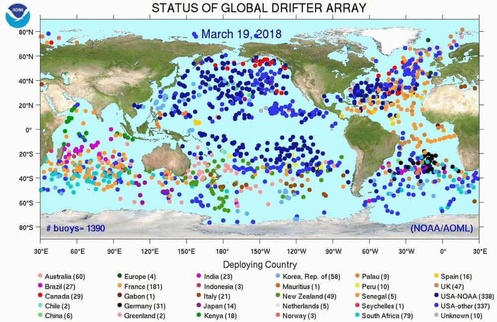
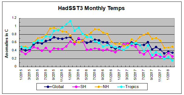 Note that higher temps in 2015 and 2016 were first of all due to a sharp rise in Tropical SST, beginning in March 2015, peaking in January 2016, and steadily declining back below its beginning level. Secondly, the Northern Hemisphere added three bumps on the shoulders of Tropical warming, with peaks in August of each year. Also, note that the global release of heat was not dramatic, due to the Southern Hemisphere offsetting the Northern one.
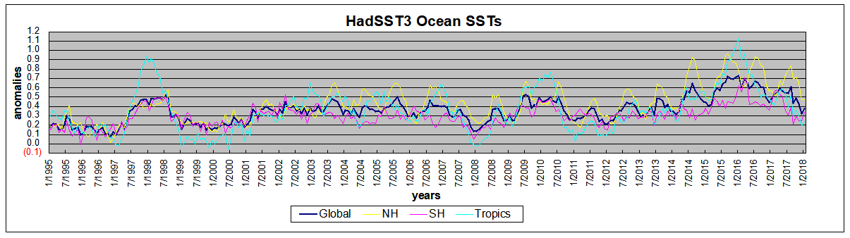
 The data is annual averages of absolute SSTs measured in the North Atlantic. The significance of the pulses for weather forecasting is discussed in AMO: Atlantic Climate Pulse
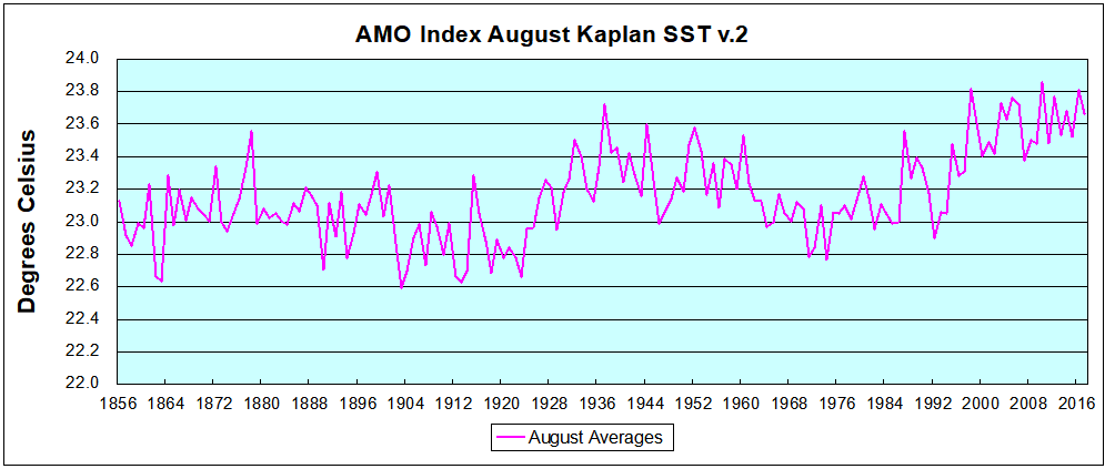 Now the regime shift appears clearly. Starting with 2003, seven times the August average has exceeded 23.6C, a level that prior to ’98 registered only once before, in 1937. And other recent years were all greater than 23.4C.