The best context for understanding decadal temperature changes comes from the world’s sea surface temperatures (SST), for several reasons:
The ocean covers 71% of the globe and drives average temperatures;
SSTs have a constant water content, (unlike air temperatures), so give a better reading of heat content variations;
A major El Nino was the dominant climate feature in recent years.
HadSST is generally regarded as the best of the global SST data sets, and so the temperature story here comes from that source, the latest version being HadSST3. More on what distinguishes HadSST3 from other SST products at the end.
The Current Context
The chart below shows SST monthly anomalies as reported in HadSST3 starting in 2015 through April 2018.
A global cooling pattern has persisted, seen clearly in the Tropics since its peak in 2016, joined by NH and SH dropping since last August. Upward bumps occurred last October, in January and again in March and April 2018. Four months of 2018 now show slight warming since the low point of December 2017, led by steadily rising NH. Only the Tropics are showing temps the lowest in this time frame, despite an anomaly rise of 0.14 in April. Globally, and in both hemispheres anomalies closely match April 2015.
Note that higher temps in 2015 and 2016 were first of all due to a sharp rise in Tropical SST, beginning in March 2015, peaking in January 2016, and steadily declining back below its beginning level. Secondly, the Northern Hemisphere added three bumps on the shoulders of Tropical warming, with peaks in August of each year. Also, note that the global release of heat was not dramatic, due to the Southern Hemisphere offsetting the Northern one.
With ocean temps positioned the same as three years ago, we can only wait and see whether the previous cycle will repeat or something different appears. As the analysis belows shows, the North Atlantic has been the wild card bringing warming this decade, and cooling will depend upon a phase shift in that region.
A longer view of SSTs
The graph below is noisy, but the density is needed to see the seasonal patterns in the oceanic fluctuations. Previous posts focused on the rise and fall of the last El Nino starting in 2015. This post adds a longer view, encompassing the significant 1998 El Nino and since. The color schemes are retained for Global, Tropics, NH and SH anomalies. Despite the longer time frame, I have kept the monthly data (rather than yearly averages) because of interesting shifts between January and July.
Open image in new tab for sharper detail.
1995 is a reasonable starting point prior to the first El Nino. The sharp Tropical rise peaking in 1998 is dominant in the record, starting Jan. ’97 to pull up SSTs uniformly before returning to the same level Jan. ’99. For the next 2 years, the Tropics stayed down, and the world’s oceans held steady around 0.2C above 1961 to 1990 average.
Then comes a steady rise over two years to a lesser peak Jan. 2003, but again uniformly pulling all oceans up around 0.4C. Something changes at this point, with more hemispheric divergence than before. Over the 4 years until Jan 2007, the Tropics go through ups and downs, NH a series of ups and SH mostly downs. As a result the Global average fluctuates around that same 0.4C, which also turns out to be the average for the entire record since 1995.
2007 stands out with a sharp drop in temperatures so that Jan.08 matches the low in Jan. ’99, but starting from a lower high. The oceans all decline as well, until temps build peaking in 2010.
Now again a different pattern appears. The Tropics cool sharply to Jan 11, then rise steadily for 4 years to Jan 15, at which point the most recent major El Nino takes off. But this time in contrast to ’97-’99, the Northern Hemisphere produces peaks every summer pulling up the Global average. In fact, these NH peaks appear every July starting in 2003, growing stronger to produce 3 massive highs in 2014, 15 and 16, with July 2017 only slightly lower. Note also that starting in 2014 SH plays a moderating role, offsetting the NH warming pulses. (Note: these are high anomalies on top of the highest absolute temps in the NH.)
What to make of all this? The patterns suggest that in addition to El Ninos in the Pacific driving the Tropic SSTs, something else is going on in the NH. The obvious culprit is the North Atlantic, since I have seen this sort of pulsing before. After reading some papers by David Dilley, I confirmed his observation of Atlantic pulses into the Arctic every 8 to 10 years as shown by this graph:
The data is annual averages of absolute SSTs measured in the North Atlantic. The significance of the pulses for weather forecasting is discussed in AMO: Atlantic Climate Pulse
But the peaks coming nearly every July in HadSST require a different picture. Let’s look at August, the hottest month in the North Atlantic from the Kaplan dataset.Now the regime shift appears clearly. Starting with 2003, seven times the August average has exceeded 23.6C, a level that prior to ’98 registered only once before, in 1937. And other recent years were all greater than 23.4C.
Summary
The oceans are driving the warming this century. SSTs took a step up with the 1998 El Nino and have stayed there with help from the North Atlantic, and more recently the Pacific northern “Blob.” The ocean surfaces are releasing a lot of energy, warming the air, but eventually will have a cooling effect. The decline after 1937 was rapid by comparison, so one wonders: How long can the oceans keep this up?
To paraphrase the wheel of fortune carnival barker: “Down and down she goes, where she stops nobody knows.” As this month shows, nature moves in cycles, not straight lines, and human forecasts and projections are tenuous at best.
Postscript:
In the most recent GWPF 2017 State of the Climate report, Dr. Humlum made this observation:
“It is instructive to consider the variation of the annual change rate of atmospheric CO2 together with the annual change rates for the global air temperature and global sea surface temperature (Figure 16). All three change rates clearly vary in concert, but with sea surface temperature rates leading the global temperature rates by a few months and atmospheric CO2 rates lagging 11–12 months behind the sea surface temperature rates.”
Footnote: Why Rely on HadSST3
HadSST3 is distinguished from other SST products because HadCRU (Hadley Climatic Research Unit) does not engage in SST interpolation, i.e. infilling estimated anomalies into grid cells lacking sufficient sampling in a given month. From reading the documentation and from queries to Met Office, this is their procedure.
HadSST3 imports data from gridcells containing ocean, excluding land cells. From past records, they have calculated daily and monthly average readings for each grid cell for the period 1961 to 1990. Those temperatures form the baseline from which anomalies are calculated.
In a given month, each gridcell with sufficient sampling is averaged for the month and then the baseline value for that cell and that month is subtracted, resulting in the monthly anomaly for that cell. All cells with monthly anomalies are averaged to produce global, hemispheric and tropical anomalies for the month, based on the cells in those locations. For example, Tropics averages include ocean grid cells lying between latitudes 20N and 20S.
Gridcells lacking sufficient sampling that month are left out of the averaging, and the uncertainty from such missing data is estimated. IMO that is more reasonable than inventing data to infill. And it seems that the Global Drifter Array displayed in the top image is providing more uniform coverage of the oceans than in the past.
USS Pearl Harbor deploys Global Drifter Buoys in Pacific Ocean
Years ago, Dr. Roger Pielke Sr. explained why sea surface temperatures (SST) were the best indicator of heat content gained or lost from earth’s climate system. Enthalpy is the thermodynamic term for total heat content in a system, and humidity differences in air parcels affect enthalpy. Measuring water temperature directly avoids distorted impressions from air measurements. In addition, ocean covers 71% of the planet surface and thus dominates surface temperature estimates.
More recently, Dr. Ole Humlum reported from his research that air temperatures lag 2-3 months behind changes in SST. He also observed that changes in CO2 atmospheric concentrations lag behind SST by 11-12 months. This latter point is addressed in a previous post Who to Blame for Rising CO2?
The April update to HadSST3 will appear later this month, but in the meantime we can look at lower troposphere temperatures (TLT) from UAHv.6 which are already posted for April. The temperature record is derived from microwave sounding units (MSU) on board satellites like the one pictured above.
The UAH dataset includes temperature results for air above the oceans, and thus should be most comparable to the SSTs. The graph below shows monthly anomalies for ocean temps since January 2015. The anomalies have reached the same levels as 2015. Taking a longer view, we can look at the record since 1995, that year being an ENSO neutral year and thus a reasonable starting point for considering the past two decades. On that basis we can see the plateau in ocean temps is persisting. Since last October all oceans have cooled, with upward bumps in Feb. 2018, now erased.
UAHv.6 TLT Monthly Ocean Anomalies
Ave. Since 1995
Ocean 4/2018
Global
0.13
0.11
NH
0.16
0.27
SH
0.11
-0.01
Tropics
0.12
-0.1
As of April 2018, global ocean temps are slightly below the average since 1995. NH remains higher, but not enough to offset much lower temps in SH and Tropics (between 20N and 20S latitudes).
The details of UAH ocean temps are provided below. The monthly data make for a noisy picture, but seasonal fluxes between January and July are important.
Click on image to enlarge.
The greater volatility of the Tropics is evident, leading the oceans through three major El Nino events during this period. Note also the flat period between 7/1999 and 7/2009. The 2010 El Nino was erased by La Nina in 2011 and 2012. Then the record shows a fairly steady rise peaking in 2016, with strong support from warmer NH anomalies, before returning to the 22-year average.
Summary
TLTs include mixing above the oceans and probably some influence from nearby more volatile land temps. They started the recent cooling later than SSTs from HadSST3, but are now showing the same pattern. It seems obvious that despite the three El Ninos, their warming has not persisted, and without them it would probably have cooled since 1995. Of course, the future has not yet been written.
The subtropical jet streams are weaker and higher in the atmosphere at 10-16 kilometers above sea level. Jet streams wander laterally in quite dramatic waves and can exhibit huge changes in altitude. Breaks in the tropopause at the Polar, Hadley and Ferrel circulation cells cause the streams to form. The combination of circulation and Coriolis forces acting on the cell masses drive the phenomenon. The Polar jet, being at a lower altitude, strongly affects weather and aviation. It is most often found between the latitudes of 30 degrees and 60 degrees, while you can find the subtropical jets at 30 degrees. A jet stream is generally a few hundred kilometers wide and only about 5 kilometers high.
The abrupt climate changes that occurred during the last glaciation and deglaciation are mind boggling both in terms of rapidity and magnitude. That winters in the British Isles could switch between mild, wet ones very similar to today and ones in which winter temperatures dropped to as much as 20◦C below freezing, and do so in years to decades, is simply astounding. No state-of-the-art climate model, of the kind used to project future climate change within the Intergovernmental Panel on Climate Change process, has ever produced a climate change like this.
The problem for dynamicists working in this area is that the period of instrumental observations, and model simulations of that period, do not provide even a hint that drastic climate reorganizations can occur. Our understanding of the general circulation is based fundamentally on this period or, more correctly, on the last 50 years of it, a time of gradual climate change or, at best, more rapid changes of modest amplitude. So it is not surprising that our encyclopedia of knowledge of the general circulations contains many ideas of negative feedbacks between circulation features that may help explain climate variability but also stabilize the climate (Bjerknes 1964; Hazeleger et al. 2005; Shaffrey and Sutton 2004). The modern period has not been propitious for studying how the climate can run away to a new state. Because of this, our understanding has to be limited
The normal explanation of how such changes occurred is that deepwater formation in the Nordic Seas abruptly ceased or resumed forcing a change in ocean heat flux convergence and changes in sea ice. However, coupled GCMs only produce such rapid cessations in response to unrealistically large freshwater forcing and have not so far produced a rapid resumption.
The discussions of the spatial extent of abrupt climate changes in glacial times and during the last deglaciation should make it clear that the causes must be found in changes in the general circulations of the global, as opposed to regional, atmosphere and ocean circulation. The idea that the THC changes and directly impacts a small area of the globe, and that somehow most of the rest of the world piggy-backs along in a rather systematic and reliable way seems dubious.
Thus the problems posed by abrupt change in the North Atlantic region are: 1. How could sea ice extend so far south in winter during the stadials? 2. How, during the spring and summer of stadials, can there be such an enormous influx of heat as to melt the ice and warm the water below by close to 10◦C? If 50 m of water needs to be warmed up by this much in four months, it would take an average net surface heat flux of 150 Wm−2, more than twice the current average between early spring and midsummer and more than can be accounted for by any increase in summer solar irradiance (as during the Younger Dryas). 3. How can this stadial state of drastic seasonality abruptly shift into one similar to that of today with a highly maritime climate in western Europe? Remember that both states can exist in the presence of large ice sheets over North America and Scandinavia.
In thinking of ways to reduce the winter convergence of heat into the mid and high-latitude North Atlantic, we might begin with the storm tracks and mean atmosphere circulation. The Atlantic storm track and jet stream have a clear southwest-to-northeast trajectory, whereas the Pacific ones are more zonal over most of their longitudinal reach (Hoskins and Valdes 1990). If the Atlantic storm track and jet could be induced to take a more zonal track, akin to its Pacific cousin, the North Atlantic would cool.
Here we have argued that the abrupt changes must involve more than changes in the North Atlantic Ocean circulation. In particular it is argued that the degree of winter cooling around the North Atlantic must be caused by a substantial change in the atmospheric circulation involving a great reduction of atmospheric heat transport into the region. Such a change could, possibly, be due to a switch to a regime of nearly zonal wind flow across the Atlantic, denying western Europe the warm advection within stationary waves that is the fundamental reason for why Europe’s winters are currently so mild. Such a change in wind regime would, presumably, also cause a change in the North Atlantic Ocean circulation as the poleward flow of warm, salty waters from the tropics into the Nordic Seas is diverted south by the change in wind stress curl. This would impact the location and strength of deep water formation and allow sea ice to expand south.
The North Atlantic Oscillation (NAO) is is a largely atmospheric mode from fluctuations in the difference of atmospheric pressure at sea level (SLP) between the Icelandic low and the Azores high. Through fluctuations in the strength of the Icelandic low and the Azores high, it controls the strength and direction of westerly winds and location of storm tracks across the North Atlantic. It is part of the Arctic oscillation, and varies over time with no particular periodicity. Wikipedia
Recent Wind Research
A decade later we have further insight into the role of winds in climate change by means of a paper discussed in this Futurity article Wind shifts may explain Europe’s ‘weird’ winters Excerpts in italics with my bolds.
In the mid-1990s, scientists assembled the first century-long record of North Atlantic sea surface temperatures and quickly discovered a cycle of heating and cooling at the surface of the ocean. Each of these phases lasted for decades, even as temperatures warmed overall during the course of the century. Since this discovery, these fluctuations in ocean temperature have been linked to all manner of Northern Hemisphere climate disturbances, from Sahel drought to North Atlantic hurricanes.
Research also linked European climate variability to the temperature swings of its neighboring ocean in the spring, summer, and fall. Surprisingly, however, no imprint of the ocean’s variability could be found in Western Europe’s wintertime temperature record. This absence was especially puzzling in light of the fact that Europe’s mild winters are a direct consequence of its enviable location downwind of the North Atlantic.
Now, a study by researchers at McGill University and the University of Rhode Island suggests the answer to this puzzle lies in the winds themselves. The fluctuations in ocean temperature are accompanied by shifts in the winds. These wind shifts mean that air arrives in Western Europe via very different pathways in decades when the surface of the North Atlantic is warm, compared to decades when it is cool.
(a) Time series of the linearly detrended North Atlantic SST (black lines, referred to as the AMO index) and SAT averaged over western Europe ([36N 60N] × [10W 3E]; shown in coloured lines) in July (top panel) and January (bottom panel). Bold lines show 10-year running means. The correlation coefficient between the 10-year running mean of the detrended SAT and AMO index is 0.61 in July (statistically significant at 10% confidence level even after accounting for the reduced effective degrees of freedom due to autocorrelation of the time series) and −0.02 in January; these correlations are insensitive to the averaging region chosen for western Europe. The red circles on January plot indicate the AMO-positive years chosen for the composite analysis, whereas the blue circles indicate the AMO-negative years chosen. (b) Study region encompassing western Europe ([36N 60N] × [10W 3E]) and locations for the backtracked Lagrangian particle release (black squares).
The researchers studied the winds and their interaction with the ocean in a recently developed reconstruction of 20th-century climate. Their main approach was to launch virtual particles into the winds, and trace their journey for ten key days leading up to their arrival in Western Europe. They repeated this procedure using the wind field for each winter of the last 72 years, a period for which the winds of the North Atlantic have already been carefully documented and validated.
The new research reveals that in decades in which North Atlantic sea surface temperatures are elevated, winds deliver air to Europe disproportionately from the north.
In contrast, in decades of coolest sea surface temperature, swifter winds extract more heat from the western and central Atlantic before arriving in Europe. The researchers suggest the distinct atmospheric pathways hide the ocean oscillation from Europe in winter.
“It is often presumed that the cooler North Atlantic will quickly lead to cooling in Europe, or at least a slowdown in its rate of warming,” says Ayako Yamamoto, a PhD student at McGill University and lead author of the study. “But our research suggests that the dynamics of the atmosphere might stop this relative cooling from showing up in Europe in winter in the decades following an Atlantic cooling.”
Figure 2: The spatial pattern of the AMO index and its relationship with the atmospheric flow in January. Composite maps of (a) sea surface temperature (SST) field and (b) 500 hPa geopotential height field (Z500) for AMO anomalously positive years (left panel) and negative years (right panel). The January mean field is shown in contours, and its departure from the 72-year climatology is represented by colour shading. The thick grey contour line in a denotes 0 °C, whereas thin (dashed) lines denote positive (negative) SST every 5 °C. The black dashed lines in b are drawn through the local maxima of the geopotential height field at each latitude, which is the point where the wind changes direction from south–westerly to north–westerly.
The large-scale atmospheric flow varies with the AMO index (Fig. 2b). The difference in the 500-hPa geopotential height (Z500) field, which is analogous to streamlines, shows that the direction of winds arriving in western Europe changes between the two AMO phases: winds are more northerly during the anomalous AMO-positive years, whereas they are more zonal during the AMO-negative years (Fig. 2b). The more tightly spaced isohypses during the AMO-negative years indicate a swifter flow relative to the AMO-positive years. Accordingly, the AMO-negative years see an elongated and more zonal January storm track (Supplementary Fig. 1), which is consistent with results from a free-running climate model7. Composite Z500 maps constructed with more complete sampling of the longer decadal periods associated with the AMO show similar, albeit weaker, anomaly patterns (Supplementary Fig. 2a).
In winter in the North Atlantic, SST is almost always warmer than the surface air temperature (SAT), so the ocean loses heat rapidly to the atmosphere over the entirety of the basin (that is, positive fluxes in our convention; Fig. 3b and Supplementary Fig. 3b). The fluxes over the warm Gulf Stream and its North Atlantic Current extension are generally a factor of five higher than found elsewhere. However, a view of the fluxes weighted by the fraction of time the particles spend in each location on their journey to western Europe (Fig. 3c and Supplementary Fig. 3c) suggests a reduced role of these strong flux regions in establishing western European wintertime temperature.
The difference in the number density of the particle positions between the composite AMO periods (Fig. 3d) shows a significant distinction in the preferred pathways, with the statistical significance increasing when results are separated by particles launched from northern and southern sub-regions of western Europe (Supplementary Fig. 3d). In the AMO-positive years, particles spend more of their 10-day trajectory recirculating locally to the southwest of Iceland. During the AMO-negative years, the pathways are anomalously long, and a greater number of trajectories originate from North America and the Arctic, before transiting over the Labrador Sea and mid-latitude North Atlantic.
The strengthening and lengthening of the storm track in sync with anomalously cooler North Atlantic SSTs has important implications for future climate. Given that decadal variability in North Atlantic SSTs may be driven partly by fluctuations in the strength of the AMOC10,11,12, our result suggests the possibility of a stabilizing feedback for ocean circulation: Cooler SSTs associated with a sluggish AMOC is linked with an atmospheric adjustment that enhances turbulent heat fluxes over oceanic convective regions in winter. These larger fluxes could possibly reinvigorate convection, deep water formation and the AMOC. Moreover, the observed link of the atmospheric circulation with the cool SST anomalies of the late 1970s to early 1990s is much like the predicted change of the storm track in response to a decline of the AMOC under global warming36. A weakened AMOC has long been thought to cause anomalous cooling in western Europe via a decline in oceanic heat transport and associated atmospheric feedbacks21. However, the changes we describe here in atmospheric Lagrangian trajectories and the heat fluxes along them could provide a mechanism that reduces the magnitude of European wintertime cooling on decadal time scales, even as they might stabilize the oceanic circulation.
The video is a recent interview with Piers Corbyn of Weather Action making the case for a cooling climate over the next twenty years. H/T to iceagenow for the link. I made a loose transcription to express the main points made by Corbyn.
The sun rules the sea temperature and the sea temperature rules the climate.
The truth is the levels of CO2 in the atmosphere are beyond the control of man. And furthermore, the levels of CO2 themselves do not have any impact on climate.
All sides agree there are 50 times more CO2 in the ocean than in the air. The level between them and the saturation level in the atmosphere will be set by the ocean. Warm up the ocean a bit and more gas will come, cool it and more gas will be absorbed. Because oceanic CO2 is 50 times larger, anything man does to atmospheric levels does not matter. If man, or nature, or insects put more CO2 into the air, it will just go into the ocean, depending on the sea temperature. The equilibrium levels will follow Henry’s law of gas solubility.
What we have happening now is the start of a mini ice age. It began starting slowly around 2013, and the move is accelerating. In the immediate you can look at this winter and spring. We have had extreme snow, record low temperatures, all over the Northern Hemisphere.
The main thing is the wild jet stream signifying onset of a mini ice age. Instead of staying in a high north zonal position associated with a warmer world, the jet stream has gotten wavy and descended into mid latitudes and lower, because of minimal solar activity.
North of the jet stream is colder air, and warmer air south of it. Under normal springtime conditions, the jet stream remains well North of the British Isles meaning warmer weather there. However presently the jet stream is both lower and extra wavy, meaning that loops bring cold arctic air over parts of NH. This behavior contradicts global warming theory, but confirms expectations of a mini ice age.
The graph compares average solar activity in the last 200 years with solar activity ten magnetic cycles previous to now. The correlation is impressive. We are at the knee of this curve, plus or minus three or four years. If the correlation holds, we are plunging into a mini ice age. So for the next two decades until about 2035 it will get cooler and cooler on average and there will more wild jet streams and weather. Growing seasons will be shorter and crop failures more frequent, resulting in economic difficulties.
The basic message is that the sun is controlling the climate, primarily by the sea. “The best thing to do now is to tell your politicians to stop believing nonsense, and to stop doing silly measures like the bird-killing machines of wind farms in order to save the planet (they say), but get rid of all those things, which cost money, and reduce electricity prices now.”
Summary
This winter and spring are inconsistent with global warming assumed to result from CO2. The wild jet stream (polar vortex) bringing these conditions does fit with solar activity fluxes. If the correlation holds, the planet will cool not warm. Governments would serve their citizens by shifting priorities from controlling emissions to ensuring robust infrastructure and reliable, affordable energy.
Amidst all the concerns for social diversity, let’s raise a cry for scientific diversity. No, I am not referring to the gender or racial identities of people doing science, but rather acknowledging the diversity of climates and their divergent patterns over time. The actual climate realities affecting people’s lives are hidden within global averages and abstractions. A previous post Concurrent Warming and Cooling presented research findings that on long time scales maritime climates can shift toward inland patterns including both colder winters and warmer summers.
It occurred to me that Frank Lansner had done studies on weather stations showing differences depending on exposure to ocean breezes or not. That led me to his recent publication Temperature trends with reduced impact of ocean air temperature Lansner and Pederson March 21, 2018. Excerpts in italics with my bolds.
Abstract
Temperature data 1900–2010 from meteorological stations across the world have been analyzed and it has been found that all land areas generally have two different valid temperature trends. Coastal stations and hill stations facing ocean winds are normally more warm-trended than the valley stations that are sheltered from dominant oceans winds.
Thus, we found that in any area with variation in the topography, we can divide the stations into the more warm trended ocean air-affected stations, and the more cold-trended ocean air-sheltered stations. We find that the distinction between ocean air-affected and ocean air-sheltered stations can be used to identify the influence of the oceans on land surface. We can then use this knowledge as a tool to better study climate variability on the land surface without the moderating effects of the ocean.
We find a lack of warming in the ocean air sheltered temperature data – with less impact of ocean temperature trends – after 1950. The lack of warming in the ocean air sheltered temperature trends after 1950 should be considered when evaluating the climatic effects of changes in the Earth’s atmospheric trace amounts of greenhouse gasses as well as variations in solar conditions.
As a contrast to the OAS stations, we compare with what we designate as ocean air affected (OAA) stations, which are more exposed to the influence of the ocean, see Figure 1. The optimal OAA locations are defined as positions with potential first contact with ocean air. In general, stations where the location offers no shelter in the directions of predominant winds are best categorized as OAA stations.
Conversely, the optimal OAS area is a lower point surrounded by mountains in all directions. In this case, the existence of predominant wind directions is not needed. Only in locations with a predominant wind direction, the leeward side of the mountains can also form an OAS region.
Figure 2. The optimal OAA and OAS locations with respect to dominating wind direction.
A total of 10 areas were chosen for this work to present the temperature trends of OAS areas (typically valley areas) and OAA areas from Scandinavia, Central Siberia, Central Balkan, Midwest USA, Central China, Pakistan/North India, the Sahel Area, Southern Africa, Central South America, and Southeast Australia. In this work, we have only considered an area as “OAS” or “OAA” if it comprises at least eight independent temperature sets. In the following, temperature data 1900–2010 from individual areas are discussed.
As an example, we show in Figure 3 the results for the Scandinavian area where we have used a total of 49 OAS stations and 18 OAA stations. The large number of stations available is due to the use of meteorological yearbooks as supplement to data sources such as ECA&D climate data and Nordklim database.
Figure 3. OAS and OAA temperature stations, Scandinavia.
The upper set of curves is from the OAS areas: Here the blue lines show one-year mean temperature averages for each temperature station, the red lines show the average of all stations of the area, and the thick black line is a five-year running mean of the station average. The reference period is 1951–1980. The middle set of curves is from the OAA areas. Here the orange lines show one-year mean temperature averages for each temperature station, the red lines show average of the stations of the area, and the thick black line is a five-year running mean of the station average. The reference period is 1951–1980.
On the lower set of curves labeled “OAS vs. OAA areas,” a comparison of the two data sets of stations is shown. The blue lines are the one-year average of OAS stations of the area and the red lines are the one-year average of OAA stations of the area. The reference period is 1995–2010. We note that these Scandinavian OAS stations are not well shielded from easterly winds.
Although easterly winds are not frequent (see Figure 2), the OAS area used cannot be characterized as an optimal OAS area. Despite this, we find a difference between the OAS and OAA area temperature data. While the general five-year running mean temperature curves (left panel in Figure 3) show resemblance in warming/cooling cycles, the OAA stations show less variation than the OAS stations.
We also find the absolute temperature anomalies for the Scandinavian OAS areas deviate from the OAA area with the OAS stations showing less warming than the OAA stations during the 20th century. For the years 1920–1950, we thus find temperatures in the OAS area to be up to 1 K warmer than temperature in the OAA area. In recent years, there is a closer agreement between OAS and OAA trends and even though the Scandinavian OAS data generally are warmer than OAA data for 1920–1950, we also note that in some very cold years, OAS temperatures are slightly colder than the OAA temperatures.
The paper presents all ten regions analyzed, but I will include here the USA example to see how it compares with other depictions of US regions. For example, see the map at the top shows the dramatic difference between temperature records in Eastern versus Western US stations. Here is the assessment from Lansner and Pederson. Note the topographical realities.
For the USA (Figure 6), we defined the OAS area as consisting of eight boxes, each of size 5° X 5°. The boxes were defined as 40–45N X 100–95 W, 40–45N X 95–90W, 35– 40N X 100–95W, 35–40N X 95–90 W, 35–40N X 90–85W, 35–30N X 100– 95W, 35–30N X 95–90W, and 35–30N X 90–85W. A total of 236 temperature stations were used from this area. Full 5 X 5 grids were not found to be suited as OAA areas, but 27 stations indicated on the map were used for the OAA data set. All data were taken from GHCN v2 raw data. The OAS area in the US Midwest is well protected against westerly oceanic (Pacific) winds due to the Rocky Mountains. The US Midwest is also to some degree sheltered against easterly winds due to the Appalachian mountain range. Again the temperature trends from the OAS area as defined above show the 1920–1955 period in most years to be around 1 K warmer than temperature trends from the OAA areas.
Summation
Figure 13. OAS and OAA temperature averages, Northern Hemisphere.
In Figure 13 we have combined average temperature trends for all seven NH OAS areas (blue curves) and OAA areas (brown curves) were areas are divided into low (0–45N) and high (45–90N) latitudes (dark colors are used for low and light colors for high latitudes). Both for the OAS areas and the OAA areas we see that the seven NH areas have similar development of temperature trends for 1900–2010. The larger variation in data from high latitudes (45–90N) is likely to reflect the Arctic amplification of temperature variations. OAS temperature stations further away from the Arctic (0–45N) seem to show less temperature increase during 1980–2010 than the OAS areas most affected by the Arctic (45– 90N). The NH OAS data all reveal a period of heating of the Earth surface 1920–1950 that the OAA data do not reflect well.
Figure 19. OAS and OAA temperatures, all regions.
Conclusion
Bromley et al. raise shifts in seasonality as a factor in climate change. Now Lansner and Pederson show differences in temperature trends due to ocean exposure, and also greater fluctuations with higher latitudes. Note that the cooling in the USA is replicated in the pattern shown worldwide in OAS regions. The key factor is the hotter temperatures prior to 1950s appearing in OAS records but not in OAA records.
Despite all the clamor about global warming (or recently global cooling since the hiatus), it all depends on where you are. Recognizing the diversity of local and regional climates is the sort of climate justice I can support.
Footnote:
I do not subscribe to Arctic “Amplification” to explain latitudinal differences. Since earth’s climate system is always working to transport energy from the equator to poles, any additional heat shows up in higher latitudes by meridional transport. Previous posts have noted how anomalies give a distorted picture since temperatures are more volatile at higher (colder) NH latitudes.
Clive Best provides this animation of recent monthly temperature anomalies which demonstrates how most variability in anomalies occur over northern continents.
Rannoch Moor and Glencoe Landscape. Scotland Images by Nigel For is a photograph I by Nigel Forster which was uploaded on May 30th, 2019.
This post highlights recent interesting findings regarding past climate change in NH, Scotland in particular. The purpose of the research was to better understand how glaciers could be retreating during the Younger Dryas Stadia (YDS), one of the coldest periods in our Holocene epoch.
The lead researcher is Gordon Bromley, and the field work was done on site of the last ice fields on the highlands of Scotland. 14C dating was used to estimate time of glacial events such as vegetation colonizing these places. Bromley explains in an article Shells found in Scotland rewrite our understanding of climate change at siliconrepublic. Excerpts in italics with my bolds.
By analysing ancient shells found in Scotland, the team’s data challenges the idea that the period was an abrupt return to an ice age climate in the North Atlantic, by showing that the last glaciers there were actually decaying rapidly during that period.
The shells were found in glacial deposits, and one in particular was dated as being the first organic matter to colonise the newly ice-free landscape, helping to provide a minimum age for the glacial advance. While all of these shell species are still in existence in the North Atlantic, many are extinct in Scotland, where ocean temperatures are too warm.
This means that although winters in Britain and Ireland were extremely cold, summers were a lot warmer than previously thought, more in line with the seasonal climates of central Europe.
“There’s a lot of geologic evidence of these former glaciers, including deposits of rubble bulldozed up by the ice, but their age has not been well established,” said Dr Gordon Bromley, lead author of the study, from NUI Galway’s School of Geography and Archaeology.
“It has largely been assumed that these glaciers existed during the cold Younger Dryas period, since other climate records give the impression that it was a cold time.”
He continued: “This finding is controversial and, if we are correct, it helps rewrite our understanding of how abrupt climate change impacts our maritime region, both in the past and potentially into the future.”
Establishing the atmospheric expression of abrupt climate change during the last glacial termination is key to understanding driving mechanisms. In this paper, we present a new 14C chronology of glacier behavior during late‐glacial time from the Scottish Highlands, located close to the overturning region of the North Atlantic Ocean. Our results indicate that the last pulse of glaciation culminated between ~12.8 and ~12.6 ka, during the earliest part of the Younger Dryas stadial and as much as a millennium earlier than several recent estimates. Comparison of our results with existing minimum‐limiting 14C data also suggests that the subsequent deglaciation of Scotland was rapid and occurred during full stadial conditions in the North Atlantic. We attribute this pattern of ice recession to enhanced summertime melting, despite severely cool winters, and propose that relatively warm summers are a fundamental characteristic of North Atlantic stadials.
Plain Language Summary
Geologic data reveal that Earth is capable of abrupt, high‐magnitude changes in both temperature and precipitation that can occur well within a human lifespan. Exactly what causes these potentially catastrophic climate‐change events, however, and their likelihood in the near future, remains frustratingly unclear due to uncertainty about how they are manifested on land and in the oceans. Our study sheds new light on the terrestrial impact of so‐called “stadial” events in the North Atlantic region, a key area in abrupt climate change. We reconstructed the behavior of Scotland’s last glaciers, which served as natural thermometers, to explore past changes in summertime temperature. Stadials have long been associated with extreme cooling of the North Atlantic and adjacent Europe and the most recent, the Younger Dryas stadial, is commonly invoked as an example of what might happen due to anthropogenic global warming. In contrast, our new glacial chronology suggests that the Younger Dryas was instead characterized by glacier retreat, which is indicative of climate warming. This finding is important because, rather than being defined by severe year‐round cooling, it indicates that abrupt climate change is instead characterized by extreme seasonality in the North Atlantic region, with cold winters yet anomalously warm summers.
Significance: As a principal component of global heat transport, the North Atlantic Ocean also is susceptible to rapid disruptions of meridional overturning circulation and thus widely invoked as a cause of abrupt climate variability in the Northern Hemisphere. We assess the impact of one such North Atlantic cold event—the Younger Dryas Stadial—on an adjacent ice mass and show that, rather than instigating a return to glacial conditions, this abrupt climate event was characterized by deglaciation. We suggest this pattern indicates summertime warming during the Younger Dryas, potentially as a function of enhanced seasonality in the North Atlantic.
Surface temperatures range from -30C to +30C
Fig. 1. Surface temperature and heat transport in the North Atlantic Ocean. The relatively mild European climate is sustained by warm sea-surface temperatures and prevailing southwesterly airflow in the North Atlantic Ocean (NAO), with this ameliorating effect being strongest in maritime regions such as Scotland. Mean annual temperature (1979 to present) at 2 m above surface (image obtained using University of Maine Climate Reanalyzer, http://www.cci-reanalyzer.org). Locations of Rannoch Moor and the GISP2 ice core are indicated.
Thus the Scottish glacial record is ideal for reconstructing late glacial variability in North Atlantic temperature (Fig. 1). The last glacier resurgence in Scotland—the “Loch Lomond Advance” (LLA)—culminated in a ∼9,500-km2 ice cap centered over Rannoch Moor (Fig. 2A) and surrounded by smaller ice fields and cirque glaciers.
Fig. 2. Extent of the LLA ice cap in Scotland and glacial geomorphology of western Rannoch Moor. (A) Maximum extent of the ∼9,500 km2 LLA ice cap and larger satellite ice masses, indicating the central location of Rannoch Moor. Nunataks are not shown. (B) Glacial-geomorphic map of western Rannoch Moor. Distinct moraine ridges mark the northward active retreat of the glacier margin (indicated by arrow) across this sector of the moor, whereas chaotic moraines near Lochan Meall a’ Phuill (LMP) mark final stagnation of ice. Core sites are shown, including those (K1–K3) of previous investigations (14, 15).
When did the LLA itself occur? We consider two possible resolutions to the paradox of deglaciation during the YDS. First, declining precipitation over Scotland due to gradually increasing North Atlantic sea-ice extent has been invoked to explain the reported shrinkage of glaciers in the latter half of the YDS (18). However, this course of events conflicts with recent data depicting rapid, widespread imposition of winter sea-ice cover at the onset of the YDS (9), rather than progressive expansion throughout the stadial.
Loch Lomond
Furthermore, considering the gradual active retreat of LLA glaciers indicated by the geomorphic record, our chronology suggests that deglaciation began considerably earlier than the mid-YDS, when precipitation reportedly began to decline (18). Finally, our cores contain lacustrine sediments deposited throughout the latter part of the YDS, indicating that the water table was not substantially different from that of today. Indeed, some reconstructions suggest enhanced YDS precipitation in Scotland (24, 25), which is inconsistent with the explanation that precipitation starvation drove deglaciation (26).
We prefer an alternative scenario in which glacier recession was driven by summertime warming and snowline rise. We suggest that amplified seasonality, driven by greatly expanded winter sea ice, resulted in a relatively continental YDS climate for western Europe, both in winter and in summer. Although sea-ice formation prevented ocean–atmosphere heat transfer during the winter months (10), summertime melting of sea ice would have imposed an extensive freshwater cap on the ocean surface (27), resulting in a buoyancy-stratified North Atlantic. In the absence of deep vertical mixing, summertime heating would be concentrated at the ocean surface, thereby increasing both North Atlantic summer sea-surface temperatures (SSTs) and downwind air temperatures. Such a scenario is analogous to modern conditions in the Sea of Okhotsk (28) and the North Pacific Ocean (29), where buoyancy stratification maintains considerable seasonal contrasts in SSTs. Indeed, Haug et al. (30) reported higher summer SSTs in the North Pacific following the onset of stratification than previously under destratified conditions, despite the growing presence of northern ice sheets and an overall reduction in annual SST. A similar pattern is evident in a new SST record from the northeastern North Atlantic, which shows higher summer temperatures during stadial periods (e.g., Heinrich stadials 1 and 2) than during interstadials on account of amplified seasonality (30).
Our interpretation of the Rannoch Moor data, involving the summer (winter) heating (cooling) effects of a shallow North Atlantic mixed layer, reconciles full stadial conditions in the North Atlantic with YDS deglaciation in Scotland. This scenario might also account for the absence of YDS-age moraines at several higher-latitude locations (12, 36–38) and for evidence of mild summer temperatures in southern Greenland (11). Crucially, our chronology challenges the traditional view of renewed glaciation in the Northern Hemisphere during the YDS, particularly in the circum-North Atlantic, and highlights our as yet incomplete understanding of abrupt climate change.
Summary
Several things are illuminated by this study. For one thing, glaciers grow or recede because of multiple factors, not just air temperature. The study noted that glaciers require precipitation (snow) in order to grow, but also melt under warmer conditions. For background on the complexities of glacier dynamics see Glaciermania
Also, paleoclimatology relies on temperature proxies who respond to changes over multicentennial scales at best. C14 brings higher resolution to the table.
Finally, it is interesting to consider climate changing with respect to seasonality. Bromley et al. observe that during Younger Dryas, Scotland shifted from a moderate maritime climate to one with more seasonal extremes like that of inland continental regions. In that light, what should we expect from cooler SSTs in the North Atlantic?
Note also that our modern warming period has been marked by the opposite pattern. Many NH temperature records show slight summer cooling along with somewhat stronger warming in winter, the net being the modest (fearful?) warming in estimates of global annual temperatures.
It seems that climate shifts are still events we see through a glass darkly.
Last night PBS aired the most impressive presentation yet of “Official” climate doctrine. I don’t say “science” because it mounts a powerful advocacy for a particular viewpoint and entertains no alternative perspectives. The broadcast is extremely well crafted with great imagery, crisp sound bite dialogue and sincere acting.
With all the invested effort, talent and expense, it is probably the strongest yet Blue Team argument for climate alarm and against fossil fuel consumption. As such we can expect that large audiences of impressionable people of all ages will be exposed to it. It behooves anyone who stands on skeptical ground, who wants to hold that position, to study what is asserted and decide what points are acceptable and what claims are disputed.
The telecast will be repeatedly aired this month on NOVA on US PBS stations. The website apparently blocks viewing in foreign countries, but the transcript is available and I will refer to it in comments below.
Update April 20: An independent review of the documentary is added at the end.
Decoding the Weather Machine Discover how Earth’s intricate climate system is changing. Airing April 18, 2018 at 8 pm on PBS
Program Description Disastrous hurricanes. Widespread droughts and wildfires. Withering heat. Extreme rainfall. It is hard not to conclude that something’s up with the weather, and many scientists agree. It’s the result of the weather machine itself—our climate—changing, becoming hotter and more erratic. In this two-hour documentary, NOVA will cut through the confusion around climate change. Why do scientists overwhelmingly agree that our climate is changing, and that human activity is causing it? How and when will it affect us through the weather we experience? And what will it take to bend the trajectory of planetary warming toward more benign outcomes? Join scientists around the world on a quest to better understand the workings of the weather and climate machine we call Earth, and discover how we can be resilient—even thrive—in the face of enormous change.
Outline Of Themes (Excerpts in italics from the transcript with my added images and pushback)
Introduction (The video clip above) This is the essence of science …a global investigation of our climate machine.
We’re poking at the climate system with a long, sharp, carbon-tipped spear. And we cannot perfectly predict all of the consequences.
It’s a planetary crisis, but we’re clever enough to think our way out of this.
Alarming Weather and Wildfires
The rhythm of the atmosphere was off. We were seeing more freakish weather; storms were stronger and wetter. We’ve got a multitude of active large fires, and another megastorm en route.
Douglas had heard about global warming, but given all the crazy weather he’d experienced, he was skeptical. And he’s not alone. A third of Americans doubt humans are changing the climate.
But: Weather is not more extreme. And Wildfires were worse in the past. Litany of Changes
Seven of the ten hottest years on record have occurred within the last decade; wildfires are at an all-time high, while Arctic Sea ice is rapidly diminishing.
We are seeing one-in-a-thousand-year floods with astonishing frequency.
When it rains really hard, it’s harder than ever.
We’re seeing glaciers melting, sea level rising.
The length and the intensity of heatwaves has gone up dramatically.
Plants and trees are flowering earlier in the year. Birds are moving polewards.
We’re seeing more intense storms.
But: All of these are within the range of past variability.
In fact our climate is remarkably stable.
And many aspects follow quasi-60 year cycles.
Climate is Changing the Weather
Changes like these have led an overwhelming majority of climate scientists to an alarming conclusion: it isn’t just the weather that’s changing, it’s what drives the weather, Earth’s climate.
But: Actual climate zones are local and regional in scope, and they show little boundary change.
The Journey to Blaming CO2 and Humans
In 1824, Fourier was the first to deduce that it’s the composition of the atmosphere that governs the surface temperature of the earth; 1824, almost 200 years ago, and climate science has been accumulating ever since.
(Forty years later)Tyndall figured out that carbon dioxide traps heat. But even more importantly, Tyndall realized that when we dig up coal and burn it, it’s actually releasing more of these heat-trapping gases.
(In the 1950’s) This annual rise and fall of carbon dioxide is what Dave Keeling discovered. It is the breath of the world’s forests. The Keeling Curve established, without question, that the carbon dioxide content in the atmosphere was going up steeply, sharply, rapidly.
But these(Antarctic) ice cores can extend the Keeling Curve back in time and reveal that today’s concentration of carbon dioxide is unusually high. The current concentration of carbon dioxide in the atmosphere is higher than it has been for 800,000 years.
From ocean mud, emerges a record of temperature that goes back tens of millions of years. That record shows temperature swings from warm periods to ice ages triggered by changes in Earth’s orbit. But when these temperature changes are paired with the levels of carbon dioxide from ice cores, a startling correlation emerges. The two graphs are a near perfect match.
Fossil fuels have been locked up underground for millions of years. So, when we emit fossil fuels into the atmosphere, we’re emitting carbon that is very different. It has a very distinct fingerprint. This chemical fingerprint and many other lines of evidence leave no doubt that we are responsible for the skyrocketing levels of carbon dioxide.
But: Ice cores show that it was warmer in the past, not due to humans.
And CO2 relation to Temperature is Inconsistent.
Linking CO2 to Climate and Weather
Climate and weather are flip sides of the same coin. You impact climate, it’s going to impact weather. Weather is what is happening in the atmosphere at a given time and place: hot, cold, rain or snow. Climate is an average of that weather, over longer periods.
It is fundamentally these two factors, Earth’s spin and heat differences between the poles and the equator that create the weather patterns we know. So, if you trap more heat in the system, you change the weather.
We are more powerful than nature in the push we are putting on climate. And we don’t entirely understand and cannot perfectly predict all of the consequences. It’s not we’re worried because it’s never happened before, Earth’s climate has changed. What hasn’t happened before is to change it this quickly.
But: Human emissions are dwarfed by CO2 from estimated natural sources.
The Race to Understand the Climate Machine
Across the globe, scientists are now racing to understand and model Earth’s climate system, trying to figure out just how damaging climate change will be.
The evidence is clear that by burning fossil fuels, we humans have changed the composition of the atmosphere, which is now trapping more heat. How the other parts of the climate machine will respond will determine how much our climate will change and how much the great diversity of life that it supports will be affected.
The land, part of Earth’s climate machine, is playing an essential role, because trees are absorbing about 25 percent of the extra carbon dioxide that is heating our atmosphere. It turns out that the oceans are doing the same.
Probing the Ocean’s Mysteries
When we talk about warming of the climate system, we tend to focus on the atmosphere, but the lion’s share of the warming of our climate system is in the ocean.
Along with teams from around the world, (Stephen Riser) is building fleets of underwater drones, called “Argo floats,” to do the work. These robots are pioneering explorers, designed to probe parts of the earth never seen before.
The Southern Ocean is this gateway between the deep ocean and the atmosphere. There’s not many places in the global ocean where that deep water can contact the atmosphere. Once at the surface, the deep cold water, that scientists call “old water,” soaks up heat like a sponge.
The Argo floats reveal that over the last 30 years, the ocean has heated up by an average of a half-degree Fahrenheit. If we put all of that heat into the lower atmosphere, the atmosphere would heat up by about 20 degrees Fahrenheit, that’s how much heat we’re talking about here.
In all, a staggering 93 percent of the heat that we’re putting into our atmosphere is getting soaked up by our oceans. This comes with consequences. Heating the ocean and adding carbon dioxide are damaging to life in the sea.
But: The Argo record is short and shows a mixed picture.
Studying Ice and Sea Levels
The data from the motion trackers and other high tech devices, like this radar, are giving Holland new insights into how glaciers disappear. What he has found is surprising. For glaciers in contact with the ocean, warmer air causes some of the loss of ice, but the real trigger for intense calving is warmer water coming underneath the glacier and destabilizing it.
Locked up in the Antarctic ice sheet is a total of 200 feet of possible sea level rise. And this vast continent of ice, especially the western part, is breaking up faster than anyone thought possible.
The melting or break up of all that ice would devastate much of civilization as we know it, as sea levels rise and flood cities and coasts.
By mapping this ancient Australian reef, Andrea Dutton is able to tell how high sea levels were the last time Earth was as warm as today. Our research shows that with just the amount of warming we’ve seen today, the seas could rise much higher, up to 20 to 30 feet higher than today.
The big question is how fast? Does it take us 500 years to get there? Well that’s one thing. Or does it take us 100 years to get there. That’s three feet in a decade. That’s a lot.
But: Sea Level Rise is not accelerating.
Sea Level Rise Today
So, when will we start to feel the impact of sea level rise? Some people already are. The Marshall Islands are a nation of low-lying islands in the Pacific. They are home to 50,000 people and a vibrant culture. Today, they face becoming a new kind of refugee: a climate refugee.
Sea level rise is now a reality even in the United States. And low-lying cities, like Norfolk, Virginia, are on the front line.
But: On site observations show no alarming sea level rise.
Rising Costs and Feedbacks
For the people of Norfolk, climate change is already affecting their lives. And across all of America, the costs are mounting. 2017 was the costliest hurricane season on record. Harvey alone caused catastrophic flooding in southeastern Texas, with financial damages that rival Katrina, and Puerto Rico was devastated by Hurricane Maria.
Wildfires in the western United States have quadrupled since the 1980s, exacerbated by drought. Effects like these are being felt across the planet, and some are even accelerating the warming itself. When trees that have been helping by pulling carbon dioxide out of the atmosphere burn down, much of that carbon is pumped back into the air.
And in the Arctic, ice that has been cooling the planet by reflecting away some of the sun’s heat is melting. The loss of ice means more warming.
But: Arctic Ice has not declined since 2007.
Models Foretell the Future
Using nothing but basic physics, we can actually produce, in our computers, a virtual Earth. With this virtual Earth, scientists like Kirsten Findell work to predict where our climate is going, before it’s too late to change course.
Worldwide, there are dozens of models. They predict how each part of the climate machine will change, like sea surface temperature, storm intensity or the extent of the ice caps. Every detail is included. But the path to perfect models is still a work in progress, because Earth’s climate machine is such a complicated one.
The role that clouds play, for instance, is important, but poorly understood. And the speed at which ice sheets will break apart is another big unknown.
Computer models don’t exist in isolation. We calibrate them against what we’ve observed. We test them against the history of climate change. And we now know they’re pretty good.
But: Those models are running hot and vary greatly despite shared assumptions.
And the models only come close to observations when CO2 is left out. The Grim Outlook from Models
The models can be used to run a virtual experiment: if we continue emitting carbon dioxide on the path we are on, what do they say our world will look like in 2100?
This map shows how temperatures could change. The models predict the average temperature could be 5 to 10 degrees Fahrenheit hotter. That means in New York City, days with temperatures over 90 degrees would more than triple. And in the Arctic, which will heat up even faster, it could rise, on average, more than 15 degrees.
Their results suggest we will see more Category 4 and 5 hurricanes, and the prevalence of devastating heatwaves will be much more extreme.
The models also show that by the end of the century, it is likely the ocean will rise one-and-a-half to four feet. Without major changes, this would put parts of cities like Miami under water.
But: We have heard all this before.
What are The Options
The path ahead comes down to three basic options. We can do nothing and suffer the consequences; we can adapt as the changes unfold; or we can act now to mitigate, or limit the damage. The options are connected. The more we mitigate, the less we would need to adapt. The more we adapt and mitigate, the less we would suffer.
Adaptation is perhaps most urgent in the ocean, which, right now, is bearing the brunt of climate change by absorbing most of the heat. Billions of people depend on the sea for food or their livelihood. As temperatures rise, many species of marine life are moving to cooler waters, threatening local fisheries. And warmer water is killing off coral reefs, which support about 25 percent of all life in the sea.
Across America, cities are drawing up plans to adapt to the impacts of climate change, whether that’s too much water from rising sea levels and stronger storms, or too little water from harsher, longer droughts.
But there is a way to avoid the worst impacts of climate change in the first place. The more we mitigate, or limit, how much our climate changes, the less we will have to adapt. That will require shifting our economies away from burning fossil fuels. The good news is technology is moving so fast, there are many alternatives.
But: Fossil fuel consumption is poorly related to temperatures.
Technology Solutions
The scientific toolkit finally got big enough to crack this thing. Wind and solar are much further ahead than anybody ever thought they would be 10 years ago. They’re growing impossibly rapidly.
These turbines are 40 stories high, with rotors the size of a football field. Each can produce enough electricity to power up to 400 homes or make a lot of dishwashers. It’s time to innovate, and it’s time to change. Instead of having one plant that makes 1,000 megawatts, let’s have 100 plants and make 10 megawatts, or 1,000 plants that make one megawatt.
They’re working on endgame technologies that fully fill the gap between where we need to go and the track that we’ve been on since the beginning in the Industrial Revolution. So where do we need to go? Jet fuel made from plants; taller, more powerful wind turbines; better batteries; and the next generation solar cell.
Lisa Dyson envisions a day that our choices for solving the climate crisis are not just suffer, adapt or mitigate, but also prosper, by learning to recycle carbon dioxide into useful everyday products. If carbon capture and renewable technologies become more widespread, carbon dioxide levels will stop increasing.
But: Modern nations (G20) depend on fossil fuels for nearly 90% of their energy.
Negative Emissions
But even reaching that goal may not be enough, because we still would have record high levels, continuing to warm up our planet. We may need to find a way to pull more carbon dioxide out of the air than we emit into it, to go into what’s called “negative emissions.”
On most farms, the soil is tilled, or plowed, to reduce weeds and pests. But in the process, much of the carbon gets dug up and released back to the atmosphere. Dave decided to go another route called “no-till” farming. Every time you harvest, you leave the residue from that crop in place, so there is a protective blanket on the top of the soil. So, here we have residue left from last year’s corn crop. Corn stalks, leaves, an occasional corncob. Not tilling helped the soil become healthier.
We need to fundamentally rethink how we do agriculture, focused on soil building, soil health, putting carbon back in the ground. And if we’re able to do that, then agriculture could be a major contributor to very positive changes related to global climate.
But: The planet is greener because of rising CO2.
Summation
For over 200 years, in every corner of the globe, scientists have probed Earth’s climate machine, developing a deep understanding of how it works.
They have proven beyond reasonable doubt that climate change is happening and that burning fossil fuels is the primary cause. They have built computer models that can predict the road ahead, and they have come up with ways to adapt, or solutions to avoid the worst of the impacts. But there is one powerful piece of the climate machine so unpredictable and inconsistent that no computer model could ever guess how it will behave: us.
The scientific evidence is so clear about where we’re going, but there is an astonishing inertia. We’re not mitigating fast enough to stop the train crash. The technological solutions make it inevitable that we will solve this problem. The question is just how much damage we create before we finally reign it in.
Update April 20: This review of the documentary was posted by cerescokid at Climate Etc.
I watched the PBS show. Perfect……..for an 8 year old. Could it be more simplistic? It is warming. CO2 did it. That was the sum and substance of it.
No mention of previous warm periods or the debate about them. Not a word about questions over SLR acceleration. Nothing on previous warm periods in the Arctic. Silence on East Antarctica gaining ice or Antarctic Peninsula Cooling. Not a peep about geothermal activity in Greenland and Antarctica. Nothing about the 12 year hiatus in Cat 3 hurricanes. Nothing about trendless tornadic activity. Nothing about trendless snow levels in North America. Not any explanation why temperatures are believed to be unprecedented and not just natural variability. Why no discussion of endless stacked Oscillations. Why wasn’t the sun dismissed? Hasn’t glacier calving been happening for eons? They made a big deal of an iceberg the size of the Empire State Building. Big deal.
But there were plenty of pretty pictures and age appropriate explanations of the issues. See spot run.
It was nothing more than a propaganda piece, perfect for the marginally competent HP aficionados.
They did, however, have a nice voiceover stating that temperatures haven’t been this warm in 800,000 years while showing a graph, not of temperatures, but of spiking CO2 levels over the last 800,000 years. Nice Trick.
Blaming global warming on humans comes down to two assertions:
Rising CO2 in the atmosphere causes earth’s surface temperature to rise.
Humans burning fossil fuels cause rising atmospheric CO2.
For this post I will not address the first premise, instead refer the reader to a previous article referencing Fred Singer. He noted that greenhouse gas theory presumes surface warming arises because heat is forced to escape at a higher, colder altitude. In fact, temperatures in the tropopause do not change with altitude (“pause”), and in the stratosphere temperatures increase with altitude. That post also includes the “meat” of the brief submitted to Judge Alsup’s court by Happer, Koonin and Lindzen, which questions CO2 driving global warming in the face of other more powerful factors. See Courtroom Climate Science
The focus in this piece is the claim that fossil fuel emissions drive observed rising CO2 concentrations. IPCC consensus scientists and supporters note that human emissions are about twice the measured rise and presume that natural sinks absorb half, leaving the other half to accumulate in the atmosphere. Thus they conclude all of the increase in atmospheric CO2 is from fossil fuels.
This simple-minded conclusion takes the only two things we measure in the carbon cycle: CO2 in the atmosphere, and fossil fuel emissions. And then asserts that one causes the other. But several elephants are in the room, namely the several carbon reservoirs that dwarf human activity in their size and activity, and can not be measured because of their complexity.
The consensus notion is based on a familiar environmental paradigm: The Garden of Eden. This is the modern belief that nature, and indeed the climate is in balance, except for humans disrupting it by their activities. In the current carbon cycle context, it is the supposition that all natural sources and sinks are in balance, thus any additional CO2 is because of humans.
Now, a curious person might wonder: How is it that for decades as the rate of fossil fuel emissions increased, the absorption by natural sinks has also increased at exactly the same rate, so that 50% is always removed and 50% remains? It can only be that nature is also dynamic and its flows change over time!
That alternative paradigm is elaborated in several papers that are currently under vigorous attack from climatists. As one antagonist put it: Any paper concluding that humans don’t cause rising CO2 is obviously wrong. One objectionable study was published by Hermann Harde, another by Ole Humlum, and a third by Ed Berry is delayed in pre-publication review.
The methods and analyses are different, but the three skeptical papers argue that the levels and flows of various carbon reservoirs fluctuate over time with temperature itself as a causal variable. Some sinks are stimulated by higher temperatures to release more CO2 while others respond by capturing more CO2. And these reactions occur on a range of timescales. Once these dynamics are factored in, the human contribution to rising atmospheric CO2 is neglible, much to the ire of alarmists.
Ed Berry finds IPCC carbon cycle metrics illogical.
Dr. Ed Berry provides a preprint of his submitted paper at a blog post entitled Why human CO2 does not change climate. He welcomes comments and uses the discussion to revise and improve the text. Excerpts with my bolds.
The United Nations Intergovernmental Panel on Climate Change (IPCC) claims human emissions raised the carbon dioxide level from 280 ppm to 410 ppm, or 130 ppm. Physics proves this claim is impossible.
Figure 3. Data from Figure 2 show the carbon levels and flows for IPCC’s natural carbon cycle (top row) and human carbon cycle (bottom row). Levels are in GtC or PgC of carbon. Flows are in GtC per year. Human-caused carbon inflow varies from year to year.
The IPCC agrees today’s annual human carbon dioxide emissions are 4.5 ppm per year and nature’s carbon dioxide emissions are 98 ppm per year. Yet, the IPCC claims human emissions have caused all the increase in carbon dioxide since 1750, which is 30 percent of today’s total.
How can human carbon dioxide, which is only 5 percent of natural carbon dioxide, add 30 percent to the level of atmospheric carbon dioxide? It can’t.
This paper derives a Model that shows how human and natural carbon dioxide emissions independently change the equilibrium level of atmospheric carbon dioxide. This Model should replace the IPCC’s invalid Bern model.
The Model shows the ratio of human to natural carbon dioxide in the atmosphere equals the ratio of their inflows, independent of residence time.
Fig. 5. The sum of nature’s inflow is 20 times larger than the sum of human emissions. Nature balances inflow with or without human emissions.
The model shows, contrary to IPCC claims, that human emissions do not continually add carbon dioxide to the atmosphere, but rather cause a flow of carbon dioxide through the atmosphere. The flow adds a constant equilibrium level, not a continuing increasing level, of carbon dioxide.
Fig. 2. Balance proceeds as follows: (1) Inflow sets the balance level. (2) Level sets the outflow. (3) Level moves toward balance level until outflow equals inflow.
Ole Humlum proves that CO2 follows temperature also for interannual/decadal periods.
Humlum et al. looks the modern record of fluctuating temperatures and atmospheric CO2 and concludes that CO2 changes follow temperature changes over these timescales. The paper is The phase relation between atmospheric carbon dioxide and global temperature OleHumlum, KjellStordahl, Jan-ErikSolheim. Excerpts with my bolds.
From the Abstract: Using data series on atmospheric carbon dioxide and global temperatures we investigate the phase relation (leads/lags) between these for the period January 1980 to December 2011. Ice cores show atmospheric CO2 variations to lag behind atmospheric temperature changes on a century to millennium scale, but modern temperature is expected to lag changes in atmospheric CO2, as the atmospheric temperature increase since about 1975 generally is assumed to be caused by the modern increase in CO2.
In our analysis we used eight well-known datasets. . . We find a high degree of co-variation between all data series except 7) and 8), but with changes in CO2 always lagging changes in temperature.
Highlights ► Changes in global atmospheric CO2 are lagging 11–12 months behind changes in global sea surface temperature. ► Changes in global atmospheric CO2 are lagging 9.5–10 months behind changes in global air surface temperature. ► Changes in global atmospheric CO2 are lagging about 9 months behind changes in global lower troposphere temperature. ► Changes in ocean temperatures explain a substantial part of the observed changes in atmospheric CO2 since January 1980. ► Changes in atmospheric CO2 are not tracking changes in human emissions.
Summary
Summing up, monthly data since January 1980 on atmospheric CO2 and sea and air temperatures unambiguously demonstrate the overall global temperature change sequence of events to be 1) ocean surface, 2) surface air, 3) lower troposphere, and with changes in atmospheric CO2 always lagging behind changes in any of these different temperature records.9
A main control on atmospheric CO2 appears to be the ocean surface temperature, and it remains a possibility that a significant part of the overall increase of atmospheric CO2 since at least 1958 (start of Mauna Loa observations) simply reflects the gradual warming of the oceans, as a result of the prolonged period of high solar activity since 1920 (Solanki et al., 2004).
Based on the GISP2 ice core proxy record from Greenland it has previously been pointed out that the present period of warming since 1850 to a high degree may be explained by a natural c. 1100 yr periodic temperature variation (Humlum et al., 2011).
Hermann Harde sets realistic proportions for the carbon cycle.
Climate scientists presume that the carbon cycle has come out of balance due to the increasing anthropogenic emissions from fossil fuel combustion and land use change. This is made responsible for the rapidly increasing atmospheric CO2 concentrations over recent years, and it is estimated that the removal of the additional emissions from the atmosphere will take a few hundred thousand years. Since this goes along with an increasing greenhouse effect and a further global warming, a better understanding of the carbon cycle is of great importance for all future climate change predictions. We have critically scrutinized this cycle and present an alternative concept, for which the uptake of CO2 by natural sinks scales proportional with the CO2 concentration. In addition, we consider temperature dependent natural emission and absorption rates, by which the paleoclimatic CO2 variations and the actual CO2 growth rate can well be explained. The anthropogenic contribution to the actual CO2 concentration is found to be 4.3%, its fraction to the CO2 increase over the Industrial Era is 15% and the average residence time 4 years.
Fig. 1. Simplified schematic of the global carbon cycle. Black numbers and arrows indicate reservoir mass in PgC and exchange fluxes in PgC/yr before the Industrial Era. Red arrows and numbers show annual anthropogenic’ flux changes averaged over the 2000–2009 time period. Graphic from AR5-Chap.6-Fig.6.1.
Conclusions
Climate scientists assume that a disturbed carbon cycle, which has come out of balance by the increasing anthropogenic emissions from fossil fuel combustion and land use change, is responsible for the rapidly increasing atmospheric CO2 concentrations over recent years. While over the whole Holocene up to the entrance of the Industrial Era (1750) natural emissions by heterotrophic processes and fire were supposed to be in equilibrium with the uptake by photosynthesis and the net ocean-atmosphere gas exchange, with the onset of the Industrial Era the IPCC estimates that about 15–40% of the additional emissions cannot further be absorbed by the natural sinks and are accumulating in the atmosphere. The IPCC further argues that CO2 emitted until 2100 will remain in the atmosphere longer than 1000 years, and in the same context it is even mentioned that the removal of human-emitted CO2 from the atmosphere by natural processes will take a few hundred thousand years (high confidence) (see AR5-Chap.6ExecutiveSummary). Since the rising CO2 concentrations go along with an increasing greenhouse effect and, thus, a further global warming, a better understanding of the carbon cycle is a necessary prerequisite for all future climate change predictions.
In their accounting schemes and models of the carbon cycle the IPCC uses many new and detailed data which are primarily focussing on fossil fuel emission, cement fabrication or net land use change (see AR5-WG1- Chap.6.3.2), but it largely neglects any changes of the natural emissions, which contribute to more than 95 % to the total emissions and by far cannot be assumed to be constant over longer periods (see, e.g.: variations over the last 800,000 years (Jouzel et al., 2007); the last glacial termination (Monnin et al., 2001); or the younger Holocene (Monnin et al., 2004; Wagner et al., 2004)).
Since our own estimates of the average CO2 residence time in the atmosphere differ by several orders of magnitude from the announced IPCC values, and on the other hand actual investigations of Humlum et al. (2013) or Salby (2013, 2016) show a strong relation between the natural CO2 emission rate and the surface temperature, this was motivation enough to scrutinize the IPCC accounting scheme in more detail and to contrast this to our own calculations.
Different to the IPCC we start with a rate equation for the emission and absorption processes, where the uptake is not assumed to be saturated but scales proportional with the actual CO2 concentration in the atmosphere (see also Essenhigh, 2009; Salby, 2016). This is justified by the observation of an exponential decay of 14C. A fractional saturation, as assumed by the IPCC, can directly be expressed by a larger residence time of CO2 in the atmosphere and makes a distinction between a turnover time and adjustment time needless.
Based on this approach and as solution of the rate equation we derive a concentration at steady state, which is only determined by the product of the total emission rate and the residence time. Under present conditions the natural emissions contribute 373 ppm and anthropogenic emissions 17 ppm to the total concentration of 390 ppm (2012). For the average residence time we only find 4 years.
The stronger increase of the concentration over the Industrial Era up to present times can be explained by introducing a temperature dependent natural emission rate as well as a temperature affected residence time. With this approach not only the exponential increase with the onset of the Industrial Era but also the concentrations at glacial and cooler interglacial times can well be reproduced in full agreement with all observations.
So, different to the IPCC’s interpretation the steep increase of the concentration since 1850 finds its natural explanationin the self accelerating processes on the one hand by stronger degassing of the oceans as well as a faster plant growth and decomposition, on the other hand by an increasing residence time at reduced solubility of CO2 in oceans. Together this results in a dominating temperature controlled natural gain, which contributes about 85% to the 110 ppm CO2 increase over the Industrial Era, whereas the actual anthropogenic emissions of 4.3% only donate 15%. These results indicate that almost all of the observed change of CO2 during the Industrial Era followed, not from anthropogenic emission, but from changes of natural emission. The results are consistent with the observed lag of CO2 changes behind temperature changes (Humlum et al., 2013; Salby, 2013), a signature of cause and effect. Our analysis of the carbon cycle, which exclusively uses data for the CO2 concentrations and fluxes as published in AR5, shows that also a completely different interpretation of these data is possible, this in complete conformity with all observations and natural causalities.
This is an update to a previous post on the climate science brief submitted to Judge Alsup’s tutorial. In a recent article, Dr. Fred Singer draws some implications from one of the many points in the brief written by Happer, Koonin and Lindzen. The Singer essay is Does the Greenhouse Gas CO2 cool the climate? in the American Thinker.
First the pertinent paragraph from the legal brief. In responding to Judge Alsup’s eighth question the scientists said this (my bolds):
On average, the absorption rate of solar radiation by the Earth’s surface and atmosphere is equal to emission rate of thermal infrared radiation to space. Much of the radiation to space does not come from the surface but from greenhouse gases and clouds in the lower atmosphere, where the temperature is usually colder than the surface temperature, as shown in the figure on the previous page. The thermal radiation originates from an “escape altitude” where there is so little absorption from the overlying atmosphere that most (say half) of the radiation can escape to space with no further absorption or scattering. Adding greenhouse gases can warm the Earth’s surface by increasing the escape altitude. To maintain the same cooling rate to space, the temperature of the entire troposphere, and the surface, would have to increase to make the effective temperature at the new escape altitude the same as at the original escape altitude. For greenhouse warming to occur, a temperature profile that cools with increasing altitude is required.
Over most of the CO2 absorption band (between about 580 cm-1 and 750 cm-1 ) the escape altitude is the nearly isothermal lower stratosphere shown in the first figure. The narrow spike of radiation at about 667 cm-1 in the center of the CO2 band escapes from an altitude of around 40 km (upper stratosphere), where it is considerably warmer than the lower stratosphere due heating by solar ultraviolet light which is absorbed by ozone, O3. Only at the edges of the CO2 band (near 580 cm-1 and 750 cm-1 ) is the escape altitude in the troposphere where it could have some effect on the surface temperature. Water vapor, H2O, has emission altitudes in the troposphere over most of its absorption bands. This is mainly because water vapor, unlike CO2, is not well mixed but mostly confined to the troposphere.
Dr. Singer picks up on this and comments (my bolds):
“Greenhouse gas” only means that CO2 absorbs some infrared (IR) radiation; it does not guarantee climate warming.
In fact, the outcome depends mostly on atmospheric structure, measured by balloon-borne radiosondes. It is expressed by the so-called atmospheric lapse rate (ALR), defined as change in atmospheric temperature with altitude.[ii] [Note that “lapse rate” has nothing to do with back-sliding alcoholics and smokers.]
Physicists who have examined our counter-intuitive hypothesis, all agree with the science — albeit somewhat reluctantly. Such is the power of group-think that even experts, with some exception, find the idea that CO2 might cool the climate difficult to accept.
STRATOSPHERE
ALR is positive
Temperature increases
with altitude
TROPOPAUSE
ALR is zero
Temperature is constant
TROPOSPHERE
ALR is negative
Temperature decreases
with altitude
The ALR is generally negative in the troposphere[iii] as much as [minus] -6.5 degree C per km of altitude. [The troposphere is the lowest atmospheric layer, from zero up to about 50,000 foot altitude.]
ALR goes through zero in the tropopause region, the layer that separates the troposphere from the overlying stratosphere. The ALR turns positive in the stratosphere, just above [see schematic nearby.[iv] [The warming of the stratosphere is produced by absorption of energy by stratospheric ozone.]
The key result
Adding a tiny increment of CO2 raises slightly the “effective” altitude for emitting Outgoing Long-wave (OLR), the Radiation (IR), going out to space from a CO2 molecule.
Because of the reversal in the atmospheric temperature structure, OLR is:
1. of lower energy than normal if the effective altitude remains in the troposphere; and
2. a bit higher than normal if this effective altitude is in the stratosphere.
In case 2., the stratospheric CO2 emission “borrows” some energy from the surface emission — hence “cooling” the surface.
The previous post Cal Climate Tutorial: The Meat appears below as background.
This post goes into the meat and potatoes of that submission with excerpts from Section II: Answers to specific questions (my bolds)
Question 1: What caused the various ice ages (including the “little ice age” and prolonged cool periods) and what caused the ice to melt? When they melted, by how much did sea level rise?
The discussion of the major ice ages of the past 700 thousand years is distinct from the discussion of the “little ice age.” The former refers to the growth of massive ice sheets (a mile or two thick) where periods of immense ice growth occurred, lasting approximately eighty thousand years, followed by warm interglacials lasting on the order of twenty thousand years. By contrast, the “little ice age” was a relatively brief period (about four hundred years) of relatively cool temperatures accompanied by the growth of alpine glaciers over much of the earth.
The last glacial episode ended somewhat irregularly. Ice coverage reached its maximum extent about eighteen thousand years ago. Melting occurred between about twenty thousand years ago and thirteen thousand years ago, and then there was a strong cooling (Younger Dryas) which ended about 11,700 years ago. Between twenty thousand years ago and six thousand years ago, there was a dramatic increase in sea level of about 120 meters followed by more gradual increase over the following several thousand years. Since the end of the “little ice age,” there has been steady increase in sea-level of about 6 inches per century.
As to the cause of the “little ice age,” this is still a matter of uncertainty. There was a long hiatus in solar activity that may have played a role, but on these relatively short time scales one can’t exclude natural internal variability. It must be emphasized that the surface of the earth is never in equilibrium with net incident solar radiation because the oceans are always carrying heat to and from the surface, and the motion systems responsible have time scales ranging from years (for example ENSO) to millennia.
The claim that orbital variability requires a boost from CO2 to drive ice ages comes from the implausible notion that what matters is the orbital variations in the global average insolation (which are, in fact, quite small) rather than the large forcing represented by the Milankovitch parameter. This situation is very different than in the recent and more modest shorter-term warming, where natural variability makes the role of CO2 much more difficult to determine.
Question 2: What is the molecular difference by which CO2 absorbs infrared radiation but oxygen and nitrogen do not?
Molecules like CO2, H2O, CO or NO are called a greenhouse-gas molecules, because they can efficiently absorb or emit infrared radiation, but they are nearly transparent to sunlight. Molecules like O2 and N2 are also nearly transparent to sunlight, but since they do not absorb or emit thermal infrared radiation very well, they are not greenhouse gases. The most important greenhouse gas, by far, is water vapor. Water molecules, H2O, are permanently bent and have large electric dipole moments.
Question 3: What is mechanism by which infrared radiation trapped by CO2 in the atmosphere is turned into heat and finds its way back to sea level?
Unscattered infrared radiation is very good at transmitting energy because it moves at the speed of light. But the energy per unit volume stored by the thermal radiation in the Earth’s atmosphere is completely negligible compared to the internal energy of the air molecules.
Although CO2 molecules radiate very slowly, there are so many CO2 molecules that they produce lots of radiation, and some of this radiation reaches sea level. The figure following shows downwelling radiation measured at the island of Nauru in the Tropical Western Pacific Ocean, and at colder Point Barrow, Alaska, on the shore of the Arctic Ocean.
So the answer to the last part of the question, “What is the mechanism by which … heat … finds its way back to sea level?” is that the heat is radiated to the ground by molecules at various altitudes, where there is usually a range of different temperatures. The emission altitude is the height from which radiation could reach the surface without much absorption, say 50% absorption. For strongly absorbed frequencies, the radiation reaching the ground comes from low-altitude molecules, only a few meters above ground level for the 667 cm-1 frequency at the center of the CO2 band. More weakly absorbed frequencies are radiated from higher altitudes where the temperature is usually colder than that of the surface. But occasionally, as the data from Point Barrow show, higher-altitude air can be warmer than the surface.
Closely related to Question 3 is how heat from the absorption of sunlight by the surface gets back to space to avoid a steadily increasing surface temperature. As one might surmise from the figure, at Narau there is so much absorption from CO2 and by water vapor, H2O, that most daytime heat transfer near the surface is by convection, not by radiation.Especially important is moist convection, where the water vapor in rising moist air releases its latent heat to form clouds. The clouds have a major effect on radiative heat transfer. Cooled, drier, subsiding air completes the convection circuit. Minor changes of convection and cloudiness can have a bigger effect on the surface temperature than large changes in CO2 concentrations.
Question 4: Does CO2 in the atmosphere reflect any sunlight back into space, such that the reflected sunlight never penetrates the atmosphere in the first place?
The short answer to this question is “No”, but it raises some interesting issues that we discuss below.
Molecules can either scatter or absorb radiation. CO2 molecules are good absorbers of thermal infrared radiation, but they scatter almost none. Infrared radiant energy absorbed by a CO2 molecule is converted to internal vibrational and rotational energy. This internal energy is quickly lost in collisions with the N2 and O2 molecules that make up most of the atmosphere. The collision rates, billions per second, are much too fast to allow the CO2 molecules to reradiate the absorbed energy, which takes about a second. CO2 molecules in the atmosphere do emit thermal infrared radiation continuously, but the energy is almost always provided by collisions with N2 and O2 molecules, not by previously absorbed radiation. The molecules “glow in the dark” with thermal infrared radiation.
The figure shows that water vapor is by far the most important absorber. It can absorb both thermal infrared radiation from the Earth and shorter-wave radiation from the Sun. Water vapor and its condensates, clouds of liquid or solid water (ice), dominate radiative heat transfer in the Earth’s atmosphere; CO2 is of secondary importance.
If Question 4 were “Do clouds in the atmosphere reflect any sunlight back into space, such that the reflected sunlight never penetrates the atmosphere in the first place?” the answer would be “Yes”. It is common knowledge that low clouds on a sunny day shade and cool the surface of the Earth by scattering the sunlight back to space before it can be absorbed and converted to heat at the surface.
The figure shows that very little thermal radiation from the surface can reach the top of the atmosphere without absorption, even if there are no clouds. But some of the surface radiation is replaced by molecular radiation emitted by greenhouse molecules or cloud tops at sufficiently high altitudes that the there are no longer enough higher-altitude greenhouse molecules or clouds to appreciably attenuate the radiation before it escapes to space. Since the replacement radiation comes from colder, higher altitudes, it is less intense and does not reject as much heat to space as the warmer surface could have without greenhousegas absorption.
As implied by the figure, sunlight contains some thermal infrared energy that can be absorbed by CO2. But only about 5% of sunlight has wavelengths longer than 3 micrometers where the strongest absorption bands of CO2 are located. The Sun is so hot, that most of its radiation is at visible and near-visible wavelengths, where CO2 has no absorption bands.
Question 5: Apart from CO2, what happens to the collective heat from tail pipe exhausts, engine radiators, and all other heat from combustion of fossil fuels? How, if at all, does this collective heat contribute to warming of the atmosphere?
After that energy is used for heat, mobility, and electricity, the Second Law of Thermodynamics guarantees that virtually all of it ends up as heat in the climate system, ultimately to be radiated into space along with the earth’s natural IR emissions. [A very small fraction winds up as visible light that escapes directly to space through the transparent atmosphere, but even that ultimately winds up as heat somewhere “out there.”]
How much does this anthropogenic heat affect the climate? There are local effects where energy use is concentrated, for example in cities and near power plants. But globally, the effects are very small. To see that, convert the global annual energy consumption of 13.3 Gtoe (Gigatons of oil equivalent) to 5.6 × 10²⁰ joules. Dividing that by the 3.2 × 10⁷ seconds in a year gives a global power consumption of 1.75 × 10¹³ Watts. Spreading that over the earth’s surface area of 5.1 × 10¹⁴ m2 results in an anthropogenic heat flux of 0.03 W/m2 . This is some four orders of magnitude smaller than the natural heat fluxes of the climate system, and some two orders of magnitude smaller than the anthropogenic radiative forcing.
Question 6: In grade school many of us were taught that humans exhale CO2 but plants absorb CO2 and return oxygen to the air (keeping the carbon fiber). Is this still valid? If so why hasn’t plant life turned the higher levels of CO2 back into oxygen? Given the increase in population on earth (four billion), is human respiration a contributing factor to the buildup of CO2?
If all of the CO2 produced by current combustion of fossil fuels remained in the atmosphere, the level would increase by about 4 ppm per year, substantially more than the observed rate of around 2.5 ppm per year, as seen in the figure above. Some of the anthropogenic CO2 emissions are being sequestered on land or in the oceans.
There is evidence that primary photosynthetic productivity has increased somewhat over the past half century, perhaps due to more CO2 in the atmosphere. For example, the summerwinter swings like those in the figure above are increasing in amplitude. Other evidence for modestly increasing primary productivity includes the pronounced “greening” of the Earth that has been observe by satellites. An example is the map above, which shows a general increase in vegetation cover over the past three decades.
The primary productivity estimate mentioned above would also correspond to an increase of the oxygen fraction of the air by 50 ppm, but since the oxygen fraction of the air is very high (209,500 ppm), the relative increase would be small and hard to detect. Also much of the oxygen is used up by respiration.
The average human exhales about 1 kg of CO2 per day, so the 7 billion humans that populate the Earth today exhale about 2.5 x 10⁹ tons of CO2 per year, a little less than 1% of that is needed to support the primary productivity of photosynthesis and only about 6% of the CO2 “pollution” resulting from the burning of fossil fuels. However, unlike fossil fuel emissions, these human (or more generally, biological) emissions do not accumulate in the atmosphere, since the carbon in food ultimately comes from the atmosphere in the first place.
Question 7: What are the main sources of CO2 that account for the incremental buildup of CO2 in the atmosphere?
The CO2 in the atmosphere is but one reservoir within the global carbon cycle, whose stocks and flows are illustrated by Figure 6.1 from IPCC AR5 WG1:
There is a nearly-balanced annual exchange of some 200 PgC between the atmosphere and the earth’s surface (~80 Pg land and ~120 Pg ocean); the atmospheric stock of 829 Pg therefore “turns over” in about four years.
Human activities currently add 8.9 PgC each year to these closely coupled reservoirs (7.8 from fossil fuels and cement production, 1.1 from land use changes such as deforestation). About half of that is absorbed into the surface, while the balance (airborne fraction) accumulates in the atmosphere because of its multicentury lifetime there. Other reservoirs such as the intermediate and deep ocean are less closely coupled to the surface-atmosphere system.
Much of the natural emission of CO2 stems from the decay of organic matter on land, a process that depends strongly on temperature and moisture. And much CO2 is absorbed and released from the oceans, which are estimated to contain about 50 times as much CO2 as the atmosphere. In the oceans CO2 is stored mostly as bicarbonate (HCO3 – ) and carbonate (CO3 – – ) ions. Without the dissolved CO2, the mildly alkaline ocean with a pH of about 8 would be very alkaline with a pH of about 11.3 (like deadly household ammonia) because of the strong natural alkalinity.
Only once in the geological past, the Permian period about 300 million years ago, have atmospheric CO2 levels been as low as now. Life flourished abundantly during the geological past when CO2 levels were five or ten times higher than those today.
Question 8: What are the main sources of heat that account for the incremental rise in temperature on earth?
The only important primary heat source for the Earth’s surface is the Sun. But the heat can be stored in the oceans for long periods of time, even centuries. Variable ocean currents can release more or less of this stored heat episodically, leading to episodic rises (and falls) of the Earth’s surface temperature.
Incremental changes of the surface temperature anomaly can be traced back to two causes: (1) changes in the surface heating rate; (2) changes in the resistance of heat flow to space. Quasi periodic El Nino episodes are examples of the former. During an El Nino year, easterly trade winds weaken and very warm deep water, normally blown toward the coasts of Indonesia and Australia, floats to the surface and spreads eastward to replace previously cool surface waters off of South America. The average temperature anomaly can increase by 1 C or more because of the increased release of heat from the ocean. The heat source for the El Nino is solar energy that has accumulated beneath the ocean surface for several years before being released.
On average, the absorption rate of solar radiation by the Earth’s surface and atmosphere is equal to emission rate of thermal infrared radiation to space. Much of the radiation to space does not come from the surface but from greenhouse gases and clouds in the lower atmosphere, where the temperature is usually colder than the surface temperature, as shown in the figure on the previous page. The thermal radiation originates from an “escape altitude” where there is so little absorption from the overlying atmosphere that most (say half) of the radiation can escape to space with no further absorption or scattering. Adding greenhouse gases can warm the Earth’s surface by increasing the escape altitude. To maintain the same cooling rate to space, the temperature of the entire troposphere, and the surface, would have to increase to make the effective temperature at the new escape altitude the same as at the original escape altitude. For greenhouse warming to occur, a temperature profile that cools with increasing altitude is required.
Over most of the CO2 absorption band (between about 580 cm-1 and 750 cm-1 ) the escape altitude is the nearly isothermal lower stratosphere shown in the first figure. The narrow spike of radiation at about 667 cm-1 in the center of the CO2 band escapes from an altitude of around 40 km (upper stratosphere), where it is considerably warmer than the lower stratosphere due heating by solar ultraviolet light which is absorbed by ozone, O3. Only at the edges of the CO2 band (near 580 cm-1 and 750 cm-1 ) is the escape altitude in the troposphere where it could have some effect on the surface temperature. Water vapor, H2O, has emission altitudes in the troposphere over most of its absorption bands. This is mainly because water vapor, unlike CO2, is not well mixed but mostly confined to the troposphere.
Summary
To summarize this overview, the historical and geological record suggests recent changes in the climate over the past century are within the bounds of natural variability. Human influences on the climate (largely the accumulation of CO2 from fossil fuel combustion) are a physically small (1%) effect on a complex, chaotic, multicomponent and multiscale system. Unfortunately, the data and our understanding are insufficient to usefully quantify the climate’s response to human influences. However, even as human influences have quadrupled since 1950, severe weather phenomena and sea level rise show no significant trends attributable to them. Projections of future climate and weather events rely on models demonstrably unfit for the purpose. As a result, rising levels of CO2 do not obviously pose an immediate, let alone imminent, threat to the earth’s climate.
In the fairy tale, Goldilocks entered the three bears’ house to find one bowl of soup too hot, another too cold, and one just right for her to eat. A new study of our planetary history suggests that since its beginning our climate has been self-regulating to avoid extremes, with much less variability in temperature and oceanic pH than previously thought.
An overview of the finding comes from an article in Phys.org and is followed by excerpts from the paper itself published in PNAS.
Theories about the early days of our planet’s history vary wildly. Some studies have painted the picture of a snowball Earth, when much of its surface was frozen. Other theories have included periods that would be inhospitably hot for most current lifeforms to survive.
New research from the University of Washington suggests a milder youth for our planet. An analysis of temperature through early Earth’s history, published the week of April 2 in the Proceedings of the National Academy of Sciences, supports more moderate average temperatures throughout the billions of years when life slowly emerged on Earth.
“Our results show that Earth has had a moderate temperature through virtually all of its history, and that is attributable to weathering feedbacks—they do a good job at maintaining a habitable climate,” said first author Joshua Krissansen-Totton, a UW doctoral student in Earth and space sciences.
To create their estimate, the researchers took the most recent understanding for how rocks, oceans, and air temperature interact, and put that into a computer simulation of Earth’s temperature over the past 4 billion years. Their calculations included the most recent information for how seafloor weathering occurs on geologic timescales, and under different conditions.
“Seafloor weathering was more important for regulating temperature of the early Earth because there was less continental landmass at that time, the Earth’s interior was even hotter, and the seafloor crust was spreading faster, so that was providing more crust to be weathered,” Krissansen-Totton said.
The existence of a negative feedback to balance the carbon cycle on million-year timescales is undisputed. Without it, atmospheric CO2 would be depleted, leading to a runaway icehouse, or would accumulate to excessive levels (34). However, the relative importance of continental and seafloor weathering in providing this negative feedback, and the overall effectiveness of these climate-stabilizing and pH-buffering feedbacks on the early Earth are unknown.
In this study, we apply a geological carbon cycle model with ocean chemistry to the entirety of Earth history. The inclusion of ocean carbon chemistry enables us to model the evolution of ocean pH and realistically capture the pH-dependent and temperature-dependent kinetics of seafloor weathering. This is a significant improvement on previous geological carbon cycle models (e.g., refs. 12 and 35) that omit ocean chemistry and instead adopt an arbitrary power-law dependence on pCO2 for seafloor weathering which, as we show, overestimates CO2 drawdown on the early Earth. By coupling seafloor weathering to Earth’s climate and the geological carbon cycle, we calculate self-consistent histories of Earth’s climate and pH evolution, and evaluate the relative importance of continental and seafloor weathering through time. The pH evolution we calculate is therefore more robust than that of Halevy and Bachan (29) because, unlike their model, we do not prescribe pCO2 and temperature histories.
The climate and ocean pH of the early Earth are important for understanding the origin and early evolution of life. However, estimates of early climate range from below freezing to over 70 °C, and ocean pH estimates span from strongly acidic to alkaline. To better constrain environmental conditions, we applied a self-consistent geological carbon cycle model to the last 4 billion years. The model predicts a temperate (0–50 °C) climate and circumneutral ocean pH throughout the Precambrian due to stabilizing feedbacks from continental and seafloor weathering. These environmental conditions under which life emerged and diversified were akin to the modern Earth. Similar stabilizing feedbacks on climate and ocean pH may operate on earthlike exoplanets, implying life elsewhere could emerge in comparable environments.
Schematic of carbon cycle model used in this study. Carbon fluxes (Tmol C y−1) are denoted by solid green arrows, and alkalinity fluxes (Tmol eq y−1) are denoted by red dashed arrows. The fluxes into/out of the atmosphere–ocean system are outgassing, Fout, silicate weathering, Fsil, carbonate weathering, Fcarb, and marine carbonate precipitation, Pocean. The fluxes into/out of the pore space are basalt dissolution, Fdiss, and pore-space carbonate precipitation, Ppore. Alkalinity fluxes are multiplied by 2 because the uptake or release of one mole of carbon as carbonate is balanced by a cation with a 2+ charge (typically Ca2+). A constant mixing flux, J (kg y−1), exchanges carbon and alkalinity between the atmosphere–ocean system and pore space.
The dissolution of basalt in the seafloor is dependent on the spreading rate, pore-space pH, and pore-space temperature (SI Appendix A). This formulation is based on the validated parameterization in ref. 36. Pore-space temperatures are a function of climate and geothermal heat flow. Empirical data and fully coupled global climate models reveal a linear relationship between deep ocean temperature and surface climate (36). Equations relating pore-space temperature, deep ocean temperature, and sediment thickness are provided in SI Appendix A.
Carbon leaves the atmosphere–ocean system through carbonate precipitation in the ocean and pore space of the oceanic crust. At each time step, the carbon abundances and alkalinities are used to calculate the carbon speciation, atmospheric pCO2, and saturation state assuming chemical equilibrium. Saturation states are then used to calculate carbonate precipitation fluxes (SI Appendix A). We allow calcium (Ca) abundance to evolve with alkalinity, effectively assuming no processes are affecting Ca abundances other than carbonate and silicate weathering, seafloor dissolution, and carbonate precipitation. The consequences of this simplification are explored in the sensitivity analysis in SI Appendix C. We do not track organic carbon burial because organic burial only constitutes 10–30% of total carbon burial for the vast majority of Earth history (40), and so the inorganic carbon cycle is the primary control.
We conclude that current best knowledge of Earth’s geologic carbon cycle precludes a hot Archean. Our results are insensitive to assumptions about ocean chemistry, internal evolution, and weathering parameterizations, so a hot early Earth would require some fundamental error in current understanding of the carbon cycle. Increasing the biotic enhancement of weathering by several orders of magnitude as proposed by Schwartzman (60) does not produce a hot Archean because this is mathematically equivalent to zeroing out the continental weathering flux (Fig. 4). In this case the temperature-dependent seafloor weathering feedback buffers the climate of the Earth to moderate temperatures (SI Appendix, Fig. S14). Dramatic temperature increases (or decreases) due to albedo changes also do not change our conclusions due to the buffering effect of the carbon cycle (see above). If both continental and seafloor weathering become supply limited (e.g., refs. 49 and 61), then temperatures could easily exceed 50 °C. However, in this case the carbon cycle would be out of balance, leading to excessive pCO2 accumulation within a few hundred million years unless buffered by some other, unknown feedback.
The only way to produce Archean climates below 0 °C in our model is to assume the Archean outgassing flux was 1–5× lower than the modern flux (SI Appendix, Fig. S12). However, dramatically lowered Archean outgassing fluxes contradict known outgassing proxies and probably require both a stagnant lid tectonic regime and a mantle more reduced than zircon data suggest, which lowers the portion of outgassed CO2 (SI Appendix C). Moreover, even when outgassing is low, frozen climates are not guaranteed (SI Appendix, Fig. S12).
We observe that modeled temperatures are relatively constant throughout Earth history, with Archean temperatures ranging from 271 to 314 K. The combination of continental and seafloor weathering efficiently buffers climate against changes in luminosity, outgassing, and biological evolution. This temperature history is broadly consistent with glacial constraints and recent isotope proxies (Fig. 3D). The continental weathering buffer dominates over the seafloor weathering buffer for most of Earth history, but in the Archean the two carbon sinks are comparable (SI Appendix, Fig. S1). Indeed, if seafloor weathering were artificially held constant, then continental weathering alone may be unable to efficiently buffer the climate of the early Earth—the temperature distribution at 4.0 Ga extends to 370 K, and the atmospheric pCO2 distribution extends to 7 bar (SI Appendix, Fig. S3).
In our nominal model, the median Archean surface temperature is slightly higher than modern surface temperatures. If solar evolution were the only driver of the carbon cycle, then Archean temperatures would necessarily be cooler than modern temperatures; weathering feedbacks can mitigate this cooling but not produce warming. Warmer Archean climates are possible because elevated internal heat flow, lower continental land fraction, and lessened biological enhancement of weathering all act to warm to Precambrian climate. These three factors produce a comparable warming effect (SI Appendix, Fig. S17A and Appendix C), although the magnitude of each is highly uncertain and so temperate Archean temperatures cannot be uniquely attributed to any one variable.
Conclusions
The early Earth was probably temperate. Continental and seafloor weathering buffer Archean surface temperatures to 0–50 °C. This result holds for a broad range of assumptions about the evolution of internal heat flow, crustal production, spreading rates, and the biotic enhancement of continental weathering. Even in extreme scenarios with negligible subaerial Archean land and high methane abundances, a hot Archean (>50 °C) is unlikely. Sub-0 °C climates are also unlikely unless the Archean outgassing flux was unrealistically lower than the modern flux.
The seafloor weathering feedback is important, but less dominant than previously assumed. Consequently, the early Earth would not have been in a snowball state due to pCO2 drawdown from seafloor weathering. In principle, little to no methane is required to maintain a habitable surface climate, although methane should be expected in the anoxic Archean atmosphere once methanogenesis evolved (ref. 62, chap. 11).
Ignoring transient excursions, the pH of Earth’s ocean has evolved monotonicallyfrom 6.6+0.6−0.4 at 4.0 Ga (2σ) to 7.0+0.7−0.5 at 2.5 Ga (2σ), and 8.2 in the modern ocean. This evolution is robust to assumptions about ocean chemistry, internal heat flow, and other carbon cycle parameterizations. Consequently, similar feedbacks may control ocean pH and climate on other Earthlike planets with basaltic seafloors and silicate continents, suggesting that life elsewhere could emerge in comparable environments to those on our early planet.

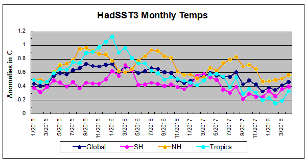
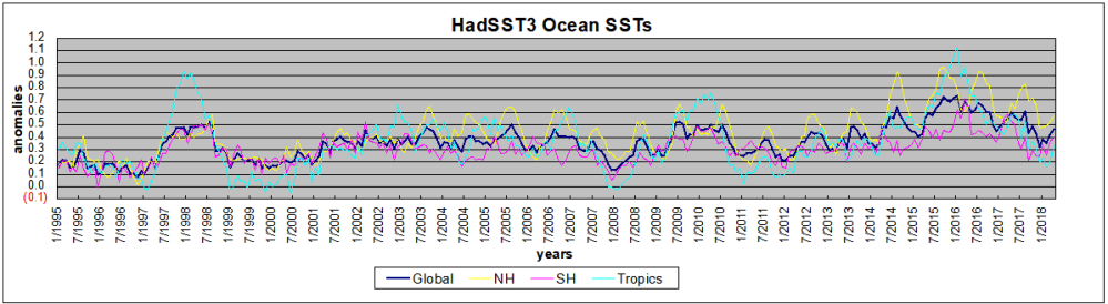
 The data is annual averages of absolute SSTs measured in the North Atlantic. The significance of the pulses for weather forecasting is discussed in AMO: Atlantic Climate Pulse
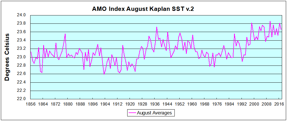 Now the regime shift appears clearly. Starting with 2003, seven times the August average has exceeded 23.6C, a level that prior to ’98 registered only once before, in 1937. And other recent years were all greater than 23.4C.


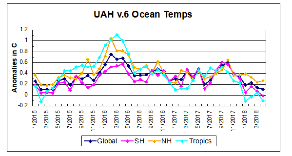

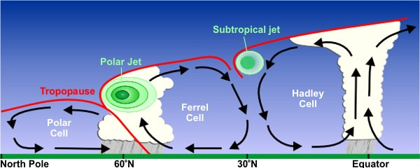

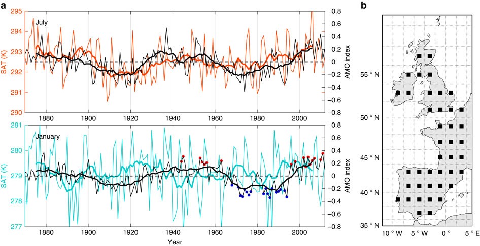
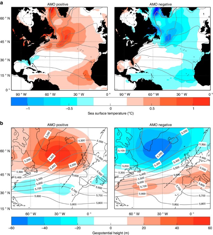
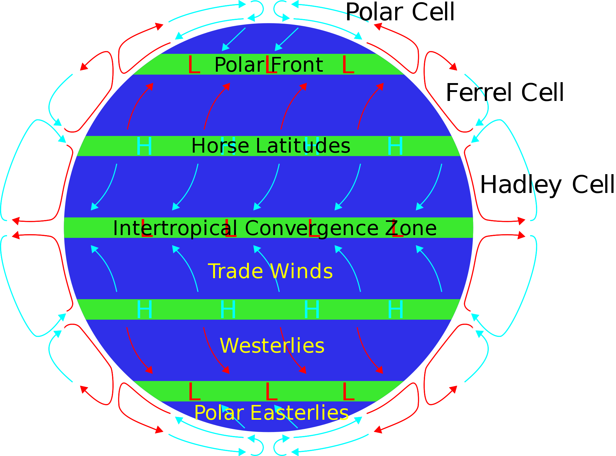

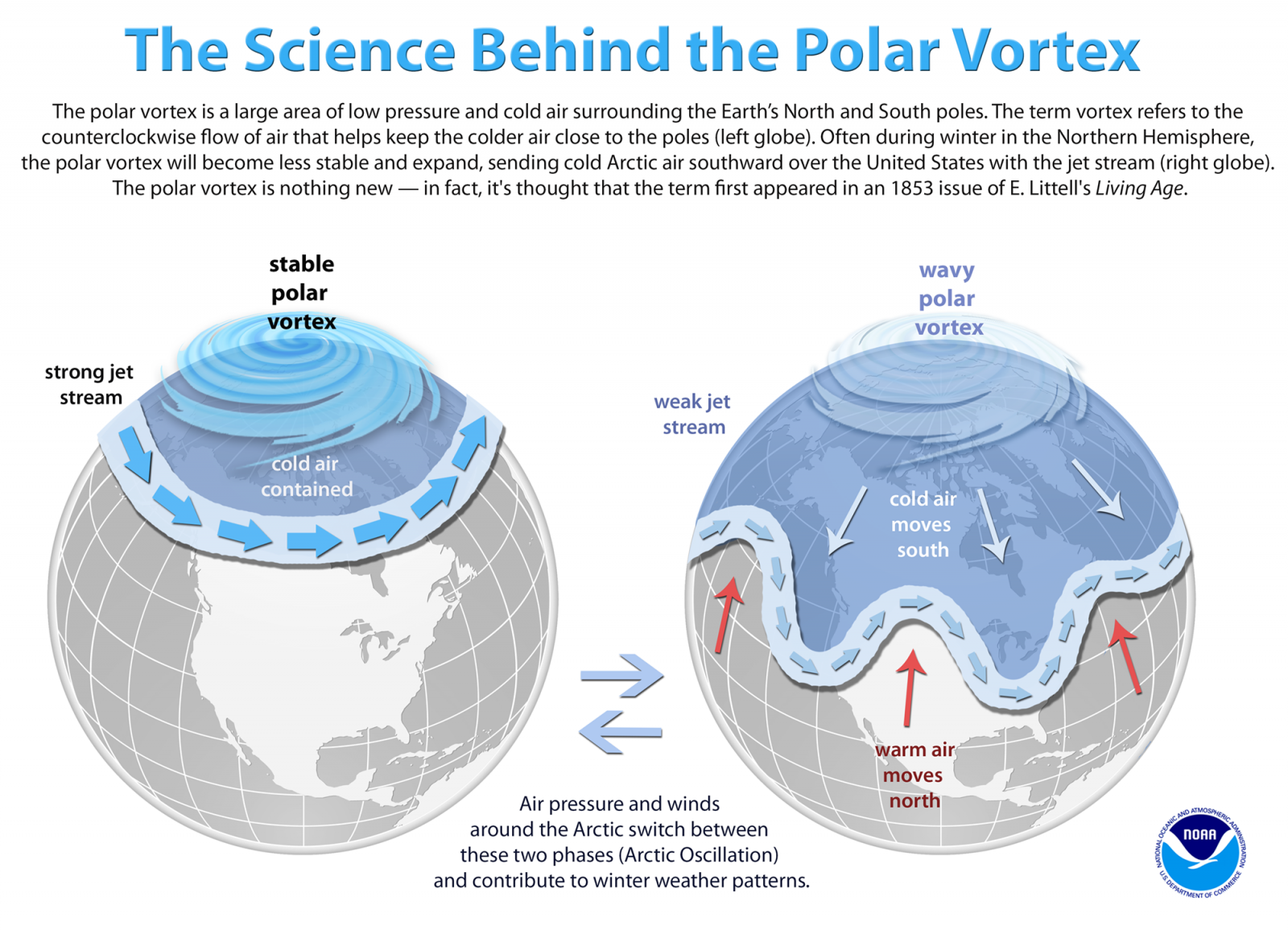
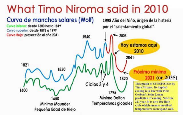
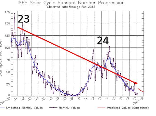


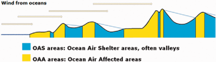
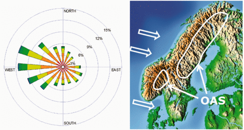
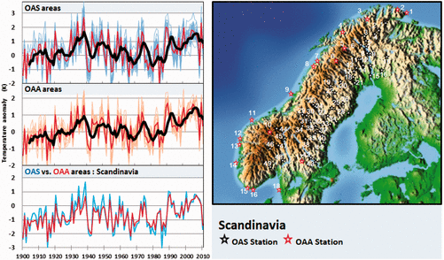
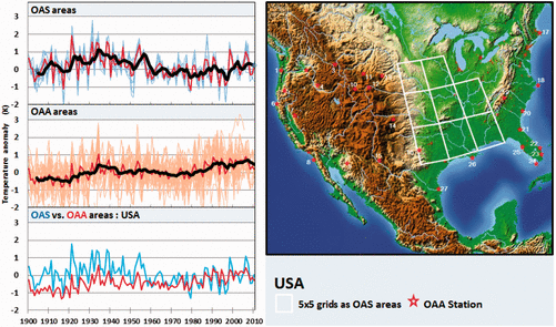
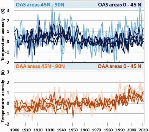
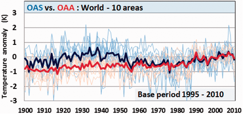


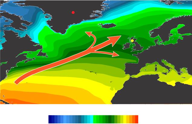
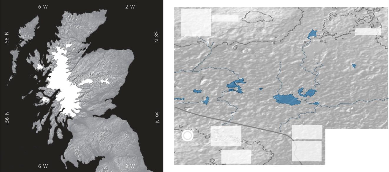


 And Wildfires were worse in the past.
 In fact our climate is remarkably stable.


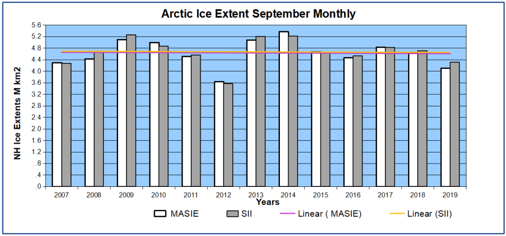


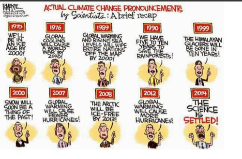


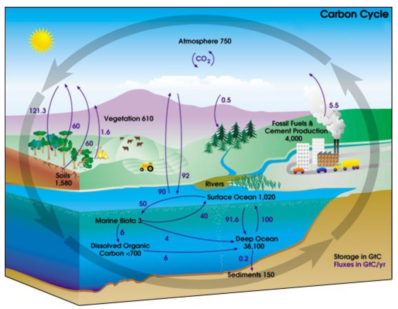

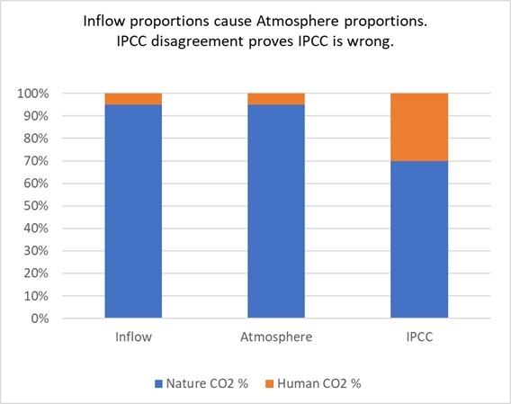


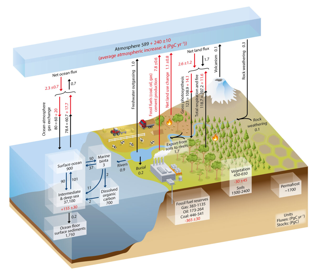 Fig. 1. Simplified schematic of the global carbon cycle. Black numbers and arrows indicate reservoir mass in PgC and exchange fluxes in PgC/yr before the Industrial Era. Red arrows and numbers show annual anthropogenic’ flux changes averaged over the 2000–2009 time period. Graphic from AR5-Chap.6-Fig.6.1.
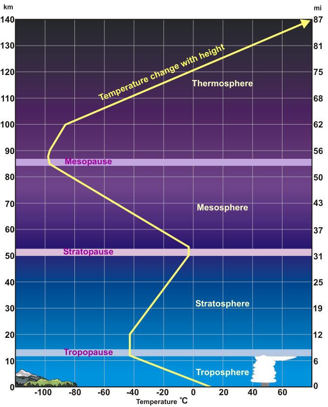


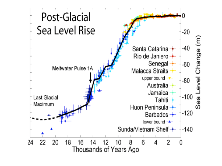


 In the fairy tale, Goldilocks entered the three bears’ house to find one bowl of soup too hot, another too cold, and one just right for her to eat. A new study of our planetary history suggests that since its beginning our climate has been self-regulating to avoid extremes, with much less variability in temperature and oceanic pH than previously thought.
