Unbelievable Climate Models

It is not just you thinking the world is not warming the way climate models predicted. The models are flawed, and their estimates of the climate’s future response to rising CO2 are way too hot. Yet these overcooked forecasts are the basis for policy makers to consider all kinds of climate impacts, from sea level rise to food production and outbreaks of Acne.

The models’ outputs are contradicted by the instrumental temperature records. So a choice must be made: Shall we rely on measurements of our past climate experience, or embrace the much warmer future envisioned by these models?

Ross McKitrick takes us through this fundamental issue in his Financial Post article All those warming-climate predictions suddenly have a big, new problem Excerpts below with my bolds, headers and images

Why ECS is Important

One of the most important numbers in the world goes by the catchy title of Equilibrium Climate Sensitivity, or ECS. It is a measure of how much the climate responds to greenhouse gases. More formally, it is defined as the increase, in degrees Celsius, of average temperatures around the world, after doubling the amount of carbon dioxide in the atmosphere and allowing the atmosphere and the oceans to adjust fully to the change. The reason it’s important is that it is the ultimate justification for governmental policies to fight climate change.

The United Nations Intergovernmental Panel on Climate Change (IPCC) says ECS is likely between 1.5 and 4.5 degrees Celsius, but it can’t be more precise than that. Which is too bad, because an enormous amount of public policy depends on its value. People who study the impacts of global warming have found that if ECS is low — say, less than two — then the impacts of global warming on the economy will be mostly small and, in many places, mildly beneficial. If it is very low, for instance around one, it means greenhouse gas emissions are simply not worth doing anything about. But if ECS is high — say, around four degrees or more — then climate change is probably a big problem. We may not be able to stop it, but we’d better get ready to adapt to it.

So, somebody, somewhere, ought to measure ECS. As it turns out, a lot of people have been trying, and what they have found has enormous policy implications.

The violins span 5–95% ranges; their widths indicate how PDF values vary with ECS. Black lines show medians, red lines span 17–83% ‘likely’ ranges. Published estimates based directly on observed warming are shown in blue. Unpublished estimates of mine based on warming attributable to greenhouse gases inferred by two recent detection and attribution studies are shown in green. CMIP5 models are shown in salmon. The observational ECS estimates have broadly similar medians and ‘likely’ ranges, all of which are far below the corresponding values for the CMIP5 models. Source: Nic Lewis at Climate Audit https://climateaudit.org/2015/04/13/pitfalls-in-climate-sensitivity-estimation-part-2/

Methods Matter

To understand why, we first need to delve into the methodology a bit. There are two ways scientists try to estimate ECS. The first is to use a climate model, double the modeled CO2 concentration from the pre-industrial level, and let it run until temperatures stabilize a few hundred years into the future. This approach, called the model-based method, depends for its accuracy on the validity of the climate model, and since models differ quite a bit from one another, it yields a wide range of possible answers. A well-known statistical distribution derived from modeling studies summarizes the uncertainties in this method. It shows that ECS is probably between two and 4.5 degrees, possibly as low as 1.5 but not lower, and possibly as high as nine degrees. This range of potential warming is very influential on economic analyses of the costs of climate change.***

The second method is to use long-term historical data on temperatures, solar activity, carbon-dioxide emissions and atmospheric chemistry to estimate ECS using a simple statistical model derived by applying the law of conservation of energy to the planetary atmosphere. This is called the Energy Balance method. It relies on some extrapolation to satisfy the definition of ECS but has the advantage of taking account of the available data showing how the actual atmosphere has behaved over the past 150 years.

The surprising thing is that the Energy Balance estimates are very low compared to model-based estimates. The accompanying chart compares the model-based range to ECS estimates from a dozen Energy Balance studies over the past decade. Clearly these two methods give differing answers, and the question of which one is more accurate is important.

Weak Defenses for Models Discrepancies

Climate modelers have put forward two explanations for the discrepancy. One is called the “emergent constraint” approach. The idea is that models yield a range of ECS values, and while we can’t measure ECS directly, the models also yield estimates of a lot of other things that we can measure (such as the reflectivity of cloud tops), so we could compare those other measures to the data, and when we do, sometimes the models with high ECS values also yield measures of secondary things that fit the data better than models with low ECS values.

This argument has been a bit of a tough sell, since the correlations involved are often weak, and it doesn’t explain why the Energy Balance results are so low.

The second approach is based on so-called “forcing efficacies,” which is the concept that climate forcings, such as greenhouse gases and aerosol pollutants, differ in their effectiveness over time and space, and if these variations are taken into account the Energy Balance sensitivity estimates may come out higher. This, too, has been a controversial suggestion.

Challenges to Oversensitive Models

A recent Energy Balance ECS estimate was just published in the Journal of Climate by Nicholas Lewis and Judith Curry. There are several features that make their study especially valuable. First, they rely on IPCC estimates of greenhouse gases, solar changes and other climate forcings, so they can’t be accused of putting a finger on the scale by their choice of data. Second, they take into account the efficacy issue and discuss it at length. They also take into account recent debates about how surface temperatures should or shouldn’t be measured, and how to deal with areas like the Arctic where data are sparse. Third, they compute their estimates over a variety of start and end dates to check that their ECS estimate is not dependent on the relative warming hiatus of the past two decades.

Their ECS estimate is 1.5 degrees, with a probability range between 1.05 and 2.45 degrees. If the study was a one-time outlier we might be able to ignore it. But it is part of a long list of studies from independent teams (as this interactive graphic shows), using a variety of methods that take account of critical challenges, all of which conclude that climate models exhibit too much sensitivity to greenhouse gases.

Change the Sensitivity, Change the Future

Policy-makers need to pay attention, because this debate directly impacts the carbon-tax discussion.

The Environmental Protection Agency uses social cost of carbon models that rely on the model-based ECS estimates. Last year, two colleagues and I published a study in which we took an earlier Lewis and Curry ECS estimate and plugged it into two of those models. The result was that the estimated economic damages of greenhouse gas emissions fell by between 40 and 80 per cent, and in the case of one model the damages had a 40 per cent probability of being negative for the next few decades — that is, they would be beneficial changes. The new Lewis and Curry ECS estimate is even lower than their old one, so if we re-did the same study we would find even lower social costs of carbon.

Conclusion

If ECS is as low as the Energy Balance literature suggests, it means that the climate models we have been using for decades run too hot and need to be revised. It also means that greenhouse gas emissions do not have as big an impact on the climate as has been claimed, and the case for costly policy measures to reduce carbon-dioxide emissions is much weaker than governments have told us. For a science that was supposedly “settled” back in the early 1990s, we sure have a lot left to learn.

Ross McKitrick is professor of economics at the University of Guelph and senior fellow at the Fraser Institute.

2018 Update: Fossil Fuels ≠ Global Warming

gas in hands

Previous posts addressed the claim that fossil fuels are driving global warming. This post updates that analysis with the latest (2017) numbers from BP Statistics and compares World Fossil Fuel Consumption (WFFC) with three estimates of Global Mean Temperature (GMT). More on both these variables below.

WFFC

2017 statistics are now available from BP for international consumption of Primary Energy sources. 2018 Statistical Review of World Energy. 

The reporting categories are:
Oil
Natural Gas
Coal
Nuclear
Hydro
Renewables (other than hydro)

This analysis combines the first three, Oil, Gas, and Coal for total fossil fuel consumption world wide. The chart below shows the patterns for WFFC compared to world consumption of Primary Energy from 1965 through 2017.

WFFC2017

The graph shows that Primary Energy consumption has grown continuously for 5 decades. Over that period oil, gas and coal (sometimes termed “Thermal”) averaged 89% of PE consumed, ranging from 94% in 1965 to 85% in 2017.  MToe is millions of tons of oil equivalents.

Global Mean Temperatures

Everyone acknowledges that GMT is a fiction since temperature is an intrinsic property of objects, and varies dramatically over time and over the surface of the earth. No place on earth determines “average” temperature for the globe. Yet for the purpose of detecting change in temperature, major climate data sets estimate GMT and report anomalies from it.

UAH record consists of satellite era global temperature estimates for the lower troposphere, a layer of air from 0 to 4km above the surface. HadSST estimates sea surface temperatures from oceans covering 71% of the planet. HADCRUT combines HadSST estimates with records from land stations whose elevations range up to 6km above sea level.

Both GISS LOTI (land and ocean) and HADCRUT4 (land and ocean) use 14.0 Celsius as the climate normal, so I will add that number back into the anomalies. This is done not claiming any validity other than to achieve a reasonable measure of magnitude regarding the observed fluctuations.

No doubt global sea surface temperatures are typically higher than 14C, more like 17 or 18C, and of course warmer in the tropics and colder at higher latitudes. Likewise, the lapse rate in the atmosphere means that air temperatures both from satellites and elevated land stations will range colder than 14C. Still, that climate normal is a generally accepted indicator of GMT.

Correlations of GMT and WFFC

The next graph compares WFFC to GMT estimates over the five decades from 1965 to 2017 from HADCRUT4, which includes HadSST3.

WFFC&GMT2017

Over the last five decades the increase in fossil fuel consumption is dramatic and monotonic, steadily increasing by 227% from 3.5B to 11.5B oil equivalent tons.  Meanwhile the GMT record from Hadcrut shows multiple ups and downs with an accumulated rise of 0.9C over 52 years, 6% of the starting value.

The second graph compares to GMT estimates from UAH6, and HadSST3 for the satellite era from 1979 to 2017, a period of 38 years.

WFFC&UAH&HAD2017

In the satellite era WFFC has increased at a compounded rate of nearly 2% per year, for a total increase of 87% since 1979. At the same time, SST warming amounted to 0.44C, or 3.1% of the starting value.  UAH warming was 0.58C, or 4.2% up from 1979.  The temperature compounded rate of change is 0.1% per year, an order of magnitude less.  Even more obvious is the 1998 El Nino peak and flat GMT since.

Summary

The climate alarmist/activist claim is straight forward: Burning fossil fuels makes measured temperatures warmer. The Paris Accord further asserts that by reducing human use of fossil fuels, further warming can be prevented.  Those claims do not bear up under scrutiny.

It is enough for simple minds to see that two time series are both rising and to think that one must be causing the other. But both scientific and legal methods assert causation only when the two variables are both strongly and consistently aligned. The above shows a weak and inconsistent linkage between WFFC and GMT.

Going further back in history shows even weaker correlation between fossil fuels consumption and global temperature estimates:

wfc-vs-sat

Figure 5.1. Comparative dynamics of the World Fuel Consumption (WFC) and Global Surface Air Temperature Anomaly (ΔT), 1861-2000. The thin dashed line represents annual ΔT, the bold line—its 13-year smoothing, and the line constructed from rectangles—WFC (in millions of tons of nominal fuel) (Klyashtorin and Lyubushin, 2003). Source: Frolov et al. 2009

In legal terms, as long as there is another equally or more likely explanation for the set of facts, the claimed causation is unproven. The more likely explanation is that global temperatures vary due to oceanic and solar cycles. The proof is clearly and thoroughly set forward in the post Quantifying Natural Climate Change.

Background context for today’s post is at Claim: Fossil Fuels Cause Global Warming.

Answers Before Climate Action

As the stool above shows, the climate change package sits on three premises. The first is the science bit, consisting of an unproven claim that observed warming is caused by humans burning fossil fuels. The second part rests on impact studies from billions of research dollars spent uncovering any and all possible negatives from warming. And the third leg is climate policies showing how governments can “fight climate change.”

The call for climate action depends on proponents providing convincing answers to questions regarding all three dimensions.  H/T to Master Resource for pointing to essays by William Niskonen and Steven Horwitz setting forth the issues to be resolved.  I will refer to excerpts from Global Warming Is about Social Science Too by Horowitz.

To help clarify what’s at stake, I offer a list of questions that are (or should be) at the center of the debate over anthropogenic (human-caused) global warming. I will provide some quick commentary on some to note their importance and then conclude with what I see as the importance of this list.

Matters of Science

1. Is the planet getting warmer?

2. If it’s getting warmer, is that warming caused by humans? Obviously this is a big question because if warming is not human-caused, then it’s not clear how much we can do to reduce it. What we might do about the consequences, however, remains an open question.

3. If it’s getting warmer, by what magnitude? If the magnitude is large, then there’s one set of implications. But if it’s small, then, as we’ll see, it might not be worth responding to. This is a good example of a scientific question with large implications for policy.

My Comment:  Most people studying climate science agree that it has warmed about a degree celsius since the end of the Little Ice Age (~1850).  But there have been multi-decadal periods of warming and cooling as well as the current plateau in temperatures.  As well, there are many places (e.g.almost 1/3 of US stations) showing cooling while other places have warming trends.  Skeptics note that no one has yet separated natural warming from man-made warming.  In the record, natural warming prior to the 1940s matches almost exactly the warming from 1970s to 2000, claimed to be man-made.

Horowitz continues: All these questions are presumably matters of science. In principle we ought to be able to answer them using the tools of science, even if they are complex issues that involve competing interpretations and methods. Let’s assume the planet is in fact warming and that humans are the reason.

Impacts of Warming

4. What are the costs of global warming? This question is frequently asked and answered.

5. What are the benefits of global warming? This question needs to be asked as well, as global warming might bring currently arctic areas into a more temperate climate that would enable them to become sources of food. Plus, a warmer planet might decrease the demand for fossil fuels for heating homes and businesses in those formerly colder places.

6. Do the benefits outweigh the costs or do the costs outweigh the benefits? This is also not frequently asked. Obviously, if the benefits outweigh the costs, then we shouldn’t be worrying about global warming. Two other points are worth considering. First, the benefits and costs are not questions of scientific fact because how we do the accounting depends on all kinds of value-laden questions. But that doesn’t mean the cost-benefit comparison isn’t important. Second, this question might depend greatly on the answers to the scientific questions above. In other words: All questions of public policy are ones that require both facts and values to answer. One cannot go directly from science to policy without asking the kinds of questions I’ve raised here.

Rotterdam Adaptation Policy–Ninety years thriving behind dikes and dams.

Climate Policies

7. If the costs outweigh the benefits, what sorts of policies are appropriate? There are many too many questions here to deal with in detail, but it should be noted that disagreements over what sorts of policies would best deal with the net costs of global warming are, again, matters of both fact and value, or science and social science.

8. What are the costs of the policies designed to reduce the costs of global warming? This question is not asked nearly enough. Even if we design policies on the blackboard that seem to mitigate the effects of global warming, we have to consider, first, whether those policies are even likely to be passed by politicians as we know them, and second, whether the policies might have associated costs that outweigh their benefits with respect to global warming. So if in our attempt to reduce the effects of global warming we slow economic growth so far as to impoverish more people, or we give powers to governments that are likely to be used in ways having little to do with global warming, we have to consider those results in the total costs and benefits of using policy to combat global warming. This is a question of social science that is no less important than the scientific questions I began with.

I could add more, but this is sufficient to make my key points. First, it is perfectly possible to accept the science of global warming but reject the policies most often put forward to combat it. One can think humans are causing the planet to warm but logically and humanely conclude that we should do nothing about it.

Second, people who take that position and back it up with good arguments should not be called “deniers.” They are not denying the science; they are questioning its implications. In fact, those who think they can go directly from science to policy are, as it turns out, engaged in denial – denial of the relevance of social science.

Steven Horwitz is the Schnatter Distinguished Professor of Free Enterprise in the Department of Economics at Ball State University, where he also is a Fellow at the John H. Schnatter Institute for Entrepreneurship and Free Enterprise. He is the author of Hayek’s Modern Family: Classical Liberalism and the Evolution of Social Institutions.

Climate science, impacts and policies also appear as a house of cards.

More about Climate Policy Failures

Speaking Climate Truth to Policymakers

Climate Policies Failure, the Movie

Climatists Wrong-Footed

From Russia With Climate Love

Sputnik News spins climate alarmism in this current article New Climate Change Report Says We’re Screwed Even if Paris Accord Goals Met Text in italics with my bolds, images and titles.

A recently published study on climate change predicts catastrophic changes to the planet’s ecology, even if global temperatures rise by only 1.5 degrees Celsius, a cap on warming the Paris Climate Accord aims to secure.

Foretelling the Future

The new study, performed by an international research group and published in the journal Nature on June 7, predicts catastrophic changes to the planet even if Paris Accord emission targets are met.

According to Phys.org, many studies predict that a 2 degree increase would lead to massive climatic and ecological changes, but few have examined what would happen if the temperature rose by only 1.5 degrees instead. While this fraction of a degree might seem unimportant, it actually means a lot on a global scale, researchers say.

Apocalypse Now

If today’s temperature trend continues until 2100, then many inhabited islands as well as many coastal cities will be swallowed by the sea, with the Maldives being just one example. The Paris Agreement was signed with the stated aim of preventing this catastrophe by limiting global warming to only 1.5 C.

However, the new study says that while a hard limit keeping the temperature increase fewer than 2 C would avert drastic changes, such as the Mediterranean drying up or US cities getting 5 C hotter than they are now, the exact character of the global warming curve is more important to overall climate change effects than most people understand. For example, if global temperature even briefly increases by 2 C overall but then falls back, that would also cause irreparable damage.

“The extinction of species during a phase of excess temperatures couldn’t be undone, even if the level of warming was then reduced and limited to a 1.5 C increase,” says ETH Zurich (Swiss Federal Institute of Technology) professor Sonia Seneviratne, one of the lead authors of the study.

No Escape, No Silver Bullet

According to Seneviratne, many existing scenarios on climate change mitigation actually allow for a temporary 2 C degree increase and also involve vast CO2-reducing measures, which include reforestation, carbon capture and storage operations (CCS). However, CCS is not yet a viable option, as humanity does not have any effective and scalable means to return carbon from the air to the ground for good. Even the much-advertised “negative emissions” power plant in Iceland is not as great in reality as it looks on paper. Besides, even in theory, CCS needs so much space to work that it’s comparable to the world’s food production operations.

Therefore, Seneviratne says, the only way to save the world now is to immediately and dramatically cut CO2 emissions.

“It’s clear that we must urgently reduce emissions if we want to stand a chance of meeting the 1.5 C goal and keeping any temperature overshoot as low as possible,” Seneviratne emphasized.

The Usual Bad Guys

In 2015, China was the number one carbon dioxide-emitting country, with almost 30 percent of the world’s fossil fuel CO2 emissions, according to the data from the EU’s Emissions Database for Global Atmospheric Research. The US took second place, emitting almost half as much as China does, slightly below 15 percent of the world’s total. Despite all their efforts, the European Union as a whole takes proud third place with 9.6 percent, followed by India, which produces 6.8 percent of the world’s fossil fuel carbon emissions.

Women, Children and Minorities Hit Hardest By the World Ending

Unfortunately, drastic carbon emission cuts will also mean drastic changes to modern social and economic life, consequences the US has recently and notably refused to countenance by backing out of the global climate accord.


Cooling Ocean Air Temps

Presently sea surface temperatures (SST) are the best available indicator of heat content gained or lost from earth’s climate system.  Enthalpy is the thermodynamic term for total heat content in a system, and humidity differences in air parcels affect enthalpy.  Measuring water temperature directly avoids distorted impressions from air measurements.  In addition, ocean covers 71% of the planet surface and thus dominates surface temperature estimates.  Eventually we will likely have reliable means of recording water temperatures at depth.

Recently, Dr. Ole Humlum reported from his research that air temperatures lag 2-3 months behind changes in SST.  He also observed that changes in CO2 atmospheric concentrations lag behind SST by 11-12 months.  This latter point is addressed in a previous post Who to Blame for Rising CO2?

The May update to HadSST3 will appear later this month, but in the meantime we can look at lower troposphere temperatures (TLT) from UAHv6 which are already posted for May. The temperature record is derived from microwave sounding units (MSU) on board satellites like the one pictured above.

The UAH dataset includes temperature results for air above the oceans, and thus should be most comparable to the SSTs. The graph below shows monthly anomalies for ocean temps since January 2015.

UAH May2018

Open image in new tab to enlarge.

The anomalies have reached the same levels as 2015.  Taking a longer view, we can look at the record since 1995, that year being an ENSO neutral year and thus a reasonable starting point for considering the past two decades.  On that basis we can see the plateau in ocean temps is persisting. Since last October all oceans have cooled, with upward bumps in Feb. 2018, now erased.

UAHv6 TLT 
Monthly Ocean
Anomalies
Average Since 1995 Ocean 5/2018
Global 0.13 0.09
NH 0.16 0.33
SH 0.11 -0.09
Tropics 0.12 0.02

As of May 2018, global ocean temps are slightly lower than April and below the average since 1995.  NH remains higher, but not enough to offset much lower temps in SH and Tropics (between 20N and 20S latitudes).  Global ocean air temps are now the lowest since April 2015, and SH the lowest since May 2013.

The details of UAH ocean temps are provided below.  The monthly data make for a noisy picture, but seasonal fluxes between January and July are important.

Click on image to enlarge.

The greater volatility of the Tropics is evident, leading the oceans through three major El Nino events during this period.  Note also the flat period between 7/1999 and 7/2009.  The 2010 El Nino was erased by La Nina in 2011 and 2012.  Then the record shows a fairly steady rise peaking in 2016, with strong support from warmer NH anomalies, before returning to the 22-year average.

Summary

TLTs include mixing above the oceans and probably some influence from nearby more volatile land temps.  They started the recent cooling later than SSTs from HadSST3, but are now showing the same pattern.  It seems obvious that despite the three El Ninos, their warming has not persisted, and without them it would probably have cooled since 1995.  Of course, the future has not yet been written.


New Zealand Warming Disputed

New Zealand Cook National Park.

A dust up over the temperature trend in New Zealand is discussed at the the climate conversation New Zealand Response to NIWA comment on de Freitas reanalysis of the NZ temperature record  by Barry Brill, Chairman of the New Zealand Climate Science Coalition.  Excerpts with my bolds.

Conclusions

de Freitas finds that New Zealand has experienced an insignificant warming trend of 0.28°C/century during 1909-2008. Using the same data, the Mullan Report calculates that trend at 0.91°C/century. Both studies claim to apply the statistical technique described in RS93, and each alleges that the other has departed from that methodology. This core issue has been described in the graph above but has not been addressed in this note.

A second core issue relates to reliance upon inhomogeneous Auckland and Wellington data despite the extensive contamination of both sites by sheltering and UHI. That matter has not been addressed here either.

Instead, this limited reply deals with the raft of peripheral allegations contained in the NIWA Comment. In particular, it sets out to show that all plausible published records, as well as the scientific literature, support the view that New Zealand’s temperature record has remained remarkably stable over the past century or so.

Some of the Issues Rebutted

Other temperature records:

The de Freitas warming trend of 0.28°C/century is wholly consistent with the synchronous Southern Hemisphere trend reported in IPPC’s AR5. Both the IPCC and NIWA have long reported that anthropogenic warming trends in ocean-dominated New Zealand would be materially lower than global averages. The S81/Mullan Report trend of 0.91°C/century is clearly anomalous.

Official New Zealand temperature records for eight years in the 1860s, which are both reliable and area-representative, show the absolute mean temperature was then 13.1°C. A 30-year government record for the period ending 1919 shows the mean temperature to be 12.8°C. The current normal (30-year) mean 7SS temperature is 12.9°C. Clearly, New Zealand mean temperatures have remained almost perfectly stable during the past 150 years.

Use of RS93 Statistical Method:

The Mullan Report (along with other NIWA articles that are not publicly available) does purport to use RS93 comparison techniques, so this assertion is naturally accepted whenever these ‘grey’ papers are mentioned in the peer-reviewed literature. However, the Mullan Report sits outside the literature and clearly fails to execute its stated intention to apply RS93 methods. The de Freitas paper rectifies those omissions.

NZ Glaciers

In this area, the most recent authority is Mackintosh et al. (2017), entitled “Regional cooling caused recent New Zealand glacier advances in a period of global warming.” After observing that at least 58 Southern Alps glaciers advanced during the period 1983-2008, the abstract notes:

“Here we show that the glacier advance phase resulted predominantly from discrete periods of reduced air temperature, rather than increased precipitation. The lower temperatures were associated with anomalous southerly winds and low sea surface temperature in the Tasman Sea region. These conditions result from variability in the structure of the extratropical atmospheric circulation over the South Pacific.”

This Nature paper, of which James Renwick was an author, notes that the World Glacier Monitoring Service database shows that in 2005 “15 of the 26 advancing glaciers observed worldwide were in New Zealand.”

BEST Data

Using up to 52 auto-adjusted datasets1, the Berkeley Earth group derives an absolute New Zealand temperature range of 9.5°C to 11°C over the 160-year period from 1853 to 2013.

The mid-point of this range is very far from the mid-point of the 12.3°C to 13.2°C range recorded in the 7SS (whether raw or adjusted) and is clearly wrong. Nonetheless, for the 100-year period 1909-2008, the BEST adjusted anomalies are said to show a 100% perfect correlation with those of the Mullan Report (to three decimal points). The claimed independence of such an immaculate outcome is entirely implausible.

Anthropogenic Warming

The Mullan Report’s 1960-90 upwards spike could not have occurred whilst the south-west Pacific region was in a cooling phase – which is confirmed by Mackintosh et al. (2017). Further, the final 30-year period of the Mullan Report shows an insignificant trend of only 0.12°C/century, demonstrating that New Zealand has not yet been affected by global warming trends.

Summary

Good to see that de Fritas et al are again speaking climate truth to entrenched alarmists.  Go Kiwis!

Confronting Suzuki’s Climate Hysteria

Thanks to Friends of Science in Calgary for hosting Award-winning Dutch filmmaker Marijn Poels and Canadian climate change scientist Dr. Madhav Khandekar.  They dismantled the dogma of Global Editors Network and Dr. Suzuki-style climate hysteria in one evening at Friends of Science Society’s 15th Annual Event entitled: “Extreme Climate Uncertainty.”

Full story is Inquiry not Dogma, which includes links and background information.  Excerpts with my bolds.

Poels challenged the audience with evidence that food security is at risk due to ‘green’ energy policies while Dr. Khandekar deconstructed climate alarmism with convincing evidence that extreme weather is mostly media hype.

Left-wing, progressive Poels recounted to the Friends of Science event audience how he had worked in conflict and poverty countries for nine years, making 50 films in that time. When he returned home to Europe for some recovery time in the pastoral countryside, he was surprised, then alarmed to find that EU climate and energy policies were trading food security for unreliable, expensive ‘energy’ security. Curious to find the root of this strange set of policies, Poels followed the money and policy to talk with climate scientists and agricultural experts.

Poels noted that he had a broad-reaching, very supportive media network for his human rights and justice films; this dried up the moment he broached the topic of climate change.His 2017  documentary film exposed how climate change policies are threatening modern civilization. Trailer can be viewed below. My recent post on this subject was Climate Policies Failure, the Movie.

Dr. Madhav Khandekar, former Environment Canada researcher, gave a lively, humorous presentation that debunked the claims of extreme weather being more frequent or caused by human influence on climate or human industrial carbon dioxide emissions. Khandekar explained some of the intricacies of the global effects of the natural, cyclical El Nino Southern Oscillation and its mirror image, La Nina. Overall, Khandekar says the only noticeable trends are toward longer cold snaps, a possible harbinger of long periods of cold and erratic weather as experienced in the Little Ice Age, during a solar minimum.

Khandekar was an instructor at the University of Alberta early on in his career, an institution now embroiled in a vigorous public debate about the propriety of conferring an honorary degree on Dr. David Suzuki at this spring’s convocation.

Friends of Science Society posted an open letter on their blog on May 9, 2018, addressed to the president of the University of Alberta, expressing their views on the matter. After describing the details of Suzuki’s destructive behavior, the letter concludes with the following summary:

Friends of Science Society University of Alberta grad members are not upset that Dr. Suzuki holds controversial views because they value freedom of speech. More so, they value scientific integrity. They are upset that he spouts false and misleading diatribes on scientific topics – contrary to all the careful and accurate scientific methods that they learned as students at the University of Alberta.

And they are very upset that you choose to honor that.

Our members have not only seen job loss for themselves or their employees, they have experienced the tragic consequences of lives lost through suicide as careers, finances, families and business enterprises fall apart.

For no good reason.

Under your leadership, Dr. Turpin, the University of Alberta embarked on a program entitled “For the Public Good.” Now you want to honor a high-profile public figure, someone whose uninformed and misleading activism, has aided the destruction of the economy in Alberta, whose unsupported activist rhetoric has done untold damage to the Canadian economy and whose statements have damaged our international reputation as a reliable and fair place to do business. The outcomes include personal catastrophe for hundreds of thousands of people, many of them University of Alberta alumni. How is that for the public good?

In our opinion, based on the foregoing evidence, Dr. Suzuki’s actions and words are not congruent with the skills learned in the physical sciences, environmental or business management at the University of Alberta. They are not in keeping with the expectations of its graduates or faculty members, nor with its own Code of Ethics, nor with the values you express in your statement meant to validate your decision to honor Dr. Suzuki.

We ask that you rescind the offer of the honorary degree to Dr. David Suzuki.


Climate Canary? N. America Cooling

Hidden amid reports of recent warmest months and years based on global averages, there is a significant departure in North America. Those of us living in Canada and USA have noticed a distinct cooling, and our impressions are not wrong.

The image above shows how much lower have been April 2018 temperatures. The table below provides the numbers behind the graphs from NOAA State of the Climate.

CONTINENT ANOMALY (1910-2000) TREND (1910-2018) RANK RECORDS
°C °F °C °F (OUT OF 109 YEARS) YEAR(S) °C °F
North America -0.97 -1.75 0.11 0.19 Warmest 94ᵗʰ 2010 2.65 4.77
South America 1.34 2.41 0.13 0.24 Warmest 1ˢᵗ 2018 1.34 2.41
Europe 2.82 5.08 0.14 0.25 Warmest 1ˢᵗ 2018 2.82 5.08
Africa 1.23 2.21 0.12 0.22 Warmest 5ᵗʰ 2016 1.72 3.1
Asia 1.66 2.99 0.18 0.32 Warmest 9ᵗʰ 2016 2.4 4.32
Oceania 2.47 4.45 0.14 0.25 Warmest 2ⁿᵈ 2005 2.54 4.57

The table shows how different was the North American experience: 94th out of 109 years.  But when we look at the first four months of the year, the NA is more in line with the rest of the globe.


As the image shows, cooling was more widespread during the first third of 2018, particularly in NA, Northern Europe and Asia, as well as a swath of cooler mid ocean latitudes in the Southern Hemisphere.

CONTINENT ANOMALY (1910-2000) TREND (1910-2018) RANK RECORDS
°C °F °C °F (OUT OF 109 YEARS) YEAR(S) °C °F
North America 0.44 0.79 0.16 0.29 Warmest 44ᵗʰ 2016 2.71 4.88
South America 0.94 1.69 0.13 0.24 Warmest 6ᵗʰ 2016 1.39 2.5
Europe 1.35 2.43 0.13 0.24 Warmest 13ᵗʰ 2014 2.46 4.43
Africa 1.08 1.94 0.1 0.18 Warmest 3ʳᵈ 2010 1.62 2.92
Asia 1.57 2.83 0.19 0.34 Warmest 8ᵗʰ 2002 2.72 4.9
Oceania 1.58 2.84 0.12 0.22 Warmest 1ˢᵗ 2018 1.58 2.84

The table confirms that Europe and Asia are cooler in 2018 than recent years in the decade.

Summary

These data show again that temperature indicators of climate are not global but regional, and even local in their manifestations.  At the continental level there are significant differences.  North America is an outlier, but who is to say whether it is an aberration that will join the rest, or whether it is the trend setter signaling a widespread cooler future.

See Also:  Is This Cold the New Normal?

CanAm Bucks the Trend

Hidden amid reports of recent warmest months and years based on global averages, there is a significant departure in North America. Those of us living in Canada and USA have noticed a distinct cooling, and our impressions are not wrong.

The image above shows how much lower have been April 2018 temperatures. The table below provides the numbers behind the graphs from NOAA State of the Climate.

CONTINENT ANOMALY (1910-2000) TREND (1910-2018) RANK RECORDS
°C °F °C °F (OUT OF 109 YEARS) YEAR(S) °C °F
North America -0.97 -1.75 0.11 0.19 Warmest 94ᵗʰ 2010 2.65 4.77
South America 1.34 2.41 0.13 0.24 Warmest 1ˢᵗ 2018 1.34 2.41
Europe 2.82 5.08 0.14 0.25 Warmest 1ˢᵗ 2018 2.82 5.08
Africa 1.23 2.21 0.12 0.22 Warmest 5ᵗʰ 2016 1.72 3.1
Asia 1.66 2.99 0.18 0.32 Warmest 9ᵗʰ 2016 2.4 4.32
Oceania 2.47 4.45 0.14 0.25 Warmest 2ⁿᵈ 2005 2.54 4.57

The table shows how different was the North American experience: 94th out of 109 years.  But when we look at the first four months of the year, the NA is more in line with the rest of the globe.


As the image shows, cooling was more widespread during the first third of 2018, particularly in NA, Northern Europe and Asia, as well as a swath of cooler mid ocean latitudes in the Southern Hemisphere.

CONTINENT ANOMALY (1910-2000) TREND (1910-2018) RANK RECORDS
°C °F °C °F (OUT OF 109 YEARS) YEAR(S) °C °F
North America 0.44 0.79 0.16 0.29 Warmest 44ᵗʰ 2016 2.71 4.88
South America 0.94 1.69 0.13 0.24 Warmest 6ᵗʰ 2016 1.39 2.5
Europe 1.35 2.43 0.13 0.24 Warmest 13ᵗʰ 2014 2.46 4.43
Africa 1.08 1.94 0.1 0.18 Warmest 3ʳᵈ 2010 1.62 2.92
Asia 1.57 2.83 0.19 0.34 Warmest 8ᵗʰ 2002 2.72 4.9
Oceania 1.58 2.84 0.12 0.22 Warmest 1ˢᵗ 2018 1.58 2.84

The table confirms that Europe and Asia are cooler in 2018 than recent years in the decade.

Summary

These data show again that temperature indicators of climate are not global but regional, and even local in their manifestations.  At the continental level there are significant differences.  North America is an outlier, but who is to say whether it is an aberration that will join the rest, or whether it is the trend setter signaling a widespread cooler future.

Correcting Flaws in Global Warming Projections

William Mason Gray (1929-2016), pioneering hurricane scientist and forecaster and professor of atmospheric science at Colorado State University.

Thanks to GWPF for publishing posthumously Bill Gray’s understanding of global warming/climate change.  The paper was compiled at his request, completed and now available as Flaws in applying greenhouse warming to Climate Variability This post provides some excerpts in italics with my bolds and some headers.  Readers will learn much from the entire document (title above is link to pdf).

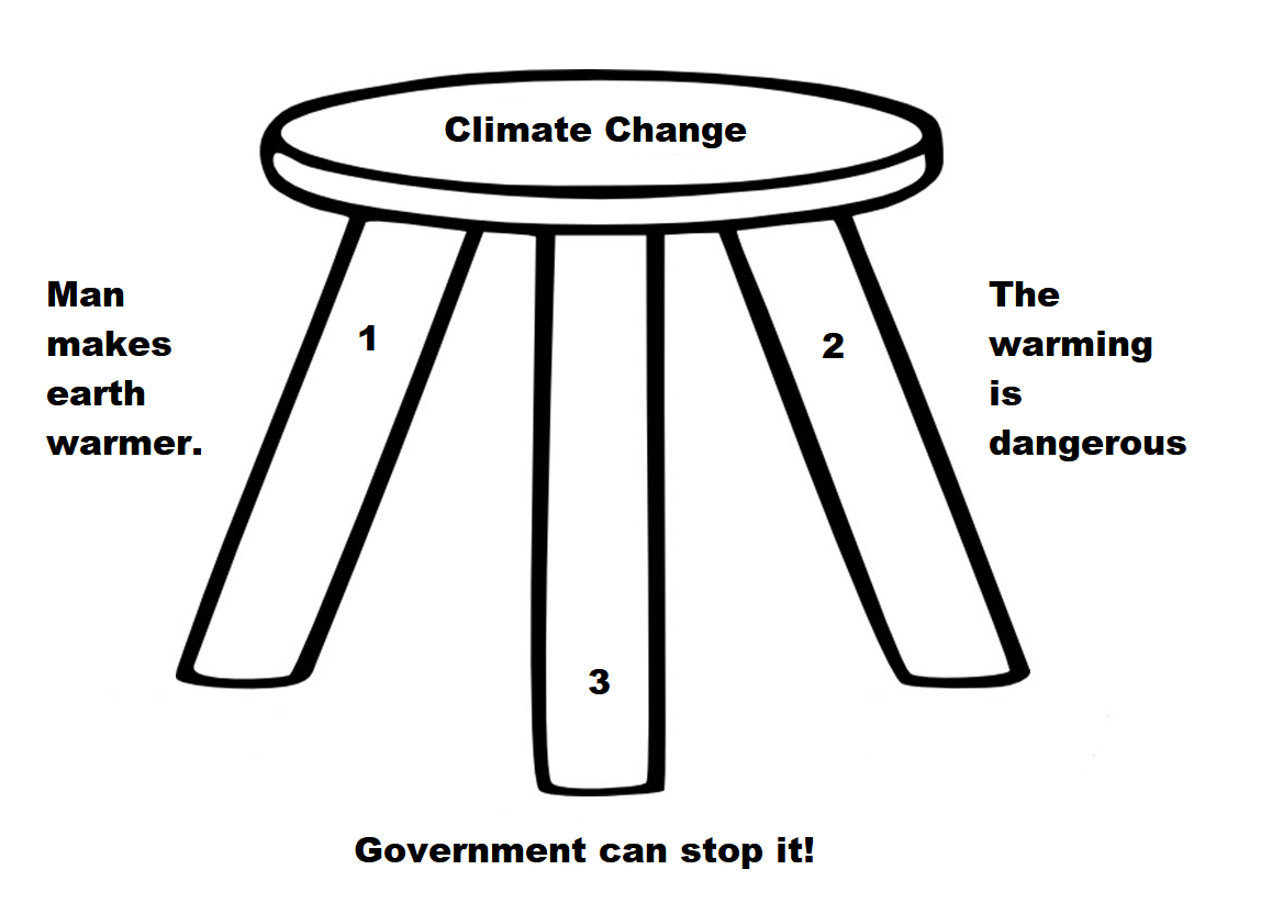
The Fundamental Correction

The critical argument that is made by many in the global climate modeling (GCM) community is that an increase in CO2 warming leads to an increase in atmospheric water vapor, resulting in more warming from the absorption of outgoing infrared radiation (IR) by the water vapor. Water vapor is the most potent greenhouse gas present in the atmosphere in large quantities. Its variability (i.e. global cloudiness) is not handled adequately in GCMs in my view. In contrast to the positive feedback between CO2 and water vapor predicted by the GCMs, it is my hypothesis that there is a negative feedback between CO2 warming and and water vapor. CO2 warming ultimately results in less water vapor (not more) in the upper troposphere. The GCMs therefore predict unrealistic warming of global temperature. I hypothesize that the Earth’s energy balance is regulated by precipitation (primarily via deep cumulonimbus (Cb) convection) and that this precipitation counteracts warming due to CO2.

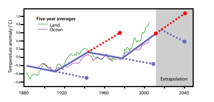
Figure 14: Global surface temperature change since 1880. The dotted blue and dotted red lines illustrate how much error one would have made by extrapolating a multi-decadal cooling or warming trend beyond a typical 25-35 year period. Note the recent 1975-2000 warming trend has not continued, and the global temperature remained relatively constant until 2014.

Projected Climate Changes from Rising CO2 Not Observed

Continuous measurements of atmospheric CO2, which were first made at Mauna Loa, Hawaii in 1958, show that atmospheric concentrations of CO2 have risen since that time. The warming influence of CO2 increases with the natural logarithm (ln) of the atmosphere’s CO2 concentration. With CO2 concentrations now exceeding 400 parts per million by volume (ppm), the Earth’s atmosphere is slightly more than halfway to containing double the 280 ppm CO2 amounts in 1860 (at the beginning of the Industrial Revolution).∗

We have not observed the global climate change we would have expected to take place, given this increase in CO2. Assuming that there has been at least an average of 1 W/m2 CO2 blockage of IR energy to space over the last 50 years and that this energy imbalance has been allowed to independently accumulate and cause climate change over this period with no compensating response, it would have had the potential to bring about changes in any one of the following global conditions:

  • Warm the atmosphere by 180◦C if all CO2 energy gain was utilized for this purpose – actual warming over this period has been about 0.5◦C, or many hundreds of times less.
  • Warm the top 100 meters of the globe’s oceans by over 5◦C – actual warming over this period has been about 0.5◦C, or 10 or more times less.
  • Melt sufficient land-based snow and ice as to raise the global sea level by about 6.4 m. The actual rise has been about 8–9 cm, or 60–70 times less. The gradual rise of sea level has been only slightly greater over the last ~50 years (1965–2015) than it has been over the previous two ~50-year periods of 1915–1965 and 1865–1915, when atmospheric CO2 gain was much less.
  • Increase global rainfall over the past ~50-year period by 60 cm.

Earth Climate System Compensates for CO2

If CO2 gain is the only influence on climate variability, large and important counterbalancing influences must have occurred over the last 50 years in order to negate most of the climate change expected from CO2’s energy addition. Similarly, this hypothesized CO2-induced energy gain of 1 W/m2 over 50 years must have stimulated a compensating response that acted to largely negate energy gains from the increase in CO2.

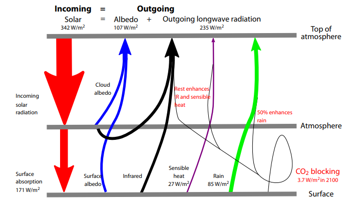
The continuous balancing of global average in-and-out net radiation flux is therefore much larger than the radiation flux from anthropogenic CO2. For example, 342 W/m2, the total energy budget, is almost 100 times larger than the amount of radiation blockage expected from a CO2 doubling over 150 years. If all other factors are held constant, a doubling of CO2 requires a warming of the globe of about 1◦C to enhance outward IR flux by 3.7 W/m2 and thus balance the blockage of IR flux to space.

Figure 2: Vertical cross-section of the annual global energy budget. Determined from a combination of satellite-derived radiation measurements and reanalysis data over the period of 1984–2004.

This pure IR energy blocking by CO2 versus compensating temperature increase for radiation equilibrium is unrealistic for the long-term and slow CO2 increases that are occurring. Only half of the blockage of 3.7 W/m2 at the surface should be expected to go into an temperature increase. The other half (about 1.85 W/m2) of the blocked IR energy to space will be compensated by surface energy loss to support enhanced evaporation. This occurs in a similar way to how the Earth’s surface energy budget compensates for half its solar gain of 171 W/m2 by surface-to-air upward water vapor flux due to evaporation.

Assuming that the imposed extra CO2 doubling IR blockage of 3.7 W/m2 is taken up and balanced by the Earth’s surface in the same way as the solar absorption is taken up and balanced, we should expect a direct warming of only ~0.5◦C for a doubling of CO2. The 1◦C expected warming that is commonly accepted incorrectly assumes that all the absorbed IR goes to the balancing outward radiation with no energy going to evaporation.

Consensus Science Exaggerates Humidity and Temperature Effects

A major premise of the GCMs has been their application of the National Academy of Science (NAS) 1979 study3 – often referred to as the Charney Report – which hypothesized that a doubling of atmospheric CO2 would bring about a general warming of the globe’s mean temperature of 1.5–4.5◦C (or an average of ~3.0◦C). These large warming values were based on the report’s assumption that the relative humidity (RH) of the atmosphere remains quasiconstant as the globe’s temperature increases. This assumption was made without any type of cumulus convective cloud model and was based solely on the Clausius–Clapeyron (CC) equation and the assumption that the RH of the air will remain constant during any future CO2-induced temperature changes. If RH remains constant as atmospheric temperature increases, then the water vapor content in the atmosphere must rise exponentially.

With constant RH, the water vapor content of the atmosphere rises by about 50% if atmospheric temperature is increased by 5◦C. Upper tropospheric water vapor increases act to raise the atmosphere’s radiation emission level to a higher and thus colder level. This reduces the amount of outgoing IR energy which can escape to space by decreasing T^4.

These model predictions of large upper-level tropospheric moisture increases have persisted in the current generation of GCM forecasts.§ These models significantly overestimate globally-averaged tropospheric and lower stratospheric (0–50,000 feet) temperature trends since 1979 (Figure 7).

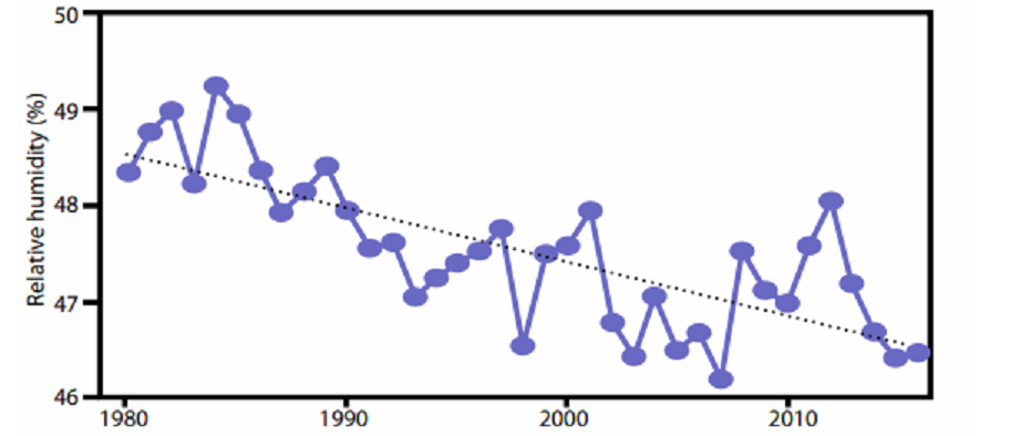
Figure 8: Decline in upper tropospheric RH. Annually-averaged 300 mb relative humidity for the tropics (30°S–30°N). From NASA-MERRA2 reanalysis for 1980–2016. Black dotted line is linear trend.

All of these early GCM simulations were destined to give unrealistically large upper-tropospheric water vapor increases for doubling of CO2 blockage of IR energy to space, and as a result large and unrealistic upper tropospheric temperature increases were predicted. In fact, if data from NASA-MERRA24 and NCEP/NCAR5 can be believed, upper tropospheric RH has actually been declining since 1980 as shown in Figure 8. The top part of Table 1 shows temperature and humidity differences between very wet and dry years in the tropics since 1948; in the wettest years, precipitation was 3.9% higher than in the driest ones. Clearly, when it rains more in the tropics, relative and specific humidity decrease. A similar decrease is seen when differencing 1995–2004 from 1985–1994, periods for which the equivalent precipitation difference is 2%. Such a decrease in RH would lead to a decrease in the height of the radiation emission level and an increase in IR to space.

The Earth’s natural thermostat – evaporation and precipitation

What has prevented this extra CO2-induced energy input of the last 50 years from being realized in more climate warming than has actually occurred? Why was there recently a pause in global warming, lasting for about 15 years?  The compensating influence that prevents the predicted CO2-induced warming is enhanced global surface evaporation and increased precipitation.

Annual average global evaporational cooling is about 80 W/m2 or about 2.8 mm per day.  A little more than 1% extra global average evaporation per year would amount to 1.3 cm per year or 65 cm of extra evaporation integrated over the last 50 years. This is the only way that such a CO2-induced , 1 W/m2 IR energy gain sustained over 50 years could occur without a significant alteration of globally-averaged surface temperature. This hypothesized increase in global surface evaporation as a response to CO2-forced energy gain should not be considered unusual. All geophysical systems attempt to adapt to imposed energy forcings by developing responses that counter the imposed action. In analysing the Earth’s radiation budget, it is incorrect to simply add or subtract energy sources or sinks to the global system and expect the resulting global temperatures to proportionally change. This is because the majority of CO2-induced energy gains will not go into warming the atmosphere. Various amounts of CO2-forced energy will go into ocean surface storage or into ocean energy gain for increased surface evaporation. Therefore a significant part of the CO2 buildup (~75%) will bring about the phase change of surface liquid water to atmospheric water vapour. The energy for this phase change must come from the surface water, with an expenditure of around 580 calories of energy for every gram of liquid that is converted into vapour. The surface water must thus undergo a cooling to accomplish this phase change.

Therefore, increases in anthropogenic CO2 have brought about a small (about 0.8%) speeding up of the globe’s hydrologic cycle, leading to more precipitation, and to relatively little global temperature increase. Therefore, greenhouse gases are indeed playing an important role in altering the globe’s climate, but they are doing so primarily by increasing the speed of the hydrologic cycle as opposed to increasing global temperature.

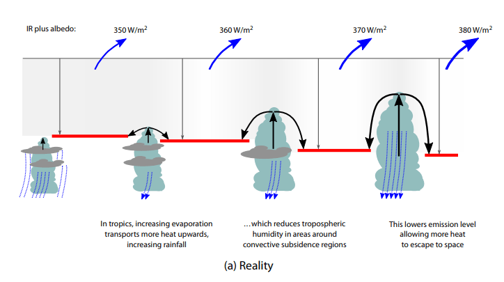
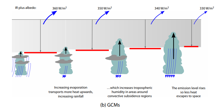
Figure 9: Two contrasting views of the effects of how the continuous intensification of deep
cumulus convection would act to alter radiation flux to space.
The top (bottom) diagram represents a net increase (decrease) in radiation to space

Tropical Clouds Energy Control Mechanism

It is my hypothesis that the increase in global precipitation primarily arises from an increase in deep tropical cumulonimbus (Cb) convection. The typical enhancement of rainfall and updraft motion in these areas together act to increase the return flow mass subsidence in the surrounding broader clear and partly cloudy regions. The upper diagram in Figure 9 illustrates the increasing extra mass flow return subsidence associated with increasing depth and intensity of cumulus convection. Rainfall increases typically cause an overall reduction of specific humidity (q) and relative humidity (RH) in the upper tropospheric levels of the broader scale surrounding convective subsidence regions. This leads to a net enhancement of radiation flux to space due to a lowering of the upper-level emission level. This viewpoint contrasts with the position in GCMs, which suggest that an increase in deep convection will increase upper-level water vapour.

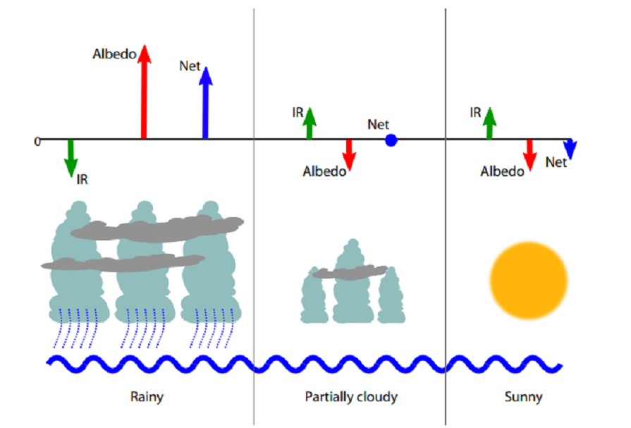
Figure 10: Conceptual model of typical variations of IR, albedo and net (IR + albedo) associated with three different areas of rain and cloud for periods of increased precipitation.

The albedo enhancement over the cloud–rain areas tends to increase the net (IR + albedo) radiation energy to space more than the weak suppression of (IR + albedo) in the clear areas. Near-neutral conditions prevail in the partly cloudy areas. The bottom diagram of Figure 9 illustrates how, in GCMs, Cb convection erroneously increases upper tropospheric moisture. Based on reanalysis data (Table 1, Figure 8) this is not observed in the real atmosphere.

Ocean Overturning Circulation Drives Warming Last Century

A slowing down of the global ocean’s MOC is the likely cause of most of the global warming that has been observed since the latter part of the 19th century.15 I hypothesize that shorter multi-decadal changes in the MOC16 are responsible for the more recent global warming periods between 1910–1940 and 1975–1998 and the global warming hiatus periods between 1945–1975 and 2000–2013.

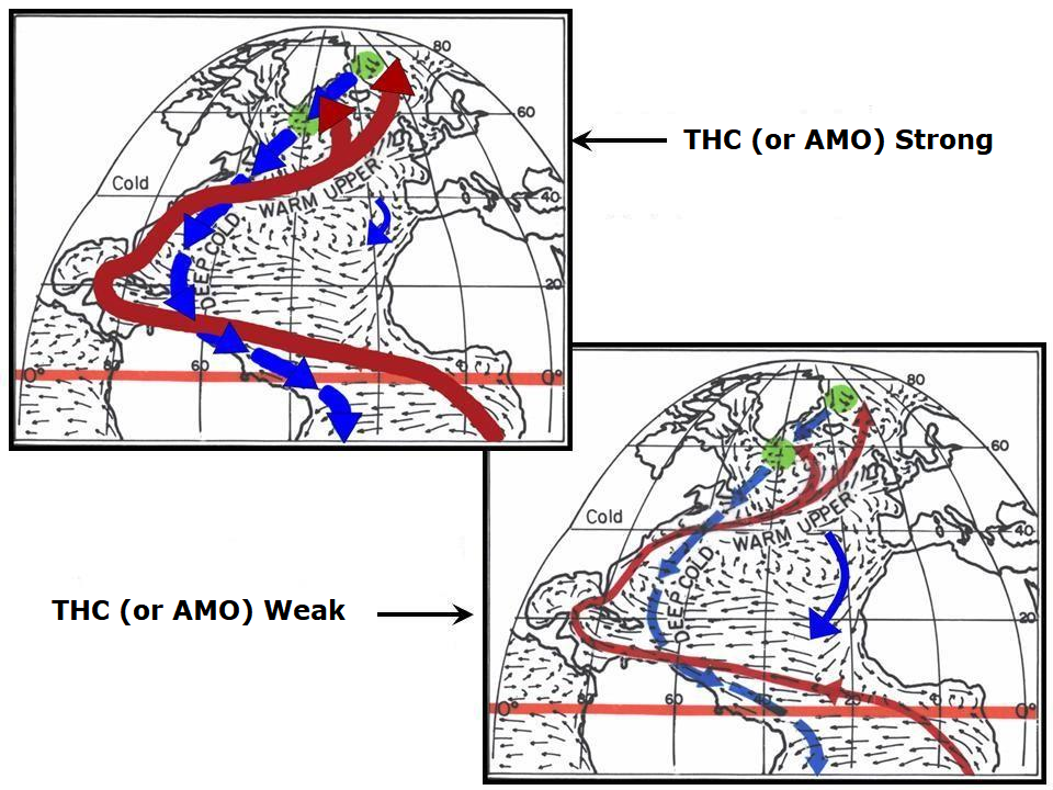
Figure 12: The effect of strong and weak Atlantic THC. Idealized portrayal of the primary Atlantic Ocean upper ocean currents during strong and weak phases of the thermohaline circulation (THC)

Figure 13 shows the circulation features that typically accompany periods when the MOC is stronger than normal and when it is weaker than normal. In general, a strong MOC is associated with a warmer-than-normal North Atlantic, increased Atlantic hurricane activity, increased blocking action in both the North Atlantic and North Pacific and weaker westerlies in the mid-latitude Southern Hemisphere. There is more upwelling of cold water in the South Pacific and Indian Oceans, and an increase in global rainfall of a few percent occurs. This causes the global surface temperatures to cool. The opposite occurs when the MOC is weaker than normal.

The average strength of the MOC over the last 150 years has likely been below the multimillennium average, and that is the primary reason we have seen this long-term global warming since the late 19th century. The globe appears to be rebounding from the conditions of the Little Ice Age to conditions that were typical of the earlier ‘Medieval’ and ‘Roman’ warm periods.

Summary and Conclusions

The Earth is covered with 71% liquid water. Over the ocean surface, sub-saturated winds blow, forcing continuous surface evaporation. Observations and energy budget analyses indicate that the surface of the globe is losing about 80 W/m2 of energy from the global surface evaporation process. This evaporation energy loss is needed as part of the process of balancing the surface’s absorption of large amounts of incoming solar energy. Variations in the strength of the globe’s hydrologic cycle are the way that the global climate is regulated. The stronger the hydrologic cycle, the more surface evaporation cooling occurs, and greater the globe’s IR flux to space. The globe’s surface cools when the hydrologic cycle is stronger than average and warms when the hydrologic cycle is weaker than normal. The strength of the hydrologic cycle is thus the primary regulator of the globe’s surface temperature. Variations in global precipitation are linked to long-term changes in the MOC (or THC).

I have proposed that any additional warming from an increase in CO2 added to the atmosphere is offset by an increase in surface evaporation and increased precipitation (an increase in the water cycle). My prediction seems to be supported by evidence of upper tropospheric drying since 1979 and the increase in global precipitation seen in reanalysis data. I have shown that the additional heating that may be caused by an increase in CO2 results in a drying, not a moistening, of the upper troposphere, resulting in an increase of outgoing radiation to space, not a decrease as proposed by the most recent application of the greenhouse theory.

Deficiencies in the ability of GCMs to adequately represent variations in global cloudiness, the water cycle, the carbon cycle, long-term changes in deep-ocean circulation, and other important mechanisms that control the climate reduce our confidence in the ability of these models to adequately forecast future global temperatures. It seems that the models do not correctly handle what happens to the added energy from CO2 IR blocking.

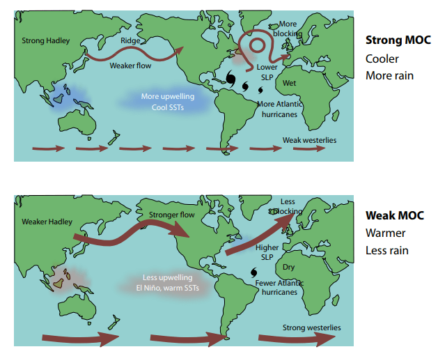
Figure 13: Effect of changes in MOC: top, strong MOC; bottom weak MOC. SLP: sea level pressure; SST, sea surface temperature.

Solar variations, sunspots, volcanic eruptions and cosmic ray changes are energy-wise too small to play a significant role in the large energy changes that occur during important multi-decadal and multi-century temperature changes. It is the Earth’s internal fluctuations that are the most important cause of climate and temperature change. These internal fluctuations are driven primarily by deep multi-decadal and multi-century ocean circulation changes, of which naturally varying upper-ocean salinity content is hypothesized to be the primary driving mechanism. Salinity controls ocean density at cold temperatures and at high latitudes where the potential deep-water formation sites of the THC and SAS are located. North Atlantic upper ocean salinity changes are brought about by both multi-decadal and multi-century induced North Atlantic salinity variability.

 Footnote:

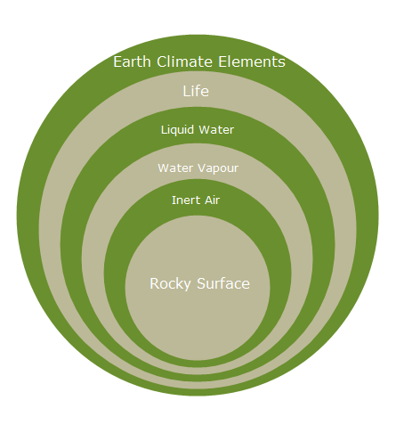
The main point from Bill Gray was nicely summarized in a previous post Earth Climate Layers

The most fundamental of the many fatal mathematical flaws in the IPCC related modelling of atmospheric energy dynamics is to start with the impact of CO2 and assume water vapour as a dependent ‘forcing’.  This has the tail trying to wag the dog. The impact of CO2 should be treated as a perturbation of the water cycle. When this is done, its effect is negligible. — Dr. Dai Davies
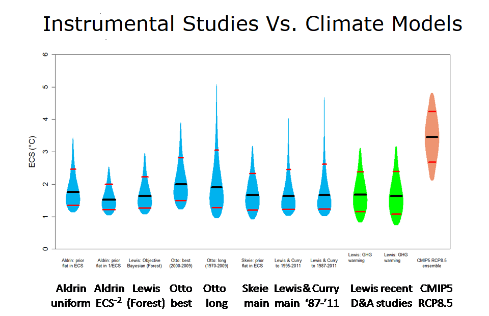
climate-onion2