Alarmist Heads in the Clouds

A new study from Scripps at UC San Diego claims proof of greenhouse gas warming by means of changes to the clouds. The paper is behind a paywall, so the reasoning is not accessible, but the media releases will ensure wide repetition.

From the news release July 11, 2016 (here)
Clouds Are Moving Higher, Subtropical Dry Zones Expanding, According to Satellite Analysis
Scripps-led study confirms computerized climate simulations projecting effects of global warming

Inconsistent satellite imaging of clouds over the decades has been a hindrance to improving scientists’ understanding. Records of cloudiness from satellites originally designed to monitor weather are prone to spurious trends related to changes in satellite orbit, instrument calibration, degradation of sensors over time, and other factors.

When the researchers removed such artifacts from the record, the data exhibited large-scale patterns of cloud change between the 1980s and 2000s that are consistent with climate model predictions for that time period, including poleward retreat of mid-latitude storm tracks, expansion of subtropical dry zones, and increasing height of the highest cloud tops. These cloud changes enhance absorption of solar radiation by the earth and reduce emission of thermal radiation to space. This exacerbates global warming caused by increasing greenhouse gas concentrations.

The researchers drew from several independent corrected satellite records in their analysis. They concluded that the behavior of clouds they observed is consistent with a human-caused increase in greenhouse gas concentrations and a planet-wide recovery from two major volcanic eruptions, the 1982 El Chichón eruption in Mexico and the 1991 eruption of Mt. Pinatubo in the Philippines. Aerosols ejected from those eruptions had a net cooling effect on the planet for several years after they took place.

Barring another volcanic event of this sort, the scientists expect the cloud trends to continue in the future as the planet continues to warm due to increasing greenhouse gas concentrations. (My bolds)

Another Example of Lop-sided Myopia and Confirmation Bias

The report above violates basic physics, resulting in a gross distortion. Two points are critical. When it comes to clouds, the greenhouse gas that matters is H2O, not CO2. Any IR effects are 96% due to the presence of water vapor and the droplets in the clouds.

And even more importantly, as Dr. Salby illustrated (here), the net effect from clouds is cooling, not warming.

Net cloud forcing is then −15 W m−2. It represents radiative cooling of the Earth-atmosphere system. This is four times as great as the additional warming of the Earth’s surface that would be introduced by a doubling of CO2. Latent heat transfer to the atmosphere (Fig. 1.32) is 90 W m−2. It is an order of magnitude greater. Consequently, the direct radiative effect of increased CO2 would be overshadowed by even a small adjustment of convection (Sec. 8.7).

Convective clouds forming over the Amazon in a blanket smoke. Credit: Prof. Ilan Koren

This is confirmed by other researchers, such as I. Koren, G. Dagan, and O. Altaratz. From aerosol-limited to invigoration of warm convective clouds. Science, 2014; 344 (6188) here.

They then looked at another source of data: that of the Clouds’ and Earth’s Radiant Energy System (CERES) satellite instruments which measure fluxes of reflected and emitted radiation from Earth to space, to help scientists understand how the climate varies over time. When analyzed together with the aerosol loading over the same area at the same time, the outcome, says Koren, was a “textbook demonstration of the invigoration effect” of added aerosols on clouds. In other words, the radiation data fit the unique signature of clouds that were growing higher and larger. Such clouds show a strong increase in cooling due to the reflected short waves, but that effect is partly cancelled out by the enhanced, trapped, long-wave radiation coming from underneath. (My bold)

More info on clouds is here:Climate Partly Cloudy 

Summary

Once again, atmospheric physics is willfully distorted in order to get a headline and burnish credentials in support of man-made climate change. They promote a myopic and lop-sided picture to frighten a public mostly ill-equipped to see through their mumbo-jumbo.

mumbo_jumbo_flamingo-land1

The Coming Climate July 4 Update

Update July 4 below

When you see a graph like that below, it is obvious that an unusually strong El Nino just happened in our climate system. It resulted in higher global temperatures the last two years and so far in 2016. But that event is over now, and naturally we wonder what to expect in the months and years ahead.

cdas_v2_hemisphere_2016june2
For example some comments from a recent thread at WUWT (here) were intriguing:

It will be interesting to see what comes next. The major difference between the 1998 el nino and this one is that in 1998 the sun was increasing in solar activity, while this one solar activity is decreasing. (rishrac)

Nino3,4 and UAH LT dC Anomalies, and UAH LT Scaled *3 and Lagged 4 Months h/t Allan MacRae

And richard takes the long view of the situation:

While we all stare at the short-term ups and downs of the global temperatures, pay a little thought to the fact that the Earth’s orbit around the Sun causes snow in the winter and warmth during the summer, so it may be important?

Perihelion presently occurs around January 3, (Northern hemisphere winter, Southern summer) while aphelion is around July 4. Therefore, the southern hemisphere receives more solar radiation and is therefore warmer in summer and colder in winter (aphelion). The Northern hemisphere has cooler summers and milder winter (solar radiation-wise).

Also the northern hemispheres autumn and winter are slightly shorter than spring and summer, because the Earth is moving faster around the Sun in winter slower in summer.

This alone could account for “Global Warming” attributed to CO2, (which no doubt plays some part in it).

Over the next 10,000 years, northern hemisphere winters will become gradually longer and summers will become shorter, due to the change in the Earth’s Orbital Eccentricity.

Couple this with changes in the Earth’s tilt, which varies from 22.1 degrees to 24.5 degrees, (currently at 23.4 degrees). More tilt means more solar radiation gets to the poles (global warming) and less tilt means less radiation gets to the poles (global cooling). The last maximum tilt occurred in 8700 BC (Holocene maximum) and the next minimum tilt will happen in 11,800 AD (the advance of the ice sheets), precisely at the time of longer northern winters and shorter summers.

Orbital Climate Factors: E for eccentricity, T for tilt, and P for precession

Predicting the Future is Tough

Chiefio (E.M. Smith) has a good post (here) reminding us that statistical projections do not help us much in this case. Temperature series produced by our climate system have special qualities. The patterns are auto-correlated, meaning that tomorrow’s weather will be similar to today’s; the occurrence is not totally independent, like the flip of coin. IOW there is momentum in the climate characteristics, which can and do fluctuate over seasons, decades, centuries and more. Our attempts to use linear regressions to forecast are thwarted by temperature time series that do not follow a normal gaussian distribution, and are semi-chaotic and non-stationary.

Four Possibilities Forward From Today

From past experience, the next few years could logically follow one of four temperature scenarios:
1. The Plateau since 1998 continues.
2. The Warming prior to 1998 resumes.
3. A new Plateau begins with 2016 at a higher (step up) level.
4. A Cooling begins comparable to the years after 1940.

All of these have analogues in our recent climate observations. If this now finished El Nino triggers a regime change comparable to the 1998 event, then a step-up plateau can result. If warmists are right, and there is a release of pent-up heat in the system, then a warming trend would resume.

If this El Nino is not strong enough to shift the regime, then the Plateau could continue at the same level. Finally, it could be that several factors align to reverse the warming since the 1970’s, and bring a return to cooler 1950’s weather.

Those who see a quasi-60 year cycle in weather patterns note that it is about time for the PDO in the Pacific and the AMO in the Atlantic to be in cooler phases, along with a quiet sun, which went spotless last week. There are also those attending to orbital climate patterns, which gave us the Modern Warming Period and will eventually take it away.


Changes in climate due to earth’s orbit around the sun

Update July 4

In the previous thread is a chart from J. Martin displaying the effects of the changing tilt of earth’s axis.  As shown, the long term pattern is toward cooling.

J. Martin: Tilt (obliquity) has a 41k yr cycle and prior to the arrival of 100,000 year glaciations, the 41k year world dominated with short sharp glaciations every 41 thousand years. The 41k influence us still there. Javier has done a graph which overlays the obliquity cycle on top of a graph of the holocene which produces a perfect match. So it would seem that interstitial temperatures are largely governed by obliquity, but glaciation temperatures are governed by eccentricity with occasional disturbances from precession .

In addition, ren provides interesting links to studies showing SA (Sunspot numbers) correlating to Middle Ages Warm period and LIA, and a 2012 study forecasting the next 2 cycles.

shepherd etalfig1

Figure 1. Bottom plot: the summary component of the two PCs (solid curve) and the decaying component (dashed curves) for the “historical” data (cycles 21–23) and predicted data (cycles 24–26). The cycle lengths (about 11 yr) are marked with different colors.

Abstract: We can conclude with a sufficient degree of confidence that the solar activity in cycles 24–26 will be systematically decreasing because of the increasing phase shift between the two magnetic waves of the poloidal field leading to their full separation into opposite hemispheres in cycles 25 and 26. This separation is expected to result in the lack of their subsequent interaction in any of the hemispheres, possibly leading to a lackof noticeable sunspot activity on the solar surface lasting for a decade or two, similar to those recorded in the medieval period.

Again, to the extent that SSNs are a proxy for changes in heat content within the earth’s climate system, the graph is also indicating future cooling.

For an approach to quantifying climate effects from Solar Activity, as well as oceanic cycles, see:
Quantifying Natural Climate Change

Quantifying Natural Climate Change


Natural climate change

Recent posts have stressed the complexity of climates and their component variables. However, global warming was invented on the back of a single metric: rising global mean temperatures the last decades of last century. That was de-emphasized during the “pause” but re-emerged lately with the El-Nino-induced warming. So this post is focusing on that narrow aspect of climate change.

There are several papers on this blog referring to a quasi-60 year oscillation of surface temperatures due to oceanic circulations. I have also noted the attempts by many to make the link between solar activity (SA) and earth climate patterns.

Dan Pangburn is a professional engineer who has synthesized the solar and oceanic factors into a mathematical model that correlates with Average Global Temperature (AGT). On his blog is posted a monograph (here) Cause of Global Climate Change explaining clearly his thinking and the maths.  I am providing some excerpts and graphs as a synopsis of his analysis, in hopes others will also access and appreciate his work on this issue.

Introduction

The basis for assessment of AGT is the first law of thermodynamics, conservation of energy, applied to the entire planet as a single entity. Much of the available data are forcings or proxies for forcings which must be integrated (mathematically as in calculus, i.e. accumulated over time) to compute energy change. Energy change divided by effective thermal capacitance is temperature change. Temperature change is expressed as anomalies which are the differences between annual averages of measured temperatures and some baseline reference temperature; usually the average over a previous multiple year time period. (Monthly anomalies, which are not used here, are referenced to previous average for the same month to account for seasonal norms.)

At this point, it appears reasonable to consider two temperature anomaly data sets extending through 2015.  These are co-plotted on Figure 8.

Slide8lrg

1) The set used previously [12] through 2012 with extension 2013-2015 set at the average 2002-2012 (when the trend was flat) at 0.4864 K above the reference temperature. 2) Current (5/27/16) HadCRUT4 data set [13] through 2012 with 2013-2015 set at the average 2002-2012 at 0.4863 K above the reference temperature.

Accuracy of the model is determined using the Coefficient of Determination, R 2, to compare calculated AGT with measured AGT.

Oceanic Climate Impacts

Approximation of the sea surface temperature anomaly oscillation can be described as varying linearly from –A/2 K in 1909 to approximately +A/2 K in 1941 and linearly back to the 1909 value in 1973. This cycle repeats before and after with a period of 64 years.

Slide1

Figure 1: Ocean surface temperature oscillations (α-trend) do not significantly affect the bulk energy of the planet.

Comparison with PDO, ENSO and AMO

Ocean cycles are perceived to contribute to AGT in two ways: The first is the direct measurement of sea surface temperature (SST). The second is warmer SST increases atmospheric water vapor which acts as a forcing and therefore has a time-integral effect on temperature. The approximation, (A,y), accounts for both ways.

Successful accounting for oscillations is achieved for PDO and ENSO when considering these as forcings (with appropriate proxy factors) instead of direct measurements. As forcings, their influence accumulates with time. The proxy factors must be determined separately for each forcing.

Slide2

Figure 2: Comparison of idealized approximation of ocean cycle effect and the calculated effect from PDO and ENSO.

The AMO index [9] is formed from area-weighted and de-trended SST data. It is shown with two different amounts of smoothing in Figure 3 along with the saw-tooth approximation for the entire planet per Equation (2) with A = 0.36.

Slide3

The high coefficients of determination in Table 1 and the comparisons in Figures 2 and 3 corroborate the assumption that the saw-tooth profile with a period of 64 years provides adequate approximation of the net effect of all named and unnamed ocean cycles in the calculated AGT anomalies.

Solar-Climate Connection

An assessment of this is that sunspots are somehow related to the net energy retained by the planet, as indicated by changes to average global temperature. Fewer sunspots are associated with cooling, and more sunspots are associated with warming. Thus the hypothesis is made that SSN are proxies for the rate at which the planet accumulates (or loses) radiant energy over time. Therefore the time-integral of the SSN anomalies is a proxy for the amount of energy retained by the planet above or below breakeven.

Also, a lower solar cycle over a longer period might result in the same increase in energy retained by the planet as a higher solar cycle over a shorter period. Both magnitude and time are accounted for by taking the time-integral of the SSN anomalies, which is simply the sum of annual mean SSN (each minus Savg) over the period of study.

The values for Savg are subject to two constraints. Initially they are determined as that which results in derived coefficients and maximum R2. However, calculated values must also result in rational values for calculated AGT at the depths of the Little Ice Age. The necessity to calculate a rational LIA AGT is a somewhat more sensitive constraint. The selected values for Savg result in calculated LIA AGT of approximately 1 K less than the recent trend which appears rational and is consistent with most LIA AGT assessments.

The sunspot number anomaly time-integral is a proxy for a primary driver of the temperature anomaly β-trend. By definition, energy change divided by effective thermal capacitance is temperature change.

Slide10

Figure 10: 5-year running average of measured temperatures with calculated prior and future trends (Data Set 1) using 34 as the average daily sunspot number and with V1 SSN. R2 = 0.978887

Projections until 2020 use the expected sunspot number trend for the remainder of solar cycle 24 as provided [6] by NASA. After 2020 the ‘limiting cases’ are either assuming sunspots like from 1924 to 1940 or for the case of no sunspots which is similar to the Maunder Minimum.

Some noteworthy volcanoes and the year they occurred are also shown on Figure 9. No consistent AGT response is observed to be associated with these. Any global temperature perturbation that might have been caused by volcanoes of this size is lost in the natural fluctuation of measured temperatures.

Although the connection between AGT and the sunspot number anomaly time-integral is demonstrated, the mechanism by which this takes place remains somewhat speculative.

Various papers have been written that indicate how the solar magnetic field associated with sunspots can influence climate on earth. These papers posit that decreased sunspots are associated with decreased solar magnetic field which decreases the deflection of and therefore increases the flow of galactic cosmic rays on earth.

These papers [14,15] associated the increased low-altitude clouds with increased albedo leading to lower temperatures. Increased low altitude clouds would also result in lower average cloud altitude and therefore higher average cloud temperature. Although clouds are commonly acknowledged to increase albedo, they also radiate energy to space so increasing their temperature increases S-B radiation to space which would cause the planet to cool. Increased albedo reduces the energy received by the planet and increased radiation to space reduces the energy of the planet. Thus the two effects work together to change the AGT of the planet.

Summary

Simple analyses [17] indicate that either an increase of approximately 186 meters in average cloud altitude or a decrease of average albedo from 0.3 to the very slightly reduced value of 0.2928 would account for all of the 20th century increase in AGT of 0.74 K. Because the cloud effects work together and part of the temperature change is due to ocean oscillation (low in 1901, 0.2114 higher in 2000), substantially less cloud change would suffice.

All of this leaves little warming left to attribute to rising CO2. Pangburn estimates CO2 forcing could be at most 18.6% or 0.23C added since 1895. Given uncertainties in proxies from the past, the estimate could be as low as 0.05C, and the correlation with natural factors would still be .97 R2.

However, all is not lost for CO2. It is still an important player in the atmosphere, despite its impotence as a warming agent.


Think Global Act Local, or Not

The slogan “Think Global, Act Local” began with multinational corporations realizing that national and regional markets around the world had distinct needs and preferences requiring accommodations. As the name implies it refers to the corporate strategy by which a global viewpoint is adopted in terms of formulating company vision, long-term aims and objectives and devising effective programs to achieve these aims and objectives, however, adaptations are made in each market according to the culture and specifications of any specific market.

Environmental activists took the notion on board during the first wave becoming aware of globalization. Early bearers of the catchphrase were for the most part supporters of an environmental movement that supported individual activism. The theory behind the saying was that in order to make large-scale global movements stick, the responsibility lay on individuals to carry out progressive practices – like environmental stewardship – in their own homes. The globe had become the new frame of reference for some far-thinking activists.

Clearly “climate change” activism operates in this mode. But as we shall see in this essay, the top-down, Global-Local approach to understanding climate and weather leads to distortions and misconceptions. In fact, climate science itself is best served by observing and establishing principles from the bottom up.

It turns out that the climate system is one of those things where averages do not tell very much, and can be misleading. For example:

Look at precipitation around the world

About 1 meter a year is the nominal average of all rain over all surfaces. Some places get up to 10 meters of rain (about 400 inches ) and others get near none. 47% of the earth is considered dryland, defined as anyplace where the rate of evaporation/transpiration exceeds the rate of precipitation. A desert is defined as a dryland with less than 25 cm of precipitation. In the image above, polar deserts are remarkably defined. It just does not have much hope of precipitation as there is little heat to move the water. More heat in, more water movement. Less heat in, less water movement.

Then there’s the seasonal patterns. The band of maximum rains moves with the sun: More north in June, more south in December. More sun, more heating, more rain. Movement in sync with the sun, little time delay. Equatorial max solar heat has max rains. Polar zones minimal heating, minimal precipitation. It’s a very tightly coupled system with low time lags.

Then Look at Temperatures

Average temperatures in F at sea level by longitude and latitude. Source: Lyndon State College Meteorology

Notice:

  • latitudinal change
  • N.H. – difference between land and ocean
  • U.S. west coast (upwelling and cold current) v.s. U.S. east coast (gulf stream)
  • influence of gulf stream in north Atlantic
  • highest temps are in the subtropical N.H. desert regions
  • west coast of S. America is cool while the east coast is warm, due to the ocean currents
  • much less variability in the zonal direction in the S. H.

And look at clouds and their radiative effects

The large opacity of cloud increases the optical depth of the atmosphere, introducing warming in the LW energy budget. This warming varies with cloud-top temperature and height. For SW radiation, the high reflectivity of cloud decreases the incoming solar flux, favoring reduced surface temperature. Cloud routinely covers about 50% of the Earth. It accounts for about half of the Earth’s albedo (eg, for ∼0.15). Source: Salby 2012 pg315

Globally averaged values of CLW and CSW are about 30 and −45 W m−2, respectively. Net cloud forcing is then −15 W m−2. It represents radiative cooling of the Earth-atmosphere system. This is four times as great as the additional warming of the Earth’s surface that would be introduced by a doubling of CO2.

But clearly during Northern winter (diagrams above), that net cooling occurs largely over the Southern Ocean around Antarctica.

What happens when you average all this diversity?

We have all seen graphs showing how climate models project unrealistic global mean temperatures higher than those measured by stations or satellites. But Dr. Salby in his textbook points to a more fundamental failing of the climate simulations.  By construction they balance global average energy budgets, but regional realities are grossly distorted.

From IPCC Working Group 1 AR4

Figure 8.4. Root-mean-square (RMS) model error, as a function of latitude, in simulation of (a) outgoing SW radiation reflected to space and (b) outgoing LW radiation. The RMS error is calculated over all longitudes and over all 12 months of a climatology formed from several years of data. . .The Earth Radiation Budget Experiment (ERBE; Barkstrom et al., 1989) observational estimates used here are for the period 1985 to 1989 from satellite-based radiometers, and the model results are for the same period in the 20th-century simulations in the MMD at PCMDI.

Symbolizing the local energy budget is net radiation (Fig. 1.34c), which represents the local imbalance between the SW and LW fluxes F0 and F ↑(0) in the TOA energy budget (8.82). Local values of those fluxes have been measured around the Earth by the three satellites of ERBE. The observed fluxes, averaged over time, have then been compared against coincident fluxes from climate simulations, likewise averaged. Figure 8.34 plots, for several GCMs, the rms error in simulated fluxes, which have been referenced against those observed by ERBE.

Values represent the regional error in the (time-mean) TOA energy budget. The error in reflected SW flux, Fs 4 − F0 in the global mean (8.82), is of order 20 Wm−2 (Fig. 8.34a). Such error prevails at most latitudes. Differences in error between models (an indication of intermodel discrepancies) are almost as large, 10–20 Wm−2. The picture is much the same for outgoing LW flux (Fig. 8.34b). For F ↑(0), the rms error is of order 10–15 Wm−2. It is larger for all models in the tropics, where the error exceeds 20 Wm−2. . .Consequently, the simulated change introduced by increased CO2 (2–4 Wm−2), even inclusive of feedback, is overshadowed by error in the simulated change of major absorbers.

By construction, GCMs achieve global-mean energy balance. How faithfully the energy budget is represented locally, however, is another matter. The local energy budget forces regional climate, along with the gamut of weather phenomena that derive from it. This driver of regional conditions is determined internally – through the simulation of local heat flux, water vapor, and cloud.  (My bold)

Conclusion

A common expression is: “The devil is in the details.” When it comes to climate, it is truer to say that we humans are bedeviled (thwarted) by nature’s details refusing to fit into our global generalities. The proper role of science is to investigate those details and revise our mental constructs.

“Global Climate” is an oxymoron.
(oxymoron: A figure of speech in which two words with opposing meanings are used together intentionally for effect; IOW a contradiction in terms. From the Greek: pointed foolishness).

Climates are plural, not global, as the Koppen system makes clear. There are hundreds of regional climate zones defined empirically by temperature and precipitation patterns. And the observational data shows those zones are highly stable; that is, fears of climate change rarely appear in any actual climates showing shifting boundaries. See post: Data vs. Models 4: Climates Changing

Thus, we are better advised to:

Think Local Climates,
Prepare Local Adaptations
for the range of future weather consequences.

Fearless Physics from Dr. Salby


“Fearless Felix” Baumgartner ascended to the stratosphere and stepped into the void from 24.2 miles above the Earth. His speed during the fall reached Mach 1.24, and the Austrian adventurer nailed the landing. October 14, 2012 Wired 

Introduction
Murry Salby is also totally committed to the atmosphere. He is a scientist with such deep and broad knowledge of atmospheric physics that he has written multiple textbooks on the subject. And yet he is not fearful for the future of our climate system, in contrast to many of his colleagues. By stepping away from “consensus” climate alarms, he has shown unusual courage by speaking plainly about the atmosphere and climate, despite attempts to silence him.

Dr. Salby’s latest textbook is entitled Physics of the Atmosphere and Climate (here). I got a copy and have been reading in it to understand where he comes down on various issues related to climate change. In particular I wanted to know what explains his divergence from IPCC climate scientists.
H/T to Kenneth Richard and No Tricks Zone

Synopsis

In reading the textbook, I find two main reasons why Salby is skeptical of AGW (anthropogenic global warming) alarm. This knowledgeable book is an antidote to myopic and lop-sided understandings of our climate system.

  1. CO2 Alarm is Myopic: Claiming CO2 causes dangerous global warming is too simplistic. CO2 is but one factor among many other forces and processes interacting to make weather and climate.

Myopia is a failure of perception by focusing on one near thing to the exclusion of the other realities present, thus missing the big picture. For example: “Not seeing the forest for the trees.”  AKA “tunnel vision.”

2. CO2 Alarm is Lopsided: CO2 forcing is too small to have the overblown effect claimed for it. Other factors are orders of magnitude larger than the potential of CO2 to influence the climate system.


Lop-sided refers to a failure in judging values, whereby someone lacking in sense of proportion, places great weight on a factor which actually has a minor influence compared to other forces. For example: “Making a mountain out of a mole hill.”

Overview

Salby’s textbook presents all of the physical complexity of the climate system in contrast to simplistic global warming theory. And he provides his sense of the Scales of the various processes, balancing any lopsided overemphasis on CO2 effects.

From the Preface:
Despite technological advances in observing the Earth-atmosphere system and in computing power, strides in predicting its evolution reliably – on climatic time scales and with regional detail – have been limited. The pace of progress reflects the interdisciplinary demands of the subject. Reliable simulation, adequate to reproduce the observed record of climate variation, requires a grasp of mechanisms from different disciplines and of how those mechanisms are interwoven in the Earth-atmosphere system.

What is today labeled climate science includes everything from archeology of the Earth to superficial statistics and a spate of social issues. Yet, many who embrace the label have little more than a veneer of insight into the physical processes that actually control the Earth-atmosphere system, let alone what is necessary to simulate its evolution reliably. Without such insight and its application to resolve major uncertainties, genuine progress is unlikely.

The atmosphere is the heart of the climate system, driven through interaction with the sun, continents, and ocean. It is the one component that is comprehensively observed. For this reason, the atmosphere is the central feature against which climate simulations must ultimately be validated.

The treatment focuses upon physical concepts, which are developed from first principles. It integrates five major themes:
1. Atmospheric Thermodynamics;
2. Hydrostatic Equilibrium and Stability;
3. Radiation, Cloud, and Aerosol;
4. Atmospheric Dynamics and the General Circulation;
5. Interaction with the Ocean and Stratosphere.

Lessons from Dr. Salby:  Essential Elements of a Balanced Climate Understanding

Below I show some of the written statements from the textbook to illustrate how his knowledge counteracts myopic and lopsided thinking.

Focusing on CO2 from burning fossil fuels is myopic: A multitude of natural sources drive atmospheric concentrations.

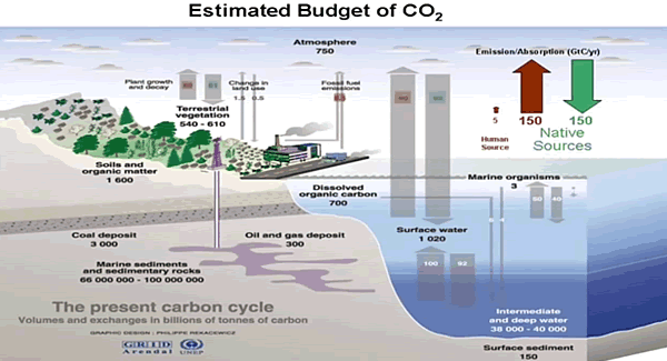
Plate 24 Estimated global carbon cycle, illustrating stores of carbon,
in GtC, and transfers in GtC/yr, where 1 GtC=109 tons of carbon.
Source: Design by Philippe Rekacewicz, UNEP/GRID-Arendal (11.07.10).

Pg.545-6
The storage of CO2 is illustrated in Fig. 17.11. Except for deep sedimentary rock, which is sequestered, most of the carbon is stored in the ocean. It accounts for some 40,000 gigatons (1012 kg) of carbon (GtC), in the form of dissolved CO2 and organic matter. Most resides in the deep ocean, where cold water supports the greatest observed concentrations. There, dissolved CO2 is controlled by the thermohaline circulation. Land and the adjoining biosphere account for only about 2000 GtC. The atmosphere contains less than 1000 GtC, concentrated in CO2. Hence, the store of carbon in the ocean is two orders of magnitude greater than the store in the atmosphere.

Equally significant are transfers of carbon into and out of the ocean. Of order 100 GtC/yr, they exceed those into and out of land. Together, emission from ocean and land sources (∼150 GtC/yr) is two orders of magnitude greater than CO2 emission from combustion of fossil fuel. These natural sources are offset by natural sinks, of comparable strength. However, because they are so much stronger, even a minor imbalance between natural sources and sinks can overshadow the anthropogenic component of CO2 emission (cf Secs 1.6.2, 8.7.1).

The values in Fig. 17.11 can be used to estimate the effective turnover time of atmospheric CO2. At an absorption rate of 100 GtC/yr, the ocean will absorb the atmospheric store of CO2 of 1000 GtC in about a decade. That absorption of CO2, which is concentrated in cold SST at polar latitudes, is nearly offset by emission of CO2 from warm SST at tropical latitudes. Warming of SST (by any mechanism) will increase the outgassing of CO2 while reducing its absorption. Owing to the magnitude of transfers with the ocean, even a minor increase of SST can lead to increased emission of CO2 that rivals other sources (Sec. 8.7.1). Further, if the increase of SST involves heat transfer with the deep ocean, the time for equilibrium to be reestablished would be centuries (Sec. 17.1.2).

Attributing rising temperatures to fossil fuels is lop-sided: Natural sinks respond to warming by releasing CO2 in far greater quantities.

Net emission rate of CO2, r˙ CO2 = d dt rCO2 (ppmv/yr), derived from the Mauna Loa record (Fig. 1.15), lowpass filtered to changes that occur on time scales longer than 2 years (solid). Superimposed is the satellite record of anomalous Global Mean Temperature (Fig. 1.39), lowpass filtered likewise and scaled by 0.225 (dashed). Trend in GMT over 1979–2009 (not included) is ∼0.125 K/decade.

Pg.65ff
Net emission of CO2 closely tracks the evolution of GMT. Achieving a correlation of 0.80, the variation of GMT accounts for most of the variance in CO2 emission.

Plotted in Fig. 1.43b is the rate of change in isotopic composition, d dt δ13C = ˙ δ13C (solid).12 Its mean is negative, consistent with the long-term decline of δ13C in ice cores (Fig. 1.14). However, like emission of CO2, differential emission of 13CO2 varies substantially from one year to the next. It too tracks the evolution of GMT – just out of phase. When GMT increases, emission of 13CO2 decreases and vice versa. The records achieve a correlation of −0.86. Hence the variation of GMT, which accounts for most of the variance in emission of CO2, also accounts for most of the variance in differential emission of 13CO2.

The out-of-phase relationship between rCO2 and δ13C in the instrumental record (Fig. 1.43) is the same one evidenced on longer time scales by ice cores (Fig. 1.14). The out-of-phase relationship in ice cores is regarded as a signature of anthropogenic emission, subject to uncertainties (Sec. 1.2.4). The out-of-phase relationship in the instrumental record, however, is clearly not anthropogenic. Swings of GMT following the eruption of Pinatubo and during the 1997–1998 El Nino were introduced through natural mechanisms (cf. Figs 1.27; 17.19, 17.20). Changes in Fig. 1.43 reveal that net emission of CO2, although 13C lean, is accelerated by increased surface temperature. Outgassing from ocean, which increases with temperature (Sec. 17.3), is consistent with the observed relationship – if the source region has anomalously low δ13C. So is the decomposition of organic matter derived from vegetation. Having δ13C comparable to that of fossil fuel, its decomposition is likewise accelerated by increased surface temperature.

Focusing on CO2 as the greenhouse gas of concern is both myopic and lop-sided: H20 makes 98% of the IR radiative activity in the atmosphere.

Pg. 47
The radiative-equilibrium surface temperature Ts is significantly warmer than that in the absence of an atmosphere.

The discrepancy between Ts and Te follows from the different ways the atmosphere processes SW and LW radiation. Although nearly transparent to SW radiation (wavelengths λ ∼ 0.5 μm), the atmosphere is almost opaque to LW radiation (λ ∼ 10 μm) that is re-emitted by the Earth’s surface. For this reason, SW radiation passes relatively freely to the Earth’s surface, where it can be absorbed. However, LW radiation emitted by the Earth’s surface is captured by the overlying air, chiefly by the major LW absorbers: water vapor and cloud. Energy absorbed in an atmospheric layer is reemitted, half upward and half back downward. The upwelling re-emitted radiation is absorbed again in overlying layers, which subsequently re-emit that energy in similar fashion. This process is repeated until LW energy is eventually radiated beyond all absorbing components of the atmosphere and rejected to space. By inhibiting the transfer of energy from the Earth’s surface, repeated absorption and emission by intermediate layers of the atmosphere traps LW energy, elevating surface temperature over what it would be in the absence of an atmosphere.

Pg. 247ff
The residual, +1.5 Wm−2, represents net warming. It is about 0.5% of the 327 Wm−2 of overall downwelling LW radiation that warms the Earth’s surface (Fig. 1.32). The vast majority of that warming is contributed by water vapor. Together with cloud, it accounts for 98% of the greenhouse effect. How water vapor has changed in relation to changes of the comparatively minor anthropogenic species (Fig. 8.30) is not known. The additional surface warming introduced by anthropogenic increases in greenhouse gases amounts to about 75% of that which would be introduced by a doubling of CO2. Arrhenius’ estimate of 5–6◦ K for the accompanying increase of surface temperature (Sec. 1.2.4) then translates into ∼4◦ K. Yet, the observed change of global-mean temperature since the mid nineteenth century is only about 1◦ K (Sec. 1.6.1). The discrepancy points to changes of the Earth-atmosphere system (notably, involving the major absorbers, water vapor and cloud) that develop in response to imposed perturbations, like anthropogenic emission of CO2.

Focusing on CO2 radiative activity is myopic: The tropospheric heat engine comprises many powerful heat transfer processes.

Cloud Forcing

Figure 9.40 Cloud radiative forcing during northern winter derived from ERBE measurements on board the satellites ERBS and NOAA-9 for the (a) LW energy budget, (b) SW energy budget, and (c) net radiative energy budget. Courtesy of D. Hartmann (U. Washington).

Pg. 318ff
A quantitative description of how cloud figures in the global energy budget is complicated by its dependence on microphysical properties and interactions with the surface. These complications are circumvented by comparing radiative fluxes at TOA under cloudy vs clear-sky conditions. Over a given region, the column-integrated radiative heating rate must equal the difference between the energy flux absorbed and that emitted to space.

The components of cloud forcing (9.53) can be evaluated directly from broadband fluxes of outgoing LW and SW radiation that are measured by satellite. Figure 9.40 shows time-averaged distributions of CSW , CLW , and C. Longwave forcing (Fig. 9.40a) is large in centers of deep convection over tropical Africa, South America, and the maritime continent, where CLW approaches 100 W m−2 (cf. Fig. 1.30b). Secondary maxima appear in the maritime ITCZ and in the North Pacific and North Atlantic storm tracks (Sec. 1.2.5). Shortwave forcing (Fig. 9.40b) is strong in the same regions, where CSW < −100 W m−2. Negative SW forcing is also strong over extensive marine stratocumulus in the eastern oceans and over the Southern Ocean, coincident with the storm track of the Southern Hemisphere. Inside the centers of deep tropical convection, SW and LW cloud forcing nearly cancel. They leave small values of C throughout the tropics (Fig. 9.40c). Negative CSW in the storm tracks and over marine stratocumulus then dominates positive CLW , especially over the Southern Ocean. It prevails in the global-mean cloud forcing. Globally averaged values of CLW and CSW are about 30 and −45 W m−2, respectively.

Net cloud forcing is then −15 W m−2. It represents radiative cooling of the Earth-atmosphere system. This is four times as great as the additional warming of the Earth’s surface that would be introduced by a doubling of CO2. Latent heat transfer to the atmosphere (Fig. 1.32) is 90 W m−2. It is an order of magnitude greater. Consequently, the direct radiative effect of increased CO2 would be overshadowed by even a small adjustment of convection (Sec. 8.7).

Trusting climate models driven by CO2 sensitivity is lop-sided: Natural climate factors are poorly quantified but are orders of magnitude larger than estimated CO2 effects.

Pg. 260
Global climate models are sophisticated extensions of the idealized models considered above. Treatments of climate properties in different GCMs are as varied as they are complex. For some properties, like cloud cover, ice, and vegetation, they must resort to empirical relationships or simply ad hoc parameterization. For others, the governing equations cannot even be defined. Together with the ocean simulation, these limitations introduce errors, which can be substantial. Along with discrepancies between GCMs, they leave in question how faithfully climate feedbacks are represented (see, e.g., Tsushima and Manabe, 2001; Lindzen and Choi, 2009).

fig-8-04-724x1024

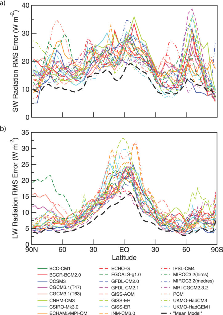
The accuracy of GCMs is reflected in the skill with which they simulate the TOA energy budget: the driver of climate. By construction, GCMs achieve global-mean energy balance. How faithfully the energy budget is represented locally, however, is another matter. The local energy budget forces regional climate, along with the gamut of weather phenomena that derive from it. This driver of regional conditions is determined internally – through the simulation of local heat flux, water vapor, and cloud. Symbolizing the local energy budget is net radiation (Fig. 1.34c), which represents the local imbalance between the SW and LW fluxes F0 and F ↑(0) in the TOA energy budget (8.82). Local values of those fluxes have been measured around the Earth by the three satellites of ERBE. The observed fluxes, averaged over time, have then been compared against coincident fluxes from climate simulations, likewise averaged. Figure 8.34 plots, for several GCMs, the rms error in simulated fluxes, which have been referenced against those observed by ERBE.

Values represent the regional error in the (time-mean) TOA energy budget. The error in reflected SW flux, Fs 4 − F0 in the global mean (8.82), is of order 20 Wm−2 (Fig. 8.34a). Such error prevails at most latitudes. Differences in error between models (an indication of intermodel discrepancies) are almost as large, 10–20 Wm−2. The picture is much the same for outgoing LW flux (Fig. 8.34b). For F ↑(0), the rms error is of order 10–15 Wm−2. It is larger for all models in the tropics, where the error exceeds 20 Wm−2.

The significance of these discrepancies depends on application. Overall fluxes at TOA are controlled by water vapor and cloud (Fig. 1.32) – the major absorbers that account for the preponderance of downwelling LW flux to the Earth’s surface. Relative to those fluxes, the errors in Fig. 8.34 are manageable: Of order 10% for outgoing LW and 20% for reflected SW. Relative to minor absorbers, however, this is not the case. The entire contribution to the energy budget from CO2 is about 4 Wm−2. Errors in Fig. 8.34 are an order of magnitude greater. Consequently, the simulated change introduced by increased CO2 (2–4 Wm−2), even inclusive of feedback, is overshadowed by error in the simulated change of major absorbers.

Conclusion:

Pg. 262
Discrepancies between GCMs arise from inaccuracies in climate properties and from differences in how those properties are represented. Much of the discrepancy surrounds the representation of convection and its influence on water vapor and cloud, the absorbers that account for most of the downwelling LW flux to the Earth’s surface. The involvement of convection is strongly suggested by models of radiative-convective equilibrium. Those simulations are inherently sensitive to how convection and cloud are prescribed. Cloud is especially significant to radiative considerations because it sharply modifies the atmosphere’s scattering characteristics, which determine albedo, and its absorption characteristics, which determine optical depth.

Footnote:

Best wishes to Dr. Salby and much appreciation for telling it like it is.  May you also nail your landing as did Fearless Felix.

h/t malagabay

Cooling Outlook

The RAPID moorings being deployed in North Atlantic. Credit: National Oceanography Centre

In the comments on a previous post (here) ren points to the declining NAO, with the implication that a cooling phase is underway in the North Atlantic SSTs.  The cold blob in the North Atlantic was subject of a post here and elsewhere, and Paul Homewood posts today (here) on the increasing cold water, not only surface but coming from below.

Dr. Gerard McCarthy is a lead researcher on the RAPID array project measuring the AMO heat transport and provides a good context on their observations and the implications for the climate cooling in coming decades.

Our results show that ocean circulation responds to the first mode of Atlantic atmospheric forcing, the North Atlantic Oscillation, through circulation changes between the subtropical and subpolar gyres – the intergyre region. This a major influence on the wind patterns and the heat transferred between the atmosphere and ocean.

The observations that we do have of the Atlantic overturning circulation over the past ten years show that it is declining. As a result, we expect the AMO is moving to a negative (colder surface waters) phase. This is consistent with observations of temperature in the North Atlantic.

Summary:

The Atlantic Ocean’s surface temperature swings between warm and cold phases every few decades. Like its higher-frequency Pacific relative El Nino, this so-called “Atlantic Multidecadal Oscillation” can alter weather patterns throughout the world. The warmer spell we’ve seen since the late 1990s has generally meant warmer conditions in Ireland and Britain, more North Atlantic hurricanes, and worse droughts in the US Midwest.

However a colder phase in the Atlantic could bring drought and consequent famine to the developing countries of Africa’s Sahel region. In the UK it would offer a brief respite from the rise of global temperatures, while less rainfall would mean more frequent summer barbeques. A cold Atlantic also means fewer hurricanes hitting the southern US.

https://www.weforum.org/agenda/2015/06/how-the-atlantics-cool-phase-will-change-the-worlds-weather/

Implications for Arctic Ice

A 2016 article for EOS is entitled Atlantic Sea Ice Could Grow in the Next Decade

Changing ocean circulation in the North Atlantic could lead to winter sea ice coverage remaining steady and even growing in select regions.

The researchers analyzed simulations from the Community Earth System Model, modeling both atmosphere and ocean circulation. They found that decadal-scale trends in Arctic winter sea ice extent are largely explained by changes in ocean circulation rather than by large-scale external factors like anthropogenic warming.

From the Abstract of Yeager et al.

We present evidence that the extreme negative trends in Arctic winter sea-ice extent in the late 1990s were a predictable consequence of the preceding decade of persistent positive winter North Atlantic Oscillation (NAO) conditions and associated spin-up of the thermohaline circulation (THC). Initialized forecasts made with the Community Earth System Model decadal prediction system indicate that relatively low rates of North Atlantic Deep Water formation in recent years will result in a continuation of a THC spin-down that began more than a decade ago. Consequently, projected 10-year trends in winter Arctic winter sea-ice extent seem likely to be much more positive than has recently been observed, with the possibility of actual decadal growth in Atlantic sea-ice in the near future.


Historic Climate Change

Orbital Climate Factors: E for eccentricity, T for tilt, and P for precession

My recent post The Coming Climate included a description of the orbital factors inducing natural cycles of warming and cooling far larger than any possible effect from CO2.

Yesterday commenter Alberto Zaragoza Comendador took this further into a discussion of the uncertainties in paleoclimatology. He started by referring to a paper by Lindzen, which focused on only one of these dynamics: fluxes of equator-to-pole heat transport.

Lindzen et al. 1993 concluded:
The present note shows the importance of aspects of the forcing which lead to changes in meridional (i.e., tropics to higher latitudes) heat fluxes. These aspects are seasonal, and involve the distribution of heating; they do not necessarily involve changes in globally and/or annually averaged insolation. Thus, simple, commonly used notions of climate sensitivity as employed in Houghton et al. (1990) are not relevant. Indeed, the present mechanism can readily produce major changes in climate (including, as a by product, changes in the globally averaged temperature) in systems which are profoundly insensitive to a doubling of CO2. To assume (as was done in Hoffert and Covey 1992, for example) that major climate changes necessarily require high sensitivity to such changes in gross averaged forcing is clearly inappropriate.

The full text of comment by Comendador is below from Climate Etc. (here)

Alberto Zaragoza Comendador | June 11, 2016 at 3:19 pm |

Somebody mentioned Milankovitch which reminded me of other thing.

http://www-eaps.mit.edu/faculty/lindzen/171nocephf.pdf (Lindzen et al 1993)

Check out the last paragraph. It explains why every paleo estimate of sensitivity is hopeless: even if you knew the temperatures, which you don’t really but even if you did, you’d have no idea what caused them. Lindzen uses the example of equator-to-pole heat transport but there are many more things that can cause climate to change, and we mostly know nothing about how they affected climate in the past.

We have records of methane and CO2, but we don’t have records of cloud albedo, ozone, water vapor, vegetation… someone might quibble that we do have some records of vegetation and dust for example, but unlike CH4 and CO2 you cannot assume these dust or vegetation ‘levels’ applied globally.

(Hell, until recently the greening trend of the last half-century was in dispute, even though we can look at the world’s plants and trees with seven billion pairs of eyes plus a few billion cameras, including some mounted on satellites. To assume we can now estimate greening or browning trends from twenty thousand years ago is preposterous.)

And we have estimates of how much area was covered in ice, but we have no idea how much dust that ice was covered with, or if the radiative forcing one could expect from the ice was really ‘apples to apples’ (i.e. of the same efficacy) as that of CO2. Now we know that as sea ice recedes the Arctic gets cloudier so the overall effect is about 1/3 of what you would expect simply looking at the decline in ice; we have no idea if the same thing would happen upon the disappearance of an ice sheet because we have never observed such a thing. Until recently we thought Greenland was reflecting less sunlight because it was getting dustier; it then turned out that, rather, the satellites’ sensors were getting degraded.

We still have little idea how aerosols affect climate… yet some guys are trying to model the aerosols of the past. And they’re not even the same kind (today the main agent is sulphuric acid, before dust).

(It’s funny that the ‘forcing efficacy’ issue has been raised about instrumental studies, and not about paleo papers that would be devastated if efficacy really changed much between forcing agents. For example, only about 20% of the forcing in LGM reconstructions is CO2).

You cannot simply assume that whatever change in GHG concentration (or other ‘forcings’) took place at the time of these temperature changes was responsible for said changes. In fact, by excluding other factors (which you know nothing about) you will systematically overestimate sensitivity. That’s why paleo sensitivity disagrees with both energy budget and inter-annual (ERBE/CERES) estimates. It also explains in part why the range of sensitivity in paleo is so wide.

Admittedly this is also a strike against sensitivity estimates using the instrumental record, but less so – because we have observations that allow us to rule out a good many ‘natural’ causes of climate change. We know that in the last 150 years the AMOC hasn’t shut down and there hasn’t been a massive change in equator-to-pole heat transfer. We know that since 1980 the amount of cloud cover has remained more or less the same, within a 5% band; the warming trend since then would be very difficult to explain from changes in cloud cover alone. And so on.

Whenever one mentions natural climate change the response from a certain side is something like ‘the ocean cannot create heat’ or ‘the clouds cannot change by themselves’. While technically true these statements are meaningless and reveal at best ignorance and at worst deception. All climate changes will involve a radiative change at some point, but said radiative change (forcing, feedback, whatever you call it) does NOT have to originate from a radiative source. It can all start with a change in air currents, or ocean currents, or tree cover, or sea ice, or methane emissions from bacteria, or…

Asking ‘yeah but what caused the clouds to change?’ is like asking why are there planets.

The best example of non-radiative climate change is in fact Milankovitch cycles, which affect not the amount but the distribution of sunlight (well eccentricity changes the amount of sunlight, but precession and tilt don’t). Technically speaking, the forcing is zero; paleo estimates consider GHGs, ice sheets and vegetation/dust forcings but if one is strict they should be considered feedbacks. Sensitivity, calculated the way it’s done for observational estimates, would be infinite.

You can also see how simply switching one of these radiative ‘things’ from forcing to feedback, or viceversa, can allow a researcher to arrive at a radically different sensitivity number. It’s all meaningless.

The one advantage of the paleo method is that since there is enough time for the ocean to reach equilibrium you avoid that source of uncertainty. But that also means you cannot use it to estimate TCR.

Anyway, as time goes on the estimates of aerosol forcing and heat uptake will get better and better. The instrumental studies will arrive at a number, if not for what sensitivity ‘is’, at least for what it has been for the last 150 years. The paleos will never arrive at anything.

Conclusion:

Thanks Alberto for that summation.  It deserves wide appreciation

Geological Time Spiral

Geological Time Spirial

Wave Drowns CO2 Warming


Update May 13 below

This post presents key findings from the recently published paper: Anthropogenic CO2 warming challenged by 60-year cycle (here) by François Gervais
Department of Physics, Faculty of Sciences & Techniques, François Rabelais University, Parc de Grandmont, 37200 Tours, France

In the synopsis below, Gervais puts his study in context, followed by his conclusions.

The Global Warming Debate Rages

The impact on climate of the CO2 emitted by burning of fossil fuels is a long-standing debate illustrated by 1637 papers found in the Web of Science by crossing the keywords

“anthropogenic” AND “greenhouse OR CO2” AND “warming”

This is to be compared to more than 1350 peer-reviewed papers which express reservations about dangerous anthropogenic CO2 warming and/or insist on the natural variability of climate.

Signatures of 60-year Climate Wave

Time series of sea-level rise are fitted by a sinusoid of period ~ 60 years, confirming the cycle reported for the global mean temperature of the earth. This cycle appears in phase with the Atlantic Multidecadal Oscillation (AMO). The last maximum of the sinusoid coincides with the temperature plateau observed since the end of the 20th century. A 60-year climate cycle is confirmed in sea-level rise and global sea ice area, as well as in measured temperature series.

Onset of the Declining Phase

The four following indicators sign for the onset of the declining  phase of the 60-year cycle.

  1. The recent change of sign of global sea ice area anomaly which
    reveals an excess in Fig. 3, a sensitive indicator of climate, is unexpected
    from model projections (AR5, 2013).
  2. The AMO index indicates the onset of a declining phase.
  3. A negative temperature slope is measured from 2002 to 2015 independently by different satellites in the low troposphere by Remote Sensing System (RSS, 2015) and by UAH (Spencer et al., 2015) as shown in Fig. 4. The plot is voluntarily restricted to 13 years, viz. less than 1/4 of the 60 year-cycle, to evaluate the sign of the tangent to the sinusoid.
  4. A deceleration of the sea-level rise measured by satellite altimetry is also found since 2002 (Chen et al., 2014; Cazenave et al.,2014).

Rising Temperatures cause rising CO2

The correlation of yearly CO2 increase, therefore, appears not with MEI or SOI but with global mean temperature to which El Niño and La Niña contribute. This temperature/CO2 correlation may be tentatively explained, at least partly, by the solubility of CO2 into water which decreases with temperature, consistent with sea pH maps (Byrne et al., 2010). Warm temperature fluctuations favor CO2 release from the oceans which contain 60 times more CO2 than the atmosphere (AR5, 2013), whereas cooler fluctuations favor its oceanic Capture.

Summary: 60-year Wave Rules

Dangerous anthropogenic warming is questioned (i) upon recognition of the large amplitude of the natural 60–year cyclic component and (ii) upon revision downwards of the transient climate response consistent with latest tendencies shown in Fig. 1, here found to be at most 0.6 °C once the natural component has been removed, consistent with latest infrared studies (Harde, 2014). Anthropogenic warming well below the potentially dangerous range were reported in older and recent studies. On inspection of a risk of anthropogenic warming thus toned down, a change of paradigm which highlights a benefit for mankind related to the increase of plant feeding and crops yields by enhanced CO2 photosynthesis is suggested.

The whole paper is well worth the read, and is chock full of links to sources and references supporting his analysis.

Here is a recent Youtube video of Francois Gervais presenting his findings (with English translation)

Update May 13

In the comments below ren points to the declining NAO, with the implication that a cooling phase is underway in the North Atlantic SSTs.  The cold blob in the North Atlantic was subject of a post here and elsewhere, and Paul Homewood posts today on the increasing cold water, not only surface but coming from below.

Dr. Gerard McCarthy is a lead researcher on the RAPID array project measuring the AMO heat transport and provides a good context on their observations and the implications for the climate cooling in coming decades.

Our results show that ocean circulation responds to the first mode of Atlantic atmospheric forcing, the North Atlantic Oscillation, through circulation changes between the subtropical and subpolar gyres – the intergyre region. This a major influence on the wind patterns and the heat transferred between the atmosphere and ocean.

The observations that we do have of the Atlantic overturning circulation over the past ten years show that it is declining. As a result, we expect the AMO is moving to a negative (colder surfer waters) phase. This is consistent with observations of temperature in the North Atlantic.

https://www.weforum.org/agenda/2015/06/how-the-atlantics-cool-phase-will-change-the-worlds-weather/


Brad Keyes, Climatism Fortune Teller

It is a wickedly satirical look into the future of the climate debate by Brad Keyes (here). The comic relief is welcome as a refreshment from pushing back against the relentless fictional claims and alarms. Lots of inside jokes and sceptics’ wish dreams concerning future misfortunes of leading alarmist figures.

The post covers a lot of ground as Keyes looks into his crystal ball and reports on happenings he sees from 2017 up to 2052. Everyone’s funny bone is different, but these were especially entertaining, IMO:

2017 – Michael Mann’s courtroom loss decried as “a death knell for free speech.”

2018 – ECHR agrees “Holocaust denier” is an intentionally demeaning reference to climate denial.

2018 – James Hansen blames eclipse on global warming, but others hesitate to attribute any specific EAE (extreme astronomical event) to carbon emissions.

2019 – The Trenberth Travesty is captured by satellite imagery.

2020 – Psychiatric Manual of Mental Disorders updated to deal with Weather control delusional disorder, Munchhausen’s by proxy and Medieval global warming denial.

2023 – Weary of the emotive, polarizing nature of the debate, scientists will now refer to global warming as “climate 9/11.”

2024 – Drawing heavily on the principles of the Delphi Technique, Naomi Oreskes changes the scientific method to the Delphi Technique.

2025 – In simultaneous media releases around the globe, every scientific body of international or national standing announces that the only safe atmospheric CO2 concentration is zero ppm. They explain: “Lowballing” is the only way to achieve 300-400 ppm.

2027 – The first climatically-correct chemistry textbooks appear in Australian high schools. The dioxide anion has been renamed ‘pollution’; chemical symbol C now stands for ‘cancer.’

2028 – It’s official: reputable science website SkepticalScience quietly removes “Consensus levels have plateaued” from its list of myths.

2031 – A Climateball stadium becomes the scene of ugly rioting today after a supporter of the denier (pro-cancer-pollutionist) side is overheard using the hate term “w_rmist.”

2034 – Spring is silent this year after a wind turbine kills the last American bald eagle.

2037 – As sea level rise continues to defy expectations, tracking almost 1m (3ft.) below ensemble model projections, science’s newest fear is that the Earth’s surface will be completely dry by the year 51000.

2038 – An attempt to replicate the Doran and Zimmermann [2009] consensus survey instead finds most of the scientists now deny the science, with almost 85% endorsing the statement that “According to the weight of the data, the evidence is wrong.”

Chameleon Climate Models

Chameleon2

Paul Pfleiderer has done a public service in calling attention to
The Misuse of Theoretical Models in Finance and Economics (here)
h/t to William Briggs for noticing and linking

He coins the term “Chameleon” for the abuse of models, and explains in the abstract of his article:

In this essay I discuss how theoretical models in finance and economics are used in ways that make them “chameleons” and how chameleons devalue the intellectual currency and muddy policy debates. A model becomes a chameleon when it is built on assumptions with dubious connections to the real world but nevertheless has conclusions that are uncritically (or not critically enough) applied to understanding our economy. I discuss how chameleons are created and nurtured by the mistaken notion that one should not judge a model by its assumptions, by the unfounded argument that models should have equal standing until definitive empirical tests are conducted, and by misplaced appeals to “as-if” arguments, mathematical elegance, subtlety, references to assumptions that are “standard in the literature,” and the need for tractability.

Chameleon Climate Models

Pfleiderer is writing about his specialty, financial models, and even more particularly banking systems, and gives several examples of how dysfunctional is the problem. As we shall see below, climate models are an order of magnitude more complicated, and abused in the same way, only more flagrantly.

As the analogy suggests, a chameleon model changes color when it is moved to a different context. When politicians and activists refer to climate models, they assert the model outputs as “Predictions”. The media is rife with examples, but here is one from Climate Concern UK

Some predicted Future Effects of Climate Change

  • Increased average temperatures: the IPCC (International Panel for Climate Change) predict a global rise of between 1.1ºC and 6.4ºC by 2100 depending on some scientific uncertainties and the extent to which the world decreases or increases greenhouse gas emissions.
  • 50% less rainfall in the tropics. Severe water shortages within 25 years – potentially affecting 5 billion people. Widespread crop failures.
  • 50% more river volume by 2100 in northern countries.
  • Desertification and burning down of vast areas of agricultural land and forests.
  • Continuing spread of malaria and other diseases, including from a much increased insect population in UK. Respiratory illnesses due to poor air quality with higher temperatures.
  • Extinction of large numbers of animal and plant species.
  • Sea level rise: due to both warmer water (greater volume) and melting ice. The IPCC predicts between 28cm and 43cm by 2100, with consequent high storm wave heights, threatening to displace up to 200 million people. At worst, if emissions this century were to set in place future melting of both the Greenland and West Antarctic ice caps, sea level would eventually rise approx 12m.

Now that alarming list of predictions is a claim to forecast what will be the future of the actual world as we know it.

Now for the switcheroo. When climate models are referenced by scientists or agencies likely to be held legally accountable for making claims, the model output is transformed into “Projections.” The difference is more than semantics:
Prediction: What will actually happen in the future.
Projection: What will possibly happen in the future.

In other words, the climate model has gone from the bookshelf world (possibilities) to the world of actualities and of policy decision-making.  The step of applying reality filters to the climate models (verification) is skipped in order to score political and public relations points.

The ultimate proof of this is the existence of legal disclaimers exempting the modellers from accountability. One example is from ClimateData.US

Disclaimer NASA NEX-DCP30 Terms of Use

The maps are based on NASA’s NEX-DCP30 dataset that are provided to assist the science community in conducting studies of climate change impacts at local to regional scales, and to enhance public understanding of possible future climate patterns and climate impacts at the scale of individual neighborhoods and communities. The maps presented here are visual representations only and are not to be used for decision-making. The NEX-DCP30 dataset upon which these maps are derived is intended for use in scientific research only, and use of this dataset or visualizations for other purposes, such as commercial applications, and engineering or design studies is not recommended without consultation with a qualified expert. (my bold)

Conclusion:

Whereas some theoretical models can be immensely useful in developing intuitions, in essence a theoretical model is nothing more than an argument that a set of conclusions follows from a given set of assumptions. Being logically correct may earn a place for a theoretical model on the bookshelf, but when a theoretical model is taken off the shelf and applied to the real world, it is important to question whether the model’s assumptions are in accord with what we know about the world. Is the story behind the model one that captures what is important or is it a fiction that has little connection to what we see in practice? Have important factors been omitted? Are economic agents assumed to be doing things that we have serious doubts they are able to do? These questions and others like them allow us to filter out models that are ill suited to give us genuine insights. To be taken seriously models should pass through the real world filter.

Chameleons are models that are offered up as saying something significant about the real world even though they do not pass through the filter. When the assumptions of a chameleon are challenged, various defenses are made (e.g., one shouldn’t judge a model by its assumptions, any model has equal standing with all other models until the proper empirical tests have been run, etc.). In many cases the chameleon will change colors as necessary, taking on the colors of a bookshelf model when challenged, but reverting back to the colors of a model that claims to apply the real world when not challenged.

A model becomes a chameleon when it is built on assumptions with dubious connections to the real world but nevertheless has conclusions that are uncritically (or not critically enough) applied to understanding our economy. Chameleons are not just mischievous they can be harmful − especially when used to inform policy and other decision making − and they devalue the intellectual currency.

Thank you Dr. Pfleiderer for showing us how the sleight-of-hand occurs in economic considerations. The same abuse prevails in the world of climate science.

Paul Pfleiderer, Stanford University Faculty
C.O.G. Miller Distinguished Professor of Finance
Senior Associate Dean for Academic Affairs
Professor of Law (by courtesy), School of Law

Footnote:

There are a series of posts here which apply reality filters to attest climate models.  The first was Temperatures According to Climate Models where both hindcasting and forecasting were seen to be flawed.

Others in the Series are:

Sea Level Rise: Just the Facts

Data vs. Models #1: Arctic Warming

Data vs. Models #2: Droughts and Floods

Data vs. Models #3: Disasters

Data vs. Models #4: Climates Changing