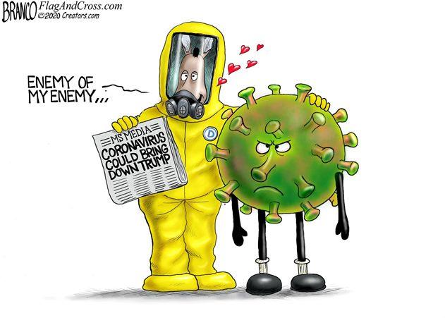
Global policy-makers shoved pandemic risk aside and spread climate alarm instead
One of the noble houses of global macroprudentialism, the International Monetary Fund, declared Tuesday that “The Great Lockdown” will plunge the global economy into the “worst recession since the Great Depression, surpassing that seen during the global financial crisis a decade ago.” Along with the rest of the world’s economic overseers and protectors of financial stability, the IMF seems to have been unprepared for — and overwhelmed by — the arrival of COVID-19.
That the IMF was blindsided is clear in the opening words of Tuesday’s World Economic Outlook. “The world has changed dramatically in the three months since our last World Economic Outlook update on the global economy. A pandemic scenario had been raised as a possibility in previous economic policy discussions, but none of us had a meaningful sense of what it would look like on the ground and what it would mean for the economy.”
That’s some statement: “None of us” had a sense of what such a pandemic might impose on the world economy.
It’s not clear who is included in the collective “us,” but it seems fair to assume the IMF is referring to the host of other members of the global fraternity of institutions that have assumed the role of guardians of the stability of the global financial system.
Among the institutions that should have been preparing for and assessing the risks of a global viral pandemic, in addition to the IMF, are the Financial Stability Board, the Bank for International Settlements, the G20 assembly of finance ministers, the World Bank and the European Central Bank.
In the wake of the 2008 financial crisis, which “none of us” had anticipated, these global entities and national authorities adopted “macroprudential policy” to prevent the next global financial meltdown and, if possible, prepare plans to deal with a new blow to global financial stability.
Wikipedia has an excellent and authoritative review of the origins of macroprudentialism, describing it as an “approach to financial regulation that aims to mitigate risk to the financial system as a whole.” In the aftermath of the 2008 financial crisis, policy-makers and economic researchers backed the need to reorient the global regulatory framework “towards a macroprudential perspective.”
As the world sinks into lockdown and decline, one wonders why the whole macroprudential policy preparations, underway since the 2008 financial crisis and formally installed in 2016, so obviously failed to prepare for the financial stability shakeup brought on by the COVID-19 pandemic?
There are two explanations.One is that the whole financial stability-macroprudential effort is an international bureaucratic collection of agencies dedicated to the pursuit of meaningless bureaucratic interventions.
The second explanation is that the macroprudential apparatus, from the IMF through to the FSB and down, was hijacked by activists pushing climate change as the dominant systemic risk of our time.
In 2017, Mark Carney, then Bank of England governor and head of the FSB, reviewed the successes of macroprudential policy and highlighted new risks. The FSB, said Carney, is assessing “emerging vulnerabilities affecting the global financial system … within a macroprudential perspective.” Among the risks identified, he said, were “risks from FinTech, climate‐related financial risks and misconduct in financial institutions.”
Carney has been something of a poster boy for climate change. In a 2015 speech at Lloyd’s of London — titled “Breaking the tragedy of the horizon — climate change and financial stability,” Carney warned the insurance industry to prepare for big climate risks — including defaults, lawsuits, stranded assets and increased liabilities related to a changing climate.
The insurance execs picked up the macroprudential warnings. The replacement of pandemic risks with climate change as a threat to the global financial and economic system was highlighted this week by Roger Pielke Jr. at the University of Colorado. In 2008, the No. 1 risk cited by insurance executives was a pandemic, described as “a new highly infectious and fatal disease spreads through the human population.” In 2019, the top risk was identified as “global temperature change.” Pandemic was not even one of the top-10 insurance risks.
Over the past several years, but especially through 2019, the major efforts of the macroprudes has been to spread alarm about the financial stability risks allegedly building around climate change. Never mind pandemics and other more mundane but genuine financial risks, such a soaring government debt buildup and U.S. political schemes to dismantle Big Tech. Instead, banks and other financial institutions have been pressed to get out of fossil fuels and shift into ethical investing, sustainable financing, green financing, social financing, impact investing, ESG investment, responsible investing.
At the turn of the 2020 New Year, Carney appeared on BBC television calling for “action on financing” from banks against fossil investments.One day later, the Communist government in China informed the World Health Organization of pneumonia cases in Wuhan City, Hubei province, with unknown cause. Carney’s get-out-of oil call caused alarm within Canada’s fossil fuel industry. At the time, oil was trading at US$55 a barrel.
On Tuesday, thanks in part to the pandemic Carney and the macroprudes failed to plan for, West Texas crude continued to languish at just above US$20.
By promoting the risks of far-off climate change and ignoring the real financial and economic risks of a pandemic, the macroprudes got what they wanted by helping to usher in a global economic crisis they claimed to be attempting to prevent.
Fig. 1. Phylogenetic network of 160 SARS-CoV-2 genomes. Node A is the root cluster obtained with the bat (R. affinis) coronavirus isolate BatCoVRaTG13 from Yunnan Province. Circle areas are proportional to the number of taxa, and each notch on the links represents a mutated nucleotide position.
A recent study employed modern genetic techniques to analyze the progressive mutations of the novel coronavirus as it spread across the world. The paper is Phylogenetic network analysis of SARS-CoV-2 genomes. Excerpts in italics with my bolds.
Significance This is a phylogenetic network of SARS-CoV-2 genomes sampled from across the world. These genomes are closely related and under evolutionary selection in their human hosts, sometimes with parallel evolution events, that is, the same virus mutation emerges in two different human hosts. This makes character-based phylogenetic networks the method of choice for reconstructing their evolutionary paths and their ancestral genome in the human host. The network method has been used in around 10,000 phylogenetic studies of diverse organisms, and is mostly known for reconstructing the prehistoric population movements of humans and for ecological studies, but is less commonly employed in the field of virology.
Abstract In a phylogenetic network analysis of 160 complete human severe acute respiratory syndrome coronavirus 2 (SARS-Cov-2) genomes, we find three central variants distinguished by amino acid changes, which we have named A, B, and C, with A being the ancestral type according to the bat outgroup coronavirus. The A and C types are found in significant proportions outside East Asia, that is, in Europeans and Americans. In contrast, the B type is the most common type in East Asia, and its ancestral genome appears not to have spread outside East Asia without first mutating into derived B types, pointing to founder effects or immunological or environmental resistance against this type outside Asia. The network faithfully traces routes of infections for documented coronavirus disease 2019 (COVID-19) cases, indicating that phylogenetic networks can likewise be successfully used to help trace undocumented COVID-19 infection sources, which can then be quarantined to prevent recurrent spread of the disease worldwide.
In early March 2020, the GISAID database (https://www.gisaid.org/) contained a compilation of 253 severe acute respiratory syndrome coronavirus 2 (SARS-CoV-2) complete and partial genomes contributed by clinicians and researchers from across the world since December 2019. To understand the evolution of this virus within humans, and to assist in tracing infection pathways and designing preventive strategies, we here present a phylogenetic network of 160 largely complete SARS-Cov-2 genomes (Fig. 1).
Although SARS-CoV-2 is an RNA virus, the deposited sequences, by convention, are in DNA format. Our initial alignment confirmed an earlier report by Zhou et al. (7) that the pangolin coronavirus sequences are poorly conserved with respect to the human SARS-CoV-2 virus, while the bat coronavirus yielded a sequence similarity of 96.2% in our analysis, in agreement with the 96.2% published by Zhou et al. We discarded partial sequences, and used only the most complete genomes that we aligned to the full reference genome by Wu et al. (8) comprising 29,903 nucleotides
Zhou et al. (7) recently reported a closely related bat coronavirus, with 96.2% sequence similarity to the human virus. We use this bat virus as an outgroup, resulting in the root of the network being placed in a cluster of lineages which we have labeled “A.” Overall, the network, as expected in an ongoing outbreak, shows ancestral viral genomes existing alongside their newly mutated daughter genomes.
There are two subclusters of A which are distinguished by the synonymous mutation T29095C. In the T-allele subcluster, four Chinese individuals (from the southern coastal Chinese province of Guangdong) carry the ancestral genome, while three Japanese and two American patients differ from it by a number of mutations. These American patients are reported to have had a history of residence in the presumed source of the outbreak in Wuhan. The C-allele subcluster sports relatively long mutational branches and includes five individuals from Wuhan, two of which are represented in the ancestral node, and eight other East Asians from China and adjacent countries. It is noteworthy that nearly half (15/33) of the types in this subcluster, however, are found outside East Asia, mainly in the United States and Australia.
Two derived network nodes are striking in terms of the number of individuals included in the nodal type and in mutational branches radiating from these nodes. We have labeled these phylogenetic clusters B and C.
One practical application of the phylogenetic network is to reconstruct infection paths where they are unknown and pose a public health risk. The following cases where the infection history is well documented may serve as illustrations (SI Appendix). On 25 February 2020, the first Brazilian was reported to have been infected following a visit to Italy, and the network algorithm reflects this with a mutational link between an Italian and his Brazilian viral genome in cluster C (SI Appendix, Fig. S1). In another case, a man from Ontario had traveled from Wuhan in central China to Guangdong in southern China and then returned to Canada, where he fell ill and was conclusively diagnosed with coronavirus disease 2019 (COVID-19) on 27 January 2020. In the phylogenetic network (SI Appendix, Fig. S2), his virus genome branches from a reconstructed ancestral node, with derived virus variants in Foshan and Shenzhen (both in Guangdong province), in agreement with his travel history. His virus genome now coexists with those of other infected North Americans (one Canadian and two Californians) who evidently share a common viral genealogy. The case of the single Mexican viral genome in the network is a documented infection diagnosed on 28 February 2020 in a Mexican traveler to Italy. Not only does the network confirm the Italian origin of the Mexican virus (SI Appendix, Fig. S3), but it also implies that this Italian virus derives from the first documented German infection on 27 January 2020 in an employee working for the Webasto company in Munich, who, in turn, had contracted the infection from a Chinese colleague in Shanghai who had received a visit by her parents from Wuhan. This viral journey from Wuhan to Mexico, lasting a month, is documented by 10 mutations in the phylogenetic network.
The proverb is “Generals are always fighting the last war,” and its origin is uncertain. One possibility is a quote from Winston Churchill: “It is a joke in Britain to say that the War Office is always preparing for the last war.” 1948 Winston S. Churchill _The Second World War_ I (Boston: Houghton Mifflin, 1985) 426:
Konrad Lorenz demonstrated how imprinting works upon animal behavior, while military historians have reported how powerfully human social animals are influenced by the past and instilled lessons from others.
Austria – 20th century. Animal behaviourist Konrad Lorenz and mallard goslings
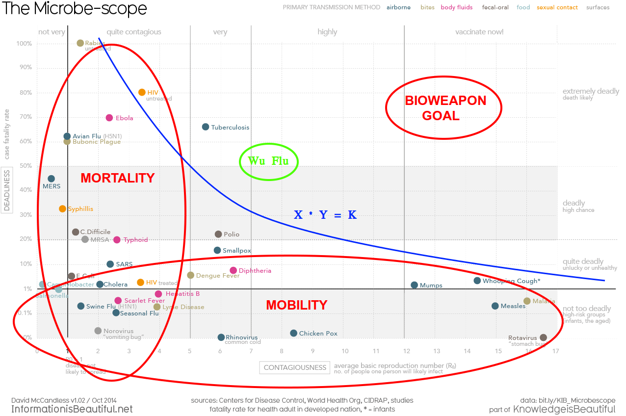
Which brings me to these reflections about the current WuHanFlu outbreak. The chart at the top summarizes our received epidemiological wisdom about the danger of viruses according to the dimensions of deadliness and contagiousness. As the diagram shows, extremely deadly viruses tend to kill their hosts too quickly to be transmitted widely. Conversely, a virus that spreads easily accomplishes that by slowly killing its hosts, perhaps even leaving them alive. The biggest threats are the germs that are lethal, but spread widely because the symptoms are slow to develop (longer incubation period).
Regarding the recent virus wars, consider these four (Source: Big Think. Excerpts in italics with my bolds)
SARS (started in Hong Kong in March 2003), Swine flu (started in Mexico in March 2009), Ebola (started in Western Africa in March 2014), and MERS (started in South Korea in May 2015).
The video below explains the last two impactful wars were against SARS and Swine Flu (HINI).
For the sake of comparison, the graphs for each epidemic are aligned so they all start together on Day One of each outbreak.
At first, Ebola is the scary one. Not only had it infected the most people after just one day, it had killed two thirds of those.
By comparison, SARS killed its first victim only after three days (out of 38 people infected).
By Day 10, SARS had overtaken Ebola as the most infectious of the outbreaks (264 vs. 145 patients), but the latter was ten times more lethal (91 dead from Ebola vs. 9 from SARS). At this time, the coronavirus had infected 39 people, killed none, and was still playing in the same minor league as the swine flu and MERS.
Day 20, and SARS cases are skyrocketing: 1,550 people are ill, 55 have died. That’s a death rate of 3.5%. Ebola has affected only 203 people by now, but killed 61.6% of them, a total of 125. Meanwhile, the coronavirus has taken Ebola’s second place, but is still far behind SARS (284 infected). At this time, the coronavirus has claimed the lives of just five people.
But now the coronavirus cases are exploding; by Day 30, the new virus has infected 7,816 people, killing 204. That’s far more infected than any other virus (SARS comes a distant second with 2,710 patients), and significantly more killed (Ebola, though still just 242 people ill, has killed 147, due to its high fatality rate). Meanwhile, MERS is stuck in triple digits, and the swine flu in double digits.
The swine flu numbers keep growing exponentially: by Day 80, they’ve passed 362,000 cases (and 1,770 deaths), far surpassing any of the other diseases.
Day 100: swine flu cases are approaching 1 million, deaths have surpassed 5,000. That’s far more than all the other diseases combined—they have merged into a single line at the bottom of the graph.
By Day 150, swine flu hit 5.2 million patients, with 25,400 people killed. By the time it was declared over, a year later, the outbreak would eventually have infected more than 60 million people and claimed the lives of almost 300,000.
Swine flu was caused by the H1N1 virus, which also caused the Spanish flu. That outbreak, in 1918/19, infected about 500 million people, or 1 in 3 people alive at that time. It killed at least 50 million people. It was the combination of extreme infectiousness and high fatality that made the Spanish flu such a global, lethal pandemic.
None of the other infectious diseases comes close to that combination. The swine flu, although more infectious than other diseases, was less infectious than the Spanish flu, and also less deadly (0.5%). Unlike COVID-19 or its fellow coronaviruses SARS and MERS, Ebola is not spread via airborne particles, but via contact with infected blood. That makes it hard to spread. Ironically, it may also be too lethal (39.6%) to spread very far. And COVID-19 itself, while relatively lethal (2.4%), is well below the deadliness of the Spanish flu, and does not seem to spread with the same ease.
As that history lesson shows, our pandemic generals have likely been preoccupied with three previous enemies: Spanish Flu, Swine Flu, and SARS. The first one served as the catastrophic defeat to be avoided, H1N1 as the victory achieved by deploying vaccine, and SARS as the coronavirus prototype. Naming the Wuhan virus SARS-CoV-2 (Severe acute respiratory syndrome coronavirus 2) predisposed tacticians and soldiers to fight against a viral pneumonia, and to expect air borne transmission as happened with SARS 1.
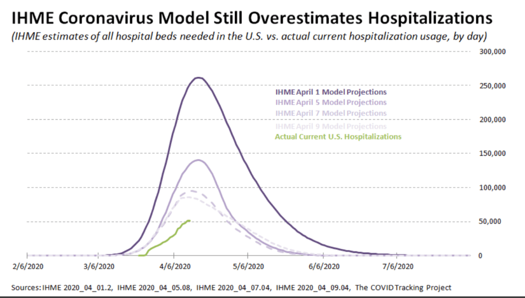
The battle plan was drawn up to protect the health care system against the deluge of victims coming to hospitals and ICUs. Flattening the curve of such cases was the strategy, and social distancing and personal immobility was imposed to that end. What has been the effect? For that there is an analysis from John Nolte What Terrible Coronavirus Models Tell Us About Global Warming Models H/T Joe D’Aleo Excerpts in italics with my bolds.
Let’s face it, the coronavirus models are terrible. Not just off, but way, way, way off in their predictions of a doomsday scenario that never arrived.
That’s not to say that over 20,000 dead Americans is not a heartbreaking reality. That’s not even to say that parts of the country should not have been shut down. But come on…
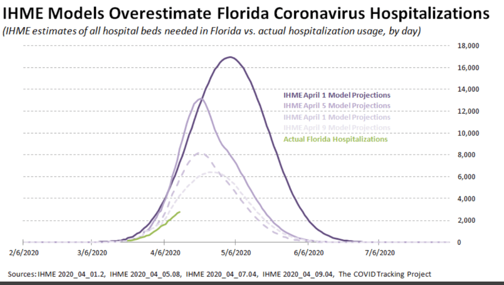
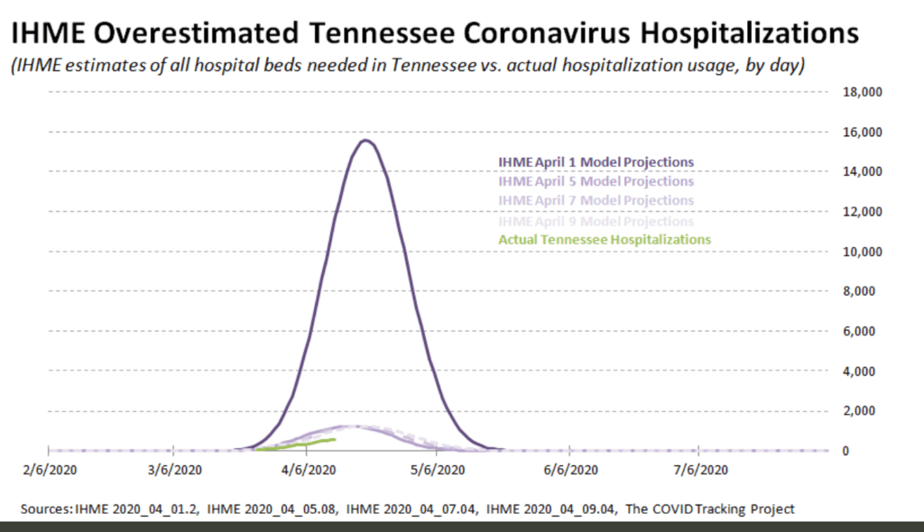
We shut the entire country down using the Institute for Health Metrics and Evaluation (IHME) models, and in doing so put 17 million (and counting) Americans out of work, shattered 17 million (and counting) lives, and… Well, take a look for yourself below.
That gigantic hump is the IHME’s April 1 prediction of coronavirus hospitalizations. The smaller humps way, way, waaaay below that are the IMHE’s predictions of coronavirus hospitalizations after they were revised just a few days later on April 5, 7, and 9.
The green line is the true number of hospitalizations, starting with the whole U.S., and into the states.
So why does this matter? And why are we looking at hospitalizations?
Well, remember, the whole reason for shutting down the economy was to ensure our healthcare system was not overloaded. And it should be noted that these expert models are based on full mitigation, based on what did indeed happen, which was basically a full shutdown of the economy by way of a lockdown. And these models are still horribly, terribly wrong.
Even if you believe the correct decision was made, that does not change how wildly wrong the coronavirus models were, are, and will almost certainly continue to be. That does not change the fact we shut down our entire economy based on incredibly flawed models.
Now I realize that the people who did the terribly flawed coronavirus models are not the same people who do the modeling for global cooling global warming climate change or whatever the hell these proven frauds are calling it today. But hear me out…
We’re still talking about “experts” our media and government grovel down to without question.
We’re still talking about models with the goal of destroying our way of life, our prosperity, our standard of living, and our individual freedoms to live our lives in whatever way we choose
We’re still talking about models with the goal of handing a tremendously scary amount of authority and power to a centralized government.
The coronavirus modeling was based on something real, on something happening at the time. The experts doing the coronavirus models had all kinds of data on which to make their assumptions. Not just reams and reams of scientific data based on previous pandemics, viruses, and human behavior; but also real-time data on the coronavirus itself from China, Italy, and other countries… And they still blew it. They still got it horribly wrong.
A health worker in protective gear waits to hand out self-testing kits in a parking lot of Rose Bowl Stadium in Pasadena, Calif., during the coronavirus outbreak, April 8, 2020. (Mario Anzuoni/Reuters)
What Went Wrong? California Provides a Clue
As the diagram at the top shows, WuHanFlu looked like an especially dangerous mix of deadly contagion. Thus California with its large population and extensive contact with China should be the US viral hot spot, and yet it isn’t. Maybe the contagion is real but the effects are milder than imagined.
Victor Davis Hanson writes at National Review Yes, California Remains Mysterious— Despite the Weaponization of the Debate. Excerpts in italics with my bolds.
How Many People Already Have COVID-19?
California is touchy, and yet still remains confused, about incomplete data showing that the 40-million-person state, as of Sunday, April 12, reportedly had 23,777 cases of residents who have tested posted for the COVID-19 illness. The number of infected by the 12th includes 674 deaths, resulting in a fatality rate of about 17 deaths per million of population. That is among the lowest rates of the larger American states (Texas has 10 deaths per million), and lower than almost all major European countries, (about half of Germany’s 36 deaths per million).
No doubt there are lots of questionable data in all such metrics. As a large state California has not been especially impressive in a per capita sense in testing its population (about 200,000 tests so far). Few of course believe that the denominator of cases based on test results represent the real number of those who have been or are infected.
There is the now another old debate over exactly how the U.S. defines death by the virus versus death because of the contributing factors of the virus to existing medical issues. Certainly, the methodology of coronavirus modeling is quite different from that of, say, the flu. The denominator of flu cases is almost always a modeled approximation, not a misleadingly precise number taken from only those who go to their doctors or emergency rooms and test positive for an influenza strain. And the numerator of deaths from the flu may be calibrated somewhat more conservatively than those currently listed as deaths from the coronavirus.
Nonetheless, the state’s population is fairly certain. And for now, the number of deaths by the virus is the least controversial of many of these data, suggesting that deaths per million of population might be a useful comparative number.
As I wrote in a recent NRO piece, the state on the eve of the epidemic seemed especially vulnerable given the large influx of visitors from China on direct flights to its major airports all fall and early winter until the January 31 ban (and sometime after). It ranks rather low in state comparisons of hospital beds, physicians, and nurses per capita. It suffers high rates of poverty, wide prevalence of state assistance, and medical challenges such as widespread diabetes.
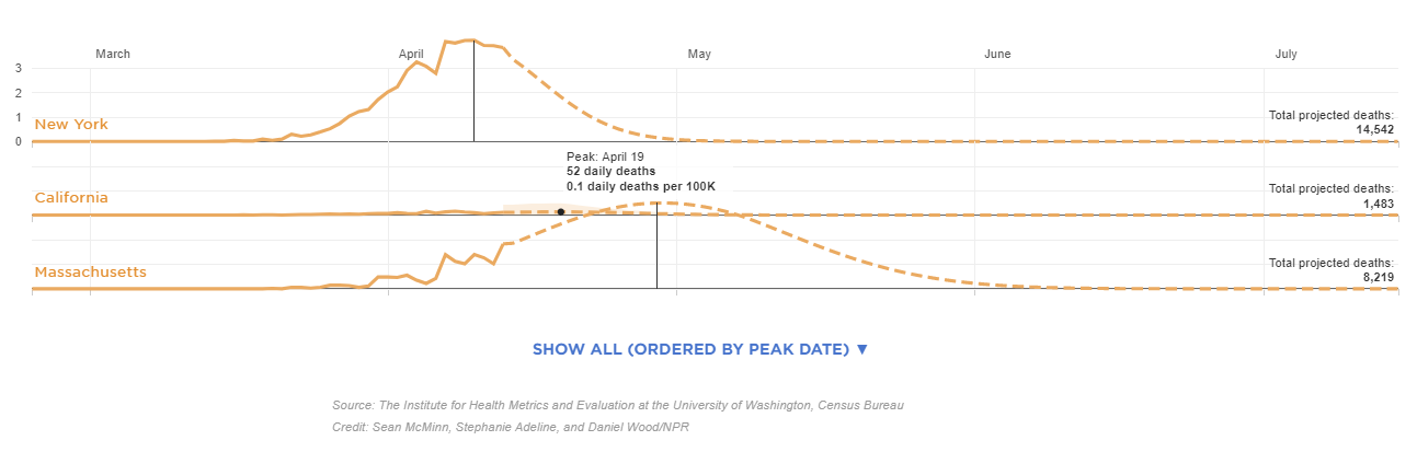
This IHME projection is current as of April 14, at 12 p.m. ET, and will be updated periodically as the modelers input new data. The visualization shows the day each state may reach its peak between now and Aug. 4. The projected peak is when a state’s curve begins to show a consistent trend downward. To enlarge open image in new tab. Source: NPR
Certainly, both then and more recently, there have been a number of anecdotal accounts, media stories, and small isolated studies suggesting that more people than once thought, both here and abroad, have been infected with the virus and developed immunity, that the virus may have reached the West and the U.S. earlier than once or currently admitted by Chinese researchers — so, inter alia, California in theory could weather the epidemic with much less death and illness than earlier models of an eventual 25.5 million infected had suggested. Since then, a number of models, including Governor Newsom’s projection of 25.5 million infected Californians over an eight-week period, have been questioned. Controversy exists over exactly why models are being recalibrated downward. One explanation is that the shelter-in-space orders have been more successful than expected; others point to various flawed modeling assumptions.
Front-line physicians who see sick patients do not necessarily agree with researchers in the lab. For example, a Los Angeles Times story was widely picked up by other news outlets that quoted Dr. Jeff Smith, the chief executive of Santa Clara County. Smith reportedly now believes that the virus arrived in California much earlier than often cited, at least in early 2020:
The severity of flu season made health care professionals think that patients were suffering from influenza given the similarity of some of the symptoms. In reality, however, a handful of sick Californians that were going to the doctor earlier this year may have been among the first to be carrying the coronavirus. “The virus was freewheeling in our community and probably has been here for quite some time,” Smith, a physician, told county leaders in a recent briefing. The failure of authorities to detect the virus earlier has allowed it to spread unchecked in California and across the nation. “This wasn’t recognized because we were having a severe flu season. . . . Symptoms are very much like the flu. If you got a mild case of COVID, you didn’t really notice. You didn’t even go to the doctor. . . . The doctor maybe didn’t even do it because they presumed it was the flu.”
Isaac Ben-Israel, who is not a medical expert, says analysis worldwide shows new cases peaking after about 40 days, slams economic closures; leading doctor dismisses his claims
A prominent Israeli mathematician, analyst and former general claims simple statistical analysis demonstrates that the spread of COVID-19 peaks after about 40 days and declines to almost zero after 70 days — no matter where it strikes, and no matter what measures governments impose to try to thwart it.
Prof Isaac Ben-Israel, head of the Security Studies program in Tel Aviv University and the chairman of the National Council for Research and Development, told Israel’s Channel 12 (Hebrew) Monday night that research he conducted with a fellow professor, analyzing the growth and decline of new cases in countries around the world, showed repeatedly that “there’s a set pattern” and “the numbers speak for themselves.”
Ben-Israel’s Analysis
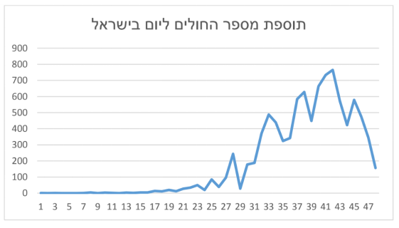
Addition of the number of patients per day in Israel
From the graph above you can see that the increment of patients per day peaked (around the 41st day) to about 700 additional patients a day, beginning to fade since.
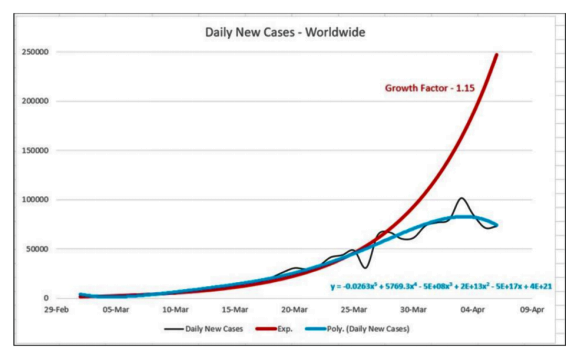
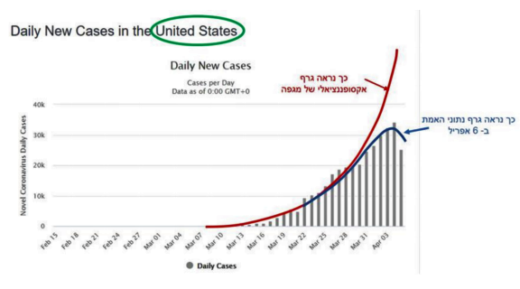
From a graphical point of view, this phenomenon is remarkably exemplary in almost every country where there is data. For comparison, let’s see what happens in the US. The numbers are bigger) The US has about 330 million people! The drop phenomenon is clear:
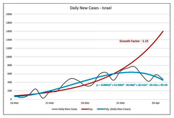
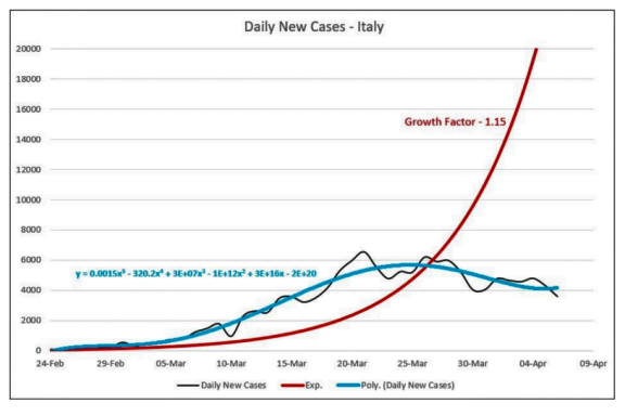
Red line is exponential projection, blue line is pattern of observations.
The infection behavior is not only unique to Israel or the United States and is a global phenomenon, as reflected in the following sketch. The daily supplement is added worldwide (or more precisely in countries that publish data). This is actually a worldwide phenomenon, as can be clearly seen from the drawing that brings together the data of all countries.
In Israel, the absolute numbers are smaller but the phenomenon is similar:
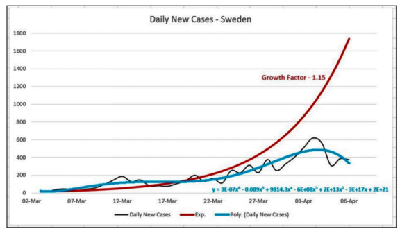
The pattern of onset and decline in the number of patients after a few weeks is also shared by completely different countries (as illustrated in the following two drawings). This is true regardless of their behavior during the crisis. For example, Italy imposed a total closure, including the paralysis of the economy while Sweden has not yet taken these steps.
Summary from Ben-Israel’s document:
Let’s return to the question in the headline: Is the Corona Expansion Exponential? The answer to the numbers is simple: No. Expansion begins exponentially but moderately and fades quickly after about 8 weeks of its breakout.
Continuation of Times of Israel article:
While he said he supports social distancing, the widespread shuttering of economies worldwide constitutes a demonstrable error in light of those statistics. In Israel’s case, he noted, about 140 people normally die every day. To have shuttered much of the economy because of a virus that is killing one or two a day is a radical error that is unnecessarily costing Israel 20% of its GDP, he charged.
Prof. Gabi Barbash, a hospital director and the former Health Ministry director general, insisted in a bitter TV exchange that Ben-Israel is mistaken, and that the death tolls would have been far higher if Israel and other countries had not taken the steps they did.
But Ben-Israel said the figures — notably from countries, such as Singapore, Taiwan, and Sweden, which did not take such radical measures to shutter their economies — proved his point. (He also posted a Hebrew paper to this effect on Facebook, with graphs showing the trajectories.)
When Barbash cited New York as ostensible proof that Ben-Israel was mistaken, Ben-Israel noted the latest indications from New York were precisely in line with his statistics that indicate daily new cases figures peaking and starting to fall after about 40 days.
Asked to explain the phenomenon, Ben-Israel, who also heads Israel’s Space Agency, later said: “I have no explanation. There are all kinds of speculations. Maybe it’s related to climate, or the virus has a life-span of its own.”
Asked to explain why the virus had caused such a high death toll in countries such as Italy, he said the Italian health service was already overwhelmed. “It collapsed in 2017 because of the flu,” he said.
He said the policy of lockdowns and closures was a case of “mass hysteria.” Simple social distancing would be sufficient, he said.
If the lockdowns instituted in Israel and elsewhere were not causing such immense economic havoc, there wouldn’t be a problem with them, he said. “But you shouldn’t be closing down the entire country when most of the population is not at high risk.”
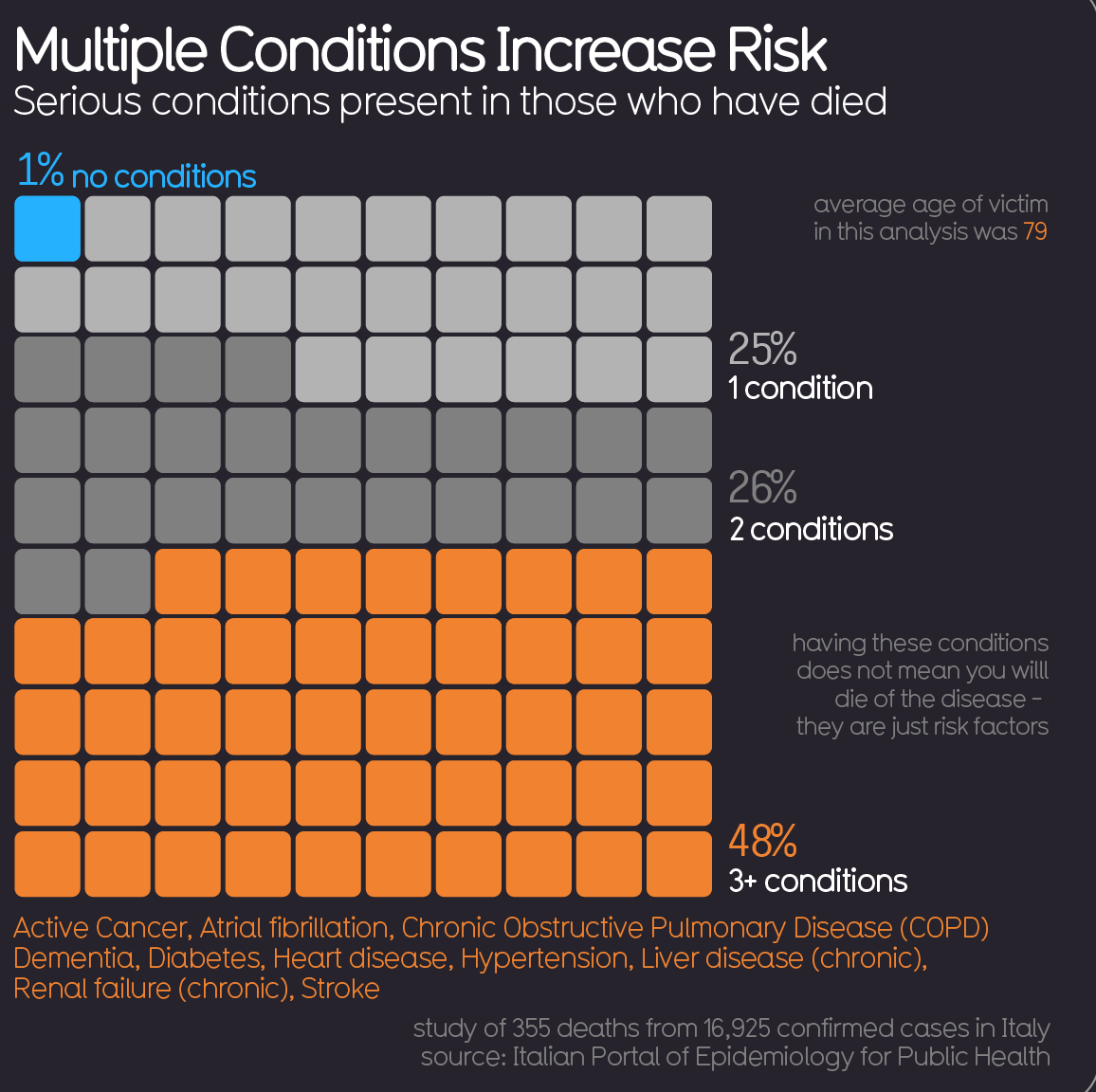
As reported previously, and increasingly confirmed by physicians around the world, the pattern of mortality is the same this year compared to previous history. For example, in Italy, the median age of those dying with the virus is 84, and more often males than females, with deaths rarely in younger age groups.
The virus is there along with one or more of the usual comorbidities: cancer, heart disease, arteries, chronic lung disease, and so on. Some Italian doctors have lamented that some patients who normally would have gone into palliative care in their nursing homes have instead died on ventilators in an ICU.
Still, quantifying fatalities and the mortality rate remains elusive. Case in point: New York City. As the New York Times reported yesterday, Gotham’s Health Department abruptly added 3,700 victims to the COVID-19 death toll even though these decedents were not tested.
Despite the lack of coronavirus diagnoses in these cases, the inference that it was a factor in death (or, as the city insists, the proximate cause) is not irrational. The Health Department says that 3,000 more people died in the last month than would ordinarily have been expected in the City this time of year. The City has been vexed by the sparse availability of testing. By counting only people who had tested positive, it was surely undercounting COVID-19 deaths to some degree.
But to what degree? We really don’t know. In truth, we will never know beyond educated supposition.
City health officials deduce that some of the spike in “excess deaths” is only indirectly attributable to the coronavirus. On this theory, COVID-19 infections so overwhelmed the health-care system that some non-infected people are assumed to have died of conditions that would otherwise have been treatable.
Meantime, health officials have been tracking deaths they’ve hypothesized could have been related to the virus, based on symptoms and medical history. But what does that mean? Was the coronavirus present in the decedents (unconfirmable because they weren’t tested)? Are health officials saying COVID-19 was actually the proximate cause of death? That it may have exacerbated underlying health problems? That such comorbidities would not have killed the decedents but for the (unconfirmed) presence of COVID-19?
New York City is dysfunctional, but this is not a New York issue. The guesstimating is being done at the express invitation of the federal Centers for Disease Control.
The CDC instructs officials to report deaths as COVID-19 deaths whenever the patient has either tested positive or, despite the absence of a test, presents circumstances from which presence of the infection can be inferred “within a reasonable degree of certainty” — such that its contribution to death is “probable” or may be “presumed.” This is drawn from CDC guidance, which directs that COVID-19 be specified in death certificates whenever “COVID-19 played a role in the death.”
Who knows? The fact is, they are just making estimates. But, as the Times computes it, this estimate has suddenly increased the overall U.S. death count from COVID-19 by a whopping 17 percent. And if the Big Apple is going to cook the books this way, what is to stop Newark, New Orleans, Philadelphia, Boston, Chicago, Detroit, Los Angeles, and the rest?
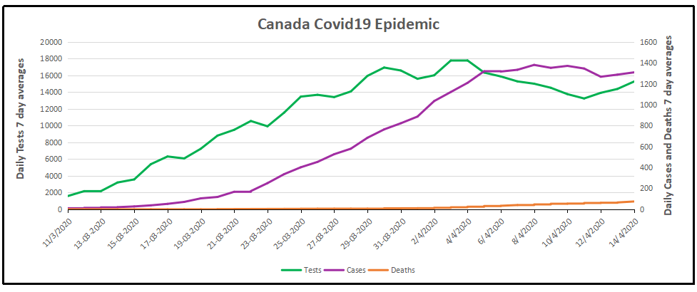
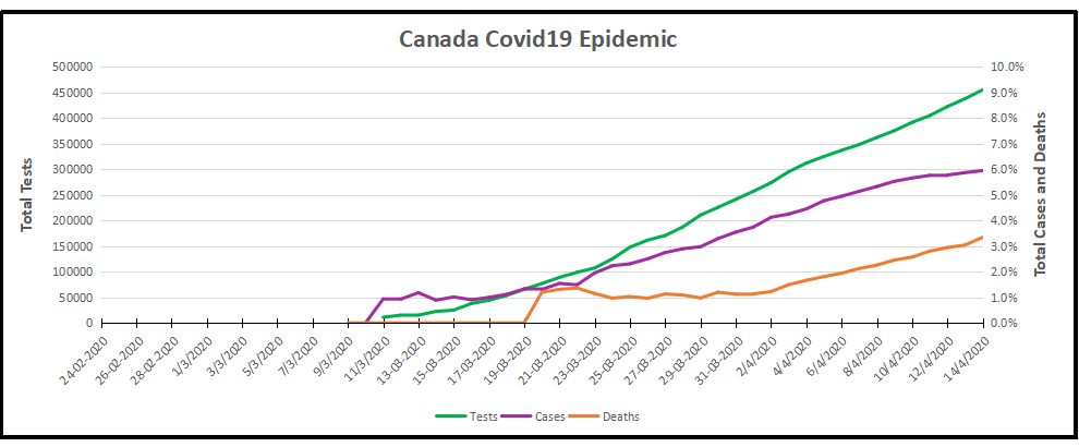
The image presents coronavirus data as of the latest week 14 statistics complete April 14, 2020. From the underlying data we can see that this covid 19 outbreak started toward the end of the annual flu season. Here are the daily reported tests, cases, and deaths smoothed with 7 day averaging. The graph shows that the number of cases has flattened, averaging 1287 the last 3 days after peaking at 1380 on April 8. ( All daily figures are averages of the 7 day period ending with the stated date.) Tests also peaked at 17,800 on April 4, and are averaging 14,500 presently.
The cumulative graph shows how the proportions held during this period.
Out of a total 454,983 tests, 27,046 (6%) cases were detected, and 903 died (3% of cases).
Background from Previous Post
With coronavirus sucking all the air out of room globally, I got interested in looking at how the Canadian national flu seasons compare with the new Wuhan virus. The analysis is important since there are many nations at higher latitudes that are in equilibrium relative to infectious diseases, but vulnerable to outbreaks of new viruses. Where I live in Canada, we have winter outbreaks every year, but are protected by a combination of sanitary practices, health care system and annual vaccines, contributing to herd immunity.
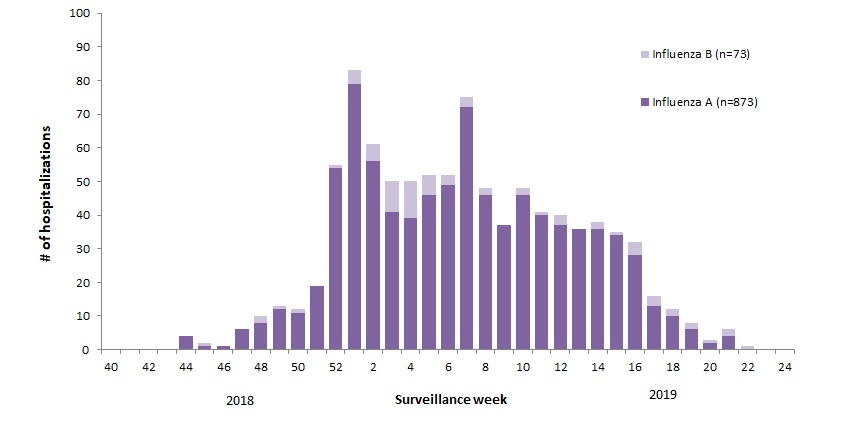
For example, 2018-19 was slightly higher than a typical year, with this pattern: The various flu types are noted, all together making a total of 48,818 influenza detections during the 2018-19 season. A total of 946 hospitalizations were reported by CIRN-SOS sentinels that season (age = or >16). Source: Annual Influenza Reports
A total of 137 (14%) ICU admissions and 65 (7%) deaths were reported. The seasonality is obvious, as is the social resilience, when we have the antibodies in place.
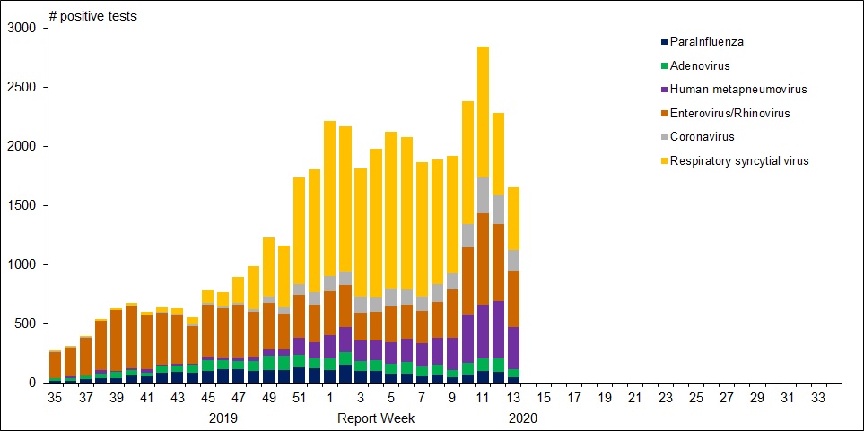
For further background, look at the latest Respiratory Virus Report for week 13 ending March 28, 2020. [In this Respiratory Virus Report, the number of detections of coronavirus reflects only seasonal human coronaviruses, not the novel pandemic coronavirus (SARS-CoV2) that causes COVID-19. Kung Flu statistics are above at the beginning.]
For the period shown in the graph, 320560 flu tests were done, resulting in 32751 type A positives and 22683 type B positives. That is a ratio of 17% of tests confirming conventional flu infection cases. Public Health Canada went on to say in reporting March 22 to 28, 2020 (week 13): The percentage of tests positive for influenza fell below 5% this week. This suggests that Canada is nearing the end of the 2019-2020 influenza season at the national level. [Keep that 5% in mind]
Summary: It’s true that total cases and deaths are still rising, and everyone should practice sanitary behaviors and social distancing. But it appears that we are weathering this storm and have the resources to beat it. Let us hope for reasonable governance, Spring weather and a return to economic normalcy.
A provincewide clinical trial led by the University of Calgary will test the effectiveness of the anti-malarial drug hydroxychloroquine on COVID-19 patients, with the goal of reducing pressure on hospitals and preventing further infections.
“There is minimal evidence for use of hydroxychloroquine to use it, but there is enough (evidence) to study it,” said Metz, the acting facility medical director at Foothills Medical Centre and a professor in the department of clinical neurosciences at the Cumming School of Medicine.
“It just has to be done. If this drug does, indeed, reduce the severity and help people get better faster, it can help us in flattening the curve.”
The “HOPE” trial, to begin April 15, will target 1,600 Alberta outpatients who have tested positive for COVID-19 and are at risk of developing severe symptoms. The study will determine if hydroxychloroquine can prevent hospitalization for those at highest risk of developing a severe illness.
Participants will give their permission to Alberta Health Services after testing positive for COVID-19 and provide their contact information to U of C researchers. They’ll then be screened for safety and eligibility through a telephone interview and review of their electronic health record.
Those patients accepted will be sent hydroxychloroquine to their homes and will be required to take the drug over a five-day period. Researchers will follow up with participants seven and 30 days after starting the treatment.
Metz said timing of the trial is crucial and must begin within 96 hours of confirmation of a positive COVID-19 result, and within 12 days of symptom onset.
Should the drug prove effective, it may reduce the pressures that COVID-19 is expected to put on the health-care system.
“If we can keep more people out of hospital, then we’re not going to have that huge rise in hospitalizations and more people can get better at home,” she said. “Our system will get back to normal life or whatever we choose to move to in the future.
“We’ll be able to get there if we find this works.”
Hamilton Health Services starting an Anti-Covid19 study this month
The ACT COVID-19 program consists of two parallel trials evaluating azithromycin and chloroquine therapy (ACT) versus usual care in outpatients and inpatients who have tested positive for COVID-19. The trial is an open-label, parallel group, randomized controlled trial with an adaptive design. Adaptive design features include adaptive intervention arms and adaptive sample size based on new and emerging data.
Experimental: Azithromycin and Chloroquine Therapy (ACT)
Chloroquine (Adults with a bodyweight ≥ 50 kg: 500 mg twice daily for 7 days; Adults with a bodyweight < 50 kg: 500 mg twice daily on days 1 and 2, followed by 500 mg once daily for days 3-7), plus Azithromycin (500 mg on day 1 followed by 250 mg daily for 4 days) Source: ClinicalTrials.gov
David Warren writes at his blog Essays in Idleness on the scourge of modern media in the coronavirus age. Be afraid, be very afraid. Excerpts in italics with my bolds.
Be afraid, be very afraid
Gentle reader may be wondering how many people are in hospital with the Batflu. Let us take North America’s “epicentre” of New York City, for our spot check. The experts guessed, with all the confidence of settled science, that 140,000 beds would be needed at this point in the pandemic, give or take a few thousand. By the end of last week, 8,500 were occupied. That’s about one bed for every sixteen they anticipated.
(A hotelier who trusted their calculations would be out of business by summer.)
Those glued to the news may have heard about this shortfall. Their horror is now, that if we go back to work, and try to put our lives back together, some of those beds may be refilled.
Horrible things do happen on this planet, and from the accounts I’ve read, the Chinese Communist Batflu is among them. If you get it, you could indeed become quite ill. But this is unlikely, unless you are already severely immuno-compromised. In a world that could think straight, the old and weak would be the very people we were racing to shelter: not de-prioritizing because they’re going to die soon anyway.
Your chances of getting the Xi Jinping Batflu are slight, and falling, but not actually zero. Of course, it is in the interest of the media of entertainment (which is to say, all the Western media today, with their heavy Chinese investments) to sensationalize; and thus produce a sensation that every political operative may apply to his self-interested, political ends.
It is hard for people, especially while scared, to consider anything in proportion. And it is difficult to find contextual information: for we cannot expect the media of entertainment to tell us anything that might ruin the show, while they’re in the theatre business.
The “beauty” of computer projections, working from speculative data by theory, is that it won’t be off by double, or half. It will be off by orders of magnitude. This will even help the researchers wet themselves. Whereas, mere common sense will fail every time.
Leafing through an old Idler magazine, during my own compulsory isolation, I was reminded of the scary age of Reagan. If my reader is old enough, he will remember nuclear annihilation. Did I know, I was then told, that the superpowers had enough A-bombs to vaporize everyone on the planet ten times over? — provided they were efficiently deployed, and we all held still.
But as I argued then, there were other terrifying threats to human life.
“There is, for instance, enough water in the planet to drown everyone four thousand times; there are enough matches to set fire to every wooden building; enough kitchen knives to murder all the husbands of the world; enough hairspray (if drunk) to poison all their wives; enough pillows to smother the entire population of Asia; enough pencils to put out everyone’s eyes; enough fishbones to choke the combined population of France and Italy; enough ties, belts, suspenders, and pyjama draw strings to hang everyone over the age of forty; enough cigarettes (if eaten) to make everyone in Africa south of the Sahara throw up; enough stairs for all the toddlers in the world to fall down; enough statues to crush the inhabitants of the fourteen largest cities in the American Midwest; enough piano wire to garrot three-quarters of the population of Roumania; enough frozen lamb chops to club to death the entire Scottish aristocracy.”
Granted, the weight of human suffering. Granted, that we all progress to biological death, after a brief illusion of invincibility. But would it be entirely irresponsible, to dance our way through the interim? Even while the vultures are circling in the sky?
There is a breakthrough in understanding how Covid19 kills people. How fitting that such good news arrives on Easter Sunday. A great H/T to Ice Age Now for breaking this story along with others.
Why chloroquine and Z-Pak (also known as azithromycin or Zithromax) work.
I have been thinking this for several weeks now, so it is good to see other folks thinking the same. By the way, I am an RN and a Nutritional Biochemist in former times.
The Malaria-COVID-19 connection is explained very well here in this link (text reprinted at end)
I am unpacking this to a very simple level so all of you can understand why Z-Pak, also known as azithromycin or Zithromax, works, as does the Quinine derivative chloroquine! That doctor compares the presentation to that of altitude sickness, and he is spot-on! (See “We are treating the wrong disease.”)
Like Malaria, the coronavirus “ROBS” red blood cells of the ability to “collect and transfer” oxygen to wherever it is needed. This results in lower and lower Oxygen levels.. organs start to fail as they can’t get enough oxygen to function properly.. people die…. this alone is likely why those who already have eg Kidney or Heart, or Liver Failure, have a high morbidity.. also anyone who doesn’t have a SPLEEN is at VERY high risk as the spleen is involved with filtering your blood. The spleen affects the number of red blood cells that carry oxygen throughout your body, by breaking down and removing cells that are abnormal, old, or damaged.. also If you have COPD, or are a smoker, and/or have Cardiovascular Disease, you ALREADY have impaired Oxygen transport mechanisms, so this is another perfectly logical co-morbidity!
In this article, the Red Blood Cells (RBCs) are compared to truck cabs running around furiously with no payload (OXYGEN).. so simply pumping oxygen into the lungs under pressure will NOT work, unless you address the “diseased “Red Blood Cells, which are the OXYGEN CARRIERS. which both Quinine derivatives and Z-Pak address, along with (interestingly!) Vitamin C and other “cell-protective” Antioxidants address.
NOW it makes perfect sense.. the biggest clue is that the “pneumonia” is always bilateral with COVID-19, unlike almost every other case of pneumonia which typically affects just ONE lung!
The body’s response to low Oxygen levels is to make more red blood cells, so that is why high red blood cell levels are also found in the sickest patients.
Covid-19 had us all fooled, but now we might have finally found its secret.
In the last 3–5 days, a mountain of anecdotal evidence has come out of NYC, Italy, Spain, etc. about COVID-19 and characteristics of patients who get seriously ill. It’s not only piling up but now leading to a general field-level consensus backed up by a few previously little-known studies that we’ve had it all wrong the whole time. Well, a few had some things eerily correct (cough Trump cough), especially with Hydroxychloroquine with Azithromicin, but we’ll get to that in a minute.
There is no ‘pneumonia’ nor ARDS. At least not the ARDS with established treatment protocols and procedures we’re familiar with. Ventilators are not only the wrong solution, but high pressure intubation can actually wind up causing more damage than without, not to mention complications from tracheal scarring and ulcers given the duration of intubation often required… They may still have a use in the immediate future for patients too far to bring back with this newfound knowledge, but moving forward a new treatment protocol needs to be established so we stop treating patients for the wrong disease.
The past 48 hours or so have seen a huge revelation: COVID-19 causes prolonged and progressive hypoxia (starving your body of oxygen) by binding to the heme groups in hemoglobin in your red blood cells. People are simply desaturating (losing o2 in their blood), and that’s what eventually leads to organ failures that kill them, not any form of ARDS or pneumonia. All the damage to the lungs you see in CT scans are from the release of oxidative iron from the hemes, this overwhelms the natural defenses against pulmonary oxidative stress and causes that nice, always-bilateral ground glass opacity in the lungs. Patients returning for re-hospitalization days or weeks after recovery suffering from apparent delayed post-hypoxic leukoencephalopathy strengthen the notion COVID-19 patients are suffering from hypoxia despite no signs of respiratory ‘tire out’ or fatigue.
Here’s the breakdown of the whole process, including some ELI5-level cliff notes. Much has been simplified just to keep it digestible and layman-friendly.
Your red blood cells carry oxygen from your lungs to all your organs and the rest of your body. Red blood cells can do this thanks to hemoglobin, which is a protein consisting of four “hemes”. Hemes have a special kind of iron ion, which is normally quite toxic in its free form, locked away in its center with a porphyrin acting as it’s ‘container’. In this way, the iron ion can be ‘caged’ and carried around safely by the hemoglobin, but used to bind to oxygen when it gets to your lungs.
When the red blood cell gets to the alveoli, or the little sacs in your lungs where all the gas exchange happens, that special little iron ion can flip between FE2+ and FE3+ states with electron exchange and bond to some oxygen, then it goes off on its little merry way to deliver o2 elsewhere.
Here’s where COVID-19 comes in. Its glycoproteins bond to the heme, and in doing so that special and toxic oxidative iron ion is “disassociated” (released). It’s basically let out of the cage and now freely roaming around on its own. This is bad for two reasons:
1) Without the iron ion, hemoglobin can no longer bind to oxygen. Once all the hemoglobin is impaired, the red blood cell is essentially turned into a Freightliner truck cab with no trailer and no ability to store its cargo.. it is useless and just running around with COVID-19 virus attached to its porphyrin. All these useless trucks running around not delivering oxygen is what starts to lead to desaturation, or watching the patient’s spo2 levels drop. It is INCORRECT to assume traditional ARDS and in doing so, you’re treating the WRONG DISEASE. Think of it a lot like carbon monoxide poisoning, in which CO is bound to the hemoglobin, making it unable to carry oxygen. In those cases, ventilators aren’t treating the root cause; the patient’s lungs aren’t ‘tiring out’, they’re pumping just fine. The red blood cells just can’t carry o2, end of story. Only in this case, unlike CO poisoning in which eventually the CO can break off, the affected hemoglobin is permanently stripped of its ability to carry o2 because it has lost its iron ion. The body compensates for this lack of o2 carrying capacity and deliveries by having your kidneys release hormones like erythropoietin, which tell your bone marrow factories to ramp up production on new red blood cells with freshly made and fully functioning hemoglobin. This is the reason you find elevated hemoglobin and decreased blood oxygen saturation as one of the 3 primary indicators of whether the shit is about to hit the fan for a particular patient or not.
2) That little iron ion, along with millions of its friends released from other hemes, are now floating through your blood freely. As I mentioned before, this type of iron ion is highly reactive and causes oxidative damage. It turns out that this happens to a limited extent naturally in our bodies and we have cleanup & defense mechanisms to keep the balance. The lungs, in particular, have 3 primary defenses to maintain “iron homeostasis”, 2 of which are in the alveoli, those little sacs in your lungs we talked about earlier. The first of the two are little macrophages that roam around and scavenge up any free radicals like this oxidative iron. The second is a lining on the walls (called the epithelial surface) which has a thin layer of fluid packed with high levels of antioxidant molecules.. things like abscorbic acid (AKA Vitamin C) among others. Well, this is usually good enough for naturally occurring rogue iron ions but with COVID-19 running rampant your body is now basically like a progressive state letting out all the prisoners out of the prisons… it’s just too much iron and it begins to overwhelm your lungs’ countermeasures, and thus begins the process of pulmonary oxidative stress. This leads to damage and inflammation, which leads to all that nasty stuff and damage you see in CT scans of COVID-19 patient lungs.
Ever noticed how it’s always bilateral? (both lungs at the same time) Pneumonia rarely ever does that, but COVID-19 does… EVERY. SINGLE. TIME.
The core point being, treating patients with the iron ions stripped from their hemoglobin (rendering it abnormally nonfunctional) with ventilator intubation is futile, unless you’re just hoping the patient’s immune system will work its magic in time. The root of the illness needs to be addressed.
Best case scenario? Treatment regimen early, before symptoms progress too far. Hydroxychloroquine (more on that in a minute, I promise) with Azithromicin has shown fantastic, albeit critics keep mentioning ‘anecdotal’ to describe the mountain, promise and I’ll explain why it does so well next. But forget straight-up plasma with antibodies, that might work early but if the patient is too far gone they’ll need more. They’ll need all the blood: antibodies and red blood cells. No help in sending over a detachment of ammunition to a soldier already unconscious and bleeding out on the battlefield, you need to send that ammo along with some hemoglobin-stimulant-magic so that he can wake up and fire those shots at the enemy.
The story with Hydroxychloroquine
All that hilariously misguided and counterproductive criticism the media piled on chloroquine (purely for political reasons) as a viable treatment will now go down as the biggest Fake News blunder to rule them all. The media actively engaged their activism to fight ‘bad orange man’ at the cost of thousands of lives. Shame on them.
How does chloroquine work? Same way as it does for malaria. You see, malaria is this little parasite that enters the red blood cells and starts eating hemoglobin as its food source. The reason chloroquine works for malaria is the same reason it works for COVID-19 — while not fully understood, it is suspected to bind to DNA and interfere with the ability to work magic on hemoglobin. The same mechanism that stops malaria from getting its hands on hemoglobin and gobbling it up seems to do the same to COVID-19 (essentially little snippets of DNA in an envelope) from binding to it. On top of that, Hydroxychloroquine (an advanced descendant of regular old chloroquine) lowers the pH which can interfere with the replication of the virus.
Again, while the full details are not known, the entire premise of this potentially ‘game changing’ treatment is to prevent hemoglobin from being interfered with, whether due to malaria or COVID-19.
Update: A more technical discussion and link to published research is here:
Why were “smart” people so wrong about this pandemic?
Two weeks ago, Dr. Deborah Birx warned against doomsday predictions that millions of Americans might die from coronavirus. At a White House press briefing on March 25, the coordinator of President Trump’s task force condemned media speculation based on claims that as much as half the country’s population might become infected with COVID-19. “I think the numbers that have been put out there are actually very frightening to people,” said Birx, adding that reported rates of infection in China, where the virus originated, were “nowhere close to the numbers that you see people putting out there. I think it has frightened the American people.”
Birx did not name MSNBC personality Chris Hayes, although he was one of the worst scaremongers in the media mob. On his March 23 program, Hayes warned that “millions of lives are on the line” if the economic lockdown response to the virus was not extended indefinitely: “There is no option to just let everyone go back out and go back to normal if a pandemic rages across the country and infects 50 percent of the population and kills a percentage point at the low end of those infected and also melts down all the hospitals.” Applying simple arithmetic to that sentence — treating it like one of those word problems we learned to do in middle-school math class — we find that 50 percent of the U.S. population is more than 160 million people infected with COVID-19. If just 1 percent of those infected died from the virus, that would mean a death toll of at least 1.6 million.
The word “if” signifies a hypothetical contingency, but the way Hayes used the word implied a predictive quality to his speculation about “millions of lives” at jeopardy in a rampaging coronavirus outbreak. And who can say, really, what might have happened in some imagined alternative scenario? As it happened in real life, however, Trump decided to extend the “social distancing” policy to April 30, most Americans took the recommended precautions seriously, and there is already evidence that we have begun to “flatten the curve,” so that the final U.S. death toll of COVID-19 will likely be a mere fraction of the “millions” about which Hayes warned last month.
Chris Hayes is not stupid, and neither are the scientists whose forecasting models wildly exaggerated the trajectory of this pandemic. Smart people can be wrong, too. Monday, just hours after I called attention to the failure of these doomsday prophecies (“Coronavirus: The Wrong Numbers”), the widely cited Institute for Health Metrics and Evaluation (IHME) made headlines by revising their forecast: “Key Coronavirus Model Now Predicts Many Fewer U.S. Deaths” (New York magazine), “Dramatic Reduction in COVID-19 Disaster Projections” (National Review), and “Coronavirus Model Now Estimates Fewer U.S. Deaths” (U.S. News & World Report), to cite a few.
Why were the original IMHE projections, first published March 26, so far off the mark? We don’t know. Perhaps the scientists underestimated the efficacy of the “mitigation” measures Trump announced March 16. Or possibly the use of chloroquine — which Trump controversially called a “game changer” — to combat the virus was more successful than any of the president’s critics are willing to admit. But the fact is, the projection models were wrong, and the gap between what was predicted and what actually happened became apparent within a matter of days. By April 1, as Justin Hart pointed out, the number of COVID-19 patients hospitalized was less than a third of the number projected by the IHME model. In their revised forecast issued Monday, IHME lowered its estimate of total U.S. coronavirus deaths by 12 percent, from 93,531 down to 81,766.
Even this revised forecast may be too pessimistic, however. At his Tuesday press conference, New York Gov. Andrew Cuomo, whose state is the epicenter of the U.S. outbreak, spoke of a “plateau” in the number of COVID-19 cases in the state’s hospitals, with about 17,500 patients currently hospitalized, about 4,600 of those in intensive-care units. This is very bad, but it is not the system-crashing catastrophe Cuomo was anticipating when, at a March 24 press conference, he angrily shouted that a shortage of ventilators would cause 26,000 unnecessary deaths in the state. While we cannot predict future events, it appears that New York now has more ventilators than will ever be needed to cope with the coronavirus outbreak — and this is good news.
Such hopeful signs that we have avoided the worst-case scenarios are probably little comfort to doctors and nurses working double shifts to cope with the COVID-19 patient load in New York City and its suburbs, or in other places around the country dealing with severe local outbreaks of the virus. At Monday’s White House briefing, Birx spoke of her team’s tracking of the pandemic at a “county by county” level, citing Detroit and New Orleans as examples of the hot spots where federal authorities are helping communities cope with the problem. At a time when more than 1,000 Americans are dying daily from this disease, the good news — that the pandemic is falling short of the catastrophe previously predicted — is a matter of comparison between a reality that is still quite bad and a doomsday scenario where MSNBC viewers were told that “millions of lives” might be lost.
What was Chris Hayes doing when he hyped fears of a raging pandemic that would overwhelm the health-care system and kill 1.6 million Americans, 200 times more than the 80,000 currently projected by the IMHE model? He was blaming Trump for having failed to prevent the approaching “doom and death.” The more deaths, the more blame — that was apparently why the Greek chorus of media fear-mongers (Hayes was by no means alone in this) were so eager to promote the worst-case scenarios that did not materialize. America’s coronavirus death rate (39 per 1 million residents) is currently a fraction of the rates in several European countries, including Spain (300 per million), Italy (283 per million), France (158 per million), and Belgium (176 per million). Trump’s critics accuse our president of failing to prepare America for this crisis, but where is their criticism for the leaders of the European countries, who, as measured by statistics, failed far worse? Dead people are not statistics, of course, and many thousands of Americans are now fighting for their lives against this Chinese virus.
Oh, wait — we’re not allowed to mention where this disease came from, are we? One might hope that Chris Hayes and the other media fear-mongers would spend more time blaming the communist regime in Beijing and less time accusing our president of malicious indifference to American lives. But we should not think the media’s failures prove that they’re stupid.
They’re smart people who know exactly what they’re doing. And they should be ashamed of themselves.
Clearly the coronavirus outbreak has aroused the fear of dying that is always just beneath the surface of awareness. Most of us are closer to being snowflakes than warriors, and thus secure in our artificial physical and cyberspaces. With only virtual threats serving as entertainment, the notion that we could actually die from an unseen virus is terrifying.
Meanwhile, mass media is following the global warming/climate change game plan: Hose the public with a tsunami of large numbers, guaranteed to cow them into fearful submission. That approach backfired with climate claims since anyone who bothered to check could verify that nothing out of the ordinary has yet happened. But the viral emergency is different: It is happening and people are dying from Kung Flu! Or are we again being besieged with numbers out of context in order to feed on our fear of mortality?
It occurred to me that unless you are a public health professional or an actuary, you pay little or no attention to morbidity statistics, and thus have no basis to judge how serious is this crisis. For example, every day In every province, elected officials along with health officials are messaging us that things are dire, even “unprecedented”, and all we can do is put our lives on hold in order to save them. I am following the restrictions but can’t help wondering about the level of exaggeration.
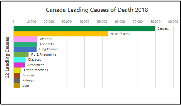
ln the last reported statistical year (2018) the top twelve causes resulted in 209,290 deaths, or 574 people dying every day. When we add in the less lethal killers, in 2018 in Canada, 283,706 people died, or 777 every day. This is not abnormal, but is the ongoing reality of our society where lives end for all kinds of reasons to make room for infants to be born and take their place among us. Below are the tables for the last five years to show how this level of mortality is our ordinary state.
Canada Leading Causes of Death
Causes of Death
2014
2015
2016
2017
2018
Cancers
77,059
77,054
79,084
79,844
79,536
Heart Disease
51,014
51,534
51,396
53,029
53,134
Arteries
13,573
13,795
13,551
13,893
13,480
Accidents
11,724
11,833
12,524
13,894
13,290
Chronic Lung Disease
11,876
12,573
12,293
12,847
12,998
Flu and Pneumonia
6,597
7,630
6,235
7,396
8,511
Diabetes
7,071
7,172
6,838
6,882
6,794
Alzheimer’s
6,410
6,587
6,521
6,675
6,429
Other infections
4,881
4,964
4,168
4,272
4,578
Suicides
4,254
4,405
3,978
4,157
3,811
Kidneys
3,098
3,129
3,054
3,270
3,615
Liver
3,126
3,176
3,385
3,425
3,514
Total Top 12 Causes
200,683
203,852
203,027
209,584
209,690
Total All causes
258,821
264,333
267,213
276,689
283,706
Population
35,437,435
35,702,908
36,109,487
36,543,321
37,057,765
There are many things to note here. The diseases of cancers, heart and arteries dominate in the aged cohorts of our society, and show that the bulk of the population is not threatened by diseases that wreak havoc in many parts of the world. Note how far down is the batch of other infections, including such as malaria, cholera, HIV. The overall death rate in Canada is about 0.75% of the population each year.
With the Wuhan virus raging, our attention is drawn to the middle portion of the figure: deaths caused by lung failure. Chronic lung disease kills more, but close behind is flu and bacterial infections leading to pneumonia. This is important because Kung Flu in its severe manifestation is essentially viral pneumonia.
All of the deaths in the tables above are identified according to the International Classifications for Diseases. On March 24, 2020 a new ICD code was establishedto designate deaths caused by Covid 19.
The notice included these instructions: The WHO has provided a second code, U07.2, for clinical or epidemiological diagnosis of COVID-19 where a laboratory confirmation is inconclusive or not available. Because laboratory test results are not typically reported on death certificates in the U.S., NCHS is not planning to implement U07.2 for mortality statistics.
Will COVID-19 be the underlying cause? The underlying cause depends upon what and where conditions are reported on the death certificate. However, the rules for coding and selection of the underlying cause of death are expected to result in COVID19 being the underlying cause more often than not.
What happens if the terms reported on the death certificate indicate uncertainty? If the death certificate reports terms such as “probable COVID-19” or “likely COVID-19,” these terms would be assigned the new ICD code. It Is not likely that NCHS will follow up on these cases. If “pending COVID-19 testing” is reported on the death certificate, this would be considered a pending record. In this scenario, NCHS would expect to receive an updated record, since the code will likely result in R99. In this case, NCHS will ask the states to follow up to verify if test results confirmed that the decedent had COVID19.
The impact of this coding policy is seen in Canada’s record of Covid deaths. From the first identified case on January 31, 2020, there were a total of 27 deaths reported as caused by Covid 19 over the 35 days up to March 24, 0.8 deaths per day. In the last 13 days since the ICD was issued, 296 Covid 19 deaths have been added, an average of 23 per day. For context, note that in 2018 Flu and Pneumonia deaths averaged 23 a day, obviously much higher than that during winter months.
Comparing last year’s flu season to this one shows the last five weeks a sharp uptick in tests but with a sharp drop in positives . Could it be Covid19 making the difference? Note also the scale of testing is much higher this year, begiinning in January. (Red line is Flu A, blue line is Flu B positives)
Worldometer showed on March 24, 2020, almost 19,000 Covid 19 deaths had been reported globally going back to January 23, an average of 305 per day over 62 days. After the code was announced, 50,533 Covid 19 deaths were reported in just 12 days, a daily average of 4211.
There are epidemic numbers being generated, and no doubt some places have seen hospitals overwhelmed (Lombardy, NYC, Tehran, etc.). But is it really a pandemic (everywhere)? And how many deaths from pneumonia and other causes are classified differently in this feverish environment?
The guidance will result in attributing deaths to Covid 19 in all cases where the virus was probably or certainly present. However, the experience so far shows that the large majority of severe cases include multiple serious conditions. Because the Mortality results are compiled more slowly (2019 is forthcoming), we have no way of knowing how many 2020 flu and pneumonia deaths have been counted as Kung Flu deaths instead of using the previous codes.
Don’t look just at deaths from coronavirus, look at cumulative deaths from comorbidities. Since most people dying from coronavirus also exhibit comorbidities,[1] and it is unclear how deaths are assigned to the former rather than one of the co-morbidities and whether there is a uniform accepted methodology from one doctor to another (or one hospital to another or one country to another) in the assignments, it is not clear how much credence can be given to coronavirus death estimates at this time.
This also means that we shouldn’t attempt cross-country and cross-jurisdictional comparisons because they could mislead. It is best to look at (and compare) aggregate excess deaths from all co-morbidities rather than just one or another co-morbidity. I would suggest looking at excess deaths against an average over the last 5-10 years for both all-cause deaths and deaths from all coronavirus-plus- comorbidities to get an idea about how devastating coronavirus has been versus an average year.
I wouldn’t be surprised if at the end of the current period with most populated areas currently shut in by individual choice or government decree, once all the data are in, excess deaths for all causes are not negative relative to the 5- or 10-year average, since physical distancing should also reduce transmission of the flu (influenza and pneumonia kill about 50,000+ Americans annually)[2]. At least, I would hope that would be the case, so we can look back and see that some good came of our flattening our economy. At least one can hope.
Footnote: Meanwhile at least one doctor working with Covid 19 patients is questioning the medical paradigm identifying the disease as a viral pneumonia.
Listen this short video: Dr. Cameron Kyle-Sidell, a doctor treating COVID-19 patients in New York City’s Maimonides Medical Center, warns that the medical community may be wrong about the nature of the coronavirus and how it is said to cause acute respiratory distress syndrome (ARDS).
There’s no cooler way to get around Mazatlan, Mexico, than riding in an open air pulmonia. And yes, the name means Pneumonia in english. When these vehicles first became available and popular, traditional taxi owners started a rumor you could catch the disease from riding in them.


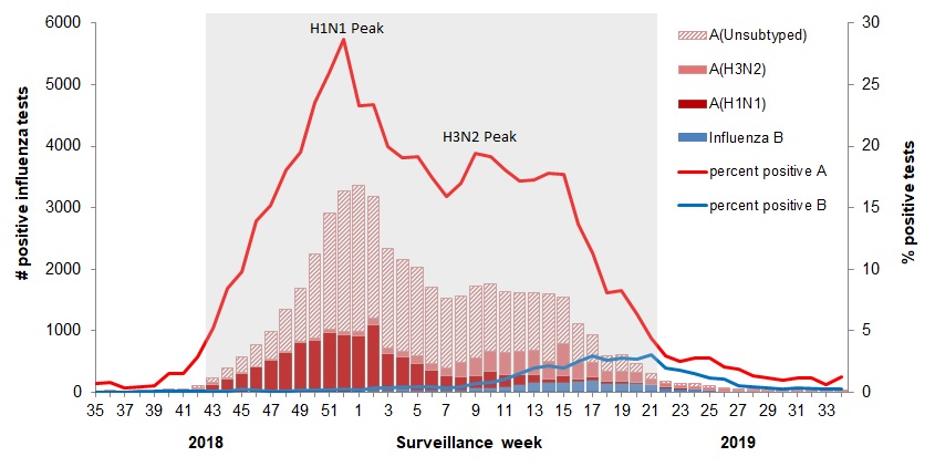 The various flu types are noted, all together making a total of 48,818 influenza detections during the 2018-19 season. A total of 946 hospitalizations were reported by CIRN-SOS sentinels that season (age = or >16). Source: