When is it Warming?–The Real Reason for the Pause

June 21 E.M. Smith made an intriguing comment on the occasion of Summer Solstice (NH) and Winter Solstice (SH):
“This is the time when the sun stops the apparent drift in the sky toward one pole, reverses, and heads toward the other. For about 2 more months, temperatures lag this change of trend. That is the total heat storage capacity of the planet. Heat is not stored beyond that point and there can not be any persistent warming as long as winter brings a return to cold.
I’d actually assert that there are only two measurements needed to show the existence or absence of global warming. Highs in the hottest month must get hotter and lows in the coldest month must get warmer. BOTH must happen, and no other months matter as they are just transitional.
I’m also pretty sure that the comparison of dates of peaks between locations could also be interesting. If one hemisphere is having a drift to, say, longer springs while the other is having longer falls, that’s more orbital mechanics than CO2 driven and ought to be reflected in different temperature trends / rates of drift.”
https://chiefio.wordpress.com/2015/06/21/summer-solstice-is-here/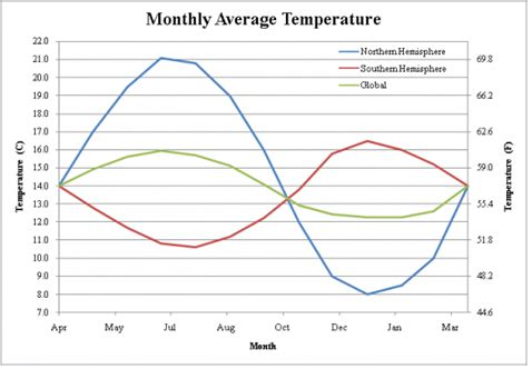
Notice that the global temperature tracks with the seasons of the NH. The reason for this is simple. The NH has twice as much land as the Southern Hemisphere (SH). Oceans have greater heat capacity and do not change temperatures as much as land does. So every year when there is almost a 4 °C swing in the temperature of the Earth, it follows the seasons of the NH. This is especially interesting because the Earth gets the most energy from the sun in January right now. That is because of the orbit of the Earth. The perihelion is when the Earth is closest to the sun and that currently takes place in January.
http://theinconvenientskeptic.com/2010/10/how-the-northern-hemisphere-drives-the-modern-climate/
Observations and Analysis:
My curiosity piqued by Chiefio’s comment, I went looking for data to analyze to test his proposition. As it happens, Berkeley Earth provides data tables for monthly Tmax and Tmin by hemisphere (NH and SH), from land station records. Setting aside any concerns about adjustments or infilling I did the analysis taking the BEST data tables at face value. Since land surface temperatures are more variable than sea surface temps, it seems like a reasonable dataset to analyze for the mentioned patterns.

Tmax Records
NH and SH long-term trends are the same 0.07C/decade, and in both there was cooling before 1979 and above average warming since. However, since 1950 NH warmed more strongly, and mostly prior to 1998, while SH has warmed strongly since 1998. (Trends below are in C/yr.)
| Tmax Trends | NH Tmax | SH Tmax |
| All years | 0.007 | 0.007 |
| 1998-2013 | 0.018 | 0.030 |
| 1979-1998 | 0.029 | 0.017 |
| 1950-1979 | -0.003 | -0.003 |
| 1950-2013 | 0.020 | 0.014 |
Summer Comparisons:
NH summer months are June, July, August, (6-8) and SH summer is December, January, February (12-2). The trends for each of those months were computed and the annual trends subtracted to show if summer months were warming more than the rest of the year (Trends below are in C/yr.).
| Month less Annual | NH Tmax |
NH Tmax | NH Tmax | SH Tmax | SH Tmax | SH Tmax |
| Summer Trends |
6 |
7 | 8 | 12 | 1 |
2 |
| All years | -0.002 | -0.004 | -0.004 | 0.000 | 0.003 | 0.002 |
| 1998-2013 | 0.026 | 0.002 | 0.006 | 0.022 | 0.004 | -0.029 |
| 1979-1998 | 0.003 | -0.004 | -0.003 | -0.014 | -0.029 | 0.001 |
| 1950-1979 | -0.002 | -0.002 | -0.005 | 0.004 | 0.005 | -0.005 |
| 1950-2013 | -0.002 | -0.003 | -0.002 | -0.002 | -0.002 | -0.002 |
NH summer months are cooler than average overall and since 1950. Warming does appear since 1998 with a large anomaly in June and also warming in August.SH shows no strong pattern of Tmax warming in summer months. A hot December trend since 1998 is offset by a cold February. Overall SH summers are just above average, and since 1950 have been slightly cooler.
Tmin Records
Both NH and SH show Tmin rising 0.12C/decade, much more strongly warming than Tmax. SH show that average warming persisting throughout the record, slightly higher prior to 1979. NH Tmin is more variable, showing a large jump 1979-1998, a rate of 0.25 C/decade (Trends below are in C/yr.).
| Trends | NH Tmin | SH Tmin |
| All years | 0.012 | 0.012 |
| 1998-2013 | 0.010 | 0.010 |
| 1979-1998 | 0.025 | 0.011 |
| 1950-1979 | 0.006 | 0.014 |
| 1950-2013 | 0.022 | 0.014 |
Winter Comparisons:
SH winter months are June, July, August, (6-8) and NH winter is December, January, February (12-2). The trends for each of those months were computed and the annual trends subtracted to show if winter months were warming more than the rest of the year (Trends below are in C/yr.).
| Month less Annual | NH Tmin | NH Tmin | NH Tmin | SH Tmin | SH Tmin | SH Tmin |
| Winter Trends |
12 |
1 | 2 | 6 | 7 |
8 |
| All years | 0.007 | 0.008 | 0.007 | 0.005 | 0.003 | 0.004 |
| 1998-2013 | -0.045 | -0.035 | -0.076 | -0.043 | -0.024 | -0.019 |
| 1979-1998 | -0.018 | -0.005 | 0.024 | 0.034 | 0.008 | -0.008 |
| 1950-1979 | 0.008 | 0.005 | 0.007 | 0.008 | 0.012 | 0.013 |
| 1950-2013 | 0.001 | 0.007 | 0.008 | -0.001 | -0.002 | 0.002 |
NH winter Tmin warming is stronger than SH Tmin trends, but shows quite strong cooling since 1998. An anomalously warm February is the exception in the period 1979-1998.Both NH and SH show higher Tmin warming in winter months, with some irregularities. Most of the SH Tmin warming was before 1979, with strong cooling since 1998. June was anomalously warming in the period 1979 to 1998.
Summary
Tmin did trend higher in winter months but not consistently. Mostly winter Tmin warmed 1950 to 1979, and was much cooler than other months since 1998.
Tmax has not warmed in summer more than in other months, with the exception of two anomalous months since 1998: NH June and SH December.
Conclusion:
I find no convincing pattern of summer Tmax warming carrying over into winter Tmin warming. In other words, summers are not adding warming more than other seasons. There is no support for concerns over summer heat waves increasing as a pattern.
It is interesting to note that the plateau in temperatures since the 1998 El Nino is matched by winter months cooler than average during that period, leading to my discovering the real reason for lack of warming recently.
The Real Reason for the Pause in Global Warming
These data suggest warming trends are coming from less cold overnight temperatures as measured at land weather stations. Since stations exposed to urban heat sources typically show higher minimums overnight and in winter months, this pattern is likely an artifact of human settlement activity rather than CO2 from fossil fuels.
Thus the Pause (more correctly the Plateau) in global warming is caused by end of the century completion of urbanization around most surface stations. With no additional warming from additional urban heat sources, temperatures have remained flat for more than 15 years.

Data is here:
http://berkeleyearth.lbl.gov/regions/northern-hemisphere
http://berkeleyearth.lbl.gov/regions/southern-hemisphere