I hate to be the bearer of bad news, but Atlanta is not burning. Bodies are not piled up in the streets. Hospitals in Georgia are not being overwhelmed; in fact, they are virtually empty. There is no mad rush for ventilators (remember those?). Instead, men, women, and children in the Peach State are returning to some semblance of normal life: working outside their homes, going to restaurants and bars, getting haircuts, exercising, and most important, spending time with their friends and families and worshipping God. The opening that began more than three weeks ago is continuing apace.
Oh, my apologies, you were waiting for bad news? Sorry, I forgot, we were actually not supposed to be rooting for the virus. Despite the apparent relish behind headlines like “Georgia’s Experiment in Human Sacrifice,” one assumes that most Americans, even the ones most committed to omnidirectional prophecies of doom, were actually hoping this would happen. While it really is a shame that we do not get to gloat about the cravenness and stupidity of yet another GOP politician, I think on balance most of us will be glad to hear that Gov. Brian Kemp was not badly wrong here.
What is happening instead of the widely predicted bloodbath? Confirmed cases of the virus are obviously increasing (though the actual rolling weekly average of new ones have been headed down for nearly a month) while deaths remain more or less flat. This is in fact what happens when you test more people for a disease that is not fatal or even particularly serious for the vast majority of those who contract it, for which the median age of death is higher than the American life expectancy.
How was this possible? One answer is that the lockdown did not in fact do what it was supposed to do, which is to say, meaningfully impede transmission of the virus.
In fact, data both from states like Georgia and from abroad suggests that the lifting of lockdowns is positively correlated with a decrease in rates of infection. This could be because lockdowns are inherently ineffective at slowing down a disease whose spread appears to be largely intrafamilial and nosocomial.
It could also be the weather. That’s right: another thing that we were told months ago not even to suggest aloud because it would be irresponsible to make assumptions of any kind about the virus, even sensible ones, like the idea that wearing masks just might help slow it down. This is not science. COVID-19 arrived from China, not from outer space. Unsurprisingly, it appears to behave very much like other respiratory viruses, including influenza. It hates sunlight and the outdoors generally and prefers cramped stuffy conditions, like those found in public transit systems and dense housing complexes with poor ventilation.
It is worth pointing out here that journalists and Democratic politicians (most notably Stacey Abrams, the former Georgia state representative who labors under the bizarre illusion that she won a statewide election there two years ago and would now like to be vice president) were not the only critics of Gov. Kemp. After a series of spasmodic muscular contractions that seemed to have resulted in tweets calling upon unnamed persons to “liberate” various states, President Trump changed his mind and insisted on more than one occasion that he “strongly disagreed” with the decision to open Georgia. Expecting anything resembling consistency from this president is a fool’s errand, but one hopes that at least some of his supporters remember that he was wrong here.
None of what I have written above should be taken to suggest that Kemp’s handling of the pandemic is above reproach, or that he should receive a medal for clear-sightedness here. (I might give one instead to Gov. Ron DeSantis of Florida, where amid shrill moaning about the non-existent dangers of people standing on beaches, thousands of lives may have been saved by a swift executive order banning the re-introduction of coronavirus patients to elder care facilities). Nor am I suggesting that things in the Peach State cannot possibly take a turn for the worse, especially if appropriate measures are not taken in nursing homes.
Two much narrower claims are being made. The first is that those who insisted that Georgia would be transformed into a post-apocalyptic wasteland within days or even weeks of reopening were wrong, and predictably so.
The second is that this is something about which we should be happy.
Among the top Google News search results this morning for “climate change,” the Miami Herald published an article asserting a new study shows global warming is causing more Atlantic hurricanes. In reality, the new study shows there is a declining trend in hurricanes in many parts of the world and concludes there will likely be a declining trend globally during the 21st century. Moreover, objective data show the number of Atlantic hurricanes is declining, just like the forecast global trend.
The National Oceanic and Atmospheric Administration (NOAA) study referencedby the Herald reports, “our climate models project decreases in the number of global TCs [tropical cyclones] toward the end of the 21st century due to the dominant effect of greenhouse gases on decreasing TC occurrence in most of the tropics, consistent with many previous studies.”
The NOAA study reported a trend of “substantial decreases” in Indian Ocean and North Pacific hurricanes is already detected in the record. The study asserts there has been an increase in Atlantic hurricanes since 1980, which “anthropogenic aerosols could have also influenced.”
The major takeaway from the NOAA study is there will be fewer hurricanes as the world continues its modest warming. That is good news. Rather than reporting good climate news, however, the Herald goes to great lengths to try to pull some bad news from a good-news study.
The only reason the authors of the NOAA study could report an increase in Atlantic hurricanes since 1980 is because the decade ending in 1980 was an abnormally low year, with the fewest number of Atlantic hurricanes on record. So, any trend line starting at the record-low point of 1980 will show more frequent hurricanes. However, a more complete and representative record shows a long-term and ongoing decline in Atlantic hurricanes. The graph below illustrates that point.
Located in Florida, the Miami Herald surprisingly did not mention two very important facts about hurricanes and Florida. As documented in Climate at a Glance: Hurricanes, Florida recently concluded an 11-year period (2005 through 2016) without a landfalling hurricane of any size—the longest such period in recorded history. The Gulf of Mexico also recently benefited from its longest hurricane-free period in recorded history (2013 through 2016).
For completely misleading its readers about the recent NOAA study, and for asserting the exact opposite of the truth regarding hurricane frequency and Atlantic hurricane frequency, the Miami Herald earns a gigantic Pinocchio award.
Footnote: The 2020 consensus forecast for the coming hurricane season is for an active season (H/T trackthetropics)
GWO’s prediction calls for 16 named storms, 7 hurricanes and 3 to 4 major hurricanes. They note the United States can expect 5 named storms to make landfall, with 2 or 3 hurricane landfalls – one of which will likely be a major category 3 hurricane. Professor David Dilley – senior research scientist for GWO, says several favorable meteorological and climatological factors are in place to produce another above average hurricane season this year. Some of the factors include a 72-year ClimatePulse Hurricane Landfall Enhancement Cycle – coupled with the continuance of above normal warm Atlantic Ocean and Gulf of Mexico water temperatures – and the lack of either a moderate or strong El Niño to subdue the hurricane seasons. Entire forecast: https://www.globalweatheroscillations.com/
Of course, any storm making US landfall is big weather news, and the media is ready.
Update at End May 20, 2020 It took a lot of work, but I was able to produce something akin to the Dutch advice to their citizens.
Original Post:
The media and governmental reports focus on total accumulated numbers which are big enough to scare people to do as they are told. In the absence of contextual comparisons, citizens have difficulty answering the main (perhaps only) question on their minds: What are my chances of catching Covid19 and dying from it? The map shows a lot of cases, and the chart looks like an hockey stick, going upward on a straight line. So why do I say canadians are safer than it looks like from such images?
By showing daily tests, new cases and reported deaths, we can see how the outbreak has built up over the last 2 months or so. The green line shows how testing has grown to a sustained daily rate of 30,000 (all numbers are smoothed with 7 day averages ending with the stated date.) Note that the curve is now descending after peaking at 1800 on May 3, now down to 1156 new cases per day. This lower rate of infections is despite the highest rate of testing since the outbreak began. Deaths have also peaked at 177 on May 6, down to 121 yesterday. The percentage of people testing positive is down to 4%, and deaths are 0.42% of the tests administered.
But it matters greatly where in Canada you live. In the map at the top, Quebec is the dark blue province leading the nation in both cases and deaths. Quebec has always celebrated being a distinct society, but not in this way. Below is the same chart for the Quebec epidemic from the same dataset. The province has about 23% of the national population and does about 25% of the tests. But Quebec contributes 56% of the cases and 62% of the deaths, as of yesterday. Here how the outbreak has gone in La Belle Province.
Cases have dropped off recently, from 1100 May 9 down to 737 yesterday. Deaths are also slowing, declining from 110 on May 7 to 83 yesterday. The animation below shows the epidemic in Canada with and without Quebec statistics.
But clearly everywhere else in Canada, people are much safer than those living in Quebec. So what is going on?
To enlarge image, open in new tab.
The graph shows that people in Quebec are dying in group homes, the majority in CHSLD (long term medical care facilities) and also in PSR (private seniors’ residences). The huge majority of Quebecers in other, more typical living arrangements have very little chance of dying from this disease. Not even prisoners are much at risk.
Of course the other dimension is years of age, since this disease has punished mostly people suffering from end-of-life frailties. A previous post reported that the Netherlands parliament was provided with the type of guidance everyone wants to see.
The table presents only those cases with a full clinical documentation, which included some 2194 deaths compared to the 5842 total reported. The numbers show that under 60 years old, few adults and almost no children have anything to fear.
Update May 20, 2020
It is really quite difficult to find cases and deaths broken down by age groups. For Canadian national statistics, I resorted to a report from Ontario to get the age distributions, since that province provides 69% of the cases outside of Quebec and 87% of the deaths. Applying those proportions across Canada results in this table. For Canada as a whole nation:
Age
Risk of Test +
Risk of Death
Population per 1 CV death
<20
0.05%
None
NA
20-39
0.20%
0.000%
431817
40-59
0.25%
0.002%
42273
60-79
0.20%
0.020%
4984
80+
0.76%
0.251%
398
In the worst case, if you are a Canadian aged more than 80 years, you have a 1 in 400 chance of dying from Covid19. If you are 60 to 80 years old, your odds are 1 in 5000. Younger than that, it’s only slightly higher than winning (or in this case, losing the lottery).
As noted above Quebec provides the bulk of cases and deaths in Canada, and also reports age distribution more precisely, The numbers in the table below show risks for Quebecers.
Age
Risk of Test +
Risk of Death
Population per 1 CV death
0-9 yrs
0.13%
0
NA
10-19 yrs
0.21%
0
NA
20-29 yrs
0.50%
0.000%
289,647
30-39
0.51%
0.001%
152,009
40-49 years
0.63%
0.001%
73,342
50-59 years
0.53%
0.005%
21,087
60-69 years
0.37%
0.021%
4,778
70-79 years
0.52%
0.094%
1,069
80-89
1.78%
0.469%
213
90 +
5.19%
1.608%
62
While some of the risk factors are higher in the viral hotspot of Quebec, it is still the case that under 80 years of age, your chances of dying from Covid 19 are better than 1 in 1000, and much better the younger you are.
The media and governmental reports focus on total accumulated numbers which are big enough to scare people to do as they are told. In the absence of contextual comparisons, citizens have difficulty answering the main (perhaps only) question on their minds: What are my chances of catching Covid19 and dying from it? The map shows a lot of cases, and the chart looks like an hockey stick, going upward on a straight line. So why do I say canadians are safer than it looks like from such images?
By showing daily tests, new cases and reported deaths, we can see how the outbreak has built up over the last 2 months or so. The green line shows how testing has grown to a sustained daily rate of 30,000 (all numbers are smoothed with 7 day averages ending with the stated date.) Note that the curve is now descending after peaking at 1800 on May 3, now down to 1156 new cases per day. This lower rate of infections is despite the highest rate of testing since the outbreak began. Deaths have also peaked at 177 on May 6, down to 121 yesterday. The percentage of people testing positive is down to 4%, and deaths are 0.42% of the tests administered.
But it matters greatly where in Canada you live. In the map at the top, Quebec is the dark blue province leading the nation in both cases and deaths. Quebec has always celebrated being a distinct society, but not in this way. Below is the same chart for the Quebec epidemic from the same dataset. The province has about 23% of the national population and does about 25% of the tests. But Quebec contributes 56% of the cases and 62% of the deaths, as of yesterday. Here how the outbreak has gone in La Belle Province.
Cases have dropped off recently, from 1100 May 9 down to 737 yesterday. Deaths are also slowing, declining from 110 on May 7 to 83 yesterday.
But clearly everywhere else in Canada, people are much safer than those living in Quebec. So what is going on?
To enlarge image, open in new tab.
The graph shows that people are dying in group homes, the majority in CHSLD (long term medical care facilities) and also in PSR (private seniors’ residences). The huge majority of Quebecers in other, more typical living arrangements have very little chance of dying from this disease. Not even prisoners are much at risk.
Of course the other dimension is years of age, since this disease has punished mostly people suffering from end-of-life frailties. A previous post reported that the Netherlands parliament was provided with the type of guidance everyone wants to see.
The table presents only those cases with a full clinical documentation, which included some 2194 deaths compared to the 5842 total reported. The numbers show that under 60 years old, few adults and almost no children have anything to fear.
Only one question matters to people: What is my risk of getting Covid19 and dying from it? Daniel Horowitz explains that the Dutch have answered this question while the US CDC has not. See One chart exposes the lie behind universal lockdowns in the Conservative Review. Excerpts in italics with my bolds.
What is the true infection fatality rate of COVID-19, broken down by age and health status?
This is a simple question for which the CDC should have a clear answer by now, accompanied by a readable chart – a chart showing everyone’s demographic risk assessment so that we can better target our infection mitigation efforts.
Yet it’s the one thing our government hasn’t done. Wonder why?
Take a look at the above chart (which I translated into English using Google Translate) prepared by the Economisch Statistische Berichten (ESB), a Dutch economics magazine, quantifying the infection fatality rate for the Dutch population based on age bracket. The data were calculated from an antibody test of 4,000 blood donors conducted by Dutch blood bank Sanquin to see how many have been infected for the purpose of donating blood plasma to those currently suffering from the virus. The data were presented to the Dutch House of Representatives in mid-April by the National Institute for Public Health and the Environment (RIVM).
Based on this serology test, they were able to determine that 3% of the population (at the time) were infected and were therefore able to divide the numerator of those who died of COVID-19 by the extrapolated denominator of those who were likely infected and break out the infection fatality rate by age group.
Study this chart for a few minutes and take in all the data – from the asymptomatic/mildly symptomatic rates to the hospital and fatality rates divided by age. You have to get to the 50-59 age group just to reach a 0.1% fatality rate, the level often cited as the overall death rate for the seasonal flu. Those are all lower odds than an individual has of dying in a giving year of any cause and in the case of an average 50-year-old, five times lower.
They didn’t test kids under 20, but their fatality rate is likely near zero.
While the Netherlands is an entirely different country, it has actually experienced a 30% higher death rate per capita than America. So the numbers are likely not any higher here for those under 70, especially because the macro serology tests showing a 0.2% fatality rate (but grossly distorted by the death rate of those over 80), as well as what we are seeing in prisons and ships in younger populations, seems to harmonize with this data. A brand-new study from France also shows very similar estimates of fatality rates, at least for those under 60.
If anything, those who are sicker tend to stay away from blood donation, so it could be that infection rate was even higher than this sample suggests, thereby driving down the fatality rate even lower.
Moreover, several weeks later, another research group in the Netherlands did a second serology test that broke down even more groups and came up with almost identical results:
As you can see, the death rate doesn’t even climb above 1% until you reach over 70, with a steep and dangerous growth of risk over 75 and 80. However, it’s important to remember that even those death rates might need to be cut in half for those outside nursing homes, given that half the deaths in most countries are in senior care facilities.
Why has our government not put out a similar chart? How many Americans even know that children have near-zero threat and anyone under 60 has next to no risk of dying from the virus? Even those between 60 and 69 are at much lower risk than anything the government has suggested and that the level of panic indicates. The World Health Organization wrongly pegged the overall death rate for all ages at 3.4% on average. This simple fact makes a world of difference both to our targeted response to the virus and also to the degree of panic that should and should not be infused into society so as not to keep people away from hospitals when they are experiencing other potentially dangerous medical conditions.
But even this chart doesn’t tell the full story. The virus lopsidedly targets people with particular underlying conditions, such as heart disease and diabetes. It is simply criminal that, with the tens of billions of dollars in “emergency” funding, the CDC has not conducted or published the results of a survey of 20,000 or so Americans to determine the exact number of infections and the fatality rate broken down by each health and age status. To most Americans, based on what the government and media have been putting out, it’s all the same and even babies will all die, as if there is a 50% fatality rate. Most people I know think their infants are in danger from COVID-19, even though the threat of flu and SIDS is much more pervasive in infants than that of coronavirus.
Consequently, we destroyed our entire country and sacked the Constitution all for a very narrow and specific problem that required a precise and balanced approach. Yet two months into this mistake, our government won’t even put out the simple math demonstrating this obvious point. As one commentator so aptly observed,
“Homogenous intervention in the face of heterogenous risk is just cruelty passed off as equality.”
The best context for understanding decadal temperature changes comes from the world’s sea surface temperatures (SST), for several reasons:
The ocean covers 71% of the globe and drives average temperatures;
SSTs have a constant water content, (unlike air temperatures), so give a better reading of heat content variations;
A major El Nino was the dominant climate feature in recent years.
HadSST is generally regarded as the best of the global SST data sets, and so the temperature story here comes from that source, the latest version being HadSST3. More on what distinguishes HadSST3 from other SST products at the end.
The Current Context
The chart below shows SST monthly anomalies as reported in HadSST3 starting in 2015 through April 2020. A global cooling pattern is seen clearly in the Tropics since its peak in 2016, joined by NH and SH cycling downward since 2016. In 2019 all regions had been converging to reach nearly the same value in April.
Then NH rose exceptionally by almost 0.5C over the four summer months, in August exceeding previous summer peaks in NH since 2015. In the last 4 months of 2019 that warm NH pulse reversed sharply. Now in 2020 the first 4 months show little change from last December. Recently anomalies in the NH and Tropics bumped upward in April, offset by a drop in the SH causing the global anomaly to dip as well.
Note that higher temps in 2015 and 2016 were first of all due to a sharp rise in Tropical SST, beginning in March 2015, peaking in January 2016, and steadily declining back below its beginning level. Secondly, the Northern Hemisphere added three bumps on the shoulders of Tropical warming, with peaks in August of each year. A fourth NH bump was lower and peaked in September 2018. As noted above, a fifth peak in August 2019 exceeded the four previous upward bumps in NH.
And as before, note that the global release of heat was not dramatic, due to the Southern Hemisphere offsetting the Northern one. The major difference between now and 2015-2016 is the absence of Tropical warming driving the SSTs.
A longer view of SSTs
The graph below is noisy, but the density is needed to see the seasonal patterns in the oceanic fluctuations. Previous posts focused on the rise and fall of the last El Nino starting in 2015. This post adds a longer view, encompassing the significant 1998 El Nino and since. The color schemes are retained for Global, Tropics, NH and SH anomalies. Despite the longer time frame, I have kept the monthly data (rather than yearly averages) because of interesting shifts between January and July.
To enlarge, open image in new tab.
1995 is a reasonable (ENSO neutral) starting point prior to the first El Nino. The sharp Tropical rise peaking in 1998 is dominant in the record, starting Jan. ’97 to pull up SSTs uniformly before returning to the same level Jan. ’99. For the next 2 years, the Tropics stayed down, and the world’s oceans held steady around 0.2C above 1961 to 1990 average.
Then comes a steady rise over two years to a lesser peak Jan. 2003, but again uniformly pulling all oceans up around 0.4C. Something changes at this point, with more hemispheric divergence than before. Over the 4 years until Jan 2007, the Tropics go through ups and downs, NH a series of ups and SH mostly downs. As a result the Global average fluctuates around that same 0.4C, which also turns out to be the average for the entire record since 1995.
2007 stands out with a sharp drop in temperatures so that Jan.08 matches the low in Jan. ’99, but starting from a lower high. The oceans all decline as well, until temps build peaking in 2010.
Now again a different pattern appears. The Tropics cool sharply to Jan 11, then rise steadily for 4 years to Jan 15, at which point the most recent major El Nino takes off. But this time in contrast to ’97-’99, the Northern Hemisphere produces peaks every summer pulling up the Global average. In fact, these NH peaks appear every July starting in 2003, growing stronger to produce 3 massive highs in 2014, 15 and 16. NH July 2017 was only slightly lower, and a fifth NH peak still lower in Sept. 2018.
The highest summer NH peak came in 2019, only this time the Tropics and SH are offsetting rather adding to the warming. Since 2014 SH has played a moderating role, offsetting the NH warming pulses. (Note: these are high anomalies on top of the highest absolute temps in the NH.)
What to make of all this? The patterns suggest that in addition to El Ninos in the Pacific driving the Tropic SSTs, something else is going on in the NH. The obvious culprit is the North Atlantic, since I have seen this sort of pulsing before. After reading some papers by David Dilley, I confirmed his observation of Atlantic pulses into the Arctic every 8 to 10 years.
But the peaks coming nearly every summer in HadSST require a different picture. Let’s look at August, the hottest month in the North Atlantic from the Kaplan dataset. The AMO Index is from from Kaplan SST v2, the unaltered and not detrended dataset. By definition, the data are monthly average SSTs interpolated to a 5×5 grid over the North Atlantic basically 0 to 70N. The graph shows warming began after 1992 up to 1998, with a series of matching years since. Because the N. Atlantic has partnered with the Pacific ENSO recently, let’s take a closer look at some AMO years in the last 2 decades.
This graph shows monthly AMO temps for some important years. The Peak years were 1998, 2010 and 2016, with the latter emphasized as the most recent. The other years show lesser warming, with 2007 emphasized as the coolest in the last 20 years. Note the red 2018 line is at the bottom of all these tracks. The black line shows that 2020 began near average, but is showing higher temperatures the last three months than any year in the record except for tracking 2010. It appears that the Atlantic is driving warming in NH and Tropics thes year.
Summary
The oceans are driving the warming this century. SSTs took a step up with the 1998 El Nino and have stayed there with help from the North Atlantic, and more recently the Pacific northern “Blob.” The ocean surfaces are releasing a lot of energy, warming the air, but eventually will have a cooling effect. The decline after 1937 was rapid by comparison, so one wonders: How long can the oceans keep this up? If the pattern of recent years continues, NH SST anomalies may rise slightly in coming months, but once again, ENSO which has weakened will probably determine the outcome.
Footnote: Why Rely on HadSST3
HadSST3 is distinguished from other SST products because HadCRU (Hadley Climatic Research Unit) does not engage in SST interpolation, i.e. infilling estimated anomalies into grid cells lacking sufficient sampling in a given month. From reading the documentation and from queries to Met Office, this is their procedure.
HadSST3 imports data from gridcells containing ocean, excluding land cells. From past records, they have calculated daily and monthly average readings for each grid cell for the period 1961 to 1990. Those temperatures form the baseline from which anomalies are calculated.
In a given month, each gridcell with sufficient sampling is averaged for the month and then the baseline value for that cell and that month is subtracted, resulting in the monthly anomaly for that cell. All cells with monthly anomalies are averaged to produce global, hemispheric and tropical anomalies for the month, based on the cells in those locations. For example, Tropics averages include ocean grid cells lying between latitudes 20N and 20S.
Gridcells lacking sufficient sampling that month are left out of the averaging, and the uncertainty from such missing data is estimated. IMO that is more reasonable than inventing data to infill. And it seems that the Global Drifter Array displayed in the top image is providing more uniform coverage of the oceans than in the past.
USS Pearl Harbor deploys Global Drifter Buoys in Pacific Ocean
Those who have investigated global warming/climate change discovered that the numbers don’t add up. But if you don’t do the math you wouldn’t know that, because in the details is found the truth (the devilish contradictions to sweeping claims). Those without numerical literacy (including apparently most journalists) are at the mercy of the loudest advocates. Social policy then becomes a matter of going along with herd popularity. Shout out to AOC!
Now we get the additional revelation regarding pandemic math and the refusal to correct over-the-top predictions. It’s the same dynamic but accelerated by the more immediate failure of models to forecast contagious reality. Sean Trende writes at Real Clear Politics The Costly Failure to Update Sky-Is-Falling Predictions. Excerpts in italics with my bolds.
On March 6, Liz Specht, Ph.D., posted a thread on Twitter that immediately went viral. As of this writing, it has received over 100,000 likes and almost 41,000 retweets, and was republished at Stat News. It purported to “talk math” and reflected the views of “highly esteemed epidemiologists.” It insisted it was “not a hypothetical, fear-mongering, worst-case scenario,” and that, while the predictions it contained might be wrong, they would not be “orders of magnitude wrong.” It was also catastrophically incorrect.
The crux of Dr. Specht’s 35-tweet thread was that the rapid doubling of COVID-19 cases would lead to about 1 million cases by May 5, 4 million by May 11, and so forth. Under this scenario, with a 10% hospitalization rate, we would expect approximately 400,000 hospitalizations by mid-May, which would more than overwhelm the estimated 330,000 available hospital beds in the country. This would combine with a lack of protective equipment for health care workers and lead to them “dropping from the workforce for weeks at a time,” to shortages of saline drips and so forth. Half the world would be infected by the summer, and we were implicitly advised to buy dry goods and to prepare not to leave the house.
Interestingly, this thread was wrong not because we managed to bend the curve and stave off the apocalypse; for starters, Dr. Specht described the cancellation of large events and workplace closures as something that would shift things by only days or weeks.
Instead, this thread was wrong because it dramatically understated our knowledge of the way the virus worked; it fell prey to the problem, common among experts, of failing to address adequately the uncertainty surrounding its point estimates. It did so in two opposing ways. First, it dramatically understated the rate of spread. If serological tests are to be remotely believed, we likely hit the apocalyptic milestone of 2 million cases quite some time ago. Not in the United States, mind you, but in New York City, where 20% of residents showed positive COVID-19 antibodies on April 23. Fourteen percent of state residents showed antibodies, suggesting 2.5 million cases in the Empire State alone; since antibodies take a while to develop, this was likely the state of affairs in mid-April or earlier.
But in addition to being wrong about the rate of spread, the thread was also very wrong about the rate of hospitalization. While New York City found its hospital system stretched, it avoided catastrophic failure, despite having within its borders the entire number of cases predicted for the country as a whole, a month earlier than predicted. Other areas of the United States found themselves with empty hospital beds and unused emergency capacity.
One would think that, given the amount of attention this was given in mainstream sources, there would be some sort of revisiting of the prediction. Of course, nothing of the sort occurred.
This thread has been absolutely memory-holed, along with countless other threads and Medium articles from February and March. We might forgive such forays on sites like Twitter and Medium, but feeding frenzies from mainstream sources are also passed over without the media ever revisiting to see how things turned out.
Consider Florida. Gov. Ron DeSantis was castigated for failing to close the beaches during spring break, and critics suggested that the state might be the next New York. I’ve written about this at length elsewhere, but Florida’s new cases peaked in early April, at which point it was a middling state in terms of infections per capita. The virus hasn’t gone away, of course, but the five-day rolling average of daily cases in Florida is roughly where it was in late March, notwithstanding the fact that testing has increased substantially. Taking increased testing into account, the positive test rate has gradually declined since late March as well, falling from a peak of 11.8% on April 1 to a low of 3.6% on May 12.
Notwithstanding this, the Washington Post continues to press stories of public health officials begging state officials to close beaches (a more interesting angle at this point might be why these health officials were so wrong), while the New York Times noted a few days ago (misleadingly, and grossly so) that “Florida had a huge spike in cases around Miami after spring break revelry,” without providing the crucial context that the caseload mimicked increases in other states that did not play host to spring break. Again, perhaps the real story is that spring breakers passed COVID-19 among themselves and seeded it when they got home. I am sure some of this occurred, but it seems exceedingly unlikely that they would have spread it widely among themselves and not also spread it widely to bartenders, wait staff, hotel staff, and the like in Florida.
Florida was also one of the first states to experiment with reopening. Duval County (Jacksonville) reopened its beaches on April 19 to much national skepticism. Yet daily cases are lower today than they were they day that it reopened; there was a recent spike in cases associated with increased testing, but it is now receding.
Or consider Georgia, which one prominent national magazine claimed was engaging in “human sacrifice” by reopening. Yet, after nearly a month, a five-day average of Georgia’s daily cases looks like this:
What about Wisconsin, which was heavily criticized for holding in-person voting? It has had an increased caseload, but that is largely due to increased testing (up almost six-fold since early April) and an idiosyncratic outbreak in its meatpacking plants. The latter is tragic, but it is not related to the election; in fact, a Milwaukee Journal-Sentinel investigation failed to link any cases to the election; this has largely been ignored outside of conservative media sites such as National Review.
We could go on – after being panned for refusing to issue a stay-at-home order, South Dakota indeed suffered an outbreak (once again, in its meatpacking plants), but deaths there have consistently averaged less than three per day, to little fanfare – but the point is made. Some “feeding frenzies” have panned out, but many have failed to do so; rather than acknowledging this failure, the press typically moves on.
This is an unwelcome development, for a few reasons. First, not everyone follows this pandemic closely, and so a failure to follow up on how feeding frenzies end up means that many people likely don’t update their views as often as they should. You’d probably be forgiven if you suspected hundreds of cases and deaths followed the Wisconsin election.
Second, we obviously need to get policy right here, and to be sure, reporting bad news is important for producing informed public opinion. But reporting good news is equally as important. Third, there are dangers to forecasting with incredible certitude, especially with a virus that was detected less than six months ago. There really is a lot we still don’t know, and people should be reminded of this. Finally, among people who do remember things like this, a failure to acknowledge errors foments cynicism and further distrust of experts.
The damage done to this trust is dangerous, for at this time we desperately need quality expert opinions and news reporting that we can rely upon.
It did not take long after the onset of the global pandemic for people to observe the many parallels between the covid-19 pandemic and climate change. An invisible novel virus of the SARS family now represents an existential threat to humanity. As does CO2, a colourless trace gas constituting 0.04% of the atmosphere which allegedly serves as the control knob of climate change. Lockdowns are to the pandemic what decarbonization is to climate change. Indeed, lockdowns and decarbonization share much in common, from tourism and international travel to shopping and having a good time. It would seem that Greta Thunberg’s dreams have come true, and perhaps that is why CNN announced on Wednesday that it is featuring her on a coronavirus town-hall panel alongside health experts.
But, beyond being a soundbite and means of obtaining political cover, ‘following the science’ is neither straightforward nor consensual. The diversity of scientific views on covid-19 became quickly apparent in the dramatic flip-flop of the UK government. In the early stages of the spread in infection, Boris Johnson spoke of “herd immunity”, protecting the vulnerable and common sense (à la Sweden’s leading epidemiologist Professor Johan Giesecke) and rejected banning mass gatherings or imposing social distancing rules. Then, an unpublished bombshell March 16th report by Professor Neil Ferguson of Imperial College, London, warned of 510,000 deaths in the country if the country did not immediately adopt a suppression strategy. On March 23, the UK government reversed course and imposed one of Europe’s strictest lockdowns. For the US, the professor had predicted 2.2 million deaths absent similar government controls, and here too, Ferguson’s alarmism moved the federal government into lockdown mode.
Unlike climate change models that predict outcomes over a period of decades, however, it takes only days and weeks for epidemiological model forecasts to be falsified by data. Thus, by March 25th, Ferguson’s predicted half a million fatalities in the UK was adjusted downward to “unlikely to exceed 20,000”, a reduction by a factor of 25. This drastic reduction was credited to the UK’s lockdown which, however, was imposed only 2 days previously, before any social distancing measures could possibly have had enough time to work.
For those engaged in the fraught debates over climate change over the past few decades, the use of alarmist models to guide policy has been a familiar point of contention. Much as Ferguson’s model drove governments to impose Covid-19 lockdowns affecting nearly 3 billion people on the planet, Professor Michael Mann’s “hockey stick” model was used by the IPCC, mass media and politicians to push the man-made global warming (now called climate change) hysteria over the past two decades.
As politicians abdicate policy formulation to opaque expertise in highly specialized fields such as epidemiology or climate science, a process of groupthink emerges as scientists generate ‘significant’ results which reinforce confirmation bias, affirm the “scientific consensus” and marginalize sceptics.
Rather than allocating resources and efforts towards protecting the vulnerable old and infirm while allowing the rest of the population to carry on with their livelihoods with individuals taking responsibility for safe socializing, most governments have opted to experiment with top-down economy-crushing lockdowns. And rather than mitigating real environmental threats such as the use of traditional biomass for cooking indoors that is a major cause of mortality in the developing world or the trade in wild animals, the climate change establishment advocates decarbonisation (read de-industrialization) to save us from extreme scenarios of global warming.
Taking the wheels off of entire economies on the basis of wildly exaggerated models is not the way to go.
Footnote: Mark Hemingway sees how commonplace is the problem of uncorrected media falsity in his article When Did the Media Stop Running Corrections? Excerpts in italics with my bolds.
Vanity Fair quickly recast Sherman’s story without acknowledging its error: “This post has been updated to include a denial from Blackstone, and to reflect comments received after publication by Charles P. Herring, president of Herring Networks, OANN’s parent company.” In sum, Sherman based his piece on a premise that was wrong, and Vanity Fair merely acted as if all the story needed was a minor update.
Such post-publication “stealth editing” has become the norm. Last month, The New York Times published a story on the allegation that Joe Biden sexually assaulted a former Senate aide. After publication, the Times deleted the second half of this sentence: “The Times found no pattern of sexual misconduct by Mr. Biden, beyond the hugs, kisses and touching that women previously said made them uncomfortable.”
In an interview with Times media columnist Ben Smith, Times’ Executive Editor Dean Baquet admitted the sentence was altered at the request of Biden’s presidential campaign. However, if you go to the Times’ original story on the Biden allegations, there’s no note saying how the story was specifically altered or why.
It’s also impossible not to note how this failure to issue proper corrections and penchant for stealth editing goes hand-in-hand with the media’s ideological preferences.
In the end the media’s refusal to run corrections is a damnable practice for reasons that have nothing to do with Christianity. In an era when large majorities of the public routinely tell pollsters they don’t trust the media, you don’t have to be a Bible-thumper to see that admitting your mistakes promptly, being transparent about trying to correct them, and when appropriate, apologizing and asking for forgiveness – are good secular, professional ethics.
Study enrolling adults with mild to moderate COVID-19 in the United States.
A clinical trial has begun to evaluate whether the malaria drug hydroxychloroquine, given together with the antibiotic azithromycin, can prevent hospitalization and death from coronavirus disease 2019 (COVID-19). The National Institute of Allergy and Infectious Diseases (NIAID), part of the National Institutes of Health, is sponsoring the trial, which is being conducted by the NIAID-funded AIDS Clinical Trials Group (ACTG). Teva Pharmaceuticals is donating medications for the study.
Transmission electron micrograph of SARS-CoV-2 virus particles, isolated from a patient. Image captured and color-enhanced at the NIAID Integrated Research Facility (IRF) in Fort Detrick, Maryland.NIAID
The Phase 2b trial will enroll approximately 2,000 adults at participating ACTG sites(link is external) across the United States. Study participants must have confirmed infection with SARS-CoV-2, the virus that causes COVID-19, and be experiencing fever, cough and/or shortness of breath. The investigators anticipate that many of those enrolled will be 60 years of age or older or have a comorbidity associated with developing serious complications from COVID-19, such as cardiovascular disease or diabetes. Participants will be randomly assigned to receive short-term treatment with either hydroxychloroquine and azithromycin or matching placebos. People living with HIV and pregnant and breastfeeding women also are eligible to participate in the study. The first participant enrolled today in San Diego, California.
“We urgently need a safe and effective treatment for COVID-19. Repurposing existing drugs is an attractive option because these medications have undergone extensive testing, allowing them to move quickly into clinical trials and accelerating their potential approval for COVID-19 treatment,” said NIAID Director Anthony S. Fauci, M.D. “Although there is anecdotal evidence that hydroxychloroquine and azithromycin may benefit people with COVID-19, we need solid data from a large randomized, controlled clinical trial to determine whether this experimental treatment is safe and can improve clinical outcomes.”
On March 28, FDA issued an Emergency Use Authorization (link) (EUA) to allow hydroxychloroquine and medical-grade chloroquine to be distributed from the Strategic National Stockpile and prescribed by doctors to hospitalized adolescents and adults with COVID-19, as appropriate, when a clinical trial is not available or feasible.
Participants in the ACTG study, called A5395, will receive oral medications to take at home. Those randomly assigned to the experimental treatment group will take 400 milligrams (mg) of hydroxychloroquine twice on the first day and 200 mg twice daily for an additional six days. They also will take 500 mg of azithromycin on the first day and 250 mg daily for an additional four days. The control group will receive equivalent numbers of placebo pills. Neither the participants nor the study team will know who received experimental treatment or placebo until the end of the trial.
Participants will record their symptoms, adherence to treatment, and major events such as hospitalizations in a diary for 20 days. Study staff will follow up with participants by telephone during this period. When possible, participants will come to the clinical research site for an in-person visit at day 20. Additional follow-ups will be conducted by telephone three and six months after treatment starts.
The main objective of the study is to determine whether hydroxychloroquine and azithromycin can prevent hospitalization and death due to COVID-19. Additionally, investigators will evaluate the safety and tolerability of the experimental treatment for people with SARS-CoV-2 infection.
“This study will provide key data to aid responses to the COVID-19 pandemic,” said ACTG Chair Judith Currier, M.D., of the University of California, Los Angeles. “We are pleased to be able to leverage ACTG’s existing infrastructure for HIV treatment clinical trials to quickly implement this important study.”
The study description at ClinicalTrials.gov is here. The program started May 1 and with a primary completion date of October 9, 2020.
Researchers at NYU Grossman School of Medicine looked at 932 coronavirus patients hospitalized between March 2 and April 5
Half were given a combination of hydroxychloroquine, azithromycin and zinc sulfate and the other half did not receive zinc
Patients receiving the triple drug combination were 1.5 times more likely to recover enough to be discharged and 44% less likely to die
The team believes hydroxychloroquine helps zinc, which has antiviral properties, get into infected cells
The main finding of this study is that after adjusting for the timing of zinc therapy, we found that the addition of zinc sulfate to hydroxychloroquine and azithromycin was found to associate with a decrease in mortality or transition to hospice among patients who did not require ICU level of care, but this association was not significant in patients who were treated in the ICU. This result may be reflective of the proposed mechanism of action of zinc sulfate in COVID-19. Zinc has been shown to reduce SARS-CoV RNA dependent RNA polymerase activity in vitro [13]. As such, zinc may have a role in preventing the virus from progressing to severe disease, but once the aberrant production of systemic immune mediators is initiated, known as the cytokine storm, the addition of zinc may no longer be effective [17]. Our findings suggest a potential therapeutic synergistic mechanism of zinc sulfate with hydroxychloroquine, if used early on in presentation with COVID-19. However, our findings do not suggest a prophylactic benefit of zinc sulfate in the absence of a zinc ionophore, despite interest in this therapy for prevention. A prophylactic strategy of zinc sulfate should be evaluated to help answer this question.
Background: Previous Post Preemptive Coronavirus Therapy
University of Minnesota is leading an important HCQ clinical trial, including collaboration with McGill University Montreal, University of Manitoba and University of Alberta. The initiative is called Post-exposure Prophylaxis / Preemptive Therapy for SARS-Coronavirus-2 (COVID-19 PEP) at ClinicalTrials.gov. Excerpts in italics with my bolds. H/T Don Monfort
Study Objective:
To test if post-exposure prophylaxis with hydroxychloroquine can prevent symptomatic COVID-19 disease after known exposure to the SARS-CoV-2 coronavirus.
To test if early preemptive hydroxychloroquine therapy can prevent disease progression in persons with known symptomatic COVID-19 disease, decreasing hospitalizations and symptom severity.
The Intervention Drug is Hydroxychloroquine. 200mg tablet; 800 mg orally once, followed in 6 to 8 hours by 600 mg, then 600mg once a day for 4 consecutive days Other Name: Plaquenil
On April 22, 2020, the independent Data and Safety Monitoring Board (DSMB) for the COVID-19 post-exposure prophylaxis trial has reviewed the cumulative safety data from 783 participants in the ongoing hydroxychloroquine prevention trial. The DSMB has identified no safety concerns or efficacy concerns at this time. We congratulate the study investigators on their enrollment thus far, and we will continue to provide oversight for the trial as specified in the DSMB charter.
Based on the event rate of COVID-19 illness observed in the control group, the sample size can be reduced by approximately one-third with approximately 200 more research participants needed to complete the trial to demonstrate conclusively whether or not there is a 50% reduction in symptomatic illness with a 5-day course of hydroxychloroquine after a high-risk exposure to someone with COIVD-19. The next interim analysis is scheduled for May 6, 2020. Ongoing U.S. enrollment is occurring at http://www.covidpep.umn.eduand in Canada at: http://www.covid-19research.ca
What Theory of the Disease Covid19 Suggests this Intervention?
In the United States and Europe, a handful of clinical trials have begun to test ways to keep healthcare workers and other vulnerable people safe from coronavirus disease (COVID-19).
Most are testing drugs called chloroquine or hydroxychloroquine that have long been used to prevent and treat malaria, and also as a therapy against rheumatoid arthritis and lupus. The hope is that, given before infection or early in the course of the disease, the drugs will protect someone against infection and illness from the virus, or, if they do, will ensure that their case is mild. But whether these drugs will help, hurt or do nothing remains an open question.
The virus that causes COVID-19 uses a backdoor to enter the cell. As it enters, it is exposed to an acidic, vinegar-like environment, which is actually needed for the virus to get all the way inside. Hydroxychloroquine, metaphorically keeps the cap on the vinegar, Greene says, preventing acidification. Thus, there is a scientific rationale for how this drug might exert an antiviral effect.
Mahir Ozmen, a professor of surgery at the Istinye University, School of Medicine in Istanbul, Turkey, says he thinks the best way to use chloroquine is in combination with zinc and vitamins C and D. He is running a clinical trial, testing to see whether this combination protects health care workers and their immediate families – including his own.
Ozmen, who is collaborating with a chest medicine specialist, an intensive care physician, and two infectious disease experts, says he intended to include only 80 participants, but 98 quickly volunteered. He began in April providing prophylactic therapy, and expects to complete the trial by July.
Ozmen says, “Hydroxychloroquine helps the zinc get inside the infected cells to destroy the virus, and vitamins A and D support immune function”. He gives volunteers a low dose of hydroxychloroquine every 3 weeks, and a vitamin tablet every day – or every other day for people prone to kidney stones. At the end of the trial, each participant will be checked for antibodies to COVID-19, suggesting an infection, whether they realised it or not.
This kind of prophylaxis will give us the time to develop a vaccine that will offer protection to everyone.
In perhaps the fastest-moving, large prophylaxis trial, researchers at Duke University are leading a US$ 50 million collaboration across hundreds of American healthcare systems, which will test 15,000 volunteers. Half the health care workers will take hydroxychloroquine, and half a placebo. Other drugs could be added to the study if they prove promising for preventing or lessening infection, says Adrian Hernandez, the trial’s principle investigator.
In France, researchers are running a trial with 1,200 healthcare workers to test prophylactic use of hydroxychloroquine or a combination of two HIV drugs, Lopinavir and Ritonavir, which failed as a treatment in people with severe COVID-19 infections but may work as prevention. It is expected to take 6 months.
In a 40,000-person trial led by the University of Oxford in England, participants in Asia will receive chloroquine or a placebo, and in Europe, hydroxychloroquine or a placebo. That trial is expected to take a year.
Footnote: A more detailed hypothesis for testing is provided by Dr. Scholz and Dr. Derwand of Leukocare in Munich (PDF here). Excerpt:
Based on the evidence of therapeutic effects of CQ/HCQ, their possible pharmacological effect as zinc ionophores and possibly underestimated specific and unspecific antiviral effects of zinc, we hypothesize that the combination of CQ/HCQ with parenteral zinc in the treatment of hospitalized COVID-19 patients may help to improve clinical outcomes and to limit the COVID-19 fatality rates.
Due to the existing substantial evidence, we propose to amend current clinical trial designs to test this hypothesis in the treatment of hospitalized COVID-19 patients by including at least one treatment arm with oral CQ or HCQ in combination with zinc. However, because of the better clinical safety profile HCQ should be preferred. To avoid interindividual differences of oral absorption rates and because of possible gastrointestinal side effects of oral zinc supplementation, it is proposed to use parenteral zinc preparations which are approved and clinically already used.
As the image above shows, supported by more detailed graphs below, Canada has now tested 1.17 million people with 6% positive for SARS-CoV-2 infection. 7% of those cases are reported deaths, or 0.45% of those tested.
The image presents coronavirus data as of the latest statistics complete to May 13, 2020. Note that Quebec accounts for 55% of all cases and deaths, most of them in Montreal, and mostly elderly residents in group homes. From the underlying data we can see that this Covid 19 outbreak started toward the end of the annual flu season. Since the graph is showing total accumulated cases, it can only go up until there are zero new ones.
To see the contagion in progress, here are the daily reported tests, cases, and deaths smoothed with 7 day averaging.
This outbreak is now about two months old. Note how cases early on rose along with the higher daily rates of testing, then held steady April 4 to 15 as testing declined slightly. Both testing and new cases then rose peaking on April 22 with 1806 new cases. Since then daily new cases have declined down to 1255 yesterday. Deaths per day peaked at 177 on May 5, and are down to 158 yesterday. (All daily figures are averages of the 7 day period ending with the stated date.) Tests went over 29,000 on May 9 and have continued at that level, about twice the daily number when April started.
The cumulative graph shows how the proportions faired during this period. Out of a total 1,172,872 tests, 72278 (6.2%) cases were detected, a rate down from 6.6% as recently as May 5. 5304 are reported deaths (7.3% of cases).
For context, below are the latest reported leading causes of deaths.
ln the last reported statistical year (2018) the top twelve causes resulted in 209,290 deaths, or 574 people dying every day. When we add in the less lethal killers, in 2018 in Canada, 283,706 people died, or 777 every day. This is not abnormal, but is the ongoing reality of our society where lives end for all kinds of reasons to make room for infants to be born and take their place among us.
Background from Previous Post
With coronavirus sucking all the air out of room globally, I got interested in looking at how the Canadian national flu seasons compare with the new Wuhan virus. The analysis is important since there are many nations at higher latitudes that are in equilibrium relative to infectious diseases, but vulnerable to outbreaks of new viruses. Where I live in Canada, we have winter outbreaks every year, but are protected by a combination of sanitary practices, health care system and annual vaccines, contributing to herd immunity.
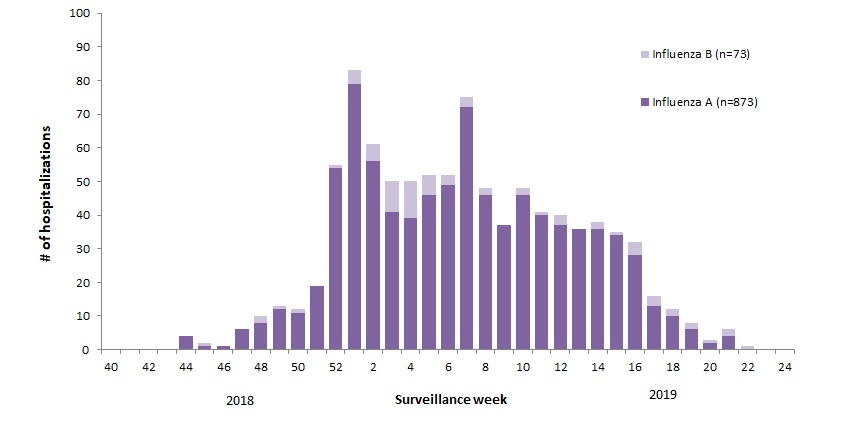
For example, 2018-19 was slightly higher than a typical year, with this pattern: The various flu types are noted, all together making a total of 48,818 influenza detections during the 2018-19 season. A total of 946 hospitalizations were reported by CIRN-SOS sentinels that season (age = or >16). Source: Annual Influenza Reports
A total of 137 (14%) ICU admissions and 65 (7%) deaths were reported. The seasonality is obvious, as is the social resilience, when we have the antibodies in place.
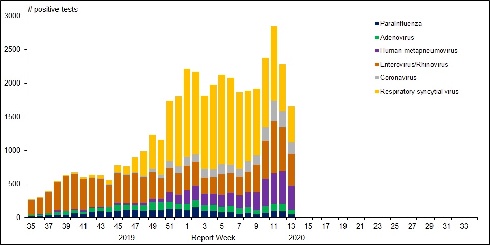
For further background, look at the latest Respiratory Virus Report for week 13 ending March 28, 2020. [In this Respiratory Virus Report, the number of detections of coronavirus reflects only seasonal human coronaviruses, not the novel pandemic coronavirus (SARS-CoV2) that causes COVID-19. Kung Flu statistics are above at the beginning.]
For the period shown in the graph, 320560 flu tests were done, resulting in 32751 type A positives and 22683 type B positives. That is a ratio of 17% of tests confirming conventional flu infection cases. Public Health Canada went on to say in reporting March 22 to 28, 2020 (week 13): The percentage of tests positive for influenza fell below 5% this week. This suggests that Canada is nearing the end of the 2019-2020 influenza season at the national level. [Keep that 5% in mind]
Summary: It’s true that total cases and deaths are still rising, and everyone should practice sanitary behaviors and social distancing. But it appears that we are weathering this storm and have the resources to beat it. Let us hope for reasonable governance, Spring weather and a return to economic normalcy.
A provincewide clinical trial led by the University of Calgary will test the effectiveness of the anti-malarial drug hydroxychloroquine on COVID-19 patients, with the goal of reducing pressure on hospitals and preventing further infections.
“There is minimal evidence for use of hydroxychloroquine to use it, but there is enough (evidence) to study it,” said Metz, the acting facility medical director at Foothills Medical Centre and a professor in the department of clinical neurosciences at the Cumming School of Medicine.
“It just has to be done. If this drug does, indeed, reduce the severity and help people get better faster, it can help us in flattening the curve.”
The “HOPE” trial, to begin April 15, will target 1,600 Alberta outpatients who have tested positive for COVID-19 and are at risk of developing severe symptoms. The study will determine if hydroxychloroquine can prevent hospitalization for those at highest risk of developing a severe illness.
Participants will give their permission to Alberta Health Services after testing positive for COVID-19 and provide their contact information to U of C researchers. They’ll then be screened for safety and eligibility through a telephone interview and review of their electronic health record.
Those patients accepted will be sent hydroxychloroquine to their homes and will be required to take the drug over a five-day period. Researchers will follow up with participants seven and 30 days after starting the treatment.
Metz said timing of the trial is crucial and must begin within 96 hours of confirmation of a positive COVID-19 result, and within 12 days of symptom onset.
Should the drug prove effective, it may reduce the pressures that COVID-19 is expected to put on the health-care system.
“If we can keep more people out of hospital, then we’re not going to have that huge rise in hospitalizations and more people can get better at home,” she said. “Our system will get back to normal life or whatever we choose to move to in the future.
“We’ll be able to get there if we find this works.”
Hamilton Health Services starting an Anti-Covid19 study this month
The ACT COVID-19 program consists of two parallel trials evaluating azithromycin and chloroquine therapy (ACT) versus usual care in outpatients and inpatients who have tested positive for COVID-19. The trial is an open-label, parallel group, randomized controlled trial with an adaptive design. Adaptive design features include adaptive intervention arms and adaptive sample size based on new and emerging data.
Experimental: Azithromycin and Chloroquine Therapy (ACT)
Chloroquine (Adults with a bodyweight ≥ 50 kg: 500 mg twice daily for 7 days; Adults with a bodyweight < 50 kg: 500 mg twice daily on days 1 and 2, followed by 500 mg once daily for days 3-7), plus Azithromycin (500 mg on day 1 followed by 250 mg daily for 4 days) Source: ClinicalTrials.gov
With all the reporting on the pandemic, generalists are finding virology a steep learning curve, especially if one has been focused on climatology. A case in point: Recently the media reported on virus antibody testing of Major League Baseball (MLB) employees. Various headlines and stories drew differing conclusions about the import of the findings. Consider these few among many examples.
Inquiring scientific minds want to know if the large print is actually supported by what is stated in the small print. A fourth article in the Washington Postsuggested some of the places where digging for clarity is required. Excerpts in italics with my bolds
The study reportedly involved 26 of the 30 MLB teams and based its results on 5,603 completed tests and surveys. Researchers said 60 people tested positive for covid-19 antibodies, and after controlling for an expected amount of false positives and negatives, that number was adjusted to 42. There were zero deaths among the test group.
Researchers noted that the test group was not perfectly “representative of the American population at large,” because it skewed toward subjects who mostly ranged in age from 20 to 64 and who generally were of elevated socioeconomic status. [Note that this is a good sample of the work force, in contrast to all of the testing and cases involving elderly retirees from group homes.]
However, researchers pointed to the fact that the “overwhelming majority” of test subjects were not athletes but other types of team employees, from front-office executives to stadium vendors.
It takes about six to 10 days for 50 percent of people to develop antibodies, Bhattacharya said, and thus the snapshot provided by the study would have been from early April. MLB suspended spring training in mid-March, and it hopes to resume in June before starting to play games in July.
Bhattacharya said the 0.7 percent figure was surprising in part because players and team staffers would have been grouped together in spring training, in some cases in an environment featuring a higher than normal number of respiratory droplets, a few weeks before tests were completed April 14 and 15.
Bhattacharya said the study provided good news in the zero deaths but bad news by indicating that “the epidemic has not gotten very far.” Another positive takeaway could be gleaned from the fact that 70 percent of the subjects who tested positive described themselves as asymptomatic.
Like all viruses, SARS-CoV-2 needs to get inside human cells to multiply and survive. To do this, a particle on the outer shell of the virus latches onto a matching protein receptor, called ACE2, like a lock and key. ACE2 receptors are normally found in the lungs, kidneys, heart and the gut.
Once a person has been infected with the virus, it can take up to 14 days for symptoms to appear (if they do at all) – known as the incubation period.
The path from the point of infection can vary enormously. The body’s immune system is critical for determining this.
Having a strong immune response during the incubation period can prevent the infection taking hold, reduce the actual quantity of virus in the body and prevent it from getting to the lungs.
Some immune response basics
Our immune system offers us two lines of defence against viruses.
The first is the innate system and includes physical barriers such as skin and mucous membranes (the lining of the throat and nose), various proteins and molecules found in tissues, as well as some of the white blood cells that attack invading organisms. This immune response is general, non-specific and kicks in quickly.
Children have immature immune systems, but one hypothesis to explain why they don’t seem to get as sick with COVID-19 is that their innate immune response to coronavirus is greater than in adults.
This may lead to a reduced viral load – the quantity of virus particles that survive in the body – because they’re able to clear the virus more quickly.
The second line of defence is the adaptive immune response. This takes longer to initiate but once established, is much more efficient at eradicating a specific infection when encountering it again.
It’s thought that very specific genetic variations in some people might play a part in how sick they get. By generating an early adaptive immune response, the body seems to recognise the virus during the incubation period and fight it off.
A person also needs to be generally healthy to be able to mount an appropriate immune response to the infection.
After the incubation period, what determines how sick you get?
If the SARS-CoV-2 virus survives beyond the point of entry to the body (nose, eyes, throat) it might then make its way down the respiratory tract into the lungs.
In the lungs, it latches onto ACE2 receptors and continues replicating itself, triggering further immune responses to clean out infected cells. The amount of virus that gets deep into the lungs may be another important factor determining how sick you get.
As the battle between virus and immune responses proceeds, infected airway linings produce large amounts of fluid that fill the air sacs, leaving less room for transferring oxygen into the bloodstream and removing carbon dioxide. Symptoms of pneumonia appear, such as fever, cough with sputum (phlegm) and shortness of breath.
For some people, the immune response is excessive or prolonged and causes what’s known as a “cytokine storm”. Cytokines are a group of proteins that send signals to cells in the immune system, helping direct the response. A cytokine storm is a catastrophic overreaction that causes so much inflammation and organ damage, it can be fatal.
In people with COVID-19, as well as the previous SARS and MERS coronaviruses, this causes acute respiratory distress syndrome (ARDS), when fluid builds up in the lungs. This is the most common cause of death from SARS-CoV-2.
Elderly people and those with chronic lung disorders are more likely to develop ARDS and therefore to die. This is currently thought to be due to these groups of people having fewer ACE2 receptors in their lungs. This seems counter-intuitive, because the virus attaches itself to these receptors. However, ACE2 receptors have an important role in regulating the immune response, particularly in managing the degree of inflammation. So the reduced levels of ACE2 receptors in the elderly may actually make them more at risk of a cytokine storm and severe lung disease.
Conversely, children have more ACE2 receptors in their lungs which might explain why they do not get as sick.
In some cases, medications that work to suppress the immune system have successfully treated this excessive immune response in people with COVID-19.
Can people without symptoms pass it on?
Some studies have indicated people with COVID-19 tend to have a high viral load just before and shortly after they start getting symptoms. This suggests they can transmit it when they first get sick and up to 48 hours before, while they’re pre-symptomatic.
However, there is no good evidence that asymptomatic people who never develop symptoms are able to pass it on.
Researchers and clinicians are working around the clock to understand the complex relationship between humans’ immune systems and SARS-CoV-2 but it remains very much a work in progress.
Source: The Conversation Abela Mahimbo, Lecturer in Public Health, University of Technology Sydney; David Isaacs, Professor of Pediatric Infectious Diseases, University of Sydney; Melanie Wong, Head of Diagnostic Immunology Laboratory, Kids Research, and Melissa Kang, Associate professor, University of Technology Sydney.
An article at Clinical Chemistry discusses issues around the role of generic versus specfic coronavirus antibodies. SARS-CoV-2 Serology: Much Hype, Little Data. Excerpt in italics with my bolds.
What could be the reason for these false positive results?
Given the homology of SARS-CoV-2 to other coronaviruses, it is likely that antigens used as targets in poorly designed assays will cross react. This risk is exaggerated in older populations who are likely to have been exposed to a wider variety of coronaviruses (12). Many serologic assays also cross-react in patients with EBV, rheumatoid factor, and heterophile antibodies. Careful antigen selection in COVID-19 serological assays is required to avoid cross reactivity of anti-seasonal coronavirus antibodies. If validation studies are not designed appropriately (ie. if only young, asymptomatic pre-pandemic patients are used as the negative population), then these limitations may not be thoroughly vetted and specificity of the assay may be grossly overestimated. [Note the authors are concerned with overestimating cases with SARS CoV-2 specific antibodies by counting presence of other coronavirus antibodies. They do not consider the possibility that other generic antibodies act against SARS CoV-2 infection.]
It’s months into the coronavirus pandemic and public health officials still don’t know how many people have actually contracted the culprit, SARS-CoV-2. In many countries testing capacity has lagged behind the spread of the virus. Large numbers of people have developed COVID-19symptoms but have not been tested, and the vast majority of people who had the virus but never developed symptoms and therefore were not tested, are not reflected in official statistics.
Federal and state governments, companies, and research groups are now racing to develop antibody tests to shine a light on the true spread of SARS-CoV-2. While PCR tests currently used to diagnose cases detect the virus’s genetic material, antibody tests can screen for virus-attacking antibodies that are formed shortly after an initial infection. Those antibodies usually linger in the blood long after the virus is gone. One such antibody, or serological, test was given emergency use authorization by the Food and Drug Administration in early April, and a number of other groups are making more tests, and in some cases even deploying them.
The National Institutes of Health has launched a study to detect antibodies in order to gather data for epidemiological models. And a recent survey of residents in a German town was one of the first to use an antibody test among the public, reporting that 14 percent of people there were likely to have been infected with SARS-CoV-2 due to the presence of antibodies.
It’s not clear yet whether milder or asymptomatic cases will develop antibodies.
Policymakers have another reason to scramble to deploy antibody tests: they could indicate whether someone is immune to SARS-CoV-2. With around 3 billion people globally under lockdown, pressure is mounting to re-open national economies. In recent weeks, several politicians have proposed the idea of “immunity passports” or “immunity certificates” to identify people who have had the virus and therefore gained immunity to it and could re-enter the workforce again. Officials in Germany, the UK, Italy, and the US are already discussing such proposals.
The success of such a program hinges on:
whether everyone who has contracted SARS-CoV-2 actually develops antibodies,
whether those antibodies protect against secondary infections, and if so,
how long the antibodies hang around in the body.
So far, scientists don’t have firm answers to any of these questions. Although antibody surveys of communities around the world could yield information that is crucial to understanding the spread of the pathogen, some consider the idea of “immunity passports” premature.
“People understand that [it] would be very powerful, if we could say, ‘you’re immune now, and you can return to work,’ or, ‘you could safely return to your family if you’re a healthcare worker,’” notes Stanford University and Chan Zuckerberg Biohub immunologist Taia Wang. But there are a lot of unknowns, she cautions. “To get to that point where we’ll know with some certainty what the antibody response means, we just have to collect [more] data.”
The antibody response to SARS-CoV-2
There is solid evidence emerging that COVID-19 patients are developing antibodies to the virus, as the human body does for most infectious pathogens. Kara Lynch, a clinical chemist at the University of California, San Francisco, and her colleagues have been testing around 500 serum samples from roughly 100 COVID-19 patients who were treated at the Zuckerberg San Francisco General Hospital, where Lynch co-directs a clinical chemistry laboratory. The team is using an assay that was applied to samples from patients in China and picks out antibodies that target a protein-binding site of the virus’s spike protein.
“What we’re seeing is that patients are [developing antibodies] anywhere from two to about fifteen days” after developing symptoms, Lynch says. In most patients, the antibody response is broadly reminiscent of the typical reaction to many other pathogens: first, a flush of IgM, a generic type of antibody, followed later by the longer-lasting and more-specific IgG antibodies. Other studies have yielded similar results and suggest that antibodies circulate in the blood of COVID-19 patients for at least two weeks.
The data are skewed toward severe cases, however, as most of the subjects that Lynch’s group tested had been hospitalized, and it’s not clear yet whether milder or asymptomatic cases will develop antibodies, Lynch notes. “I’m optimistic [but] I’m still a little bit cautious.”
Recently, researchers at Fudan University in Shanghai examined the plasma from 175 COVID-19 patients who recovered after mild symptoms. The vast majority of patients developed antibodies that targeted the spike protein around 10 to 15 days after symptom onset, the scientists reported in preprint. The report generated some concern on social media because the researchers couldn’t detect antibodies in 10 of the patients. That could have been a fluke, notes Shane Crotty, an immunologist at the La Jolla Institute for Immunology. It’s possible that that the PCR test for SARS-CoV-2 was a false positive, and those people in fact had a different respiratory infection.
It’s also possible that some patients simply don’t develop antibodies.
While years ago, “pretty much everybody infected with SARS made an antibody response,” Crotty says, that did not hold true for MERS. Some studies on MERS have found that PCR-positive mild or asymptomatic infections can cause varied immune responses that are undetectable in antibody assays. Lynch points out that in her cohort, there are three patients who have not yet developed antibodies even though it’s been 17 days or more since their symptoms started. Some of those patients were immunocompromised, “but there are examples of healthy individuals that did not generate antibodies,” she writes in an email to The Scientist.
In many viral infections, “the magnitude of an antibody response correlates well with how big the infection was,” Crotty notes. In other words, severe infections are more memorable to the immune system. Interestingly, the preprint on COVID-19 patients in China also reported a positive correlation between the patients’ antibody levels and their age, which in turn, is known to correlate with the severity of COVID-19 symptoms. If it were the case that milder SARS-CoV-2 infections are less likely to produce a detectable antibody response, that may reduce the usefulness of antibody tests in detecting asymptomatic or mild cases.
Are the antibodies actually protective?
Overall, Crotty says he finds the data from the Chinese study robust and encouraging, noting that the researchers had extracted the patients’ antibodies and conducted in vitro experiments to see if they prevented SARS-CoV-2 from entering human host cells. “They tested 175 people and almost all of them had really nice antibody responses and really nice neutralizing responses,” he says. This is consistent with a recent study in macaques, and some other studies that have extracted antibodies from COVID-19 survivors and also found those antibodies were neutralizing, that is, capable of binding to the virus and its blocking entry into host cells.
Those experiments are important, and the results encouraging, but it’s still a mystery whether neutralizing activity in vitro correlates with protection in vivo for SARS-CoV-2, Wang notes. And even if antibodies aren’t neutralizing—and don’t physically stop the virus from entering host cells—they can still play important roles in immunity by recruiting other components of the immune system. “In vivo, there are many more cells that come into play to clear virus, to clear infected cells,” says Wang. It may well be that other components of the immune system—such as helper T cells or killer T cells—also play important roles in protecting against SARS-CoV-2.
On the whole, Wang finds it too early to say what the role of antibodies is for SARS-CoV-2. “We have no idea if production of antibodies during a primary infection, for example, has any role in clearing virus during that infection, or for that matter, we don’t have any good data on whether antibodies produced during an infection are protective against a second infection,” she says. And even if they were protective, they may not be protective for everyone. “Antibody responses can vary tremendously from person to person.”
How long will antibody levels last?
Ideally, the human antibody response to SARS-CoV-2 would mirror that to measles. A single exposure is enough to generate robust, neutralizing IgG antibodies that circulate in the blood throughout life and provide lifelong protection, Crotty notes.
But immune responses to coronaviruses appear to differ. Studies of survivors of the 2003 SARS epidemic suggest that concentrations of neutralizing antibodies lasted for up to three years. Although, a recent yet-to-be-peer-reviewed preprint reports to have found neutralizing antibodies in SARS survivors 17 years after the epidemic.
In MERS, the levels of neutralizing antibodies have been observed to fade after three years. For the less deadly, cold-causing coronaviruses, neutralizing antibody levels also fall off in that two-to-three-year range. One 1990 study of fewer than a dozen volunteers found that people exposed twice to the coronavirus 229E developed much milder symptoms compared with people getting exposed the first time, suggesting that re-infection could occur, but with reduced symptoms.
However, how long those cells or the antibodies they produce persist in the blood is not a surefast indicator of how long someone is immune to secondary infection, he stresses.
That’s because an initial encounter with a pathogen not only prompts the antibody-supplying cells, called plasmablasts, in the blood to turn into plasma cells that generate specific antibodies. It also stimulates memory B cells. These memory B cells can last decades, hiding out in lymph nodes, the spleen, bone marrow, and the lung, while some circulate in the blood. Upon re-infection by the same pathogen, they swing back into action, taking two-to-four days to differentiate into cells that secrete neutralizing antibodies, Menachery explains. He speculates that one might be able to acquire a second SARS-CoV-2 infection once the initial burst of neutralizing antibodies fades—which he reckons might be after one or two years—but the second infection will be milder thanks to immune memory.
It helps matters that SARS-CoV-2’s RNA genome appears to be relatively stable, meaning that the immune system may have a better chance of developing longer-lasting immunity compared to frequently-mutating influenza viruses, for instance, which require researchers to design new vaccines every year.
Summary: There are a lot of moving parts in this puzzle, and the observational record is short. The presence of SARS CoV-2 antibodies can estimate the minimum extent of people whose adaptive immune system fought off this virus. We are still in the dark about how many have been exposed to the virus but did not come down with the disease Covid-19 due to innate immunity.


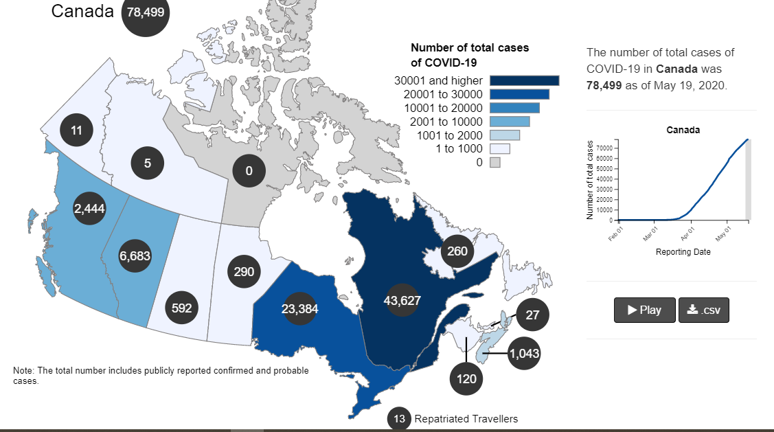
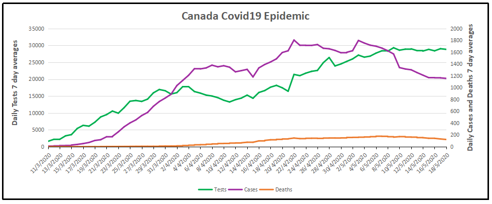
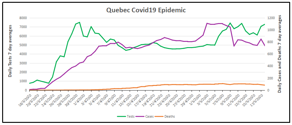
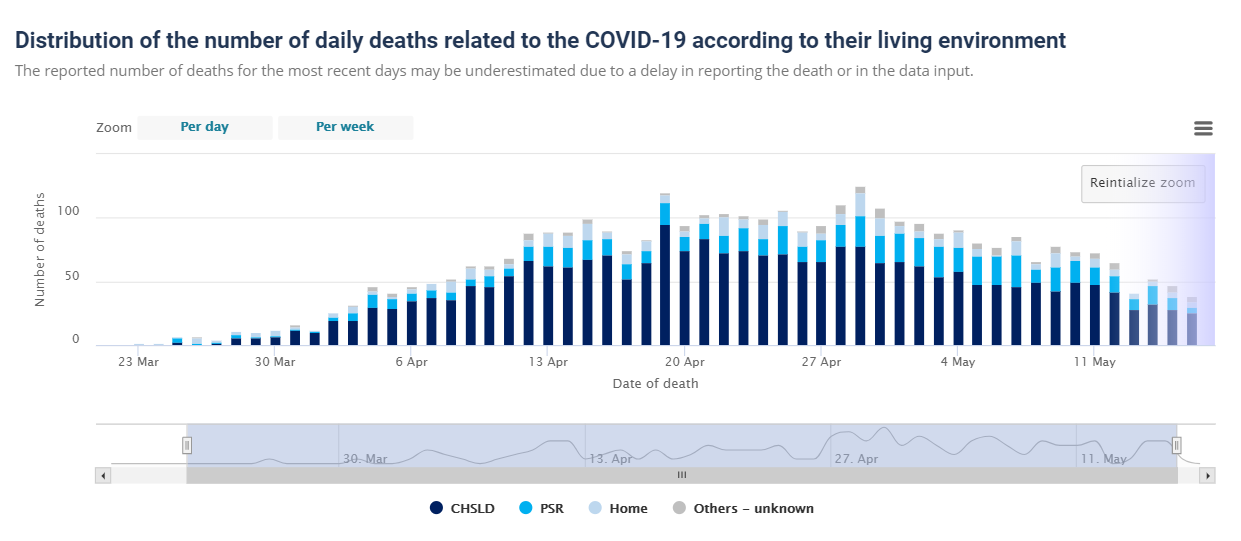

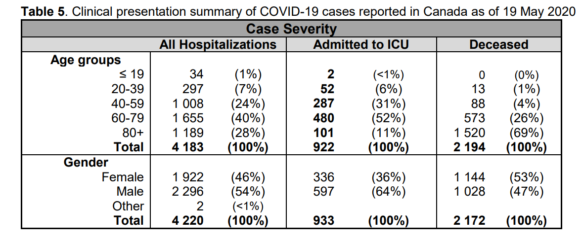


 The best context for understanding decadal temperature changes comes from the world’s sea surface temperatures (SST), for several reasons:
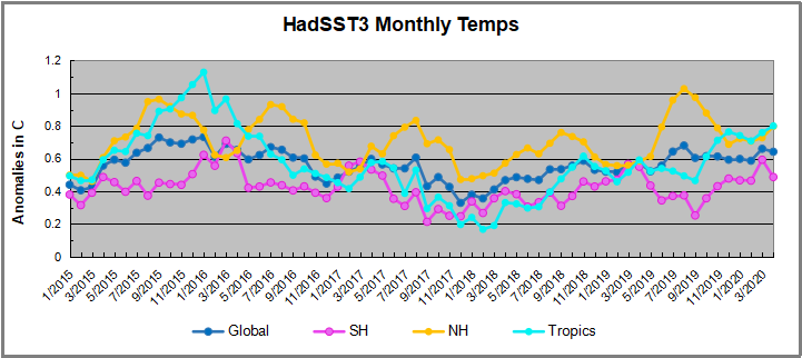
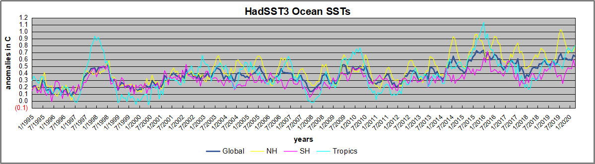
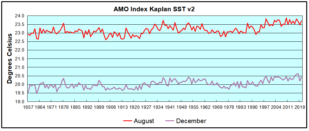
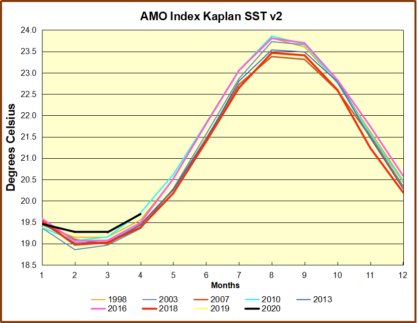


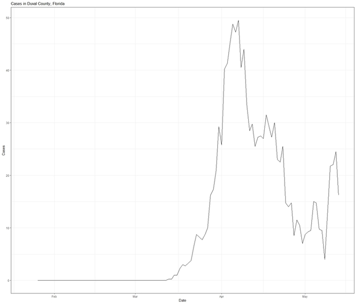
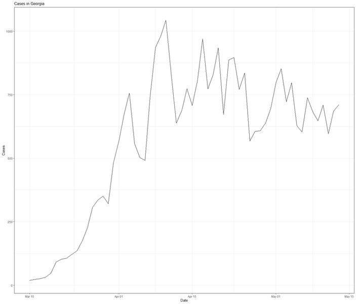


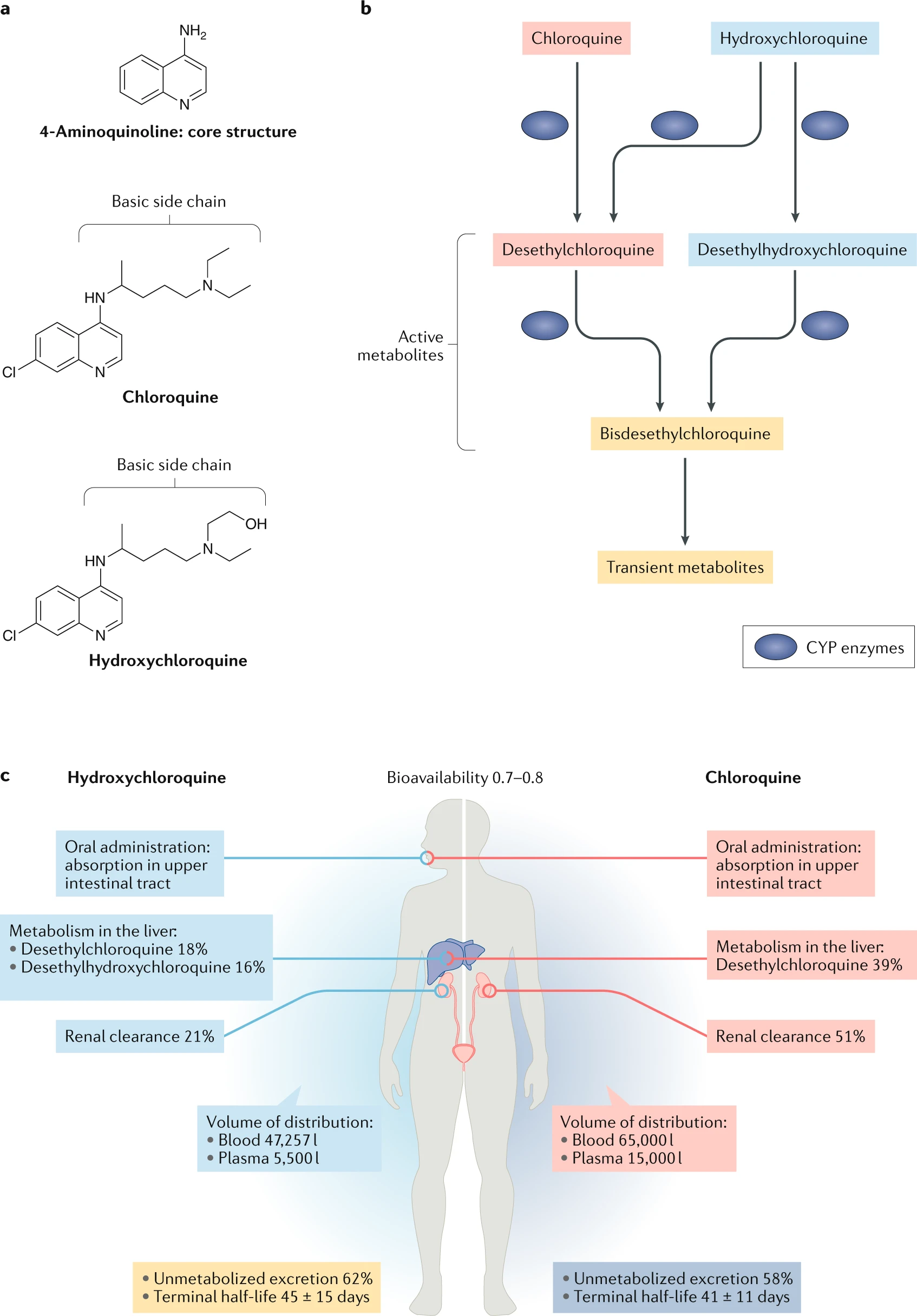
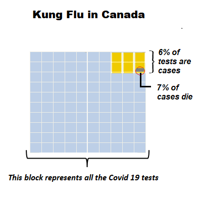
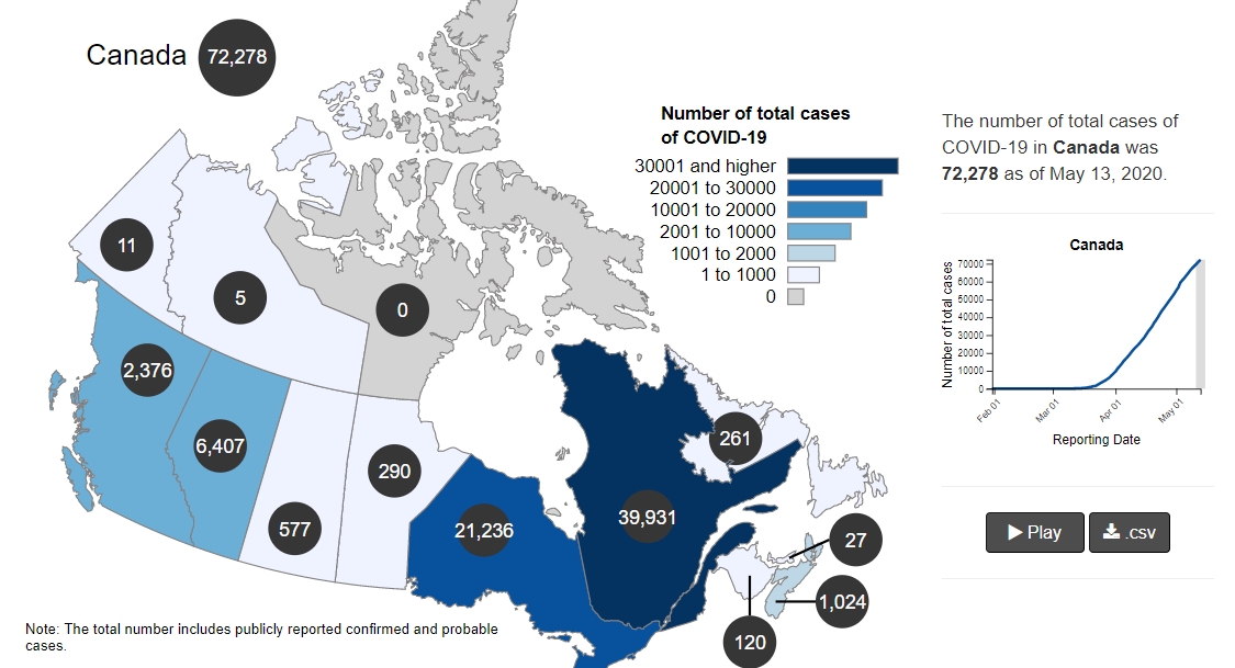
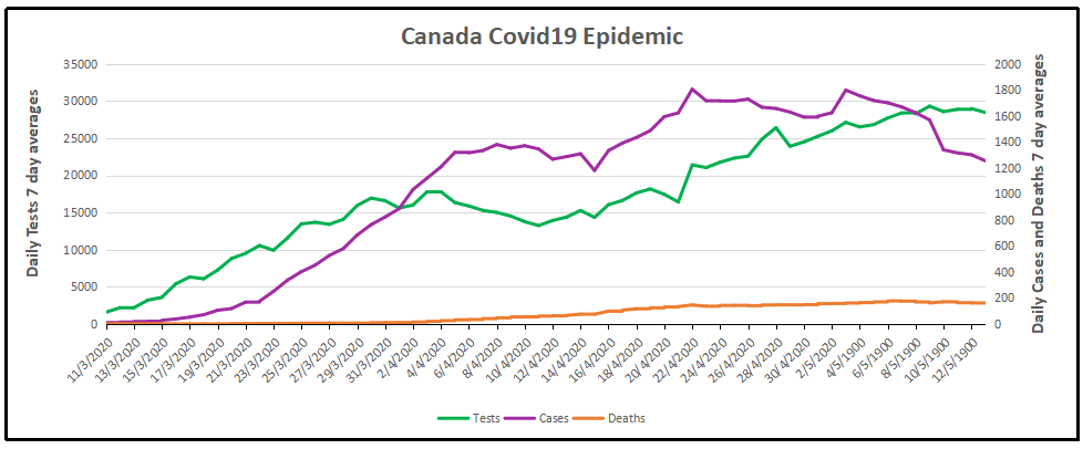
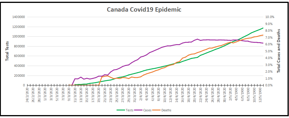

 The various flu types are noted, all together making a total of 48,818 influenza detections during the 2018-19 season. A total of 946 hospitalizations were reported by CIRN-SOS sentinels that season (age = or >16). Source: