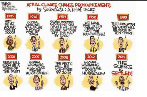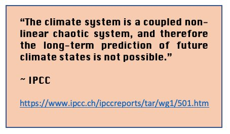

From every multinational institution in the world, we hear the same message. From the World Bank, “The world is battling a perfect storm of climate, conflict, economic, and nature crises.” From the World Health Organization, “Between 2030 and 2050, climate change is expected to cause approximately 250,000 additional deaths per year from malnutrition, malaria, diarrhea, and heat.”
A major problem with all this unanimity over this “emergency” is the fact that for at least half of all people living in Western nations in 2025, the UN, WEF, WHO, and World Bank have no credibility. We don’t want to “own nothing and be happy” as our middle class is crushed. We don’t want the only politically acceptable way to maintain national economic growth to rely on population replacement. And with only the slightest numeracy, we see apocalyptic proclamations as lacking substance.
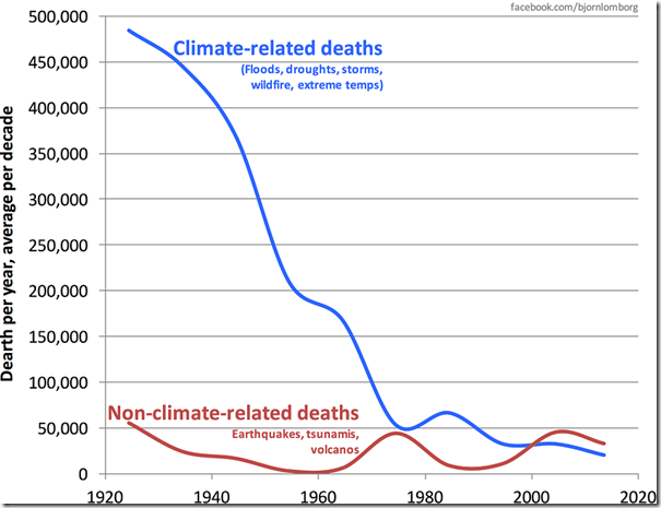
Top Ten Causes of Death Globally 2021
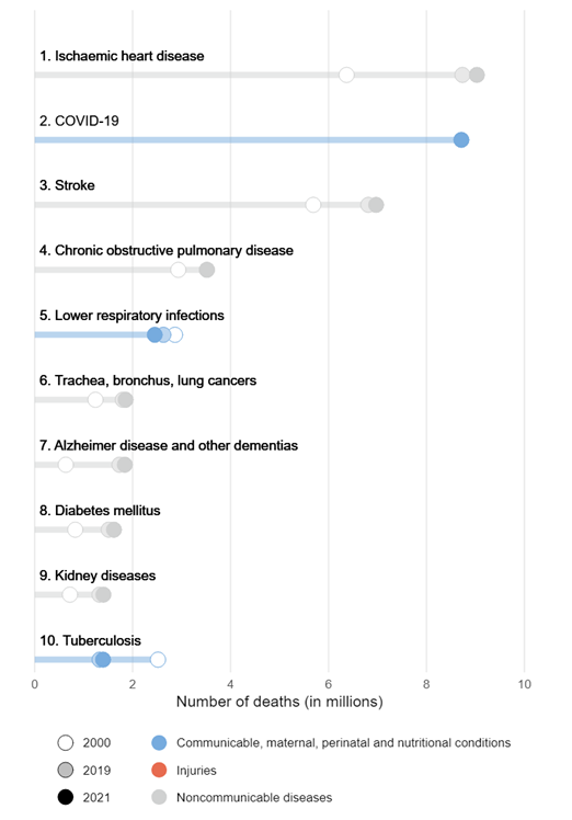
For example, while 250,000 “additional deaths per year” is tragic, worldwide estimates of total deaths are not quite 70 million per year. These “additional deaths” constitute a 0.36 percent increase over that baseline, just over one-third of one percent. Not even a rounding error.
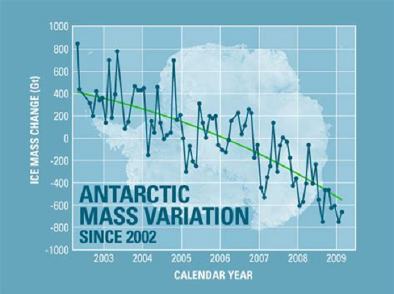
Source NASA
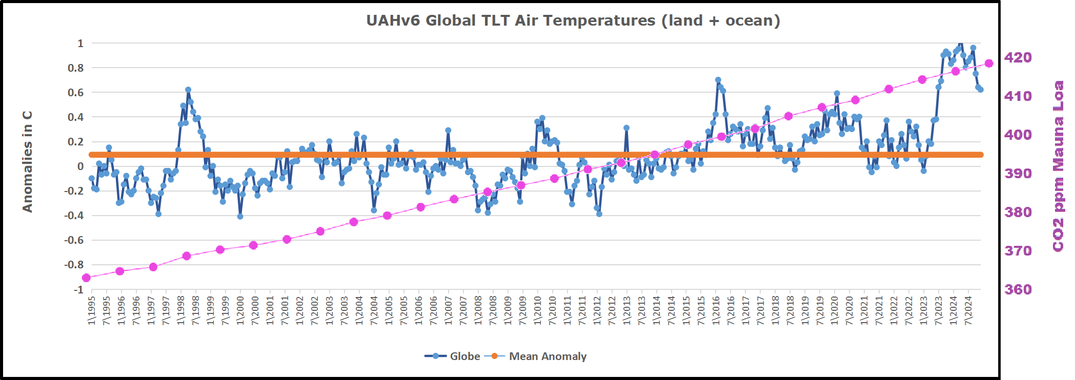
Similarly, an alarmist prediction from NASA is that “Antarctica is losing ice mass (melting) at an average rate of about 150 billion tons per year, and Greenland is losing about 270 billion tons per year, adding to sea level rise.” Let’s unpack that a bit. A billion tons is a gigaton, equivalent in volume to one cubic kilometer. So Antarctica is losing 150 cubic kilometers of ice per year. But Antarctica has an estimated total ice mass of 30 million cubic kilometers. Which means Antarctica is losing about one twenty-thousandth of one percent of its total ice mass per year. That is well below the accuracy of measurement. It is an estimate, and the conclusion it suggests is of no significance.
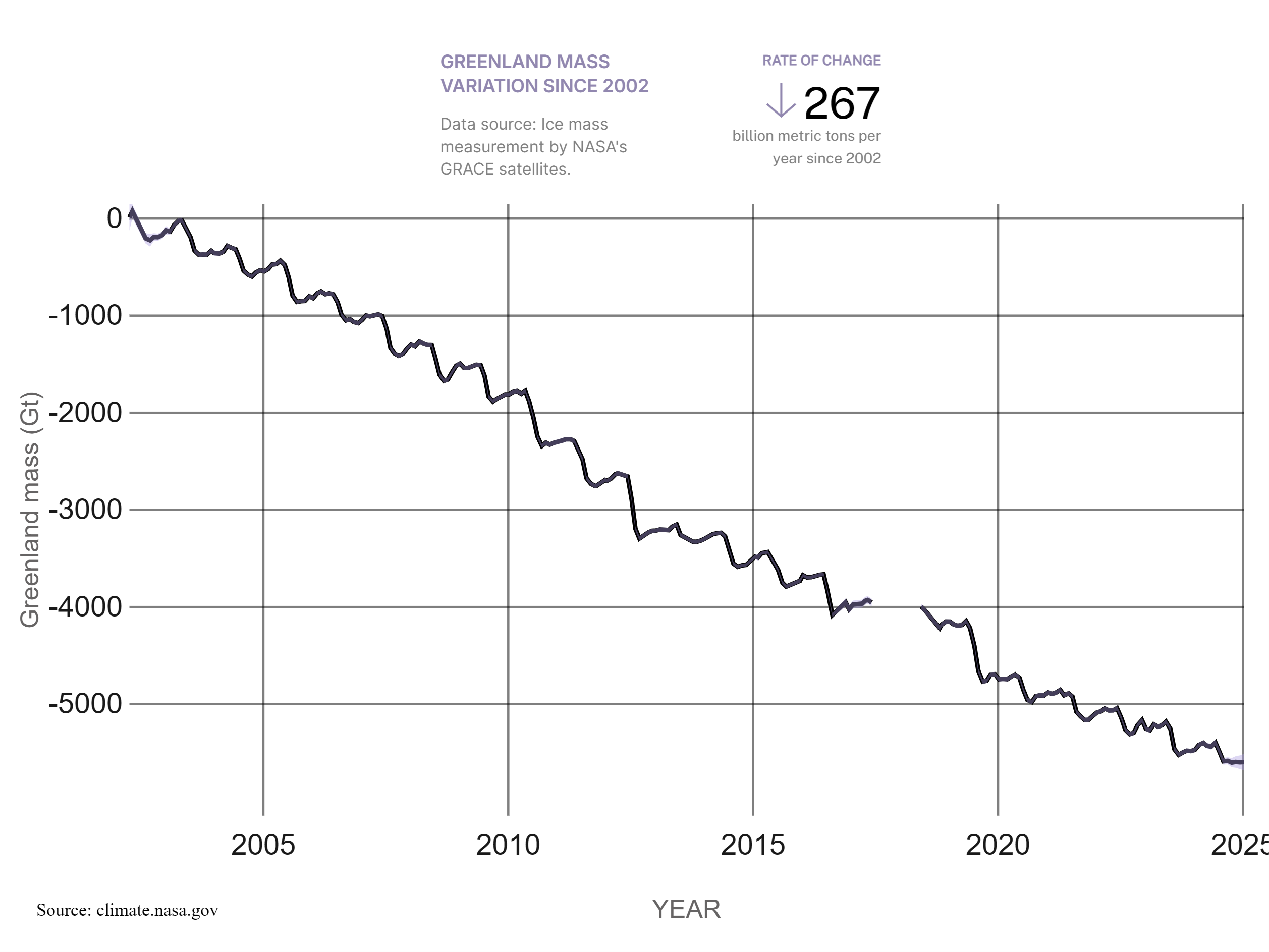
One may wonder about Greenland, with “only” 2.9 million cubic kilometers of ice, melting at an estimated rate of 270 gigatons per year. But that still yields a rate of loss of less than one one-hundredth of one percent per year, which is almost certainly below the ability to actually gauge total ice mass and total annual ice loss.
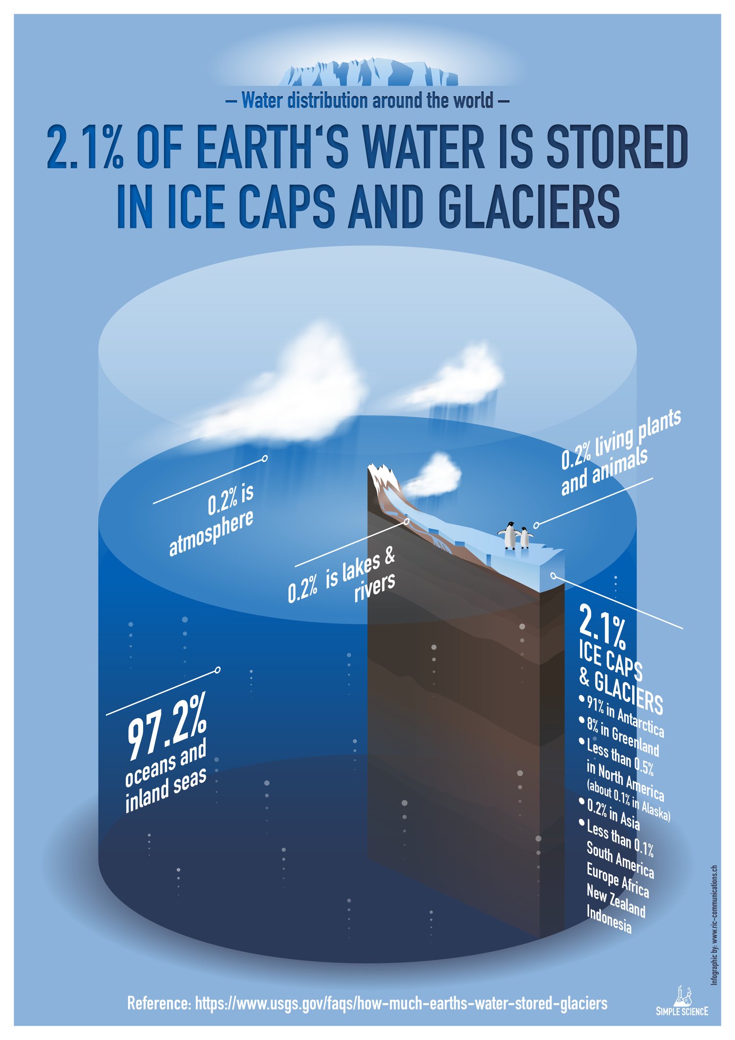
What about sea level rise? Here again, basic math yields underwhelming conclusions. The total surface area of the world’s oceans is 361 million square kilometers. If you spread 420 gigatons over that surface (Greenland and Antarctica’s melting combined), you get a sea level rise of not quite 1.2 millimeters per year. This is, again, so insignificant that it is below the threshold of our ability to measure.
These fundamental facts will turn anyone willing
to do even basic fact-checking into a cynic.
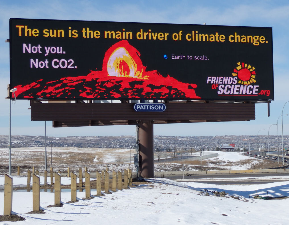
What’s really going on? We get at least a glimpse of truth from the above quotation from the World Bank, where they ascribe the challenges of humanity to several causes: “climate, conflict, economic, and nature crises.” There’s value in the distinctions they make. They list “nature crisis” as distinct from “climate,” and at least explicitly, “climate” is not cited as resulting from some anthropogenically generated trend of increasing temperatures and increasingly extreme weather. They just say “climate.”

Which brings us to the point: Conflict and economic crises are far bigger sources of human misery, and we face serious environmental challenges that have little to do with climate change and more to do with how we manage our industry, our wilderness, and our natural resources. And we are face “climate” challenges even when catastrophic climate events have nothing to do with any alleged “climate crisis.”
 A perfect example of how the climate “crisis” narrative is falsely applied when, in fact, the climate-related catastrophe would have happened anyway is found in the disastrous floods that devastated Pakistan in 2022. Despite the doomsday spin from PBS (etc.), these floods were not abnormal because of “climate change.” They were an abnormal catastrophe because in just 60 years, the population of that nation has grown from 45 million to 240 million people. They’ve channelized their rivers, built dense new settlements onto what were once floodplains and other marginal land, they’ve denuded their forests, which took away the capacity to absorb runoff, and they’ve paved thousands of square miles, creating impervious surfaces where water can’t percolate. Of course, a big storm made a mess. The weather didn’t change. The nation changed.

The disaster story repeats everywhere. Contrary to the narrative, the primary cause is not “climate change.” Bigger tsunamis? Maybe it’s because coastal aquifers were overdrafted, which caused land subsidence, or because previously uninhabited tidelands were settled because the population quintupled in less than two generations, and because coastal mangrove forests were destroyed, which used to attenuate big waves. What about deforestation? Perhaps because these nations have been denied the ability to develop natural gas and hydroelectric power, they’re stripping away the forests for fuel to cook their food. In some cases, they’re burning their forests to make room for biofuel plantations, in a towering display of irony and corruption.

In California, our nation’s epicenter of climate crisis fearmongering and the subsequent commercial opportunism, the emphasis on crisis instead of resilience has led to absurd policies. Instead of bringing back the timber industry to thin the state’s overgrown forests, the governor mandates exclusive sales of EVs by 2035. Instead of responsibly drilling oil in California’s ample reserves of crude, California imports 75 percent of its oil, and its economy still relies on oil for half the energy that the state consumes.
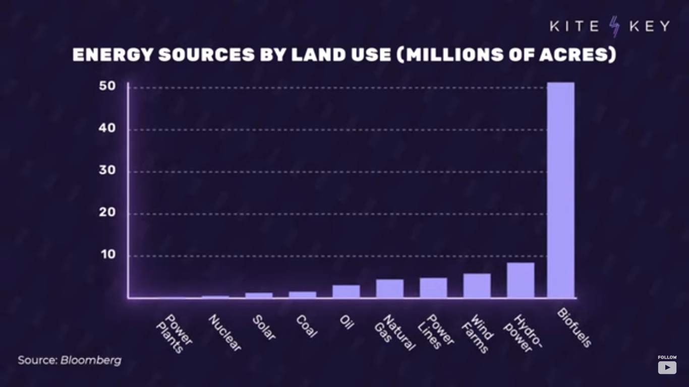
Worldwide, these mistakes multiply. Biofuel plantations consume half a million square miles in order to replace a mere two percent of transportation fuel. A mad scramble across every continent to increase mining by an order of magnitude to meet the demand for raw materials to manufacture batteries, wind turbines, and solar panels. Denial of funds for natural gas development in Africa, condemning over a billion people to ongoing energy poverty.
Simple truths are obscured by the climate crisis narrative. We need to rebuild our infrastructure for climate resilience because much of it is over a century old, at the same time as the US population has tripled. Floods and hurricanes cause more damage because there are more people, and more of them live in areas that have always been hit by floods and hurricanes.

The truths are as endless as they are repressed. We can’t possibly lift all of humanity into a middle-class lifestyle without at least doubling energy production worldwide, and we can’t possibly accomplish that while also reducing our use of coal, oil, and gas. Renewables aren’t renewable (here’s a must-read on that topic). Offshore wind is an environmental disaster, as is biofuel, as is the explosion of totally unregulated mining to feed the renewables industry. On the other hand, extreme environmental laws and regulations are harming economic growth, freedom, and, in no small irony, the innovation and investment that would give us the wealth we need to better protect the environment. And the prevailing economic, environmental, and cultural challenge in the world is not the climate but crashing birthrates among developing nations at the same time as the population of the world’s most undeveloped nations continues to explode exponentially.
We need climate resilience in order to properly protect a global population that has quadrupled to 8 billion in just the last century, spreading to every corner of the earth. That goal would be easier if once-trusted global institutions would allow for honest debate and practical infrastructure development. Instead, they continue to spew transparently misleading climate crisis propaganda, adhering to a mission that can only be described as repressive on all fronts—culturally, economically, and environmentally.