Happer: Cloud Radiation Matters, CO2 Not So Much

Earlier this month William Happer spoke on Radiation Transfer in Clouds at the EIKE conference, and the video is above.  For those preferring to read, below is a transcript from the closed captions along with some key exhibits.  I left out the most technical section in the latter part of the presentation. Text in italics with my bolds.

William Happer: Radiation Transfer in Clouds

People have been looking at Clouds for a very long time in in a quantitive way. This is one of the first quantitative studies done about 1800. And this is John Leslie,  a Scottish physicist who built this gadget. He called it an Aethrioscope, but basically it was designed to figure out how effective the sky was in causing Frost. If you live in Scotland you worry about Frost. So it consisted of two glass bulbs with a very thin capillary attachment between them. And there was a little column of alcohol here.

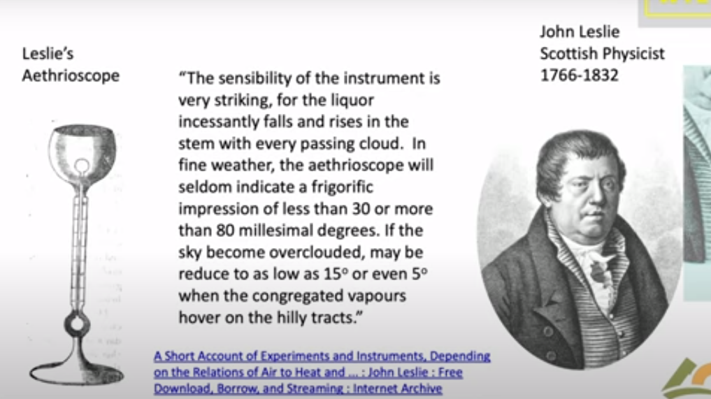
The bulbs were full of air, and so if one bulb got a little bit warmer it would force the alcohol up through the capillary. If this one got colder it would suck the alcohol up. So he set this device out under the clear sky. And he described that the sensibility of the instrument is very striking. For the liquor incessantly falls and rises in the stem with every passing cloud. in fine weather the aethrioscope will seldom indicate a frigorific impression of less than 30 or more than 80 millesimal degrees. He’s talking about how high this column of alcohol would go up and down if the sky became overclouded. it may be reduced to as low as 15 refers to how much the sky cools or even five degrees when the congregated vapours hover over the hilly tracks. We don’t speak English that way anymore but I I love it.

The point was that even in 1800 Leslie and his colleagues knew very well that clouds have an enormous effect on the cooling of the earth. And of course anyone who has a garden knows that if you have a clear calm night you’re likely to get Frost and lose your crops. So this was a quantitative study of that.

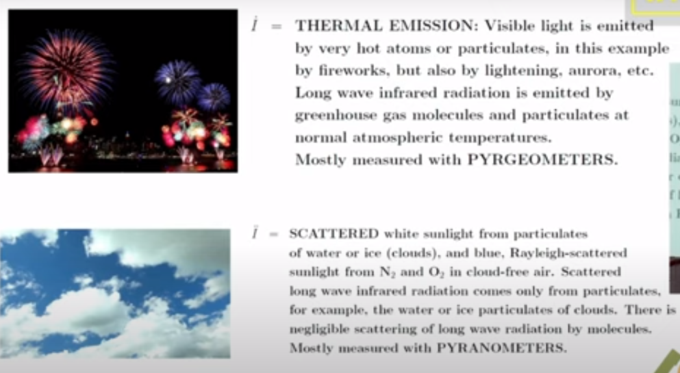
Now it’s important to remember that if you go out today the atmosphere is full of two types of radiation. There’s sunlight which you can see and then there is the thermal radiation that’s generated by greenhouse gases, by clouds and by the surface of the Earth. You can’t see thermal radiation but you you can feel it if it’s intense enough by its warming effect. And these curves practically don’t overlap so we’re really dealing with two completely different types of radiation.

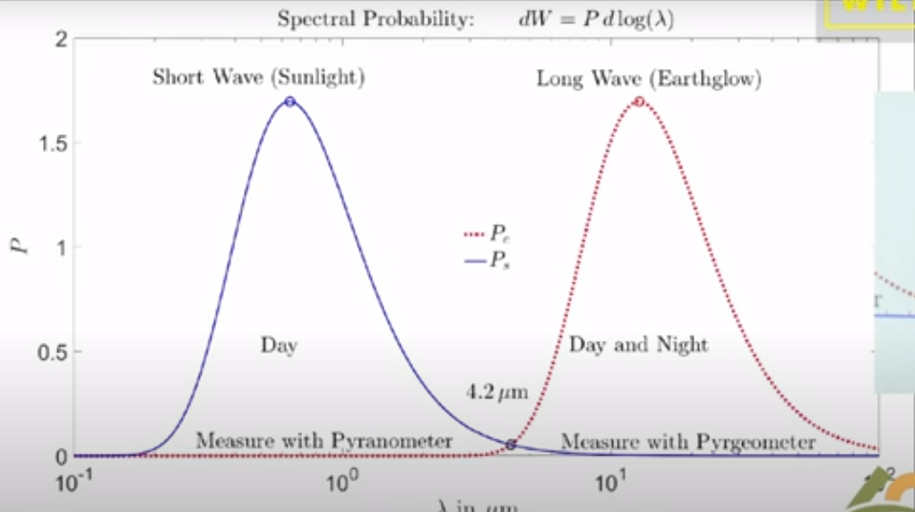
There’s sunlight which scatters very nicely and off of not only clouds but molecules; it’s the blue sky the Rayleigh scattering. Then there’s the thermal radiation which actually doesn’t scatter at all on molecules so greenhouse gases are very good at absorbing thermal radiation but they don’t scatter it. But clouds scatter thermal radiation and plotted here is the probability that you will find Photon of sunlight between you know log of its wavelength and the log of in this interval of the wavelength scale.

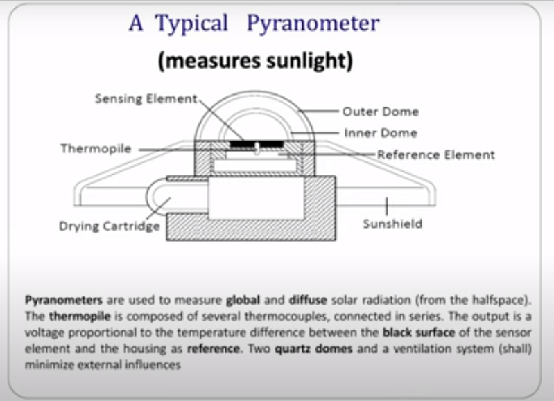
Since Leslie’s day two types of instruments have been developed to do what he did more precisely. One of them is called a pyranometer and this is designed to measure sunlight coming down onto the Earth on a day like this. So you put this instrument out there and it would read the flux of sunlight coming down. It’s designed to see sunlight coming in every direction so it doesn’t matter which angle the sun is shining; it’s uh calibrated to see them all.

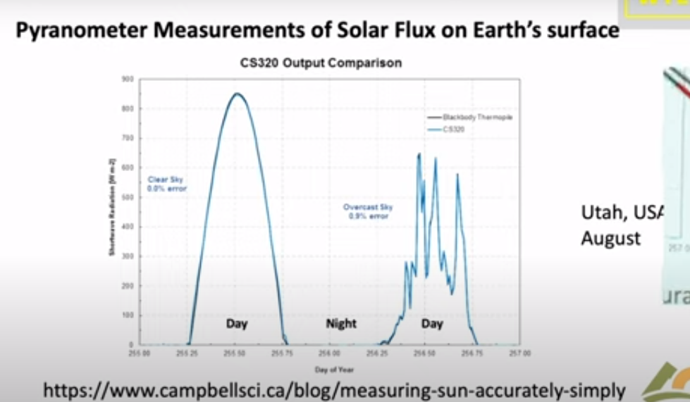
Let me show you a measurement by a pyranometer. This is a actually a curve from a sales brochure of a company that will sell you one of these devices. It’s comparing two types of detectors and as you can see they’re very good you can hardly tell the difference. The point is that if you look on a clear day with no clouds you see sunlight beginning to increase at dawn it peaks at noon and it goes down to zero and there’s no sunlight at night. So half of the day over most of the Earth there’s no sunlight in the in the atmosphere.

Here’s a day with clouds, it’s just a few days later shown by days of the year going across. You can see every time a cloud goes by the intensity hitting the ground goes down. With a little clear sky it goes up, then down up and so on. On average at this particular day you get a lot less sunlight than you did on the clear day.

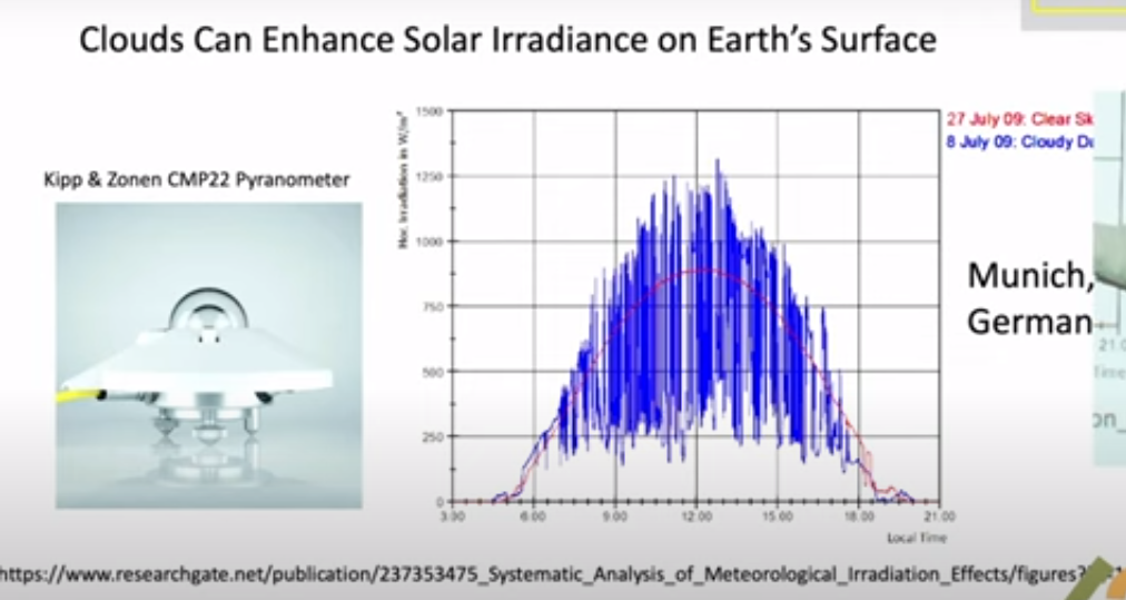
But you know nature is surprising. Einstein had this wonderful quote: God is subtle but he’s not malicious. He meant that nature does all of sorts of things you don’t expect, and so let me show you what happens on a partly cloudy day. Here so this is data taken near Munich. The blue curve is the measurement and the red curve is is the intensity on the ground if there were no clouds. This is a partly cloudy day and you can see there are brief periods when the sunlight is much brighter on the detector on a cloudy day than it is on the clear day. And that’s because coming through clouds you get focusing from the edges of the cloud pointing down toward your detector. That means somewhere else there’s less radiation reaching the ground. But this is rather surprising to most people. I was very surprised to learn about it but it just shows that the actual details of climate are a lot more subtle than you might think.

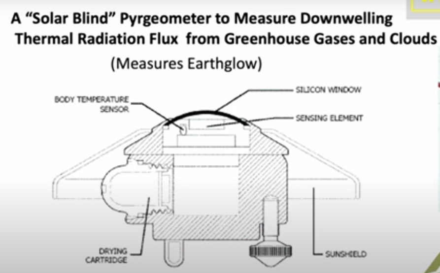
We knnow that visible light only happens during the daytime and stops at night. There’s a second type of important radiation which is the thermal radiation which is measured by a similar divice. You have a silicon window that passes infrared, which is below the band gap of silicon, so it passes through it as though transparent. Then there’s some interference filters here to give you further discrimination against sunlight. So sunlight practically doesn’t go through this at all, so they call it solar solar blind since it doesn’t see the Sun.

But it sees thermal radiation very clearly with a big difference between this device and the sunlight sensing device I showed you. Because actually most of the time this is radiating up not down. Out in the open air this detector normally gets colder than the body of the instrument. And so it’s carefully calibrated for you to compare the balance of down coming radiation with the upcoming radiation. Upcoming is normally greater than downcoming.

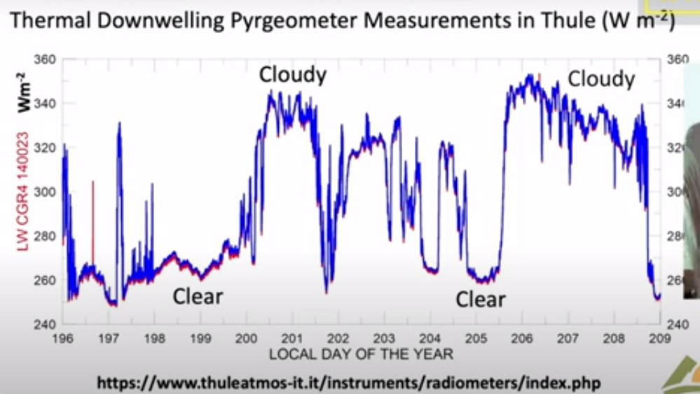
I’ll show you some measurements of the downwelling flux here; these are actually in Greenland in Thule and these are are watts per square meter on the vertical axis here. The first thing to notice is that the radiation continues day and night you can you if you look at the output of the pyrgeometer you can’t tell whether it’s day or night because the atmosphere is just as bright at night as it is during the day. However, the big difference is clouds: on a cloudy day you get a lot more downwelling radiation than you do on a clear day. Here’s a a near a full day of clear weather there’s another several days of clear weather. Then suddenly it gets cloudy. Radiation rises because the bottoms of the clouds are relatively warm at least compared to the clear sky. I think if you put the numbers In, this cloud bottom is around 5° Centigrade so it was fairly low Cloud. it was summertime in Greenland and this compares to about minus 5° for the clear sky.

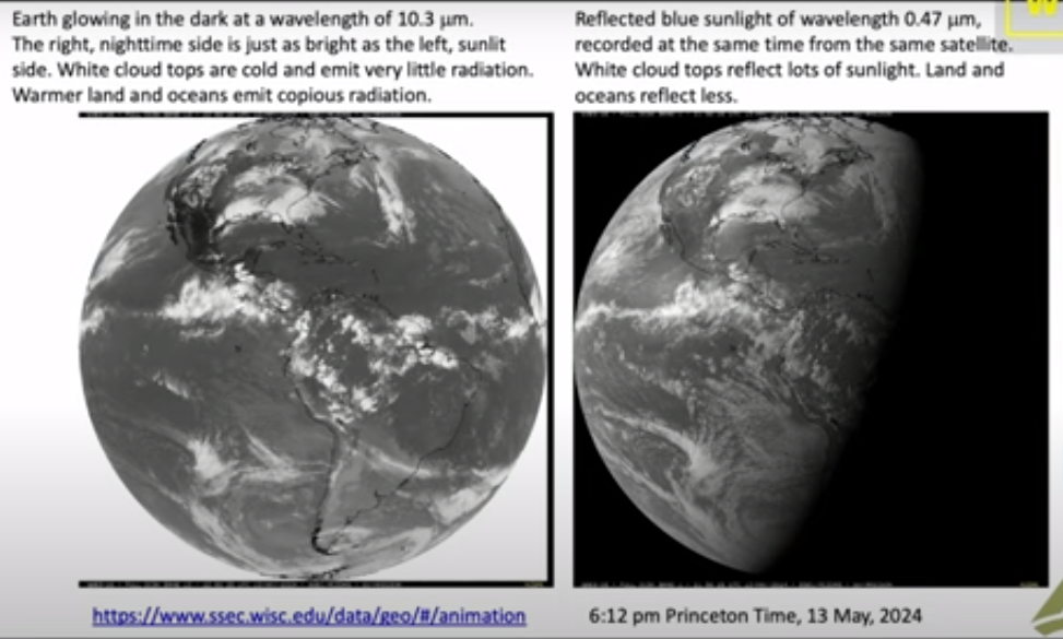
So there’s a lot of data out there and there really is downwelling radiation there no no question about that you measure it routinely. And now you can do the same thing looking down from satellites so this is a picture that I downloaded a few weeks ago to get ready for this talk from Princeton and it was from Princeton at 6 PM so it was already dark in Europe. So this is a picture of the Earth from a geosynchronous satellite that’s parked over Ecuador. You are looking down on the Western Hemisphere and this is a filtered image of the Earth in Blue Light at 47 micrometers. So it’s a nice blue color not so different from the sky and it’s dark where the sun has set. There’s still a fair amount of sunlight over the United States and the further west.

Here is exactly the same time and from the same satellite the infrared radiation coming up at 10.3 which is right in the middle of the infrared window where there’s not much Greenhouse gas absorption; there’s a little bit from water vapor but very little, trivial from CO2.

As you can see, you can’t tell which side is night and which side is day. So even though the sun has set over here it is still glowing nice and bright. There’s sort of a pesky difference here because what you’re looking at here is reflected sunlight over the intertropical Convergence Zone. There are lots of high clouds that have been pushed up by the convection in the tropics and uh so this means more visible light here. You’re looking at emission of the cloud top so this is less thermal light so white here means less light, white there means more light so you have to calibrate your thinking. to

But the Striking thing about all of this: if you can see the Earth is covered with clouds, you have to look hard to find a a clear spot of the earth. Roughly half of the earth maybe is clear at any given time but most of it’s covered with clouds. So if anything governs the climate it is clouds and and so that’s one of the reasons I admire so much the work that Svensmark and Nir Shaviv have done. Because they’re focusing on the most important mechanism of the earth: it’s not Greenhouse Gases, it’s Clouds. You can see that here.

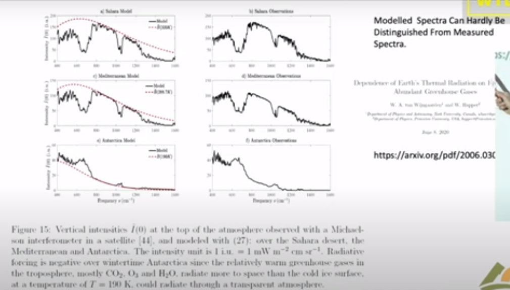
Now this is a single frequency let me show you what happens if you look down from a satellite and do look at the Spectrum. This is the spectrum of light coming up over the Sahara Desert measured from a satellite. And so here is the infrared window; there’s the 10.3 microns I mentioned in the previous slide it’s it’s a clear region. So radiation in this region can get up from the surface of the Sahara right up to outer space.

Notice that the units on these scales are very different; over the Sahara the top unit is 200, 150 over the Mediterranean and it’s only 60 over the South Pole. But at least the Mediterranean and the Sahara are roughly similar so the right side here these three curves on the right are observations from satellites and the three curves on the left are are calculations modeling that we’ve done. The point here is that you can hardly tell the difference between a model calculation and observed radiation.

So it’s really straightforward to calculate radiation transfer. If someone quotes you a number in watts per square centimeter you should take it seriously; that probably a good number. If they tell you a temperature you don’t know what to make about it. Because there’s a big step between going from watts per square centimeter to a temperature change. All the mischief in the whole climate business is going from watts per square centimeter to to Centigrade or Kelvin.

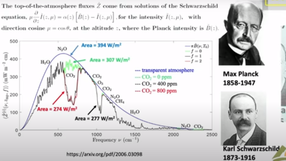
Now I will say just a few words about clear sky because that is the simplest. Then we’ll get on to clouds, the topic of this talk. This is a calculation with the same codes that I showed you in the previous slide which as you saw work very well. It’s worth spending a little time because this is the famous Planck curve that was the birth of quantum mechanics. There is Max Planck who figured out what the formula for that curve is and why it is that way. This is what the Earth would radiate at 15° Centigrade if there were no greenhouse gases. You would get this beautiful smooth curve the Planck curve. If you actually look at the Earth from the satellites you get a raggedy jaggedy black curve. We like to call that the Schwarzchild curve because Carl Schwarzchild was the person who showed how to do that calculation. Tragically he died during World War I, a Big Big loss to science.

There are two colored curves that I want to draw your attention. The green curve is is what Earth would radiate to space if you took away all the CO2 so it only differs from the black curve you know in the CO2 band here this is the bending band of CO2 which is the main greenhouse effect of CO2. There’s a little additional effect here which is the asymmetric stretch but it it doesn’t contribute very much. Then here is a red curve and that’s what happens if you double CO2.

So notice the huge asymmetry. If taking all 400 parts per million of CO2 away from the atmosphere causes this enormous change 30 watts per square meter, the difference between this green 307 and and the black 277, that’s 30 watts per square meter. But if you double CO2 you practically don’t make any change. This is the famous saturation of CO2. At the levels we have now doubling CO2, a 100% Increase of CO2 only changes the radiation to space by 3 watts per square meter. The difference between 274 for the red curve and 277 for the curve for today. So it’s a tiny amount: for 100% increase in CO2 a 1% decrease of radiation to space.

That allows you to estimate the feedback-free climate sensitivity in your head. I’ll talk you through the feedback-free climate free sensitivity. So doubling CO2 is a 1% decrease of radiation to space. If that happens then the Earth will start to warm up. But it will radiate as the fourth power of the temperature. So temperature starts to rise but if you’ve got a fourth power, the temperature only has to rise by one-quarter of a percent absolute temperature. So a 1% forcing in watts per square centimeter is a one-quarter percent of temperature in Kelvin. Since the ambient Kelvin temperature is about 300 Kelvin (actually a little less) a quarter of that is 75 Kelvin. So the feedback free equilibrium climate sensitivity is less than 1 Degree. It’s 0.75 Centigrade. It’s a number you can do in your head.

So when you hear about 3 centigrade instead of .75 C that’s a factor of four, all of which is positive feedback. So how is there really that much positive feedback? Because most feedbacks in nature are negative. The famous Le Chatelier principle which says that if you perturb a system it reacts in a way to to dampen the perturbation not increase it. There are a few positive feedback systems that were’re familiar with for example High explosives have positive feedback. So if the earth’s climate were like other positive feedback systems, all of them are highly explosive, it would have exploded a long time ago. But the climate has never done that, so the empirical observational evidence from geology is that the climate is like any other feedback system it’s probably negative Okay so I leave that thought with you and and let me stress again:

This is clear skies no clouds; if you add clouds all this does is
suppress the effects of changes of the greenhouse gas.

So now let’s talk about clouds and the theory of clouds, since we’ve already seen clouds are very important. Here is the formidable equation of transfer which has been around since Schwarzchild’s day. So some of the symbols here relate to the intensity, another represents scattering. If you have a thermal radiation on a greenhouse gas where it comes in and immediately is absorbed, there’s no scattering at all. If you hit a cloud particle it will scatter this way or that way, or some maybe even backwards.

So all of that’s described by this integral so you’ve got incoming light at One Direction and you’ve got outgoing light at a second Direction. And then at the same time you’ve got thermal radiation so the warm particles of the cloud are are emitting radiation creating photons which are coming out and and increasing the Earth glow the and this is represented by two parameters. Even a single cloud particle has an albedo, this is is the fraction of radiation that hits the cloud that is scattered as opposed to absorbed and being converted to heat. It’s a very important parameter for visible light and white clouds, typically 99% of the encounters are scattered. But for thermal radiation it’s much less. So water scatters thermal radiation only half as efficiently as shorter wavelengths.

The big problem is that in spite of all the billions of dollars that we have spent, these things which should be known and and would have been known if there hadn’t been this crazy fixation on carbon dioxide and greenhouse gases. And so we’ve neglected working on these areas that are really important as opposed to the trivial effects of greenhouse gases. Attenuation in a cloud is both scattering and absorption. Of course you have to solve these equations for every different frequency of the light because especially for molecules, there’s a strong frequency dependence.

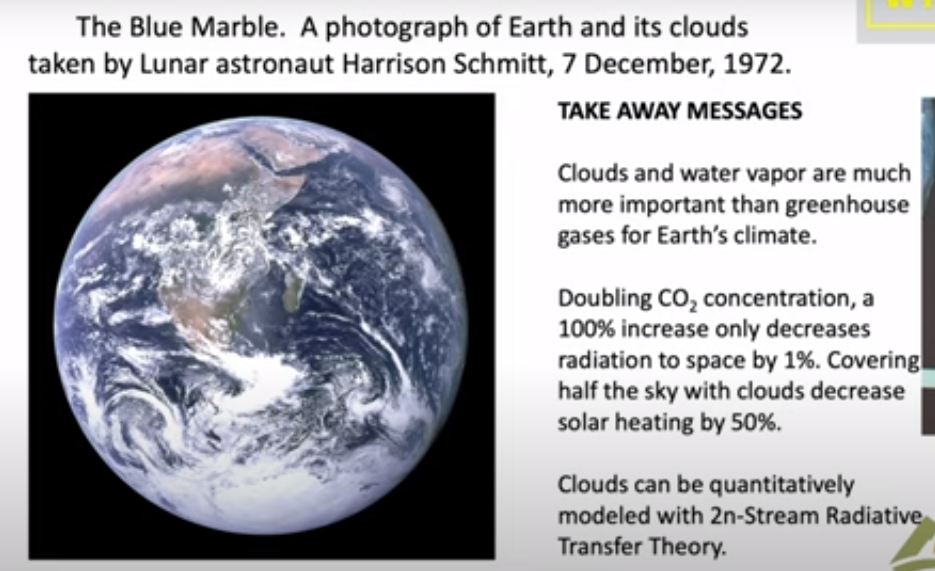
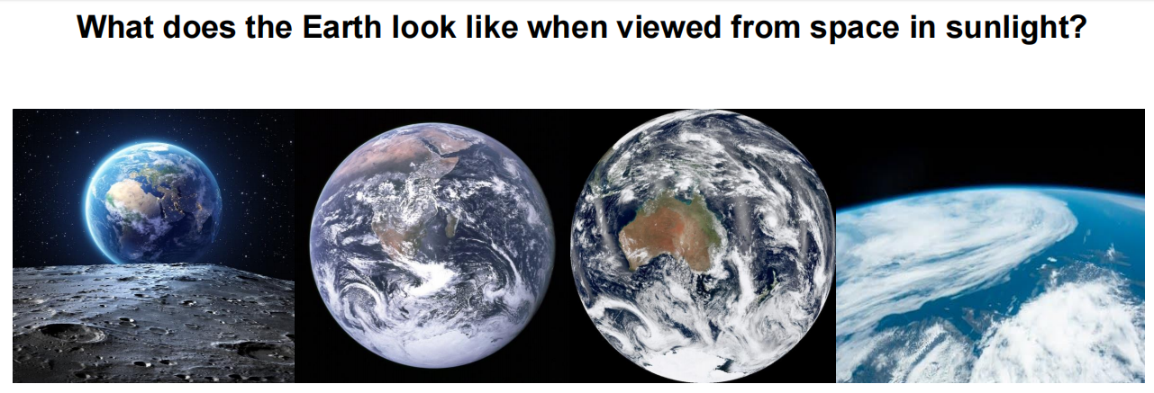
In summary,  let me show you this photo which was taken by Harrison Schmitt who was a friend of mine on one of the first moonshots. It was taken in December and looking at this you can see that they were south of Madagascar when the photograph was taken. You can see it was Winter because here the Intertropical Convergence Zone is quite a bit south of the Equator; it’s moved Way South of India and Saudi Arabia. By good luck they had the sun behind them so they had the whole earth Irradiated.

There’s a lot of information there and and again let me draw your attention to how much of the Earth is covered with clouds. So only very small parts of the Earth can actually be directly affected by greenhouse gases, of the order of half. The takeaway message is that clouds and water vapor are much more important than greenhouse gases for earth’s climate. The second point is the reason they’re much more important: doubling CO2 as I indicated in the middle of the talk only causes a 1% difference of radiation to space. It is a very tiny effect because of saturation. You know people like to say that’s not so, but you can’t really argue that one, even the IPCC gets the same numbers that we do.

And you also know that covering half of the sky with clouds will decrease solar heating by 50%. So for clouds it’s one to one, for greenhouse gases it’s a 100 to one. If you really want to affect the climate, you want to do something to the clouds. You will have a very hard time making any difference with Net Zero with CO2 if you are alarmed about the warmings that have happened.

So one would hope that with all the money that we’ve spent trying to turn CO2 into a demon that some good science has come out of it. Fom my point of view this is a small part of it, this scattering theory that I think will be here a long time after the craze over greenhouse gases has gone away. I hope there will be other things too. You can point to the better instrumentation that we’ve got, satellite instrumentation as well as ground instrumentation. So that’s been a good investment of money. But the money we’ve spent on supercomputers and modeling has been completely wasted in my view.


Intro to Climate Fallacies

First an example of how classical thought fallacies derail discussion from any search for meaning. H/T Jim Rose.

Then I took the liberty to change the discussion topic to climate change, by inserting typical claims heard in that context.

Below is a previous post taking a deeper dive into the fallacies that have plagued global warming/climate change for decades

Background Post Climatism is a Logic Fail

Two fallacies in particular ensure meaningless public discussion about climate “crisis” or “emergency.” H/T to Terry Oldberg for comments and writings prompting me to post on this topic.

One corruption is the numerous times climate claims include fallacies of Equivocation. For instance, “climate change” can mean all observed events in nature, but as defined by IPCC all are 100% caused by human activities.  Similarly, forecasts from climate models are proclaimed to be “predictions” of future disasters, but renamed “projections” in disclaimers against legal liability.  And so on.

A second error in the argument is the Fallacy of Misplaced Concreteness, AKA Reification. This involves mistaking an abstraction for something tangible and real in time and space. We often see this in both spoken and written communications. It can take several forms:

♦ Confusing a word with the thing to which it refers

♦ Confusing an image with the reality it represents

♦ Confusing an idea with something observed to be happening

Examples of Equivocation and Reification from the World of Climate Alarm

“Seeing the wildfires, floods and storms, Mother Nature is not happy with us failing to recognize the challenges facing us.” – Nancy Pelosi

Mother Nature’ is a philosophical construct and has no feelings about people.

“This was the moment when the rise of the oceans began to slow and our planet began to heal …”
– Barack Obama

The ocean and the planet do not respond to someone winning a political party nomination. Nor does a planet experience human sickness and healing.

“If something has never happened before, we are generally safe in assuming it is not going to happen in the future, but the exceptions can kill you, and climate change is one of those exceptions.” – Al Gore

The future is not knowable, and can only be a matter of speculation and opinion.

“The planet is warming because of the growing level of greenhouse gas emissions from human activity. If this trend continues, truly catastrophic consequences are likely to ensue. “– Malcolm Turnbull

Temperature is an intrinsic property of an object, so temperature of “the planet” cannot be measured. The likelihood of catastrophic consequences is unknowable. Humans are blamed as guilty by association.

“Anybody who doesn’t see the impact of climate change is really, and I would say, myopic. They don’t see the reality. It’s so evident that we are destroying Mother Earth. “– Juan Manuel Santos

“Climate change” is an abstraction anyone can fill with subjective content. Efforts to safeguard the environment are real, successful and ignored in the rush to alarm.

“Climate change, if unchecked, is an urgent threat to health, food supplies, biodiversity, and livelihoods across the globe.” – John F. Kerry

To the abstraction “Climate Change” is added abstract “threats” and abstract means of “checking Climate Change.”

Climate change is the most severe problem that we are facing today, more serious even than the threat of terrorism.” -David King

Instances of people killed and injured by terrorists are reported daily and are a matter of record, while problems from Climate Change are hypothetical


Corollary: Reality is also that which doesn’t happen, no matter how much we expect it to.

Climate Models Are Built on Fallacies


A previous post Chameleon Climate Models described the general issue of whether a model belongs on the bookshelf (theoretically useful) or whether it passes real world filters of relevance, thus qualifying as useful for policy considerations.

Following an interesting discussion on her blog, Dr. Judith Curry has written an important essay on the usefulness and limitations of climate models.

The paper was developed to respond to a request from a group of lawyers wondering how to regard claims based upon climate model outputs. The document is entitled Climate Models and is a great informative read for anyone. Some excerpts that struck me in italics with my bolds and added images.

Climate model development has followed a pathway mostly driven by scientific curiosity and computational limitations. GCMs were originally designed as a tool to help understand how the climate system works. GCMs are used by researchers to represent aspects of climate that are extremely difficult to observe, experiment with theories in a new way by enabling hitherto infeasible calculations, understand a complex system of equations that would otherwise be impenetrable, and explore the climate system to identify unexpected outcomes. As such, GCMs are an important element of climate research.

Climate models are useful tools for conducting scientific research to understand the climate system. However, the above points support the conclusion that current GCM climate models are not fit for the purpose of attributing the causes of 20th century warming or for predicting global or regional climate change on timescales of decades to centuries, with any high level of confidence. By extension, GCMs are not fit for the purpose of justifying political policies to fundamentally alter world social, economic and energy systems.

It is this application of climate model results that fuels the vociferousness
of the debate surrounding climate models.

Evolution of state-of-the-art Climate Models from the mid 70s to the mid 00s. From IPCC (2007)

Evolution of state-of-the-art Climate Models from the mid 70s to the mid 00s. From IPCC (2007)

The actual equations used in the GCM computer codes are only approximations of
the physical processes that occur in the climate system.

While some of these approximations are highly accurate, others are unavoidably crude. This is because the real processes they represent are either poorly understood or too complex to include in the model given the constraints of the computer system. Of the processes that are most important for climate change, parameterizations related to clouds and precipitation remain the most challenging, and are the greatest source of disagreement among different GCMs.

There are literally thousands of different choices made in the construction of a climate model (e.g. resolution, complexity of the submodels, parameterizations). Each different set of choices produces a different model having different sensitivities. Further, different modeling groups have different focal interests, e.g. long paleoclimate simulations, details of ocean circulations, nuances of the interactions between aerosol particles and clouds, the carbon cycle. These different interests focus their limited computational resources on a particular aspect of simulating the climate system, at the expense of others.


Overview of the structure of a state-of-the-art climate model. See Climate Models Explained by R.G. Brown

Human-caused warming depends not only on how much CO2 is added to the atmosphere, but also on how ‘sensitive’ the climate is to the increased CO2. Climate sensitivity is defined as the global surface warming that occurs when the concentration of carbon dioxide in the atmosphere doubles. If climate sensitivity is high, then we can expect substantial warming in the coming century as emissions continue to increase. If climate sensitivity is low, then future warming will be substantially lower.

In GCMs, the equilibrium climate sensitivity is an ‘emergent property’
that is not directly calibrated or tuned.

While there has been some narrowing of the range of modeled climate sensitivities over time, models still can be made to yield a wide range of sensitivities by altering model parameterizations. Model versions can be rejected or not, subject to the modelers’ own preconceptions, expectations and biases of the outcome of equilibrium climate sensitivity calculation.

Further, the discrepancy between observational and climate model-based estimates of climate sensitivity is substantial and of significant importance to policymakers. Equilibrium climate sensitivity, and the level of uncertainty in its value, is a key input into the economic models that drive cost-benefit analyses and estimates of the social cost of carbon.

Variations in climate can be caused by external forcing, such as solar variations, volcanic eruptions or changes in atmospheric composition such as an increase in CO2. Climate can also change owing to internal processes within the climate system (internal variability). The best known example of internal climate variability is El Nino/La Nina. Modes of decadal to centennial to millennial internal variability arise from the slow circulations in the oceans. As such, the ocean serves as a ‘fly wheel’ on the climate system, storing and releasing heat on long timescales and acting to stabilize the climate. As a result of the time lags and storage of heat in the ocean, the climate system is never in equilibrium.

The combination of uncertainty in the transient climate response (sensitivity) and the uncertainties in the magnitude and phasing of the major modes in natural internal variability preclude an unambiguous separation of externally forced climate variations from natural internal climate variability. If the climate sensitivity is on the low end of the range of estimates, and natural internal variability is on the strong side of the distribution of climate models, different conclusions are drawn about the relative importance of human causes to the 20th century warming.

Figure 5.1. Comparative dynamics of the World Fuel Consumption (WFC) and Global Surface Air Temperature Anomaly (ΔT), 1861-2000. The thin dashed line represents annual ΔT, the bold line—its 13-year smoothing, and the line constructed from rectangles—WFC (in millions of tons of nominal fuel) (Klyashtorin and Lyubushin, 2003). Source: Frolov et al. 2009

Anthropogenic (human-caused) climate change is a theory in which the basic mechanism is well understood, but whose potential magnitude is highly uncertain.

What does the preceding analysis imply for IPCC’s ‘extremely likely’ attribution of anthropogenically caused warming since 1950? Climate models infer that all of the warming since 1950 can be attributed to humans. However, there have been large magnitude variations in global/hemispheric climate on timescales of 30 years, which are the same duration as the late 20th century warming. The IPCC does not have convincing explanations for previous 30 year periods in the 20th century, notably the warming 1910-1945 and the grand hiatus 1945-1975. Further, there is a secular warming trend at least since 1800 (and possibly as long as 400 years) that cannot be explained by CO2, and is only partly explained by volcanic eruptions.

CO2 relation to Temperature is Inconsistent.

Summary

There is growing evidence that climate models are running too hot and that climate sensitivity to CO2 is on the lower end of the range provided by the IPCC. Nevertheless, these lower values of climate sensitivity are not accounted for in IPCC climate model projections of temperature at the end of the 21st century or in estimates of the impact on temperatures of reducing CO2 emissions.

The climate modeling community has been focused on the response of the climate to increased human caused emissions, and the policy community accepts (either explicitly or implicitly) the results of the 21st century GCM simulations as actual predictions. Hence we don’t have a good understanding of the relative climate impacts of the above (natural factors) or their potential impacts on the evolution of the 21st century climate.

Footnote:

There are a series of posts here which apply reality filters to attest climate models.  The first was Temperatures According to Climate Models where both hindcasting and forecasting were seen to be flawed.

Others in the Series are:

Sea Level Rise: Just the Facts

Data vs. Models #1: Arctic Warming

Data vs. Models #2: Droughts and Floods

Data vs. Models #3: Disasters

Data vs. Models #4: Climates Changing

Climate Medicine

Climates Don’t Start Wars, People Do

virtual-reality-1920x1200

Beware getting sucked into any model, climate or otherwise.


Clauser’s Case: GHG Science Wrong, Clouds the Climate Thermostat

This post provides a synopsis of Dr. John Clauser’s Clintel presentation last May.  Below are the texts from his slides gathered into an easily readable format. The two principal takeways are (in my words):

A.  IPCC’s Green House Gas Science is Flawed and Untrustworthy

B.  Clouds are the Thermostat for Earth’s Climate, Not GHGs.

Part I Climate Change is a Myth.

  • The IPCC and its collaborators have been tasked with computer modeling and observationally measuring two very important numbers – the Earth’s so-called power imbalance, and its power-balance feedback-stability strength. They have grossly botched both tasks, in turn, leading them to draw the wrong conclusion.
  • I assert that the IPCC has not proven global warming! On the contrary, observational data are fully consistent with no global warming. Without global warming, there is no climate-change crisis!
  • Their computer modeling (GISS) of the climate is unable to simulate the Earth’s surface temperature history, let alone predict its future.
  • Their computer modeling (GISS) is unable to simulate anywhere near the Earth’s albedo (sunlight reflectivity). The computer simulated sunlight reflected power and associated power imbalance error, are typically about fourteen times bigger than the claimed measured power imbalance, and about twenty five times bigger than the claimed measured power imbalance error range.
  • The IPCC’s observational data are wildly self-inconsistent and/or are fully consistent with no global warming.
  • The IPCC’s observational data claim an albedo for cloudy skies that is inconsistent with direct measurements by a factor of two. Alternatively, their data significantly violate conservation of energy.
  • Scientists performing the power-balance measurements admit that the available methodologies are incapable of measuring a net power imbalance with anywhere near the desired accuracy. This difficulty is due to huge temporal and spatial fluctuations of the imbalance, along with gross under-sampling of the data.
  • The observational data they report are self-inconsistent and are visibly dishonestly fudged to claim warming. The fudged final reported values, herein highlighted and exposed, are an example of the proverbial proliferation of bad pennies.
  • NOAA’s claims that there is an observed increase in extreme weather events are bogus. Their own published data disprove their own arguments. A 100 year history of extreme weather event frequency, plotted frontwards in time is virtually indistinguishable from the same historical data plotted backwards in time.
  • In Part II, I present the cloud-thermostat feedback mechanism. My new mechanism dominantly controls and stabilizes the Earth’s climate and temperature. The IPCC has not previously considered this mechanism. The IPCC ignores cloud-cover variability.

The IPCC’s two sacred tasks – both botched!

  1. The IPCC and its collaborators have been tasked with computer modeling and observationally measuring two very important numbers – the Earth’s so-called power imbalance, and its power-balance feedback-stability strength.
  2. The Earth’s net power imbalance is its sunlight heating power (its power-IN), minus its two components of cooling power – reflected sunlight and reradiated infrared power (its power-OUT).
  3. Based on their claimed power imbalance and global-warming assertion, the IPCC and its collaborators assemble a house of cards argument that forebodes an impending climate change apocalypse/ catastrophe.
  4. Additionally, the IPCC and its contributors calculate the strength of naturally occurring feedback mechanisms that presently stabilize the Earth’s temperature and climate
  5. They claim only marginal effectiveness for these mechanisms, and correspondingly assert that there is a “tipping point”, whereinafter further added greenhouse gasses catastrophically cause what amounts to a thermal-runaway of the Earth’s temperature.
  6. The IPCC scapegoats atmospheric greenhouse gasses as the cause of global warming, and further mandates that trillions of dollars must be spent to stop greenhouse gas release into the environment with a so-called “zero-carbon” policy.
  7. The IPCC also mandates multi-trillion dollar per year geoengineering projects including Solar Radiation Management Systems to stabilize the Earth’s climate and CO2 capture projects to reduce the atmospheric CO2 levels.
  8. I assert that the IPCC and its contributors have not proven global warming, whereupon their house of cards collapses.
  9. My cloud thermostat mechanism’s net feedback “strength” (the IPCC’s 2nd sacred task to estimate) is anywhere from -5.7 to -12.7 W/m2/K (depending on the assumed cloud albedo, 0.36 vs. 0.8), compared to the IPCC’s botched best estimate for their mechanisms of -1.1 W/m2/K. My mechanism’s overwhelmingly dominant strength confirms that it is the dominant feedback mechanism controlling the Earth’s climate.
  10. Correspondingly, I confidently assert that the climate crisis is a colossal trillion-dollar hoax.

The IPCC’s computer modeling uses flawed physics to estimate the Earth’s temperature history

• The above graph is copied from [AR5, (IPCC, 2013) Fig 11.25].
• It shows the IPCC’s CMIP5 computer modeling of the Earth’s temperature “anomaly”. The various computed curves display the earth’s predicted (colored) and historical (gray) “temperature anomaly”.
• The solid black curve is the observed temperature anomaly
• Note that all 40+ models are incapable of simulating the Earth’s past temperature history. The total disarray and total lack of reliability among the CMIP5 predictions was first highlighted by Steve Koonin (former White House science advisor to Barack Obama) in his recent book- Unsettled? What climate science tells us, what it doesn’t, and why it matters.
• Something is obviously very wrong with the physics incorporated within the computer models, and their predictions are totally unreliable.
• Albedo is the fraction of sunlight power that is directly reflected by the Earth back out into space (OSR=100 W/m2 portion of power-OUT)


• The above Figure, copied from Stephens et al. (2015), shows the IPCC’s CMIP5 computer modeling (colored curves) of the Earth’s mean annual albedo temporal variation. The solid black curve is the Earth’s albedo measured by satellite radiometry. (The variation is not sinusoidal.)
• The added scale shows the associated reflected sunlight power. It assumes a constant solar irradiance – 340 W/m2
• Note that the IPCC’s computer modeling is grossly incapable of simulating the observed Earth’s reflected power, and especially incapable of simulating that power’s dramatic temporal fluctuation.
• The actual power’s annual variation is actually much greater than is shown by this Figure by about 18 W/m2, due to the ellipticity of the Earth’s orbit and the associated sinusoidal temporal variation of the so-called solar constant.
• Despite more than 10 W/m2 gross errors in the computer simulation’s calculated reflected power, as is shown on the Figure, the IPCC [AR6 (2021)] still claims that it has computer simulated and precisely measured this power, yielding an imbalance that is equal to 0.7 ± 0.2 W/m2 – Huh?

The IPCC’s observational data are consistent with NO global warming

• Power-IN is the sunlight power incident on the Earth. The IPCC and climate scientists call it Short Wavelength (SW) Radiation. It is about 340 Watts per square meter of the Earth’s surface area. (It is not actually constant, but varies ± 9 W/m2.)
• Power-OUT has two components:
• One component is the sunlight energy that is directly reflected by the Earth back out into space, whereinafter it can no longer heat the planet. That component is claimed by the IPCC to be about 100 W/m2.
• The other component is the far-infrared heat radiated into space by a hot planet. It is claimed to be about 240 W/m2. The IPCC calls the far-infrared heat radiation component, Long Wavelength (LW) Radiation.
• Measuring the power imbalance consists of measuring power-IN, measuring power-OUT and subtracting. Simple enough? Not really. The problem is that power-IN, and power-OUT are huge numbers, and that the difference between them is miniscule – 0.2% of power-IN. That miniscule difference is the net imbalance that is sought, both experimentally and theoretically.

Unfortunately, it is so small that it is very difficult, if not impossible, to measure to the desired accuracy, 0.1 W/m2, or 0.03% of power-IN. It is much tougher to measure when power-IN and power-OUT are both also hugely varying in a seemingly random irreproducible fashion. Large variations occur both in time and in space over the surface of the Earth. As noted in a previous slide, this grossly under-sampled fluctuation is about 28 W/m2, compared with the IPCC’s claimed imbalance, 0.7 ± 0.2 W/m2.
• A variety of methods has been employed to measure these powers. They include satellite radiometry, (the ERBE, and CERES Terra and Aqua satellites), ocean heat content (OHC) measured using the ARGO buoy chain and XBT water sampling by ships, and finally by ground sunlight observations using the Baseline Surface Radiation Network (BSRN).
• The various measured values are all in wild disagreement with each other. Importantly, none of the reported data actually show a convincing net warming power imbalance. Importantly, much of the reported data are totally fudged in a manner that dishonestly changes them from showing no warming to showing warming!

AR6 Power-flow Diagrams

Critiques of Power-Flow Diagrams by Trenberth et al. (2010, 2014)

• Satellites measure the Top of Atmosphere energy balance, while Ocean Heat Content data apply to the surface energy balance. One may legitimately mix power-flux data at the two different altitudes, if and only if one fully understands all of the power-flow processes in the atmosphere that occur between the surface and the Top of Atmosphere. If the latter requirement is not true, then one ends up with an “apples to oranges” comparison.
• Trenberth et al. (2010, 2014) are highly critical of Loeb, Stephens, L’Ecuyer, and Hansen’s claimed “understanding” of the associated connection between the power flows at these two altitudes.
• Trenberth and Fasullo (2010) point to a huge “missing energy” indicated by the difference between the satellite data and the OHC data power-imbalance calculations, and specifically ask “Where exactly does the energy go?”
• Hansen et al. (2011) dismiss Trenberth and Fasullo’s alleged missing energy as being simply due to satellite calibration errors.
• Trenberth Fasullo and Balmesada (2014) further note that despite various considerations of the surface power balance, significant unresolved discrepancies remain, and they are skeptical of the power imbalance claims.
• In effect, Trenberth et al. are the earliest “whistle blowers” to the above-mentioned data fudges.

Part I –The Climate Change Myth– Conclusions

1. The IPCC and its contributors claim the Earth has a net-warming energy imbalance. I show here that those claims are false.
2. The IPCC bases its claims on computer modeling of the Earth’s atmosphere, and on observational data from a variety of observational modalities. Both the computer models and the observational data are grossly flawed, and fudged.
3. The IPCC’s computer modeling and its predictions are totally unreliable. There is something clearly very wrong with the physics incorporated within these computer models. Since the computer models can’t even explain the past, why should anyone trust their prediction for the future?
4. Not one of the observational modalities for measuring the Earth’s power imbalance convincingly shows net global warming.
5. I show where various observers and the IPCC have dishonestly fudged their reported data, and have dishonestly changed it from showing No Warming, to showing Warming. Crucially important data fudges are revealed here and highlighted in red. If you don’t believe me, check my arithmetic.
6. The IPCC and NOAA further claim that the purported power imbalance has already caused an increase in dangerous extreme weather events. NOAA’s own data disprove their own claims.
7. I thus offer Great News. Despite what you may have heard from the IPCC and others, there is no real climate crisis! The planet is NOT in peril!
8. The IPCC’s (and NOAA’s) claims are a hoax. Trillions of dollars are being wasted.

Part II – The cloud thermostat 

1. So what is really happening? Why is the earth’s climate actually as stable as it really is?
2. The cloud thermostat mechanism is clearly the overwhelmingly dominant climate controlling feedback mechanism that controls stabilizes the Earth’s climate and temperature. It thereby prevents global warming and climate change.
3. The cloud-thermostat mechanism provides very powerful feedback that stabilizes the Earth’s climate and temperature. It great strength obtains from the observed large fluctuation of the Earth’s power imbalance.
4. The mechanism gains its strength from the Earth’s observed very large cloud-cover variation. The power imbalance is actually observed to be continuously strongly fluctuating by anywhere between 18 to 55 W/m2.
5. Clouds modulate the outgoing Shortwave power and therefore control the Earth’s power imbalance, minimally with a 18 W/m2 available power range (ignoring the added 18 W/m2 solar-constant variation), which is minimally 26 times the IPCC’s 0.7 W/m2 claimed power imbalance, and 45 times the IPCC’s ± 0.2 W/m2 power imbalance error range.
6. The above numbers use the IPCC’s assumed data parameters. With more realistic assumptions, the cloud-thermostat mechanism controls the Earth’s power imbalance with a 73 W/m2 available power range, which is 100 times bigger than the IPCC’s 0.7 W/m2 claimed power imbalance, and 180 times bigger than the IPCC’s ± 0.2 W/m2 power-imbalance total error range.
7. This seemingly random fluctuation of the power imbalance is not random at all, but is actually a crucial part of a thermostat-like feedback mechanism that controls and stabilizes the Earth’s climate and
temperature. It is observed by King et al. (2013) and by Stephens et al. (2015) to be quasi-periodic,
8. Just like the thermostat in your home, the power-imbalance is never zero. The furnace or AC is always either ON or OFF. The thermostat simply modulates the heating/cooling duty cycle.

Features of the cloud thermostat mechanism

1. In preparation for the introduction of this model, I first describe important, underappreciated, but conspicuous properties of clouds – their variability and their strong reflectivity of sunlight (SW radiation).
2. I show that the cloud-thermostat mechanism involves the dominant (73%) use of sunlight energy by the planet.
3. I show that when the cloud-thermostat mechanism is viewed as a form of climate-stabilizing negative feedback, it is by far the most powerful of any such mechanism heretofore considered.
4. The IPCC estimates that the net stabilizing feedback strength or the Earth’s climate, including the destabilizing feedback strength of greenhouses is about -1 W/m2/ºC.
5. I show that the cloud thermostat feedback increases the net natural stabilizing feedback strength to about anywhere between -7 W/m2/ºC and -14 W/m2/ºC, depending on the assumptions used.

There are 5 important take-home messages to be gleaned from these satellite photographs.

1. Clouds reflect dramatically more sunlight than the rest of the planet does!
2. Clouds of all types appear bright white!
3. The photos (along with a large number of careful measurements) strongly suggest that the average cloud reflectivity (of sunlight) is about 0.8 – 0.9. (For comparison, white paper has a reflectivity of ≈ 0.99.) [Wild et al.(2019) claim that cloud reflectivity is 0.36.]
4. The rest of the planet appears much darker than the clouds. The average reflectivity of land (green and brown areas) and ocean (dark blue areas) is ≈ 0.16.
5.Cloud coverage area is highly variable over the Earth.

What does sunlight mostly do when it reaches the Earth’s surface?

• It is commonly believed that sunlight that is absorbed by the Earth’s surface simply warms the surface. That may be true over land. But land represents only about 30% of the surface.
• Oceans cover 70% of the Earth’s surface. Correspondingly, about 70% of incoming sunlight falls on the oceans. Virtually all of the Earth’s exposed water surface occurs in the oceans.
• Following the AR6 power-flow diagram, 160 W/m2is absorbed by the whole Earth, meaning that roughly 70% X 160 = 112 W/m2 is absorbed by oceans.
• The AR6 power-flow diagram indicates that 82 W/m2 is used for evaporating water, and not for heating the surface.
• Since clouds are mostly produced over the oceans (because that’s where the exposed water is), then 82/112 = 73% of the input energy absorbed by the Earth’s oceans is used, not for warming the Earth, but instead simply for making clouds.

How does the cloud thermostat work?

1. Recall that the IPCC’s AR6 power-flow map asserts that 73% of the input energy absorbed by the Earth’s oceans is used, not for warming the Earth, but instead simply for evaporating seawater and making clouds, rather than for raising the Earth’s surface temperature. Recall that the Earth has a strongly varying cloud cover and albedo.
2. Temperature control of the Earth’s surface by this mechanism works exactly the same way as does a common home thermostat. A thermostat automatically corrects a structure’s temperature in the presence of varying modest heat leaks. For the earth, the presence of significant CO2 in the earth’s atmosphere, manmade or not, provides, in fact, a very small heat leak (at most, about 2 W/m2).  Note that, just like the Earth, the power imbalance for a thermostatically controlled system is never zero. It is always fully heating or fully cooling.
3. How does the cloud thermostat work? When the Earth’s cloud-cover fraction is too high, then the earth’s surface temperature is too low. Why? Clouds produce shadows. Cloudy days are cooler than sunny days. A high cloud-cover fraction equals a highly shadowed area. With reduced sunlight reaching the ocean’s surface and lower temperature, the evaporation rate of seawater is reduced. The cloud production rate over ocean (70% of the earth) is low because sunlight is needed to evaporate seawater. The earth’s too-high cloud-cover fraction obediently starts to decrease. Very quickly, cloud-cover fraction decreases, the temperature increases. The Earth’s cloud-cover fraction is no longer too high. Equilibrium cloud cover and temperature are restored.
4. When the Earth’s cloud-cover fraction is too low, the surface temperature is then too high, then the reverse process occurs. With low cloud cover, lots of sunlight reaches the ocean surface. Increased sunlit area then evaporates more seawater. The cloud-production rate obediently increases and the cloud-cover fraction is no longer too low . Equilibrium cloud cover and temperature are again restored.
5. Depending of one’s assumption regarding cloud reflectivity (albedo), the cloud thermostat mechanism has anywhere between 18 and 55 W/m2 power available from cloud-fraction variability to overcome a wimpy 0.7 W/m2 heat leak (allegedly blamed on greenhouse gasses) and to stabilize the Earth’s temperature, no matter what the greenhouse gas atmospheric concentration is!
6. These two fluctuating opposing processes, when in equilibrium, provide an equilibrium cloud-cover fraction, and an equilibrium average temperature. The earth thus has a built in thermostat!

Feedback strength of the cloud thermostat mechanism

1. The resulting cloud-thermostat mechanism’s feedback parameter is now readily evaluated under the two scenarios associated with two choices for cloud albedo. The details of the calculation are shown in Appendix D.
2. Using the AR6 choice for cloud albedo, αClouds = 0.36, we have λClouds ≈ – 5.7 W/m2 K, which is 1.7 times larger than (the misnamed) λ Planck , heretofore the strongest feedback term.
3. Alternatively, using the more reasonable choice for cloud albedo, αClouds = 0.8, we have λClouds ≈ -12.7 W/m2 K, which is 3.8 times larger than (the misnamed) λPlanck.
4. These values are plotted as an extension of the AR6 Figure 7.1, which shows the feedback strength for various mechanisms. The total system strength is shown in the left-hand column.
5. Viewed as a temperature-control feedback mechanism, in either scenario, the cloud thermostat has the strongest negative (stabilizing) feedback of any mechanism heretofore considered.
6. It very powerfully controls and stabilizes the Earth’s climate and temperature.

Part II – Conclusions

1. I have introduced here the cloud-thermostat mechanism. It is clearly the overwhelmingly dominant climate controlling feedback mechanism that controls stabilizes the Earth’s climate and temperature. It thereby prevents global warming and climate change.
2. The IPCC’s 2021 AR6 report (p.978) claims that climate stabilizing natural feedback mechanisms have a net (total) stabilizing strength of -1.16 ± 0.6 W/m2/K. My cloud feedback mechanism has a net stabilizing strength of anywhere between -5.7 to -12.7 W/m2/K, depending of one’s assumptions regarding the albedo of clouds.
3. My cloud thermostat mechanism provides nature’s own Solar Radiation Management System. This mechanism already exists. It is built in to nature’s own cloud factory. It works very well to stabilize the Earth’s temperature on a long term basis. And, it is free!

“Recommendations for policy makers”

1. There is no climate crisis! There is, however, a very real problem with providing a decent standard of living to the world’s now enormous population. There is indeed an energy shortage crisis. The latter is being unnecessarily exacerbated by what, in my opinion, is incorrect climate science, and by
government’s associated incorrect muddled response to it.
2. Government and business are currently needlessly spending trillions of dollars on efforts to limit the greenhouse gasses, CO2 and CH4, in the Earth’s atmosphere.
3. CO2 and CH4 are not pollutants. They must be removed from every list of defined pollutants. They have a negligible effect on the climate. Trillions of dollars can be saved by this one simple measure alone! Additionally, the CO2 Coalition points out that atmospheric CO2 is actually beneficial.
4. I recommend that all efforts to limit environmental carbon should be terminated immediately! Trillions of dollars can be saved by eliminating carbon caps, carbon credits, carbon sequestration, carbon footprints, zero-carbon targets, carbon taxes, anti-carbon policies and fossil-fuel limits, in energy policy and elsewhere.

Climatists Deny Natural Warming Factors

After a recent contretemps at Climate Etc. with CO2 warmists, I was again reminded how insistent are zero carbon zealots to deny multiple natural climate factors, in order to attribute all modern warming to humans burning hydrocarbons. A large part of this blindness comes from constraints dictated by the IPCC to climate model builders.  Simply put, natural causes of warming (and cooling) are systematically excluded from CIMP models for the sake of the narrative blaming humans for all climate activity: “Climate Change is real, dangerous and man-made.”  A previous post later on analyzes how models deceive by excluding natural forcings.

Let’s start with a paper that seeks objectively to consider both internal and external climate forcings, including human and natural processes.  The paper by Bokuchava & Semenov was published last October and is behind a paywall at Springer.  An open access copy is here:  Factors of natural climate variability contributing to the Early 20th Century Warming in the Arctic.  Excerpt in italics with my bolds and added images.

Abstract

The warming in the first half of the 20th century in the Northern Hemisphere (NH) (early 20th century warming (ETCW)) was comparable in magnitude to the current warming, but occurred at a time when the growth rate of the greenhouse gas (GG) concentration in the atmosphere was 4–5 times slower than in recent decades. The mechanisms of the early warming are still a subject of discussion. The ETCW was most pronounced in the high latitudes of the NH, and the recent reconstructions consistently indicate a significant negative anomaly of the Arctic sea ice area during early warming period linked with enhanced Atlantic water inflow to the Arctic and amplified warming in high latitudes of the NH.

Assessing the contributions of internal variability and external natural and anthropogenic factors to this climatic anomaly is key for understanding historical and modern climate dynamics. This paper considers mechanisms of ETCW associated with various internal variability and external anthropogenic and natural factors. An analysis of the findings on the topic of long-term studies of climate variations in the NH during the period of instrumental observations does not allow one to attribute the ETCW to one particular mechanism of internal climate variability or external forcing of the climate.

Most likely, this event was caused by a combined effect of long-term climatic fluctuations in the North Atlantic and the North Pacific with a noticeable contribution of external radiative forcing associated with a decrease in volcanic activity, changes in solar activity, and an increase in GG concentration in the atmosphere due to anthropogenic emissions. Furthermore, this climate variation in high latitudes of the NH has been enhanced by a number of positive feedbacks. An overview of existing research is given, as are the main mechanisms of internal and external climate variability in the NH in the early 20th century. Despite the fact that the internal variability of the climate system is apparently the main mechanism that explains the ETCW, the quantitative assessment of the contribution of each factor remains uncertain, since it significantly depends on the initial conditions in the models and the lack of instrumental data in the early 20th century, especially in polar latitudes.

Figure 1. 30-year moving trends in global surface air temperature
(°C / 30 years) according to Berkley dataset [4]

The main cause of the recent warming is considered to be due to the anthropogenic forcing  primarily the carbon dioxide (CO2) concentration growth causing a greenhouse effect [5]. But the role of CO2 for ETCW could not be as important since this period precedes the time of the accelerating growth of radiative forcing by greenhouse gases (GHG). This GHG increase after 1950s is also inconsistent with the global SAT decline from 1940s to 1970s.

Numerical experiments with different climate model generations [6,7] show that modern warming is well reproduced when averaged over model ensembles (indicating external influence as major factor). The ETCW amplitude, despite the increasing accuracy of model simulations, still differs significantly in climate models. This may indicate the important role of internal climate variability [2], as well as the uncertainty of results of model experiments due to incorrectly specified forcing.

The majority of studies [8,9] agree that such a strong warming can be explained by a combination of internal climate system variability as quasi-periodic oscillation or random climate fluctuation with increasing global temperature in the background associated with external anthropogenic and natural forcings (increased GHGs emissions and a pause in volcanic eruptions, in particular).

This paper provides an overview of the existing hypotheses that may explain ECTW, describes the main mechanisms of internal climate variability during the twentieth century, in particular in the Arctic region.

Figure 2. Average annual SAT (°C) anomalies in the period 1900-2015,
according to Berkley observational dataset (5-year running mean), global (black curve),
Northern Hemisphere (blue curve), Southern Hemisphere (orange curve),
NH high latitudes (60°-90° N) (red curve), and NH high latitudes
without 5-yr running mean smoothing (gray curve)

Internal variability in the Arctic can be enhanced by positive radiation feedbacks [12], including surface albedo – temperature feedback, which can strongly impact the absorption of solar shortwave radiation. This mechanism manifests itself during prolonged warm periods, mainly in autumn, when a growing ice-free ocean surface with low albedo absorbs more solar radiation and warms the upper ocean layer that leads to further sea ice melting [10]. This positive radiation feedback contributes to the faster temperature increase in the Arctic. This phenomenon is now well-known as “Arctic (or Polar) Amplification”.

However, other positive feedbacks also play major roles in the Arctic Amplification. There are positive feedbacks related to long-wave radiation, for instance, an increase of water vapor content and cloud cover leads to a greenhouse effect, which is more pronounced at high latitudes [13], as well as dynamic feedbacks, which imply strengthened oceanic and atmospheric ocean heat transfer to the Arctic in the conditions of the shrinking sea ice extent [14,15].

Arctic Amplification may also be a consequence of non-local mechanisms such as enhanced northward latent heat transfer in the warmer atmosphere [16] Quasi-periodic fluctuations of North Atlantic sea surface temperature (SST) of 60-80 year time scale [17] suggest a possible role of oceanic heat transfer as a driver of long-term SAT anomalies in the Arctic that can be enhanced by positive feedbacks [18].

Thus, the amplitude of SST oscillations in the NH polar latitudes can be a combination of both regional response to global climate change and the formation of internal oscillations in the ocean atmosphere system.

Natural internal factors – ocean-atmosphere system variability
Atmosphere circulation variability

Figure 3. Winter Arctic (60°-90°N) SAT anomalies for according to
Berkley observations (5-year running mean) (black curve); NAO index (pink curve),
PNA index (blue curve) according to HadSLP2.0 dataset [25]

The North Atlantic Oscillation (NAO) and the closely related Arctic Oscillation (AO) is the dominant mode of large-scale winter atmospheric variability in the North Atlantic, characterized by sea level pressure dipole with one center over Greenland (Icelandic minimum) and another center of the opposite sign in the North Atlantic mid latitudes (Azores maximum). NAO controls the strength and direction of westerly winds and the position of storm tracks in the North Atlantic sector, thus crucially impacting the European climate [23].

During the first two decades of the 20th century, the positive phase of NAO was expressed in a stronger than usual zonal circulation over the North Atlantic (Fig. 3). The long-term dominance of these atmospheric circulation pattern led to an advection of heat to the northeastern part of the North Atlantic. However, the NAO transition to the negative phase after 1920s and in general inconsistency between NAO and Arctic SAT variations in the first half of the 20th century do not support an hypothesis of NAO contribution to the ETCW warming [24].

The Pacific North American Oscillation index (PNA) characterizes the pressure gradient between the North Pacific (Aleutian minimum) and the East of North America (Canadian maximum) and is related to fluctuations of North Pacific zonal flow. An important feature of PNA in the context of the ETCW is that both (positive and negative) PNA phases may contribute to atmospheric heat advection to the Arctic. In the 1930s and 1950s, the negative phase (Fig. 3) led to the transfer of warm air masses to the pole across the northwestern Pacific Ocean, and the positive phase of the 1940s forced increased zonal transfer to the Western coast of Canada and Alaska [8]. PNA is strongly influenced by the Pacific Southern Oscillation (El Nino Southern Oscillation – ENSO) – the positive index phase is associated with the El Nino phenomena, and the negative with La Niña events.

Atmospheric circulation in the mid-latitudes of the Pacific Ocean may also depend on fluctuations of the Pacific trade winds [28]. The trade winds weakening is manifested in the SAT growth in Pacific mid-latitudes, which coincides on the time scale with the warming of 1910-1940s in the high Arctic latitudes and in the lowering of temperatures during the cooling period between 1940s and 1970s when the strength of the trade winds had been increasing.

Ocean circulation variability

Figure 4. Winter Arctic (60°-90°N) SAT anomalies according to
Berkley dataset (5-year running mean, black curve); AMO index (pink curve),
PDO index (blue curve) according to HadiSST2.0 dataset [37]

Arctic Amplification in the 20th century, including ETCW period can be associated not only with an increase of atmospheric heat transport, but also with an enhancement of ocean heat inflow in the North Atlantic to the extratropical latitudes of the NH from its equatorial part [30].

Instrumental data show that SST variability in the North Atlantic during the 20th century was dominated by cyclic fluctuations on time scales of 50-80 years, showing two warm periods in the 1930s-1940s and at the end of the 20th century and two cold periods in the beginning of the century and in the 1960s-1970s. SST oscillations in the North Atlantic are called Atlantic Multidecadal Oscillation (AMO). The observational data also indicate AMO-like cycles in the Arctic SAT (Fig. 4).

Paleo-reconstructions of AMO [33] demonstrate that strong, low-frequency (60-100 years) SSTnvariability is a robust feature of the North Atlantic climate over the past five centuries. There are also indications of a significant correlation between Arctic sea ice area and AMO index including a sharp change during ECTW period [34].

There is another pronounced internal climate variability that may act synchronously with AMO. This is the Pacific Decadal Oscillation (PDO), which reflects a variability of the Pacific SSTs north of 20° N and has 20-40 years periodicity [35]. PDO might have played an equally important role in the heat advection to the Arctic in the middle of the century. Several current studies [36,29] suggest the synchronous phase shift of AMO and PDO largely contributed to the accelerated Arctic warming, both the ongoing and ETCW.

Сonclusions

Understanding the mechanisms of ETCW and subsequent cooling is a key to determine the relative contribution of internal natural variability to global climate change on multi-decadal time scale. Studies of climate changes in high latitudes in the mid-twentieth century allows us to identify a number of possible mechanisms involving natural variability and positive feedbacks in the Arctic climate system that may partially explain ETCW.

Based on the recent literature it can be concluded that internal oceanic variability, together with additional impact of natural atmospheric circulation variations are important factors for ETCW. Recently, a number of results indicating the Pacific Ocean as a source of multidecadal fluctuation both on a global scale and in high latitudes has increased. Howewer, assessment of a relative contribution to ETCW in the Atlantic and Pacific sectors remains uncertain.

Climate model simulations [9,43,44] argue that the internal variability of the ocean-atmosphere system cannot explain the entire amplitude of temperature fluctuations in the first half of the 20th century as a single factor, and must act in combination with external forcings (solar and volcanic activity), positive feedbacks in the Arctic climate system, and anthropogenic factors. Quantifying the contribution of each factor still remains a matter of debate.

Climate Deception:  Models Hide the Paleo Incline

Figure 1. Anthropgenic and natural contributions. (a) Locked scaling factors, weak Pre Industrial Climate Anomalies (PCA). (b) Free scaling, strong PCA

In  2009, the iconic email from the Climategate leak included a comment by Phil Jones about the “trick” used by Michael Mann to “hide the decline,” in his Hockey Stick graph, referring to tree proxy temperatures  cooling rather than warming in modern times.  Now we have an important paper demonstrating that climate models insist on man-made global warming only by hiding the incline of natural warming in Pre-Industrial times.  The paper is From Behavioral Climate Models and Millennial Data to AGW Reassessment by Philippe de Larminat.  H/T No Tricks Zone. Excerpts in italics with my bolds.

Abstract

Context. The so called AGW (Anthropogenic Global Warming), is based on thousands of climate simulations indicating that human activity is virtually solely responsible for the recent global warming. The climate models used are derived from the meteorological models used for short-term predictions. They are based on the fundamental and empirical physical laws that govern the myriad of atmospheric and oceanic cells integrated by the finite element technique. Numerical approximations, empiricism and the inherent chaos in fluid circulations make these models questionable for validating the anthropogenic principle, given the accuracy required (better than one per thousand) in determining the Earth energy balance.

Aims and methods. The purpose is to quantify and simulate behavioral models of weak complexity, without referring to predefined parameters of the underlying physical laws, but relying exclusively on generally accepted historical and paleoclimate series.

Results. These models perform global temperature simulations that are consistent with those from the more complex physical models. However, the repartition of contributions in the present warming depends strongly on the retained temperature reconstructions, in particular the magnitudes of the Medieval Warm Period and the Little Ice Age. It also depends on the level of the solar activity series. It results from these observations and climate reconstructions that the anthropogenic principle only holds for climate profiles assuming almost no PCA neither significant variations in solar activity. Otherwise, it reduces to a weak principle where global warming is not only the result of human activity, but is largely due to solar activity.

Discussion

GCMs (short acronym for AOCGM: Atmosphere Ocean General Circulation Models, or for Global Climate model) are fed by series related to climate drivers. Some are of human origin: fossil fuel combustion, industrial aerosols, changes in land use, condensation trails, etc. Others are of natural origin: solar and volcanic activities, Earth’s orbital parameters, geomagnetism, internal variability generated by atmospheric and oceanic chaos. These drivers, or forcing factors, are expressed in their own units: total solar irradiance (W m–2), atmospheric concentrations of GHG (ppm), optical depth of industrial or volcanic aerosols (dimless), oceanic indexes (ENSO, AMO…), or by annual growth rates (%). Climate scientists have introduced a metric in order to characterize the relative impact of the different climate drivers on climate change. This metric is that of radiative forcings (RF), designed to quantify climate drivers through their effects on the terrestrial radiation budget at the top of the atmosphere (TOA).

However, independently of the physical units and associated energy properties of the RFs, one can recognize their signatures in the output and deduce their contributions. For example, volcanic eruptions are identifiable events whose contributions can be quantified without reference to either their assumed radiative forcings, or to physical modeling of aerosol diffusion in the atmosphere. Similarly, the Preindustrial Climate Anomalies (PCA) gathering the Medieval Warm Period (MWP) and the Little Ice Age (LIA), shows a profile similar to that of the solar forcing reconstructions. Per the methodology proposed in this paper, the respective contributions of the RF inputs are quantified through behavior models, or black-box models.

Now, Figures 1-a and 1-b presents simulations obtained from the models identified under two different sets of assumptions, detailed in sections 6 and 7 respectively.

Figure 1. Anthropgenic and natural contributions. (a) Locked scaling factors, weak Pre Industrial Climate Anomalies (PCA). (b) Free scaling, strong PCA

In both cases, the overall result for the global temperature simulation (red) fits fairly well with the observations (black).  Curves also show the forcing contributions to modern warming (since 1850). From this perspective, the natural (green) and anthropogenic (blue) contributions are in strong contradiction between panels (a) and (b). This incompatibility is at the heart of our work.

Simulations in panel (a) are calculated per section 6, where the scaling multipliers planned in the model are locked to unity, so that the radiative forcing inputs are constrained to strictly comply with the IPCC quantification. The remaining parameters of the black-box model are adjusted in order to minimize the deviation between the observations (black curve) and the simulated outputs (red). Per these assumptions, the resulting contributions (blue vs. green) comply with the AGW principle. Also, the conformity of the results with those of the CMIP supports the validity of the type of behavioral model adopted for our simulations.

Paleoclimate Temperatures

Although historically documented the Medieval Warm Period (MWP) and the Little Ice Age (LIA) don’t make consensus about their amplitudes and geographic extensions [2, 3]. In Fig. 7.1-c of the First Assessment Report of IPCC, a reconstruction from showed a peak PCA amplitude of about 1.2 °C [4]. Then later on, a reconstruction by the so-called ‘hockey stick graph’, was reproduced five times in the IPCC Third Assessment Report (2001), wherein there was no longer any significant MWP [5].

After, 2003 controversies reference to this reconstruction had disappeared from subsequent IPCC reports:it is not included among the fifteen paleoclimate reconstructions covering the millennium period listed in the fifth report (AR5, 2013) [6]. Nevertheless, AR6 (2021) revived a hockey stick graph reconstruction from a consortium initiated by a network “PAst climate chanGES” [7,8]. The IPCC assures (AR6, 2.3.1.1.2): “this synthesis is generally in agreement with the AR5 assessment”.

Figure 2 below puts this claim into perspective. It shows the fifteen reconstructions covering the preindustrial period accredited by the IPCC in AR5 (2013, Fig. 5.7 to 5.9, and table 5.A.6), compiled (Pangaea database) by [7]. Visibly, the claimed agreement of the PAGES2k reconstruction (blue) with the AR5 green lines does not hold.

Figure 2. Weak and strong preindustrial climate anomalies, respectively from AR5 (2013) in green and AR6 (2021) in blue.

Conclusion

In section 8 above, a set of consistent climate series is explored, from which solar activity appears to be the main driver of climate change. To eradicate this hypothesis, the anthropogenic principle requires four simultaneous assessments:

♦  A strong anthropogenic forcing, able to account for all of the current warming.
♦  A low solar forcing.
♦  A low internal variability.
♦  The nonexistence of significant pre-industrial climate anomalies, which could indeed be explained by strong solar forcing or high internal variability.

None of these conditions is strongly established, neither by theoretical knowledge nor by historical and paleoclimatic observations. On the contrary, our analysis challenges them through a weak complexity model, fed by accepted forcing profiles, which are recalibrated owning to climate observations. The simulations show that solar activity contributes to current climate warming in proportions depending on the assessed pre-industrial climate anomalies.

Therefore, adherence to the anthropogenic principle requires that when reconstructing climate data, the Medieval Warming Period and the Little Ice Age be reduced to nothing, and that any series of strongly varying solar forcing be discarded. 

Background on Disappearing Paleo Global Warming

The first graph appeared in the IPCC 1990 First Assessment Report (FAR) credited to H.H.Lamb, first director of CRU-UEA. The second graph was featured in 2001 IPCC Third Assessment Report (TAR) the famous hockey stick credited to M. Mann.

Rise and Fall of the Modern Warming Spike


Good and Bad Climate Models Simply Put

Thanks to John Shewchuk of ClimateCraze for explaining simply how climate models are evaluated and why most are untrustworthy in the above video. He also explains why worst performing model was prized rather than the one closest to the truth.  Below is a synopsis of a discussion by Patrick Michaels on the same point.

Background:  Nobel Prize for Worst Climate Model

Patrick J. Michaels reports at Real Clear Policy Nobel Prize Awarded for the Worst Climate Model. Excerpts in italics with my bolds and added images.

Given the persistent headlines about climate change over the years, it’s surprising how long it took the Nobel Committee to award the Physics prize to a climate modeler, which finally occurred earlier this month.

Indeed, Syukuro Manabe has been a pioneer in the development of so-called general circulation climate models (GCMs) and more comprehensive Earth System Models (ESMs). According to the Committee, Manabe was awarded the prize “For the physical modelling of the earth’s climate, quantifying variability, and reliably predicting global warming.”

What Manabe did was to modify early global weather forecasting models, adapting them to long-term increases in human emissions of carbon dioxide that alter the atmosphere’s internal energy balance, resulting in a general warming of surface temperatures, along with a much larger warming of temperatures above the surface over the earth’s vast tropics.

Unlike some climate modelers, like NASA’s James Hansen — who lit the bonfire of the greenhouse vanities in 1988, Manabe is hardly a publicity hound. And while politics clearly influences it (see Al Gore’s 2007 Prize), the Nobel Committee also respects primacy, as Manabe’s model was the first comprehensive GCM. He produced it at the National Oceanic and Atmospheric Administration’s Geophysical Fluid Dynamics Laboratory (GFDL) in Princeton NJ. The seminal papers were published in 1975 and 1980.

And, after many modifications and renditions, it is also the most incorrect of all the world’s GCMs at altitude over the vast tropics of the planet.

Getting the tropical temperatures right is critical. The vast majority of life-giving moisture that falls over the worlds productive midlatitude agrosystems originates as evaporation from the tropical oceans.

The major determinant of how much moisture is wafted into our region is the vertical distribution of tropical temperature. When the contrast is great, with cold temperatures aloft compared to the normally hot surface, that surface air is buoyant and ascends, ultimately transferring moisture to the temperate zones. When the contrast is less, the opposite occurs, and less moisture enters the atmosphere.

Every GCM or ESM predicts that several miles above the tropical surface should be a “hot spot,” where there is much more warming caused by carbon dioxide emissions than at the surface. If this is improperly forecast, then subsequent forecasts of rainfall over the world’s major agricultural regions will be unreliable.

That in turn will affect forecasts of surface temperature. Everyone knows a wet surface heats up (and cools down) slower than a dry one (see: deserts), so getting the moisture input right is critical.

Following Manabe, vast numbers of modelling centers popped up, mushrooms fertilized by public — and only public — money.

Every six years or so, the U.S. Department of Energy collects all of these models, aggregating them into what they call Coupled Model Intercomparison Projects (CMIPs). These serve as the bases for the various “scientific assessments” of climate change produced by the U.N.’s Intergovernmental Panel on Climate Change (IPCC) or the U.S. “National Assessments” of climate.

Figure 8: Warming in the tropical troposphere according to the CMIP6 models. Trends 1979–2014 (except the rightmost model, which is to 2007), for 20°N–20°S, 300–200 hPa. John Christy (2019)

In 2017, University of Alabama’s John Christy, along with Richard McNider, published a paper that, among other things, examined the 25 applicable families of CMIP-5 models, comparing their performance to what’s been observed in the three-dimensional global tropics. Take a close look at Figure 3 from the paper, in the Asia-Pacific Journal of Atmospheric Sciences, and you’ll see that the model GFDL-CM3 is so bad that it is literally off the scale of the graph. [See Climate Models: Good, Bad and Ugly]

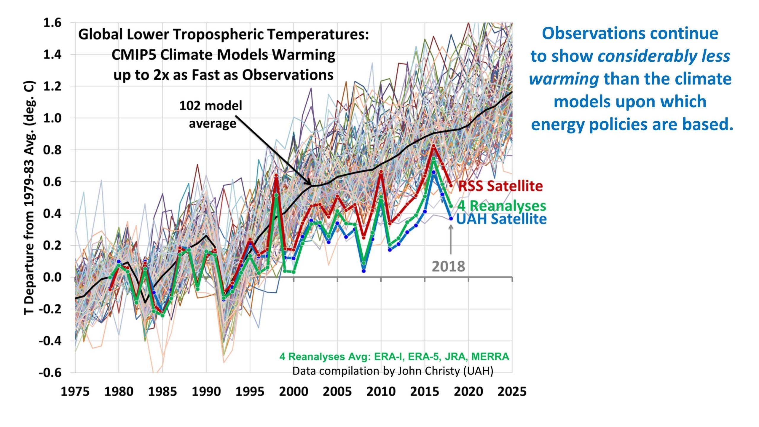
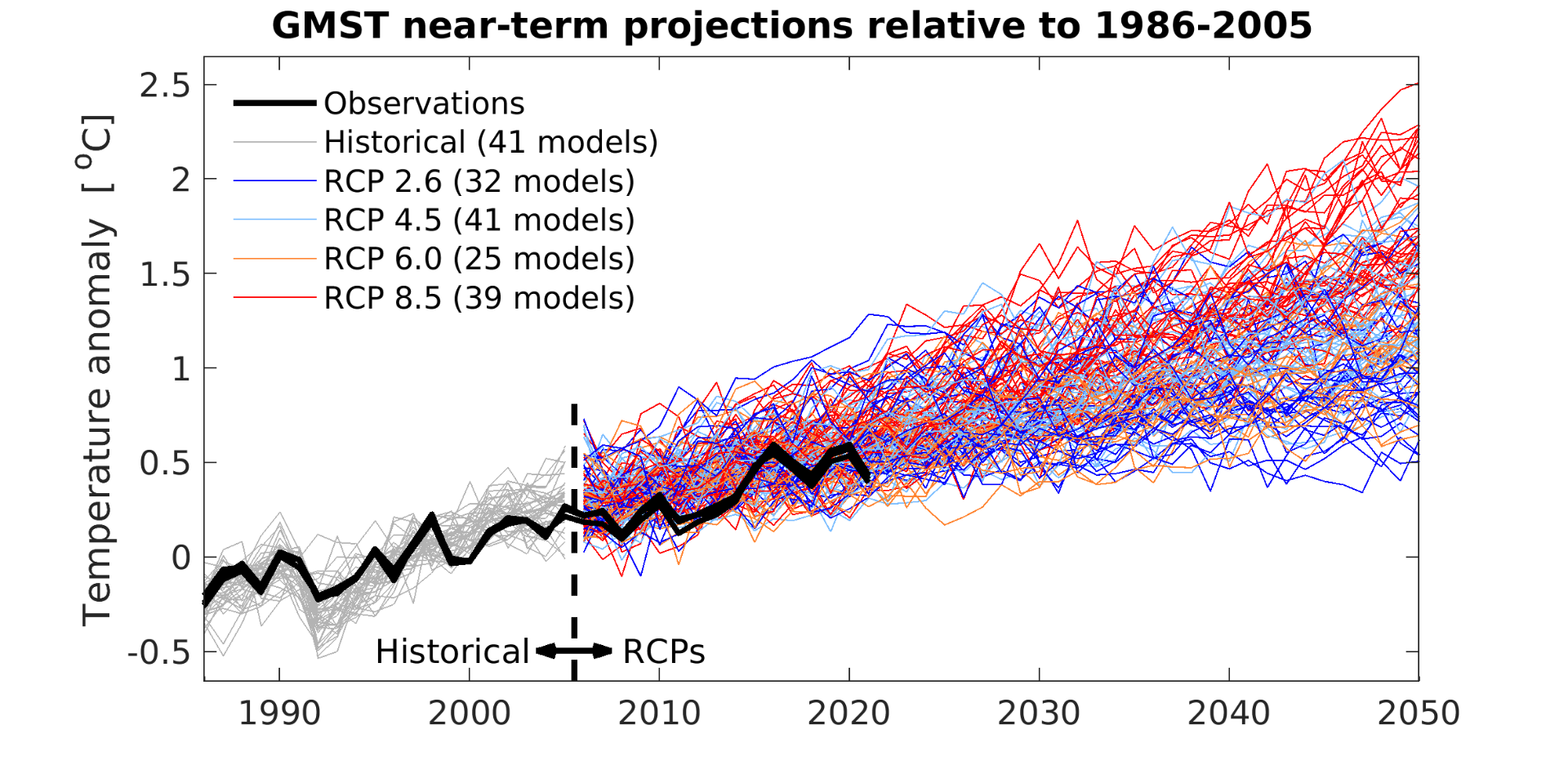
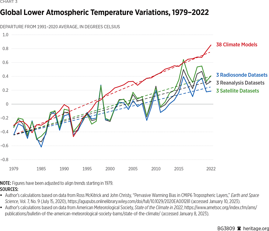
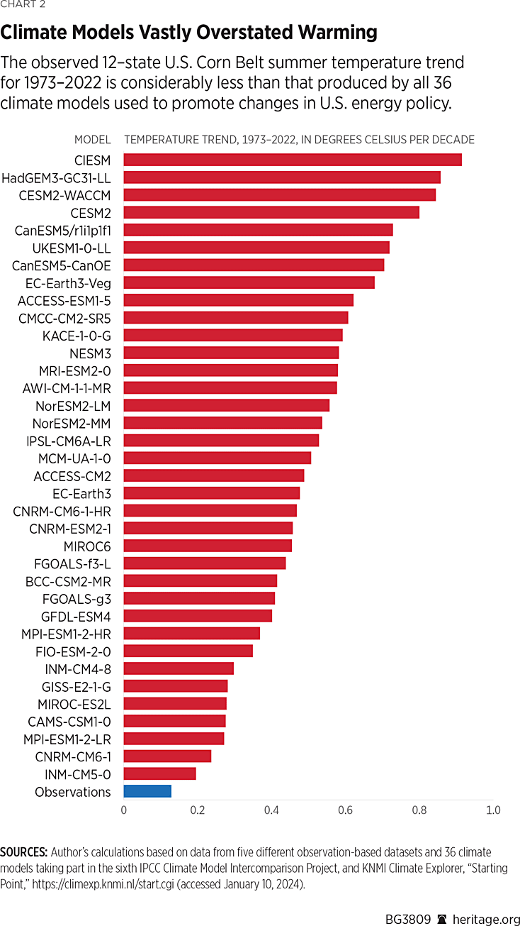
At its worst, the GFDL model is predicting approximately five times as much warming as has been observed since the upper-atmospheric data became comprehensive in 1979. This is the most evolved version of the model that won Manabe the Nobel.

In the CMIP-5 model suite, there is one, and only one, that works. It is the model INM-CM4 from the Russian Institute for Numerical Modelling, and the lead author is Evgeny Volodin. It seems that Volodin would be much more deserving of the Nobel for, in the words of the committee “reliably predicting global warming.”

Might this have something to do with the fact that INM-CM4 and its successor models have less predicted warming than all of the other models?

Patrick J. Michaels is a senior fellow working on energy and environment issues at the Competitive Enterprise Institute and author of “Scientocracy: The Tangled Web of Public Science and Public Policy.”

Top Climate Model Improved to Show ENSO Skill

Previous posts (linked at end) discuss how the climate model from RAS (Russian Academy of Science) has evolved through several versions. The interest arose because of its greater ability to replicate the past temperature history. The model is part of the CMIP program which is now going the next step to CMIP7, and is one of the first to test with a new climate simulation. Improvements to the latest model, INMCM60, show an enhanced ability to replicate ENSO oscillations in the Pacific ocean, which have significant climate impacts world wide.

This news comes by way of a new paper published in the Russian Journal of Numerical Analysis and Mathematical Modelling February 2024.  The title is ENSO phase locking, asymmetry and predictability in the INMCM Earth system model Seleznev et al. (2024) Excerpts in italics with my bolds and images from the article.

Abstract:

Advanced numerical climate models are known to exhibit biases in simulating some features of El Niño–Southern Oscillation (ENSO) which is a key mode of inter-annual climate variability. In this study we analyze how two fundamental features of observed ENSO – asymmetry between hot and cold states and phase-locking to the annual cycle – are reflected in two different versions of the INMCM Earth system model (state-of-the-art Earth system model participating in the Coupled Model Intercomparison Project).

We identify the above ENSO features using the conventional empirical orthogonal functions (EOF) analysis which is applied to both observed and simulated upper ocean heat content (OHC) data in the tropical Pacific. We obtain that the observed tropical Pacific OHC variability is described well by two leading EOF-modes which roughly reflect the fundamental recharge-discharge mechanism of ENSO. These modes exhibit strong seasonal cycles associated with ENSO phase locking while the revealed nonlinear dependencies between amplitudes of these cycles reflect ENSO asymmetry.

We also assess and compare predictability of observed and simulated ENSO based on linear inverse modeling. We find that the improved INMCM6 model has significant benefits in simulating described features of observed ENSO as compared with the previous INMCM5 model. The improvements of the INMCM6 model providing such benefits arediscussed. We argue that proper cloud parametrization scheme is crucial for accurate simulation of ENSO dynamics with numerical climate models

Introduction

El Niño–Southern Oscillation (ENSO) is the most prominent mode of inter-annual climate variability which originates in the tropical Pacific, but has a global impact [41]. Accurately simulating ENSO is still a challenging task for global climate modelers [3,5,15,25]. In the comprehensive study [35] large-ensemble climate model simulations provided by the Coupled Model Intercomparison Project phases 5 (CMIP5)and 6 (CMIP6) were analyzed. It was found that the CMIP6 models significantly outperform those fromCMIP5 for 8 out of 24 ENSO-relevant metrics, especially regarding the simulation of ENSO spatial patterns, diversity and teleconnections. Nevertheless, some important aspects of the observed ENSO are still not satisfactorily simulated by the most of state-of-the-art models [7,38,49]. In this study we are aimed at examination of how two such aspects – ENSO asymmetry and ENSO phase-locking to the annual cycle –are reflected in the INMCM Earth system model [44, 45].

The asymmetry between hot (El Nino) and cold (La Nina) states is a fundamental feature in the observed ENSO occurrences [39]. El Niño events are often stronger than La Niña events, while the latter ones tend to be more persistent [10]. Such an asymmetry is generally attributed to nonlinear feedbacks between sea surface temperatures (SSTs), thermocline and winds in the tropical Pacific [2,19,28]. The alternative conceptions highlight the role of tropical instability waves [1] and fast atmospheric processes associated with irregular zonal wind anomalies [24]. ENSO phase-locking is identified as the tendency of ENSO-events to peak in boreal winter.

Several studies [11,17,34] argue that the phase-locking is associated with seasonal changes in thermocline depth, ocean upwelling velocity, and cloud feedback processes. These processes collectively contribute to the coupling strength modulation between ocean and atmosphere, which, in the context of conceptual ENSO models [4,18], provides seasonal modulation of stability (in the sense of decay rate) of the “ENSO oscillator”. Another theory [20,42] supposes the phase-locking results from nonlinear interactions between the seasonal forcing and the inherent ENSO cycle. Both the asymmetry and phaselocking effects are typically captured by low-dimensional data-driven ENSO models [14, 21, 26, 29, 37].

In this work we identify the ENSO features discussed above via the analysis of upper ocean heat content (OHC) variability in the the tropical Pacific. The recent study [37] analyzed high-resolution reanalysis dataset of the tropical Pacific (10N – 10S, 120E – 80W) OHC anomalies in the 0–300 m depth layer using the standard empirical orthogonal function (EOF) decomposition [16]. It was found that observed OHC variability is effectively captured by two leading EOFs, which roughly describe the fundamental recharge-discharge mechanism of ENSO [18]. The time series of the corresponding principal components (PCs) demonstrate strong seasonal cycles, reflecting ENSO phase-locking, while the revealed inter-annual nonlinear dependencies between these cycles can be associated with ENSO asymmetry [37].

Here we apply similar analysis to the OHC data simulated by two different versions of INMCM Earth system model. The first is the INMCM5 model [45] from CMIP6, and the second is the perspective INMCM6 [44] model with improved parameterization of clouds, large-scale condensation and aerosols. Along with the traditional EOF decomposition we invoke the linear inverse modeling to assess and compare predictability of ENSO from observed and simulated data.

The paper is organized as follows. Sect. 2 describes the datasets we analyze: OHC reanalysis dataset and OHC data obtained from the ensemble simulations of global climate with two versions of INMCM model. Data preparation, including separation of the forced and internal variability, is also discussed. The ensemble EOF analysis is represented, which is used for identifying the meaningful processes contributing to observed and simulated ENSO dynamics. Sect. 3 presents the results we obtain in analyzing both observed and simulated OHC data. In Sect. 4 we summarize and discuss the obtained results, particularly regarding the significant benefits of new version of INMCM model (INMCM6) in simulating key features of observed ENSO.

Fig. 1: Two leading EOFs of the observed tropical Pacific upper ocean heat content (OHC) variability

Fig. 2: Two leading EOFs of the INMCM5 ensemble of tropical Pacific upper ocean heat content simulations

Fig. 3: The same as in Fig. 2 but for INMCM6 model simulations

The corresponding spatial patterns in Fig. 1 have clear interpretation. The first contributes to the central and eastern tropical Pacific, where most significant variations of sea surface temperature (SST) during El Niño/La Nina events occur [9]. The second predominates mainly in the western tropical Pacific and can be associated with the OHC accumulation and discharge before and during the El Niño events [48].

What we can see from Fig. 2 is that the two leading EOFs of OHC variability simulated by the INMCM5 model do not correspond to the observed ones. The corresponding time series and spatial patterns exhibit smaller-scale features, as compared to those we obtain from the reanalysys data, indicating their noisier spatio-temporal nature.

The two leading EOFs of the improved INMCM6 model (Fig. 3), by contrast, capture well both the spatial and temporal features of observed EOFs. In the next section we focus on furtheranalysis of these EOFs assuming that they contain the most meaningful information about ENSO dynamics.

Discussion

In this study we have analyzed how two different versions of the INMCM model [44,45] (state-of-the-art Earth system model participating in the Coupled Model Intercomparison Project, CMIP) simulate some features of El Niño–Southern Oscillation (ENSO) which is a key mode of the global climate. We identified the ENSO features via the EOF analysis applied to both observed and simulated upper ocean heat content(OHC) variability in the the tropical Pacific. It was found that the observed tropical Pacific OHC variability is captured well by two leading modes (EOFs) which reflect the fundamental recharge-discharge mechanism of ENSO involving a recharge and discharge of OHC along the equator caused by a disequilibrium between zonal winds and zonal mean thermocline depth. These modes are phase-shifted and exhibit the strong seasonal cycles associated with ENSO phase locking. The inter-annual dependencies between amplitudes of the revealed ESNO seasonal cycles are strongly nonlinear which reflects the asymmetry between hot (ElNino) and cold (La Nina) states of observed ENSO. We found that the INMCM5 model (the previous version of the INMCM model from CMIP6) poorly reproduces the leading modes of observed ENSO and reflect neither the observed ENSO phase locking nor asymmetry. At the same time, the perspective INMCM6 model demonstrates significant improvement in simulating these key features of observed ENSO. The analysis of ENSO predictability based on linear inverse modeling indicates that the improved INMCM6 model reflects well the ENSO spring predictability barrier and therefore could potentially have an advantage in long range weather prediction as compared with the INMCM5.

Such benefits of the new version of the INMCM model (INMCM6) in simulating observed ENSO dynamics can be provided by using more relevant parametrization of sub-grid scale processes. Particularly, the difference in the amplitude of OHC anomaly associated with ENSO between INMCM5 and INMCM6 shown in Fig.2-3 can be explained mainly by the difference in cloud parameterization in these models. In short, in INMCM5 El-Nino event leads to increase of middle and low clouds over central and eastern Pacific that leads to cooling because of decrease in surface incoming shortwave radiation.

While decrease in low clouds and increase in high clouds in INMCM6 over El-Nino region during positive phase of ENSO lead to further upper ocean warming [43]. This is consistent with the recent study [36] which argued that erroneous cloud feedback arising from a dominant contribution of low-level clouds may lead to heat flux feedback bias in the tropical Pacific, which play a key role in ENSO dynamics. Fast decrease in OHC in central Pacific after El-Nino maximum in INMCM6 can probably occur because of too shallow mixed layer in equatorial Pacific in the model, that leads to fast surface cooling after renewal of upwelling and further increase of tradewinds. Summarizing the above we can conclude that proper cloud parameterization scheme is crucial for accurate simulation of observed ENSO with numerical climate models.

Background on INMCM6

New 2023 INMCM RAS Climate Model First Results

The INMCM60 model, like the previous INMCM48 [1], consists of three major components: atmospheric dynamics, aerosol evolution, and ocean dynamics. The atmospheric component incorporates a land model including surface, vegetation, and soil. The oceanic component also encompasses a sea-ice evolution model. Both versions in the atmosphere have a spatial 2° × 1° longitude-by-latitude resolution and 21 vertical levels up to 10 hPa. In the ocean, the resolution is 1° × 0.5° and 40 levels.

The following changes have been introduced into the model compared to INMCM48.

Parameterization of clouds and large-scale condensation is identical to that described in [4], except that tuning parameters of this parameterization differ from any of the versions outlined in [3], being, however, closest to version 4. The main difference from it is that the cloud water flux rating boundary-layer clouds is estimated not only for reasons of boundary-layer turbulence development, but also from the condition of moist instability, which, under deep convection, results in fewer clouds in the boundary layer and more in the upper troposphere. The equilibrium sensitivity of such a version to a doubling of atmospheric СО2 is about 3.3 K.

The aerosol scheme has also been updated by including a change in the calculation of natural emissions of sulfate aerosol [5] and wet scavenging, as well as the influence of aerosol concentration on the cloud droplet radius, i.e., the first indirect effect [6]. Numerical values of the constants, however, were taken to be a little different from those used in [5]. Additionally, the improved scheme of snow evolution taking into account refreezing and the calculation of the snow albedo [7] were introduced to the model. The calculation of universal functions in the atmospheric boundary layer in stable stratification has also been changed: in the latest model version, such functions assume turbulence at even large gradient Richardson numbers [8].


Hot Climate Models Not Fit For Policymaking

Roy Spencer has published a study at Heritage Global Warming: Observations vs. Climate Models.  Excerpts in italics with my bolds.

Summary

Warming of the global climate system over the past half-century has averaged 43 percent less than that produced by computerized climate models used to promote changes in energy policy. In the United States during summer, the observed warming is much weaker than that produced by all 36 climate models surveyed here. While the cause of this relatively benign warming could theoretically be entirely due to humanity’s production of carbon dioxide from fossil-fuel burning, this claim cannot be demonstrated through science. At least some of the measured warming could be natural. Contrary to media reports and environmental organizations’ press releases, global warming offers no justification for carbon-based regulation.

KEY TAKEAWAYS
  1. The observed rate of global warming over the past 50 years has been weaker than that predicted by almost all computerized climate models.
  2. Climate models that guide energy policy do not even conserve energy, a necessary condition for any physically based model of the climate system.
  3. Public policy should be based on climate observations—which are rather unremarkable—rather than climate models that exaggerate climate impacts.

For the purposes of guiding public policy and for adaptation to any climate change that occurs, it is necessary to understand the claims of global warming science as promoted by the United Nations Intergovernmental Panel on Climate Change (IPCC).  When it comes to increases in global average temperature since the 1970s, three questions are pertinent:

  1. Is recent warming of the climate system materially attributable to anthropogenic greenhouse gas emissions, as is usually claimed?
  2. Is the rate of observed warming close to what computer climate models—used to guide public policy—show?
  3. Has the observed rate of warming been sufficient to justify alarm and extensive regulation of CO2 emissions?

While the climate system has warmed somewhat over the past five decades,
the popular perception of a “climate crisis” and resulting calls for economically
significant regulation of CO2 emissions is not supported by science.

Discussion Points

Temperature Change Is Caused by an Imbalance Between Energy Gain and Energy Loss.

Recent Warming of the Climate System Corresponds to a Tiny Energy Imbalance.

Climate Models Assume Energy Balance, but Have Difficulty Achieving It.

Global Warming Theory Says Direct Warming from a Doubling of CO2 Is Only 1.2°C.

Climate Models Produce Too Much Warming.

Climate models are not only used to predict future changes (forecasting), but also to explain past changes (hindcasting). Depending on where temperatures are measured (at the Earth’s surface, in the deep atmosphere, or in the deep ocean), it is generally true that climate models have a history of producing more warming than has been observed in recent decades.

This disparity is not true of all the models, as two models (both Russian) produce warming rates close to what has been observed, but those models are not the ones used to promote the climate crisis narrative. Instead, those producing the greatest amount of climate change usually make their way into, for example, the U.S. National Climate Assessment,  the congressionally mandated evaluation of what global climate models project for climate in the United States.

The best demonstration of the tendency of climate models to overpredict warming is a direct comparison between models and observations for global average surface air temperature, shown in Chart 1.

In this plot, the average of five different observation-based datasets (blue) are compared to the average of 36 climate models taking part in the sixth IPCC Climate Model Intercomparison Project (CMIP6). The models have produced, on average, 43 percent faster warming than has been observed from 1979 to 2022. This is the period of the most rapid increase in global temperatures and anthropogenic greenhouse gas emissions, and also corresponds to the period for which satellite observations exist (described below). This discrepancy between models and observations is seldom mentioned despite that fact that it is, roughly speaking, the average of the models (or even the most extreme models) that is used to promote policy changes in the U.S. and abroad.

Summertime Warming in the United States

While global averages produce the most robust indicator of “global” warming, regional effects are often of more concern to national and regional governments and their citizens. For example, in the United States large increases in summertime heat could affect human health and agricultural crop productivity. But as Chart 2 shows, surface air temperatures during the growing season (June, July, and August) over the 12-state Corn Belt for the past 50 years reveal a large discrepancy between climate models and observations, with all 36 models producing warming rates well above what has been observed and the most extreme model producing seven times too much warming.  

The fact that global food production has increased faster than population growth in the past 60 years suggests that any negative impacts due to climate change have been small. In fact, “global greening” has been documented to be occurring in response to more atmospheric CO2, which enhances both natural plant growth and agricultural productivity, leading to significant agricultural benefits.

These discrepancies between models and observations are never mentioned when climate researchers promote climate models for energy policy decision-making. Instead, they exploit exaggerated model forecasts of climate change to concoct exaggerated claims of a climate crisis.

Global Warming of the Lower Atmosphere

While near-surface air temperatures are clearly important to human activity, the warming experienced over the low atmosphere (approximately the lowest 10 kilometers of the “troposphere,” where the Earth’s weather occurs) is also of interest, especially given the satellite observations of this layer extending back to 1979.

Satellites provide the only source of geographically complete coverage of the Earth, except very close to the North and South Poles.

Chart 3 shows a comparison of the temperature of this layer as produced by 38 climate models (red) and how the same layer has been observed to warm in three radiosonde (weather balloon) datasets (green), three global reanalysis datasets (which use satellites, weather balloons, and aircraft data; black), and three satellite datasets (blue).

Conclusion

Climate models produce too much warming when compared to observations over the past fifty years or so, which is the period of most rapid warming and increases in carbon dioxide in the atmosphere. The discrepancy ranges from over 40 percent for global surface air temperature, about 50 percent for global lower atmospheric temperatures, and even a factor of two to three for the United States in the summertime. This discrepancy is never mentioned when those same models are used as the basis for policy decisions.

Also not mentioned when discussing climate models is their reliance on the assumption that there are no natural sources of long-term climate change. The models must be “tuned” to produce no climate change, and then a human influence is added in the form of a very small, roughly 1 percent change in the global energy balance. While the resulting model warming is claimed to prove that humans are responsible, clearly this is circular reasoning. It does not necessarily mean that the claim is wrong—only that it is based on faith in assumptions about the natural climate system that cannot be shown to be true from observations.

Finally, possible chaotic internal variations will always lead to uncertainty in both global warming projections and explanation of past changes. Given these uncertainties, policymakers should proceed cautiously and not allow themselves to be influenced by exaggerated claims based on demonstrably faulty climate models.

Roy W. Spencer, PhD, is Principal Research Scientist at the University of Alabama in Huntsville.


Climate Models Hide the Paleo Incline

Figure 1. Anthropgenic and natural contributions. (a) Locked scaling factors, weak Pre Industrial Climate Anomalies (PCA). (b) Free scaling, strong PCA

In  2009, the iconic email from the Climategate leak included a comment by Phil Jones about the “trick” used by Michael Mann to “hide the decline,” in his Hockey Stick graph, referring to tree proxy temperatures  cooling rather than warming in modern times.  Now we have an important paper demonstrating that climate models insist on man-made global warming only by hiding the incline of natural warming in Pre-Industrial times.  The paper is From Behavioral Climate Models and Millennial Data to AGW Reassessment by Philippe de Larminat.  H/T No Tricks Zone. Excerpts in italics with my bolds.

Abstract

Context. The so called AGW (Anthropogenic Global Warming), is based on thousands of climate simulations indicating that human activity is virtually solely responsible for the recent global warming. The climate models used are derived from the meteorological models used for short-term predictions. They are based on the fundamental and empirical physical laws that govern the myriad of atmospheric and oceanic cells integrated by the finite element technique. Numerical approximations, empiricism and the inherent chaos in fluid circulations make these models questionable for validating the anthropogenic principle, given the accuracy required (better than one per thousand) in determining the Earth energy balance.

Aims and methods. The purpose is to quantify and simulate behavioral models of weak complexity, without referring to predefined parameters of the underlying physical laws, but relying exclusively on generally accepted historical and paleoclimate series.

Results. These models perform global temperature simulations that are consistent with those from the more complex physical models. However, the repartition of contributions in the present warming depends strongly on the retained temperature reconstructions, in particular the magnitudes of the Medieval Warm Period and the Little Ice Age. It also depends on the level of the solar activity series. It results from these observations and climate reconstructions that the anthropogenic principle only holds for climate profiles assuming almost no PCA neither significant variations in solar activity. Otherwise, it reduces to a weak principle where global warming is not only the result of human activity, but is largely due to solar activity.

Discussion

GCMs (short acronym for AOCGM: Atmosphere Ocean General Circulation Models, or for Global Climate model) are fed by series related to climate drivers. Some are of human origin: fossil fuel combustion, industrial aerosols, changes in land use, condensation trails, etc. Others are of natural origin: solar and volcanic activities, Earth’s orbital parameters, geomagnetism, internal variability generated by atmospheric and oceanic chaos. These drivers, or forcing factors, are expressed in their own units: total solar irradiance (W m–2), atmospheric concentrations of GHG (ppm), optical depth of industrial or volcanic aerosols (dimless), oceanic indexes (ENSO, AMO…), or by annual growth rates (%). Climate scientists have introduced a metric in order to characterize the relative impact of the different climate drivers on climate change. This metric is that of radiative forcings (RF), designed to quantify climate drivers through their effects on the terrestrial radiation budget at the top of the atmosphere (TOA).

However, independently of the physical units and associated energy properties of the RFs, one can recognize their signatures in the output and deduce their contributions. For example, volcanic eruptions are identifiable events whose contributions can be quantified without reference to either their assumed radiative forcings, or to physical modeling of aerosol diffusion in the atmosphere. Similarly, the Preindustrial Climate Anomalies (PCA) gathering the Medieval Warm Period (MWP) and the Little Ice Age (LIA), shows a profile similar to that of the solar forcing reconstructions. Per the methodology proposed in this paper, the respective contributions of the RF inputs are quantified through behavior models, or black-box models.

Now, Figures 1-a and 1-b presents simulations obtained from the models identified under two different sets of assumptions, detailed in sections 6 and 7 respectively.

Figure 1. Anthropgenic and natural contributions. (a) Locked scaling factors, weak Pre Industrial Climate Anomalies (PCA). (b) Free scaling, strong PCA

In both cases, the overall result for the global temperature simulation (red) fits fairly well with the observations (black).  Curves also show the forcing contributions to modern warming (since 1850). From this perspective, the natural (green) and anthropogenic (blue) contributions are in strong contradiction between panels (a) and (b). This incompatibility is at the heart of our work.

Simulations in panel (a) are calculated per section 6, where the scaling multipliers planned in the model are locked to unity, so that the radiative forcing inputs are constrained to strictly comply with the IPCC quantification. The remaining parameters of the black-box model are adjusted in order to minimize the deviation between the observations (black curve) and the simulated outputs (red). Per these assumptions, the resulting contributions (blue vs. green) comply with the AGW principle. Also, the conformity of the results with those of the CMIP supports the validity of the type of behavioral model adopted for our simulations.

Paleoclimate Temperatures

Although historically documented the Medieval Warm Period (MWP) and the Little Ice Age (LIA) don’t make consensus about their amplitudes and geographic extensions [2, 3]. In Fig. 7.1-c of the First Assessment Report of IPCC, a reconstruction from showed a peak PCA amplitude of about 1.2 °C [4]. Then later on, a reconstruction by the so-called ‘hockey stick graph’, was reproduced five times in the IPCC Third Assessment Report (2001), wherein there was no longer any significant MWP [5].

After, 2003 controversies reference to this reconstruction had disappeared from subsequent IPCC reports:it is not included among the fifteen paleoclimate reconstructions covering the millennium period listed in the fifth report (AR5, 2013) [6]. Nevertheless, AR6 (2021) revived a hockey stick graph reconstruction from a consortium initiated by a network “PAst climate chanGES” [7,8]. The IPCC assures (AR6, 2.3.1.1.2): “this synthesis is generally in agreement with the AR5 assessment”.

Figure 2 below puts this claim into perspective. It shows the fifteen reconstructions covering the preindustrial period accredited by the IPCC in AR5 (2013, Fig. 5.7 to 5.9, and table 5.A.6), compiled (Pangaea database) by [7]. Visibly, the claimed agreement of the PAGES2k reconstruction (blue) with the AR5 green lines does not hold.

Figure 2. Weak and strong preindustrial climate anomalies, respectively from AR5 (2013) in green and AR6 (2021) in blue.

Conclusion

In section 8 above, a set of consistent climate series is explored, from which solar activity appears to be the main driver of climate change. To eradicate this hypothesis, the anthropogenic principle requires four simultaneous assessments:

♦  A strong anthropogenic forcing, able to account for all of the current warming.
♦  A low solar forcing.
♦  A low internal variability.
♦  The nonexistence of significant pre-industrial climate anomalies, which could indeed be explained by strong solar forcing or high internal variability.

None of these conditions is strongly established, neither by theoretical knowledge nor by historical and paleoclimatic observations. On the contrary, our analysis challenges them through a weak complexity model, fed by accepted forcing profiles, which are recalibrated owning to climate observations. The simulations show that solar activity contributes to current climate warming in proportions depending on the assessed pre-industrial climate anomalies.

Therefore, adherence to the anthropogenic principle requires that when reconstructing climate data, the Medieval Warming Period and the Little Ice Age be reduced to nothing, and that any series of strongly varying solar forcing be discarded. 

Background on Disappearing Paleo Global Warming

The first graph appeared in the IPCC 1990 First Assessment Report (FAR) credited to H.H.Lamb, first director of CRU-UEA. The second graph was featured in 2001 IPCC Third Assessment Report (TAR) the famous hockey stick credited to M. Mann.

Rise and Fall of the Modern Warming Spike


Self Imposed Energy Poverty Coming to Canada

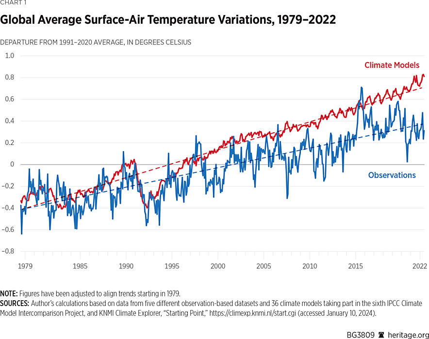
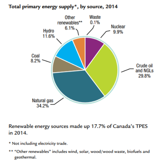
Jock Finlayson describes how climate change policies are depleting Canadians’ financial means in his article Millions of Canadians May Face ‘Energy Poverty’.  Excerpts in italics with my bolds and added images.

The term “energy poverty” is not yet part of day-to-day political debate in Canada, but that’s likely to change in the next few years. In Europe, the high and rising cost of energy has become a political lightning rod in several countries including Britain and France. Something similar may be in store for Canada.

The Trudeau government and some of the provinces are
aggressively pursuing the holy grail of decarbonization.

To achieve this, they’re engineering dramatic increases in carbon and other taxes on fossil fuels and promising to pour vast sums of money into building new electricity generation and transmission infrastructure to help reduce reliance on oil, refined petroleum products, natural gas and coal. Both strategies point to higher energy costs.

Tax advocates say it is a small % of GDP. But it is still $10 Billion extracted from Canadian households

The Trudeau government has legislated a national minimum carbon tax set to reach $170 per tonne of emissions by 2030, up from $50 in 2022 and $65 currently. Ottawa has also imposed a “clean fuel standard” that will further raise the cost of fuel. These policies are driven by concerns over climate change, which is a risk, to be sure, but so is the prospect of rapidly escalating energy prices for Canadian households and businesses.

Energy poverty arises when households and families must devote a significant fraction of their after-tax income to cover the cost of energy used for transportation, home heating and cooking, and the provision of electricity. In 2022, the United Kingdom government estimated that 13.4 percent of households were in energy poverty, which it defined as needing to spend more than 10 percent of income to cover the cost of directly consumed energy.

There’s no single agreed methodology for assessing the prevalence of energy poverty. A recent Canadian study reports that in 2017, between 6 percent and 19 percent of Canadian households experienced some form of energy poverty, with an above-average incidence in rural areas, Atlantic Canada and among people living in older single-family homes. If accurate, this finding suggests that many more Canadians will soon become acquainted with the term as taxes on fossil fuels climb and governments impose new regulations affecting the energy efficiency of buildings, vehicles, industrial equipment, appliances and agricultural operations.

Canada is blessed with plentiful and diverse supplies of energy. Over time, we have become an important global producer and exporter of energy, with oil, natural gas and electricity together expected to account for one-quarter of Canada’s merchandise exports in 2023. Canada is also an intensive consumer of energy, in part because of our cold climate, dispersed population and relatively high living standards.

80% of the Other Renewables is solid biomass (wood), which leaves at most 1% of Canadian total energy supply coming from wind and solar.

End-use energy demand in Canada is around 13,000 petajoules. Of this, industry is responsible for about half, followed by transportation, residential buildings, commercial buildings and agriculture. Refined petroleum products—all based on oil—are the largest fuel type consumed in Canada (around 40 percent of the total), followed by natural gas (36 percent) and electricity (16 percent). Biofuels and other smaller sources comprise the rest. These data underscore Canadians’ overwhelming dependence on fossil fuels to meet their energy needs.

Politicians in a hurry to slash greenhouse gas emissions via higher taxes
and more regulations must be alert to the risk that millions of Canadians
could find themselves in energy poverty by the end of the decade.

Jock Finlayson is a Senior Fellow at the Fraser Institute.

See Also Canada Budget Officer Quashes Climate Alarm


IPCC Guilty of “Prosecutor’s Fallacy”

IPCC made an illogical argument in a previous report as explained in a new GWPF paper The Prosecutor’s Fallacy and the IPCC Report.  Excerpts in italics with my bolds and added images.

London, 13 September – A new paper from the Global Warming Policy Foundation reveals that the IPCC’s 2013 report contained a remarkable logical fallacy.

The author, Professor Norman Fenton, shows that the authors of the Summary for Policymakers claimed, with 95% certainty, that more than half of the warming observed since 1950 had been caused by man. But as Professor Fenton explains, their logic in reaching this conclusion was fatally flawed.

“Given the observed temperature increase, and the output from their computer simulations of the climate system, the IPCC rejected the idea that less than half the warming was man-made. They said there was less than a 5% chance that this was true.”

“But they then turned this around and concluded that there was a 95% chance
that more than half of observed warming was man-made.”

This is an example of what is known as the Prosecutor’s Fallacy, in which the probability of a hypothesis given certain evidence, is mistakenly taken to be the same as the probability of the evidence given the hypothesis.

As Professor Fenton explains

“If an animal is a cat, there is a very high probability that it has four legs.
However, if an animal has four legs, we cannot conclude that it is a cat.
It’s a classic error, and is precisely what the IPCC has done.”

Professor Fenton’s paper is entitled The Prosecutor’s Fallacy and the IPCC Report.

What the number does and does not mean

Recall that the particular ‘climate change number’ that I was asked to explain was the number 95: specifically, relating to the assertion made in the IPCC 2013 Report of ‘at least 95% degree of certainty that more than half the recent warming is man-made’.  The ‘recent warming’ related to the period 1950–2010. So, the assertion is about the probability of humans causing most of this warming.

Before explaining the problem with this assertion, we need to make clear that (although superficially similar) it is very different to another more widely known assertion (still promoted by NASA) that ‘97% of climate scientists agree that humans are causing global warming and climate change’. That assertion was simply based on a flawed survey of authors of published papers and has been thoroughly debunked.

The 95% degree of certainty is a more serious claim.
But the  case made for it in the IPCC report is also flawed.

[Commment: In the short video above, Norman Fenton explains the fallacy IPCC committed.  Synopsis of example.  A man dies is a very rowdy gathering of young men.  A size 13 footprint is found on the body.  Fred is picked up by the police.  He admits to being there but not to killing anyone, despite wearing size 13 shoes.  Since statistics show that only 1% of young men have size 13 feet, the prosecutor claims a 99% chance Fred is guilty.  The crowd was reported to be on the order of 1000, so  there were likely 10 others with size 13 shoes.  So in fact there is only a 10% chance Fred is guilty.]

The flaw in the IPCC summary report

It turns out that the assertion that ‘at least 95% degree of certainty that more than half the recent warming is man-made’ is  based on the same fallacy. In my article about the programme, I highlighted this concern as follows:

The real probabilistic meaning of the 95% figure. In fact it comes from a classical hypothesis test in which observed data is used to test the credibility of the ‘null hypothesis’. The null hypothesis is the ‘opposite’ statement to the one believed to be true, i.e. ‘Less than half the warming in the last 60 years is man-made’. If, as in this case, there is only a 5% probability of observing the data if the null hypothesis is true, the statisticians equate this figure (called a p-value) to a 95% confidence that we can reject the null hypothesis.

But the probability here is a statement about the data given the hypothesis. It is not generally the same as the probability of the hypothesis given the data (in fact equating the two is often referred to as the ‘prosecutors fallacy’, since it is an error often made by lawyers when interpreting statistical evidence).

IPCC defined ‘extremely likely’ as at least 95% probability.  The basis for the claim is found in Chapter 10 of the detailed Technical Summary, which describes various climate change simulation models, which reject the null hypothesis (that more than half the warming was not man-made) at the 5% significance level. Specifically, in the simulation models, if you assumed that there was little man-made impact, then there was less than 5% chance of observing the warming that has been measured. In other words, the models do not support the null hypothesis of little man-made climate change. The problem is that, even if the models were accurate (and it is unlikely that they are) we cannot conclude that there is at least a 95% chance that more than half the warming was man-made, because doing so is the fallacy of the transposed conditional.

The illusion of confidence in the coin example comes from ignoring (the ‘prior probability’) of how rare the double-headed coins are. Similarly, in the case of climate change there is no allowance made for the prior probability of man-made climate change, i.e. how likely it is that humans rather than other factors such as solar activity cause most of the warming. After all, previous periods of warming certainly could not have been caused by increased greenhouse gases from humans, so it seems reasonable to assume – before we have considered any of the evidence – that the probability humans caused most of the recent increase in temperature to be very low. 

Only the assumptions of the simulation models are allowed,
and other explanations are absent.

In both of these circumstances, classical statistics can then be used to deceive you into presenting an illusion of confidence when it is not justified.

See Also 

Beliefs and Uncertainty: A Bayesian Primer


You pick one unopened door. Monty opens one other door. Do you stay with your choice or switch?

Monty Hall Problem Simulator