Global Weather Oscillations

H/T to No Tricks Zone for posting (here) on the remarkable forecasting record of Global Weather Oscillations Inc. founded by David Dilley. The ability to predict storm activity demonstrates an understanding of earth’s climate system dynamics. The theory and supporting evidence are available to all in a free ebook Natural Climate Pulse

The heart of the matter seems to be Mr. Dilley’s extracting from very long term Milankovitch Cycles to determine decadal variations in weather activity. From the ebook pp. 16 ff.

Earth’s Natural Rhythm and Global Warming -Cooling Cycles

After researching various elements of the Milankovitch Cycles, Mr. Dilley found that specific sub-cycles which are called the “Lunisolar Precession” are a major factor in determining and maintaining the earth’s natural climate rhythm. It is the Lunisolar Precession that controls almost all of earth’s climate cycles, and it is well known throughout the climatological science community, that specific “Milankovitch Cycles” are the primary mechanism that controls glacial and interglacial periods on earth. If it were not for the gravitational tidal field of the moon, and the electromagnetic and gravitational tidal field of the sun, earth would spin out of control (ref: 23). It is these two bodies that keep earth’s orbit and tilt within certain limits, and provide earth’s climate cycles.

Mr. Dilley researched the Lunisolar Precession cycles for over 20 years, and correlated specific cycles to recurring cycles of climate. GWO incorporated his findings into climate – weather forecast models which provide a unique approach and extremely accurate long range cycle predictions for historical major earthquakes, regional hurricane landfalls many years in advance, historical floods, droughts, natural carbon dioxide cycles, global warming and global cooling cycles.

david-dilley-global-weather-cycles_image_16

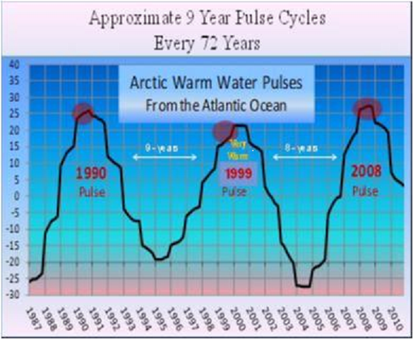
Figure 16 shows the approximate 9-year Lunisolar gravitational cycle. It is this cycle that is a major contributor to earth’s climate cycles. (Created by Global Weather Oscillations Inc.)

During the 1998 Global Warming Peak, the warm pulse occurred from 1990-93 and again 2004-07,and warmed the Arctic waters below the ice caps up to 1 Degree Celsius above normal. The Arctic Boundary Current from the Atlantic provides the largest input of water, heat, and salt into the Arctic Ocean; the total quantity of heat is substantial, enough to melt the Arctic sea ice cover several times over.
Courtesy…Fate of Early 2000s Arctic Warm Water Pulse Aigor V. Polyakov, Vladmir A. Alexeeve et al, Bulletin of the American Meteorological Society, Vol. 92 Number 5, May 2011

david-dilley-global-weather-cycles_image_17

Figure 17 shows the North Atlantic warm water pulse (Ref:41) that enters the Arctic Ocean in coincidence with the 9-year Lunisolar Pulse shown as the red dots in Figure 16.(Created by Global Weather Oscillations Inc.)

Thus it can be seen that it is likely the approximate 9-year Lunisolar gravitational tidal pulse that sets up a rhythm or heartbeat for earth. During the recurring 230-year global warming cycles a very strong gravitation pulse acts like a plunger in the North Atlantic, causing a warm water pulse surge to enter the Arctic Ocean. It takes the warm water 13-years to circulate around the Arctic Ocean (Ref:43), gradually cooling during the period as it mixes with cooler water. It is this pulse that melts the Arctic Ice from the bottom up and eventually causes open waters to appear as melting continues during the lifespan of the pulse.

david-dilley-global-weather-cycles_image_18

Figure 18 Shows the United States temperatures (red line) from 1880 on the left to the year 2008. Notice an approximate 9-year temperature rhythm for temperatures in the United States. Note the peaks in temperatures every 8 to 10 years, which are very similar to the 9-year Lunisolar. (Created by Global Weather Oscillations Inc.)

The strongest pulses are separated by 72-years during the 230-year global warming episode. For instance, a very warm water pulse caused 10-years of warm global temperatures in the 1930s, and a second very warm pulse 72-years later caused 10-years of warm global temperatures from 1998 to 2008. This approximate 9-year pulse also corresponds closely with temperature pulses around the world. If we extend the Lunisolar Precession 9-year Pulse out to an approximate 230-year pulse (full moon cycle only shown here), we get a clear picture of the relationship of the Lunisolar pulse to global warming cycles which occur approximately every 230 years.

Summary

Any theory stands or falls on the success of its predictions about the subject system’s behavior. Dilley is earning respect for his understanding of earth’s climate system. We should also note that his analysis anticipates a cooling period in the next decades, something not foreseen by any climate model builder.

Followup post is  https://rclutz.wordpress.com/2017/02/08/amo-atlantic-climate-pulse/

Tornados: Blame them on La Niña

A tornado brews near El Reno, Okla., May 2013. A new study links the frequency of tornadoes and hailstorms in parts of the southern United States to ENSO, a cyclic temperature pattern in the Pacific Ocean. Credit: John Allen

Reported in Science Daily Frequency of tornadoes, hail linked to El Niño, La Niña

“We can forecast how active the spring tornado season will be based on the state of El Niño or La Niña in December or even earlier,” said lead author John Allen, a postdoctoral research scientist at the International Research Institute for Climate and Society (IRI).

Allen and his coauthors show that moderately strong La Niña events lead to more tornadoes and hail storms over portions of Oklahoma, Texas, Kansas and other parts of the southern United States. El Niño events act in the opposite manner, suppressing both types of storms in this area.

While the information can’t pinpoint when and where storms will wreak havoc, it will nevertheless be useful for governments and insurance companies to prepare for the coming season, Allen said.

The Tornado statistics are available from the Storm Prediction Center (here).

El Niño was in effect for 2015 and most of 2016.  2015 had 36 deaths, all but 10 of them between Dec. 23 and 26. This year there have been 17 deaths recorded. An average year is 80 tornado deaths.

TOP 5 GREATEST U.S. ANNUAL TORNADO DEATH TOLLS

RANK YEAR DEATHS
1) 1925 794
2) 2011 553
3) 1936 552
4) 1917 551
5) 1927 540

In 2011–a La Niña year– tornadoes killed more than 550 people, higher than in the previous 10 years combined. Hail storms and tornadoes cause an average estimated $1.6 billion in insured losses each year in the United States, according to the insurer Munich RE. Powerful, isolated events such as the 2011 Joplin, Missouri, tornado can smash that average. That storm alone caused several billion dollars in damage and killed 158 people.

Image: La Niña is characterized by unusually cold ocean temperatures in the central equatorial Pacific. The colder than normal water is depicted in this image in blue. During a La Niña stronger than normal trade winds bring cold water up to the surface of the ocean. Credit: NASA

Image: La Niña is characterized by unusually cold ocean temperatures in the central equatorial Pacific. The colder than normal water is depicted in this image in blue. During a La Niña stronger than normal trade winds bring cold water up to the surface of the ocean. Credit: NASA

Past studies that have relied on eyewitness records alone have had limited success, said Allen. “For example, previous work has shown a clear linkage between ENSO and winter activity, but spring–the season when most of tornadoes occur in the southern U.S.–remained an enigma until now,” Allen said.

To get around these challenges, the Columbia University team created indices derived from environmental conditions such as wind shear, temperature and moisture. Each is a key ingredient in severe storm formation, and each is influenced by ENSO. The scientists then verified the indices using available observational records.

Summary

If La Niña strengthens beyond its present near-neutral condition, look for more killer tornados in the SE United States.  But it is not the fault of CO2 or fossil fuels.

Footnote December 4

I want to be as careful as the authors not to overstate the certainty of their findings. (h/t comment by Les Johnson).  Tornados are mesoscale events with multiple contributing factors.  Researchers have concluded that ENSO sets environmental conditions that favor or disfavor tornado formation, i.e. increase or decrease the probabilities.

Michon Scott provides a more detailed description of the mechanism entitled El Niño and La Niña affect spring tornadoes and hailstorms at Climate.gov (here).

In these maps, purple indicates higher storm event frequency, and brown indicates lower storm event frequency. Specifics vary, but in general, springtime tornadoes and hailstorms are less frequent in the southern central United States during El Niño, and more frequent during La Niña.

The research showed that ENSO affects tornado and hailstorm frequency by influencing the position of the jet stream over North America. El Niño weakens the surface winds that carry warm, most air from the Gulf of Mexico over Texas and neighboring states. La Niña, in contrast, concentrates hot, humid air over the region. The heat and humidity over the southern Plains states sets up a strong north-south temperature gradient, which in turn favors storm formation.

El Niño/La Niña conditions often persist from winter into spring, the researchers found, so the ENSO state seen in December, January, and February can be used to predict tornado and hailstorm frequency for March, April, and May.

Tornado season and hail season don’t have set beginnings and endings. In general, tornado season peaks in Gulf Coast states in the spring, in the southern Plains in May and June, and in upper Midwest in June and July. . . But tornadoes can strike at any time of year. Severe hailstorms often strike between May and July, but can also occur at any time of year.

Stormy Climate Deception

Wikipedia: 2013 Pacific typhoon season summary. Even including super-typhoon Haiyan, 2013 was an average year.

Wikipedia: 2013 Pacific typhoon season summary. Even including super-typhoon Haiyan, 2013 was an average year. image is from commdiginews

Paul Driessen tells it like it is in this Town Hall article (here).  Some excerpts that struck me and some bolding that I added.

No Real-World evidence supports a “dangerous manmade climate change” thesis. In fact, a moderately warmer planet with more atmospheric carbon dioxide would hugely benefit crop, forest and other plant growth, wildlife and humans – with no or minimal climate effect. A colder planet with less CO2 would punish them. And a chillier CO2-deprived planet with less reliable, less affordable energy (from massive wind, solar and biofuel projects) would threaten habitats, species, nutrition and the poorest among us.

And yet, as Hurricane Matthew neared Florida on the very day the Paris climate accord secured enough signatures to bring it into force, politicians, activists and reporters refused to let that crisis go to waste.

Matthew was a powerful storm that left destruction and death in its wake, especially in impoverished Haiti. Its slow track up the southeastern US coastline pummeled the region with rain, flooding and more deaths. But it was a Category 1 hurricane with 75 mph winds when it made landfall in South Carolina October 8, and a post-tropical storm as it moved offshore from North Carolina a day later.

Despite the rain and floods, that makes a record eleven years since a major (Category 3-5) hurricane last made landfall in the United States (Wilma in October 2005). The previous record major hurricane hiatus was nine years, 1860-1869, according to NOAA’s Hurricane Research Division.

Only a charlatan would suggest that this record lull is due to rising atmospheric carbon dioxide levels. But plenty of alarmist charlatans claim that any violent or “unseasonal” storms are due to “too much” CO2.

Just as intolerable, United Nations “humanitarian and disaster relief” agencies were issuing “emergency appeals” for $120 million in “life-saving assistance” funds for the desperate Haitians. This after President Obama improperly diverted $500 million from an economic aid program set up to address disease epidemics – like the Zika and cholera cases that are rapidly rising in Haiti – to the UN’s Climate Action Fund. So Obama and the UN blame hurricanes and diseases on manmade climate change, but refuse to spend money they already have on a hurricane disaster, and instead beg for more money. Incredible!

It is clearly not climate change that threatens the poor. It is policies imposed in the name of preventing climate change that imperil poor, minority, blue-collar, farm and factory families.

The impacts of climate change obsession on developing nations would be far worse, if they bowed to President Obama’s suggestions and agendas. African nations, he has said, should “leapfrog” “dirty” fossil fuels and instead utilize their “bountiful” wind, solar, geothermal and biofuel resources. In practice, that would mean having expensive, intermittent electricity and growing biofuel crops on Africa’s nutrient-depleted, drought-stricken lands, with no fertilizer, mechanized farming equipment or GMO seeds.

That is racist. It reflects an elitist preference that the world’s poor should die, rather than emit carbon dioxide “pollution,” drive cars, build modern homes, or engage in other “unsustainable” practices.

Thankfully, few developing countries are listening to such nonsense. Instead, they are using oil, natural gas and especially coal, in ever-increasing amounts, to lift their people out of abject poverty – because the “climate-saving” Paris non-treaty imposes no restrictions on their use of fossil fuels.

Keeping fossil fuels in the ground really means depriving people of reliable, affordable electricity; prolonging unemployment and poverty; having no feed stocks for plastics and petrochemicals, except what might come from biofuels; and blanketing hundreds of millions of acres of farm, scenic and habitat areas with biofuel crops, 400-foot-tall wind turbines, vast solar arrays and new transmission lines.

When taxpayers, consumers, unemployed workers and poor families finally recognize these inconvenient truths, the world will be a far better place – with true freedom, justice and opportunity for all.

Man-Made Drought in US Southwest


Once again climatism misinforms and misdirects on environmental hazards. Now fears of long-term drought in the US Southwest are put forward and blamed on “climate change”, code for burning fossil fuels. NASA: Megadrought Lasting Decades Is 99% Certain in American Southwest 

Unsurprisingly, when you read past the headlines, you find that the real issue is man-made all right: water and land usage by growing populations of residents in the region.

Much of the Southwest relies on the Colorado River and its tributaries for some or all of its water. Beginning as a trickle seeping out of the ground above 10,000 feet, just west of the Continental Divide, the Colorado feeds critical farmland, public water supplies and helps generate hydroelectric power. Thirty to 40 million people rely on Colorado River water.

Historically, the Colorado emptied into the Gulf of California. Today, what little remains of the Colorado River when it reaches Mexico has been diverted to irrigate the farms of Mexicali Valley. The rest of the river exists mostly as a dry memory.

“The Colorado River is one of the most dammed and diverted rivers on the planet,” said Gary Wockner, executive director of Save The Colorado, in an interview with EcoWatch. “In fact, every drop of its water, over 5 trillion gallons of water per year, is diverted out and the river no longer meets the Gulf of California.”

Climate models are then employed to predict a megadrought for the region resulting from projecting several degrees of global warming.

First of all, even though the US Southwest has seen more temperature rise than other US regions, it is still the case that it is not getting hotter, it is getting milder. That is, daily maximums are trending lower, while overnight lows are rising, resulting in milder winters, earlier springs and later autumns.

But future temperature increases are not the problem, that is misdirection.  The present water shortages are totally man-made, directly resulting from failed management practices and lack of political will and leadership.

“The implications are that the river is already severely depleted and the reservoirs are at near historic lows and all the predictions are that it is going to get worse,” said Wockner. “And so people who manage water supplies need to be managing for less water.”

It is a cop-out to campaign for CO2 reduction agreements and for a cap-and-trade market (casino to replace the subprime mortgage game). Those initiatives will do nothing for water in the region. Forget “fighting climate change” and get on with adapting social and economic policies to suit the water realities that exist already.


Florida Sets Fair Weather Record

The absence of extreme weather is often called “fair weather”, so I’ll use that to describe the record number of days to pass in Florida without a hurricane making landfall anywhere in the state.  With Hermine crossing northern Florida this morning briefly at hurricane strength, the record is now set at 10 years between 2006 and 2016.

Florida Hurricanes

The chart shows the number of hurricanes making landfall in Florida in each year, the highest year being 4 such storms in 2004.  It is unprecedented to go a full decade without any hurricanes hitting Florida.  The previous lull was 7 years between 1987 to 1994.  The serious category 4 storms (max winds 125+ miles/hr) are listed below, showing how active was the previous decade.

2005 Wilma, Katrina, Dennis
2004 Ivan, Frances, Charlie
1998 Mitch, George
1995 Opal

Summary

The plateau of mild temperatures in this decade coincides with unprecedented fair weather, not extremes as alarmists claim.

The full list of tropical storms striking Florida is available at State Climate Office of North Carolina

boat-climate-change

Pleasure craft spotted in a marina near Miami.

Data vs. Models #3: Disasters

Addendum at end on Wildfires

Looking Through Alarmist Glasses

In the aftermath of COP21 in Paris, the Irish Times said this:

Scientists who closely monitored the talks in Paris said it was not the agreement that humanity really needed. By itself, it will not save the planet. The great ice sheets remain imperiled, the oceans are still rising, forests and reefs are under stress, people are dying by tens of thousands in heatwaves and floods, and the agriculture system that feeds 7 billion human beings is still at risk.

That list of calamities looks familiar from insurance policies where they would be defined as “Acts of God.” Before we caught CO2 fever, everyone accepted that natural disasters happened, unpredictably and beyond human control. Now of course, we have computer models to project scenarios where all such suffering will increase and it will be our fault.

For example, from an alarmist US.gov website we are told:

Human-induced climate change has already increased the number and strength of some of these extreme events. Over the last 50 years, much of the U.S. has seen increases in prolonged periods of excessively high temperatures, heavy downpours, and in some regions, severe floods and droughts.

By late this century, models, on average, project an increase in the number of the strongest (Category 4 and 5) hurricanes. Models also project greater rainfall rates in hurricanes in a warmer climate, with increases of about 20% averaged near the center of hurricanes.

Looking Without Alarmist Glasses

But looking at the data without a warmist bias leads to a different conclusion.

The trends in normalized disaster impacts show large differences between regions and weather event categories. Despite these variations, our overall conclusion is that the increasing exposure of people and economic assets is the major cause of increasing trends in disaster impacts. This holds for long-term trends in economic losses as well as the number of people affected.

From this recent study:  On the relation between weather-related disaster impacts, vulnerability and climate change, by Hans Visser, Arthur C. Petersen, Willem Ligtvoet 2014 (open source access here)

Data and Analysis

All the analyses in this article are based on the EM-DAT emergency database. This database is open source and maintained by the World Health Organization (WHO) and the Centre for Research on the Epidemiology of Disasters (CRED) at the University of Louvain, Belgium (Guha-Sapir et al. 2012).

The EM-DAT database contains disaster events from 1900 onwards, presented on a country basis. . .We aggregated country information on disasters to three economic regions: OECD countries, BRIICS countries (Brazil, Russia, India, Indonesia, China and South Africa) and the remaining countries, denoted hereafter as Rest of World (RoW) countries. OECD countries can be seen as the developed countries, BRIICS countries as upcoming economies and RoW as the developing countries.

The EM-DAT database provides three disaster impact indicators for each disaster event: economic losses, the number of people affected and the number of people killed. . .The data show large differences across disaster indicators and regions: economic losses are largest in the OECD countries, the number of people affected is largest in the BRIICS countries and the number of people killed is largest in the RoW countries.

Fig. 3 Economic losses normalized for wealth (upper panel) and the number of people affected normalized for population size (lower panel). Sample period is 1980–2010. Solid lines are IRW trends for the corresponding data.

Fig. 3
Economic losses normalized for wealth (upper panel) and the number of people affected normalized for population size (lower panel). Sample period is 1980–2010. Solid lines are IRW trends for the corresponding data.

The general idea behind normalization is that if we want to detect a climate signal in disaster losses, the role of changes in wealth and population should be ruled out; however, this is complicated by the fact that changes in vulnerability may also play a role. . .(After extensive research), we conclude that quantitative information on time-varying vulnerability patterns is lacking. More qualitatively, we judge that a stable vulnerability V t, as derived in this study, is not in contrast with estimates in the literature.

Climate drivers

Historic trend estimates for weather and climate variables and phenomena are presented in IPCC-SREX (2012, see their table 3-1). The categories ‘winds’, ‘tropical cyclones’ and ‘extratropical cyclones’ coincide with the ‘meteorological events’ category in the CRED database. In the same way, the ‘floods’ category coincides with the CRED ‘hydrological events’ category. The IPCC trend estimates hold for large spatial scales (trends for smaller regions or individual countries could be quite different).

The IPCC table shows that little evidence is found for historic trends in meteorological and hydrological events. Furthermore, Table 1 shows that these two events are the main drivers for (1) economic losses (all regions), (2) the number of people affected (all regions) and (3) the number of people killed (BRIICS countries only). Thus, trends in normalized data and climate drivers are consistent across these impact indicators and regions.

Summary

People who are proclaiming that disasters rise with fossil fuel emissions are flying in the face of the facts, and in denial of IPCC scientists.

Trends in normalized data show constant, stabilized patterns in most cases, a result consistent with findings reported in Bouwer (2011a) and references therein, Neumayer and Barthel (2011) and IPCC-SREX (2012).

The absence of trends in normalized disaster burden indicators appears to be largely consistent with the absence of trends in extreme weather events.

For more on attributing x-weather to climate change see: X-Weathermen Are Back

Addendum on Wildfires

Within all the coverage of the Fort McMurray Alberta wildfire, there have also been lazy journalists linking the event to fossil fuel-driven global warming, with a special delight of this being located near the oil sands.  The best call to reason has come from A Chemist in Langley, who argues for defensible science against mindless activism.  Of course, he has taken some heat for being so rational.

Here is what he said about the data and the models regarding boreal forest wildfires:

Well the climate models indicate that in the long-term (by the 2091-2100 fire regimes) climate change, if it continues unabated, should result in increased number and severity of fires in the boreal forest. However, what the data says is that right now this signal is not yet evident. While some increases may be occurring in the sub-arctic boreal forests of northern Alaska, similar effects are not yet evident in the southern boreal forests around Fort McMurray.

My final word is for the activists who are seeking to take advantage of Albertans’ misfortunes to advance their political agendas. Not only have you shown yourselves to be callous and insensitive at a time where you could have been civilized and sensitive but you cannot even comfort yourself by hiding under the cloak of truth since, as I have shown above, the data does not support your case.

Data vs. Models #2: Droughts and Floods

This post compares observations with models’ projections regarding variable precipitation across the globe.

There have been many media reports that global warming produces more droughts and more flooding. That is, the models claim that dry places will get drier and wet places will get wetter because of warmer weather. And of course, the models predict future warming because CO2 continues to rise, and the model programmers believe only warming, never cooling, can be the result.

Now we have a recent data-rich study of global precipitation patterns and the facts on the ground lead the authors to a different conclusion.

Stations experiencing low, moderate and heavy annual precipitation did not show very different precipitation trends. This indicates deserts or jungles are neither expanding nor shrinking due to changes in precipitation patterns. It is therefore reasonable to conclude that some caution is warranted about claiming that large changes to global precipitation have occurred during the last 150 years.

The paper (here) is:

Changes in Annual Precipitation over the Earth’s Land Mass excluding Antarctica from the 18th century to 2013 W. A. van Wijngaarden, Journal of Hydrology (2015)

Study Scope

Fig. 1. Locations of stations examined in this study. Red dots show the 776 stations having 100–149 years of data, green dots the 184 stations having 150–199 years of data and blue dots the 24 stations having more than 200 years of data.

Fig. 1. Locations of stations examined in this study. Red dots show the 776 stations having 100–149 years of data, green dots the 184 stations having 150–199 years of data
and blue dots the 24 stations having more than 200 years of data.

This study examined the percentage change of nearly 1000 stations each having monthly totals of daily precipitation measurements for over a century. The data extended from 1700 to 2013, although most stations only had observations available beginning after 1850. The percentage change in precipitation relative to that occurring during 1961–90 was plotted for various countries as well as the continents excluding Antarctica. 

There are year to year as well as decadal fluctuations of precipitation that are undoubtedly influenced by effects such as the El Nino Southern Oscillation (ENSO) (Davey et al., 2014) and the North Atlantic Oscillation (NAO) (Lopez-Moreno et al., 2011). However, most trends over a prolonged period of a century or longer are consistent with little precipitation change.Similarly, data plotted for a number of countries and or regions thereof that each have a substantial number of stations, show few statistically significant trends.

Fig. 8. Effect of total precipitation on percentage precipitation change relative to 1961–90 for stations having total annual precipitation (a) 1000 mm. The red curve is the moving 5 year average while the blue curve shows the number of stations. Considering only years having at least 10 stations reporting data, the trends in units of % per century are: (a) 1.4 ± 2.8 during 1854–2013, (b) 0.9 ± 1.1 during 1774–2013 and (c) 2.4 ± 1.2 during 1832–2013.

Fig. 8. Effect of total precipitation on percentage precipitation change relative to 1961–90 for stations having total annual precipitation (a) less than 500 mm, (b) 500 to 1000 mm, (c) more than 1000 mm. The red curve is the moving 5 year average while the blue curve shows the number of stations. Considering only years having at least 10 stations reporting data, the trends in units of % per century are: (a) 1.4 ± 2.8 during 1854–2013, (b) 0.9 ± 1.1 during 1774–2013 and (c) 2.4 ± 1.2 during 1832–2013.

Fig. 8 compares the percentage precipitation change for dry stations (total precipitation <500 mm), stations experiencing moderate rainfall (between 500 and 1000 mm) and wet stations (total precipitation >1000 mm). There is no dramatic difference. Hence, one cannot conclude that dry areas are becoming drier nor wet areas wetter.

Summary

The percentage annual precipitation change relative to 1961–90 was plotted for 6 continents; as well as for stations at different latitudes and those experiencing low, moderate and high annual precipitation totals. The trends for precipitation change together with their 95% confidence intervals were found for various periods of time. Most trends exhibited no clear precipitation change. The global changes in precipitation over the Earth’s land mass excluding Antarctica relative to 1961–90 were estimated to be:

Periods % per Century
 1850–1900 1.2 ± 1.7
 1900–2000 2.6 ± 2.5
 1950–2000 5.4 ± 8.1

A change of 1% per century corresponds to a precipitation change of 0.09 mm/year or 9 mm/century.

As a background for how precipitation is distributed around the world, see the post: Here Comes the Rain Again. Along with temperatures, precipitation is the other main determinant of climates, properly understood as distinctive local and regional patterns of weather.  As the above study shows, climate change from precipitation change is vanishingly small.

Data vs. Models #1 was Arctic Warming.


Look in the Past for Extreme Weather

Recently I posted X-Weathermen are Back on news stories claiming that extreme weather events can be tied to global warming.  As Mike Hulme explained, the methods do not support those attributions.

Now we have a study looking at extreme weather in the past and concluding: Climate data since Vikings cast doubt on more wet, dry extremes.  It seems that our weather today is quite tame by comparison. There are the usual comments assuring readers that this in no way contradicts global warming doctrine.  But the conclusions say otherwise:

Climate records back to Viking times show the 20th century was unexceptional for rainfall and droughts despite assumptions that global warming would trigger more wet and dry extremes, a study showed on Wednesday.

Stretching back 1,200 years, written accounts of climate and data from tree rings, ice cores and marine sediments in the northern hemisphere indicated that variations in the extremes in the 20th century were less than in some past centuries.

“Several other centuries show stronger and more widespread extremes,” lead author Fredrik Ljungqvist of Stockholm University told Reuters of findings published in the journal Nature. “We can’t say it’s more extreme now.”

Ljungqvist said many existing scientific models of climate change over-estimated assumptions that rising temperatures would make dry areas drier and wet areas wetter, with more extreme heatwaves, droughts, downpours and droughts.

The 10th century, when the Vikings were carrying out raids across Europe and the Song dynasty took power in China, was the wettest in the records ahead of the 20th, according to the researchers in Sweden, Germany, Greece and Switzerland.

And the warm 12th century and the cool 15th centuries, for instance, were the driest, according to the report, based on 196 climate records. Variations in the sun’s output were among factors driving natural shifts in the climate in past centuries.

“This paper adds to the growing evidence that the simple paradigm of ‘wet-gets-wetter, dry-gets-drier’ under a warming climate does not apply over land areas,” said Ted Shepherd, a professor at the University of Reading.

For more on how rainfall is distributed across the globe see Here Comes the Rain Again

Rainbow signifying the promise of safety from global flooding