AMO: Atlantic Climate Pulse

I was inspired by David Dilley’s weather forecasting based upon Atlantic water pulsing into the Arctic Ocean (see post: Global Weather Oscillations). So I went looking for that signal in the AMO dataset, our best long-term measure of sea surface temperature variations in the North Atlantic.

ATLANTIC MULTI-DECADAL OSCILLATION (AMO)

For this purpose, I downloaded the AMO Index from Kaplan SST v.2, the unaltered and untrended dataset. By definition, the data are monthly average SSTs interpolated to a 5×5 grid over the North Atlantic basically 0 to 70N.

For an overview the graph below presents a comparison between Annual, March and September averages from 1856 to 2016 inclusive.

amo-march-sept

We see about 4°C difference between the cold month of March, and warm September. The overall trend is slightly positive at 0.27°C per century, about 10% higher in September and 10% lower in March. It is also clear that monthly patterns resemble closely the annual pattern, so it is reasonable to look more closely into Annual variability.

The details of the Annual fluctuations in AMO reveal the pulse pattern suggested by Dilley.

amo-pulses-2

We note firstly the classic pattern of temperature cycles seen in all datasets featuring quality-controlled unadjusted data. The low in 1913, high in 1944, low in 1975, and high in 1998. Also evident are the matching El Nino years 1998, 2009 and 2016, indicating that what happens in the Pacific does not stay in the Pacific.

Most interesting are the periodic peaking of AMO in the 8 to 10 year time frame. The arrows indicate the peaks, which as Dilley describes produce a greater influx of warm Atlantic water under the Arctic ice. And as we know from historical records and naval ice charts, Arctic ice extents were indeed low in the 1930s, high in the 1970s, low in the 1990s and on a plateau presently.

Conclusion

I am intrigued but do not yet subscribe to the Lunarsolar explanation for these pulses, but the AMO index does provide impressive indication of the North Atlantic role as a climate pacemaker. Oceans make up 71% of the planet surface, so SSTs directly drive global mean temperatures (GMT). But beyond the math, Atlantic pulses set up oscillations in the Arctic that impact the world.

In the background is a large scale actor, the Atlantic Meridional Overturning Circulation (AMOC) which is the Atlantic part of the global “conveyor belt” moving warm water from the equatorial oceans to the poles and back again.  For more on this deep circulation pattern see Climate Pacemaker: The AMOC

Global Weather Oscillations

H/T to No Tricks Zone for posting (here) on the remarkable forecasting record of Global Weather Oscillations Inc. founded by David Dilley. The ability to predict storm activity demonstrates an understanding of earth’s climate system dynamics. The theory and supporting evidence are available to all in a free ebook Natural Climate Pulse

The heart of the matter seems to be Mr. Dilley’s extracting from very long term Milankovitch Cycles to determine decadal variations in weather activity. From the ebook pp. 16 ff.

Earth’s Natural Rhythm and Global Warming -Cooling Cycles

After researching various elements of the Milankovitch Cycles, Mr. Dilley found that specific sub-cycles which are called the “Lunisolar Precession” are a major factor in determining and maintaining the earth’s natural climate rhythm. It is the Lunisolar Precession that controls almost all of earth’s climate cycles, and it is well known throughout the climatological science community, that specific “Milankovitch Cycles” are the primary mechanism that controls glacial and interglacial periods on earth. If it were not for the gravitational tidal field of the moon, and the electromagnetic and gravitational tidal field of the sun, earth would spin out of control (ref: 23). It is these two bodies that keep earth’s orbit and tilt within certain limits, and provide earth’s climate cycles.

Mr. Dilley researched the Lunisolar Precession cycles for over 20 years, and correlated specific cycles to recurring cycles of climate. GWO incorporated his findings into climate – weather forecast models which provide a unique approach and extremely accurate long range cycle predictions for historical major earthquakes, regional hurricane landfalls many years in advance, historical floods, droughts, natural carbon dioxide cycles, global warming and global cooling cycles.

david-dilley-global-weather-cycles_image_16

Figure 16 shows the approximate 9-year Lunisolar gravitational cycle. It is this cycle that is a major contributor to earth’s climate cycles. (Created by Global Weather Oscillations Inc.)

During the 1998 Global Warming Peak, the warm pulse occurred from 1990-93 and again 2004-07,and warmed the Arctic waters below the ice caps up to 1 Degree Celsius above normal. The Arctic Boundary Current from the Atlantic provides the largest input of water, heat, and salt into the Arctic Ocean; the total quantity of heat is substantial, enough to melt the Arctic sea ice cover several times over.
Courtesy…Fate of Early 2000s Arctic Warm Water Pulse Aigor V. Polyakov, Vladmir A. Alexeeve et al, Bulletin of the American Meteorological Society, Vol. 92 Number 5, May 2011

david-dilley-global-weather-cycles_image_17

Figure 17 shows the North Atlantic warm water pulse (Ref:41) that enters the Arctic Ocean in coincidence with the 9-year Lunisolar Pulse shown as the red dots in Figure 16.(Created by Global Weather Oscillations Inc.)

Thus it can be seen that it is likely the approximate 9-year Lunisolar gravitational tidal pulse that sets up a rhythm or heartbeat for earth. During the recurring 230-year global warming cycles a very strong gravitation pulse acts like a plunger in the North Atlantic, causing a warm water pulse surge to enter the Arctic Ocean. It takes the warm water 13-years to circulate around the Arctic Ocean (Ref:43), gradually cooling during the period as it mixes with cooler water. It is this pulse that melts the Arctic Ice from the bottom up and eventually causes open waters to appear as melting continues during the lifespan of the pulse.

david-dilley-global-weather-cycles_image_18

Figure 18 Shows the United States temperatures (red line) from 1880 on the left to the year 2008. Notice an approximate 9-year temperature rhythm for temperatures in the United States. Note the peaks in temperatures every 8 to 10 years, which are very similar to the 9-year Lunisolar. (Created by Global Weather Oscillations Inc.)

The strongest pulses are separated by 72-years during the 230-year global warming episode. For instance, a very warm water pulse caused 10-years of warm global temperatures in the 1930s, and a second very warm pulse 72-years later caused 10-years of warm global temperatures from 1998 to 2008. This approximate 9-year pulse also corresponds closely with temperature pulses around the world. If we extend the Lunisolar Precession 9-year Pulse out to an approximate 230-year pulse (full moon cycle only shown here), we get a clear picture of the relationship of the Lunisolar pulse to global warming cycles which occur approximately every 230 years.

Summary

Any theory stands or falls on the success of its predictions about the subject system’s behavior. Dilley is earning respect for his understanding of earth’s climate system. We should also note that his analysis anticipates a cooling period in the next decades, something not foreseen by any climate model builder.

Followup post is  https://rclutz.wordpress.com/2017/02/08/amo-atlantic-climate-pulse/

Oceans Make 2015 & 2016 Climate


Ocean temperature measurements come from a global array of 3,500 Argo floats and other ocean sensors. Credits: Argo Program, Germany/Ifremer

We are seeing lots of claims about the temperature records for 2016 and 2015 proving dangerous man made warming.  At least one senator stated that in a confirmation hearing.  Now that HadSST3 data is complete for last year, let’s see how obvious is the ocean’s governing of global average temperatures.

The best context for understanding these two years comes from the world’s sea surface temperatures (SST), for several reasons:

  • The ocean covers 71% of the globe and drives average temperatures;
  • SSTs have a constant water content, (unlike air temperatures), so give a better reading of heat content variations;
  • A major El Nino was the dominant climate feature these years.

HadSST is generally regarded as the best of the global SST data sets, and so the temperature story here comes from that source, the latest version being HadSST3.

The chart below shows the last two years of SST monthly anomalies as reported in HadSST3.

hadsst3-2015-2016all

Note that higher temps in 2015 and 2016 are first of all due to a sharp rise in Tropical SST, beginning in March 2015, peaking in January 2016, and steadily declining back to its beginning level. Secondly, the Northern Hemisphere added two bumps on the shoulders of Tropical warming, with peaks in August of each year. Also, note that the global release of heat was not dramatic, due to the Southern Hemisphere offsetting the Northern one.

Finally, the oceans are entering 2017 at the same temperature level as 2015, only now with downward momentum.

Much ado will be made of this warming, including claims of human causation, despite the obvious oceanic origin. However, it is unreasonable to claim CO2 functions as a global warming agent, yet the two hemispheres respond so differently.  Moreover, CO2 warming theory expects greater warming in the higher latitudes, while this event was driven by heating in the Tropics, contradicting alarmist warming theory.

Solar energy accumulates massively in the ocean and is variably released during circulation events.


The Ocean Climate Spin Zone

ocean_gyres_big

This image shows the five major ocean gyres. It shows that gyres rotate in a clockwise direction in the Northern hemisphere and a counter-clockwise direction in the Southern hemisphere. The black square shows the approximate location of the Great Pacific Garbage Patch and the red circle shows the position of the Beaufort gyre in the Arctic Ocean.

Professional hydrologist Rob Ellison has for years been thinking and writing to connect the dots between the sun, ocean and climate. Recently he wrote this post at his excellent blog Terra et Aqua, An Earnest Discovery of Climate Causality (link in red)

Below I provide some excerpts from his discussion about an ocean mechanism which would be much better understood, were it not for the CO2 obsession sucking up most of the research funding.

Overview

It is hypothesized that upwelling in the Pacific Ocean is modulated by solar activity over periods of decades to millennia – with profound impacts on communities and ecosystems globally. The great resonant systems of the Pacific respond at variable periods – the tempo increased last century for instance – of La Niña and El Niño alternation. . .The mechanism proposed is a spinning up of the Pacific gyres as a result of colder and denser polar air. Low solar activity spins up the gyres producing more frequent La Niña (more equatorial upwelling) – and vice versa.

Pacific Oscillations Global Impact

The Pacific has a globally influential role in climate variability at scales of months to millennia. The variability in atmospheric temperature, rainfall and biology has its origin in the volume of cold water rising off California and in the equatorial Pacific. It is an ever changing anomaly.

The principle of atmospheric heating and cooling by ENSO is very simple. Cold, nutrient rich currents cascade through the deep oceans over a millennia or more. These turbulent currents don’t generally emerge through a sun warmed surface layer. By far the most significant deep ocean upwelling is in the eastern and central Pacific. Cold water in contact with the atmosphere absorbs heat and warms as the atmosphere cools. At times there is less upwelling and warm water spreads eastward across the Pacific – warming the atmosphere. It is simple enough to see in temperature data.

I have a preference for near global coverage and depth integrated satellite temperature records – it doesn’t miss energy in latent heat at the surface for one thing. 21st century instrumentation is much to be preferred going forward. Over the past century the 20 to 30 year influence of the Pacific Decadal Oscillation (PDO) anomaly can be seen in the surface records. Warming to the mid 1940’s, cooling to 1976, warming to 1998 and little change since. The PDO and ENSO are, moreover, in lockstep. A cooler PDO anomaly and more frequent and intense La Niña – and vice versa.

Pacific Gyres Spinning Up Climate Change

The atmospheric/ocean system of triggers and feedbacks varies – usually abruptly with triggers. The trigger for more upwelling I can only imagine is the great ocean gyres. Ocean gyres spin up on the surface through winds and planetary rotation. Pressure systems shift polar winds and storms into lower latitudes. High polar atmospheric pressures spin up the gyres pushing cold polar water into the Californian and Peruvian currents. Roiling cold water upwelling sets up wind and current feedback across the Pacific.

More polar cold water at the surface facilitates upwelling in critical regions.  Trade winds spin up as a feedback and piles warm water against Australia and Indonesia.  Sometimes the winds falter and warm water flows back eastward suppressing cold upwelling.  The whole is a complex and dynamic system triggered by changes in atmospheric pressure zones in the north and south Pacific.  Great movements of atmospheric mass driven by a marginal change in solar activity.  A large reaction from a small jolt as expected with technically chaotic systems.

Tessa Vance and colleagues from the Antarctic Climate and Ecosystems CRC found a proxy of eastern Pacific upwelling in an ice core at the Law Dome Antarctica.  A higher salt content – from polar westerlies – is a proxy for solar activity.  But also results in changes in the great Pacific gyres and the intensity of upwelling.   More upwelling brings rain and cyclones to Indonesia and northern and eastern Australia, drought in the United States of and South America, cooler global temperatures and biological abundance.   Less in El Niña conditions and we – in Australia – get drought.   The absolute volume of rainfall is roughly constant but where it falls on the planet changes.

The record captures in high resolution the 20 to 30 year Pacific beat, the change in the ENSO tempo last century and has at least a resemblance to the solar signal over a 1000 years.  But even with a millennial high El Niño anomaly last century – conditions have been far more extreme at other times in the past 12,000 years.

Conclusion

Will there be more La Niña over the next centuries? Can we expect more El Niño in a thousand years?  Might we see great herds return to the Sahel?  The future remains unpredictable.   Still – a return to the mean scenario does suggest better odds on a cooler sun and a little more upwelling in the Pacific Ocean – a cooling influence on the atmosphere and the inevitable regional variabilities in rainfall.

Oceans Make Climate is a major theme at this blog, since I fortunately made the acquaintance of Dr. Arnd Bernaerts.  Rob Ellison adds another important dimension with his consideration of the gyres.

Footnote:

Recently I noticed how sea surface temperatures drove the 2015-2016 global warming, as shown in the HadSST3 record:

Note that higher temps in 2015 and 2016 are first of all due to a sharp rise in Tropical SST, beginning in March 2015, peaking in January 2016, and steadily declining back to its beginning level. Secondly, the Northern Hemisphere added two bumps on the shoulders of Tropical warming, with peaks in August of each year. Finally, note that the global release of heat was not dramatic, due to the Southern Hemisphere offsetting the Northern one.

Much ado will be made of this warming, including claims of human causation, despite the obvious oceanic origin. Further, it is curious that CO2 functions as a warming agent so unevenly around the world, and that the Tropics drove this event, contradicting CO2 warming theory.

Anatomy of the Hottest Years Ever


Anatomy of the Hottest Years Ever


Ocean temperature measurements come from a global array of 3,500 Argo floats and other ocean sensors. Credits: Argo Program, Germany/Ifremer

With the year end, media climate attack dogs are going after the Trump administration, throwing whatever they can (hoping for anything to stick). One thing they will surely trumpet is the temperature records for 2016 and 2015 as proof of dangerous man made warming.

Now the best context for understanding these two years comes from the world’s sea surface temperatures (SST), for several reasons:

  • The ocean covers 71% of the globe and drives average temperatures;
  • SSTs have a constant water content, (unlike air temperatures), so give a better reading of heat content variations;
  • A major El Nino was the dominant climate feature these years.

HadSST is generally regarded as the best of the global SST data sets, and so the temperature story here comes from that source, the latest version being HadSST3.

The chart below shows the last two years of SST monthly anomalies as reported in HadSST3.

hadsst3-2015-2016

Note that higher temps in 2015 and 2016 are first of all due to a sharp rise in Tropical SST, beginning in March 2015, peaking in January 2016, and steadily declining back to its beginning level. Secondly, the Northern Hemisphere added two bumps on the shoulders of Tropical warming, with peaks in August of each year. Finally, note that the global release of heat was not dramatic, due to the Southern Hemisphere offsetting the Northern one.

Much ado will be made of this warming, including claims of human causation, despite the obvious oceanic origin. Further, it is curious that CO2 functions as a warming agent so unevenly around the world, and that the Tropics drove this event, contradicting global warming theory.

Solar energy accumulates massively in the ocean and is variably released during circulation events.


El Nino’s Hottest Year

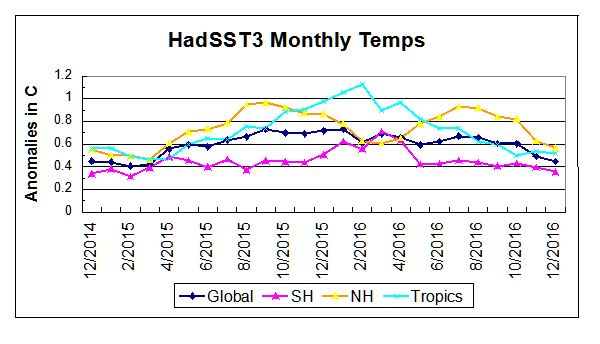
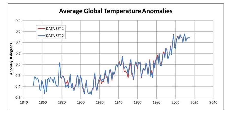
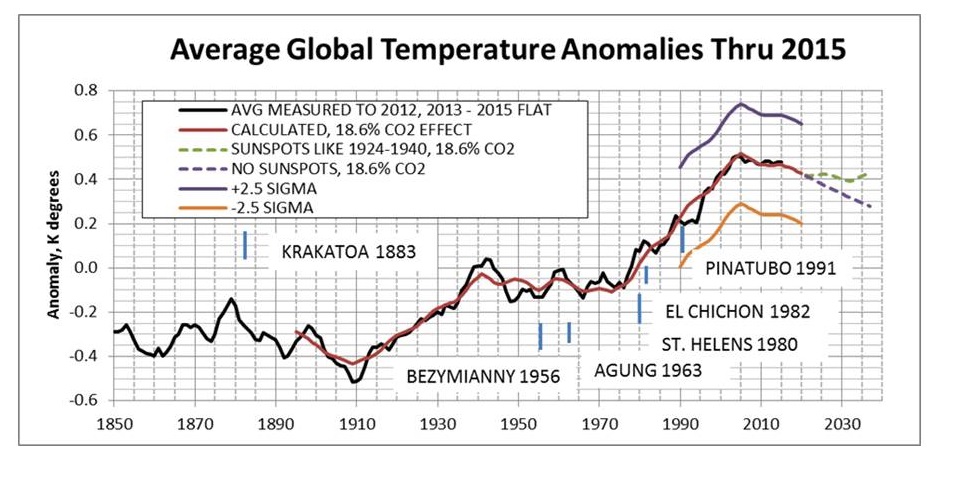
With just 2 months to go, it could well be that 2016 replaces 1998 as the “hottest year ever.” With the Pacific Blob only now dissipated, and La Nina delaying her appearance, it is becoming likely that the inevitable cooling will come only next year. That may result in an annual GMT surpassing 1998 in the satellite record.

Fossil fuel activists and consensus climate scientists will claim this proves CO2 is causing global warming, but knowledgeable people know they are once again dissing the Ocean in order to push their agenda.

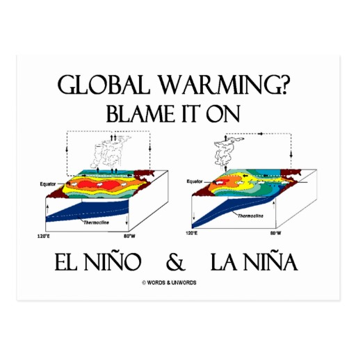
Actual data, rather than computer models, show that ocean oscillations, not CO2 have produced the bulk of warming in the temperature record. ENSO (El Nino Southern Oscillation) produces sea surface temperature anomalies (SSTa) resulting in most of the variability in global averages.

Climatists will blame the rise on so-called “greenhouse gases” asserting several unproven notions:

  • CO2 induces atmospheric warming which raises SSTs;
  • Higher SSTs increase evaporation and clouds that trap LW radiation, thereby further raising surface temperatures;
  • ENSO warming and cooling cycles cancel out each other leaving CO2 as the sole warming agent.

As the final results for 2016 come in, expect the media to bombard the masses with declarations along these lines. The purpose of this post is inoculation (like a flu shot) to protect against the feverish reporting ahead.

How El Nino Affects Surface Temperatures

Roy Spencer and William Braswell looked at the data in their 2014 published article (here)
The Role of ENSO in Global Ocean Temperature Changes during 1955-2011

Roy Spencer May 13, 2014 on WUWT (here):

Based on global area-average ocean signatures, the observational evidence regarding the *global oceanic* signature of El Nino is this:

1) El Nino involves a decrease in the overturning in the 0-200 m layer, which leads to warming of the upper 100 m and cooling of the 100-200m layer. We calculate this is 2/3 of the source of surface warming.

2)El Nino surface warmth is partly driven by a decrease in cloud cover letting more sunlight in…This is 1/3 of the surface warming, and it also appears to contribute to longer-term deep ocean warming if there are stronger El Ninos and weaker La Ninas than average..

In the same thread Bob Tisdale comments:

ENSO impacts when and where sunlight reaches the surface of the oceans and penetrates into the oceans. . . ENSO also impacts how energy is released from the oceans to the atmosphere which further impacts the energy balance.

Keep in mind that the majority (about 90%) of the heat released from the ocean is through evaporation. During an El Nino, more of the surface of the tropical Pacific is covered with warm water, which yields more evaporation. And the opposite holds true during a La Nina.

Ocean Heat Also Rises

When there are super-El Nino years such as 1998 and 2016, climatists insist on attributing warming to fossil fuel emissions. Obsessed with CO2 and radiative energy flows, they are unable to see and affirm this oceanic climate driver. An extended discussion at Climate Etc. (here) included a series of comments by Kristian that provide a synopsis of El Nino’s role in global warming.

This is what the data consistently shows: surface temps up (or down) > tropospheric temps up (or down) > OLR at ToA up (or down).

This is how the heat from the sun actually flows through the earth system. Surface warms first, then the troposphere, then, as a consequence of this, the radiative output to space increases. There is NO observational evidence anywhere for the opposite process to occur: OLR at ToA down >tropospheric temps up > surface temps up.

Radiatively active gases in the atmosphere do not enable it to WARM. It would’ve warmed with or without them, simply by being directly convectively coupled with the solar-heated surface. This connection is never broken as long as there is air present, a gravity field and sunshine heating the surface.

Radiatively active gases, however, DO enable the atmosphere to adequately COOL to space. Because this can only be done through radiation.

So an atmosphere without radiatively active gases would still WARM from the surface up, but wouldn’t be able to adequately COOL to space.

It’s not the so-called ‘GHGs’ that trap the surface heat. It’s the 99.5% of the atmosphere NOT being significantly radiatively active at ‘earthly’ temperatures that would do that. Because this part can STILL be warmed conductively, convectively and latently, but it can’t to any real extent radiate it away again.

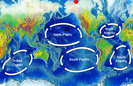
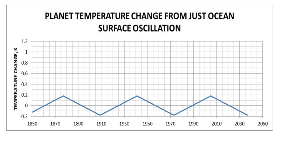
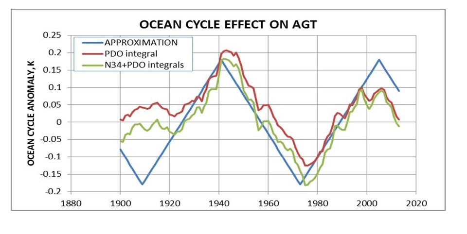
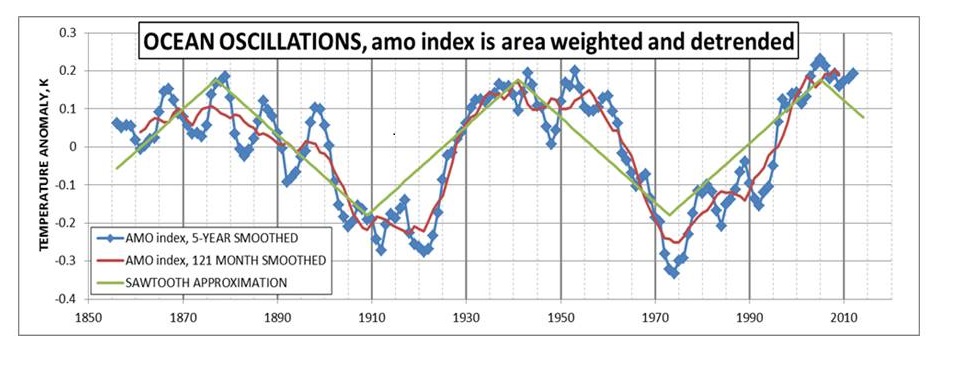
ENSO Discharges and Recharges Ocean Heat Content

Image: La Niña is characterized by unusually cold ocean temperatures in the central equatorial Pacific. The colder than normal water is depicted in this image in blue. During a La Niña stronger than normal trade winds bring cold water up to the surface of the ocean. Credit: NASA

Image: La Niña is characterized by unusually cold ocean temperatures in the central equatorial Pacific. The colder than normal water is depicted in this image in blue. During a La Niña stronger than normal trade winds bring cold water up to the surface of the ocean. Credit: NASA

As a rule of thumb, El Niños cause global warming but drain global heat (actually, ‘energy’) content. El Niño: global surface/troposphere temps UP, global internal energy DOWN.

Why the distinction? Because most of the stored-up (solar) energy of the earth system is to be found at depth in the oceans, that is, AWAY FROM the surface. What an El Niño does is to pull a significant amount of this energy up from its hiding place in the deep and instead spreads it out across a huge area on the surface, raising its temperature in the process, laying the energy bare, so to speak, to be lost from the ocean to the atmosphere (and ultimately to space) through evaporation (deep/moist convection) and conduction. Radiation also occurs but to a much lesser degree.

So, the depths of the ocean – well, basically of the IPWP (the Indo-Pacific Warm Pool) – is drained of energy during an El Niño, it ‘cools’, while the surface in the tropics of the Central and East Pacific (where the NINO3.4 region is located), warms up immensely, the SST here shoots up.

Following this significant tropical Central and East Pacific surface warming, the troposphere above it warms from the vastly increased transfer and freeing of latent heat. The warming of the tropical Pacific also affects the atmospheric circulation over the rest of the tropics through so-called ‘atmospheric bridges’, indirectly inducing a lagged warming also in the Atlantic and Indian ocean basins.

From the tropics/subtropics, part of the El Niño released ocean heat is then transported (mostly via the atmosphere) out to the extratropics, eventually ending up in the polar regions (well, in reality it mostly ends up in the Arctic, not in the Antarctic, the reason being a profound difference between northern and southern hemisphere extratropical circulation.)

The massive amount of energy released onto the world during an El Niño event is neither generated by nor absorbed during the event itself. The energy of course originally came from the sun and it was stored up during the La Niña normally preceding the El Niño.

It’s the La Niñas (and often also during neutral ENSO conditions, much more resembling the cool events than the warm events) that builds ‘global heat content’. They soak up the solar energy and store it at depth. The El Niños subsequently release it again.

Global Warming Since 1970 Due to Major El Ninos

Since 1970 we have seen four ENSO sequences where a strong and solitary El Niño is surrounded by (preceded AND succeeded by) La Niña-events. In each sequence, the storing up of energy during the often extended/prolonged La Niña periods has far outdone the energy depletion during the strong, but mostly short El Niño-events.

1. During the period 1970-76 only one year saw an El Niño (1972/73). The rest of the years, 1970-72 and 1973-76, were mostly La Niña-dominated.

2. During the period 1983-89, two years back-to-back saw El Niño-conditions (1986-88). The years 1983-86 saw either cold neutral or La Niña-conditions and the year 1988/89 saw one of the strongest La Niñas of modern history.

3. During the period 1995-2001 only one year saw an El Niño (1997/98). The rest of the years, 1995-97 and 1998-2001, were mostly La Niña-dominated.

4. During the period 2007-14 only one year saw an El Niño (2009/10). The rest of the years, 2007-09 and 2010-14, were mostly La Niña-dominated.

5. Beginning in 2015 another major El Nino event occurred, peaking mid 2016.  From past experience, we expect a La Nina to follow in coming months.  Over the next few years it will be evident whether or not a new step level results from this event.

The periods in between these sequences of clustered distinct cool and warm ENSO events, 1976-83, 1989-95 and 2001-07, were all neutral to warmish, with much smaller variations from the mean state and prominently without any clear extended cold events, lacking the strength to create a global signal.

El Nino temperatures correlate well with satellite global temperatures

temperature_el_nino_satellite-b

The oceans are not some passive reservoir where the solar energy just comes and goes as it wants and always in complete balance. No, they are quite dynamic and the absorbed energy is held back or is released, according to their own internal processes. If the climatic conditions (the coupled ocean/atmosphere system) in the Pacific basin are such that they promote net storage of solar energy over several decades, well, then that is what will happen. Quite naturally. That doesn’t mean that these conditions will prevail forever.

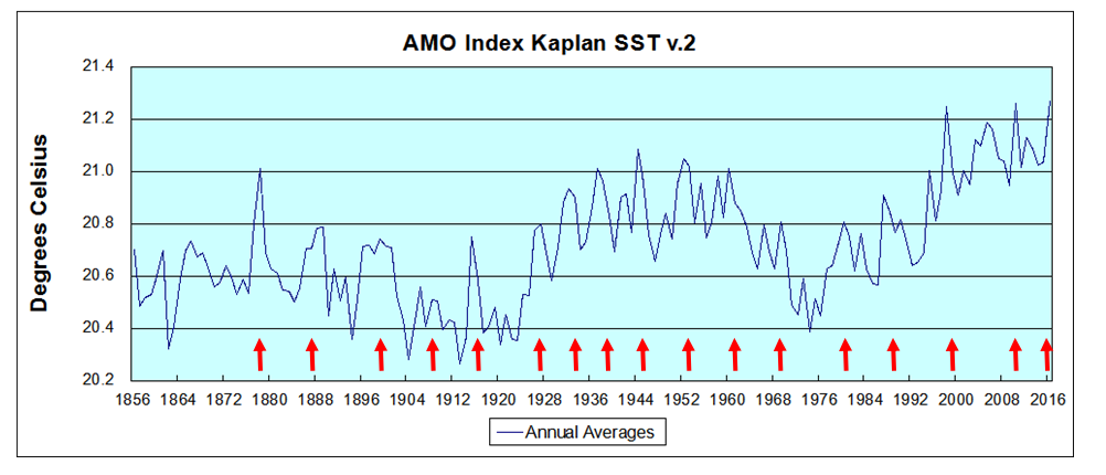
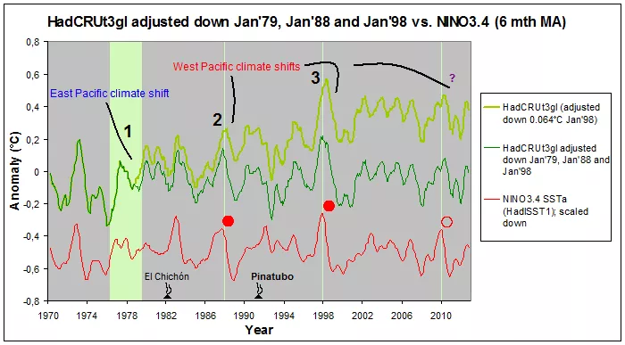
We KNOW that large-scale and fairly abrupt climate shifts occur in the (pan-)Pacific basin at certain intervals. In fact, there has been no additional global warming OUTSIDE of these sudden hikes, from 1970 till today. That means, the ENTIRE modern global warming seen since 1970 is contained within the steps up during the Great Pacific Climate Shift of the late 70s and the two following ones in 1988/89 and 1998/99.

The ENTIRE modern global warming is found in these three sudden hikes alone, all occurring within the time-span of less than a year.

El Nino Spreads Warming From Sea to Sea

How did global warming progress from 1975/76 to 2001/02? Follow the data. No preconceived ideas about mechanisms.

First of all, there is no question that there is a definite East Pacific signal plastered all over the global temperature series. Compare with NINO3.4:

nino-kristian-1

In fact, global temperatures tend to lag NINO3.4 SSTa by several months. And everyone knows that this particular correlation also speaks causation. Not just from the consistent and tight lead-lag relation, but from the thoroughly explicated oceanic/atmospheric mechanisms by which we know the large-scale and integrated ENSO process creates global warming and cooling. I’m talking here about the major swings up and down that we see all along from 1970 till today.

What went on in 1978/79, in 1988 and in 1998? What was so special about these three short time segments? Why is the ENTIRE ‘modern global warming’ contained within them?

Bob Tisdale:
Those upward shifts are the long-term responses to the discharge phases of ENSO that occurs during strong El Niños. As part of the discharge phase of ENSO, the El Niño takes warm water from below the surface of the western tropical Pacific and places it on the surface (warm water that was created by the increased sunlight during the prior recharging La Niña). The discharged warm water floods into the East Pacific, where it temporarily raises sea surface temperatures during the El Niño, but causes little long-term trend there.

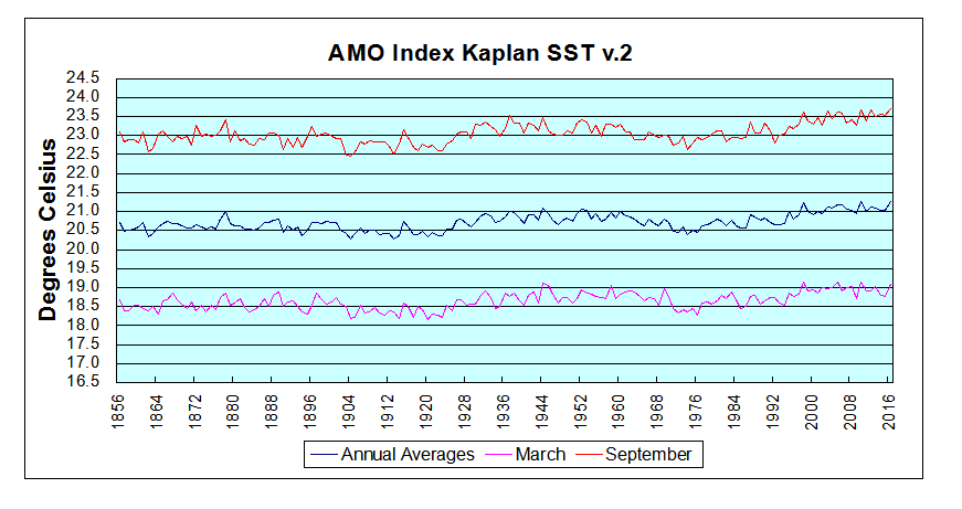
And at the end of the El Niño, the warm water is redistributed by the renewed trade winds, ocean currents and the downwelling Rossby wave into the West Pacific, Indian Ocean and eventually the South Atlantic. The East Pacific represents about 33% of the surface of the global oceans, and the South Atlantic-Indian-West Pacific covers another 52%. That leaves the North Atlantic, which has another mode of natural variability called the Atlantic Multidecadal Oscillation. The Atlantic Multidecadal Oscillation, according to NOAA, can contribute to or suppress global warming. And so far, the only global surface warming we’ve seen was in the South Atlantic-Indian-West Pacific subset and that warming was caused by discharge of sunlight-created warm water released from below the surface of the West Pacific Warm Pool during El Niño events.

For data on ocean-air heat exchanges see: Empirical Evidence: Oceans Make Climate

blame-it-on-enso


Quantifying Natural Climate Change


Natural climate change

Recent posts have stressed the complexity of climates and their component variables. However, global warming was invented on the back of a single metric: rising global mean temperatures the last decades of last century. That was de-emphasized during the “pause” but re-emerged lately with the El-Nino-induced warming. So this post is focusing on that narrow aspect of climate change.

There are several papers on this blog referring to a quasi-60 year oscillation of surface temperatures due to oceanic circulations. I have also noted the attempts by many to make the link between solar activity (SA) and earth climate patterns.

Dan Pangburn is a professional engineer who has synthesized the solar and oceanic factors into a mathematical model that correlates with Average Global Temperature (AGT). On his blog is posted a monograph (here) Cause of Global Climate Change explaining clearly his thinking and the maths.  I am providing some excerpts and graphs as a synopsis of his analysis, in hopes others will also access and appreciate his work on this issue.

Introduction

The basis for assessment of AGT is the first law of thermodynamics, conservation of energy, applied to the entire planet as a single entity. Much of the available data are forcings or proxies for forcings which must be integrated (mathematically as in calculus, i.e. accumulated over time) to compute energy change. Energy change divided by effective thermal capacitance is temperature change. Temperature change is expressed as anomalies which are the differences between annual averages of measured temperatures and some baseline reference temperature; usually the average over a previous multiple year time period. (Monthly anomalies, which are not used here, are referenced to previous average for the same month to account for seasonal norms.)

At this point, it appears reasonable to consider two temperature anomaly data sets extending through 2015.  These are co-plotted on Figure 8.

Slide8lrg

1) The set used previously [12] through 2012 with extension 2013-2015 set at the average 2002-2012 (when the trend was flat) at 0.4864 K above the reference temperature. 2) Current (5/27/16) HadCRUT4 data set [13] through 2012 with 2013-2015 set at the average 2002-2012 at 0.4863 K above the reference temperature.

Accuracy of the model is determined using the Coefficient of Determination, R 2, to compare calculated AGT with measured AGT.

Oceanic Climate Impacts

Approximation of the sea surface temperature anomaly oscillation can be described as varying linearly from –A/2 K in 1909 to approximately +A/2 K in 1941 and linearly back to the 1909 value in 1973. This cycle repeats before and after with a period of 64 years.

Slide1

Figure 1: Ocean surface temperature oscillations (α-trend) do not significantly affect the bulk energy of the planet.

Comparison with PDO, ENSO and AMO

Ocean cycles are perceived to contribute to AGT in two ways: The first is the direct measurement of sea surface temperature (SST). The second is warmer SST increases atmospheric water vapor which acts as a forcing and therefore has a time-integral effect on temperature. The approximation, (A,y), accounts for both ways.

Successful accounting for oscillations is achieved for PDO and ENSO when considering these as forcings (with appropriate proxy factors) instead of direct measurements. As forcings, their influence accumulates with time. The proxy factors must be determined separately for each forcing.

Slide2

Figure 2: Comparison of idealized approximation of ocean cycle effect and the calculated effect from PDO and ENSO.

The AMO index [9] is formed from area-weighted and de-trended SST data. It is shown with two different amounts of smoothing in Figure 3 along with the saw-tooth approximation for the entire planet per Equation (2) with A = 0.36.

Slide3

The high coefficients of determination in Table 1 and the comparisons in Figures 2 and 3 corroborate the assumption that the saw-tooth profile with a period of 64 years provides adequate approximation of the net effect of all named and unnamed ocean cycles in the calculated AGT anomalies.

Solar-Climate Connection

An assessment of this is that sunspots are somehow related to the net energy retained by the planet, as indicated by changes to average global temperature. Fewer sunspots are associated with cooling, and more sunspots are associated with warming. Thus the hypothesis is made that SSN are proxies for the rate at which the planet accumulates (or loses) radiant energy over time. Therefore the time-integral of the SSN anomalies is a proxy for the amount of energy retained by the planet above or below breakeven.

Also, a lower solar cycle over a longer period might result in the same increase in energy retained by the planet as a higher solar cycle over a shorter period. Both magnitude and time are accounted for by taking the time-integral of the SSN anomalies, which is simply the sum of annual mean SSN (each minus Savg) over the period of study.

The values for Savg are subject to two constraints. Initially they are determined as that which results in derived coefficients and maximum R2. However, calculated values must also result in rational values for calculated AGT at the depths of the Little Ice Age. The necessity to calculate a rational LIA AGT is a somewhat more sensitive constraint. The selected values for Savg result in calculated LIA AGT of approximately 1 K less than the recent trend which appears rational and is consistent with most LIA AGT assessments.

The sunspot number anomaly time-integral is a proxy for a primary driver of the temperature anomaly β-trend. By definition, energy change divided by effective thermal capacitance is temperature change.

Slide10

Figure 10: 5-year running average of measured temperatures with calculated prior and future trends (Data Set 1) using 34 as the average daily sunspot number and with V1 SSN. R2 = 0.978887

Projections until 2020 use the expected sunspot number trend for the remainder of solar cycle 24 as provided [6] by NASA. After 2020 the ‘limiting cases’ are either assuming sunspots like from 1924 to 1940 or for the case of no sunspots which is similar to the Maunder Minimum.

Some noteworthy volcanoes and the year they occurred are also shown on Figure 9. No consistent AGT response is observed to be associated with these. Any global temperature perturbation that might have been caused by volcanoes of this size is lost in the natural fluctuation of measured temperatures.

Although the connection between AGT and the sunspot number anomaly time-integral is demonstrated, the mechanism by which this takes place remains somewhat speculative.

Various papers have been written that indicate how the solar magnetic field associated with sunspots can influence climate on earth. These papers posit that decreased sunspots are associated with decreased solar magnetic field which decreases the deflection of and therefore increases the flow of galactic cosmic rays on earth.

These papers [14,15] associated the increased low-altitude clouds with increased albedo leading to lower temperatures. Increased low altitude clouds would also result in lower average cloud altitude and therefore higher average cloud temperature. Although clouds are commonly acknowledged to increase albedo, they also radiate energy to space so increasing their temperature increases S-B radiation to space which would cause the planet to cool. Increased albedo reduces the energy received by the planet and increased radiation to space reduces the energy of the planet. Thus the two effects work together to change the AGT of the planet.

Summary

Simple analyses [17] indicate that either an increase of approximately 186 meters in average cloud altitude or a decrease of average albedo from 0.3 to the very slightly reduced value of 0.2928 would account for all of the 20th century increase in AGT of 0.74 K. Because the cloud effects work together and part of the temperature change is due to ocean oscillation (low in 1901, 0.2114 higher in 2000), substantially less cloud change would suffice.

All of this leaves little warming left to attribute to rising CO2. Pangburn estimates CO2 forcing could be at most 18.6% or 0.23C added since 1895. Given uncertainties in proxies from the past, the estimate could be as low as 0.05C, and the correlation with natural factors would still be .97 R2.

However, all is not lost for CO2. It is still an important player in the atmosphere, despite its impotence as a warming agent.


Climate Partly Cloudy

Dr. Curry has a new very informative post (here) on clouds and climate, including links to several studies recently announced from CERN and others. It reminded me of Joni Mitchell’s song Both Sides Now:

Bows and flows of angel hair
And ice cream castles in the air
And feather canyons everywhere
I’ve looked at clouds that way
But now they only block the sun
They rain and snow on everyone
So many things I would have done
But clouds got in my way

I’ve looked at clouds from both sides now
From up and down and still somehow
It’s clouds’ illusions I recall
I really don’t know clouds at all
– Joni Mitchell – Both Sides Now Lyrics

The above chorus could serve as an anthem for climate modelers. Clouds are arguably the least understood and most unpredictable of factors in climate change. We are getting much better at the weather connection between storms and cloud formation. But the long-term effects of clouds and cloudiness are still uncertain. Dr. Curry helpfully separates the cloud problem into two issues: cloud microphysics and cloud dynamics. She observes that the latter is much more difficult and also has much more impact on climate.

Some things are known and described in textbooks of Atmospheric Physics. In introducing Chapter 9: Aerosols and Clouds in his updated volume, Murray Salby (here) suggests the complexities involved:

Radiative transfer is modified importantly by cloud. Owing to its high reflectivity in the visible, cloud shields the Earth-atmosphere system from solar radiation. It therefore introduces cooling in the SW energy budget of the Earth’s surface, offsetting the greenhouse effect. Conversely, the strong absorptivity in the IR of water and ice sharply increases the optical depth of the atmosphere. Cloud thus introduces warming in the LW energy budget of the Earth’s surface, reinforcing the greenhouse effect. We develop cloud processes from a morphological description of atmospheric aerosol, without which cloud would not form. The microphysics controlling cloud formation is then examined. Macrophysical properties of cloud are developed in terms of environmental conditions that control the formation of particular cloud types. These fundamental considerations culminate in descriptions of radiative and chemical processes that involve cloud.

Cloud Formation

The microphysics is mostly related to how clouds form, and the role of aerosols. Even though clouds can form simply from enough water vapor, in practice the required conditions for such “homogenous” formation are higher than those needed for “heterogenous” formation from ever-present aerosols, termed CCN. From Salby (pg. 272):

The simplest means of forming cloud is through homogeneous nucleation, wherein pure vapor condenses to form droplets. . . Yet, the formation of most cloud cannot be explained by homogeneous nucleation. Instead, cloud droplets form through heterogeneous nucleation, wherein water vapor condenses onto existing particles of atmospheric aerosol. Termed cloud condensation nuclei (CCN), such particles support condensation at supersaturations well below those required for homogeneous nucleation.

Cloudiness Impact on Radiative Balance

The extent of cloudiness varies a lot, as shown by measures of OLR (Outgoing Longwave Radiation) by satellites above TOA (h/t greensand). Notice that the scale has a range of 100 W m^2 compared to estimated CO2 sensitivity of ~4 W m^2.

OLR or ‘Cloudiness’ at the equatorial dateline 7.5S – 7.5N, 170E – 170W (large sea surface area) has been below norm for 15/16 months. Below average OLR is the result of increased cloud cover, which in turn = reduced insolation, less incoming solar energy. Yet as Salby says, cloud tops can reflect SW solar energy away while the cloud mass absorbs IR from the surface, delaying cooling. Different types of clouds have different impacts on radiative forcing. Not to mention water changing between all 3 phases inside.

Therein lies the cloud conundrum: How much warming and how much cooling from changes in cloudiness?

giphy

Clouds Complicating Climate
Salby, 9.5.1.pg.315ff

A quantitative description of how cloud figures in the global energy budget is complicated by its dependence on microphysical properties and interactions with the surface. These complications are circumvented by comparing radiative fluxes at TOA under cloudy vs clear-sky conditions. Over a given region, the column-integrated radiative heating rate must equal the difference between the energy flux absorbed and that emitted to space.

Shortwave cloud forcing represents cooling. It is concentrated near the Earth’s surface, because the principal effect of increased albedo is to shield the ground from incident SW. Longwave cloud forcing represents warming. It is manifest in heating near the base of cloud and cooling near its top (Fig. 9.36b).

That radiative forcing depends intrinsically on the vertical distribution of cloud. For instance, deep cumulonimbus and comparatively shallow cirrostratus can have identical cloud-top temperature, yielding the same LW forcing of the TOA energy budget. However, they have very different optical depths, producing very different vertical distributions of radiative heating. The strong correlation between water vapor and cloud cover introduces another source of uncertainty.

Summary

Since 90% of water in the atmosphere comes from the ocean, clouds are another way that Oceans Make Climate. And as Roger Andrews demonstrates (here) cloudiness correlates quite positively with SSTs.

Bottom Line: Any CO2 effect is lost in the Clouds

Globally averaged values of CLW and CSW are about 30 and −45 W m−2, respectively. Net cloud forcing is then −15 W m−2. It represents radiative cooling of the Earth atmosphere system. This is four times as great as the additional warming of the Earth’s surface that would be introduced by a doubling of CO2. Latent heat transfer to the atmosphere (Fig. 1.32) is 90 W m−2. It is an order of magnitude greater. Consequently, the direct radiative effect of increased CO2 would be overshadowed by even a small adjustment of convection (Sec. 8.7).


Ocean Trumps Global Warming

Internal Climate Variability Trumps Global Warming (here) is a
great post by hydrologist Rob Ellison confirming how the Oceans Make Climate. He was intrigued by discovering that rivers in eastern Australia changed form – from low energy meandering to high energy braided forms and back – every few decades. For almost 30 years he looked for the source and import of this variability, and has found it in the ocean.

Turns out that it is a combination of conditions in the northern and central Pacific Ocean that is of immense significance. A 20 to 30 year change in the volume of frigid and nutrient rich water upwelling from the abysmal depths. A generally warmer or cooler sea surface in the northern Pacific and greater frequency and intensity of El Niño or La Niña respectively. This sets up changes in patterns of wind, currents and cloud that cause changes in rainfall, biology and temperature globally. In the cool pattern shown above – booming ecologies, drought in the Americas and Europe, rainfall in Australia, Indonesia, Africa, China and India and cooler global temperatures. The reverse in the warm phase. Warming to 1944, cooling to 1976, warming again to 1998 and – at the least – not warming since. It leads to a prediction that the La Niña currently emerging is likely to be large.

A Persistent Ocean Cycle

Changes in the Pacific Ocean state can be traced in sediment, ice cores, stalagmites and corals. A record covering the last 12,000 years was developed by Christopher Moy and colleagues from measurements of red sediment in a South American lake. More red sediment is associated with El Niño. The record shows periods of high and low El Niño activity alternating with a period of about 2,000 years. There was a shift from La Niña dominance to El Niño dominance 5000 years ago that is associated with the drying of the Sahel. There is a period around 3,500 years ago of high El Niño activity associated with the demise of the Minoan civilisation (Tsonis et al, 2010).

Tessa Vance and colleagues devised a 1000 year record from salt content in an Antarctic ice core. More salt is La Niña as a result of changing winds in the Southern Ocean. It revealed several interesting facts. The persistence of the 20 to 30 year pattern. A change in the period of oscillation between El Niño and La Niña states at the end of the 19th century. A 1000 year peak in El Niño frequency and intensity in the 20th century which resulted in uncharacteristically dry condition since 1920.

Conclusion

The whole post is worth reading and a solid contribution to our understanding. Ellison’s summary is pertinent, compelling and wise.

It is quite impossible to quantify natural and anthropogenic warming in the 20th century.  The assumption that it was all anthropogenic is quite wrong.  The early century warming was mostly natural – as was at least some of the late century warming.  It seems quite likely that a natural cooling with declining solar activity – amplified through Pacific Ocean states – will counteract rather than add to future greenhouse gas warming.   A return to the more common condition of La Niña dominance – and enhanced rainfall in northern and eastern Australia – seems more likely than not.

I predict – on the balance of probabilities – cooler conditions in this century.  But I would still argue for returning carbon to agricultural soils, restoring ecosystems and research on and development of cheap and abundant energy supplies.  The former to enhance productivity in a hungry world, increase soil water holding capacity, improve drought resilience, mitigate flooding and conserve biodiversity.  We may in this way sequester all greenhouse gas emissions for 20 to 30 years.  The latter as a basis for desperately needed economic growth.  Climate change seems very much an unnecessary consideration and tales of climate doom – based on wrong science and unfortunate policy ambitions – a diversion from practical and measured development policy.

Australia’s River Systems ABC

Cutting Edge Sea Level Data


PSLMPThis post is about the SEAFRAME network measuring sea levels in the Pacific, and about the difficulty to discern multi-decadal trends of rising or accelerating sea levels as evidence of climate change.

Update May 10 below, regarding recent Solomon Islands news

Pacific Sea Level Monitoring Network

The PSLM project was established in response to concerns voiced by Pacific Island countries about the potential effects of climate change. The project aims to provide an accurate long-term record of sea levels in the area for partner countries and the international scientific community, and enable the former to make informed decisions about managing their coastal environments and resources.

In 1991, the National Tidal Facility (NTF) of the Flinders University of South Australia was awarded the contract to undertake the management of the project.  Between July 1991 and December 2000 sea level and meteorological monitoring stations were installed at 11 sites. Between 2001 and 2005 another station was established in the Federated States of Micronesia and continuous global positioning systems (CGPS) were installed in numerous locations to monitor the islands’ vertical movements.

The 14 Pacific Island countries now participating in the project provide a wide coverage across the Pacific Basin: the Cook Islands, Federated States of Micronesia, Fiji, Kiribati, Marshall Islands, Nauru, Niue, Palau, Papua New Guinea, Samoa, Solomon Islands, Tonga, Tuvalu and Vanuatu.

SPSLCM_2008_4_data_report_Image_11

Each of these SEA Level Fine Resolution Acoustic Measuring Equipment (SEAFRAME) stations in the Pacific region are continuously monitoring the Sea Level, Wind Speed and Direction, Wind Gust, Air and Water Temperatures and Atmospheric Pressure.

In addition to its system of tide gauge facilities, the Pacific Sea-Level Monitoring Network also includes a network of earth monitoring stations for geodetic observations, implemented and maintained by Geoscience Australia. The earth monitoring installations provide Global Navigation Satellite System (GNSS) measurements to allow absolute determination of the vertical height of the tide gauges that measure sea level.

Sea Level Datasets from PSLM

Data and reports are here.

Monthly reports are detailed and informative. At each station water levels are measured every six minutes in order to calculate daily maxs, mins and means, as a basis for monthly averages. So the daily mean sea level value is averaged from 240 readings, and the daily min and max are single readings taken from the 240.


untitled

A typical monthly graph appears above. It shows how tides for these stations range between 1 to 3 meters daily, as well variations during the month.

According to the calibrations, measurement errors are in the range of +/- 1 mm. Vertical movement of the land is monitored relative to a GPS benchmark. So far, land movement at these stations has also been within the +/- 1 mm range (with one exception related to an earthquake).

The PSLM Record

March SL range

In the Monthly reports are graphs showing results of six minute observations, indicating tidal movements daily over the course of a month.The chart above shows how sea level varied in each location during March 2016 compared to long term March results. Since many stations were installed in 1993, long term means about 22 years of history.

This dataset for Pacific Sea Level Monitoring provides a realistic context for interpreting studies claiming sea level trends and/or acceleration of such trends. Of course, one can draw a line through any scatter of datapoints and assert the existence of a trend. And the error ranges above allow for annual changes of a few mm to be meaningful. Here is a table produced in just that way.

Location Installation date Sea-level trend (mm/yr)
Cook Islands Feb 2003 +5.5
Federated States of Micronesia Dec 2001 +17.7
Fiji Oct 1992 +2.9
Kiribati Dec 1992 +2.9
Marshall Islands May 1993 +5.2
Nauru Jul 1993 +3.6
Papua New Guinea Sept 1994 +8.0
Samoa Feb 1993 +6.9
Solomon Islands Jul 1994 +7.7
Tonga Jan 1993 +8.6
Tuvalu Mar 1993 +4.1
Vanuatu Jan 1993 +5.3

The rising trends range from 2.9 to 8.6 mm/year (FSM is too short to be meaningful).

Looking into the details of the monthly anomalies, it is clear that sea level changes at the mm level are swamped by volatility of movements greater by orders of magnitude.  And there are obvious effects from ENSO events. The 1997-98 El Nino shows up in a dramatic fall of sea levels almost everywhere, and that event alone creates most of the rising trends in the table above.  The 2014-2016 El Nino is also causing sea levels to fall, but is too recent to affect the long term trend.

Picture17revSummary

Sea Level Rise is another metric for climate change that demonstrates the difficulty discerning a small change of a few millimeters in a dataset where tides vary thousands of millimeters every day. And the record is also subject to irregular fluctuations from storms, currents and oceanic oscillations, such as the ENSO.

On page 8 of its monthly reports (here), PSLM project provides this caution regarding the measurements:

The overall rates of movement are updated every month by calculating the linear slope during the tidal analysis of all the data available at individual stations. The rates are relative to the SEAFRAME sensor benchmark, whose movement relative to inland benchmarks is monitored by Geosciences Australia.
Please exercise caution in interpreting the overall rates of movement of sea level – the records are too short to be inferring long-term trends.

A longer record will bring more insight, but even then sea level trends are a very weak signal inside a noisy dataset. Even with state-of-the-art equipment, it is a fool’s errand to discern any acceleration in sea levels, in order to link it to CO2. Such changes are in fractions of millimeters when the measurement error is +/- 1 mm.

For more on the worldwide network of tidal gauges, as well as satellite systems attempting to measure sea level, sea Dave Burton’s excellent website.

May 10 update Regarding recent news about Solomon Islands.

As the charts above show, there is negligible sea level rise in the West Pacific, and receding a bit lately at Solomon Islands.  So it was curious that the media was declaring those islands inundating because of climate change.

Now the real story is coming out (but don’t wait for the retractions)

A new study published in Environmental Research Letters shows that some low-lying reef islands in the Solomon Islands are being gobbled up by “extreme events, seawalls and inappropriate development, rather than sea level rise alone.” Despite headlines claiming that man-made climate change has caused five Islands (out of nearly a thousand) to disappear from rising sea levels, a closer inspection of the study reveals the true cause is natural, and the report’s lead author says many of the headlines have been ‘exaggerated’ to ill-effect.

http://www.examiner.com/article/sinking-solomon-islands-and-climate-link-exaggerated-admits-study-s-author