Climate Compilation Part I Temperatures

Background

When first investigating the global warming/climate change issue (beginning around the Copenhagen COP in 2008), my interest arose from reading various claims repeated ad nauseum without any other viewpoints expressed. Searching on the web revealed that indeed other researchers had different, sometimes nuanced and sometime outright contradictory findings.

In 2015 while signing up on WordPress to be able to comment on Climate Etc., I was surprised to find that the process left me with my own blogsite. So I began to put up posts of researches I had done, some were data analyses of my own, and others were discussions of analyses done by others. It has always been a niche project intending to provide information and a broader context related to climate science claims, for the sake of others who might be interested but lacked the time or energy to dig in the weeds for the all-important details.

Lately we have a sea change in the discourse around global warming/climate change. The Paris accord and the subsequent US withdrawal from it, along with the tumult around Trump’s presidency, Brexit, the broken electricity grid in Australia, have all shifted the focus from scientific discrepancies to policy questions.

It pleases me that in this current media setting, diverse and skeptical voices are more easily heard by those with inquiring minds who want to know. For example, Master Resource blog provides expert analyses on energy issues such as subsidies and renewables challenges. Other well-known blogs such as WUWT and Notalotofpeopleknowthat are actively addressing exaggerations and bogus claims by activists.

It also looks more likely that we will be treated to an official investigation into the EPA case for CO2 endangerment. Some studies by prominent skeptics are appearing as resources in that context.

So, there are many others rebutting unfounded claims, and less need for me to write such posts. It is also the case that this blog already contains multiple posts on almost all the issues that continue to be raised. This is the first of a series pointing out resources compiled here.

1.Temperature Trend Analysis

This category of posts (title above is link to posts) started some years ago when Dave from California commented on a thread at WUWT:  “I am an actuary not a climate scientist, but it seems to me if you want to know about temperature changes, you should study the changes not the temperatures.”  That rang my bell and suddenly things came together. JR Wakefield studied the change derivatives (slopes) of temperature changes at individual weather stations in Ontario. Lubos Motl did a similar analysis using monthly trends over station lifetimes as a basis for compiling global trends–no anomalies, no adjustments or homogenization.

I termed this technique Temperature Trend Analysis (TTA) and applied it to a set of station records in Kansas and the report was published at WUWT in 2014 with the title Do-It-Yourself Climate Analysis

Richard Mallet and I then collaborated on a study of the 25 best stations in the world (longest continuous records) also published at WUWT as Analyzing Temperature Changes Using World Class Stations. Later on I applied TTA to US stations classified as CRN #1 and then assessed the differences between adjusted and unadjusted datasets. The results were published at No Tricks Zone and then posted as Temperature Data Review Project-My Submission.

Just this week we have a thorough and professional report on the systematic corruption of the land station records by climate authorities:  On the Validity of NOAA, NASA and Hadley CRU Global Average Surface Temperature Data & The Validity of EPA’s CO2 Endangerment Finding  From the Report:

This research sought to validate the current estimates of Global Average Surface Temperature (GAST) using the best available relevant data. The conclusive findings were that the three GAST data sets are not a valid representation of reality. In fact, the magnitude of their historical data adjustments which removed their cyclical temperature patterns are totally inconsistent with published and credible U.S. and other temperature data.  Thus, despite current claims of record setting warming, it is impossible to conclude from the NOAA, NASA and Hadley CRU GAST data sets that recent years have been the warmest ever.

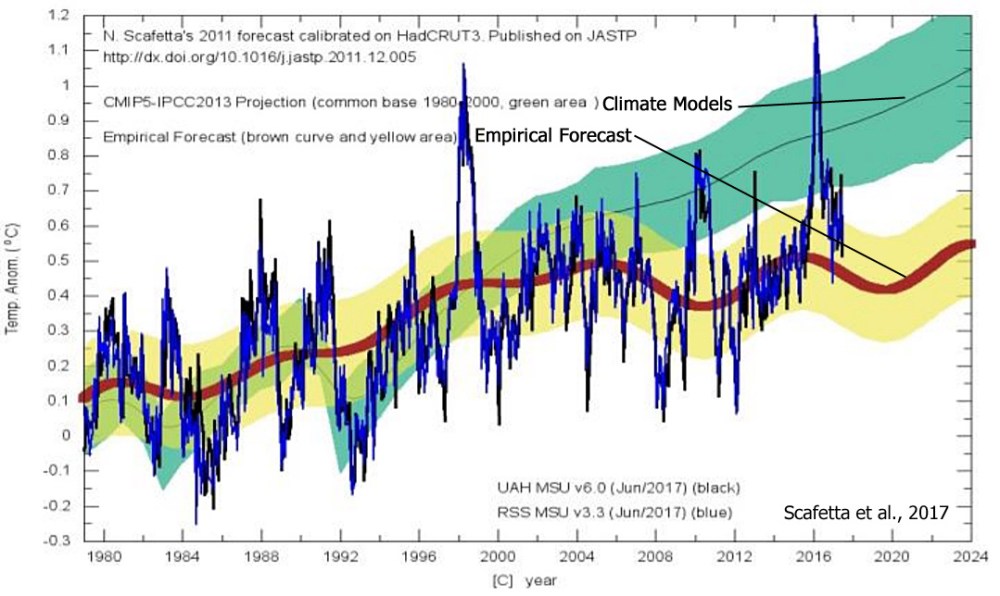
Additional studies included an analysis of Temperatures According to Climate Models

One post provided a visual synopsis why global warming claims are not supported by temperature records. See The Climate Story (Illustrated)

Climate Roller Coaster

Behemoth, Canada’s Wonderland, Ontario   Behemoth’s bright yellow-and-blue steel stands out against the Ontario landscape. At one point the roller coaster, which opened in 2008, drops 230 feet at a 75-degree angle and hits speeds of 77 mph. Its open-air seating gives every rider a front seat to the action.

Roller coasters came to mind when reading recent studies addressing the global warming hiatus this century. For example: The global warming hiatus – a natural product of interactions of a secular warming trend and a multi-decadal variability by Shuai-Lei Yao, Gang Huang, Ren-Guang and WuXia Qu.

Abstract:

The globally-averaged annual combined land and ocean surface temperature (GST) anomaly change features a slowdown in the rate of global warming in the mid-twentieth century and the beginning of the twenty-first century. Here, it is shown that the hiatus in the rate of global warming typically occurs when the internally generated cooling associated with the cool phase of the multi-decadal variability overcomes the secular warming from human-induced forcing.

We provide compelling evidence that the global warming hiatus is a natural product of the interplays between a secular warming tendency due in a large part to the buildup of anthropogenic greenhouse gas concentrations, in particular CO2 concentration, and internally generated cooling by a cool phase of a quasi-60-year oscillatory variability that is closely associated with the Atlantic multi-decadal oscillation (AMO) and the Pacific decadal oscillation (PDO). We further illuminate that the AMO can be considered as a useful indicator and the PDO can be implicated as a harbinger of variations in global annual average surface temperature on multi-decadal timescales.

Our results suggest that the recent observed hiatus in the rate of global warming will very likely extend for several more years due to the cooling phase of the quasi-60-year oscillatory variability superimposed on the secular warming trend.

CO2 sceptics have proposed similar explanations for the global temperature pattern, but were ignored heretofore. For example Syun-Ichi Akasofu,
Two Natural Components of the Recent Climate Change:
(1) The Recovery from the Little Ice Age  (A Possible Cause of Global Warming) and
(2) The Multi-decadal Oscillation  (The Recent Halting of the Warming):

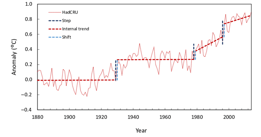
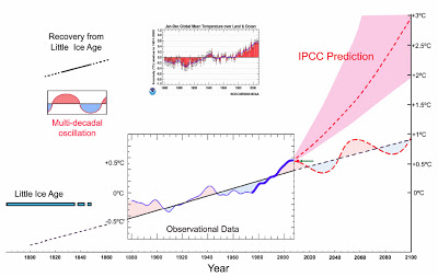
Note that the hypothesis is virtually the same, except for the leap of faith to attribute the secular background rise to CO2, rather than to a steady recovery from the Little Ice Age (LIA).  Finally climate modelers are admitting that natural variability is strong enough to offset warming from any other means.  And by extension the rise in temperatures late last century was due in large measure to a warming natural phase.

(Aside: “Secular” has two main meanings:
a : of or relating to the worldly or temporal secular concerns, not overtly or specifically religious
b : of or relating to a long term of indefinite duration, existing or continuing through ages or centuries
How ironic that some climate scientists use the term “secular” while applying a faith-based attribution.)

Nicola Scafetta is another scientist asserting a solar-lunar cyclical climate pattern based on oscillations within the solar system. More at Scaffetta vs. IPCC: Dueling Climate Theories

cooling-vs-warming-forecasts-scafetta-2017

The Thrill of Riding the Climate Roller Coaster

The original amusement park roller coasters had a single ratcheting up an incline to the top, with gravity pulling the train down to the bottom through a series of curving sine wave peaks and valleys. Newer rides like the one at Wonderland have more than one ratcheting upward to start a new decline. A recent paper explains how this additional excitement operates in our climate system.

Reconciling the signal and noise of atmospheric warming on decadal timescales by Roger N. Jones and James H. Ricketts Victoria University, Melbourne, Australia was published March 16, 2017 in Earth System Dynamics. From the abstract:

Interactions between externally forced and internally generated climate variations on decadal timescales is a major determinant of changing climate risk. Severe testing is applied to observed global and regional surface and satellite temperatures and modelled surface temperatures to determine whether these interactions are independent, as in the traditional signal-to-noise model, or whether they interact, resulting in step-like warming. The multistep bivariate test is used to detect step changes in temperature data. The resulting data are then subject to six tests designed to distinguish between the two statistical hypotheses, hstep and htrend.

record-of-mean-annual-surface-temperature-anomalies-1880-2014-from-the-hadley-centre-and

Figure 1. Record of mean annual surface temperature anomalies 1880–2014 from the Hadley Centre and Climate Research Unit (HadCRU), showing step changes (p < 0.01) and internal trends and shifts taken from the end of one internal trend to the start of the next across a step.

Test 1: since the mid-20th century, most observed warming has taken place in four events: in 1979/80 and 1997/98 at the global scale, 1988/89 in the Northern Hemisphere and 1968–70 in the Southern Hemisphere. Temperature is more step-like than trend-like on a regional basis. Satellite temperature is more step-like than surface temperature. Warming from internal trends is less than 40 % of the total for four of five global records tested (1880–2013/14).

Test 2: correlations between step-change frequency in observations and models (1880–2005) are 0.32 (CMIP3) and 0.34 (CMIP5). For the period 1950–2005, grouping selected events (1963/64, 1968–70, 1976/77, 1979/80, 1987/88 and 1996–98), the correlation increases to 0.78.

Test 3: steps and shifts (steps minus internal trends) from a 107-member climate model ensemble (2006–2095) explain total warming and equilibrium climate sensitivity better than internal trends.

Test 4: in three regions tested, the change between stationary and non-stationary temperatures is step-like and attributable to external forcing.

Test 5: step-like changes are also present in tide gauge observations, rainfall, ocean heat content and related variables.

Test 6: across a selection of tests, a simple stepladder model better represents the internal structures of warming than a simple trend, providing strong evidence that the climate system is exhibiting complex system behaviour on decadal timescales.

This model indicates that in situ warming of the atmosphere does not occur; instead, a store-and-release mechanism from the ocean to the atmosphere is proposed. It is physically plausible and theoretically sound. The presence of step-like – rather than gradual – warming is important information for characterising and managing future climate risk. (my bold)

Summary

The climate roller coaster is thrilling because we can’t see the track ahead for certain. Are we coming off a major peak and heading down into a deep valley? (Scafetta) Or is this a small dip before heading up again? (Yao et al.) Or are we hitting the top of the recovery from 1850 and starting into the next (hopefully little) ice age as signaled by the quiet sun (Akasofu, Abdussamatov)?

Daily sun June 27, 2017 with sunspot 2664.

See Also: Wave Drowns CO2 Warming

Ocean Cooling Resumes

May Sea Surface Temperatures (SSTs) are now available, and we can see ocean cooling resuming after a short pause from the downward trajectory during the previous 12 months.

HadSST is generally regarded as the best of the global SST data sets, and so the temperature story here comes from that source, the latest version being HadSST3.

The chart below shows the last two years of SST monthly anomalies as reported in HadSST3 including May 2017.


After an upward bump in April 2017 due to the Tropics and NH, the May SSTs show the average declining slightly.  Note the Tropics recorded a rise, but not enough to offset declines in both hemispheres and globally.  SH is now two months into a cooling phase. The present readings compare closely with April 2015, but currently with no indication of an El Nino event any time soon.

Note that higher temps in 2015 and 2016 were first of all due to a sharp rise in Tropical SST, beginning in March 2015, peaking in January 2016, and steadily declining back to its beginning level. Secondly, the Northern Hemisphere added two bumps on the shoulders of Tropical warming, with peaks in August of each year. Also, note that the global release of heat was not dramatic, due to the Southern Hemisphere offsetting the Northern one.

Satellite measures of the air over the oceans give a slightly different result.  The graph below provides UAH vs.6 TLT (lower troposphere temps) over the oceans confirming the general impression from SSTs.

In contrast with SST measurements, air temps in the TLT over the oceans upticked in May with all areas participating in the rise of almost 0.2C.  In the satellite dataset, it is quite noticeable that land air temps rose quite strongly and may have caused air temps in the May TLT over oceans to show higher anomalies than the SSTs.

We have seen lots of claims about the temperature records for 2016 and 2015 proving dangerous man made warming.  At least one senator stated that in a confirmation hearing.  Yet HadSST3 data for the last two years show how obvious is the ocean’s governing of global average temperatures.

USS Pearl Harbor deploys Global Drifter Buoys in Pacific Ocean

The best context for understanding these two years comes from the world’s sea surface temperatures (SST), for several reasons:

  • The ocean covers 71% of the globe and drives average temperatures;
  • SSTs have a constant water content, (unlike air temperatures), so give a better reading of heat content variations;
  • A major El Nino was the dominant climate feature these years.

Solar energy accumulates massively in the ocean and is variably released during circulation events.


April Pause in Ocean Cooling


Ocean temperature measurements come from a global array of 3,500 Argo floats and other ocean sensors. Credits: Argo Program, Germany/Ifremer

April Sea Surface Temperatures are now available, and we can see a pause in the downward trajectory over the previous 13 months.

HadSST is generally regarded as the best of the global SST data sets, and so the temperature story here comes from that source, the latest version being HadSST3.

The chart below shows the last two years of SST monthly anomalies as reported in HadSST3 including April 2017.

In April 2017, the SH appears to be entering its cooler phase, while both the tropics and NH ticked upward from March, causing the Global anomaly to rise for the fourth month in a row.  The downward momentum has stopped, except now the SH (mostly ocean) has started down from a lower peak than a year ago.  It was the SH that was pulling up the Global average the previous three months.   The Tropics and NH may or may not start a new warming cycle, depending upon the appearance of El Nino.

Note that higher temps in 2015 and 2016 were first of all due to a sharp rise in Tropical SST, beginning in March 2015, peaking in January 2016, and steadily declining back to its beginning level. Secondly, the Northern Hemisphere added two bumps on the shoulders of Tropical warming, with peaks in August of each year. Also, note that the global release of heat was not dramatic, due to the Southern Hemisphere offsetting the Northern one.

Satellite measures of the air over the oceans give a similar result.  The graph below provides UAH vs.6 TLT (lower troposphere temps) over the oceans confirming the impression from SSTs.

Once again it is the Tropical and NH oceans that drove the warming that peaked a year ago.  SH  moderated the Global averages, though the air temps over the oceans are more synchronized than is the case with SSTs. Note how in April all anomalies converged on 0.3C.

We have seen lots of claims about the temperature records for 2016 and 2015 proving dangerous man made warming.  At least one senator stated that in a confirmation hearing.  Yet HadSST3 data for the last two years show how obvious is the ocean’s governing of global average temperatures.

The best context for understanding these two years comes from the world’s sea surface temperatures (SST), for several reasons:

  • The ocean covers 71% of the globe and drives average temperatures;
  • SSTs have a constant water content, (unlike air temperatures), so give a better reading of heat content variations;
  • A major El Nino was the dominant climate feature these years.

Solar energy accumulates massively in the ocean and is variably released during circulation events.


Ocean Surface Temps–How Low Will They Go?


Ocean temperature measurements come from a global array of 3,500 Argo floats and other ocean sensors. Credits: Argo Program, Germany/Ifremer

We have seen lots of claims about the temperature records for 2016 and 2015 proving dangerous man made warming.  At least one senator stated that in a confirmation hearing.  Now that HadSST3 data is complete through February 2017, let’s see how obvious is the ocean’s governing of global average temperatures.

The best context for understanding these last two years comes from the world’s sea surface temperatures (SST), for several reasons:

  • The ocean covers 71% of the globe and drives average temperatures;
  • SSTs have a constant water content, (unlike air temperatures), so give a better reading of heat content variations;
  • A major El Nino was the dominant climate feature the last two years.

HadSST is generally regarded as the best of the global SST data sets, and so the temperature story here comes from that source, the latest version being HadSST3.

The chart below shows the last two years of SST monthly anomalies as reported in HadSST3, along with the first two months of 2017.

Note that higher temps in 2015 and 2016 are first of all due to a sharp rise in Tropical SST, beginning in March 2015, peaking in February 2016, and steadily declining back to its beginning level. Secondly, the Northern Hemisphere added two bumps on the shoulders of Tropical warming, with peaks in August of each year. Also, note that the global release of heat was not dramatic, due to the Southern Hemisphere offsetting the Northern one.

Finally, the oceans are starting 2017 only slightly lower than a year ago, but this year with much cooler Tropics.  Notice that both the Tropics and also the Northern Hemisphere continue to cool.  The Global average warmed slightly, pulled upward by the Southern Hemisphere which reaches its summer peak at this time.

March may repeat 2016 when NH bottomed and SH peaked, or maybe both will rise or both will drop.  In the latter case, perhaps we will see the long-awaited La Nina.

H/T to Global Warming Policy Forum for adding this informative graphic:
|floatcyclescaled

Much ado has been made of this warming, including claims of human causation, despite the obvious oceanic origin. However, it is unreasonable to claim CO2 functions as a global warming agent, yet the two hemispheres respond so differently.  Moreover, CO2 warming theory expects greater warming in the higher latitudes, while this event was driven by heating in the Tropics, contradicting alarmist warming theory.

Solar energy accumulates massively in the ocean and is variably released during circulation events.


Fact: Future Will be Flatter Not Hotter

Another powerful post by Clive Best on how earth’s surface temperatures change by means of changing meridional heat transfers. Meridional Warming.

The key point for me was seeing how the best geological knowledge proves beyond the shadow of a doubt how the earth’s climate profile shifts over time, as presented in the diagram above.  It comes from esteemed paleoclimatologist Christopher Scotese.  His compete evidence and analysis can be reviewed in his article Some thoughts on Global Climate Change: The Transition from Icehouse to Hothouse (here).

In that essay Scotese shows where we are presently in this cycle between icehouse and hothouse.

As of 2015 earth is showing a GMT of 14.4C, compared to pre-industrial GMT of 13.8C.  According to the best geological evidence from millions of years of earth’s history, that puts us in the category “Severe Icehouse.”  So, thankfully we are warming up, albeit very slowly.

Moreover, and this is Clive Best’s point, progress toward a warming world means flattening the profile at the higher latitudes, especially the Arctic.  Equatorial locations remain at 23C throughout the millennia, while the gradient decreases in a warmer world.

The previous post explained what is wrong with averaging temperature anomalies.  See Temperature Misunderstandings

Conclusion:

We have many, many centuries to go before the earth can warm up to the “Greenhouse” profile, let alone get to “Hothouse.”  Regional and local climates at higher latitudes will see slightly warming temperatures and smaller differences from equatorial climates.  These are facts based on solid geological evidence, not opinions or estimates from computer models.

It is still a very cold world, but we are moving in the right direction.  Stay the course.

Meanwhile, keep firing away Clive.

damaged-ship3


Temperature Misunderstandings

Clive Best provides this animation of recent monthly temperature anomalies which demonstrates how most variability in anomalies occur over northern continents.

Beyond the issues with the measurements and the questionable adjustments, there is a more fundamental misconception about air temperatures in relation to “climate change.” Clive Best does a fine job explaining why Global Mean Temperature anomalies do not mean what people think. Below is my synopsis of his recent essay entitled Do Global Temperatures make sense? (link)

Background: Earth’s Heat Imbalance

ERBE measurements of radiative imbalance.

The earth’s temperature at any location is never in equilibrium. It changes daily, seasonally and annually. Incoming solar radiation varies enormously especially near the poles which receive more energy per day in summer than the equator.

The earth cools primarily by moving heat from hot tropical regions towards high latitudes where net IR radiation loss cools the planet, thus maintaining a certain temperature profile.

Key Point: Heat Distribution Changes, not Global Temperatures

Rising CO2 levels modify that radiation imbalance profile slightly. Surface temperatures in the tropics are not really warming at all. Any excess heat induces more clouds and more convection while surface temperatures remain constant. What really happens is that the meridional radiation profile changes. Slightly more heat is transported polewards so that hot places are shifting more heat to cold places which are doing the warming. If CO2 levels stop rising then a new temperature and radiation profile would rather quickly be reached. This is then called ‘climate change’ but any such changes are concentrated in colder regions of the world. The global ‘temperature’ itself is not changing, but instead the global distribution of temperature is changing.

Key Point: More Atmospheric Heat means Warming in the Coldest Places

Temperatures at the poles during 6 months of darkness would fall well below -150C if there was no atmosphere, similar to the moon. Instead heat is constantly being transported from lower latitudes by the atmosphere and ocean and so that temperatures never fall much below -43C. If more heat is transported northwards than previously, then minimum temperatures must rise, and this is what we observe in individual measurements.

Key Point: GMT Anomalies Are Dominated by the Highest Latitudes

The main problem with all the existing observational datasets is that they don’t actually measure the global temperature at all. Instead they measure the global average temperature ‘anomaly’. . .The use of anomalies introduces a new bias because they are now dominated by the larger ‘anomalies’ occurring at cold places in high latitudes. The reason for this is obvious, because all extreme seasonal variations in temperature occur in northern continents, with the exception of Antarctica. Increases in anomalies are mainly due to an increase in the minimum winter temperatures, especially near the arctic circle. 

To take an extreme example here is the monthly temperature data and calculated anomalies for Verkoyhansk in Siberia. Annual temperatures vary from -50C in winter to +20C in summer. That is a seasonal range of 70C each year, and a year to year anomaly variation of ~8C is normal. The only global warming effect evident is a slight increase in the minimum winter temperatures since 1900. That is not due to any localised enhanced greenhouse effect but rather to an enhanced meridional heat transport. Temperatures in equatorial regions meanwhile have only ~4C seasonal variations, and show essentially no warming trend.

Long term changes in temperature anomalies occur mainly in northern continents in winter months. This is not because the earth as a whole is warming up but rather that meridional heat transport from the equator to the poles has increased and the largest effect on ‘anomalies occurs in winter. The average absolute temperature of the earth’s surface is unknown. Basing the evidence for climate change on the 150 year trend in global averaged temperature anomalies still biases the result towards higher latitudes where most of the stations are located.

Summary

When heat is released into the atmosphere from the oceans, it is transported toward the poles to dissipate into space. Places in higher latitudes are warmed, not by radiative effects of greenhouse gases in those locales, but by the incursion of warmer air from the equator.

What happens if more CO2 is added into the atmosphere? No one knows, but there are many opinions, a popular one being that more heat is retained in the atmosphere. But in that case, that additional heat will be shed by the planet in exactly the same manner: transport to the poles with slightly less extremely cold air at the higher latitudes.

Why in the world would we pay anything to prevent a little bit of warming in the world’s coldest places?

Clive Best takes the analysis further and relates to work by Christopher Scotese in a later post Fact: Future Climate Will Be Flatter, not Hotter

Footnote: Scott Pruitt provides a concise synopsis of the issues in measuring global surface temperatures.  From his responses to Senators’ questions during confirmation hearings:

Senator Merkley:

Are you aware that each of the past three decades has been warmer than the one before, and warmer than all the previous decades since record keeping began in the 1880s? This trend is based on actual temperature measurements. Do you believe that there is uncertainty in this warming trend that has been directly measured? If so, please explain.

Nominee Pruitt:

I am aware of a diverse range of conclusions regarding global temperatures, including that over the past two decades satellite data indicates there has been a leveling off of warming, which some scientists refer to as the “hiatus.”
I am also aware that the discrepancy between land-based temperature stations and satellite temperature stations can be attributed to expansive urbanization within in our country where artificial substances such as asphalt can interfere with the accuracy of land-based temperature stations and that the agencies charged with keeping the data do not accurately account for this type of interference.
I am also aware that ‘warmest year ever’ claims from NASA and NOAA are based on minimal temperature differences that fall within the margin of error.
Finally, I am aware that temperatures have been changing for millions of years that predate the relatively short modern record keeping efforts that began in 1880.

More Q&A is at Running the Climate Gauntlet

More explanation at The Climate Water Wheel

Oceans Make 2015 & 2016 Climate


Ocean temperature measurements come from a global array of 3,500 Argo floats and other ocean sensors. Credits: Argo Program, Germany/Ifremer

We are seeing lots of claims about the temperature records for 2016 and 2015 proving dangerous man made warming.  At least one senator stated that in a confirmation hearing.  Now that HadSST3 data is complete for last year, let’s see how obvious is the ocean’s governing of global average temperatures.

The best context for understanding these two years comes from the world’s sea surface temperatures (SST), for several reasons:

  • The ocean covers 71% of the globe and drives average temperatures;
  • SSTs have a constant water content, (unlike air temperatures), so give a better reading of heat content variations;
  • A major El Nino was the dominant climate feature these years.

HadSST is generally regarded as the best of the global SST data sets, and so the temperature story here comes from that source, the latest version being HadSST3.

The chart below shows the last two years of SST monthly anomalies as reported in HadSST3.

hadsst3-2015-2016all

Note that higher temps in 2015 and 2016 are first of all due to a sharp rise in Tropical SST, beginning in March 2015, peaking in January 2016, and steadily declining back to its beginning level. Secondly, the Northern Hemisphere added two bumps on the shoulders of Tropical warming, with peaks in August of each year. Also, note that the global release of heat was not dramatic, due to the Southern Hemisphere offsetting the Northern one.

Finally, the oceans are entering 2017 at the same temperature level as 2015, only now with downward momentum.

Much ado will be made of this warming, including claims of human causation, despite the obvious oceanic origin. However, it is unreasonable to claim CO2 functions as a global warming agent, yet the two hemispheres respond so differently.  Moreover, CO2 warming theory expects greater warming in the higher latitudes, while this event was driven by heating in the Tropics, contradicting alarmist warming theory.

Solar energy accumulates massively in the ocean and is variably released during circulation events.


Anatomy of the Hottest Years Ever


Ocean temperature measurements come from a global array of 3,500 Argo floats and other ocean sensors. Credits: Argo Program, Germany/Ifremer

With the year end, media climate attack dogs are going after the Trump administration, throwing whatever they can (hoping for anything to stick). One thing they will surely trumpet is the temperature records for 2016 and 2015 as proof of dangerous man made warming.

Now the best context for understanding these two years comes from the world’s sea surface temperatures (SST), for several reasons:

  • The ocean covers 71% of the globe and drives average temperatures;
  • SSTs have a constant water content, (unlike air temperatures), so give a better reading of heat content variations;
  • A major El Nino was the dominant climate feature these years.

HadSST is generally regarded as the best of the global SST data sets, and so the temperature story here comes from that source, the latest version being HadSST3.

The chart below shows the last two years of SST monthly anomalies as reported in HadSST3.

hadsst3-2015-2016

Note that higher temps in 2015 and 2016 are first of all due to a sharp rise in Tropical SST, beginning in March 2015, peaking in January 2016, and steadily declining back to its beginning level. Secondly, the Northern Hemisphere added two bumps on the shoulders of Tropical warming, with peaks in August of each year. Finally, note that the global release of heat was not dramatic, due to the Southern Hemisphere offsetting the Northern one.

Much ado will be made of this warming, including claims of human causation, despite the obvious oceanic origin. Further, it is curious that CO2 functions as a warming agent so unevenly around the world, and that the Tropics drove this event, contradicting global warming theory.

Solar energy accumulates massively in the ocean and is variably released during circulation events.


Clamatology

clamSome reporters are showing an interest in a lesser known proxy for climate change: giant clams. Of course, some scientists claim clams prove unprecedented global warming this century. Unsurprising since their funding (clams) depends on sounding the alarms.

For some insight into the connection between clams and climate, here is a paper Giant clam recorders of ENSO variability (here).

Giant clam stable isotope profiles from Papua New Guinea faithfully record all the major El Niño events between 1986 and 2003, thus illustrating the usefulness of this archive to reconstruct past ENSO variability. Elliott et al.

In northern Papua New Guinea precipitation and temperatures are coupled on seasonal and interannual timescales. El Niño periods are associated with lower than average SST and drier conditions, whereas La Niña periods are associated with higher than average SST and wetter conditions. The associated changes in sea water δ18O and SST will thus have cumulative effects on shell δ18O, which will become more positive during El Niño and more negative during La Niña phases.

clam-fig2

Figure 2: Comparison of T. gigas δ18O profile with ENSO index, local temperature and rainfall data. A) NINO3.4 index, (B) 3pt smoothed monthly rainfall anomaly (mm day-1, NASA/GPCPV2) for 146.25°E, 6.25°S, (C) T. gigas δ18O record, (D) Porites δ18O profiles and (E) 3pt smoothed monthly SST anomaly (from IGOSS) for the same grid box as the rainfall data. Y-axes of the δ18O are inverted. The shaded bands indicate El Niño events.

The comparison of the ENSO index with the T. gigas and Porites δ18O records shows that each El Niño event is recorded in the shell and coral profile by isotopic shifts of around 1.0 to 1.2‰ toward more positive values (Fig. 2) reflecting the combined influence of lower temperatures and decreased rainfall. During the El Niño phase of the Southern Oscillation, the region experiences relative drought and slightly reduced SSTs (~-0.2 to -0.5°C anomaly, see Fig. 2). These factors combine to drive skeletal δ18O to heavy values, with SST explaining about 30-50% of the skeletal δ18O range.

Take away message

We show that shells of T. gigas can be used to produce multi-decadal climatic records, hence providing a valuable resource for investigating changes to the frequency and strength of ENSO events in the past. The excellent reproducibility of clam and coral δ18O profiles illustrates the strength of using these archives to reconstruct large-scale hydrographic changes.

Some points worth noting: Clamshell variability is influenced by precipitation as well as water temperature. And water temperatures do not simply correlate to air temperatures. Finally, it is the water heating the air, not the other way around.

The data is good, but the interpretation can be biased by warmist beliefs.