Update: EU Leads in Climate Blame and Shame

Update February 15, 2017

The EU is already loading climate reporting requirements onto pension funds.

On December 8th, 2016 the EU adopted a new regulation regarding Pension Funds, the IORP II Directive — the successor of the Institutions for Occupational Retirement Provision Directive adopted in 2003.

A key feature of the directive is the consideration of environmental, social and governance (ESG) factors as part of pension providers’ investment. In particular, pension providers are now required to carry out their own risk assessment, including climate change-related risks, as well as risks caused by the use of resources and regulatory changes.

IORP II applies to all the 14,358 registered EU pension funds, among which 160 have cross-border activities.

Member States (EU countries) have until January 13, 2019 to transpose IORP II into their national law, which was published early January in the Official Journal of the European Union. According to current projections, the implementation deadline should therefore fall before Brexit, an important fact considering that the UK accounts for 50 percent of the EU occupational pension fund sector, followed by the Netherlands (33 percent).

New EU Directive Requires Pension Funds to Assess Climate-related Risks

The Climate Disclosure Standards Board provides an insight into the expanding bureaucracy working to impose climatism on financial and business institutions around the world. Since Paris COP agreement is not legally binding, the effort is on forcing reporting on national commitments and pointing fingers at laggards.

At the microeconomic level, the mission is to load regulatory requirements onto corporations and investors to force them into statements of belief and responsibility for mythical changes in future weather and climate.

The Mission is presented in Making Climate Disclosure the New Norm in Business

In short, the Task Force Recommendations report encourages all financial organizations, ranging from banks, insurance companies, to asset managers and asset owners, and companies with public debt or equity, to disclose in a transparent and consistent way their financial risks and opportunities associated with climate change.

Image: Recommendations of the Task Force on Climate-related Financial Disclosures

The report is the result of one year of work by the Task Force on climate-related financial disclosures, a business and investors-led initiative, launched at the COP21 climate negotiations in Paris, and convened by the Financial Stability Board.

The aim of the initiative is to drive the adoption of the recommendations across the G20 countries, as the final version of the report will be released in July and presented to the G20 leaders gathering in Hamburg. Having the support of the governments of the largest economies in the world would be the ultimate step to make climate disclosure the new norm.

The CDSB Board of Directors (all carrying climate activist resumes)

Pankaj Bhatia Director of GHG Protocol Initiative, World Resources Institute

Henry Derwent Honorary Vice President, International Emissions Trading Association

Dr Rodney Irwin Managing Director, Redefining Value & Education, World Business Council for Sustainable Development

Mindy S. Lubber JD, MBA President, Ceres Director, Investor Network on Climate Risk

David Rosenheim Executive Director, The Climate Registry

Damian Ryan Acting CEO, The Climate Group

Richard Samans (Chairman) Managing Director and Member of the Managing Board, World Economic Forum

Paul Simpson Chief Executive Officer, CDP (formerly Carbon Disclosure Project)

Gordon Wilson Senior Manager PwC, Chairman, Technical Working Group, Climate Disclosure Standards Board

Rough seas ahead for Captains of Industry


Arctic Ice Seesaw

Mid February is about a month away from the annual maximum Arctic ice extent, and measurements continue to seesaw in the two dynamic places where freezing and drifting cause gains and losses in sea ice. In each region, the gains and losses teeter-totter between two basins.

Here is the Atlantic seesaw with Barents and Baffin.

output_vbs7wb

And here is the Pacific seesaw with Bering and Okhotsk.

output_jbavnc
While the seesaws are tilting back and forth on the margins, the bulk of the Arctic is frozen solid. And with limited places where more extent can be added, the pace of overall growth has slowed.

arctic-ice-2017044
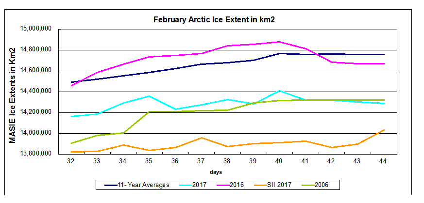
The graph shows that 2017 and 2006 are virtually tied at this date. It shows both years are below average by about 450k km2, and SII adds a further deficit by showing 2017 averaging in February ~400k km2 lower than MASIE.

The table below shows ice extents in the seas comprising the Arctic, comparing day 044 2017 with the same day average over the last 11 years and with 2006.

Region 2017044 Day 044
Average
2017-Ave. 2006044 2017-2006
 (0) Northern_Hemisphere 14287848 14759423 -471575 14318694 -30846
 (1) Beaufort_Sea 1070445 1070111 334 1069711 734
 (2) Chukchi_Sea 966006 965614 392 966006 0
 (3) East_Siberian_Sea 1087137 1087131 6 1087103 35
 (4) Laptev_Sea 897845 897835 10 897773 71
 (5) Kara_Sea 908380 908367 12 932924 -24545
 (6) Barents_Sea 363927 581052 -217125 507771 -143844
 (7) Greenland_Sea 565090 633257 -68167 592221 -27131
 (8) Baffin_Bay_Gulf_of_St._Lawrence 1564353 1451561 112792 1209203 355150
 (9) Canadian_Archipelago 853214 852984 230 852715 499
 (10) Hudson_Bay 1260903 1260476 427 1257433 3470
 (11) Central_Arctic 3209792 3215238 -5446 3178718 31074
 (12) Bering_Sea 564241 759583 -195342 889465 -325224
 (13) Baltic_Sea 59994 105815 -45822 68543 -8549
 (14) Sea_of_Okhotsk 834828 895634 -60806 720201 114628
 (15) Yellow_Sea 17654 31061 -13407 20909 -3255
 (16) Cook_Inlet 9131 12083 -2952 9530 -399

The table indicates some differences in locations of ice surpluses and deficits. Bering Sea has been the largest deficit this year, while Barents is now matching it by losing ~100k in the last week. Greenland Sea is also down slightly compared to average and to 2006. Baffin Bay is the largest surplus to average and to 2006. Okhotsk lost more than 200k km2 in recent days, but still exceeds 2006 by 115k.

The second half of February will be interesting. The average year in the last eleven gained about 200k km2 from now to month end. But the variability ranged from 2006 losing 170K to 2012 gaining 590k km2. What will the ice do this year?

The polar bears have a Valentine Day’s wish for Arctic Ice.

welovearcticicefinal

And Arctic Ice loves them back, returning every year so the bears can roam and hunt for seals.

Footnote:

Seesaw accurately describes Arctic ice in another sense:  The ice we see now is not the same ice we saw previously.  It is better to think of the Arctic as an ice blender than as an ice cap, explained in the post The Great Arctic Ice Exchange.

The Green Energy Money Pit

As we know, politicians are throwing money away on mad green energy schemes in Australia, Germany and Canada.  In the USA, bad examples are found in the left coast states of California and New York.

California Dreaming

From the LA Times: Californians are paying billions for power they don’t need
We’re using less electricity. Some power plants have even shut down. So why do state officials keep approving new ones?

At its 2001 launch, the Sutter Energy Center was hailed as the nation’s cleanest power plant. It generated electricity while using less water and natural gas than older designs.

A year ago, however, the $300-million plant closed indefinitely, just 15 years into an expected 30- to 40-year lifespan. The power it produces is no longer needed — in large part because state regulators approved the construction of a plant just 40 miles away in Colusa that opened in 2010.

Sutter Energy Center has been offline since 2016, after just 15 years of an expected 30- to 40-year lifespan. (David Butow / For The Times)

California has a big — and growing — glut of power, an investigation by the Los Angeles Times has found. The state’s power plants are on track to be able to produce at least 21% more electricity than it needs by 2020, based on official estimates. And that doesn’t even count the soaring production of electricity by rooftop solar panels that has added to the surplus. (my bold)

This translates into a staggering bill. Although California uses 2.6% less electricity annually from the power grid now than in 2008, residential and business customers together pay $6.8 billion more for power than they did then. The added cost to customers will total many billions of dollars over the next two decades, because regulators have approved higher rates for years to come so utilities can recoup the expense of building and maintaining the new plants, transmission lines and related equipment, even if their power isn’t needed. (my bold)

“We overbuilt the system because that was the way we provided that degree of reliability,” explained Michael Picker, president of the California Public Utilities Commission. “Redundancy is important to reliability.”

Some of the excess capacity, he noted, is in preparation for the retirement of older, inefficient power plants over the next several years. The state is building many new plants to try to meet California environmental standards requiring 50% clean energy by 2030, he said. (my bold)

“California has this tradition of astonishingly bad decisions,” said McCullough, the energy consultant. “They build and charge the ratepayers. There’s nothing dishonest about it. There’s nothing complicated. It’s just bad planning.”

Pacific Gas & Electric’s Colusa Generating Station has operated at well below its generating capacity — just 47% in its first five years. (Rich Pedroncelli / AP)

Sutter isn’t alone. Other natural gas plants once heralded as the saviors of California’s energy troubles have found themselves victims of the power glut. Independent power producers have announced plans to sell or close the 14-year-old Moss Landing power plant at Monterey Bay and the 13-year-old La Paloma facility in Kern County.

New York Blowing It in the Wind

From the New York Post: Cash in the Wind: New York’s Wind-power Giveaway

Gov. Cuomo doesn’t like nuclear energy.  Last month, he finalized a deal that will prematurely shutter the Indian Point Energy Center, the twin-reactor facility that supplies about 25 percent of New York City’s electricity.

Cuomo doesn’t like natural gas, either. In 2014, after a years-long moratorium, he banned fracking, the process used to get oil or gas from underground rock formations.

But there’s one thing the governor just loves: wind energy. Indeed, three days after the Indian Point closure was announced, Cuomo’s appointees at the New York State Energy Research and Development Authority provided details on $360 million in subsidies for a handful of renewable-energy projects.

Roughly 80 percent of that money will be doled out to two wind companies: Florida-based NextEra Energy Inc. and Illinois-based Invenergy.

Plus, when the new subsidies are combined with existing federal cash, the amount in subsidies Next­Era and Invenergy will be collecting will exceed the prevailing wholesale price of electricity in the state by nearly $13 per megawatt-hour.

Even more remarkable: those same subsidies, on an energy-equivalent basis — comparing the amount of energy we get from different sources — come to four times the current market price of natural gas. (my bold)

The companies will receive the NYSERDA subsidies over a period of 20 years. Given the size of their wind projects, which are about 101 megawatts and 106 megawatts, respectively, the two companies will likely collect about $286 million from the state over the next two decades. And remember, NextEra and Invenergy will collect those subsidies in addition to the cash they get for actually selling their product. (my bold)

I’ve heard of sweetheart deals, but this one deserves a medal.

It there no bottom to the green energy money pit?

Climate Blame and Shame

Update February 15, 2017

The EU is already loading these reporting requirements onto pension funds.

IORP II applies to all the 14,358 registered EU pension funds, among which 160 have cross-border activities.

Member States (EU countries) have until January 13, 2019 to transpose IORP II into their national law, which was published early January in the Official Journal of the European Union. According to current projections, the implementation deadline should therefore fall before Brexit, an important fact considering that the UK accounts for 50 percent of the EU occupational pension fund sector, followed by the Netherlands (33 percent).

New EU Directive Requires Pension Funds to Assess Climate-related Risks

The Climate Disclosure Standards Board provides an insight into the expanding bureaucracy working to impose climatism on businesses around the world. Since Paris COP agreement is not legally binding, the effort is on forcing reporting on national commitments and pointing fingers at laggards.

At the microeconomic level, the mission is to load regulatory requirements onto corporations to force them into statements of belief and responsibility for mythical changes in future weather and climate.

The Mission is presented in Making Climate Disclosure the New Norm in Business

In short, the Task Force Recommendations report encourages all financial organizations, ranging from banks, insurance companies, to asset managers and asset owners, and companies with public debt or equity, to disclose in a transparent and consistent way their financial risks and opportunities associated with climate change.

Image: Recommendations of the Task Force on Climate-related Financial Disclosures

The report is the result of one year of work by the Task Force on climate-related financial disclosures, a business and investors-led initiative, launched at the COP21 climate negotiations in Paris, and convened by the Financial Stability Board.

The aim of the initiative is to drive the adoption of the recommendations across the G20 countries, as the final version of the report will be released in July and presented to the G20 leaders gathering in Hamburg. Having the support of the governments of the largest economies in the world would be the ultimate step to make climate disclosure the new norm.

The CDSB Board of Directors (all carrying climate activist resumes)

Pankaj Bhatia Director of GHG Protocol Initiative, World Resources Institute

Henry Derwent Honorary Vice President, International Emissions Trading Association

Dr Rodney Irwin Managing Director, Redefining Value & Education, World Business Council for Sustainable Development

Mindy S. Lubber JD, MBA President, Ceres Director, Investor Network on Climate Risk

David Rosenheim Executive Director, The Climate Registry

Damian Ryan Acting CEO, The Climate Group

Richard Samans (Chairman) Managing Director and Member of the Managing Board, World Economic Forum

Paul Simpson Chief Executive Officer, CDP (formerly Carbon Disclosure Project)

Gordon Wilson Senior Manager PwC, Chairman, Technical Working Group, Climate Disclosure Standards Board

Rough seas ahead for Captains of Industry


Precipitation Misunderstandings


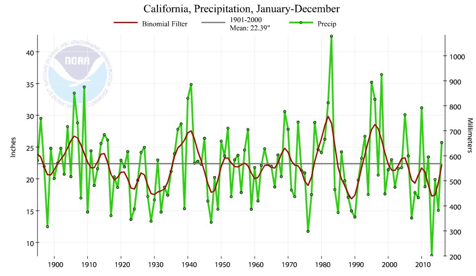
A previous post on Temperature Misunderstandings addressed mistaken notions about the meaning of temperature measurements and records. This post looks at rainfall, the other primary determinant of climates. For this topic California provides the means for everyone to see how misconceptions arise, and how to see precipitation statistics in context.

Lessons learned from the end of California’s “permanent drought”

A report by Larry Kummer documents how extensively California’s recent shortage of water was proclaimed as a “permanent drought”. And it goes on to document how El Nino conditions have ended the water shortage.

Status of the California drought

“During the past week, a series of storms bringing widespread rain and snow showers impacted the states along the Pacific Coast and northern Rockies. In California, the cumulative effect of several months of abundant precipitation has significantly improved drought conditions across the state.”
— US Drought monitor – California, February 9.

Precipitation over California in the water year so far (October 1 to January 31) is 178% of average for this date. The snowpack is 179% of average, as of Feb 8. Our reservoirs are at 125% of average capacity. See the bottom line summary as of February 7, from the US Drought monitor for California.

The improvement has been tremendous. The area with exceptional drought conditions have gone year over year from 38% of California to 0%, extreme drought from 23% to 1%, severe drought from 20% to 10% — while dry and moderate drought went from 18% to 48%, and no drought from <1% to 41%. See the map below. And the rain continues to fall.

In addition there is the saga of Oroville dam threatened by its reservoir overfilling.

Confusing Weather and Climate

As with temperature, rainy weather is not climate. Neither is fair, sunny weather permanent. Precipitation is variable in any particular climate, with the seasons and on decadal and mult-decadal bases. For a context on precipitation patterns around the world see Here Comes the Rain Again.

It is a mistake to call a temporary lack of rain a drought, or worse a permanent drought, and equally a mistake to call a return of rainfall the end of a drought. California’s history as a desert environment does not change just because politicians and the public have short memories.

H/T to Eric Simpson for reminding us of that history:

There is also this perceptive comment by tomholsinger

I wouldn’t be so quick about the drought ending. Droughts are ALWAYS multi-season events. I was very impressed by the references below, which made the point that the 20th Century average of ~200 million acre feet of precipitation in California (rain and snow combined) is way more than the average of ~140 million acre feet over the last 2000 years.

Drying of the West, National Geographic

The West without Water: What Past Floods, Droughts, and Other Climatic Clues Tell Us about Tomorrow, Ingram, B. Lynn, and Malamud-Roam, Frances, 2013, University of California Press

Tom goes on to quote himself from a Modesto Bee op-ed almost two years ago.

Global warming has nothing to do with this – history is bad enough. A long-standing pre-industrial regional climate fluctuation seems underway, returning us from the wettest century in the past 1000 years to at least the historic average of much less (~70%) rain and snow. Many paleoclimatologists believe we are entering a still worse mega-drought .

An extreme drought by historic standards means a drop to 35-40% of the 20th Century average for 10-20 years. California has experienced two centuries-long such extreme mega-droughts in the past 2000 years.

Our average 20th Century precipitation (rain and snow combined) produced about 200 million acre feet of water annually over the whole state. 118 million acre feet went to nature in 2000, and 82 million was allocated by humans – the first 39 million for federal mandates, 9 million was used by people and industry, and the last 34 million for irrigation. A drop to the historic average of ~140 million acre feet over the past 2000 years means extinction for California agriculture – it would bear almost all the burden of the decrease even if the federal water is released. An extreme drought means a drop to about 75 million acre feet, and we might be starting 1-2 centuries of that.

This is happening to the entire Southwest . ~20 million acre feet of the Southwest’s precipitation annually entered the Colorado River in the 20th Century, of which ~12 million is currently withdrawn by Americans. Colorado River flow too has averaged much less over the past 2000 years (12-14 million acre fee annually), and it drops to 7-8 million in droughts which sometimes last centuries.

A drop to only the historic average precipitation over the past 2000 years means catastrophe for the Southwest. 2/3 of the very wet 20th Century average is normal for the entire area. We can expect ALL of California’s allotment of Colorado River to be diverted to urban areas in Arizona and Nevada in the decades of drought the region seems to be entering.

Summary

As with temperatures, changes in precipitation are misinterpreted when taken out of historical context. This is usually done to hype a sociopolitical agenda by distracting people from the baseline realities to which we can only adapt, not prevent.

The rainfall measures above show that California enjoyed an unusually wet century and it would have been prudent to take advantage of it by storing water resources. As the fable tells us, grasshoppers live for today, ants prepare for tomorrow.

Arctic Ice Going and Coming

output_1ctjsm

As I said previously, most of the Arctic seas are now frozen solid, so all the action is confined to just two places where ice will grow or not, making the difference between this year and others.  There is a lot of fussing from alarmists about a storm bringing warm air from the North Atlantic, and this is indeed affecting the ice extent in Barents Sea, one of the two dynamic places at this point in the year.

https://earth.nullschool.net/#current/wind/surface/level/orthographic=-18.40,68.10,459/loc=2.182,47.571

The wind pattern is visible in the nullschool image link above.  And we can see some ice retreating in Barents at this time.  However, Nature has a way of giving back when she takes away, and in this case, Baffin is growing more than Barents is losing.

In these two weeks, Barents first grew 144k km2 of ice up to 492k km2 extent, besieging Svalbard, then lost 53k km2.  At the same time, Baffin grew steadily to gain 240k km2 in 10 days to arrive at 1523k km2, more than 100k above average.

Similarly, both freezing and melting appear in the other dynamic place, the Pacific seas of Okhotsk and Bering.

https://earth.nullschool.net/#current/wind/surface/level/orthographic=-195.48,46.95,606/loc=143.378,43.684

There a pair of subpolar gyres are diverting southern air away from Bering and Okhotsk, allowing normal freezing to return.

output_yoqh8a

In the Pacific, Okhotsk grew 154k km2 of ice to reach 1.2 M km2, 25% above the 11-year average, and then gave back 94k.  Meanwhile in the last 16 days, Bering first gained 69k km2, then lost 163k km2, then gained back 90k in the last 5 days, almost the same extent as the beginning.

Summary

The end result of the fluctuations is an overall  gain of 450k km2 in Arctic ice extent despite the influence of weather events.  The only place where Arctic ice extent is down this year is in Bering Sea, more than offset by Baffin and Okhotsk.

Footnote:
The nullschool image shows that Kamchatka Peninsula protects Okhotsk from prevailing wind, and may explain why ice formation is not inhibited there as it is in Bering.


AMO: Atlantic Climate Pulse

I was inspired by David Dilley’s weather forecasting based upon Atlantic water pulsing into the Arctic Ocean (see post: Global Weather Oscillations). So I went looking for that signal in the AMO dataset, our best long-term measure of sea surface temperature variations in the North Atlantic.

ATLANTIC MULTI-DECADAL OSCILLATION (AMO)

For this purpose, I downloaded the AMO Index from Kaplan SST v.2, the unaltered and untrended dataset. By definition, the data are monthly average SSTs interpolated to a 5×5 grid over the North Atlantic basically 0 to 70N.

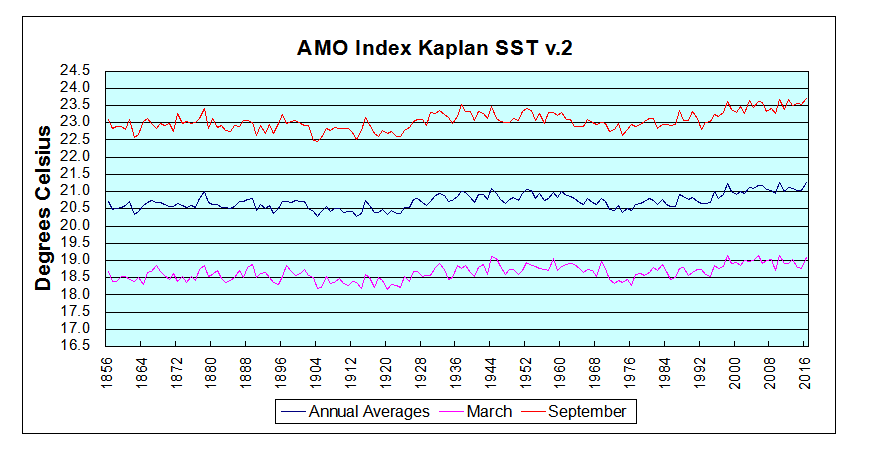
For an overview the graph below presents a comparison between Annual, March and September averages from 1856 to 2016 inclusive.

amo-march-sept

We see about 4°C difference between the cold month of March, and warm September. The overall trend is slightly positive at 0.27°C per century, about 10% higher in September and 10% lower in March. It is also clear that monthly patterns resemble closely the annual pattern, so it is reasonable to look more closely into Annual variability.

The details of the Annual fluctuations in AMO reveal the pulse pattern suggested by Dilley.

amo-pulses-2

We note firstly the classic pattern of temperature cycles seen in all datasets featuring quality-controlled unadjusted data. The low in 1913, high in 1944, low in 1975, and high in 1998. Also evident are the matching El Nino years 1998, 2009 and 2016, indicating that what happens in the Pacific does not stay in the Pacific.

Most interesting are the periodic peaking of AMO in the 8 to 10 year time frame. The arrows indicate the peaks, which as Dilley describes produce a greater influx of warm Atlantic water under the Arctic ice. And as we know from historical records and naval ice charts, Arctic ice extents were indeed low in the 1930s, high in the 1970s, low in the 1990s and on a plateau presently.

Conclusion

I am intrigued but do not yet subscribe to the Lunarsolar explanation for these pulses, but the AMO index does provide impressive indication of the North Atlantic role as a climate pacemaker. Oceans make up 71% of the planet surface, so SSTs directly drive global mean temperatures (GMT). But beyond the math, Atlantic pulses set up oscillations in the Arctic that impact the world.

In the background is a large scale actor, the Atlantic Meridional Overturning Circulation (AMOC) which is the Atlantic part of the global “conveyor belt” moving warm water from the equatorial oceans to the poles and back again.  For more on this deep circulation pattern see Climate Pacemaker: The AMOC

Global Weather Oscillations

H/T to No Tricks Zone for posting (here) on the remarkable forecasting record of Global Weather Oscillations Inc. founded by David Dilley. The ability to predict storm activity demonstrates an understanding of earth’s climate system dynamics. The theory and supporting evidence are available to all in a free ebook Natural Climate Pulse

The heart of the matter seems to be Mr. Dilley’s extracting from very long term Milankovitch Cycles to determine decadal variations in weather activity. From the ebook pp. 16 ff.

Earth’s Natural Rhythm and Global Warming -Cooling Cycles

After researching various elements of the Milankovitch Cycles, Mr. Dilley found that specific sub-cycles which are called the “Lunisolar Precession” are a major factor in determining and maintaining the earth’s natural climate rhythm. It is the Lunisolar Precession that controls almost all of earth’s climate cycles, and it is well known throughout the climatological science community, that specific “Milankovitch Cycles” are the primary mechanism that controls glacial and interglacial periods on earth. If it were not for the gravitational tidal field of the moon, and the electromagnetic and gravitational tidal field of the sun, earth would spin out of control (ref: 23). It is these two bodies that keep earth’s orbit and tilt within certain limits, and provide earth’s climate cycles.

Mr. Dilley researched the Lunisolar Precession cycles for over 20 years, and correlated specific cycles to recurring cycles of climate. GWO incorporated his findings into climate – weather forecast models which provide a unique approach and extremely accurate long range cycle predictions for historical major earthquakes, regional hurricane landfalls many years in advance, historical floods, droughts, natural carbon dioxide cycles, global warming and global cooling cycles.

david-dilley-global-weather-cycles_image_16

Figure 16 shows the approximate 9-year Lunisolar gravitational cycle. It is this cycle that is a major contributor to earth’s climate cycles. (Created by Global Weather Oscillations Inc.)

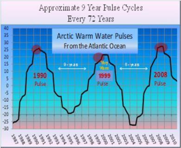
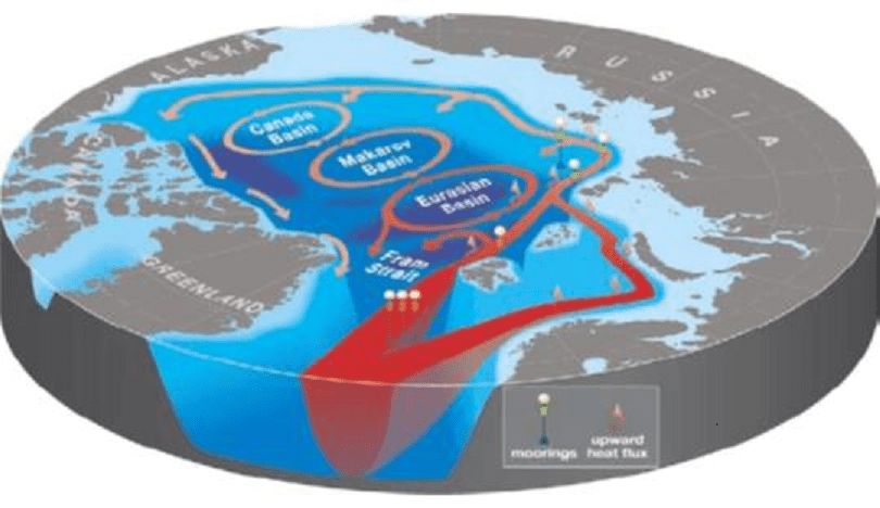
During the 1998 Global Warming Peak, the warm pulse occurred from 1990-93 and again 2004-07,and warmed the Arctic waters below the ice caps up to 1 Degree Celsius above normal. The Arctic Boundary Current from the Atlantic provides the largest input of water, heat, and salt into the Arctic Ocean; the total quantity of heat is substantial, enough to melt the Arctic sea ice cover several times over.
Courtesy…Fate of Early 2000s Arctic Warm Water Pulse Aigor V. Polyakov, Vladmir A. Alexeeve et al, Bulletin of the American Meteorological Society, Vol. 92 Number 5, May 2011

david-dilley-global-weather-cycles_image_17

Figure 17 shows the North Atlantic warm water pulse (Ref:41) that enters the Arctic Ocean in coincidence with the 9-year Lunisolar Pulse shown as the red dots in Figure 16.(Created by Global Weather Oscillations Inc.)

Thus it can be seen that it is likely the approximate 9-year Lunisolar gravitational tidal pulse that sets up a rhythm or heartbeat for earth. During the recurring 230-year global warming cycles a very strong gravitation pulse acts like a plunger in the North Atlantic, causing a warm water pulse surge to enter the Arctic Ocean. It takes the warm water 13-years to circulate around the Arctic Ocean (Ref:43), gradually cooling during the period as it mixes with cooler water. It is this pulse that melts the Arctic Ice from the bottom up and eventually causes open waters to appear as melting continues during the lifespan of the pulse.

david-dilley-global-weather-cycles_image_18

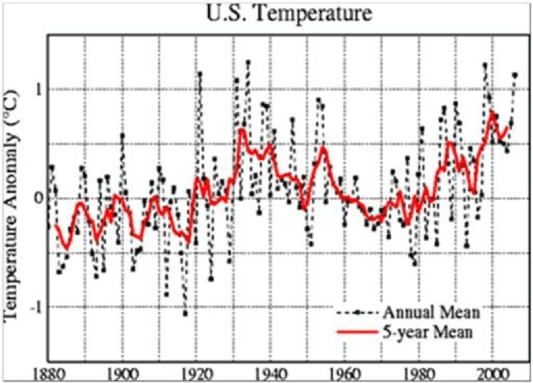
Figure 18 Shows the United States temperatures (red line) from 1880 on the left to the year 2008. Notice an approximate 9-year temperature rhythm for temperatures in the United States. Note the peaks in temperatures every 8 to 10 years, which are very similar to the 9-year Lunisolar. (Created by Global Weather Oscillations Inc.)

The strongest pulses are separated by 72-years during the 230-year global warming episode. For instance, a very warm water pulse caused 10-years of warm global temperatures in the 1930s, and a second very warm pulse 72-years later caused 10-years of warm global temperatures from 1998 to 2008. This approximate 9-year pulse also corresponds closely with temperature pulses around the world. If we extend the Lunisolar Precession 9-year Pulse out to an approximate 230-year pulse (full moon cycle only shown here), we get a clear picture of the relationship of the Lunisolar pulse to global warming cycles which occur approximately every 230 years.

Summary

Any theory stands or falls on the success of its predictions about the subject system’s behavior. Dilley is earning respect for his understanding of earth’s climate system. We should also note that his analysis anticipates a cooling period in the next decades, something not foreseen by any climate model builder.

Followup post is  https://rclutz.wordpress.com/2017/02/08/amo-atlantic-climate-pulse/

Ice Dance in the Pacific

With the Arctic ice extent maximum due in March, there are only two places where ice will grow or not, making the difference between this year and others.  Yesterday, we looked at one of them Ice Taking Hold in Barents Sea and saw dramatic growth in a single week.

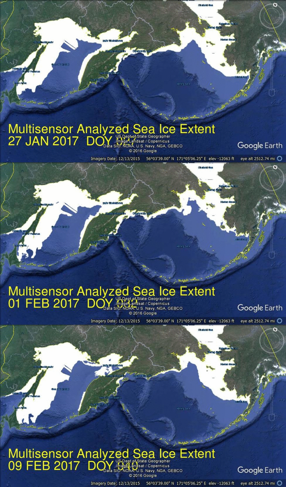
This post features the Pacific seas of Okhotsk and Bering, where a peculiar dance can be seen.  The images come from MASIE showing the difference between Feb. 1 and Feb. 4, yesterday.

pac-ice-day35

In those three days Okhotsk grew 103k km2 of ice, while Bering lost 33k km2.  Bering has the same extent now as on Jan. 19, having gained and then lost 140k km2 over those two weeks.  Okhotsk is now at 1.2 M km2, 25% above the 11-year average.

The only place where Arctic ice extent is down this year is in Bering Sea.

Update February 6

Pethefin provides in his comment an informative link to the current wind patterns over these seas:
https://earth.nullschool.net/#current/wind/surface/level/orthographic=-195.48,46.95,606/loc=143.378,43.684

As the nullschool graphic shows, the polar gyres are pulling southern air up and over Bering Sea.  The Kamchatka Peninsula protects Okhotsk from that pattern, and may explain why ice formation is not inhibited as it is in Bering.

Meanwhile, on the Atlantic side, nullschool shows why Barents has been gaining ice.  The gyre is positioned southwest of Iceland and drawing most of the southern air away from Barents.

https://earth.nullschool.net/#current/wind/surface/level/orthographic=-18.40,68.10,459/loc=2.182,47.571


Climate Poppycock

Definition
pop·py·cock ˈpäpēˌkäk/informal noun meaning nonsense.
Synonyms: nonsense, rubbish, claptrap, balderdash, blather, moonshine, garbage;

Origin: mid 19th century: from Dutch dialect pappekak, from pap ‘soft’ + kak ‘dung.’

This is obviously the linguistically correct term for most of the articles on climate published in the mainstream media. And it serves to describe perfectly the output from alarmist activists.

Exhibit A is provided by Ken Ward, leader of the “valve turners” and defendant facing felony charges in Washington state.

This week he succeeded to convince a juror to refuse him conviction because in his defense he “put up a map of Skagit County, about a third of which will be under water in 2050.”

I call “Poppycock.”  A study from U. of Washington came up with a range of 1″ to 18″ SLR by 2050 for coastal Washington state. Not only will that not flood the place, the range tells you they are shooting in the dark.

http://www.cses.washington.edu/db/pdf/moteetalslr579.pdf

For a deeper look into this phenomenon, see Post-Truth Climatism