
This is a new slide from Raymond at RIC-Communications added to twelve others in a project entitled The World of CO2. Below is a reprinted post with the background and complete set of exhibits, or infographics as he calls them. Recently Dr. William Happer referred to this long historical view to correct activists who claim we are conducting a dangerous experiment on the planet by burning fossil fuels and releasing CO2. As the chart shows, CO2 atmospheric concentrations have been much higher throughout history, with today being a period of CO2 famine. As well the graph shows that temperatures can crash even when CO2 is high, and periods that remained warm while CO2 declined. Also apparent is our current time well into an interglacial period, classified by paleoclimatologists as an “Icehouse. See Post Climate Advice: Don’t Worry Be Happer
Previous Post Here’s Looking at You CO2
Raymond of RiC-Communications studio commented on a recent post and made an offer to share here some graphics on CO2 for improving public awareness. This post presents the eleven charts he has produced so far. I find them straightforward and useful, and appreciate his excellent work on this. Project title is link to RiC-Communications.
Updates January 21 and 26, 2020, with added slides
This project is: The world of CO2
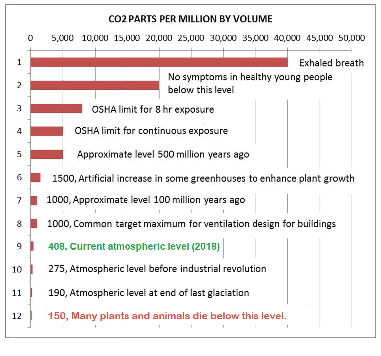
Infographics can be helpful, in making things simple to understand. CO2 is a complex topic with a lot of information and statistics. These simple step by step charts should help to give you an idea of CO2’s importance. Without CO2, plants wouldn’t be able to live on this planet. Just remember, that if CO2 falls below 150 ppm, all plant life would cease to exist.
– N° 1 Earth‘s atmospheric composition
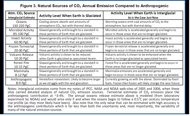
– N° 2 Natural sources of CO2 emissions
– N° 3 Global anthropogenic CO2 emissions
– N° 4 CO2 – Carbon dioxide molecule
– N° 5 The global carbon cycle
– N° 6 Carbon and plant respiration
– N° 7 Plant categories and abundance (C3, C4 & CAM Plants)
– N° 8 Photosynthesis, the C3 vs C4 gap
– N° 9 Plant respiration and CO2
– N° 10 The logarithmic temperature rise of higher CO2 levels.
– N° 11 Earth‘s atmospheric composition in relationship to CO2
– N° 12 Human respiration and CO2 concentrations.
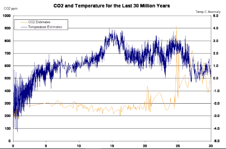
– N° 13 600 million years of temperature change and atmospheric CO2


And in Addition
Note that the illustration #10 assumes (as is the “consensus”) that doubling atmospheric CO2 produces a 1C rise in GMT (Global Mean Temperature). Even if true, the warming would be gentle and not cataclysmic. Greta and XR are foolishly thinking the world goes over a cliff if CO2 hits 430ppm. I start to wonder if Greta really can see CO2 as she claims.
It is also important to know that natural CO2 sources and sinks are estimated with large error ranges. For example this table from earlier IPCC reports:
Below are some other images I find meaningful, though they lack Raymond’s high production values.


Reblogged this on Climate Collections.
LikeLike
Hi Ron
Thanks and I hope you had a nice weekend. That charts is a really interesting one.
––––––––––––––––––––––––––––––––
I just added a new chart to The World of Climate Change.
This chart shows the past 400 thousand years and temperatures.
– During this period almost 90% is dominated by cold periods.
– Warm periods are very short, this last warming periods is also one of the coolest period up till now.
This got me thinking a whole lot. Considering how low the CO2 levels where and considering had they dropped any lower, it’s very possible that we would start to see global extinctions on a mass scale. I don’t want to sound dramatic but just think for a minute this isn’t something we should laugh about. The lack of stepping back and looking at the whole give us a completely different perspective on the topic. This is the part that I find so exciting.
I’m thinking of rearranging the order of the charts for World of Climate Change.
I would order it as follows:
01) 400 thousand years of temperature
02) Holocene Period
03) Sea level Rise
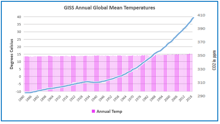
04) 140 years of temperature
or
01) 600 Million years of temperature (without CO2)
02) 400 Thousand years of temperature
03) Holocene Period
04) Sea level Rise
05) 140 years of temperature
This would help bring us to the present day situation.
Cheers R.
LikeLike
Well, I’ve rearranged chart order for “The World of Climate Change” as follows.
01) 600 Million years of temperature (without CO2)
02) 400 Thousand years of temperature
03) Holocene Period
04) 140 years of temperature
05) Sea level Rise
This kind of ist like a step by step beginners approsch to see from the past into the present.
What do you think? Thanks for the feedback and Chart N° 2 is new in the list…
Have a good start to the week! Cheers R
LikeLike
Thanks Raymond. I am not seeing the 400k years slide nor a revised listing at your website
LikeLike