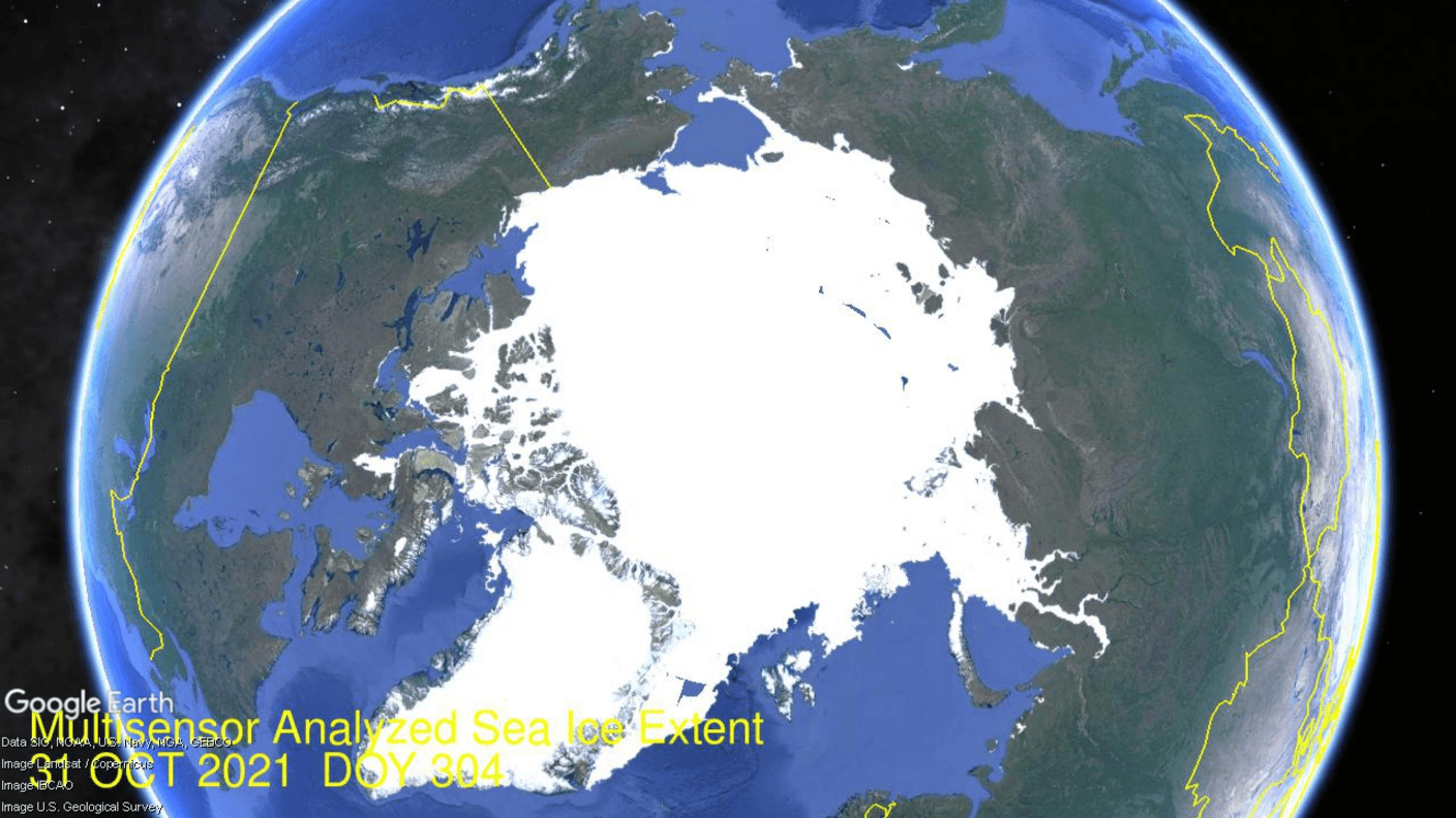
The animation shows Arctic ice extents from day 304 (end of October) to day 334, Nov.30, 2021. On the right side are the Euro-Russian seas already frozen over end of October. At the bottom right Kara Sea fills in to >90%, while Barents (left of Kara) adds nearly 400k km2 to reach 60% of March maximum. Dramatically, at the top center Chukchi freezes over and Bering Sea grows ~300k km2 of ice extent. On the far left Hudson Bay shows its delayed freezing this year, with some western shore ice appearing only in the last 10 days. Meanwhile, Baffin Bay (lower left) added 480k km2 of ice extent. The graph below shows November daily ice extents for 2021 compared to 14 year averages, and some years of note.
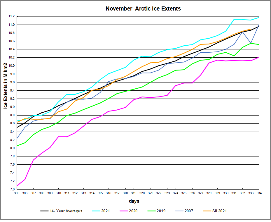 The black line shows during November on average Arctic ice extents increase ~2.5M km2 from ~8.5M km2 up to ~11M km2. The 2021 cyan MASIE line started the month 163k km2 above average and on day 334 showed a surplus of 196k km2. The Sea Ice Index in orange (SII from NOAA) started with the same deficit, then lagged behind through the month, before ending ~200k km2 lower than MASIE. (No SII data yet for day 334). 2019 and 2020 were well below average at this stage of the ice recovery.
Why is this important? All the claims of global climate emergency depend on dangerously higher temperatures, lower sea ice, and rising sea levels. The lack of additional warming is documented in a post Adios, Global Warming
The lack of acceleration in sea levels along coastlines has been discussed also. See USCS Warnings of Coastal Flooding
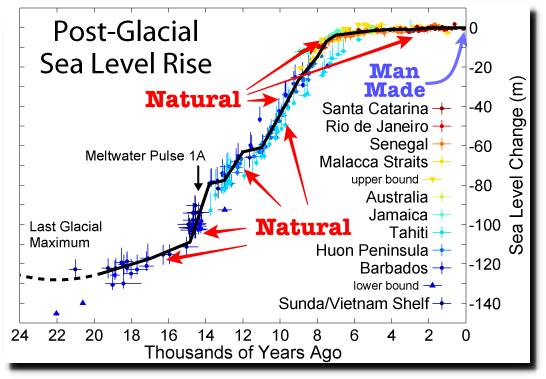
Also, a longer term perspective is informative:
 The table below shows the distribution of Sea Ice on day 334 across the Arctic Regions, on average, this year and 2020.
| Region | 2021334 | Day 334 Average | 2021-Ave. | 2020334 | 2021-2020 |
| (0) Northern_Hemisphere | 11171831 | 10976208 | 195623 | 10207244 | 964587 |
| (1) Beaufort_Sea | 1070776 | 1069252 | 1524 | 1070689 | 87 |
| (2) Chukchi_Sea | 966006 | 781701 | 184305 | 601423 | 364584 |
| (3) East_Siberian_Sea | 1087085 | 1082808 | 4277 | 1075464 | 11621 |
| (4) Laptev_Sea | 897827 | 897818 | 9 | 897827 | 0 |
| (5) Kara_Sea | 874105 | 789034 | 85071 | 470654 | 403451 |
| (6) Barents_Sea | 445466 | 252273 | 193193 | 56772 | 388695 |
| (7) Greenland_Sea | 468845 | 543650 | -74805 | 577314 | -108469 |
| (8) Baffin_Bay_Gulf_of_St._Lawrence | 606454 | 680452 | -73998 | 608255 | -1802 |
| (9) Canadian_Archipelago | 854668 | 853089 | 1579 | 854597 | 71 |
| (10) Hudson_Bay | 307719 | 615274 | -307555 | 803363 | -495644 |
| (11) Central_Arctic | 3208675 | 3195024 | 13651 | 3118738 | 89936 |
| (12) Bering_Sea | 335645 | 140327 | 195318 | 39284 | 296361 |
| (13) Baltic_Sea | 6666 | 3698 | 2969 | 0 | 6666 |
| (14) Sea_of_Okhotsk | 34960 | 67733 | -32773 | 31397 | 3563 |
The overall surplus to average is 196k km2, (2%). Note the large surpluses of ice in Chukchi and Bering Seas, partly offset by deficits in Greenland Sea and Baffin bay. The largest deficit is Hudson Bay, a shallow basin that should freeze over in coming weeks, adding nearly 1M km2 when it does. Note that 2021 ice extent exceeds that of 2020 by almost a full Wadham, 965k km2, most of the surplus being in Chukchi, Bering, Kara and Barents Seas.


Illustration by Eleanor Lutz shows Earth’s seasonal climate changes. If played in full screen, the four corners present views from top, bottom and sides. It is a visual representation of scientific datasets measuring Arctic ice extents.

Reblogged this on Climate Collections.
LikeLike
Dear sir,
I was ashamed noting that the DMI (Danish Meteorological Institute) has “changed” it’s calculations on Arctic sea ice thickness and volume, in reality completely changing the graphs for all recent years (and the present one) to make it appear as it’s very low, whereas it was at the top of last 5 years in thickness and volume.
A previously reliable institution sells it’s soul to the pagan god of climate change, very sad.
I wrote a mail underpinning their change to fake science but they remained stuck to a “better horizontal resolution” that should explain the impossible relocation of every yearly curve on the graph.
Very sad.
Best regards.
LikeLike
Thanks for noting that Cristiano. Another case of adapting facts to a narrative, rather than the other way around. As I read recently: When politics gets mixed up with science, all you get is politics.
LikeLike