Arctic Ice Uncertainties

Northern Hemisphere Spatial Coverage

As noted in the September Outlook Arctic Ice, NOAA’s Sea Ice Index (SII) typically shows less ice than MASIE from National Ice Center (NIC). SII is a satellite product processed from passive microwave sensors. MASIE (Multisensor Analyzed Sea Ice Extent) adds other sources such as satellite imagery and field observations to produce high resolution ice charts for navigational purposes.

A post in 2016 NOAA Is Losing Arctic Ice showed how discrepancies between the two datasets vary considerably throughout the year, usually lower in SII except for October. Walt Meier directs the SII production and published a study in October 2015 comparing SII and MASIE, also discussed in that post.

In 2016 NOAA upgraded from SII version 1 to version 2, and later to version 2.1. The latest documentation says few datapoints were changed in v2.1, and that anomalies were unchanged. My cursory look seemed to confirm that. However, on closer inspection, there are significant differences between v1 and v2 (which carry over to v2.1). This post describes those differences.

I prepared two spreadsheet arrays for SIIv1 and SIIv2.1 and then a third array to calculate the differences. The graph below shows the results for 2006 to 2015 inclusive, being the years for which datapoints can be compared with MASIE.

It is clear that V2.1 is systematically lower than V1, on average -200k km2. The differences are less than 100k km2 the first four months, then increase May, June, July, before shrinking again in August and September. The big changes come in the last months, especially October. The October correction is not surprising. The comparison by Meier and in my post discussed large SII surpluses over MASIE in October that did not appear credible.

The graph is limited to one decade since that is the period to be compared with MASIE. The spreadsheet shows that the differences are typical of the whole dataset going back to 1979, albeit with considerable variety through the years. The graph below shows the month by month differences for all years through 2015.

As stated before, the average all years difference in green is comparable to the last decade. Differences were calculated by subtracting v1 from v2, since v2 is mostly lower. However, as the Min Diff line shows, v2 was higher for some datapoints, notably in July. The Max Diff shows that some Octobers were changed by as much as 1M km2. The dotted lines show the standard deviation for the average differences, which averaged  +/- 90k km2.

Summary

It is challenging to estimate Arctic ice extents. NOAA is to be commended for recognizing the erroneous October values, and correcting them. Clearly some of that overall diminishing of extents by 200k km2 derives from removing the bogus surpluses.

Those claiming that SII is for certain and MASIE is dubious need to reconsider. MASIE has its own challenges but is reasonably consistent in recent years. Meanwhile SII had to improve its product, resulting in changes to past values in the dataset. While error ranges are not available for these statistics, the standard deviation gives some indication of the variability in the estimates.

Fortunately, it appears that the critical months of March and September have not changed much in the new SII version.  However, it is not encouraging to see SII averages for the last two months -500k km2 below MASIE.  See September Outlook Arctic Ice

It is a good thing that several agencies and methods are involved in the effort to measure and understand Arctic ice dynamics. It is not good to claim certainty for a single record or to ignore the errors that are found along the way. It is wise to remember that measuring anything in the Arctic is difficult.

September Outlook Arctic Ice

2017: August Report from Sea Ice Prediction Network

For the August Report there were 37 contributions with the median Outlook value for September 2017 Arctic sea ice extent of 4.5 million square kilometers with quartiles of 4.2 and 4.8 million square kilometers (See Figure 1 in the Overview section, below). These values are unchanged from the July Report, which is consistent with the moderating impact of summer 2017 Arctic weather. The range is 3.1 to 5.5 million square kilometers in August, unchanged from the July Outlook. To place this Outlook in context, recently observed values were 4.3 million square kilometers in 2007, 3.6 million square kilometers in 2012, and 4.7 million square kilometers in 2016. 

These are predictions for the September 2017 monthly average ice extent as reported by NOAA Sea Ice Index (SII). This post provides a look at the 2017 Year To Date (YTD) based on monthly averages comparing MASIE and SII datasets. (10 year average is 2007 to 2016 inclusive)

The graph puts 2017 into recent historical perspective. Note how 2017 was below the 10-year average for the first 4 months, then recovered to match average in May and has maintained average through August. The outlier 2012 provided the highest March maximum as well as the lowest September minimum, coinciding with the Great Arctic Cyclone that year.  2007 began the decade with the lowest minimum except for 2012.  SII 2017 is running below MASIE and is currently just below MASIE 2007 and 2012.

The table below provides the numbers for comparisons.

Monthly 2017 2017 2017 2017-10yr Ave 2017-10yr Ave 2017-
2007
Averages MASIE SII SII
Deficit
MASIE SII MASIE
Jan 13.503 13.174 -0.329 -0.418 -0.512 -0.259
Feb 14.478 14.112 -0.366 -0.363 -0.440 -0.173
Mar 14.509 14.273 -0.236 -0.544 -0.542 -0.114
Apr 13.941 13.760 -0.180 -0.412 -0.446 0.246
May 12.838 12.618 -0.220 0.075 -0.138 0.412
June 10.975 10.720 -0.255 0.069 -0.218 0.148
July 8.383 7.901 -0.482 0.024 -0.206 0.367
Aug 6.006 5.472 -0.533 0.051 -0.185 0.421

The first two columns are the 2017 YTD shown by MASIE and SII, with the SII deficits in column three.  The difference has doubled the last two months and averaged -325k km2 for the YTD. Column four shows MASIE 2017 compared to MASIE 10 year average, while column five shows SII 2017 compared to SII 10 year average.  YTD MASIE is -190k km2 to average and SII is -336k km2 to average.  The last column shows MASIE 2017 holding an August surplus of 421k km2 over 2007.  For the YTD 2017 is 131k km2 higher than 2007, overcoming this year’s deficits in the early months.

For more on SII versions 1 and 2 differences see Arctic Ice Uncertainties

Summary

The experts involved in SIPN are expecting SII 2017 September to be higher than 2007 and slightly lower than 2016.  The way MASIE is going, this September looks to go higher than 2016 unless some bad weather intervenes.

Footnote:

Some people unhappy with the higher amounts of ice extent shown by MASIE continue to claim that Sea Ice Index is the only dataset that can be used. This is false in fact and in logic. Why should anyone accept that the highest quality picture of ice day to day has no shelf life, that one year’s charts can not be compared with another year? Researchers do this, including Walt Meier in charge of Sea Ice Index. That said, I understand his interest in directing people to use his product rather than one he does not control. As I have said before:

MASIE is rigorous, reliable, serves as calibration for satellite products, and continues the long and honorable tradition of naval ice charting using modern technologies. More on this at my post Support MASIE Arctic Ice Dataset

MASIE: “high-resolution, accurate charts of ice conditions”
Walt Meier, NSIDC, October 2015 article in Annals of Glaciology.

Arctic Ice September Strong

Click on image to enlarge.

The image above shows ice extents for yesterday, day 244, from 2007 to 2017.  Particularly interesting is the variation in the CAA (Canadian Arctic  Archipelago), crucial for the Northwest Passage.  (The region is located north of the word “Extent” in gold.)  While 2016 was a fine year for cruising with the passage completely open at day 244 that was not the case in 2014, and this year also has places frozen solid. By September 1, ice is still clogging some channels.

The graph of August NH ice extents shows 2017 has remained above the decadal average in recent days. (Ten-year average is for 2007 to 2016 inclusive).

This year is now 600k km2 greater than 2016 and exceeds the 10 year average by 50k km2.  SII (Sea Ice Index) 2017 is closer now, only 200k km2 lower.  2007 is running 400k km2 lower.  A previous post Beware the Arctic Storms of August discussed how late summer storms have dramatic impacts, and the graph shows both 2012 and 2016 plummeting in late August.  Note that just 2 weeks ago 2012 was tied with 2017, and then lost 1.6M km2.  2016 lost 1.3M km2 in the same period.

The table below compares 2017 with 2007 and the 10-year averages for Arctic regions.

Region 2017244 Day 244
Average
2017-Ave. 2007244 2017-2007
 (0) Northern_Hemisphere 4934548 4884191 50357 4525136 409412
 (1) Beaufort_Sea 424479 542957 -118477 629454 -204974
 (2) Chukchi_Sea 204972 225008 -20036 96232 108740
 (3) East_Siberian_Sea 314746 348577 -33831 196 314550
 (4) Laptev_Sea 216679 182883 33796 245578 -28899
 (5) Kara_Sea 34099 45628 -11528 74307 -40208
 (6) Barents_Sea 16638 23603 -6965 11061 5577
 (7) Greenland_Sea 142702 183941 -41239 288223 -145521
 (8) Baffin_Bay_Gulf_of_St._Lawrence 55689 24864 30825 32804 22885
 (9) Canadian_Archipelago 384879 294120 90759 234389 150490
 (10) Hudson_Bay 3848 23575 -19727 28401 -24553
 (11) Central_Arctic 3135439 2988097 147342 2883201 252238

2017 has deficits mainly in BCE, especially Beaufort Sea, but those are more than offset by surpluses in Central Arctic and CAA (Canadian Arctic Archipelago).  As shown in the post Arctic Heart Beat Central Arctic and CAA are the two regions providing most of the ice extent at annual minimum.

Footnote

Some people unhappy with the higher amounts of ice extent shown by MASIE continue to claim that Sea Ice Index is the only dataset that can be used.  This is false in fact and in logic.  Why should anyone accept that the highest quality picture of ice day to day has no shelf life, that one year’s charts can not be compared with another year?  Researchers do this, including Walt Meier in charge of Sea Ice Index.  That said, I understand his interest in directing people to use his product rather than one he does not control.  As I have said before:

MASIE is rigorous, reliable, serves as calibration for satellite products, and continues the long and honorable tradition of naval ice charting using modern technologies.  More on this at my post Support MASIE Arctic Ice Dataset

Bret Stephens on Harvey: Wealth and Resilience

Bret Stephens again writes insightfully regarding society and climate matters, this time in his recent article Hurricanes, climate and the capitalist offset  published in NYT reprinted in Tampa Bay Times.  Entire text below.

Texans will find few consolations in the wake of a hurricane as terrifying as Harvey. But here, at least, is one: A biblical storm has hit them, and the death toll — 38 as of this writing — is mercifully low, given its intensity.

This is not how it plays out in much of the world. In 1998, Hurricane Mitch ripped through Central America and killed anywhere between 11,000 and 19,000 people, mostly in Honduras and Nicaragua. Nearly a decade later Cyclone Nargis slammed into Myanmar, and a staggering 138,000 people perished.

Nature’s furies — hurricanes, earthquakes, landslides, droughts, infectious diseases, you name it — may strike unpredictably. But their effects are not distributed at random.

Rich countries tend to experience, and measure, the costs of such disasters primarily in terms of money. Poor countries experience them primarily in terms of lives. Between 1940 and 2016, a total of 3,348 people died in the United States on account of hurricanes, according to government data, for an average of 43 victims a year. That’s a tragedy, but compare it to the nearly 140,000 lives lost when a cyclone hit Bangladesh in 1991.

Why do richer countries fare so much better than poorer ones when it comes to natural disasters? It isn’t just better regulation. I grew up in Mexico City, which adopted stringent building codes following a devastating earthquake in 1957. That didn’t save the city in the 1985 earthquake, when we learned that those codes had been flouted for years by lax or corrupt building inspectors, and thousands of people were buried under the rubble of shoddy construction. Regulation is only as good, or bad, as its enforcement.

A better answer lies in the combination of government responsiveness and civic spiritedness so splendidly on display this week in Texas. And then there’s the matter of wealth.

Every child knows that houses of brick are safer than houses of wood or straw — and therefore cost more to build. Harvey will damage or ruin thousands of homes. But it won’t sweep away entire neighborhoods, as Typhoon Haiyan did in the Philippine city of Tacloban in 2013.

Harvey will also inflict billions in economic damage, most crushingly on uninsured homeowners. The numbers are likely to be staggering in absolute terms, but what’s more remarkable is how easily the U.S. economy can absorb the blow. The storm will be a “speed bump” to Houston’s $503 billion economy, according to Moody’s Analytics’ Adam Kamins, who told the Wall Street Journal that he expects the storm to derail growth for about two months.

On a global level, the University of Colorado’s Roger Pielke Jr. notes that disaster losses as a percentage of the world’s GDP, at just 0.3 percent, have remained constant since 1990. That’s despite the dollar cost of disasters having nearly doubled over the same time — at just about the same rate as the growth in the global economy. (Pielke is yet another victim of the climate lobby’s hyperactive smear machine, but that doesn’t make his data any less valid.)

Climate activists often claim that unchecked economic growth and the things that go with it are principal causes of environmental destruction. In reality, growth is the great offset. It’s a big part of the reason why, despite our warming planet, mortality rates from storms have declined from 0.11 per 100,000 in the 1900s to 0.04 per 100,000 in the 2010s, according to data compiled by Hannah Ritchie and Max Roser. Death rates from other natural disasters such as floods and droughts have fallen by even more staggering percentages over the last century.

That’s because economic growth isn’t just a matter of parking lots paving over paradise. It also underwrites safety standards, funds scientific research, builds spillways and wastewater plants, creates “green jobs,” subsidizes Elon Musk, sets aside prime real estate for conservation, and so on. Poverty, not wealth, is the enemy of the environment. Only the rich have the luxury of developing an ethical stance toward their trash.

The paradox of our time is that the part of the world that has never been safer from the vagaries of nature seems never to have been more terrified of them. Harvey truly is an astonishing storm, the likes of which few people can easily remember.

Then again, as meteorologist Philip Klotzbach points out, it’s also only one of four Category 4 or 5 hurricanes to make landfall in the United States since 1970. By contrast, more than twice as many such storms made landfall between 1922 and 1969. Make of that what you will, but remember that fear is often a function of unfamiliarity.

Houston will ultimately recover from Harvey’s devastation because its people are creative and courageous. They will rebuild and, when the next storm comes, as it inevitably will, be better prepared for it. The best lesson the world can take from Texas is to follow the path of its extraordinary economic growth on the way to environmental resilience.

Stephens is one of a few journalists who writes lucidly about weather and climate.  Let’s see how the progressive NYT readers enjoy his clarity.

Update: What Stephens writes is largely confirmed by a news report today from the Mayor of Houston. Houston Mayor Sylvester Turner said Thursday that the city is now “mostly dry,” after having taken an aerial tour of the city.  He also said: “One year from now when people visit Houston, they will not see signs of Harvey.”

See also Climate Adaptive Cities: The Smart Way Forward

Serenity Faces Ice Aug.30

Click on image to enlarge.

August 31 and Sept. 1 Updates Below

h/t to angech for asking an interesting question:  What are the chances of an early refreezing in the Northwest Passage?  It provoked me to look more into the recent history of ice extents in the CAA (Canadian Arctic Archipelago).

The image above shows the years in the last decade closest to 2017 in terms of ice present in the CAA.  Only 2014 had more ice in that region than this year: 513k km2 compared to 464k km2 at day 240.  It appears that CAA annual minimum typically occurs at day 260, the same as the overall NH minimum.  The image above also shows that 2009 with 388k km2 provides the closest analog to this year for the amount of ice in McClintock Bay just in front of Serenity. The image below gives the progression in 2009 from day 244 to 270.

As of 10:30 EST this morning Serenity is located as shown in image below along with ice extent reported by MASIE for yesterday.  Ship tracking is provided by marinevesseltraffic.com  and shows that Serenity is now in convoy with two icebreakers ahead of her.

Canadian ice chart from yesterday showing Serenity and escort worked their way through the water and thinner green ice, but with some thicker stuff ahead.

Serenity will make it through with such assistance, which was largely unnecessary last year.  And as the above shows, 2014 would have been close to impossible.

UPDATE 16:30 EST

The convoy has reached the southern tip of Prince of Wales Island and are turning northeast. It appears they will sail along the thin shore ice, presumably headed for the western entrance of Bellot Strait which passes through to Prince Regent channel.

UPDATE 7:00AM EST AUG. 31

Serenity convoy is about to enter Bellot Strait.  Waiting for a cargo ship to exit the channel.

UPDATE 9:00AM EST Aug. 31

Cruisemapper shows Serenity has entered the Strait following her icebreaker.

Update 12:00 PM EST Aug. 31

Serenity and icebreaker escort have emerged from Bellot Strait into Prince Regent channel and are turning north.  Next destination may well be Devon Island with some interesting things that were seen last year.  See Mars in the Arctic

Update 7:00 AM EST Sept. 1, 2017

Serenity and icebreaker are anchored just off Beechey Island at the southwestern tip of Devon Island.


Persistent August Arctic Ice

Click on image to enlarge.

The image above shows ice extents for yesterday, day 239, from 2007 to 2017.  Particularly interesting is the variation in the CAA (Canadian Arctic  Archipelago), crucial for the Northwest Passage.  (The region is located just north of the word “Sea” in gold.)  Note that 2016 was a fine year for cruising with the passage completely open at this date.  That was not the case in 2014, and this year also has places frozen solid.

Crystal Serenity is going through the Northwest Passage again this year, having left Seward Alaska on Aug. 15, 2017.  She arrives at Cambridge Bay today, having traveled in the wake of icebreaker RRS Ernest Shackleton.  The next part of the voyage could be challenging.

The graph of August NH ice extents shows 2017 has moved above the decadal average in recent days. (Ten-year average is for 2007 to 2016 inclusive)

This year is now 850k km2 greater than 2016 and exceeds the 10 year average by 200k km2.  SII (Sea Ice Index) 2017 is also 450k km2 lower.  A previous post Beware the Arctic Storms of August discussed how late summer storms have dramatic impacts, and the graph shows both 2012 and 2016 plummeting in the last ten days.  By the end of the month in four days, those two years will go below 4.4M km2.

By the way, Barents is still above average and holding steady near 50k km2.

The black line is average for the last 11 years.  2007 in purple appears close to an average year.  2014 had the highest annual extent in Barents Sea, due to higher and later maximums, holding onto ice during the summer, and recovering quickly.  In contrast, 2016 was the lowest annual extent, melting out early and recovering later.  2017 in blue started out way behind, but grew rapidly to reach average, and then persisted longer to exceed even 2014.  It will be important to see when the recovery of ice begins.

For more on why Barents Sea matters see Barents Icicles

Footnote

Some people unhappy with the higher amounts of ice extent shown by MASIE continue to claim that Sea Ice Index is the only dataset that can be used.  This is false in fact and in logic.  Why should anyone accept that the highest quality picture of ice day to day has no shelf life, that one year’s charts can not be compared with another year?  Researchers do this, including Walt Meier in charge of Sea Ice Index.  That said, I understand his interest in directing people to use his product rather than one he does not control.  As I have said before:

MASIE is rigorous, reliable, serves as calibration for satellite products, and continues the long and honorable tradition of naval ice charting using modern technologies.  More on this at my post Support MASIE Arctic Ice Dataset

Crystal Serenity and escort near Cambridge Bay in 2016.

Partying in Paris instead of Preparing in Houston

Waves pound the shore from approaching Hurricane Harvey on August 25, 2017 in Corpus Christi, Texas.(Photo by Joe Raedle/Getty Images)

“We are not ready for a return to 1950’s weather, let alone something unprecedented.”

As evidence of the above, we have Hurricane Harvey as a case in point.  While elected officials blather about “zero-carbon” footprints, nothing is done to prepare for weather events that have happened before and can always happen again. International accords and conferences like the last one in Paris do nothing for a vulnerable place like Houston.

Consider this article A Texas newsroom predicted a disaster. Now it’s close to coming true. published at Columbia Journalism Review.  Excerpts below.

THE TEXAS TRIBUNE AND PROPUBLICA last year published a multi-part investigation looking at what would happen if Houston was hit by a major hurricane.

The reporters partnered with scientists at several universities in Texas to conduct simulations, gaming out various storm scenarios for the country’s fourth-largest city, with its rapidly growing population, huge stores of oil and natural gas, and a major NASA facility.

The conclusion: The city and region were woefully unprepared for a major hurricane, with inadequate infrastructure for evacuation and flood control. A major storm would inflict catastrophic damage, bringing “economic and ecological disaster.” The series won awards, including a Peabody and an Edward R. Murrow, but it didn’t lead to substantive policy changes or big new investments in infrastructure.

Houston is the fourth-largest city in the country. It’s home to the nation’s largest refining and petrochemical complex, where billions of gallons of oil and dangerous chemicals are stored. And it’s a sitting duck for the next big hurricane. Learn why Texas isn’t ready. March 3, 2016

A house is engulfed in flames as water and waves inundate homes on Galveston Island as Hurricane Ike approaches the coast Sept. 12, 2008.

Now the same journalists are watching nervously as Hurricane Harvey inches closer to the Texas shoreline. While landfall is expected between Corpus Christi and Houston, one of their worst-case scenarios could still come true.

“Unfortunately it might take a disaster,” Shaw adds, “before Texas wakes up and realizes we need to send some real money to protect one of the nation’s biggest ports, where we keep most of our oil and chemicals.” If Houston was directly hit by a storm of Harvey’s magnitude, Shaw says, the environmental damage would exceed the BP Deepwater Horizon oil spill.

After the series appeared, the reporters reached out to the state’s entire congressional delegation and both of its US senators, one of whom, Ted Cruz, ran for president. “So none of them can say nobody could anticipate the calamity a large storm could inflict upon their constituencies,” Klein wrote.

“Ike was supposed to be that wake-up call to do something about this,” Shaw says. “All I can hope for is that this will be another wake-up call, and Texas will ask for more action before the ‘big one.’”

A short video explaining in 2011 how to protect the area from the next big one.

See also Climate Adaptive Cities: The Smart Way Forward

X-Weather is Back! Harvey edition

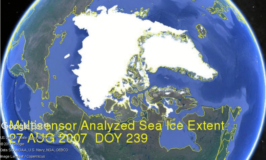
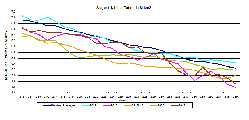
With Hurricane Harvey making landfall in Texas as a Cat 4, the storm drought is over and claims of linkage to climate change can be expected.  So far (mercifully) articles in Time and Washington Post have been more circumspect than in the past.  Has it become more respectable to look at the proof supporting wild claims?  This post provides background on X-Weathermen working hard to claim extreme weather as proof of climate change.

In the past the media has been awash with claims of “human footprints” in extreme weather events, with headlines like these:

“Global warming is making hot days hotter, rainfall and flooding heavier, hurricanes stronger and droughts more severe.”

“Global climate change is making weather worse over time”

“Climate change link to extreme weather easier to gauge”– U.S. Report

“Heat Waves, Droughts and Heavy Rain Have Clear Links to Climate Change, Says National Academies”

That last one refers to a paper released by the National Academy of Sciences Press: Attribution of Extreme Weather Events in the Context of Climate Change (2016)

And as usual, the headline claims are unsupported by the actual text. From the NAS report (here): (my bolds)

Attribution studies of individual events should not be used to draw general conclusions about the impact of climate change on extreme events as a whole. Events that have been selected for attribution studies to date are not a representative sample (e.g., events affecting areas with high population and extensive infrastructure will attract the greatest demand for information from stakeholders) P 107

Systematic criteria for selecting events to be analyzed would minimize selection bias and permit systematic evaluation of event attribution performance, which is important for enhancing confidence in attribution results. Studies of a representative sample of extreme events would allow stakeholders to use such studies as a tool for understanding how individual events fit into the broader picture of climate change. P 110

Correctly done, attribution of extreme weather events can provide an additional line of evidence that demonstrates the changing climate, and its impacts and consequences. An accurate scientific understanding of extreme weather event attribution can be an additional piece of evidence needed to inform decisions on climate change related actions. P. 112

The Indicative Without the Imperative

extreme-weather-events

The antidote to such feverish reporting is provided by Mike Hulme in a publication: Attributing Weather Extremes to ‘Climate Change’: a Review (here).

He has an insider’s perspective on this issue, and is certainly among the committed on global warming (color him concerned). Yet here he writes objectively to inform us on X-weather, without advocacy: real science journalism and a public service, really. Excerpts below with my bolds.

Overview

In this third and final review I survey the nascent science of extreme weather event attribution. The article proceeds by examining the field in four stages: motivations for extreme weather attribution, methods of attribution, some example case studies and the politics of weather event Attribution.

The X-Weather Issue

As many climate scientists can attest, following the latest meteorological extreme one of the most frequent questions asked by media journalists and other interested parties is: ‘Was this weather event caused by climate change?’

In recent decades the meaning of climate change in popular western discourse has changed from being a descriptive index of a change in climate (as in ‘evidence that a climatic change has occurred’) to becoming an independent causative agent (as in ‘climate change caused this event to happen’). Rather than being a descriptive outcome of a chain of causal events affecting how weather is generated, climate change has been granted power to change worlds: political and social worlds as much as physical and ecological ones.

To be more precise then, what people mean when they ask the ‘extreme weather blame’ question is: ‘Was this particular weather event caused by greenhouse gases emitted from human activities and/or by other human perturbations to the environment?’ In other words, can this meteorological event be attributed to human agency as opposed to some other form of agency?

The Motivations

Hulme shows what drives scientists to pursue the “extreme weather blame” question, noting four motivational factors.

Why have climate scientists over the last ten years embarked upon research to provide an answer beyond the stock phrase ‘no individual weather event can directly be attributed to greenhouse gas emissions’?  There seem to be four possible motives.

1.Curiosity
The first is because the question piques the scientific mind; it acts as a spur to develop new rational understanding of physical processes and new analytic methods for studying them.

2.Adaptation
A second argument, put forward by some, is that it is important to know whether or not specific instances of extreme weather are human-caused in order to improve the justification, planning and execution of climate adaptation.

3.Liability
A third argument for pursuing an answer to the ‘extreme weather blame’ question is inspired by the possibility of pursuing legal liability for damages caused. . . If specific loss and damage from extreme weather can be attributed to greenhouse gas emissions – even if expressed in terms of increased risk rather than deterministically – then lawyers might get interested.

The liability motivation for research into weather event attribution also bisects the new international political agenda of ‘loss and damage’ which has emerged in the last two years. . . The basic idea is to give recognition that loss and damage caused by climate change is legitimate ground for less developed countries to gain access to new international climate adaptation funds.

4. Persuasion
A final reason for scientists to be investing in this area of climate science – a reason stated explicitly less often than the ones above and yet one which underlies much of the public interest in the ‘extreme weather blame’ question – is frustration with and argument about the invisibility of climate change. . . If this is believed to be true – that only scientists can make climate change visible and real –then there is extra onus on scientists to answer the ‘extreme weather blame’ question as part of an effort to convince citizens of the reality of human-caused climate change.

Attribution Methods

Attributing extreme weather events to human influences requires different approaches, of which four broad categories can be identified.

1. Physical Reasoning
The first and most general approach to attributing extreme weather phenomena to rising greenhouse gas concentrations is to use simple physical reasoning.

General physical reasoning can only lead to broad qualitative statements such as ‘this extreme weather is consistent with’ what is known about the human-enhanced greenhouse effect. Such statements offer neither deterministic nor stochastic answers and clearly underdetermine the ‘weather blame question.’ It has given rise to a number of analogies to try to communicate the non-deterministic nature of extreme event attribution. The three most widely used ones concern a loaded die (the chance of rolling a ‘6’ has increased, but no single ‘6’ can be attributed to the biased die), the baseball player on steroids (the number of home runs hit increases, but no single home run can be attributed to the steroids) and the speeding car-driver (the chance of an accident increases in dangerous conditions, but no specific accident can be attributed to the fast-driving).

2. Classical Statistical Analysis
A second approach is to use classical statistical analysis of meteorological time series data to determine whether a particular weather (or climatic) extreme falls outside the range of what a ‘normal’ unperturbed climate might have delivered.

All such extreme event analyses of meteorological time series are at best able to detect outliers, but can never be decisive about possible cause(s). A different time series approach therefore combines observational data with model simulations and seeks to determine whether trends in extreme weather predicted by climate models have been observed in meteorological statistics (e.g. Zwiers et al., 2011, for temperature extremes and Min et al., 2011, for precipitation extremes). This approach is able to attribute statistically a trend in extreme weather to human influence, but not a specific weather event. Again, the ‘weather blame question’ remains underdetermined.

slide20

3. Fractional Attributable Risk (FAR)
Taking inspiration from the field of epidemiology, this method seeks to establish the Fractional Attributable Risk (FAR) of an extreme weather (or short-term climate) event. It asks the counterfactual question, ‘How might the risk of a weather event be different in the presence of a specific causal agent in the climate system?’

The single observational record available to us, and which is analysed in the statistical methods described above, is inadequate for this task. The solution is to use multiple model simulations of the climate system, first of all without the forcing agent(s) accused of ‘causing’ the weather event and then again with that external forcing introduced into the model.

The credibility of this method of weather attribution can be no greater than the overall credibility of the climate model(s) used – and may be less, depending on the ability of the model in question to simulate accurately the precise weather event under consideration at a given scale (e.g. a heatwave in continental Europe, a rain event in northern Thailand) (see Christidis et al., 2013a).

4. Eco-systems Philosophy
A fourth, more philosophical, approach to weather event attribution should also be mentioned. This is the argument that since human influences on the climate system as a whole are now clearly established – through changing atmospheric composition, altered land surface characteristics, and so on – there can no longer be such a thing as a purely natural weather event. All weather — whether it be a raging tempest or a still summer afternoon — is now attributable to human influence, at least to some extent. Weather is the local and momentary expression of a complex system whose functioning as a system is now different to what it would otherwise have been had humans not been active.

Results from Weather Attribution Studies

Hulme provides a table of numerous such studies using various methods, along with his view of the findings.

It is likely that attribution of temperature-related extremes using FAR methods will always be more attainable than for other meteorological extremes such as rainfall and wind, which climate models generally find harder to simulate faithfully at the spatial scales involved. As discussed below, this limitation on which weather events and in which regions attribution studies can be conducted will place important constraints on any operational extreme weather attribution system.

Political Dimensions of Weather Attribution

Hulme concludes by discussing the political hunger for scientific proof in support of policy actions.

But Hulme et al. (2011) show why such ambitious claims are unlikely to be realised. Investment in climate adaptation, they claim, is most needed “… where vulnerability to meteorological hazard is high, not where meteorological hazards are most attributable to human influence” (p.765). Extreme weather attribution says nothing about how damages are attributable to meteorological hazard as opposed to exposure to risk; it says nothing about the complex political, social and economic structures which mediate physical hazards.

And separating weather into two categories — ‘human-caused’ weather and ‘tough-luck’ weather – raises practical and ethical concerns about any subsequent investment allocation guidelines which excluded the victims of ‘tough-luck weather’ from benefiting from adaptation funds.

Contrary to the claims of some weather attribution scientists, the loss and damage agenda of the UNFCCC, as it is currently emerging, makes no distinction between ‘human-caused’ and ‘tough-luck’ weather. “Loss and damage impacts fall along a continuum, ranging from ‘events’ associated with variability around current climatic norms (e.g., weather-related natural hazards) to [slow-onset] ‘processes’ associated with future anticipated changes in climatic norms” (Warner et al., 2012:21). Although definitions and protocols have not yet been formally ratified, it seems unlikely that there will be a role for the sort of forensic science being offered by extreme weather attribution science.

Conclusion

Thank you Mike Hulme for a sane, balanced and expert analysis. It strikes me as being another element in a “Quiet Storm of Lucidity”.

Is that light the end of the tunnel or an oncoming train?

Climate Adaptive Cities: The Smart Way Forward

A recent post Renewables Hypocrisy described the vain and empty spectacle of Mayors of major cities lining up to get badges claiming “100% Renewable Energy”. This post provides the alternative to such posturing. Matthew Kahn is a microeconomist studying and writing on the more rational and productive response to future climate change possibilities. His thinking is explained in a recent paper is Will Climate Change Cause Enormous Social Costs for Poor Asian Cities? Asian Development Review September 2017. There is much wisdom packed in this document, not only regarding Asia but everywhere.  Some excerpts below give the flavor.

Overview

Climate change could significantly reduce the quality of life for poor people in Asia. Extreme heat and drought, and the increased incidence of natural disasters will pose new challenges for the urban poor and rural farmers. If farming profits decline, urbanization rates will accelerate and the social costs of rapid urbanization could increase due to rising infectious disease rates, pollution, and congestion. This paper studies strategies for reducing the increased social costs imposed on cities by climate change.

Cities face a practical challenge and many have not embraced it

While Asia’s poor face major new risks because of climate change, there are countervailing forces in play as well. With the rise of big data, governments and individuals have greater access to real-time information about emerging threats. Increased international flows of capital have given local governments the capacity to fund public infrastructure projects.

An open question concerns the incentives for mayors and city governments in developing countries to take costly steps to improve the quality of life of the urban poor. Such investments will ultimately increase the migration of rural poor to these cities. Anticipating this effect, some mayors and city governments are discouraged from making such investments. Feler and Henderson (2011) present evidence of this dynamic in Brazil.

Asia’s collective ability to adapt to anticipated but ambiguous new climate risks hinges on the well-being of the urban poor. If this group can successfully adapt to new challenges, then Asia’s overall urbanization experience is more likely to yield long-term economic growth and improvements in living standards.

The campaign to mitigate (prevent) global warming by reducing CO2 emissions is typified by the Paris accord, an ongoing political theater providing cover for elected officials.
Mitigation is not only useless, it distracts from real efforts to prepare for the future. Kahn:

Given that climate change directly impacts city quality of life, one surprising fact is that many leaders from around the world appear to devote more effort to seeing their city become a low-carbon city rather than a resilient city. To an economist, greater effort being devoted to mitigation rather than adaptation is surprising. With the former, there is a free-rider problem. Each city only contributes a small amount of the world’s total emissions; even if a city’s emissions are reduced to zero, its efforts will make no real difference in mitigating climate change.

Therefore, self-interest should drive adaptation efforts. Climate change can be perceived as a medium-term threat that will intensify after today’s leaders are no longer in power. It remains an open question whether elected officials are rewarded for tackling medium-term challenges. If real estate markets are forward looking, then current prices should reflect future threats. If a city develops a reputation for having a declining quality of life, then it will have more trouble attracting and retaining skilled workers. The threat of a brain drain (and lost tourism receipts) should incentivize local leaders to act.

It is also a case where one size does not fit all

In the spatial economics literature, cities differ with respect to their locational characteristics. Some cities feature cold winters, while others feature mountains. Real estate prices and rents adjust across cities so that those with better quality of life have higher rents and lower wages as compensation differential for living there (Rosen 2002). Climate change affects a city’s attributes. For example, a city that has enjoyed a temperate summer climate may now be much warmer during summer months.

In the typical urban economics model, a city’s attributes are all common knowledge. When considering the urban consequences of climate change, a city’s future attributes should be thought of as a random vector. For example, we do not know exactly what challenges Singapore will face in the year 2025 resulting from higher temperatures and/or rising sea levels. We can form expectations of these random variables, but we know that we do not know these future outcomes.

Facing uncertainty about how the quality of life will evolve in different cities, the theory of option value suggests it is important that Asia’s urban poor have as many possible destinations to move as possible. Such a menu of cities protects individuals and creates competition. Every city and country features locations of “higher ground” that are ostensibly more protected from the impacts of climate change. Advances in spatial mapping software can pinpoint such areas. If cities change their land use patterns to allow for higher densities in such areas, then adaptation is promoted.

If a population can self-protect from emerging threats using affordable technologies and real-time information, and if local governments can do a better job protecting urban residents from risk, then the historical relationship between risk and negative outcomes can be attenuated. This is a new version of the “Lucas critique,” which argues that as governments change the rules of the game, economic agents reoptimize and past relationships between consumption and income no longer hold (Lucas 1976).

In the case of climate adaptation, Mother Nature changes the rules of the game and economic actors change their decision making to reduce their risk exposure. Forward-looking households and firms should be making investments to become more nimble in the face of increased exposure to heat, drought, and climate volatility. The net effect should be that B1 in equation (1) shrinks toward zero over time.

Summary

Two schools of thought regarding future climates:

Mitigation: Cut down on use of fossil fuels to mitigate or prevent future global warming.
Adaptation: As changes occur, adapt our methods and practices to survive and prosper in new conditions.

The Paris Agreement and various cap-and-trade schemes intend to Mitigate future warming. Lots of gloom and doom is projected (forecast) by activists claiming mitigation is the only way. But the facts of our experience say otherwise. Building Adaptive Cities means investing in resilience, preparing for future periods both colder and warmer than the present. Key objectives include reliable, affordable energy and robust infrastructure.

See also: Adapt, Don’t Fight Climate Change

Mitigation is Bad for Us and the Planet