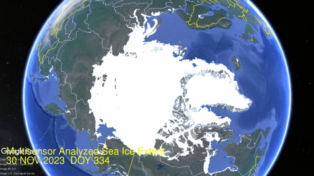
Fear Not for Arctic Ice New Year 2024
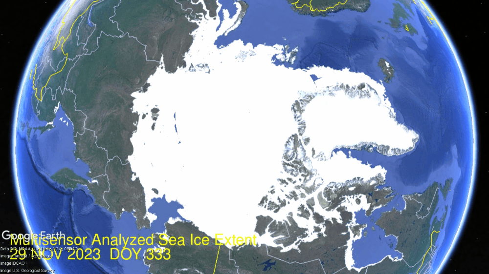
Impressive Arctic ice recovery continued in December as seen in the animation below:
The month of December 2023 shows Hudson Bay (lower right) starting with some western shore ice and ending 92% ice covered, adding in that basin ~800k km2. Just above Hudson, you can see the Gulf of St. Lawrence icing over, and Baffin Bay adding ice as well, now up to 50% of its annual maximum.
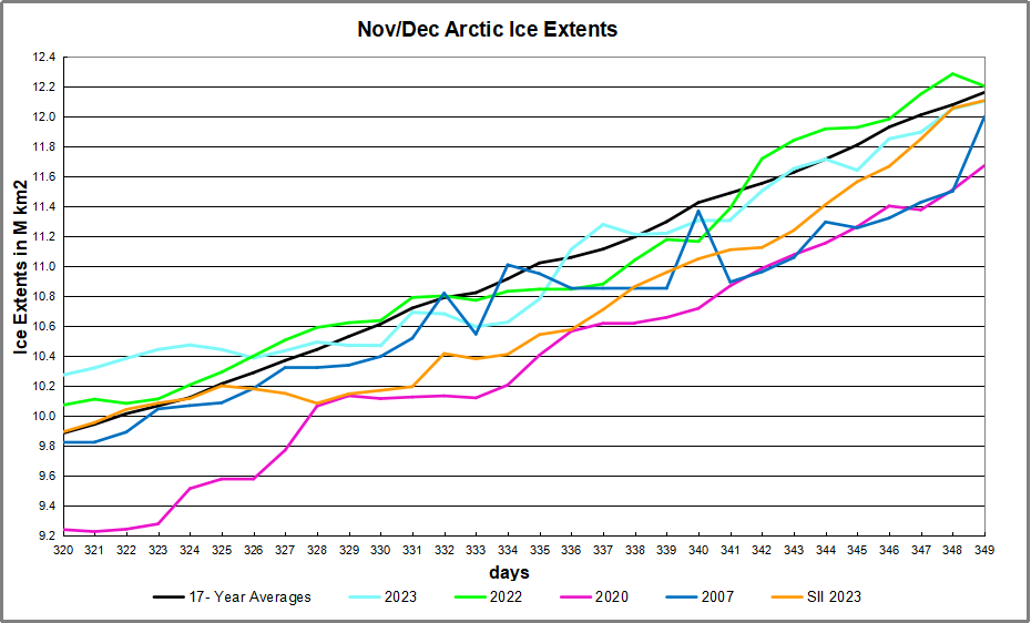
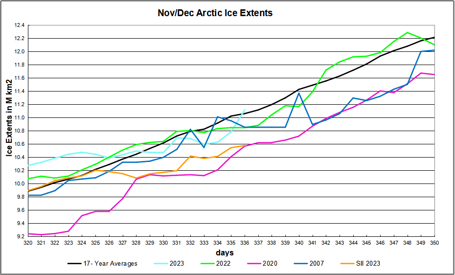
At the extreme and lower left, Okhotsk and Bering Seas also start with little shore ice. Okhotsk grew ice extent from 57k km2 up to 530k, 62% of its max last March. Bering grew from 48k up to 478k km2, 56% of its max. At the top Kara freezes over and Barents and Greenland Seas add ice to their margins. The graph below shows the December ice recovery. (Day 365 coming, and may be delayed by holiday.)
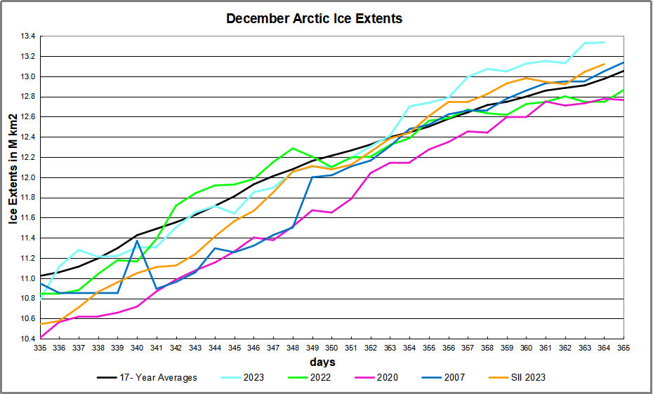
Note the average year adds 2M km2 while 2023 added ~2.5M, now 361k km2 above average. SII started 200k km2 lower than MASIE and ended up with the same deficit. Note that the other years are not far from the 17-year average at year end.
The table below shows year-end ice extents in the various Arctic basins compared to the 17-year averages and some recent years.
| Region | 2023364 | Day 364 | 2023-Ave. | 2007364 | 2023-2007 |
| (0) Northern_Hemisphere | 13335688 | 12974817 | 360871 | 13049737 | 285951 |
| (1) Beaufort_Sea | 1070966 | 1070352 | 614 | 1069711 | 1255 |
| (2) Chukchi_Sea | 966006 | 963344 | 2662 | 965971 | 35 |
| (3) East_Siberian_Sea | 1087137 | 1087133 | 4 | 1087120 | 17 |
| (4) Laptev_Sea | 897845 | 897841 | 4 | 897845 | 0 |
| (5) Kara_Sea | 923106 | 880831 | 42275 | 871851 | 51255 |
| (6) Barents_Sea | 423772 | 415592 | 8179 | 334577 | 89194 |
| (7) Greenland_Sea | 739662 | 579776 | 159886 | 666135 | 73528 |
| (8) Baffin_Bay_Gulf_of_St._Lawrence | 911691 | 965051 | -53360 | 1074827 | -163136 |
| (9) Canadian_Archipelago | 854860 | 853421 | 1439 | 852556 | 2304 |
| (10) Hudson_Bay | 1165656 | 1234412 | -68757 | 1260856 | -95201 |
| (11) Central_Arctic | 3218074 | 3205662 | 12412 | 3199726 | 18348 |
| (12) Bering_Sea | 472476 | 391321 | 81155 | 373942 | 98534 |
| (13) Baltic_Sea | 44969 | 27442 | 17527 | 9972 | 34997 |
| (14) Sea_of_Okhotsk | 530117 | 377911 | 152206 | 371241 | 158876 |
This year’s ice extent is 361k km2 or 2.8% above average. Only Baffin Bay and Hudson have deficits to average, more than offset by surpluses elsewhere, espcially Greenland, Bering and Okhotsk seas. Many of the others are already maxed out.

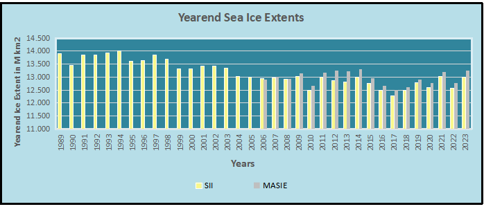
Comparing Arctic Ice at End of Years
At the bottom is a discussion of statistics on year-end Arctic Sea Ice extents. The values are averages of the last five days of each year. End of December is a neutral point in the melting-freezing cycle, midway between September minimum and March maximum extents.
Background from Previous Post Updated to Year-End 2023
Some years ago reading a thread on global warming at WUWT, I was struck by one person’s comment: “I’m an actuary with limited knowledge of climate metrics, but it seems to me if you want to understand temperature changes, you should analyze the changes, not the temperatures.” That rang bells for me, and I applied that insight in a series of Temperature Trend Analysis studies of surface station temperature records. Those posts are available under this heading. Climate Compilation Part I Temperatures
This post seeks to understand Arctic Sea Ice fluctuations using a similar approach: Focusing on the rates of extent changes rather than the usual study of the ice extents themselves. Fortunately, Sea Ice Index (SII) from NOAA provides a suitable dataset for this project. As many know, SII relies on satellite passive microwave sensors to produce charts of Arctic Ice extents going back to 1979. The current Version 3 has become more closely aligned with MASIE, the modern form of Naval ice charting in support of Arctic navigation. The SII User Guide is here.
There are statistical analyses available, and the one of interest (table below) is called Sea Ice Index Rates of Change (here). As indicated by the title, this spreadsheet consists not of monthly extents, but changes of extents from the previous month. Specifically, a monthly value is calculated by subtracting the average of the last five days of the previous month from this month’s average of final five days. So the value presents the amount of ice gained or lost during the present month.
These monthly rates of change have been compiled into a baseline for the period 1980 to 2010, which shows the fluctuations of Arctic ice extents over the course of a calendar year. Below is a graph of those averages of monthly changes up to and including this year. Those familiar with Arctic Ice studies will not be surprised at the sine wave form. December end is a relatively neutral point in the cycle, midway between the September Minimum and March Maximum.
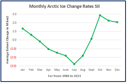
The graph makes evident the six spring/summer months of melting and the six autumn/winter months of freezing. Note that June-August produce the bulk of losses, while October-December show the bulk of gains. Also the peak and valley months of March and September show very little change in extent from beginning to end.
The table of monthly data reveals the variability of ice extents over the last 4 decades.
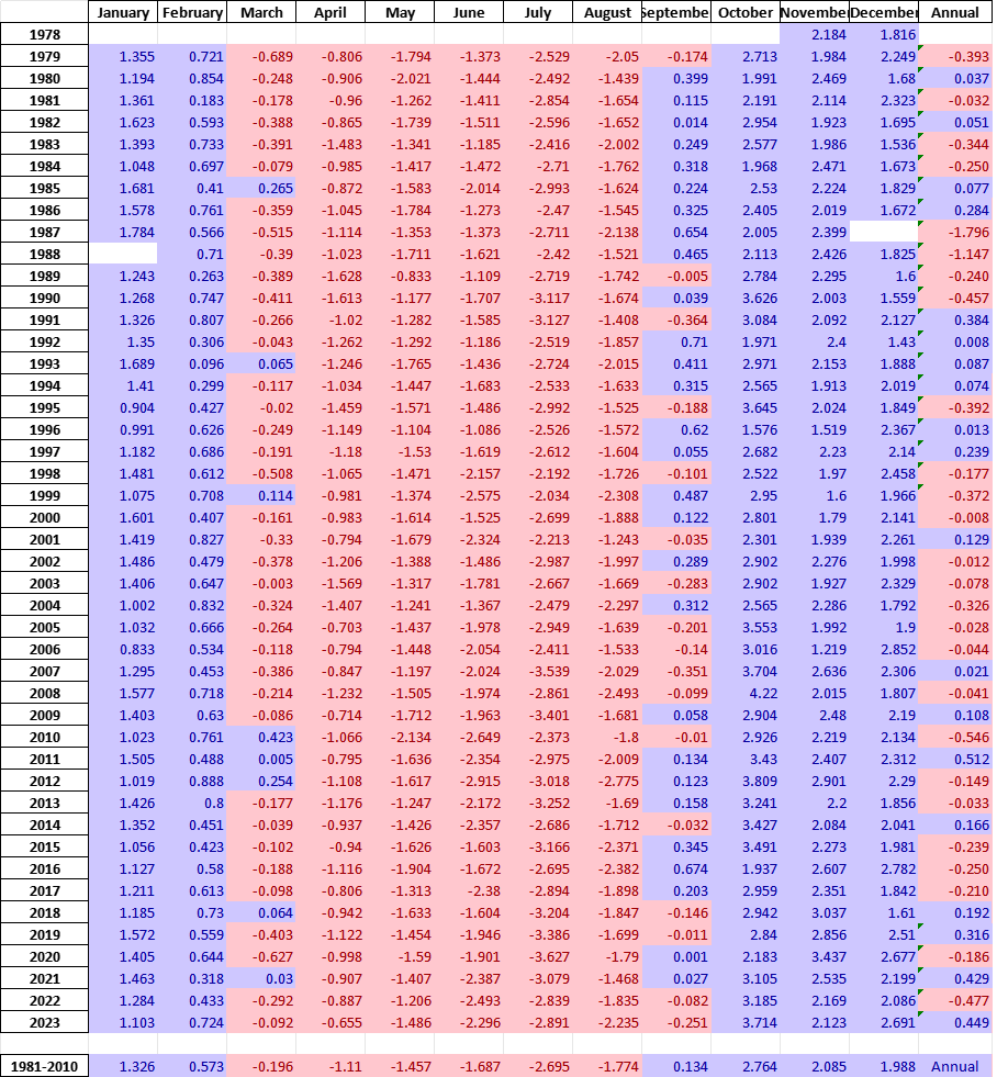
The values in January show changes from the end of the previous December, and by summing twelve consecutive months we can calculate an annual rate of change for the years 1979 to 2023.
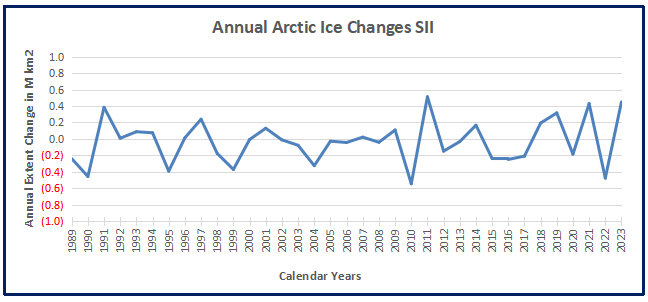
As many know, there has been a decline of Arctic ice extent over these 40 years, averaging 70k km2 per year. But year over year, the changes shift constantly between gains and losses, ranging up to +/- 500k km2. Since 1989 the average yearend gain/loss is nearly zero, -0.033k km2 to be exact.
Moreover, it seems random as to which months are determinative for a given year. For example, much ado was printed about 2023 losing more ice than usual June through September. But then the final 3 months of 2023 more than made up for those summer losses, resulting in a sizeable gain for the year.
As it happens in this dataset, October has the highest rate of adding ice. The table below shows the variety of monthly rates in the record as anomalies from the 1980-2010 baseline. In this exhibit a red cell is a negative anomaly (less than baseline for that month) and blue is positive (higher than baseline).
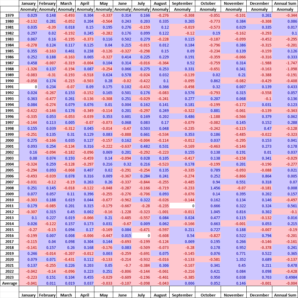
Note that the +/ – rate anomalies are distributed all across the grid, sequences of different months in different years, with gains and losses offsetting one another. As noted earlier, in 2023 the outlier negative months were June through September where unusual amounts of ice were lost. Then unusally strong gains in October and December resulted in a large annual gain, compared to the baseline. The bottom line presents the average anomalies for each month over the period 1979-2021. Note the rates of gains and losses mostly offset, and the average of all months in the bottom right cell is virtually zero.
A final observation: The graph below shows the Yearend Arctic Ice Extents for the last 34 years.
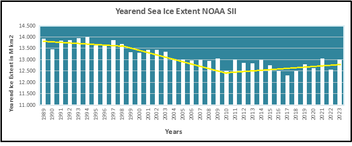
Year-end Arctic ice extents (last 5 days of December) show three distinct regimes: 1988-1998, 1998-2010, 2010-2022. The average year-end extent 1989-2010 is 13.4M km2. In the last decade, 2011 was 13.0M km2, and six years later, 2017 was 12.3M km2. 2021 rose back to 13.06 2022 slipped back to 12.6M, and 2023 is back up to 13.0M. So for all the the fluctuations, the net is zero, or a gain of half a Wadham (0.5M) from 2010. Talk of an Arctic ice death spiral is fanciful.
These data show a noisy, highly variable natural phenomenon. Clearly, unpredictable factors are in play, principally water structure and circulation, atmospheric circulation regimes, and also incursions and storms. And in the longer view, today’s extents are not unusual.


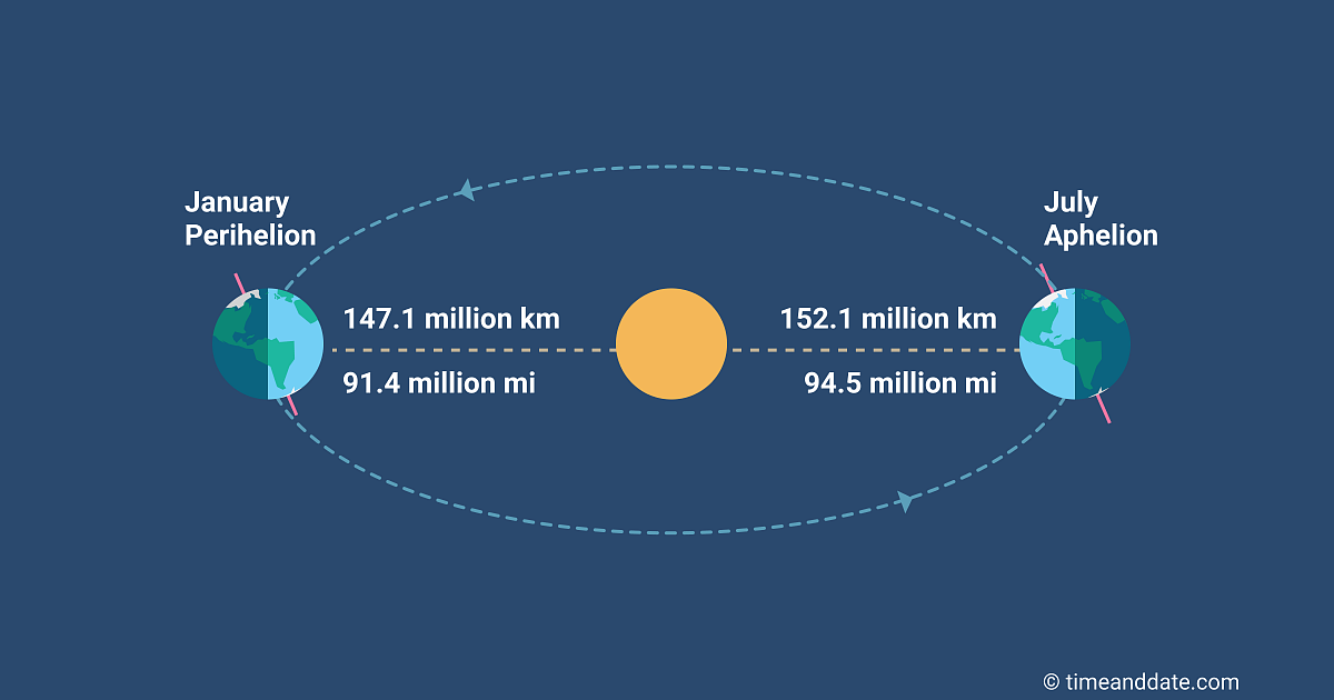
Illustration by Eleanor Lutz shows Earth’s seasonal climate changes. If played in full screen, the four corners present views from top, bottom and sides. It is a visual representation of scientific datasets measuring Arctic ice extents.