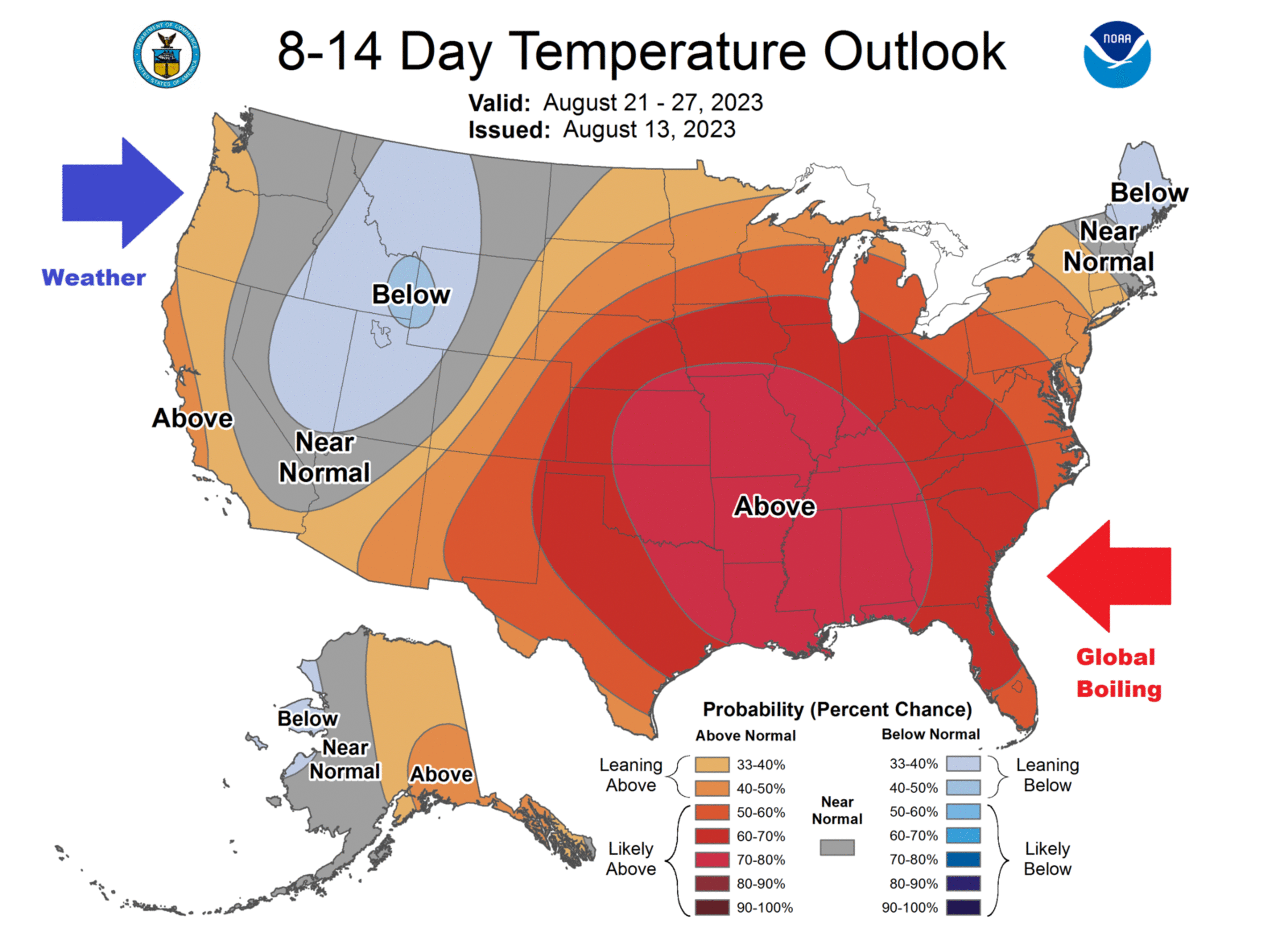
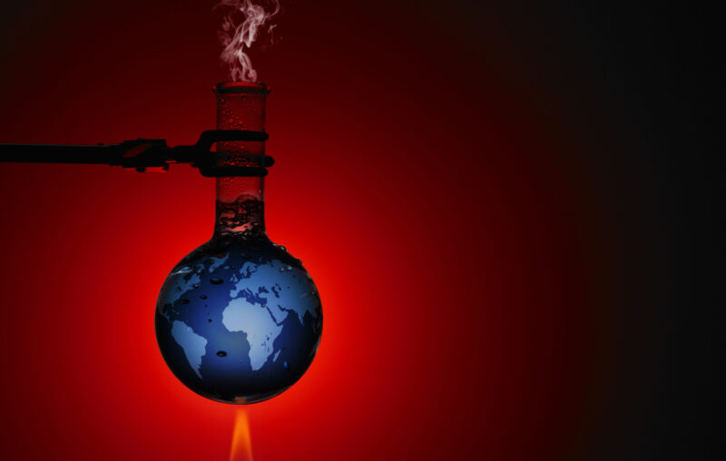
X-Weather is Climate Scoundrels’ Last Refuge
John Ray posted on his blog an update of climatists power play against scientific facts contrary to their beliefs. The saga is about the Alimonte et al. (2022) analysis of extreme weather events and the lack of evidence to attribute them to global warming. In italics with my bolds Ray’s post is:
The very gradual process of global warming that we have seen so far has produced no direct ill-effects that we can see. Crops are more abundant than ever and some Pacific islands are growing rather than shrinking. So “extreme events” are the last refuge of the warmists. Bad weather generally is routinely branded as an extreme event and is attributed to global warming without any shred of evidence for the link.
Any causal statement requires controls.
You have to show that the “caused” event would not have happened without the “cause” specified. But that would require you to show what would have happened WITHOUT global warming — and that is impossible.
Single events might or might not be due to some influence or other but you have no way of showing what the influence was. It is known as the “attribution” problem and is in principle unsolvable where the event is a “one-off”, a hurricane, for instance. You have to have variations in the causal condition to correlate with the alleged caused condition. Would this hurricane have happened in the absence of global warming? We cannot know. We can only surmise. And a surmise is no proof.
So the attribution of individual extreme events to global warming is LOGICALLY false. It CANNOT be shown as be fact. But science is at ease with hypotheses so it remains a hypothesis that COULD be true even if proving it is currently impossible.
And an hypothesis can be tested in various ways. It is commonly tested by asking if it generates accurate predictions. And it could be held as preliminary support for an hypothesis that the incidence of extreme events has systematically increased as the globe has warmed. Is there a correlation? So has it? There are some claims to that effect but how well-founded are they? Have extreme events in fact become more frequent?
A recent study has addressed that hypothesis. They have looked at a big range of reports about extreme events and asked are such events becoming more frequent. For each of a range or event extremes they have gathered published information about whether such events are increasing in frequency over time. An abstract of the report concerned is given below.
It finds no evidence that any extreme event has become more frequent.
So the claimed connections are not only logically false
but they are empirically false too.
The study was published 18 months ago and various climate skeptics have quoted it approvingly. That approval has eventually got under the skin of the Warmists so they have tried to discredit the research concerned. And their antagonism to the paper has borne fruit. The paper was “withdrawn” by its publisher, which counts as evidence that it is faulty.
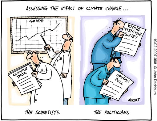 But is it faulty? A much quoted attack on the paper in “The Guardian” lists a whole array of orthododox Warmists who say it is faulty but detailed evidence of the faults is conspicuously missing. No detailed numbers are quoted and the issue is entirely a matter of numbers. The Guardian makes clear that orthodox scientists disagree with the paper but does not give chapter and verse why. Link to The Guardian below:
Note that some of the attacks from Warmists are of the most intellectually discreditable kind: “Ad hominem” attacks — attacking the motives of the authors rather than the evidence they put forward
And that none of the critics quote the detailed numbers is a major scientific fault.
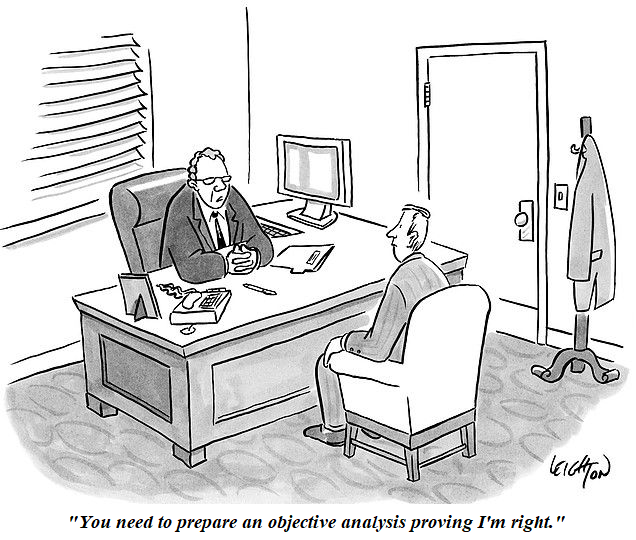
If a scientist disagrees with the conclusions of a particular paper — as I have often done — he goes over the ground covered by the paper and shows where it went wrong. In this case the paper at issue is a meta-analysis so the data behind it is readily available. Its conclusions are readily tested by repeating the meta-analysis in some more cautious way. Nobody seems to have attempted that. “Do better” is the obvious retort to the Warmists but none seem even to have attempted that.
The next link takes you to an extensive discussion of whether the paper deserved withdrawal:
https://rogerpielkejr.substack.com/p/thread-extended-peer-review-of-the/comments
The abstract of the deplored paper follows:
A critical assessment of extreme events trends in times of global warming
Gianluca Alimonti et al.
Abstract
This article reviews recent bibliography on time series of some extreme weather events and related response indicators in order to understand whether an increase in intensity and/or frequency is detectable. The most robust global changes in climate extremes are found in yearly values of heatwaves (number of days, maximum duration and cumulated heat), while global trends in heatwave intensity are not significant. Daily precipitation intensity and extreme precipitation frequency are stationary in the main part of the weather stations. Trend analysis of the time series of tropical cyclones show a substantial temporal invariance and the same is true for tornadoes in the USA. At the same time, the impact of warming on surface wind speed remains unclear. The analysis is then extended to some global response indicators of extreme meteorological events, namely natural disasters, floods, droughts, ecosystem productivity and yields of the four main crops (maize, rice, soybean and wheat). None of these response indicators show a clear positive trend of extreme events. In conclusion on the basis of observational data, the climate crisis that, according to many sources, we are experiencing today, is not evident yet. It would be nevertheless extremely important to define mitigation and adaptation strategies that take into account current trends.

A 2015 study by 22 scientists from around the world found that cold kills over 17 times more people than heat. Thus the planet’s recent modest warming has been saving millions of lives.
Springer website reports the paper retracted August 23, 2023. The article was revised by the authors and published at Environmental Hazards journal on August 3, 2023 as reported at Taylor & Francis online
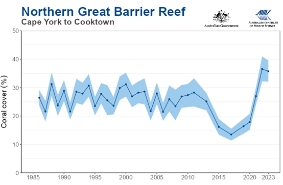
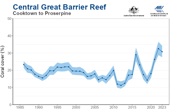
Is the number of global natural disasters increasing?
We analyze temporal trends in the number of natural disasters reported since 1900 in the Emergency Events Database (EM-DAT) from the Center for Research on the Epidemiology of Disasters (CRED). Visual inspection suggests three distinct phases: first, a linear upward trend to around mid-century followed by rapid growth to the turn of the new century, and thereafter a decreasing trend to 2022. These observations are supported by piecewise regression analyses that identify three breakpoints (1922, 1975, 2002), with the most recent subperiod 2002–2022 characterized by a significant decline in number of events. A similar pattern over time is exhibited by contemporaneous number of geophysical disasters – volcanoes, earthquakes, dry landslides – which, by their nature, are not significantly influenced by climate or anthropogenic factors. We conclude that the patterns observed are largely attributable to progressively better reporting of natural disaster events, with the EM-DAT dataset now regarded as relatively complete since ∼2000. The above result sits in marked contradiction to earlier analyses by two UN bodies (FAO andUNDRR), which predicts an increasing number of natural disasters and impacts in concert with global warming. Our analyses strongly refute this assertion as well as extrapolations published by UNDRR based on this claim.

Conclusion Alimonte et al.
Fearing a climate emergency without this being supported by data, means altering the framework of priorities with negative effects that could prove deleterious to our ability to face the challenges of the future, squandering natural and human resources in an economically difficult context, even more negative following the COVID emergency. This does not mean we should do nothing about climate change: we should work to minimize our impact on the planet and to minimize air and water pollution.
Whether or not we manage to drastically curtail our carbon dioxide emissions in the coming decades, we need to reduce our vulnerability to extreme weather and climate events. Leaving the baton to our children without burdening them with the anxiety of being in a climate emergency would allow them to face the various problems in place (energy,agricultural-food, health, etc.) with a more objective and constructive spirit, with the goal of arriving at a weighted assessment of the actions to be taken without wasting the limited resources at our disposal in costly and ineffective solutions.
How the climate of the twenty-first century will play out is a topic of deep uncertainty. We need to increase our resiliency to whatever the future climate will present us.We need to remind ourselves that addressing climate change is not an end in itself, and that climate change is not the only problem that the world is facing. The objective should be to improve human well-being in the twenty-first century, while protecting the environmentas much as we can. And it would be a nonsense not to do so: it would be like not taking care of the house where we were born and raised.
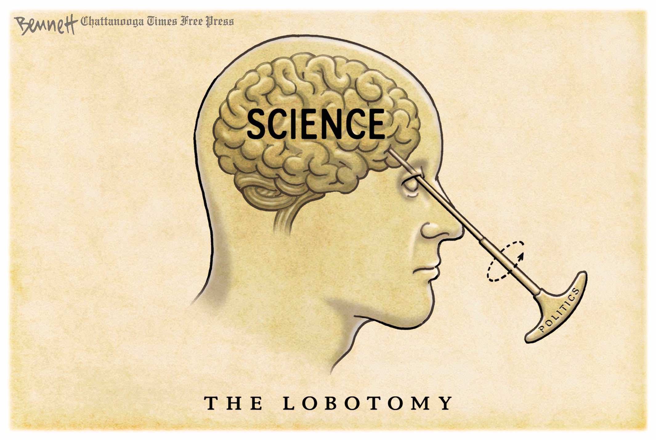
Tony Thomas describes the climate scoundrels and their machinations at the Quadrant: How Science is Done These Days
Footnote Add Another Scoundrel

 Mark Higgie reports


 Christopher Lingle explains in his AIER article