Warmists Epic History Fail

epic fail

Geologist Gregory Whitestone provides a climate history lesson for warmists who skipped history classes protesting against global warming.  His article at Town Hall is Ocasio-Cortez’s Climatology Lacks Historical Context. Excerpts in italics with my bolds. H/T Climate Depot.

When Sam Cooke sang “Don’t know much about history” in 1960 he could not have had U.S. Rep. Alexandria Ocasio-Cortez in mind, but only because she lives a half century later.

Whatever Ocasio-Cortez got from history classes during her time at Boston University, it wasn’t an appreciation of historical context because it is sorely lacking in her assertions about climate and its effect on humankind. She and others promoting the Green New Deal have the facts exactly backwards when they claim that warming temperatures are an existential threat to humanity.

Ocasio-Cortez recently warned in a House Oversight Committee hearing that the United States would have “blood on our hands” if legislation to tackle climate change was not passed. In questioning former Secretary of Defense Chuck Hagel, she alleged that “denial or even delaying in that action could cost us American life.”

Is that the case? Has increasing temperature been associated with negative impacts on the human condition? Common sense would seem to dictate that higher temperatures would lead to more drought and then to famine and ultimately to loss of life.

However, the story is different upon checking several thousands of years of extensive documentation covering the most recent warming trends to see how humans fared with temperatures like those predicted to occur by 2050 or 2100.

As it turns out, there is a great correlation between the rise and fall of temperature and the rise and fall of civilization, and the human experience is not the apocalypse you are being told to expect. Very consistently, throughout the last 3,500 years, humanity has prospered and thrived during warming periods, while the intervening colder periods witnessed crop failure, famine and mass depopulation. In fact, before climate science became politicized in the late 20th century, the warm eras were known as “Climate Optima” because both people and the Earth’s ecosystems benefited.

The last three warming trends corresponded with large advances in culture, science and technology. The Minoan (Bronze Age), Roman (Iron Age) and Medieval (High Middle Ages) periods were all much warmer than our current temperature and all benefited greatly from the rising temperature. Likely the most significant factor that allowed advances in civilization was a plentiful supply of food. Crops flourished and allowed time for the citizens of each culture to think, to dream and to invent.

Lucas van Valckenborch painted a cold winter landscape set near Antwerp, Belgium, in 1575, when Europe was in the midst of the Little Ice Age. Städel/Wikimedia Commons

Contrary to what we are being told by modern prophets of climate doom, it was the intervening cold that was devastating and led to the fall of empires and the collapse of civilizations. With names like the Greek Dark Ages, the Dark Ages and the Little Ice Age, these cold periods’ accompanying crop failure, famine, and mass depopulation were horrific for people.

The most recent and best documented cold period was the Little Ice Age (1250 – 1850 AD) which brought severe hardship, primarily in the northern latitudes. The combination of bitterly cold winters and cool, wet summers led to poor harvests, hunger and widespread death. Half the population of Iceland perished, and as much as one-third of humankind was decimated.

The worst cold of the Little Ice Age occurred in the late 17th century during a time known as the Maunder Minimum, which is linked to inactivity of the Sun. Based on the Central England Temperature record (the longest thermometer-based record) the depths of the cold were reached in the year 1695. For the next 40 years temperatures rose quickly and at several times the rate of warming measured in the 20th century.

The warming that began in the late 17th century continued for the next 300-plus years, ushering in an era of advancement unseen during any other period in humanity’s existence. It is what author W. Cleon Skousen called the “5,000 Year Leap” — five millennia of advances in communication, transportation, energy and exploration, and a doubling of the average length of human life, all condensed into less than 200 years. A myriad of factors were responsible, but it is certainly not clear that this progress would have occurred had Earth still been mired in the frigid temperatures of the Little Ice Age.

Last year, while Scott Pruitt was still the administrator of the EPA, he posed the question of how anyone could know what the ideal temperature of the Earth should be. Well known climate scientist Dr. Michael Mann of Penn State responded to Pruitt’s question by stating that the ideal temperature would be that which pre-dated the burning of fossil fuels. That temperature would put us squarely in the middle of the Little Ice Age’s devastating cold and history tells us that it turned out quite poorly.

History tells us that warming is very, very good, while cold is very, very bad.

Perhaps both Ocasio-Cortez and Mann should be labeled as “history deniers” for ignoring the true relationship between temperature and the human condition.

Footnote:  The obsession with a slight rise in average temperatures in the last 100 years is all the more remarkable for taking that warming totally out of context.
Any warming is good, even this small amount seen in the context of a year in the life of a typical American.  Moreover, the details of the statistics reveal that the rise is the result of cold months being warmer, while hotter months have cooled very slightly.  False Alarm.

Postscript (old soviet joke):  During soviet Russia era a professor addressed his history class, “I have good news and bad news about your final exam.  The good news is that all the questions are the same as last year.  The bad news:  Some of the answers are different.”

March Cools Seas More Than Land Warms

banner-blog

With apologies to Paul Revere, this post is on the lookout for cooler weather with an eye on both the Land and the Sea.  UAH has updated their tlt (temperatures in lower troposphere) dataset for March.   Previously I have done posts on their reading of ocean air temps as a prelude to updated records from HADSST3. This month also has a separate graph of land air temps because the comparisons and contrasts are interesting as we contemplate possible cooling in coming months and years.

Presently sea surface temperatures (SST) are the best available indicator of heat content gained or lost from earth’s climate system.  Enthalpy is the thermodynamic term for total heat content in a system, and humidity differences in air parcels affect enthalpy.  Measuring water temperature directly avoids distorted impressions from air measurements.  In addition, ocean covers 71% of the planet surface and thus dominates surface temperature estimates.  Eventually we will likely have reliable means of recording water temperatures at depth.

Recently, Dr. Ole Humlum reported from his research that air temperatures lag 2-3 months behind changes in SST.  He also observed that changes in CO2 atmospheric concentrations lag behind SST by 11-12 months.  This latter point is addressed in a previous post Who to Blame for Rising CO2?

The March update to HadSST3 will appear later this month, but in the meantime we can look at lower troposphere temperatures (TLT) from UAHv6 which are already posted for March. The temperature record is derived from microwave sounding units (MSU) on board satellites like the one pictured above. This month also involved a change in UAH processing of satellite drift corrections, including dropping one platform which can no longer be corrected. The graphs below are taken from the new and current dataset.

The UAH dataset includes temperature results for air above the oceans, and thus should be most comparable to the SSTs. There is the additional feature that ocean air temps avoid Urban Heat Islands (UHI).  The graph below shows monthly anomalies for ocean temps since January 2015.

Open image in new tab to enlarge.

The anomalies over the entire ocean dropped to the same value, 0.11C  in August.  Warming in previous months was erased, and September added very little warming back. In October and November NH and the Tropics rose, joined by SH.  In December 2018 all regions cooled resulting in a global drop of nearly 0.1C. The upward bump in January in SH was reversed in February.  Despite some February warming in both NH and the Tropics, the Global anomaly cooled. Now in March the cooling appears in all regions resulting in a global decline in SST anomaly of 01C since 01/2019. Except for the Tropics, the ocean SSTs match those of 2015.

Land Air Temperatures Tracking Downward in Seesaw Pattern

We sometimes overlook that in climate temperature records, while the oceans are measured directly with SSTs, land temps are measured only indirectly.  The land temperature records at surface stations record air temps at 2 meters above ground.  UAH gives tlt anomalies for air over land separately from ocean air temps.  The graph updated for March is below.

The greater volatility of the Land temperatures was evident earlier, but has calmed down recently. Also the  NH dominates, having twice as much land area as SH.  Note how global peaks mirror NH peaks.  In November air over NH land Global and surfaces bottomed.despite the Tropics.  By January  all regions had almost the same anomaly. Now in March an upward bump in NH has pulled the Global anomaly up, and both are comparable to early 2015.  SH and the Tropics air over land are currently matching other regions, in contrast to starting 2015 much cooler.

TLTs include mixing above the oceans and probably some influence from nearby more volatile land temps.  Clearly NH and Global land temps have been dropping in a seesaw pattern, now more than 1C lower than the peak in 2016.  TLT measures started the recent cooling later than SSTs from HadSST3, but are now showing the same pattern.  It seems obvious that despite the three El Ninos, their warming has not persisted, and without them it would probably have cooled since 1995.  Of course, the future has not yet been written.


About Canadian Warming: Just the Facts

Just in time for the Trudeau carbon tax taking effect, we have all the media trumpeting “Canada Warming Twice as Fast as Global Rate–Effectively Irreversible.”  That was written by some urban-dwelling climate illiterates who are woefully misinformed.  Let’s help them out with some facts surprising to people who don’t get out much.  Unfortunately ignored this week was an informative CBC publication that could have spared us “fake news” spewing across the land, from Bonavista to Vancouuver Island, as the song says.

Surprising Facts About Canada are presented in a CBC series 10 Strange Facts About Canada’s Climate  Excerpts below provide highlights in italics with my bolds.

Through blistering cold winters to hot muggy summers; torrential rain, blinding snowstorms, deadly tornados and scorching drought, Canadians experience some of the planet’s most diverse weather systems.  [ Uh oh, averaging all of that could be a problem]

Canada is as tall as it is wide, creating a wide range of climate conditions.

Canada has the largest latitude range of any country on the planet. Our southern border lies at the same latitude as northern California, while our northern edge reaches right to the top of the world. It’s rarely the same season in the same place at the same time. In early April, the Arctic may still be in the throes of a frigid winter, while the south can experience summer-like temperatures. No doubt, our weather forecasters are the busiest in the world!

Canada has an ‘iceberg alley’.

Pieces of glaciers from the coast of Greenland are picked up by the Labrador Current, a counter-clockwise vortex of waters in the North Atlantic Ocean. Those broken pieces become icebergs that float in the sea off northeast Newfoundland where Fogo Island lies. Navigating the area is risky for ships; in fact this is where the mighty Titanic sank in 1912. But it’s a boon to tourism. Iceberg seekers flock to the area to watch (safely) from the shore and boast about drinking 10,000-year-old fresh water taken from an iceberg floating in the ocean.

Cold Weather Niagara Falls

Niagra Falls (the Canadian side)

Canada is (really) cold.

It’s certainly not surprising to most Canadians that we are tied with Russia for the title of ‘coldest nation in the world.’ Over our vast country, we have an average daily temperature of -5.6C. This is deadly cold. More of us — about 108 — die from exposure to extreme cold than from any other natural event. And that’s not counting Canadian wildlife who are more susceptible to Canada’s icy climate than we are.

Calgary Golfer February 9, 2016.

Every winter, southern Alberta is the ‘Chinook’ capital.

For six months — from November to May — warm dry winds rush down the slope of the Rocky Mountains towards southern Alberta. Often moving at hurricane-force speeds of 120 km per hour, they can bring astonishing temperature changes and melt ice within a couple of hours. In 1962 Pincher Creek saw a record temperature rise of 41C, from -19 to 22 in just one hour. Chinook is also known as the ‘ice-eater’ among locals who appreciate the break from winter that the winds provide.

Newfoundland is the foggiest place in the world.

At the Grand Banks off Newfoundland, the cold water from the Labrador Current from the north meets the warmer Gulf Stream from the south. The result is a whopping 206 days of fog a year. In the summer, it’s foggy 84 per cent of the time! It’s also the richest fishery in the world, the fog is a serious hazard to ships in the region.

View of the Haughton-Mars Project Research Station (HMPRS) on Devon Island, Nunavut, Arctic Canada

Canada’s North is actually a desert

Canada’s North is very cold and dry with very little precipitation, ranging from 10-20 cm a year. Temperatures average below freezing most of the year. Together, they limit the diversity of plants and animals found in the North. And it’s huge: this polar desert covers one seventh of Canada’s total land mass.

In 1816, Canada didn’t have a summer.

If winter in Canada weren’t bad enough, in 1816 the country’s eastern population were sledding in June and thawing water cisterns in July. Trees shed their leaves and there were reports of migratory birds dropping dead in the streets.

Over in Europe, the weird weather stoked anti-American sentiment. People opposed to emigration said that North America was inhospitable and getting colder every year.

Representation of Mount Tambora 1815 eruption in Indonesia.

Ironically, as eastern Canada stayed cool, the Arctic warmed, creating flotillas of icebergs off the coasts of Nova Scotia and Newfoundland. At the time, it was thought that the icebergs were the cause of the cooling, like a giant glass of iced lemonade. What was the real reason? In 1815, the Tambora volcano erupted in Indonesia, spewing tonnes of ash and dust into the air. Less sunlight reached the earth and this caused the planet’s surface to cool. The volcanic eruption changed the climate in different ways around the world, but Eastern Canadians were treated to the summer that just didn’t come.

The Prairies face brutal temperature extremes.

It’s no surprise that Regina, Saskatchewan — which lies smack in the middle of Canada’s prairies — lays claim to both the country’s lowest recorded temperature, -50C on January 1, 1885 and the highest, 43.3C on July 5, 1937. Without the moderating effects of a large body of water, Canada’s Prairies are vulnerable to some of the worst weather Canada has to offer.

Hopewell Rocks at the Bay of fundy. Photo: gregstokinger

The Bay of Fundy has the largest tides in the world.

Twice each day, 160 billion tonnes of seawater flow in and out of this small area in Nova Scotia — more than the combined flow of the world’s freshwater rivers. The tides reach a peak of 16 metres (as high as a five-storey building) and take about six hours to come in. The most extreme tides in the Bay occur twice each month when the earth, moon and sun are in alignment and together they create a larger-than-usual gravitational pull on the ocean, creating a “spring tide” (not to be confused with the season spring).

Lightning over Lake St. Clair Photo: seebest

Windsor is the thunderstorm capital of Canada.

Hot, humid air from the Gulf of Mexico funnels up through Windsor and the Western Basin of Lake Erie creating the perfect conditions for thunderstorms. About 251 lightning flashes per 100 square kilometres happen every year when small pieces of frozen raindrops collide within thunderclouds. The clouds fill with electrical charges that are eventually funnelled to the ground as lightning.

Summary

With all that going on, all the variety of temperature, precipitation, weather events and seasonalities, no one noticed it had warmed much, and would be grateful if it had.  With all the alarms sounding about the Arctic meltdown in the last decades, let’s consider the best long-service stations in the far north.

According to the “leaked report”, Canada’s annual average temperature over land has warmed 1.7 C when looking at the data since 1948. But that claim is misleading when recent data is considered.

Over the past 25 years, since scientists began to warn that the planet was warming in earnest, there has not been any warming when one looks at the untampered data provided by the Japan meteorology Agency (JMA) that were measured by 9 different stations across Canada. These 9 stations have the data dating back to around 1983 or 1986, so I used their datasats.

Looking at the JMA database and plotting the stations with longer term recording, we have the following chart:

Though temperatures over Canada no doubt have risen over the past century, there has not been any real warming in over 25 years. Rather, there’s been slight cooling, though not statistically significant. Clearly there hasn’t been any Canadian warming recently.

So it is misleading — to say the least — to give the impression that Canada warming has been accelerating. Thanks to Kirye for posting this at No Tricks Zone

See also Cold Summer in Nunavut

N. Atlantic Starts Cold in 2019

RAPID Array measuring North Atlantic SSTs.

Update April 10, 2019  March AMO Results now available and included in Decadal graph below.

For the last few years, observers have been speculating about when the North Atlantic will start the next phase shift from warm to cold. Given the way 2018 went, this may be the onset.  First some background.

Source: Energy and Education Canada

An example is this report in May 2015 The Atlantic is entering a cool phase that will change the world’s weather by Gerald McCarthy and Evan Haigh of the RAPID Atlantic monitoring project. Excerpts in italics with my bolds.

This is known as the Atlantic Multidecadal Oscillation (AMO), and the transition between its positive and negative phases can be very rapid. For example, Atlantic temperatures declined by 0.1ºC per decade from the 1940s to the 1970s. By comparison, global surface warming is estimated at 0.5ºC per century – a rate twice as slow.

In many parts of the world, the AMO has been linked with decade-long temperature and rainfall trends. Certainly – and perhaps obviously – the mean temperature of islands downwind of the Atlantic such as Britain and Ireland show almost exactly the same temperature fluctuations as the AMO.

Atlantic oscillations are associated with the frequency of hurricanes and droughts. When the AMO is in the warm phase, there are more hurricanes in the Atlantic and droughts in the US Midwest tend to be more frequent and prolonged. In the Pacific Northwest, a positive AMO leads to more rainfall.

A negative AMO (cooler ocean) is associated with reduced rainfall in the vulnerable Sahel region of Africa. The prolonged negative AMO was associated with the infamous Ethiopian famine in the mid-1980s. In the UK it tends to mean reduced summer rainfall – the mythical “barbeque summer”.Our results show that ocean circulation responds to the first mode of Atlantic atmospheric forcing, the North Atlantic Oscillation, through circulation changes between the subtropical and subpolar gyres – the intergyre region. This a major influence on the wind patterns and the heat transferred between the atmosphere and ocean.

The observations that we do have of the Atlantic overturning circulation over the past ten years show that it is declining. As a result, we expect the AMO is moving to a negative (colder surface waters) phase. This is consistent with observations of temperature in the North Atlantic.

Cold “blobs” in North Atlantic have been reported, but they are usually winter phenomena. For example in April 2016, the sst anomalies looked like this

But by September, the picture changed to this

And we know from Kaplan AMO dataset, that 2016 summer SSTs were right up there with 1998 and 2010 as the highest recorded.

As the graph above suggests, this body of water is also important for tropical cyclones, since warmer water provides more energy.  But those are annual averages, and I am interested in the summer pulses of warm water into the Arctic. As I have noted in my monthly HadSST3 reports, most summers since 2003 there have been warm pulses in the north atlantic.
amo december 2018
The AMO Index is from from Kaplan SST v2, the unaltered and not detrended dataset. By definition, the data are monthly average SSTs interpolated to a 5×5 grid over the North Atlantic basically 0 to 70N.  The graph shows the warmest month August beginning to rise after 1993 up to 1998, with a series of matching years since.  December 2016 set a record at 20.6C, but note the plunge down to 20.2C for  December 2018, matching 2011 as the coldest years  since 2000.  Because McCarthy refers to hints of cooling to come in the N. Atlantic, let’s take a closer look at some AMO years in the last 2 decades.

This graph shows monthly AMO temps for some important years. The Peak years were 1998, 2010 and 2016, with the latter emphasized as the most recent. The other years show lesser warming, with 2007 emphasized as the coolest in the last 20 years. Note the red 2018 line is at the bottom of all these tracks.  The short black line shows that 2019 began slightly cooler than January 2018  The February average AMO matched the low SST of the previous year, 0.14C lower than the peak year February 2017. March 2019 is also slightly lower than 2018  and 0.06C lower than peak year March 2016.

With all the talk of AMOC slowing down and a phase shift in the North Atlantic, it seems the annual average for 2018 confirms that cooling has set in.  Through December the momentum is certainly heading downward, despite the band of warming ocean  that gave rise to European heat waves last summer.

amo annual122018

natlssta

cdas-sflux_sst_atl_1


On Thermodynamic Climate Modelling


circulation-solar-heat-engine

Some years ago I wrote a post called Climate Thinking Out of the Box (reprinted later on) which was prompted by a conclusion from Lucarini et al. 2014:

“In particular, it is not obvious, as of today, whether it is more efficient to approach the problem of constructing a theory of climate dynamics starting from the framework of hamiltonian mechanics and quasi-equilibrium statistical mechanics or taking the point of view of dissipative chaotic dynamical systems, and of non-equilibrium statistical mechanics, and even the authors of this review disagree. The former approach can rely on much more powerful mathematical tools, while the latter is more realistic and epistemologically more correct, because, obviously, the climate is, indeed, a non-equilibrium system.”

Now we have a publication discussing progress in applying the latter approach using thermodynamic concepts in the effort to model climate processes.. The article is A new diagnostic tool for water, energy and entropy budgets in climate models by Valerio Lembo, Frank Lunkeit, and Valerio Lucarini February 14, 2019.  Overview in italics with my bolds.

Abstract: This work presents a novel diagnostic tool for studying the thermodynamics of the climate systems with a wide range of applications,from sensitivity studies to model tuning. It includes a number of modules for assessing the internal energy budget, the hydrological cycle,the Lorenz Energy Cycle and the material entropy production, respectively.

The routine receives as inputs energy fluxes at surface and at the Top-of-Atmosphere (TOA), for the computation of energy budgets at Top-of-Atmosphere (TOA), at the surface, and in the atmosphere as a residual. Meridional enthalpy transports are also computed from the divergence of the zonal mean energy budget fluxes; location and intensity of peaks in the two hemispheres are then provided as outputs. Rainfall, snowfall and latent heat fluxes are received as inputs for computing the water mass and latent energy budgets. If a land-sea mask is provided, the required quantities are separately computed over continents and oceans. The diagnostic tool also computes the Lorenz Energy Cycle (LEC) and its storage/conversion terms as annual mean global and hemispheric values.

In order to achieve this, one needs to provide as input three-dimensional daily fields of horizontal wind velocity and temperature in the troposphere. Two methods have been implemented for the computation of the material entropy production, one relying on the convergence of radiative heat fluxes in the atmosphere (indirect method), one combining the irreversible processes occurring in the climate system, particularly heat fluxes in the boundary layer, the hydrological cycle and the kinetic energy dissipation as retrieved from the residuals of the LEC.

A version of the diagnostic tool is included in the Earth System Model eValuation Tool (ESMValTool) community diagnostics, in order to assess the performances of soon available CMIP6 model simulations. The aim of this software is to provide a comprehensive picture of the thermodynamics of the climate system as reproduced in the state-of-the-art coupled general circulation models. This can prove useful for better understanding anthropogenic and natural climate change, paleoclimatic climate variability, and climatic tipping points.

Energy: Rather than a proxy of a changing climate, surface temperatures and precipitation changes should be better viewed as a consequence of a non-equilibrium steady state system which is responding to a radiative energy imbalance through a complex interaction of feedbacks. A changing climate, under the effect of an external transient forcing, can only be properly addressed if the energy imbalance, and the way it is transported within the system and converted into different forms is taken into account. The models’ skill to represent the history of energy and heat exchanges in the climate system has been assessed by comparing numerical simulations against available observations, where available, including the fundamental problem of ocean heat uptake.

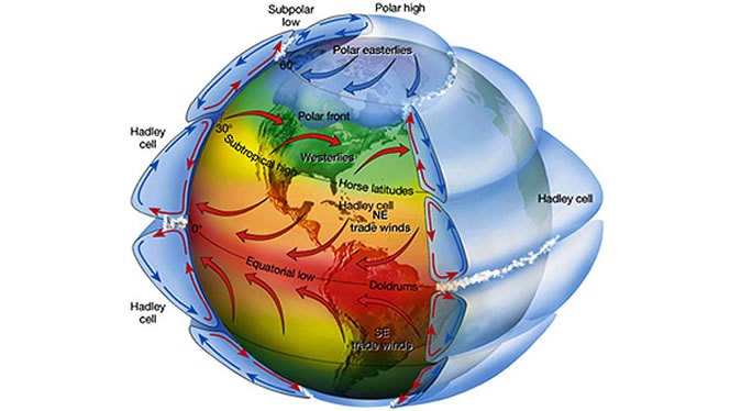
Heat Transport: In order to understand how the heat is transported by the geophysical fluids, one should clarify what sets them into motion. We focus here on the atmosphere. A comprehensive view of the energetics fuelling the general circulation is given by the Lorenz Energy Cycle (LEC) framework. This provides a picture of the various processes responsible for conversion of available potential energy (APE), i.e. the excess of potential energy with respect to a state of thermodynamic equilibrium, into kinetic energy and dissipative heating. Under stationary conditions, the dissipative heating exactly equals the mechanical work performed by the atmosphere. In other words, the LEC formulation allows to constrain the atmosphere to the first law of thermodynamics, and the system as a whole can be seen as a pure thermodynamic heat engine under dissipative non-equilibrium conditions.

Water: On one hand the energy budget is relevantly affected by semi-empirical formulations of the water vapor spectrum, on the other hand the energy budget influences the moisture budget by means of uncertainties in aerosol-cloud interactions and mechanisms of tropical deep convection. A global scale evaluation of the hydrological cycle, both from a moisture and energetic perspective, is thus considered an integral part of an overall diagnostics for the thermodynamics of climate system.

Entropy: From a macroscopic point of view, one usually refers to “material entropy production” as the entropy produced by the geophysical fluids in the climate system, which are not related to the properties of the radiative fields, but rather to the irreversible processes related to the motion of these fluids. Mainly, this has to do with phase changes and water vapor diffusion. Lucarini (2009) underlined the link between entropy production and efficiency of the climate engine, which were then used to understand climatic tipping points, and, in particular, the snowball/warm Earth critical transition, to define a wider class of climate response metrics, and to study planetary circulation regimes. A constraint has also been proposed to the entropy production of the atmospheric heat engine, given by the emerging importance of non-viscous processes in a warming climate.

The goal here is to look at models through the lens of their dynamics and thermodynamics, in the view of enunciated above ideas about complex non-equilibrium systems. The metrics that we here propose are based on the analysis of the energy and water budgets and transports, of the energy transformations, and of the entropy production.

Previous Post: Climate Thinking Out of the Box 

CMIP5 vs RSS

It seems that climate modelers are dealing with a quandary: How can we improve on the unsatisfactory results from climate modeling?

Shall we:
A.Continue tweaking models using classical maths though they depend on climate being in quasi-equilibrium; or,
B.Start over from scratch applying non-equilibrium maths to the turbulent climate, though this branch of math is immature with limited expertise.

In other words, we are confident in classical maths, but does climate have features that disqualify it from their application? We are confident that non-equilibrium maths were developed for systems such as the climate, but are these maths robust enough to deal with such a complex reality?

It appears that some modelers are coming to grips with the turbulent quality of climate due to convection dominating heat transfer in the lower troposphere. Heretofore, models put in a parameter for energy loss through convection, and proceeded to model the system as a purely radiative dissipative system. Recently, it seems that some modelers are striking out in a new, possibly more fruitful direction. Herbert et al 2013 is one example exploring the paradigm of non-equilibrium steady states (NESS). Such attempts are open to criticism from a classical position, but may lead to a breakthrough for climate modeling.

That is my layman’s POV. Here is the issue stated by practitioners, more elegantly with bigger words:

“In particular, it is not obvious, as of today, whether it is more efficient to approach the problem of constructing a theory of climate dynamics starting from the framework of hamiltonian mechanics and quasi-equilibrium statistical mechanics or taking the point of view of dissipative chaotic dynamical systems, and of non-equilibrium statistical mechanics, and even the authors of this review disagree. The former approach can rely on much more powerful mathematical tools, while the latter is more realistic and epistemologically more correct, because, obviously, the climate is, indeed, a non-equilibrium system.”

Lucarini et al 2014

Click to access 1311.1190.pdf

Here’s how Herbert et al address the issue of a turbulent, non-equilibrium atmosphere. Their results show that convection rules in the lower troposphere and direct warming from CO2 is quite modest, much less than current models project.

“Like any fluid heated from below, the atmosphere is subject to vertical instability which triggers convection. Convection occurs on small time and space scales, which makes it a challenging feature to include in climate models. Usually sub-grid parameterizations are required. Here, we develop an alternative view based on a global thermodynamic variational principle. We compute convective flux profiles and temperature profiles at steady-state in an implicit way, by maximizing the associated entropy production rate. Two settings are examined, corresponding respectively to the idealized case of a gray atmosphere, and a realistic case based on a Net Exchange Formulation radiative scheme. In the second case, we are also able to discuss the effect of variations of the atmospheric composition, like a doubling of the carbon dioxide concentration.

The response of the surface temperature to the variation of the carbon dioxide concentration — usually called climate sensitivity — ranges from 0.24 K (for the sub-arctic winter profile) to 0.66 K (for the tropical profile), as shown in table 3. To compare these values with the literature, we need to be careful about the feedbacks included in the model we wish to compare to. Indeed, if the overall climate sensitivity is still a subject of debate, this is mainly due to poorly understood feedbacks, like the cloud feedback (Stephens 2005), which are not accounted for in the present study.”

Abstract from:
Vertical Temperature Profiles at Maximum Entropy Production with a Net Exchange Radiative Formulation
Herbert et al 2013

Click to access 1301.1550.pdf

In this modeling paradigm, we have to move from a linear radiative Energy Budget to a dynamic steady state Entropy Budget. As Ozawa et al explains, this is a shift from current modeling practices, but is based on concepts going back to Carnot.

“Entropy of a system is defined as a summation of “heat supplied” divided by its “temperature” [Clausius, 1865].. Heat can be supplied by conduction, by convection, or by radiation. The entropy of the system will increase by equation (1) no matter which way we may choose. When we extract the heat from the system, the entropy of the system will decrease by the same amount. Thus the entropy of a diabatic system, which exchanges heat with its surrounding system, can either increase or decrease, depending on the direction of the heat exchange. This is not a violation of the second law of thermodynamics since the entropy increase in the surrounding system is larger.

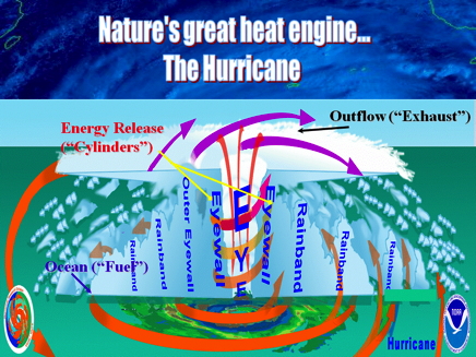
Carnot regarded the Earth as a sort of heat engine, in which a fluid like the atmosphere acts as working substance transporting heat from hot to cold places, thereby producing the kinetic energy of the fluid itself. His general conclusion about heat engines is that there is a certain limit for the conversion rate of the heat energy into the kinetic energy and that this limit is inevitable for any natural systems including, among others, the Earth’s atmosphere.

Thus there is a flow of energy from the hot Sun to cold space through the Earth. In the Earth’s system the energy is transported from the warm equatorial region to the cool polar regions by the atmosphere and oceans. Then, according to Carnot, a part of the heat energy is converted into the potential energy which is the source of the kinetic energy of the atmosphere and oceans.

Thus it is likely that the global climate system is regulated at a state with a maximum rate of entropy production by the turbulent heat transport, regardless of the entropy production by the absorption of solar radiation This result is also consistent with a conjecture that entropy of a whole system connected through a nonlinear system will increase along a path of evolution, with a maximum rate of entropy production among a manifold of possible paths [Sawada, 1981]. We shall resolve this radiation problem in this paper by providing a complete view of dissipation processes in the climate system in the framework of an entropy budget for the globe.

The hypothesis of the maximum entropy production (MEP) thus far seems to have been dismissed by some as coincidence. The fact that the Earths climate system transports heat to the same extent as a system in a MEP state does not prove that the Earths climate system is necessarily seeking such a state. However, the coincidence argument has become harder to sustain now that Lorenz et al. [2001] have shown that the same condition can reproduce the observed distributions of temperatures and meridional heat fluxes in the atmospheres of Mars and Titan, two celestial bodies with atmospheric conditions and radiative settings very different from those of the Earth.”

THE SECOND LAW OF THERMODYNAMICS AND THE GLOBAL CLIMATE SYSTEM: A REVIEW OF THE MAXIMUM ENTROPY PRODUCTION PRINCIPLE
Hisashi Ozawa et al 2003

Click to access Ozawa.pdf

De Nada Ocean SSTs in February

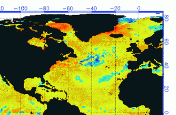
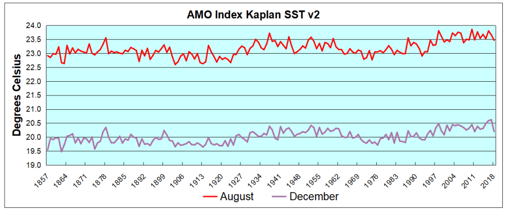
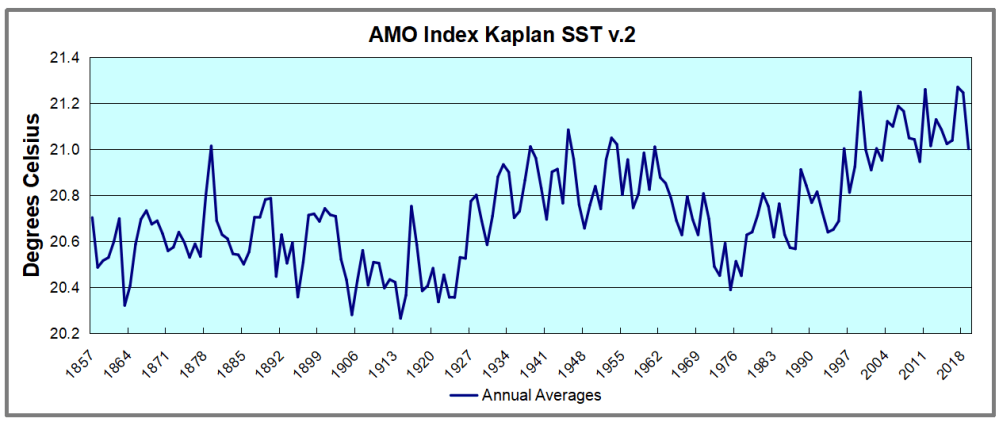
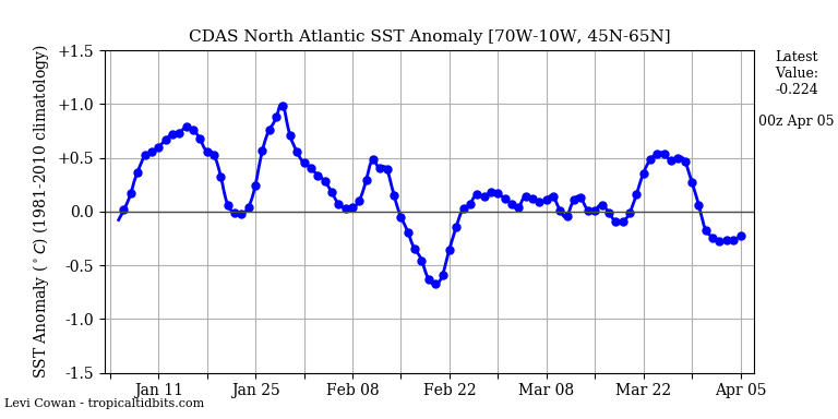
The best context for understanding decadal temperature changes comes from the world’s sea surface temperatures (SST), for several reasons:

  • The ocean covers 71% of the globe and drives average temperatures;
  • SSTs have a constant water content, (unlike air temperatures), so give a better reading of heat content variations;
  • A major El Nino was the dominant climate feature in recent years.

HadSST is generally regarded as the best of the global SST data sets, and so the temperature story here comes from that source, the latest version being HadSST3.  More on what distinguishes HadSST3 from other SST products at the end.

The Current Context

The chart below shows SST monthly anomalies as reported in HadSST3 starting in 2015 through February 2019. For some reason, it took almost a whole month to publish the updated dataset.

A global cooling pattern is seen clearly in the Tropics since its peak in 2016, joined by NH and SH cycling downward since 2016.  2018 started with slow warming after the low point of December 2017, led by steadily rising NH, which peaked in September and cooled since.  The Tropics rose steadily until November, and are now cooling as well.  With a little warming in SH, the Global anomaly is virtually unchanged last month.

All regions are about the same as 02/2017 and 02/2015, but much cooler than 02/2016.  The February Global anomaly is 0.09 lower than 2016;  NH is 0.06 lower, SH is 0.09 lower and the Tropics  are down 0.43, or 50% from 02/2016. The rise in the Tropics had suggested a possible El Nino, but is now cooling down and better described as De Nada.

Note that higher temps in 2015 and 2016 were first of all due to a sharp rise in Tropical SST, beginning in March 2015, peaking in January 2016, and steadily declining back below its beginning level. Secondly, the Northern Hemisphere added three bumps on the shoulders of Tropical warming, with peaks in August of each year.  A fourth NH bump was lower and peaked in September 2018.  Also, note that the global release of heat was not dramatic, due to the Southern Hemisphere offsetting the Northern one.

The annual SSTs for the last five years are as follows:

Annual SSTs Global NH SH  Tropics
2014 0.477 0.617 0.335 0.451
2015 0.592 0.737 0.425 0.717
2016 0.613 0.746 0.486 0.708
2017 0.505 0.650 0.385 0.424
2018 0.480 0.620 0.362 0.369

2018 annual average SSTs across the regions are close to 2014, slightly higher in SH and much lower in the Tropics.  The SST rise from the global ocean was remarkable, peaking in 2016, higher than 2011 by 0.32C.

A longer view of SSTs

The graph below  is noisy, but the density is needed to see the seasonal patterns in the oceanic fluctuations.  Previous posts focused on the rise and fall of the last El Nino starting in 2015.  This post adds a longer view, encompassing the significant 1998 El Nino and since.  The color schemes are retained for Global, Tropics, NH and SH anomalies.  Despite the longer time frame, I have kept the monthly data (rather than yearly averages) because of interesting shifts between January and July.

Open image in new tab to enlarge.

1995 is a reasonable starting point prior to the first El Nino.  The sharp Tropical rise peaking in 1998 is dominant in the record, starting Jan. ’97 to pull up SSTs uniformly before returning to the same level Jan. ’99.  For the next 2 years, the Tropics stayed down, and the world’s oceans held steady around 0.2C above 1961 to 1990 average.

Then comes a steady rise over two years to a lesser peak Jan. 2003, but again uniformly pulling all oceans up around 0.4C.  Something changes at this point, with more hemispheric divergence than before. Over the 4 years until Jan 2007, the Tropics go through ups and downs, NH a series of ups and SH mostly downs.  As a result the Global average fluctuates around that same 0.4C, which also turns out to be the average for the entire record since 1995.

2007 stands out with a sharp drop in temperatures so that Jan.08 matches the low in Jan. ’99, but starting from a lower high. The oceans all decline as well, until temps build peaking in 2010.

Now again a different pattern appears.  The Tropics cool sharply to Jan 11, then rise steadily for 4 years to Jan 15, at which point the most recent major El Nino takes off.  But this time in contrast to ’97-’99, the Northern Hemisphere produces peaks every summer pulling up the Global average.  In fact, these NH peaks appear every July starting in 2003, growing stronger to produce 3 massive highs in 2014, 15 and 16.  NH July 2017 was only slightly lower, and a fifth NH peak still lower in Sept. 2018.  Note also that starting in 2014 SH plays a moderating role, offsetting the NH warming pulses. (Note: these are high anomalies on top of the highest absolute temps in the NH.)

What to make of all this? The patterns suggest that in addition to El Ninos in the Pacific driving the Tropic SSTs, something else is going on in the NH.  The obvious culprit is the North Atlantic, since I have seen this sort of pulsing before.  After reading some papers by David Dilley, I confirmed his observation of Atlantic pulses into the Arctic every 8 to 10 years.

But the peaks coming nearly every summer in HadSST require a different picture.  Let’s look at August, the hottest month in the North Atlantic from the Kaplan dataset.
AMO August 2018

The AMO Index is from from Kaplan SST v2, the unaltered and not detrended dataset. By definition, the data are monthly average SSTs interpolated to a 5×5 grid over the North Atlantic basically 0 to 70N. The graph shows warming began after 1992 up to 1998, with a series of matching years since. Because the N. Atlantic has partnered with the Pacific ENSO recently, let’s take a closer look at some AMO years in the last 2 decades.

This graph shows monthly AMO temps for some important years. The Peak years were 1998, 2010 and 2016, with the latter emphasized as the most recent. The other years show lesser warming, with 2007 emphasized as the coolest in the last 20 years. Note the red 2018 line is at the bottom of all these tracks. The short black line shows that 2019 began slightly cooler than January 2018,  and in February matched the low SST of the previous year.

Summary

The oceans are driving the warming this century.  SSTs took a step up with the 1998 El Nino and have stayed there with help from the North Atlantic, and more recently the Pacific northern “Blob.”  The ocean surfaces are releasing a lot of energy, warming the air, but eventually will have a cooling effect.  The decline after 1937 was rapid by comparison, so one wonders: How long can the oceans keep this up? If the pattern of recent years continues, NH SST anomalies will likely cool in coming months.  Once again, ENSO will probably determine the outcome.

Postscript:

In the most recent GWPF 2017 State of the Climate report, Dr. Humlum made this observation:

“It is instructive to consider the variation of the annual change rate of atmospheric CO2 together with the annual change rates for the global air temperature and global sea surface temperature (Figure 16). All three change rates clearly vary in concert, but with sea surface temperature rates leading the global temperature rates by a few months and atmospheric CO2 rates lagging 11–12 months behind the sea surface temperature rates.”

Footnote: Why Rely on HadSST3

HadSST3 is distinguished from other SST products because HadCRU (Hadley Climatic Research Unit) does not engage in SST interpolation, i.e. infilling estimated anomalies into grid cells lacking sufficient sampling in a given month. From reading the documentation and from queries to Met Office, this is their procedure.

HadSST3 imports data from gridcells containing ocean, excluding land cells. From past records, they have calculated daily and monthly average readings for each grid cell for the period 1961 to 1990. Those temperatures form the baseline from which anomalies are calculated.

In a given month, each gridcell with sufficient sampling is averaged for the month and then the baseline value for that cell and that month is subtracted, resulting in the monthly anomaly for that cell. All cells with monthly anomalies are averaged to produce global, hemispheric and tropical anomalies for the month, based on the cells in those locations. For example, Tropics averages include ocean grid cells lying between latitudes 20N and 20S.

Gridcells lacking sufficient sampling that month are left out of the averaging, and the uncertainty from such missing data is estimated. IMO that is more reasonable than inventing data to infill. And it seems that the Global Drifter Array displayed in the top image is providing more uniform coverage of the oceans than in the past.

uss-pearl-harbor-deploys-global-drifter-buoys-in-pacific-ocean

USS Pearl Harbor deploys Global Drifter Buoys in Pacific Ocean


Straight Talk on CO2

The video above gives you in 20 minutes the viewpoint of William Happer, a key scientific advisor to the Trump Administration.  H/T Elephant’s Child and Tallbloke.

LEARNING A BIT ABOUT CO² AND MASS HYSTERIA by The Elephant’s Child March 25, 2019,

William Happer is one of our most renowned and esteemed physicists, a professor emeritus from Princeton University. He decidedly does not agree with the current panic about the horrors of “climate change.”He says, and explains why CO², carbon dioxide, doesn’t have much of anything to do with warming, and we really need more of it — not less. CO² is food for plants. The slight increase we have had is greening the earth. You can see it from space.

This conversation with Dr. Happer is completely fascinating and worth your time. Share it with your kids and friends and family.

You have surely heard the current crop of Democrat candidates hoping to run for the presidency against Donald Trump, speaking out on the notion that they will work to save us from the horrors of climate change and only disagreeing on how long we have left before it is all over. Green New Deal, they all signed right on.

Yes, I know that Nancy Pelosi wants sixteen year-olds to vote, but one would expect better from grownups who think they should be president. Yes, in the heat of a campaign and trying to raise money, they should have some responsibility for saying stupid things.

For those who are sure that 400 ppm represents the upper limits of what we can tolerate in the atmosphere, greenhouses pump in extra CO² to reach about 1,000 ppm to help their seedlings grow. The floors of greenhouses are not littered with the corpses of nurserymen.

We are in a CO² famine. We don’t have enough.

Stop Fake Science. Approve the PCCS!

John Droz makes some good points writing at Town Hall.Stop Fake Science. Approve the PCCS! Excerpts in italics with my bolds, images and header questions.

Shouldn’t We Get Independent Advice Before We Spend Trillions of Dollars?

Not to date myself, but in my day the “$64,000 Question” represented a lot of money!

Today I’m proposing to you a $64 Trillion question: “Should the United States conduct a full, independent expert scientific investigation into the models and studies that say we face a serious risk of manmade global warming, climate change and extreme weather disasters?”

That independent expert investigation is what’s being proposed by Dr. Will Happer, President Trump’s Senior Director for Emerging Technologies, in the National Security Council. Specifically, a brand new Presidential Committee on Climate Science (PCCS) will do this analysis. The decision about launching the PCCS will be made in the next few days. America’s support for President Trump is urgently needed.

(For the sake of brevity – and to use the most commonly employed term – when I say “global warming,” I mean all the climate changes that are supposedly caused by fossil fuel use and other human activities.)

$64 Trillion is actually at the lower end of estimates of what it will cost the USA over the next decade to replace all our fossil fuel use with (supposedly) green, renewable, sustainable wind, solar and biofuel energy – in order to (supposedly) stabilize Earth’s climate (which has never been stable).

Many say the obvious answer to this $64 Trillion question is YES, of course. However, many other parties are saying NO. What are the arguments against the PCCS, and do they hold water?

If the case for alarm is so convincing, what’s the problem?

1) It’s a waste of money to have this PCCS investigation. If the US was about to spend an enormous amount of money – such as $64 trillion or more – would you say an investigation costing one-billionth(!) of that monumental expenditure would be a waste of money? That’s what we are talking about here.

2) It’s a waste of time. President Trump has already stated that (without new facts confirming that we actually face imminent manmade climate chaos) he’s not going to do anything consequential about global warming. So since the USA is in a holding period on this issue, how is any time being wasted?

In fact, since the President is asking for an independent investigation, the end result could be that the PCCS would recommend that Mr. Trump take a different global warming policy position, and actually support action against fossil fuels. One would think those clamoring for exactly that would be ecstatic!

3) Human responsibility for climate change and extreme weather has already been scientifically resolved. That is simply not so. A genuine scientific assessment has four necessary components. It must be: a) comprehensive, b) objective, c) transparent, and d) empirical. There has never been a true scientific assessment of global warming claims, anywhere on the planet.


How about the many scientists who have valid questions about the evidence?

What about the position of 97% of the world’s scientists? That’s a good question, because we constantly hear that virtually the entire scientific community agrees that humans are causing climate catastrophes.

Fact one: there never has been a survey of the world’s 2+ million scientists on anything – certainly not on this vital issue, which is being used to demand the immediate end to all use of fossil fuels that today provide over 80% of all the energy the United States and entire world use.

Fact two: There may indeed be a majority of certain subsets of scientists who hold an opinion about global warming. However, many who support climate cataclysm claims receive government or other grants that would be terminated if they began to “question the science of global warming.” And not one of them has ever conducted a genuine, evidence-based scientific analysis of the global warming matter.

Fact three: Science is never determined by a vote. Do you think that Einstein’s Theory of Relativity was accepted due to a poll? Or was it because his theory survived extensive scientific scrutiny?

What about the UN Intergovernmental Panel on Climate Change’s voluminous Assessment Reports?

Another good question. However, if we compare the reports to the four necessary requirements for Real Science, as practiced for centuries, they actually fail on at least three of the four criteria that I just presented a few paragraphs ago!

If the global warming cataclysm proponents’ scientific arguments were as unassailable as they say they are, then those scientists should relish this high-profile opportunity to publicly upstage the skeptics and prove to the world that “dangerous manmade climate change” is real.

On the other hand, those alarmist scientists might fail spectacularly. They might be shown to have no real-world evidence to back up their computer models and assertions. I submit that they are scared to death this would happen. That is why they oppose the PCCS so stridently.

How about our long history of coping with changes in climate and weather extremes?

4) Global Warming is a national security threat. This is another three-card-Monte trick being played on the technically-challenged public. Multiple studies have shown there is little correlation between extreme weather events (e.g. hurricanes, tornadoes, floods) and global warming. Moreover, our military – indeed our entire country and civilization – have been dealing with these problems for centuries, and today we have far better technologies to do so than ever before.

On the other hand, one of the key “solutions” to Global Warming (industrial wind energy), has a well-documented history of interfering with the missions and operational readiness of our military. Where is the outcry against that?

What’s wrong with asking questions about actions being promoted?

5) President Trump is acting irrationally regarding global warming. Surprisingly, President Trump, as a skeptic, is actually taking a more scientific position than many scientists who hold PhDs. Skepticism is the primary pillar of Real Science. So being labeled a “skeptic” is high praise to real scientists.

Unless we pay close attention, it may not be apparent that America’s Left is frequently in favor of exactly the opposite of what they are now saying. For example:

* The people who say they want more unity – are actually instigating divisiveness.

* The people who say they are protectors of the environment – are actually doing the most to ravage the environment, by demanding energy systems that require far more land, far more raw materials, and far more environmental damage than fossil fuels have ever caused.

* The people who say immediate, extraordinary, highly disruptive changes are needed to prevent global warming catastrophe – are promoting feeble, inadequate solutions: like wind and solar energy.

So when these same people clamor that they want President Trump to reverse his position on global warming (and the Paris Climate Accord – in reality they actually want President Trump to continue with his present climate policies and skepticism. Why is that?

Because they think that will give them political ammunition to use against him in the 2020 election.

 Shouldn’t we try to separate private interests from the public good?

The bottom line is very simple. President Trump should be applauded for proposing the PCCS, and for being open-minded enough to reconsider global warming claims – before our nation accepts them as gospel … and rushes headlong into disrupting our energy, economy, living standards and lives … probably for no climate benefit whatsoever.

We citizens need to support him against the very vocal (and often very self-interested) people and organizations that strongly oppose the Presidential Committee on Climate Science. We need to take immediate action to support President Trump on this vitally important initiative.

Send him a quick note. Real, evidence-based climate science demands that we have this PCCS review. So does the future of our country and our children.

What Warming 1978 to 1997?


Flawed thermometers can lead to false results.

Those public opinion surveys on global warming/climate change often ask if you believe the world has gotten warmer in the last century. Most all of us answer “Yes,” because that is the data we have been shown by the record keepers.  Fred Singer, a distinguished climate scientist, asks a disturbing question: “What if trends in surface average temperatures (SAT) were produced by biases of the instruments themselves, rather than being a natural fact?.  He makes his case in an article at The Independent The 1978-1997 Warming Trend Is an Artifact of Instrumentation  Excerpts below in italics with my bolds.(H/T John Ray)

Now we tackle, using newly available data, what may have caused the fictitious temperature trend in the latter decades of the 20th century.

We first look at ocean data. There was a great shift, after 1980, in the way Sea Surface Temperatures (SSTs) were measured (see Goretzki and Kennedy et al. JGR 2011, Fig. 1), “Sources of SST data.” Note the drastic changes between 1980 and 2000 as global floating drifter buoys and geographic changes increasingly replaced opportunities for sampling SST with buckets.

Data taken from floating drifter buoys increased from zero to 60% between 1980 and 2000. But such buoys are heated directly by the sun, with the unheated engine inlet water in lower ocean layers. This combination leads to a spurious rise in SST when the data are mixed together.

The estimated biases for the global and hemispheric average SSTs are shown in Figure 3 (orange areas). They increase from between 0.0 and −0.2°C in the 1850s to between −0.1 and −0.6°C in 1935 as the proportion of both canvas buckets and fast ships increases. From 1935 to 1942, the proportion of ERI  (Engine Room Inlet) measurements increases (see also Figure 2) and the bias approaches zero. Between 1941 and 1945, the biases are between 0.05 and 0.2°C. The positive bias is a result of the large numbers of U.K. Navy and U.S. ERI measurements in the ICOADS database during the Second World War. In late 1945, the bias drops sharply and becomes negative again, reflecting an influx of data gathered by U.K. ships using canvas buckets. The bias then increases from 1946 to the early 1980s, becoming predominantly positive after 1975, as insulated buckets were introduced and ERI measurements become more common. After 1980, the slow decrease in the bias is caused by the increase in the number of buoy observations.

In merging them, we must note that buoy data are global, while bucket and inlet temperatures are (perforce) confined to (mostly commercial) shipping routes. Nor do we know the ocean depths that buckets sample; inlet depths depend on ship type and degree of loading.

Disentangling this mess requires data details that are not available. About all we might demonstrate is the possibility of a distinct diurnal variation in the buoy temperatures.

The land data have problems of their own. During these same decades, quite independently, by coincidence, there was a severe reduction in “superfluous” (mostly) rural stations—unless they were located at airports. As seen from Fig. 2, the number of stations decreased drastically in the 1990s, but the fraction of airport stations increased sharply…

Figure 2: Weather stations at (potential) airports. Source: NOAA.

…from ~35% to ~80%, in the fraction of “airport” weather stations, producing a spurious temperature increase from all the construction of runways and buildings. These are hard to calculate in detail. About all we can claim is a general increase in air traffic, about 5% per year worldwide (Fig. 19, “HTCS-1”).

We have, however, MSU data for the lower atmosphere over both ocean and land; they show little difference, so we can assume that both land data and ocean data contribute about equally to the fictitious surface trend reported for 1978 to 1997. The BEST (Berkeley Earth System Temperatures) data confirm our supposition.

The absence of a warming trend removes all of the IPCC’s evidence for AGW (anthropogenic global warming). Both IPCC-AR4 (2007) and IPCC-AR5 (2013), and perhaps also AR-6, rely on the spurious 1978–1997 warming trend to demonstrate AGW (see chapters on “Attribution” in their respective final reports).

Obviously, if there is no warming trend, these demonstrations fail—and so do all their proofs for AGW.

S. FRED SINGER is a Research Fellow at the Independent Institute and Professor Emeritus of Environmental Sciences at the University of Virginia.


On Climate “Signal” and Weather “Noise”

Discussions and arguments concerning global warming/climate change often get into the issue of discerning the longer term signal within the shorter term noisy temperature records. The effort to separate natural and human forcings of estimated Global Mean Temperatures reminds of the medieval quest for the Holy Grail. Skeptics of CO2 obsession have also addressed this. For example the graph above from Dr. Syun Akasofu shows a quasi-60 year oscillation on top of a steady rise since the end of the Little Ice Age (LIA). Various other studies have produced similar graphs with the main distinction being alarmists/activists attributing the linear rise to increasing atmospheric CO2 rather than to natural causes (e.g. ocean warming causing the rising CO2).

This post features a comment by rappolini from a thread at Climate Etc. and Is worth careful reading. The occasion was Ross McKitrick’s critique of Santer et al. (2019) that claimed 5-sigma certainty proof of human caused global warming. Excerpts from rappolini in italics with my bolds

Ben Santer was searching for a human footprint back in 2011. Apparently, he is still searching.

Most recent global climate models are consistent in depicting a tropical lower troposphere that warms at a rate much faster than that of the surface. Thus, the models would predict that the trend for warming of the troposphere temperature (TT) would be at a higher rate than the surface.

Douglass and Christy (2009) presented the latest tropospheric temperature measurements (at that time) that did not show this warming. (Since then, this continued lack of warming has continued for another ten years without much change, but that is getting ahead of ourselves).

Hence, in keeping with recent practice over the past few years in which alarmistsj promptly publish rebuttals to any papers that slip through their control of which manuscripts get accepted by climate journals, it was necessary for the alarmists to publish such a rebuttal.

Ben Santer took on this responsibility and the result was Santer et al. (2011). It is interesting, perhaps, that Santer included 16 co-authors in addition to himself; yet the nature of the work is such that it is difficult to imagine how 16 individuals could each contribute significant portions to the work. In other words, many names were added to give the paper political endorsement? In fact, when I redid all their work, it took me about one day!


Santer et al. (2011) were concerned with a very basic problem in climatology: how to distinguish between long-term climate change and short-term variable weather in regard to TT measurements? They treated the problem in terms of signal and noise: the signal is assumed to be a long-term linear trend of rising temperatures due increasing greenhouse gas concentrations, that is obfuscated by short-term noise. However, the climate-weather problem is innately different from a classical signal/noise problem such as a radio signal affected by atmospheric activity. In that case, if the radio signal has a sufficiently narrow frequency band, and the noise has a wider frequency spectrum, the signal-to-noise ratio (S/N) can be improved with a narrow-band receiver tuned to the frequency of the radio signal. The radio signal and the noise are separate and distinct. By contrast, in the climate-weather problem, the instantaneous weather is the noise, and the signal is the long-term trend of the noise. The noise and signal are coupled in a unique way. Furthermore, there is no evidence that it is even meaningful to talk about a “trend” since there is no evidence that the variation of TT with time is linear.

Santer et al. (2011) were primarily concerned with estimating how many years of data are necessary to provide a good estimate of the putative underlying linear trend. They were also intent on showing that short periods with no apparent trend do not violate the possibility that over a longer term, the trend is always there. They derived signal-to-noise (S/N) ratios for both the temperature data and the model average by means that are not exactly clear to this writer.

As Santer et al. (2011) showed, one can pick any starting date and any duration length and fit a straight line to that portion of the curve of TT vs. time. They did this for various 10-year and 20-year durations. In each case, depending on the start date, they derived a best straight-line fit to the TT data for that time period. They found that the range of trends for 10-year periods was greater (-0.05 to +0.44°C/decade) than the range for 20-year periods (+0.15 to +0.25°C/decade).

The trend line was steepest for a start date around 1988 (ending in the giant El Niño year of 1998). Prior to 1988 and after 1998, the trends were minimal.

Santer et al. described use of longer durations as “noise reduction”, which it is, provided that one assumes the overall signal is linear in time. It still was problematic that the trend was nil after 1998 that they rationalized by saying:

The relatively small values of overlapping 10-year TT trends during the period 1998 to 2010 are partly due to the fact that this period is bracketed (by chance) by a large El Niño (warm) event in 1997/98, and by several smaller La Niña (cool) events at the end of the … record”.

However, as Pielke pointed out, the period after 1998 was 13 years, not 10, and furthermore, the period after 1998 had roughly equal periods of El Niño and La Niña and was not dominated by La Niñas as Santer et al. claimed. What Santer et al. (2011) implied was that an unusual conflux of a large El Niño early on and multiple La Niñas later on caused the trend to minimize for that unique period as a statistical quirk. However, that is like a baseball pitcher saying that if the opponents hadn’t hit that home run, he would have won the game.

In simplistic terms, the signal-to-noise ratio can be estimated as follows. For either 10-year or 20-year durations, the signal was the mean trend derived by a straight-line fit to the TT data over that duration. The noise was the range of trends for different starting dates. For ten-year durations, the trend was 0.19 ± 0.25°C/decade. For twenty-year durations, the trend was 0.20 ± 0.05°C/decade. The signal in each case is taken as the mean trend. The distribution of trends within these ranges was similar to a normal distribution. Thus, we can roughly estimate the noise as ~ 0.7 times the full width of the range. Hence, the S/N ratio for ten-year durations can be crudely estimated to be S/N ~ 0.19/(0.7  0.5) = 0.5 and for twenty-year durations is S/N ~ 0.2/(0.7  0.1) = 2.9. Santer et al. obtained S/N = 1 for ten-year durations and S/N = 2.9 for twenty-year durations. If it can be assumed that the signal varies linearly with time, one can then estimate what level of precision for the estimated trend can be obtained for any chosen duration. Santer et al. obviously believe that the signal is linear with time for all time. By some logic that escapes me, Santer et al. concluded that

“Our results show that temperature records of at least 17 years in length are required for identifying human effects on global-mean tropospheric temperature”.

This conclusion seems to be grossly exaggerated. A more proper statement might be as follows:

Assuming that the variability of TT is characterized by a long-term upward linear trend caused by human impact on the climate, and that variability about this trend is due to yearly variability of weather, El Niños and La Niñas, and other climatological fluctuations, the recent data suggest that the trend can be estimated for any 17-year period with a S/N ratio of roughly 2.5.

Finally, we get to the nub of the paper by Santer et al. that asserted:

“Claims that minimal warming over a single decade undermine findings of a slowly-evolving externally-forced warming signal are simply incorrect”.

Here is where Santer et al. attempted to dispel the notion that minimal warming for a period contradicts the belief that underneath it all, the long-term signal continues to rise at a constant rate. Pielke Sr. argued that this was an overstatement and he concluded:

“If one accepts this statement by Santer et al. as correct, then what should have been written is that the observed lack of warming over a 10-year time period is still too short to definitely conclude that the models are failing to skillfully predict this aspect of the climate system”

However, I would go further than Pielke Sr. First of all, the period of minimal temperature rise was longer than 10 years. Second, there is no cliff at 17 years whereby trends derived from shorter periods are statistically invalid and trends derived from longer periods are valid. According to Santer et al. a trend derived from a 13-year period is associated with a S/N ~ 1.5 which though not ideal, is good enough to cast some doubt on the validity of models.

The continued almost religious belief by alarmists that the temperature always rises linearly and continuously is evidently refuted. If the alarmists would only reduce their hyperbole and argue that rising greenhouse gas concentrations produce a warming force that is one of several factors controlling the Earth’s climate, and there are periods during which the other factors overwhelm the greenhouse forces, perhaps we would have a rational description. Instead, the alarmists continue to find linear trends over various time periods, in some cases when they are not there.

Santer, B. D., C. Mears, C. Doutriaux, P. Caldwell, P. J. Gleckler, T. M. L. Wigley, S. Solomon, N. P. Gillett, D. Ivanova, T. R. Karl, J. R. Lanzante, G. A. Meehl, P. A. Stott, K. E. Taylor, P. W. Thorne, M. F. Wehner, and F. J. Wentz (2011) “Separating Signal and Noise in Atmospheric Temperature Changes: The Importance of Timescale” Journal of Geophysical Research (Atmospheres) 116, D22105.

PS.
There may not be human fingerprint on tropospheric temperatures since 1978, but there very certainly is an El Nino fingerprint. Occurrence of El Ninos dominated over La Ninas from 1978 to 1998, a period when there was more global warming than any other period in the past 150 years. After the great El Nino of 1997-8, global temperatures have meandered in consonance with the Nino 3.4 Index, rising to a new height in the great El Nino of 2015-6, only to fall back after that to about the “pause”.