Climate Models Cover Up

Making Climate Models Look Good

Clive Best dove into climate models temperature projections and discovered how the data can be manipulated to make model projections look closer to measurements than they really are. His first post was A comparison of CMIP5 Climate Models with HadCRUT4.6 January 21, 2019. Excerpts in italics with my bolds.

Overview: Figure 1. shows a comparison of the latest HadCRUT4.6 temperatures with CMIP5 models for Representative Concentration Pathways (RCPs). The temperature data lies significantly below all RCPs, which themselves only diverge after ~2025.

Modern Climate models originate from Global Circulation models which are used for weather forecasting. These simulate the 3D hydrodynamic flow of the atmosphere and ocean on earth as it rotates daily on its tilted axis, and while orbiting the sun annually. The meridional flow of energy from the tropics to the poles generates convective cells, prevailing winds, ocean currents and weather systems. Energy must be balanced at the top of the atmosphere between incoming solar energy and out going infra-red energy. This depends on changes in the solar heating, water vapour, clouds , CO2, Ozone etc. This energy balance determines the surface temperature.

Weather forecasting models use live data assimilation to fix the state of the atmosphere in time and then extrapolate forward one or more days up to a maximum of a week or so. Climate models however run autonomously from some initial state, stepping far into the future assuming that they correctly simulate a changing climate due to CO2 levels, incident solar energy, aerosols, volcanoes etc. These models predict past and future surface temperatures, regional climates, rainfall, ice cover etc. So how well are they doing?

Fig 2. Global Surface temperatures from 12 different CMIP5 models run with RCP8.5

The disagreement on the global average surface temperature is huge – a spread of 4C. This implies that there must still be a problem relating to achieving overall energy balance at the TOA. Wikipedia tells us that the average temperature should be about 288K or 15C. Despite this discrepancy in reproducing net surface temperature the model trends in warming for RCP8.5 are similar.

Likewise weather station measurements of temperature have changed with time and place, so they too do not yield a consistent absolute temperature average. The ‘solution’ to this problem is to use temperature ‘anomalies’ instead, relative to some fixed normal monthly period (baseline). I always use the same baseline as CRU 1961-1990. Global warming is then measured by the change in such global average temperature anomalies. The implicit assumption of this is that nearby weather station and/or ocean measurements warm or cool coherently, such that the changes in temperature relative to the baseline can all be spatially averaged together. The usual example of this is that two nearby stations with different altitudes will have different temperatures but produce the similar ‘anomalies’. A similar procedure is used on the model results to produce temperature anomalies. So how do they compare to the data?

Fig 4. Model comparisons to data 1950-2050

Figure 4 shows a close up detail from 1950-2050. This shows how there is a large spread in model trends even within each RCP ensemble. The data falls below the bulk of model runs after 2005 except briefly during the recent el Nino peak in 2016.  Figure 4. shows that the data are now lower than the mean of every RCP, furthermore we won’t be able to distinguish between RCPs until after ~2030.

Zeke Hausfather’s Tricks to Make the Models Look Good

Clive’s second post is Zeke’s Wonder Plot January 25,2019. Excerpts in italics with my bolds.

Zeke Hausfather who works for Carbon Brief and Berkeley Earth has produced a plot which shows almost perfect agreement between CMIP5 model projections and global temperature data. This is based on RCP4.5 models and a baseline of 1981-2010. First here is his original plot.

I have reproduced his plot and  essentially agree that it is correct. However, I also found some interesting quirks.

The apples to apples comparison (model SSTs blended with model land 2m temperatures) reduces the model mean by about 0.06C. Zeke has also smoothed out the temperature data by using a 12 month running average. This has the effect of exaggerating peak values as compared to using the annual averages.

Effect of changing normalisation period. Cowtan & Way uses kriging to interpolate Hadcrut4.6 coverage into the Arctic and elsewhere.

Shown above is the result for a normalisation from 1961-1990. Firstly look how the lowest 2 model projections now drop further down while the data seemingly now lies below both the blended (thick black) and the original CMIP average (thin black). HadCRUT4 2016 is now below the blended value.

This improved model agreement has nothing to do with the data itself but instead is due to a reduction in warming predicted by the models. So what exactly is meant by ‘blending’?

Measurements of global average temperature anomalies use weather stations on land and sea surface temperatures (SST) over oceans. The land measurements are “surface air temperatures”(SAT) defined as the temperature 2m above ground level. The CMIP5 simulations however used SAT everywhere. The blended model projections use simulated SAT over land and TOS (temperature at surface) over oceans. This reduces all model predictions slightly, thereby marginally improving agreement with data. See also Climate-lab-book

The detailed blending calculations were done by Kevin Cowtan using a land mask and ice mask to define where TOS and SAT should be used in forming the global average. I downloaded his python scripts and checked all the algorithm, and they look good to me. His results are based on the RCP8.5 ensemble

The solid blue curve is the CMIP5 RCP4.6 ensemble average after blending. The dashed curve is the original. Click to expand.

Again the models mostly lie above the data after 1999.

This post is intended to demonstrate just how careful you must be when interpreting plots that seemingly demonstrate either full agreement of climate models with data, or else total disagreement.

In summary, Zeke Hausfather writing for Carbon Brief 1) used a clever choice of baseline, 2) of RCP for blended models and 3) by using a 12 month running average, was able to show an almost perfect agreement between data and models. His plot is 100% correct. However exactly the same data plotted with a different baseline and using annual values (exactly like those in the models), instead of 12 monthly running averages shows instead that the models are still lying consistently above the data. I know which one I think best represents reality.

Moral to the Story:
There are lots of ways to make computer models look good.Try not to be distracted.

Update Jan.22: Hot Ocean False Alarm

What is Argo? Argo is a global array of 3,800 free-drifting profiling floats that measures thetemperature and salinity of the upper 2000 m of the ocean. This allows, for the first time, continuous monitoring of the temperature, salinity, and velocity of the upper ocean, with all data being relayed and made publicly available within hours after collection. Positions of the floats that have delivered data within the last 30 days :

Scientists deploy an Argo float. For over a decade, more than 3000 floats have provided near-global data coverage for the upper 2000 m of the ocean.

Update January 22, 2019

In a post at GWPF Nic Lewis critiques the Cheng et al. study and points in detail to the errors and misleading findings.  His short analysis: Is ocean warming accelerating faster than thought? – An analysis of Cheng et al (2019), Science . Excerpt in italics with my bolds.

Contrary to what the paper indicates:
Contemporary estimates of the trend in 0–2000 m depth ocean heat content over 1971–2010 are closely in line with that assessed in the IPCC AR5 report five years ago
Contemporary estimates of the trend in 0–2000 m depth ocean heat content over 2005–2017 are significantly (> 95% probability) smaller than the mean CMIP5 model simulation trend.

lewis fig.1

Figure 1: Updated 0–2000 m OHC linear trend estimates compared with AR5 and the CMIP5 mean. Error bars are 90% confidence intervals; black lines are means. Units relate to the Earth’s entire surface area.

falsealarm02

Previous Post:  Scare of the Day:  Ocean Heat Content (January 11, 2019)

Here is a sample of yesterday’s coordinated reports from CCN- Climate Crisis Network captured by my news aggregator, listed by the most recent first. Note the worldwide scope and editorial poetic license on the titles.

Ocean warming accelerating to record temperatures, scientists warn Engineering and Technology Magazine
Scalding seas? Oceans boil to hottest temp on record USA Today EU
World’s oceans heating up at quickening pace: study Egypt Independent
Ocean warming ‘accelerating’ The London Economic
Oceans warming faster than we thought: Study AniNews.in
Ocean temperatures rising faster than thought in ‘delayed response’ to global warming, scientists say The Japan Times
Oceans warming much faster than previously thought: Study The Hindu Business Line
The Oceans Are Warming Faster Than We Thought, a New Study Says TIME
Oceans Warming Even Faster Than Previously Thought Eurasia Review
The Ocean Is Warming Much Faster Than We Thought, According To A New Study BuzzFeed
Pacific: New research proves ocean warming is accelerating ABC Online – Radio Australia
We’re Boiling the Ocean Faster Than We Thought New York Magazine
Oceans warming faster than expected SBS
Ocean temperatures are rising far faster than previously thought, report says TVNZ
Ocean Temps Rising Faster Than Scientists Thought: Report HuffPost (US)
World’s oceans are heating up at a quickening pace Bangkok Post
The Warming of the World’s Oceans Is Set to Increase Dramatically Over the Next 60 Years Pacific Standard
New Climate Change Report Says Ocean Warming Is Far Worse Than Expected Fortune
Oceans Are Warming Faster Than Expected, Research Says Geek.com
World’s oceans are heating up at a quickening pace: study AFP
Oceans Warming Faster Than Predicted, Scientists Say gCaptain

So the message to the world is very clear: Ocean Heat Content is rising out of control, Be Very Afraid!
The trigger for all of this concern comes from this paper How fast are the oceans warming? by Lijing Cheng, John Abraham, Zeke Hausfather, Kevin E. Trenberth. Science 11 Jan 2019 Excerpts from paper in italics with my bolds.

Climate change from human activities mainly results from the energy imbalance in Earth’s climate system caused by rising concentrations of heat-trapping gases. About 93% of the energy imbalance accumulates in the ocean as increased ocean heat content (OHC). The ocean record of this imbalance is much less affected by internal variability and is thus better suited for detecting and attributing human influences (1) than more commonly used surface temperature records. Recent observation-based estimates show rapid warming of Earth’s oceans over the past few decades (see the figure) (1, 2). This warming has contributed to increases in rainfall intensity, rising sea levels, the destruction of coral reefs, declining ocean oxygen levels, and declines in ice sheets; glaciers; and ice caps in the polar regions (3, 4). Recent estimates of observed warming resemble those seen in models, indicating that models reliably project changes in OHC.

The Intergovernmental Panel on Climate Change’s Fifth Assessment Report (AR5), published in 2013 (4), featured five different time series of historical global OHC for the upper 700 m of the ocean. These time series are based on different choices for data processing (see the supplementary materials). Interpretation of the results is complicated by the fact that there are large differences among the series. Furthermore, the OHC changes that they showed were smaller than those projected by most climate models in the Coupled Model Intercomparison Project 5 (CMIP5) (5) over the period from 1971 to 2010 (see the figure).

Since then, the research community has made substantial progress in improving long-term OHC records and has identified several sources of uncertainty in prior measurements and analyses (2, 6–8). In AR5, all OHC time series were corrected for biases in expendable bathythermograph (XBT) data that had not been accounted for in the previous report (AR4). But these correction methods relied on very different assumptions of the error sources and led to substantial differences among correction schemes. Since AR5, the main factors influencing the errors have been identified (2), helping to better account for systematic errors in XBT data and their analysis.

Multiple lines of evidence from four independent groups thus now suggest a stronger observed OHC warming. Although climate model results (see the supplementary materials) have been criticized during debates about a “hiatus” or “slowdown” of global mean surface temperature, it is increasingly clear that the pause in surface warming was at least in part due to the redistribution of heat within the climate system from Earth surface into the ocean interiors (13). The recent OHC warming estimates (2, 6, 10, 11) are quite similar to the average of CMIP5 models, both for the late 1950s until present and during the 1971–2010 period highlighted in AR5 (see the figure). The ensemble average of the models has a linear ocean warming trend of 0.39 ± 0.07 W m−2 for the upper 2000 m from 1971–2010 compared with recent observations ranging from 0.36 to 0.39 W m−2 (see the figure).

MISSION ACCOMPLISHED: “The recent OHC warming estimates are quite similar to the average of CMIP5 models.”

What They are Not Telling You

The Sea Surface Temperature (SST) record is a mature dataset, not without issues from changing measurement technologies, but providing a lengthy set of observations making up 71% of the surface temperature history.  Sussing out temperatures at various depths in the ocean is a whole nother kettle of fish.

The Ocean Heat Content data is sparse, both in time and space.

The Ocean is vast, 360 million square kilometers with an average depth of 3700 meters, and we have 3900 Argo floats operating for 10 years. In addition we have some sensors arrayed at depths in the North Atlantic. As the text above admits, there are lots of holes in the data, and only a short history of the recently available reliable data. Other publications by some of the same authors admit: Large discrepancies are found in the percentage of basinal ocean heating related to the global ocean, with the largest differences in the Pacific and Southern Ocean. Meanwhile, we find a large discrepancy of ocean heat storage in different layers, especially within 300–700 m in the Pacific and Southern Oceans. Source: Consensuses and discrepancies of basin-scale ocean heat content changes in different ocean analyses, Gongjie Wang, Lijing Cheng, John Abraham.

Modelers Make OHC Reconstructions by Adding Guesstimates to Observations

Again climate science alarms are raised after “reanalysis” of the data. No one should be surprised that after computer manipulations and data processing, the “reanalyzed” data has changed and now favors warming and confirms the climate models. The Argo data record by itself is too short to make any such claim. In previous studies, scientists were more circumspect and refrained from “jumping the shark.” Apparently, with the Paris Accord on the ropes in 2019, caution and nuance has been thrown to the wind, as witnessed by the recent SR15 horror show, and now this.

Methodological Problems Bedevil These Reconstructions

One of the studies cited in support of revising OHC upward is the study Quantification of ocean heat uptake from changes in atmospheric O2 and CO2 composition, L. Resplandy et al. Published in Nature 31 October 2018.  From the Media Release:

The world’s oceans have absorbed far more heat than we realized, shortening our timeline to stop the causes of global warming, and foreboding some of the worst case scenarios put forth by climate experts, according to new findings.

A novel study by researchers from Scripps Institution of Oceanography at the University of California San Diego and Princeton University, published on Wednesday in Nature, implies that officials have underestimated the amount of heat retained by Earth’s oceans.

Between 1991 and 2016, oceans warmed an average 60 percent more than estimates by the Intergovernmental Panel on Climate Change (IPCC) originally calculated, the study claims. That amount equalled 13 zettajoules, or eight times the world’s annual energy consumption.

Something didn’t look right to climate statistician Nic Lewis so he deconstructed the study, finding several methodological mistakes along the way. He explained and communicated with the authors in a series of 4 posts at Climate Etc. Nov. 6 through 23, 2018.

Nic Lewis, Nov. 6 (here):

The findings of the Resplandy et al paper were peer reviewed and published in the world’s premier scientific journal and were given wide coverage in the English-speaking media. Despite this, a quick review of the first page of the paper was sufficient to raise doubts as to the accuracy of its results. Just a few hours of analysis and calculations, based only on published information, was sufficient to uncover apparently serious (but surely inadvertent) errors in the underlying calculations.

Moreover, even if the paper’s results had been correct, they would not have justified its findings regarding an increase to 2.0°C in the lower bound of the equilibrium climate sensitivity range and a 25% reduction in the carbon budget for 2°C global warming.

Because of the wide dissemination of the paper’s results, it is extremely important that these errors are acknowledged by the authors without delay and then corrected.

Authors Respond:

On November 14, 2018 this paper’s authors announced key errors to the two week-old study that made claims about the amount of heat that Earth’s oceans have absorbed. The errors stem from “incorrectly treating systematic errors in the O2 measurements and the use of a constant land O2:C exchange ratio of 1.1,” co-author Ralph Keeling said in an update from Scripps Institution of Oceanography, which is affiliated with the study. More simply, the team’s findings are too uncertain to conclusively support their statement that Earth’s oceans have absorbed 60 percent more heat than previously thought. Keeling claims the errors “do not invalidate the study’s methodology or the new insights into ocean biogeochemistry on which it is based.”

Subsequent posts by Lewis found other differences between the stated method and the analysis actually applied, adding to the uncertainty of the study and its finding. Lewis is not done yet, and the paper has not been reissued. Unfortunately, it has not been retracted and is still cited in reference to unsupported claims of runaway ocean heat content.

Meanwhile, other measurements, such as those in North Atlantic and Indian Ocean show slight cooling rather than warming, with researchers suspecting natural cyclical activity.

Summary

So anxious are alarmists/activists to cry wolf that they are running the computers flat out to manipulate and extrapolate from precious but incomplete limited data to confirm their suppositions.  All to keep alive a deflating narrative that the public increasingly finds offensive.

Footnote:

Oceanographers know that deep ocean temperatures can vary on centennial up to millennial time scales, so if some heat goes into the depths, it is not at all clear when it would come out.

Beware getting sucked into any model, climate or otherwise.

More at Putting Climate Models in Their Place

Ocean SSTs Cooler in December

droguestatus

Note: A drogue is a sea anchor resisting drifting speed.

The best context for understanding decadal temperature changes comes from the world’s sea surface temperatures (SST), for several reasons:

  • The ocean covers 71% of the globe and drives average temperatures;
  • SSTs have a constant water content, (unlike air temperatures), so give a better reading of heat content variations;
  • A major El Nino was the dominant climate feature in recent years.

HadSST is generally regarded as the best of the global SST data sets, and so the temperature story here comes from that source, the latest version being HadSST3.  More on what distinguishes HadSST3 from other SST products at the end.

The Current Context

The chart below shows SST monthly anomalies as reported in HadSST3 starting in 2015 through December 2018.

hadsst122018

A global cooling pattern is seen clearly in the Tropics since its peak in 2016, joined by NH and SH cycling downward since 2016.  2018 started with slow warming after the low point of December 2017, led by steadily rising NH, which peaked in September and cooled the last 3 months.  The Tropics have risen steadily since July, and along with a bump in SH pulled the Global anomaly up slightly, peaking in November.

The December Global anomaly is higher than 2017 but still lower than 2015.  Similarly, NH, SH and the Tropics are all slightly higher than 2017, but still lower than 12/2015. The rise in the Tropics is likely due to the weak El Nino, maybe also affecting the SH, but has now backed down.

Note that higher temps in 2015 and 2016 were first of all due to a sharp rise in Tropical SST, beginning in March 2015, peaking in January 2016, and steadily declining back below its beginning level. Secondly, the Northern Hemisphere added three bumps on the shoulders of Tropical warming, with peaks in August of each year.  A fourth NH bump was lower and peaked in September 2018.  Also, note that the global release of heat was not dramatic, due to the Southern Hemisphere offsetting the Northern one.

The annual SSTs for the last five years are as follows:

Annual SSTs Global NH SH  Tropics
2014 0.477 0.617 0.335 0.451
2015 0.592 0.737 0.425 0.717
2016 0.613 0.746 0.486 0.708
2017 0.505 0.650 0.385 0.424
2018 0.480 0.620 0.362 0.369

2018 annual average SSTs across the regions are close to 2014, slightly higher in SH and much lower in the Tropics.  The SST rise from the global ocean was remarkable, peaking in 2016, higher than 2011 by 0.32C.

A longer view of SSTs

The graph below  is noisy, but the density is needed to see the seasonal patterns in the oceanic fluctuations.  Previous posts focused on the rise and fall of the last El Nino starting in 2015.  This post adds a longer view, encompassing the significant 1998 El Nino and since.  The color schemes are retained for Global, Tropics, NH and SH anomalies.  Despite the longer time frame, I have kept the monthly data (rather than yearly averages) because of interesting shifts between January and July.

hadsst1995to122018
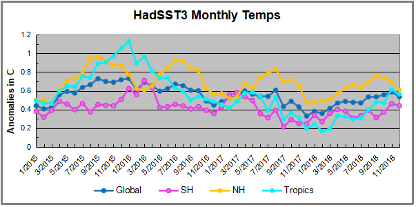
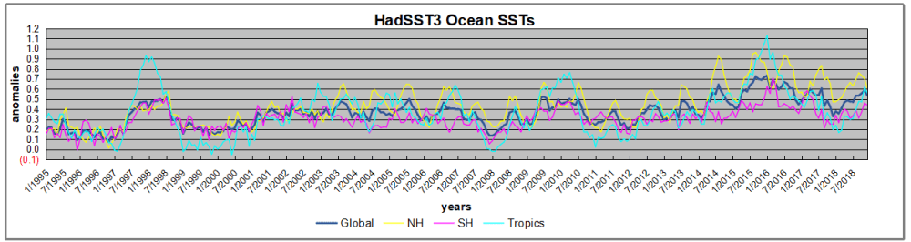
1995 is a reasonable starting point prior to the first El Nino.  The sharp Tropical rise peaking in 1998 is dominant in the record, starting Jan. ’97 to pull up SSTs uniformly before returning to the same level Jan. ’99.  For the next 2 years, the Tropics stayed down, and the world’s oceans held steady around 0.2C above 1961 to 1990 average.

Then comes a steady rise over two years to a lesser peak Jan. 2003, but again uniformly pulling all oceans up around 0.4C.  Something changes at this point, with more hemispheric divergence than before. Over the 4 years until Jan 2007, the Tropics go through ups and downs, NH a series of ups and SH mostly downs.  As a result the Global average fluctuates around that same 0.4C, which also turns out to be the average for the entire record since 1995.

2007 stands out with a sharp drop in temperatures so that Jan.08 matches the low in Jan. ’99, but starting from a lower high. The oceans all decline as well, until temps build peaking in 2010.

Now again a different pattern appears.  The Tropics cool sharply to Jan 11, then rise steadily for 4 years to Jan 15, at which point the most recent major El Nino takes off.  But this time in contrast to ’97-’99, the Northern Hemisphere produces peaks every summer pulling up the Global average.  In fact, these NH peaks appear every July starting in 2003, growing stronger to produce 3 massive highs in 2014, 15 and 16.  NH July 2017 was only slightly lower, and a fifth NH peak still lower in Sept. 2018.  Note also that starting in 2014 SH plays a moderating role, offsetting the NH warming pulses. (Note: these are high anomalies on top of the highest absolute temps in the NH.)

What to make of all this? The patterns suggest that in addition to El Ninos in the Pacific driving the Tropic SSTs, something else is going on in the NH.  The obvious culprit is the North Atlantic, since I have seen this sort of pulsing before.  After reading some papers by David Dilley, I confirmed his observation of Atlantic pulses into the Arctic every 8 to 10 years.

But the peaks coming nearly every summer in HadSST require a different picture.  Let’s look at August, the hottest month in the North Atlantic from the Kaplan dataset.
AMO August 2018

The AMO Index is from from Kaplan SST v2, the unaltered and not detrended dataset. By definition, the data are monthly average SSTs interpolated to a 5×5 grid over the North Atlantic basically 0 to 70N. The graph shows warming began after 1992 up to 1998, with a series of matching years since. Because the N. Atlantic has partnered with the Pacific ENSO recently, let’s take a closer look at some AMO years in the last 2 decades.

AMO decade 112018

This graph shows monthly AMO temps for some important years. The Peak years were 1998, 2010 and 2016, with the latter emphasized as the most recent. The other years show lesser warming, with 2007 emphasized as the coolest in the last 20 years. Note the red 2018 line is at the bottom of all these tracks. Most recently November 2018 is 0.50C lower than November 2016, and is the coolest November since 2011.

Summary

The oceans are driving the warming this century.  SSTs took a step up with the 1998 El Nino and have stayed there with help from the North Atlantic, and more recently the Pacific northern “Blob.”  The ocean surfaces are releasing a lot of energy, warming the air, but eventually will have a cooling effect.  The decline after 1937 was rapid by comparison, so one wonders: How long can the oceans keep this up? If the pattern of recent years continues, NH SST anomalies will likely cool in coming months.  Once again, ENSO will probably determine the outcome.

Postscript:

In the most recent GWPF 2017 State of the Climate report, Dr. Humlum made this observation:

“It is instructive to consider the variation of the annual change rate of atmospheric CO2 together with the annual change rates for the global air temperature and global sea surface temperature (Figure 16). All three change rates clearly vary in concert, but with sea surface temperature rates leading the global temperature rates by a few months and atmospheric CO2 rates lagging 11–12 months behind the sea surface temperature rates.”

Footnote: Why Rely on HadSST3

HadSST3 is distinguished from other SST products because HadCRU (Hadley Climatic Research Unit) does not engage in SST interpolation, i.e. infilling estimated anomalies into grid cells lacking sufficient sampling in a given month. From reading the documentation and from queries to Met Office, this is their procedure.

HadSST3 imports data from gridcells containing ocean, excluding land cells. From past records, they have calculated daily and monthly average readings for each grid cell for the period 1961 to 1990. Those temperatures form the baseline from which anomalies are calculated.

In a given month, each gridcell with sufficient sampling is averaged for the month and then the baseline value for that cell and that month is subtracted, resulting in the monthly anomaly for that cell. All cells with monthly anomalies are averaged to produce global, hemispheric and tropical anomalies for the month, based on the cells in those locations. For example, Tropics averages include ocean grid cells lying between latitudes 20N and 20S.

Gridcells lacking sufficient sampling that month are left out of the averaging, and the uncertainty from such missing data is estimated. IMO that is more reasonable than inventing data to infill. And it seems that the Global Drifter Array displayed in the top image is providing more uniform coverage of the oceans than in the past.

uss-pearl-harbor-deploys-global-drifter-buoys-in-pacific-ocean

USS Pearl Harbor deploys Global Drifter Buoys in Pacific Ocean


Scare of the Day: Ocean Heat Content

For over a decade, more than 3000 floats have provided near-global data coverage for the upper 2000 m of the ocean.

Here is a sample of yesterday’s coordinated reports from CCN- Climate Crisis Network captured by my news aggregator, listed by the most recent first. Note the worldwide scope and editorial poetic license on the titles.

Ocean warming accelerating to record temperatures, scientists warn Engineering and Technology Magazine
Scalding seas? Oceans boil to hottest temp on record USA Today EU
World’s oceans heating up at quickening pace: study Egypt Independent
Ocean warming ‘accelerating’ The London Economic
Oceans warming faster than we thought: Study AniNews.in
Ocean temperatures rising faster than thought in ‘delayed response’ to global warming, scientists say The Japan Times
Oceans warming much faster than previously thought: Study The Hindu Business Line
The Oceans Are Warming Faster Than We Thought, a New Study Says TIME
Oceans Warming Even Faster Than Previously Thought Eurasia Review
The Ocean Is Warming Much Faster Than We Thought, According To A New Study BuzzFeed
Pacific: New research proves ocean warming is accelerating ABC Online – Radio Australia
We’re Boiling the Ocean Faster Than We Thought New York Magazine
Oceans warming faster than expected SBS
Ocean temperatures are rising far faster than previously thought, report says TVNZ
Ocean Temps Rising Faster Than Scientists Thought: Report HuffPost (US)
World’s oceans are heating up at a quickening pace Bangkok Post
The Warming of the World’s Oceans Is Set to Increase Dramatically Over the Next 60 Years Pacific Standard
New Climate Change Report Says Ocean Warming Is Far Worse Than Expected Fortune
Oceans Are Warming Faster Than Expected, Research Says Geek.com
World’s oceans are heating up at a quickening pace: study AFP
Oceans Warming Faster Than Predicted, Scientists Say gCaptain

So the message to the world is very clear: Ocean Heat Content is rising out of control, Be Very Afraid!
The trigger for all of this concern comes from this paper How fast are the oceans warming? by Lijing Cheng, John Abraham, Zeke Hausfather, Kevin E. Trenberth. Science 11 Jan 2019 Excerpts from paper in italics with my bolds.

Climate change from human activities mainly results from the energy imbalance in Earth’s climate system caused by rising concentrations of heat-trapping gases. About 93% of the energy imbalance accumulates in the ocean as increased ocean heat content (OHC). The ocean record of this imbalance is much less affected by internal variability and is thus better suited for detecting and attributing human influences (1) than more commonly used surface temperature records. Recent observation-based estimates show rapid warming of Earth’s oceans over the past few decades (see the figure) (1, 2). This warming has contributed to increases in rainfall intensity, rising sea levels, the destruction of coral reefs, declining ocean oxygen levels, and declines in ice sheets; glaciers; and ice caps in the polar regions (3, 4). Recent estimates of observed warming resemble those seen in models, indicating that models reliably project changes in OHC.

The Intergovernmental Panel on Climate Change’s Fifth Assessment Report (AR5), published in 2013 (4), featured five different time series of historical global OHC for the upper 700 m of the ocean. These time series are based on different choices for data processing (see the supplementary materials). Interpretation of the results is complicated by the fact that there are large differences among the series. Furthermore, the OHC changes that they showed were smaller than those projected by most climate models in the Coupled Model Intercomparison Project 5 (CMIP5) (5) over the period from 1971 to 2010 (see the figure).

Since then, the research community has made substantial progress in improving long-term OHC records and has identified several sources of uncertainty in prior measurements and analyses (2, 6–8). In AR5, all OHC time series were corrected for biases in expendable bathythermograph (XBT) data that had not been accounted for in the previous report (AR4). But these correction methods relied on very different assumptions of the error sources and led to substantial differences among correction schemes. Since AR5, the main factors influencing the errors have been identified (2), helping to better account for systematic errors in XBT data and their analysis.

Multiple lines of evidence from four independent groups thus now suggest a stronger observed OHC warming. Although climate model results (see the supplementary materials) have been criticized during debates about a “hiatus” or “slowdown” of global mean surface temperature, it is increasingly clear that the pause in surface warming was at least in part due to the redistribution of heat within the climate system from Earth surface into the ocean interiors (13). The recent OHC warming estimates (2, 6, 10, 11) are quite similar to the average of CMIP5 models, both for the late 1950s until present and during the 1971–2010 period highlighted in AR5 (see the figure). The ensemble average of the models has a linear ocean warming trend of 0.39 ± 0.07 W m−2 for the upper 2000 m from 1971–2010 compared with recent observations ranging from 0.36 to 0.39 W m−2 (see the figure).

MISSION ACCOMPLISHED: “The recent OHC warming estimates are quite similar to the average of CMIP5 models.”

What They are Not Telling You

The Sea Surface Temperature (SST) record is a mature dataset, not without issues from changing measurement technologies, but providing a lengthy set of observations making up 71% of the surface temperature history.  Sussing out temperatures at various depths in the ocean is a whole nother kettle of fish.

The Ocean Heat Content data is sparse, both in time and space.

The Ocean is vast, 360 million square kilometers with an average depth of 3700 meters, and we have 3900 Argo floats operating for 10 years. In addition we have some sensors arrayed at depths in the North Atlantic. As the text above admits, there are lots of holes in the data, and only a short history of the recently available reliable data. Other publications by some of the same authors admit: Large discrepancies are found in the percentage of basinal ocean heating related to the global ocean, with the largest differences in the Pacific and Southern Ocean. Meanwhile, we find a large discrepancy of ocean heat storage in different layers, especially within 300–700 m in the Pacific and Southern Oceans. Source: Consensuses and discrepancies of basin-scale ocean heat content changes in different ocean analyses, Gongjie Wang, Lijing Cheng, John Abraham.

Modelers Make OHC Reconstructions by Adding Guesstimates to Observations

Again climate science alarms are raised after “reanalysis” of the data. No one should be surprised that after computer manipulations and data processing, the “reanalyzed” data has changed and now favors warming and confirms the climate models. The Argo data record by itself is too short to make any such claim. In previous studies, scientists were more circumspect and refrained from “jumping the shark.” Apparently, with the Paris Accord on the ropes in 2019, caution and nuance has been thrown to the wind, as witnessed by the recent SR15 horror show, and now this.

Methodological Problems Bedevil These Reconstructions

One of the studies cited in support of revising OHC upward is the study Quantification of ocean heat uptake from changes in atmospheric O2 and CO2 composition, L. Resplandy et al. Published in Nature 31 October 2018.  From the Media Release:

The world’s oceans have absorbed far more heat than we realized, shortening our timeline to stop the causes of global warming, and foreboding some of the worst case scenarios put forth by climate experts, according to new findings.

A novel study by researchers from Scripps Institution of Oceanography at the University of California San Diego and Princeton University, published on Wednesday in Nature, implies that officials have underestimated the amount of heat retained by Earth’s oceans.

Between 1991 and 2016, oceans warmed an average 60 percent more than estimates by the Intergovernmental Panel on Climate Change (IPCC) originally calculated, the study claims. That amount equalled 13 zettajoules, or eight times the world’s annual energy consumption.

Something didn’t look right to climate statistician Nic Lewis so he deconstructed the study, finding several methodological mistakes along the way. He explained and communicated with the authors in a series of 4 posts at Climate Etc. Nov. 6 through 23, 2018.

Nic Lewis, Nov. 6 (here):

The findings of the Resplandy et al paper were peer reviewed and published in the world’s premier scientific journal and were given wide coverage in the English-speaking media. Despite this, a quick review of the first page of the paper was sufficient to raise doubts as to the accuracy of its results. Just a few hours of analysis and calculations, based only on published information, was sufficient to uncover apparently serious (but surely inadvertent) errors in the underlying calculations.

Moreover, even if the paper’s results had been correct, they would not have justified its findings regarding an increase to 2.0°C in the lower bound of the equilibrium climate sensitivity range and a 25% reduction in the carbon budget for 2°C global warming.

Because of the wide dissemination of the paper’s results, it is extremely important that these errors are acknowledged by the authors without delay and then corrected.

Authors Respond:

On November 14, 2018 this paper’s authors announced key errors to the two week-old study that made claims about the amount of heat that Earth’s oceans have absorbed. The errors stem from “incorrectly treating systematic errors in the O2 measurements and the use of a constant land O2:C exchange ratio of 1.1,” co-author Ralph Keeling said in an update from Scripps Institution of Oceanography, which is affiliated with the study. More simply, the team’s findings are too uncertain to conclusively support their statement that Earth’s oceans have absorbed 60 percent more heat than previously thought. Keeling claims the errors “do not invalidate the study’s methodology or the new insights into ocean biogeochemistry on which it is based.”

Subsequent posts by Lewis found other differences between the stated method and the analysis actually applied, adding to the uncertainty of the study and its finding. Lewis is not done yet, and the paper has not been reissued. Unfortunately, it has not been retracted and is still cited in reference to unsupported claims of runaway ocean heat content.

Meanwhile, other measurements, such as those in North Atlantic and Indian Ocean show slight cooling rather than warming, with researchers suspecting natural cyclical activity.

Summary

So anxious are alarmists/activists to cry wolf that they are running the computers flat out to manipulate and extrapolate from precious but incomplete limited data to confirm their suppositions.  All to keep alive a deflating narrative that the public increasingly finds offensive.

Footnote:

Oceanographers know that deep ocean temperatures can vary on centennial up to millennial time scales, so if some heat goes into the depths, it is not at all clear when it would come out.

Beware getting sucked into any model, climate or otherwise.

More at Putting Climate Models in Their Place

What Proof Our Climate is Warming?

This is a reblog of a post at Manhattan Contrarian How Do You Tell If The Earth’s Climate System “Is Warming”? Excerpts in italics with my bolds

Back in August I had a post by the title of “How Do You Tell If The Earth’s Climate System “Is Warming”? The post took note of the fact that, with a time series (like for temperature) that fluctuates up and down, you can always give a presentation that makes the trend look to be whatever you want it to be, so long as you get to pick the start date. If you want to make it look like the trend is up, you pick a start date where the value of the series is low; and if you want to make it look like the trend is down, you pick a start date where the value of the series is high. Nothing to it! With the earth’s climate system, you have nearly infinite numbers of years that you can go back to get the result you want. Those who want to convince you that the earth’s climate system “is warming” typically pick as their start date either the 1880s or the 1970s, both of which were notable low points in the temperature times series. The trick is so obvious that you would think that nobody could be fooled. But, among others, they seem to have bamboozled Google, which as that August post noted, had taken to including on YouTube videos involving climate skeptics a legend stating “Multiple lines of scientific evidence show that the climate system is warming.”

“Multiple lines of evidence”? Really Google, is there any “line of evidence” that matters as to whether something “is warming” or “is cooling” other than the temperature time series? They don’t enlighten us as to what that other “line of evidence” might be.

Anyway, enough months have now passed for another year to end, so we now have three full years since the most recent temperature peak, which occurred in January 2016. Here is the latest UAH satellite temperature graph for the lower troposphere, going from the time the satellites were launched (1979) to December 2018:

The 0.25 deg C temperature anomaly of the latest value represents a decline of some 0.61 deg C from the peak anomaly of 0.86 deg C in January 2016. That 0.61 deg C decline is not small in the context of this series. The whole range on this chart from coldest month (-0.51 deg C in 1984) to warmest month (+ 0.86 deg C in 2016) is only 1.37 deg C; and the 0.61 deg C drop represents close to half of that.

According to Dr. Roy Spencer of UAH (publisher of the graph), 2018 came in as the 6th warmest in the 40 years of the satellite time series. That would still put 2018 among the warmer years. But it also means that five previous years were warmer, one of them being 1998 — a full 20 years ago.

A number of questions occur to me, as I’m sure they do to you:

To support the assertion that the earth’s climate system “is warming,” shouldn’t the temperature be higher each year over the preceding year?

CO2 emissions have been increasing year by year, and the amount of cumulative CO2 in the atmosphere has been increasing year by year. Isn’t that supposed to be the driving mechanism behind global temperature? How is it possible for temperature to decline, and by a rather significant amount, when CO2 has increased?

Obviously, there must be some force at work sufficient to overcome the increase in CO2. What is that force? How do you know that that force will not continue to overcome the influence of the CO2? Indeed, how do you know that that force, alone or in combination with some other forces known or unknown, will not so completely overcome the influence of CO2 as to bring on the next ice age?

How many years of temperature decline does it take before it is no longer appropriate to assert that the climate system “is warming”? I mean, we’re using the present tense here. Since when do we use the present tense in our language to mean “something that occurred more than three years ago but has not occurred for the last three years”?

You might be interested in the take of our various highly prestigious “scientific societies” on the question of whether the earth’s climate system “is warming.” You can find a compilation of summary statements on that subject at the NASA web site at this link. NASA’s page is titled “Scientific consensus: Earth’s climate is warming.” (Side question: What is a page with that title still doing up two years into the Trump administration?). A few examples:

American Association for the Advancement of Science: “The scientific evidence is clear: global climate change caused by human activities is occurring now, and it is a growing threat to society.”

American Medical Association: “Our AMA … supports the findings of the Intergovernmental Panel on Climate Change’s fourth assessment report and concurs with the scientific consensus that the Earth is undergoing adverse global climate change and that anthropogenic contributions are significant.”

American Physical Society: “The evidence is incontrovertible: Global warming is occurring.”

OK, these guys are a little more slippery with the wording than just saying (along with Wikipedia, Google and NASA) that “the climate system is warming.” But clearly NASA wants you to think that the phrase “climate change is occurring” is functionally the same thing.

Unfortunately for these societies, the question of whether the earth “is warming” is really not a scientific question, but rather only one of appropriate use of the English language. I don’t know where the temperatures may go from here — and neither do they. But a full three years into an obvious cooling cycle, isn’t it time to recognize that this awkward use of language is no longer appropriate?

See Also:  Man Made Warming from Adjusting Data

December Cooling by Sea, More than by Land

banner-blog

With apologies to Paul Revere, this post is on the lookout for cooler weather with an eye on both the Land and the Sea.  UAH has updated their tlt (temperatures in lower troposphere) dataset for December.   Previously I have done posts on their reading of ocean air temps as a prelude to updated records from HADSST3. This month I will add a separate graph of land air temps because the comparisons and contrasts are interesting as we contemplate possible cooling in coming months and years.

Presently sea surface temperatures (SST) are the best available indicator of heat content gained or lost from earth’s climate system.  Enthalpy is the thermodynamic term for total heat content in a system, and humidity differences in air parcels affect enthalpy.  Measuring water temperature directly avoids distorted impressions from air measurements.  In addition, ocean covers 71% of the planet surface and thus dominates surface temperature estimates.  Eventually we will likely have reliable means of recording water temperatures at depth.

Recently, Dr. Ole Humlum reported from his research that air temperatures lag 2-3 months behind changes in SST.  He also observed that changes in CO2 atmospheric concentrations lag behind SST by 11-12 months.  This latter point is addressed in a previous post Who to Blame for Rising CO2?

The December update to HadSST3 will appear later this month, but in the meantime we can look at lower troposphere temperatures (TLT) from UAHv6 which are already posted for December. The temperature record is derived from microwave sounding units (MSU) on board satellites like the one pictured above.

The UAH dataset includes temperature results for air above the oceans, and thus should be most comparable to the SSTs. There is the additional feature that ocean air temps avoid Urban Heat Islands (UHI).  The graph below shows monthly anomalies for ocean temps since January 2015.

uah oceans 201812
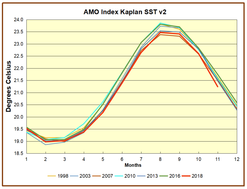
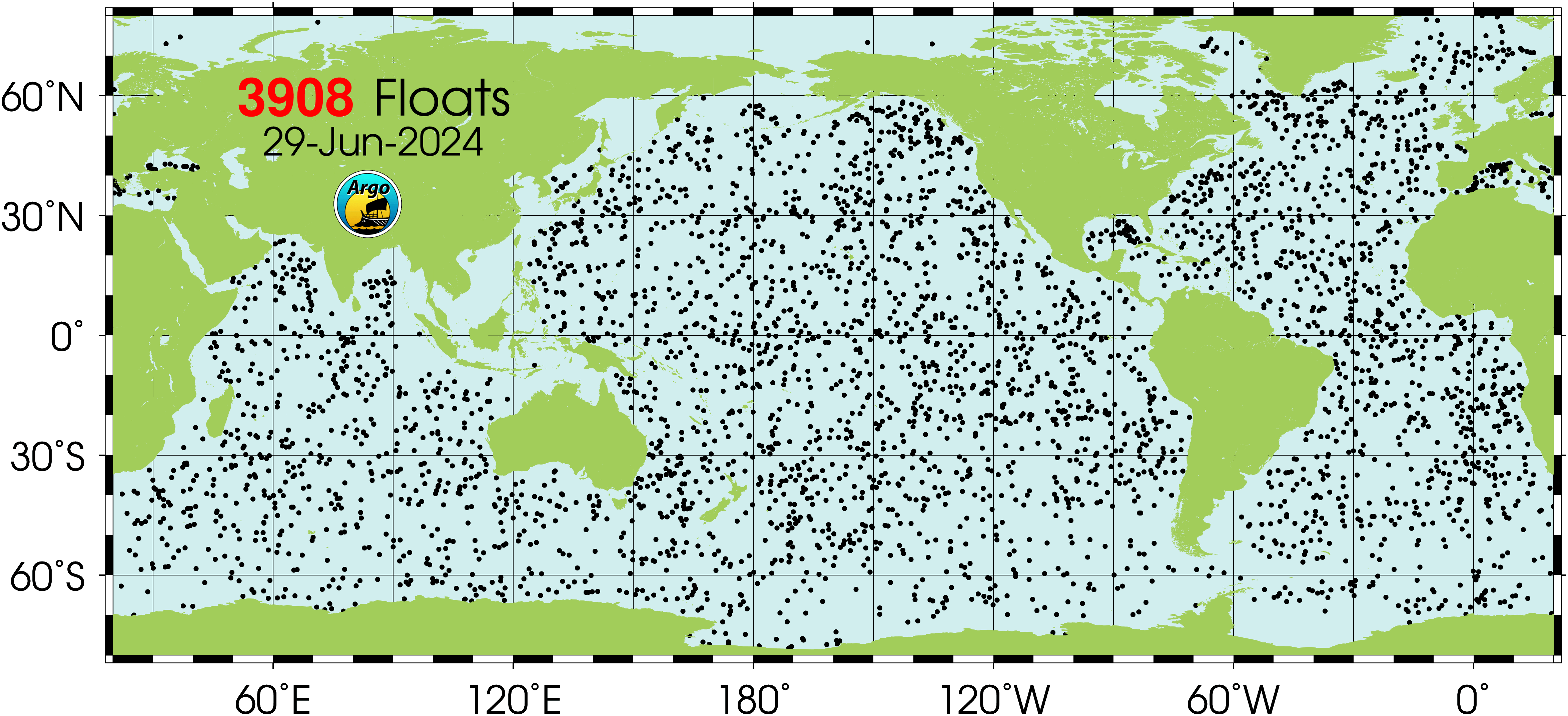
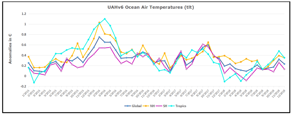
The anomalies over the entire ocean dropped to the same value, 0.12C  in August (Tropics were 0.13C).  Warming in previous months was erased, and September added very little warming back. In October and November NH and the Tropics rose, joined by SH last month.,  In December 2018 all regions cooled resulting in a global drop of nearly 0.1C.

Taking a longer view, we can look at the record since 1995, that year being an ENSO neutral year and thus a reasonable starting point for considering the past two decades.  On that basis we can see the plateau in ocean temps is persisting. Global ocean temps are the lowest December since 2014.  It also appears that the NH Autumn upward bump is over and temps will likely trend downward.

Land Air Temperatures Plunged in September, then Rose in October

We sometimes overlook that in climate temperature records, while the oceans are measured directly with SSTs, land temps are measured only indirectly.  The land temperature records at surface stations record air temps at 2 meters above ground.  UAH gives tlt anomalies for air over land separately from ocean air temps.  The graph updated for December is below.uah land 201812

The greater volatility of the Land temperatures is evident, and also the dominance of NH, which has twice as much land area as SH.  Note how global peaks mirror NH peaks.  In December air over Tropics fell sharply, SH slightly, while the NH land surfaces rose, pulling up the Global anomaly for the month.  Despite the warming, air temps over land were the lowest December since 2013 both Globally and for the Tropics.  And all regions are cooler than December 2015 when the El Nino was starting in earnest.

Summary

TLTs include mixing above the oceans and probably some influence from nearby more volatile land temps.  It is striking to now see NH and Global land temps dropping rapidly.  TLT measures started the recent cooling later than SSTs from HadSST3, but are now showing the same pattern.  It seems obvious that despite the three El Ninos, their warming has not persisted, and without them it would probably have cooled since 1995.  Of course, the future has not yet been written.


Clashing Climate Paradigms


Global Warming/Climate Change is not formally debated any more since early on such proceedings made audiences more skeptical of alarmist claims. Instead, mostly it is on comment threads that True Believers (TB) of AGW can be found jousting with Climate Realists (CR). I recently came upon one from earlier in 2018 that illuminated how these two worldviews compare and contrast regarding the planetary climate functioning. There were numerous participants on both sides (unusually rich interchange), so I will organize my synopsis as a dialogue between Believer and Realist comprised of text from various comments in italics with my bolds. This is a shortened extract of a very long thread focusing on those comments generating more light than heat.

Structuring this argument along the lines of a Platonic dialogue seems right, but also ironic because Plato invented idealism, the basic stance of True Believers. That is, Plato invested eternal verity into objects of the mind, like Good and Evil, Beauty and Justice. Whereas, Climate Sceptics subscribe to objective realism, thus see the natural world as operating by its own devices, independent of what we think or know about it. This interplay of theoretical versus empirical orientations manifests throughout the commentary. And like Plato’s dialogues, the discussion sometimes returns to previous topics and repeats information in another context, which can also be instructive.

The comments were triggered by a post at Discover Magazine Here’s what real science says about the role of CO2 as Earth’s preeminent climatic thermostat. The article by Tom Yulsman concluded:

Earth’s climate is clearly an incredibly complex system. And climate scientists have never contended that they’ve understood all the details, or that their current understanding isn’t subject to revision when new evidence comes along. This is why they continue to do their research – to improve our understanding of how one of Earth’s key life support systems works.

They’ve also never contended that CO2 is the sole factor driving climate changes over geologic history. As we’ve seen, however, it plays a key role: Without the CO2 thermostat, Earth would likely be a proverbial snowball.

And now, we humans have turned the thermostat up, with predictable results that we’re already observing — such as changes to permafrost in the Arctic that got me going on this post to begin with.

The article prompted responses such as these.

Realist: Yulsman correctly states that “scientists actually have long known that something other than CO2 sets thing in motion when Earth enters and emerges from ice ages: shifts in solar radiation …” and “The bottom line is that a change in amount of solar energy reaching Earth may get things going”.

But he is just speculating when he goes on to say “but it’s CO2 that plays the dominant role”, because there is no empirical evidence that is true. It’s just the assumption of the CO2 hypothesis. The real world data shows is not true, as the 1940-1970 global cooling essentially reversed the 1910-1940 warming even though CO2 steadily increased from 1940-1970, and as there has been no CO2-induced warming over the last ~2 decades, even though human CO2 increase has been even higher during the most recent two decades.

There is much more evidence that H2O is the “thermostat”, as the Ramanathan 1981 paper cited below finds, ie., high SST during El Ninos causes more high cirrus clouds which regulate the max SST by blocking solar radiation.

Clouds, made of H2O, are the thermostat. When warming occurs this causes more clouds which reduces solar radiation reaching the surface to prevent ‘runaway’ warming. A negative feedback keeping the temperature within a limited range. When cooling occurs this causes fewer clouds which increases solar radiation reaching the surface to prevent ‘runaway’ cooling. Again, a negative feedback keeping he temperature within a limited range.

There is no physical reason that this cloud/water vapor negative feedback would stop working if there was no CO2 in the atmosphere. So Yulsman’s claim “if water vapor would rain out the result would be a very dramatic cooling” is wrong. If water vapor were to rain out, there would be fewer clouds and more solar radiation would reach the earth’s surface causing warming. It would never drive to an icehouse climate.

Believer: So you’re basically accusing the author of this article of fraud, if he’s perpetuating a “hoax,” as you call the well-established scientific principle that human greenhouse gas emissions are contributing to rising average global temperatures. Exactly what evidence would you use to support such a radical assertion?

Realist:  “well-established scientific principle that human greenhouse gas emissions are contributing to rising average global temperatures.”
What a mouthful. However, it isn’t ‘well established” (although it is widely believed that it is…)
…There is no observational evidence linking Mannkind’s burning of fossil fuels, and planetary warming. None. There are lots of big computer models that generate the appearance of “evidence” … but this is imaginary, existing only in the output of the models. Look a little deeper, and you’ll find large flaws in those models.

Believer: Wrong, as the article above, and over a century of scientific knowledge of carbon dioxide’s properties has shown. Please discuss the “flaws” in this science, if you’re so certain otherwise.

Realist: Trenberth, Fasullo, & Balmaseda 2014: ”All estimates (OHC and TOA) show that over the past decade, the energy imbalance ranges between about 0.5 and 1 W/㎡.

The concept of “Global Warming” is the supposed imbalance of Earth heat gain, and heat loss, measured in Watts per square metre of the Earth surface. In no particular order:

L’Ecuyer 2015 0.45 W/㎡, Trenberth and pals, 2009: 0.9 W/㎡; Stephens 2012: 0.6W/㎡; Lyman 2010: 0.64 ± 0.11 W/㎡; Hansen 2011: 0.8 ± 0.2 W/㎡; Loeb 2012: 0.5 ± 0.43 W/㎡; Allan 2014: 0.34 ± 0.67 W/㎡ from 1985 to 1999 and 0.62 ± 0.43 W/㎡ from 2000 to 2012; Dieng: 0.75 ± 0.52 W/㎡; Levitus 2009: 0.57 W/㎡; Llovel 2014: 0.67 ± 0.43 W/㎡; Wild 2017: 0.60 W/㎡; Johnson 2012 0.48 W/㎡; Church 2011 ~0.4 W/㎡ …von Schuckmann and Le Traon, 2011: 0.55 ± 0.1 W/㎡, so, about ½ Watt per square metre.

Schwartz 2008: ”Comparison with the natural greenhouse effect of about 300 W/m^2 … shows that this enhancement [greenhouse gas forcing] is well less than 1%.”

Wielicki 2013: ”Climate change, however, consists of very small changes in distributions of geophysical variables … Typical decadal changes are much less than 1% and clearly are small perturbations.”

Ollila 2014: “The changes are so small that they can be analyzed only by computational methods.”

Wick, Gary 2016: ”These climate change signals … are far below any expected observational accuracy globally or in polar regions. … .”

All these high-level climate scientists are telling you that these ‘Climate Change’ signals are really small… far below observational accuracy, can only be analyzed by computational methods, consisting of very small changes, much less than 1% … These folks are telling you that, in the twenty-first century. What “century of scientific knowledge” do you have, that these above-mentioned, high-level climate scientists have missed?

Believer: Very close to 1C surface warming in 137 years is substantial and very fast warming. There is no denying that.

Oceans heat content steadily increasing, with temps increasing as deep as 2,000 meters.
Season changing, shorter winters
Arctic rapidly losing sea ice and land ice on Greenland
Agricultural growing zones shifting north in northern hemisphere
Sea level rising

Realist: “Slight warming?”
Yes, slight warming over the last half of the 20th century, which is the only warming the IPCC claims is primarily human-caused. The satellite data shows that there has only been ~0.5C and most of that has been natural, due to El Nino and more solar radiation reaching the earth’s surface.
“is VERY fast warming”
There have been many previous natural warmings with greater rates of warming and greater absolute warming than recent warming of less than 1C/century, such as the following:
– 250 yrs BP 106yr natural warming of >1.5C/century
– 400 yrs BP 103yr natural warming of >1.5C/century
– 1600 yrs BP 119yr natural warming of >1.25C/century
– 2585 yrs BP 84yr natural warming of 2.0C/century
– 2760 yrs BP 90yr natural warming of 2.2C/century
– 2980 yrs BP 133yr natural warming of 1.5C/century
– 3511 yrs BP 89yr natural warming of 1.3C/century
– 4880 yrs BP 94yr natural warming of 1.5C/century
– 6385 yrs BP 98yr natural warming of 1.9C/century
– 8226 yrs BP 91yr natural warming of 3.2C/century
– 10.3K yrs BP 97yr natural warming of 1.9C/century
– 74.7K yrs BP 167yr natural warming of 1.3C/century
– 78.4K yrs BP 160yr natural warming of 1.9C/century
– 80.2K yrs BP 153yr natural warming of 1.8C/century
– 82.4K yrs BP 139yr natural warming of 1.7C/century
– 90.1K yrs BP 155yr natural warming of 1.3C/century
– 102K yrs BP 65yr natural warming of 1.4C/century
– 127K yrs BP 102yr natural warming of 1.3C/century
– 129K yrs BP 162yr natural warming was 1.9C/century
Sources: Mulvaney(2012) and this report

Believer: And you are saying the Earth’s energy balance change is not enough?
Offsetting some of the increased greenhouse effect from our emissions is human emissions of aerosols, having a cooling effect.

Then there is the fact that the net effect of all natural factors would have cooled the planet over the last 50 plus years, if not for our emissions.
Foster & Rahmstorf 2011
Lean and Rind 2008
and other attribution studies

Realist: All of the above, fast warming, OHC, shorter winters, ice loss, agricultural zones moving poleward, rising sea level … These are all just different manifestations of one single fact … It’s a bit warmer. These are not independent, separate facts … they are just one.
Trenberth, Fasullo, & Balmaseda 2014: ”Rising surface temperatures are just one manifestation. Melting Arctic sea ice is another.”
Shepherd, T, 2014: ”…surface temperature, upper-ocean heat content, sea level, Arctic sea-ice extent, glaciers, Northern Hemisphere snow cover, large-scale precipitation patterns (especially as reflected in ocean salinity), and temperature extremes (Figure 1a,b). All these global indicators are physically linked in a direct way to the first on the list, surface temperature, …”
von Schuckmann 2016: ”…global temperature rise, increased [ocean heat content], sea level rise, and the acceleration of the hydrological cycle (Fig. 2b). These are all symptoms of [Earth’s energy imbalance].”
this, theorized, energy imbalance has been quantified as about ½W/㎡. Beyond small, that is tiny. Relative to the average sunshine striking Earth … (½÷340)=0.001471 ≈0.15%
No, what I’m saying is that the imbalance is tiny. Too small for any direct measurement.

Believer: Every year since 2001 was warmer than any year in the 20th century, with the sole exception of 1998. – Globally 15 of the warmest years on record were in the last 16 years.

Realist: CO2’s “properties” are a “push” in the warming direction. Ramanathan 1981: ”Increasing CO2, while fixing all the other climatic parameters and variables, will cause a radiative heating of the surface-troposphere system.”

the trouble is, however, “fixing” all the other variables and parameters in place. Things change.

Plass 1956: ”The most recent calculations of the infra-red flux in the region of the 15 micron CO2 band show that the average surface temperature of the earth increases 3.6° C if the CO2 concentration in the atmosphere is doubled, and decreases 3.8°C if the CO2 amount is halved, provided that no other factors change which influence the radiation balance.”

Plass 1956 didn’t warn us, just once. He told us, three different ways, three different phrases … Did you listen? “It is assumed that nothing else changes that affects the radiation balance when the CO2 amount varies.”

” It is also assumed here that no other factors change at the same time which can influence the radiation balance.”

Believer: There are about a half dozen peer reviewed attribution studies showing that the net effect of ALL natural climate forcings and feedbacks, as well as effects of solar and ENSO cycles, since 1960, would have Cooled the Planet, if not for human emissions of CO2 and other greenhouse gases.

Foster and Rahmstorf (2011) is one such study.

Lean and Rind (2008)
“None of the natural processes can account for the overall warming trend in global surface temperatures. In the 100 years from 1905 to 2005, the temperature trends produce by all three natural influences are at least an order of magnitude smaller than the observed surface temperature trend reported by IPCC [2007].”

According to this analysis, solar forcing contributed negligible long-term warming in the past 25 years and 10% of the warming in the past 100 years”

{Skeptical Science}

Realist: Believer, I want you to think for yourself. Please stop typing what SkS has written. Read the real science papers, take notes, quote the paper (not SkS) and provide citations. I won’t send you to What’s Up, please stop prattling on with SkS text.

Feel free to read the papers I quote. SkS is all backed up by selective choice of papers. You’ll not see many of the papers that I quote from, on SkS. That means, when real science has a disagreement, or a correction, SkS just lets that slide. Then again, I wouldn’t expect you to find and read those papers … so, read the references you find at SkS, and quote the reference paper … not the SkS text, please. Assemble your own thoughts, and support them with quotations from the papers.

Lean & Rind 2008, and the “none of the natural processes…” has several monstrously large flaws. The biggest, is that it is discussing the flawed computer models …these are known knowns, thorny problems that continue into CMIP6. But the second, is that not all the natural processes have been considered. These are known unknowns. Oh, and then, there are the unknown, unknowns.

As I was perusing the paper, Lean & Rind 2008: Influences on Surface Temperatures, I noticed the authors started off with a grand summary. In it, they mentioned, ”An exhaustive model- based study concludes that increasing anthropogenic gas concentrations (GHGs and tropospheric aerosols) produced 0.3–0.5 K per century warming over the 1906–1996 period, and are the dominant cause of global surface warming after 1976 [Allen et al., 2006].”

If some empirical, observational evidence, of this anthropogenic warming, existed prior to their publication in 2008, don’t you think that this review, would have mentioned it? …but, all they mentioned in this review, was this exhaustive model-based study by Allen 2006.
Lean, Judith L., and David H. Rind 2008. “How natural and anthropogenic influences alter global and regional surface temperatures: 1889 to 2006.” Geophysical Research Letters

Believer: Lean and Rind is one of several studies with the same conclusions. Of course, you believe climate models are not valid tools, which is nonsense.

Knutti and Huber is another such study

“Our results show that it is extremely likely that at least 74% of the observed warming since 1950 was caused by radiative forcings, and less than 26% by unforced internal variability.

Of the forced signal during that particular period, 102% (90–116%) is due to anthropogenic and 1% (−10 to 13%) due to natural forcing…. The combination of those results with attribution studies based on optimal fingerprinting, with independent constraints on the magnitude of climate feedbacks, with process understanding, as well as paleoclimate evidence leads to an even higher confidence about human influence dominating the observed temperature increase since pre-industrial times.”
——-
To test whether recent warming might just be down to a random swing in Earth’s unstable climate — another theory favoured by sceptics — Knutti and Huber conducted a series of control runs of different climate models without including the effects of the energy-budget parameters. But even if climate variability were three times greater than that estimated by state-of-the-art models, it is extremely unlikely to have produced a warming trend as pronounced as that observed in the real world, they found.

Realist: “you believe that climate models are not valid tools, which is nonsense.”

Climate models are not empirical data. They merely output what is programmed into them, and we know that what is programmed into them is wrong because 95% of them predict too much warming, and because they can’t project global temperature at even the 2% confidence level, “we find that the continued warming stagnation of fifteen years, 1998-2012, is no longer consistent with model projections even at the 2% confidence level” – vonStorch(2013).

Knutti and Hueber is climate model based:

“based on a massive ensemble of simulations with a medium-complexity climate model we demonstrate…” – Huber & Knutti(2011) ‘Anthropogenic and natural warming inferred from changes in Earth’s energy balance’   And the only solar they use is at ToA, and do not include the amount of solar radiation reaching the surface, which invalidates that study as attempting to attribute warming to CO2 versus solar radiation.

There are no peer reviewed papers that empirically show that anthropogenic CO2 was the primary cause of the late 20th century warming like climate alarmists claim.

Believer: “Climate models are not empirical data. They merely output what is programmed into them, and we know that what is programmed into them is wrong because 95% of them predict too much warming”

Patently FALSE
The models do NOT show too much warming, except when deniers cherry pick their projection for worst case emissions scenarios and ignore the other one or two scenarios used in the models. In fact the projections are spot on when looked at honestly

Realist: “The models do NOT show too much warming . . .”
Patently FALSE. A scientist who is not a denier, but a believer in your CAGW-by-CO2 climate alarmism wrote a paper which confirmed that 98% of the latest CMIP5 climate models predict too much warming.

“we find that the continued warming stagnation of fifteen years, 1998-2012, is no longer consistent with model projections even at the 2% confidence level … for the 15-year trend interval corresponding to the latest observation period 1998-2012, only 2% of the 62 CMIP5 and less than 1% of the 189 CMIP3 trend computations are as low as or lower than the observed trend.” – vonStorch(2013) ‘Can climate models explain the recent stagnation in global warming?’
“In fact the projections are spot on when looked at honestly”

Patently FALSE. That warmist scientist confirmed that 61 of the 62 CMIP climate models predicted too much warming.

And that warmist scientist’s paper confirmed that Dr. Roy Spencer’s graph was correct. And there was no cherry-picking by Roy Spencer, because he evaluated 90 CMIP5 models, ~50% more than vonStorch did!

You are just denying reality, evidently because of your ideological blindness and/or your inflexible belief in your climate alarmism belief system/religion.

Believer: “Later in the documentary he meets with climate scientist Hans von Storch, astrophysicist Piers Corbyn and physicist Freeman Dyson. Those in the loop will immediately recognize that this is not at all a fair representation of the scientific debate, but rather provides a very skewed vision thereof by emphasizing outlier views that are demonstrably false.”

Realist: “outlier views that are demonstrably false”
That’s exactly what your CO2-causes-global-warming view is: demonstrably false.

From 1940 to the 1970s, humans added 350 billion tons of CO2 to the atmosphere, twice as much as had been added prior to 1940, the amount of CO2 in the atmosphere increased, yet global temperatures decreased by as much as they had increased since 1900. This is according to data from the U.S. National Center of Atmospheric Research:

When you add twice as much human CO2 to the atmosphere in 3 decades than had been added in the entirety of human history before that and the global temperature goes down by as much as it had increased over the previous 4 decades, that is irrefutable real world empirical data showing that CO2 does NOT cause global warming.

Why do you believe in a falsified CatastrophicAGW-by-CO2 hypothesis when there isn’t a single peer reviewed paper in existence which empirically shows that anthropogenic CO2 was the primary cause of the late 20th century warming like your climate alarmism religion says?

It’s just not rational.

Believer: That is because industrialization, before and after WWII, also greatly increased emissions of sulfur aerosols that cool the planet. When we put pollution controls on everything, those emissions were greatly reduced. This made the greenhouse gas warming stand out, which is why the warming increased after about 1975.

Those aerosols have a short resident time in the atmosphere of a few years. So it didn’t take long for their cooling effect to be greatly reduced.
The CO2 from back then is still in the atmosphere and will be for hundreds of years.

In fact, daily minimum temperatures rose during mid century cooling, even while daily maximum temps decreased.
——————
“Solar activity increased during that period, and of course greenhouse gases were also already on the rise – in fact already in the 1930s Callendar attributed warming to rising CO2 in the air. The “hump” during WW2 (which includes the subsequent cooling) is only in the SST data and not the land temperatures, so for that I suspect there is still some uncorrected issues in the SST data sets. It is well-known that methods of SST data collection changed during this time.” – stefan at Real Climate

Realist: Sorry, but that BS failed excuse doesn’t fly. Even the IPCC admits that aersols from humans in the lower troposphere are washed out in a few days with rain, and don’t impact global climate:

“Aerosols undergo physical and chemical transformations in the atmosphere, especially within clouds, and are removed largely by precipitation. Consequently aerosols in the lower troposphere typically have residence times of a few days.”- IPCC, SAR, WG1, p.20
In the 1940s-1970s they were too insignificant to have global impact. The only aerosols that can cause a global impact are volcanic aerosols that reach the stratosphere and are there for a year or two, and they only cause a small cooling, not the several tenths of a degree C that happened in the 1940-1970s, while the amount of human CO2 added to he atmosphere TRIPLED. Clear refutation of your CO2 causes global warming hypothesis.
Your argument totally fails.

“The CO2 in the atmosphere from back then is still in the atmosphere and will be for hundreds of years.”
No, you are just repeating the false propaganda of your climate cult religion that was made up out of whole cloth by the IPCC as they denied the peer reviewed science and made up their 100-200 year claim. Here is the peer reviewed science that they ignored:
“in fact already in the 1930s Callendar attributed warming to rising CO2 in the air.”
Callendar was also making an evidence-free claim, confirmed by his own 1938 paper. In that paper he admitted that few scientists at that time held that human CO2 could have “any influence” on our climate and weather.

“Few of those familiar with the natural heat exchanges of the atmosphere, which go into makings of our climate and weather, would be prepared to admit that activities of man could have any influence on phenomena of so vast a scale. … It is well known that the gas carbon dioxide has certain strong absorption bands in the infra-red region of the spectrum, and when this fact was discovered some 70 years ago it soon led to speculation on the effect which changes in the amount of the gas in the air could have on the temperature of the earth’s surface. In view of the much larger quantities and absorbing power of atmospheric water vapour it was concluded that the effect of carbon dioxide was probably negligible.” – Callendar(1938) ‘The Artificial Production of Carbon Dioxide and its Influence on Temperature’

Since rates of human carbon dioxide release in the atmosphere were constantly increasing, Callendar expected that global temperature would increase during the next 20 years and would show that the CO2 hypothesis to be correct:

“The course of world temperatures during the next twenty years should afford valuable evidence as to the accuracy of the calculated effect of atmospheric carbon dioxide.” – ibid
In the next 30 years after Callendar’s paper, humans added more CO2 to the atmosphere than ever before. But the empirical data of temperatures over the next 30 years after Callendar’s 1938 paper showed that global temperature decreased by ~0.7C over the next 30 years:

So we see that the Arrhenius/Chamberlain /Callendar CO2 hypothesis failed the real world test, because global temperatures decreased over the next 30 years after Calander’s prediction, even though humans added over 2 times the total amount of human CO2 between 1938-1968 than had been added before 1938.

During that period of global cooling we come to 1951, where the world’s leading climatologists and meteorologists documented the then-current state-of-the-art climate science in the American Meteorological Society’s 1951 Compendium on Meteorology.

“The purpose of the Compendium of Meteorology is to take stock of the present position of meteorology, to summarize an appraise the knowledge which untiring research has been able to wrest from nature during past years, and to indicate the avenues of further studies and research which need to be explored in order to extend the frontiers of our knowledge.” – American Meteorology Society’s 1951 Compendium on Meteorology, Preface, p.v
It was in this state of climate science report that the world’s leading climate scientists and meteorologists stated that the CO2 hypothesis was never widely held and had been abandoned:

“Arrhenius and Chamberlain saw in this [variations in carbon dioxide] a cause of climate changes, but the theory was never widely accepted and was abandoned when it was found that all the long-wave radiation absorbed by CO2 is also absorbed by water vapor. In the past hundred years burning coal has increased the amount of CO2 by a measurable amount (from 0.28 to 0,30 percent), and Callendar [7] sees in this an explanation of the recent rise in global temperature. But during the last 7000 years there have been greater fluctuations in temperature without the intervention of man, and there seems to be no reason to regard the recent rise as more than a coincidence. This theory is not considered further. – American Meteorology Society’s 1951 Compendium on Meteorology, p.1016
You have swallowed the fake revisionist history that he peddlers of your CAGW-by-CO2 climate alarmism religion have fed you.

Believer: “The current warming trend is of particular significance because most of it is extremely likely (greater than 95 percent probability) to be the result of human activity since the mid-20th century and proceeding at a rate that is unprecedented over decades to millennia.

Earth-orbiting satellites and other technological advances have enabled scientists to see the big picture, collecting many different types of information about our planet and its climate on a global scale. This body of data, collected over many years, reveals the signals of a changing climate.

The heat-trapping nature of carbon dioxide and other gases was demonstrated in the mid-19th century. Their ability to affect the transfer of infrared energy through the atmosphere is the scientific basis of many instruments flown by NASA. There is no question that increased levels of greenhouse gases must cause the Earth to warm in response.

Ice cores drawn from Greenland, Antarctica, and tropical mountain glaciers show that the Earth’s climate responds to changes in greenhouse gas levels. Ancient evidence can also be found in tree rings, ocean sediments, coral reefs, and layers of sedimentary rocks. This ancient, or paleoclimate, evidence reveals that current warming is occurring roughly ten times faster than the average rate of ice-age-recovery warming.”

“Overall, Foster and Rahmstorf (2011) find that ENSO has the largest impact on short-term temperature variations, followed by volcanic activity, with solar irradiance a distant third. However, the contributions of each factor to the 32-year temperature trends were very similar (Table 2, Figure 2). …..These factors contributed to very slight cooling of global temperatures over the past 32 years”

Realist: “and solar irradiance a distant third”
That’s only considering the change in TSI at ToA before it enters the earth’s climate atmosphere/ocean/land system. What is important to global temperature is how much of that solar radiation reaches the earth’s surface. This has been known in peer reviewed science for decades:

“It follows from the analysis of observation data that the secular variation in the mean temperature of the Earth can be explained by the variation of shortwave radiation arriving at the surface of the Earth.” – Budyko(1969) ‘The effect of solar radiation variations on the climate of the Earth’
And the amount of solar radiation reaching the earth’s surface increased by 2.7W/m² to 6.8W/m² during the late 20th century warming. This is documented in the following peer reviewed science:

“Significant increasing trends in DSR [DownwardSurface Radiation] and net DSR fluxes were found, equal to 4.1 and 3.7 Wm⁻², respectively, over the 1984-2000 period (equivalent to 2.4 and 2.2Wm⁻² per decade), indicating an increasing surface solar radiative heating. This surface SW radiative heating is primarily attributed to clouds” –
Title: ‘Global distribution of Earth’s surface shortwave budget’
Author: N. Hatzianastassiou, et.al.
Journal: Atmospheric Chemistry and Physics
DoP: 01 Nov 2005
SRef-ID: 1680-7324/acp/2005-5-2847

“The decrease in the Earth’s reflectance from 1984 to 2000 suggested by Fig. 4, translates into a Bond albedo decrease of 0.02 (out of a nominal value of about 0.30) or an additional global shortwave forcing of 6.8W/m².”
Title: ‘Shortwave forcing of the Earth’s climate: Modern and historical variations in the Sun’s irradiance and Earth’s reflectance’
Author, P.R. Goode, E. Pallé
Journal: Journal of ATMOSPHERIC and SOLAR-TERRESTRIAL PHYSICS
DoP: Sept 2007
DOI: 10.1016/j.jastp.2007.06.011

“Long term variations in solar radiation at the Earth’s surface (S) can affect our climate … We observed an overall increase in S from 1983 to 2001 at a rate of 0.16 W per square meter (0.10%) per year … the observed changes in radiation budget are caused by changes in mean tropical cloudiness, which is detected in the satellite observations but fails to be predicted by several current climate models.” –
Title: ‘Do Satellites Detect Trends in Surface Solar Radiation?’
Author: R.T. Pinker, et al.
Journal: Science
DoP: 6 May 2005
DOI: 10.1126/science.1103159
(0.16W/m²/yr x 18 years=2.88W/m² for 1983-2001)

“Applying a 3.6% cloud reflectivity perturbation to the shortwave energy balance partitioning given by Trenberth et al. (2009) corresponds to an increase of 2.7 Wm⁻² of solar energy reaching the Earth’s surface and an increase of 2.4 Wm⁻² absorbed by the surface.” –
Title: ‘A net decrease in the Earth’s cloud, aerosol, and surface 340 nm reflectivity during the past 33 yr (1979-2011)’
Author: J. Herman, et al.,
Journal: Atmospheric Chemistry and Physics
DoP: 27 Aug 2013
DOI: 10.5194/acp-13-8505-2013

“The temperature pattern for the period 1988-1997 appears to be generally consistent with the 7% reduction in total cloud cover that occurred across the period 1987-1999. Applying that reduction to the influence of clouds in the energy budget described by Trenberth et al. [34] results in an increased average solar forcing at the Earth’s surface of about 5 Wm⁻². This increase is more than double the IPCC’s estimated radiative forcing from all anthropogenic emissions of greenhouse gases. … Conclusions Since 1950, global average temperature anomalies have been driven firstly, from 1950 to 1987, by a sustained shift in ENSO conditions, by reductions in total cloud cover (1987 to late 1990s) and then a shift from low cloud to mid and high-level cloud, with both changes in cloud cover being very widespread. According to the energy balance described by Trenberth et al. (2009) [34], the reduction in total cloud cover accounts for the increase in temperature since 1987, leaving little, if any, of the temperature change to be attributed to other forcings.” –
Title: ‘Late Twentieth-Century Warming and Variations in Cloud Cover’
Author: John McLean
Journal: Atmospheric and Climate Sciences
DoP: October 24, 2014
DOI: 10.4236/acs.2014.44066
The alleged increase in CO2 forcing during that time period was only ~0.5W/m². Clear empirical evidence that the late 20th century was overwhelmingly natural, not caused by human CO2.

Believer: I went to Skeptical Science and asked for clarification on the issues you brought up about CO2 increase mostly being natural, and clouds changes increasing solar energy.

Here are the responses

comment by Eclectic:

“The natural organic Carbon Cycle at the surface has been in mildly-fluctuating equilibrium for millions of years. Fossil CO2 (as represented by the approximately “4%” ) is a cumulative addition to the surface Carbon Cycle. Hence the AGW.

The friend appears to be suggesting that the solar radiation incidence increased significantly and/or the Earth’s cloud layer has become significantly less reflective, during the 20th Century.
Both such suggestions are unsupported by the evidence.”
——————————-

Comment by MA Rodger

” the egregious CO2 cycle nonsense in Harde (2017) has been rebutted at RealClimate and in the literature by Köhler et al (2017). The paper itself still sits for unsuspecting fools to feed from courtesy of the heatland of fiction-creation the Heartland Institute which pretty-much says it all.

Realist: “I went to Skeptical Science…”
There’s your problem. You will never get honest science from a dishonest propaganda website for climate alarmism. The “About Skeptical Science” webpage admitted: “I’m not a climatatologist or a scientist but a self-employed cartoonist and web programmer by trade.” –

Now on to expose the false claims that you got from SkS commenters.
1st false statement by Eclectic: “The natural organic Carbon Cycle at the surface has been in mildly fluctuating equilibrium for millions of years”. Totally false, as over millions of years the natural level of CO2 has varied from a few hundred ppm to 7,000ppm.

2nd false statement by Eclectic: “Fossil CO2 (as represented by the approximately “4%”) is a cumulative addition to the surface Carbon Cycle.” Totally false, because the natural CO2 sinks can not discriminate between natural and human FF CO2 and only sequester the natural CO2, leaving the excess consisting only of human FF CO2. There is no physical process by which that can happen. What really happens is that there is 96% natural and 4% human CO2 in the well mixed atmosphere. 98% of that mixture is sequestered each year, leaving a residual made up of 96% natural and 4% human CO2, to which the next year’s 96% natural and 4% human CO2 is added, which still makes the mixture 96% natural and 4% human, then 98% of that is sequestered away leaving a residual that is still 96% natural and 4% human, and on and on and on, and as far as you go, the atmosphere is made up of 96% natural and 4% human CO2.

MA Rodger’s 1st false claim is that Kohler(2017) refuted Harde(2017). It did not because it was fatally flawed with its assumption that atmospheric CO2 would be constant without a human pertubation. Harde(2017) has not been retracted. It stands unrefuted inspite of flawded attack pieces like Kohler(2017). Rodger is counting on scientifically illiterate people swallowing his whopper false claims.

MA Rodger next writes a lot of words, NONE of which refute the empirical data which shows that there was 2.7W/m to 6.8W/m more “energy in” to the climate system during the late 20th century.

MA Rodger’s 2nd false claim is that “but the actual values for global warming are measured at the top of the atmosphere”. That is patently false, as what matters is how much solar radiation enters the atmosphere and is transferred to the surface. THAT is the only thing that transfers heat/thermal energy to surface & into the oceans.

The absurdity of Rodger’s claim is seen by a simple example. Assume the TSI at ToA is constant for two decades. During the first decade assume that the earth’s albedo is 37%. Then during the second decade assume the albedo changes to 0%. According to Rodgers it wouldn’t impact the global mean temperature because the TSI at ToA was unchanged. That’s ludicrous. The ludicrousness is also seen if the albedo would have changed to 100% so that no net solar radiation would have reached the surface. Again, according to Rodger, the global temperature wouldn’t have changed because the TSI at ToA didn’t change.

Then Rodger goes on to make an OWN GOAL when he brings up Ocean Heat Content. He claims that OHC is a more reliable measure and says that the increases in OHC “are those to be expected by AGW”. That is totally false because the only physical mechanism which can transfer heat/thermal energy into the oceans is solar radiation. And since the climate alarmist admit that 93% of global warming is observed in the increase in OHC, they are admitting that global warming is natural, not human-caused, because there is no physical mechanism by which CO2 in the cold atmosphere can transfer heat/thermal energy into the warmer surface of the ocean.

Believer: Realist, I feel you go beyond the bounds of respectability, even here deep in a Disqus thread. For an unreconstructed AGW denialist, you throw your words around as liberally as your citations. Yet your account is not in any way representative of what you describe. That makes you an untrustworthy source of anything.

You insist CO2 has not been in rough natural equilibrium for millions of years. Yet the last time atmopheric CO2 topped 400ppm (as it has done within just the last three years) was probably 14 million years ago (with an outside chance of it recurring briefly 3 million years ago). And within 40 years that could be 500ppm and a 25million year record falling. You however talk of ” the natural level of CO2 has varied from a few hundred ppm to 7,000ppm” with no time-scale. Of course, such a variation can be seen to have happened in a matter of seconds, having occurred once over millions of billions of second. Your response to the world is saying “High CO2? That’s alright. CO2 has been much-much-much higher, right here on Earth (before animals existed).”

You defend the egregious nonsense of Harde (2017) by saying it has not been “retracted”. That is true. Harde has not admitted that the nonsense-first-class he presented was an abomination. The actual state of play is that Wilde’s attempt to respond to Köhler et al (2017) was refused as it was as nonsensical as his original offerings. And the journal has now reviewed its procedures to prevent such an abomination happening again.

You then accuse me of a “false claim” (a second one apparently) and back this up by ignoring all Top-of-the-Atmosphere measurement bar incoming solar radiation. Are you crazy suggesting this is my meaining? Think of the implications of what you set out. How could anyone accept AGW if the only factor in play was TOA TSI? You are crazy!!

And why would the reliability of OHC measurement have any connection with the drivers of OHC? Oh, I forget. I read the words of a total moron. “…there is no physical mechanism by which CO2 in the cold atmosphere can transfer heat/thermal energy into the warmer surface of the ocean.there is no physical mechanism by which CO2 in the cold atmosphere can transfer heat/thermal energy into the warmer surface of the ocean.” You’re a complete muppet. You’re a SkyDragonSlayer!!!

Yet you insist you are a mere messenger who sets out peer-reviewed literature, like Wilde (2017) perhaps, or even Budyko (1969), who by-the-way was talking ice ages and not AGW. Mind, if you believe “What is important to global temperature is how much of that solar radiation reaches the earth’s surface.” and if you insist “This has been known in peer reviewed science for decades.”, do you have something more recent that a 1969 reference? (Interestingly Budyko is usually mentioned as modelling a climate with an excessively high climate sensitivity, something which denialists argue as being tiny-tiny-tiny. That’s probably why they tend not to be so stupid as to cite Budyko. But for you, Budyko is a bit of a favourite.)

Realist: “I feel that you go beyond the bounds of respectability, even here in a Disqus thread”
I’m sorry you feel that posting cites and quotes from peer reviewed empirical science and explaining people’s fallacious arguments is beyond the bounds of respectability. I suspect the real issue is that the science that I have presented is contrary to your deeply held climate beliefs and it disturbs you that deep down you know that your beliefs are not supportable by empirical science.

Your baseless name calling weakens your case before you even begin. I haven’t denied anything that is supported by empirical science. But you are obviously denying the peer reviewed science which I have presented which shows that the late 20th century warming was caused primarily by natural climate forcing, because the only “energy in” to the climate system increased by 2.7W/m² to 6.8W/m², which was ~10 times greater than the increase in CO2 forcing during that same time frame. Why do you deny that when the only “energy in” to the climate system increases significantly, it is clear evidence for the cause of warming? That’s not rational. It’s a denial of reality. So it appears that you were projecting on your “denialist” accusation.

“Yet the last time atmospheric CO2 topped 400ppm … was probably 14 million years ago”
Peer reviewed science reveals that is a false claim. Beck(2007), http://disq.us/url?url=http… , documents hundreds of direct atmospheric CO2 measurements greater than 400ppm, taken from 180 published technical papers written between 1812 and 1961. And he documents the cherry picking of Callendar which rejected any high CO2 measurements which didn’t fit their CO2 narrative. This cherry-picking is documented in Fig.1 from Fonselius(1956):

Fig 1. Average atmospheric CO2 concentrations measured in the 19th and 20th centuries. Encircled are the values used by Callendar. Redrawn after Fonselius et al. 1956

Your RealClimate article on Harde(2017) was just snipe and gripe and refuted no science from Harde’s paper. About what you would expect from a PR website created to promote your climate alarmism.

“but the important thing is that they are losing the PR battle. That’s what the site is about. By the way, did Gavin come up with the name? … Mike”[Mann] … “Got the email about realclimate from Gavin… Phil Jones” – climategate email #1485

And your histrionics doesn’t change the fact that you made a ridiculous claim: “The changes in these energy fluxes are large but the actual values for global warming are measured at the top of atmosphere and such large levels of warming are not present”. Your clear intention was to dismiss the increase in solar radiation at the surface by claiming that the TSI at TOA was not large. No amount of handwaving on your part can change that.

I made a scientifically correct statement that solar radiation is the only physical mechanism that transfers heat into the ocean. That is supported by Columbia University:

“Sea-air heat exchange … On average the ocean is about 1 or 2 degrees warmer than the atmosphere so on average ocean heat is transferred from ocean to atmosphere by conduction. …
Solar heating of the ocean on a global average is 168 watts per square meter. …
Net back radiation cools the ocean, on a global average by 66 watts per square meter. …
On global average the oceanic heat loss by conduction is only 24 watts per square meter. …
On global average the heat loss by evaporation is 78 watts per square meter. …” – Columbia Univ. Earth & Environ. Science Lecture, ‘Ocean-Atmosphere Coupling’, http://eesc.columbia.edu/co…
Get that? The only ocean-atmosphere heat exchange process that adds heat to the ocean is solar radiation. Why deny reality. It only destroys your credibility, which is already in shambles.

“Budyko (1969) who by-the-way was talking ice ages and not AGW.”
Strawman. I never said it was talking about AGW. Budyko(1969) was not limited to glaciations, as it stated: “Thus it seems probable that present changes of the Earth’s temperature are determined mainly the atmospheric transparency variations“. Your attempt to dismiss Budyko fail.

“Do you have something more recent that[sic] a 1969 reference?”

Really? You need a cite to confirm the fact that the amount of SW solar radiation entering the climate system, most of which arrives at the surface, is the most important factor in determining global temperature? Al, solar radiation is the only “energy-in” to the climate system, just as the previously cited Ozawa(2003) paper showed in its Fig.5(a). That’s the only reference you need, even though there are countless others.

Believer: When you tell me ”the only physical mechanism which can transfer heat/thermal energy into the oceans is solar radiation” this can be considered in one of two ways. (1) The only thing of consequence that is warming the oceans is “the sun’s radiation” but this is rather sweeping and I assume it is not your intended meaning. (2) The energy entering the oceans comes from the sun directly in the form of solar radiation being absorbed by the water. That is untrue but appears to be your meaning. What a shambles you appear to create? By listing heat fluxes from a CU webpage you seem to be continuing with (2). Is this (2) what you intend to mean?

Realist: Al just handwaved to deny the scientific fact that solar radiation is the only physical mechanism that transfers heat into the ocean. Notice that he failed to offer any other physical mechanism that transferred heat into the oceans. Notice that he ignored the Columbia Univ. Lecture that I quoted from which confirmed my statement on ocean warming was true. In his handwaving he stated and dismissed two things that are in fact true:
(1) “The only thing of consequence that is warming the oceans is “the sun’s radiation”.” He dismissed that by saying it is rather sweeping, which it is, but it’s true.
(2) “The energy entering the oceans comes from the sun directly in the form of solar radiation being absorbed by the water. That is also true and exactly what I meant. NOAA confirms that sun is what transfers heat into the oceans in a webpage on “Layers of the ocean”:

“This surface layer is called the sunlight zone and extends from the surface to 200 meters (660 feet). … With the light comes heating from the sun.” – https://web.archive.org/web…

Note that this NOAA reference says nothing about ‘backradiation from the cold atmosphere transferring any heat into the ocean, which is the claim of climate alarmists. Science tells us that backradiation can’t transfer heat into the ocean because first, the atmosphere is colder than the ocean, and heat/thermal energy is only transferred from higher temperature objects to lower temperature objects. Second, energy absorption into water is governed by wavelength. The 15μm wavelength of CO2 ‘backradiation’ essentially can’t penetrate the surface of the ocean. This graph from peer reviewed science shows that that wavelength is only absorbed in the top ~3 millionths of a meter, which is ~1/10th the thickness of a human hair:

Idealized temperature profiles of the near surface layer (~10 m depth) of the ocean during (a) nighttime and daytime during strong wind conditions and (b) daytime low wind speed conditions and high insolation resulting thermal stratification of the surface layers.

Solar radiation from the 5500C sun penetrates up to 200m as NOAA stated. Then you must consider that that uppermost few microns of the ocean skin is always colder than the water just below it, so heat can’t conduct downward. That is shown in this graphic from Donlon(2001) ‘The character of skin and subsurface sea surface temperature’:

So if you want to continue this discussion, please stop playing games, talking in circles, and misrepresenting what has happened and address the original subject of this discussion; the peer reviewed science in my original comment. So you don’t have to go back, I’ll repeat it here:

“It follows from the analysis of observation data that the secular variation in the mean temperature of the Earth can be explained by the variation of shortwave radiation arriving at the surface of the Earth.” – Budyko(1969) ‘The effect of solar radiation variations on the climate of the Earth’
And the amount of solar radiation reaching the earth’s surface increased by 2.7W/m² to 6.8W/m² during the late 20th century warming. This is documented in the following peer reviewed science referenced earlier.

Believer: “When greenhouse gases absorb infrared radiation, the energy heats the atmosphere which in turn re-radiates infrared radiation in all directions. Some makes its way back to the earth’s surface. Hence we expect to find more infrared radiation heading downwards. Surface measurements from 1973 to 2008 find an increasing trend of infrared radiation returning to earth (Wang 2009). A regional study over the central Alps found that downward infrared radiation is increasing due to the enhanced greenhouse effect (Philipona 2004). Taking this a step further, an analysis of high resolution spectral data allowed scientists to quantitatively attribute the increase in downward radiation to each of several greenhouse gases (Evans 2006).”

“From 1970 to 2003, the planet has been accumulating heat at a rate of 190,260 gigawatts with the vast majority of the energy going into the oceans. Considering a typical nuclear power plant has an output of 1 gigawatt, imagine 190,000 nuclear power plants pouring their energy output directly into our oceans. What about after 2003? A map of of ocean heat from 2003 to 2008 was constructed from ocean heat measurements down to 2000 metres deep (von Schuckmann 2009). Globally, the oceans have continued to accumulate heat to the end of 2008 at a rate of 0.77 ± 0.11 Wm?2, consistent with other determinations of the planet’s energy imbalance (Hansen 2005, Trenberth 2009). The planet continues to accumulate heat”

The enhanced greenhouse effect is confirmed by satellite and surface measurements. The planet’s energy imbalance is confirmed by summations of the planet’s total heat content and ocean heat measurements.”

Realist: Reinhart 2013: ” After an absorption event, the CO2 molecule is in an excited state with an estimated lifetime, τrad = (uj / ∆uj)2 / ν ≈ 6 µs for the 15 ㎛ lines. This corresponds to the spontaneous radiative decay rate, Rrad = 1.7×10⁵ s-1. Collisions with the dominant gases of the atmosphere lead to a non-radiative decay. At sea level and T = 288 K, the collision rate of all gas molecules is approximately the inverse of the mean free time between collision. Its value is 7 x 10^9/s. The present CO2 concentration amounts to cco2 = 400 ppm. This leads to a non-radiative collision rate with the CO2 Rnon = 28 x 10^5/s. The chances of radiative emission in this situation is given by Rrad / (Rrad + Rnon ) ≈ 0.06. In the troposphere, where most of the absorption takes place, most of the absorbed energy, by the CO2, heats the dominant atmospheric gases. This is, however, no longer the case in the stratosphere and even higher levels, where the collision rate is dramatically decreased.”

NASA: ”Evaporation and convection processes in the atmosphere transport heat from the surface to the upper troposphere, where it can be much more efficiently radiated into space since it is above most of the greenhouse-trapping water vapor.”

“So in short, it is this convective overturning of the atmosphere – poorly represented in computer models of global warming – that primarily determines the temperature distribution of the surface and upper troposphere, not radiation balance.”

Realist: “Surface measurements from 1973 to 2008 find an increasing trend of infrared radiation returning to earth”
Infrared radiation returning to earth, DLR, varies directly with atmospheric temperature. Temperature went up.

Cho 2008: ”It has been shown that the downward longwave irradiance (DLR) is significantly correlated with three variables: air temperature, specific humidity, and cloudiness.

Dong 2006: ”Cloud fraction is the dominant modulator for determining insolation on the surface, nevertheless cloud-base height (temperature) is more important for downwelling LW flux.” 

Feldman 2015: ”Over the length of the observation period (2000–2010), the modelled spectra at both [Southern Great Plains] and [North Slope of Alaska] are dominated by trends associated with the temperature and humidity structure of the atmosphere rather than the smaller signal from CO2.” Temperature and humidity.

Philipona 2004: ”Longwave downward radiation is expected to increase with increasing greenhouse gas concentrations, but also with the increase in temperature and cloud amount.” Temperature and cloud amount.

Dong 2006 found a decrease…

Cho 2008 found a decrease in DLR, in Antarctica, were there is supposed to be “polar amplification” of this DLR.

Believer: CO2 from fossil fuels has a different Carbon isotope than CO2 from other sources

sources of carbon:
land 120 Gt
ocean 90 Gt
human 7 Gt

sinks for carbon:
land 122 Gt
ocean 92 Gt
human 0 Gt
net change: 3 Gt source – And it’s all human!

Realist: “CO2 from fossil fuels has a different Carbon isotope than CO2 from other sources.”
False. Figure 1 in this ‘Plant Physiology’ journal article, https://www.ncbi.nlm.nih.go… , shows that the δ¹³ C isotope ratio is exactly the same for coal, marine petroleum and land plants.

“And it’s all human!”
Peer reviewed science says that only 15% of the increased CO2 since the Industrial era is human, and 85% is natural:

“The anthropogenic contribution to the actual CO2 concentration is found to be 4.3%, its fraction to the CO2 increase over the Industrial Era is 15%” – Harde(2017) ‘Scrutinizing the carbon cycle and CO2 residence time in the atmosphere’

Believer: So by natural factors, CO2 stayed between 170ppm – 300ppm for at least the previous 800,000 years, but somehow nature magically increases CO2 since the start of the industrial revolution, to what is now 33% higher than in any of that previous time, at over 400ppm.

Here’s someone who thinks like me.

Tom Curtis at 12:40 PM on 5 April, 2012
tompinlb @1:

“1) CO2 concentrations over the holocene show little variation prior to the industrial era showing that the net natural CO2 flux is close to zero. Even the small 0.003 ppmv flux over the 7000 years prior to the industrial revolution is probably due to land use changes, partly from the desertification of the Sahara, but primarily due to human agriculture, particularly the cultivation of rice. The supposition that natural fluxes should increase 150 fold (conservatively estimated) by strange coincidence at exactly the time when humans started burning fossil fuels at a rate approximately double that which is required to explain the increase in CO2 in the atmosphere strains credulity, both in requiring human emissions to magically not effect atmospheric concentrations, and by requiring the vastly larger natural emissions from an undiscoverable source to magically coincide with the curiously ineffective human emissions.”

Realist: Repeating your false claim and finding someone else that believes it doesn’t refute Harde(2017).

“but somehow nature magically increases CO2 since the start of the industrial revolution … both in requiring human emissions to magically not effect[sic] atmospheric concentrations, and by requiring the vastly larger natural emissions from an undiscoverable source to magically coincide with the curiously ineffective human emissions.”

You and Curtis reveal your lack of science knowledge here. First, no one saying that human emissions don’t affect atmospheric CO2, as Harde(2017) shows. It’s just that all of the increase in CO2 is not due to humans, because nature can’t magically discriminate and only sequester natural CO2. There’s nothing magical about this, nor is there any “undiscoverable source” involved. Peer reviewed science shows it is natural laws such as Henry’s law that causes oceans to net outgas CO2 into the atmosphere when the oceans have warmed since the end of the Little Ice Age, which is coincident with the Industrial era.

“As the rate of net CO2 outgassing from the ocean is then affected by reduced solubility, this offers a simple physical explanation of the observed time lag” – Humlum(2011)  Peer reviewed science acknowledges that over 90% of global warming is observed in the increase in ocean heat content (OHC).

“The World Ocean accounts for approximately 93% of the warming of the earth system that has occurred since 1955.” – Levitus(2012) ‘World ocean heat content and thermosteric sea level change (0-2000m), 1955-2010’  The only physical mechanism that can transfer any significant amount of heat into the oceans on a global average basis is solar radiation. So again, nothing magical at all, just natural physical processes at work.

And the Humlum paper shows that this natural physical process of ocean outgassing happens because the increase in CO2 lags temperature increase. This shows that the temperature change is the cause and the CO2 increase/decrease is the effect because a cause must happen before the effect.

“Using data series on atmospheric carbon dioxide and global temperatures we investigate the phase relation (leads/lags) between these for the period January 1980 to December 2011. Ice cores show atmospheric CO2 variations to lag behind atmospheric temperature changes on a century to millenium scale, but modern temperature is expected to lag changes in atmospheric CO2, as the atmospheric temperature increase since about 1975 generally is assumed to be caused by the modern increase in CO2. In our analysis we use eight well-known datasets: 1) globally averaged well-mixed marine boundary layer CO2 data, 2) HadCRUT3 surface air temperature data, 3) GISS surface air temperature data, 4) NCDC surface air temperature data, 5) HadSST2 sea surface temperature data, 6) UAH lower troposphere temperature data series, 7) CDIAC data on release of anthropogene CO2, and 8) GWP data on volcanic eruptions. Annual cycles are present in all datasets except 7) and 8), and to remove the influence of these we analyze 12-month averaged data. We find a high degree of co-variation between all data series except 7) and 8), but with changes in CO2 always lagging changes in temperature.

A main control on atmospheric CO2 appears to be the ocean surface temperature, and remains a possibility that a significant part of the overall increase of atmospheric CO2 since at least 1958 (start of Mauna Loa observations) simply relflects the gradual warming of the oceans as a result of the prolonged period of high solar activity since 1920 (Solanki et al., 2004). Based on the GISP2 ice core proxy record from Greenland it has previously been pointed out that the present period of warming since 1850 to a high degree may be explained by a natural c. 1100 yr periodic temperature variation (Humlum et al., 2011). …

Believer: There you go again “Where is this empirical, observational evidence?” We realize by now that YOU haven’t seen any, but that does not mean it doesn’t exist.

Obviously you have considerable difficult adding two and two, or even one and one. Otherwise you would look at the many experiments which show that increasing CO2 in a body of air (like in a greenhouse) raises the temperature. Then you would look at the measurements (usually considered empirical evidence) of CO2 in the atmosphere (around 280 in pre-industrial days and over 400 now) and you would say to your self “Could this possibly be the reason that temperatures are rising?”

Of course,you would have to accept the fact – shown by yet more empirical evidence – that temperatures are rising. If you were in any way connected to the climate sciences (which you clearly are not), you would do what scientists do and you would test this hypothesis in whatever way you could. And you would come to the conclusion that all the empirical evidence available pointed in one direction: the earth is warming because of humans’ love affair with fossil fuels.

You would, but you don’t because you are a stubborn old fool who thinks he knows better than nearly every climate-related scientist on the planet.

Realist: Even you (tacitly) admit, there is no observational evidence!

“many experiments … CO2 … temperature”
Consider Ramanathan & Collins 1991, where they observed, not only an increase in the greenhouse effect, but, as they termed it, a supergreenhouse effect. However, Earth reacted to it, and formed (a slight excess of) clouds, which cut off the incident sunlight, and stopped the warming.
Ramanathan & Collins 1991: ”Observations made … in the upper range of sea surface temperatures, … In response to this ‘super greenhouse effect’, highly reflective cirrus clouds are produced which act like a thermostat shielding the ocean from solar radiation. The regulatory effect of these cirrus clouds may limit sea surface temperatures to less than 305 K.” Yes, there are excellent measurements of atmospheric CO₂. There are bastardized measurements of global surface-air Tamperature. The correlation between the two isn’t so hot (pun intended) ‘cept for the last few years (when, the correlation is mediocre). In his awesome 1982 tome, called “Causation”, Barnard wrote: “That correlation, is not causation, is perhaps the first thing that must be said.”
Barnard, G. A. 1982 “Causation. Encyclopedia of Statistical Sciences” John Wiley, New York …
“Correlation is a necessary, but not sufficient condition, for a causal relationship” J Munshi
This is sage advice from learned, esteemed professors. 

CO₂ is easily demonstrated as opaque to certain wavenumbers, in a brass tube, as was done by John Tyndall, when he experimentally verified infrared opacity in various gases. However, the gases in Tyndall’s tube did not convect, advect, evaporate, condense, or freeze, as things do in a real atmosphere. It is this atmospheric motion …

Ramanathan & Collins 1991: “The required moisture for sustaining cirrus is not necessarily provided by the local evaporation, but instead, by large-scale transport within the lower troposphere, into the region of convection. These large circulation systems are the ‘Hadly’ and ‘Walker’ circulations. The sources [of energy] for these large-scale motions are the latent heat released by convection, the cirrus long-wave cloud forcing, and the spatial gradients in SST. Therefore, this convective large-scale system is self-sustaining. The large-scale convergence of moisture, into the warm oceanic regions, amplifies the warming, though the enhanced greenhouse effect, further driving the circulation. This continues, until the cirrus clouds, which accumulate during this process, reflect enough sunlight to arrest further warming. Thus, the [cirrus-cloud] anvils act like a thermostat.”

Believer: Face palm. I admitted nothing of the sort, tacitly or otherwise. There is a wealth of observational evidence. You are just too stupid to accept that.

And yes, I called you stupid. It takes a lot to make me say that, but, boy, have you earned the epithet.

Realist: Sure, there’s a wealth of observational evidence, of all kinds of things … but, none that show Mannkind’s CO₂ emissions cause planarity warming. We realize by now that YOU haven’t seen any, either, but that doesn’t stop you from believing it, simply because you are told it is so. Faith.

Lean 2018: ”IPCC’s finding that the globe would warm in the range 2–4 °C by the end of the 21st century unless greenhouse gas emissions were reduced significantly was based on simulations made by physical climate models, …”

Lean 2018: ”The Fourth Assessment Report (AR4) of the IPCC (2007), charged with the detection and attribution of climate change for its Government stakeholders, stated that ❝Most of the observed increase in global average temperature since the mid‐20th century is very likely due to the observed increase in anthropogenic greenhouse gases❞. The basis for asserting a discernible human influence on climate is statistical comparisons of observed temperature with physical model simulations of the changes expected from anthropogenic and natural influences (Hegerl & Zwiers, 2011; Stott et al., 2010).”

Lean, Judith L. 2018 “Observation‐based detection and attribution of 21st century climate change.” Wiley Interdisciplinary Reviews: Climate Change

Believer: What evidence? The massive body of evidence going back to 1859. The huge number of peer reviewed research papers,

In the one year+ from November 12, 2012 through December 31, 2013, –
there were 2,225 peer reviewed papers published by 9,136 contributing scientists.
Only ONE of those 9,136 rejects AGW – [That’s just over 1/100 of 1%]
—–

Between 1991 -2012 there were 13,950 papers published.
24 of them reject AGW.
Of the 33,690 scientists who contributed to the 13,950 papers, only 34 reject AGW – [That’s 1/10 of 1%]
—–

Cook et al looked at 12,280 papers published, of which 4,011 papers addressed the cause.

* 3,933 papers endorsed AGW.
* 78 rejected AGW – 1.9%

98% of the authors of those 4,011 papers said they and their papers agree with AGW

Realist: 150 years of incorrect conclusions brought to the forefront as if they were uncontested. Recognize the errors of your worshipped gods, Tyndall and Arrhenius. Svante did not know about the water vapour’s far infrared radiation … neither did John Tyndall. See, John used rock salt to cap his brass tubes, when he observed that CO2 was opaque to some bands of infrared radiation. He knew not to use glass, because Silicon dioxide glass is widely opaque to infrared. At least, rock salt has some penetration into the IR (but not enough). Arrhenius used data from Langley’s prism, which was made from rock salt. Rock salt is opaque from 20㎛ past 100㎛. Neither Tyndall nor Langley nor Arrhenius could “see” or “measure” wavelengths longer than 20㎛. However, the cooling of the middle and upper troposphere is primarily from the water vapour rotational band (15㎛-100㎛ far-infrared). [Liou 1981 An Introduction to Atmospheric Radiation, 4.8, pg 109] … This is important, flighty, … about half of the infrared radiation that successfully escapes into space from water vapour, is in this long wavelength band. That means Arrhenius blundered, in his attempts to “subtract” water vapour’s effects from the combined atmosphere “greenhouse effect” … which means, he got a grossly wrong answer for the effects of CO2. Around 46% of water vapour’s radiation is in this band of longer wavelengths … Those scientists missed that. Even Plass, in 1956, laments the missing, far-infrared data:

Plass 1956: ”An accurate analysis of the effect of H,O on atmospheric radiation has not been made as yet because of the complexity of this spectrum and the difficulty of making experimental measurements beyond 20 microns. Considerable further work needs to be done on the effect of H2O. ”

Without detailed knowledge of the measure of water vapour in the far infrared, nobody could determine any balance or imbalance of the planet energy budget.

Believer: You don’t “get it”, do you?

Of course scientists document facts – all of them. Then other scientists look at the documentation. Some look at a small number of studies. Others do meta studies, looking at huge numbers of other studies. And pretty close to all of them have come to the same conclusion – when you look at all the data, the only possible explanation for rising temperatures is human activity.

Realist: Well, re-reading a paper that I had cited for other reasons, this paper by Judith Lean, I found a real nugget. She answered my question. I’ve been looking for observational evidence; her paragraph, rather succinctly, says that the only evidence is that from the computer models. There is no physical, observational evidence.

Lean 2018: ”The Fourth Assessment Report (AR4) of the IPCC (2007), charged with the detection and attribution of climate change for its Government stakeholders, stated that ❝Most of the observed increase in global average temperature since the mid‐20th century is very likely due to the observed increase in anthropogenic greenhouse gases❞. The basis for asserting a discernible human influence on climate is statistical comparisons of observed temperature with physical model simulations of the changes expected from anthropogenic and natural influences (Hegerl & Zwiers, 2011; Stott et al., 2010).”

That’s it … quest, over. There is no observational evidence.

Believer: Some of these statements are true in a very limited way; others are just plain wrong.

For example, the climate has changed before. Of course. But never before at the rate of change we have seen in the past 50 years.

It’s the sun. Yes. Everything is the sun. But again, variations in solar activity take place on a different time scale. If we look only at incoming radiation from the sun, the earth should be cooling, but it is not.

It is bad – very bad, but I suspect you will choose not to accept that.

There is very definitely consensus in the scientific sense -all studies, all data, regardless of the source point to the same conclusion – human activity has caused the earth to warm.

Yes, it should be cooling, but it’s not.

The information derived from models changes with the input. That does not mean that they are unreliable. They are not expected to be perfect predictors of future climate conditions, but they give a reasonably accurate idea of what will happen if we continue with business as usual.

Temperature measurements become more and more accurate every day using a vast network of thermometers and satellites. It is possible that we are off on estimates of temperatures thousands and millions of years ago. However, it is clear that the current trend is inexorably upward. In my 34 years in the US, I have seen our temperature zone shift from Zone 5 to Zone 5B. This may not sound like much, but it translates to a difference in the frost free season of nearly two months. That is huge. Good for me trying to grow tomatoes in upstate New York, disaster areas that previously relied on a severe winter to control bugs.

Humans can probably adapt, but plants and most animals are having a hard time.

It has most definitely warmed since 1998. The RATE of increase stayed relatively stable, but the actual temperature continued to rise.

The Antarctic is gaining SEA ICE as are and more ice slips off the continental shelf. Overall there is a loss.

I challenge you to prove otherwise

Realist: You failed to mention what parameter you’re speaking of. Usually, alarmists speak of temperature rise rate, or the atmospheric CO2 rise rate.
Both are flawed concepts, as the modern instrumentation period cannot be compared to the non-instrumentation period, because … well, there were no instruments, then. You have to switch to proxy representations of temperature. Even if the proxy item could be considered as absolutely flawless in its ability to record temperature, the ability we have of determining the temporal resolution … what year it was, for example … is really poor. The temporal resolution of the instrumentation period is measured in minutes, perhaps a few hours. The ice core records have a temporal error amounting to dozens and dozens of years, even plus or minus a hundred years. The imprecise dating of the sample, introduces a skew of the (time, temperature) data point. Subsequent averaging of (time, temperature) data points (with dating errors) causes the obliteration of short-term temperature excursions, even though the peaks of the excursions might have been accurately recorded with individual proxies. This causes a low-frequency-pass (high-frequency-attenuation) “smearing” of the temperature reconstruction.

Believer: I get it now. You want someone to attach micro-thermometers to molecules of carbon dioxide so that you can actually OBSERVE a change in temperature. Great idea!

Realist: Well, we can do that, but in bulk. It is called “brightness temperature” and is observed with a microwave sensor. That’s how the satellites measure atmospheric temperature. What is reported, though is Oxygen brightness temperature, not CO2.

Believer: Why? You’ll have to explain to me why the satellites measure oxygen brightness and not CO2, if we can do that.

Realist: Just because CO2 is a GHG does nor mean that more CO2, causes planetary warming. Ramanathan & Collins 1991 showed, with real observations — no modelling — that (1) sunshine warms Earf, (2) Greenhouse gases intensify this warming, (3) the intensified warming causes more clouds (4) the clouds stop the sunshine that started the warming in the first place. End of points, reinforcement info follows.
Ramanathan & Collins 1991: ”… the greenhouse effect increases with surface temperature … In response to this ‘super greenhouse effect’, highly reflective cirrus clouds are produced which act like a thermostat shielding the ocean from solar radiation.”
The warmer ocean, thus, produces clouds, at higher altitudes. These clouds … have a larger greenhouse effect. … The sources [of energy] for these large-scale motions are the latent heat released by convection, the cirrus long-wave cloud forcing, and the spatial gradients in SST. …This continues, until the cirrus clouds, which accumulate during this process, reflect enough sunlight to arrest further warming. Thus, the [cirrus-cloud] anvils act like a thermostat.”
Ramanathan, Vi, and Wu Collins 1991. “Thermodynamic regulation of ocean warming by cirrus clouds deduced from observations of the 1987 El Nino.” Nature
http://ramanathan.ucsd.edu/…
MORE observational work by Lebsock 2010, Lloyd 2012 has supported this hypothesis.

Summary

Important skeptical understandings embedded in this dialogue:

There is no observational evidence showing human CO2 causes rising temperatures.  All studies claiming so are based upon computer models incorporating that supposition. See Also: Temperatures According to Climate Models.

The fraction of atmospheric CO2 is 4% human and 96% from natural sources, such as microbes, insects, and principally ocean outgassing.  The human share of the rise in CO2 is about 15%.  See Also Who to Blame for Rising CO2?

The hypothetical GHG effect is too small to be detected, let alone quantified.  The claim depends on both a tiny CO2 signal and also on the supposition that nothing else changes in response to the minuscule perturbation.  See Also:  No GHG Warming Fingerprints in the Sky

The Arrhenius/Chamberlain /Callendar CO2 hypothesis failed the real world test in the decades following Callendar in the 1930s predicting future global warming .  In 1951 the world’s leading climate scientists and meteorologists stated that the CO2 hypothesis was never widely held and had been abandoned.

The evidence is much stronger for H20, not CO2, acting as climate thermostat.  Evaporation and clouds provide negative feedback to solar rays warming the surface.  See Also Nature’s Sunscreen

There is nothing unusual in the temperatures and weather patterns of the Modern Warming Period since the Little Ice Age.  Ice cores show dozens of previous periods with warming rates much faster and temperatures higher than we have seen.  See Also Does the Current Global Warming Signal Reflect a Recurrent Natural Cycle? by W. Jackson Davis and Peter Taylor

Thank you to RealOldOne2 and Damn Nitpicker for their strong contributions to the discussion and for providing many references to original sources supporting their assertions.

Footnote:

There is an old trial lawyers’ saying “When the facts are on your side, pound the facts. When the law is on your side, pound the law. When neither is on your side, pound the table.”

Postscript:  Believing in a climate forcing too small to be discerned by our best observation instruments reminds of Bertrand Russell’s Cosmic Teapot:

To enlarge, open image in new tab.


GHGs Endangerment? Evidence?


Stanford sock4

Once again Stanford University (my alma mater) fills its stocking with coal instead of scientific gifts. It is often said, “Extraordinary claims require extraordinary evidence.” As we will see, a recent Stanford climate change publication makes over-the-top claims based upon suppositions rather than evidence. The paper published in Science is Strengthened scientific support for the Endangerment Finding for atmospheric greenhouse gases, by Philip B. Duffy et al. Two of the leading (out of 15) authors are Christopher B. Field and Noah S. Diffenbaugh of Stanford’s Woods Institute for the Environment. Excerpts in italics with my bolds.

The abstract makes extraordinary claims:

Abstract
We assess scientific evidence that has emerged since the U.S. Environmental Protection Agency’s 2009 Endangerment Finding for six well-mixed greenhouse gases, and find that this new evidence lends increased support to the conclusion that these gases pose a danger to public health and welfare. Newly available evidence about a wide range of observed and projected impacts strengthens the association between risk of some of these impacts and anthropogenic climate change; indicates that some impacts or combinations of impacts have the potential to be more severe than previously understood; and identifies substantial risk of additional impacts through processes and pathways not considered in the endangerment finding.

The core of their argument is:

The EF was structured around knowledge related to public health and public welfare, with a primary focus on impacts in the U.S. The information on public welfare was grouped in sections on (1) air quality, (2) food production and agriculture, (3) forestry, (4) water resources, (5) sea level rise and coastal areas, (6) energy, infrastructure, and settlements, and (7) ecosystems and wildlife. We follow that organization here. In addition, some of the most important advances in understanding the risks of climate change involve sectors or impact types not highlighted in the EF. We summarize the evidence for four of these that are broadly important: ocean acidification, violence and social instability, national security, and economic wellbeing. We characterize changes since the EF in terms of (1) strength of evidence for a link with anthropogenic climate change, (2) potential severity of observed and projected impacts, and (3) risks of additional kinds of impacts, beyond those considered in the EF (Fig. 1).

Fig. 1
Summary of changes in the amount and implications of new evidence since the EF, on each of the impact areas discussed in the EF, and four additional impact areas where evidence of climate sensitivity has matured since the EF.
An upward pointing arrow indicates increasing evidence of endangerment. A downward pointing arrow indicates decreasing evidence of endangerment. A solid arrow indicates that the new evidence is abundant and robust. An outlined arrow indicates that the new evidence, in addition, comes from multiple approaches, is based on independent lines of information, or builds on a new level of mechanistic understanding. The left column refers to confidence in the impacts discussed in the EF. The middle column refers to impact areas that are discussed in the EF but where new evidence points to specific impacts that are fundamentally more severe or pervasive than those discussed in the EF. The right column refers to types of impacts not discussed in the EF.

What about the Warming?

Let’s start with their first theme: We characterize changes since the EF in terms of (1) strength of evidence for a link with anthropogenic climate change. Looking in the text we find the single point of evidence to be a projection from CMIP5 climate models, represented in this diagram:

Fig. 2 The frequency of years in 2080 to 2099 of the RCP8.5 scenario where the June-July-August (JJA) seasonal temperature equals or exceeds the warmest JJA value in the period from 1986 to 2005.

Now showing the globe in bright red colors is certainly in the Christmas spirit and would make a fine ornament for the tree. But there are several problems. We are supposed to believe they can predict summer temperatures 60 to 80 years from now, when trustworthy weather models become unreliable more than 10 days in the future. Next, on average CMIP5 models are configured to forecast future warming at a rate 5 times the past warming (historically observed). Then, the CO2 concentrations fed into the models come from the notorious RCP8.5 scenario.

People like Dr. Judith Curry who have looked into the suppositions comprising RCP8.5 have concluded that it is not only extreme, it is so unlikely as to be nearly impossible. Thus it serves as a scare tactic, but not for reasonable future projections. See: Is RCP8.5 an impossible scenario?

The burning world figure comes from this paper by one of the Stanford lead authors Climate change hotspots in the CMIP5 global climate model ensemble. Out of an array of various projection images, obviously the global warming ornament was chosen specifically for its cherry red color.

To see how they mislead with this model output, let’s consider comparable observations. For the same season (NH Summer), Berkeley Earth provides this global summary of recent warming:

So in the last century of observed temperatures, we get yellows and greens, warming of 0.0 to 1.0 degrees celsius. But the models say the next century we will be on fire. And there is another deception. Notice that the BEST globe shows only continents since that dataset is built on records from land stations. Figure 2 above smears warming also over the oceans (71% of earth’s surface), when we know that land temps are much more volatile than is the ocean. For example, here is a comparable representation of sea surface temperatures (SSTs):

This map displays seasonal standardized sea surface temperature anomalies for the season indicated.

The climatological base period used to calculate the sea surface temperature anomalies is 1971-2000, and the base period used for the standardization is November 1981 to present. Yellow to orange colors on the map indicate areas where sea surface temperature for the season shown is above the climatological value for that season of the year, and blue shades indicate where sea surface temperature is below normal. Shading and contours start at +/- 1.0 s.d., and the shading and contour interval is 0.5 s.d. Source: Columbia IRI climate monitoring (here)

Again, observations do not portend what the unvalidated climate models predict. There are some warm spots, cool spots, and a lot of neutral.

0d37f35b357b035e4623ae67429c4c4afad51c806fe2ccdbad14772381992347

What about the Impacts?

Turning to the main theme of this report: We characterize changes since the EF in terms of (2) potential severity of observed and projected impacts, and (3) risks of additional kinds of impacts, beyond those considered in the EF. The bulk of the text and all of the 281 references pertain to impacts expected from models’ supposed warming. The same research process is repeated ad infinitum: Plug the extreme scenario assumptions into models super-sensitive to GHGs, and then project the horrific impacts from such unlikely levels and supposed results. And the usual litany of disasters is covered (from Duffy et al.2018):

The information on public welfare was grouped in sections on (1) air quality, (2) food production and agriculture, (3) forestry, (4) water resources, (5) sea level rise and coastal areas, (6) energy, infrastructure, and settlements, and (7) ecosystems and wildlife.

Billions of dollars have been spent researching any and all negative effects from a warming world: Everything from Acne to Zika virus.  But these are not what we have experienced and observed, rather they are the models’ imagined future.

Litany of Changes

Seven of the ten hottest years on record have occurred within the last decade; wildfires are at an all-time high, while Arctic Sea ice is rapidly diminishing.

We are seeing one-in-a-thousand-year floods with astonishing frequency.

When it rains really hard, it’s harder than ever.

We’re seeing glaciers melting, sea level rising.

The length and the intensity of heatwaves has gone up dramatically.

Plants and trees are flowering earlier in the year. Birds are moving polewards.

We’re seeing more intense storms.

But: Weather is not more extreme.
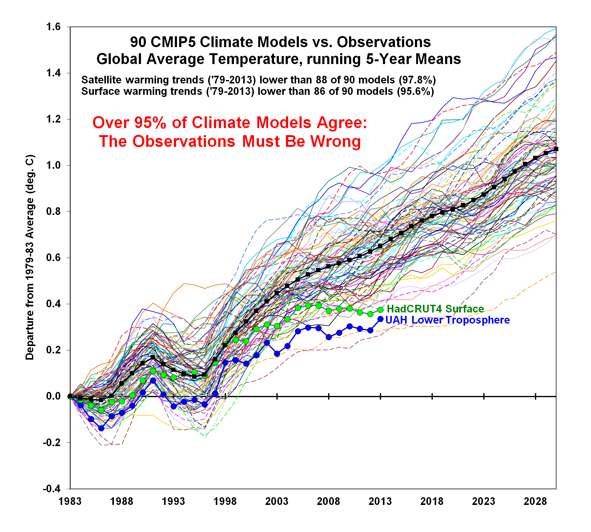
And Wildfires were worse in the past.
But: Sea Level Rise is not accelerating.

But: Arctic Ice has not declined since 2007.
arctic-sept-2007-to-20181

But: All of these are within the range of past variability.

In fact our climate is remarkably stable.

And many aspects follow quasi-60 year cycles.

But: Actual climate zones are local and regional in scope, and they show little boundary change.


But: Ice cores show that it was warmer in the past, not due to humans.

But: The planet is greener because of rising CO2.

In conclusion:

Duffy et al. Omitted Recent Scientific Findings that Contradict their Alarms

You may have noticed that no downward arrows appeared in Duffy et al. summary of new science regarding GHG endangerment.  Let’s correct that now.  In addition to exhibits above, there are several findings refuting the link between CO2 emissions and global temperatures.

Why is there no mention of the CERES satellite data showing no effect of rising GHGs upon the radiative behavior of the atmosphere?

We once again observe a rather close match overall. At the very least, we can safely say that there is no evidence whatsoever of any gradual, systematic rise in DWLWIR over the TLT, going from 2000 to 2018. If we plot the difference between the two curves in Fig.9 to obtain the “DWLWIR residual”, this fact becomes all the more evident:

Why do they ignore the radiosonde data showing the temperature profile of the atmosphere has not shifted as GHG theory predicts?

Why do they not report that the optical density at the top of the atmosphere has not changed in 60 years despite rising CO2?

And why do they fail to point out that CMIP5 models only match temperature observations in the tropical troposphere when the CO2 sensitivity is turned off?

In addition, there is no mention that GCMs projections are running about twice as hot as observations. Omitted is the fact GCMs correctly replicate tropospheric temperature observations only when CO2 warming is turned off.

Figure 5. Simplification of IPCC AR5 shown above in Fig. 4. The colored lines represent the range of results for the models and observations. The trends here represent trends at different levels of the tropical atmosphere from the surface up to 50,000 ft. The gray lines are the bounds for the range of observations, the blue for the range of IPCC model results without extra GHGs and the red for IPCC model results with extra GHGs.The key point displayed is the lack of overlap between the GHG model results (red) and the observations (gray). The nonGHG model runs (blue) overlap the observations almost completely.

Summary:

This paper does not prove GHGs endanger the climate.  It repeats old suppositions and disregards contrary observational evidence, both new and long-established.

See also:  No GHG Warming Fingerprints in the Sky

Climate alarms are balanced on an array of suppositions.


Obsessing Over Global Temperatures


Reification is the Fallacy of Misplaced Concreteness. It is a mental process by which someone comes to believe that an abstraction (idea or concept) is a material, physical object in the real world. Mike Hulme observes that many people are obsessing over global temperatures, not realizing they are abstractions and not things to be feared. He provides calm and sensible views regarding global temperature reporting. The post at his blog is Climatism and the Reification of Global Temperature. Excerpts in italics with my bolds.

Over the last 40 years global-mean surface air temperature – ‘global temperature’ for short – has gained an extraordinary role in the science, politics and public discourse of climate change. What was once a number crudely calculated through averaging together a few dozen reasonably well-spaced meteorological time series, has become reified as an objective entity that simultaneously measures Earth System behaviour, reveals the future, regulates geopolitical negotiations and disciplines the human imagination. Apart perhaps from GDP rarely can so constructed an abstract entity have gained such power over the human world.

All of this is very nicely illustrated in a new paper published in the journal Geophysical Research Letters, titled ‘Predicted chance that global warming will temporarily exceed 1.5°C’. Doug Smith and 32 colleagues set out to develop a new capability to predict the likelihood that global temperature will exceed 1.5°C above pre-industrial levels, for a variety of durations upwards from a month, in the coming five years. The assumed importance of the study is suggested by the author team mobilising climate modelling and analysis capabilities at 17 institutions in 9 different countries.

But why is such an early warning system deemed necessary or useful? What power is being imputed to small increments of global temperature to alert future danger?

Smith and colleagues argue that forewarning of temporary excursions of global temperature above a certain threshold—1.5°C is the normative threshold aspired to in the Paris Agreement on Climate Change, even though 2°C is the threshold formally agreed—for periods even a little as a month is relevant for policy-makers. To make such a claim requires an extraordinary degree of abstraction.

Global temperature does not cause anything to happen. It has no material agency. It is an abstract proxy for the aggregated accumulation of heat in the surface boundary layer of the planet. It is far removed from revealing the physical realities of meteorological hazards occurring in particular places. And forecasts of global temperature threshold exceedance are even further removed from actionable early warning information upon which disaster risk management systems can work.

Global temperature offers the ultimate view of the planet—and of meteorological hazard—from nowhere.

I have argued elsewhere about the dangers of climate reductionism, a form of reasoning that lends disproportionate power in political and social discourse to climate model-based descriptions of the future. The adoption of forecasts of global temperature exceedance as an early warning index is a clear case of the related phenomenon of climatism. Similar to explanations of scientism—“the phenomenon whereby authority is implicitly granted to scientific and technical experts to define the meaning, scope and, by extension, [the] solution for public policy concerns”—climatism grants authority to an abstracted global climate, in this case to global temperature, to guide, direct and discipline human actions in the world.

The authors of this new study claim to have developed an operational system with annually updated forecasts of the likelihood of near-term global temperature threshold exceedance. The value of such forecasts is claimed to lie in the general media and public interest they would generate. Issuing such forecasts to the world at large may or may not generate public interest. But they would certainly reinforce the growing ideology of climatism. It is another step toward putting abstract and unsituated descriptions of a globalised climate at the heart of world affairs.

Offering forecasts of global temperature threshold exceedance as an operational proxy for risk and disaster management seems bizarre. Such early warnings would seem to assume that small fluctuations in global temperature contain meaningful and actionable information. But why is it significant to know that the chance of global temperature exceeding 1.5C for two months during the period 2019-2023 is, say, 25% rather than 10%?

Such nuanced differences in the likelihood of a threshold exceedance tell us nothing about the likelihood of real meteorological hazards faced by real people and structures in real places. At the very least the proposed forecasts fail to discriminate between the different causes of global temperature fluctuations—e.g. greenhouse gas accumulation, aerosol loading, ENSO events, solar variability. Each of these causes carry very different implications for the geographical distribution of meteorological hazards, even if global temperature is identical.

Humans are now agents of significant influence in the Earth System and human development trajectories carry a range of profound implications. But offering annual forecasts of near-term global temperature fluctuations as early warnings to (re-)direct these trajectories fails to recognise the situated and differentiated polities, values and visions that shape the world.

GDP has acquired the power to account for the economic health of nations and for the implied well-being of individuals. It has become the hegemonic index which national policies seek to maximise and an index which in turn passes judgement on the performance of governments. In a similar way, the ideology of climatism—aided by the reification of global temperature—narrows actions by the world’s governments to minimise this one index of planetary health.

This new paper by Smith et al. reinforces this reductionist move and discloses the powerful performativity of global temperature in the contemporary world.

Mike Hulme, 24 October 2018

Mike Hulme has been studying climate change for over thirty years and is today one of the most distinctive and recognisable voices speaking internationally about climate change in the academy, in public and in the media. He is currently Professor of Human Geography at the University of Cambridge and Fellow of Pembroke College. Previously, Mike Hulme was professor of climate change in the Science, Society and Sustainability (3S) Group in the School of Environmental Sciences at the University of East Anglia. He is author of Why We Disagree About Climate Change (2009) and Exploring Climate Change Through Science and In Society (2013). Website: http://www.mikehulme.org.

See also his common sense review of the science attributing extreme weather events to human agency. X-Weather is Back! Kerala edition

See Also Climate Reductionism

No GHG Warming Fingerprints in the Sky

For several years I have pored over comments from Kristian (okulaer) and gained understanding from the effort. Here is his recent article on the absence of  “AGW warming” fingerprints in the CERES satellite data.  How the CERES EBAF Ed4 data disconfirms “AGW” in 3 different ways  by okulaer November 11, 2018. Excerpts below with my bolds.  Kristian provides more detailed discussion at his blog (title in red is link)

Background: The AGW Hypothesis

For those of you who aren’t entirely up to date with the hypothetical idea of an “(anthropogenically) enhanced GHE” (the “AGW”) and its supposed mechanism for (CO2-driven) global warming, the general principle is fairly neatly summed up here.

I’ve modified this diagram below somewhat, so as to clarify even further the concept of “the raised ERL (Effective Radiating Level)” – referred to as Ze in the schematic – and how it is meant to ‘drive’ warming within the Earth system; to simply bring the message of this fundamental premise of “AGW” thinking more clearly across.
Then we have the “doubled CO2” (t1) scenario, where the ERL has been pushed higher up into cooler air layers closer to the tropopause:
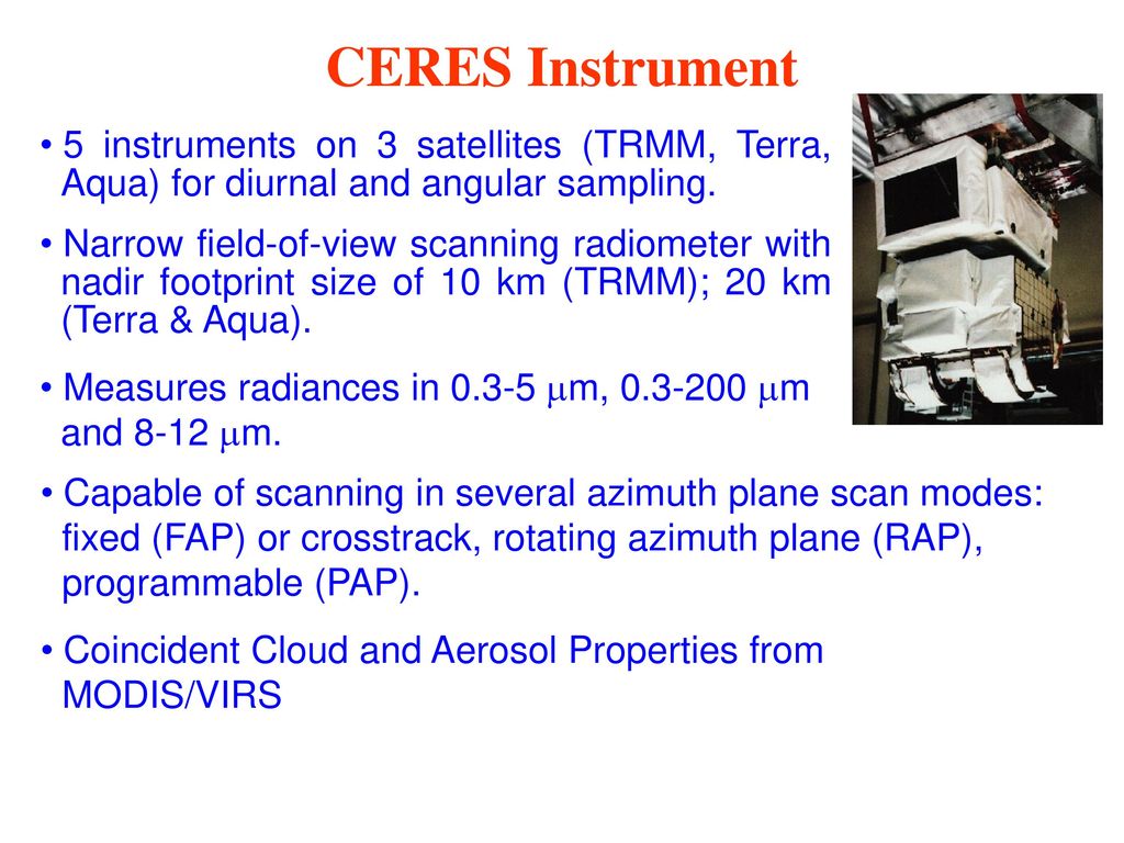
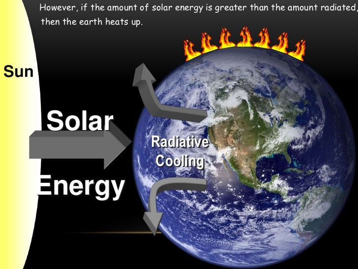
So when the atmosphere’s IR opacity increases with the excess input of CO2, the ERL is pushed up, and, with that, the temperature at ALL ALTITUDE-SPECIFIC LEVELS of the Earth system, from the surface (Ts) up through the troposphere (Ttropo) to the tropopause, directly connected via the so-called environmental lapse rate, i.e. the negative temperature profile rising up through the tropospheric column, is forced to do the same.

The Expected GHG Fingerprints

How, then, is this mechanism supposed to manifest itself?

Well, as the ERL, basically the “effective atmospheric layer of OUTWARD (upward) radiation”, the one conceptually/mathematically responsible for the All-Sky OLR flux at the ToA, and from now on, in this post, dubbed rather the EALOR, is lifted higher, into cooler layers of air, the diametrically opposite level, the “effective atmospheric layer of INWARD (downward) radiation” (EALIR), the one conceptually and mathematically responsible for the All-Sky DWLWIR ‘flux’ (or “the atmospheric back radiation”) to the surface, is simultaneously – and for the same physical reason, only inversely so – pulled down, into warmer layers of air closer to the surface. This latter concept was explained already in 1938 by G.S. Callendar. Feldman et al., 2015, (as an example) confirm that this is still how “Mainstream Climate Science (MCS)” views this ‘phenomenon’:

The gist being that, when we make the atmosphere more opaque to IR by putting more CO2 into it, “the atmospheric back radiation” (all-sky DWLWIR at sfc) will naturally increase as a result, reducing the radiative heat loss (net LW) from the surface up. And do note, it will increase regardless of (and thus, on top of) any atmospheric rise in temperature, which would itself cause an increase. Which is to say that it will always distinctly increase also RELATIVE TO tropospheric temps (which are, by definition, altitude-specific (fixed at one particular level, like ‘the lower troposphere’ (LT))). That is, even when tropospheric temps do go up, the DWLWIR should be observed to increase systematically and significantly MORE than what we would expect from the temperature rise alone. Because the EALIR moves further down.

Conversely, at the other end, at the ToA, the EALOR moves the opposite way, up into colder layers of air, which means the all-sky OLR (the outward emission flux) should rather be observed to systematically and significantly decrease over time relative to tropospheric temps. If tropospheric temps were to go up, while the DWLWIR at the surface should be observed to go significantly more up, the OLR at the ToA should instead be observed to go significantly less up, because the warming of the troposphere would simply serve to offset the ‘cooling’ of the effective emission to space due to the rise of the EALOR into colder strata of air.

What we’re looking for, then, if indeed there is an “enhancement” of some “radiative GHE” going on in the Earth system, causing global warming, is ideally the following:

OLR stays flat, while TLT increases significantly and systematically over time;
TLT increases systematically over time, but DWLWIR increases significantly even more.
Effectively summed up in this simplified diagram.

Figure 4. Note, this schematic disregards – for the sake of simplicity – any solar warming at work.

However, we also expect to observe one more “greenhouse” signature.

If we expect the OLR at the ToA to stay relatively flat, but the DWLWIR at the sfc to increase significantly over time, even relative to tropospheric temps, then, if we were to compare the two (OLR and DWLWIR) directly, we’d, after all, naturally expect to see a fairly remarkable systematic rise in the latter over the former (refer to Fig.4 above).

Which means we now have our three ways to test the reality of an hypothesized “enhanced GHE” as a ‘driver’ (cause) of global warming.

Three Tests for GHG Warming in the Sky

The null hypothesis in this case would claim or predict that, if there is NO strengthening “greenhouse mechanism” at work in the Earth system, we would observe:

1. The general evolution (beyond short-term, non-thermal noise (like ENSO-related humidity and cloud anomalies or volcanic aerosol anomalies))* of the All-Sky OLR flux at the ToA to track that of Ttropo (e.g. TLT) over time;
2. The general evolution of the All-Sky DWLWIR at the surface to track that of Ttropo (Ts + Ttropo, really) over time;
3. The general evolution of the All-Sky OLR at the ToA and the All-Sky DWLWIR at the surface to track each other over time, barring short-term, non-thermal noise.

* (We see how the curve of the all-sky OLR flux at the ToA differs quite noticeably from the TLT and DWLWIR curves, especially during some of the larger thermal fluctuations (up or down), normally associated with particularly strong ENSO events. This is because there are factors other than pure mean tropospheric temperatures that affect Earth’s final emission flux to space, like the concentration and distribution (equator→poles, surface→tropopause/stratosphere) of clouds, water vapour and aerosols. These may (and do) all vary strongly in the short term, significantly disrupting the normal temperature↔flux (Stefan-Boltzmann) connection, but in the longer term, they display a remarkable tendency to even out, leaving the tropospheric temperature signal as the only real factor to consider when comparing the OLR with Ttropo (TLT). Or not. The “AGW” idea specifically contends, resting on the premise, that these other factors (and crucially also including CO2, of course) do NOT even out over time, but rather accrue in a positive (‘warming’) direction.)

Missing Fingerprint #1

The first point above we have already covered extensively. The combined ERBS+CERES OLR record is seen to track the general progression of the UAHv6 TLT series tightly, both in the tropics and near-globally, all the way from 1985 till today (the last ~33 years), as discussed at length both here and here.

Since, however, in this post we’re specifically considering the CERES era alone, this is how the global OLR matches against the global TLT since 2000:
Figure 5.

This is simply the monthly CERES OLR flux data properly scaled (x0.266), enabling us to compare it more directly to temperatures (W/m2→K), and superimposed on the UAH TLT data. Watch how closely the two curves track each other, beyond the obvious noise. To highlight this striking state of relative congruity, we remove the main sources of visual bias in Fig.5 above. Notice, then, how the red OLR curve, after the 4-year period of fairly large ENSO-events (La Niña-El Niño-La Niña) between 2007/2008 and 2011/2012, when the cyan TLT curve goes both much lower (during the flanking La Niñas) and much higher (during the central El Niño), quickly reestablishes itself right back on top of the TLT curve, just where it used to be prior to that intermediate stretch of strong ENSO influence. And as a result, there is NO gradual divergence whatsoever to be spotted between the mean levels of these two curves, from the beginning of 2000 to the end of 2015.

Missing Fingerprint #2

The second point above is just as relevant as the first one, if we want to confirm (or disconfirm) the reality of an “enhanced GHE” at work in the Earth system. We compare the tropospheric temperatures with the DWLWIRsfc ‘flux’, that is, the apparent atmospheric thermal emission to the surface:

Figure 9. Note how the scaling of the flux (W/m2) values is different close to the surface than at the ToA. Here at the DWLWIR level, down low, we divide by 5 (x0.2), while at the OLR level, up high, we divide by 3.76 (x0.266).

We once again observe a rather close match overall. At the very least, we can safely say that there is no evidence whatsoever of any gradual, systematic rise in DWLWIR over the TLT, going from 2000 to 2018. If we plot the difference between the two curves in Fig.9 to obtain the “DWLWIR residual”, this fact becomes all the more evident:

Figure 10.

Remember now how the idea of an “enhanced GHE” requires the DWLWIR to rise significantly more than Ttropo (TLT) over time, and that its “null hypothesis” therefore postulates that such a rise should NOT be seen. Well, do we see such a rise in the plot above? Nope. Not at all. Which fits in perfectly with the impression we got at the ToA, where the TLT-curve was supposed to rise systematically up and away from the OLR-curve over time, but didn’t – no observed evidence there either of any “enhanced GHE” at work.

Missing Fingerprint #3

Finally, the third point above is also pretty interesting. It is simply to verify whether or not the CERES EBAF Ed4 ‘radiation flux’ data products are indeed suggesting a strengthening of some radiatively defined “greenhouse mechanism”. We sort of know the answer to this already, though, from going through points 1 and 2 above. Since neither the OLR at the ToA nor the DWLWIR at the surface deviated meaningfully from the UAHv6 TLT series (the same one used to compare with both, after all), we expect rather by necessity that the two CERES ‘flux products’ also shouldn’t themselves deviate meaningfully overall from one another. And, unsurprisingly, they don’t:

Figure 14.  Difference plot (“DWLWIR residual”)

Again, it is so easy here to allow oneself to be fooled by the visual impact of that late – obviously ENSO-related – peak, and, in this case, also a definite ENSO-based trough right at the start (you’ll plainly recognise it in Fig.14); another perfect example of how one’s perception and interpretation of a plot is directly affected by “the end-point bias”. Don’t be fooled:

If we expect the OLR at the ToA to stay relatively flat, but the DWLWIR at the sfc to increase significantly over time, even relative to tropospheric temps, then, if we were to compare the two (OLR and DWLWIR) directly, we’d […] naturally expect to see a fairly remarkable systematic rise in the latter over the former (refer to Fig.4 above).

Looking at Fig.14, and taking into account the various ENSO states along the way, does such a “remarkable systematic rise” in DWLWIR over OLR manifest itself during the CERES era?

I’m afraid not …

Four Lines of Evidence Against GHG Warming Hypothesis

The lack of GHG warming in the CERES data is added to three previous atmospheric heat radiation studies.

  1.  In 2004 Ferenc MIskolczi studied the radiosonde datasets and found that the optical density at the top of the troposphere does not change with increasing CO2, since reducing H2O maintains optimal radiating efficiency.  His publication was suppressed by NASA, and he resigned from his job there. He has elaborated on his findings in publications as recently as 2014. See:  The Curious Case of Dr. Miskolczi

2.  Ronan and Michael Connolly  studied radiosonde data and concluded in 2014:

“It can be seen from the infra-red cooling model of Figure 19 that the greenhouse effect theory predicts a strong influence from the greenhouse gases on the barometric temperature profile. Moreover, the modeled net effect of the greenhouse gases on infra-red cooling varies substantially over the entire atmospheric profile.

However, when we analysed the barometric temperature profiles of the radiosondes in this paper, we were unable to detect any influence from greenhouse gases. Instead, the profiles were very well described by the thermodynamic properties of the main atmospheric gases, i.e., N 2 and O 2 , in a gravitational field.”

While water vapour is a greenhouse gas, the effects of water vapour on the temperature profile did not appear to be related to its radiative properties, but rather its different molecular structure and the latent heat released/gained by water in its gas/liquid/solid phase changes.

For this reason, our results suggest that the magnitude of the greenhouse effect is very small, perhaps negligible. At any rate, its magnitude appears to be too small to be detected from the archived radiosonde data.” Pg. 18 of referenced research paper

See:  The Physics Of The Earth’s Atmosphere I. Phase Change Associated With Tropopause

3.  An important proof against the CO2 global warming claim was included in John Christy’s testimony 29 March 2017 at the House Committee on Science, Space and Technology. The text and diagram below are from that document which can be accessed here.

IPCC Assessment Reports show that the IPCC climate models performed best versus observations when they did not include extra GHGs and this result can be demonstrated with a statistical model as well.

Figure 5. Simplification of IPCC AR5 shown above in Fig. 4. The colored lines represent the range of results for the models and observations. The trends here represent trends at different levels of the tropical atmosphere from the surface up to 50,000 ft. The gray lines are the bounds for the range of observations, the blue for the range of IPCC model results without extra GHGs and the red for IPCC model results with extra GHGs.The key point displayed is the lack of overlap between the GHG model results (red) and the observations (gray). The nonGHG model runs (blue) overlap the observations almost completely.