
Once again Stanford University (my alma mater) fills its stocking with coal instead of scientific gifts. It is often said, “Extraordinary claims require extraordinary evidence.” As we will see, a recent Stanford climate change publication makes over-the-top claims based upon suppositions rather than evidence. The paper published in Science is Strengthened scientific support for the Endangerment Finding for atmospheric greenhouse gases, by Philip B. Duffy et al. Two of the leading (out of 15) authors are Christopher B. Field and Noah S. Diffenbaugh of Stanford’s Woods Institute for the Environment. Excerpts in italics with my bolds.
The abstract makes extraordinary claims:
Abstract
We assess scientific evidence that has emerged since the U.S. Environmental Protection Agency’s 2009 Endangerment Finding for six well-mixed greenhouse gases, and find that this new evidence lends increased support to the conclusion that these gases pose a danger to public health and welfare. Newly available evidence about a wide range of observed and projected impacts strengthens the association between risk of some of these impacts and anthropogenic climate change; indicates that some impacts or combinations of impacts have the potential to be more severe than previously understood; and identifies substantial risk of additional impacts through processes and pathways not considered in the endangerment finding.
The core of their argument is:
The EF was structured around knowledge related to public health and public welfare, with a primary focus on impacts in the U.S. The information on public welfare was grouped in sections on (1) air quality, (2) food production and agriculture, (3) forestry, (4) water resources, (5) sea level rise and coastal areas, (6) energy, infrastructure, and settlements, and (7) ecosystems and wildlife. We follow that organization here. In addition, some of the most important advances in understanding the risks of climate change involve sectors or impact types not highlighted in the EF. We summarize the evidence for four of these that are broadly important: ocean acidification, violence and social instability, national security, and economic wellbeing. We characterize changes since the EF in terms of (1) strength of evidence for a link with anthropogenic climate change, (2) potential severity of observed and projected impacts, and (3) risks of additional kinds of impacts, beyond those considered in the EF (Fig. 1).
http://science.sciencemag.org/content/sci/early/2018/12/12/science.aat5982/F1.large.jpg
Fig. 1
Summary of changes in the amount and implications of new evidence since the EF, on each of the impact areas discussed in the EF, and four additional impact areas where evidence of climate sensitivity has matured since the EF.
An upward pointing arrow indicates increasing evidence of endangerment. A downward pointing arrow indicates decreasing evidence of endangerment. A solid arrow indicates that the new evidence is abundant and robust. An outlined arrow indicates that the new evidence, in addition, comes from multiple approaches, is based on independent lines of information, or builds on a new level of mechanistic understanding. The left column refers to confidence in the impacts discussed in the EF. The middle column refers to impact areas that are discussed in the EF but where new evidence points to specific impacts that are fundamentally more severe or pervasive than those discussed in the EF. The right column refers to types of impacts not discussed in the EF.
What about the Warming?
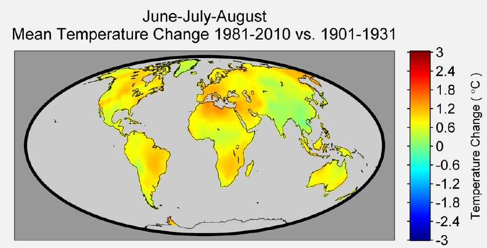
Let’s start with their first theme: We characterize changes since the EF in terms of (1) strength of evidence for a link with anthropogenic climate change. Looking in the text we find the single point of evidence to be a projection from CMIP5 climate models, represented in this diagram:
http://science.sciencemag.org/content/sci/early/2018/12/12/science.aat5982/F2.medium.gif
Fig. 2 The frequency of years in 2080 to 2099 of the RCP8.5 scenario where the June-July-August (JJA) seasonal temperature equals or exceeds the warmest JJA value in the period from 1986 to 2005.
Now showing the globe in bright red colors is certainly in the Christmas spirit and would make a fine ornament for the tree. But there are several problems. We are supposed to believe they can predict summer temperatures 60 to 80 years from now, when trustworthy weather models become unreliable more than 10 days in the future. Next, on average CMIP5 models are configured to forecast future warming at a rate 5 times the past warming (historically observed). Then, the CO2 concentrations fed into the models come from the notorious RCP8.5 scenario.
People like Dr. Judith Curry who have looked into the suppositions comprising RCP8.5 have concluded that it is not only extreme, it is so unlikely as to be nearly impossible. Thus it serves as a scare tactic, but not for reasonable future projections. See: Is RCP8.5 an impossible scenario?
The burning world figure comes from this paper by one of the Stanford lead authors Climate change hotspots in the CMIP5 global climate model ensemble. Out of an array of various projection images, obviously the global warming ornament was chosen specifically for its cherry red color.
To see how they mislead with this model output, let’s consider comparable observations. For the same season (NH Summer), Berkeley Earth provides this global summary of recent warming:
http://berkeleyearth.org/wp-content/uploads/2015/02/global-warming-since-1900-summer-northern.png
So in the last century of observed temperatures, we get yellows and greens, warming of 0.0 to 1.0 degrees celsius. But the models say the next century we will be on fire. And there is another deception. Notice that the BEST globe shows only continents since that dataset is built on records from land stations. Figure 2 above smears warming also over the oceans (71% of earth’s surface), when we know that land temps are much more volatile than is the ocean. For example, here is a comparable representation of sea surface temperatures (SSTs):
 This map displays seasonal standardized sea surface temperature anomalies for the season indicated.
The climatological base period used to calculate the sea surface temperature anomalies is 1971-2000, and the base period used for the standardization is November 1981 to present. Yellow to orange colors on the map indicate areas where sea surface temperature for the season shown is above the climatological value for that season of the year, and blue shades indicate where sea surface temperature is below normal. Shading and contours start at +/- 1.0 s.d., and the shading and contour interval is 0.5 s.d. Source: Columbia IRI climate monitoring (here)
Again, observations do not portend what the unvalidated climate models predict. There are some warm spots, cool spots, and a lot of neutral.

What about the Impacts?
Turning to the main theme of this report: We characterize changes since the EF in terms of (2) potential severity of observed and projected impacts, and (3) risks of additional kinds of impacts, beyond those considered in the EF. The bulk of the text and all of the 281 references pertain to impacts expected from models’ supposed warming. The same research process is repeated ad infinitum: Plug the extreme scenario assumptions into models super-sensitive to GHGs, and then project the horrific impacts from such unlikely levels and supposed results. And the usual litany of disasters is covered (from Duffy et al.2018):
The information on public welfare was grouped in sections on (1) air quality, (2) food production and agriculture, (3) forestry, (4) water resources, (5) sea level rise and coastal areas, (6) energy, infrastructure, and settlements, and (7) ecosystems and wildlife.
Billions of dollars have been spent researching any and all negative effects from a warming world: Everything from Acne to Zika virus. But these are not what we have experienced and observed, rather they are the models’ imagined future.
Litany of Changes
Seven of the ten hottest years on record have occurred within the last decade; wildfires are at an all-time high, while Arctic Sea ice is rapidly diminishing.
We are seeing one-in-a-thousand-year floods with astonishing frequency.
When it rains really hard, it’s harder than ever.
We’re seeing glaciers melting, sea level rising.
The length and the intensity of heatwaves has gone up dramatically.
Plants and trees are flowering earlier in the year. Birds are moving polewards.
We’re seeing more intense storms.
But: Weather is not more extreme.
 And Wildfires were worse in the past.
 But: Sea Level Rise is not accelerating.

But: Arctic Ice has not declined since 2007.

But: All of these are within the range of past variability.
https://i0.wp.com/edberry.com/SiteDocs/Christy11.jpg
In fact our climate is remarkably stable.
https://rclutz.com/wp-content/uploads/2018/01/giss-anntemps2017.png
And many aspects follow quasi-60 year cycles.
https://i0.wp.com/appinsys.com/GlobalWarming/RS_Arctic_files/image070.jpg
But: Actual climate zones are local and regional in scope, and they show little boundary change.
https://rclutz.com/wp-content/uploads/2016/05/188767-004-6bde1150.jpg
But: Ice cores show that it was warmer in the past, not due to humans.

But: The planet is greener because of rising CO2.

In conclusion:
Duffy et al. Omitted Recent Scientific Findings that Contradict their Alarms
You may have noticed that no downward arrows appeared in Duffy et al. summary of new science regarding GHG endangerment. Let’s correct that now. In addition to exhibits above, there are several findings refuting the link between CO2 emissions and global temperatures.
Why is there no mention of the CERES satellite data showing no effect of rising GHGs upon the radiative behavior of the atmosphere?

We once again observe a rather close match overall. At the very least, we can safely say that there is no evidence whatsoever of any gradual, systematic rise in DWLWIR over the TLT, going from 2000 to 2018. If we plot the difference between the two curves in Fig.9 to obtain the “DWLWIR residual”, this fact becomes all the more evident:
Why do they ignore the radiosonde data showing the temperature profile of the atmosphere has not shifted as GHG theory predicts?
Why do they not report that the optical density at the top of the atmosphere has not changed in 60 years despite rising CO2?
And why do they fail to point out that CMIP5 models only match temperature observations in the tropical troposphere when the CO2 sensitivity is turned off?
In addition, there is no mention that GCMs projections are running about twice as hot as observations. Omitted is the fact GCMs correctly replicate tropospheric temperature observations only when CO2 warming is turned off.

Figure 5. Simplification of IPCC AR5 shown above in Fig. 4. The colored lines represent the range of results for the models and observations. The trends here represent trends at different levels of the tropical atmosphere from the surface up to 50,000 ft. The gray lines are the bounds for the range of observations, the blue for the range of IPCC model results without extra GHGs and the red for IPCC model results with extra GHGs.The key point displayed is the lack of overlap between the GHG model results (red) and the observations (gray). The nonGHG model runs (blue) overlap the observations almost completely.
Summary:
This paper does not prove GHGs endanger the climate. It repeats old suppositions and disregards contrary observational evidence, both new and long-established.
See also: No GHG Warming Fingerprints in the Sky

Climate alarms are balanced on an array of suppositions.
Lot’s of red, just in time for Christmas. We seem to be in the cycle of my prediction is worse than yours competition.
Thanks for the update on impending doom. It’s driving me to spirituous liquors. Glad it tis the season for egg nogs and the like.
Merry Christmas, Ron
Bob, thanks for your comments and for stopping by frequently. Much appreciated. Let me offer the ancient Scottish prayer against these alarms:
https://rclutz.files.wordpress.com/2018/12/Lord-Deliver-us-prayer.png
Excellent compilation of real evidence, Ron. This is a keeper!
Thanks Michael. Best wishes for the new year.