Election Fraud Too Big to Fail?


With apologies to Paul Revere, this post is on the lookout for cooler weather with an eye on both the Land and the Sea. UAH has updated their tlt (temperatures in lower troposphere) dataset for November 2020. Previously I have done posts on their reading of ocean air temps as a prelude to updated records from HADSST3. This month also has a separate graph of land air temps because the comparisons and contrasts are interesting as we contemplate possible cooling in coming months and years.

Presently sea surface temperatures (SST) are the best available indicator of heat content gained or lost from earth’s climate system. Enthalpy is the thermodynamic term for total heat content in a system, and humidity differences in air parcels affect enthalpy. Measuring water temperature directly avoids distorted impressions from air measurements. In addition, ocean covers 71% of the planet surface and thus dominates surface temperature estimates. Eventually we will likely have reliable means of recording water temperatures at depth.
Recently, Dr. Ole Humlum reported from his research that air temperatures lag 2-3 months behind changes in SST. He also observed that changes in CO2 atmospheric concentrations lag behind SST by 11-12 months. This latter point is addressed in a previous post Who to Blame for Rising CO2?
HadSST3 results will be posted later this month. For comparison we can look at lower troposphere temperatures (TLT) from UAHv6 which are now posted for November. The temperature record is derived from microwave sounding units (MSU) on board satellites like the one pictured above.
The UAH dataset includes temperature results for air above the oceans, and thus should be most comparable to the SSTs. There is the additional feature that ocean air temps avoid Urban Heat Islands (UHI). In 2015 there was a change in UAH processing of satellite drift corrections, including dropping one platform which can no longer be corrected. The graphs below are taken from the latest and current dataset, Version 6.0.
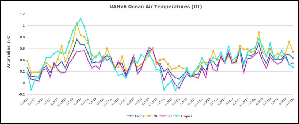
The graph above shows monthly anomalies for ocean temps since January 2015. After all regions peaked with the El Nino in early 2016, the ocean air temps dropped back down with all regions showing the same low anomaly August 2018. Then a warming phase ensued peaking with NH and Tropics spikes in February, and a lesser rise May 2020. As was the case in 2015-16, the warming was driven by the Tropics and NH, with SH lagging behind.
Since the peak in February 2020, all ocean regions have trended downward in a sawtooth pattern, returning to a flat anomaly in the three Summer months, close to the 0.4C average for the period. A small rise occurred in September, mostly due to SH. In October NH spiked, coincidental with all the storm activity in north Pacific and Atlantic. Now in November that NH warmth is gone, and the global anomaly declined due also to dropping temps in the Tropics
Land Air Temperatures Showing Volatility.
We sometimes overlook that in climate temperature records, while the oceans are measured directly with SSTs, land temps are measured only indirectly. The land temperature records at surface stations sample air temps at 2 meters above ground. UAH gives tlt anomalies for air over land separately from ocean air temps. The graph updated for November 2020 is below.
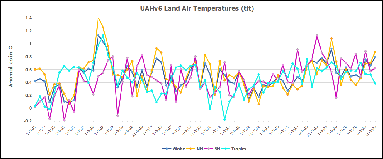
Here we see the noisy evidence of the greater volatility of the Land temperatures, along with extraordinary departures, first by NH land with SH often offsetting. The overall pattern is similar to the ocean air temps, but obviously driven by NH with its greater amount of land surface. The Tropics synchronized with NH for the 2016 event, but otherwise follow a contrary rhythm.
SH seems to vary wildly, especially in recent months. Note the extremely high anomaly November 2019, cold in March 2020, and then again a spike in April. In June 2020, all land regions converged, erasing the earlier spikes in NH and SH, and showing anomalies comparable to the 0.5C average land anomaly this period. After a relatively quiet Summer, land air temps rose Globally in September with spikes in both NH and SH. In October, the SH spike reversed, but November NH land is showing a warm spike, pulling up the Global anomaly slightly. Next month will show whether NH land will cool off as rapidly as did the NH ocean temps.
The longer term picture from UAH is a return to the in for the period starting with 1995. 2019 average rose and caused 2020 to start warmly, but currently lacks any El Nino or NH warm blob to sustain it.
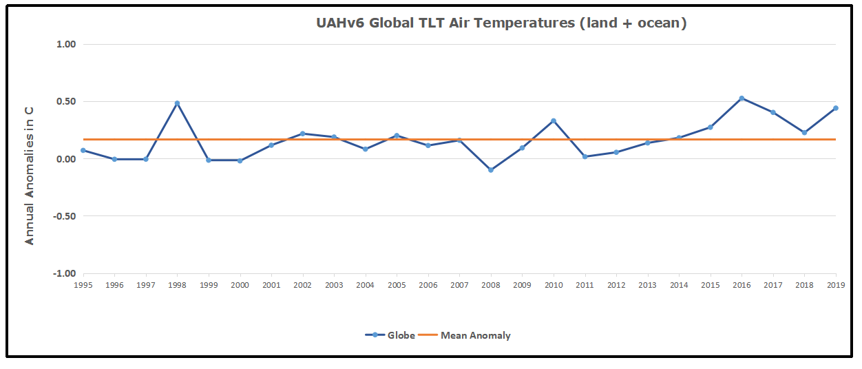
These charts demonstrate that underneath the averages, warming and cooling is diverse and constantly changing, contrary to the notion of a global climate that can be fixed at some favorable temperature.
TLTs include mixing above the oceans and probably some influence from nearby more volatile land temps. Clearly NH and Global land temps have been dropping in a seesaw pattern, NH in July more than 1C lower than the 2016 peak. TLT measures started the recent cooling later than SSTs from HadSST3, but are now showing the same pattern. It seems obvious that despite the three El Ninos, their warming has not persisted, and without them it would probably have cooled since 1995. Of course, the future has not yet been written.

Phys.org sounds the alarm: Greenland ice sheet faces irreversible melting. But as is usual with announcements from that source, discretion and critical intelligence are advised. The back story is a study that takes outputs from climate models projecting incredible warming and feeds them into ice models that assume melting from higher temperatures. Warning: The paper has 93 references to “experiments” and all of them are virtual reality manipulations in the computers they programmed. Excerpts in italics with my bolds.
Professor Jonathan Gregory, Climate Scientist from the National Centre for Atmospheric Science and University of Reading, said: “Our experiments underline the importance of mitigating global temperature rise. To avoid partially irreversible loss of the ice sheet, climate change must be reversed—not just stabilized—before we reach the critical point where the ice sheet has declined too far.”
The paper is Large and irreversible future decline of the Greenland ice sheet. And obviously, it is models all the way down. Excerpts in italics with my bolds.
We run a set of 47 FiG experiments to study the SMB change (ΔSMB), rate of mass loss and eventual steady state of the Greenland ice sheet using the three different choices of FAMOUS–ice snow-albedo parameters, with 20-year climatological monthly mean sea surface BCs taken from the four selected CMIP5 AOGCMs for five climate scenarios (Table 2). These five are the late 20th century (1980–1999, called “historical”), the end of the 21st century under three representative concentration pathway (RCP) scenarios (as in the AR5; van Vuuren et al., 2011) and quadrupled pre-industrial CO2 (abrupt4xCO2, warmer than any RCP). The experiments have steady-state climates. This is unrealistic, but it simplifies the comparison and is reasonable since no-one can tell how climate will change over millennia into the future. Our simulations should be regarded only as indicative rather than as projections. Each experiment begins from the FiG spun-up state for MIROC5 historical climate with the appropriate albedo parameter. Although in most cases there is a substantial instantaneous change in BCs when the experiment begins, the land and atmosphere require only a couple of years to adjust.
Under constant climates that are warmer than the late 20th century, the ice sheet loses mass, its surface elevation decreases, and its surface climate becomes warmer. This gives a positive feedback on mass loss, but it is outweighed by the negative feedbacks due to declining ablation area and increasing cloudiness over the interior as the ice sheet contracts. In the ice sheet area integral, snowfall decreases less than ablation because the precipitation on the margins is enhanced by the topographic gradient and moves inland as the ice sheet retreats. Consequently, after many millennia under a constant warm climate, the ice sheet reaches a reduced steady state. Final GMSLR is less than 1.5 m in most late 21st-century RCP2.6 climates and more than 4 m in all late 21st-century RCP8.5 climates. For warming exceeding 3 K, the ice sheet would be mostly lost, and its contribution to GMSLR would exceed 5 m.
The reliability of our conclusions depends on the realism of our model. There are systematic uncertainties arising from assumptions made in its formulation. The atmosphere GCM has low resolution and comparatively simple parametrization schemes. The ice sheet model does not simulate rapid ice sheet dynamics; this certainly means that it underestimates the rate of ice sheet mass loss in coming decades, but we do not know what effect this has on the eventual steady states, which are our focus. The SMB scheme uses a uniform air temperature lapse rate and omits the phase change in precipitation in the downscaling from GCM to ice sheet model. The snow albedo is a particularly important uncertainty; with our highest choice of albedo, removal of the ice sheet is reversible.
The scare du jour is about Greenland Ice Sheet (GIS) and how it will melt out and flood us all. It’s declared that GIS has passed its tipping point, and we are doomed. Typical is the Phys.org hysteria: Sea level rise quickens as Greenland ice sheet sheds record amount: “Greenland’s massive ice sheet saw a record net loss of 532 billion tonnes last year, raising red flags about accelerating sea level rise, according to new findings.”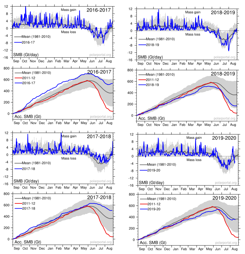
Panic is warranted only if you treat this as proof of an alarmist narrative and ignore the facts and context in which natural variation occurs. For starters, consider the last four years of GIS fluctuations reported by DMI and summarized in the eight graphs above. Note the noisy blue lines showing how the surface mass balance (SMB) changes its daily weight by 8 or 10 gigatonnes (Gt) around the baseline mean from 1981 to 2010. Note also the summer decrease between May and August each year before recovering to match or exceed the mean.
The other four graphs show the accumulation of SMB for each of the last four years including 2020. Tipping Point? Note that in both 2017 and 2018, SMB ended about 500 Gt higher than the year began, and way higher than 2012, which added nothing. Then came 2019 dropping below the mean, but still above 2012. Lastly, this year is matching the 30-year average. Note also that the charts do not integrate from previous years; i.e. each year starts at zero and shows the accumulation only for that year. Thus the gains from 2017 and 2018 do not result in 2019 starting the year up 1000 Gt, but from zero.
Researchers know that the small flows of water from surface melting are not the main way GIS loses ice in the summer. Neil Humphrey explains in this article from last year Nate Maier and Neil Humphrey Lead Team Discovering Ice is Sliding Toward Edges Off Greenland Ice Sheet Excerpts in italics with my bolds.
While they may appear solid, all ice sheets—which are essentially giant glaciers—experience movement: ice flows downslope either through the process of deformation or sliding. The latest results suggest that the movement of the ice on the GIS is dominated by sliding, not deformation. This process is moving ice to the marginal zones of the sheet, where melting occurs, at a much faster rate.
“The study was motivated by a major unknown in how the ice of Greenland moves from the cold interior, to the melting regions on the margins,” Neil Humphrey, a professor of geology from the University of Wyoming and author of the study, told Newsweek. “The ice is known to move both by sliding over the bedrock under the ice, and by oozing (deforming) like slowly flowing honey or molasses. What was unknown was the ratio between these two modes of motion—sliding or deforming.
“This lack of understanding makes predicting the future difficult, since we know how to calculate the flowing, but do not know much about sliding,” he said. “Although melt can occur anywhere in Greenland, the only place that significant melt can occur is in the low altitude margins. The center (high altitude) of the ice is too cold for the melt to contribute significant water to the oceans; that only occurs at the margins. Therefore ice has to get from where it snows in the interior to the margins.
“The implications for having high sliding along the margin of the ice sheet means that thinning or thickening along the margins due to changes in ice speed can occur much more rapidly than previously thought,” Maier said. “This is really important; as when the ice sheet thins or thickens it will either increase the rate of melting or alternatively become more resilient in a changing climate.“
“There has been some debate as to whether ice flow along the edges of Greenland should be considered mostly deformation or mostly sliding,” Maier says. “This has to do with uncertainty of trying to calculate deformation motion using surface measurements alone. Our direct measurements of sliding- dominated motion, along with sliding measurements made by other research teams in Greenland, make a pretty compelling argument that no matter where you go along the edges of Greenland, you are likely to have a lot of sliding.”
The sliding ice does two things, Humphrey says. First, it allows the ice to slide into the ocean and make icebergs, which then float away. Two, the ice slides into lower, warmer climate, where it can melt faster.
While it may sound dire, Humphrey notes the entire Greenland Ice Sheet is 5,000 to 10,000 feet thick.
“In a really big melt year, the ice sheet might melt a few feet. It means Greenland is going to be there another 10,000 years,” Humphrey says. “So, it’s not the catastrophe the media is overhyping.”
Humphrey has been working in Greenland for the past 30 years and says the Greenland Ice Sheet has only melted 10 feet during that time span.
Summary
The Greenland ice sheet is more than 1.2 miles thick in most regions. If all of its ice was to melt, global sea levels could be expected to rise by about 25 feet. However, this would take more than 10,000 years at the current rates of melting.
The modern pattern of environmental scares started with Rachel Carson’s Silent Spring claiming chemicals are killing birds, only today it is windmills doing the carnage. That was followed by ever expanding doomsday scenarios, from DDT, to SST, to CFC, and now the most glorious of them all, CO2. In all cases the menace was placed in remote areas difficult for objective observers to verify or contradict. From the wilderness bird sanctuaries, the scares are now hiding in the stratosphere and more recently in the Arctic and Antarctic polar deserts. See Progressively Scaring the World (Lewin book synopsis)
The advantage of course is that no one can challenge the claims with facts on the ground, or on the ice. Correction: Scratch “no one”, because the climate faithful are the exception. Highly motivated to go to the ends of the earth, they will look through their alarmist glasses and bring back the news that we are indeed doomed for using fossil fuels.
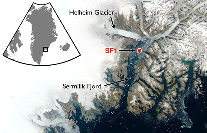
A recent example is a team of researchers from Dubai (the hot and sandy petro kingdom) going to Greenland to report on the melting of Helheim glacier there. The article is NYUAD team finds reasons behind Greenland’s glacier melt. Excerpts in italics with my bolds.
First the study and findings:
For the first time, warm waters that originate in the tropics have been found at uniform depth, displacing the cold polar water at the Helheim calving front, causing an unusually high melt rate. Typically, ocean waters near the terminus of an outlet glacier like Helheim are at the freezing point and cause little melting.
NYUAD researchers, led by Professor of Mathematics at NYU’s Courant Institute of Mathematical Sciences and Principal Investigator for NYU Abu Dhabi’s Centre for Sea Level Change David Holland, on August 5, deployed a helicopter-borne ocean temperature probe into a pond-like opening, created by warm ocean waters, in the usually thick and frozen melange in front of the glacier terminus.
Normally, warm, salty waters from the tropics travel north with the Gulf Stream, where at Greenland they meet with cold, fresh water coming from the polar region. Because the tropical waters are so salty, they normally sink beneath the polar waters. But Holland and his team discovered that the temperature of the ocean water at the base of the glacier was a uniform 4 degrees Centigrade from top to bottom at depth to 800 metres. The finding was also recently confirmed by Nasa’s OMG (Oceans Melting Greenland) project.
“This is unsustainable from the point of view of glacier mass balance as the warm waters are melting the glacier much faster than they can be replenished,” said Holland.
Surface melt drains through the ice sheet and flows under the glacier and into the ocean. Such fresh waters input at the calving front at depth have enormous buoyancy and want to reach the surface of the ocean at the calving front. In doing so, they draw the deep warm tropical water up to the surface, as well.
All around Greenland, at depth, warm tropical waters can be found at many locations. Their presence over time changes depending on the behaviour of the Gulf Stream. Over the last two decades, the warm tropical waters at depth have been found in abundance. Greenland outlet glaciers like Helheim have been melting rapidly and retreating since the arrival of these warm waters.
Then the Hysteria and Pledge of Alligiance to Global Warming
“We are surprised to learn that increased surface glacier melt due to warming atmosphere can trigger increased ocean melting of the glacier,” added Holland. “Essentially, the warming air and warming ocean water are delivering a troubling ‘one-two punch’ that is rapidly accelerating glacier melt.”
My comment: Hold on.They studied effects from warmer ocean water gaining access underneath that glacier. Oceans have roughly 1000 times the heat capacity of the atmosphere, so the idea that the air is warming the water is far-fetched. And remember also that long wave radiation of the sort that CO2 can emit can not penetrate beyond the first millimeter or so of the water surface. So how did warmer ocean water get attributed to rising CO2? Don’t ask, don’t tell. And the idea that air is melting Arctic glaciers is also unfounded.
Consider the basics of air parcels in the Arctic.
The central region of the Arctic is very dry. Why? Firstly because the water is frozen and releases very little water vapour into the atmosphere. And secondly because (according to the laws of physics) cold air can retain very little moisture.
Greenland has the only veritable polar ice cap in the Arctic, meaning that the climate is even harsher (10°C colder) than at the North Pole, except along the coast and in the southern part of the landmass where the Atlantic has a warming effect. The marked stability of Greenland’s climate is due to a layer of very cold air just above ground level, air that is always heavier than the upper layers of the troposphere. The result of this is a strong, gravity-driven air flow down the slopes (i.e. catabatic winds), generating gusts that can reach 200 kph at ground level.
Arctic air temperatures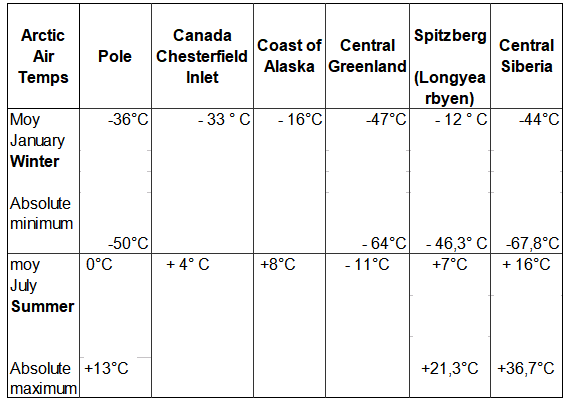
Some history and scientific facts are needed to put these claims in context. Let’s start with what is known about Helheim Glacier.
Holocene history of the Helheim Glacier, southeast Greenland
Helheim Glacier ranks among the fastest flowing and most ice discharging outlets of the Greenland Ice Sheet (GrIS). After undergoing rapid speed-up in the early 2000s, understanding its long-term mass balance and dynamic has become increasingly important. Here, we present the first record of direct Holocene ice-marginal changes of the Helheim Glacier following the initial deglaciation. By analysing cores from lakes adjacent to the present ice margin, we pinpoint periods of advance and retreat. We target threshold lakes, which receive glacial meltwater only when the margin is at an advanced position, similar to the present. We show that, during the period from 10.5 to 9.6 cal ka BP, the extent of Helheim Glacier was similar to that of todays, after which it remained retracted for most of the Holocene until a re-advance caused it to reach its present extent at c. 0.3 cal ka BP, during the Little Ice Age (LIA). Thus, Helheim Glacier’s present extent is the largest since the last deglaciation, and its Holocene history shows that it is capable of recovering after several millennia of warming and retreat. Furthermore, the absence of advances beyond the present-day position during for example the 9.3 and 8.2 ka cold events as well as the early-Neoglacial suggest a substantial retreat during most of the Holocene.
Quaternary Science Reviews, Holocene history of the Helheim Glacier, southeast Greenland
A.A.Bjørk et. Al. 1 August 2018
The topography of Greenland shows why its ice cap has persisted for millenia despite its southerly location. It is a bowl surrounded by ridges except for a few outlets, Helheim being a major one.
And then, what do we know about the recent history of glacier changes. Two Decades of Changes in Helheim Glacier
Helheim Glacier is the fastest flowing glacier along the eastern edge of Greenland Ice Sheet and one of the island’s largest ocean-terminating rivers of ice. Named after the Vikings’ world of the dead, Helheim has kept scientists on their toes for the past two decades. Between 2000 and 2005, Helheim quickly increased the rate at which it dumped ice to the sea, while also rapidly retreating inland- a behavior also seen in other glaciers around Greenland. Since then, the ice loss has slowed down and the glacier’s front has partially recovered, readvancing by about 2 miles of the more than 4 miles it had initially retreated.
NASA has compiled a time series of airborne observations of Helheim’s changes into a new visualization that illustrates the complexity of studying Earth’s changing ice sheets. NASA uses satellites and airborne sensors to track variations in polar ice year after year to figure out what’s driving these changes and what impact they will have in the future on global concerns like sea level rise.
Since 1997, NASA has collected data over Helheim Glacier almost every year during annual airborne surveys of the Greenland Ice Sheet using an airborne laser altimeter called the Airborne Topographic Mapper (ATM). Since 2009 these surveys have continued as part of Operation IceBridge, NASA’s ongoing airborne survey of polar ice and its longest-running airborne mission. ATM measures the elevation of the glacier along a swath as the plane files along the middle of the glacier. By comparing the changes in the height of the glacier surface from year to year, scientists estimate how much ice the glacier has lost.
The animation begins by showing the NASA P-3 plane collecting elevation data in 1998. The laser instrument maps the glacier’s surface in a circular scanning pattern, firing laser shots that reflect off the ice and are recorded by the laser’s detectors aboard the airplane. The instrument measures the time it takes for the laser pulses to travel down to the ice and back to the aircraft, enabling scientists to measure the height of the ice surface. In the animation, the laser data is combined with three-dimensional images created from IceBridge’s high-resolution camera system. The animation then switches to data collected in 2013, showing how the surface elevation and position of the calving front (the edge of the glacier, from where it sheds ice) have changed over those 15 years.
Helheim’s calving front retreated about 2.5 miles between 1998 and 2013. It also thinned by around 330 feet during that period, one of the fastest thinning rates in Greenland.
“The calving front of the glacier most likely was perched on a ledge in the bedrock in 1998 and then something altered its equilibrium,” said Joe MacGregor, IceBridge deputy project scientist. “One of the most likely culprits is a change in ocean circulation or temperature, such that slightly warmer water entered into the fjord, melted a bit more ice and disturbed the glacier’s delicate balance of forces.”
Prompted by comments from Gordon Walleville, let’s look at Greenland ice gains and losses in context. The ongoing SMB (surface mass balance) estimates ice sheet mass net from melting and sublimation losses and precipitation gains. Dynamic ice loss is a separate calculation of calving chunks of ice off the edges of the sheet, as discussed in the post above. The two factors are combined in a paper Forty-six years of Greenland Ice Sheet mass balance from 1972 to 2018 by Mouginot et al. (2019) Excerpt in italics. (“D” refers to dynamic ice loss.)
Greenland’s SMB averaged 422 ± 10 Gt/y in 1961–1989 (SI Appendix, Fig. S1H). It decreased from 506 ± 18 Gt/y in the 1970s to 410 ± 17 Gt/y in the 1980s and 1990s, 251 ± 20 Gt/y in 2010–2018, and a minimum at 145 ± 55 Gt/y in 2012. In 2018, SMB was above equilibrium at 449 ± 55 Gt, but the ice sheet still lost 105 ± 55 Gt, because D is well above equilibrium and 15 Gt higher than in 2017. In 1972–2000, D averaged 456 ± 1 Gt/y, near balance, to peak at 555 ± 12 Gt/y in 2018. In total, the mass loss increased to 286 ± 20 Gt/y in 2010–2018 due to an 18 ± 1% increase in D and a 48 ± 9% decrease in SMB. The ice sheet gained 47 ± 21 Gt/y in 1972–1980, and lost 50 ± 17 Gt/y in the 1980s, 41 ± 17 Gt/y in the 1990s, 187 ± 17 Gt/y in the 2000s, and 286 ± 20 Gt/y in 2010–2018 (Fig. 2). Since 1972, the ice sheet lost 4,976 ± 400 Gt, or 13.7 ± 1.1 mm SLR.
Doing the numbers: Greenland area 2.1 10^6 km2 80% ice cover, 1500 m thick in average- That is 2.5 Million Gton. Simplified to 1 km3 = 1 Gton
The estimated loss since 1972 is 5000 Gt (rounded off), which is 110 Gt a year. The more recent estimates are higher, in the 200 Gt range.
200 Gton is 0.008 % of the Greenland ice sheet mass.
Annual snowfall: From the Lost Squadron, we know at that particular spot, the ice increase since 1942 – 1990 was 1.5 m/year ( Planes were found 75 m below surface)
Assume that yearly precipitation is 100 mm / year over the entire surface.
That is 168000 Gton. Yes, Greenland is Big!
Inflow = 168,000Gton. Outflow is 168,200 Gton.
So if that 200 Gton rate continued, (assuming as models do, despite air photos showing fluctuations), that ice loss would result in a 1% loss of Greenland ice in 800 years. (H/t Bengt Abelsson)
Comment:
Once again, history is a better guide than hysteria. Over time glaciers advance and retreat, and incursions of warm water are a key factor. Greenland ice cap and glaciers are part of the Arctic self-oscillating climate system operating on a quasi-60 year cycle.

Roger Pielke Jr. explains that climate models projections are unreliable because they are based on scenarios no longer bounded by reality. His article is The Unstoppable Momentum of Outdated Science. Excerpts in italics with my bolds.
Much of climate research is focused on implausible scenarios of the future, but implementing a course correction will be difficult.
In 2020, climate research finds itself in a similar situation to that of breast cancer research in 2007. Evidence indicates the scenarios of the future to 2100 that are at the focus of much of climate research have already diverged from the real world and thus offer a poor basis for projecting policy-relevant variables like economic growth and carbon dioxide emissions. A course-correction is needed.
In a new paper of ours just out in Environmental Research Letters we perform the most rigorous evaluation to date of how key variables in climate scenarios compare with data from the real world (specifically, we look at population, economic growth, energy intensity of economic growth and carbon intensity of energy consumption). We also look at how these variables might evolve in the near-term to 2040.
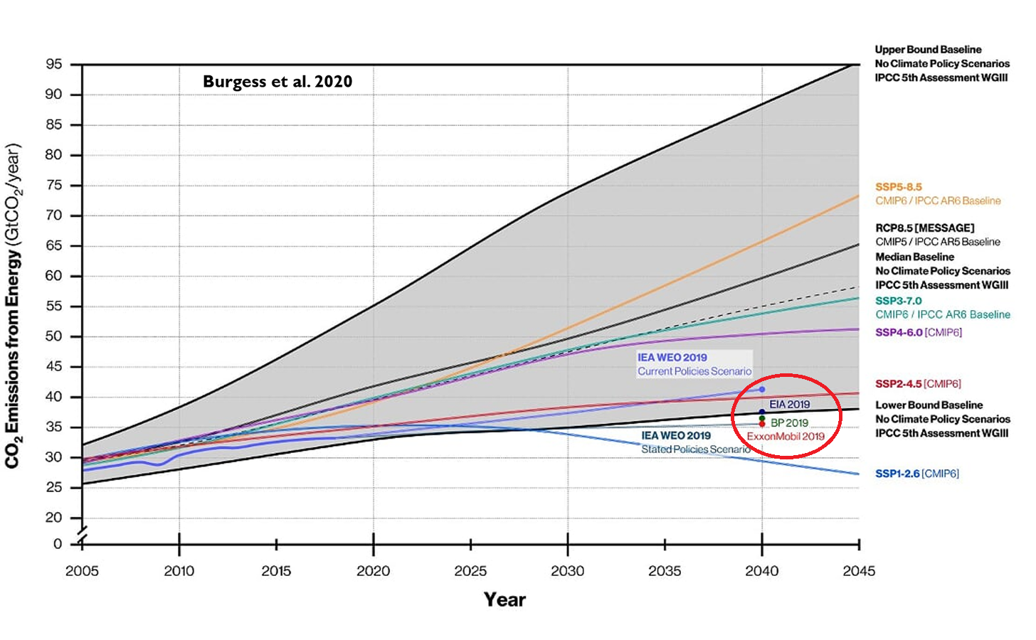
We find that the most commonly-used scenarios in climate research have already diverged significantly from the real world, and that divergence is going to only get larger in coming decades. You can see this visualized in the graph above, which shows carbon dioxide emissions from fossil fuels from 2005, when many scenarios begin, to 2045. The graph shows emissions trajectories projected by the most commonly used climate scenarios (called SSP5-8.5 and RCP8.5, with labels on the right vertical axis), along with other scenario trajectories. Actual emissions to date (dark purple curve) and those of near-term energy outlooks (labeled as EIA, BP and ExxonMobil) all can be found at the very low end of the scenario range, and far below the most commonly used scenarios.
Our paper goes into the technical details, but in short, an important reason for the lower-than-projected carbon dioxide emissions is that economic growth has been slower than expected across the scenarios, and rather than seeing coal use expand dramatically around the world, it has actually declined in many regions.
It is even conceivable, if not likely, that in 2019 the world has passed “peak carbon dioxide emissions.” Crucially, the projections in the figure above are pre-Covid19, which means that actual emissions 2020 to 2045 will be even less than was projected in 2019.
While it is excellent news that the broader community is beginning to realize that scenarios are increasingly outdated, voluminous amounts of research have been and continue to be produced based on the outdated scenarios. For instance, O’Neill and colleagues find that “many studies” use scenarios that are “unlikely.” In fact, in their literature review such “unlikely” scenarios comprise more than 20% of all scenario applications from 2014 to 2019. They also call for “re-examining the assumptions underlying” the high-end emissions scenarios that are favored in physical climate research, impact studies and economic and policy analyses.
Make no mistake. The momentum of outdated science is powerful. Recognizing that a considerable amount of climate science to be outdated is, in the words of the late Steve Rayer, “uncomfortable knowledge” — that knowledge which challenges widely-held preconceptions. According to Rayner, in such a context we should expect to see reactions to uncomfortable knowledge that include:
Such responses reinforce the momentum of outdated science and make it more difficult to implement a much needed course correction.
Responding to climate change is critically important. So too is upholding the integrity of the science which helps to inform those responses. Identification of a growing divergence between scenarios and the real-world should be seen as an opportunity — to improve both science and policy related to climate — but also to develop new ways for science to be more nimble in getting back on track when research is found to be outdated.
[A previous post is reprinted below since it demonstrates how the scenarios drive forecasting by CMIP6 models, including the example of the best performant model: INMCM5]
Links are provided at the end to previous posts describing climate models 4 and 5 from the Institute of Numerical Mathematics in Moscow, Russia. Now we have forecasts for the 21st Century published for INM-CM5 at Izvestiya, Atmospheric and Oceanic Physics volume 56, pages218–228(July 7, 2020). The article is Simulation of Possible Future Climate Changes in the 21st Century in the INM-CM5 Climate Model by E. M. Volodin & A. S. Gritsun. Excerpts are in italics with my bolds, along with a contextual comment.
Climate changes in 2015–2100 have been simulated with the use of the INM-CM5 climate model following four scenarios: SSP1-2.6, SSP2-4.5, and SSP5-8.5 (single model runs) and SSP3-7.0 (an ensemble of five model runs). Changes in the global mean temperature and spatial distribution of temperature and precipitation are analyzed. The global warming predicted by the INM-CM5 model in the scenarios considered is smaller than that in other CMIP6 models. It is shown that the temperature in the hottest summer month can rise more quickly than the seasonal mean temperature in Russia. An analysis of a change in Arctic sea ice shows no complete Arctic summer ice melting in the 21st century under any model scenario. Changes in the meridional stream function in atmosphere and ocean are studied.
The climate is understood as the totality of statistical characteristics of the instantaneous states of the atmosphere, ocean, and other climate system components averaged over a long time period.
Therefore, we restrict ourselves to an analysis of some of the most important climate parameters, such as average temperature and precipitation. A more detailed analysis of individual aspects of climate change, such as changes in extreme weather and climate situations, will be the subject of another work. This study is not aimed at a full comparison with the results of other climate models, where calculations follow the same scenarios, since the results of other models have not yet been published in peer reviewed journals by the time of this writing.
The INM-CM5 climate model [1, 2] is used for the numerical experiments. It differs from the previous version, INMCM4, which was also used for experiments on reproducing climate change in the 21st century [3], in the following:
The model resolution in the atmospheric and aerosol blocks is 2° × 1.5° in longitude and latitude and 73 levels and, in the ocean, 0.5° × 0.25° and 40 levels. The calculations were performed at supercomputers of the Joint Supercomputer Center, Russian Academy of Sciences, and Moscow State University, with the use of 360 to 720 cores. The model calculated 6–10 years per 24 h in the above configuration.
Four scenarios were used to model the future climate: SSP1-2.6, SSP2-4.5, SSP3-7.0, and SSP5-8.5. The scenarios are described in [4]. The figure after the abbreviation SSP (Shared Socioeconomic Pathway) is the number of the mankind development path (see the values in [4]). The number after the dash means the radiation forcing (W m–2) in 2100 compared to the preindustrial level. Thus, the SSP1-2.6 scenario is the most moderate and assumes rapid actions which sharply limit and then almost completely stop anthropogenic emissions. Within this scenario, greenhouse gas concentrations are maximal in the middle of the 21st century and then slightly decrease by the end of the century. The SSP5-8.5 scenario is the warmest and implies the fastest climate change. The scenarios are recommended for use in the project on comparing CMIP6 (Coupled Model Intercomparison Project, Phase 6, [5]) climate models. Each scenario includes the time series of:
One model experiment was carried out for each of the above scenarios. It began at the beginning of 2015 and ended at the end of 2100. The initial state was taken from the so-called historical experiment with the same model, where climate changes were simulated for 1850–2014, and all impacts on the climate system were set according to observations. The results of the ensemble of historical experiments with the model under consideration are given in [6, 7]. For the SSP3-7.0 scenario, five model runs was performed differing in the initial data taken from different historical experiments. The ensemble of numerical experiments is required to increase the statistical confidence of conclusions about climate changes.
Firstly, the INM-CM5 historical experiment can be read in detail by following a linked post (see Resources at the end), but this graphic summarizes the model hindcasting of past temperatures (GMT) compared to HadCrutv4.
Figure 1. The 5-year mean GMST (K) anomaly with respect to 1850–1899 for HadCRUTv4 (thick solid black); model mean (thick solid red). Dashed thin lines represent data from individual model runs: 1 – purple, 2 – dark blue, 3 – blue, 4 – green, 5 – yellow, 6 – orange, 7 – magenta. In this and the next figures numbers on the time axis indicate the first year of the 5-year mean.
Secondly, the scenarios are important to understand since they stipulate data inputs the model must accept as conditions for producing forecasts according to a particular scenario (set of assumptions). The document with complete details referenced as [4] is The Scenario Model Intercomparison Project (ScenarioMIP) for CMIP6.
All the details are written there but one diagram suggests the implications for the results described below.
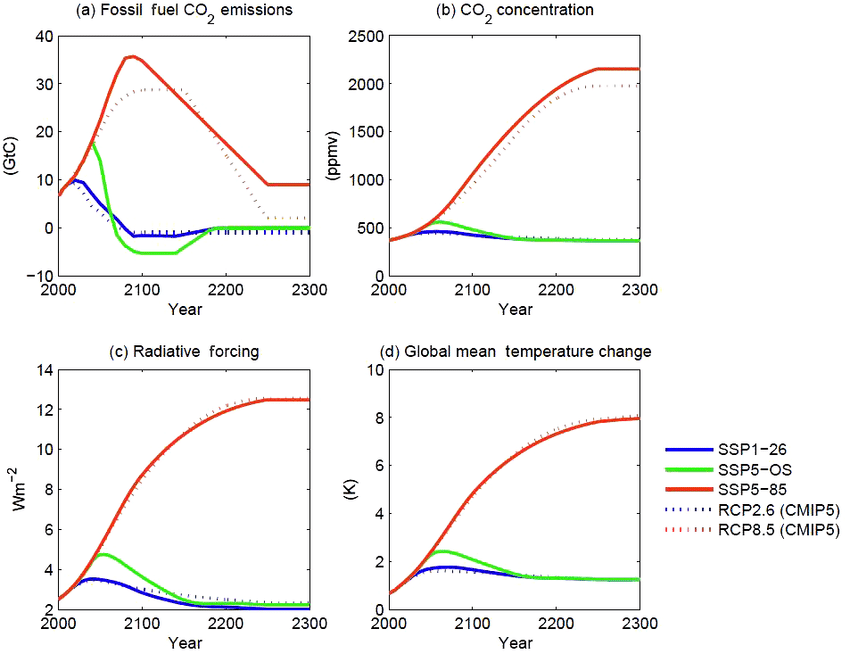
Figure 5. CO2 emissions (a) and concentrations (b), anthropogenic radiative forcing (c), and global mean temperature change (d) for the three long-term extensions. As in Fig. 3, concentration, forcing, and temperature outcomes are calculated with a simple climate model (MAGICC version 6.8.01 BETA; Meinshausen et al., 2011a, b). Outcomes for the CMIP5 versions of the long-term extensions of RCP2.6 and RCP8.5 (Meinshausen et al., 2011c), as calculated with the same model, are shown for comparison.
As shown, the SSP1-26 is virtually the same scenario as the former RCP2.6, while SSP5-85 is virtually the same as RCP8.5, the wildly improbable scenario (impossible according to some analysts). Note that FF CO2 emissions are assumed to quadruple in the next 80 years, with atmospheric CO2 rising from 400 to 1000 ppm ( +150%). Bear these suppositions in mind when considering the INMCM5 forecasts below.
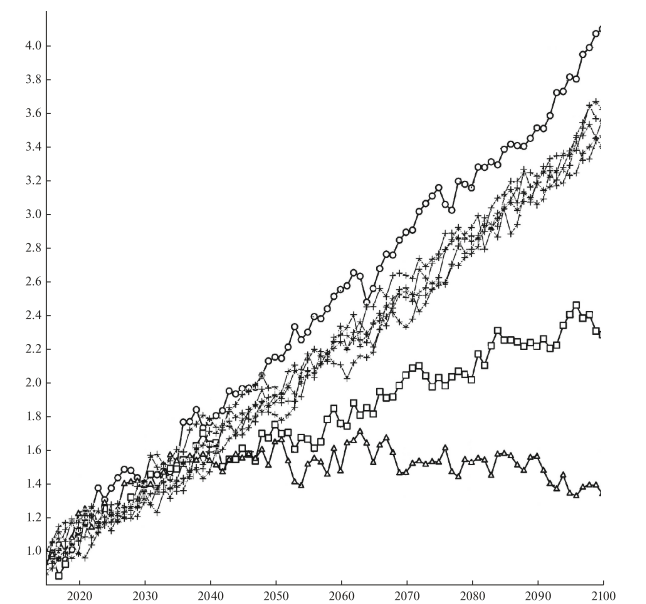
Fig. 1. Changes in the global average surface temperature (K) with respect to the pre-industrial level in experiments according to the SSP1-2.6 (triangles), SSP2-4.5 (squares), SSP3-7.0 (crosses), and SSP5-8.5 (circles) scenarios.
Let us describe some simulation results of climate change in the 21st century. Figure 1 shows the change in the globally averaged surface air temperature with respect to the data of the corresponding historical experiment for 1850–1899. In the warmest SSP5-8.5 scenario (circles), the temperature rises by more than 4° by the end of the 21st century. In the SSP3-7.0 scenario (crosses), different members of the ensemble show warming by 3.4°–3.6°. In the SSP2-4.5 scenario (squares), the temperature increases by about 2.4°. According to the SSP1-2.6 scenario (triangles) , the maximal warming by ~1.7° occurs in the middle of the 21st century, and the temperature exceeds the preindustrial temperature by 1.4° by the end of the century.
[My comment: Note that the vertical scale starts with +1.0C as was seen in the historical experiment. Thus an anomaly of 1.4C by 2100 is an increase of only 0.4C, while the SSP2-4.5 result adds 1.4C to the present].
The results for other CMIP6 models have not yet been published in peer-reviewed journals. However, according to the preliminary analysis (see, e.g. https://cmip6workshop19.sciencesconf.org/ data/Session1_PosterSlides.pdf, p.29), the INM-CM5 model shows the lowest temperature increase among the CMIP6 models considered for all the scenarios due to the minimal equilibrium sensitivity to the CO2 concentration doubling, which is ~2.1° for the current model version, like for the previous version, despite new condensation and cloud formation blocks. [For more on CMIP6 comparisons see post Climate Models: Good, Bad and Ugly]
Fig. 2. Differences between the annual average surface air temperatures (K) in 2071–2100 and 1981–2010 for the (a) SSP5-8.5 and (b) SSP1-2.6 scenarios.
The changes in the surface air temperature are similar for all scenarios; therefore, we analyze the difference between temperatures in 2071–2100 and 1981–2010 under the SSP5-8.5 and SSP1-2.6 scenarios (Fig. 2). The warming is maximal in the Arctic; it reaches 10° and 3°, respectively. Other features mainly correspond to CMIP5 data [8], including the INMCM4 model, which participates in the comparison. The warming on the continents of the Northern Hemisphere is about 2 times higher than the mean, and the warming in the Southern Hemisphere is noticeably less than in the Northern Hemisphere. The land surface is getting warmer than the ocean surface in all the scenarios except SSP1-2.6, because the greenhouse effect is expected to weaken in the second half of the 21st century in this scenario, and the higher heat capacity of the ocean prevents it from cooling as quickly as the land.
The changes in precipitation in December–February and June–August for the SSP3-7.0 scenario averaged over five members of the ensemble are shown in Fig. 4. All members of the ensemble show an increase in precipitation in the winter in a significant part of middle and high latitudes. In summer, the border between the increase and decrease in precipitation in Eurasia passes mainly around or to the north of 60°. In southern and central Europe, all members of the ensemble show a decrease in precipitation. Precipitation also increases in the region of the summer Asian monsoon, over the equatorial Pacific, due to a decrease in the upwelling and an increase in ocean surface temperature (OST). The distribution of changes in precipitation mainly corresponds to that given in [6, Fig. 12.22] for all CMIP5 models.
The change in the Arctic sea ice area in September, when the ocean ice cover is minimal over the year, is of interest. Figure 5 shows the sea ice area in September 2015–2019 to be 4–6 million km2 in all experiments, which corresponds to the estimate from observations in [11]. The Arctic sea ice does not completely melt in any of the experiments and under any scenario. However, according to [8, Figs. 12.28 and 12.31], many models participating in CMIP6, where the Arctic ice area is similar to that observed at the beginning of the 21st century, show the complete absence of ice by the end of the 21st century, especially under the RCP8.5 scenario, which is similar to SSP5-8.5.
The reason for these differences is the lower equilibrium sensitivity of the INM-CM5 model.
Note that the scatter of data between experiments under different scenarios in the first half of the 21st century is approximately the same as between different members of the ensemble under the SSP3-7.0 scenario and becomes larger only after 2070. The sea ice area values are sorted in accordance with the radiative forcing of the scenarios only after 2090. This indicates the large contribution of natural climate variability into the Arctic ice area. In the SSP1-2.6 experiment, the Arctic ice area at the end of the 21st century approximately corresponds to its area at the beginning of the experiment.
Climate changes can be also traced in the ocean circulation. Figure 6 shows the change in the 5-year averaged intensity of the Atlantic meridional circulation, defined as the maximum of the meridional streamfunction at 32° N. All experiments show a decrease in the intensity of meridional circulation in the 21st century and natural fluctuations against this decrease. The decrease is about 4.5–5 Sv for the SSP5-8.5 scenario, which is close to values obtained in the CMIP5 models [8, Fig. 12.35] under the RCP8.5 scenario. Under milder scenarios, the weakening of the meridional circulation is less pronounced. The reason for this weakening of the meridional circulation in the Atlantic, as far as we know, is not yet fully understood.
Numerical experiments have been carried out to reproduce climate changes in the 21st century according to four scenarios of the CMIP6 program [4, 5], including an ensemble of five experiments under the SSP3-7.0 scenario. The changes in the global mean surface temperature are analyzed. It is shown that the global warming predicted by the INM-CM5 model is the lowest among the currently published CMIP6 model data. The geographical distribution of changes in the temperature and precipitation is considered. According to the model, the temperature in the warmest summer month will increase faster than the summer average temperature in Russia.
None of the experiments show the complete melting of the Arctic ice cover by the end of the 21st century. Some changes in the ocean dynamics, including the flow velocity and the meridional stream function, are analyzed. The changes in the Hadley and Ferrel circulation in the atmosphere are considered.

Climate Models: Good, Bad and Ugly
Elected officials have become one-trick ponies. All they know is locking people down for the sake of social distancing. That was a reasonable strategy when the outbreak began, before the disease and its treatment was understood, and in order to protect the health care system from overload. But now a different prescription is required, if leaders have the courage and wisdom to adapt. Here are three recommendations that will stop the damage being done in the name of “fighting Covid19.”
Shutting schools and/or applying social distancing protocols to children are not only unnecessary, but harmful. Stopping normal social interaction among children takes away the exposure they need to develop immunity for future outbreaks. Donna L. Farber and Thomas Connors and Columbia University wrote Quarantine May Negatively Affect Kids’ Immune Systems. H/T Jeffrey Tucker at AIER (here). Excerpts in italics with my bolds.
During the Covid-19 pandemic, the world is unwittingly conducting what amounts to the largest immunological experiment in history on our own children. We have been keeping children inside, relentlessly sanitizing their living spaces and their hands and largely isolating them. In doing so, we have prevented large numbers of them from becoming infected or transmitting the virus. But in the course of social distancing to mitigate the spread, we may also be unintentionally inhibiting the proper development of children’s immune systems….Immunological memory and tolerance learned during childhood serves as the basis for immunity and health throughout adulthood.
[The article then continues and actually invokes the great taboo word of our age: exposure. It’s good. Exposure is good. It is necessary. It is needed. Not bad. Good.]
However, for memory T cells to become functionally mature, multiple exposures may be necessary, particularly for cells residing in tissues such as the lung and intestines, where we encounter numerous pathogens. These exposures typically and naturally occur during the everyday experiences of childhood — such as interactions with friends, teachers, trips to the playground, sports — all of which have been curtailed or shut down entirely during efforts to mitigate viral spread. As a result, we are altering the frequency, breadth and degree of exposures that are crucial for immune memory development.
[Okay, now it is time for the writer to invoke a bit of memorable scientific knowledge. It’s a beautiful paragraph with a stunning opening sentence.]
Failing to train our immune systems properly can have serious consequences. When laboratory mice raised in nearly sterile conditions were housed together in the same cage with pet mice raised in standard conditions, some of the laboratory mice succumbed to pathogens that the pet mice were able to fight off. Additional studies of the microbiome — the bacteria that normally inhabit our intestines and other sites — have shown that mice raised in germ-free conditions or in the presence of antibiotics had reduced and altered immune responses to many types of pathogens. These studies suggest that for establishing a healthy immune system, the more diverse and frequent the encounters with antigens, the better.
Summary: The kids are all right, let them get on with their lives for their own sakes.
Public health officials need to stop confusing and scaring the public with positive PCR tests. As noted in previous posts here, PCR tests amplify a viral trace up to 35 or 40 doublings, which is too small a viral load to make the person sick or to transmit to others. The rapid tests now available do not amplify and the protocol now should be to do antigen tests on people with symptoms to identify actual patients needing treatment and isolation.
Background posts: COVID Fearmongering With ‘Cases’ of Perfectly Healthy People
Summary: The BinaxNOW test detects antigens — proteins unique to the virus that are usually detectable whenever there is an active infection.
Kevin Pham, MD, explains in his essay If We’re Going to Control COVID, We Need to Make This Crucial Change. Excerpts in italics with my bolds.
According to an Associated Press report, there has been a four-fold rise in nursing home-related cases of COVID-19 since June. And CDC data shows there has been an increase of nearly 1,000 COVID-related deaths in nursing homes from September to October.
There are three ways for COVID-19 to enter a nursing home: 1.) through staff and faculty working at the facility, 2.) through visitors who enter the premises, and 3.) through forcing nursing homes to admit patients with active infections.
The disastrous effects of the latter policy is one reason that Gov. Andrew Cuomo’s New York has contributed a disproportionate share of American COVID-related deaths. Thankfully, his order was finally reversed in May.
The more recent increase in nursing home cases are likely a function of the former two ways that COVID enters a nursing home. This is where we need to focus our efforts, with refined policies.
Test nursing home visitors.
Current guidance from the Centers for Medicare and Medicaid Services restrict the number of visitors in ways that are lacking. The focus is temperature checks and screening questionnaires, as well as observing for signs or symptoms of illness.
This may have been reasonable early on in the pandemic, when any sort of a screen was better than no screen, but it’s insufficient now. We have had point-of-care testing for months now, and more recently, rapid antigen tests that require no special lab equipment, no specialized storage, not even refrigeration.
No effort should be spared in procuring what is needed to test everyone going into a nursing home, whether visitor or staff. Key to making this work: the FDA should lift restrictions requiring all tests to reviewed at a lab, so rapid tests that don’t need lab equipment can truly live up to their promise.
Stronger mitigation measures for nursing home staff.
It is likely that infected staff are driving the rise in cases, as visitations are relatively restricted. The AP report shows a proportionate increase in the number of staff cases and resident cases. This is naturally difficult to control because the staff live in the community and work in the nursing homes. Their job is vital.
The latest CMS guidance on staff testing frequency are intended to test often enough to detect cases early enough to stop transmissions, from staff to residents.
Clearly that hasn’t been enough. We need more targeted testing to detect early cases, and that has to be done every time someone leaves and reenters the nursing home. This may be difficult for some facilities, especially rural ones, that lack either financial or human resources, but again, no effort should be spared to enable nursing homes to test everyone going to visit or who works with our elders.
Ensuring a steady and abundant supply of tests is one solution, but nursing home leadership should consider providing for housing for staff for several days at a time to obviate the need to go into the community where there may be high levels of COVID-19. Such an isolation “bubble” was good enough for the National Basketball Association, so it ought to be good enough for older Americans.
If a facility cannot manage these steps on their own, they should receive help, post haste. Every mayor and governor should immediately ask nursing home leaders for their plans, and to identify any barriers. If helped is needed, they need to arrange for its provision.
Summary: The primary focus of our COVID response should center on helping those known to be most at risk from the virus—nursing homes, the elderly and the vulnerable, and those who work with them. Anything else, especially now, would be unconscionable.

This post is about the US at a junction, dramatized by the crisis of a flawed federal election. The change point is also demonstrated by dictatorial behavior of elected officials claiming to protect the citizenry from coronavirus. As explained below, there are in principle two ways of organizing a society: a market based on free choices by individuals, or a jungle where the powerful decide and the weak conform. The US was conceived and operated for 2 centuries upon the market paradigm, but is now facing an activist minority seeking to overthrow that model in favor of autocracy in the form of one-party rule.
Many people have heard of Jordan Peterson due to his battles against post modernism and progressive social justice warfare. Bruce Pardy is another outspoken Canadian professor, belonging to the Faculty of Law, Queen’s College, Kingston, Ontario. This post will provide excerpts from several of Pardy’s writings to give readers access to his worldview and its usefulness making sense of current cultural struggles, and the US on the brink of a socio-political revolution.
In 2009 Pardy wrote Climate Change Charades: False Environmental Pretences of Statist Energy Governance
The Abstract:
Climate change is a poor justification for energy statism, which consists of centralized government administration of energy supplies, sources, prices, generating facilities, production and conservation. Statist energy governance produces climate change charades: government actions taken in the name of climate change that bear little relationship to the nature of the problem. Such actions include incremental, unilateral steps to reduce domestic carbon emissions to arbitrary levels, and attempts to choose winners and losers in future technology, using public money to subsidize ineffective investments. These proffered solutions are counter-productive. Governments abdicate their responsibility to govern energy in a manner that is consistent with domestic legal norms and competitive markets, and make the development of environmental solutions less likely rather than more so.
Pardy also spoke out in support of Peterson and against the Canadian government legislation proscribing private speech between individuals. His article in National Post was Meet the new ‘human rights’ — where you are forced by law to use ‘reasonable’ pronouns
Human rights were conceived to liberate. They protected people from an oppressive state. Their purpose was to prevent arbitrary arrest and detention, torture, and censorship, by placing restraints on government. The state’s capacity to accommodate these “negative rights” was unlimited, since they required only that people be left alone.

If only arm twisting were prohbited beyond the ring.
But freedom from interference is so 20th century. Modern human rights entitle. We are in the middle of a culture war, and human rights have become a weapon to normalize social justice values and to delegitimize competing beliefs. These rights are applied against other people to limit their liberties.
Freedom of expression is a traditional, negative human right. When the state manages expression, it threatens to control what we think. Forced speech is the most extreme infringement of free speech. It puts words in the mouths of citizens and threatens to punish them if they do not comply. When speech is merely restricted, you can at least keep your thoughts to yourself. Compelled speech makes people say things with which they disagree.
Some senators expressed the view that forcing the use of non-gendered pronouns was reasonable because calling someone by their preferred pronoun is a reasonable thing to do. That position reflects a profound misunderstanding of the role of expression in a free society. The question is not whether required speech is “reasonable” speech. If a statute required people to say “hello,” “please” and “thank you,” that statute would be tyrannical, not because “hello,” “please” and “thank you” aren’t reasonable things to say, but because the state has dictated the content of private conversation.
Traditional negative human rights give people the freedom to portray themselves as they wish without fearing violence or retribution from others. Everyone can exercise such rights without limiting the rights of others. Not so the new human rights. Did you expect to decide your own words and attitudes? If so, human rights are not your friend.
These positions derive from bedrock reasoning by Pardy on the foundations of law and legitimacy. An insight into his thinking is his rebuttal of a critic The Only Legitimate Rule: A Reply to MacLean’s Critique of Ecolawgic Dalhousie Law Journal, Spring 2017
Ecosystem as One model of Society
An ecosystem is not a thing. It does not exist as a concrete entity. “Ecosystem” is a label for the dynamics that result when organisms interact with each other and their environment. Those dynamics occur in infinite variation, but always reflect the same logic: Competition for scarce resources leads to natural selection, where those organisms better adapted to ecosystem conditions survive and reproduce, leading to evolutionary change. All participants are equally subject to their forces; systems do not play favourites.
In ecosystems, the use of the word “autonomy” does not mean legally enforced liberty but the reverse: no externally imposed rules govern behaviour. In ecosystems unmanaged by people, organisms can succeed or fail, live or die, as their genetically determined physiology and behaviour allow. Every life feeds on the death of others, whether animal or plant, and those better adapted to their circumstances survive to reproduce. Organisms can do anything that their genes dictate, and their success or failure is the consequence that fuels evolution.

When an antelope is chased by a lion and plunges into a river to escape, that action allows the antelope to survive and thus to reproduce. The offspring may carry a genetic disposition to run into water when chased by predators. There are no committees of either antelopes or humans deciding how antelopes will behave. Autonomy in ecosystems is not a human creation. It is not based upon human history or culture and is not a human preference.
Market as a Different Model of Society
A market is not a thing either. Nor is it a place. Markets, like ecosystems, do not exist as concrete entities. “Market” is a label for the dynamics that result when people exchange with each other. Bargains may be commercial in nature, where things are bought and sold, but they also occur in other facets of life. For example, in Ecolawgic I suggested that marriage is a kind of exchange that is made when people perceive themselves better off to enter into the bargain than not to.
As I said in Ecolawgic, “Laws and governments can make markets more stable and efficient, such as by enforcing contracts and creating a supply of money, but they create neither the activity of trading nor the market dynamics that the transactions create.” A market is not a place or a legal structure but the dynamics of a collection of transactions. It does not exist before or independently of the transactions within it. The transactions make the market. Transactions are not created by governments but by the parties who enter into them.

People transact whether they are facilitated by governments or not. The evidence is everywhere. If it were not so, human beings would not have bartered long before there were governments to create money and enforce contracts. During Prohibition, no alcohol would have been produced and sold. Citizens of the Soviet Union would not have exchanged goods. Today there would be no drug trade, no black market and no smuggling. Cigarettes would not be used as currency inside jails. People would not date, hold garage sales or trade hockey cards. There would be no Bitcoin or barter. Try prohibiting people from transacting and see that they will transact anyway. They will do so because they perceive themselves as better off. Sometimes the benefit is concrete and sometimes it is ethereal. The perception of benefit is personal and subjective.
Ecosystems are Coercive, Markets are Voluntary
Ecosystems and markets share many features but they differ in one important respect. Violence plays an important role in ecosystems but is not a part of voluntary market exchange. Ecosystems are arenas for mortal combat. Lions eat antelopes if they can catch them. Nothing prevents taking a dead antelope from a lion except the lion’s response. There are no restrictions on survival strategies, and organisms do not respect the interests, habitats or lives of other organisms.
Markets, in contrast, proceed upon the judgment of the transacting parties that they are better off to trade than to fight. The hunter did not shoot the woodworker to get chairs, and the woodworker traded for meat instead of stealing it. They chose to trade because it made them better off than fighting. The reasons are their own. Perhaps they were friends, colleagues or allies. Perhaps they believed that harming other people is wrong. Perhaps they hoped to have an ongoing trading relationship. Perhaps fighting carried risks that were too high and they feared injury or retribution. Perhaps trading was less work than fighting.
For whatever reason, they chose to trade. This choice is not universal. People have traded throughout human history, but they have also fought. I do not maintain that trading is any more “natural” or inbred than fighting, but neither is it is less so. When people choose to fight, they are no longer part of a market. Markets are like ecosystems with the violence removed. They are the kinder, gentler version of ecosystems.
There are only two models for legal governance and only one legitimate rule.
The logic is as follows:
1. In the wild, organisms compete for scarce resources. Those organisms better adapted to conditions survive and reproduce. Their interactions constitute ecosystems. No legal rules govern behaviour and might is right.
2. Human beings trade spontaneously. Parties enter into transactions when they perceive themselves as better off to trade than to fight. Their transactions constitute markets.
3. Moral values and policy goals are preferences whose inherent validity cannot be established. They are turtles all the way down. Therefore laws based upon those preferences lack legitimacy.
4. When governments use might to impose laws and policies that are illegitimate, they unintentionally imitate ecosystems, where might is right. Political constituencies use whatever means necessary to impose their preferences, and their opponents use whatever means necessary to resist. They are “autonomous” in the ecosystem sense: there are no inherently valid restrictions on behaviour. The result is a social order of division and conflict.
5. The alternative is to model human governance on the other system that exists independently of state preference: markets. If the model for human governance is markets, interactions between people are voluntary. People are “autonomous” in the market sense: they may pursue their own interests without coercion. Instead of imposing illegitimate rules and policies, the state uses force only to prohibit people from imposing force on each other. A plethora of sub-rules follow as corollaries of the rule against coercion: property, consent, criminal offences that punish violence and so on.
6. There is no third choice. Coercion is not right or wrong depending upon the goals being pursued since those goals are merely preferences. Their advocates cannot establish that their goals have inherent validity to those who do not agree. Therefore, giving priority to those objectives is to assert that might is right. If might is right, we are back to ecosystems, where any and all actions are legitimate.
7. If might is right, anything goes, and the model is ecosystems. If might is not right, force is prohibited, and the model is markets. Choose one and all else follows.
When I claim that a prohibition on force is the only legitimate rule, I mean the only substantive rule to govern relations between competent adults. No doubt the administration of a legal system, even a minimalist one, would require other kinds of laws to function. Constitutional rules, court administration, the conduct of elections and procedures to bring legal proceedings are a few of the other categories that would be necessary in order to give effect to the general rule.
No Property, No Market
But the existence of property rights must follow from a general rule prohibiting coercion. If it does not, the general rule is not what it purports to be. When people trade, they recognize the property interest held by the other party. It is that interest that they wish to obtain. When the woodworker trades chairs for the hunter’s meat, she trades “her” chairs for “his” meat. The trade would not occur without a mutual understanding of the possession that both hold over their respective stuff.
Sometimes those interests are recognized and protected by the law, which according to Bentham created the property. However, since markets arise even where no property is legally recognized, the notion of property must be prior to the law. Above I gave examples of markets that have arisen where no legal regime has protected property rights: prehistorical trade, alcohol sales during Prohibition, black markets in the Soviet Union, the modern day drug trade, smuggling of illicit goods, and the internal markets of prisons. Since trading occurs even in the absence of an approving legal regime, the notion of property must exist independently as well.
No Consent, No Market
Autonomy in the market sense means to be able to pursue your own interests and control your own choices without coercion. Consent is part and parcel of autonomy. Without the ability to consent, no trades can be made. Without trades, no markets exist. If one cannot consent to be touched, to give up property, to make bargains, to mate, to arm wrestle, to trade chairs for meat, to sell labour for money, and so on, then one is not autonomous.
If force is prohibited, then corollaries are laws that protect people from having force imposed upon them. Laws apply the force of the state to prevent or punish the application of force. A criminal law that prohibits assault is an extension of the general rule. A tax to finance the police department is legitimate if its purpose is to investigate and prosecute violent crimes. Traffic laws prevent people from running each other over. Civil liability compensates for physical injuries caused by the force of others.
Illegitimate Laws, No Market
Illegitimate laws use state coercion to seek other ends such as enforcing moral standards, pursuing social goals or saving people from themselves. A criminal law that prohibits the use of drugs uses state force to prevent an activity in which there is no coercion. A tax to fund the armed forces to protect the peace may be legitimate, but one to take wealth from Peter to give to Paul is not. The legal regimes of modern administrative states consist largely of instrumentalist laws and policies that are inconsistent with the general rule, including tax laws, economic development programs, bankruptcy, patent regimes, mandatory government-run pension plans and MacLean’s version of environmental regulation, in which each decision turns on a political determination of the values to be applied.
It is either ecosystems or markets. Either might is right or it is not. If it is, then human society is subject to the law of the jungle where people are at liberty to fight like animals if they choose to do so. If it is not, then human society is a marketplace where people may enter into transactions voluntarily and the state may justifiably use force only to prevent or punish the application of force.
There is no third choice. Some might insist that coercion is not categorically wrong but that it can be right or wrong depending upon the other goals to be pursued. Those goals are merely preferences. They are turtles all the way down. I do not maintain that other rules will not be passed and enforced using the established machinery of government but only that they have no claim to legitimacy, any more than other rules that might have been chosen instead. If force is used to pursue those preferences, why would others not use force to resist? Such a choice results in a free-for-all. If state force is right only because it cannot be resisted, that means that might is right. The administrative welfare state prevails not because it is justified morally or socially but because it has managed to secure a monopoly on violence. The imposition of government preferences is an invitation to those opposed to an arbitrary policy agenda to take up force against it.
Summary
In a way, Pardy is warning us not to take for granted the free market social democracies to which we were accustomed. Post modern progressive social justice warriors have decided that society is essentially an endless power struggle, that one group’s rights are gained only at the expense of another group. In other words, it’s a dog-eat-dog, might makes right ecosystem. Pardy says there is another way, which has been the basis for the rise of civilization, but can be reversed by governance that destroys the free market of ideas and efforts by imposing values favored by the rich and powerful.
Footnote about Turtles. Pardy explains the metaphor:
In Rapanos v. United States, Justice Antonin Scalia offered a version of the traditional tale of how the Earth is carried on the backs of animals. In this version of the story, an Eastern guru affirms that the earth is supported on the back of a tiger. When asked what supports the tiger, he says it stands upon an elephant; and when asked what supports the elephant he says it is a giant turtle. When asked, finally, what supports the giant turtle, he is briefly taken aback, but quickly replies “Ah, after that it is turtles all the way down.”
Let the Paris climate deal die. It was never good for anything, anyway
Opinion: Paris is a climate fairy tale. It has always been more about money and politics than the environment. Excerpts below with my bolds.
Paris is more a movement than a legal framework. It imagines the world as a global community working in solidarity on a common problem, making sacrifices in the common good, reducing inequality and transcending the negative effects of market forces. In this fable, climate change is a catalyst for revolution. It is the monster created by capitalism that will turn on its creator and bring the market system to the end of its natural life. A new social order will emerge in which market value no longer determines economic decisions. Governments will exercise influence over economic behaviour by imposing “market-based mechanisms” such as carbon taxes and cap-and-trade systems. Enlightened leaders will direct energy use based upon social justice values and community needs. An international culture will unite peoples in a cause that transcends their national interests, giving way to the next stage of human society. Between the lines of the formal text, the Paris agreement reads like a socialist nightmare.
The regime attempts to establish an escalating global norm that requires continual updating, planning and negotiation. To adhere, governments are to supervise, regulate and tax the energy use and behaviour of their citizens (for example, the Trudeau government’s insistence that all provinces impose a carbon tax or the equivalent, to escalate over time.) Yet for all of the domestic action it legitimizes, Paris does not actually require it. Like the US$100-billion pledge, reduction targets are outside the formal Paris agreement. They are voluntary; neither binding nor enforceable. Other countries have condemned Trump’s withdrawal and reaffirmed their commitment to Paris but many of them, including Canada, are not on track to meet even their initial promises. Global emissions are rising again.
If human action is not causing the climate to change, Paris is irrelevant. If it is, then Paris is an obstacle to actual solutions. If there is a crisis, it will be solved when someone develops a low-carbon energy source as useful and cheap as fossil fuels. A transition will then occur without government interventions and international declarations. Until then, Paris will fix nothing. It serves interests that have little to do with atmospheric concentrations of greenhouse gases. Will America’s repudiation result in its eventual demise? One can hope.

Readers can now access the deposition by a reputable election fraud analyst at Court Listener King v. Whitmer Exhibit 105 — Document #1, Attachment #15 Excerpts in italics with my bolds
4. Whereas the Dominion and Edison Research systems exist in the internet of things, and whereas this makes the network connections between the Dominion, Edison Research and related network nodes available for scanning,
5. And whereas Edison Research’s primary job is to report the tabulation of the count of the ballot information as received from the tabulation software, to provide to Decision HQ for election results,
6. And whereas Spiderfoot and Robtex are industry standard digital forensic tools for evaluation
network security and infrastructure, these tools were used to conduct public security scans of the aforementioned Dominion and Edison Research systems,
7. A public network scan of Dominionvoting.com on 2020-11-08 revealed the following interrelationships and revealed 13 unencrypted passwords for dominion employees, and 75
hashed passwords available in TOR nodes:

[The deposition then describes devices with two-way access to servers in this network, especially in Serbia, Iran and China. A search also showed a subdomain which evidences the existence of scorecard software in use as part of the Indivisible (formerly ACORN) political group for Obama.]
14. Beanfield.com out of Canada shows the connections via co-hosting related sites, including
dvscorp.com.
This Dominion partner domain “dvscorp” also includes an auto discovery feature, where new in-network devices automatically connect to the system. The following diagram shows some of the related dvscopr.com mappings, which mimic the infrastructure for Dominion and are an obvious typo derivation of the name. Typo derivations are commonly purchased to catch redirect traffic and sometimes are used as honeypots. The diagram shows that infrastructure spans multiple different servers as a methodology.
The above diagram shows how these domains also show the connection to Iran and other places, including the following Chinese domain, highlighted below.
15. The auto discovery feature allows programmers to access any system while it is connected to the internet once it’s a part of the constellation of devices (see original Spiderfoot graph).
16. Dominion Voting Systems Corporation in 2019 sold a number of their patents to China (via HSBC Bank in Canada)
Of particular interest is a section of the document showing aspects of the nature of the patents dealing with authentication (at the ballot level).
17. Smartmatic creates the backbone (like the cloud). SCYTL is responsible for the security within the election system.
18. In the GitHub account for Scytl, Scytl Jseats has some of the programming necessary to support a much broader set of election types, including a decorator process where the data is smoothed, see the following diagram provided in their source code:
20. As seen in included document titled “AA20-304A Iranian_Advanced_Persistent_Threat_Actor_Identified_Obtaining_Voter_Registration_Data
” that was authored by the Cybersecurity & Infrastructure Security Agency (CISA) with a Product ID of AA20-304A on a specified date of October 30, 2020, CISA and the FBI reports that Iranian APT teams were seen using ACUTENIX, a website scanning software, to find vulnerabilities within Election company websites, confirmed to be used by the Iranian APT teams buy seized cloud storage that I had personally captured and reported to higher authorities. These scanning behaviors showed that foreign agents of aggressor nations had access to US voter lists, and had done so recently.
21. In my professional opinion, this affidavit presents unambiguous evidence that Dominion Voter Systems and Edison Research have been accessible and were certainly compromised by rogue actors, such as Iran and China. By using servers and employees connected with rogue actors and hostile foreign influences combined with numerous easily discoverable leaked credentials, these organizations neglectfully allowed foreign adversaries to access data and intentionally provided access to their infrastructure in order to monitor and manipulate elections, including the most recent one in 2020. This represents a complete failure of their duty to provide basic cyber security. This is not a technological issue, but rather a governance and basic security issue: if it is not corrected, future elections in the United States and beyond will not be secure and citizens will not have confidence in the results.
How all of this played on election night in the US is described in an article Anomalies in Vote Counts and Their Effects on Election 2020. Excerpts in italics with my bolds.
A Quantitative Analysis of Decisive Vote Updates in Michigan, Wisconsin, and Georgia on and after Election Night
In particular, we are able to quantify the extent of compliance with this property and discover that, of the 8,954 vote updates used in the analysis, these four decisive updates were the 1st, 2nd, 4th, and 7th most anomalous updates in the entire data set. Not only does each of these vote updates not follow the generally observed pattern, but the anomalous behavior of these updates is particularly extreme. That is, these vote updates are outliers of the outliers.
The four vote updates in question are:
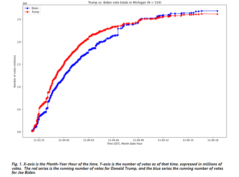
2. An update in Wisconsin listed as 3:42AM Central Time on November 4th, 2020, which shows 143,379 votes for Joe Biden and 25,163 votes for Donald Trump

3. A vote update in Georgia listed at 1:34AM Eastern Time on November 4th, 2020, which shows 136,155 votes for Joe Biden and 29,115 votes for Donald Trump
4. An update in Michigan listed as of 3:50AM Eastern Time on November 4th, 2020, which shows 54,497 votes for Joe Biden and 4,718 votes for Donald Trump
We further find that if these updates were only more extreme than 99% of all updates nationally in terms of their deviation from this generally-observed pattern, that, holding all else equal, Joe Biden may very well have lost the states of Michigan, Wisconsin, and Georgia, and that he would have 42 fewer Electoral votes — putting Biden below the number required to win the Presidency. Either way, it is indisputable that his margin of victory in these three states relies on four most anomalous vote updates identified by the metric developed in this report.


The cancel culture is driven by fears that a contrary point of view might be truer than one’s own way of thinking. Dissing the messenger, and deplatforming if possible, is easier than reflection and self-examination. Thus has John Christy been attacked and recently responded in his quiet and reasonable manner. The article at AL.com is John Christy: We don’t ‘attack science’. Excerpts in italics with my bolds.
On Nov 2nd 2020 InsideClimate News (ICN) and AL.com published a fairly long (5,000 words!) profile on the climate research that Dr. Roy Spencer and I perform at The University of Alabama in Huntsville. They spent a good bit of time criticizing our satellite data as well as my personal life. The article seems schizophrenic at times, bouncing from highly critical assertions to a depiction of me as a sort of nice, hardworking, churchgoing Alabama scientist.
A major problem here is the technique of quoting antagonists of our work, without giving us a chance to respond. This is the modus operandi of advocacy-journalism. Add to that the numerous editorialized opinions such as, “… Christy’s data have been corrected repeatedly and his conclusions contradicted time and again …” A look at the record indicates this is not so.
But with all of the misleading claims, I’m able to forgive the reporters because they also say, “… he looks 69 going on 50 …” Awesome. How could a 69-year-old not love that?
Unfortunately, ICN ran the story as part of series called “The Anti-Scientists” that explores “the Trump Administration’s attacks on the science underlying environmental protections.” However, kudos to AL.com for including a link to my congressional testimony so the reader could hear my on-the-record story.
It should be clear to all that this agendized “hit-piece” (as we call it), is designed to discredit me, but the truth is, we don’t “attack science,” we “employ science.” Now, I’ve always been told, never pick a fight with someone who buys ink (cloud-storage) by the barrel (terabyte), but here it goes.
In 1990, Roy and I created and today still publish monthly values of the global temperature of three atmospheric layers from satellite measurements. A 1997 paper suggested our dataset had abrupt “downward” jumps. In response, we demonstrated the purported jumps were found in the sea water temperatures they used, not in the deep atmosphere we measured – so they were mixing apples and oranges. The next claim stating there are gaps in the satellite record is just false as every new satellite is directly calibrated to a satellite already in orbit. Later, scientists in Washington State misled the community with papers that (1) allegedly discovered “contamination” of one of our products by stratospheric influence, and (2) that our correction to account for the satellite’s east-west drift over time was wrong.
Neither complaint applied to our datasets. We had always published accurate representations of what our products measured including the stratospheric impact.
In fact, 12 years earlier we created one without the stratospheric influence to deal with this issue directly. The second complaint was moot because we had already adopted an advanced, observations-based adjustment for the east-west drift, while their proposed model-based correction had serious problems.
Early on, though, the very clever scientists at Remote Sensing Systems in California discovered two issues with our dataset, both of which were immediately remedied 15 and 20 years ago respectively with only very small impacts.
While we recognize no dataset is perfect, a detailed evaluation of our temperature products was published in 2018, demonstrating that ours outperforms other satellite products when compared against independent data. Why was this not mentioned?
Another scientist appears to refute our explicit conclusion that climate models are unrealistically aggressive in depicting the atmosphere’s warming rate. This is important because regulatory policies advocated in the media which include price-hikes for all our energy, are based on fears engendered by these models.
Again, our conclusion has stood the test of time, (that scientist published a similar result later). Even this year, more published studies continue to show climate models are poor tools for policy decision—they can’t reproduce the climate that has already happened, and they don’t agree with each other about the future.
Then, the clumsy attempt to connect me with an anti-evolution movement was misguided. The reporters would be chagrined to learn that I had testified before the Alabama State Board of Education advocating the removal of the “Evolution Disclaimer” from biology textbooks. Even the NY Times, of all places, took note and quoted me on the issue (Feb. 1, 2005.) So again, doing a little fact-checking rather than following today’s “jump-to-(my-biased)-conclusion” reporting style, would have saved us all some trouble.
Finally, a broader question to ask is this, “Why was so much effort and expense proffered to try to discredit a scientist like me?”
By the way, the title, “When Trump’s EPA needed a climate scientist, they called on Alabama’s John Christy” misinforms. I saw a federal notice asking for applications for the EPA Science Advisory Board and sent mine in, just like the others. I was eventually selected, based on my credentials, to be one of its 45 members.
But, the line that still carries the day for me is, ” … he looks 69 going on 50.”
“The reason there is so much contention regarding “global warming” is relatively simple to understand: In climate change science we basically cannot prove anything about how the climate will change as a result of adding extra greenhouse gases to the atmosphere.
So we are left to argue about unprovable claims.”
John R. Christy | Climate science isn’t necessarily ‘settled’
See also: Christy’s Common Sense about Climate
Note: John Christy of the University of Alabama at Huntsville testified before the House of Representatives Natural Resources Committee on May 13, 2015, but his opening statement has been purged from the committee’s website. In addition to the video above, his statement that day is available here.
After concerns over lackluster ice recovery in October, November is seeing ice roaring back. The image above shows the last 3 weeks adding 3 M km2 of sea ice. (The metric 1 Wadham = 1 M km2 comes from the professor’s predictions of an ice-free Arctic, meaning less than 1 M km2 extent) The Russian shelf seas on the left filled with ice early on. On the CanAm side, Beaufort at the bottom center is iced over, Canadian Archipelago (center right) is frozen, and Baffin Bay is filling from the north down. Hudson Bay (far right) first grew fast ice around the edges, and is now half iced over. A background post is reprinted below, showing that in just 23 days, 2020 has added 3.1 M km2, 50% more than an average 30-day November.

Some years ago reading a thread on global warming at WUWT, I was struck by one person’s comment: “I’m an actuary with limited knowledge of climate metrics, but it seems to me if you want to understand temperature changes, you should analyze the changes, not the temperatures.” That rang bells for me, and I applied that insight in a series of Temperature Trend Analysis studies of surface station temperature records. Those posts are available under this heading. Climate Compilation Part I Temperatures
This post seeks to understand Arctic Sea Ice fluctuations using a similar approach: Focusing on the rates of extent changes rather than the usual study of the ice extents themselves. Fortunately, Sea Ice Index (SII) from NOAA provides a suitable dataset for this project. As many know, SII relies on satellite passive microwave sensors to produce charts of Arctic Ice extents going back to 1979. The current Version 3 has become more closely aligned with MASIE, the modern form of Naval ice charting in support of Arctic navigation. The SII User Guide is here.
There are statistical analyses available, and the one of interest (table below) is called Sea Ice Index Rates of Change (here). As indicated by the title, this spreadsheet consists not of monthly extents, but changes of extents from the previous month. Specifically, a monthly value is calculated by subtracting the average of the last five days of the previous month from this month’s average of final five days. So the value presents the amount of ice gained or lost during the present month.
These monthly rates of change have been compiled into a baseline for the period 1980 to 2010, which shows the fluctuations of Arctic ice extents over the course of a calendar year. Below is a graph of those averages of monthly changes during the baseline period. Those familiar with Arctic Ice studies will not be surprised at the sine wave form. December end is a relatively neutral point in the cycle, midway between the September Minimum and March Maximum.
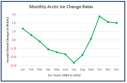
The graph makes evident the six spring/summer months of melting and the six autumn/winter months of freezing. Note that June-August produce the bulk of losses, while October-December show the bulk of gains. Also the peak and valley months of March and September show very little change in extent from beginning to end.
The table of monthly data reveals the variability of ice extents over the last 4 decades.

Table 1 Monthly Arctic Ice rates of Extent Changes in M km2. Months with losses in pink, months with gains in blue.
The values in January show changes from the end of the previous December, and by summing twelve consecutive months we can calculate an annual rate of change for the years 1979 to 2019.
As many know, there has been a decline of Arctic ice extent over these 40 years, averaging 40k km2 per year. But year over year, the changes shift constantly between gains and losses.
Moreover, it seems random as to which months are determinative for a given year. For example, much ado has been printed about October 2020 being slower than expected to refreeze and add ice extents. As it happens in this dataset, October has the highest rate of adding ice. The table below shows the variety of monthly rates in the record as anomalies from the 1980-2010 baseline. In this exhibit a red cell is a negative anomaly (less than baseline for that month) and blue is positive (higher than baseline).
Note that the +/ – rate anomalies are distributed all across the grid, sequences of different months in different years, with gains and losses offsetting one another. Yes, October 2020 recorded a lower than average gain, but higher than 2016. The loss in July 2020 was the largest of the year, during the hot Siberian summer. The bottom line presents the average anomalies for each month over the period 1979-2020. Note the rates of gains and losses mostly offset, and the average of all months in the bottom right cell is virtually zero.
A final observation: The graph below shows the Yearend Arctic Ice Extents for the last 30 years.
Note: SII daily extents file does not provide complete values prior to 1988.
Year-end Arctic ice extents (last 5 days of December) show three distinct regimes: 1989-1998, 1998-2010, 2010-2019. The average year-end extent 1989-2010 is 13.4M km2. In the last decade, 2009 was 13.0M km2, and ten years later, 2019 was 12.8M km2. So for all the the fluctuations, the net loss was 200k km2, or 1.5%. Talk of an Arctic ice death spiral is fanciful.
These data show a noisy, highly variable natural phenomenon. Clearly, unpredictable factors are in play, principally water structure and circulation, atmospheric circulation regimes, and also incursions and storms. And in the longer view, today’s extents are not unusual.


Illustration by Eleanor Lutz shows Earth’s seasonal climate changes. If played in full screen, the four corners present views from top, bottom and sides. It is a visual representation of scientific datasets measuring Arctic ice extents.

R. J. Quinn writes at The American Conservative The Greatest Scandal Of Our Lifetime. Excerpts in italics with my bolds. This post is prompted by an edict from the Quebec Government that citizens should continue to be under house arrest with small gatherings allowed only during 4 days Dec.24 to Dec. 27.
Elites have ignored practical scientific approaches to the virus in favor of totalitarian lockdowns which rob us of our humanity and our health.
What if I told you that thousands of lives could be saved during this pandemic if we followed the science?
Instead of following the science, governments around the world are implementing the exact opposite of effective measures to combat the pandemic. Governments and health officials from first world countries are pursuing lockdowns and advising patients to wait until their symptoms worsen before going to the hospital seeking treatment. Sadly, this is the approach many countries have taken for the COVID-19 virus. Lockdowns are destroying lives economically, mentally, and physically, while the elites are becoming richer and profiting off of the destruction of the middle class and the poor.

Also egregious is the lack of an outpatient treatment plan for people who come down with Covid. In the NIH’s recommended treatment protocol, there is no recommended treatment for non-hospitalized patients. ‘Isolate in your home and wait until your condition gets so bad you have to go to the hospital’ is the NIH’s position. A patient’s treatment only begins once they are hospitalized. This is akin to using dial-up internet compared to today’s high-speed internet. It does not have to be this way. We can effectively provide outpatient treatment care to patients with the virus in a safe and cheap manner.
Many heroic doctors are focusing on the vital task of fighting COVID-19 in the early stages of the illness. Since March, there have been copious amounts of research, studies, and treatment of patients that have shown success against the illness. Antivirals, vitamins, existing vaccines, aspirin, exercise, sleep, and proper air filtration all play a pivotal role in preventing severe cases of Coronavirus in mild to moderate patients. Prestigious doctors such as Dr. Peter McCullough of Baylor University Medical Center in Texas, and Dr. Paul Marik of the Eastern Virginia Medical School, among many others, have devised home treatment or outpatient care regimens for mild cases and prophylaxis. There have been numerous (many peer-reviewed) studies which have shown that antivirals like Hydroxychloroquine and Ivermectin are effective in combatting the illness in mild to moderate stages. Simply strengthening your immune system with vitamin D, vitamin C, Zinc, and a Zinc ionosphere (Quercetin and EGCG) along with proper exercise and rest goes a long way in preparing the body to effective combat Covid-19. Also, the MMR vaccine could provide protection from the most severe effects of Covid as well, according to doctors. While we wait for antibody cocktail treatments and a potential vaccine, these other treatments must be strongly recommended and pursued by the general public, especially those most susceptible to the illness.
Masks, social distancing, and early effective treatments are the best tools we have to combat this illness. However, this is not the case in many first world nations, including the United States. Lockdowns are considered the most important way to slow the spread of the virus. This lockdown mindset is a totalitarian mindset. It is a mindset that rejects humanity. The more humane approach is that espoused in the Great Barrington Declaration. Protect the elderly and sick in their homes while the young and healthy return to society through measured social distancing. However, the elites in most governments hate this plan because they deny that early effective treatments and strengthening of the immune system can effectively combat the virus. Lockdowns show a disregard for humanity, and the unintended consequences will be felt for decades. There is a better approach than destroying our society and our humanity. It is the approach of the Great Barrington Declaration paired with the promoting of outpatient treatments for the virus.
This is the only way for society to regain its humanity and stop the totalitarian mindset of our elites.
We are in a war with the virus. In war, urgency is a necessity. We cannot wait years for a double-blind randomized study of antivirals while thousands are being infected and being told to isolate at home until they can’t breathe and only go to the hospital when it is possibly too late. While businesses and jobs are being lost and lives are being destroyed, there is no excuse for government health organizations like the NIH to not recommend early treatment care. Dr. Peter McCullough said, “Medicine is both an art and a science. In this pandemic, we have focused on the science, in randomized trials, in a new drug development, and the body count has been through the roof. [What is needed is] clinical judgement, careful observation, being able to quickly adapt to new concepts.”
Treating COVID-19 too late is part of the lockdown mindset. By denying early outpatient treatment care, the elites are chipping away at our liberties, forming us into a submissive society where we follow everything the government says. The only problem is that the elites in these governments have been dreadfully wrong with lockdowns and not recommending outpatient treatment. Their denial of humanity and freedom to choose during this pandemic has been criminal, and we must never forget what they want and plan to do with their authoritarian mindset of complete ineptitude. This sordid tale is the greatest scandal of our lifetime.

(By Corona Borealis Studio/Shutterstock)
