Watts Up With Warming and CO2

Anthony Watts has a short and to the point video entitled The True Relationship of CO2 and Temperature That the Media Won’t Tell You.  For those who prefer reading I provide below a transcript in italics, lightly edited from the closed captions, along with images and my bolds.  H/T  Geo Rublik

Climate change is in fact real. Climate has changed on the earth for millennia. Okay that’s just the natural order of things–climate is not static in any way shape or form. Let’s start with that.

The first point is: Yes, carbon dioxide does have an effect.

However it is down on the lower side of things, almost minuscule. The reason is the fact that we have reached saturation of the effect of carbon dioxide on warming the atmosphere. It happens in the first 100 parts per million and then after that it’s a logarithmic scale. The effect flattens out at the top, and we’re very nearly at the top of the curve of the effect of carbon dioxide warming the planet. The ability for additional carbon dioxide to affect the temperature is is quickly diminishing to become flat.

This mod trend calculation shows exactly what I’m talking about. In the first hundred parts per million, it’s just a rapid increase. And then it tapers off more and more. So the idea of climate running away due to carbon dioxide isn’t going to happen. So yes carbon dioxide does have an effect which gets smaller as the amount of concentration of co2 gets larger.

The second point is what I brought up in my surface station project.

Namely, that we are retaining more and more heat in our local areas due to increased infrastructure, increased concrete, asphalt and so forth. So are locales are retaining heat at night. And the more artificial structures and surfaces we have in the vicinity of the thermometer, the more it warms the temperature at night, it doesn’t get as cold.

Well the climate folks track climate change per se using the average temperature. That average temperature is obtained by averaging between the daily high and the low. So if the low goes up and the high stays the same. then the average is going to go up. That’s the result showing a warming planet, mostly based on the nighttime temperature going up.  [Note the dotted red line for daytime averages changes little compared to the rise of nightime averages shown by blue dotted line.]

That’s due both to carbon dioxide retarding heat going to space and
because we’ve got more localized influences of infrastructure retaining heat
which affects the thermometers. it’s just that simple.

Addendum

Thirdly, there has also been man made warming of the temperature record by making adjustments to the observations.

There’s a third point Anthony didn’t raise, but I will. There has also been man made warming of the temperature record by making adjustments to the observations. And those data alterations always serve to increase the warming trend.

The diagram above comes from KNMI showing how repeated adjustments over time added increments of warming to the GISSTemp record. The blue line is the GISS value for January 1910.  The red line is GISS value for January 2000.  The values for both months change many times between the GISS dataset at May 2008 and the same dataset at June 2023.  The effect is to increase the warming (the difference between January 1910 and 2000) from 0.45 C to 0.67 C, due to lowering the 1910 number and increasing the 2000 number.

Dr. Ole Humlum commented: A temperature record which keeps on changing the past hardly can qualify as being correct.

I have also done a study of the records of surface stations rated by Watts’ project as having a #1 rating for siting quality–no urban heat sources nearby. That analysis compared raw data (as reported by the local weather authority) with the adjusted data (reanalyzed before input into climatology models.)  See Updated Review of Temperature Data   which also confirms the problems noted above.

The analysis showed the effect of GHCN adjustments on each of the 23 stations in the sample. The average station was warmed by +0.58 C/Century, from +.18 to +.76, comparing adjusted to unadjusted records. 19 station records were warmed, 6 of them by more than +1 C/century. 4 stations were cooled, most of the total cooling coming at one station, Tallahassee. So for this set of stations, the chance of adjustments producing warming is 19/23 or 83%.  For example, Baker City Oregon


Unbelievable Record Heat

Gregory Wrightstone tells it like it is at CO2 Coalition Data Shows We’re NOT Seeing Record Heat.  Excerpts in italics with my bolds and added images.

Hotter Than the Fourth of July!

It was widely reported recently that July 4th, 2023 was the hottest day in Earth’s recorded history.

Paulo Ceppi, a climate scientist at London’s Grantham Institute stated: “It hasn’t been this warm since at least 125,000 years ago, which was the previous interglacial.” And, of course, it was reported that it was our fault due to our “sins of emission.”

This didn’t meet the smell test for the scientists at the CO2 Coalition. We know that previous warm periods were warmer than our modern temperatures. For example, during the Roman Warm Period there was citrus being grown in the north of England and barley was grown by Vikings on Greenland 1,000 years ago. Why aren’t they grown there now? It’s quite simple: Lower modern temperatures.

So, here at the CO2 Coalition, we did what scientists are trained to do:

We looked at the available data. Our Science and Research Associate Byron Soepyan reviewed temperature data from the US Historical Climatology Network and found that both the number of weather stations reporting temperature over 100 degrees F and the Maximum Average Temperature for July 4th were slightly declining since the record began in 1895 – not increasing – as Ceppi claimed.

The Great Texas Heat Wave

It is summer. It is hot in Texas. It is not unusual or unprecedented. Below is a chart of the percentage of days in Texas that were above 100 degrees Fahrenheit since 1895. Despite a significant and steady rise in CO2 emissions, there has been a decline in the occurrence of very hot days.

Gregory Wrightstone is a geologist; executive director of the CO2 Coalition, Arlington, VA; and author of Inconvenient Facts: The Science That Al Gore Doesn’t Want You to Know.

Wild Weather News Spreads Like Wildfire

New York City Covered in Thick Smoke from Western USA and Canada Wildfires

The Wild Weather meme has gone viral, along with the usual suspects claiming it’s climate change.  Just in the last 24 hours:

Extreme weather is terrorizing the world. It’s only just begun. Yahoo
Heatwaves are one of the deadliest hazards to emerge in extreme weather, and they’re occurring on a global scale.

After Earth’s hottest week on record, extreme weather surprises everyone — even climate scientists CBC.ca
This past week was the Earth’s hottest on record, as extreme weather from wildfires to floods ravaged various corners of the world. Here’s a closer look at what’s happening.

There’s no escaping climate change as extreme weather events abound The Washington Post

Extreme weather highlights need for greater climate action: WMO UN News Centre
Scorching temperatures are engulfing large parts of the Northern hemisphere, while devastating floods triggered by relentless rainfall have disrupted lives and livelihoods, underscoring the urgent need for more climate action,

White House details ‘extreme heat strategy’ amid blistering temperatures in U.S. City News
Crippling heat waves are an annual fixture in the United States — but it’s not every day the White House announces a detailed strategy to confront them. So far, it’s been an extreme-weather summer

U.S. lays out extreme heat plan amid record temperatures. What about Canada? Global News
Like in the U.S., the federal government in Canada has staked much of its reputation on enunciating and enacting a comprehensive response to climate change.

NASA climate adviser warns extreme weather events will persist if temps keep rising. wusf.usf.edu
With much of the U.S. facing extreme weather, NASA chief scientist and senior climate adviser Kate Calvin talks to NPR’s A Martinez about what we can expect as global temperatures continue to rise.

What this summer’s extreme weather events mean for humanity. Public Radio International
As the worldwide heat record fell last week, the acute effects are emerging quickly. Extreme weather events are proliferating across the globe.

Floods, tornadoes, heat: more extreme weather predicted across US. The Guardian
Over a third of Americans under extreme heat warnings as Vermont, still recovering from historic flooding, prepares for more storms

More than 40% of Californians say they were affected by recent extreme weather, poll finds Yahoo Canada Sports
An overwhelming majority of respondents say climate change is impacting their community, but are less confident in government’s readiness to respond.

El Niño is back: Surging temperatures bring extreme weather and threaten lives Euronews
“Early warnings and anticipatory action of extreme weather events associated with this major climate phenomenon are vital to save lives and livelihoods.” Rising sea temperatures are already …

Cities fight to keep the lights on in extreme weather events Politico Europe
More intense and longer-lasting heat waves are a challenge for the electricity grids that power Europe’s urban centers.

Heat: 3 in 4 Californians say climate change is contributing to the state’s extreme weather events East Bay Times
With a heat wave approaching that could send inland temperatures soaring this weekend to more than 105 degrees, a new poll shows Californians’ concerns are rising about climate change and its connections to extreme weather.

Extreme Weather Bakes the South, Soaks the Northeast The Globe and Mail

This extreme weather from coast to coast: Is it ‘a new abnormal’? Yahoo News Canada
Wildfire smoke engulfed the iconic skyline of New York, blotting out the Empire State Building in a dystopian orange haze. A massive heat dome broke temperature records in Texas, straining the power grid and killing 13 people.

This seasonal outbreak of distressing media hype deserves a rational response, so I am reposting wise words from meteorologist Cliff Mass from summer 2021.

heat-dome-graphic

Reality Check on Extreme Weather Claims

CBS News headline was:  ‘Pacific Northwest heat wave would have been “virtually impossible” without climate change, experts say.’

Eric Felton provides a useful reprise of the campaign to exploit a recent Washington State heat wave for climate hysteria mongering.  His article at Real Clear Investigations is Does Climate Change Cause Extreme Weather Now? Here’s a Scorcher of a Reality Check.  This discussion is timely since you can soon expect an inundation of hype saying our SUVs caused whatever damage is done by Hurricane (or Tropical Storm) Henri, shown below approaching Long Island and New England. Excerpts from Felton’s article are below in italics with my bolds.

Henri 20210822

The Pacific Northwest was hit with a record-shattering heat wave in June, with temperatures over 35 degrees higher than normal in some places. On June 28, Portland, Ore., reached 116 degrees. Late last week the region suffered another blast of hot weather, with a high in Portland of 103 degrees. The New York Times didn’t hesitate to pronounce the region’s bouts of extreme weather proof that the climate wasn’t just changing, but catastrophically so.

To make that claim, the Times relied on a “consortium of climate experts” that calls itself World Weather Attribution, a group organized not just to attribute extreme weather events to climate change, but to do so quickly. Within days of the June heat wave, the researchers released an analysis, declaring that the torrid spell “was virtually impossible without human-caused climate change.”

World Weather Attribution and its alarming report were trumpeted by Time magazine, touted by the NOAA website Climate.gov , and featured by CBS News, CNBC, Scientific American, CNN, the Washington Post, USAToday, and the New York Times, among others.

The group’s claim that global warming was to blame was perhaps less significant than the speed with which that conclusion was provided to the media. Previous efforts to tie extreme weather events to climate change hadn’t had the impact scientists had hoped for, according to Time, because it “wasn’t producing results fast enough to get attention from people outside the climate science world.”

“Being able to confidently say that a given weather disaster was caused by climate change while said event still has the world’s attention,” Time explained, approvingly, “can be an enormously useful tool to convince leaders, lawmakers and others that climate change is a threat that must be addressed.” In other words, the value of rapid attribution is primarily political, not scientific.

550856_5_

World Weather Attribution was organized to quickly attribute extreme weather events to climate change.  World Weather Attribution

Inconveniently for World Weather Attribution, an atmospheric scientist with extensive knowledge of the Pacific Northwest climate was actively running weather models that accurately predicted the heatwave. Cliff Mass rejected the notion that global warming was to blame for the scorching temperatures. He calculated that global warming might have been responsible for two degrees of the near 40-degree anomaly. With or without climate change, Mass wrote, the region “still would have experienced the most severe heat wave of the past century.”

Mass has no shortage of credentials relevant to the issue: A professor of atmospheric sciences at the University of Washington, he is author of the book “The Weather of the Pacific Northwest.”

Mass took on the World Weather Attribution group directly: “Unfortunately, there are serious flaws in their approach.” According to Mass, the heatwave was the result of “natural variability.” The models being used by the international group lacked the “resolution to correctly simulate critical intense, local precipitation features,” and “they generally use unrealistic greenhouse gas emissions.”

WWA issued a “rebuttal” calling Mass’ criticisms “misleading and incorrect.” But the gauntlet thrown down by Mass did seem to affect WWA’s confidence in its claims. The group, which had originally declared the heatwave would have been “virtually impossible without human-caused climate change,” altered its tone. In subsequent public statements, it emphasized that it had merely been making “best estimates” and had presented them “with the appropriate caveats and uncertainties.” Scientists with the attribution group did not respond to questions about Mass’s criticisms posed by RealClearInvestigations.

But what of the group’s basic mission, the attribution of individual weather events to climate change? Hasn’t it been a fundamental rule of discussing extreme temperatures in a given place not to conflate weather with climate? Weather, it is regularly pointed out, refers to conditions during a short time in a limited area; climate is said to describe longer-term atmospheric patterns over large areas.

Until recently, at least, climate scientists long warned against using individual weather events to ponder the existence or otherwise of global warming. Typically, that argument is used to respond to those who might argue a spate of extreme cold is reason to doubt the planet is warming. Using individual weather events to say anything about the climate is “dangerous nonsense,” the New Scientist warned a decade ago.

noaa-us-temp-2019-2021

Perhaps, but it happens all the time now that climate advocates have found it to be an effective tool. In 2019, The Associated Press-NORC Center for Public Affairs Research and the Energy Policy Institute at the University of Chicago found that three-fourths of those polled said their views about climate change had been shaped by extreme weather events. Leah Sprain, in the book “Ethics and Practice in Science Communication,” says that even though it may be legitimate to make the broad claim that climate change “may result in future extreme weather,” when one tries “arguing weather patterns were caused by climate change, things get dicey.” Which creates a tension: “For some communicators, the ultimate goal – mobilizing political action – warrants rhetorical use of extreme weather events.” But that makes scientists nervous, Sprain writes, because “misrepresenting science will undermine the credibility of arguments for climate change.”

Which is exactly what happened with the World Weather Attribution group, according to Mass: “Many of the climate attribution studies are resulting in headlines that are deceptive and result in people coming to incorrect conclusions about the relative roles of global warming and natural variability in current extreme weather,” he wrote at his blog. “Scary headlines and apocalyptic attribution studies needlessly provoke fear.”

The blogging professor laments that atmospheric sciences have been “poisoned” by politics. “It’s damaged climate science,” he told RCI.

payn_c18450120210819120100

And not just politics – Mass also says that the accepted tenets of global warming have become a sort of religion. Consider the language used, he says, such as the question of whether one “believes” in anthropogenic climate change. “You don’t believe in gravity,” he says. The religious metaphor also explains why colleagues get so bent out of shape with him, Mass says: “There’s nothing worse than an apostate priest.”

That goes even for those who are merely mild apostates. Mass doesn’t dispute warming, he merely questions how big a problem it is. “We need to worry about climate change,” he has said. “But hype and exaggeration of its impacts only undermine the potential for effective action.”

mle190506c20190506011552

For a more in depth look at the the science of attributing causes of extreme weather events, see:

X-Weathermen are Back!

Hottest Year Misdirection June Report

Activists and their media allies are Hell-bent to spoil our summertime joy by stirring up climate fear to further their zero carbon agenda.

The calendar turning to June and the official start to summer triggers the usual alarms that this year will surely be the hottest ever.  Headlines recently:

♦  Is 2023 going to be the hottest year on record?  World Economic Forum

♦  Why 2023 is shaping up to be the hottest year on record New Scientist

♦  Global temperatures in 2023 set to be among hottest on record  The Guardian

♦  2023 will be ‘one of the hottest on record’ says Met Office BBC

And of course you can count on NYT to totally jump the shark:

♦  The Last 8 Years Were the Hottest on Record – The New York Times

In the past few years, the earth cooled after warming from the 2015-2016 El Nino, and with higher North Atlantic summer anomalies repeating in 2020.  The cooling was significant as shown in the chart below (from the UAH satellite temperature dataset.)

The Global anomaly dropped from +0.7C January 2016 to <0.0C January 2023.  And of course the media ignored that cooling since they are addicted to the global warming narrative: temperatures can only go up, since CO2 keeps rising.  On the contrary, the chart shows CO2 did rise steadily, while temps fluctuated up and down, ending this period of 27 years flat.

Curiously, a lot of us have so far seen unseasonably cool temperatures this year, and wonder where this hottest year could be?  I mean, 60 cm of snow one June day in Jasper Park Alberta?   Suspecting that we have again a weather/climate perception that exists everywhere elsewhere, I turned to NOAA’s Climate at a Glance website to see what their data shows.

Climate reporting is confusing because the scope of temperature averaging gives very different impressions, and at the mega scale rarely corresponds to anyone’s particular experience.  So generalizations are claimed extrapolating from statistics, contradicted by many persons’ direct experience.

NOAA State of the Climate is another site advocating for the IPCC agenda and illustrates how this works.  First the Global Climate Report:

So there is the #1 hottest month out of 174 years–warmest Land, Ocean and combined Global.  Now let’s look at the year to date (YTD):

Whoops, that’s not as scary; the first half of 2023 is not #1.   Rather, the ocean is #2, Land #5, and the Global start to the year is #3.  And the table shows that 2016 was the hottest, consistent with the UAH graph above.  We start to see how media reports are speculating and hoping for this to be the hottest year, despite the first half of the year.

And to understand why most people will be put off by hottest year claims, we go to the Regional Analysis in order to see what the year has been like in various continents (land by definition).

It becomes obvious that no matter where I live, don’t tell me this is the hottest year ever. OK some Africans and Europeans may agree, but those in Oceania (mostly Australians) will boo you out of the room.

Note:  NOAA climatology data

The Extended Reconstructed Sea Surface Temperature (ERSST) dataset is a global monthly analysis of SST data derived from the International Comprehensive Ocean–Atmosphere Dataset (ICOADS). The dataset can be used for long-term global and basin-wide studies and incorporates smoothed local and short-term variations.

The Global Historical Climatology Network monthly (GHCNm) dataset provides monthly climate summaries from thousands of weather stations around the world. The initial version was developed in the early 1990s, and subsequent iterations were released in 1997, 2011, and most recently in 2018. The period of record for each summary varies by station, with the earliest observations dating to the 18th century. Some station records are purely historical and are no longer updated, but many others are still operational and provide short time delay updates that are useful for climate monitoring. The current version (GHCNm v4) consists of mean monthly temperature data, as well as a beta release of monthly precipitation data. [Reported station data are subject to adjustments by way of a procedure, known as the Pairwise Homogenization Algorithm (PHA)]

In addition, a previous post gives directions and links for anyone to get the unbiased climate history where they live, including the example of my locale.  See June 2023 the Hottest Ever? Not So Fast!

Footnote: Everyone has an agenda and packages data in support of their POV.  Those who joined the anti-hydrocarbon crusade are bound to find and amplify any bit of global warming they can find.  My agenda is for people to consider the full amount of relevant data and facts, and to reason accordingly rather than go along with the crowd or their feelings.  My approach is best expressed in this essay:

I Want You Not to Panic

New 2023 INMCM RAS Climate Model First Results

Previous posts (linked at end) discuss how the climate model from RAS (Russian Academy of Science) has evolved through several versions. The interest arose because of its greater ability to replicate the past temperature history. The model is part of the CMIP program which will soon go the next step to CMIP7, and is one of the first to test with a new climate simulation.

This synopsis is made possible thanks to the lead author, Evgeny M. Volodin, providing me with a copy of the article published May 11, 2023 in Izvestiya, Atmospheric and Oceanic Physics. Those with institutional research credentials can access the paper at Simulation of Present-Day Climate with the INMCM60 Model by E. M. Volodin, et al. (2023). Excerpts are in italics with my bolds and added images and comment.

Abstract

A simulation of the present-day climate with a new version of the climate model developed at the Institute of Numerical Mathematics of the Russian Academy of Sciences (INM RAS) is considered. This model differs from the previous version by a change in the cloud and condensation scheme, which leads to a higher sensitivity to the increase in СО2. The changes are also included in the calculation of aerosol evolution, the aerosol indirect effect, land snow, atmospheric boundary-layer parameterization, and some other schemes.

The model is capable of reproducing near-surface air temperature, precipitation, sea-level pressure, cloud radiative forcing, and other parameters better than the previous version. The largest improvement can be seen in the simulation of temperature in the tropical troposphere and at the polar tropopause and surface temperature of the Southern Ocean. The simulation of climate changes in 1850 2021 by the two model versions is discussed.

Introduction

A new version has been developed on the basis of the climate system model described in [1]. It was shown [2] that introducing changes only to the cloud parameterization would produce climate models with different equilibrium sensitivities to a doubling of СО2, in a range of 1.8 to 4.1 K. The INMCM48 version has the lowest sensitivity of 1.8 K among Coupled Model Intercomparison Project Phase 6 (CMIP6) models. The natural question then arises as to how parameterization changes that increase the equilibrium sensitivity affect the simulation of modern climate and of its changes observed in recent decades.

The INMCM48 version simulates modern climate quite well, but it has some systematic biases common to many of the current climate models, and biases specific only to this model. For example, most climate models overestimate surface temperatures and near surface air temperatures at southern midlatitudes and off the east coast of the tropical Pacific and Atlantic oceans and underestimate surface air temperatures in the Arctic (see, e.g., [3]). A typical error of many current models, as well as of INMCM48, is the cold polar tropopause and the warm tropical tropopause, resulting in an overestimation of the westerlies in the midlatitude stratosphere. Possible sources of such systematic biases are the errors in the simulation of cloud amount and optical properties.

In the next version, therefore, changes were first made in cloud parameterization. Furthermore, the INMCM48 exhibited systematic biases specific solely to it. These are, for example, the overestimation of sea-level pressure, as well as of geopotential at any level in the troposphere, over the North Pacific. The likely reason for such biases seems to be related to errors in the heat sources located southward, over the tropical Pacific.

In this study, it is shown how changes in physical parameterizations,
including clouds, affect systematic biases in the simulation of
modern climate and its changes observed in recent decades.

Model and Numerical Experiments

The INMCM60 model, like the previous INMCM48 [1], consists of three major components: atmospheric dynamics, aerosol evolution, and ocean dynamics. The atmospheric component incorporates a land model including surface, vegetation, and soil. The oceanic component also encompasses a sea-ice evolution model. Both versions in the atmosphere have a spatial 2° × 1° longitude-by-latitude resolution and 21 vertical levels up to 10 hPa. In the ocean, the resolution is 1° × 0.5° and 40 levels.

The following changes have been introduced into the model
compared to INMCM48.

Parameterization of clouds and large-scale condensation is identical to that described in [4], except that tuning parameters of this parameterization differ from any of the versions outlined in [3], being, however, closest to version 4. The main difference from it is that the cloud water flux rating boundary-layer clouds is estimated not only for reasons of boundary-layer turbulence development, but also from the condition of moist instability, which, under deep convection, results in fewer clouds in the boundary layer and more in the upper troposphere. The equilibrium sensitivity of such a version to a doubling of atmospheric СО2 is about 3.3 K.

The aerosol scheme has also been updated by including a change in the calculation of natural emissions of sulfate aerosol [5] and wet scavenging, as well as the influence of aerosol concentration on the cloud droplet radius, i.e., the first indirect effect [6]. Numerical values of the constants, however, were taken to be a little different from those used in [5]. Additionally, the improved scheme of snow evolution taking into account refreezing and the calculation of the snow albedo [7] were introduced to the model. The calculation of universal functions in the atmospheric boundary layer in stable stratification has also been changed: in the latest model version, such functions assume turbulence at even large gradient Richardson numbers [8].

A numerical model experiment to simulate a preindustrial climate was run for
180 years,
not including the 200 years when equilibrium was reached.

All climate forcings in this experiment were held at their 1850 level. Along with a preindustrial experiment, a numerical experiment was run to simulate climate change in 1850–2029, for which forcings for 1850–2014 were prescribed consistent with observational estimates [9], while forcings for 2015–2029 were set according to the Shared Socioeconomic Pathway (SSP3-7.0) scenario [10].

To verify the simulation of present-day climate, the data from the experiment with a realistic forcing change for 1985–2014 were used and compared against the European Centre for Medium-Range Weather Forecasts (ECMWF) Reanalysis fifth generation (ERA5) data [11], the Global Precipitation Climatology Project, version 2.3 (GPCP 2.3) precipitation data [12], and the Clouds and the Earth’s Radiant Energy System (CERES) Energy Balanced and Fitted Edition 4.1 (CERES-EBAF 4.1) top-of-atmosphere (TOA) outgoing radiation fluxes [13].

The root-mean-square deviation of the annual and monthly averages of modeled and observed fields was used as a measure for the deviation of model data from observations, for which the observed fields were interpolated into a model grid. For calculating the sea-level pressure and 850-hPa temperature errors, grid points with a height over 1500 m were excluded. The modeled surface air temperatures were compared with the Met Office Hadley Center/Climatic Research Unit version 5  (HadCRUT5) dataset [14].

Results

Below are some results of the present-day climate simulation. Because changes in the model were introduced mainly into the scheme of atmospheric dynamics and land surface and there were no essential changes in the oceanic component, we shall restrict our discussion to atmospheric dynamics.


Table 1 demonstrates that the norms of errors in most fields were reduced. Changing the calculation of cloud cover and properties has improved the cloud radiative forcing, and the norm of errors for both longwave and shortwave forcing decreased by 10–20% in the new version compared to its predecessor. The global average of short-wave cloud radiative forcing is –47.7 W/m2 in the new version, –40.5 W/m2 in the previous version, and about –47 W/m2 in CERES-EBAF. The average TOA longwave radiative forcing is 29.5 W/m2 in the new version, 23.2 W/m2 in the previous version, and 28 W/m2 in CERES-EBAF. Thus, the average longwave and shortwave cloud radiative forcing in the new model version has proven to be much closer to observations than in the previous version.

From Table 1, the norm of the systematic bias has decreased significantly for 850-hPa temperatures and 500-hPa geopotential height. It was reduced mainly because average values of these fields approached observations, whereas the averages of both fields in INMCM48 were underestimated.

Figure 3 Volodin et al (2023)

We now consider the simulation of climate changes for 1850–2021. The 5-year mean surface temperature from HadCRUT5 (black), INMCM48 (blue), and INMCM60 (red) is shown in Fig. 3. The average for the period 1850 to 1899 is subtracted for each of the three datasets. The model data are slightly extended to the future, so that the most recent value matches the 2025–2029 average. It can be seen that warming in both versions by 2010 is about 1 K, approximately consistent with observations. The observed climate changes, such as the warmer 1940s and 1950s and the slower warming, or even a small cooling, in the 1960s and 1970s, are also obtained in both model versions. However, the warming after 2010–2014 turns out to be far larger in the new version than in the previous one, with differences reaching 0.5 K in 2025–2029. The discrepancies between the two versions are most distinct in the rate of temperature rise from 1990–1994 to 2025–2029. In INMCM48, the temperature rises by about 0.8 K, while the increase for INMCM60 is about 1.5 K. The discrepancy appears to have been caused primarily by a different sensitivity of the models, but a substantial contribution may also come from natural variability, so a more reliable conclusion could be made only by running ensemble numerical experiments.

Figure 4 Volodin et al. (2023)

Figure 4 displays the difference in surface air temperature from HadCRUT5 (top), the new version (midddle) , and the previous version (bottom) in 2000–2021 and 1979–1999. It is the interval where the warming was the largest, as is seen in Fig. 3. The observational data show that the largest warming, above 2 K, was in the Arctic, there was a warming of about 1 K in the Northern Hemisphere midlatitudes, and there was hardly any warming over the Southern Ocean. The pattern associated with a transition of the Pacific Decadal Oscillation (PDO) from the positive phase to the negative one appears over the Pacific Ocean. The new model version simulates a temperature rise at high and middle northern latitudes more closely to observations, whereas the previous version underestimates the rise in temperature in that region.

At the same time, over the tropical oceans where the observed warming is small, the data from the previous model version agree better with observations, while the new version overestimates warming. Both models failed to reproduce the Pacific Ocean temperature changes resulting from a positive to negative phase transition of PDO, as well as near zero temperature changes at southern midlatitudes.  Large differences of temperature change in the Atlantic sector of the Arctic, where there is some temperature decrease in the INMCM48 model and substantial increase in the INMCM60, are most probably caused by natural climate fluctuations in this region, so a reliable conclusion regarding the response of these model versions to observed forcing could also be drawn here only by running ensemble numerical experiments.

Conclusions

The INMCM60 climate model is able to simulate present-day climate better than the previous version The largest decrease can be seen in systematic biases connected with an overestimation of surface temperatures at southern midlatitudes, an underestimation of surface air temperatures in the Arctic, and an underestimation of polar tropopause and tropospheric temperatures in the tropics. The simulation of the cloud radiative forcing has also improved.

Despite different equilibrium sensitivities to doubled СО2, both model versions show approximately the same global warming by 2010–2015, similar to observations. However, projections of global temperature for 2025–2029 already differ between the two model versions by about 0.5 K. A more reliable conclusion regarding the difference in the simulation of current climate changes by the two model versions could have been made by running ensemble simulations, but this is likely to be done later because of the large amount of computational time and computer resources it will take.

My Comments
  1.  Note that INMCM60 runs hotter than version 48 and HadCRUT5. However, as the author points out, this is only a single simulation run, and a truer result will come later from an ensemble of multiple runs. There were several other references to tetnative findings awaiting ensemble runs yet to be done.
    For example see the comparable ensemble performance of the previous version (then referred to as INMCM5)

Figure 1. The 5-year mean GMST (K) anomaly with respect to 1850–1899 for HadCRUTv4 (thick solid black); model mean (thick solid red). Dashed thin lines represent data from individual model runs: 1 – purple, 2 – dark blue, 3 – blue, 4 – green, 5 – yellow, 6 – orange, 7 – magenta. In this and the next figures numbers on the time axis indicate the first year of the 5-year mean.


2.  Secondly, this study confirms the warming impacts of cloud parameters that appear in all the CMIP6 models. They all run hotter primarily because of changes in cloud settings. The author explains how INMCM60 performance improved in various respects, but it came with increased CO2 sensitivity. That value rose from 1.8C per doubling to 3.3C, shifting the model from lowest to middle of the range of CMIP6 models. (See Climate Models: Good, Bad and Ugly)

Figure 8: Warming in the tropical troposphere according to the CMIP6 models. Trends 1979–2014 (except the rightmost model, which is to 2007), for 20°N–20°S, 300–200 hPa.

3.  Thirdly, the temperature record standard has changed with a warming bias. See below from Clive Best comparison between HadCrut 4.6 and HadCrut 5.

The HadCRUT5 data show about a 0.1C increase in annual global temperatures compared to HadCRUT4.6. There are two reasons for this.

The change in sea surface temperatures moving from HadSST3 to HadSST4
The interpolation of nearby station data into previously empty grid cells.

Here I look into how large each effect is. Shown above is a comparison of HadCRUt4.6 with HadCRUT5.

Coincidentally or not, with the temperature standard shifting to HadCrut 5, model parameters shifted to show more warming to match. Skeptics of climate models are not encouraged by seeing warming added into the temperature record, followed by models tuned to increase CO2 warming.

4. The additional warming in both the model and in HadCRUT5 is mostly located in the Arctic. However, those observations include a warming bias derived from using datasets of anomalies rather than actual temperature readings.

Clive Best provides this animation of recent monthly temperature anomalies which demonstrates how most variability in anomalies occur over northern continents.

See Temperature Misunderstandings

The main problem with all the existing observational datasets is that they don’t actually measure the global temperature at all. Instead they measure the global average temperature ‘anomaly’. . .The use of anomalies introduces a new bias because they are now dominated by the larger ‘anomalies’ occurring at cold places in high latitudes. The reason for this is obvious, because all extreme seasonal variations in temperature occur in northern continents, with the exception of Antarctica. Increases in anomalies are mainly due to an increase in the minimum winter temperatures, especially near the arctic circle.

A study of temperature trends recorded at weather stations around the Arctic showed the same pattern as the rest of NH.  See Arctic Warming Unalarming

5. The CMIP program specifies that participating models include CO2 forcing and exclude solar forcing. Aerosols are the main parameter for tuning models to match. Scafetta has shown recently that models perform better when a solar forcing proxy is included. See Empirical Proof Sun Driving Climate (Scafetta 2023)

• The role of the Sun in climate change is hotly debated with diverse models.

• The Earth’s climate is likely influenced by the Sun through a variety of physical mechanisms.

• Balanced multi-proxy solar records were created and their climate effect assessed.

• Factors other than direct TSI forcing account for around 80% of the solar influence on the climate.

• Important solar-climate mechanisms must be investigated before developing reliable GCMs.

This issue may well become crucial if we go into a cooling period due to a drop in solar activity.

Summation

I appreciate very much the diligence and candor shown by the INM team in pursuing this monumental modeling challenge. The many complexities are evident, as well as the exacting attention to details in the attempt to dynamically and realistically represent Earth’s climate. It is also clear that clouds continue to be a major obstacle to model performance, both hindcasting and forecasting. I look forward to their future results.

Resources

Top Climate Model Gets Better

Best Climate Model: Mild Warming Forecasted

Temperatures According to Climate Models

Why Trump So Far Ahead of GOP Field?

The best answer comes from John Daniel Davidson writing at The Federalist DeSantis’ Problem Isn’t Trump, It’s That Dems Rigged The Last Election.  Excerpts in italics with my bolds and added images.

How can GOP candidates admit that 2020 was rigged against Trump voters,
and then ask those voters to abandon Trump?

You might have noticed a media narrative taking shape the last few days about how Florida Gov. Ron DeSantis’ presidential campaign has “stalled.” A Politico Playbook item over the weekend described it as a “failure to launch,” noting that polling for DeSantis peaked in January at 40.5 percent and has since settled in the low 20s amid a barrage of attacks from former President Donald Trump.

Playbook also cited other news outlets recently casting doubt on the DeSantis operation, from fundraising struggles to lack of endorsements to difficulties distinguishing himself from Trump on policy. DeSantis super PAC official Steve Cortes added fuel to the narrative fire in an interview Sunday night, bemoaning the polls and admitting, “clearly Donald Trump is the runaway frontrunner.”

One could of course object that it’s only July, that polls don’t mean much this far out from the primaries, and that corporate media want nothing more than to push a DeSantis-is-stalled narrative whether it’s true or not, because they hate and fear him just as they hate and fear Trump.

But maybe there’s something else going on here. If enthusiasm for DeSantis seems lacking, maybe it has little or nothing to do with DeSantis or his campaign. Perhaps what we’re seeing is less about him and still less about 2024 or the upcoming GOP primary scrum, and more about what happened in 2020. Put bluntly, maybe what we’re seeing now is an early sign that what Democrats, Big Tech, and corporate media did in 2020 was inject poison into our political system, and the 2024 election cycle is going to show us just how deadly that poison is. 

Recall that 2020 was unlike any election in American history.

One need not declare that it was “stolen” to admit that it was obviously rigged. After all, the people and institutions that rigged it have freely admitted what they did. They suppressed the Hunter Biden laptop story, censored what Americans could say on social media, introduced unprecedented changes to our voting system under the pretext of pandemic precautions, and poured hundreds of millions of dollars into putatively nonpartisan local election offices through Mark Zuckerberg-connected nonprofits for the sole purpose of turning out Democrat voters in swing states.

Nothing like that has ever happened in American history. And it was all done
for the singular purpose of ensuring that Trump would not serve a second term.

What’s more, all of that came after four years of the permanent regime in Washington discarding every political norm, bending every rule, and breaking more than a few laws in a failed effort to oust Trump from office during his first term.

Now, maybe you think that’s all nonsense, or just water under the bridge. What’s done is done, we can’t go back, and even if the 2020 election wasn’t on the level we all just need to move on and go about the 2024 primary season like it’s business as usual. There’ll be debates and a deluge of political ads and campaign shenanigans. There’ll be a chaotic, rambunctious primary full of zingers and debate moderator tomfoolery, and at the end of it Republicans will have their nominee and we can all get on with the general election.

Sorry, but that’s not going to happen. It won’t happen because Trump supporters are understandably not willing to forget 2020 and just trundle along through 2024 like none of it happened. Plenty of them will always believe, not without reason, that 2020 was stolen outright. Many millions more believe, with even more reason, that it was rigged unfairly against Trump and that the same forces are at work now to rig it against whomever the GOP nominee turns out to be.

Does that mean Trump is somehow entitled to the nomination, or even to another term in the White House? Not necessarily. To the extent that 2020 was stolen, it wasn’t strictly speaking stolen from Trump but from the American people, the voters who cast their ballots for Trump in good faith, trusting that our elections were free and fair. 

Now that their faith has proved misplaced, do you think they’re going to line up for a GOP primary and consider each candidate on his or her merits, giving them all a fair hearing? Of course not. As far as they’re concerned, they were robbed of their votes in the last election by a corrupt cabal of powerful elites who are still in control.

Indeed, we know more today about the astounding level of corruption
and election-rigging in 2020 than we did at the time.

None of the problems have been fixed, and no reparations have been made. You can’t expect these voters to simply move on and act like 2024 is going to be a free and fair election, and accept whatever result the machine coughs up. 

To win over GOP primary voters who supported Trump in the past two cycles, these candidates have to speak to the injustice that was done in 2020, they have to admit what happened, name who did it, and affirm that we cannot have a self-governing republic if that’s how our elections are going to be.

And therein lies the problem for a candidate like DeSantis — to say nothing of such winsome and meritorious gunners like Vivek Ramaswamy or Tim Scott. How can you decry what they did to Trump in one breath and in the next proclaim that you’re the best person to redress those grievances? That Trump should stand aside and let you, Nikki Haley, restore faith in American elections and put Democrats in their place. 

Maybe it can be done, maybe they can come up with a rationale for their candidacies that will appeal to Trump supporters. It certainly would be a neat trick. 

But if you’re trying to explain why an otherwise popular figure like DeSantis isn’t gaining traction among GOP primary voters, the answer has less to do with Trump and more to do with what Democrats did in 2020. No one should expect Trump voters to forgive and forget.

Democrats and their accomplices might have thought they were
getting rid of Trump once and for all, and maybe they will
get rid of him in the end. But right now, it looks like they sowed the wind.


In Defence of Non-IPCC CO2 Science

Currently some Zero Carbon zealots are trying to discredit and disappear a peer reviewed study of CO2 atmospheric concentrations because its findings contradict IPCC dogma.  The paper is World Atmospheric CO2, Its 14C Specific Activity, Non-fossil Component, Anthropogenic Fossil Component, and Emissions (1750–2018). by Skrable et al. (2022).  The link is to the paper and also shows the comments recently addressed to the authors and the editor of the journal, as well as responses by both.

This came to my attention by way of a comment by one of the attackers on my 2022 post regarding this study.  Text is below in italics with my bolds.

D. Andrews 10/7/2023

This post is over a year old, but in the interest of correcting the record, please note the following:
1. Skrable et al. have conceded that the data they “guesstimated” bore little resemblance to actual atmospheric radiocarbon data.

2. In a reanalysis using good data, they still find that the present atmosphere contains more 14C than if the entire atmospheric carbon increase since 1750 was 14C -free fossil fuel carbon. But that is no surprise. Atmospheric carbon and carbon from ocean/land reservoirs is continually mixing, with the result that net 14C moves to the 14C depleted atmosphere. Because of this mixing, one cannot infer the source of the atmospheric carbon increase from its present radiocarbon content.

3. One can conclude from the atmospheric increase being but half of human emissions, that ocean /land reservoirs are net sinks of carbon, nor sources. The increase is clearly on us, not natural processes.

4.Because this paper was made open access by the Health Physics editor, while numerous rebuttals and the partial retraction were kept behind a paywall, it got far more attention than it deserved. Health Physics has now removed the paywall, making the rebuttals available from their website (for a limited time). See in particular the letters from Schwartz et al. and Andrews (myself).

Skrable et al. Respond:

None of the four letters to the editor in the June 2022 issue of Health Physics include any specific criticism of the assumptions, methodologies, and simple equations that we use in our paper to estimate the anthropogenic fossil and non-fossil components present each year in the atmosphere. We have estimated from the “No bombs” curve, modeled in the absence of the perturbation due to nuclear weapons testing, an approximation fitting function of annual expected specific activities.

Annual mean concentrations of CO2 in our paper are used along with our revised expected specific activities to calculate values of the anthropogenic fossil and non-fossil components of CO2. These values are presented in revisions of Table 2a, Table 2, and figures in our paper. They are included here in a revised supporting document for our paper, which provides a detailed discussion of the assumptions, methodology, equations, and example calculations of the two components of CO2 in 2018.

Our revised results support our original conclusions and produce an even smaller anthropogenic fraction of CO2 in the atmosphere. The file for the revised supporting document, including Table 2, is available at the link: (Supplemental Digital Content link, https://links.lww.com/HP/A230 provided by HPJ).

With respect to the elements of our paper (Skrable et al. 2022), our responses to this lengthy letter to the Health Physics Journal, which mostly contains extraneous comments and critiques that are wrong, are as follows:

    1. Assumptions: No specific critique of our assumptions is given in the letter. Other related criticisms include the value of S(0), the specific activity in 1750, and the assumption that bomb- produced 14C being released from reservoirs was not significant. Our use of the likely elevated S(0) value is explained and justified in the paper. Regarding the use of bomb-produced 14C recycling from reservoirs to the atmosphere, we did express our belief that this influence would be small because most of it remains in the oceans, and the entire bomb 14C represents a small fraction of all 14C present in the world.
    2. Methodology: No specific critique of our methodology is given in the letter. The major thrust of our paper was to describe a simple methodology for determining the anthropogenic portion of CO2 in the atmosphere, based on the dilution of naturally occurring 14CO2 by the anthropogenic fossil-derived CO2, the well-known Suess effect as acknowledged by Andrews and Tans.
    3. Equations: Our D14C equation expressed in per mil was obtained from the Δ14C equation reported by Miller et.al referenced in our paper. Our D14C equation is the same as NOAA’s Δ14C equation, and it does not agree with that in the letter. Our equation was not used to calculate D14C values. Rather, we extracted annual mean D14 values directly from a file provided by NOAA and used them to calculate annual mean values of the specific activity. The annual mean D14C values in our paper are consistent with those displayed in a figure by NOAA  (https://gml.noaa.gov/ccgg/isotopes/c14tellsus.html).
    4. Results: As a consequence of our disagreement in (3) above, many of the comments, criticisms, and suggestions of why we did certain things are wrong in paragraph 3 and others.
    5. Technical Merits: The letter does not have any specific comments or criticisms of the simple equations used to estimate all components of CO2 by either of two independent pathways, which rely on the estimation of the annual changes since 1750 in either the 14C activity per unit volume or the 14C activity per gram of carbon in the atmosphere.
    6. Practical Significance: Andrews and Tans do not agree with our conclusion (10) on page 303 of our paper, which includes the practical significance of our paper that is not recognized by Andrews and Tans.

We stand by our methodology, results, and conclusions.

HPJ Editor Brant Ulsh Responds

The commentors argued that the Skrable paper is outside the scope of Health Physics. I disagree. The journal’s scope is clearly articulated in our Instructions for Authors (https://edmgr.ovid.com/hpj/accounts/ifauth.htm):   . . . The Skrable et al. paper is solidly within our scope and adds to a body of similar research previously published in Health Physics.

The commentors asserted that the authors should have submitted their paper to a more relevant (in their opinion) journal (e.g., Journal of Geophysical Research or Geophysical Research Letters). It is not clear to me how the commentors could know what journals the authors submitted their manuscript to prior to submitting it to Health Physics. In their response to this criticism in this issue, Skrable and his co-authors revealed that they had indeed previously submitted a similar version of this manuscript to the Journal of Geophysical Research, but that journal was unable to secure two qualified peer-reviewers. I am assuming—though the authors did not state so—that part of the difficulty in securing peer-reviewers stemmed from the interdisciplinary nature of their work, which straddles radiation and atmospheric sciences. This leads to the last criticism I will address.

The commentors stated that the peer-reviewers selected by the Journal are unqualified to review Skrable et al. (2022) due to a lack of expertise in atmospheric sciences. Again, as Health Physics employs double-blind peer-review, and the identities of reviewers are kept confidential, it is not at all clear how the commentors could have known who reviewed this paper and their qualifications to do so. Regardless, this claim is without foundation. In fact, both peer-reviewers were selected specifically for their expertise in atmospheric science/meteorology/climate science.

In closing, I stand behind my decision to publish Skrable et al. (2022) in Health Physics. I invite our readers to examine the original paper, the criticisms in the Letters in this issue, and the authors’ responses to these criticisms and come to their own informed conclusions of this work.

Full Defence in Previous Post:  By the Numbers: CO2 Mostly Natural

This post compiles several independent proofs which refute those reasserting the “consensus” view attributing all additional atmospheric CO2 to humans burning fossil fuels.

The IPCC doctrine which has long been promoted goes as follows. We have a number over here for monthly fossil fuel CO2 emissions, and a number over there for monthly atmospheric CO2. We don’t have good numbers for the rest of it-oceans, soils, biosphere–though rough estimates are orders of magnitude higher, dwarfing human CO2. So we ignore nature and assume it is always a sink, explaining the difference between the two numbers we do have. Easy peasy, science settled.

The non-IPCC paradigm is that atmospheric CO2 levels are a function of two very different fluxes. FF CO2 changes rapidly and increases steadily, while Natural CO2 changes slowly over time, and fluctuates up and down from temperature changes. The implications are that human CO2 is a simple addition, while natural CO2 comes from the integral of previous fluctuations.

1.  History of Atmospheric CO2 Mostly Natural

This proof is based on the 2021 paper World Atmospheric CO2, Its 14C Specific Activity, Non-fossil Component, Anthropogenic Fossil Component, and Emissions (1750–2018) by Kenneth Skrable, George Chabot, and Clayton French at University of Massachusetts Lowell.

The analysis employs ratios of carbon isotopes to calculate the relative proportions of atmospheric CO2 from natural sources and from fossil fuel emissions. 

The specific activity of 14C in the atmosphere gets reduced by a dilution effect when fossil CO2, which is devoid of 14C, enters the atmosphere. We have used the results of this effect to quantify the two components: the anthropogenic fossil component and the non-fossil component.  All results covering the period from 1750 through 2018 are listed in a table and plotted in figures.

These results negate claims that the increase in total atmospheric CO2 concentration C(t) since 1800 has been dominated by the increase of the anthropogenic fossil component. We determined that in 2018, atmospheric anthropogenic fossil COrepresented 23% of the total emissions since 1750 with the remaining 77% in the exchange reservoirs. Our results show that the percentage of the total CO2 due to the use of fossil fuels from 1750 to 2018 increased from 0% in 1750 to 12% in 2018, much too low to be the cause of global warming.

The graph above is produced from Skrable et al. dataset Table 2. World atmospheric CO2, its C‐14 specific activity, anthropogenic‐fossil component, non fossil component, and emissions (1750 ‐ 2018).  The purple line shows reported annual concentrations of atmospheric CO2 from Energy Information Administration (EIA)  The starting value in 1750 is 276 ppm and the final value in this study is 406 ppm in 2018, a gain of 130 ppm.

The red line is based on EIA estimates of human fossil fuel CO2 emissions starting from zero in 1750 and the sum slowly accumulating over the first 200 years.  The estimate of annual CO2 emitted from FF increases from 0.75 ppm in 1950 up to 4.69 ppm in 2018. The sum of all these annual emissions rises from 29.3 ppm in 1950 (from the previous 200 years) up to 204.9 ppm (from 268 years).  These are estimates of historical FF CO2 emitted into the atmosphere, not the amount of FF CO2 found in the air.

Atmospheric CO2 is constantly in two-way fluxes between multiple natural sinks/sources, principally the ocean, soil and biosphere. The annual dilution of carbon 14 proportion is used to calculate the fractions of atmospheric FF CO2 and Natural CO2 remaining in a given year. The blue line shows the FF CO2 fraction rising from 4.03 ppm in 1950 to 46.84 ppm in 2018.  The cyan line shows Natural CO2 fraction rising from 307.51 in 1950 to 358.56 in 2018.

The details of these calculations from observations are presented in the two links above, and the logic of the analysis is summarized in my previous post On CO2 Sources and Isotopes.  The table below illustrates the factors applied in the analysis.

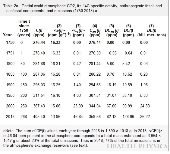
C(t) is total atm CO2, S(t) is Seuss 14C effect, CF(t) is FF atm CO2, CNF(t) is atm non-FF CO2, DE(t) is FF CO2 emissions

Summary

Despite an estimated 205 ppm of FF CO2 emitted since 1750, only 46.84 ppm (23%) of FF CO2 remains, while the other 77% is distributed into natural sinks/sources. As of 2018 atmospheric CO2 was 405, of which 12% (47 ppm) originated from FF.   And the other 88% (358 ppm) came from natural sources: 276 prior to 1750, and 82 ppm since.  Natural CO2 sources/sinks continue to drive rising atmospheric CO2, presently at a rate of 2 to 1 over FF CO2.

2.  Analysis of CO2 Flows Confirms Natural Dominance

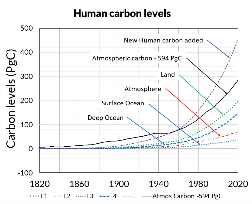
Figure 3. How human carbon levels change with time.

Independent research by Dr. Ed Berry focused on studying flows and level of CO2 sources and sinks.  The above summary chart from his published work presents a very similar result.

The graph above summarizes Dr. Berry’s findings. The lines represent CO2 added into the atmosphere since the 1750 level of 280 ppm. Based on IPCC data regarding CO2 natural sources and sinks, the black dots show the CO2 data. The small blue dots show the sum of all human CO2 emissions since they became measurable, irrespective of transfers of that CO2 from the atmosphere to land or to ocean.

Notice the CO2 data is greater than the sum of all human CO2 until 1960. That means nature caused the CO2 level to increase prior to 1960, with no reason to stop adding CO2 since. In fact, the analysis shows that in the year 2020, the human contribution to atmospheric CO2 level is 33 ppm, which means that from a 2020 total of 413 ppm, 280 is pre-industrial and 100 is added from land and ocean during the industrial era.

My synopsis of his work is IPCC Data: Rising CO2 is 75% Natural

A new carbon cycle model shows human emissions cause 25% and nature 75% of the CO2 increase is the title (and link) for Dr. Edwin Berry’s paper accepted in the journal Atmosphere August 12, 2021.

3. Nature Erases Pulses of Human CO2 Emissions  

Those committed to blaming humans for rising atmospheric CO2 sometimes admit that emitted CO2 (from any source) only stays in the air about 5 years (20% removed each year)  being absorbed into natural sinks.  But they then save their belief by theorizing that human emissions are “pulses” of additional CO2 which persist even when particular molecules are removed, resulting in higher CO2 concentrations.  The analogy would be a traffic jam on the freeway which persists long after the blockage is removed.

A recent study by Bud Bromley puts the fork in this theory.  His paper is A conservative calculation of specific impulse for CO2.  The title links to his text which goes through the math in detail.  Excerpts are in italics here with my bolds.

In the 2 years following the June 15, 1991 eruption of the Pinatubo volcano, the natural environment removed more CO2 than the entire increase in CO2 concentration due to all sources, human and natural, during the entire measured daily record of the Global Monitoring Laboratory of NOAA/Scripps Oceanographic Institute (MLO) May 17, 1974 to June 15, 1991. Then, in the 2 years after that, that CO2 was replaced plus an additional increment of CO2.

The data and graphs produced by MLO also show a reduction in slope of total CO2 concentration following the June 1991 eruption of Pinatubo, and also show the more rapid recovery of total CO2 concentration that began about 2 years after the 1991 eruption. This graph is the annual rate of change (i.e., velocity or slope) of total atmosphere CO2 concentration. This graph is not human CO2.

More recently is his study Scaling the size of the CO2 error in Friedlingstein et al.  Excerpts in italics with my bolds.

Since net human emissions would be a cumulative net of two fluxes, if there were a method to measure it, and since net global average CO2 concentration (i.e., NOAA Mauna Loa) is the net of two fluxes, then we should compare these data as integral areas. That is still an apples and oranges comparison because we only have the estimate of human emissions, not net human emissions. But at least the comparison would be in the right order of magnitude.

That comparison would look something like the above graphic. We would be comparing the entire area of the orange quadrangle to the entire blue area, understanding that the tiny blue area shown is much larger than actually is because the amount shown is human emissions only, not net human emissions. Human CO2 absorptions have not been subtracted. Nevertheless, it should be obvious that (1) B is not causing A, and (2) the orange area is enormously larger than the blue area.

Human emissions cannot be driving the growth rate (slope) observed in net global average CO2 concentration.

4.  Setting realistic proportions for the carbon cycle.

Hermann Harde applies a comparable perspective to consider the carbon cycle dynamics. His paper is Scrutinizing the carbon cycle and CO2 residence time in the atmosphere. Excerpts with my bolds.

Different to the IPCC we start with a rate equation for the emission and absorption processes, where the uptake is not assumed to be saturated but scales proportional with the actual CO2 concentration in the atmosphere (see also Essenhigh, 2009; Salby, 2016). This is justified by the observation of an exponential decay of 14C. A fractional saturation, as assumed by the IPCC, can directly be expressed by a larger residence time of CO2 in the atmosphere and makes a distinction between a turnover time and adjustment time needless.

Based on this approach and as solution of the rate equation we derive a concentration at steady state, which is only determined by the product of the total emission rate and the residence time. Under present conditions the natural emissions contribute 373 ppm and anthropogenic emissions 17 ppm to the total concentration of 390 ppm (2012). For the average residence time we only find 4 years.

The stronger increase of the concentration over the Industrial Era up to present times can be explained by introducing a temperature dependent natural emission rate as well as a temperature affected residence time. With this approach not only the exponential increase with the onset of the Industrial Era but also the concentrations at glacial and cooler interglacial times can well be reproduced in full agreement with all observations.

So, different to the IPCC’s interpretation the steep increase of the concentration since 1850 finds its natural explanation in the self accelerating processes on the one hand by stronger degassing of the oceans as well as a faster plant growth and decomposition, on the other hand by an increasing residence time at reduced solubility of CO2 in oceans. Together this results in a dominating temperature controlled natural gain, which contributes about 85% to the 110 ppm CO2 increase over the Industrial Era, whereas the actual anthropogenic emissions of 4.3% only donate 15%. These results indicate that almost all of the observed change of CO2 during the Industrial Era followed, not from anthropogenic emission, but from changes of natural emission. The results are consistent with the observed lag of CO2 changes behind temperature changes (Humlum et al., 2013; Salby, 2013), a signature of cause and effect. Our analysis of the carbon cycle, which exclusively uses data for the CO2 concentrations and fluxes as published in AR5, shows that also a completely different interpretation of these data is possible, this in complete conformity with all observations and natural causalities.

5.  More CO2 Is Not a Problem But a Blessing

William Happer provides a framework for thinking about climate, based on his expertise regarding atmospheric radiation (the “greenhouse” mechanism).  But he uses plain language accessible to all.  The Independent Institute published the transcript for those like myself who prefer reading for full comprehension.  Source: How to Think about Climate Change  

His presentation boils down to two main points:  More CO2 will result in very little additional global warming. But it will increase productivity of the biosphere.  My synopsis is: Climate Change and CO2 Not a Problem  Brief excerpts in italics with my bolds.

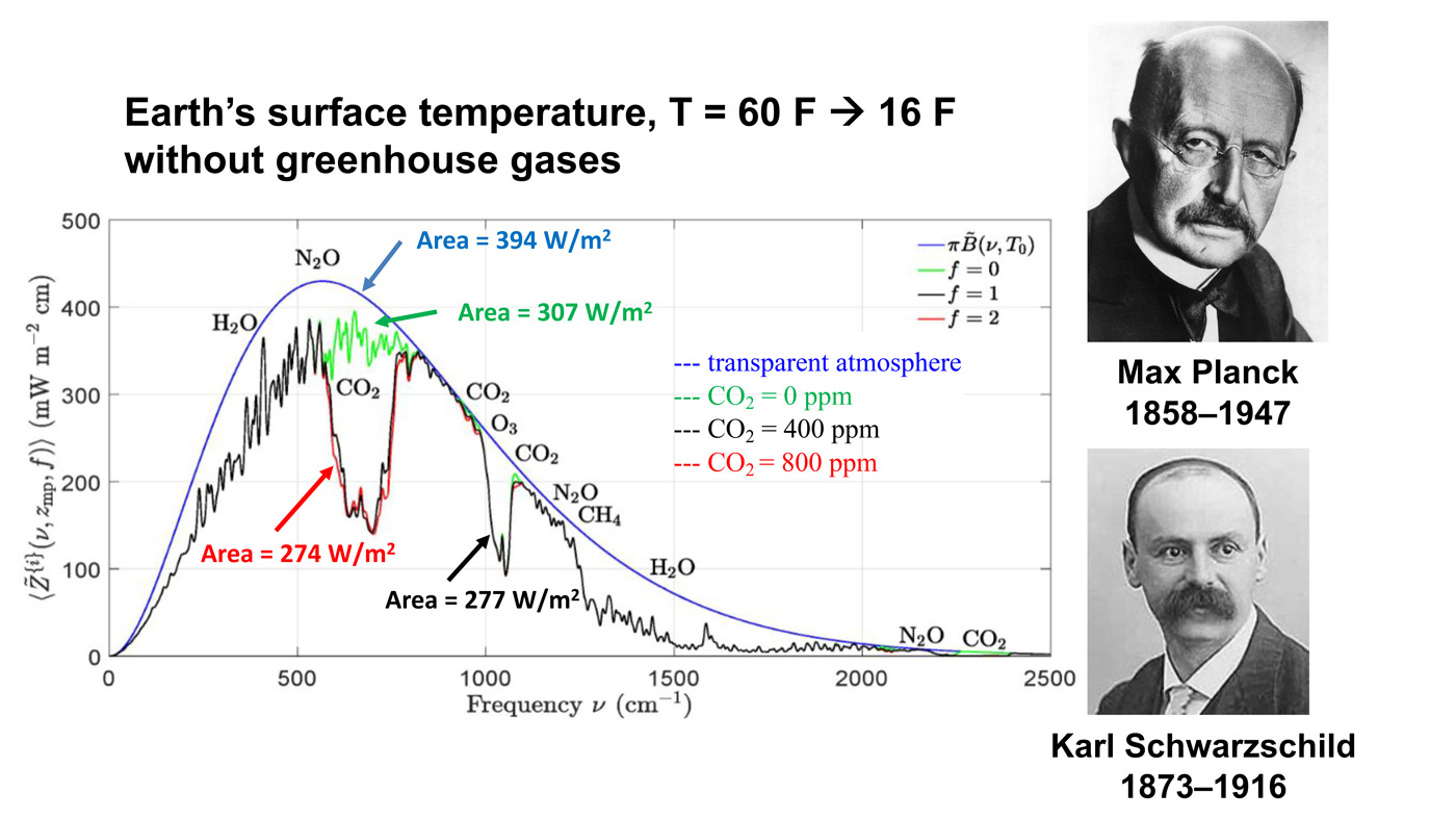
This is an important slide. There is a lot of history here and so there are two historical pictures. The top picture is Max Planck, the great German physicist who discovered quantum mechanics. Amazingly, quantum mechanics got its start from greenhouse gas-physics and thermal radiation, just what we are talking about today. Most climate fanatics do not understand the basic physics. But Planck understood it very well and he was the first to show why the spectrum of radiation from warm bodies has the shape shown on this picture, to the left of Planck. Below is a smooth blue curve. The horizontal scale, left to right is the “spatial frequency” (wave peaks per cm) of thermal radiation. The vertical scale is the thermal power that is going out to space. If there were no greenhouse gases, the radiation going to space would be the area under the blue Planck curve. This would be the thermal radiation that balances the heating of Earth by sunlight.

In fact, you never observe the Planck curve if you look down from a satellite. We have lots of satellite measurements now. What you see is something that looks a lot like the black curve, with lots of jags and wiggles in it. That curve was first calculated by Karl Schwarzschild, who first figured out how the real Earth, including the greenhouse gases in its atmosphere, radiates to space. That is described by the jagged black line. The important point here is the red line. This is what Earth would radiate to space if you were to double the CO2 concentration from today’s value. Right in the middle of these curves, you can see a gap in spectrum. The gap is caused by CO2 absorbing radiation that would otherwise cool the Earth. If you double the amount of CO2, you don’t double the size of that gap. You just go from the black curve to the red curve, and you can barely see the difference. The gap hardly changes.

The message I want you to understand, which practically no one really understands, is that doubling CO2 makes almost no difference.

The alleged harm from CO2 is from warming, and the warming observed is much, much less than predictions. In fact, warming as small as we are observing is almost certainly beneficial. It gives slightly longer growing seasons. You can ripen crops a little bit further north than you could before. So, there is completely good news in terms of the temperature directly. But there is even better news. By standards of geological history, plants have been living in a CO2 famine during our current geological period.

So, the takeaway message is that policies that slow CO2 emissions are based on flawed computer models which exaggerate warming by factors of two or three, probably more. That is message number one. So, why do we give up our freedoms, why do we give up our automobiles, why do we give up a beefsteak because of this model that does not work?

Takeaway message number two is that if you really look into it, more CO2 actually benefits the world. So, why are we demonizing this beneficial molecule that is making plants grow better, that is giving us slightly less harsh winters, a slightly longer growing season? Why is that a pollutant? It is not a pollutant at all, and we should have the courage to do nothing about CO2 emissions. Nothing needs to be done.

See Also Peter Stallinga 2023 Study  CO2 Fluxes Not What IPCC Telling You

Footnote:  The Core of the CO2 Issue Update July 15

An adversarial comment below goes to the heart of the issue:

“The increase of the CO2 level since 1850 are more than accounted for by manmade emissions.  Nature remains a net CO2 sink, not a net emitter.”

The data show otherwise.  Warming temperatures favor natural sources/sinks emitting more CO2 into the atmosphere, while previously captured CO2 shifts over time into long term storage as bicarbonates.  In fact, rising temperatures are predictive of rising CO2, as shown mathematically.

02/2025 Update–Temperature Changes, CO2 Follows

It is the ongoing natural contribution to atmospheric CO2 that is being denied.

Govt. Green Rules Make Appliances Cost More and Do Less

NYC going after pizza oven emissions. You’d have to burn a pizza stove 849 years to equal one year of John Kerry’s private jet

In his Master Resource article Energy Appliance Victory! (DC Circuit vs. DOE), Mark Krebs explains the DOE agency machinations targeting boilers as a case in point of government bureaucrats attacking everyone’s economic well-being in the name of saving the planet.  First, a contextual piece describes the game plan behind all this.  Later on, a synopsis of Kreb’s analysis of the tactics on the ground.

Background:  Why This Judgment Matters 
Biden’s Green Rules Make Appliances Cost More and Do Less

Authored by Kevin Stocklin at The Epoch Times, published at Planet Today.  Excerpts in italics with my bolds and added images.

The Biden administration announced in December 2022 its pledge to take “more than 100 actions” to impose significantly tighter environmental standards on consumer goods is now becoming reality.  And consumer groups are predicting a future in which Americans pay more for products that do less, while manufacturers warn of shortages and supply chain breakdowns.

“You’re seeing, just in the last few months, new rules from the Biden administration about clothes washers, dishwashers, and other kinds of kitchen appliances, and in every case, you’re talking about a tightening of already very, very tight standards,” O.H. Skinner, executive director of the Alliance for Consumers, told The Epoch Times. “That will make it so that nearly the majority of the current products on the market don’t meet the standards and have to be redesigned or removed from the market,” Skinner said.

“Everyday things that people actually want are going to get more expensive
or disappear, and the products that will be available will be more expensive
but not better. People are going to wonder why life is worse.”

The announcement touted 110 new regulations enacted by federal agencies on “everything from air conditioners and furnaces, to clothes washers and dryers, to kitchen appliances and water heaters—as well as commercial and industrial equipment.” According to the Biden administration: “Once finalized, these standards will reduce greenhouse gas emissions by an estimated 2.4 billion metric tons, equivalent to the carbon emissions from 10 million homes, 17 million gas cars, or 21 coal-fired power plants over 30 years. The projected consumer savings from these standards would be $570 billion cumulatively, and for an average household this will mean at least $100 in annual savings.”

The stoves are just the thin end of the wedge.

These actions follow a familiar pattern: rumors of new directives, followed by official denials, followed by draconian diktats.   For example, reports that the Consumer Product Safety Commission would ban gas stoves over alleged safety concerns sparked a public outcry in January, which was met with denials by the Commission, together with media ridicule, that any such thing was being contemplated. This was then followed by new environmental standards from the DOE that would ban the manufacturing of 50 percent of the gas stoves available on the market today.

Case in Point: DOE Rule on Boilers Vacated by DC Circuit Court

Mark Krebs explains the agency machinations in his Master Resource article Energy Appliance Victory! (DC Circuit vs. DOE).  Excerpts in italics with my bolds.

“The ‘wheels of justice turn slowly,’ but they indeed turned, even within the District of Columbia’s ‘uni-party.’ As for holding on to this victory, it is far from a slam-dunk for preserving consumer choice and free markets. I expect the struggle to escalate in Biden’s all-of-government war against natural gas and other fossil fuels.”

Beleaguered energy consumers were just handed a far-reaching victory by the United States Court of Appeals for the District of Columbia (DC Circuit). The ruling vacated a Final Rule from the U.S, Department of Energy (DOE) that would have banned the manufacture and sale of non-condensing boilers for use in commercial applications. DOE’s rule was challenged several years ago by natural gas interests–and later joined with a separate but similar case brought by the Air-Conditioning, Heating, and Refrigeration Institute (AHRI).

DOE’s failures were major and numerous. Previously, the Court had afforded DOE ample opportunities to rectify them, but they didn’t. Ultimately (reading in between the lines), it appears that the Court lost its patience with “the Agency” (DOE). One of the far-reaching results of this victory is that it undermines a veritable super-weapon of the administrative state: the Chevron Deference. This aspect will be discussed in more detail further down.

DC Circuit has set a precedent that illustrates how DOE routinely bends the rules to achieve its “administrative state” objectives. Consequently, DOE should exercise more care and transparency going forward with both present and future developments of appliance minimum efficiency standards.  However, it is probably more likely that DOE will find ways to get around it; perhaps drastically.

The end-result of this (amid many other analytical biases discussed in the Court ruling) is fatally skewed economic “determinations” that almost always favor stricter standards, regardless of the true economics.. As a result of this Court Order, such routine biases are now on public display to demonstrate the full intent of regulatory failures that occur within the intentionally opaque bureaucratic processes to ostensibly overcome so-called market failures.

Most important of all, fossil fuel industries should exploit this victory to illustrate just how fallible government agencies can be.  This decision goes far beyond the particulars of packaged commercial boilers. It goes to the heart of the question of government agency standing relative to actual stakeholders.

Ever since the “Chevron Deference” was put in place in 1984, federal courts have deferred to an agency’s ostensibly unique “subject matter expertise” for interpretating ambiguous statutes. Such is clearly the case when reviewing regulatory actions like promulgating rulemaking for mandating minimum energy efficiency standards for appliances. On May 1, 2023, the U.S. Supreme Court granted review in Loper Bright Enterprises v. Raimondo, No. 22-451, on whether to overturn or limit Chevron Deference.

Subsequently, perhaps the most important victory in this case is that it becomes a “poster child” for why the administrative state’s abuse of the Chevron Deference should end. At least in this instance, the Courts found DOE to be not worthy of deference. Perhaps SCOTUS will follow their lead.


Canada Road to Ruin Paved with Trudeau’s CO2 Intentions

Bill Bewick explains in his National Post article Federal climate policy makes us poorer.  Excerpts in italics wtih my bolds and added images.

The clean fuel standard on top of an escalating carbon tax and onerous emissions
targets will make everything more expensive

Canada is in an affordability crisis. Despite the pain felt by Canadians every day at the till or the gas pump, the federal government’s passion for world-leading carbon taxes and regulations is driving up the cost of everything while making us collectively poorer.

Tax advocates say it is a small % of GDP. But it is still $10 Billion extracted from Canadian households.

Canada Day saw the Clean Fuel Standards (CFS) regulation come into effect. A week earlier they passed a “Sustainable Jobs Act” that seeks to help transition workers away from highly productive jobs in oil, gas and related industries despite growing global demand for these energy sources.

The Parliamentary Budget Officer projects that by 2030 the net CFS cost will be over $1,100 per household in Alberta and Saskatchewan. While it will add roughly 17 cents on a litre of fuel (in addition to the carbon tax, of course) most of the costs will be on Canadian businesses, which means less jobs, less tax revenue and higher prices, making life more expensive with less ability to pay for it.

The fact is the world will need oil for the next 20-30 years at least. Canada is the responsible, reliable supplier many in the world would already prefer to get their energy from. With Canadian oilsands producers aggressively pursuing net zero operations by 2050, there is no better place to get oil from.

The demand for Liquefied Natural Gas (LNG) is booming globally. It should be vocally supported by anyone concerned with emissions since Canadian exports off our west coast would drive down the need for all the coal plants being built and planned in China and India. It also features an unprecedented level of Indigenous partnerships, offering an unparalleled opportunity for the economic self-sufficiency of countless communities.

Why would we “transition” these high-paying, unsubsidized jobs?
And transition them to what?

Well, the federal government seems to know that our oil and gas sector will have to shrink despite growing world demand. This is because in addition to steadily rising carbon taxes and the new CFS, they’ve arbitrarily demanded a 42 per cent reduction in emissions for the oil and gas sector in seven short years.

Requiring this drastic reduction by 2030 will force hasty and frantic changes as well as production cuts that will drive up energy prices for everyone while decreasing jobs and government revenues. That means more debt and more tax burden for Canadians, while hurting our economy and increasing our reliance on foreign oil.

An escalating carbon tax was supposed to let the economy decarbonize in an efficient way, but the federal government keeps piling on. This is crushing Canada’s competitiveness generally, especially after our American neighbours decided to go along with most of the rest of the world and not implement a carbon tax at all.

The fact that every manufacturer, farmer, trucker, and even commercial business owner on this side of the border has to pay these taxes on their fuel, heat, and power means everything is more expensive and will keep going up. Lower wages and job opportunities means we will be less and less able to afford it.

The government either says we must make these sacrifices for the planet, or that the green jobs they will transition to will be just as profitable and more sustainable. Their most recent example: the Volkswagen battery plant. There will be 3,000 jobs created, but the government will subsidize the plant with an estimated $13 billion. Does $4.3 million in taxpayer dollars per job sound sustainable to you?

As for our sacrifices saving the planet, carbon emissions are global. As Asia grows its economy, emissions are steadily rising. Canada can certainly “do its part” but other than massive LNG export to Asia, nothing we do with our declining 1.6 per cent share can meaningfully reduce overall global emissions.

There’s one more major federal policy being pursued that might be the most expensive of them all: the demand that every province’s electrical grid get to net zero by 2035. Canadian ratepayers spent billions to convert coal plants to gas and subsidize solar and wind projects. Now they are forcing us to get off natural gas entirely — a fuel source even the EU considers green.

Trying to do this in 12 years will cost an estimated $52 billion to achieve in Alberta alone, driving up power bills by 40 per cent. Nothing complements renewables like natural gas. If we want to keep the lights on when there’s no sun or wind, the only technology right now up to the task is natural gas plants — but the government seems to think higher power bills and less reliability is the way to go.

Canadians care about reducing emissions and it is happening. Canadians also care about affordability. We need to demand our governments find a balance between the two. If Canada recalibrates our carbon policies to be part of the global parade instead of driving off an economic cliff, we can have both.


See Also Canada Budget Officer Quashes Climate Alarm