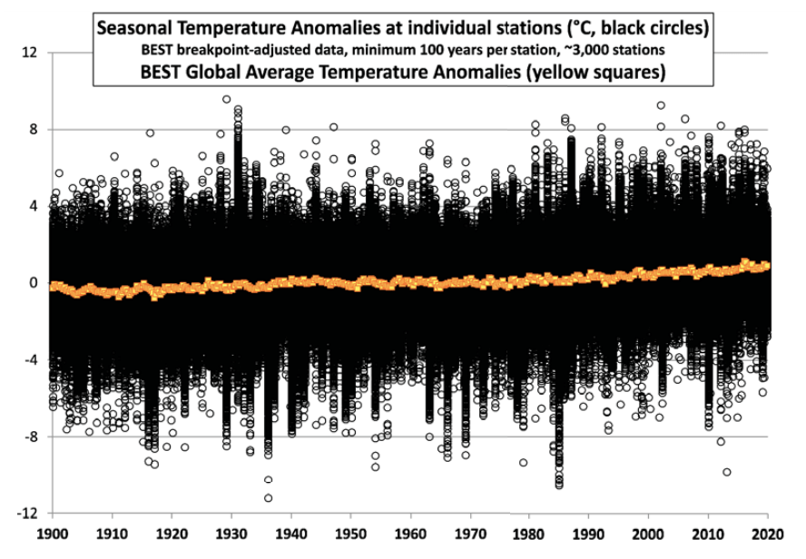
Figure 4. As in Fig. 3 except for seasonal station and global anomalies. As noted in the text, the inhabitants of the Earth experience the anomalies as noted by the black circles, not the yellow squares.
The CO2 Coalition does the world a service by publishing a brief public information about the temperature claims trumpeted in the media to stir up climate alarms. The pdf pamphlet is The Global Mean Temperature Anomaly Record How it works and why it is misleading by Richard S. Lindzen and John R. Christy. H/T John Ray. Excerpts in italics with my bolds.
Overview
At the center of most discussions of global warming is the record of the global mean surface temperature anomaly—often somewhat misleadingly referred to as the global mean temperature record. This paper addresses two aspects of this record. First, we note that this record is only one link in a fairly long chain of inference leading to the claimed need for worldwide reduction in CO2 emissions. Second, we explore the implications of the way the record is constructed and presented, and show why the record is misleading.
This is because the record is often treated as a kind of single, direct instrumental measurement. However, as the late Stan Grotch of the Laurence Livermore Laboratory pointed out 30 years ago, it is really the average of widely scattered station data, where the actual data points are almost evenly spread between large positive and negative values.
The average is simply the small difference of these positive and negative excursions, with the usual problem associated with small differences of large numbers: at least thus far, the approximately one degree Celsius increase in the global mean since 1900 is swamped by the normal variations at individual stations, and so bears little relation to what is actually going on at a particular one.
The changes at the stations are distributed around the one-degree global average increase. Even if a single station had recorded this increase itself, this would take a typical annual range of temperature there, for example, from -10 to 40 degrees in 1900, and replace it with a range today from -9 to 41. People, crops, and weather at that station would find it hard to tell this difference. However, the increase looks significant on the charts used in almost all presentations, because they omit the range of the original data points and expand the scale in order to make the mean change look large.
The record does display certain consistent trends, but it is also quite noisy, and fluctuations of a tenth or two of a degree are unlikely to be significant. In the public discourse, little attention is paid to magnitudes; the focus is rather on whether this anomaly is increasing or decreasing. Given the noise and sampling errors, it is rather easy to “adjust” such averaging, and even change the sign of a trend from positive to negative.
The Global Temperature Record and its Role
The earth’s climate system is notoriously complex. We know, for example, that this system undergoes multiyear variations without any external forcing at all other than the steady component of the sun’s radiation (for example, the El Niño Southern Oscillation and the Quasibiennial Oscillation of the tropical stratosphere). We know, moreover, that these changes are hardly describable simply by some global measure of temperature. Indeed, what is presented is actually something else. You may have noticed that it is referred to as the global mean temperature anomaly.
What is being averaged is the deviation of the surface temperature from some 30-year mean at stations non-randomly scattered around the globe. As we will soon see, this average bears rather little relation to the changes at the individual stations. Moreover, as noted by Christy and McNider (2017), the temperature anomaly of the lower troposphere (measured by satellites) relative to the surface temperature is much better sampled and represents the “more climate-relevant quantity of heat content, a change in which is a [theorized] consequence of enhanced GHG forcing.”
However imprecise and lightly-relevant the surface temperature is to the physics of the issue, the narrative of a global warming disaster uses the record as the first in a sequence of often comparably questionable assumptions. The narrative first claims that changes in this dubious metric are almost entirely due to variations in CO2, even though there are quite a few other factors whose common variations are as large as or larger than the impact of changes in CO2 (for example, modest changes in the area of upper and lower level clouds or changes in the height of upper level clouds).
Then the narrative asserts that changes in CO2 were primarily due to man’s activities. There is indeed evidence that this link is likely true for changes over the past two hundred years. However, over Earth’s history, there were radical changes in CO2 levels, and these changes were largely uncorrelated with changes in temperature.
Presentations of the Global Mean Temperature Anomaly Record
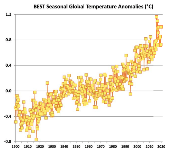
In order to obscure the fact that the global means are small residues of large numbers whose precision is questionable, the common presentations plot the global mean anomalies without the scattered points and expand the scale so as to make the changes look large. These expanded graphs of global means are shown in Figures 5 and 6.

Figure 6. Global seasonal anomalies of temperature from Fig. 4 without station anomalies. Note
the range here is -0.8 to +1.2 °C, or 9 times less than Figs. 2 and 4.
The frequently cited trends are evident in these graphs–most notably, the pre-CO2 warming from 1920-1940 and the warming that has been attributed to man from 1978-1998. We also see a reduced rate from 1998 (best seen in Fig. 6) until the major El Niño of 2016 occurred. Even if one could attribute all the 1978-1998 warming to the increases in CO2 , the slowdown clearly shows that there is something going on that is at least as large as the response to CO2 . This contradicts the IPCC attribution studies that assume, based on model results, that other sources of variability since 1950 are negligible.
Note that the results in Figures 5 and 6 are quite noisy, with large interseasonal and interannual fluctuations. This noise contributes to the uncertainty of the values, in addition to the usual sampling errors. The graphs one usually sees are a lot smoother looking than what we see in Figures 5 and 6; these have resulted from taking running means over 5 or more years. The results of such smoothing are shown in Figure 7 (smoothed over 11 years) and 8 (smoothed over 21 seasons, or about 5 years). They look much cleaner and presumably more authoritative than the unsmoothed results or the scatter diagrams, but this tends to disguise the uncertainty, which is likely on the order of 0.1-0.2 degrees. (For example, Figure 7 substantially disguises the pause following 1998; Figure 8 does this less because it is averaged over only about 5 years.)
Obviously, warmings or coolings of a tenth or two of a degree are without significance since possible adjustments can easily lead to changes of sign from positive to negative, yet in the popular literature much is made of such small changes. Like with sausage, you might not want to know what went into these graphs, but, in this case, it is important that you do.
Some Concluding Remarks
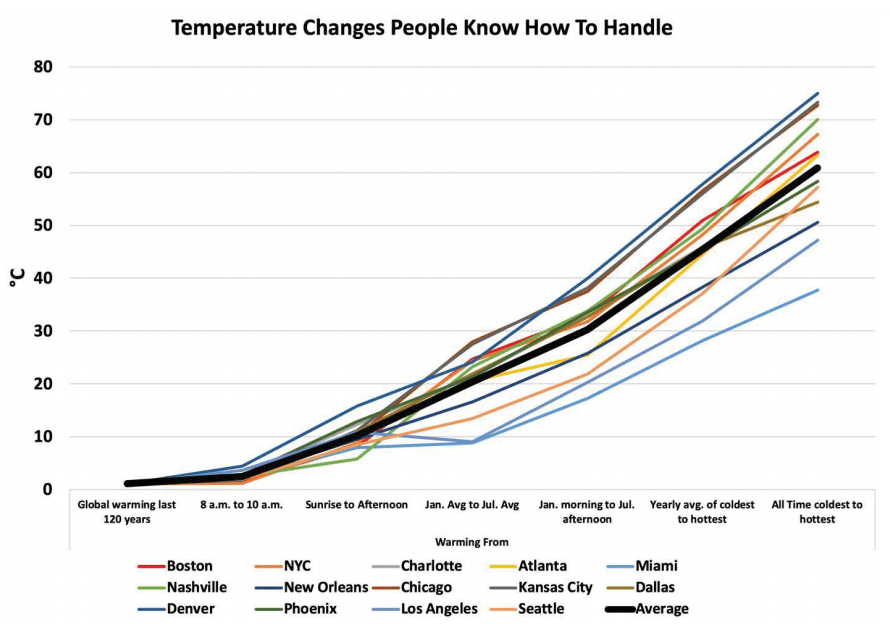
An examination of the data that goes into calculating the global mean temperature anomaly clearly shows that any place on earth is almost as likely, at any given time, to be warmer or cooler than average. The anomaly is the small residue of the generally larger excursions we saw in Figures 1 and 2. This residue (which is popularly held to represent “climate”) is also much smaller than the temperature variations that all life on Earth regularly experiences. Figure 9 illustrates this for 14 major cities in the United States.
Indeed, the 1.2 degree Celsius global temperature change in the past 120 years, depicted as alarming in Figure 7, is only equivalent to the thickness of the “Average” line in Figure 9. As the figure shows, the difference in average temperature from January to July in these major cities ranges from just under ten degrees in Los Angeles to nearly 30 degrees in Chicago. And the average difference between the coldest and warmest moments each year ranges from about 25 degrees in Miami (a 45 degree Fahrenheit change) to 55 degrees in Denver (a 99 degree Fahrenheit change)
At the very least, we should keep the large natural changes in Figure 9 in mind, and not attribute them to the small residue, the global mean temperature anomaly, or obsess over its small changes.
See Also Temperature Misunderstandings

Clive Best provides this animation of recent monthly temperature anomalies which demonstrates how most variability in anomalies occur over northern continents.

Hi Ron,
The notion above „ warming from 1920-1940” haunts me since long, and due to a recent paper
(as many others) titled “Rapid reductions and millennial-scale variability in Nordic Seas sea ice cover during abrupt glacial climate changes” by researcher Henrik Sadatzki, et al., (which is again superficial), I took on the issue yesterday: “A big Arctic Warming started 102 Years ago! Human caused? The interest is nil!” https://oceansgovernclimate.com/1885-2/
I also wonder either why Richard Lindzen and John Christy think it makes sense to discuss -Global Mean Temperature- since 1900, without mentioning the oceans.
How much longer will it further take climatology to investigate the human impact on the warming from 1920-1940? However, it is a good opportunity wishing you a fine holiday season!
Stay healthy,
ArndB
LikeLike
Thanks Arnd, it’s good to hear from you. In this crazy year, best wishes for a better 2021 are more needed than ever. As for Christy and Lindzen, they did mention ENSO as a major internal climate system factor. But as you hove long said, the naval warfare disturbances of the ocean water structure have never been taken seriously by others. They do want to blame it on humans, but there’s no profit in any other theory than CO2 obsession.
LikeLike
Reblogged this on Climate Collections.
LikeLike