We are about 50 days away from the annual Arctic ice extent minimum, which typically occurs on or about day 260 (mid September). Some take any year’s slightly lower minimum as proof that Arctic ice is dying, but the image below shows the third week in July over the last 11 years. The Arctic heart is beating clear and strong.
Open image in new tab to enlarge.
These are weekly ice charts from AARI in St. Petersburg. The legend says the brown area is 7/10 to 10/10 ice concentration, while green areas are 1/10 to 6/10 ice covered. North American arctic areas are not analyzed in these images.
Over this decade, the Arctic ice minimum has not declined, but since 2007 looks like fluctuations around a plateau. By mid-September, all the peripheral seas have turned to water, and the residual ice shows up in a few places. The table below indicates where we can expect to find ice this next September. Numbers are area units of Mkm2 (millions of square kilometers).
Day 260
12 yr
Arctic Regions
2007
2010
2012
2014
2015
2016
2017
2018
Average
Central Arctic Sea
2.67
3.16
2.64
2.98
2.93
2.92
3.07
2.91
2.93
BCE
0.5
1.08
0.31
1.38
0.89
0.52
0.84
1.16
0.89
LKB
0.29
0.24
0.02
0.19
0.05
0.28
0.26
0.02
0.16
Greenland & CAA
0.56
0.41
0.41
0.55
0.46
0.45
0.52
0.41
0.46
B&H Bays
0.03
0.03
0.02
0.02
0.1
0.03
0.07
0.05
0.03
NH Total
4.05
4.91
3.4
5.13
4.44
4.2
4.76
4.56
4.48
The table includes three early years of note along with the last 5 years compared to the 12 year average for five contiguous arctic regions. BCE (Beaufort, Chukchi and East Siberian) on the Asian side are quite variable as the largest source of ice other than the Central Arctic itself. Greenland Sea and CAA (Canadian Arctic Archipelago) together hold almost 0.5M km2 of ice at annual minimum, fairly consistently. LKB are the European seas of Laptev, Kara and Barents, a smaller source of ice, but a difference maker some years, as Laptev was in 2016. Baffin and Hudson Bays are almost inconsequential as of day 260.
For context, note that the average maximum has been 15M, so on average the extent shrinks to 30% of the March high before growing back the following winter.
Reuseable Trump straws in durable plastic never stop keeping you hydrated. Now available for $15 a pack; proceeds go to a worthy cause: Trump re-election campaign.
“Now you can finally be free from liberal paper straws that fall apart within minutes and ruin your drink,” stated Trump Campaign Manager Brad Parscale in a fundraising email. “Trump Straws are custom made with the Official Trump Logo, recyclable and reusable, and, as always, 100% MADE IN AMERICA.”
Liking him or not doesn’t matter: He is the one stopping the climate lunatics from taking over the asylum.
All the doom-mongers said that Greenland would melt from the Europe stagnant air. Ha! This demonstrates interesting physics.
The warm air just bounces off Greenland. This shows the permanent high pressure air over the ice, and shows the winds.
And the ice stays as cold as ever. I never realized it before, but this demonstrates my concept of an ‘ice block’, which is a major component of my hypothesis for major ice advances. No need for solar cycles.
The glacier creates its own weather. That comes mainly from the ability to shed off solar heat flux, and to maintain a high pressure zone. This seems to only happen for continental ice sheets, the Arctic ocean has its own problems with the sea trying to melt it from below, so it isn’t cold enough for weather-making.
Thus, once a continental ice sheet starts (or the Arctic ice becomes very thick), then it’s a ‘snowball’ effect. The true Ice Age starts. But, as I have said, there is the little problem of the continents sinking under ice load, so we won’t have this for another few thousand years.
All the papers that reported this doom won’t follow through. People will be left with the impression that Greenland is melting, and impressions are what the warmies live on.
People who struggle with anxiety are known to have moments of “hair on fire.” IOW, letting your fears take over is like setting your own hair on fire. Currently the media, pandering as always to primal fear instincts, is declaring that the Arctic is on fire, and it is our fault. Let’s see what we can do to help them get a grip.
1. Summer is fire season for northern boreal forests and tundra.
Since 1990, “wildland fires” across Canada have consumed an average of 2.5 million hectares a year.
Recent Canadian Forest Fire Activity
2015
2016
2017
Area burned (hectares)
3,861,647
1,416,053
3,371,833
Number of fires
7,140
5,203
5,611
The total area of Forest and other wooded land in Canada is 396,433,600 (hectares). So the data says that every average year 0.6% of Canadian wooded area burns due to numerous fires, ranging from 1000 in a slow year to over 10,000 fires and 7M hectares burned in 1994.
2. With the warming since 1980 some years have seen increased areas burning.
Despite the low annual temperatures and short growing seasons characteristic of northern ecosystems, wildland fire affects both boreal forest (the broad band of mostly coniferous trees that generallystretches across the area north of the July 13° C isotherm in North America and Eurasia, also known as Taiga) and adjacent tundra regions. In fact, fire is the dominant ecological disturbance in boreal forest, the world’s largest terrestrial biome. Fire disturbance affects these high latitude systems at multiple scales, including direct release of carbon through combustion (Kasischke et al., 2000) and interactions with vegetation succession (Mann et al., 2012; Johnstone et al., 2010), biogeochemical cycles (Bond-Lamberty et al., 2007), energy balance (Rogers et al., 2015), and hydrology (Liu et al., 2005). About 35% of global soil carbon is stored in tundra and boreal systems (Scharlemann et al., 2014) that are potentially vulnerable to fire disturbance (Turetsky et al., 2015). This brief report summarizes evidence from Alaska and Canada on variability and trends in fire disturbance in high latitudes and outlines how short-term fire weather conditions in these regions influence area burned.
Climate is a dominant control of fire activity in both boreal and tundra ecosystems. The relationship between climate and fire is strongly nonlinear, with the likelihood of fire occurrence within a 30-year period much higher where mean July temperatures exceed 13.4° C (56° F) (Young et al., 2017). High latitude fire regimes appear to be responding rapidly to recent environmental changes associated with the warming climate. Although highly variable, area burned has increased over the past several decades in much of boreal North America (Kasischke and Turetsky, 2006; Gillett et al., 2004). Since the early 1960s, the number of individual fire events and the size of those events has increased, contributing to more frequent large fire years in northwestern North America (Kasischke and Turetsky, 2006). Figure 1 shows annual area burned per year in Alaska (a) and Northwest Territories (b) since 1980, including both boreal and tundra regions.
[Comment: Note that both Alaska and NW Territories see about 500k hectares burned on average each year since 1980. And in each region, three years have been much above that average, with no particular pattern as to timing.]
Recent large fire seasons in high latitudes include 2014 in the Northwest Territories, where 385 fires burned 8.4 million acres, and 2015 in Alaska, where 766 fires burned 5.1 million acres (Figs. 1 & 2)—more than half the total acreage burned in the US (NWT, 2015; AICC, 2015). Multiple northern communities have been threatened or damaged by recent wildfires, notably Fort McMurray, Alberta, where 88,000 people were evacuated and 2400 structures were destroyed in May 2016. Examples of recent significant tundra fires include the 2007 Anaktuvuk River Fire, the largest and longest-burning fire known to have occurred on the North Slope of Alaska (256,000 acres), which initiated widespread thermokarst development (Jones et al., 2015). An unusually large tundra fire in western Greenland in 2017 received considerable media attention.
Large fire events such as these require the confluence of receptive fuels that will promote fire growth once ignited, periods of warm and dry weather conditions, and a source of ignition—most commonly, convective thunderstorms that produce lightning ignitions. High latitude ecosystems are characterized by unique fuels—in particular, fast-drying beds of mosses, lichens, resinous shrubs, and accumulated organic material (duff) that underlie dense, highly flammable conifers. These understory fuels cure rapidly during warm, dry periods with long daylight hours in June and July. Consequently, extended periods of drought are not required to increase fire danger to extreme levels in these systems.
Most acreage burned in high latitude systems occurs during sporadic periods of high fire activity; 50% of the acreage burned in Alaska from 2002 to 2010 was consumed in just 36 days (Barrett et al., 2016). Figure 3 shows cumulative acres burned in the four largest fire seasons in Alaska since 1990 (from Fig. 1) and illustrates the varying trajectories of each season. Some seasons show periods of rapid growth during unusually warm and dry weather (2004, 2009, 2015), while others (2004 and 2005) were prolonged into the fall in the absence of season-ending rain events. In 2004, which was Alaska’s largest wildfire season at 6.6 million acres, the trajectory was characterized by both rapid mid-season growth and extended activity into September. These different pathways to large fire seasons demonstrate the importance of intraseasonal weather variability and the timing of dynamical features. As another example, although not large in total acres burned, the 2016 wildland fire season in Alaska was more than 6 months long, with incidents requiring response from mid-April through late October (AICC, 2016).
3. Wildfires are part of the ecology cycle making the biosphere sustainable.
In the moist forests of the west coast, wildland fires are relatively infrequent and generally play a minor ecological role.
In boreal forests, the complete opposite is true. Fires are frequent and their ecological influence at all levels—species, stand and landscape—drives boreal forest vegetation dynamics. This in turn affects the movement of wildlife populations, whose need for food and cover means they must relocate as the forest patterns change.
lThe Canadian boreal forest is a mosaic of species and stands. It ranges in composition from pure deciduous and mixed deciduous-coniferous to pure coniferous stands.
The diversity of the forest mosaic is largely the result of many fires occurring on the landscape over a long period of time. These fires have varied in frequency, intensity, severity, size, shape and season of burn.
The fire management balancing act: Fire is a vital ecological component of Canadian forests and will always be present.
Not all wildland fires should (or can) be controlled. Forest agencies work to harness the force of natural fire to take advantage of its ecological benefits while at the same time limiting its potential damage and costs.
Circumpolar tundra fires have primarily occurred in the portions of the Arctic with warmer summer conditions, especially Alaska and northeastern Siberia (Figure 1). Satellite-based estimates (Giglio et al. 2010; Global Fire Emissions Database 2015) show that for the period of 2002–2013, 0.48% of the Alaskan tundra has burned, which is four times the estimate for the Arctic as a whole (0.12%; Figure 1). These estimates encompass tundra ecoregions with a wide range of fire regimes. For instance, within Alaska, the observational record of the past 60 years indicates that only 1.4% of the North Slope ecoregion has burned (Rocha et al. 2012); 68% of the total burned area in this ecoregion was associated with a single event, the 2007 AR Fire.
The Noatak and Seward Peninsula ecoregions are the most flammable of the tundra biome, and both contain areas that have experienced multiple fires within the past 60 years (Rocha et al. 2012). This high level of fire activity suggests that fuel availability has not been a major limiting factor for fire occurrence in some tundra regions, probably because of the rapid post-fire recovery of tundra vegetation (Racine et al. 1987; Bret-Harte et al. 2013) and the abundance of peaty soils.
However, the wide range of tundra-fire regimes in the modern record results from spatial variations in climate and fuel conditions among ecoregions. For example, frequent tundra burning in the Noatak ecoregion reflects relatively warm/dry climate conditions, whereas the extreme rarity of tundra fires in southwestern Alaska reflects a wet regional climate and abundant lakes that act as natural firebreaks.
Fire alters the surface properties, energy balance, and carbon (C) storage of many terrestrial ecosystems. These effects are particularly marked in Arctic tundra (Figure 5), where fires can catalyze biogeochemical and energetic processes that have historically been limited by low temperatures.
In contrast to the long-term impacts of tundra fires on soil processes, post-fire vegetation recovery is unexpectedly rapid. Across all burned areas in the Alaskan tundra, surface greenness recovered within a decade after burning (Figure 6; Rocha et al. 2012). This rapid recovery was fueled by belowground C reserves in roots and rhizomes, increased nutrient availability from ash, and elevated soil temperatures.
At present, the primary objective for wildland fire management in tundra ecosystems is to maintain biodiversity through wildland fires while also protecting life, property, and sensitive resources. In Alaska, the majority of Arctic tundra is managed under the “Limited Protection” option, and most natural ignitions are managed for the purpose of preserving fire in its natural role in ecosystems. Under future scenarios of climate and tundra burning, managing tundra fire is likely to become increasingly complex. Land managers and policy makers will need to consider trade-offs between fire’s ecological roles and its socioeconomic impacts.
4. Arctic fire regimes involve numerous interacting factors.
Although our fire-history records provide unique insights into the potential response of modern tundra ecosystems to climate and vegetation change, they are imperfect analogs for future fire regimes. First, ongoing vegetation changes differ from those of the late-glacial period: several shrub taxa (Salix, Alnus, and Betula) are currently expanding into tundra [10], whereas Betula was the primary constituent of the ancient shrub tundra. The lower flammability of Alnus and Salix compared to Betula could make future shrub tundra less flammable than the ancient shrub tundra. Second, mechanisms of past and future climate change also differ. In the late-glacial and early-Holocene periods, Alaskan climate was responding to shrinking continental ice volumes, sea-level changes, and amplified seasonality arising from changes in the seasonal cycle of insolation [13]; in the future, increased concentrations of atmospheric greenhouse gases are projected to cause year-round warming in the Arctic, but with a greater increase in winter months [8]. Finally, we know little about the potential effects of a variety of biological and physical processes on climate-vegetation-fire interactions. For example, permafrost melting as a result of future warming [8] and/or increased burning [24] could further facilitate fires by promoting shrub expansion [10], or inhibit fires by increasing soil moisture [24].
5. The Arctic has adapted to many fire regimes stronger than today’s activity.
Fire history in the Noatak also suggests that subtle changes in vegetation were linked to changes in tundra fire occurrence. Spatial variability across the study region suggests that vegetation responded to local-scale climate, which in turn influenced the flammability of surrounding areas. This work adds to evidence from ‘ancient’ shrub tundra in the southcentral Brooks Range suggesting that vegetation change will likely modify tundra fire regimes, and it further suggests that the direction of this impact will depend upon the specific makeup of future tundra vegetation. Ongoing climate-related vegetation change in arctic tundra such as increasing shrub abundance in response to warming temperatures (e.g., Tape et al. 2006), could both increase (e.g., birch) or decrease (e.g., alder) the probability of future tundra fires.
This study provides estimated fire return intervals (FRIs) for one of the most flammable tundra ecosystems in Alaska. Fire managers require this basic information, and it provides a valuable context for ongoing and future environmental change. At most sites, FRIs varied through time in response to changes in climate and local vegetation. Thus, an individual mean or median FRI does not capture the range of variability in tundra fire occurrence. Long-term mean FRIs in many periods were both shorter than estimates based on the past 60 years and statistically indistinct from mean FRIs found in Alaskan boreal forests (e.g., Higuera et al. 2009) (Figure 2). These results imply that tundra ecosystems have been resilient to relatively frequent burning over the past 6,000 years, which has implications for both managers and scientists concerned about environmental change in tundra ecosystems. For example, increased tundra fire occurrence could negatively impact winter forage for the Western Arctic Caribou Herd (Joly et al. 2009). Although the Noatak is only a portion of this herd’s range, our results indicate that if caribou utilized the study area over the past 6,000 years, then they have successfully co-existed with relatively frequent fire.
Ever since the IPCC report in 2018, there’s been an increasing surge of doomist reporting, to the point that it is no surprise that there are many of our youngsters are naturally depressed and suicidal, thinking there is little point in life, and that they won’t live to be adults. Others are leading the way with politically unrealistic demands that we decarbonize completely within 12 years. These new requirements they are making are not supported at all by science, rather they are a result of emotional rhetoric, journalistic exaggerations, and junk science that they do not know how to evaluate correctly. The situation is indeed urgent. We are already doing much, we need to ramp up quickly, but we do not have only 12 years to do it. Also, the future does not risk collapse of civilization or human extinction on any scenario.
The paper is called Why setting a climate deadline is dangerous and it says in its subtitle / short abstract:
The publication of the IPCC Special Report on global warming of 1.5°C paved the way for the rise of the political rhetoric of setting a fixed deadline for decisive actions on climate change. However, the dangers of such deadline rhetoric suggest the need for the IPCC to take responsibility for its report and openly challenge the credibility of such a deadline.
Journalists have been saying that we have twelve years to act to save the planet. Now many are “upping the ante” and saying we have only 18 months, with the implication that if we don’t do very drastic action by 2020, then civilization will collapse and humans likely go extinct. They use very emotive words such as that this action is needed for our very survival. Many of our youngsters, and adults too, take this quite literally, they think that by the time they reach adulthood, in a little over a decade, the world will no longer have any humans in it, that our civilization and species will be gone. This is why I think it is a responsibility for science bloggers like myself and journalists to speak up against this.
But the authors say the situation has got so out of hand that the IPCC should say something to make it clear how badly they have been misrepresented in the media. They argue, basically, that to stay silent in this situation is the more political thing to do. It is to give tacit report to this doomist framing. This also is an important and valid point. I hear that a lot – if the journalists are wrong, scared people ask, why don’t the IPCC say?
If you listen to what the IPCC themselves say, they do not talk about a risk of human extinction or collapse of civilization. There is no mention of such ideas anywhere in the report, or the press conference the journalists attended, their response to questions or the short summaries by the co-chairs. That is all JOURNALISTIC INVENTION, HYPERBOLE, SIMPLIFIED CLIMATE SLOGANS, AND JUNK SCIENCE.
The story of the Modern Warming Spike (AKA the Hockey Stick) and its Rise and Fall is recounted in a previous post, reprinted later on. The news today is about a fresh initiative to reassert the discredited analysis using a new temperature reconstruction combining proxies stored by the PAGES2K network.
In a recent post Marcel Crok described his initiation into the climate wars as a young science journalist and discovering that two Canadians (Ross McKitrick and Steve McIntyre) had proved false Michael Mann’s modern warming spike. As he says correctly:
The arguments of the critics were not difficult to refute and the work of the two Canadians stands firmly to this day. I was intrigued by the quite aggressive and also defensive reaction of the climate scientists. Up to this day the criticism of the Canadians has never been fully addressed by the climate science community or the IPCC. Wasn’t this about the progress of science?
Just in time for the Year without a Summer in North America, we have a coordinated blitz of articles claiming present day warming never happened before. Just a sample from yesterday:
New climate studies bust sceptics’ ‘Little Ice Age’ theory Newshub17:13
Global warming is happening at a speed and scale ‘unprecedented’ in the last 2,000 years Daily Mail17:10
Trees tell us: this heating is different Stuff.co.nz17:04
Global warming dwarfs climate variations of past 2,000 years Thomson Reuters Foundation News16:50
2,000 years of records show it’s getting hotter, faster The Conversation (AU)15:59
Climate is warming faster than it has in 2,000 years USA Today EU15:52
Causes of multidecadal climate changes ScienceDaily15:51
20th-century warming ‘unmatched’ in 2,000 years AFP15:41
Unlike Modern Climate Change, the Biggest Swings in Recorded History Were Just Regional Patterns Discover Magazine15:07
Global extent of climate change is ‘unparalleled’ in past 2,000 years Carbon Brief14:18
Recent warming ‘unmatched in the past 2000 years’ Cosmos14:11
Climate is warming faster than it has in the last 2,000 years ScienceDaily13:50
New global warming study definitively proves climate deniers wrong The Independent13:49
Earth warmed faster in the last few decades than the previous 1,900 years, study says Los Angeles Times13:48
Global warming ‘unparalleled’ in 2,000 years BBC13:33
Recent climate change trends ‘unprecedented’ in the last 2,000 years CNET13:30
Global warming dwarfs climate variations of past 2,000 years – study Reuters13:29
The climate is warming faster than it has in the last 2,000 years BrightSurf.com13:29
Modern Climate Change Is the Only Worldwide Warming Event of the Past 2,000 Years Smithsonian Magazine13:18
“They’ve shown that not only is the warming that we’ve experienced in the last few decades larger in magnitude than the kinds of changes we’ve seen due to natural factors in the past, [but] it’s affecting almost the entire planet in the same way at the same time,” St. George says. “That’s really different than earlier prolonged climate changes due to natural factors which sometimes affected a large part of the planet but nothing close to 100 percent. The current warming that we’re going through is almost everywhere, and that’s what really makes it distinct from earlier climatic events due to natural causes.”
Then the Realism:
Kevin Anchukaitis, a paleoclimatologist at the University of Arizona not involved in the research, says the idea that the Medieval period and Little Ice Age weren’t eras of truly global changehas been discussedin previous studies, and the authors’ recent conclusions support that earlier work. “They were broad warm and cold periods, within which different regions of the globe had their coldest or warmest periods at different times. For the Little Ice Age, we know this is linked to volcanism,” Anchukaitis says.
Despite the fact that more data is available to paleoclimatologists than ever before, Anchukaitis believes that significantly more work needs to be done if scientists are to gather a truly global picture of past climate. “To make progress in understanding the climate of the [past 2,000 years], we should move beyond applying a smorgasbord of different statistical methods,” he says via email. Instead, scientists need a renewed effort to gather paleoclimate records from places and times that are underrepresented in compilations like PAGES 2k.
“The proxy network is largely Northern Hemisphere tree-rings, tropical records (corals) decline rapidly by 1600, and there are relatively few Southern Hemisphere records outside of the Antarctic ice cores,” Anchukaitis says. “So claims about global spatial patterns prior to about 1600, particularly for the tropics and southern hemisphere, must be viewed cautiously.”
My Comment: There is no such thing as a global climate. Climates are regional, local and even micro in their distinctive patterns of temperature and precipitation. Analyses of the Koppen climate zones show that boundaries are shifting very little over the last 100 years, and that warming and cooling remains highly variable over the earth’s surface. [See Data vs. Models #4: Climates Changing]
Moreover, the paleoproxies remain problematic and subject to both manipulation and biased interpretation. Steve McIntyre has extensive critques of PAGES at his blog Climate Audit. For example in Sept. 2015 he discussed The Ocean2K “Hockey Stick”, a study with very similar claims:
Today, the Earth is warming about 20 times faster than it cooled during the past 1,800 years,” said Michael Evans, second author of the study and an associate professor in the University of Maryland’s Department of Geology and Earth System Science Interdisciplinary Center (ESSIC). “This study truly highlights the profound effects we are having on our climate today.”
McIntyre observed:
One of the reasons for the strange lack of interest in this newest proxy “Hockey Stick” was that the proxy data didn’t actually show “the climate was warming about 20 times faster than it cooled during the past 1,800 years”. The OCEAN2K reconstruction (see Figure 1 below) had a shape that anyone would be hard-pressed to describe as a “Hockey Stick”. It showed a small decrease over the past two millennia with the most recent value having a tiny uptick from its predecessor, but, whatever image one might choose to describe its shape, “Hockey Stick” is not one of them.
Previous Post: The Rise and Fall of the Modern Warming Spike
The first graph appeared in the IPCC 1990 First Assessment Report (FAR) credited to H.H.Lamb, first director of CRU-UEA. The second graph was featured in 2001 IPCC Third Assessment Report (TAR) the famous hockey stick credited to M. Mann.
A previous post Rise and Fall of CAGW described the process that began with Hansen’s flashy Senate testimony in 1988, later supported by Santer’s flashy paper in 1996. This post traces a second iteration that ensued following Michael Mann’s production of the infamous Climate Hockey Stick graph in 1998. The image at the top comes from the 2001 IPCC TAR (Third Assessment Report) signifying the immediate embrace of this alarmist tool by consensus climatists. The message of the graph was to assert a spike in modern warming unprecedented in the last 1000 years. This claim of a “Modern Warming Spike” required a flat temperature profile throughout the Middle Ages (since 1000 AD).
The background to the process steps (image below) from Ross Pomeroy’s paper is provided followed by text and references for the rise and fall of the theory intended to erase Medieval Warming comparable to the present day. Sources of material are listed at the end and included here with my bolds.
How Theories Advance and Collapse
Seeing how disarray defines psychology, it makes perfect sense that the field’s leading theories are vulnerable to collapse. Having watched this process play out a number of times, a clear pattern has emerged. Let’s call it the “Six Stages of a Failed Psychological or Sociological Theory.”
Stage 1: The Flashy Finding. An intriguing report is published with subject matter that lends itself to water cooler conversation, say, for example, that sticking a pen in your mouth to force a smile makes things seem funnier. Media outlets provide gushing coverage.
Stage 1 Modern Warming Spike Theory
Figure 2.20: Millennial Northern Hemisphere (NH) temperature reconstruction (blue) and instrumental data (red) from AD 1000 to 1999, adapted from Mann et al. (1999). Smoother version of NH series (black), linear trend from AD 1000 to 1850 (purple-dashed) and two standard error limits (grey shaded) are shown. Source: IPCC Third Assessment Report
Since the IPCC believes that the warming from 1975 to 1998 was mainly man-made, but not the warming in earlier centuries, it would like to be able to demonstrate that recent warming is ‘unprecedented’. But it isn’t. Temperatures in many parts of the world appear to be lower than they were in the Medieval Warm Period (MWP, c. 900-1400), and also in the earlier Roman Warm Period (c. 200 BC – 600 AD). During the MWP the Vikings tilled now-frozen farms in Greenland and were buried there in ground that is now permafrost (archaeology.org). Hundreds of peer-reviewed articles show that the MWP was a global phenomenon (Idso & Singer, 2009, 69-94; wattsupwiththat.com; co2science.org), and was not confined to parts of the northern hemisphere, as the IPCC likes to assert.
Those wanting to “get rid of” the MWP run into the problem that it shows up strongly in the data. Shortly after Deming’s article appeared, a group led by Shaopeng Huang of the University of Michigan completed a major analysis of over 6,000 borehole records from every continent around the world. Their study went back 20,000 years. The portion covering the last millennium is shown in Figure 4.
The similarity to the IPCC’s 1995 graph is obvious. The world experienced a “warm” interval in the medieval era that dwarfs 20th century changes. The present-day climate appears to be simply a recovery from the cold years of the “Little Ice Age.”
Huang and coauthors published their findings in Geophysical Research Letters 6 in 1997. The next year, Nature published the first Mann hockey stick paper, commonly called “MBH98.”7 Mann et al. followed up in 1999 with a paper in GRL (“MBH99”) extending their results from AD1400 back to AD1000.8 In early 2000 the IPCC released the first draft of the TAR. The hockey stick was the only paleoclimate reconstruction shown in the Summary, and was the only one in the whole report to be singled out for repeated presentation. The borehole data received a brief mention in Chapter 2 but the Huang et al. graph was not shown. A small graph of borehole data taken from another study and based on a smaller sample was shown, but it only showed a post-1500 segment, which, conveniently, trended upwards.
Figure 2.19: Reconstructed global ground temperature estimate from borehole data over the past five centuries, relative to present day. Shaded areas represent ± two standard errors about the mean history (Pollack et al., 1998). Superimposed is a smoothed (five-year running average) of the global surface air temperature instrumental record since 1860 (Jones and Briffa, 1992). Source: IPCC Third Assessment Report WG 1
Stage 2: The Fawning Replications. Other psychologists, usually in the early stages of their careers, leap to replicate the finding. Most of their studies corroborate the effect. Those that don’t are not published, perhaps because the researchers don’t want to step on any toes, or because journal editors would prefer not to publish negative findings.
Stage 2 Modern Warming Spike Theory
As the hockey stick began to appear in the scientific literature, it emerged that 1998 was the warmest year in Phil Jones’s 150-year record of thermometer data. The length of the hockey stick blade just grew. Those in charge of publicizing the work of climate scientists and making the case for man-made climate change were understandably excited. Controversial science swiftly morphed into a propaganda tool.
The World Meteorological Organization put the hockey stick on the cover of its 1999 report on climate change. Then IPCC chiefs decided to give it pride of place in their 2001 IPCC report. Moreover, based on the hockey stick, they stated that “it is likely that the 1990s was the warmest decade and 1998 the warmest year during the past thousand years”. That attracted attention — and trouble. The doubts expressed in that paper title about “uncertainties and limitations” were melting away.
1999 WMO statement on the Climate.
An article in the Guardian (here) describes the struggle leading to victory for the Hockey Stick.
Emails exchanged in September 1999 reveal intense disagreement about whether Mann’s hockey stick should go into the IPCC summary for policymakers – the only bit of the report that usually gets read outside the scientific community – or whether other reconstructions using tree ring data alone should get priority. One of the main tree-ring constructions was by Briffa. The emails also expose major tensions between a desire for scrupulous honesty about uncertainties, and the desire for a simple story to tell the policymakers. The IPCC’s core job is to present a “consensus” on the science, but in this critical case there was no easy consensus.
The tensions were summed up in an email sent on 22 September 1999 by Met Office scientist Chris Folland, in which he alerted key researchers that a diagram of temperature change over the past thousand years “is a clear favourite for the policy makers’ summary”
But there were two competing graphs – Mann’s hockey stick and another, by Jones, Briffa and others. Mann’s graph was clearly the more compelling image of man-made climate change. The other “dilutes the message rather significantly,” said Folland. “We want the truth. Mike [Mann] thinks it lies nearer his result.” Folland noted that “this is probably the most important issue to resolve in chapter 2 at present.”
Mann, Jones and Briffa eventually settled their differences. And the hockey stick was given pride of place in the IPCC report. Folland says: “My recollection is that the final version [of the IPCC summary], which contains the hockey stick, satisfied Keith and everyone else in the end — after the usual vigorous scientific debate.” And after the three came under attack from climate sceptics, all reference to these past spats disappeared from the emails as they faced a common foe.
Stage 3: A Consensus Forms. The finding is now taken for granted, regularly appearing in pop psychology stories and books penned by writers like Malcolm Gladwell or Jonah Lehrer. Millions of people read about it and “armchair” explain it to their friends and family.
Stage 3 Modern Warming Spike Theory
In its 2001 Third Assessment Report, the IPCC used the iconic ‘hockey stick’ graph to try and show that modern warming was indeed ‘unprecedented’. The graph was produced by Michael Mann (now at Penn State University in the US), Ray Bradley and Malcolm Hughes (MBH), and published in Nature and Geophysical Research Letters in 1998 and 1999. At that time, the standard view was that the Medieval Warm Period and subsequent Little Ice Age (c. 1400-1850) were global events. But some climatologists saw the MWP as an embarrassment and spoke of the need to ‘get rid of it’. MBH’s temperature reconstruction did exactly that: it showed 900 years of gradually declining temperatures followed by a dramatic increase in the 20th century. The hockey stick played a central role in mobilizing political and public opinion in favour of drastic action to curb greenhouse gas emissions.
Al Gore with a version of the Hockey Stick graph in the 2006 movie An Inconvenient Truth
“As soon as the IPCC Report came out, the hockey stick version of climate history became canonical. Suddenly it was the “consensus” view, and for the next few years it seemed that anyone publicly questioning the result was in for a ferocious reception.” Ross McKitrick.What is the ‘Hockey Stick’ Debate About?
Stage 4: The Rebuttal. After a few decades, a new generation of researchers look to make a splash by questioning prevailing wisdom. One team produces a more methodologically-sound study that debunks the initial finding. Media outlets blare the “counterintuitive” discovery.
Stage 4 Modern Warming Spike Theory
The hockey stick was based on historical temperature proxies (mainly tree rings), with the 20th-century instrumental temperature record tacked on the end. Incredibly, although the MBH articles were peer reviewed, nobody tried to replicate and verify the work, even though it overturned well-established views on climate history. It was only several years later that Steve McIntyre, a Canadian mathematician and retired mining consultant, began to investigate the matter.Mann did his best to obstruct him; he refused to release his computer code, saying that ‘giving them the algorithm would be giving in to the intimidation tactics that these people are engaged in’.
McIntyre, with the help of economist Ross McKitrick, went on to write several articles in 2003 and 2005, exposing the flaws in the hockey-stick reconstruction. They showed that the shape of the graph was determined mainly by suspect bristlecone/foxtail tree-ring data, and that Mann’s computer algorithm was so biased that it could produce hockey sticks even out of random noise; in short, Mann’s statistical methods ‘mined’ for hockey-stick signals in the proxy data, which were then assigned exaggerated weight in the reconstruction – thereby giving a whole new meaning to the term ‘Man(n)-made warming’!
In 2006 McIntyre & McKitrick’s criticisms were upheld by two expert committees in the US – the National Academy of Sciences (NAS) panel and a congressional panel headed by statistician Edward Wegman. Wegman pointed out that the palaeoclimate field is dominated by ‘a tightly knit group of individuals who passionately believe in their thesis’, and that ‘the work has been sufficiently politicized that they can hardly reassess their own public positions without losing credibility’.
McKitrick wrote in 2005:
Since our work has begun to appear we have enjoyed the satisfaction of knowing we are winning over the expert community, one at a time. Physicist Richard Muller of Berkeley studied our work last year and wrote an article about it:
“[The findings] hit me like a bombshell, and I suspect it is having the same effect on many others. Suddenly the hockey stick, the poster-child of the global warming community, turns out to be an artifact of poor mathematics.”
In an article in the Dutch science magazine Natuurwetenschap & Techniek, Dr. Rob van Dorland of the Dutch National Meteorological Agency commented “It is strange that the climate reconstruction of Mann passed both peer review rounds of the IPCC without anyone ever really having checked it. I think this issue will be on the agenda of the next IPCC meeting in Peking this May.”
In February 2005 the German television channel Das Erste interviewed climatologist Ulrich Cubasch, who revealed that he too had been unable to replicate the hockey stick (emphasis added):
He [Climatologist Ulrich Cubasch] discussed with his coworkers – and many of his professional colleagues – the objections, and sought to work them through… Bit by bit, it became clear also to his colleagues: the two Canadians were right. …Between 1400 and 1600, the temperature shift was considerably higher than, for example, in the previous century. With that, the core conclusion, and that also of the IPCC 2001 Report, was completely undermined.
Recently Steve MacIntyre and I received an email from Dr. Hendrik Tennekes, retired director of the Royal Meteorological Institute of the Netherlands. He wrote to convey comments he wished to be communicated publicly: “The IPCC review process is fatally flawed. The behavior of Michael Mann is a disgrace to the profession.”
The original MBH graph compared to a corrected version produced by MacIntyre and McKitrick after undoing Mann’s errors.
Stage 5: Proper Replications Pour In. Research groups attempt to replicate the initial research with the skepticism and precise methodology that should’ve been used in the first place. As such, the vast majority fail to find any effect.
Stage 5 Modern Warming Spike Theory
The IPCC dealt with the devastating rebuttal by hiding the hockey stick within a spaghetti graph of various paleo proxies to diffuse the issue, while still claiming unprecedented modern warming.
In the IPCC’s 2007 Fourth Assessment Report, the hockey stick was included in a ‘spaghetti diagram’ alongside six other temperature reconstructions, which showed greater variability in the past but still no pronounced MWP. These ‘independent’ studies are the work of Mann’s colleagues and make use of the same flawed proxies as well as dubious statistical techniques (Montford, 2010, 266-308). The data were carefully cherry-picked to exclude tree-ring series that showed a prominent MWP (climateaudit.files.wordpress.com). Palaeoclimatologist Rosanne D’Arrigo actually told the NAS panel that cherry-picking was necessary if you wanted to make cherry pie (i.e. hockey sticks). And Jan Esper has stated: ‘The ability to pick and choose which samples to use is an advantage unique to dendroclimatology’ – a statement that would make any reputable scientist shudder (Montford, 236, 288-9).
Sixteen of the articles cited in AR4 failed to meet the IPCC’s own publication deadlines for cited references; all of them were written by IPCC contributing authors in support of the AGW cause. The most notable case is a paper by Eugene Wahl and Caspar Ammann. The authors of chapter 6 desperately needed this paper to counter McIntyre & McKitrick’s criticisms of the hockey stick, as the authors claimed to have validated Mann’s results. The leaked emails show that members of the Team pressurized Climatic Change editor Stephen Schneider to ensure that the paper was processed quickly enough to meet IPCC deadlines, though this was not entirely successful. Wahl and Ammann referred to arguments in another unpublished paper they had written, which was not even submitted until well after the first paper had gone forward for IPCC review. Jones advised the authors to be dishonest: ‘try and change the Received date! Don’t give those skeptics something to amuse themselves with’ (1189722851). Both papers finally appeared in September 2007. The authors conceded that the hockey stick failed a key test for statistical significance, but claimed it passed another test and promised to provide details in their Supplementary Information. When this was finally made available a year later, it became clear that torturous statistical manipulations were required to enable the test to be passed (Montford, 2010, 201-19, 338-42, 424-6; bishophill.squarespace.com). The shenanigans involved in the Wahl & Ammann saga are quite breathtaking.
But the credibility of the hockey stick claims was attacked repeatedly:
Stage 6: The Theory Lives On as a Zombie. Despite being debunked, the theory lingers on in published scientific studies, popular books, outdated webpages, and common “wisdom.” Adherents in academia cling on in a state of denial – their egos depend upon it.
Stage 6 Modern Warming Spike Theory
There are still hardcore alarmist blogs that defend the hockey stick graph, but IPCC itself has dropped it without explicitly disowning it.
About 1000 years ago, large parts of the world experienced a prominent warm phase which in many cases reached a similar temperature level as today or even exceeded present-day warmth. While this Medieval Warm Period (MWP) has been documented in numerous case studies from around the globe, climate models still fail to reproduce this historical warm phase. The problem is openly conceded in the most recent IPCC report from 2013 (AR5, Working Group 1) where in chapter 5.3.5. the IPCC scientists admit (pdf here):
“Continental-scale surface temperature reconstructions show, with high confidence, multi-decadal periods during the Medieval Climate Anomaly (950 to 1250) that were in some regions as warm as in the mid-20th century and in others as warm as in the late 20th century.” pg.386
“The timing of warm and cold periods is mostly consistent across reconstructions (in some cases this is because they use similar proxy compilations) but the magnitude of the changes is clearly sensitive to the statistical method and to the target domain (land or land and sea; the full hemisphere or only the extra-tropics; Figure 5.7a). Even accounting for these uncertainties, almost all reconstructions agree that each 30-year (50-year) period from 1200 to 1899 was very likely colder in the NH than the 1983–2012 (1963–2012) instrumental temperature NH reconstructions covering part or all of the first millennium suggest that some earlier 50-year periods might have been as warm as the 1963–2012 mean instrumental temperature, but the higher temperature of the last 30 years appear to be at least likely the warmest 30-year period in all reconstructions (Table 5.4). However, the confidence in this finding is lower prior to 1200, because the evidence is less reliable and there are fewer independent lines of evidence. There are fewer proxy records, thus yielding less independence among the reconstructions while making them more susceptible to errors in individual proxy records. The published uncertainty ranges do not include all sources of error (Section 5.3.5.2), and some proxy records and uncertainty estimates do not fully represent variations on time scales as short as the 30 years considered in Table 5.4. Considering these caveats, there is medium confidence that the last 30 years were likely the warmest 30-year period of the last 1400 years.” Pg.410
Meanwhile a multitude of studies confirm that medieval warming was widespread and not limited to regions in the Northern Hemisphere, as Mann and others have claimed. For example the MWP Mapping Project led by Dr. Sebastian Luening, Prof. Dr. Fritz Vahrenholt (authors of ‘The neglected sun‘).
red: MWP warming
blue: MWP cooling (very rare)
yellow: MWP more arid
green: MWP more humid
grey: no trend or data ambiguous
Most of western North America and Africa were experiencing drought conditions during the MWP (except some areas in Southwest Africa). In contrast, Australia and the Carribean was more humid. Globally, 99% of all paleoclimatic temperature studies compiled in the map so far show a prominent warming during the MWP. This includes Antarctica and the Arctic.
Conclusion:
“Regarding the Hockey Stick of IPCC 2001 evidence now indicates, in my view, that an IPCC Lead Author working with a small cohort of scientists, misrepresented the temperature record of the past 1000 years by (a) promoting his own result as the best estimate, (b) neglecting studies that contradicted his, and (c) amputating another’s result so as to eliminate conflicting data and limit any serious attempt to expose the real uncertainties of these data.” – John Christy, Examining the Process concerning Climate Change Assessments, Testimony 31 March 2011
Todays temperatures are cooler than the Medieval Warming Period, which was preceded by an even warmer Roman Warm Period, which followed an even warmer Minoan Warm Period. We are in an Interglacial age about 11,500 years old, and the overall trend is cooling.
Figure 37. Holocene global temperature change reconstruction. a. Red curve, global average temperature reconstruction from Marcott et al., 2013, figure 1. The averaging method does not correct for proxy drop out which produces an artificially enhanced terminal spike, while the Monte Carlo smoothing eliminates most variability information. b. Black curve, global average temperature reconstruction from Marcott et al., 2013, using proxy published dates, and differencing average. Temperature anomaly was rescaled to match biological, glaciological, and marine sedimentary evidence, indicating the Holocene Climate Optimum was about 1.2°C warmer than LIA. c. Purple curve, Earth’s axis obliquity is shown to display a similar trend to Holocene temperatures. Source: Marcott et al., 2013.
Source:Judith Curry Nature Unbound III: Holocene climate variability (Part A)
Recently I gave my first Tedx talk during Tedx Roermond. Roermond is a city in the south of The Netherlands. The experience was quite interesting. The motto of Ted is “ideas worth spreading”. Apparently not all ideas are worth spreading, because soon after the organisation of Tedx Roermond sent my name and a short description of my ideas to the TED headquarters they received a rather threatening email back that the ultimate consequence could be that they would lose their Tedx license. Kudos to the organisation of Tedx Roermond that they persisted in scheduling my talk and also in uploading it.
The talk is online, however with the following note from TED:
“NOTE FROM TED: We’ve flagged this talk, which was filmed at a TEDx event, because it appears to fall outside TEDx’s curatorial guidelines.The sweeping claims and assertions made in this talk regarding climate change only represent the views of the speaker and are not corroborated by scientific evidence.”
This – “The sweeping claims” – is all rather amusing.
In preparing my talk I wrote down what I wanted to say. That version (not a transcript) differs of course from the final talk I gave in Roermond. The talk is meant to be understandable for a broad audience. Below is the written version of my talk.
Tedx speakers are not allowed to be given a speaking fee, so you have to do all the preparation in your own time. If people appreciate the talk they might consider using the donation button. Thanks!
Marcel Crok, Amsterdam, The Netherlands
I encourage you to go read the whole presentation. Some of his key points are excerpted below.
I am going to talk about two different worlds today, the world of history and the world of the future. In the world of the past we can measure, observe, count, archive etc. The world of the future we can explore by guessing, by extrapolation and by modelling.
I studied chemistry, I then decided to become a science journalist. Late 2004 the editor in chief of the popular science magazine I worked for asked me to look into the famous hockey stick graph.
I did what science journalists do in such a case, I delved into the story. Two Canadians, both ‘outsiders’, had done a lot of audit work on the graph and I decided to contact them. Their story was fascinating and after two years of struggling they found out what was wrong with the graph. They discovered there was a crucial error in the statistics. As a result, even if you used computer generated noise, the hockey stick curve would appear.
They published this in a scientific paper and I had the scoop of their work in the media. We translated the article and published it both in our own magazine Natuurwetenschap & Techniek as in the Canadian newspaper the Financial Post.
It was my first article on climate change ever and right away I was in the middle of not only the Dutch climate debate but even the international debate. The article won an award, but I was also criticized, by KNMI for example, who said publicly my article was “nonsense”. I was also immediately branded as a “climate sceptic”, even by fellow science journalists.
The arguments of the critics were not difficult to refute and the work of the two Canadians stands firmly to this day. I was intrigued by the quite aggressive and also defensive reaction of the climate scientists. Up to this day the criticism of the Canadians has never been fully addressed by the climate science community or the IPCC. Wasn’t this about the progress of science?
I think if climate scientists in The Netherlands and abroad had accepted the criticism of the two Canadians and had corrected their graph, I would have moved on to other topics. But now I became really fascinated and also persistent. If climate change is supposed to be so important, but the science seems to lack self-correction, what about other claims in the climate debate? I decided to quit my job and work fulltime on the climate issue and I have done so ever since.
A broken hockey stick graph doesn’t mean that global warming can’t be a problem. So, let’s look at the evidence.
Now comes the hard part. Correlation doesn’t prove causation. How do we know that the increase in CO2 caused the recent warming? Well, we don’t know. It’s fair to say that the IPCC claims it is most likely that all the warming is caused by greenhouse gases. But there is no way to prove this in a way you prove Newton’s law for example.
The IPCC feels pretty certain – they call it extremely likely – that most of the warming since 1950 is caused by CO2 and other greenhouse gases. The evidence for this claim comes mainly from simulations with climate models. Climate models are huge computer programs that try to simulate the whole climate. It’s quite an accomplishment of the science community, and IPCC nowadays uses the results of around 30 models. These model simulations show that if you don’t use greenhouse gases, the models can’t replicate the warming since the mid seventies till now.
The models, represented by the thick red line, are not able to replicate this early warming that was of about the same magnitude as the warming between 1975 and 2000. So the same models that are used to ‘prove’ that humans caused the recent warming fail to reproduce a warming period earlier in the century. This of course weakens the evidence.
What is going on here? There still is no clear explanation for the early warming period and IPCC reports say very little about it. A logical candidate is what scientists call the Atlantic Multidecadal Oscillation , the AMO.
It’s a quasi-periodic warming and cooling phase of the Atlantic Ocean that influences global temperature. The AMO’s influence is evident in the pattern of global temperature changes. So, it contributes to the warming in both the early and the late warming periods. However, climate models are unable to capture this behaviour. And scientists are still uncertain what causes the AMO.
Now here is what according to me has happened. The climate modellers of course try to replicate historical changes in the Earth’s global temperature because this has become the main indicator for global warming and is a key measure used to judge their models. They manage to simulate both the recent warming and the lack of warming in the middle of last century with a combination of greenhouse gases and aerosols, which are air pollutants. However, both the mid-century flat temperature and the late century warming were partly caused by natural oscillations of the climate system. So, the models more or less replicated the post-1950 global temperature record, but for the wrong reasons.
Over the last few years the evidence for models being oversensitive has been piling up. Only in this decade has the increase in temperature and greenhouse gases since about 1850 become large enough, and the understanding of the influence of aerosols sufficiently good, to estimate with any confidence the sensitivity of the climate based on observations.
Now if we have to summarize the global climate debate in one graph, it could be this one. Mainstream climate scientists don’t like it and try to explain away the differences it shows. Sceptics see it as evidence the models are ‘oversensitive’, that means, overestimating the warming effect of CO2.
The main conclusion from these so-called observational estimates, and I share those, is that observations indicate a much less sensitive climate than the climate models. This is really good news. It means we will get considerably less warming in the future even if CO2 emissions will continue to rise, which is to be expected, since large parts of the world are still developing their economies and cannot do that without fossil fuels.
Extremes Another topic of great societal importance is the occurrence of extremes. That the climate is getting more extreme, is a message we hear almost on a daily basis in the media. But is this so? It might surprise you but for the most consequential extremes in terms of damage and victims, the answer is a clear no. Hurricanes, floods and droughts have not gotten worse because of climate change.
Sea level For us in Holland, sea level has always been a huge topic. We have experienced terrible floods in the past, for example in 1421, when the Saint Elisabeth floods killed an estimated 10,000 people. More recently of course we all remember the floods in Sealand in 1953 which killed almost 2,000 people. The sea level has been rising for the last 150 years or so, both globally and along our coast, but the rise has been remarkably steady throughout this period.
Greening The last thing I want to mention is the greening of the earth. . What are you saying? Yes, the earth is getting greener and indeed, CO2 is causing this. After all, as you all know, CO2 is plant food, so more CO2 in the air means plants are growing faster and better. This also applies to food production. Last week Dutch climate economist Richard Tol said in newspaper De Telegraaf that for this reason climate change so far has probably been beneficial.
Society Now what does this all mean for our personal life? People might be surprised to learn that I live as “green” as one could possibly live. I never had a car, I do everything by bike in Amsterdam. I came here by train. My daughter is the first junior bicycle mayor in the world. But is this because of climate change? No. This is just the lifestyle I like given my circumstances, I live in the centre of Amsterdam.
But there is no need to feel guilty if one owns a car.
Unfortunately, the positive view on the climate issue that I told you today is totally absent in government circles. You could say that climate negotiators live in a parallel universe that is built on the climate models. Perhaps this is the key element for fathoming the discrepancy between the virtual world of unrealistic models and the world you and I live in.
We as human beings should take care of our world in a meaningful way. This is a daily process that we need to figure out here and now, one step at a time. The envisioned grand and utopian future as modelled for us, not with us, spawns a dystopian threat we all know too well from the 20th century.
Politicians often think they can engineer society. Our current political leaders now even believe they can manage the climate. This is a dangerous utopian vision for which the bill is handed over to the citizens.
Thank you Marcel Crok, science writer
Footnote:
Marcel Crok’s story is compelling because he did the work to investigate and apply his critical intelligence. Presumably all TED presenters are expressing their own conclusions supported by the evidence they have found. So why does TED think it necessary to warn people away from his findings, and claim that his supporting evidence is somehow invalid? It can only be that that a narrative of “climate emergency” is favored by that organization, and contrary views are unacceptable. Marcel Crok has bravely followed the evidence and his conscience and must be heard.
Joel Kotkin makes sense of the confusing US politics around the 2020 presidential campaigning. He writes A class guide to the 2020 presidential election in Orange County Register. Excerpts in italics with my bolds.
America’s electorate in 2020 has been dissected by race, region, cultural attitudes and gender. But the most important division may well be, in a nation that has become profoundly unequal, along class lines. All politicians, from Donald Trump to Elizabeth Warren, portray themselves as “fighting for the middle class” and “working families.”
Yet our increasingly neo-feudal America is best broken down into four broad groups — the oligarchs, the clerisy, the yeomanry and the serfs. The oligarchs dominate the economic realm, including control of information media. Below them are sometimes allied members of the clerisy, the well-educated middle class who set the country’s intellectual and cultural context.
Below them are the two most numerous classes — the property-owning yeomanry and, most numerous of all, the expanding new serfdom. Understanding these groups provides a valuable insight into 2020’s realities.
The candidates of the oligarchy
The oligarchs, roughly the top .01 percent, now own the highest share of wealth in almost a century. They can fund nonprofits, media outlets, campaigns and political action committees with almost unlimited largesse. The oligarchy’s wealthiest and most influential members hail from the tech sector, Wall Street and Hollywood. In recent decades they have created a plutocrat-funded Democratic Party backing economically non-threatening but culturally and environmentally liberal figures like Bill Clinton and Barack Obama.
At first Joe Biden seemed to be winning the battle for oligarchal support. But his poor performance has opened the field for Kamala Harris, who enjoys long-standing financial ties, both political and through her husband’s law practice, to big media companies, telecom providers, Hollywood and, most of all, Silicon Valley. Harris offers gentry liberal delight — telegenic, smart, female, non-white but without posing the threat to oligarchal power represented by Elizabeth Warren and, even worse, Bernie Sanders.
Trump, of course, also boasts oligarchal supporters from older sectors of the corporate elite — retail chain owners, builders of single-family homes, manufacturing and energy executives. Given the Democratic embrace of the Green New Deal, massive redistribution of income and reversing corporate tax cuts, a lot of old economy money will flow into Dr. Demento’s coffers this time around.
The clerisy’s favorite
What analyst Michael Lind calls the “overclass” — made up of academics, the media and well-paid professionals — represents some 15 percent of the American workforce. This group has done better than the traditional middle class, let alone the working class, but over the past few decades has lost much ground against the oligarchs, who have reaped the vast majority of the economic gains.
Like the rising professional classes of the gilded age, many in the clerisy are offended by the huge wealth of the oligarchs. Harvard’s Elizabeth Warren reprises the role performed by Princeton’s Woodrow Wilson over a century ago. Her most radical proposals target not the affluent middle class but the super-rich, notably through anti-trust, while her wealth tax impacts only people with over $50 million. Most of her financial support, not surprisingly, comes from women’s groups and academics. Only Pete Buttigieg, with his base of gay support, comes close to competing in the intersectional sweepstakes.
Warren’s insistence on calling herself a “capitalist” separates her from Bernie Sanders’ full-throated socialism, with its odd Soviet nostalgia. It helps her appealing to those who still have something to protect. Sanders also loses by dint of his race and sex; Warren may have to failed to prove her Native American credentials, but her gender remains an asset at a time when being old, white and male is not the preferred brand among progressives.
The Yeomanry: Trump’s to lose
Most of America sees itself as middle class. But there’s a growing gap between the yeomanry — small business and property owners — and the clerisy as well as a vast, expanding class of permanently landless permanent serfs. Most members of the yeomanry work in the private sector; unlike the clerisy, for them government regulation provides not employment, but a burden.
They gained little from the largely asset-based prosperity of the Obama years but have done far better under Trump Many suburban dwellers and property owners may find Trump personally abhorrent (which is easy to do) but are directly threatened by a Democratic Party anxious to force up worker wages, control rents, boost regulations and raise taxes.
Many of these voters also would not like to give up their private health insurance, which Warren, Sanders and, intermittently, Harris have demanded. As the Democrats go further left, this constituency is likely to line up largely with Trump or simply abstain, given the awfulness of the choices.
Serfs and the “blue tidal wave”
The property-less working class does not tend to vote as much as the yeomanry, but their numbers are growing. Some are déclassé millennials unable to launch full careers or afford to buy houses. Unlike previous generations, they also have been reluctant to start businesses.
Many of the new serf class inhabit the precariat, a modern proletariat lacking the protections of steady work and trade unions. Many participate in the gig economy as Uber drivers, trainers, personal assistants and contract technicians. Most depend on their gigs for their livelihood income, and they are often lowly paid; according to one study nearly half of gig workers in California are under the poverty line.
With little stake in the capitalist economy, the youthful members of the precariat have been drawn to the socialist appeals of Sanders and, increasingly, Warren. The leftist American Prospect sees them driving a potential new “blue tidal wave.”
Yet if economics may impel this class toward the Democrats, two factors may work against them, particularly those who did not attend college and are older. First, low-income workers, including minorities, generally have done better under Trump than under Obama, something the president’s handlers will no doubt emphasize.
The other is support for such things as reparations, health care for the undocumented, open borders and virtually unlimited right to abortion. These positions may not play well in blue-collar communities, particularly in the Midwest, Great Plains and the south. Whoever wins the Democratic nomination cannot win based only on support from the clerical and oligarchal elites but also by winning over the serf vote, which they now are in danger of squandering.
Joel Kotkin is the R.C. Hobbs Presidential Fellow in Urban Futures at Chapman University in Orange and executive director of the Houston-based Center for Opportunity Urbanism (www.opportunityurbanism.org).
Americans east of the Rockies are sweltering as daytime temperatures soar toward 100 degrees or more. It is now customary for journalists covering big weather events to speculate on how man-made climate change may be affecting them, and the current heat wave is no exception. Take this headline in The New York Times: “Heat Waves in the Age of Climate Change: Longer, More Frequent and More Dangerous.”
As evidence, the Times cites the U.S. Global Change Research Program, reporting that “since the 1960s the average number of heat waves—defined as two or more consecutive days where daily lows exceeded historical July and August temperatures—in 50 major American cities has tripled.” That is indeed what the numbers show. But it seems odd to highlight the trend in daily low temperatures rather than daily high temperatures.
As it happens, chapter six of 2017’s Fourth National Climate Assessment reports that heat waves measured as high daily temperatures are becoming less common in the contiguous U.S., not more frequent.
Here, from the report, are the “observed changes in the coldest and warmest daily temperatures (°F) of the year for each National Climate Assessment region in the contiguous United States.” The “changes,” it explains, “are the difference between the average for present-day (1986–2016) and the average for the first half of the last century (1901–1960).”
And here is the Heat Wave Magnitude Index, which shows the maximum magnitude of a year’s heat waves. (The report defines a heat wave as a period of at least three consecutive days where the maximum temperature is above the appropriate threshold.)
The maps below, from the Fourth Assessment, illustrate the trends in the warmest (generally daytime) and coldest (generally nighttime) temperatures in the contiguous U.S.:
According to the Intergovernmental Panel on Climate Change, climate models tend to significantly underestimate the decrease in the diurnal temperature range—that is, the difference between minimum and maximum daily temperatures—over the last 50 years. The panel’s latest report notes that there is “medium confidence” that “the length and frequency of warm spells, including heat waves, has increased since the middle of the 20th century” around the world. Medium confidence means there is about a 50 percent chance of the finding being correct. (The report does deem it “likely that heatwave frequency has increased during this period in large parts of Europe, Asia and Australia.”)
Big tip of the hat to the University of Colorado’s invaluable Roger Pielke Jr.
Footnote: Since June 2019 was only the 24th warmest in the US, alarmists will be playing catch up this summer. A previous post explains how to mine the data to produce the bias you want from the billions of measurements recorded. Clear Thinking about Heat Records
The best context for understanding decadal temperature changes comes from the world’s sea surface temperatures (SST), for several reasons:
The ocean covers 71% of the globe and drives average temperatures;
SSTs have a constant water content, (unlike air temperatures), so give a better reading of heat content variations;
A major El Nino was the dominant climate feature in recent years.
HadSST is generally regarded as the best of the global SST data sets, and so the temperature story here comes from that source, the latest version being HadSST3. More on what distinguishes HadSST3 from other SST products at the end.
The Current Context
The chart below shows SST monthly anomalies as reported in HadSST3 starting in 2015 through June 2019. A global cooling pattern is seen clearly in the Tropics since its peak in 2016, joined by NH and SH cycling downward since 2016. 2018 started with slow warming after the low point of December 2017, led by steadily rising NH, which peaked in September and cooled since. The Tropics rose steadily until November, then cooled before returning to the same level.
In 2019 all regions had been converging to reach nearly the same value in April. Now in June, NH rose sharply, while SH dropped by the same amount while the Tropics SSTs are holding steady. As a result the Global average anomaly is up 0.04 to an anomaly of 0.56C All regions are about the same as 05/2017 which led to a cooling period despite NH warming at the time
Note that higher temps in 2015 and 2016 were first of all due to a sharp rise in Tropical SST, beginning in March 2015, peaking in January 2016, and steadily declining back below its beginning level. Secondly, the Northern Hemisphere added three bumps on the shoulders of Tropical warming, with peaks in August of each year. A fourth NH bump was lower and peaked in September 2018. Also, note that the global release of heat was not dramatic, due to the Southern Hemisphere offsetting the Northern one.
The annual SSTs for the last five years are as follows:
Annual SSTs
Global
NH
SH
Tropics
2014
0.477
0.617
0.335
0.451
2015
0.592
0.737
0.425
0.717
2016
0.613
0.746
0.486
0.708
2017
0.505
0.650
0.385
0.424
2018
0.480
0.620
0.362
0.369
2018 annual average SSTs across the regions are close to 2014, slightly higher in SH and much lower in the Tropics. The SST rise from the global ocean was remarkable, peaking in 2016, higher than 2011 by 0.32C.
A longer view of SSTs
The graph below is noisy, but the density is needed to see the seasonal patterns in the oceanic fluctuations. Previous posts focused on the rise and fall of the last El Nino starting in 2015. This post adds a longer view, encompassing the significant 1998 El Nino and since. The color schemes are retained for Global, Tropics, NH and SH anomalies. Despite the longer time frame, I have kept the monthly data (rather than yearly averages) because of interesting shifts between January and July.
Open image in new tab to enlarge.
1995 is a reasonable starting point prior to the first El Nino. The sharp Tropical rise peaking in 1998 is dominant in the record, starting Jan. ’97 to pull up SSTs uniformly before returning to the same level Jan. ’99. For the next 2 years, the Tropics stayed down, and the world’s oceans held steady around 0.2C above 1961 to 1990 average.
Then comes a steady rise over two years to a lesser peak Jan. 2003, but again uniformly pulling all oceans up around 0.4C. Something changes at this point, with more hemispheric divergence than before. Over the 4 years until Jan 2007, the Tropics go through ups and downs, NH a series of ups and SH mostly downs. As a result the Global average fluctuates around that same 0.4C, which also turns out to be the average for the entire record since 1995.
2007 stands out with a sharp drop in temperatures so that Jan.08 matches the low in Jan. ’99, but starting from a lower high. The oceans all decline as well, until temps build peaking in 2010.
Now again a different pattern appears. The Tropics cool sharply to Jan 11, then rise steadily for 4 years to Jan 15, at which point the most recent major El Nino takes off. But this time in contrast to ’97-’99, the Northern Hemisphere produces peaks every summer pulling up the Global average. In fact, these NH peaks appear every July starting in 2003, growing stronger to produce 3 massive highs in 2014, 15 and 16. NH July 2017 was only slightly lower, and a fifth NH peak still lower in Sept. 2018. Note also that starting in 2014 SH plays a moderating role, offsetting the NH warming pulses. (Note: these are high anomalies on top of the highest absolute temps in the NH.)
What to make of all this? The patterns suggest that in addition to El Ninos in the Pacific driving the Tropic SSTs, something else is going on in the NH. The obvious culprit is the North Atlantic, since I have seen this sort of pulsing before. After reading some papers by David Dilley, I confirmed his observation of Atlantic pulses into the Arctic every 8 to 10 years.
But the peaks coming nearly every summer in HadSST require a different picture. Let’s look at August, the hottest month in the North Atlantic from the Kaplan dataset.
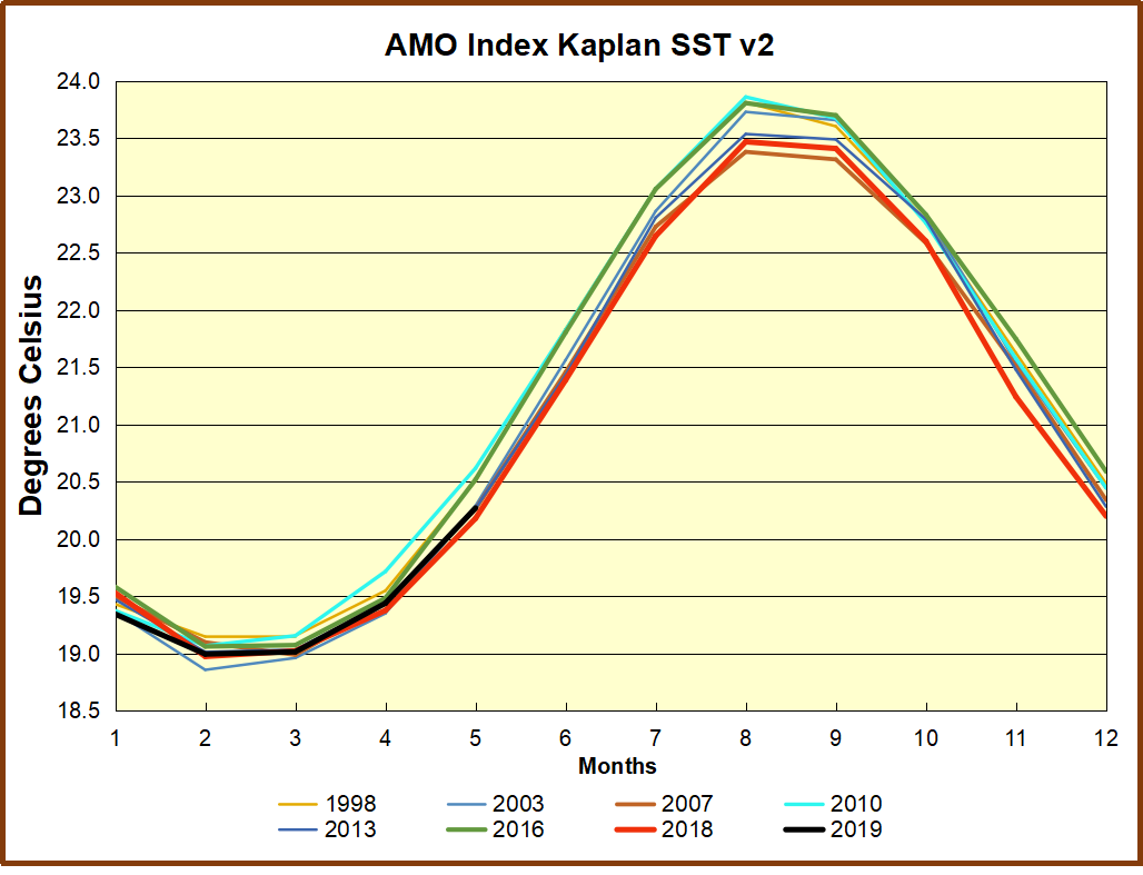
The AMO Index is from from Kaplan SST v2, the unaltered and not detrended dataset. By definition, the data are monthly average SSTs interpolated to a 5×5 grid over the North Atlantic basically 0 to 70N. The graph shows warming began after 1992 up to 1998, with a series of matching years since. Because the N. Atlantic has partnered with the Pacific ENSO recently, let’s take a closer look at some AMO years in the last 2 decades. This graph shows monthly AMO temps for some important years. The Peak years were 1998, 2010 and 2016, with the latter emphasized as the most recent. The other years show lesser warming, with 2007 emphasized as the coolest in the last 20 years. Note the red 2018 line is at the bottom of all these tracks. The short black line shows that 2019 began slightly cooler and is now tracking last year closely.
Summary
The oceans are driving the warming this century. SSTs took a step up with the 1998 El Nino and have stayed there with help from the North Atlantic, and more recently the Pacific northern “Blob.” The ocean surfaces are releasing a lot of energy, warming the air, but eventually will have a cooling effect. The decline after 1937 was rapid by comparison, so one wonders: How long can the oceans keep this up? If the pattern of recent years continues, NH SST anomalies may rise slightly in coming months, but once again, ENSO which has weakened will probably determine the outcome.
Postscript:
In the most recent GWPF 2017 State of the Climate report, Dr. Humlum made this observation:
“It is instructive to consider the variation of the annual change rate of atmospheric CO2 together with the annual change rates for the global air temperature and global sea surface temperature (Figure 16). All three change rates clearly vary in concert, but with sea surface temperature rates leading the global temperature rates by a few months and atmospheric CO2 rates lagging 11–12 months behind the sea surface temperature rates.”
Footnote: Why Rely on HadSST3
HadSST3 is distinguished from other SST products because HadCRU (Hadley Climatic Research Unit) does not engage in SST interpolation, i.e. infilling estimated anomalies into grid cells lacking sufficient sampling in a given month. From reading the documentation and from queries to Met Office, this is their procedure.
HadSST3 imports data from gridcells containing ocean, excluding land cells. From past records, they have calculated daily and monthly average readings for each grid cell for the period 1961 to 1990. Those temperatures form the baseline from which anomalies are calculated.
In a given month, each gridcell with sufficient sampling is averaged for the month and then the baseline value for that cell and that month is subtracted, resulting in the monthly anomaly for that cell. All cells with monthly anomalies are averaged to produce global, hemispheric and tropical anomalies for the month, based on the cells in those locations. For example, Tropics averages include ocean grid cells lying between latitudes 20N and 20S.
Gridcells lacking sufficient sampling that month are left out of the averaging, and the uncertainty from such missing data is estimated. IMO that is more reasonable than inventing data to infill. And it seems that the Global Drifter Array displayed in the top image is providing more uniform coverage of the oceans than in the past.
USS Pearl Harbor deploys Global Drifter Buoys in Pacific Ocean
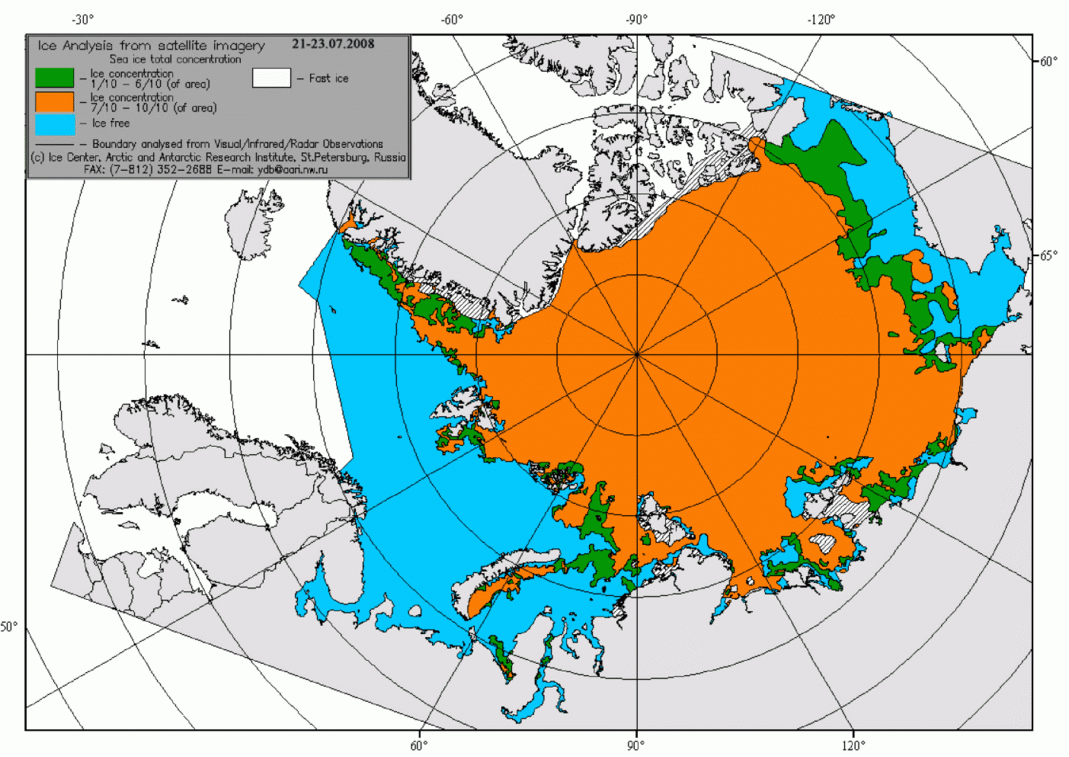


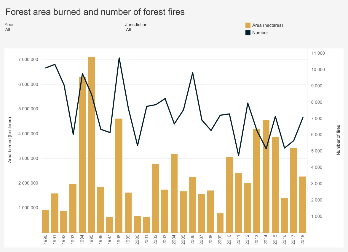

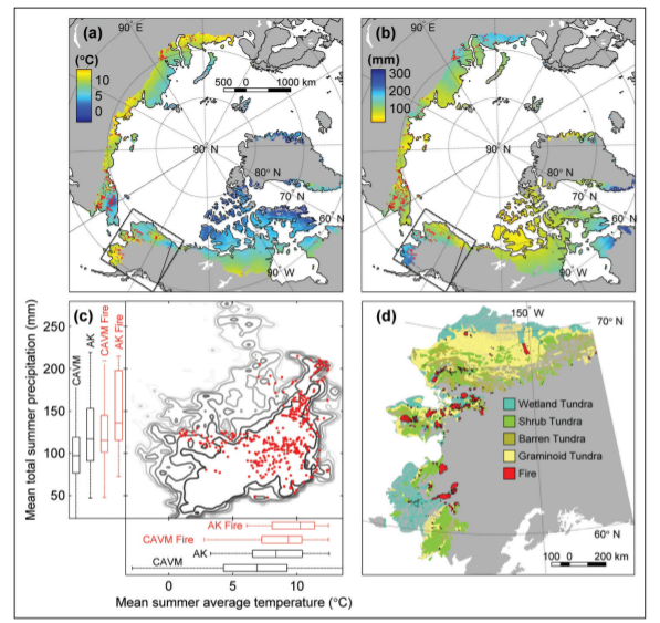


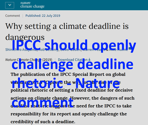
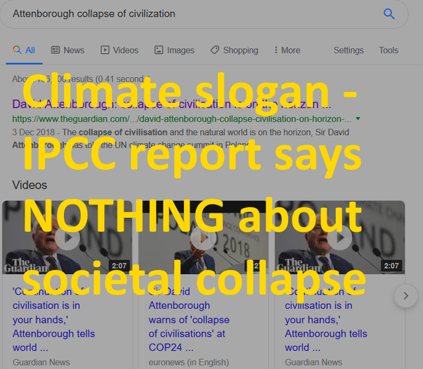


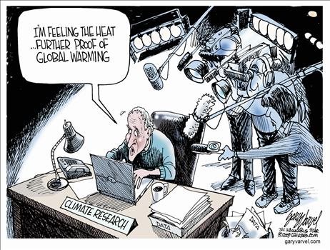


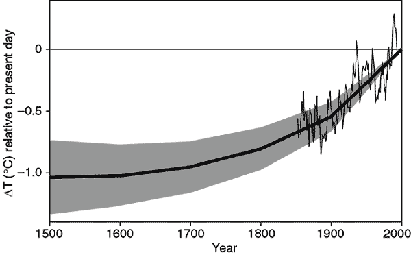
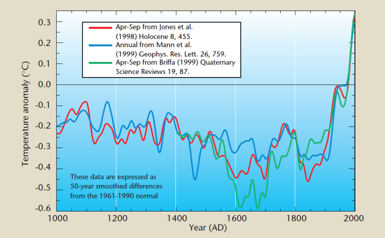


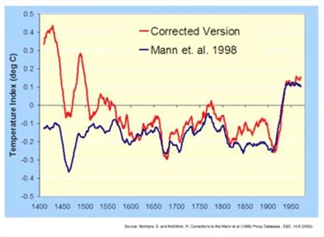


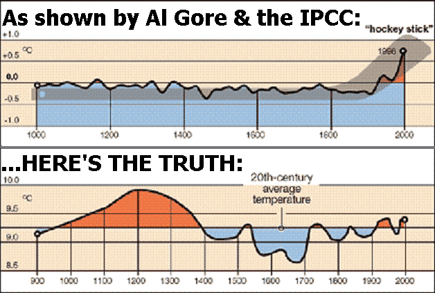
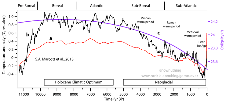


 Joel Kotkin makes sense of the confusing US politics around the 2020 presidential campaigning. He writes
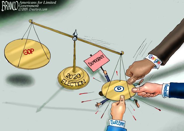


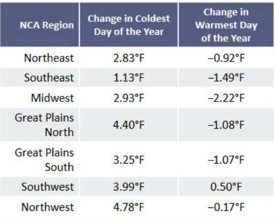
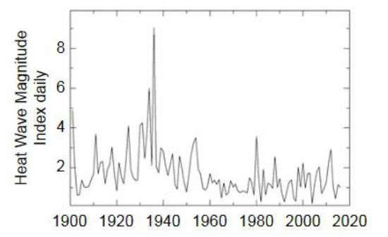
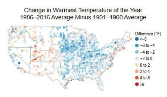
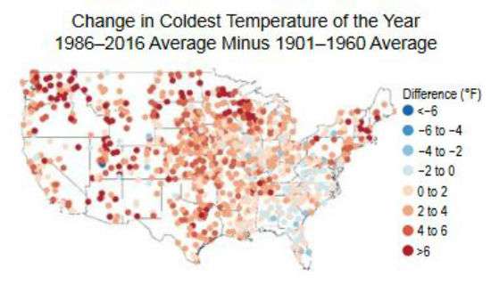

 The best context for understanding decadal temperature changes comes from the world’s sea surface temperatures (SST), for several reasons:
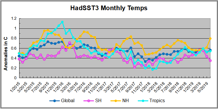
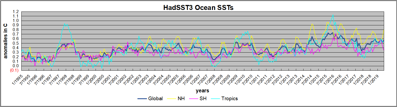 Open image in new tab to enlarge.