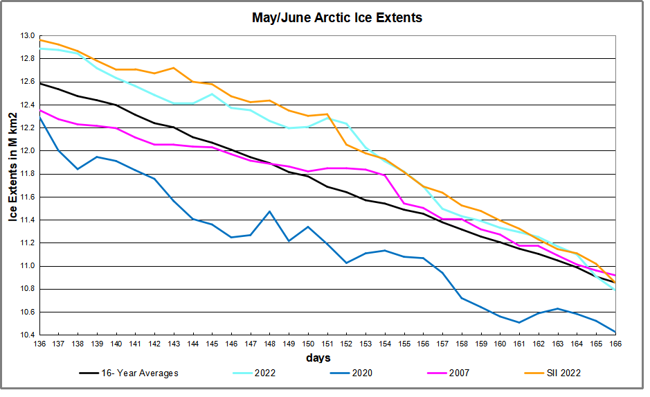
The Arctic ice melting season was delayed this year as shown by the end of May (day 151) surplus of 600k km2 over the 16-yr average. Since then both MASIE and SII show a steep decline in Arctic ice extents, now matching the average for June 15 (day 166). The reports show that Barents alone lost 320k km2, Laptev down 200k km2, Baffin Bay lost 165k km2, Chukchi, Kara, Greenland seas all lost around 100k km2 each.
For the month of June Hudson Bay will take the stage. Above average early in June. Hudson Bay lost 100k km2 the last six days. Being a shallow basin, it will likely lose much of its 1M km2 in a few weeks.
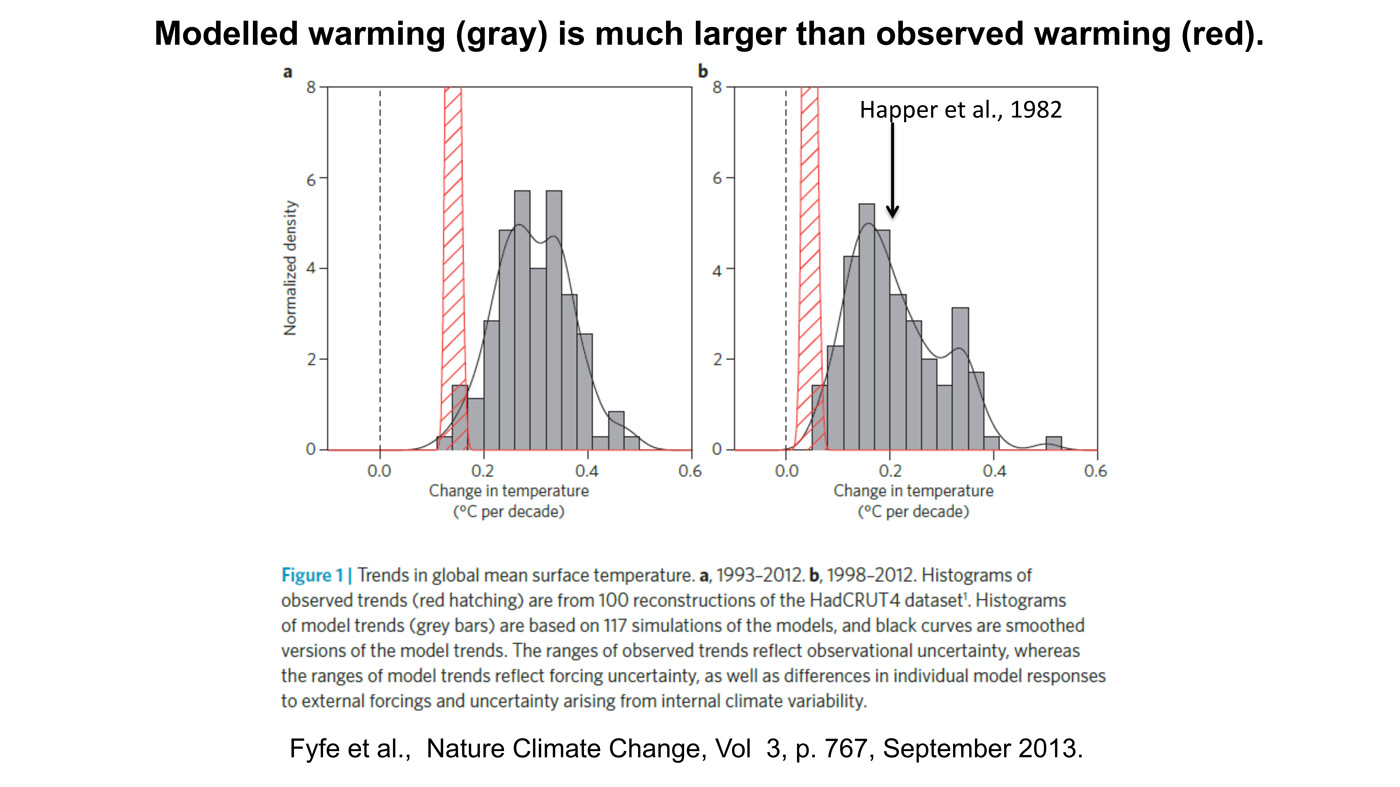
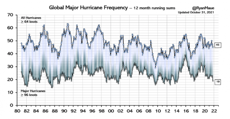
Why is this important? All the claims of global climate emergency depend on dangerously higher temperatures, lower sea ice, and rising sea levels. The lack of additional warming is documented in a post Adios, Global Warming
The usual suspects (BBC, Science Focus, Phys.org, The Independent, Metro UK, etc.) are worried that green spaces are visible from space, and snow cover will continue to retreat, with bad consequences for the Alpine eco-system, unless we stop burning fossil fuels. This is triggered by a new paper by Sabine Rumpf et al. From white to green: Snow cover loss and increased vegetation productivity in the European Alps. Excerpts from Science Focus in italics with my bolds.
Snow in the European Alps is melting and invasive plant species are outcompeting native Alpine plants, satellite imagery has shown. Both findings will reinforce climate change, say scientists.
The changes noticed in a new study, which uses satellite data from 1984 to 2021, show that as much as 77 per cent of the Alps has experienced greening, where areas with previously low vegetation have suddenly seen a boom in plant growth.
While the new plants do take a small amount of carbon out of the atmosphere by photosynthesis, scientists say the greening has a much bigger negative effect on climate change, as less of the Sun’s light will be reflected away from the Earth meaning the planet will get warmer.
The Alps are expected to see a reduction in snow mass of up to 25 per cent in the next 10-30 years, according to the Intergovernmental Panel on Climate Change’s 2019 report. As the snow melts, there will be more rock falls and landslides, which could have devastating consequences.
The new study shows that the Alps is experiencing snow cover recession that can already be seen from space, which the authors warn will only get worse as time goes on.
In the changing mountain environments, native Alpine plants have suffered while new species have thrived. This is because the plants specialised to higher elevations have had to focus on long-term living in the Alps, sacrificing the characteristics that could make them more competitive in the short term.
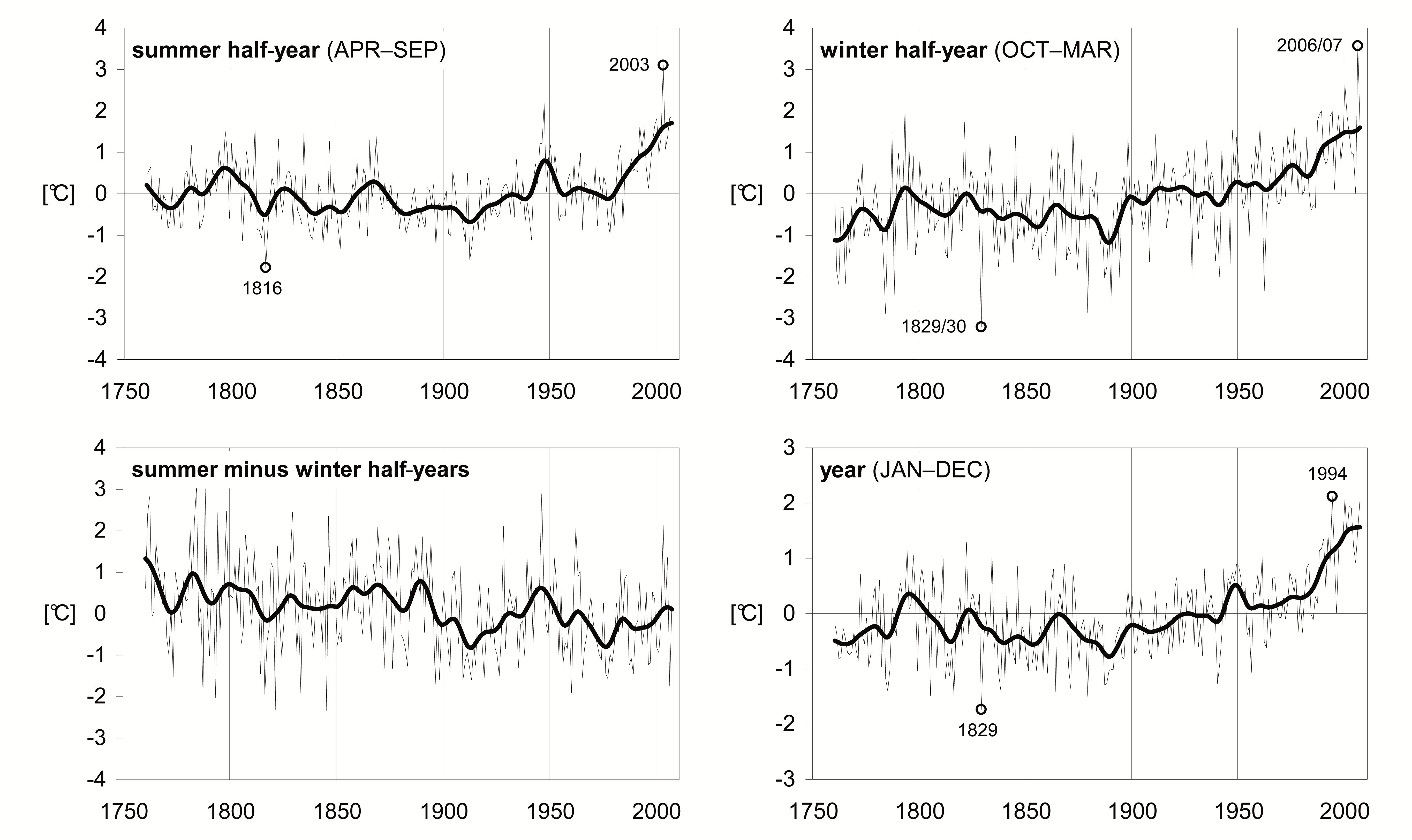
However, over time Alpine Temperatures and Snow are variable in quasi-cycles
Yes there are warming and cooling periods, and a rise recently. However, summer minus winter half-years have declined the last century. Calendar year averages peaked in 1994. So the certainty about present conditions “only getting worse” is founded on faith rather than facts.
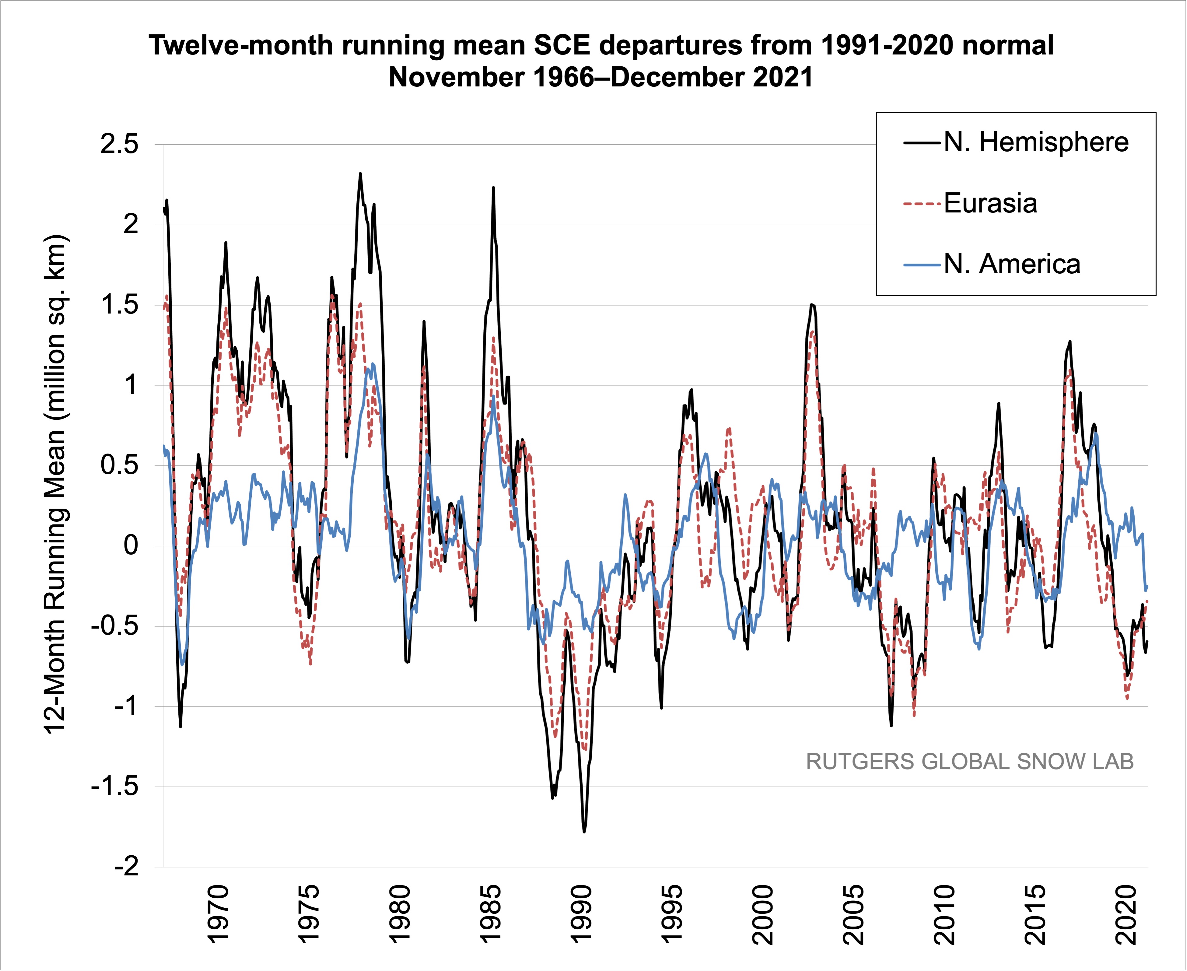
Then consider the record of snow cover over a longer period than the last thirty years. Rutgers Snow Lab provides this graph:
So a lot of decadal variation is evident. While 2020-21 snow extent is down from a peak in 2016, it was lower in 2007, and very much lower in 1988-1990. True, the last 30 years had generally less snow than 30 years prior to 1990. But who is to say that the next 30 won’t see a return to earlier levels, still with large decadal fluxes.
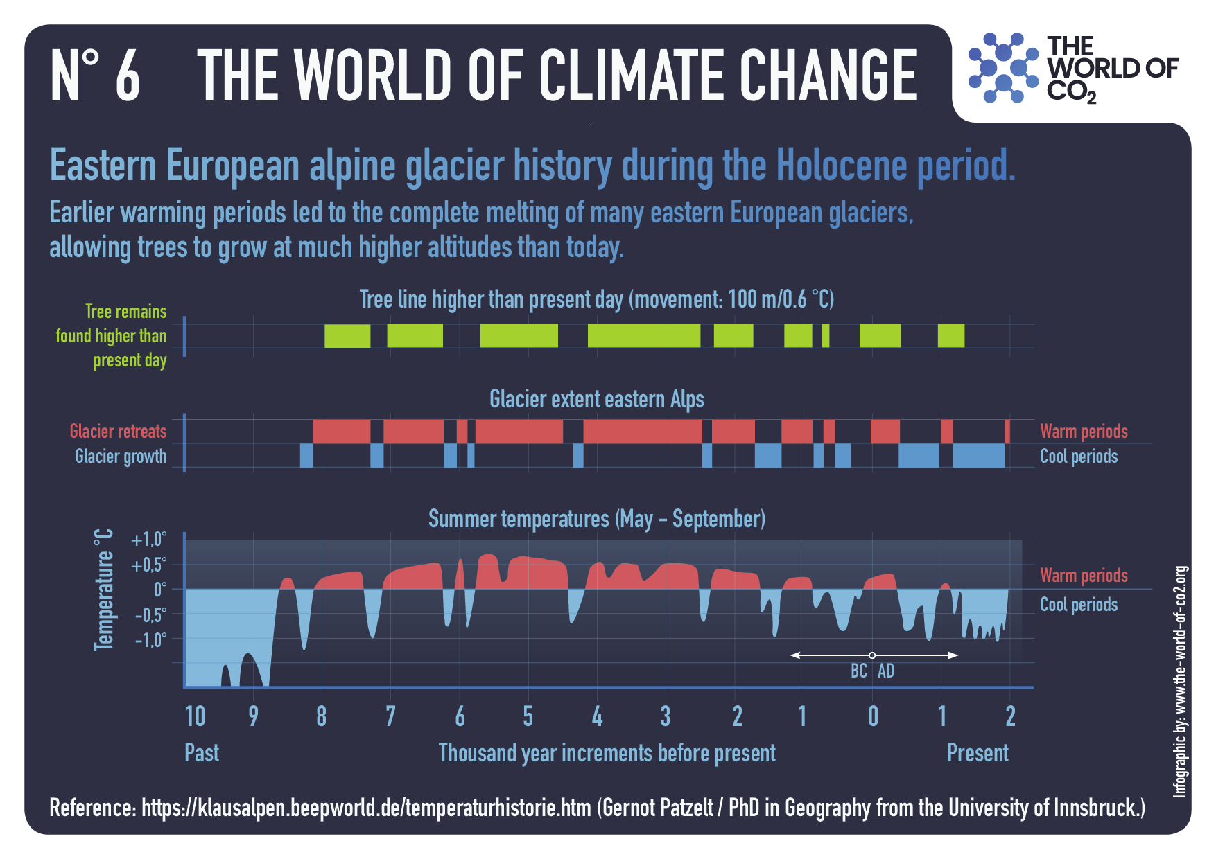
And a longer term view of Alpine glaciers, shows how much climate change has gone on without the benefit of CO2 from humans.
Summer Temperatures (May – September) A rise in temperature during a warming period will result in a glacier losing more surface area or completely vanishing. This can happen very rapidly in only a few years or over a longer period of time. If temperatures drop during a cooling period and summer temperatures are too low, glaciers will begin to grow and advance with each season. This can happen very rapidly or over a longer period in time. Special thanks to Prof. em. Christian Schlüchter / (Quartärgeologie, Umweltgeologie) Universität Bern Institut für Geologie His work is on the Western Alps and was so kind to help Raymond make this graphic as correct as possible.
Summary
The combination of mild warming and higher CO2 has greatly benefited the biosphere globally, resulting in setting crop yield records nearly every year. It should not be surprising that Europe’s Alps participated in this greening of the land. But I object to the notion that humans caused it or can stop it by reducing emissions. We do not control the climate or weather, and both warming and cooling periods will come and go as they always have.
Climatists are manifesting cognitive dissonance, or maybe factional conflict. They simultaneously claim the ocean current warming the North Atlantic is slowing down bringing colder weather, while also claiming the increasing ocean heat content is warming the ocean faster than ever. The cooling alarm was noted and rebutted in a recent No Tricks Zone article 3 New Studies Show Atlantic Tipping Point Unrealistic…”Muted Response”…”Changes To Be Viewed With Caution”.
Turning Attention from the Freezing to the Overheating Ocean
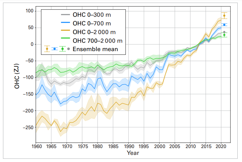
The Ocean Heat scare was included in the recent UN Climate report, alongside four other claims I rebutted in the post UN False Alarms from Key Climate Indicators.The Ocean Heat Content is more complex, requiring this post of its own. The key message was this:
Ocean heat was record high. The upper 2000m depth of the ocean continued to warm in 2021 and it is expected that it will continue to warm in the future – a change which is irreversible on centennial to millennial time scales. All data sets agree that ocean warming rates show a particularly strong increase in the past two decades. The warmth is penetrating to ever deeper levels. Much of the ocean experienced at least one ‘strong’ marine heatwave at some point in 2021.
Figure 4. 1960–2021 ensemble mean time series and ensemble standard deviation (2 standard deviations, shaded) of global OHC anomalies relative to the 2005–2017 average for the 0–300 m (grey), 0–700 m (blue), 0–2 000 m (yellow) and 700–2 000 m (green) depth layers. The ensemble mean is an update of the outcome of a concerted international data and analysis effort.
Context and Background Information
Media alarms are rampant relying mostly on a publication Record-Setting Ocean Warmth Continued in 2019 in Advances in Atmospheric Sciences
Authors: Lijing Cheng, John Abraham, Jiang Zhu, Kevin E. Trenberth, John Fasullo, Tim Boyer, Ricardo Locarnini, Bin Zhang, Fujiang Yu, Liying Wan, Xingrong Chen, Xiangzhou Song, Yulong Liu, Michael E. Mann.
Reasons for doubting the paper and its claims go well beyond the listing of so many names, including several of the usual suspects. No, this publication is tarnished by its implausible provenance. It rests upon and repeats analytical mistakes that have been pointed out, but true believers carry on without batting an eye.
It started with Resplandy et al in 2018 who became an overnight sensation with their paper Quantification of ocean heat uptake from changes in atmospheric O2 and CO2 composition in Nature October 2018, leading to media reports of extreme ocean heating. Nic Lewis published a series of articles at his own site and at Climate Etc. in November 2018, leading to the paper being withdrawn and eventually retracted. Those authors acknowledged the errors and did the honorable thing at the time, resulting the paper’s retraction 25 September 2019.
Then a revised version of the paper was published 27 December 2019 with the same title and stands today. The 2019 abstract is exactly the same as the 2018 abstract (retracted), except for one sentence.
♦ 2018: We show that the ocean gained 1.33 ± 0.20 × 10^22 joules of heat per year between 1991 and 2016, equivalent to a planetary energy imbalance of 0.83 ± 0.11 watts per square metre of Earth’s surface.
♦ 2019: We show that the ocean gained 1.29 ± 0.79 × 10^22 Joules of heat per year between 1991 and 2016, equivalent to a planetary energy imbalance of 0.80 ± 0.49 W watts per square metre of Earth’s surface.
Figure 1. Argo float operation. There are about 3,500 floats in the ocean, and a total of ~10,000 floats have been used over the period of operation.
In the discussion and graphs, readers should note that 1 Zettajoule (ZJ) = 1 x 10^21 joules, and that these are energy units, not temperatures. Willis Eschenbach did a fine analysis of this OHC issue, since it depends mostly upon ARGO float measurements. From that essay:
The first thing that I wanted to do was to look at the data using more familiar units. I mean, nobody knows what 10^22 joules means in the top two kilometres of the ocean. So I converted the data from joules to degrees C. The conversion is that it takes 4 joules to heat a gram of seawater by 1°C (or 4 megajoules per tonne per degree). The other information needed is that there are 0.65 billion cubic kilometres of ocean above 2,000 metres of depth, and that seawater weighs about 1.033 tonnes per cubic metre.
The first thing is to note that 3500 floats are sampling 0.65 billion cubic km of the ocean, and the record began in 2005. The next thing is to appreciate the impact of increasing energy upon the ocean temperature.
Yes, those are ocean warming increments of a few 1/100ths of a degree kelvin. Applying the math to Resplandy et al., we should also note the ranges of uncertainty in these estimates (ocean temps to 1/100 of a degree, really?)
Resplandy 2018: Claim 103 to 153 ZJ/decade, or warming between 0.03 to 0.05 C/decade.
Resplandy 2019: Claim 50 to 208 ZJ/decade, or warming between 0.02 to 0.07 c/decade
Your report (SROCC, p. 5-14) concludes that ” The rate of heat uptake in the upper ocean (0-700m) is very likely higher in the 1993-2017 (or .2005-2017) period compared with the 1969-1993 period (see Table 5.1).”
We would like to point out that this conclusion is based to a significant degree on a paper by Cheng et al. (2019) which itself relies on a flawed estimate by Resplandy et al. (2018). An authors’ correction to this paper and its ocean heat uptake (OHU) estimate was under review for nearly a year, but in the end Nature requested that the paper be retracted (Retraction Note, 2019).
That was not the only objection. Nic Lewis examined Cheng et al. 2019 and found it wanting. That discussion is also at Climate Etc. Is ocean warming accelerating faster than thought? The authors replied to Lewis’ critique but did not refute or correct the identified errors.
Now in 2022 the same people have processed another year of data in the same manner and then proclaim the same result. The only differences are the addition of several high profile alarmists and the subtraction of Resplandy et al. from the References. It looks like the group is emulating MIchael Mann’s blueprint: The Show Must Go On. The Noble cause justifies any and all means.
Show no weaknesses, admit no mistakes, correct nothing, sue if you have to.
Footnote: Q: Is the Ocean Warming or Cooling? A: Nobody Knows.
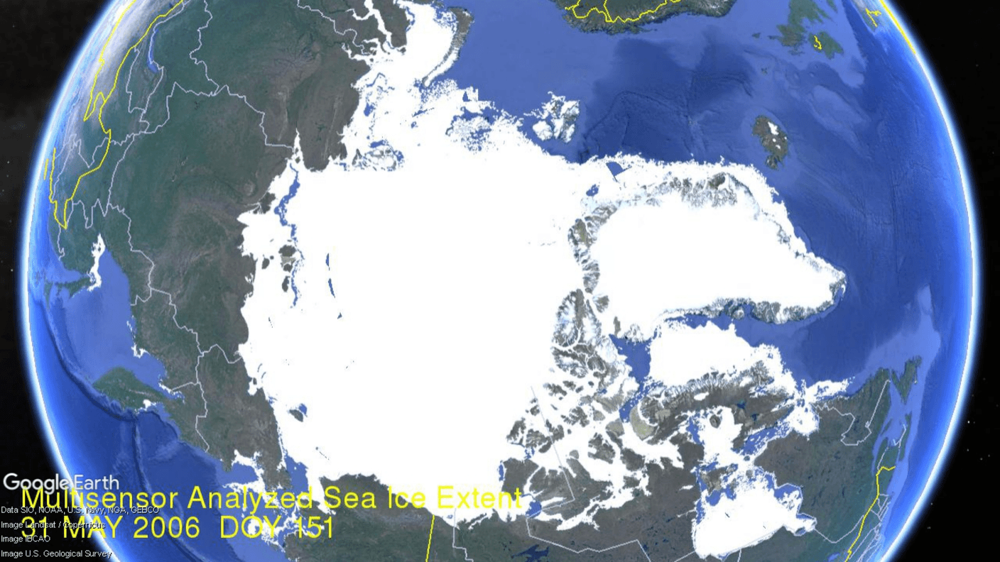
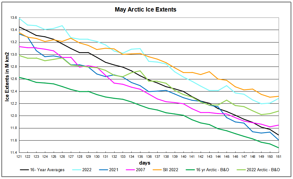
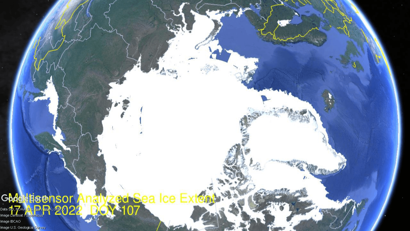
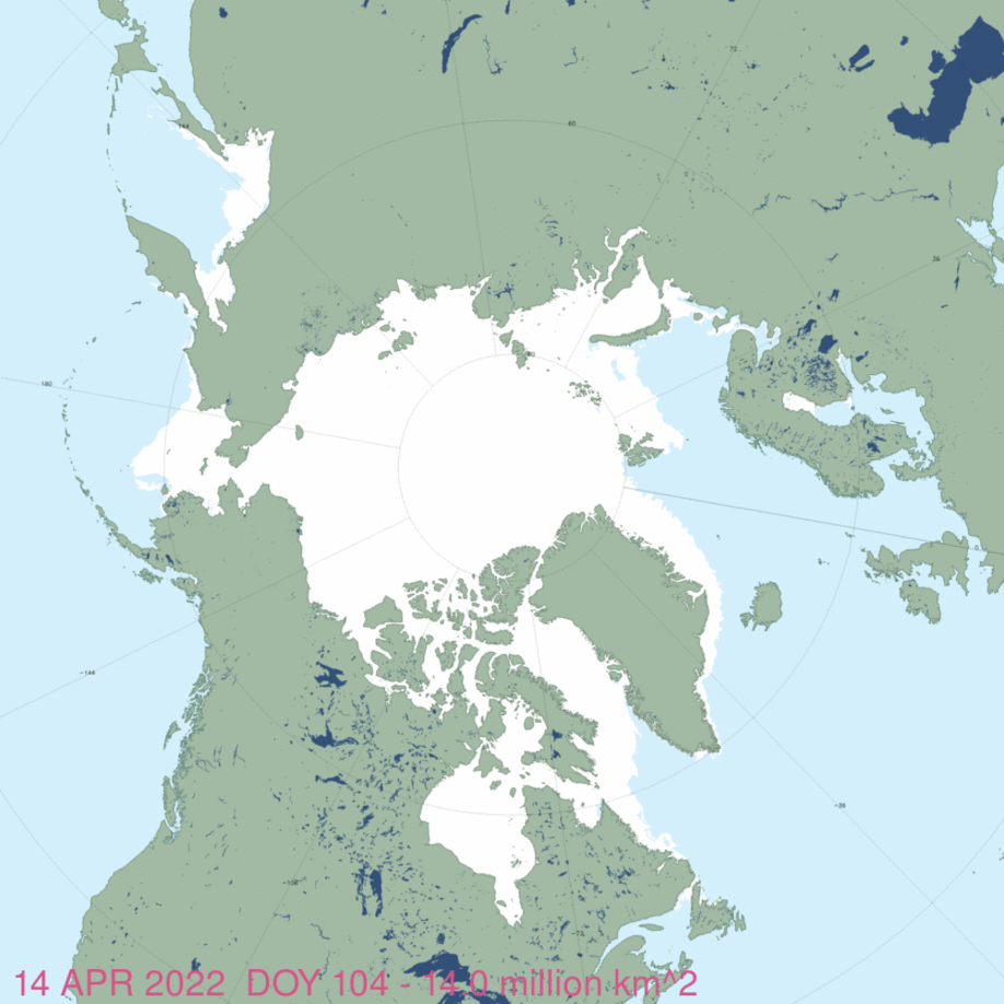
The animation shows Arctic ice extents on day 151 (end of May) from 2006 to yesterday 2022. It is evident that typically there are some regional seas starting to melt by this date, whereas 2022 remains frozen solid. More detailed analysis is below, but note the 2022 surplus is 600k km2, or 5% above the 16 year average for day 151. That extra ice extent amounts to 0.6 Wadhams, or 6826 Manhattan Islands, whichever index you prefer. The graph below shows May 2022 daily ice extents compared to the 16-year average and some other years of note.
The black line shows during May on average Arctic ice extents decline ~1.8M km2 down to 11.7M km2. The 2022 cyan MASIE line only lost 1.3M km2, starting the month 141k km2 above average and on day 151 showed a surplus of 598k km2. The Sea Ice Index in orange (SII from NOAA) starter lower than MASIE, then ran over in later weeks, ending May nearly the same. The dark green line is average Arctic ice, excluding Bering and Okhotsk (B&O), which started melting early in 2022. The light green line is 2022 without B&O. As of day 151, the 2022 B&O extent matches the average B&O, so the ~600k km2 surplus is entirely in the core Arctic ocean.
Why is this important? All the claims of global climate emergency depend on dangerously higher temperatures, lower sea ice, and rising sea levels. The lack of additional warming is documented in a post Adios, Global Warming
The table below shows the distribution of Sea Ice on day 151 across the Arctic Regions, on average, this year and 2020.
Region
2022151
Day 151 Average
2022-Ave.
2021151
2022-2021
(0) Northern_Hemisphere
12281289
11682840
598449
11605537
675752
(1) Beaufort_Sea
1060171
1003588
56582
1034779
25392
(2) Chukchi_Sea
894077
865036
29040
900868
-6792
(3) East_Siberian_Sea
1085478
1064424
21054
1051959
33520
(4) Laptev_Sea
877340
824419
52921
738294
139047
(5) Kara_Sea
870898
829705
41193
824068
46831
(6) Barents_Sea
421071
305918
115153
325745
95326
(7) Greenland_Sea
665639
562229
103411
615174
50465
(8) Baffin_Bay_Gulf_of_St._Lawrence
976116
897470
78647
812548
163568
(9) Canadian_Archipelago
854703
810848
43855
811040
43663
(10) Hudson_Bay
1122388
1088994
33395
1084892
37496
(11) Central_Arctic
3245183
3216568
28615
3232324
12859
(12) Bering_Sea
116552
115657
895
89124
27428
(13) Baltic_Sea
915
199
717
0
915
(14) Sea_of_Okhotsk
89260
96309
-7049
83572
5688
The overall surplus to average is 598k km2, (5%). The surplus is found in every region, except for a slight deficit in Okhotsk
Illustration by Eleanor Lutz shows Earth’s seasonal climate changes. If played in full screen, the four corners present views from top, bottom and sides. It is a visual representation of scientific datasets measuring Arctic ice extents.
My previous Arctic ice report was limited by technical difficulties, now resolved as shown by the animation above. So this update comes a week into May, with the animation covering the last three weeks from mid April. The dramatic melting in the Pacific basins of Bering and Okhotsk (left) sets them apart from the rest of Arctic sea ice. As noted before, those two basins are outside the Arctic circle, have no polar bears and are the first places to become open water in the Spring. Elsewhere sea ice persisted, actually growing in Barents and Greenland seas.
[The staff at National Ice Center were extremely helpful, as usual. Their work is distinctive, valuable and deserving of your appreciation. See Support MASIE Arctic Ice Dataset]
The melting effect on NH total ice extents during this period is presented in the graph below.
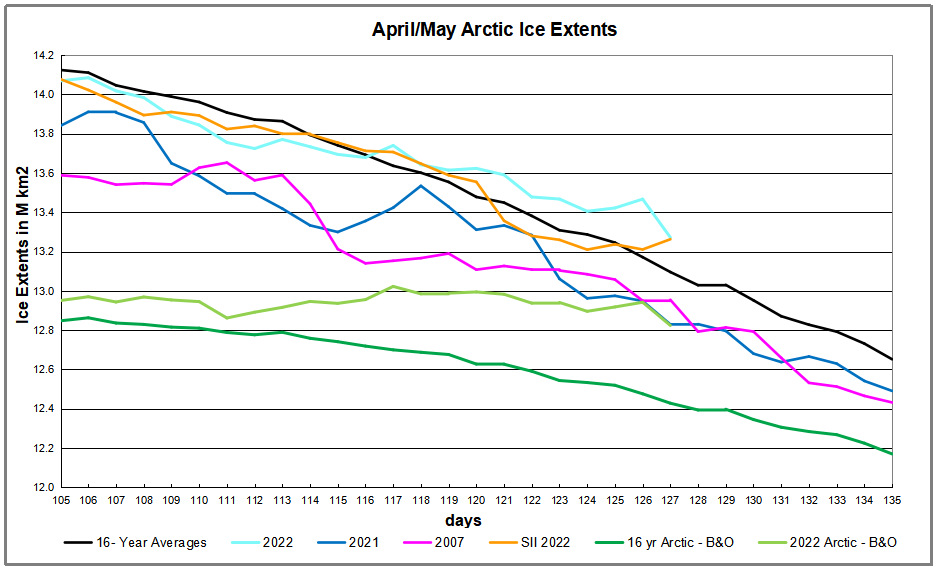
The graph above shows ice extent mid-April through May 7 comparing 2022 MASIE reports with the 16-year average, other recent years and with SII. 2022 ice extents have tracked the average, going surplus for the last 10 days. .Both 2021 and 2007 are well below average, on day 127 lower than 2022 by 318k km2 and 443k km2 respectively. The two green lines at the bottom show average and 2022 extents when Bering and Okhotsk ice are excluded. On this basis 2022 Arctic ice was nearly 400k km2 in surplus on May 7, and prior to yesterday, the horizontal line shows little loss of ice extent elsewhere than in the Pacific.
Region
2022127
Day 127 Average
2022-Ave.
2007127
2022-2007
(0) Northern_Hemisphere
13272388
13096082
176306
12954671
317717
(1) Beaufort_Sea
1053640
1059642
-6001
1056022
-2382
(2) Chukchi_Sea
959821
949409
10412
955497
4324
(3) East_Siberian_Sea
1087137
1085912
1225
1081248
5889
(4) Laptev_Sea
897845
892770
5075
870216
27628
(5) Kara_Sea
928813
897443
31370
883059
45754
(6) Barents_Sea
642899
476820
166079
430155
212745
(7) Greenland_Sea
732835
616488
116347
639861
92974
(8) Baffin_Bay_Gulf_of_St._Lawrence
1185073
1140285
44787
1076913
108159
(9) Canadian_Archipelago
854685
845807
8879
845091
9594
(10) Hudson_Bay
1216867
1212411
4456
1192270
24597
(11) Central_Arctic
3248013
3223344
24669
3241053
6960
(12) Bering_Sea
275935
401584
-125649
398914
-122980
(13) Baltic_Sea
14465
13264
1201
10416
4050
(14) Sea_of_Okhotsk
172221
278245
-106023
269684
-97463
The only deficits to average are in Bering and Okhotsk, more than offset by surpluses everywhere else, especially in Barents and Greenland seas, along with Kara and Baffin Bay. At this point, overall NH sea ice is 88% of last March maximum (15.1M kim2). All regions are well above 90% of their maxes, except for Barents (81%), Baffin Bay (66%), Bering (33%) and Okhotsk (20%).
April 1st Footnote:
It has been a long hard winter, requiring overtime efforts by Norwegian icebreakers like this one:
In addition, cold Spring temperatures led to unusual sightings of Northern creatures:
Arctic ice extent changes for the last two weeks are shown in the MASIE animation above. Note that the Pacific basins of Bering and Okhotsk (upper left) melted dramatically. Meanwhile on the Atlantic side ice persisted, actually growing in Barents and Greenland seas.
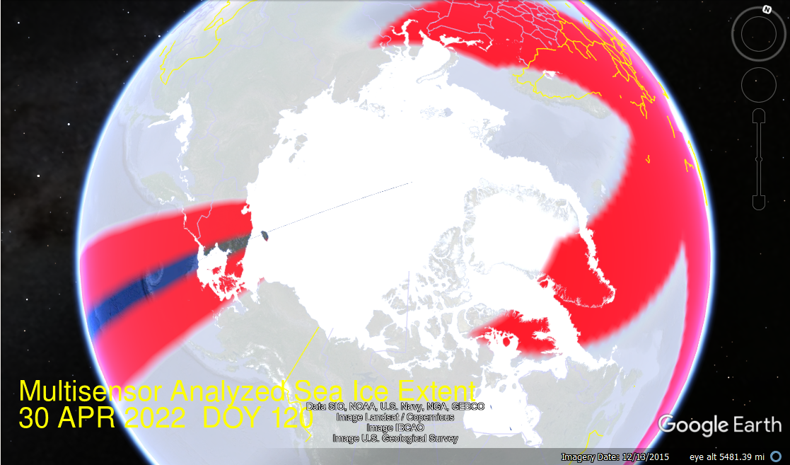
The strangeness concerns weirdness in Google Earth Pro treatment of kmz files from MASIE. Previous I have used these to produce animations like the one below for the month of March.
Today when attempting to do the same for April, this is what was shown.
That is a screen capture since Google Earth could not render an image. I hope it is just a temporary technical difficulty. But I can’t help but imagine this depicting some kind of military map with a two-pronged attack by red forces with a single resisting force in red and blue. Is it more virtuous canceling of all things Russian at the expense of scientific inquiry? (The mask with colors was only imposed on the Northern Hemisphere)
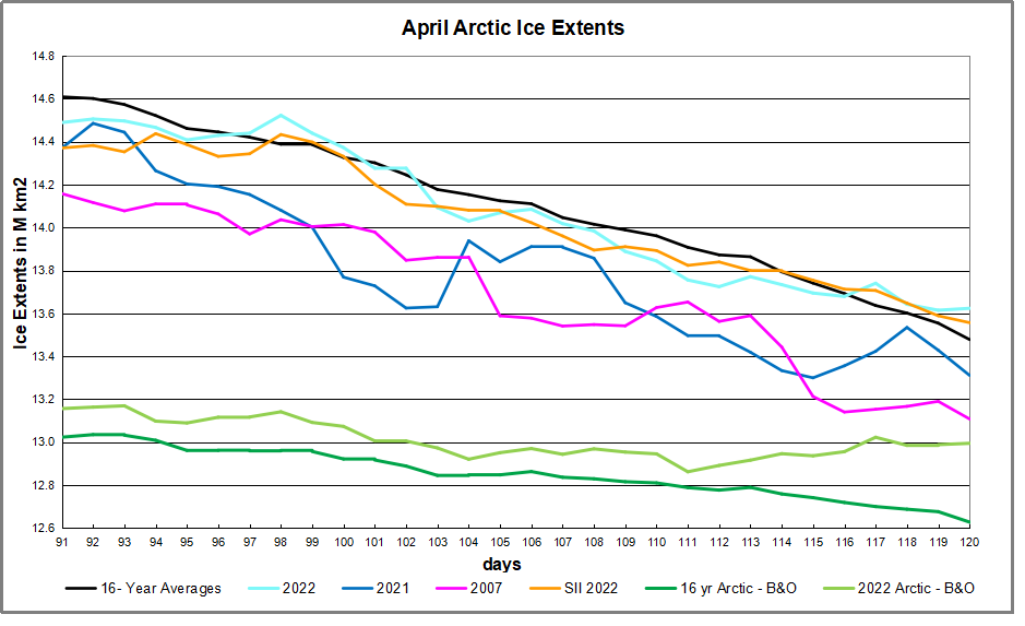
The melting effect on NH total ice extents during April is presented in the graph below.
The graph above shows ice extent through April comparing 2022 MASIE reports with the 16-year average, other recent years and with SII. On average ice extents lost 1.1M km2 during April. 2022 ice extents started slightly lower, then tracked average, ending slightly above average. Both 2021 and 2007 ended below average, by 200k km2 and 400k km2 respectively. The two green lines at the bottom show average and 2022 extents when Bering and Okhotsk ice are excluded. On this basis 2022 Arctic was nearly 400k km2 in surplus at end of April.
Region
2022120
Day 120 Average
2022-Ave.
2007120
2022-2007
(0) Northern_Hemisphere
13623874
13507670
116204
13108068
515806
(1) Beaufort_Sea
1070776
1067739
3036
1059189
11587
(2) Chukchi_Sea
963424
955654
7770
949246
14178
(3) East_Siberian_Sea
1087137
1085485
1652
1080176
6961
(4) Laptev_Sea
897845
889961
7884
875661
22184
(5) Kara_Sea
932842
911757
21084
864664
68178
(6) Barents_Sea
654813
547685
107129
396544
258270
(7) Greenland_Sea
777073
640123
136950
644438
132635
(8) Baffin_Bay_Gulf_of_St._Lawrence
1243689
1205315
38374
1147115
96574
(9) Canadian_Archipelago
854685
848564
6121
838032
16653
(10) Hudson_Bay
1240262
1238267
1995
1222074
18188
(11) Central_Arctic
3247307
3229654
17652
3241034
6272
(12) Bering_Sea
334929
482018
-147089
475489
-140560
(13) Baltic_Sea
22696
20622
2074
14684
8012
(14) Sea_of_Okhotsk
294259
381697
-87438
295743
-1484
The only deficits to average are in Bering and Okhotsk, more than offset by surpluses everywhere else, especially in Barents and Greenland seas. 2007 extents were lower by 516k km2 (half a Wadham)
April 1st Footnote:
It has been a long hard winter, requiring overtime efforts by Norwegian icebreakers like this one:
In addition, cold Spring temperatures led to unusual sightings of Northern creatures:
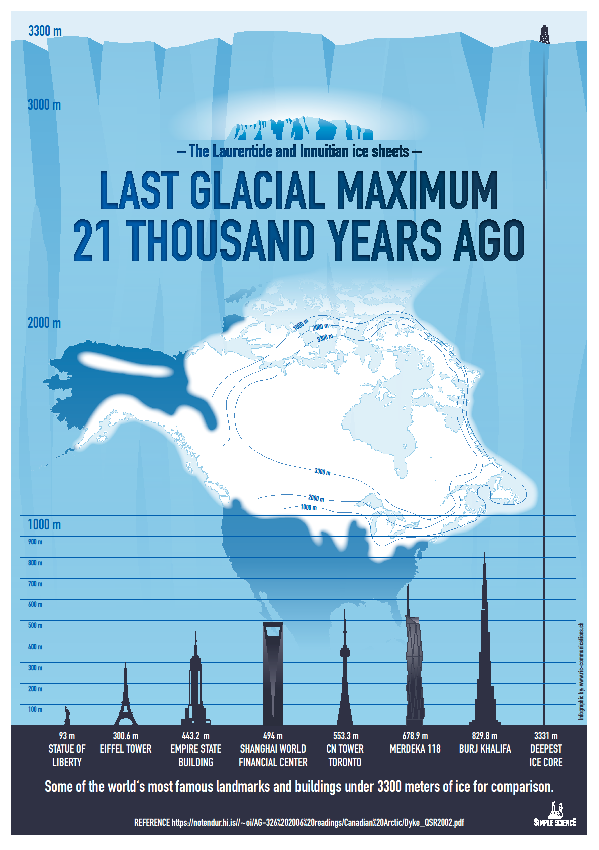
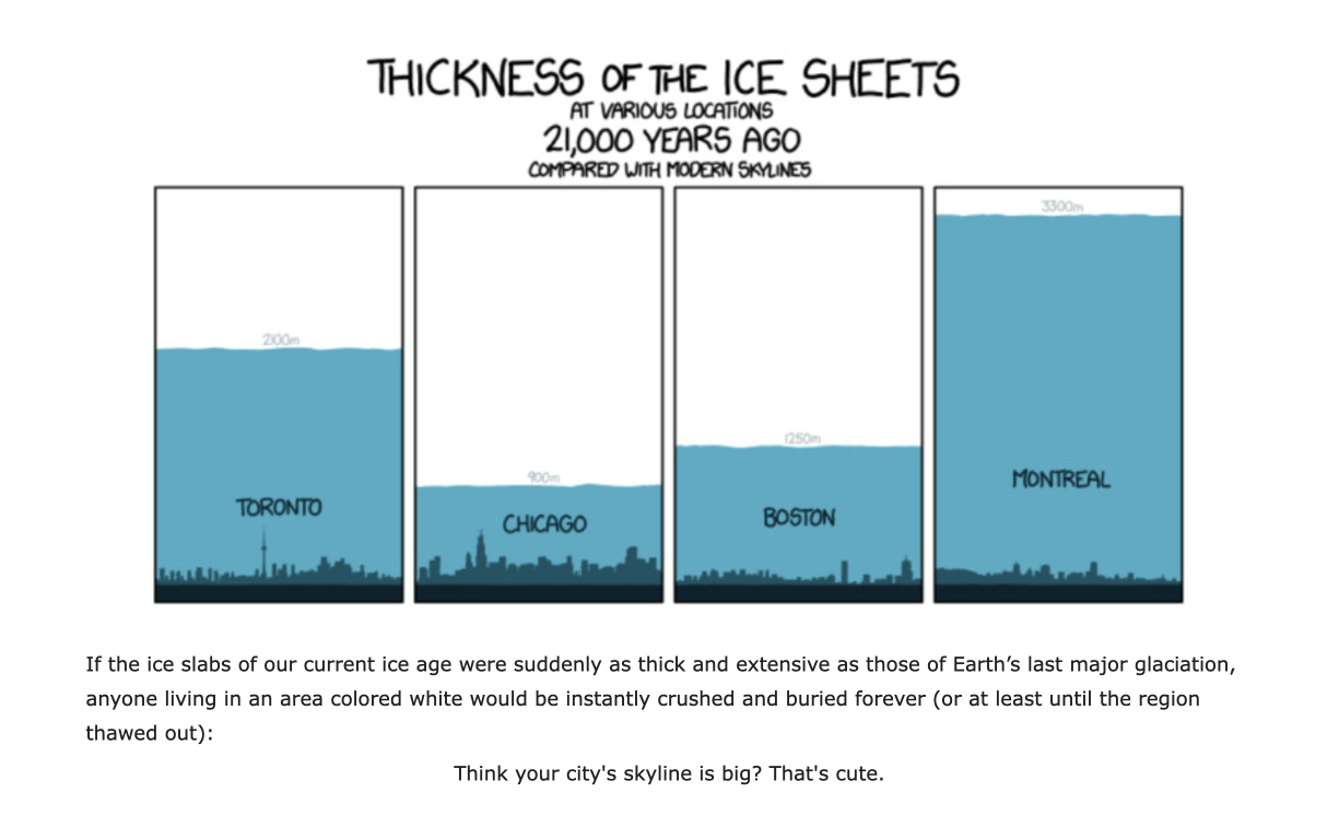
Raymond at RiC-Communications has produced the above poster on the theme expounded in a previous post In Celebration of Our Warm Climate, reprinted below. The above image is available in high resolution pdf format at his website The last ice age and its impact.
Legacy and social media keep up a constant drumbeat of warnings about a degree or two of planetary warming without any historical context for considering the significance of the alternative. A poem of Robert Frost comes to mind as some applicable wisdom:
The diagram at the top shows how grateful we should be for living in today’s climate instead of a glacial icehouse. (H/T Raymond Inauen) For most of its history Earth has been frozen rather than the mostly green place it is today. And the reference is to the extent of the North American ice sheet during the Last Glacial Maximum (LGM).
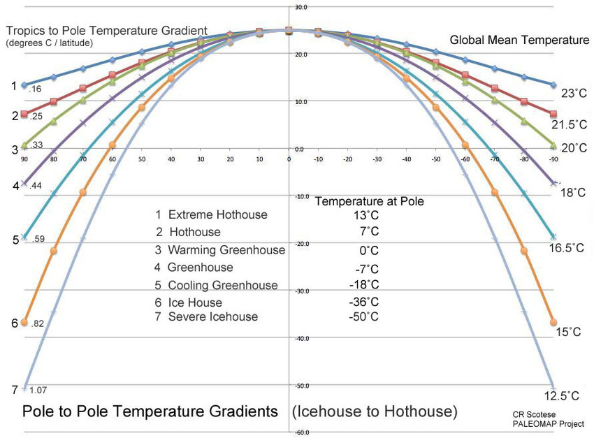
For further context consider that geologists refer to our time as a “Severe Icehouse World”, among the various conditions in earth’s history, as diagramed by paleo climatologist Christopher Scotese. Referring to the Global Mean Temperatures, it appears after many decades, we are slowly rising to “Icehouse World”, which would seem to be a good thing.
Instead of fear mongering over a bit of warming, we should celebrate our good fortune, and do our best for humanity and the biosphere. Matthew Ridley takes it from there in a previous post.
Background from previous post The Goodness of Global Warming
LAI refers to Leaf Area Index.
As noted in other posts here, warming comes and goes and a cooling period may now be ensuing. See No Global Warming, Chilly January Land and Sea. Matt Ridley provides a concise and clear argument to celebrate any warming that comes to our world in his Spiked article Why global warming is good for us. Excerpts in italics with my bolds and added images.
Climate change is creating a greener, safer planet.
Global warming is real. It is also – so far – mostly beneficial. This startling fact is kept from the public by a determined effort on the part of alarmists and their media allies who are determined to use the language of crisis and emergency. The goal of Net Zero emissions in the UK by 2050 is controversial enough as a policy because of the pain it is causing. But what if that pain is all to prevent something that is not doing net harm?
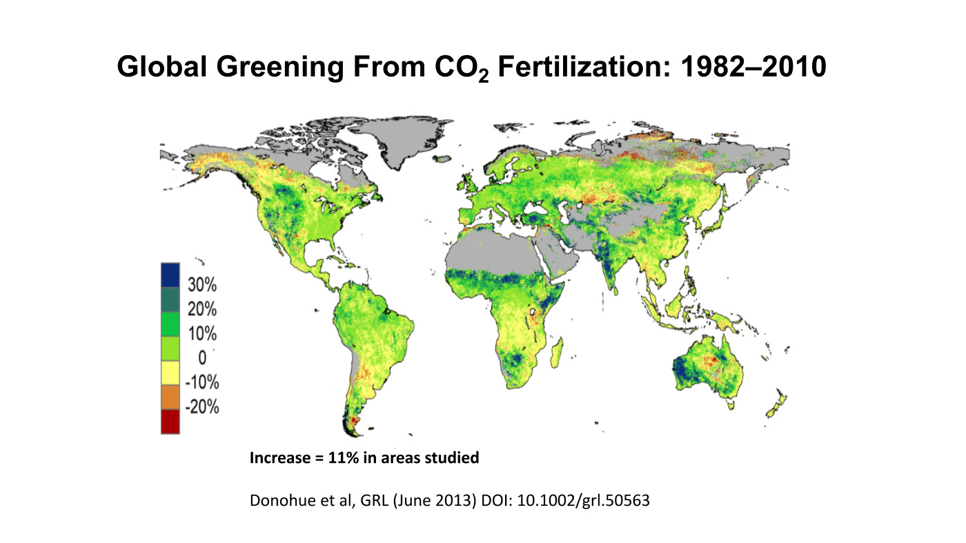
The biggest benefit of emissions is global greening, the increase year after year of green vegetation on the land surface of the planet. Forests grow more thickly, grasslands more richly and scrub more rapidly. This has been measured using satellites and on-the-ground recording of plant-growth rates. It is happening in all habitats, from tundra to rainforest. In the four decades since 1982, as Bjorn Lomborg points out, NASA data show that global greening has added 618,000 square kilometres of extra green leaves each year, equivalent to three Great Britains. You read that right: every year there’s more greenery on the planet to the extent of three Britains. I bet Greta Thunberg did not tell you that.
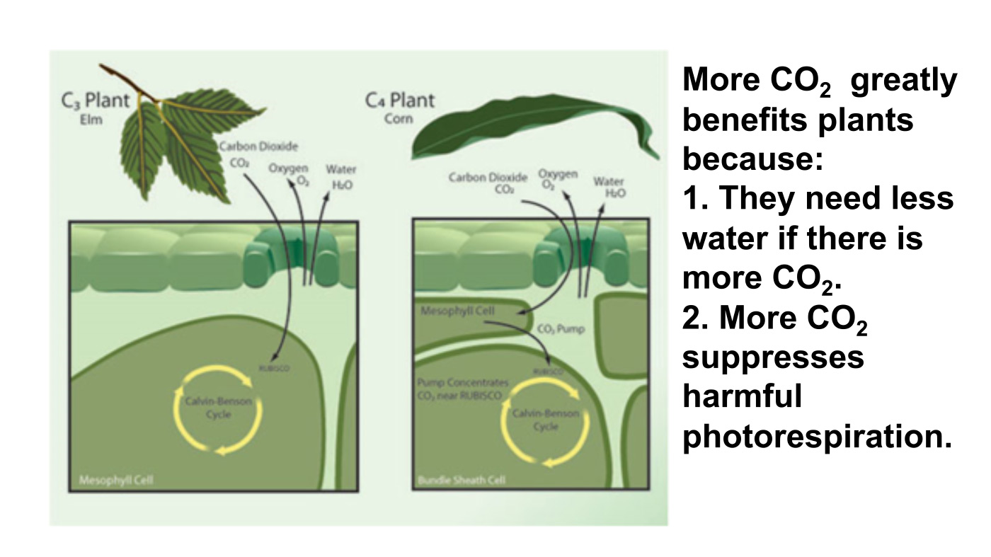
The cause of this greening? Although tree planting, natural reforestation, slightly longer growing seasons and a bit more rain all contribute, the big cause is something else. All studies agree that by far the largest contributor to global greening – responsible for roughly half the effect – is the extra carbon dioxide in the air. In 40 years, the proportion of the atmosphere that is CO2 has gone from 0.034 per cent to 0.041 per cent. That may seem a small change but, with more ‘food’ in the air, plants don’t need to lose as much water through their pores (‘stomata’) to acquire a given amount of carbon. So dry areas, like the Sahel region of Africa, are seeing some of the biggest improvements in greenery. Since this is one of the poorest places on the planet, it is good news that there is more food for people, goats and wildlife.
But because good news is no news, green pressure groups and environmental correspondents in the media prefer to ignore global greening. Astonishingly, it merited no mentions on the BBC’s recent Green Planet series, despite the name. Or, if it is mentioned, the media point to studies suggesting greening may soon cease. These studies are based on questionable models, not data (because data show the effect continuing at the same pace). On the very few occasions when the BBC has mentioned global greening it is always accompanied by a health warning in case any viewer might glimpse a silver lining to climate change – for example, ‘extra foliage helps slow climate change, but researchers warn this will be offset by rising temperatures’.
Another bit of good news is on deaths. We’re against them, right? A recent study shows that rising temperatures have resulted in half a million fewer deaths in Britain over the past two decades. That is because cold weather kills about ’20 times as many people as hot weather’, according to the study, which analyses ‘over 74million deaths in 384 locations across 13 countries’. This is especially true in a temperate place like Britain, where summer days are rarely hot enough to kill. So global warming and the unrelated phenomenon of urban warming relative to rural areas, caused by the retention of heat by buildings plus energy use, are both preventing premature deaths on a huge scale.
Summer temperatures in the US are changing at half the rate of winter temperatures and daytimes are warming 20 per cent slower than nighttimes. A similar pattern is seen in most countries. Tropical nations are mostly experiencing very slow, almost undetectable daytime warming (outside cities), while Arctic nations are seeing quite rapid change, especially in winter and at night. Alarmists love to talk about polar amplification of average climate change, but they usually omit its inevitable flip side: that tropical temperatures (where most poor people live) are changing more slowly than the average.
My Mind is Made Up, Don’t Confuse Me with the Facts. H/T Bjorn Lomborg, WUWT
But are we not told to expect more volatile weather as a result of climate change? It is certainly assumed that we should. Yet there’s no evidence to suggest weather volatility is increasing and no good theory to suggest it will. The decreasing temperature differential between the tropics and the Arctic may actually diminish the volatility of weather a little.
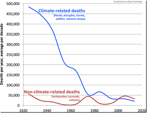
Indeed, as the Intergovernmental Panel on Climate Change (IPCC) repeatedly confirms, there is no clear pattern of storms growing in either frequency or ferocity, droughts are decreasing slightly and floods are getting worse only where land-use changes (like deforestation or building houses on flood plains) create a problem. Globally, deaths from droughts, floods and storms are down by about 98 per cent over the past 100 years – not because weather is less dangerous but because shelter, transport and communication (which are mostly the products of the fossil-fuel economy) have dramatically improved people’s ability to survive such natural disasters.
The effect of today’s warming (and greening) on farming is, on average, positive: crops can be grown farther north and for longer seasons and rainfall is slightly heavier in dry regions. We are feeding over seven billion people today much more easily than we fed three billion in the 1960s, and from a similar acreage of farmland. Global cereal production is on course to break its record this year, for the sixth time in 10 years.
Nature, too, will do generally better in a warming world. There are more species in warmer climates, so more new birds and insects are arriving to breed in southern England than are disappearing from northern Scotland. Warmer means wetter, too: 9,000 years ago, when the climate was warmer than today, the Sahara was green. Alarmists like to imply that concern about climate change goes hand in hand with concern about nature generally. But this is belied by the evidence. Climate policies often harm wildlife:biofuels compete for land with agriculture, eroding the benefits of improved agricultural productivity and increasing pressure on wild land; wind farms kill birds and bats; and the reckless planting of alien sitka spruce trees turns diverse moorland into dark monoculture.
Meanwhile, real environmental issues are ignored or neglected because of the obsession with climate. With the help of local volunteers I have been fighting to protect the red squirrel in Northumberland for years. The government does literally nothing to help us, while it pours money into grants for studying the most far-fetched and minuscule possible climate-change impacts. Invasive alien species are the main cause of species extinction worldwide (like grey squirrels driving the red to the margins), whereas climate change has yet to be shown to have caused a single species to die out altogether anywhere.
Of course, climate change does and will bring problems as well as benefits. Rapid sea-level rise could be catastrophic. But whereas the sea level shot up between 10,000 and 8,000 years ago, rising by about 60 metres in two millennia, or roughly three metres per century, todaythe change is nine times slower: three millimetres a year, or a foot per century, and with not much sign of acceleration. Countries like the Netherlands and Vietnam show that it is possible to gain land from the sea even in a world where sea levels are rising. The land area of the planet is actually increasing, not shrinking, thanks to siltation and reclamation.
Environmentalists don’t get donations or invitations to appear on the telly if they say moderate things. To stand up and pronounce that ‘climate change is real and needs to be tackled, but it’s not happening very fast and other environmental issues are more urgent’ would be about as popular as an MP in Oliver Cromwell’s parliament declaring, ‘The evidence for God is looking a bit weak, and I’m not so very sure that fornication really is a sin’. And I speak as someone who has made several speeches on climate in parliament.
No wonder we don’t hear about the good news on climate change.
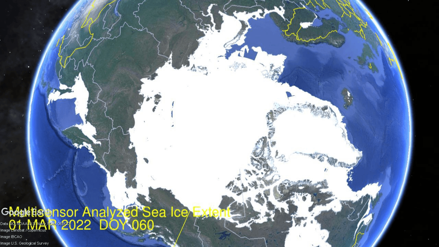
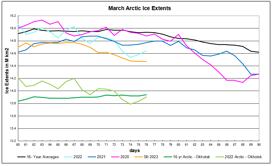
Previous posts showed 2022 Arctic Ice broke the 15M km2 ceiling in February, followed by a typical small melt in March. Climatology refers to the March monthly average ice extent as indicative of the annual maximum Arctic ice extent. The graph above shows that the March monthly average has varied little since 2007, typically around the SII average of 14.7 M km2. Of course there are regional differences as described later on.
The animation shows ice extent fluctuations during March 2022. Bering Sea (lower left) gained ice over the month, while ice in Okhotsk (higher left) retreated. At the top Kara and Barents seas lost and then gained ice. Baffin Bay lower right lost ice during March. The main changes were Baffin losing ~360k km2 of extent and Okhotsk losing ~260k km2.
The effect on NH total ice extents is presented in the graph below.
The graph above shows ice extent through March comparing 2022 MASIE reports with the 16-year average, other recent years and with SII. Hovering around 15M km2 the first week, 2022 ice extents dropped sharply mid month, then stabilized and at March end matched the average. Both 2020 and 2021 ended nearly 400k km2 below average. The two green lines at the bottom show average and 2022 extents when Okhotsk ice is excluded. On this basis 2022 Arctic was nearly 400k km2 in surplus, then declined mid month before ending nearly 200k km2 in surplus to average, except for the ice shortage in Okhotsk.
Region
2022090
Day 90 Average
2022-Ave.
2021090
2022-2021
(0) Northern_Hemisphere
14563095
14616765
-53670
14266634
296461
(1) Beaufort_Sea
1070776
1070116
660
1070689
87
(2) Chukchi_Sea
966006
963906
2100
966006
0
(3) East_Siberian_Sea
1087137
1086102
1035
1087137
0
(4) Laptev_Sea
897845
896958
887
897827
18
(5) Kara_Sea
935023
918083
16941
935023
0
(6) Barents_Sea
748326
645014
103311
602392
145934
(7) Greenland_Sea
616239
652388
-36148
620574
-4334
(8) Baffin_Bay_Gulf_of_St._Lawrence
1441014
1400528
40486
1243739
197275
(9) Canadian_Archipelago
854685
852982
1703
854597
88
(10) Hudson_Bay
1260903
1254217
6687
1260903
0
(11) Central_Arctic
3245216
3232275
12941
3192844
52373
(12) Bering_Sea
785874
720525
65348
549939
235935
(13) Baltic_Sea
52068
63446
-11377
33543
18525
(14) Sea_of_Okhotsk
596190
849221
-253031
942085
-345895
The table shows that the large deficit in Okhotsk is only partially offset by surpluses in Bering and Barents Seas. All other regions show typical extents at end of March
April 1st Footnote:
It has been a long hard winter, requiring overtime efforts by Norwegian icebreakers like this one:
In addition, cold March temperatures led to unusual sightings of Northern creatures:
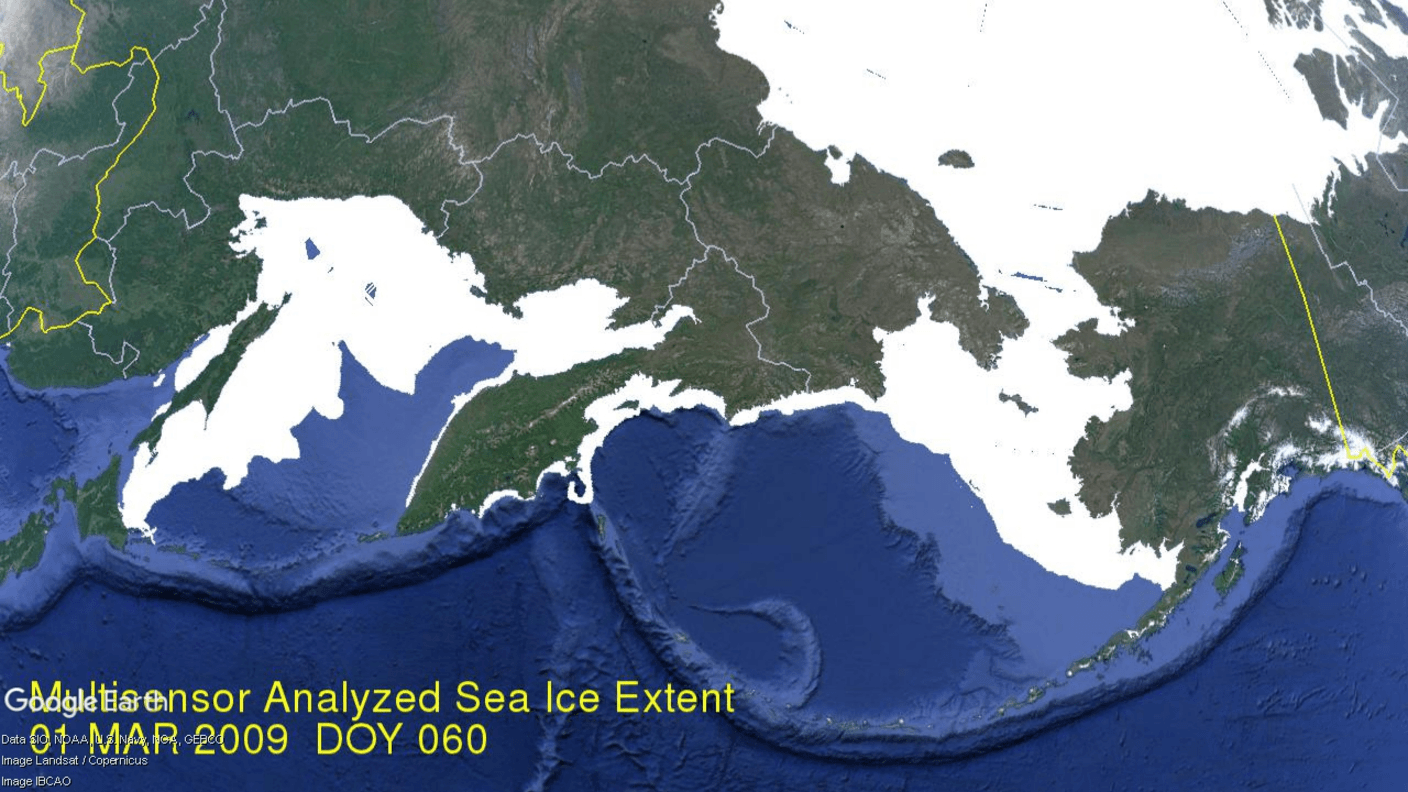
A post last month noted that Arctic ice extent in February unusually exceeded 15M km2 (15 Wadhams). This was despite slower than usual recovery of ice in Sea of Okhotsk. That early 2022 peak ice extent has passed and will now stand as 2022 annual maximum. One wonders why the large ice deficit in that basin. The graph below shows the anomaly.
The 2022 cyan line started March above 15M km2, then declined to day 76 (March 17), ~300k km2 lower than the 16 yr. average. The dark green line shows Arctic ice extent average after Okhotsk is excluded, while the light green is 2022 Arctic extent without Okhotsk. The table below shows that Okhotsk deficit to average on day 76 is 260k km2, almost the entire Arctic deficit.
Region
2022076
Day 76 Average
2022-Ave.
2021076
2022-2021
(0) Northern_Hemisphere
14641084
14935497
-294413
14769906
-128822
(1) Beaufort_Sea
1070776
1070247
529
1070689
87
(2) Chukchi_Sea
966006
965877
129
966006
0
(3) East_Siberian_Sea
1087137
1087107
30
1087120
17
(4) Laptev_Sea
897845
897837
8
897827
18
(5) Kara_Sea
905846
923576
-17730
935006
-29160
(6) Barents_Sea
554036
648194
-94158
849221
-295185
(7) Greenland_Sea
572046
618979
-46934
601423
-29377
(8) Baffin_Bay_Gulf_of_St._Lawrence
1784542
1534462
250080
1288815
495727
(9) Canadian_Archipelago
854685
853020
1665
854597
88
(10) Hudson_Bay
1260691
1258149
2542
1260471
220
(11) Central_Arctic
3153037
3223013
-69976
3222708
-69671
(12) Bering_Sea
729277
755358
-26081
547775
181502
(13) Baltic_Sea
59785
81419
-21634
62626
-2841
(14) Sea_of_Okhotsk
739183
998164
-258981
1117615
-378432
Most places are close to average, with a large surplus in Baffin Bay offsetting small deficits elsewhere. The exception is Okhotsk making up most of the total deficit to average, and even a larger deficit to last year
IOW, had Okhotsk extent been average on day 60 (1.08M km2) instead of 852k km2, the surplus would have been even higher. So why was ice missing in Okhotsk this year?
Firstly, the animation above shows that Okhotsk (and also Bering) sea ice is quite variable year over year. The MASIE record for day 60 shows Okhotsk at 880k km2 in 2006, up to 1230k km2 in 2012, down to 770k km2 in 2015, up to 1080k km2 in 2018, down to 850k km2 in 2022. Notice Okhotsk 2022 is quite similar to 2015, while Bering is about average this year. What causes these fluctuations on annual, decadal and longer time scales?
The answer illustrates the complexity of natural factors interacting to produce climatic patterns we observe and measure. In Okhotsk in particular, and in the Arctic generally, changes in ice extents are a function of the 3 Ws: Water, Wind and Weather. More specifically, water changes in temperature (SST) and salinity (SSS); wind changes with changes in sea level pressures (SLP); and stormy weather varies between cyclonic and anticyclonic regimes. Below is discussion of these natural mechanisms.
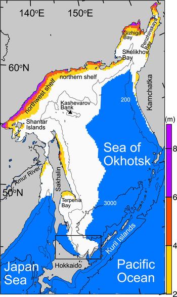
The Sea of Okhotsk is what oceanographers call a marginal sea: a region of a larger ocean basin that is partly enclosed by islands and peninsulas hugging a continental coast. With the Kamchatka Peninsula, the Kuril Islands, and Sakhalin Island partly sheltering the sea from the Pacific Ocean, and with prevailing, frigid northwesterly winds blowing out from Siberia, the sea is a winter ice factory and a year-round cloud factory.
The region is the lowest latitude (45 degrees at the southern end) where sea ice regularly forms. Ice cover varies from 50 to 90 percent each winter depending on the weather. Ice often persists for nearly six months, typically from October to March. Aside from the cold winds from the Russian interior, the prodigious flow of fresh water from the Amur River freshens the sea, making the surface less saline and more likely to freeze than other seas and bays.
Map of the Sea of Okhotsk with bottom topography. The 200- and 3000-m isobars are indicated by thin and thick solid lines, respectively. A box denotes the enlarged portion in Figure 5. White shading indicates sea-ice area (ice concentration ⩾30%) in February averaged for 2003–11; blue shading indicates open ocean area. Ice concentration from AMSR-E is used. Color shadings indicate cumulative ice production in coastal polynyas during winter (December–March) averaged from the 2002/03 to 2009/10 seasons (modified from Nihashi and others, 2012, 2017). The amount is indicated by the bar scale. Source: Cambridge Core
Basics of Weather and Ice Dynamics
Wind directions are named by which point on the compass the prevailing wind hits you in the face. Thus, a southerly wind comes from the south toward the north, typically bringing warmer air north, and displacing colder northern air.
Winds arise from differences in surface pressures. Above every square inch on the surface of the Earth is 14.7 pounds of air. That means air exerts 14.7 pounds per square inch (psi) of pressure at Earth’s surface. High in the atmosphere, air pressure decreases.
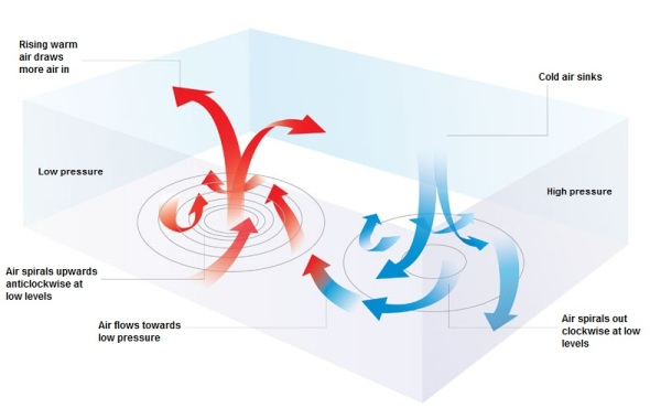
Pressure varies from day to day at the Earth’s surface – the bottom of the atmosphere. This is, in part, because the Earth is not equally heated by the Sun. Areas where the air is warmed often have lower pressure because the warm air rises. These areas are called low pressure systems. Places where the air pressure is high, are called high pressure systems.
A low pressure system has lower pressure at its center than the areas around it. Winds blow towards the low pressure, and the air rises in the atmosphere where they meet. As the air rises, the water vapor within it condenses, forming clouds and often precipitation. Because of Earth’s spin and the Coriolis effect, winds of a low pressure system swirl counterclockwise north of the equator and clockwise south of the equator. This is called cyclonic flow. On weather maps, a low pressure system is labeled with red L.
A high pressure system has higher pressure at its center than the areas around it. Winds blow away from high pressure. Swirling in the opposite direction from a low pressure system, the winds of a high pressure system rotate clockwise north of the equator and counterclockwise south of the equator. This is called anticyclonic flow. Air from higher in the atmosphere sinks down to fill the space left as air is blown outward. On a weather map, you may notice a blue H, denoting the location of a high pressure system.
High and low pressure indicated by lines of equal pressure called isobars.
When the suns shines on land the air is warmed and rises. And because the earth is rotating, an upward spiral forms. Additionally, over wetlands and the oceans there is evaporation, which also rises, H2O being lighter than N2 or O2. When the water is warmer, the rising air intensifies and resulting in a lower pressure than surrounding areas. Arctic cyclones disrupt drift ice, creating more open water, and impede freezing. Arctic anticyclones (HP cells) facilitate cooling and freezing.
The vertical direction of wind motion is typically very small (except in thunderstorm updrafts) compared to the horizontal component, but is very important for determining the day to day weather. Rising air will cool, often to saturation, and can lead to clouds and precipitation. Sinking air warms causing evaporation of clouds and thus fair weather.
The closer the isobars are drawn together the quicker the air pressure changes. This change in air pressure is called the “pressure gradient”. Pressure gradient is just the difference in pressure between high- and low-pressure areas.
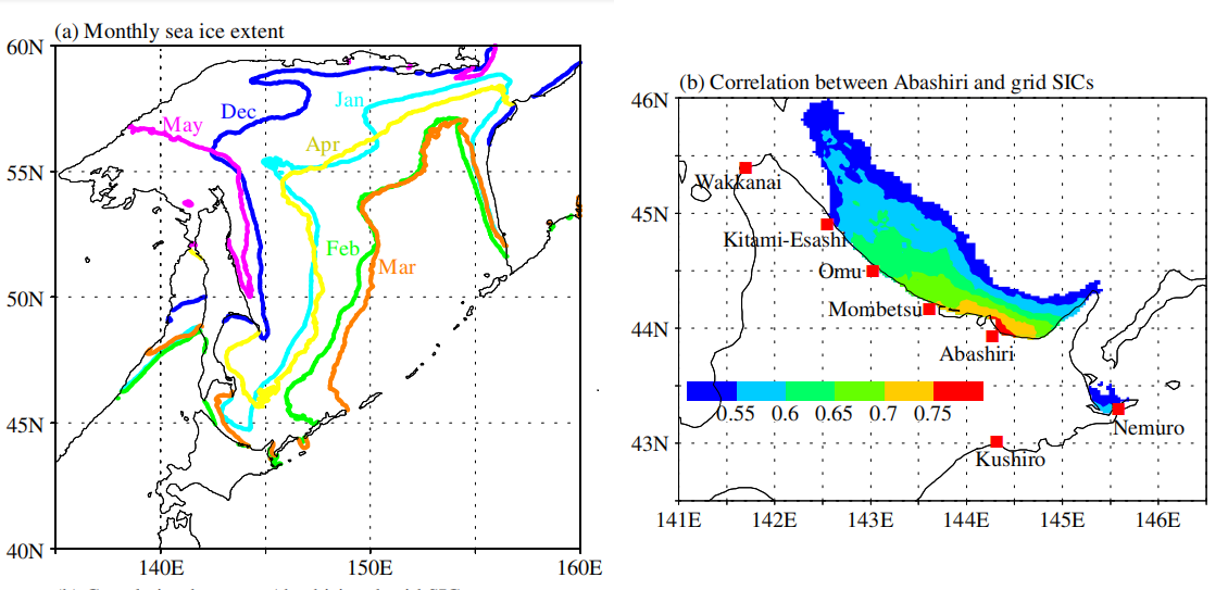
Long-term sea ice observation data at the Japan Meteorological Agency observatories along the Okhotsk coast of Hokkaido were analyzed. The observations at the Abashiri Local Meteorological Observatory largely explained the variations at other sites along much of the Okhotsk coast on a time scale longer than a few days. Interannually, variations of the maximum sea ice areas in the whole and southern Sea of Okhotsk were largely reflected in the yearly accumulated sea ice concentration (SIC) and sea ice duration variations at the observatories.
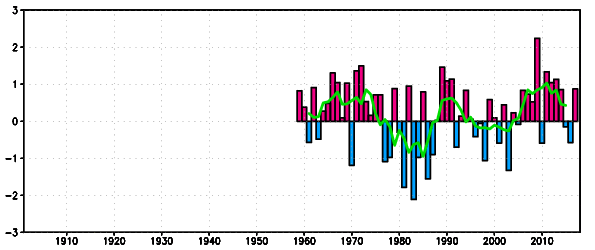
NPI time series The bars represent five-month mean ( November – March ) NPI values. The green line represents five-year running means of five-month mean NPI values. Positive (negative) NPI values indicate that the Aleutian Low is weaker (stronger) than its normal. For comparison with the PDO index, the period of the graph is adjusted to that of the PDO index.
A comparison with several indices for the North Pacific climate variability suggested that the North Pacific Index (NPI) is a robust indicatorof the recent (after the 1980s) sea ice variations in the Sea of Okhotsk on a decadal time scale. Specifically:
♦ variations in the first sea ice appearance date at the observatories resulted from variations in the Aleutian Low with meridional wind anomalies over the Sea of Okhotsk and the air temperature around Japan in January;
♦ variations in the final disappearance date resulted from the Aleutian Low variations, and,
♦ the resulting sea ice cover variations in the Sea of Okhotsk except for the Siberian coast affected the air temperatures in April. These factors influenced the sea ice duration.
A strong linkage was found between variations in the local sea ice (along the Hokkaido coast) and large-scale fields, which will help improve our understanding of the sea ice extent and retreat variability over the Sea of Okhotsk and its linkage to the North Pacific climate variability.
Fig. 1 (a) Monthly sea ice extent (contours of grid SIC = 0.3) averaged over 1977–2019. (b) Locations of JMA observatories and distribution of dailybasis correlation coefficients between the Abashiri and grid SICs. (N = 700–800 approximately).
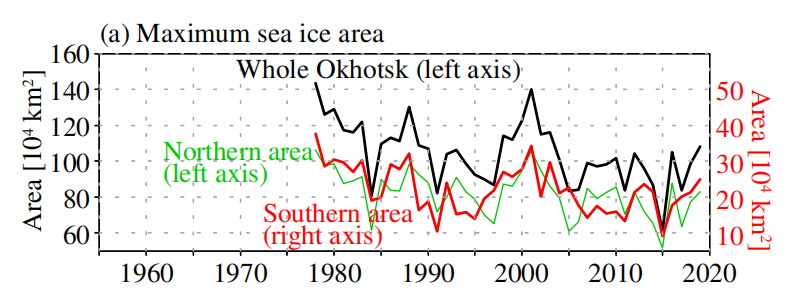
Fig. 2 (a) Yearly maximum sea ice areas in the Sea of Okhotsk from the grid SIC data for the whole (black; left axis), northern (>50°N; green; left axis), and southern (<50°N; red; right axis) areas.
Among several climate indices, the NPI is a robust indicator of recent (after the 1980s) sea ice variations in the Sea of Okhotsk. We also examined the differences between the start and end date variations, which determine the durations. Variations in the start date at the Okhotsk coast sites resulted from the variations in the Aleutian Low strength, the air temperature around Japan in January, and partly the SST along the Soya warm current in December. Variations in the end date resulted from the Aleutian Low variations; the sea ice cover variations affected the air temperatures over the Sea of Okhotsk in April, in contrast to the sea ice cover variations in January resulting from the air temperature variations.
Sea Ice Tourism from Hokkaido, Japan
Taking a boat trip from Hokkaido Island to see Okhotsk drift ice is a big tourist attraction, as seen in the short video below. Al Gore had them worried back then, but hopefully not now.
Legacy and social media keep up a constant drumbeat of warnings about a degree or two of planetary warming without any historical context for considering the significance of the alternative. A poem of Robert Frost comes to mind as some applicable wisdom:
The diagram at the top shows how grateful we should be for living in today’s climate instead of a glacial icehouse. (H/T Raymond Inauen) For most of its history Earth has been frozen rather than the mostly green place it is today. And the reference is to the extent of the North American ice sheet during the Last Glacial Maximum (LGM).
For further context consider that geologists refer to our time as a “Severe Icehouse World”, among the various conditions in earth’s history, as diagramed by paleo climatologist Christopher Scotese. Referring to the Global Mean Temperatures, it appears after many decades, we are slowly rising to “Icehouse World”, which would seem to be a good thing.
Instead of fear mongering over a bit of warming, we should celebrate our good fortune, and do our best for humanity and the biosphere. Matthew Ridley takes it from there in a previous post.
Background from previous post The Goodness of Global Warming
LAI refers to Leaf Area Index.
As noted in other posts here, warming comes and goes and a cooling period may now be ensuing. See No Global Warming, Chilly January Land and Sea. Matt Ridley provides a concise and clear argument to celebrate any warming that comes to our world in his Spiked article Why global warming is good for us. Excerpts in italics with my bolds and added images.
Climate change is creating a greener, safer planet.
Global warming is real. It is also – so far – mostly beneficial. This startling fact is kept from the public by a determined effort on the part of alarmists and their media allies who are determined to use the language of crisis and emergency. The goal of Net Zero emissions in the UK by 2050 is controversial enough as a policy because of the pain it is causing. But what if that pain is all to prevent something that is not doing net harm?
The biggest benefit of emissions is global greening, the increase year after year of green vegetation on the land surface of the planet. Forests grow more thickly, grasslands more richly and scrub more rapidly. This has been measured using satellites and on-the-ground recording of plant-growth rates. It is happening in all habitats, from tundra to rainforest. In the four decades since 1982, as Bjorn Lomborg points out, NASA data show that global greening has added 618,000 square kilometres of extra green leaves each year, equivalent to three Great Britains. You read that right: every year there’s more greenery on the planet to the extent of three Britains. I bet Greta Thunberg did not tell you that.
The cause of this greening? Although tree planting, natural reforestation, slightly longer growing seasons and a bit more rain all contribute, the big cause is something else. All studies agree that by far the largest contributor to global greening – responsible for roughly half the effect – is the extra carbon dioxide in the air. In 40 years, the proportion of the atmosphere that is CO2 has gone from 0.034 per cent to 0.041 per cent. That may seem a small change but, with more ‘food’ in the air, plants don’t need to lose as much water through their pores (‘stomata’) to acquire a given amount of carbon. So dry areas, like the Sahel region of Africa, are seeing some of the biggest improvements in greenery. Since this is one of the poorest places on the planet, it is good news that there is more food for people, goats and wildlife.
But because good news is no news, green pressure groups and environmental correspondents in the media prefer to ignore global greening. Astonishingly, it merited no mentions on the BBC’s recent Green Planet series, despite the name. Or, if it is mentioned, the media point to studies suggesting greening may soon cease. These studies are based on questionable models, not data (because data show the effect continuing at the same pace). On the very few occasions when the BBC has mentioned global greening it is always accompanied by a health warning in case any viewer might glimpse a silver lining to climate change – for example, ‘extra foliage helps slow climate change, but researchers warn this will be offset by rising temperatures’.
Another bit of good news is on deaths. We’re against them, right? A recent study shows that rising temperatures have resulted in half a million fewer deaths in Britain over the past two decades. That is because cold weather kills about ’20 times as many people as hot weather’, according to the study, which analyses ‘over 74million deaths in 384 locations across 13 countries’. This is especially true in a temperate place like Britain, where summer days are rarely hot enough to kill. So global warming and the unrelated phenomenon of urban warming relative to rural areas, caused by the retention of heat by buildings plus energy use, are both preventing premature deaths on a huge scale.
Summer temperatures in the US are changing at half the rate of winter temperatures and daytimes are warming 20 per cent slower than nighttimes. A similar pattern is seen in most countries. Tropical nations are mostly experiencing very slow, almost undetectable daytime warming (outside cities), while Arctic nations are seeing quite rapid change, especially in winter and at night. Alarmists love to talk about polar amplification of average climate change, but they usually omit its inevitable flip side: that tropical temperatures (where most poor people live) are changing more slowly than the average.
My Mind is Made Up, Don’t Confuse Me with the Facts. H/T Bjorn Lomborg, WUWT
But are we not told to expect more volatile weather as a result of climate change? It is certainly assumed that we should. Yet there’s no evidence to suggest weather volatility is increasing and no good theory to suggest it will. The decreasing temperature differential between the tropics and the Arctic may actually diminish the volatility of weather a little.
Indeed, as the Intergovernmental Panel on Climate Change (IPCC) repeatedly confirms, there is no clear pattern of storms growing in either frequency or ferocity, droughts are decreasing slightly and floods are getting worse only where land-use changes (like deforestation or building houses on flood plains) create a problem. Globally, deaths from droughts, floods and storms are down by about 98 per cent over the past 100 years – not because weather is less dangerous but because shelter, transport and communication (which are mostly the products of the fossil-fuel economy) have dramatically improved people’s ability to survive such natural disasters.
The effect of today’s warming (and greening) on farming is, on average, positive: crops can be grown farther north and for longer seasons and rainfall is slightly heavier in dry regions. We are feeding over seven billion people today much more easily than we fed three billion in the 1960s, and from a similar acreage of farmland. Global cereal production is on course to break its record this year, for the sixth time in 10 years.
Nature, too, will do generally better in a warming world. There are more species in warmer climates, so more new birds and insects are arriving to breed in southern England than are disappearing from northern Scotland. Warmer means wetter, too: 9,000 years ago, when the climate was warmer than today, the Sahara was green. Alarmists like to imply that concern about climate change goes hand in hand with concern about nature generally. But this is belied by the evidence. Climate policies often harm wildlife:biofuels compete for land with agriculture, eroding the benefits of improved agricultural productivity and increasing pressure on wild land; wind farms kill birds and bats; and the reckless planting of alien sitka spruce trees turns diverse moorland into dark monoculture.
Meanwhile, real environmental issues are ignored or neglected because of the obsession with climate. With the help of local volunteers I have been fighting to protect the red squirrel in Northumberland for years. The government does literally nothing to help us, while it pours money into grants for studying the most far-fetched and minuscule possible climate-change impacts. Invasive alien species are the main cause of species extinction worldwide (like grey squirrels driving the red to the margins), whereas climate change has yet to be shown to have caused a single species to die out altogether anywhere.
Of course, climate change does and will bring problems as well as benefits. Rapid sea-level rise could be catastrophic. But whereas the sea level shot up between 10,000 and 8,000 years ago, rising by about 60 metres in two millennia, or roughly three metres per century, todaythe change is nine times slower: three millimetres a year, or a foot per century, and with not much sign of acceleration. Countries like the Netherlands and Vietnam show that it is possible to gain land from the sea even in a world where sea levels are rising. The land area of the planet is actually increasing, not shrinking, thanks to siltation and reclamation.
Environmentalists don’t get donations or invitations to appear on the telly if they say moderate things. To stand up and pronounce that ‘climate change is real and needs to be tackled, but it’s not happening very fast and other environmental issues are more urgent’ would be about as popular as an MP in Oliver Cromwell’s parliament declaring, ‘The evidence for God is looking a bit weak, and I’m not so very sure that fornication really is a sin’. And I speak as someone who has made several speeches on climate in parliament.
No wonder we don’t hear about the good news on climate change.