This is a new slide from Raymond at RIC-Communications added to twelve others in a project entitled The World of CO2. Below is a reprinted post with the background and complete set of exhibits, or infographics as he calls them. Recently Dr. William Happer referred to this long historical view to correct activists who claim we are conducting a dangerous experiment on the planet by burning fossil fuels and releasing CO2. As the chart shows, CO2 atmospheric concentrations have been much higher throughout history, with today being a period of CO2 famine. As well the graph shows that temperatures can crash even when CO2 is high, and periods that remained warm while CO2 declined. Also apparent is our current time well into an interglacial period, classified by paleoclimatologists as an “Icehouse. See Post Climate Advice: Don’t Worry Be Happer
Previous Post Here’s Looking at You CO2
Raymond of RiC-Communications studio commented on a recent post and made an offer to share here some graphics on CO2 for improving public awareness. This post presents the eleven charts he has produced so far. I find them straightforward and useful, and appreciate his excellent work on this. Project title is link to RiC-Communications.
Updates January 21 and 26, 2020, with added slides
Infographics can be helpful, in making things simple to understand. CO2 is a complex topic with a lot of information and statistics. These simple step by step charts should help to give you an idea of CO2’s importance. Without CO2, plants wouldn’t be able to live on this planet. Just remember, that if CO2 falls below 150 ppm, all plant life would cease to exist.
– N° 1 Earth‘s atmospheric composition
– N° 2 Natural sources of CO2 emissions
– N° 3 Global anthropogenic CO2 emissions
– N° 4 CO2 – Carbon dioxide molecule
– N° 5 The global carbon cycle
– N° 6 Carbon and plant respiration
– N° 7 Plant categories and abundance (C3, C4 & CAM Plants)
– N° 8 Photosynthesis, the C3 vs C4 gap
– N° 9 Plant respiration and CO2
– N° 10 The logarithmic temperature rise of higher CO2 levels.
– N° 11 Earth‘s atmospheric composition in relationship to CO2 – N° 12 Human respiration and CO2 concentrations.
– N° 13 600 million years of temperature change and atmospheric CO2
And in Addition
Note that the illustration #10 assumes (as is the “consensus”) that doubling atmospheric CO2 produces a 1C rise in GMT (Global Mean Temperature). Even if true, the warming would be gentle and not cataclysmic. Greta and XR are foolishly thinking the world goes over a cliff if CO2 hits 430ppm. I start to wonder if Greta really can see CO2 as she claims.
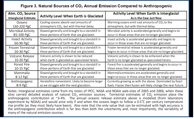
It is also important to know that natural CO2 sources and sinks are estimated with large error ranges. For example this table from earlier IPCC reports:
Below are some other images I find meaningful, though they lack Raymond’s high production values.
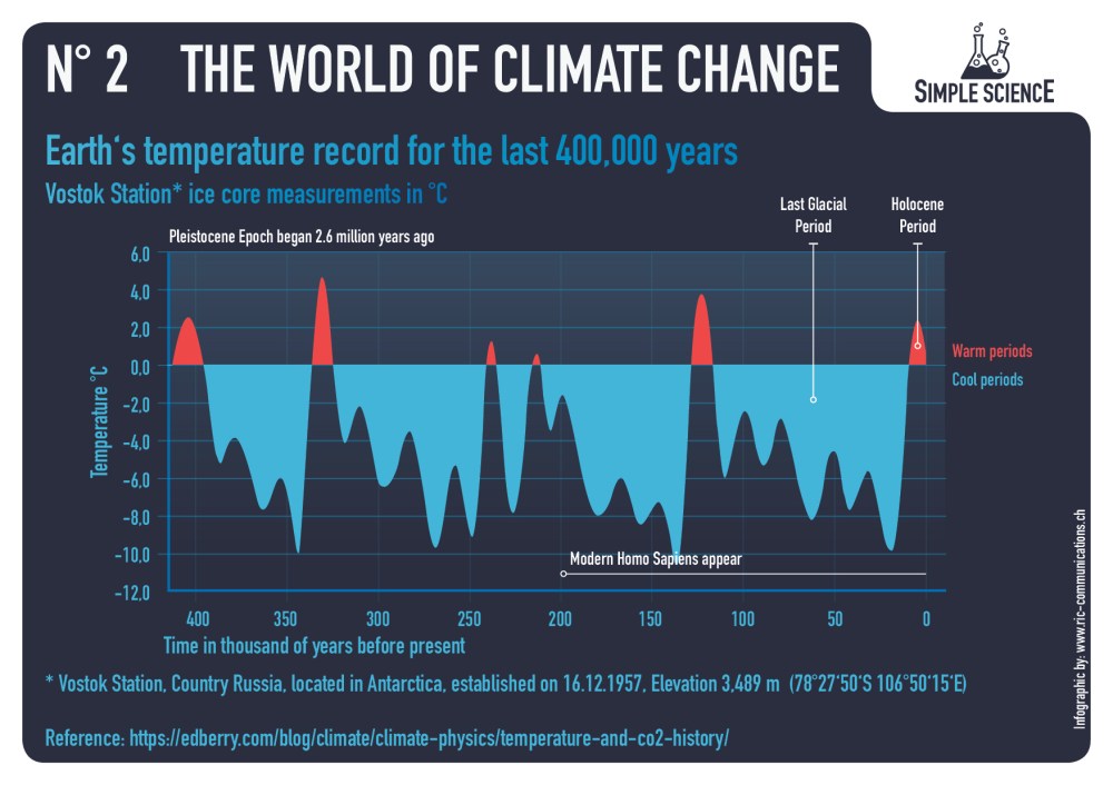
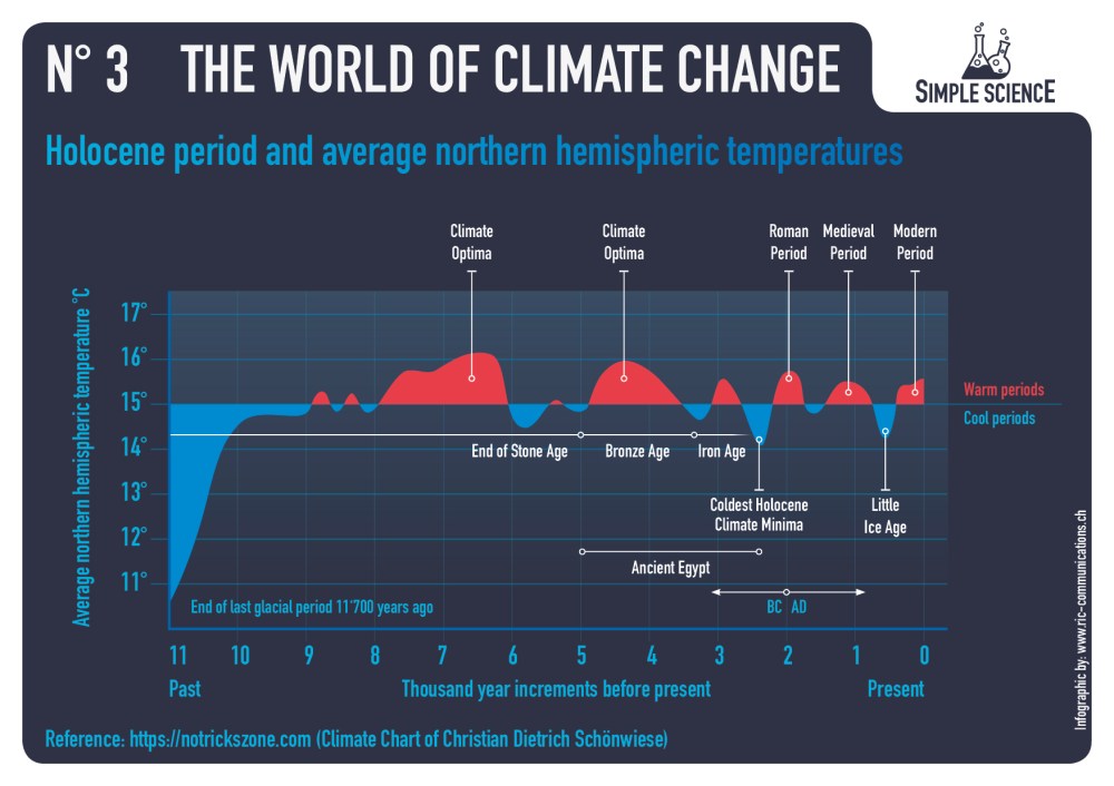
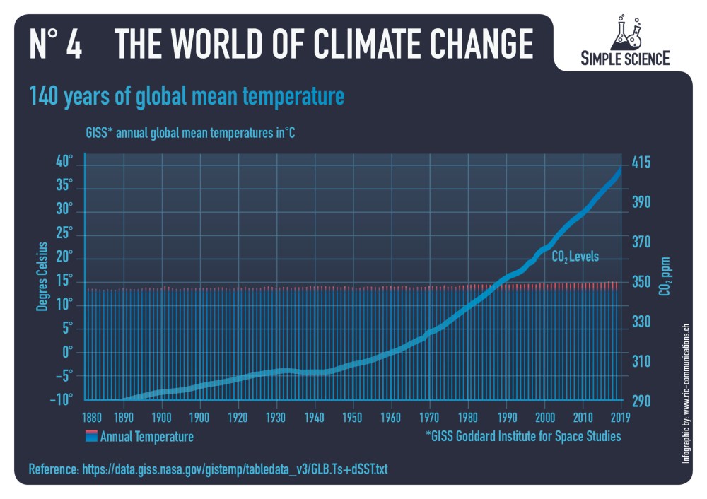
Raymond of RiC-Communications studio commented on a recent post and made an offer to share here some graphics on CO2 for improving public awareness. He has produced 12 interesting slides which are presented in the post Here’s Looking at You, CO2. This post presents the six charts he has so far created on a second theme The World of Climate Change. I find them straightforward and useful, and appreciate his excellent work on this. Project title is link to RiC-Communications.
Infographics can be helpful, in making things simple to understand. Climate change is a complex topic with a lot of information and statistics. These simple step by step charts are here to better understand what is occurring naturally and what could be caused by humans. What is cause for alarm and what isn’t cause for alarmism if at all. Only through learning is it possible to get the big picture so as to make the right decisions for the future.
Comment:
This project will explore information concerning how aspects of the world climate system have changed in the past up to the present time. Understanding the range of historical variation and the factors involved is essential for anticipating how future climate parameters might fluctuate.
Note that the illustration #10 assumes (as is the “consensus”) that doubling atmospheric CO2 produces a 1C rise in GMT (Global Mean Temperature). Even if true, the warming would be gentle and not cataclysmic. Greta and XR are foolishly thinking the world goes over a cliff if CO2 hits 430ppm. I start to wonder if Greta really can see CO2 as she claims.
It is also important to know that natural CO2 sources and sinks are estimated with large error ranges. For example this table from earlier IPCC reports:
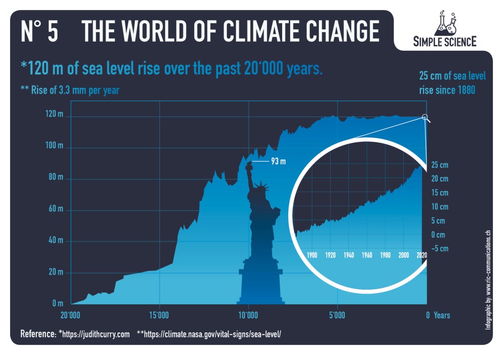
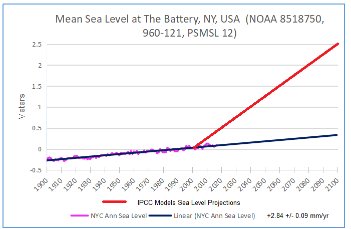
Since the Statue of Liberty features in the sea level graphic, here are observations from there
Below are some other images I find meaningful, though they lack Raymond’s high production values.
A previous post Light Bulbs Disprove Global Warming presented an article by Dr. Peter Ward along with some scientific discussion from his website. This post presents an excerpt from Chapter One of his book which helpfully explains his journey of discovery from his field of volcanism to the larger question of global warming.
The evidence for volcanism in the ice layers under Summit, Greenland, consists of sulfate deposits. Sulfate comes from sulfur dioxide, megatons of which are emitted during each volcanic eruption. At first, I thought that the warming was caused by the sulfur dioxide, which is observed to absorb solar energy passing through the atmosphere.17 My thinking was influenced by greenhouse warming theory, which assumes that carbon dioxide causes global warming because it is observed to absorb infrared energy radiated by Earth as it passes upward through the atmosphere and is then thought to re-radiate it back down to the surface, thus causing warming. The sulfur dioxide story, however, just wasn’t adding up quantitatively.
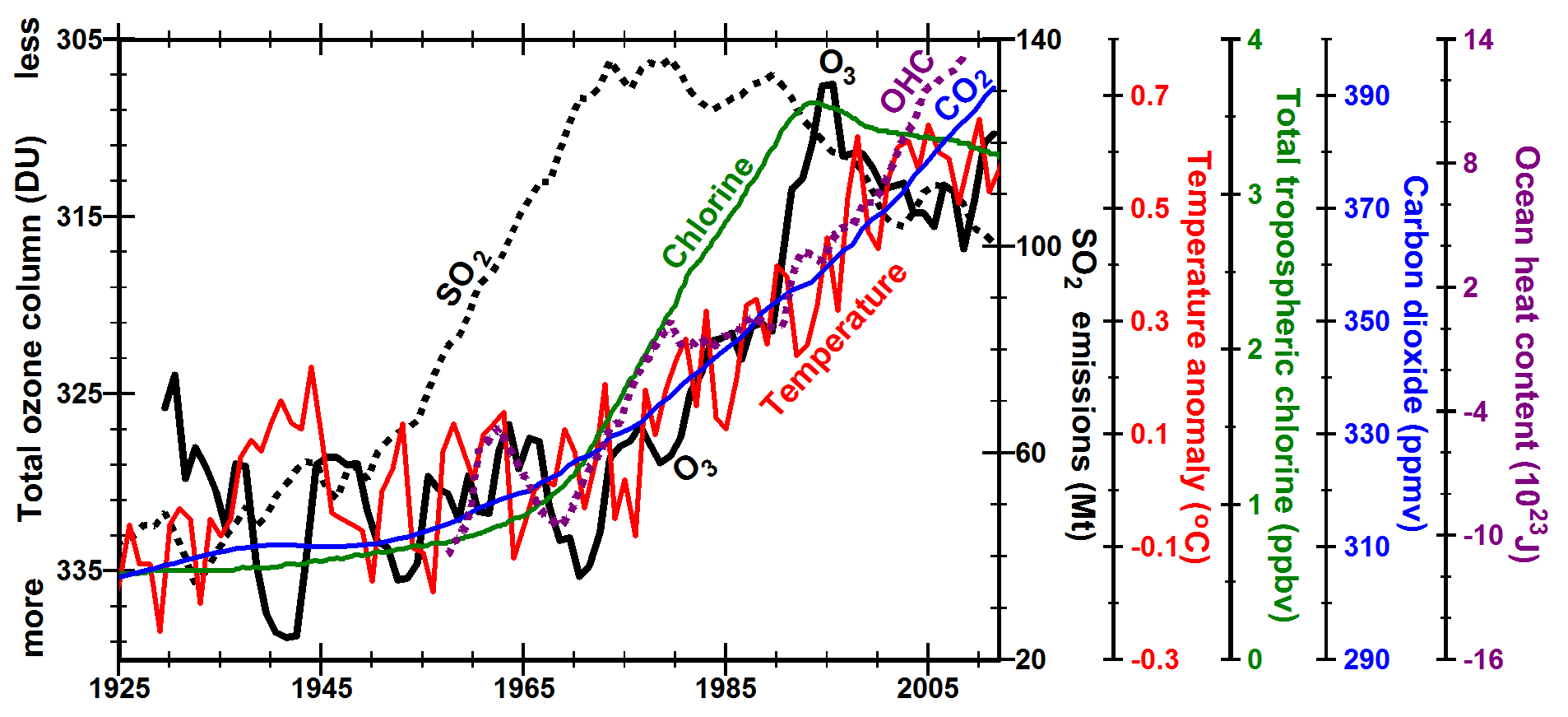
Figure 1.9 Average temperatures per century (black) increased at the same time as the amount of volcanic sulfate per century (red). The greatest warming occurred when volcanism was more continuous from year to year, as shown by the blue circles surrounding the number of contiguous layers (7 or more) containing volcanic sulfate. It was this continuity over two millennia that finally warmed the world out of the last ice age. Data are from the GISP2 drill hole under Summit, Greenland. Periods of major warming are labeled in black. Periods of major cooling are labeled in blue.
Eventually, after publishing two papers that developed this story, I came to realize that sulfur dioxide was actually just the “footprint” of volcanism—a measure of how active volcanoes were at any given time. The real breakthrough came when I came across a paper reporting that the lowest concentrations of stratospheric ozone ever recorded were for the two years after the 1991 eruption of Mt. Pinatubo, the largest volcanic eruption since the 1912 eruption of Mt. Katmai. As I dug deeper, analyzing ozone records from Arosa, Switzerland18—the longest running observations of ozone in the world, begun in 1927 (Figure 8.15 on page 119)—I found that ozone spiked in the years of most volcanic eruptions but dropped dramatically and precipitously in the year following each eruption. There seemed to be a close relationship between volcanism and ozone. What could that relationship be?
Increased SO2 pollution (dotted black line) does not appear to contribute to substantial global warming (red line) until total column ozone decreased (black line, y-axis inverted), most likely due to increasing tropospheric chlorine (green line). Mean annual temperature anomaly in the Northern Hemisphere (red line) and ozone (black line) are smoothed with a centered 5 point running mean. OHC is ocean heat content (dotted purple line).
The answer was not long in coming. I knew that all volcanoes release hydrogen chloride when they erupt, and I also knew that chlorine from man-made chlorofluorocarbon compounds had been identified in the 1970s as a potent agent of stratospheric ozone depletion. From these two facts, and a third one, I deduced that it must be the depletion of ozone by chlorine in volcanic hydrogen chloride—and not the absorption of solar radiation by sulfur dioxide—that was driving the warming events that followed volcanic eruptions. The third fact in the equation was the well-known interaction of stratospheric ozone with solar radiation.
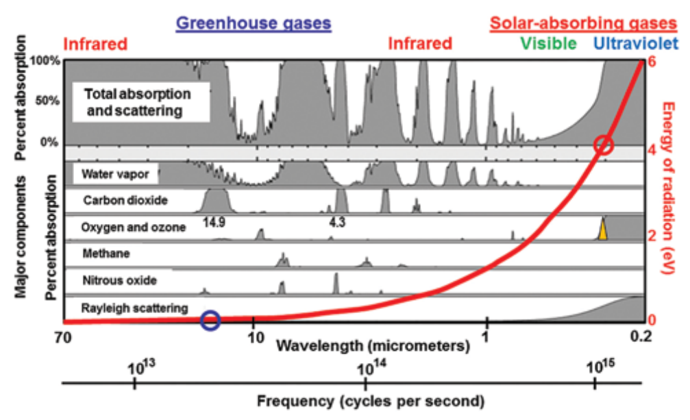
Figure 1.10 When ozone is depleted, a narrow sliver of solar ultraviolet-B radiation with wavelengths close to 0.31 µm (yellow triangle) reaches Earth. The red circle shows that the energy of this ultraviolet radiation is around 4 electron volts (eV) on the red scale on the right, 48 times the energy absorbed most strongly by carbon dioxide (blue circle, 0.083 eV at 14.9 micrometers (µm) wavelength. Shaded grey areas show the bandwidths of absorption by different greenhouse gases. Current computer models calculate radiative forcing by adding up the areas under the broadened spectral lines that make up these bandwidths. Net radiative energy, however, is proportional to frequency only (red line), not to amplitude, bandwidth, or amount.
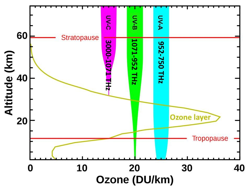
The ozone layer, at altitudes of 12 to 19 miles (20 to 30 km) up in the lower stratosphere, absorbs very energetic solar ultraviolet radiation, thereby protecting life on Earth from this very “hot,” DNA-destroying radiation. When the concentration of ozone is reduced, more ultraviolet radiation is observed to reach Earth’s surface, increasing the risk of sunburn and skin cancer. There is no disagreement among climate scientists about this, but I went one step further by deducing that this increased influx of “super-hot” ultraviolet radiation also actually warms Earth.
All ultraviolet UV-C is absorbed in the upper atmosphere. Most UV-B is absorbed in the stratosphere. The wavelengths of UV are shown in nanometers.
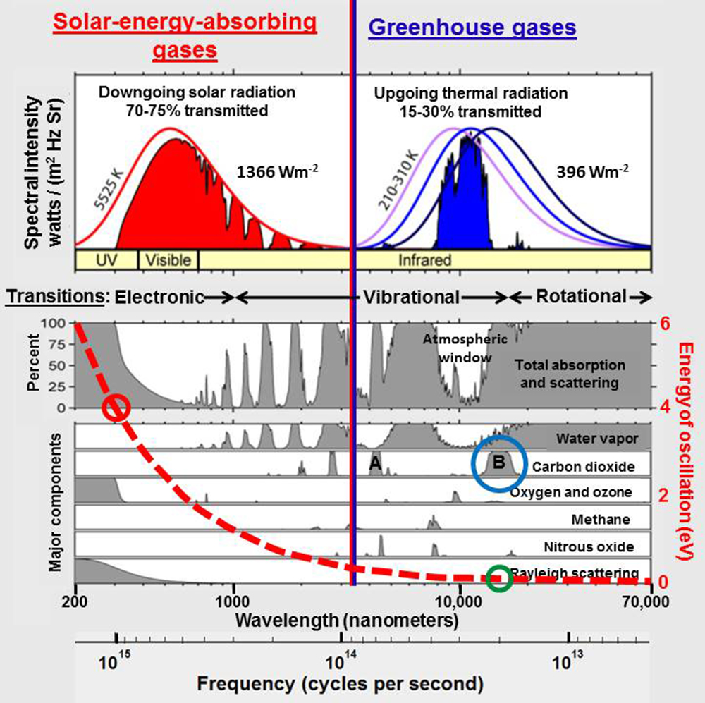
All current climate models assume that radiation travels through space as waves and that energy in radiation is proportional to the square of the amplitude of these waves and to the bandwidth of the radiation, i.e. to the range of wavelengths or frequencies involved. Figure 1.10 shows the percent absorption for different greenhouse-gases as a function of wavelength or frequency. It is generally assumed that the energy absorbed by greenhouse-gases is proportional to the areas shaded in gray. From this perspective, absorption by carbon dioxide of wavelengths around 14.9 and 4.3 micrometers in the infrared looks much more important than absorption by ozone of ultraviolet-B radiation around 0.31 micrometers. Climate models thus calculate that ultraviolet radiation is relatively unimportant for global warming because it occupies a rather narrow bandwidth in the solar spectrum compared to Earth’s much lower frequency, infrared radiation.
The models neglect the fact, shown by the red line in Figure 1.10 and explained in Chapter 4, that due to its higher frequency, ultraviolet radiation (red circle) is 48 times more energy-rich, 48 times “hotter,” than infrared absorbed by carbon dioxide (blue circle), which means that there is a great deal more energy packed into that narrow sliver of ultraviolet (yellow triangle) than there is in the broad band of infrared. This actually makes very good intuitive sense. From personal experience, we all know that we get very hot and are easily sunburned when standing in ultraviolet sunlight during the day, but that we have trouble keeping warm at night when standing in infrared energy rising from Earth.
These flawed assumptions in the climate models are based on equations that were written in 1865 by James Clerk Maxwell and have been used very successfully to design every piece of electronics that we depend on today, including our electric grid. Maxwell assumed that electromagnetic energy travels as waves through matter, air, and space. His wave equations seem to work well in matter, but not in space. Even though Albert Michelson and Edward Morley demonstrated experimentally in 1887 that there is no medium in space, no so-called luminiferous aether, through which waves could travel, most physicists and climatologists today still assume that electromagnetic radiation does in fact travel through space at least partially in the form of waves.
They also erroneously assume that energy in these imagined waves is proportional to the square of their amplitude, which is true in matter, but cannot be true in space. They calculate that there is more energy in the broad band of low-frequency infrared radiation emitted by Earth and absorbed by greenhouse gases than there is in the narrow sliver of additional high-frequency ultraviolet solar radiation that reaches Earth when ozone is depleted (Figure 1.10). Nothing could be further from the truth.
The energy of radiation absorbed by carbon dioxide around 14,900 nanometers (blue circle) is near 0.08 electron volts (green circle) while the energy that reaches Earth when the ozone layer is depleted around 310 nanometers (red circle) is near 4 electron volts, 48 times larger.
The story got even more convoluted by the rise of quantum mechanics at the dawn of the 20th century when Max Planck and Albert Einstein introduced the idea that energy in light is quantized. These quanta of light ultimately became known as photons. In order to explain the photoelectric effect, Einstein proposed that radiation travels as particles, a concept that scientists and natural philosophers had debated for 2500 years before him. I will explain in Chapter 4 why photons traveling from Sun cannot physically exist, even though they provide a very useful mathematical shorthand.
Max Planck postulated, in 1900, that the energy in radiation is equal to vibrational frequency times a constant, as is true of an atomic oscillator, in which a bond holding two atoms together is oscillating in some way. He needed this postulate in order to derive an equation by trial and error that could account for and calculate the observed properties of radiation. Planck’s postulate led to Albert Einstein’s light quanta and to modern physics, dominated by quantum mechanics and quantum electrodynamics. Curiously, however, Planck didn’t fully appreciate the far-reaching implications of his simple postulate, which states that the energy in radiation is equal to frequency times a constant. He simply saw it as a useful mathematical trick.
Energy is a function of frequency and should therefore be plotted on the x-axis (top of this figure) and units of watts should not be included on the y-axis. The colored lines show the spectral radiance predicted by Planck’s law for black bodies with different absolute temperatures.
As I dug deeper, it took me several years to become comfortable with those implications. It was not the way we were trained to think. It was not the way most physicists think, even today. Being retired turned out to be very useful because I could give my brain time to mull this over. Gradually, it began to make sense. The take-away message for me was that the energy in the kind of ultraviolet radiation that reaches Earth when ozone is depleted is 48 times “hotter” than infrared energy absorbed by greenhouse gases. In sufficient quantities, it should be correspondingly 48 times more effective in raising Earth’s surface temperature than the weak infrared radiation from Earth’s surface that is absorbed by carbon dioxide in the atmosphere and supposedly re-radiated back to the ground.
There simply is not enough energy involved with greenhouse gases to have a significant effect on global warming. Reducing emissions of greenhouse gases will therefore not be effective in reducing global warming. This conclusion is critical right now because most of the world’s nations are planning to meet in Paris, France, in late November 2015, to agree on legally binding limits to greenhouse-gas emissions. Such limits would be very expensive as well as socioeconomically disruptive. We depend on large amounts of affordable energy to support our lifestyles, and developing countries also depend on large amounts of affordable energy to improve their lifestyles. Increasing the cost of energy by even a few percent would have major negative financial and societal repercussions.
This book is your chance to join my odyssey. You do not need to have majored in science or even to be familiar with physics, chemistry, mathematics, or climatology. You just need to be curious and be willing to work. You also need to be willing to think critically about observations, and you may need to reevaluate some of your own ideas about climate. You will learn that there was a slight misunderstanding in science made back in the 1860s that has had profound implications for understanding climate change and physics today. It took me many years of hard work to gain this insight, and I will discuss that in Chapter 4. First, however, we need to look at some fundamental observations that cause us to wonder: Could the greenhouse warming theory of climate change actually be mistaken?
Footnote:
I welcome this analysis and assessment that explain why rising CO2 concentrations in the satellite era have no discernable impact on the radiative profile of the atmosphere. See Global Warming Theory and the Tests It Fails
There they go again with the ocean heating claims. Media alarms are rampant triggered by a new publication Record-Setting Ocean Warmth Continued in 2019 in Advances in Atmospheric Sciences
Authors: Lijing Cheng, John Abraham, Jiang Zhu, Kevin E. Trenberth, John Fasullo, Tim Boyer, Ricardo Locarnini, Bin Zhang, Fujiang Yu, Liying Wan, Xingrong Chen, Xiangzhou Song, Yulong Liu, Michael E. Mann.
Reasons for doubting the paper and its claims go well beyond the listing of so many names, including several of the usual suspects. No, this publication is tarnished by its implausible provenance. It rests upon and repeats analytical mistakes that have been pointed out but true believers carry on without batting an eye.
It started with Resplandy et al in 2018 who became an overnight sensation with their paper Quantification of ocean heat uptake from changes in atmospheric O2 and CO2 composition in Nature October 2018, leading to media reports of extreme ocean heating. Nic Lewis published a series of articles at his own site and at Climate Etc. in November 2018, leading to the paper being withdrawn and eventually retracted. Those authors acknowledged the errors and did the honorable thing
Then in 2019 Cheng et al. published the same claim in their Science paper January 2019 drawing on Resplandy et al. as a reference. That publication was featured in the IPCC Special Report on the Ocean and Cryosphere in a Changing Climate (SROCC).
Your report (SROCC, p. 5-14) concludes that ” The rate of heat uptake in the upper ocean (0-700m) is very likely higher in the 1993-2017 (or .2005-2017) period compared with the 1969-1993 period (see Table 5.1).”
We would like to point out that this conclusion is based to a significant degree on a paper by Cheng et al. (2019) which itself relies on a flawed estimate by Resplandy et al. (2018). An authors’ correction to this paper and its ocean heat uptake (OHU) estimate was under review for nearly a year, but in the end Nature requested that the paper be retracted (Retraction Note, 2019).
That was not the only objection. Nic Lewis examined Cheng et al. 2019 and found it wanting. That discussion is also at Climate Etc. Is ocean warming accelerating faster than thought? The authors replied to Lewis’ critique but did not refute or correct the identified errors.
A year later in January 2020 the same people have processed another year of data in the same manner and then proclaim the same result. The only differences are the addition of several high profile alarmists and the subtraction of Resplandy et al. from the References. It looks like the group is emulating MIchael Mann’s blueprint: The Show Must Go On. The Noble cause justifies any and all means. Show no weaknesses, admit no mistakes, correct nothing, sue if you have to.
When the Raman effect came up last year in relation to GHGs (Greenhouse Gases), I was firstly confused thinking it was talk of asian noodles. So I have had to learn more, and while the effect is real and useful, I doubt it is a factor concerning global warming/climate change. This post provides information principally from two sources consistent with many others I read.
One article is Raman Spectroscopyfrom University of Pennsylvania. Excerpts in italics with my bolds.
Raman Effect
Raman spectroscopy is often considered to be complementary to IR spectroscopy. For symmetrical molecules with a center of inversion, Raman and IR are mutually exclusive. In other words, bonds that are IR-active will not be Raman-active and vice versa. Other molecules may have bonds that are either Raman-active, IR-active, neither or both.
Raman spectroscopy measures the scattering of light by matter. The light source used in Raman spectroscopy is a laser.
The laser light is used because it is a very intense beam of nearly monochromatic light that can interact with sample molecules. When matter absorbs light, the internal energy of the matter is changed in some way. Since this site is focused on the complementary nature of IR and Raman, the infrared region will be discussed. Infrared radiation causes molecules to undergo changes in their vibrational and rotational motion. When the radiation is absorbed, a molecule jumps to a higher vibrational or rotational energy level. When the molecule relaxes back to a lower energy level, radiation is emitted. Most often the emitted radiation is of the same frequency as the incident light. Since the radiation was absorbed and then emitted, it will likely travel in a different direction from which it came. This is called Rayleigh scattering.Sometimes, however, the scattered (emitted) light is of a slightly different frequency than the incident light. This effect was first noted by Chandrasekhara Venkata Raman who won the Nobel Prize for this discovery. (6) The effect, named for its discoverer, is called the Raman effect, or Raman scattering.
Raman scattering occurs in two ways. If the emitted radiation is of lower frequency than the incident radiation, then it is called Stokes scattering. If it is of higher frequency, then it is called anti-Stokes scattering.
Energy Diagram Scattering (Source: Wikipedia)
The Blue arrow in the picture to the left represents the incident radiation. The Stokes scattered light has a frequency lower than that of the original light because the molecule did not relax all the way back to the original ground state. The anti-Stokes scattered light has a higher frequency than the original because it started in an excited energy level but relaxed back to the ground state.
Though any Raman scattering is very low in intensity, the Stokes scattered radiation is more intense than the anti-Stokes scattered radiation.
The reason for this is that very few molecules would exist in the excited level as compared to the ground state before the absorption of radiation. The diagram shown represents electronic energy levels as shown by the labels “n=”. The same phenomenon, however, applies to radiation in any of the regions.
Driven by applications in chemical sensing, biological imaging and material characterisation, Raman spectroscopies are attracting growing interest from a variety of scientific disciplines. The Raman effect originates from the inelastic scattering of light, and it can directly probe vibration/rotational-vibration states in molecules and materials.
Despite numerous advantages over infrared spectroscopy, spontaneous Raman scattering is very weak, and consequently, a variety of enhanced Raman spectroscopic techniques have emerged.
These techniques include stimulated Raman scattering and coherent anti-Stokes Raman scattering, as well as surface- and tip-enhanced Raman scattering spectroscopies. The present review provides the reader with an understanding of the fundamental physics that govern the Raman effect and its advantages, limitations and applications. The review also highlights the key experimental considerations for implementing the main experimental Raman spectroscopic techniques. The relevant data analysis methods and some of the most recent advances related to the Raman effect are finally presented. This review constitutes a practical introduction to the science of Raman spectroscopy; it also highlights recent and promising directions of future research developments.
Fundamental Principles
When light interacts with matter, the oscillatory electro-magnetic (EM) field of the light perturbs the charge distribution in the matter which can lead to the exchange of energy and momentum leaving the matter in a modified state. Examples include electronic excitations and molecular vibrations or rotational-vibrations (ro-vibrations) in liquids and gases, electronic excitations and optical phonons in solids, and electron-plasma oscillations in plasmas [108].
Spontaneous Raman
When an incident photon interacts with a crystal lattice or molecule, it can be scattered either elastically or inelastically. Predominantly, light is elastically scattered (i.e. the energy of the scattered photon is equal to that of the incident photon). This type of scattering is often referred to as Rayleigh scattering. The inelastic scattering of light by matter (i.e. the energy of the scattered photon is not equal to that of the incident photon) is known as the Raman effect [1, 4, 6]. This inelastic process leaves the molecule in a modified (ro-)vibrational state
In the case of spontaneous Raman scattering, the Raman effect is very weak; typically, 1 in 10^8 of the incident radiation undergoes spontaneous Raman scattering [6].
The transition from the virtual excited state to the final state can occur at any point in time and to any possible final state based on probability. Hence, spontaneous Raman scattering is an incoherent process. The output signal power is proportional to the input power, scattered in random directions and is dependent on the orientation of the polarisation. For example, in a system of gaseous molecules, the molecular orientation relative to the incident light is random and hence their polarisation wave vector will also be random. Furthermore, as the excited state has a finite lifetime, there is an associated uncertainty in the transition energy which leads to natural line broadening of the wavelength as per the Heisenberg uncertainty principle (∆E∆t ≥ ℏ/2) [1]. The scattered light, in general, has polarisation properties that differ from that of the incident radiation. Furthermore, the intensity and polarisation are dependent on the direction from which the light is measured [1]. The scattered spectrum exhibits peaks at all Raman active modes; the relative strength of the spectral peaks are determined by the scattering cross-section of each Raman mode [108]. Photons can undergo successive Rayleigh scattering events before Raman scattering occurs as Raman scattering is far less probable than Rayleigh scattering.
Laser Empowered Raman Scattering
Coherent light-scattering events involving multiple incident photons simultaneously interacting with the scattering material was not observed until laser sources became available in the 1960s, despite predictions being made as early as the 1930s [37, 38]. The first laser-based Raman scattering experiment was demonstrated in 1961 [39]. Stimulated Raman scattering (SRS) and CARS have become prominent four-wave mixing techniques and are of interest in this review.
SRS is a coherent process providing much stronger signals relative to spontaneous Raman spectroscopy as well as the ability to time-resolve the vibrational motions.
Raman is generally a very weak process; it is estimated that approximately one in every 10^8 photons undergo Raman scattering spontaneously [6]. This inherent weakness poses a limitation on the intensity of the obtainable Raman signal. Various methods can be used to increase the Raman throughput of an experiment, such as increasing the incident laser power and using microscope objectives to tightly focus the laser beam into small areas. However, this can have negative consequences such as sample photobleaching [139]. Placing the analyte on a rough metal surface can provide orders of magnitude enhancement of the measured Raman signal, i.e. SERS.
Summary
It seems to me that spontaneous scattering is the only possible way that the Raman effect could influence the radiative profile of the atmosphere. Sources like those above convince me that lacking laser intensity, natural light does not produce a Raman effect in the air of any significance for it to be considered a climate factor.
Science is not done by consensus, by popular vote, or by group think. As Michael Crichton put it: “In science consensus is irrelevant. What is relevant is reproducible results. The greatest scientists in history are great precisely because they broke with the consensus.”
The drive to demonstrate scientific consensus over greenhouse-warming theory has had the unintended consequence of inhibiting genuine scientific debate about the ultimate cause of global warming.
Believers of “the consensus” argue that anyone not agreeing with them is uninformed, an idiot or being paid by nefarious companies. The last thing most climate scientists want to consider at this point, when they think they are finally winning the climate wars, is the possibility of some problem with the science of greenhouse-warming theory. Believe me, I have tried for several years to communicate the problem to numerous leading climate scientists.
New data and improved understanding now show that there is a fatal flaw in greenhouse-warming theory. Simply put: greenhouse gases do not absorb enough of the heat radiated by Earth to cause global warming.
Understanding this very surprising and rather blunt statement is much easier than you might think. It gets down to understanding why a traditional light bulb gives off a great deal of heat whereas a new LED light bulb producing the same amount of light remains quite cool.
Heat is what makes us feel warm. More formally, heat is thermal energy flowing spontaneously from a warmer body to a cooler body. Thermal energy is well observed at the molecular level to be the oscillation of all the bonds that hold matter together. The hotter the body of matter, the higher the frequencies of oscillation and the higher the amplitudes of oscillation at each frequency of oscillation. In this way, heat and the temperature that results from absorbing heat both consist of a very broad spectrum of all of these frequencies of oscillation.
A traditional light bulb uses a large amount of electricity to heat the tungsten filament to temperatures around 5500 degrees, causing the filament to glow white hot. This high temperature is required to produce visible white light. The glowing filament gives off a very broad spectrum of frequencies of radiation, however, that we perceive as heat. Only a very small number of the highest of these frequencies are useful as visible light.
A new LED light bulb, on the other hand, uses a very small amount of electricity to cause a diode to emit a very narrow range of frequencies within the spectrum of visible light. The LED radiates only visible light — it does not radiate heat.
If you look at the LED with an infrared camera, you can see just where it gets hot. The hottest part is the base of the bulb where there is an AC to DC converter which is the primary source of heat for this bulb. For the incandescent bulbs, the hottest part is the top of the bulb.
The primary purpose of a light bulb is to provide visible light. To repeat, a traditional light bulb radiates heat, a small portion of which is visible light. An LED on the other hand, only radiates visible light, requiring much less electricity. This is why you can substantially reduce your electric bills by replacing traditional incandescent light bulbs with LED light bulbs.
How does this apply to greenhouse gases?
Detailed laboratory studies of absorption of radiation show that carbon dioxide absorbs less than 16 percent of all the frequencies making up the heat radiated by Earth. Just like LEDs, this limited number of frequencies absorbed by carbon dioxide does not constitute heat. This limited number of frequencies cannot cause an absorbing body of matter to get much hotter because it contains only a very small part of the heat required to do so.
Current radiation theory and current climate models assume that all radiation is created equal—that all radiation is the same no matter the temperature of the radiating body. Current theory simply assumes that what changes is the amount of such generic radiation measured in watts per square meter.
Extensive observations of radiation emitted by matter at different temperatures, however, show us clearly that the physical properties of radiation, the frequencies and amplitudes of oscillation making up radiation, increase in value rapidly with increasing temperature of the radiating body.
Climate scientists argue that the thermal energy absorbed by greenhouse gases is re-radiated, causing warming of air, slowing cooling of Earth and even directly warming Earth.
There simply is not enough heat involved in any of these proposed processes to have any significant effect on global warming. Greenhouse-warming theory “just ain’t so.”
Peter L. Ward worked 27 years with the United States Geological Survey. He was the chairman of the White House Working Group on Natural Disaster Information Systems during the Clinton administration. He’s published more than 50 scientific papers. He retired in 1998 but continues working to resolve several enigmatic observations related to climate change. His work is described in detail at WhyClimateChanges.com and in his book What Really Causes Global Warming? Greenhouse gases or ozone depletion? Follow him on Twitter at @yclimatechanges.
Thus greenhouse-warming theory is based on the assumption that (1) radiative energy can be quantified by a single number of watts per square meter, (2) the assumption that these radiative forcings can be added together, and (3) the assumption that Earth’s surface temperature is proportional to the sum of all of these radiative forcings. A fundamentally new understanding of the physics of thermal energy and the physics of heat, described below, shows that all three assumptions are mistaken. There are other serious problems: (4) greenhouse gases absorb only a small part of the radiation emitted by Earth, (5) they can only reradiate what they absorb, (6) they do not reradiate in every direction as assumed, (7) they make up only a tiny part of the gases in the atmosphere, and (8) they have been shown by experiment not to cause significant warming. (9) The thermal effects of radiation are not about amount of radiation absorbed, as currently assumed, they are about the temperature of the emitting body and the difference in temperature between the emitting and the absorbing bodies as described below.
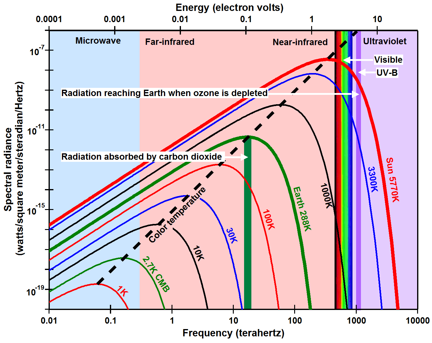
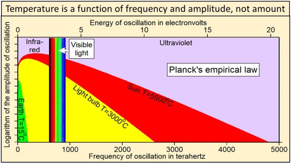
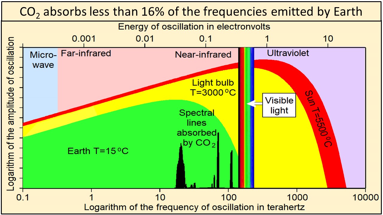
Thermal radiation from Earth, at a temperature of 15 °C, consists of the narrow continuum of frequencies of oscillation shown in green in this plot of Planck’s empirical law. Thermal radiation from the tungsten filament of an incandescent light bulb at 3000 °C consists of a broader continuum of frequencies shown in yellow and green. Thermal radiation from Sun at 5500 °C consists of a much broader continuum of frequencies shown in red, yellow and green.
Note in this plot of Planck’s empirical law that the higher the temperature, 1) the broader the continuum of frequencies, 2) the higher the amplitude of oscillation at each and every frequency, and 3) the higher the frequencies of oscillation that are oscillating with the largest amplitudes of oscillation. Radiation from Sun shown in red, yellow, and green clearly contains much higher frequencies and amplitudes of oscillation than radiation from Earth shown in green. Planck’s empirical law shows unequivocally that the physical properties of radiation are a function of the temperature of the body emitting the radiation.
Ångström (1900) showed that “no more than about 16 percent of earth’s radiation can be absorbed by atmospheric carbon dioxide, and secondly, that the total absorption is very little dependent on the changes in the atmospheric carbon dioxide content, as long as it is not smaller than 0.2 of the existing value.” Extensive modern data agree that carbon dioxide absorbs less than 16% of the frequencies emitted by Earth shown by the vertical black lines of this plot of Planck’s empirical law where frequencies are plotted on a logarithmic x-axis. These vertical black lines show frequencies and relative amplitudes only. Their absolute amplitudes on this plot are arbitrary.
Temperature at Earth’s surface is the result of the broad continuum of oscillations shown in green. Absorbing less than 16% of the frequencies emitted by Earth cannot have much effect on the temperature of anything.
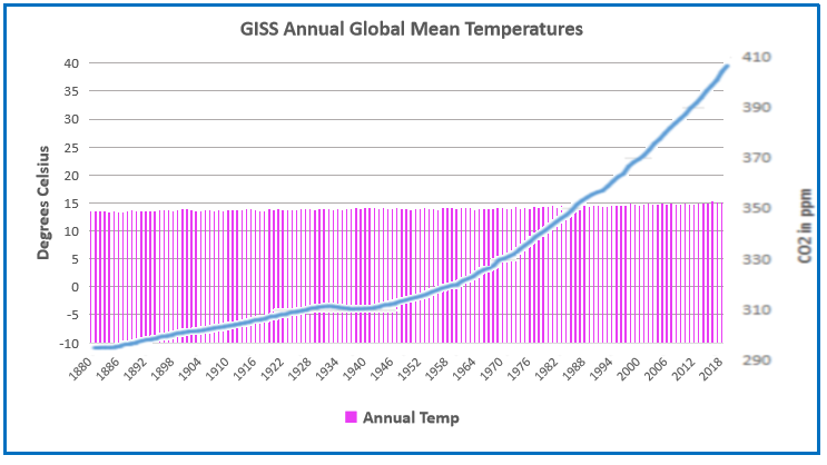
Raymond of RiC-Communications studio collaborated with me and content experts in order to produce high quality infographics on CO2 for improving public awareness. This post presents the thirteen charts he has produced on this topic. I find them straightforward and useful, and appreciate his excellent work on this. Project title is link to RiC-Communications. Thanks again to Raymond for recovering access to his work after reorganizing his website.
Infographics can be helpful, in making things simple to understand. CO2 is a complex topic with a lot of information and statistics. These simple step by step charts should help to give you an idea of CO2’s importance. Without CO2, plants wouldn’t be able to live on this planet. Just remember, that if CO2 falls below 150 ppm, all plant life would cease to exist.
– N° 1 Earth‘s atmospheric composition
– N° 2 Natural sources of CO2 emissions
– N° 3 Global anthropogenic CO2 emissions
– N° 4 CO2 – Carbon dioxide molecule
– N° 5 The global carbon cycle
– N° 6 Carbon and plant respiration
– N° 7 Plant categories and abundance (C3, C4 & CAM Plants)
– N° 8 Photosynthesis, the C3 vs C4 gap
– N° 9 Plant respiration and CO2
– N° 10 The logarithmic temperature rise of higher CO2 levels.
– N° 11 Earth‘s atmospheric composition in relationship to CO2 – N° 12 Human respiration and CO2 concentrations. – N° 13 600 million years of temperature change and atmospheric CO2
CO2 plays an important roll for the survival of our planet. Carbon Dioxide is essential for plant photosynthesis and rise of CO2 can be directly linked to the greening of the plant. At the moment climate change and global warming are being presented as a global threat to our species.
According to environmentalists, sea levels and temperatures will rise, resulting in a global breakdown for human civilization. This is based on climate models and numerous environmental studies around the world. According to the IPCC our carbon footprint needs to be reduced. The use of natural gas, oil, coal and any other fossil fuels need to be reduced to zero. The anthropogenic (man-made) influence has to be eliminated to save the planet.
According to some climate models, the planets temperature will increase to a level that will cause drought and famine for a large portion of the population in the very near future. In the future our energy needs will have to be cut so much so that all travel will need to be cut back completely.
In the future only environment friendly approved energy resources will be permitted such as, wind energy, solar energy, geothermal, biomass and hydroelectric as clean alternatives. This would deprive developing nations the possibility of building an economy and developed nations of keeping their economies.
And in Addition
Note that the illustration #10 assumes (as is the “consensus”) that doubling atmospheric CO2 produces a 1C rise in GMT (Global Mean Temperature). Even if true, the warming would be gentle and not cataclysmic. Greta and XR are foolishly thinking the world goes over a cliff if CO2 hits 430ppm. I start to wonder if Greta really can see CO2 as she claims.
It is also important to know that natural CO2 sources and sinks are estimated with large error ranges. For example this table from earlier IPCC reports:
Since the Statue of Liberty features in the sea level graphic, here are observations from there
Below are some other images I find meaningful, though they lack Raymond’s high production values.
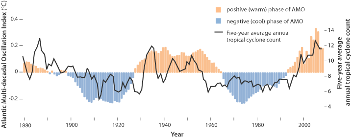
For the last few years, observers have been speculating about when the North Atlantic will start the next phase shift from warm to cold. Given the way 2018 went and 2019 followed, this may be the onset. First some background.
This is known as the Atlantic Multidecadal Oscillation (AMO), and the transition between its positive and negative phases can be very rapid. For example, Atlantic temperatures declined by 0.1ºC per decade from the 1940s to the 1970s. By comparison, global surface warming is estimated at 0.5ºC per century – a rate twice as slow.
In many parts of the world, the AMO has been linked with decade-long temperature and rainfall trends. Certainly – and perhaps obviously – the mean temperature of islands downwind of the Atlantic such as Britain and Ireland show almost exactly the same temperature fluctuations as the AMO.
Atlantic oscillations are associated with the frequency of hurricanes and droughts. When the AMO is in the warm phase, there are more hurricanes in the Atlantic and droughts in the US Midwest tend to be more frequent and prolonged. In the Pacific Northwest, a positive AMO leads to more rainfall.
A negative AMO (cooler ocean) is associated with reduced rainfall in the vulnerable Sahel region of Africa. The prolonged negative AMO was associated with the infamous Ethiopian famine in the mid-1980s. In the UK it tends to mean reduced summer rainfall – the mythical “barbeque summer”.Our results show that ocean circulation responds to the first mode of Atlantic atmospheric forcing, the North Atlantic Oscillation, through circulation changes between the subtropical and subpolar gyres – the intergyre region. This a major influence on the wind patterns and the heat transferred between the atmosphere and ocean.
The observations that we do have of the Atlantic overturning circulation over the past ten years show that it is declining. As a result, we expect the AMO is moving to a negative (colder surface waters) phase. This is consistent with observations of temperature in the North Atlantic.
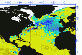
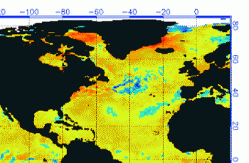
Cold “blobs” in North Atlantic have been reported, but they are usually winter phenomena. For example in April 2016, the sst anomalies looked like this
But by September, the picture changed to this
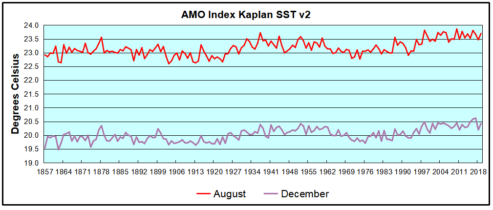
And we know from Kaplan AMO dataset, that 2016 summer SSTs were right up there with 1998 and 2010 as the highest recorded.
As the graph above suggests, this body of water is also important for tropical cyclones, since warmer water provides more energy. But those are annual averages, and I am interested in the summer pulses of warm water into the Arctic. As I have noted in my monthly HadSST3 reports, most summers since 2003 there have been warm pulses in the north atlantic.
The AMO Index is from from Kaplan SST v2, the unaltered and not detrended dataset. By definition, the data are monthly average SSTs interpolated to a 5×5 grid over the North Atlantic basically 0 to 70N. The graph shows the warmest month August beginning to rise after 1993 up to 1998, with a series of matching years since. December 2017 set a record at 20.6C, but note the plunge down to 20.2C for December 2018, matching 2011 as the coldest years since 2000. December 2019 shows an uptick but still lower than 2016-2017.
December 2019 confirms the summer pulse weakening, along with 2018 well below other recent peak years since 1998. Because McCarthy refers to hints of cooling to come in the N. Atlantic, let’s take a closer look at some AMO years in the last 2 decades.
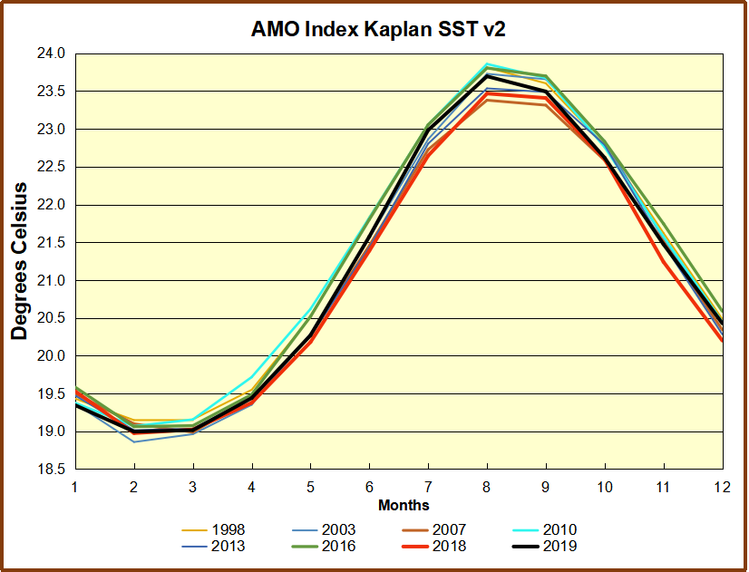
This graph shows monthly AMO temps for some important years. The Peak years were 1998, 2010 and 2016, with the latter emphasized as the most recent. The other years show lesser warming, with 2007 emphasized as the coolest in the last 20 years. Note the red 2018 line was at the bottom of all these tracks. The black line shows that 2019 began slightly cooler than January 2018, then tracked closely before rising in the summer months, though still lower than the peak years. Through December 2019 is again tracking warmer than 2018 but cooler than other recent years in the North Atlantic. For the 12 month annual average, 2019 is 0.1C higher than 2018, but cooler by more than 0.1C lower than the El Nino years of 2016 and 2017.
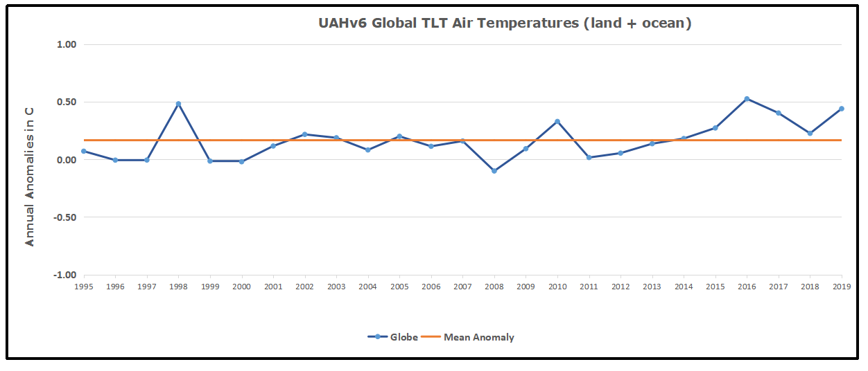
With apologies to Paul Revere, this post is on the lookout for cooler weather with an eye on both the Land and the Sea. UAH has updated their tlt (temperatures in lower troposphere) dataset for December. Previously I have done posts on their reading of ocean air temps as a prelude to updated records from HADSST3. This month also has a separate graph of land air temps because the comparisons and contrasts are interesting as we contemplate possible cooling in coming months and years.
Presently sea surface temperatures (SST) are the best available indicator of heat content gained or lost from earth’s climate system. Enthalpy is the thermodynamic term for total heat content in a system, and humidity differences in air parcels affect enthalpy. Measuring water temperature directly avoids distorted impressions from air measurements. In addition, ocean covers 71% of the planet surface and thus dominates surface temperature estimates. Eventually we will likely have reliable means of recording water temperatures at depth.
Recently, Dr. Ole Humlum reported from his research that air temperatures lag 2-3 months behind changes in SST. He also observed that changes in CO2 atmospheric concentrations lag behind SST by 11-12 months. This latter point is addressed in a previous post Who to Blame for Rising CO2?
After a technical enhancement to HadSST3 delayed March and April updates, May resumed a pattern of HadSST updates mid month. For comparison we can look at lower troposphere temperatures (TLT) from UAHv6 which are now posted for December. The temperature record is derived from microwave sounding units (MSU) on board satellites like the one pictured above. Recently there was a change in UAH processing of satellite drift corrections, including dropping one platform which can no longer be corrected. The graphs below are taken from the new and current dataset.
The UAH dataset includes temperature results for air above the oceans, and thus should be most comparable to the SSTs. There is the additional feature that ocean air temps avoid Urban Heat Islands (UHI). The graph below shows monthly anomalies for ocean temps since January 2015.
After a June rise in ocean air temps, all regions dropped back down to May levels in July and August. A spike occured in September, followed by plummenting October ocean air temps in the Tropics and SH. In November that drop partly warmed back, now leveling slightly downword with continued cooling in NH.
Land Air Temperatures Tracking in Seesaw Pattern
We sometimes overlook that in climate temperature records, while the oceans are measured directly with SSTs, land temps are measured only indirectly. The land temperature records at surface stations sample air temps at 2 meters above ground. UAH gives tlt anomalies for air over land separately from ocean air temps. The graph updated for October is below. Here we have freash evidence of the greater volatility of the Land temperatures, along with an extraordinary departure by SH land. Despite the small amount of SH land, it spiked in July, then dropped in August so sharply along with the Tropics that it pulled the global average downward against slight warming in NH. In November SH jumped up beyond any month in this period. Despite this spike along with a rise in the Tropics, NH land temps dropped sharply. The larger NH land area pulled the Global average downward. December reversed the situation with the SH dropping as sharply as it rose, while NH rose to the same anomaly, pulling the Global up slightly. The behavior of SH land temps is puzzling, to say the least. it is also a reminder that global averages can conceal important underlying volatility.
The longer term picture from UAH is a return to the mean for the period starting with 1995. 2019 average rose but currently lacks any El Nino to sustain it.
TLTs include mixing above the oceans and probably some influence from nearby more volatile land temps. Clearly NH and Global land temps have been dropping in a seesaw pattern, more than 1C lower than the 2016 peak, prior to these last several months. TLT measures started the recent cooling later than SSTs from HadSST3, but are now showing the same pattern. It seems obvious that despite the three El Ninos, their warming has not persisted, and without them it would probably have cooled since 1995. Of course, the future has not yet been written.
The hydrological cycle. Estimates of the observed main water reservoirs (black numbers in 10^3 km3 ) and the flow of moisture through the system (red numbers, in 10^3 km3 yr À1 ). Adjusted from Trenberth et al. [2007a] for the period 2002-2008 as in Trenberth et al. [2011].
Global warming issues have caused intensive research work in related areas, from land use, to urban environment to data science use in order to understand its effects better [25], [26], [27]. In this paper we focus on water related effects on global warming. Although water is recognised as the main cause of the greenhouse effect warming the Earth 33 oC above its black body temperature, water vapour is usually given a secondary role in global models, as a positive feedback from warming by all other causes. Despite its dominant effect in generating the weather, changes related to water are not seen as having a primary role in climate change, the focus being primarily on CO2. With positive feedback from primary warming, the effect of increasing CO2 is trebled [15] by water vapour increase. This conclusion is based on the perception that there are no significant trends in the hydrological cycle that could cause climate forcing. But this overlooks the effect of more than 3500 km3 of extra surface and ground water used annually in irrigation [17] to grow food for the human population. This quantity of extra water increases steadily year by year, well correlated with increasing atmospheric CO2, growing about 60% of world food requirements. Even so, the amount used in irrigation probably only adds about 3% to the annual hydrological cycle [9] of 113,000 km3. Is this sufficient to exert a significant extra greenhouse effect? Here we advance the hypothesis that it does and should be included in climate models.
A critical assumption of the IPCC consensus of global warming is that an increasing concentration of CO2 causes more retention of radiant heat near the top of the atmosphere, largely as a result of reduced emission of its spectral wavelengths centred on 15 microns. The radiative-convective model assumes that the lowered emissions at reduced pressure, number density and higher, colder altitudes from this GHG now provides an independent and sustained forcing exceeding 1-2 W per m2. It is assumed that once this reduction in OLR in the air column from increasing CO2 has occurred it must be compensated by increased OLR at different wavelengths elsewhere, maintaining balance with incoming radiation.
This critical assumption still lacks empirical confirmation.
Water Drives Atmospheric Warming
The importance of water in helping to keep the Earth’s atmosphere warm in the short term is beyond dispute. Table 1 summarises previously estimated rates for thermal energy flows into and out of the atmosphere [23]. As shown in the table, more than 80% of the power by which the temperature of air is maintained above the Earth’s black body temperature of -18 C is facilitated by water. Most significant of these air warming inputs from water is the greenhouse effect by which water vapour absorbs longwave radiation emitted from the surface, retaining more energy in air. However, warming from absorption of specific quanta by water vapour of incoming short wave solar radiation (ISR) and the latent heat of condensation of water vapour, exceeding the cooling effect of vertical convection, also contribute to warming of air.
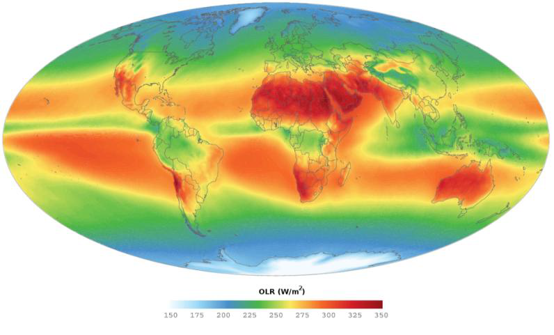
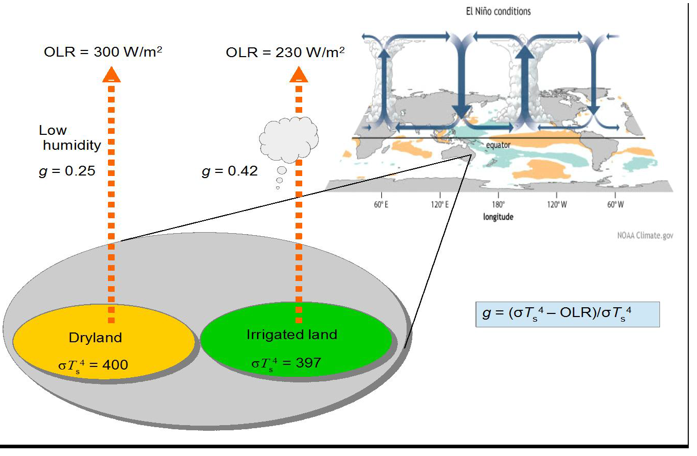
Thus, the greenhouse gas (GHG) content of the atmosphere effectively provides resistance to heat flow to space increasing the transient storage of solar energy, with a warming effect analogous to resistances in an electrical circuit. By comparison to water, other polyatomic greenhouse gases like CO2 play a minor role in this process, totalling less than 20% of warming. Furthermore, the fact that the minor GHGs are relatively well-mixed by the turbulence in the troposphere, unlike water, means that we cannot expect to observe spatial variations in their effects. Furthermore, the heat capacity of non-greenhouse gases provides some 99% of the thermal inertia of the troposphere, although only greenhouse gases capable of longwave radiation by vibrational and rotational quanta can contribute to cooling by radiation through the top of the atmosphere as OLR. Figure 1 contrasts schematically the typical variation of outgoing longwave radiation (OLR) over marine and terrestrial environments.
On well-watered land such as southern China much less direct emission of OLR to space occurs, in contrast to Quetta, Pakistan, on the same latitude with similar incoming shortwave radiation (ISR). In contrast to humid atmospheres on land and tropical seas, relatively arid regions such as the Sahara, the Middle East and Australia provide heat vents effectively cooling the Earth, solely as a result of the radiant emissions from GHGs as OLR. The varying global emissions of OLR estimated for typical marine and terrestrial regions shown in Figure 2 mirror this scheme.
Clearly, water vapour is the most critical factor in the mechanism by which the air column of the lower troposphere is charged with heat energy. It is of interest from this figure and in Table 1 that the exact sum of the effects of all greenhouse gases in directly warming air, including conduction from the surface, charges the lower atmosphere with sufficient heat to generate the downwelling radiation from greenhouse gases directed towards the surface [12]. Water is the main source of this back radiation [18], well understood to be responsible for keeping the surface air warmer in humid atmospheres, thus raising the minimum temperature.
None of the variation in OLR in Figure 1 can be attributed to the well-mixed GHGs such as CO2.
Furthermore, unlike the greenhouse effect of CO2, which is regarded as increasing only in in a logarithmic manner as its concentration rises, the greenhouse effect of water on retaining heat in the atmosphere should vary more linearly, even in the case of absorption of surface radiation, as its vapour spreads into dryer atmospheres; this potential is illustrated in Fig.1 in the descending zones of Hadley cells at sub-tropical latitudes.
Fig. 1 Global values of mean OLR from 2003-2011 (downloaded August 2, 2017, AIRS OLR 2003-2011 average htpp://mirador.gsfc.nasa.gov/ estimated by Giorgio, G.P., June 24, 2014). The russet areas show regions of greater OLR, with outgoing radiation above the average of ca. 240 W per m2, thus tending to cool the Earth. Note how the upper troposphere above arid continental regions provides a vent for the greatest rate of cooling.
Thermal Effects from Water are Direct and Linear
An approximately linear response in increasing air temperature to changes in atmospheric water content is reasonable. Unlike the well-mixed CO2, there are marked spatial and temporal variations in atmospheric water content, with much of the Earth’s surface in significant deficit, particularly in the sub-tropical zone subject to Hadley cell recycling, emphasised over semi-arid land. To the extent that additional water vapour spills over into these dryer regions on land the greater the area of the Earth that is subject to the greenhouse effect. This response can be contrasted to the effect of increasing CO2, which has a logarithmic relationship between climate forcing and concentration in the atmosphere [14], [15], each doubling causing a similar increase in temperature. Because there is no obvious regional effect of CO2 on the weather or regional climate, the effect of any increases in its concentration can only be theoretically inferred. If additional heat is retained in the atmosphere by increasing greenhouse effects from CO2 or water, the air temperature near the surface is expected to increase to keep global values of ISR and OLR in balance. A critical assumption of the IPCC consensus for climate change is that increasing CO2 causes more retention of heat in air near the top of the troposphere, largely as reduced emission from the edges of its spectral peak centred on 15 microns. This edge effect is predicted to be visible from space as a cooling of its spectrum, providing a negative forcing of 1-2 W per m2. It is assumed that this forcing must be compensated by increased OLR at different wavelengths as a result of the increased temperature.
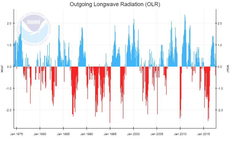
Fig. 3 Satellite measurements of global-zonal OLR (http://www.cpc.ncep.noaa.gov/data/indices/olr NOAA website, downloaded August 20, 2017). The 1998-2000 El Nino peaked at about 1.03 C above the minimum temperature in the preceding La Nina, with zonal OLR varying approximately 4 W/m2; see also (8)
This is regarded as a result of convective elevation of the maritime atmosphere, reducing the outgoing longwave radiation (OLR) about 100 W/m2 locally and 4 W/m2 globally from an increase in global water vapour of about 4%. This suggests a linear response from greenhouse warming to increased water vapour content of the atmosphere. Note that the extra heat in the atmosphere during an El Nino is controlled by all these sources of warming, as shown in Figure 2. Whatever the source of extra heat in the ocean, by moving extra water into the atmosphere as vapour it warms the atmosphere by the resultant greenhouse effect, reducing OLR, as well as direct warming by sunlight in the air column. In Table 4, another estimate of the possible effect of irrigation on global warming by comparison with the El Nino-La Nina cycle [22] is made. Consistent with the irrigation water hypothesis the El Nino has been long known to significantly reduce the OLR over the Pacific Ocean up to 25% [3], recognised as a result of elevation of emission of the OLR from water being elevated and therefore a colder altitude. Assuming 60% of irrigation water becomes vapour in the troposphere and a longer rain-out time of 15 days in dry regions compared to less than a week over the oceans with a global average of 8.5 days [19], a steady state of about 100 km3 of extra water vapour results from irrigation.
This estimate also suggests an increase in temperature near 0.2C from 0.84 W/m2 of forcing based on the data given in Figure 3. This is consistent with the total effect of water vapour on global warming exceeding 25 C.
It should be noted that this dynamic effect of water on warming air includes heat pumping by evapotranspiration as well as significant warming by direct absorption of short wave solar radiation (see Fig. 2), also contributing to a more linear effect by water on warming. Since this increase estimates a primary forcing effect of new water, a positive feedback is also anticipated from increased evaporation of the ocean, suggesting that the total increase from irrigation could be of the order of 0.5 oC in the 20th century.
These global results may have more accuracy than the results obtained from the numerous grid points in global circulation models, given the additivity of errors.
Empirical Proof Comparing Dry and Irrigated Land
In Figure 4, using the same modelling as in Figure 2, the predicted steady state greenhouse effect of adding irrigation water in a comparison between dryland and irrigated land. In fact the effect of water on heat transfer to the atmospheric column is not only a result of the greenhouse effect given in the equation in the figure but also from direct absorption by water of short wave ISR and evapotranspiration, similar in total magnitude. These latter effects will be a linear function of the water vapour involved. The evaporative effect cools the surface but must transfer a similar amount of heat to the atmosphere as infrared radiation (ca. 6 microns) associated with condensation of water vapour into droplets under convective cooling as in [21]. Paradoxically, the modelling paper in [6] failed to account for any of these effects, specifically dismissing significant transfer of water vapour into the atmosphere from growth of irrigated crop growth as noted above. This provides a clue to the possible flaw in their models. Except for environments already very humid where evapotranspiration is limited, this cannot be true.
Fig. 4 Comparison of dryland and irrigated land for effect of water on heat retention in the atmosphere as an enhanced greenhouse effect. The El Nino condition of enhanced evaporation from the ocean known to strongly reduce OLR In [3] is shown as an analogue.
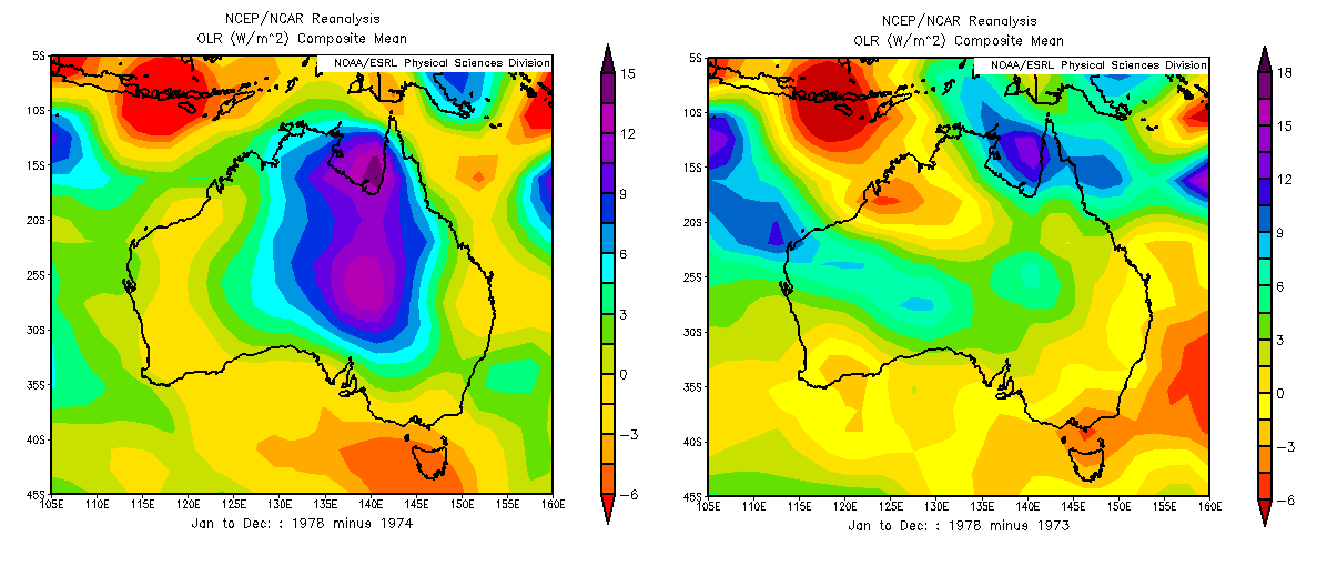
NCEP/ NCAR Reanalyses Coincident with the Periodic Flooding of Lake Eyre
Fig. 5 Variation in OLR from flooding of lake Eyre using NCEP-NCAR reanalysis datasets. a.Difference in OLR values between 1978 and 1974, dry and wet years. b. Difference in OLR values between 1978 and 1973, two dry years.
Rarely, during the La Nina phase of the climate cycle, the dry interior of northern Australia overlying the Great Artesian Basin may flood. Lacking riverine exits to the ocean, the massive runoff caused flows southwards, mainly accumulating in the depression below sea level in central South Australia known as Lake Eyre. In late January and February in the early months of 1974 Lake Eyre filled to a depth of six metres, its surface only returning to its hot, dry state three years later in 1977-78. This was the greatest flood ever recorded. The hypothesis in [4] suggests that this flooding should also lead to persistent elevated water vapour content of the atmosphere, predominantly downwind from the Lake Eyre basin. Using the NCEP-NCAR reanalysis datasets, which are informed by Nimbus and other satellite observations since 1970, the OLR emissions to space and the variation in humidity from this region comparing 12 months of 1974 with the same period in 1978 by subtraction of one year from the other. A significant elevation of OLR when the lake was dry by more than 10 W/m2 was observed for the 12-month period (Figure 5). This result is accompanied by increases in specific humidity consistent with an elevated greenhouse effect such as would be experienced in semi-arid areas when irrigated. The area affected downwind also showing elevated humidity is estimated as 35 times the flooded area, showing that the magnitude of this regional greenhouse effect was indeed significant.
Conclusion: Thankfully, A Wet World is a Warm World
The neglect of the possible effect of irrigation as a significant source of anthropogenic climate change may have been a result of reluctance to consider the relatively small amount of irrigation in the hydrological cycle. Because water has been considered as providing positive feedback to warming primarily from CO2 its possible forcing effect has been overlooked. But as shown here by several different means, the more potent effect of applying water previously in the ocean or deep in the ground to dry surfaces with air in strong water deficit can be sufficient to affect global temperature. Clearly, the water vapour content of the troposphere is the major cause of the natural greenhouse effect, contributing up to two-thirds of the 33 oC warming.
Spatial and temporal variations in soil moisture and relative humidity of the atmosphere are the main factors controlling the regional outgoing longwave radiation (OLR), in contrast to the more even effects from well-mixed greenhouse gases such as CO2.
This is well illustrated in the 4-6 year El Nino cycles, resulting in a global mean temperature variation approaching 1 oC compared with La Nina years. Longer term, the proposed Milankovitch glaciations of paleoclimates result in declines of atmospheric temperature around 10 oC, consistent with the major reduction in tropospheric water vapour approaching 50%. Weather conditions and climate as illustrated in the greenhouse effect are clearly demonstrated in the distribution of water, particularly on land. The apparently linear relationship between the water content of the atmosphere is direct verification of the greenhouse warming effect of this greenhouse gas. By contrast, other than by correlation, there is no such direct verification possible for the greenhouse effect of CO2. We rely on the forcing equation of 5.3ln[(CO2)t /(CO2)o] to estimate the climate sensitivity with respect to varying concentration (ppmv) of this greenhouse gas. Early hopes that a clear spectral signal was available showing significantly reduced OLR from increasing CO2, proving the hypothesis of climate forcing by permanent GHGs, have not been realised [5]. A focus using new satellites on the longer wavelength OLR associated with rotations of water might help resolve this question. Up till now, OLR is estimated for this region based on shorter wavelengths. The natural experiment provided by the flooding of Lake Eyre of the greenhouse effect by significantly reducing the OLR provides confirmation that irrigation water typically applied to dry land will have a measurable greenhouse effect.
One year time lapse of precipitable water (amount of water in the atmosphere) from Jan 1, 2016 to Dec 31, 2016, as modeled by the GFS. The Pacific ocean rotates into view just as the tropical cyclone season picks up steam.