WryHeat Climate Wisdom

A decade ago when I became curious about the issue of global warming/climate change, Jonathan DuHamel was one of the voices persuading me to look critically and investigate claims carefully.  He wrote a regular column in an Arizona newspaper (Arizona Daily Independent) under the banner WryHeat exploring a wide range of scientific issues, including but not limited to global warming.  This post is to celebrate his publishing a compilation of articles on climate concerns over the years, entitled  Summary Of Climate Change Principles & State Of The Science – A Rebuttal Of Climate Alarmism at the Arizona Independent News Network.

The excerpts below show the themes of articles DuHamel wrote.  To access the orginal published columns readers can go to the link in red above, where links to each article are provided.

This post collects several past articles which review climate science and bring together some main points on the state of the climate debate. These points show that the politically correct, carbon dioxide driven meme is wrong. Readers can use these articles to counter climate alarmists. Read each article for more details. (Note, many of these articles appeared in ADI, however the links below go to my Wryheat blog where the articles may be expanded and updated from the ADI versions. The articles also provide addition links to more articles.) [ The first heading below links to a summary pdf file with comprehensive discussion.]

Climate change in perspective

Climate change is a major issue of our times. Concern is affecting environmental, energy, and economic policy decisions. Many politicians are under the mistaken belief that legislation and regulation can significantly control our climate to forestall any deviation from “normal” and save us from a perceived crisis. This post is intended as a primer for politicians so they can cut through the hype and compare real observational data against the flawed model prognostications.
The data show that the current warming is not unusual, but part of a natural cycle; that greenhouse gases, other than water vapor, are not significant drivers of climate; that human emissions of carbon dioxide are insignificant when compared to natural emissions of greenhouse gases; and that many predictions by climate modelers and hyped by the media are simply wrong.

A simple question for climate alarmists – where is the evidence

“What physical evidence supports the contention that carbon dioxide emissions from burning fossil fuels are the principal cause of global warming since 1970?”
(Remember back in the 1970s, climate scientists and media were predicting a return to an “ice age.”)
I have posed that question to five “climate scientist” professors at the University of Arizona who claim that our carbon dioxide emissions are the principal cause of dangerous global warming. Yet, when asked the question, none could cite any supporting physical evidence.

Carbon dioxide is necessary for life on Earth

Rather than being a “pollutant.” Carbon dioxide is necessary for life on Earth as we know it. Earth’s climate has been changing for at least four billion years in cycles large and small. Few in the climate debate understand those changes and their causes. Many are fixated on carbon dioxide (CO2), a minor constituent of the atmosphere, but one absolutely necessary for life as we know it. Perhaps this fixation derives from ulterior political motives for controlling the global economy. For others, the true believers, perhaps this fixation derives from ignorance.

Carbon Dioxide and the Greenhouse Effect

The “greenhouse effect,” very simplified, is this: solar radiation penetrates the atmosphere and warms the surface of the earth. The earth’s surface radiates thermal energy (infrared radiation) back into space. Some of this radiation is absorbed and re-radiated back to the surface and into space by clouds, water vapor, methane, carbon dioxide, and other gases. Water vapor is the principle greenhouse gas; the others are minor players. It is claimed that without the greenhouse effect the planet would be an iceball, about 34∘C colder than it is.* The term “greenhouse effect” with respect to the atmosphere is an unfortunate usage because it is misleading. The interior of a real greenhouse (or your automobile parked with windows closed and left in the sun) heats up because there is a physical barrier to convective heat loss. There is no such physical barrier in the atmosphere.*There is an alternate hypothesis:

What keeps Earth warm – the greenhouse effect or something else?

Scottish physicist James Clerk Maxwell proposed in his 1871 book “Theory of Heat” that the temperature of a planet depends only on gravity, mass of the atmosphere, and heat capacity of the atmosphere. Temperature is independent of atmosphere composition. Greenhouse gases have nothing to do with it. Many publications since, have expounded on Maxwell’s theory and have shown that it applies to all planets in the Solar System.
The Grand Canyon of Arizona provides a practical demonstration of this principle.

Evidence that CO2 emissions do not intensify the greenhouse effect

The U.S. government’s National Climate Assessment report and the UN IPCC both claim that human carbon dioxide emissions are “intensifying” the greenhouse effect and causing global warming. The carbon dioxide driven global warming meme makes four specific predictions. Physical evidence shows that all four of these predictions are wrong.
“It doesn’t matter how beautiful your theory is; it doesn’t matter how smart you are. If it doesn’t agree with experiment, it’s wrong.” – Richard Feynmann

An examination of the relationship between temperature and carbon dioxide

In this article, we will examine the Earth’s temperature and the carbon dioxide (CO2) content of the atmosphere at several time scales to see if there is any relationship. I stipulate that the greenhouse effect does exist. I maintain, however, that the ability of CO2 emissions to cause global warming is tiny and overwhelmed by natural forces. The main effect of our “greenhouse” is to slow cooling.

How much global warming is dangerous?

The United Nation’s IPCC and other climate alarmists say all hell will break loose if the global temperature rises more than an additional 2º C (3.6ºF). That number, by the way, is purely arbitrary with no basis in science. It also ignores Earth’s geologic history which shows that for most of the time global temperatures have been much warmer than now. Let’s look back at a time when global temperatures are estimated to have been as much as 34ºF warmer than they are now. Hell didn’t break loose then.

Effects of global warming on humans

The EPA’s “endangerment finding” classified carbon dioxide as a pollutant and claimed that global warming will have adverse effects on human health. Real research says the opposite: cold is deadlier. The scientific evidence shows that warming is good for health.

Geology is responsible for some phenomena blamed on global warming

Melting of the Greenland and West Antarctic ice sheets have been blamed on global warming, but both have a geologic origin. The “Blob” a recent warm ocean area off the Oregon coast, responsible in part for the hot weather and drought in California, has been blamed on global warming, but that too may have a geologic cause.

The 97 percent consensus for human caused climate change debunked again

It has been claimed that 97% of climate scientists say humans are causing most of the global warming. An examination of the numbers and how those numbers have been reached show that only 8.2% of scientists polled explicitly endorse carbon dioxide as the principal driver.
Read also a more general article: On consensus in science

Conclusion:

The basic conclusion of this review is that carbon dioxide has little effect on climate and all attempts to control carbon dioxide will be a futile and expensive exercise to no end. All the dire predictions are based on flawed computer models. Carbon dioxide is a phantom menace.

“The whole aim of practical politics is to keep the populace alarmed (and hence clamorous to be led to safety) by menacing it with an endless series of hobgoblins, all of them imaginary.” – H. L. Mencken

ABOUT THE AUTHOR Jonathan DuHamel

I am a retired economic geologist and have worked as an explorationist in search of economic mineral deposits, mainly copper, molybdenum, and gold. My exploration activities have been mainly in the Western U.S. including Alaska. I have also worked in Mexico, South Africa, Ireland, and Scotland.

Exploration geologists are trained not only in the geologic sciences, but also in chemistry, physics, botany, and geostatistics. I am also trained in the natural history of the Sonoran Desert.

After graduating from The Colorado School of Mines with a Geologic Engineering degree and Master of Science degree, and before practicing as a geologist, I served as an officer in the Army Chemical Corps assigned to a unit that tested experimental weapons and equipment.

I currently reside in Tucson, AZ.

Greta’s Spurious “Carbon Budget”

Many have noticed that recent speeches written for child activist Greta Thunberg are basing the climate “emergency” on the rapidly closing “carbon budget”. This post aims to summarize how alarmists define the so-called carbon budget, and why their claims to its authority are spurious. In the text and at the bottom are links to websites where readers can access both the consensus science papers and the analyses showing the flaws in the carbon budget notion. Excerpts are in italics with my bolds.

The 2019 update on the Global Carbon Budget was reported at Future Earth article entitled Global Carbon Budget Estimates Global CO2 Emissions Still Rising in 2019. The results were published by the Global Carbon Project in the journals Nature Climate Change, Environmental Research Letters, and Earth System Science Data. Excerpts below in italics with my bolds.

History of Growing CO2 Emissions

“Carbon dioxide emissions must decline sharply if the world is to meet the ‘well below 2°C’ mark set out in the Paris Agreement, and every year with growing emissions makes that target even more difficult to reach,” said Robbie Andrew, a Senior Researcher at the CICERO Center for International Climate Research in Norway.

Global emissions from coal use are expected to decline 0.9 percent in 2019 (range: -2.0 percent to +0.2 percent) due to an estimated 10 percent fall in the United States and a 10 percent fall in Europe, combined with weak growth in coal use in China (+0.8 percent) and India (+2 percent).


Shifting Mix of Fossil Fuel Consumption

“The weak growth in carbon dioxide emissions in 2019 is due to an unexpected decline in global coal use, but this drop is insufficient to overcome the robust growth in natural gas and oil consumption,” said Glen Peters, Research Director at CICERO.

“Global commitments made in Paris in 2015 to reduce emissions are not yet being matched by proportionate actions,” said Peters. “Despite political rhetoric and rapid growth in low carbon technologies such as solar and wind power, electric vehicles, and batteries, global fossil carbon dioxide emissions are likely to be more than four percent higher in 2019 than in 2015 when the Paris Agreement was adopted.

“Compared to coal, natural gas is a cleaner fossil fuel, but unabated natural gas merely cooks the planet more slowly than coal,” said Peters. “While there may be some short-term emission reductions from using natural gas instead of coal, natural gas use needs to be phased out quickly on the heels of coal to meet ambitious climate goals.”

Oil and gas use have grown almost unabated in the last decade. Gas use has been pushed up by declines in coal use and increased demand for gas in industry. Oil is used mainly to fuel personal transport, freight, aviation and shipping, and to produce petrochemicals.

“This year’s Carbon Budget underscores the need for more definitive climate action from all sectors of society, from national and local governments to the private sector,” said Amy Luers, Future Earth’s Executive Director. “Like the youth climate movement is demanding, this requires large-scale systems changes – looking beyond traditional sector-based approaches to cross-cutting transformations in our governance and economic systems.”

Burning gas emits about 40 percent less CO2 than coal per unit energy, but it is not a zero-carbon fuel. While CO2 emissions are likely to decline when gas displaces coal in electricity production, Global Carbon Project researchers say it is only a short-term solution at best. All CO2 emissions will need to decline rapidly towards zero.

The Premise: Rising CO2 Emissions Cause Global Warming

Atmospheric CO2 concentration is set to reach 410 ppm on average in 2019, 47 percent above pre-industrial levels.

Glen Peters on the carbon budget and global carbon emissions is a Future of Earth interview explaining the Carbon Budget notion. Excerpts in italics with my bolds.

In many ways, the global carbon budget is like any other budget. There’s a maximum amount we can spend, and it must be allocated to various countries and various needs. But how do we determine how much carbon each country can emit? Can developing countries grow their economies without increasing their emissions? And if a large portion of China’s emissions come from products made for American and European consumption, who’s to blame for those emissions? Glen Peters, Research Director at the Center for International Climate Research (CICERO) in Oslo, explains the components that make up the carbon budget, the complexities of its calculation, and its implications for climate policy and mitigation efforts. He also discusses how emissions are allocated to different countries, how emissions are related to economic growth, what role China plays in all of this, and more.

The carbon budget generally has two components: the source component, so what’s going into the atmosphere; and the sink component, so the components which are more or less going out of the atmosphere.

So in terms of sources, we have fossil fuel emissions; so we dig up coal, oil, and gas and burn them and emit CO2. We have cement, which is a chemical reaction, which emits CO2. That’s sort of one important component on the source side. We also have land use change, so deforestation. We’re chopping down a lot of trees, burning them, using the wood products and so on. And then on the other side of the equation, sort of the sink side, we have some carbon coming back out in a sense to the atmosphere. So the land sucks up about 25% of the carbon that we put into the atmosphere and the ocean sucks up about 25%. So for every ton we put into the atmosphere, then only about half a ton of CO2 remains in the atmosphere. So in a sense, the oceans and the land are cleaning up half of our mess, if you like.

The other half just stays in the atmosphere. Half a ton stays in the atmosphere; the other half is cleaned up. It’s that carbon that stays in the atmosphere which is causing climate change and temperature increases and changes in precipitation and so on.

The carbon budget is like a balance, so you have something coming in and something going out, and in a sense by mass balance, they have to equal. So if we go out and we take an estimate of how much carbon have we emitted by burning fossil fuels or by chopping down forests and we try and estimate how much carbon has gone into the ocean or the land, then we can measure quite well how much carbon is in the atmosphere. So we can add all those measurements together and then we can compare the two totals — they should equal. But they don’t equal. And this is sort of part of the science, if we overestimated emissions or if we over or underestimated the strength of the land sink or the oceans or something like that. And we can also cross check with what our models say.

My Comment:

Several things are notable about the carbon cycle diagram from GCP. It claims the atmosphere adds 18 GtCO2 per year and drives Global Warming. Yet estimates of emissions from burning fossil fuels and from land use combined range from 36 to 45 GtCO2 per year, or +/- 4.5. The uptake by the biosphere and ocean combined range from 16 to 25 GtCO2 per year, also +/- 4.5. The uncertainty on emissions is 11% while the natural sequestration uncertainty is 22%, twice as much.

Furthermore, the fluxes from biosphere and ocean are both presented as balanced with no error range. The diagram assumes the natural sinks/sources are not in balance, but are taking more CO2 than they release. IPCC reported: Gross fluxes generally have uncertainties of more than +/- 20%. (IPCC AR4WG1 Figure 7.3.) Thus for land and ocean the estimates range as follows:

Land: 440, with uncertainty between 352 and 528, a range of 176
Ocean: 330, with uncertainty between 264 and 396, a range of 132
Nature: 770, with uncertainty between 616 and 924, a range of 308

So the natural flux uncertainty is 7.5 times the estimated human emissions of 41 GtCO2 per year.

For more detail see CO2 Fluxes, Sources and Sinks and Who to Blame for Rising CO2?

The Fundamental Flaw: Spurious Correlation

Beyond the uncertainty of the amounts is a method error in claiming rising CO2 drives temperature changes. For this discussion I am drawing on work by chaam jamal at her website Thongchai Thailand. A series of articles there explain in detail how the mistake was invented and why it is faulty. A good starting point is The Carbon Budgets of Climate Science. Below is my attempt at a synopsis from her writings with excerpts in italics and my bolds.

Simplifying Climate to a Single Number

Figure 1 above shows the strong positive correlation between cumulative emissions and cumulative warming used by climate science and by the IPCC to track the effect of emissions on temperature and to derive the “carbon budget” for various acceptable levels of warming such as 2C and 1.5C. These so called carbon budgets then serve as policy tools for international climate action agreements and climate action imperatives of the United Nations. And yet, all such budgets are numbers with no interpretation in the real world because they are derived from spurious correlations. Source: Matthews et al 2009

Carbon budget accounting is based on the TCRE (Transient Climate Response to Cumulative Emissions). It is derived from the observed correlation between temperature and cumulative emissions. A comprehensive explanation of an application of this relationship in climate science is found in the IPCC SR 15 2018. This IPCC description is quoted below in paragraphs #1 to #7 where the IPCC describes how climate science uses the TCRE for climate action mitigation of AGW in terms of the so called the carbon budget. Also included are some of difficult issues in carbon budget accounting and the methods used in their resolution.

It has long been recognized that the climate sensitivity of surface temperature to the logarithm of atmospheric CO2 (ECS), which lies at the heart of the anthropogenic global warming and climate change (AGW) proposition, was a difficult issue for climate science because of the large range of empirical values reported in the literature and the so called “uncertainty problem” it implies.

The ECS uncertainty issue was interpreted in two very different ways. Climate science took the position that ECS uncertainty implies that climate action has to be greater than that implied by the mean value of ECS in order to ensure that higher values of ECS that are possible will be accommodated while skeptics argued that the large range means that we don’t really know. At the same time skeptics also presented convincing arguments against the assumption that observed changes in atmospheric CO2 concentration can be attributed to fossil fuel emissions.

A breakthrough came in 2009 when Damon Matthews, Myles Allen, and a few others almost simultaneously published almost identical papers reporting the discovery of a “near perfect” correlation (ρ≈1) between surface temperature and cumulative emissions {2009: Matthews, H. Damon, et al. “The proportionality of global warming to cumulative carbon emissions” Nature 459.7248 (2009): 829}. They had found that, irrespective of the timing of emissions or of atmospheric CO2 concentration, emitting a trillion tonnes of carbon will cause 1.0 – 2.1 C of global warming. This linear regression coefficient corresponding with the near perfect correlation between cumulative warming and cumulative emissions (note: temperature=cumulative warming), initially described as the Climate Carbon Response (CCR) was later termed the Transient Climate Response to Cumulative Emissions (TCRE).

Initially a curiosity, it gained in importance when it was found that it was in fact predicting future temperatures consistent with model predictions. The consistency with climate models was taken as a validation of the new tool and the TCRE became integrated into the theory of climate change. However, as noted in a related post the consistency likely derives from the assumption that emissions accumulate in the atmosphere.

Thereafter the TCRE became incorporated into the foundation of climate change theory particularly so in terms of its utility in the construction of carbon budgets for climate action plans for any given target temperature rise, an application for which the TCRE appeared to be tailor made. Most importantly, it solved or perhaps bypassed the messy and inconclusive uncertainty issue in ECS climate sensitivity that remained unresolved. The importance of this aspect of the TCRE is found in the 2017 paper “Beyond Climate Sensitivity” by prominent climate scientist Reto Knutti where he declared that the TCRE metric should replace the ECS as the primary tool for relating warming to human caused emissions {2017: Knutti, Reto, Maria AA Rugenstein, and Gabriele C. Hegerl. “Beyond equilibrium climate sensitivity.” Nature Geoscience 10.10 (2017): 727}. The anti ECS Knutti paper was not only published but received with great fanfare by the journal and by the climate science community in general.

The TCRE has continued to gain in importance and prominence as a tool for the practical application of climate change theory in terms of its utility in the construction and tracking of carbon budgets for limiting warming to a target such as the Paris Climate Accord target of +1.5C above pre-industrial. {Matthews, H. Damon. “Quantifying historical carbon and climate debts among nations.” Nature climate change 6.1 (2016): 60}. A bibliography on the subject of TCRE carbon budgets is included below at the end of this article (here).

However, a mysterious and vexing issue has arisen in the practical matter of applying and tracking TCRE based carbon budgets. The unsolved matter in the TCRE carbon budget is the remaining carbon budget puzzle {Rogelj, Joeri, et al. “Estimating and tracking the remaining carbon budget for stringent climate targets.” Nature 571.7765 (2019): 335-342}. It turns out that midway in the implementation of a carbon budget, the remaining carbon budget computed by subtraction does not match the TCRE carbon budget for the latter period computed directly using the Damon Matthews proportionality of temperature with cumulative emissions for that period. As it turns out, the difference between the two estimates of the remaining carbon budget has a rational explanation in terms of the statistics of a time series of cumulative values of another time series described in a related post

It is shown that a time series of the cumulative values of another time series has neither time scale nor degrees of freedom and that therefore statistical properties of this series can have no practical interpretation.

It is demonstrated with random numbers that the only practical implication of the “near perfect proportionality” correlation reported by Damon Matthews is that the two time series being compared (annual warming and annual emissions) tend to have positive values. In the case of emissions we have all positive values, and during a time of global warming, the annual warming series contains mostly positive values. The correlation between temperature (cumulative warming) and cumulative emissions derives from this sign bias as demonstrated with random numbers with and without sign bias.

Figure 4: Random Numbers without Sign Bias

Figure 5: Random Numbers with Sign Bias

The sign bias explains the correlation between cumulative values of time series data and also the remaining carbon budget puzzle. It is shown that the TCRE regression coefficient between these time series of cumulative values derives from the positive value bias in the annual warming data. Thus, during a period of accelerated warming, the second half of the carbon budget period may contain a higher percentage of positive values for annual warming and it will therefore show a carbon budget that exceeds the proportional budget for the second half computed from the full span regression coefficient that is based on a lower bias for positive values.

In short, the bias for positive annual warming is highest for the second half, lowest for the first half, and midway between these two values for the full span – and therein lies the simple statistics explanation of the remaining carbon budget issue that climate science is trying to solve in terms of climate theory and its extension to Earth System Models. The Millar and Friedlingstein 2018 paper is yet another in a long line of studies that ignore the statistical issues the TCRE correlation and instead try to explain its anomalous behavior in terms of climate theory whereas in fact their explanation lies in statistical issues that have been overlooked by these young scientists.

The fundamental problem with the construction of TCRE carbon budgets and their interpretation in terms of climate action is that the TCRE is a spurious correlation that has no interpretation in terms of a relationship between emissions and warming. Complexities in these carbon budgets such as the remaining carbon budget are best understood in these terms and not in terms of new and esoteric variables such as those in earth system models.

Footnote:

An independent study by Jamal Munshi come to a similar conclusion. Climate Sensitivity and the Responsiveness of Temperature to Atmospheric CO2

Detrended correlation analysis of global mean temperature observations and model projections are compared in a test for the theory that surface temperature is responsive to atmospheric CO2 concentration in terms of GHG forcing of surface temperature implied by the Climate Sensitivity parameter ECS. The test shows strong evidence of GHG forcing of warming in the theoretical RCP8.5 temperature projections made with CMIP5 forcings. However, no evidence of GHG forcing by CO2 is found in observational temperatures from four sources including two from satellite measurements. The test period is set to 1979-2018 so that satellite data can be included on a comparable basis. No empirical evidence is found in these data for a climate sensitivity parameter that determines surface temperature according to atmospheric CO2 concentration or for the proposition that reductions in fossil fuel emissions will moderate the rate of warming.

Postscript on Spurious Correlations

I am not a climate, environment, geology, weather, or physics expert. However, I am an expert on statistics. So, I recognize bad statistical analysis when I see it. There are quite a few problems with the use of statistics within the global warming debate. The use of Gaussian statistics is the first error. In his first movie Gore used a linear regression of CO2 and temperature. If he had done the same regression using the number of zoos in the world, or the worldwide use of atomic energy, or sunspots, he would have the same result. A linear regression by itself proves nothing.–Dan Ashley · PhD statistics, PhD Business, Northcentral University


NH Land & Ocean Air Warms in February

banner-blog

With apologies to Paul Revere, this post is on the lookout for cooler weather with an eye on both the Land and the Sea.  UAH has updated their tlt (temperatures in lower troposphere) dataset for February 2020.  Previously I have done posts on their reading of ocean air temps as a prelude to updated records from HADSST3. This month also has a separate graph of land air temps because the comparisons and contrasts are interesting as we contemplate possible cooling in coming months and years.

Presently sea surface temperatures (SST) are the best available indicator of heat content gained or lost from earth’s climate system.  Enthalpy is the thermodynamic term for total heat content in a system, and humidity differences in air parcels affect enthalpy.  Measuring water temperature directly avoids distorted impressions from air measurements.  In addition, ocean covers 71% of the planet surface and thus dominates surface temperature estimates.  Eventually we will likely have reliable means of recording water temperatures at depth.

Recently, Dr. Ole Humlum reported from his research that air temperatures lag 2-3 months behind changes in SST.  He also observed that changes in CO2 atmospheric concentrations lag behind SST by 11-12 months.  This latter point is addressed in a previous post Who to Blame for Rising CO2?

After a technical enhancement to HadSST3 delayed March and April updates, May resumed a pattern of HadSST updates mid month.  For comparison we can look at lower troposphere temperatures (TLT) from UAHv6 which are now posted for February. The temperature record is derived from microwave sounding units (MSU) on board satellites like the one pictured above.

The UAH dataset includes temperature results for air above the oceans, and thus should be most comparable to the SSTs. There is the additional feature that ocean air temps avoid Urban Heat Islands (UHI). Recently there was a change in UAH processing of satellite drift corrections, including dropping one platform which can no longer be corrected. The graphs below are taken from the new and current dataset.

The graph below shows monthly anomalies for ocean temps since January 2015. After a June rise in ocean air temps, all regions dropped back down to May levels in July and August.  A spike occured in September, followed by plummenting October ocean air temps in the Tropics and SH. In November that drop partly warmed back, then leveling slightly downword with continued cooling in NH.

2020 started with NH warming slightly, still cooler than the previous months back to September.  SH and Tropics also rose slightly resulting in a Global rise. Now in February there is an anomaly spike of 0.32C in NH, rarely seen in the ocean data.  The Tropics and SH also rose, resulting in an uptick Globally.

Land Air Temperatures Showing a Seesaw Pattern

We sometimes overlook that in climate temperature records, while the oceans are measured directly with SSTs, land temps are measured only indirectly.  The land temperature records at surface stations sample air temps at 2 meters above ground.  UAH gives tlt anomalies for air over land separately from ocean air temps.  The graph updated for February 2020 is below.

Here we have freash evidence of the greater volatility of the Land temperatures, along with an extraordinary departures, first by SH land followed by NH  Despite the small amount of SH land, it spiked in July, then dropped in August so sharply along with the Tropics that it pulled the global average downward against slight warming in NH.  In November SH jumped up beyond any month in this period.  Despite this spike along with a rise in the Tropics, NH land temps dropped sharply.  The larger NH land area pulled the Global average downward.  December reversed the situation with the SH dropping as sharply as it rose, while NH rose to the same anomaly, pulling the Global up slightly.

2020 started with sharp drops in both SH and NH, with the Global anomaly dropping as a result.  Now in February comes a spike of 0.42C in NH land air, nearing 2016 levels. Meanwhile SH land continued dropping.  The behavior of SH and NH land temps is puzzling, to say the least.  it is also a reminder that global averages can conceal important underlying volatility.

The longer term picture from UAH is a return to the mean for the period starting with 1995.  2019 average rose but currently lacks any El Nino to sustain it.

TLTs include mixing above the oceans and probably some influence from nearby more volatile land temps.  Clearly NH and Global land temps have been dropping in a seesaw pattern, more than 1C lower than the 2016 peak, prior to these last several months. TLT measures started the recent cooling later than SSTs from HadSST3, but are now showing the same pattern.  It seems obvious that despite the three El Ninos, their warming has not persisted, and without them it would probably have cooled since 1995.  Of course, the future has not yet been written.

Climate Models Fail from Radiative Obsession

Peter Stallinga provides a thorough analysis explaining why models based purely on radiative heat exhanges fail without incorporating other thermodynamic processes.  This post is a synopsis of the structure of his position without the extensive mathematical expressions of the relationships discussed.  The full text of his paper can be accessed by linking to the title below.

Comprehensive Analytical Study of the Greenhouse Effect of the Atmosphere
By Peter Stallinga. Atmospheric and Climate Sciences, 2020 H/T NoTricksZone. Excerpts in italics with my bolds

Introduction

Climate change is an important societal issue. Large effort in society is spent on addressing it. For adequate measures, it is important that the phenomenon of climate change is well understood, especially the effect of adding carbon dioxide to the atmosphere. In this work, a theoretical fully analytical study is presented of the so-called greenhouse effect of carbon dioxide. The effect of this gas in the atmosphere itself was already determined as being of little importance based on empirical analysis. In the current work, the effect is studied both phenomenologically and analytically.

In a new approach, the atmosphere is solved by taking both radiative as well as thermodynamic processes into account. The model fully fits the empirical data and an analytical equation is given for the atmospheric behavior. Upper limits are found for the greenhouse effect ranging from zero to a couple of mK per ppm CO2. (mK is 1/1000 degree Kelvin). It is shown that it cannot explain the observed correlation of carbon dioxide and surface temperature. This correlation, however, is readily explained by Henry’s Law (outgassing of oceans), with other phenomena insignificant.

Finally, while the greenhouse effect can thus, in a rudimentary way, explain the behavior of the atmosphere of Earth, it fails describing other atmospheres such as that of Mars. Moreover, looking at three cities in Spain, it is found that radiation balances only cannot explain the temperature of these cities. Finally, three data sets with different time scales (60 years, 600 thousand years, and 650 million years) show markedly different behavior, something that is inexplicable in the framework of the greenhouse theory.

The Greenhouse Effect

The greenhouse effect is phenomenologically introduced and compared to the alternative explanation for the data, namely Henry’s Law. The observed correlations between temperature and CO2 are presented; these are the data we are going to attempt to explain.

Henry’s Law

The correlation between temperature and [CO2] is readily explained by another phenomenon, called Henry’s Law: The capacity of liquids to hold gases in solution is depending on temperature. When oceans heat up, the capacity decreases and the oceans thus release CO2 (and other gases) into the atmosphere. When we quantitatively analyze this phenomenon, we see that it perfectly fits the observations, without the need of any feedback [1]. We thus now have an alternative hypothesis for the explanation of the observations presented by Al Gore.

The greenhouse effect can be as good as rejected and Henry’s Law stays firmly standing. We concluded that the effect of anthropogenic CO2 on the climate is negligible and the effect of the ocean temperature on atmospheric [CO2] is exactly, both sign and magnitude, equal to that as expected on basis of Henry’s Law [1].

Contemporary Correlation

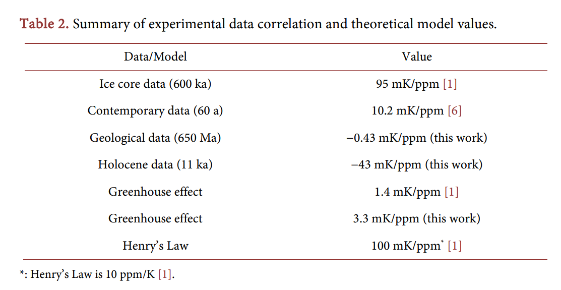
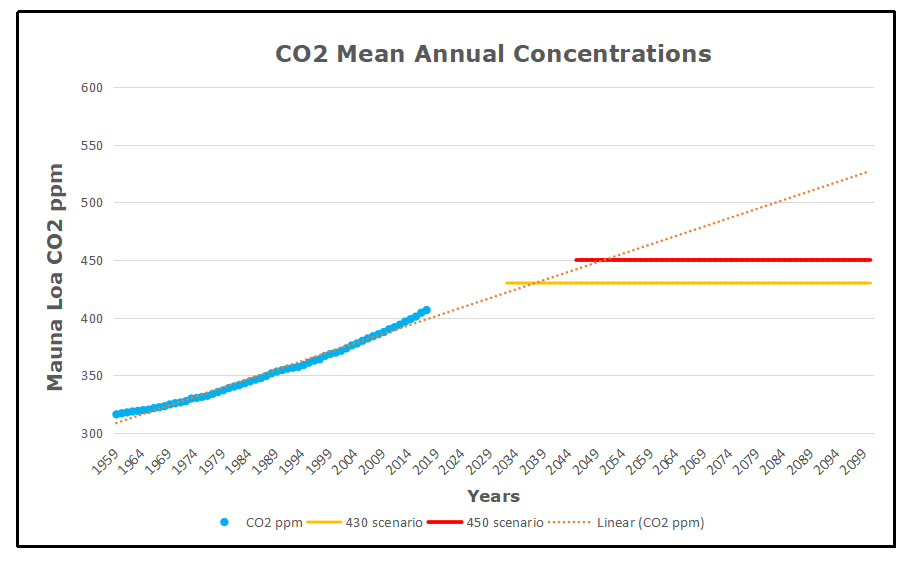
Correlations are best shown in correlation plots; instead of both shown as a time series, they are better shown as one vs. the other; if they are correlated, a straight line should result. Figure 2(b) shows a correlation plot of the same data as used for Figure 2(a) (but no averaging). We see that there is an apparent correlation between the two datasets and we can fit a line to them to find the coefficient. The value is 10.2 mK/ppm. (See Table 2 for a summary of all data sets and models described here).

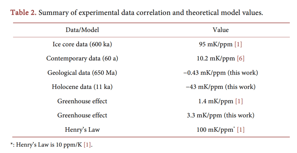
This experimental value of 10.2 mK/ppm is highly interesting. It is neither close to the value expected for the greenhouse effect (1.4 mK/ppm), nor close to the value of Henry’s Law (100 mK/ppm). Even stranger, it is also not close to the value of the 600-ka ice core data (95 mK/ppm).

A missing response might be explained in a relaxation model. After all, induced changes take time to materialize; the system needs time to settle to the new equilibrium value. However, too big responses compared to the model are not possible. A more likely cause for the divergence between model and data is that the correlation is merely coincidental [2]. In a Henry’s-Law (HL) analysis, the CO2 has no effect on the temperature, but a concurrent temperature rise is merely a coincidence. That is, because the [CO2] rise in contemporary data is possibly of anthropogenic origin and not (much) caused by the temperature rise. In the HL framework, the ca. 0.8 degree temperature rise has contributed a meager 8 ppm to the CO2 in the atmosphere. The rest might be coming from anthropogenic sources, or from nature itself.

If, on the other hand, we want to attribute the temperature rise to CO2, we must build-in a delay, since most of the effect of the alleged greenhouse effect has apparently not occurred, yet. Using the value of 95 mK/ppm (Table 2), the 80 ppm of Figure 2(b) should have produced (will produce?) a staggering 7.6 degree temperature rise. A meager 0.8 degrees is observed after 60 years (13 mK/a. Figure 2). From these data we can deduce a virtual relaxation time τ , namely a relaxation time of about half a millennium. We can thus expect a temperature rise of some tenths of a degree per decade in the coming centuries.

This causes a problem. Having set out to explain things in known physical laws, we have no idea what physical process might be the origin of this relaxation. The radiation balance of the atmosphere has a relaxation time of about a month and a half, as evidenced by the 30-day belay between shortest/longest day and coldest/warmest day [1]. No millennium-scale relaxation mechanisms are easily identifiable in the atmosphere, where the GHE resides. We can even exclude that the oceans act as thermal sinks for the heat generated in the atmosphere, because then the effect in the atmosphere would initially be even larger than theoretically predicted, in an effect called overshoot. We thus conclude that, upon scrutiny, the (alleged) greenhouse effect also has to be rejected as a hypothesis to explain contemporary data.

Can the data be explained by Henry’s Law, instead? The observed correlation is 10 mK/ppm, or conversely 100 ppm/K. That is a factor 10 too big for Henry’s Law, and relaxation processes can only make the effect smaller. We thus exclude Henry’s Law as an explanation for the contemporary steady [CO2] rise in the atmosphere, it is not caused by the steady rise in temperature.

A Radiative Greenhouse Model

A “classic” greenhouse model is presented where energy transfer is uniquely by radiation. First with the atmosphere as single body, then with the atmosphere as an infinite set of identical layers, and finally with a multi-layer model in which the atmosphere is in thermodynamic equilibrium, so that layers get thinner and colder upwards. 

Absorption in the Atmosphere

An intrinsic assumption we make here is that all incoming energy comes from radiation from the Sun. Heat coming from the Earth itself, from below the crust, is too small (about 50 mW/m2 ; estimation from the authors) to be significant. Moreover, all heat must be dissipated to the universe by radiation only. Things as evaporation of hot molecules from the top of the atmosphere is too insignificant. This is a rather trivial assumption and will therefore not be further justified. Perhaps more questionable is the assumption that the atmosphere is a well mixed chamber, meaning that all gases occur in the same ratios everywhere. The theoretical greenhouse effect is governed by optical absorption and emission processes in the atmosphere. As such, the Beer-Lambert rule of absorption plays an important role.

The greenhouse effect is often erroneously presented as being caused by the fact that σ x (and thus also α , τ and absorbance) depends on the wavelength. That visible sunlight can reach the surface and infrared terrestrial light cannot easily escape through the atmosphere. This schematic presentation is wrong, however, as we will discuss. It does not matter how and where the solar radiation is absorbed or terrestrial IR radiation is absorbed and reemitted in the atmosphere, if sunlight reaches the surface or not, etc. The only thing that matters is the amount of radiation received by Earth (that is, the amount that is not reflected directly back into space) and amount of IR radiation emitted

Since the absorption coefficient depends on capture cross-sections as well as concentrations, pumping CO2 in the atmosphere might increase heat absorption in the atmosphere and might thus heat it up. However, at first sight, the effect is probably minimal, because nearly all infrared light is already absorbed; at the top of the atmosphere, according to the Beer-Lambert Equation (Equation (2)): J h( ) ≈ 0. We thus do not expect much effect from adding CO2 to the atmosphere as long as there are other channels open for emission. Imagine: if 99% of the light possibly absorbed is already absorbed (say, 350 W/m2 ), doubling CO2 in the atmosphere will not double the absorption (to 700 W/m2 ), but just add something close to 1% to it (3.5 W/m2 ), as Equation (2) tells us. We call this the “forcing” of the atmosphere.

We must remark at this moment that 254K is the temperature of Earth as seen from outer space. Irrespective of any greenhouse or other effect. If we, from outer space, point a radiometer at the planet it will have a temperature signature of 254.0 K. (If we also include the visible light that is reflected (aS), then the total radiation power is equal to that of an black sphere with temperature 4 T S = = σ 278.3 K ). The greenhouse effect does not change the apparent temperature of the planet as seen from outer space, but only that of a hidden layer (e.g., the solid surface). Radiation into space effectively comes from the atmosphere at an altitude where the temperature is 254.0 K, which is in the troposphere at about 6 km height.

In this analysis we assume that radiation balances are determining the atmosphere. The temperature can then be found from the radiation intensity by the inverse function of Stefan-Boltzmann. With the emission α (UDz + )d linearly depending on height, this results in a fourth-root curve of height, with T = 288 K at the surface ( z = 0 ) and about 210 K (−60˚C) at the top of the atmosphere. This is obviously incorrect. In the extreme, in this model attributing all greenhouse effect to CO2, doubling c = [CO2] will double α and that will result in a temperature of 0 T = 313.2 K, or in other words, a sensitivity of ∆∆ = T0 2 [CO 25.1 K 350 ppm 71.7mK ppm ].

A Non-Uniform Atmosphere

In the analysis above, it was assumed that the atmosphere was a homogeneous well-mixed closed box of height h with constant properties everywhere: pressure, concentrations, absorption constants, etc. (Except for a radiation gradient of Figure 4(b)). A real atmosphere, on the other hand, has no upper boundary and is contained by gravity on one side, making it ever thinner with height. We can calculate the properties of such a system, starting with the ideal gas law.

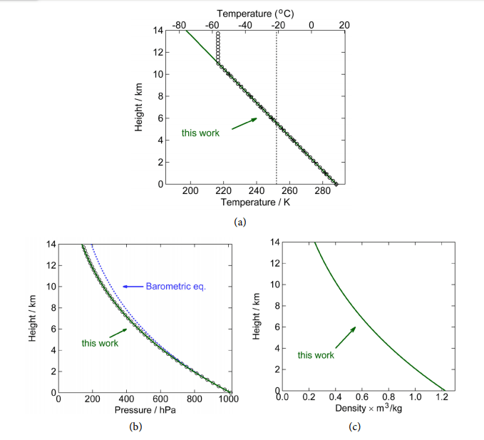
Figure 6. Adiabatic, static atmosphere without heat sources or sinks. (a) Temperature as a function of height, the slope of this linear curve is called the lapse rate and is −6.49 K/km. The black open circles and “+” signs are US standard atmosphere (Refs. [8] and [14], respectively). The green line is Equation (36). The vertical line at 254 K is where the outward radiation apparently is coming from; (b) Pressure as a function of height. The black dots are from Ref. [8]. The blue dashed line is the classical barometric equation, Equation (25), and the green solid line is Equation (38); (c) Density as a function of height, according to Equation (39). (Parameters used: 26 m 4.82 10 kg, − = × p c =1.51 kJ kg K, ⋅ 0 T =15 C, ˚ 0 P =1013.2 hPa, 2 g = 9.81 m s ). The curves here are indistinguishable from the empirical data; the atmosphere is apparently in thermodynamic equilibrium.

We have to make the very important observation that these curves and equations here are independent of any absorption of radiation in the atmosphere, for instance the greenhouse effect discussed earlier (Figure 4(b)). The lapse rate is not caused by radiation, but is a thermodynamic property of the atmosphere. That is, as long as there is thermodynamic equilibrium in the atmosphere, the curves are as given by the above three formulas that are determined by only the surface temperature T0 and total air weight 0P , and physical properties m and p c of the gas and the gravitational constant g. It might, of course, be the case that the atmosphere is not in equilibrium. In that case, mass and heat can be transported through convection, diffusion, conduction and radiation. The latter two only heat (and no mass).

These results are phenomenologically equal to the case of the closed-box Beer-Lambert model. It has the same linear radiation forcing behavior of D(0), depending linearly on total amount of absorbant in the atmosphere. For instance, doubling the total atmosphere with all constituents in it doubles P0 and that doubles the downward radiation (Equation (45)). Moreover, the dependence of temperature on total amount of [CO2] is likewise of the same behavior. If CO2 is the only gas contributing to the greenhouse effect in the atmosphere, the above number would imply a climate sensitivity of ∆T/∆[CO2] = 
(25.1 K) /(350 ppm) = 72 mK ppm.  Now, estimates are given that CO2 contributes to about 3.62% of the greenhouse effect [18]. Substituting x x σ σ ′ = 1.0362 gives a temperature of 289.2 K, and thus a climate sensitivity of s  =∆T/ ∆[CO2 ] =  (1.0 K)/( 350 ppm) =  2.9 mK ppm.

Failure of the Model

Now, as mentioned before, we have to conclude that this entire idea of an analysis is wrong, and is only performed here to show what values we might get on basis of the (faulty) analysis. Because of before-mentioned heat creep and thermodynamic equilibrium in general, it does not matter where and how the planet is heated (where radiation is absorbed, etc.), what matters is only the total amount of power, (1− a S) absorbed in the Earth system and U h( ) emitted by it, in equilibrium they are equal.

For ease of calculation we put it all at the surface, but it makes no difference whatsoever. Thus, as a consequence, and even more important to observe, radiation coming from the surface, U (0) , or anywhere else from the atmosphere itself should not be taken into account, since it does not add anything to the total energy input, it is merely a way of redistribution of internal heat, just like transport by convection and evaporation, etc., the final distribution which is given by the equations given here based on ideal gas laws.

The idea that gases in the atmosphere work as some sort of “mirror” to reflect heat back to the surface is incorrect, because a very efficient and functional “mirror” already exists: Because the atmosphere is in thermodynamic equilibrium (as evidenced by the perfect fit of thermodynamic-equilibrium equations to empirical reality, see Figure 6) adding a heat flux F to the system from the top of the atmosphere to the bottom (see Figure 8)—for instance an absorption of IR and reemission downwards—will be fully counteracted by an equal flux F from the bottom of the atmosphere to the top. The net effect will always be zero!

Adding internal radiation to the radiation balance only, and ignoring the annulling other effects, would be allowing an atmosphere to boot-strap itself, heating itself somehow. No object can heat itself to higher temperatures, when it is already in thermal equilibrium. The only radiation that matters is the one coming from the Sun, and it does not matter where and how it enters into the heat balance of the atmosphere. Heat creep (convection, evaporation and radiation) will redistribute the heat to result in the distribution given here (Figure 6); According to Sorokhtin 66.56% by convection, 24.90% by condensation and 8.54% by radiation [19].

An added process (by multiple absorption-emission) might, at best, speed up the equilibration. There is nothing CO2 would add to the current heat balance in the atmosphere, if the outward radiation no longer comes from the surface of the planet, but from a layer high up in the atmosphere. As long as the radiation does not come from the surface, making the layer blacker (more emissive) will radiate—“mirror”—more heat downwards, which is irrelevant (since it will only speed up the rate of thermalization), but also more heat upwards (F’ in Figure 8), cooling down that layer and thermodynamically the surface layer and the entire planet with it! Opening a radiative channel to the cold universe will rather cool an object.

Thermodynamic-Radiative Atmospheric Model

A thermodynamic-radiative model is presented in which each part of the atmosphere is in thermodynamic equilibrium and, moreover, exchanges heat not only by radiation, but also by other ways, such as convection, etc.

This brings us to the final model that will be presented here. It is based on combining the thermodynamic and radiative analyses given above. Considering the fact that the atmosphere is in thermodynamic equilibrium, we must assume that absorbed radiation does get assimilated by the heat bath, just like in classic Beer-Lambert theory. Radiation absorbed is distributed instantaneously all over the atmosphere and the surface. The surface emits with 4 0 σT , a part λ is passing directly to the universe unhindered, 1− λ is absorbed. The atmosphere emits too; the total emissivity equal to ε. Since, for radiation properties, it does not matter where the absorbing/emitting mass resides (z), but only how much radiation it receives and what temperature it has, we start by describing the atmosphere ρ and T not as a function of height z, but as a function of temperature T.

The total energy in the atmosphere can easily be calculated. Since in thermodynamic equilibrium all air packages have the same specific energy given by p c T gz + , independent of z, all mass must have specific energy (per kg) equal to that at z = 0, namely p 0 c T . The total thermodynamic energy of the atmosphere is then total p 0 E cTM = . The atmosphere tries to shed energy by radiation, and receives energy from the surface. The surface also tries to shed energy, either by radiation into the universe, or by transfer to the atmosphere somehow (conduction, etc.). This is a intricate interplay of energy transfer.

We go back to the Beer-Lambert analysis. Once again, this is justified by the assumption that internal absorption is simply recycled back into the system. The heat is rapidly distributed to maintain thermodynamic equilibrium. Radiation leaving the surface 4 σT0 is partly absorbed by the atmosphere and partly transmitted. The absorbed energy goes back to the heat bath p 0 cTM and is redistributed therein. It does not heat up this bath (that would be counting the solar radiation twice), but reabsorbed energy is heat that was not allowed to escape the system and is thus blocked from cooling it.

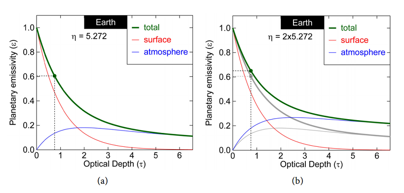
We can now make a plot of the total radiation coming out of the atmosphere as a function of the total optical depth the atmosphere (τ σ= xM m ). Combining Equations (52) and (55), Figure 9 shows the fraction which is the planetary emissivity  , as a function of optical optical depth τ = x σ M m, and thermodynamic molecular heat capacity p η = mc k .

Figure 9. Left: Earth planetary emissivity of the fraction of the radiation emitted by the surface that is escaping from the top of the atmosphere. 1 is like a black body, 0 is white. The red curve is the contribution from the surface and the blue curve from the atmosphere. The sum is  , shown by the green curve. Right: The effect of augmenting the specific heat p c of air is an increment of the planetary emissivity and thus cooling of the surface if η = mc k p increases, but also a heating up of the atmosphere from where now more radiation originates. (Gray lines are the situation of left figure, colored lines are for a doubling of p c ).

The effect of the atmosphere can be found by knowing the thermodynamic parameter and the optical parameter, more precisely the molecular heat capacity, η = mc k p , and optical depth, x τ σ= M m. The latter is complicated, since it is not simply a matter of a linear function of M. We have to know the complete spectrum. But before we continue, it has to be pointed out that the emissivity Equation (Equation (56)) is a monotonously decreasing function of τ for any value of η . That means that increasing the optical depth of the atmosphere will always reduce the emissivity and increase the surface temperature, in contrast to earlier thoughts we had. Reabsorbed radiation goes back to the heat bath and gets a second change to be radiated out to the universe, maybe through another channel: Emitted at a wavelength for which the atmosphere is more transparent, or maybe from a place higher up in the atmosphere.

Comparing to Reality

Section 5 discusses some test cases of the model. They show mixed success. 

Mars

The relevant parameters of the NASA Mars Fact Sheet [22] are given in Table 4. Because most of the atmosphere consists of CO2 (sic), the average molecular mass of molecules is close to the value of CO2 (44.01 g/mol), the fact sheet gives 43.34 g/mol [23]. Therefore, the atmosphere has 3.955 kmol/m2 of molecules. 95.32% of that is CO2, that is 3.770 kmol/m2 . That is much more than above any point on Earth. Yet, the effect of all that CO2 is unmeasurable. The black body (atmosphereless) temperature is bb, T ♂ = 209.8 K, which can be calculated on basis of the solar irradiance 2 W♂ = 586.2 W m and the albedo of Mars ( a♂ = 0.250 ): 4 σTbb,♂ = (1 4 − a W ♂) ♂ . The real temperature of the Mars surface is just this 210 K, making the measured greenhouse effect within the measurement error.

Of course, what is important is not so much how much CO2 is absorbing, but how much is the atmosphere in its entirety absorbing. Better to say, how much it is letting through. Even with CO2 fully saturated, nearly all radiated heat easily escapes the atmosphere. A tiny unmeasurable effect remains. Now, doubling it will have no effect. Imagine 1% of the spectrum is covered, in which part 90% of the radiation is absorbed. Thus 99.1% of all radiation escapes. Doubling this constituent will make the absorption in that 1% part only go to 99%; still 99.01% of all radiation escapes. In this particular case of Mars, CO2 has little effect in whatever quantity it is in the atmosphere.

Earth

Ångström, in his classical work, wrote “[…] it is clear, first, that no more than about 16 percent of earth’s radiation can be absorbed by atmospheric carbon dioxide, and secondly, that the total absorption is very little dependent on the changes in the atmospheric carbon dioxide content, as long as it is not smaller than 0.2 of the existing value” [5].

This basically states that there is no further contribution to the greenhouse effect from CO2 for concentrations above, about, 60 ppm. It is another way of saying that a radiation window that is closed cannot further contribute to greenhouse effect. That is, as long as there are other windows still open. This is not true, however, because absorption lines have tails that can never saturate, absorption can be much larger. A HITRAN simulation of only CO2 absorption (with concentrations as found in the Earth atmosphere) results in absorption of 17.4% (See Figure 11; direct emission 82.6%), close to the value estimated by Ångström. Yet, as we have seen, for Mars, with 30 times more CO2, this absorption is 26.4%. It shows the complexity of the subject. This manuscript is not about numerical simulations, but about analytical understanding of the greenhouse effect. We will now make an empirical estimation here in the framework of our analytical model.

The real emissivity of Earth (surface plus atmosphere) can easily be determined on basis of empirical data, according to Equation (57), where we defined the emissivity through the ratio of radiation coming out to the radiation emitted by the surface.  Taking the thermodynamic parameters ( p m c, ) as constant and as used before (Table 3), from the equations we find that this value occurs for an optical depth of τ = 0.754 (See the green dot of Figure 9). We can even see that 77.7% (0.470) of the radiation going into space comes from the surface and 22.3% (0.135) from the atmosphere. This contrasts the notion mentioned earlier that the radiation comes from 6 km altitude (most still comes from the surface), and also contrasts the values of 28.5% direct emission found earlier for a radiation-only atmosphere. Yet, we also see that if the opacity of the atmosphere increases, more radiation, also in absolute terms, comes from the atmosphere. This is the cooling effect of the atmosphere described earlier.

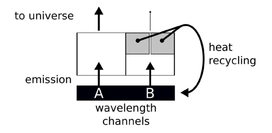
Figure 13. Schematic picture of what happens at Earth. Two channels, one (A) if fully open and one (B) is nearly closed. Closing B further has little-to-no effect.

However, the situation is much closer to situation (f) of Figure 10. That is, a part of the spectrum emission is fully open, and the part of CO2 is as good as closed (shown black in the figure). This situation is depicted in Figure 13, with an open channel A and a closed channel B. Now, further closing the channel (B) that is already as good as closed has little-to-no effect, as long as a significant part of the rest of the spectrum is open.

Note that this is not envisaged in a radiation balance analysis.

In that model, once a heat package has “decided” to opt for a certain wavelength, the only way to make it out of the atmosphere is by multiple-emission-absorptions events, or crawling its way back to the surface. As such, adding CO2 to a closed channel still has a lot of impact. In the current thermodynamic-radiative model, absorbed radiation is given back to the heat bath that is the surface plus the atmosphere ( p 0 cTM ), from where it can have a second chance of escaping into the universe, by the same or by a different channel. To say it in another way, the best-case climate sensitivity of CO2 is zero. The optical length of CO2 in the atmosphere is about 25 m. That is, 25 meters up in the air the radiation emitted by the surface in the spectrum of CO2 is already attenuated by a factor e. In this 25-m layer resides only 1/1773th part of the atmosphere (and CO2). The total transmission of the entire atmosphere is thus exp 1773 (− ) which any calculator shows as zero. Doubling the CO2 in the atmosphere, will have no measurable effect, exp 3546 0. (− ≈) Heat had no chance escaping to the universe through this channel, and now even less so. As long as there is a sliver of the emission spectrum for which the atmosphere is transparent the effect of doubling agents such as CO2 that have a spectrum that is close to saturation is close to nil. This is the lower limit of the effect.

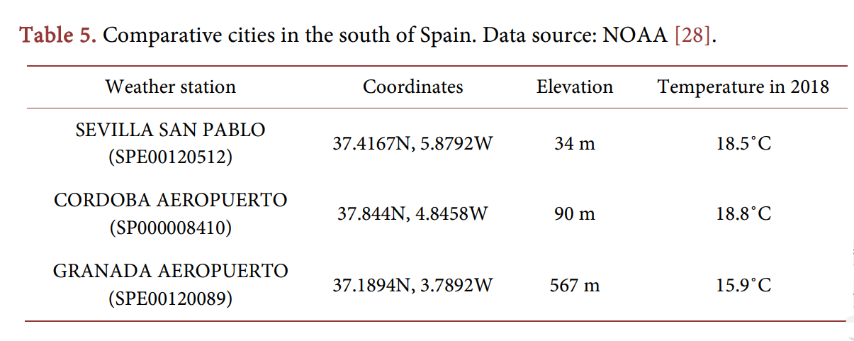
Sevilla-Córdoba-Granada

In this thermodynamic analysis, the temperature at a point on the planet is for a certain radiative input (1 , − a S) mainly determined by the altitude z. The radiative greenhouse effect states it mainly depends on the total amount of carbon dioxide floating above the point. To test these hypotheses, we can look at cities with the same or similar radiative solar input, at the same latitude on the planet, but at different altitudes. Without doing an exhaustive study, we take as example three neighboring cities in the south of Spain,namely Sevilla, Córdoba and Granada, each at a different elevation (Table 5).

The question now is, why is Granada not much warmer in 2019 than Sevilla was in 1951? It is actually still colder. This seriously undermines the idea that carbon dioxide is determining the temperature on our planet. Figure 14 plots the temperature of these cities versus the carbon content above them. The linear regression quality parameter is R2 = 0.21. Meaning, temperature is not well correlated with [CO2].

Venus

When we look at reality, the greenhouse effect on Venus is enormous. Comparing the real temperature  737 K with the blackbody temperature based on the solar radiance and albedo of only 226.6 K, we determine that the emissivity of Venus is very small: 0.00894. For these values we see that the radiation no longer comes from the surface at all, but from the atmosphere, instead, that is very opaque with an optical depth τ of about 81 (see Figure 12). Venus connects to the universe at a high altitude in the atmosphere. The heat finds it way to the surface by thermodynamic means, resulting in a high surface temperature.

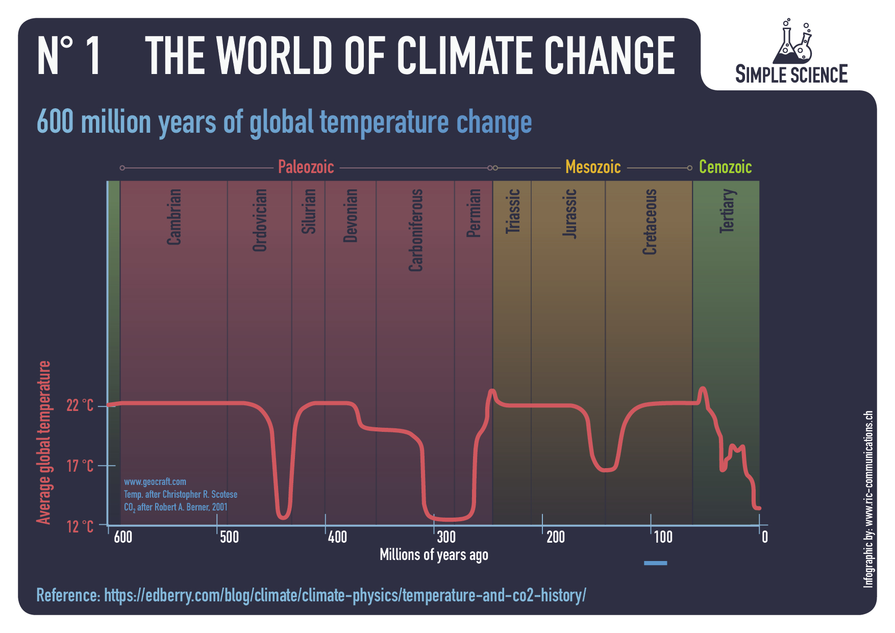
Geological Time Scales

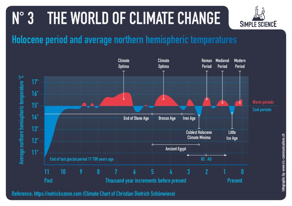
Figure 16. (a) (Holocene) ten-thousand-year time scale data of temperature (blue curve) and [CO2] (purple curve) of Greenland; (b) A correlation curve shows an absence of correlation between the two on this time scale. Plots made with the help of WebPlotDigitizer 4.2 [29] from a plot of based on data of GISP 2 (temperature) and EPICA C (CO2), found at Climate4You [31].

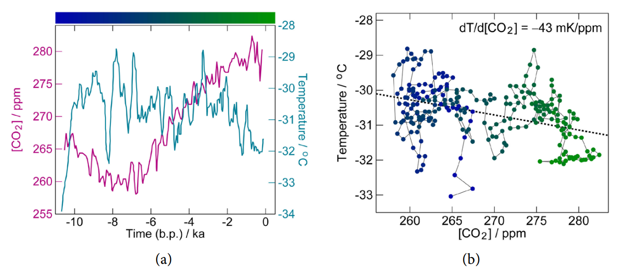
Another experiment nature throws at us is the geological time scale, from times long before humans appeared on this planet. Figure 15 shows these data and it is obvious that in this time scale there is no correlation between carbon-dioxide concentrations in the air and surface temperatures. In fact, a fitting to the data results in a correlation of dT/ d[CO2] = -0.43 mK ppm,  which is probably accidental, because we do not know any theory that might explain an inverse correlation between the two quantities. A similar non-correlation we see in the Holocene data of Greenland, see Figure 16. Here a (pseudo)correlation of dT/ d[CO2] = -0.43 mK ppm, is found, two orders-of-magnitude more than in the paleontological data of Figure 15. These results undermine the hypothesis that only CO2 is climate forcing, something that some climatologists claim.

Other Effects: Feedback, Delay, Water

Section 6 augments the model by including feedback and secondary effects, such as water. It also tries to establish relaxation times of the system.

Delay

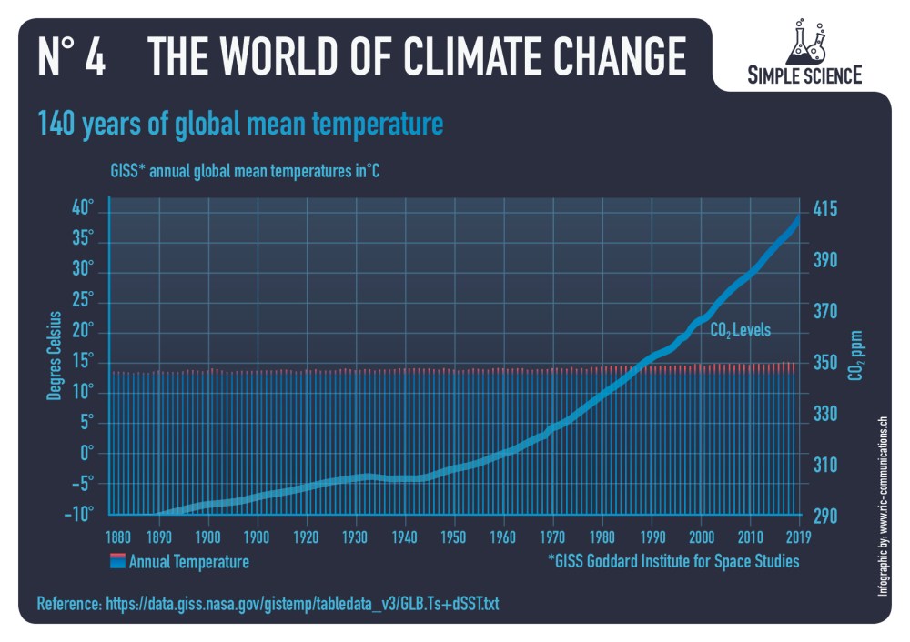
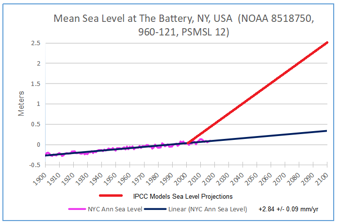
We might think that the atmosphere did not have time yet to reach the new equilibrium. The observed effects are then always less than the one calculated. For the greenhouse effect, however, we need to explain that the signal is larger than theory predicts. Considering the fact that our calculations may be wrong, we can, still, make an estimation about how long it takes to reach the equilibrium, and turn the observed short-term contemporary 10.2 mK/ppm into the observed long-term 95 mK/ppm. The specific heat capacity of air is p c = ⋅ 1.51 kJ K kg. The pressure is 1013.2 Pa, so the mass density is 3 2 0 M Pg = = × 10.3 10 kg m . We found a radiative forcing of 2 w = 8.6 mW m per ppm (Equation (61)), and a temperature effect of ∆T/∆ [CO2] = 3.3 mK ppm (Equation (60)). The characteristic temperature adjustment time of just the atmosphere alone is then  46 days,  That is about a month and a half, a value very similar to the one we found empirically in the phase shift of yearly-periodic solar radiation and temperature data, namely about 1.2 months [32] and a simple relaxation analysis of daily temperature variations which gives 23 days [1]. We can thus exclude any substantial delay effects in the greenhouse effect [CO2] → T on the time scales of the contemporary and ice-core-drilling datasets, 60 a and 600 ka, respectively. On the other hand, we can expect long delays between T and [CO2] in the framework of Henry’s Law. Imagine the atmosphere warms up for some reason (maybe solar activity). This warmed up air must then heat up the relevant layer of the ocean and expose this layer to the surface where the surplus CO2 can outgas.

Water Effect

Water has several effects. First it will change the specific heat of the air ( p c ) and thus the lapse rate of the atmosphere, Equation (36). This will slightly lower the temperature at the surface. As a secondary effect, it will increase dramatically the absorption cross section for infrared, and this will change the ground temperature T0 . The feedback effect of water on outgoing radiation is beyond the Barkhausen criterion and thus, any addition of water to the atmosphere, however tiny, would result in a run-away scenario. However, this effect is fully canceled by the albedo effect, resulting in a net negative effect of water on the temperature.

Conclusions

We have analyzed here the greenhouse effect, using fully analytical techniques, without reverting anywhere to finite-elements calculations. This gave important insight into the phenomenon. An important conclusion is that the analysis in terms of radiation-balances-only cannot explain the situation in the atmosphere. In the extreme case, a differential equation of layers with absorption coefficients, etc., gave the same results as a much simpler 2-box mixed chamber model. However, the underlying assumptions in these calculations are not physical.

Therefore we set out to model the greenhouse effect ab initio, and came up with the thermodynamic-radiation model. The atmosphere is close to thermodynamic equilibrium and based on that we can calculate where and how radiation is absorbed and emitted. This model can explain phenomenologically and analytically how big the effect of the atmosphere is, specifically Equations (56) and (58).

Continuing with the reasoning, we find that the alleged greenhouse effect cannot explain the empirical data—orders of magnitude are missing. There where Henry’s Law—outgassing of oceans—easily can explain all observed phenomena.

Moreover, the greenhouse hypothesis—as presented here—cannot explain the atmosphere on Mars, nor can it explain the geological data, where no correlation between [CO2] and temperature is observed. Nor can it explain why a different correlation is observed in contemporary data of the last 60 years compared to historical data (600 thousand years).

We thus reject the anthropogenic global warming (AGW) hypothesis, both on basis of empirical grounds as well as a theoretical analysis

Oceans Erase Last Summer’s Warming

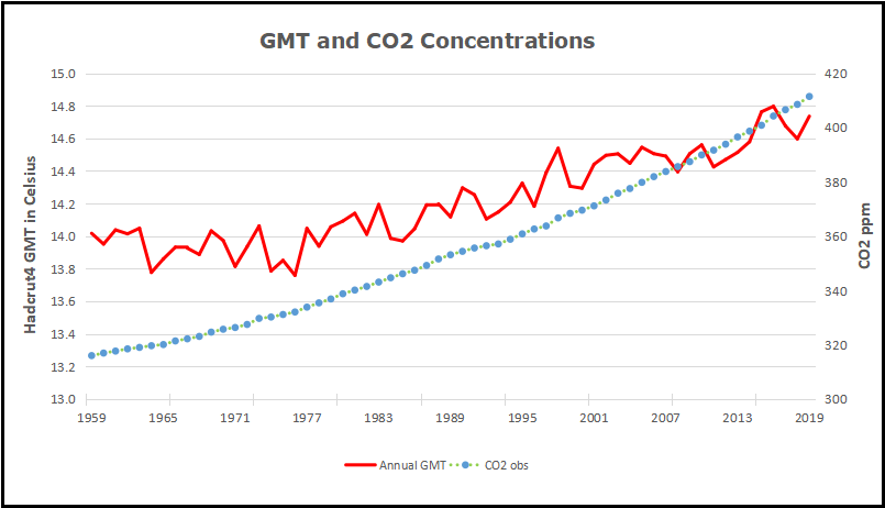
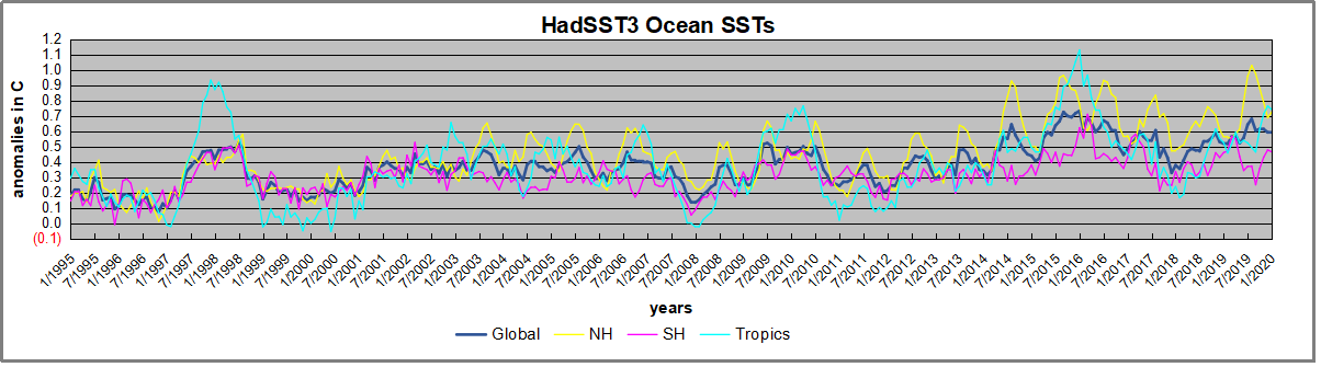
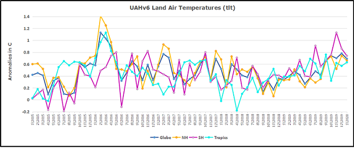
The best context for understanding decadal temperature changes comes from the world’s sea surface temperatures (SST), for several reasons:

  • The ocean covers 71% of the globe and drives average temperatures;
  • SSTs have a constant water content, (unlike air temperatures), so give a better reading of heat content variations;
  • A major El Nino was the dominant climate feature in recent years.

HadSST is generally regarded as the best of the global SST data sets, and so the temperature story here comes from that source, the latest version being HadSST3.  More on what distinguishes HadSST3 from other SST products at the end.

The Current Context

The chart below shows SST monthly anomalies as reported in HadSST3 starting in 2015 through January 2020.
A global cooling pattern is seen clearly in the Tropics since its peak in 2016, joined by NH and SH cycling downward since 2016.  In 2019 all regions had been converging to reach nearly the same value in April.

Then  NH rose exceptionally by almost 0.5C over the four summer months, in August exceeding previous summer peaks in NH since 2015.  In the 4 succeeding months, that warm NH pulse has reversed sharply.  January NH anomaly is little changed from December.  SH and Tropics SSTs bumped upward since September, but despite that the global anomaly dropped a little due to strong NH cooling. Now the Global anomaly is the same as June 2019.

Note that higher temps in 2015 and 2016 were first of all due to a sharp rise in Tropical SST, beginning in March 2015, peaking in January 2016, and steadily declining back below its beginning level. Secondly, the Northern Hemisphere added three bumps on the shoulders of Tropical warming, with peaks in August of each year.  A fourth NH bump was lower and peaked in September 2018.  As noted above, a fifth peak in August 2019 exceeded the four previous upward bumps in NH.

And as before, note that the global release of heat was not dramatic, due to the Southern Hemisphere offsetting the Northern one.  The major difference between now and 2015-2016 is the absence of Tropical warming driving the SSTs.

A longer view of SSTs

The graph below  is noisy, but the density is needed to see the seasonal patterns in the oceanic fluctuations.  Previous posts focused on the rise and fall of the last El Nino starting in 2015.  This post adds a longer view, encompassing the significant 1998 El Nino and since.  The color schemes are retained for Global, Tropics, NH and SH anomalies.  Despite the longer time frame, I have kept the monthly data (rather than yearly averages) because of interesting shifts between January and July.

1995 is a reasonable (ENSO neutral) starting point prior to the first El Nino.  The sharp Tropical rise peaking in 1998 is dominant in the record, starting Jan. ’97 to pull up SSTs uniformly before returning to the same level Jan. ’99.  For the next 2 years, the Tropics stayed down, and the world’s oceans held steady around 0.2C above 1961 to 1990 average.

Then comes a steady rise over two years to a lesser peak Jan. 2003, but again uniformly pulling all oceans up around 0.4C.  Something changes at this point, with more hemispheric divergence than before. Over the 4 years until Jan 2007, the Tropics go through ups and downs, NH a series of ups and SH mostly downs.  As a result the Global average fluctuates around that same 0.4C, which also turns out to be the average for the entire record since 1995.

2007 stands out with a sharp drop in temperatures so that Jan.08 matches the low in Jan. ’99, but starting from a lower high. The oceans all decline as well, until temps build peaking in 2010.

Now again a different pattern appears.  The Tropics cool sharply to Jan 11, then rise steadily for 4 years to Jan 15, at which point the most recent major El Nino takes off.  But this time in contrast to ’97-’99, the Northern Hemisphere produces peaks every summer pulling up the Global average.  In fact, these NH peaks appear every July starting in 2003, growing stronger to produce 3 massive highs in 2014, 15 and 16.  NH July 2017 was only slightly lower, and a fifth NH peak still lower in Sept. 2018.

The highest summer NH peak came in 2019, only this time the Tropics and SH are offsetting rather adding to the warming. Since 2014 SH has played a moderating role, offsetting the NH warming pulses. Now in January 2020 last summer’s unusually high NH SSTs have been erased. (Note: these are high anomalies on top of the highest absolute temps in the NH.)

What to make of all this? The patterns suggest that in addition to El Ninos in the Pacific driving the Tropic SSTs, something else is going on in the NH.  The obvious culprit is the North Atlantic, since I have seen this sort of pulsing before.  After reading some papers by David Dilley, I confirmed his observation of Atlantic pulses into the Arctic every 8 to 10 years.

But the peaks coming nearly every summer in HadSST require a different picture.  Let’s look at August, the hottest month in the North Atlantic from the Kaplan dataset.
The AMO Index is from from Kaplan SST v2, the unaltered and not detrended dataset. By definition, the data are monthly average SSTs interpolated to a 5×5 grid over the North Atlantic basically 0 to 70N. The graph shows warming began after 1992 up to 1998, with a series of matching years since. Because the N. Atlantic has partnered with the Pacific ENSO recently, let’s take a closer look at some AMO years in the last 2 decades.
This graph shows monthly AMO temps for some important years. The Peak years were 1998, 2010 and 2016, with the latter emphasized as the most recent. The other years show lesser warming, with 2007 emphasized as the coolest in the last 20 years. Note the red 2018 line is at the bottom of all these tracks. The black line shows that 2019 began slightly cooler, then tracked 2018, then rose to match previous summer pulses, before dropping the last four months to be slightly above 2018 and below other years.

Summary

The oceans are driving the warming this century.  SSTs took a step up with the 1998 El Nino and have stayed there with help from the North Atlantic, and more recently the Pacific northern “Blob.”  The ocean surfaces are releasing a lot of energy, warming the air, but eventually will have a cooling effect.  The decline after 1937 was rapid by comparison, so one wonders: How long can the oceans keep this up? If the pattern of recent years continues, NH SST anomalies may rise slightly in coming months, but once again, ENSO which has weakened will probably determine the outcome.

Footnote: Why Rely on HadSST3

HadSST3 is distinguished from other SST products because HadCRU (Hadley Climatic Research Unit) does not engage in SST interpolation, i.e. infilling estimated anomalies into grid cells lacking sufficient sampling in a given month. From reading the documentation and from queries to Met Office, this is their procedure.

HadSST3 imports data from gridcells containing ocean, excluding land cells. From past records, they have calculated daily and monthly average readings for each grid cell for the period 1961 to 1990. Those temperatures form the baseline from which anomalies are calculated.

In a given month, each gridcell with sufficient sampling is averaged for the month and then the baseline value for that cell and that month is subtracted, resulting in the monthly anomaly for that cell. All cells with monthly anomalies are averaged to produce global, hemispheric and tropical anomalies for the month, based on the cells in those locations. For example, Tropics averages include ocean grid cells lying between latitudes 20N and 20S.

Gridcells lacking sufficient sampling that month are left out of the averaging, and the uncertainty from such missing data is estimated. IMO that is more reasonable than inventing data to infill. And it seems that the Global Drifter Array displayed in the top image is providing more uniform coverage of the oceans than in the past.

uss-pearl-harbor-deploys-global-drifter-buoys-in-pacific-ocean

USS Pearl Harbor deploys Global Drifter Buoys in Pacific Ocean

Land Air Temps Continue Cooling in January

banner-blog

With apologies to Paul Revere, this post is on the lookout for cooler weather with an eye on both the Land and the Sea.  UAH has updated their tlt (temperatures in lower troposphere) dataset for January 2020.  Previously I have done posts on their reading of ocean air temps as a prelude to updated records from HADSST3. This month also has a separate graph of land air temps because the comparisons and contrasts are interesting as we contemplate possible cooling in coming months and years.

Presently sea surface temperatures (SST) are the best available indicator of heat content gained or lost from earth’s climate system.  Enthalpy is the thermodynamic term for total heat content in a system, and humidity differences in air parcels affect enthalpy.  Measuring water temperature directly avoids distorted impressions from air measurements.  In addition, ocean covers 71% of the planet surface and thus dominates surface temperature estimates.  Eventually we will likely have reliable means of recording water temperatures at depth.

Recently, Dr. Ole Humlum reported from his research that air temperatures lag 2-3 months behind changes in SST.  He also observed that changes in CO2 atmospheric concentrations lag behind SST by 11-12 months.  This latter point is addressed in a previous post Who to Blame for Rising CO2?

After a technical enhancement to HadSST3 delayed March and April updates, May resumed a pattern of HadSST updates mid month.  For comparison we can look at lower troposphere temperatures (TLT) from UAHv6 which are now posted for January. The temperature record is derived from microwave sounding units (MSU) on board satellites like the one pictured above. Recently there was a change in UAH processing of satellite drift corrections, including dropping one platform which can no longer be corrected. The graphs below are taken from the new and current dataset.

The UAH dataset includes temperature results for air above the oceans, and thus should be most comparable to the SSTs. There is the additional feature that ocean air temps avoid Urban Heat Islands (UHI).  The graph below shows monthly anomalies for ocean temps since January 2015.After a June rise in ocean air temps, all regions dropped back down to May levels in July and August.  A spike occured in September, followed by plummenting October ocean air temps in the Tropics and SH. In November that drop partly warmed back, now leveling slightly downword with continued cooling in NH. 2020 starts with NH warming slightly, still cooler than the previous months back to September.  SH and Tropics also rose slightly resulting in a Global rise.

Land Air Temperatures Cooling in Seesaw Pattern

We sometimes overlook that in climate temperature records, while the oceans are measured directly with SSTs, land temps are measured only indirectly.  The land temperature records at surface stations sample air temps at 2 meters above ground.  UAH gives tlt anomalies for air over land separately from ocean air temps.  The graph updated for January 2020 is below.

Here we have freash evidence of the greater volatility of the Land temperatures, along with an extraordinary departure by SH land.  Despite the small amount of SH land, it spiked in July, then dropped in August so sharply along with the Tropics that it pulled the global average downward against slight warming in NH.  In November SH jumped up beyond any month in this period.  Despite this spike along with a rise in the Tropics, NH land temps dropped sharply.  The larger NH land area pulled the Global average downward.  December reversed the situation with the SH dropping as sharply as it rose, while NH rose to the same anomaly, pulling the Global up slightly.

2020 starts with sharp drops in both SH and NH, with the Global anomaly dropping as a result.  The behavior of SH land temps is puzzling, to say the least.  it is also a reminder that global averages can conceal important underlying volatility.

The longer term picture from UAH is a return to the mean for the period starting with 1995.  2019 average rose but currently lacks any El Nino to sustain it.

TLTs include mixing above the oceans and probably some influence from nearby more volatile land temps.  Clearly NH and Global land temps have been dropping in a seesaw pattern, more than 1C lower than the 2016 peak, prior to these last several months. TLT measures started the recent cooling later than SSTs from HadSST3, but are now showing the same pattern.  It seems obvious that despite the three El Ninos, their warming has not persisted, and without them it would probably have cooled since 1995.  Of course, the future has not yet been written.

Historic Climate Cycles (glaciers added)

Update: February 7, 2020

This is an update to a post The Ever Changing Climate with a new slide showing fluctuating Alpine glaciers over several thousand years.  Context below is from the previous post along with the new content.

Raymond of RiC-Communications  studio commented on a recent post and made an offer to share here some graphics on CO2 for improving public awareness.  He produced 12 interesting slides which are presented in the post Here’s Looking at You, CO2.   I find them straightforward and useful, and appreciate his excellent work on this. Project title is link to RiC-Communications. This post presents the five initial charts he has so far created on a second theme The World of Climate Change and adds another regarding Alpine glacier studies by two prominent geologists.  In addition, Raymond was able to consult the work of  these two experts in their native German language.

This project is The World of Climate Change

Infographics can be helpful, in making things simple to understand. Climate change is a complex topic with a lot of information and statistics. These simple step by step charts are to better understand what is occurring naturally and what could be caused by humans. What is cause for alarm and what isn’t cause for alarmism if at all. Only through learning is it possible to get the big picture so as to make the right decisions for the future.

– N° 1 600 million years of global temperature change
– N° 2 Earth‘s temperature record for the last 400,000 years
– N° 3 Holocene period and average northern hemispheric temperatures
– N° 4 140 years of global mean temperature
– N° 5 120 m of sea level rise over the past 20‘000 years
– N° 6 Eastern European alpine glacier history during the Holocene period.


03_infographic_wocc-1

04_infographic_wocc

Summer Temperatures (May – September) A rise in temperature during a warming period will result in a glacier losing more surface area or completely vanishing. This can happen very rapidly in only a few years or over a longer period of time. If temperatures drop during a cooling period and summer temperatures are too low, glaciers will begin to grow and advance with each season. This can happen very rapidly or over a longer period in time. Special thanks to Prof. em. Christian Schlüchter / (Quartärgeologie, Umweltgeologie) Universität Bern Institut für Geologie His work is on the Western Alps and was so kind to help Raymond make this graphic as correct as possible.

Comment:

This project will explore information concerning how aspects of the world climate system have changed in the past up to the present time.  Understanding the range of historical variation and the factors involved is essential for anticipating how future climate parameters might fluctuate.

For example:

The Climate Story (Illustrated) looks at the temperature record.

H20 the Gorilla Climate Molecule looks at precipitation patterns.

Data vs. Models #2: Droughts and Floods looks at precipitation extremes.

Data vs. Models #3: Disasters looks at extreme weather events.

Data vs. Models #4: Climates Changing looks at boundaries of defined climate zones.

And in addition, since Chart #5 features the Statue of Liberty, here are the tidal guage observations there compared to climate model projections:


The Ever Changing Climate

Update: January 31, 2020

This is an update to a post Simple Science 2: World of Climate Change with two new slides and a revised sequence. Context below is from the previous with the new content.

Raymond of RiC-Communications  studio commented on a recent post and made an offer to share here some graphics on CO2 for improving public awareness.  He has produced 12 interesting slides which are presented in the post Here’s Looking at You, CO2.  This post presents the three initial charts he has so far created on a second theme The World of Climate Change.  I find them straightforward and useful, and appreciate his excellent work on this. Project title is link to RiC-Communications. (For some reason I had problems getting my Opera browser to load the revised links, but Edge worked fine.

This project is The World of Climate Change

Infographics can be helpful, in making things simple to understand. Climate change is a complex topic with a lot of information and statistics. These simple step by step charts are here to better understand what is occurring naturally and what could be caused by humans. What is cause for alarm and what isn’t cause for alarmism if at all. Only through learning is it possible to get the big picture so as to make the right decisions for the future.

– N° 1 600 million years of global temperature change
– N° 2 Earth‘s temperature record for the last 400,000 years
– N° 3 Holocene period and average northern hemispheric temperatures
– N° 4 140 years of global mean temperature
– N° 5 120 m of sea level rise over the past 20‘000 years


Comment:

This project will explore information concerning how aspects of the world climate system have changed in the past up to the present time.  Understanding the range of historical variation and the factors involved is essential for anticipating how future climate parameters might fluctuate.

For example:

The Climate Story (Illustrated) looks at the temperature record.

H20 the Gorilla Climate Molecule looks at precipitation patterns.

Data vs. Models #2: Droughts and Floods looks at precipitation extremes.

Data vs. Models #3: Disasters looks at extreme weather events.

Data vs. Models #4: Climates Changing looks at boundaries of defined climate zones.

And in addition, since Chart #5 features the Statue of Liberty, here are the tidal gauge observations there compared to climate model projections:


I Want You Not to Panic


I’ve been looking into claims for concern over rising CO2 and temperatures, and this post provides reasons why the alarms are exaggerated. It involves looking into the data and how it is interpreted.

First the longer view suggests where to focus for understanding. Consider a long term temperature record such as Hadcrut4. Taking it at face value, setting aside concerns about revisions and adjustments, we can see what has been the pattern in the last 120 years following the Little Ice Age. Often the period between 1850 and 1900 is considered pre industrial since modern energy and machinery took hold later on. The graph shows that warming was not much of a factor until temperatures rose peaking in the 1940s, then cooling off into the 1970s, before ending the century with a rise matching the rate of earlier warming. Overall, the accumulated warming was 0.8C.

Then regard the record concerning CO2 concentrations in the atmosphere. It’s important to know that modern measurement of CO2 really began in 1959 with Mauna Loa observatory, coinciding with the mid-century cool period. The earlier values in the chart are reconstructed by NASA GISS from various sources and calibrated to reconcile with the modern record. It is also evident that the first 60 years saw minimal change in the values compared to the post 1959 rise after WWII ended and manufacturing was turned from military production to meet consumer needs. So again the mid-20th century appears as a change point.

It becomes interesting to look at the last 60 years of temperature and CO2 from 1959 to 2019, particularly with so much clamour about climate emergency and crisis. This graph puts together rising CO2 and temperatures for this period. Firstly note that the accumulated warming is about 0.8C after fluctuations. And remember that those decades witnessed great human flourishing and prosperity by any standard of life quality. The rise of CO2 was a monotonic steady rise with some acceleration into the 21st century.

Now let’s look at projections into the future, bearing in mind Mark Twain’s warning not to trust future predictions. No scientist knows all or most of the surprises that overturn continuity from today to tomorrow. Still, as weathermen well know, the best forecasts are built from present conditions and adding some changes going forward.

Here is a look to century end as a baseline for context. No one knows what cooling and warming periods lie ahead, but one scenario is that the next 80 years could see continued warming at the same rate as the last 60 years. That presumes that forces at play making the weather in the lifetime of many of us seniors will continue in the future. Of course factors beyond our ken may deviate from that baseline and humans will notice and adapt as they have always done. And in the back of our minds is the knowledge that we are 11,500 years into an interglacial period before the cold returns, being the greater threat to both humanity and the biosphere.

Those who believe CO2 causes warming advocate for reducing use of fossil fuels for fear of overheating, apparently discounting the need for energy should winters grow harsher. The graph shows one projection for CO2 levels similar to that of temperature, showing the next 80 years accumulating at the same rate as the last 60. A second projection in green takes the somewhat higher rate of the last 10 years and projects it to century end. The latter trend would achieve a doubling of CO2.

What those two scenarios mean depends on how sensitive you think Global Mean Temperature is to changing CO2 concentrations. Climate models attempt to consider all relevant and significant factors and produce future scenarios for GMT. CMIP6 is the current group of models displaying a wide range of warming presumably from rising CO2. The one model closely replicating Hadcrut4 back to 1850 projects 1.8C higher GMT for a doubling of CO2 concentrations. If that held true going from 300 ppm to 600 ppm, the trend would resemble the red dashed line continuing the observed warming from the past 60 years: 0.8C up to now and another 1C the rest of the century. Of course there are other models programmed for warming 2 or 3 times the rate observed.

People who take to the streets with signs forecasting doom in 11 or 12 years have fallen victim to IPCC 450 and 430 scenarios.  For years activists asserted that warming from pre industrial can be contained to 2C if CO2 concentrations peak at 450 ppm.  Last year, the SR1.5 lowered the threshold to 430 ppm, thus the shortened timetable for the end of life as we know it.

For the sake of brevity, this post leaves aside many technical issues. Uncertainties about the temperature record, and about early CO2 levels, and the questions around Equilibrium CO2 Sensitivity (ECS) and Transient CO2 Sensitivity (TCS) are for another day. It should also be noted that GMT as an average hides huge variety of fluxes over the globe surface, and thus larger warming in some places such as Canada, and cooling in other places like Southeast US. Ross McKitrick pointed out that Canada has already gotten more than 1.5C of warming and it has been a great social, economic and environmental benefit.

So I want people not to panic about global warming/climate change. Should we do nothing? On the contrary, we must invest in robust infrastructure to ensure reliable affordable energy and to protect against destructive natural events. And advanced energy technologies must be developed for the future since today’s wind and solar farms will not suffice.

It is good that Greta’s demands were unheeded at the Davos gathering. Panic is not useful for making wise policies, and as you can see above, we have time to get it right.

Climate Models: Good, Bad and Ugly

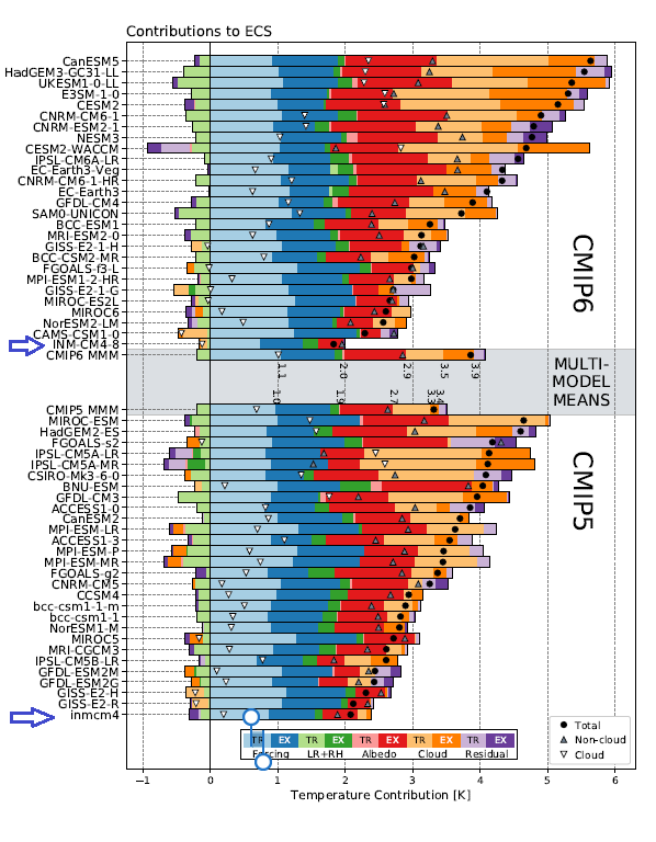
Several posts here discuss INM-CM4, the Good CMIP5 climate model since it alone closely replicates the Hadcrut temperature record, as well as approximating BEST and satellite datasets. This post is prompted by recent studies comparing various CMIP6 models, the new generation intending to hindcast history through 2014, and forecast to 2100.

Background

Much revealing information is provided in an AGU publication Causes of Higher Climate Sensitivity in CMIP6 Models by Mark D. Zelinka et al. (2019). H/T Judith Curry.  Excerpts in italics with my bolds.

The severity of climate change is closely related to how much the Earth warms in response to greenhouse gas increases. Here we find that the temperature response to an abrupt quadrupling of atmospheric carbon dioxide has increased substantially in the latest generation of global climate models. This is primarily because low cloud water content and coverage decrease more strongly with global warming, causing enhanced planetary absorption of sunlight—an amplifying feedback that ultimately results in more warming. Differences in the physical representation of clouds in models drive this enhanced sensitivity relative to the previous generation of models. It is crucial to establish whether the latest models, which presumably represent the climate system better than their predecessors, are also providing a more realistic picture of future climate warming.

The objective is to understand why the models are getting badder and uglier, and whether the increased warming is realistic. This issue was previously noted by John Christy last summer:

Figure 8: Warming in the tropical troposphere according to the CMIP6 models.
Trends 1979–2014 (except the rightmost model, which is to 2007), for 20°N–20°S, 300–200 hPa.

Christy’s comment: We are just starting to see the first of the next generation of climate models, known as CMIP6. These will be the basis of the IPCC assessment report, and of climate and energy policy for the next 10 years. Unfortunately, as Figure 8 shows, they don’t seem to be getting any better. The observations are in blue on the left. The CMIP6 models, in pink, are also warming faster than the real world. They actually have a higher sensitivity than the CMIP5 models; in other words, they’re apparently getting worse! This is a big problem.

Why CMIP6 Models Are More Sensitive

Zelinka et al. (2019) delve into the issue by comparing attributes of the CMIP6 models currently available for diagnostics.

1 Introduction

Determining the sensitivity of Earth’s climate to changes in atmospheric carbon dioxide (CO2) is a fundamental goal of climate science. A typical approach for doing so is to consider the planetary energy balance at the top of the atmosphere (TOA), represented as

urn:x-wiley:grl:media:grl60047:grl60047-math-0004

where urn:x-wiley:grl:media:grl60047:grl60047-math-0005 is the net TOA radiative flux anomaly,
urn:x-wiley:grl:media:grl60047:grl60047-math-0006 is the radiative forcing,
urn:x-wiley:grl:media:grl60047:grl60047-math-0007 is the radiative feedback parameter, and
urn:x-wiley:grl:media:grl60047:grl60047-math-0008 is the global mean surface air temperature anomaly.

The sign convention is that urn:x-wiley:grl:media:grl60047:grl60047-math-0009 is positive down and urn:x-wiley:grl:media:grl60047:grl60047-math-0010 is negative for a stable system.

Conceptually, this equation states that the TOA energy imbalance can be expressed as the sum of the radiative forcing and the radiative response of the system to a global surface temperature anomaly. The assumption that the radiative damping can be expressed as a product of a time‐invariant and global mean surface temperature anomaly is useful but imperfect (Armour et al., 2013; Ceppi & Gregory, 2019). Under this assumption, one can estimate the effective climate sensitivity (ECS), the ultimate global surface temperature change that would restore TOA energy balance.

urn:x-wiley:grl:media:grl60047:grl60047-math-0014

where urn:x-wiley:grl:media:grl60047:grl60047-math-0015 is the radiative forcing due to doubled CO urn:x-wiley:grl:media:grl60047:grl60047-math-0016. .

ECS therefore depends on the magnitude of the CO2 radiative forcing and on how strongly the climate system radiatively damps planetary warming. A climate system that more effectively radiates thermal energy to space or more strongly reflects sunlight back to space as it warms (larger magnitude urn:x-wiley:grl:media:grl60047:grl60047-math-0007 )  will require less warming to restore planetary energy balance in response to a positive radiative forcing, and vice versa.

Because GCMs attempt to represent all relevant processes governing Earth’s response to CO2, they provide the most direct means of estimating ECS. ECS values diagnosed from CO2 quadrupling experiments performed in fully coupled GCMs as part of the fifth phase of the Coupled Model Intercomparison Project ranged from 2.1 to 4.7 K. It is already known that several models taking part in CMIP6 have values of ECS exceeding the upper limit of this range. These include CanESM5.0.3 , CESM2, CNRM‐CM6‐1, E3SMv1, and both HadGEM3‐GC3.1 and UKESM1.

In all of these models, high ECS values are at least partly attributed to larger cloud feedbacks than their predecessors.

In this study, we diagnose the forcings, feedbacks, and ECS values in all available CMIP6 models. We assess in each model the individual components that make up the climate feedback parameter and quantify the contributors to intermodel differences in ECS. We also compare these results with those from CMIP5 to determine whether the multimodel mean or spread in ECS, feedbacks, and forcings have changed.

The range of ECS values across models has widened in CMIP6, particularly on the high end, and now includes nine models with values exceeding the CMIP5 maximum (Figure 1a). Specifically, the range has increased from 2.1–4.7 K in CMIP5 to 1.8–5.6 K in CMIP6, and the intermodel variance has significantly increased (p = 0.04).

One model’s ECS is below the CMIP5 minimum (INM‐CM4‐8).

This increased population of high ECS models has caused the multimodel mean ECS to increase from 3.3 K in CMIP5 to 3.9 K in CMIP6. Though substantial, this increase is not statistically significant (p = 0.16).  ERF urn:x-wiley:grl:media:grl60047:grl60047-math-0039 has increased slightly on average in CMIP6 and its intermodel standard deviation has been reduced by nearly 30% from 0.50 Wm^2 in CMIP5 to 0.36 Wm^2 in CMIP6 (Figure 1b).

This ECS increase is primarily attributable to an increased multimodel mean feedback parameter due to strengthened positive cloud feedbacks, as all noncloud feedbacks are essentially unchanged on average in CMIP6. However, it is the unique combination of weak overall negative feedback and moderate radiative forcing that allows several CMIP6 models to achieve high ECS values beyond the CMIP5 range.

The increase in cloud feedback arises solely from the strengthened SW low cloud component, while the non‐low cloud feedback has slightly decreased. The SW low cloud feedback is larger on average in CMIP6 due to larger reductions in low cloud cover and weaker increases in cloud liquid water path with warming. Both of these changes are much more dramatic in the extratropics, such that the CMIP6 mean low cloud amount feedback is now stronger in the extratropics than in the tropics, and the fraction of multimodel mean ECS attributable to extratropical cloud feedback has roughly tripled.

The aforementioned increase in CMIP6 mean cloud feedback is related to changes in model representation of clouds. Specifically, both low cloud cover and water content increase less dramatically with SST in the middle latitudes as estimated from unforced climate variability in CMIP6.

Figure 1. INM-CM5 representation of temperature history. The 5-year mean GMST (K) anomaly with respect to 1850–1899 for HadCRUTv4 (thick solid black); model mean (thick solid red). Dashed thin lines represent data from individual model runs: 1 – purple, 2 – dark blue, 3 – blue, 4 – green, 5 – yellow, 6 – orange, 7 – magenta. In this and the next figures numbers on the time axis indicate the first year of the 5-year mean

The Nitty Gritty

Open image in new tab to enlarge.

The details are shown in Supporting Information for “Causes of higher climate
sensitivity in CMIP6 models”. Here we can seen how specific models stack up on the key variables driving ECS attributes.

Open image in new tab to enlarge.

Figure S1. Gregory plots showing global and annual mean TOA net radiation anomalies
plotted against global and annual mean surface air temperature anomalies. Best-fit ordinary linear least squares lines are shown. The y-intercept of the line (divided by 2) provides an estimate of the effective radiative forcing from CO2 doubling (ERF2x), the slope of the line provides an estimate of the net climate feedback parameter (λ), and the x-intercept of the line (divided by 2) provides an estimate of the effective climate sensitivity (ECS). These values are printed in each panel. Models are ordered by ECS.

Open image in new tab to enlarge.

Figure S7. Contributions of forcing and feedbacks to ECS in each model and for the multimodel means. Contributions from the tropical and extratropical portion of the feedback are shown in light and dark shading, respectively. Black dots indicate the ECS in each model, while upward and downward pointing triangles indicate contributions from non-cloud and cloud feedbacks, respectively. Numbers printed next to the multi-model mean bars indicate the cumulative sum of each plotted component. Numerical values are not printed next to residual, extratropical forcing, and tropical albedo terms for clarity. Models within each collection are ordered by ECS.

Open image in new tab to enlarge.

Figure S8. Cloud feedbacks due to low and non-low clouds in the (light shading) tropics and (dark shading) extratropics in each model and for the multi-model means. Non-low cloud feedbacks are separated into LW and SW components, and SW low cloud feedbacks are separated into amount and scattering components. “Others” represents the sum of LW low cloud feedbacks and the small difference between kernel- and APRP-derived SW low cloud feedback. Insufficient diagnostics are available to compute SW cloud amount and scattering feedbacks for the FGOALSg2 and CAMS-CSM1-0 models. Black dots indicate the global mean net cloud feedback in each model, while upward and downward pointing triangles indicate total contributions from non-low and low clouds, respectively. Models within each collection are ordered by global mean net cloud feedback.

My Summary

Once again the Good Model INM-CM4-8 is bucking the model builders’ consensus. The new revised INM model has a reduced ECS and it flipped its cloud feedback from positive to negative.The description of improvements made to the INM modules includes how clouds are handled:

One of the few notable changes is the new parameterization of clouds and large-scale condensation. In the INMCM5 cloud area and cloud water are computed prognostically according to Tiedtke (1993). That includes the formation of large-scale cloudiness as well as the formation of clouds in the atmospheric boundary layer and clouds of deep convection. Decrease of cloudiness due to mixing with unsaturated environment and precipitation formation are also taken into account. Evaporation of precipitation is implemented according to Kessler (1969).

Cloud radiation forcing (CRF) at the top of the atmosphere is one of the most important climate model characteristics, as errors in CRF frequently lead to an incorrect surface temperature.

In the high latitudes model errors in shortwave CRF are small. The model underestimates longwave CRF in the subtropics but overestimates it in the high latitudes. Errors in longwave CRF in the tropics tend to partially compensate errors in shortwave CRF. Both errors have positive sign near 60S leading to warm bias in the surface temperature here. As a result, we have some underestimation of the net CRF absolute value at almost all latitudes except the tropics. Additional experiments with tuned conversion of cloud water (ice) to precipitation (for upper cloudiness) showed that model bias in the net CRF could be reduced, but that the RMS bias for the surface temperature will increase in this case.

Resources:

Temperatures According to Climate Models  Initial Discovery of the Good Model INM-CM4 within CMIP5

Latest Results from First-Class Climate Model INMCM5 The new version improvements and historical validation