Democrats nearly had a brawl last week in California after the party’s Resolutions Committee rejected a proposed climate debate among Democratic presidential candidates. Global warming so fully occupies the thinking of some that there’s no room for information that will contradict their faith.
If they’d only open their minds they’d see:
The U.S. hasn’t warmed since 2005. America isn’t the entire world. But the alarmists gleefully point out regional heatwaves and the “hottest day on record” when cities endure summer scorchers. So let’s look at the data. The U.S. Climate Reference Network, “a sophisticated climate-observing network specifically designed and deployed for quantifying climate change on a national scale,” has found there’s been no warming in the U.S. going back to 2005.
In fact, says meteorologist Anthony Watts, the “little known data from the state-of-the-art” operation, “(which never seems to make it into NOAA’s monthly ‘state of the climate’ reports) show that for the past nine months, six of them were below normal.”
The data also tell us 2019’s average has been cooler than 2005’s, the first year of the data set.
Man’s carbon dioxide emissions are not burning down the Amazon.Empty-headed celebrities and activists have had quite a virtue-signaling feast tweeting photos from fires three decades ago, fires in Europe, and fires in the U.S. Yes, we’ve seen the claims that there are 80% more fires this year than last in South America, but we’ve also seen this from the New York Times:
“The majority of these fires were set by farmers preparing Amazon-adjacent farmland for next year’s crops and pasture.”
Of course that’s a disposable detail because it doesn’t fit the narrative.
Carbon dioxide increases historically lag temperature increases. “In 1985, ice cores extracted from Greenland revealed temperatures and CO2 levels going back 150,000 years,” writes author Joanne Nova. “Temperature and CO2 seemed locked together. It was a turning point — the ‘greenhouse effect’ captured attention. But, in 1999 it became clear that carbon dioxide rose and fell after temperatures did. By 2003, we had better data showing the lag was 800 ± 200 years. CO2 was in the back seat.”
Of course the climate crusaders have written at great length to tell us it’s all just a myth. This time, they say, the warming (which is in doubt) is caused by man. It just has to be. All those other warming periods, the alarmists tell us, can be explained by natural events, such as Earth’s orbit around the sun, which, incidentally, we have mentioned as one of many factors that influence climate changes.
Less than 5% of carbon dioxide emissions are produced by man.Web searches turn up what seems like an endless list of stories and blog posts reporting that CO2 levels in the atmosphere have reached or exceeded 415 parts per million. This has been almost universally treated as the tip of an imminent disaster, as man has pushed greenhouse gas emissions beyond a dangerous threshold. But has he?
The United Nation’s Intergovernmental Panel on Climate Change “agrees today’s annual human carbon dioxide emissions are 4.5 ppm (parts per million) per year and nature’s carbon dioxide emissions are 98 ppm per year,” says climate scientist Ed Berry. “Yet, the IPCC claims human emissions have caused all the increase in carbon dioxide since 1750, which is 30% of today’s total.
“How can human carbon dioxide, which is less than 5% of natural carbon dioxide, cause 30% of today’s atmospheric carbon dioxide? It can’t.”
Don’t like Berry’s numbers? Consider another set of figures from the IPCC’s Fourth Assessment Report, which says that of the 750 gigatons of CO2 which travel through the carbon cycle every year, only 29 gigatons, or less than 4%, are produced by man.
Is it possible for such a small portion to have such a great influence? Despite what the hysterics tell us, it’s an unanswered question.
There are many other unanswered questions about climate, as well. An honest person would admit that they might remain unanswered forever. An alarmist, however, has his mind made up — and closed down.
The best context for understanding decadal temperature changes comes from the world’s sea surface temperatures (SST), for several reasons:
The ocean covers 71% of the globe and drives average temperatures;
SSTs have a constant water content, (unlike air temperatures), so give a better reading of heat content variations;
A major El Nino was the dominant climate feature in recent years.
HadSST is generally regarded as the best of the global SST data sets, and so the temperature story here comes from that source, the latest version being HadSST3. More on what distinguishes HadSST3 from other SST products at the end.
The Current Context
The chart below shows SST monthly anomalies as reported in HadSST3 starting in 2015 through June 2019.
A global cooling pattern is seen clearly in the Tropics since its peak in 2016, joined by NH and SH cycling downward since 2016. In 2019 all regions had been converging to reach nearly the same value in April.
Now something exceptional is happening in NH rising 0.4C in the last two months, matching the 2015 summer peak. Meanwhile the SH remains relatively cooler, and the Tropics not changing much. Despite the sharp jump in NH, the global anomaly rose only slightly.
Note that higher temps in 2015 and 2016 were first of all due to a sharp rise in Tropical SST, beginning in March 2015, peaking in January 2016, and steadily declining back below its beginning level. Secondly, the Northern Hemisphere added three bumps on the shoulders of Tropical warming, with peaks in August of each year. A fourth NH bump was lower and peaked in September 2018. As noted above, July 2019 is matching the first of these upward bumps.
And as before, note that the global release of heat was not dramatic, due to the Southern Hemisphere offsetting the Northern one. The major difference between now and 2015-2016 is the absence of Tropical warming driving the SSTs.
Note: The NH spike is unexpected since UAH ocean air tempts dropped sharply in July 2019. The discrpency between the two datasets is surprising since previously they were quite similar.
The annual SSTs for the last five years are as follows:
Annual SSTs
Global
NH
SH
Tropics
2014
0.477
0.617
0.335
0.451
2015
0.592
0.737
0.425
0.717
2016
0.613
0.746
0.486
0.708
2017
0.505
0.650
0.385
0.424
2018
0.480
0.620
0.362
0.369
2018 annual average SSTs across the regions are close to 2014, slightly higher in SH and much lower in the Tropics. The SST rise from the global ocean was remarkable, peaking in 2016, higher than 2011 by 0.32C.
A longer view of SSTs
The graph below is noisy, but the density is needed to see the seasonal patterns in the oceanic fluctuations. Previous posts focused on the rise and fall of the last El Nino starting in 2015. This post adds a longer view, encompassing the significant 1998 El Nino and since. The color schemes are retained for Global, Tropics, NH and SH anomalies. Despite the longer time frame, I have kept the monthly data (rather than yearly averages) because of interesting shifts between January and July.
Open image in new tab to enlarge.
1995 is a reasonable starting point prior to the first El Nino. The sharp Tropical rise peaking in 1998 is dominant in the record, starting Jan. ’97 to pull up SSTs uniformly before returning to the same level Jan. ’99. For the next 2 years, the Tropics stayed down, and the world’s oceans held steady around 0.2C above 1961 to 1990 average.
Then comes a steady rise over two years to a lesser peak Jan. 2003, but again uniformly pulling all oceans up around 0.4C. Something changes at this point, with more hemispheric divergence than before. Over the 4 years until Jan 2007, the Tropics go through ups and downs, NH a series of ups and SH mostly downs. As a result the Global average fluctuates around that same 0.4C, which also turns out to be the average for the entire record since 1995.
2007 stands out with a sharp drop in temperatures so that Jan.08 matches the low in Jan. ’99, but starting from a lower high. The oceans all decline as well, until temps build peaking in 2010.
Now again a different pattern appears. The Tropics cool sharply to Jan 11, then rise steadily for 4 years to Jan 15, at which point the most recent major El Nino takes off. But this time in contrast to ’97-’99, the Northern Hemisphere produces peaks every summer pulling up the Global average. In fact, these NH peaks appear every July starting in 2003, growing stronger to produce 3 massive highs in 2014, 15 and 16. NH July 2017 was only slightly lower, and a fifth NH peak still lower in Sept. 2018. Note also that starting in 2014 SH plays a moderating role, offsetting the NH warming pulses. (Note: these are high anomalies on top of the highest absolute temps in the NH.)
What to make of all this? The patterns suggest that in addition to El Ninos in the Pacific driving the Tropic SSTs, something else is going on in the NH. The obvious culprit is the North Atlantic, since I have seen this sort of pulsing before. After reading some papers by David Dilley, I confirmed his observation of Atlantic pulses into the Arctic every 8 to 10 years.
But the peaks coming nearly every summer in HadSST require a different picture. Let’s look at August, the hottest month in the North Atlantic from the Kaplan dataset.
The AMO Index is from from Kaplan SST v2, the unaltered and not detrended dataset. By definition, the data are monthly average SSTs interpolated to a 5×5 grid over the North Atlantic basically 0 to 70N. The graph shows warming began after 1992 up to 1998, with a series of matching years since. Because the N. Atlantic has partnered with the Pacific ENSO recently, let’s take a closer look at some AMO years in the last 2 decades. This graph shows monthly AMO temps for some important years. The Peak years were 1998, 2010 and 2016, with the latter emphasized as the most recent. The other years show lesser warming, with 2007 emphasized as the coolest in the last 20 years. Note the red 2018 line is at the bottom of all these tracks. The short black line shows that 2019 began slightly cooler, then tracked 2018, but has now risen to match previous summer pulses.
Summary
The oceans are driving the warming this century. SSTs took a step up with the 1998 El Nino and have stayed there with help from the North Atlantic, and more recently the Pacific northern “Blob.” The ocean surfaces are releasing a lot of energy, warming the air, but eventually will have a cooling effect. The decline after 1937 was rapid by comparison, so one wonders: How long can the oceans keep this up? If the pattern of recent years continues, NH SST anomalies may rise slightly in coming months, but once again, ENSO which has weakened will probably determine the outcome.
Footnote: Why Rely on HadSST3
HadSST3 is distinguished from other SST products because HadCRU (Hadley Climatic Research Unit) does not engage in SST interpolation, i.e. infilling estimated anomalies into grid cells lacking sufficient sampling in a given month. From reading the documentation and from queries to Met Office, this is their procedure.
HadSST3 imports data from gridcells containing ocean, excluding land cells. From past records, they have calculated daily and monthly average readings for each grid cell for the period 1961 to 1990. Those temperatures form the baseline from which anomalies are calculated.
In a given month, each gridcell with sufficient sampling is averaged for the month and then the baseline value for that cell and that month is subtracted, resulting in the monthly anomaly for that cell. All cells with monthly anomalies are averaged to produce global, hemispheric and tropical anomalies for the month, based on the cells in those locations. For example, Tropics averages include ocean grid cells lying between latitudes 20N and 20S.
Gridcells lacking sufficient sampling that month are left out of the averaging, and the uncertainty from such missing data is estimated. IMO that is more reasonable than inventing data to infill. And it seems that the Global Drifter Array displayed in the top image is providing more uniform coverage of the oceans than in the past.
USS Pearl Harbor deploys Global Drifter Buoys in Pacific Ocean
Francis Massen writes at his blog meteoLCD on The Kauppinen papers, summarizing and linking to studies by Dr Jyrki Kauppinen (Turku University in Finland) regarding the climate sensitivity problem. Excerpts in italics with my bolds
Dr. Jyrki Kauppinen (et al.) has published during the last decade several papers on the problem of finding the climate sensitivity (List with links at end). All these papers are, at least for big parts, heavy on mathematics, even if parts thereof are not too difficult to grasp. Let me try to summarize in layman’s words (if possible):
The authors remember that the IPCC models trying to deliver an estimate for ECS or TCR usually take the relative humidity of the atmosphere as constant, and practically restrict to allowing one major cause leading to a global temperature change: the change of the radiative forcing Q. Many factors can change Q, but overall the IPCC estimates the human caused emission of greenhouse gases and the land usage changes (like deforestation) are the principal causes of a changing Q. If the climate sensitivy is called R, the IPCC assumes that DT = R*DQ (here “D” is taken as the greek capital “delta”). This assumption leads to a positive water vapour feedback factor and so to the high values of R.
Kauppinen et al. disagree: They write that one has to include in the expression of DT the changes of the atmospheric water mass (which may show up in changes of the relative humidity and/or low cloud cover. Putting this into a equation leads to the conclusion that the water vapour feedback is negative and as a consequence that climate sensitivity is much lower.
Let us insist that the authors do not write that increasing CO2 concentrations do not have any influence on global temperature. They have, but it is many times smaller than the influence of the hydrological cycle.
Here what Kauppinen et al. find if they take real observational values (no fudge parameters!) and compare their calculated result to one of the offical global temperature series:
Figure 4. [2] Observed global mean temperature anomaly (red), calculated anomaly (blue), which is the sum of the natural and carbon dioxide contributions. The green line is the CO2 contribution merely. The natural component is derived using the observed changes in the relative humidity. The time resolution is one year.
The visual correlation is quite good: the changes in low cloud cover explain almost completely the warming of the last 40 years!
In their 2017 paper, they conclude to a CO2 sensitivity of 0.24°C (about ten times lower than the IPCC consensus value). In the last 2019 paper they refine their estimate, find again R=0.24 and give the following figure:
Figure 2. [2] Global temperature anomaly (red) and the global low cloud cover changes (blue) according to the observations. The anomalies are between summer 1983 and summer 2008. The time resolution of the data is one month, but the seasonal signal is removed. Zero corresponds about 15°C for the temperature and 26 % for the low cloud cover.
Clearly the results are quite satisfactory, and show also clearly that their simple model can not render the spikes caused by volcanic or El Nino activity, as these natural disturbances are not included in their balance.
The authors conclude that the IPCC models can not give a “correct” value for the climate sensitivity, as they practically ignore (at least until AR5) the influence of low cloud cover. Their finding is politically explosive in the sense that there is no need for a precipitous decarbonization (even if on the longer run a reduction in carbon intensity in many activities might be recommendable.
Francis Massen opinion
As written in part 1, Kauppinen et al. are not the first to conclude to a much lower climate sensitivity as the IPCC and its derived policies do. Many papers, even if based on different assumptions and methods come to a similar conclusion i.e. the IPCC models give values that are (much) too high. Kaupinnen et al. also show that the hydrological cycle can not be ignored, and that the influence of low clouds cover (possibly modulated by solar activity) should not be ignored.
What makes their papers so interesting is that they rely only on practically 2 observational factors and are not forced to introduce various fudge parameters.
The whole problem is a complicated one, and rushing into ill-reflected and painful policies should be avoided before we have a much clearer picture.
Footnote: The four Kauppinen papers.
2011 : Major portions in climate change: physical approach. (International Review of Physics) link
2014: Influence of relative humidity and clouds on the global mean surface temperature (Energy & Environment). Link to abstract. Link to jstor read-only version (download is paywalled).
2018: Major feedback factors and effects of the cloud cover and the relative humidity on the climate. Link.
2019: No experimental evidence for the significant anthropogenic climate change. Link. The last two papers are on arXiv and are not peer reviewed, not an argument to refute them in my opinion.
Francis Massen (francis.massen@education.lu), a physicist by education, who manages and operates the meteo/climate station http://meteo.lcd.lu of the Lycée Classique de Diekirch in Luxembourg, Europe.
Dr. Dai Davies summarized this perspective this way:
The most fundamental of the many fatal mathematical flaws in the IPCC related modelling of atmospheric energy dynamics is to start with the impact of CO2 and assume water vapour as a dependent ‘forcing’ . This has the tail trying to wag the dog. The impact of CO2 should be treated as a perturbation of the water cycle. When this is done, its effect is negligible.
With apologies to Paul Revere, this post is on the lookout for cooler weather with an eye on both the Land and the Sea. UAH has updated their tlt (temperatures in lower troposphere) dataset for July. Previously I have done posts on their reading of ocean air temps as a prelude to updated records from HADSST3. This month also has a separate graph of land air temps because the comparisons and contrasts are interesting as we contemplate possible cooling in coming months and years.
Presently sea surface temperatures (SST) are the best available indicator of heat content gained or lost from earth’s climate system. Enthalpy is the thermodynamic term for total heat content in a system, and humidity differences in air parcels affect enthalpy. Measuring water temperature directly avoids distorted impressions from air measurements. In addition, ocean covers 71% of the planet surface and thus dominates surface temperature estimates. Eventually we will likely have reliable means of recording water temperatures at depth.
Recently, Dr. Ole Humlum reported from his research that air temperatures lag 2-3 months behind changes in SST. He also observed that changes in CO2 atmospheric concentrations lag behind SST by 11-12 months. This latter point is addressed in a previous post Who to Blame for Rising CO2?
After a technical enhancement to HadSST3 delayed March and April updates, May was posted early in June, hopefully a signal the future months will also appear more promptly. For comparison we can look at lower troposphere temperatures (TLT) from UAHv6 which are now posted for July. The temperature record is derived from microwave sounding units (MSU) on board satellites like the one pictured above. Recently there was a change in UAH processing of satellite drift corrections, including dropping one platform which can no longer be corrected. The graphs below are taken from the new and current dataset.
The UAH dataset includes temperature results for air above the oceans, and thus should be most comparable to the SSTs. There is the additional feature that ocean air temps avoid Urban Heat Islands (UHI). The graph below shows monthly anomalies for ocean temps since January 2015.
June ocean air temps rose in all regions after May’s drop, resulting in the Global average back up matching June 2017. Now in July all regions dropped back down to May levels. The temps this July are warmer than 2018 and similar to 07/2017, and of course lower than 2016. What’s different now is how synchronized are all the ocean regions.
Land Air Temperatures Tracking Downward in Seesaw Pattern
We sometimes overlook that in climate temperature records, while the oceans are measured directly with SSTs, land temps are measured only indirectly. The land temperature records at surface stations record air temps at 2 meters above ground. UAH gives tlt anomalies for air over land separately from ocean air temps. The graph updated for July is below.
Here we have freash evidence of the greater volatility of the Land temperatures, along with an extraordincary departure by SH land. Despite the small amount of SH land, it rose so sharply it pulled the global average upward against cooling elsewhere. Note also that any SH warming in July means a milder winter in those places, especially Australia. The overall pattern shows global land temps follow NH temps. Note how much lower are NH land temps now compared to peaks over previous years.
The longer term picture from UAH is a return to the mean for the period starting with 1995:
TLTs include mixing above the oceans and probably some influence from nearby more volatile land temps. Clearly NH and Global land temps have been dropping in a seesaw pattern, now more than 1C lower than the peak in 2016. TLT measures started the recent cooling later than SSTs from HadSST3, but are now showing the same pattern. It seems obvious that despite the three El Ninos, their warming has not persisted, and without them it would probably have cooled since 1995. Of course, the future has not yet been written.
Nothing’s more American than a science-hero—an indomitable, big-brained hasher-out of ideas that change the world, that make the impossible possible. At least since Ben Franklin sat with the founders, and certainly since Vannevar Bush explicitly connected the US’ future to federal funding of science after World War II, the idea of sciencing the shit out of everything has been core to the American character. Like many surveys and studies before it, a new report from the Pew Research Center confirms this truth: Americans love and trust scientists. In 2019, 86 percent of Americans said they had a great deal or a fair amount of confidence in them—up 3 percent from the year before.
That’s higher than confidence in the military (82 percent), or even in public school principals (80 percent)! It’s even higher than, can you believe it, the news media (47 percent, ahem) or elected officials (35 percent).
Except, like the polling nerds say, you have to check the cross-tabs—the particulars of who answered what question, and how. This particular survey compared trust in specific types of scientists. Specifically, it covered dietitians and nutrition scientists, clinicians and biomedical researchers, and (here we go) environmental health specialists and environmental scientists. In other words: nutrition, doctors, and climate change.
And then the pollsters asked for the respondents’ political affiliations. Which: Uh oh.
Of Democrats with high levels of science knowledge (which turns out to be a thing you can pop-quiz for), just about nine out of 10 people trust environmental scientists. Of Republicans with high levels of science knowledge? Less than half. “We often see that public attitudes around climate, energy, and environmental issues are strongly correlated with party ideology, where other kinds of science issues are not,” says Cary Funk, a social scientist and lead author of the new study. This is called “motivated reasoning,” Funk says. “The idea is that your partisan identity kind of trumps the role of knowledge in your beliefs.”
It’s an outcome familiar to climate communication researchers. The Yale Program on Climate Change Communication, for example, has found rising belief among Republicans that climate change is human-caused and policy steps should be taken to combat it, but that program’s research still consistently finds a party disparity. “We’re starting to see the signal appear out of the noise and say, yeah, my direct experience reflects climate change,” Anthony Leiserowitz, the Yale program director, told me late last year. “But that’s still a small influence compared to the dominant factor, which is politics.”
Put aside Evangelicals, who often vote Republican and stereotypically express skepticism in a range of scientific conclusions. The people in the Pew study, by and large, accept the conclusions of medicine, of basic physics, of organic chemistry. But even though the methods and philosophies that produced those conclusions are the exact same methods and approaches climate scientists use, if you’re a Republican, odds are you don’t buy it.
Other research, from Pew and elsewhere, has found divides in the amount of trust people have in scientists who study other fields with policy valances, such as genetically modified foods or vaccines. But those divides don’t fall along party lines. It’s just climate.
Why? What powers this motivated cognition? It’s one thing to believe that which confirms your priors, but how do people acquire priors for climate science? At a time when “climate science” means everything from wildfires to emerging diseases to mass migration, how do people still see it as merely an environmental issue?
[Comment: The author seems oblivious to the history of progressively more extreme environmental scares, trumpeted in the media, then later dropped in favor of a new and different one. Bernie Lewin’s book provides the story of how each one was promoted taking the public in, and adding to the erosion of confidence. The sequence of expanding scares was: Synopsis of the environmental scare history (lest we forget) is at Progressively Scaring the World ]
Some researchers blame the 1970s. See, before then, most of the science that Americans so loved was, in one terminology, “production science.” Even the basic, research work led to cool new stuff, which could become salable new products. Corporations love that. But with the rise of modern environmentalism in the middle and late 20th century came “impact science” that looked at the harms of those industrial-era products—asbestos, DDT, dioxins, chlorofluorocarbons, nuclear waste, and more recently greenhouse gases and plastics. “Environmentalism and the conservation movement take off really at about the same time, the 1970s … but originally those think tanks didn’t pay too much attention to environmentalism,” says Riley Dunlap, an emeritus sociologist at Oklahoma State University.
Thomas Edison in his Menlo Park Lab.
Then, just as international environmentalism started to peak in the early 1990s, the Soviet Union fell apart. Conservatism lost its Big Bad. “We think the conservative movement really substituted a Green Scare for the declining Red Scare,” Dunlap says. The party’s funders turned to fighting the regulatory apparatus that would come with more environmentally sensitive policies.
To Dunlap and others, that’s why Republicans scoff at climate science while embracing, say, particle physics. “They haven’t heard Rush Limbaugh or Sean Hannity talking about physics,” Dunlap says. “But they’ve had a constant barrage saying global warming is the mother of all environmental issues, the one with the most dire consequences, and in the eyes of the conservatives, the most serious consequences for regulations.”
[Note: The author is also unaware of how alarmists reduce away the complexity of climate science down to their simple pre-determined assertion: Humans are making the world dangerously warmer. Explanation is at Climate Reductionism That’s why those cross-tabs keep showing the Republicans think climate science is a grift. They mostly trust nutrition science, even though in reality lots of nutrition science (and certainly the mass media coverage of it) is, according to at least one high-powered science watchdog, in need of radical reform. They mostly trust physicians, even though study after study shows that attention and gifts from pharmaceutical reps have a profound influence on what drugs physicians prescribe. These folks aren’t as infallible as we all might hope.
In fact, call me cynical, but I was actually heartened by some of the parts of the Pew study that suggested broad-based skepticism.
“Overall views of scientists are generally positive, but it tends to be a soft support,” Funk says. “It tends to be lower when it comes to counting on scientists to do their job well, on working in the public interest. And then you see the low degree or widespread skepticism around issues of scientific integrity.” Only about one in five Americans thought scientists were as up front about their own conflicts of interest as they should be. And 71 percent of African American respondents, and 63 percent of Latinx respondents, reported professional or research misconduct as a moderately or very big problem. That was higher than what white people said by 20 points and seems worth following up given the scientific establishment’s frankly crummy history with minorities in research.
On a more positive front, people reported trusting scientists more when the data they used was more open—a major goal of the open science and reproducibility movements. Good science works on fixing science.
More Republicans than Democrats thought that scientists’ policy decisions are no better than anyone else’s and that scientists are just as likely to be biased as non-scientists. The thing is, that’s true.
Scientists are human beings. The practice of science, though, remains the single best way for humans to acquire information about how the universe actually works, and then to act on it. If it’s the case that a well-funded conservative movement found a way to convince people that climate change—the single biggest existential threat humanity faces—simply wasn’t happening, they could do it again. The same thing could work with telling people that vaccines violate their personal autonomy or that environmental protections are too stringent.
The cautionary tale here isn’t about petrochemical donors to Republicans enhancing the motivated cognition of their base. It’s about how little Americans know about how science is actually supposed to work as a practice. If they did, they’d make the connection between the broad, informed skepticism that in fact drives science to improve, to continually reach toward the fundamental truths that allow deeper understanding and, candidly, cooler stuff—across every subfield. Those are the results that lead to better policy for everyone instead of higher profits for a few.
Figure 1. Graph showing the number of volcanoes reported to have been active each year since 1800 CE. Total number of volcanoes with reported eruptions per year (thin upper black line) and 10-year running mean of same data (thick upper red line). Lower lines show only the annual number of volcanoes producing large eruptions (>= 0.1 km3 of tephra or magma) and scale is enlarged on the right axis; thick red lower line again shows 10-year running mean. Global Volcanism Project Discussion
Update August 2, 2019
University of Bern confirms in a recent announcement that volcanoes triggered the depths of the LIA (Little Ice Age). Their article is Volcanoes shaped the climate before humankind. H/T GWPF. However, they spin the story in support of climate alarm (emergency, whatever), rather than making the more obvious point that recent warming was recovering to roughly Medieval Warming levels after the abnormal cooling disruption from volcanoes. Excerpt in italics with my bolds.
“The new Bern study not only explains the global early 19th century climate, but it is also relevant for the present. “Given the large climatic changes seen in the early 19th century, it is difficult to define a pre-industrial climate,” explains lead author Stefan Brönnimann, “a notion to which all our climate targets refer.” And this has consequences for the climate targets set by policymakers, who want to limit global temperature increases to between 1.5 and 2 degrees Celsius at the most. Depending on the reference period, the climate has already warmed up much more significantly than assumed in climate discussions. The reason: Today’s climate is usually compared with a 1850-1900 reference period to quantify current warming. Seen in this light, the average global temperature has increased by 1 degree. “1850 to 1900 is certainly a good choice but compared to the first half of the 19th century, when it was significantly cooler due to frequent volcanic eruptions, the temperature increase is already around 1.2 degrees,” Stefan Brönnimann points out.”
Bern seems preoccupied with targets and accounting, while others are concerned to understand the role of volcanoes in natural climate change. A previous post gives a more detailed explanation, thanks to a suggestion I received.
The LIA Warming Rebound Is Over
Thanks to Dr. Francis Manns for drawing my attention to the role of Volcanoes as a climate factor, particularly related to the onset of the Little Ice Age (LIA), 1400 to 1900 AD. I was aware that the temperature record since about 1850 can be explained by a steady rise of 0.5C per century rebound overlaid with a quasi-60 year cycle, most likely oceanic driven. See below Dr. Syun Akasofu 2009 diagram from his paper Two Natural Components of Recent Warming. When I presented this diagram to my warmist friends, they would respond, “But you don’t know what caused the LIA or what ended it!” To which I would say, “True, but we know it wasn’t due to burning fossil fuels.” Now I find there is a body of evidence suggesting what caused the LIA and why the temperature rebound may be over. Part of it is a familiar observation that the LIA coincided with a period when the sun was lacking sunspots, the Maunder Minimum, and later the Dalton.
Not to be overlooked is the climatic role of volcano activity inducing deep cooling patterns such as the LIA. Jihong Cole-Dai explains in a paper published 2010 entitled Volcanoes and climate. Excerpt in italics with my bolds.
There has been strong interest in the role of volcanism during the climatic episodes of Medieval Warm Period (MWP,800–1200 AD) and Little Ice Age (LIA, 1400–1900AD), when direct human influence on the climate was negligible. Several studies attempted to determine the influence of solar forcing and volcanic forcing and came to different conclusions: Crowley and colleagues suggested that increased frequency of stratospheric eruptions in the seventeenth century and again in the early nineteenth century was responsible in large part for LIA. Shindell et al. concluded that LIA is the result of reduced solar irradiance, as seen in the Maunder Minimum of sunspots, during the time period. Ice core records show that the number of large volcanic eruptions between 800 and 1100 AD is possibly small (Figure 1), when compared with the eruption frequency during LIA. Several researchers have proposed that more frequent large eruptions during the thirteenth century(Figure 1) contributed to the climatic transition from MWP to LIA, perhaps as a part of the global shift from a warmer to a colder climate regime. This suggests that the volcanic impact may be particularly significant during periods of climatic transitions.
How volcanoes impact on the atmosphere and climate
The major component of volcanic eruptions is the matter that emerges as solid, lithic material or solidifies into large particles, which are referred to as ash or tephra. These particles fall out of the atmosphere very rapidly, on timescales of minutes to a few days, and thus have no climatic impacts but are of great interest to volcanologists, as seen in the rest of this encyclopedia. When an eruption column still laden with these hot particles descends down the slopes of a volcano, this pyroclastic flow can be deadly to those unlucky enough to be at the base of the volcano. The destruction of Pompeii and Herculaneum after the AD 79 Vesuvius eruption is the most famous example.
Volcanic eruptions typically also emit gases, with H2O, N2, and CO2 being the most abundant. Over the lifetime of the Earth, these gases have been the main source of the Earth’s atmosphere and ocean after the primitive atmosphere of hydrogen and helium was lost to space. The water has condensed into the oceans, the CO2 has been changed by plants into O2 or formed carbonates, which sink to the ocean bottom, and some of the C has turned into fossil fuels. Of course, we eat plants and animals, which eat the plants, we drink the water, and we breathe the oxygen, so each of us is made of volcanic emissions. The atmosphere is now mainly composed of N2 (78%) and O2 (21%), both of which had sources in volcanic emissions.
Of these abundant gases, both H2O and CO2 are important greenhouse gases, but their atmospheric concentrations are so large (even for CO2 at only 400 ppm in 2013) that individual eruptions have a negligible effect on their concentrations and do not directly impact the greenhouse effect. Global annually averaged emissions of CO2 from volcanic eruptions since 1750 have been at least 100 times smaller than those from human activities. Rather the most important climatic effect of explosive volcanic eruptions is through their emission of sulfur species to the stratosphere, mainly in the form of SO2, but possibly sometimes as H2S. These sulfur species react with H2O to form H2SO4 on a timescale of weeks, and the resulting sulfate aerosols produce the dominant radiative effect from volcanic eruptions.
The major effect of a volcanic eruption on the climate system is the effect of the stratospheric cloud on solar radiation (Figure 53.1). Some of the radiation is scattered back to space, increasing the planetary albedo and cooling the Earth’s atmosphere system. The sulfate aerosol particles (typical effective radius of 0.5 mm, about the same size as the wavelength of visible light) also forward scatter much of the solar radiation, reducing the direct solar beam but increasing the brightness of the sky. After the 1991 Pinatubo eruption, the sky around the sun appeared more white than blue because of this. After the El Chicho´n eruption of 1982 and the Pinatubo eruption of 1991, the direct radiation was significantly reduced, but the diffuse radiation was enhanced by almost as much. Nevertheless, the volcanic aerosol clouds reduced the total radiation received at the surface.
Although solar variability has often been considered the primary agent for LIA cooling, the most comprehensive test of this explanation (Hegerl et al., 2003) points instead to volcanism being substantially more important, explaining as much as 40% of the decadal-scale variance during the LIA. Yet, one problem that has continually plagued climate researchers is that the paleo-volcanic record, reconstructed from Antarctic and Greenland ice cores, cannot be well calibrated against the instrumental record. This is because the primary instrumental volcano reconstruction used by the climate community is that of Sato et al. (1993), which is relatively poorly constrained by observations prior to 1960 (especially in the southern hemisphere).
Here, we report on a new study that has successfully calibrated the Antarctic sulfate record of volcanism from the 1991 eruptions of Pinatubo (Philippines) and Hudson (Chile) against satellite aerosol optical depth (AOD) data (AOD is a measure of stratospheric transparency to incoming solar radiation). A total of 22 cores yield an area-weighted sulfate accumulation rate of 10.5 kg/km2 , which translates into a conversion rate for AOD of 0.011 AOD/ kg/km2 sulfate. We validated our time series by comparing a canonical growth and decay curve for eruptions for Krakatau (1883), the 1902 Caribbean eruptions (primarily Santa Maria), and the 1912 eruption of Novarupta/Katmai (Alaska)
We therefore applied the methodology to part of the LIA record that had some of the largest temperature changes over the last millennium.
Figure 2: Comparison of 30-90°N version of ice core reconstruction with Jones et al. (1998) temperature reconstruction over the interval 1630-1850. Vertical dashed lines denote levels of coincidence between eruptions and reconstructed cooling. AOD = Aerosol Optical Depth.
The ice core chronology of volcanoes is completely independent of the (primarily) tree ring based temperature reconstruction. The volcano reconstruction is deemed accurate to within 0 ± 1 years over this interval. There is a striking agreement between 16 eruptions and cooling events over the interval 1630-1850. Of particular note is the very large cooling in 1641-1642, due to the concatenation of sulfate plumes from two eruptions (one in Japan and one in the Philippines), and a string of eruptions starting in 1667 and culminating in a large tropical eruption in 1694 (tentatively attributed to Long Island, off New Guinea). This large tropical eruption (inferred from ice core sulfate peaks in both hemispheres) occurred almost exactly at the beginning of the coldest phase of the LIA in Europe and represents a strong argument against the implicit link of Late Maunder Minimum (1640-1710) cooling to solar irradiance changes.
Figure 1: Comparison of new ice core reconstruction with various instrumental-based reconstructions of stratospheric aerosol forcing. The asterisks refer to some modification to the instrumental data; for Sato et al. (1993) and the Lunar AOD, the asterisk refers to the background AOD being removed for the last 40 years. For Stothers (1996), it refers to the fact that instrumental observations for Krakatau (1883) and the 1902 Caribbean eruptions were only for the northern hemisphere. To obtain a global AOD for these estimates we used Stothers (1996) data for the northern hemisphere and our data for the southern hemisphere. The reconstruction for Agung eruption (1963) employed Stothers (1996) results from 90°N-30°S and the Antarctic ice core data for 30-90°S.
During the 18th century lull in eruptions, temperatures recovered somewhat but then cooled early in the 19th century. The sequence begins with a newly postulated unknown tropical eruption in midlate 1804, which deposited sulfate in both Greenland and Antarctica. Then, there are four well-documented eruptions—an unknown tropical eruption in 1809, Tambora (1815) and a second doublet tentatively attributed in part to Babuyan (Philippines) in 1831 and Cosiguina (Nicaragua) in 1835. These closely spaced eruptions are not only large but have a temporally extended effect on climate, due to the fact that they reoccur within the 10-year recovery timescale of the ocean mixed layer.
The ocean has not recovered from the first eruption so the second eruption drives the temperatures to an even lower state.
Abstract: Contrary to popular media and urban mythology the global warming we have experienced since the Little Ice Age is likely finished. A review of 10 temperature time series from US cities ranging from the hottest in Death Valley, CA, to possible the most isolated and remote at Key West, FL, show rebound from the Little Ice Age (which ended in the Alps by 1840) by 1870. The United States reached temperatures like modern temperatures (1950 – 2000) by about 1870, then declined precipitously principally caused by Krakatoa, and a series of other violent eruptions. Nine of these time series started when instrumental measurement was in its infancy and the world was cooled by volcanic dust and sulphate spewed into the atmosphere and distributed by the jet streams. These ten cities represent a sample of the millions of temperature measurements used in climate models. The average annual temperatures are useful because they account for seasonal fluctuations. In addition, time series from these cities are punctuated by El Nino Southern Oscillation (ENSO).
As should be expected, temperature at each city reacted differently to differing events. Several cities measured the effects of Krakatoa in 1883 while only Death Valley, CA and Berkeley CA sensed the minor new volcano Paricutin in Michoacán, Mexico. The Key West time series shows rapid rebound from the Little Ice Age as do Albany, NY, Harrisburg, PA, and Chicago. IL long before the petroleum-industrial revolution got into full swing. Recording at most sites started during a volcanic induced temperature minimum thus giving an impression of global warming to which industrial carbon dioxide is persuasively held responsible. Carbon dioxide, however, cannot be proven responsible for these temperatures. These and likely subsequent temperatures could be the result of regression to the normal equilibriumtemperatures of the earth (for now). If one were to remove the volcanic punctuation and El Nino Southern Oscillation (ENSO) input many would display very little alarming warming from 1815 to 2000. This review illustrates the weakness of linear regression as a measure of change. If there is a systemic reason for the global warming hypothesis, it is an anthropogenic error in both origin and termination. ENSO compliments and confirms the validity of NOAA temperature data. Temperatures since 2000 during the current hiatus are not available because NOAA has closed the public website.
Example of time series from Manns. Numbers refer to major named volcano eruptions listed in his paper. For instance, #3 was Krakatoa
The cooling effect is said to have lasted for 5 years after Krakatoa erupted – from 1883 to 1888. Examination of these charts, However, shows that, e.g., Krakatoa did not add to the cooling effect from earlier eruptions of Cosaguina in 1835 and Askja in 1875. The temperature charts all show rapid rebound to equilibrium temperature for the region affected in a year or two at most.
Fourteen major volcanic eruptions, however, were recorded between 1883 and 1918 (Robock, 2000, and this essay). Some erupted for days or weeks and some were cataclysmic and shorter. The sum of all these eruptions from Krakatoa onward effected temperatures early in the instrumental age. Judging from wasting glaciers in the Alps, abrupt retreat began about 1860).
Manns Conclusions: 1)Four of these time series (Albany, Harrisburg, Chicago and Key West) show recovery to the range of today’s temperatures by 1870 before the eruption of Askja in 1875. The temperature rebounded very quickly after the Little Ice Age in the northern hemisphere.
2)Volcanic eruptions and unrelated huge swings shown from ENSO largely rule global temperature. Volcanic history and the El Nino Southern Oscillation (ENSO) trump all other increments of temperature that may be hidden in the lists.
3)The sum of the eruptions from Krakatoa (1883) to Katla (1918) and Cerro Azul (1932) was a cold start for climate models.
4)It is beyond doubt that academic and bureau climate models use data that was gathered when volcanic activity had depressed global temperature. The cluster from Krakatoa to Katla (1883 -1918) were global.
5)Modern events, Mount Saint Helens and Pinatubo, moreover, were a fraction of the event intensity of the late 19th and early 20th centuries eruptions.
6) The demise of frequent violent volcanos has allowed the planet to regress toward a norm (for now).
Summary
These findings describe a natural process by which a series of volcanoes along with a period of quiet solar cycles ended the Medieval Warm Period (MWP), chilling the land and inducing deep oceanic cooling resulting in the Little Ice Age. With much less violent volcanic activity in the 20th century, coincidental with typically active solar cycles, a Modern Warm Period ensued with temperatures rebounding back to approximately the same as before the LIA.
This suggests that humans and the biosphere were enhanced by a warming process that has ended. The solar cycles are again going quiet and are forecast to continue that way. Presently, volcanic activity has been routine, showing no increase over the last 100 years. No one knows how long will last the current warm period, a benefit to us from the ocean recovering after the LIA. But future periods are as likely to be cooler than to be warmer compared to the present.
Rather than thinking about the political divide on global warming as the result of dogma versus logic, a better explanation is that people tend to embrace conclusions—scientific or otherwise—that support themes, ideologies, and narratives that are preexisting components of their worldview. It just so happens that the themes, ideologies, and narratives associated with human-caused global warming and its proposed solutions align well with the political predispositions of the Left and create tension with those of the Right.
The definitional distinction between the political Right and the political Left originated during the French Revolution, and relates most fundamentally to the desirability and perceived validity of social hierarchies. Those on the Right see hierarchies as natural, meritocratic, and justified, while those on the Left see hierarchies primarily as a product of chance and exploitation. A secondary distinction, at least contemporarily in the West, is that those on the Right tend to emphasize individualism at the expense of collectivism and those on the Left prefer the reverse.
There are several aspects of the contemporary global warming narrative that align well with an anti-hierarchy, collectivist worldview. This makes the issue gratifying to the sensibilities of the Left and offensive to the sensibilities of the Right.
The most fundamental of these themes is the degree to which humanity itself can be placed at the top of the hierarchy of life on the planet. Those on the Right are more likely to privilege the interests of humanity over the interests of other species or the “interests” of the planet as a whole (to the degree that there is such a thing). On the other hand, those on the Left are more likely to emphasize a kind of pan-species egalitarianism and care for our shared environment, even if that means implementing policies that run counter to humans’ short-term interests.
Within humanity, there are at least two additional ways in which narratives about hierarchies influence thinking on global warming. One of these concerns attitudes towards developed versus developing countries. Firstly, the blame for global warming falls disproportionately on developed countries (in terms of historical greenhouse gas emissions) and proposed solutions therefore often call on developed countries to bear the brunt of the cost of reducing emissions going forward. (Additionally, it is argued that developed countries have the luxury of being able to afford increases in the cost of energy.) Overall, the solutions proposed for global warming imply that wealthy countries owe a debt to the rest of humanity that should be paid due at once.
Those on the Right are more likely to see the wealth of developed countries as rightfully earned by their own industriousness, while those on the Left are more likely to view the disproportionate wealth as fundamentally unjust and likely caused by exploitation. The idea that wealthy countries must therefore be penalized and made to subsidize poor countries is one that aligns well with the Left’s views about rebalancing unfairness. An accentuating factor is the Right’s tendency to favor national autonomy and therefore to oppose global governance and especially international redistribution.
Hierarchy narratives also help to determine political positions on the wealth of corporations and individuals. On the Right, oil and gas companies (as well as electric utilities that utilize fossil fuels) are held to be a product of innovation and a source of wealth creation; the smartest and most deserving people and organizations found the most efficient ways to transform idle fossil fuel resources into the power that runs society and, consequently, have greatly enhanced human wellbeing. For conservatives, it is therefore fundamentally unjust to blame those corporations and individuals that have done so much for human progress. The counter-narrative from the Left is that greedy corporations and individuals exploited natural resources for their own gain at the expense of the planet and the general public. They therefore support policies that blame and punish the fossil fuel industry in the name of cosmic justice and atonement.
Global warming is a tragedy of the commons, in which logical agents act in ways that run counter to the longterm interests of the group. These types of “collective-action problems” usually call for top-down government intervention at the expense of individual action and responsibility. Furthermore, the longterm nature of global warming demands acquiescence to collective action across generations. This natural alignment of the global warming problem with collectivist themes makes the issue much more palatable to the Left than the Right.
There is also the longstanding claim by those on the Right that the global warming issue is a Trojan Horse intended to bring about all manner of unrelated changes desired by the Left. Books like Naomi Klein’s This Changes Everything: Capitalism vs. The Climate and initiatives like the Green New Deal have done nothing to dispel this fear. For example, the Green New Deal Resolution includes the following proposals:
Providing all people of the United States with—(i) high-quality health care; (ii) affordable, safe, and adequate housing; (iii) economic security; and (iv) access to clean water, clean air, healthy and affordable food, and nature.
Guaranteeing a job with a family-sustaining wage, adequate family and medical leave, paid vacations, and retirement security to all people of the United States.
Providing resources, training, and high-quality education, including higher education, to all people of the United States, with a focus on frontline and vulnerable communities, so those communities may be full and equal participants in the Green New Deal mobilization.
These objectives satisfy the Left’s policy goals. But, whatever the merits of those goals, it is not at all clear how they relate to global warming, if at all.
Conclusion
So, it should really not be particularly mysterious that opinions on global warming tend to divide along political lines. It is not because one side cleaves to dispassionate logic while the other remains obstinately wedded to political dogmatism. It is simply that the problem and its proposed solutions align more comfortably with the dogma of one side than the other. That does not mean, however, that the Left is equally out-of-step with the science of global warming as the Right. It really is the case that the Right is more likely to deny the most well-established aspects of the science. If skeptical conservatives are to be convinced, the Left must learn to reframe the issue in a way that is more palatable to their worldview.
Patrick T. Brown is an Assistant Professor in the Department of Meteorology and Climate Science at San Jose State University, California.
Comment: The analysis explains the predispositions of left and right toward the climate issue, but stops short of recognizing that doubters are motivated to seek contrary facts and information that contradict the climate suppositions. Those on the left already have massive social proof of their position, so little or no consideration of the technical facts is needed. On the other hand, surveys show doubters tend to be more informed on the scientific research, having seen studies and findings not readily available in the biased mainstream media.
All the doom-mongers said that Greenland would melt from the Europe stagnant air. Ha! This demonstrates interesting physics.
The warm air just bounces off Greenland. This shows the permanent high pressure air over the ice, and shows the winds.
And the ice stays as cold as ever. I never realized it before, but this demonstrates my concept of an ‘ice block’, which is a major component of my hypothesis for major ice advances. No need for solar cycles.
The glacier creates its own weather. That comes mainly from the ability to shed off solar heat flux, and to maintain a high pressure zone. This seems to only happen for continental ice sheets, the Arctic ocean has its own problems with the sea trying to melt it from below, so it isn’t cold enough for weather-making.
Thus, once a continental ice sheet starts (or the Arctic ice becomes very thick), then it’s a ‘snowball’ effect. The true Ice Age starts. But, as I have said, there is the little problem of the continents sinking under ice load, so we won’t have this for another few thousand years.
All the papers that reported this doom won’t follow through. People will be left with the impression that Greenland is melting, and impressions are what the warmies live on.
Ever since the IPCC report in 2018, there’s been an increasing surge of doomist reporting, to the point that it is no surprise that there are many of our youngsters are naturally depressed and suicidal, thinking there is little point in life, and that they won’t live to be adults. Others are leading the way with politically unrealistic demands that we decarbonize completely within 12 years. These new requirements they are making are not supported at all by science, rather they are a result of emotional rhetoric, journalistic exaggerations, and junk science that they do not know how to evaluate correctly. The situation is indeed urgent. We are already doing much, we need to ramp up quickly, but we do not have only 12 years to do it. Also, the future does not risk collapse of civilization or human extinction on any scenario.
The paper is called Why setting a climate deadline is dangerous and it says in its subtitle / short abstract:
The publication of the IPCC Special Report on global warming of 1.5°C paved the way for the rise of the political rhetoric of setting a fixed deadline for decisive actions on climate change. However, the dangers of such deadline rhetoric suggest the need for the IPCC to take responsibility for its report and openly challenge the credibility of such a deadline.
Journalists have been saying that we have twelve years to act to save the planet. Now many are “upping the ante” and saying we have only 18 months, with the implication that if we don’t do very drastic action by 2020, then civilization will collapse and humans likely go extinct. They use very emotive words such as that this action is needed for our very survival. Many of our youngsters, and adults too, take this quite literally, they think that by the time they reach adulthood, in a little over a decade, the world will no longer have any humans in it, that our civilization and species will be gone. This is why I think it is a responsibility for science bloggers like myself and journalists to speak up against this.
But the authors say the situation has got so out of hand that the IPCC should say something to make it clear how badly they have been misrepresented in the media. They argue, basically, that to stay silent in this situation is the more political thing to do. It is to give tacit report to this doomist framing. This also is an important and valid point. I hear that a lot – if the journalists are wrong, scared people ask, why don’t the IPCC say?
If you listen to what the IPCC themselves say, they do not talk about a risk of human extinction or collapse of civilization. There is no mention of such ideas anywhere in the report, or the press conference the journalists attended, their response to questions or the short summaries by the co-chairs. That is all JOURNALISTIC INVENTION, HYPERBOLE, SIMPLIFIED CLIMATE SLOGANS, AND JUNK SCIENCE.
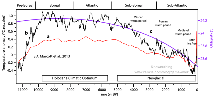
The story of the Modern Warming Spike (AKA the Hockey Stick) and its Rise and Fall is recounted in a previous post, reprinted later on. The news today is about a fresh initiative to reassert the discredited analysis using a new temperature reconstruction combining proxies stored by the PAGES2K network.
In a recent post Marcel Crok described his initiation into the climate wars as a young science journalist and discovering that two Canadians (Ross McKitrick and Steve McIntyre) had proved false Michael Mann’s modern warming spike. As he says correctly:
The arguments of the critics were not difficult to refute and the work of the two Canadians stands firmly to this day. I was intrigued by the quite aggressive and also defensive reaction of the climate scientists. Up to this day the criticism of the Canadians has never been fully addressed by the climate science community or the IPCC. Wasn’t this about the progress of science?
Just in time for the Year without a Summer in North America, we have a coordinated blitz of articles claiming present day warming never happened before. Just a sample from yesterday:
New climate studies bust sceptics’ ‘Little Ice Age’ theory Newshub17:13
Global warming is happening at a speed and scale ‘unprecedented’ in the last 2,000 years Daily Mail17:10
Trees tell us: this heating is different Stuff.co.nz17:04
Global warming dwarfs climate variations of past 2,000 years Thomson Reuters Foundation News16:50
2,000 years of records show it’s getting hotter, faster The Conversation (AU)15:59
Climate is warming faster than it has in 2,000 years USA Today EU15:52
Causes of multidecadal climate changes ScienceDaily15:51
20th-century warming ‘unmatched’ in 2,000 years AFP15:41
Unlike Modern Climate Change, the Biggest Swings in Recorded History Were Just Regional Patterns Discover Magazine15:07
Global extent of climate change is ‘unparalleled’ in past 2,000 years Carbon Brief14:18
Recent warming ‘unmatched in the past 2000 years’ Cosmos14:11
Climate is warming faster than it has in the last 2,000 years ScienceDaily13:50
New global warming study definitively proves climate deniers wrong The Independent13:49
Earth warmed faster in the last few decades than the previous 1,900 years, study says Los Angeles Times13:48
Global warming ‘unparalleled’ in 2,000 years BBC13:33
Recent climate change trends ‘unprecedented’ in the last 2,000 years CNET13:30
Global warming dwarfs climate variations of past 2,000 years – study Reuters13:29
The climate is warming faster than it has in the last 2,000 years BrightSurf.com13:29
Modern Climate Change Is the Only Worldwide Warming Event of the Past 2,000 Years Smithsonian Magazine13:18
“They’ve shown that not only is the warming that we’ve experienced in the last few decades larger in magnitude than the kinds of changes we’ve seen due to natural factors in the past, [but] it’s affecting almost the entire planet in the same way at the same time,” St. George says. “That’s really different than earlier prolonged climate changes due to natural factors which sometimes affected a large part of the planet but nothing close to 100 percent. The current warming that we’re going through is almost everywhere, and that’s what really makes it distinct from earlier climatic events due to natural causes.”
Then the Realism:
Kevin Anchukaitis, a paleoclimatologist at the University of Arizona not involved in the research, says the idea that the Medieval period and Little Ice Age weren’t eras of truly global changehas been discussedin previous studies, and the authors’ recent conclusions support that earlier work. “They were broad warm and cold periods, within which different regions of the globe had their coldest or warmest periods at different times. For the Little Ice Age, we know this is linked to volcanism,” Anchukaitis says.
Despite the fact that more data is available to paleoclimatologists than ever before, Anchukaitis believes that significantly more work needs to be done if scientists are to gather a truly global picture of past climate. “To make progress in understanding the climate of the [past 2,000 years], we should move beyond applying a smorgasbord of different statistical methods,” he says via email. Instead, scientists need a renewed effort to gather paleoclimate records from places and times that are underrepresented in compilations like PAGES 2k.
“The proxy network is largely Northern Hemisphere tree-rings, tropical records (corals) decline rapidly by 1600, and there are relatively few Southern Hemisphere records outside of the Antarctic ice cores,” Anchukaitis says. “So claims about global spatial patterns prior to about 1600, particularly for the tropics and southern hemisphere, must be viewed cautiously.”
My Comment: There is no such thing as a global climate. Climates are regional, local and even micro in their distinctive patterns of temperature and precipitation. Analyses of the Koppen climate zones show that boundaries are shifting very little over the last 100 years, and that warming and cooling remains highly variable over the earth’s surface. [See Data vs. Models #4: Climates Changing]
Moreover, the paleoproxies remain problematic and subject to both manipulation and biased interpretation. Steve McIntyre has extensive critques of PAGES at his blog Climate Audit. For example in Sept. 2015 he discussed The Ocean2K “Hockey Stick”, a study with very similar claims:
Today, the Earth is warming about 20 times faster than it cooled during the past 1,800 years,” said Michael Evans, second author of the study and an associate professor in the University of Maryland’s Department of Geology and Earth System Science Interdisciplinary Center (ESSIC). “This study truly highlights the profound effects we are having on our climate today.”
McIntyre observed:
One of the reasons for the strange lack of interest in this newest proxy “Hockey Stick” was that the proxy data didn’t actually show “the climate was warming about 20 times faster than it cooled during the past 1,800 years”. The OCEAN2K reconstruction (see Figure 1 below) had a shape that anyone would be hard-pressed to describe as a “Hockey Stick”. It showed a small decrease over the past two millennia with the most recent value having a tiny uptick from its predecessor, but, whatever image one might choose to describe its shape, “Hockey Stick” is not one of them.
Previous Post: The Rise and Fall of the Modern Warming Spike
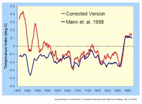
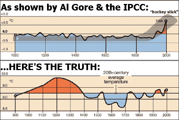
The first graph appeared in the IPCC 1990 First Assessment Report (FAR) credited to H.H.Lamb, first director of CRU-UEA. The second graph was featured in 2001 IPCC Third Assessment Report (TAR) the famous hockey stick credited to M. Mann.
A previous post Rise and Fall of CAGW described the process that began with Hansen’s flashy Senate testimony in 1988, later supported by Santer’s flashy paper in 1996. This post traces a second iteration that ensued following Michael Mann’s production of the infamous Climate Hockey Stick graph in 1998. The image at the top comes from the 2001 IPCC TAR (Third Assessment Report) signifying the immediate embrace of this alarmist tool by consensus climatists. The message of the graph was to assert a spike in modern warming unprecedented in the last 1000 years. This claim of a “Modern Warming Spike” required a flat temperature profile throughout the Middle Ages (since 1000 AD).
The background to the process steps (image below) from Ross Pomeroy’s paper is provided followed by text and references for the rise and fall of the theory intended to erase Medieval Warming comparable to the present day. Sources of material are listed at the end and included here with my bolds.
How Theories Advance and Collapse
Seeing how disarray defines psychology, it makes perfect sense that the field’s leading theories are vulnerable to collapse. Having watched this process play out a number of times, a clear pattern has emerged. Let’s call it the “Six Stages of a Failed Psychological or Sociological Theory.”
Stage 1: The Flashy Finding. An intriguing report is published with subject matter that lends itself to water cooler conversation, say, for example, that sticking a pen in your mouth to force a smile makes things seem funnier. Media outlets provide gushing coverage.
Stage 1 Modern Warming Spike Theory
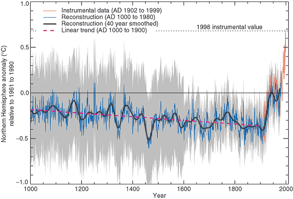
Figure 2.20: Millennial Northern Hemisphere (NH) temperature reconstruction (blue) and instrumental data (red) from AD 1000 to 1999, adapted from Mann et al. (1999). Smoother version of NH series (black), linear trend from AD 1000 to 1850 (purple-dashed) and two standard error limits (grey shaded) are shown. Source: IPCC Third Assessment Report
Since the IPCC believes that the warming from 1975 to 1998 was mainly man-made, but not the warming in earlier centuries, it would like to be able to demonstrate that recent warming is ‘unprecedented’. But it isn’t. Temperatures in many parts of the world appear to be lower than they were in the Medieval Warm Period (MWP, c. 900-1400), and also in the earlier Roman Warm Period (c. 200 BC – 600 AD). During the MWP the Vikings tilled now-frozen farms in Greenland and were buried there in ground that is now permafrost (archaeology.org). Hundreds of peer-reviewed articles show that the MWP was a global phenomenon (Idso & Singer, 2009, 69-94; wattsupwiththat.com; co2science.org), and was not confined to parts of the northern hemisphere, as the IPCC likes to assert.
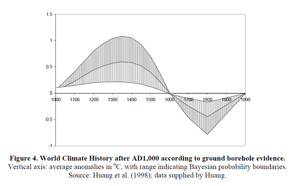
Those wanting to “get rid of” the MWP run into the problem that it shows up strongly in the data. Shortly after Deming’s article appeared, a group led by Shaopeng Huang of the University of Michigan completed a major analysis of over 6,000 borehole records from every continent around the world. Their study went back 20,000 years. The portion covering the last millennium is shown in Figure 4.
The similarity to the IPCC’s 1995 graph is obvious. The world experienced a “warm” interval in the medieval era that dwarfs 20th century changes. The present-day climate appears to be simply a recovery from the cold years of the “Little Ice Age.”
Huang and coauthors published their findings in Geophysical Research Letters 6 in 1997. The next year, Nature published the first Mann hockey stick paper, commonly called “MBH98.”7 Mann et al. followed up in 1999 with a paper in GRL (“MBH99”) extending their results from AD1400 back to AD1000.8 In early 2000 the IPCC released the first draft of the TAR. The hockey stick was the only paleoclimate reconstruction shown in the Summary, and was the only one in the whole report to be singled out for repeated presentation. The borehole data received a brief mention in Chapter 2 but the Huang et al. graph was not shown. A small graph of borehole data taken from another study and based on a smaller sample was shown, but it only showed a post-1500 segment, which, conveniently, trended upwards.
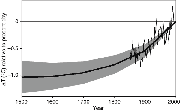
Figure 2.19: Reconstructed global ground temperature estimate from borehole data over the past five centuries, relative to present day. Shaded areas represent ± two standard errors about the mean history (Pollack et al., 1998). Superimposed is a smoothed (five-year running average) of the global surface air temperature instrumental record since 1860 (Jones and Briffa, 1992). Source: IPCC Third Assessment Report WG 1
Stage 2: The Fawning Replications. Other psychologists, usually in the early stages of their careers, leap to replicate the finding. Most of their studies corroborate the effect. Those that don’t are not published, perhaps because the researchers don’t want to step on any toes, or because journal editors would prefer not to publish negative findings.
Stage 2 Modern Warming Spike Theory
As the hockey stick began to appear in the scientific literature, it emerged that 1998 was the warmest year in Phil Jones’s 150-year record of thermometer data. The length of the hockey stick blade just grew. Those in charge of publicizing the work of climate scientists and making the case for man-made climate change were understandably excited. Controversial science swiftly morphed into a propaganda tool.
The World Meteorological Organization put the hockey stick on the cover of its 1999 report on climate change. Then IPCC chiefs decided to give it pride of place in their 2001 IPCC report. Moreover, based on the hockey stick, they stated that “it is likely that the 1990s was the warmest decade and 1998 the warmest year during the past thousand years”. That attracted attention — and trouble. The doubts expressed in that paper title about “uncertainties and limitations” were melting away.
1999 WMO statement on the Climate.
An article in the Guardian (here) describes the struggle leading to victory for the Hockey Stick.
Emails exchanged in September 1999 reveal intense disagreement about whether Mann’s hockey stick should go into the IPCC summary for policymakers – the only bit of the report that usually gets read outside the scientific community – or whether other reconstructions using tree ring data alone should get priority. One of the main tree-ring constructions was by Briffa. The emails also expose major tensions between a desire for scrupulous honesty about uncertainties, and the desire for a simple story to tell the policymakers. The IPCC’s core job is to present a “consensus” on the science, but in this critical case there was no easy consensus.
The tensions were summed up in an email sent on 22 September 1999 by Met Office scientist Chris Folland, in which he alerted key researchers that a diagram of temperature change over the past thousand years “is a clear favourite for the policy makers’ summary”
But there were two competing graphs – Mann’s hockey stick and another, by Jones, Briffa and others. Mann’s graph was clearly the more compelling image of man-made climate change. The other “dilutes the message rather significantly,” said Folland. “We want the truth. Mike [Mann] thinks it lies nearer his result.” Folland noted that “this is probably the most important issue to resolve in chapter 2 at present.”
Mann, Jones and Briffa eventually settled their differences. And the hockey stick was given pride of place in the IPCC report. Folland says: “My recollection is that the final version [of the IPCC summary], which contains the hockey stick, satisfied Keith and everyone else in the end — after the usual vigorous scientific debate.” And after the three came under attack from climate sceptics, all reference to these past spats disappeared from the emails as they faced a common foe.
Stage 3: A Consensus Forms. The finding is now taken for granted, regularly appearing in pop psychology stories and books penned by writers like Malcolm Gladwell or Jonah Lehrer. Millions of people read about it and “armchair” explain it to their friends and family.
Stage 3 Modern Warming Spike Theory
In its 2001 Third Assessment Report, the IPCC used the iconic ‘hockey stick’ graph to try and show that modern warming was indeed ‘unprecedented’. The graph was produced by Michael Mann (now at Penn State University in the US), Ray Bradley and Malcolm Hughes (MBH), and published in Nature and Geophysical Research Letters in 1998 and 1999. At that time, the standard view was that the Medieval Warm Period and subsequent Little Ice Age (c. 1400-1850) were global events. But some climatologists saw the MWP as an embarrassment and spoke of the need to ‘get rid of it’. MBH’s temperature reconstruction did exactly that: it showed 900 years of gradually declining temperatures followed by a dramatic increase in the 20th century. The hockey stick played a central role in mobilizing political and public opinion in favour of drastic action to curb greenhouse gas emissions.
Al Gore with a version of the Hockey Stick graph in the 2006 movie An Inconvenient Truth
“As soon as the IPCC Report came out, the hockey stick version of climate history became canonical. Suddenly it was the “consensus” view, and for the next few years it seemed that anyone publicly questioning the result was in for a ferocious reception.” Ross McKitrick.What is the ‘Hockey Stick’ Debate About?
Stage 4: The Rebuttal. After a few decades, a new generation of researchers look to make a splash by questioning prevailing wisdom. One team produces a more methodologically-sound study that debunks the initial finding. Media outlets blare the “counterintuitive” discovery.
Stage 4 Modern Warming Spike Theory
The hockey stick was based on historical temperature proxies (mainly tree rings), with the 20th-century instrumental temperature record tacked on the end. Incredibly, although the MBH articles were peer reviewed, nobody tried to replicate and verify the work, even though it overturned well-established views on climate history. It was only several years later that Steve McIntyre, a Canadian mathematician and retired mining consultant, began to investigate the matter.Mann did his best to obstruct him; he refused to release his computer code, saying that ‘giving them the algorithm would be giving in to the intimidation tactics that these people are engaged in’.
McIntyre, with the help of economist Ross McKitrick, went on to write several articles in 2003 and 2005, exposing the flaws in the hockey-stick reconstruction. They showed that the shape of the graph was determined mainly by suspect bristlecone/foxtail tree-ring data, and that Mann’s computer algorithm was so biased that it could produce hockey sticks even out of random noise; in short, Mann’s statistical methods ‘mined’ for hockey-stick signals in the proxy data, which were then assigned exaggerated weight in the reconstruction – thereby giving a whole new meaning to the term ‘Man(n)-made warming’!
In 2006 McIntyre & McKitrick’s criticisms were upheld by two expert committees in the US – the National Academy of Sciences (NAS) panel and a congressional panel headed by statistician Edward Wegman. Wegman pointed out that the palaeoclimate field is dominated by ‘a tightly knit group of individuals who passionately believe in their thesis’, and that ‘the work has been sufficiently politicized that they can hardly reassess their own public positions without losing credibility’.
McKitrick wrote in 2005:
Since our work has begun to appear we have enjoyed the satisfaction of knowing we are winning over the expert community, one at a time. Physicist Richard Muller of Berkeley studied our work last year and wrote an article about it:
“[The findings] hit me like a bombshell, and I suspect it is having the same effect on many others. Suddenly the hockey stick, the poster-child of the global warming community, turns out to be an artifact of poor mathematics.”
In an article in the Dutch science magazine Natuurwetenschap & Techniek, Dr. Rob van Dorland of the Dutch National Meteorological Agency commented “It is strange that the climate reconstruction of Mann passed both peer review rounds of the IPCC without anyone ever really having checked it. I think this issue will be on the agenda of the next IPCC meeting in Peking this May.”
In February 2005 the German television channel Das Erste interviewed climatologist Ulrich Cubasch, who revealed that he too had been unable to replicate the hockey stick (emphasis added):
He [Climatologist Ulrich Cubasch] discussed with his coworkers – and many of his professional colleagues – the objections, and sought to work them through… Bit by bit, it became clear also to his colleagues: the two Canadians were right. …Between 1400 and 1600, the temperature shift was considerably higher than, for example, in the previous century. With that, the core conclusion, and that also of the IPCC 2001 Report, was completely undermined.
Recently Steve MacIntyre and I received an email from Dr. Hendrik Tennekes, retired director of the Royal Meteorological Institute of the Netherlands. He wrote to convey comments he wished to be communicated publicly: “The IPCC review process is fatally flawed. The behavior of Michael Mann is a disgrace to the profession.”
The original MBH graph compared to a corrected version produced by MacIntyre and McKitrick after undoing Mann’s errors.
Stage 5: Proper Replications Pour In. Research groups attempt to replicate the initial research with the skepticism and precise methodology that should’ve been used in the first place. As such, the vast majority fail to find any effect.
Stage 5 Modern Warming Spike Theory
The IPCC dealt with the devastating rebuttal by hiding the hockey stick within a spaghetti graph of various paleo proxies to diffuse the issue, while still claiming unprecedented modern warming.
In the IPCC’s 2007 Fourth Assessment Report, the hockey stick was included in a ‘spaghetti diagram’ alongside six other temperature reconstructions, which showed greater variability in the past but still no pronounced MWP. These ‘independent’ studies are the work of Mann’s colleagues and make use of the same flawed proxies as well as dubious statistical techniques (Montford, 2010, 266-308). The data were carefully cherry-picked to exclude tree-ring series that showed a prominent MWP (climateaudit.files.wordpress.com). Palaeoclimatologist Rosanne D’Arrigo actually told the NAS panel that cherry-picking was necessary if you wanted to make cherry pie (i.e. hockey sticks). And Jan Esper has stated: ‘The ability to pick and choose which samples to use is an advantage unique to dendroclimatology’ – a statement that would make any reputable scientist shudder (Montford, 236, 288-9).
Sixteen of the articles cited in AR4 failed to meet the IPCC’s own publication deadlines for cited references; all of them were written by IPCC contributing authors in support of the AGW cause. The most notable case is a paper by Eugene Wahl and Caspar Ammann. The authors of chapter 6 desperately needed this paper to counter McIntyre & McKitrick’s criticisms of the hockey stick, as the authors claimed to have validated Mann’s results. The leaked emails show that members of the Team pressurized Climatic Change editor Stephen Schneider to ensure that the paper was processed quickly enough to meet IPCC deadlines, though this was not entirely successful. Wahl and Ammann referred to arguments in another unpublished paper they had written, which was not even submitted until well after the first paper had gone forward for IPCC review. Jones advised the authors to be dishonest: ‘try and change the Received date! Don’t give those skeptics something to amuse themselves with’ (1189722851). Both papers finally appeared in September 2007. The authors conceded that the hockey stick failed a key test for statistical significance, but claimed it passed another test and promised to provide details in their Supplementary Information. When this was finally made available a year later, it became clear that torturous statistical manipulations were required to enable the test to be passed (Montford, 2010, 201-19, 338-42, 424-6; bishophill.squarespace.com). The shenanigans involved in the Wahl & Ammann saga are quite breathtaking.
But the credibility of the hockey stick claims was attacked repeatedly:
Stage 6: The Theory Lives On as a Zombie. Despite being debunked, the theory lingers on in published scientific studies, popular books, outdated webpages, and common “wisdom.” Adherents in academia cling on in a state of denial – their egos depend upon it.
Stage 6 Modern Warming Spike Theory
There are still hardcore alarmist blogs that defend the hockey stick graph, but IPCC itself has dropped it without explicitly disowning it.
About 1000 years ago, large parts of the world experienced a prominent warm phase which in many cases reached a similar temperature level as today or even exceeded present-day warmth. While this Medieval Warm Period (MWP) has been documented in numerous case studies from around the globe, climate models still fail to reproduce this historical warm phase. The problem is openly conceded in the most recent IPCC report from 2013 (AR5, Working Group 1) where in chapter 5.3.5. the IPCC scientists admit (pdf here):
“Continental-scale surface temperature reconstructions show, with high confidence, multi-decadal periods during the Medieval Climate Anomaly (950 to 1250) that were in some regions as warm as in the mid-20th century and in others as warm as in the late 20th century.” pg.386
“The timing of warm and cold periods is mostly consistent across reconstructions (in some cases this is because they use similar proxy compilations) but the magnitude of the changes is clearly sensitive to the statistical method and to the target domain (land or land and sea; the full hemisphere or only the extra-tropics; Figure 5.7a). Even accounting for these uncertainties, almost all reconstructions agree that each 30-year (50-year) period from 1200 to 1899 was very likely colder in the NH than the 1983–2012 (1963–2012) instrumental temperature NH reconstructions covering part or all of the first millennium suggest that some earlier 50-year periods might have been as warm as the 1963–2012 mean instrumental temperature, but the higher temperature of the last 30 years appear to be at least likely the warmest 30-year period in all reconstructions (Table 5.4). However, the confidence in this finding is lower prior to 1200, because the evidence is less reliable and there are fewer independent lines of evidence. There are fewer proxy records, thus yielding less independence among the reconstructions while making them more susceptible to errors in individual proxy records. The published uncertainty ranges do not include all sources of error (Section 5.3.5.2), and some proxy records and uncertainty estimates do not fully represent variations on time scales as short as the 30 years considered in Table 5.4. Considering these caveats, there is medium confidence that the last 30 years were likely the warmest 30-year period of the last 1400 years.” Pg.410
Meanwhile a multitude of studies confirm that medieval warming was widespread and not limited to regions in the Northern Hemisphere, as Mann and others have claimed. For example the MWP Mapping Project led by Dr. Sebastian Luening, Prof. Dr. Fritz Vahrenholt (authors of ‘The neglected sun‘).
red: MWP warming
blue: MWP cooling (very rare)
yellow: MWP more arid
green: MWP more humid
grey: no trend or data ambiguous
Most of western North America and Africa were experiencing drought conditions during the MWP (except some areas in Southwest Africa). In contrast, Australia and the Carribean was more humid. Globally, 99% of all paleoclimatic temperature studies compiled in the map so far show a prominent warming during the MWP. This includes Antarctica and the Arctic.
Conclusion:
“Regarding the Hockey Stick of IPCC 2001 evidence now indicates, in my view, that an IPCC Lead Author working with a small cohort of scientists, misrepresented the temperature record of the past 1000 years by (a) promoting his own result as the best estimate, (b) neglecting studies that contradicted his, and (c) amputating another’s result so as to eliminate conflicting data and limit any serious attempt to expose the real uncertainties of these data.” – John Christy, Examining the Process concerning Climate Change Assessments, Testimony 31 March 2011
Todays temperatures are cooler than the Medieval Warming Period, which was preceded by an even warmer Roman Warm Period, which followed an even warmer Minoan Warm Period. We are in an Interglacial age about 11,500 years old, and the overall trend is cooling.
Figure 37. Holocene global temperature change reconstruction. a. Red curve, global average temperature reconstruction from Marcott et al., 2013, figure 1. The averaging method does not correct for proxy drop out which produces an artificially enhanced terminal spike, while the Monte Carlo smoothing eliminates most variability information. b. Black curve, global average temperature reconstruction from Marcott et al., 2013, using proxy published dates, and differencing average. Temperature anomaly was rescaled to match biological, glaciological, and marine sedimentary evidence, indicating the Holocene Climate Optimum was about 1.2°C warmer than LIA. c. Purple curve, Earth’s axis obliquity is shown to display a similar trend to Holocene temperatures. Source: Marcott et al., 2013.
Source:Judith Curry Nature Unbound III: Holocene climate variability (Part A)


 The best context for understanding decadal temperature changes comes from the world’s sea surface temperatures (SST), for several reasons:
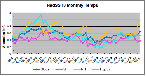

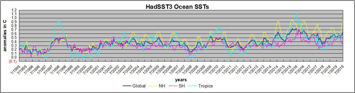
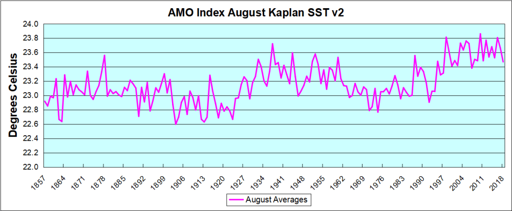
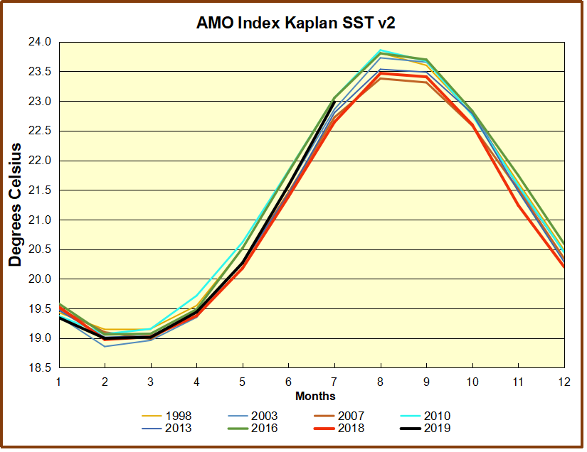


 Synopsis of the environmental scare history (lest we forget) is at
 That’s why those cross-tabs keep showing the Republicans think climate science is a grift. They mostly trust nutrition science, even though in reality lots of nutrition science (and certainly the mass media coverage of it) is, according to at least one high-powered science watchdog, in need of radical reform. They mostly trust physicians, even though study after study shows that attention and gifts from pharmaceutical reps have a profound influence on what drugs physicians prescribe. These folks aren’t as infallible as we all might hope.

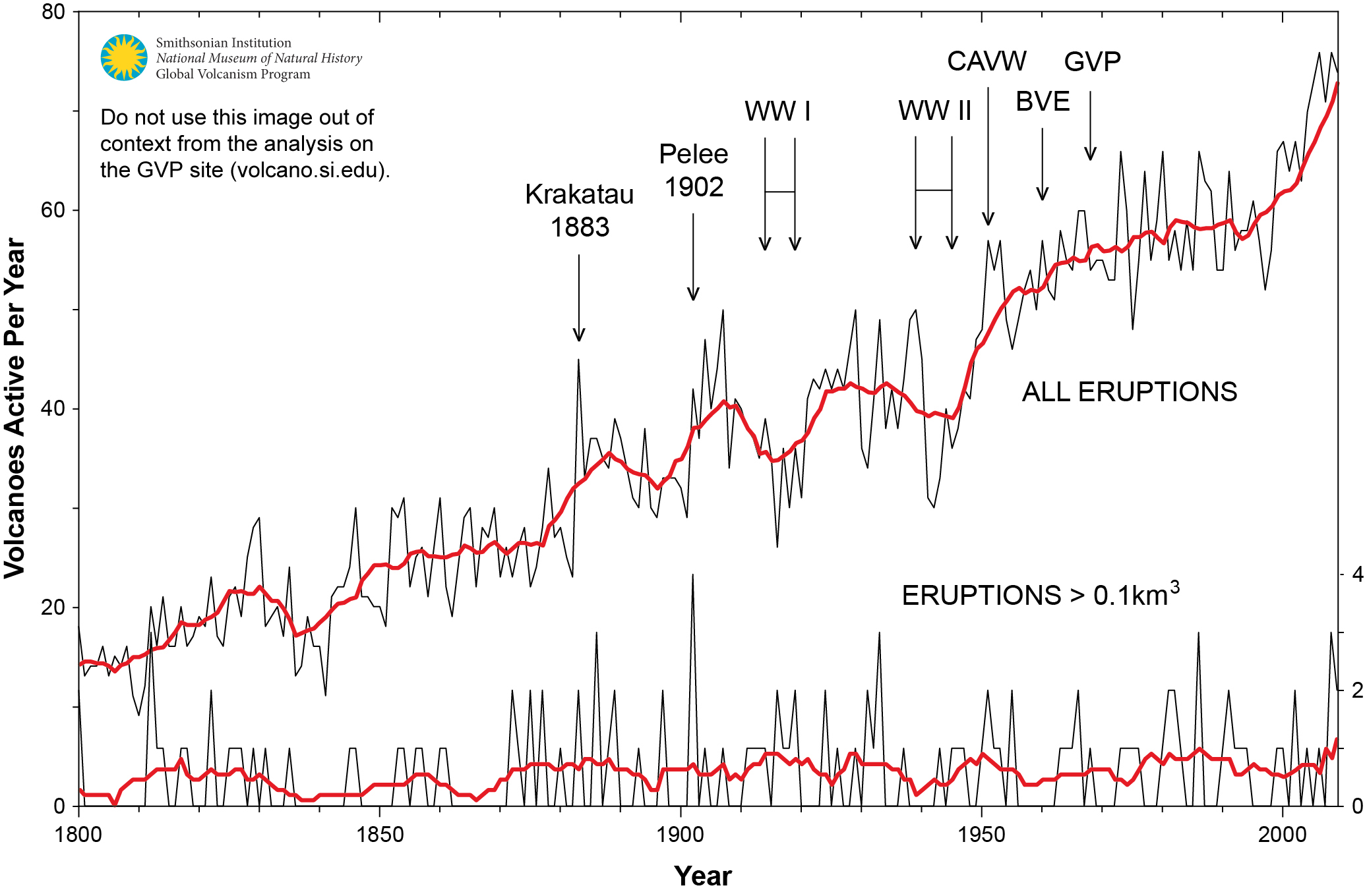
 When I presented this diagram to my warmist friends, they would respond, “But you don’t know what caused the LIA or what ended it!” To which I would say, “True, but we know it wasn’t due to burning fossil fuels.” Now I find there is a body of evidence suggesting what caused the LIA and why the temperature rebound may be over. Part of it is a familiar observation that the LIA coincided with a period when the sun was lacking sunspots, the Maunder Minimum, and later the Dalton.

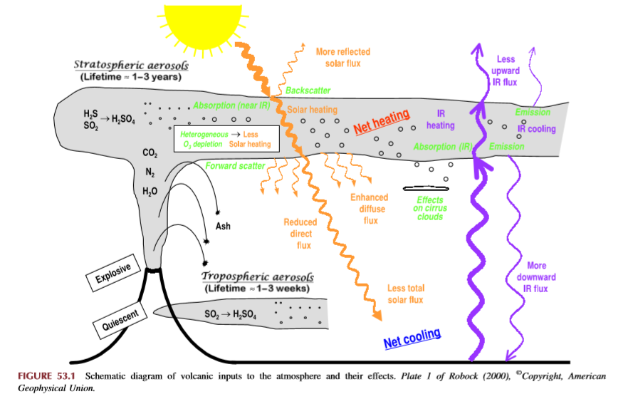
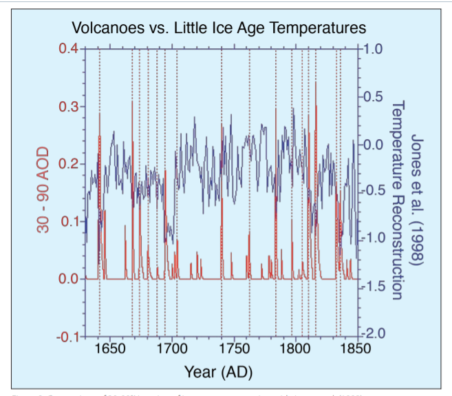

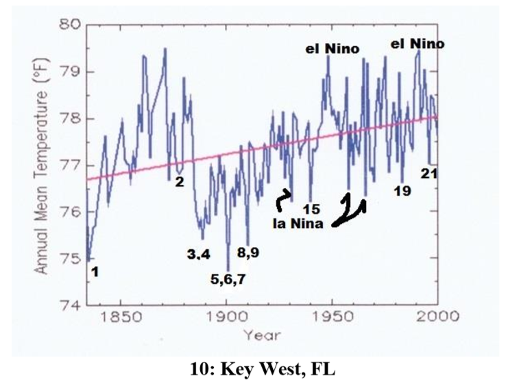


 Patrick T. Brown writes at Quillette
 Within humanity, there are at least two additional ways in which narratives about hierarchies influence thinking on global warming. One of these concerns attitudes towards developed versus developing countries. Firstly, the blame for global warming falls disproportionately on developed countries (in terms of historical greenhouse gas emissions) and proposed solutions therefore often call on developed countries to bear the brunt of the cost of reducing emissions going forward. (Additionally, it is argued that developed countries have the luxury of being able to afford increases in the cost of energy.) Overall, the solutions proposed for global warming imply that wealthy countries owe a debt to the rest of humanity that should be paid due at once.