Climate Science: Put Up or Shut Up

That’s the theme of an article by Rowan Dean in The Courier-Mail, Australia:  Time for climate scientists to produce evidence that carbon dioxide emissions affect climate  Full text below with my bolds and images.

IT’S time for so-called climate scientists to either cough up one single, solitary shred of genuine scientific evidence that proves that the climate is being changed by mankind’s carbon dioxide emissions, or ‘fess up and admit that the whole thing is a gigantic hoax.

That’s the bottom line.

Asked at the beginning of this year for one of those “predictions for 2017”, I claimed that this would be the year the Australian public wakes up and realises they are being hoodwinked by the whole climate change/renewables scam.

I told Paul Murray’s lively late night TV show on Sky News that 2017 would be the year the climate con comes to an end. So how is my prediction going?

Well, so far this year two extraordinary books have come out, and one insightful film, that support my argument that the public is indeed waking up to the tricks of the climate change/renewables fraud.

Climate Change: The Facts 2017, a series of essays published by the Institute of Public Affairs, not only debunks the entire scare campaign about the Great Barrier Reef, but in a piece of superb investigative work Dr Jennifer Marohasy exposes the Bureau of Meteorology’s embarrassing manipulation of temperature data.

The book has sold out three print runs and gained serious attention overseas. Then came the surprise hit film Climate Hustle by sceptic Marc Morano, which was, ironically, more popular than the scaremongering Al Gore film it challenged.

And this week a new book is coming out by Australia’s Ian Plimer, one of our greatest geologists.

Called Climate Change Delusion and the Great Electricity Rip-off it’s a must-read for anyone who still believes they’re saving the planet by paying through the nose for electricity.  Because you’re not. The planet is doing just fine with or without your financial impoverishment, and whatever changes may or may not be occurring to our planet’s climate, it almost certainly has nothing to do with your gas bill.

As Plimer points out, Australia is blessed with an abundance of the cheapest and cleanest energy on the planet, yet we are paying the highest electricity prices on earth.

Put simply, that doesn’t add up. And when something smells fishy, it’s because it is.

Australian taxpayers are being ripped off by deluded luvvies (Turnbull is one of the worst) pandering to the voracious leeches of the renewables industry and their greedy investors gorging on a bloated smorgasbord of your cash which they siphon up via subsidies, targets and bills.

Yet, as Plimer points out, it’s all in vain. With rigorous scientific and geological data, Plimer provides evidence that the climate “experts” fail to provide. He shows that Earth has frequently warmed up, cooled down, and warmed up again, but this process has never had anything to do with CO2.

Indeed, the geological evidence is that Earth’s coldest periods often had far higher atmospheric CO2 levels than we do now. What’s more, the mild warming we may currently be experiencing (we are, geologically speaking, still in an Ice Age and moving slowly out of it) has always been associated in human history with increased health, wealth, fertility and prosperity.

Mankind’s most successful times have been in periods such as the Roman era or medieval warming when the Earth was warmer than it is now.

Indeed, we are currently seeing flora around the globe getting greener and more fertile as CO2 levels increase.

Meanwhile, desperately trying to reinvigorate the whole tiresome climate change alarmist nonsense, this year we got Al Gore’s latest horror flick-cum-ad for his own renewables investments An Inconvenient Sequel (what an unoriginal title).

Showing suitably terrifying footage of storms, floods and hurricanes, the film was a box-office flop that received lacklustre reviews at best. Oh, and the other day an ANU “climate scientist” made the hysterical (and unprovable) claim that Sydney and Melbourne “could” roast in 50 degree summers by the end of the century.

Global Mean Temperature from land and ocean expressed in absolute degrees F.

That’s it. And still no proof that man-made carbon dioxide emissions are warming the planet. Still no proof that a warmer planet can be avoided, or would actually be a bad thing. Still no proof that removing civilisation’s reliance on coal is even remotely feasible. Still no proof that even if we did do all the things climate fanatics want us to do and destroy our economies and lifestyles, it would make the slightest difference to global temperatures. And still no proof that we even need to.

The biggest con of all is that Australian voters are denied any political leadership courageous enough to call out this scaremongering for what it is, cancel all our subsidies, targets and the Paris Agreement, which only enrich renewables carpetbaggers, and return us to a land blessed with cheap, abundant energy.


Natural Climate Factors: Snow

Variations in Siberian snow cover October (day 304) 2004 to 2016. Eurasian snow charts from IMS.

Previously I posted an explanation by Dr. Judah Cohen regarding a correlation between autumn Siberian snow cover and the following winter conditions, not only in the Arctic but extending across the Northern Hemisphere. More recently, in looking into Climate Model Upgraded: INMCM5, I noticed some of the scientists were also involved in confirming the importance of snow cover for climate forecasting. Since the poles function as the primary vents for global cooling, what happens in the Arctic in no way stays in the Arctic. This post explores data suggesting changes in snow cover drive some climate changes.

The Snow Cover Climate Factor

The diagram represents how Dr. judah Cohen pictures the Northern Hemisphere wintertime climate system.  He leads research regarding Arctic and NH weather patterns for AER.

cohen-schematic2

Dr. Cohen explains the mechanism in this diagram.

Conceptual model for how fall snow cover modifies winter circulation in both the stratosphere and the troposphere–The case for low snow cover on left; the case for extensive snow cover on right.

1. Snow cover increases rapidly in the fall across Siberia, when snow cover is above normal diabatic cooling helps to;
2. Strengthen the Siberian high and leads to below normal temperatures.
3. Snow forced diabatic cooling in proximity to high topography of Asia increases upward flux of energy in the troposphere, which is absorbed in the stratosphere.
4. Strong convergence of WAF (Wave Activity Flux) indicates higher geopotential heights.
5. A weakened polar vortex and warmer down from the stratosphere into the troposphere all the way to the surface.
6. Dynamic pathway culminates with strong negative phase of the Arctic Oscillation at the surface.

From Eurasian Snow Cover Variability and Links with Stratosphere-Troposphere
Coupling and Their Potential Use in Seasonal to Decadal Climate Predictions by Judah Cohen.

Observations of the Snow Climate Factor

The animation at the top shows from remote sensing that Eurasian snow cover fluctuates significantly from year to year, taking the end of October as a key indicator.

For several decades the IMS snow cover images have been digitized to produce a numerical database for NH snow cover, including area extents for Eurasia. The NOAA climate data record of Northern Hemisphere snow cover extent, Version 1, is archived and distributed by NCDC’s satellite Climate Data Record Program. The CDR is forward processed operationally every month, along with figures and tables made available at Rutgers University Global Snow Lab.

This first graph shows the snow extents of interest in Dr. Cohen’s paradigm. The Autumn snow area in Siberia is represented by the annual Eurasian averages of the months of October and November (ON). The following NH Winter is shown as the average snow area for December, January and February (DJF). Thus the year designates the December of that year plus the first two months of the next year.

Notes: NH snow cover minimum was 1981, trending upward since.  Siberian autumn snow cover was lowest in 1989, increasing since then.  Autumn Eurasian snow cover is about 1/3 of Winter NH snow area. Note also that fluctuations are sizable and correlated.

The second graph presents annual anomalies for the two series, each calculated as the deviation from the mean of its entire time series. Strikingly, the Eurasian Autumn flux is on the same scale as total NH flux, and closely aligned. While NH snow cover declined a few years prior to 2016, Eurasian snow is trending upward strongly.  If Dr. Cohen is correct, NH snowfall will follow. The linear trend is slightly positive, suggesting that fears of children never seeing snowfall have been exaggerated. The Eurasian trend line (not shown) is almost the same.

What About Winter 2017-2018?

These data confirm that Dr. Cohen and colleagues are onto something. Here are excerpts from his October 2 outlook for the upcoming season AER. (my bolds)

The main block/high pressure feature influencing Eurasian weather is currently centered over the Barents-Kara Seas and is predicted to first weaken and then strengthen over the next two weeks.

Blocking in the Barents-Kara Seas favors troughing/negative geopotential height anomalies and cool temperatures downstream over Eurasia but especially Central and East Asia. The forecast for the next two weeks across Central Asia is for continuation of overall below normal temperatures and new snowfall.

Currently the largest negative anomalies in sea ice extent are in the Chukchi and Beaufort Seas but that will change over the next month or so during the critical months of November-February. In my opinion low Arctic sea ice favors a more severe winter but not necessarily hemisphere-wide and depends on the regions of the strongest anomalies. Strong negative departures in the Barents-Kara Seas favors cold temperatures in Asia while strong negative departures near Greenland and/or the Beaufort Sea favor cold temperatures in eastern North America.

Siberian snow cover is advancing quickly relative to climatology and is on a pace similar to last year at this time. My, along with my colleagues and others, research has shown that extensive Siberian snow cover in the fall favors a trough across East Asia with a ridge to the west near the Urals. The atmospheric circulation pattern favors more active poleward heat flux, a weaker PV and cold temperatures across the NH. It is very early in the snow season but recent falls have been snowy across Siberia and therefore I do expect another upcoming snowy fall across Siberia.

Summary

In summary the three main predictors that I follow in the fall months most closely, the presence or absence of high latitude blocking, Arctic sea ice extent and Siberian snow cover extent all point towards a more severe winter across the continents of the NH.

Uh oh.  Now where did I put away my long johns?

Climate Model Upgraded: INMCM5 Under the Hood

2018 Update: Best Climate Model INMCM5 October 22, 2018 (follow link to latest info on INMCM5)

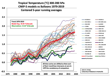
A previous analysis Temperatures According to Climate Models showed that only one of 42 CMIP5 models was close to hindcasting past temperature fluctuations. That model was INMCM4, which also projected an unalarming 1.4C warming to the end of the century, in contrast to the other models programmed for future warming five times the past.

In a recent comment thread, someone asked what has been done recently with that model, given that it appears to be “best of breed.” So I went looking and this post summarizes further work to produce a new, hopefully improved version by the modelers at the Institute of Numerical Mathematics of the Russian Academy of Sciences.

Institute of Numerical Mathematics, Russian Academy of Sciences, Moscow, Russia

Earlier this year came this publication Simulation of the present-day climate with the climate model INMCM5 by E.M. Volodin et al. Excerpts below with my bolds.

In this paper we present the fifth generation of the INMCM climate model that is being developed at the Institute of Numerical Mathematics of the Russian Academy of Sciences (INMCM5). The most important changes with respect to the previous version (INMCM4) were made in the atmospheric component of the model. Its vertical resolution was increased to resolve the upper stratosphere and the lower mesosphere. A more sophisticated parameterization of condensation and cloudiness formation was introduced as well. An aerosol module was incorporated into the model. The upgraded oceanic component has a modified dynamical core optimized for better implementation on parallel computers and has two times higher resolution in both horizontal directions.

Analysis of the present-day climatology of the INMCM5 (based on the data of historical run for 1979–2005) shows moderate improvements in reproduction of basic circulation characteristics with respect to the previous version. Biases in the near-surface temperature and precipitation are slightly reduced compared with INMCM4 as  well as biases in oceanic temperature, salinity and sea surface height. The most notable improvement over INMCM4 is the capability of the new model to reproduce the equatorial stratospheric quasi-biannual oscillation and statistics of sudden stratospheric warmings.


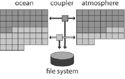
The family of INMCM climate models, as most climate system models, consists of two main blocks: the atmosphere general circulation model, and the ocean general circulation model. The atmospheric part is based on the standard set of hydrothermodynamic equations with hydrostatic approximation written in advective form. The model prognostic variables are wind horizontal components, temperature, specific humidity and surface pressure.

Atmosphere Module

The INMCM5 borrows most of the atmospheric parameterizations from its previous version. One of the few notable changes is the new parameterization of clouds and large-scale condensation. In the INMCM5 cloud area and cloud water are computed prognostically according to Tiedtke (1993). That includes the formation of large-scale cloudiness as well as the formation of clouds in the atmospheric boundary layer and clouds of deep convection. Decrease of cloudiness due to mixing with unsaturated environment and precipitation formation are also taken into account. Evaporation of precipitation is implemented according to Kessler (1969).

In the INMCM5 the atmospheric model is complemented by the interactive aerosol block, which is absent in the INMCM4. Concentrations of coarse and fine sea salt, coarse and fine mineral dust, SO2, sulfate aerosol, hydrophilic and hydrophobic black and organic carbon are all calculated prognostically.

Ocean Module

The oceanic module of the INMCM5 uses generalized spherical coordinates. The model “South Pole” coincides with the geographical one, while the model “North Pole” is located in Siberia beyond the ocean area to avoid numerical problems near the pole. Vertical sigma-coordinate is used. The finite-difference equations are written using the Arakawa C-grid. The differential and finite-difference equations, as well as methods of solving them can be found in Zalesny etal. (2010).

The INMCM5 uses explicit schemes for advection, while the INMCM4 used schemes based on splitting upon coordinates. Also, the iterative method for solving linear shallow water equation systems is used in the INMCM5 rather than direct method used in the INMCM4. The two previous changes were made to improve model parallel scalability. The horizontal resolution of the ocean part of the INMCM5 is 0.5 × 0.25° in longitude and latitude (compared to the INMCM4’s 1 × 0.5°).

Both the INMCM4 and the INMCM5 have 40 levels in vertical. The parallel implementation of the ocean model can be found in (Terekhov etal. 2011). The oceanic block includes vertical mixing and isopycnal diffusion parameterizations (Zalesny et al. 2010). Sea ice dynamics and thermodynamics are parameterized according to Iakovlev (2009). Assumptions of elastic-viscous-plastic rheology and single ice thickness gradation are used. The time step in the oceanic block of the INMCM5 is 15 min.

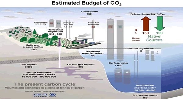
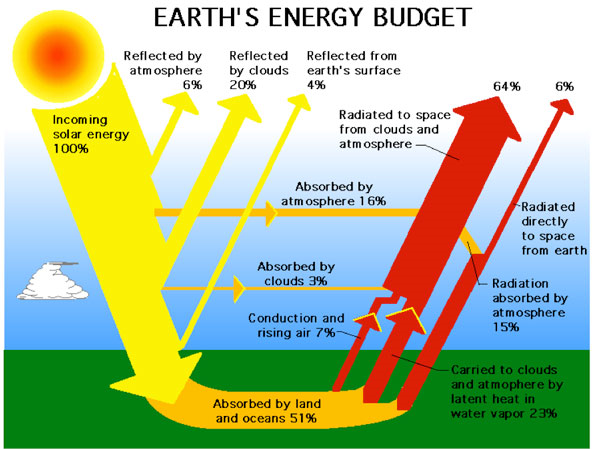
Note the size of the human emissions next to the red arrow.

Carbon Cycle Module

The climate model INMCM5 has а carbon cycle module (Volodin 2007), where atmospheric CO2 concentration, carbon in vegetation, soil and ocean are calculated. In soil, а single carbon pool is considered. In the ocean, the only prognostic variable in the carbon cycle is total inorganic carbon. Biological pump is prescribed. The model calculates methane emission from wetlands and has a simplified methane cycle (Volodin 2008). Parameterizations of some electrical phenomena, including calculation of ionospheric potential and flash intensity (Mareev and Volodin 2014), are also included in the model.

Surface Temperatures

When compared to the INMCM4 surface temperature climatology, the INMCM5 shows several improvements. Negative bias over continents is reduced mainly because of the increase in daily minimum temperature over land, which is achieved by tuning the surface flux parameterization. In addition, positive bias over southern Europe and eastern USA in summer typical for many climate models (Mueller and Seneviratne 2014) is almost absent in the INMCM5. A possible reason for this bias in many models is the shortage of soil water and suppressed evaporation leading to overestimation of the surface temperature. In the INMCM5 this problem was addressed by the increase of the minimum leaf resistance for some vegetation types.

Nevertheless, some problems migrate from one model version to the other: negative bias over most of the subtropical and tropical oceans, and positive bias over the Atlantic to the east of the USA and Canada. Root mean square (RMS) error of annual mean near surface temperature was reduced from 2.48 K in the INMCM4 to 1.85 K in the INMCM5.

Precipitation

In mid-latitudes, the positive precipitation bias over the ocean prevails in winter while negative bias occurs in summer. Compared to the INMCM4, the biases over the western Indian Ocean, Indonesia, the eastern tropical Pacific and the tropical Atlantic are reduced. A possible reason for this is the better reproduction of the tropical sea surface temperature (SST) in the INMCM5 due to the increase of the spatial resolution in the oceanic block, as well as the new condensation scheme. RMS annual mean model bias for precipitation is 1.35mm day−1 for the INMCM5 compared to 1.60mm day−1 for the INMCM4.

Cloud Radiation Forcing

Cloud radiation forcing (CRF) at the top of the atmosphere is one of the most important climate model characteristics, as errors in CRF frequently lead to an incorrect surface temperature.

In the high latitudes model errors in shortwave CRF are small. The model underestimates longwave CRF in the subtropics but overestimates it in the high latitudes. Errors in longwave CRF in the tropics tend to partially compensate errors in shortwave CRF. Both errors have positive sign near 60S leading to warm bias in the surface temperature here. As a result, we have some underestimation of the net CRF absolute value at almost all latitudes except the tropics. Additional experiments with tuned conversion of cloud water (ice) to precipitation (for upper cloudiness) showed that model bias in the net CRF could be reduced, but that the RMS bias for the surface temperature will increase in this case.


A table from another paper provides the climate parameters described by INMCM5.

Climate Parameters Observations INMCM3 INMCM4 INMCM5
Incoming solar radiation at TOA 341.3 [26] 341.7 341.8 341.4
Outgoing solar radiation at TOA   96–100 [26] 97.5 ± 0.1 96.2 ± 0.1 98.5 ± 0.2
Outgoing longwave radiation at TOA 236–242 [26] 240.8 ± 0.1 244.6 ± 0.1 241.6 ± 0.2
Solar radiation absorbed by surface 154–166 [26] 166.7 ± 0.2 166.7 ± 0.2 169.0 ± 0.3
Solar radiation reflected by surface     22–26 [26] 29.4 ± 0.1 30.6 ± 0.1 30.8 ± 0.1
Longwave radiation balance at surface –54 to 58 [26] –52.1 ± 0.1 –49.5 ± 0.1 –63.0 ± 0.2
Solar radiation reflected by atmosphere      74–78 [26] 68.1 ± 0.1 66.7 ± 0.1 67.8 ± 0.1
Solar radiation absorbed by atmosphere     74–91 [26] 77.4 ± 0.1 78.9 ± 0.1 81.9 ± 0.1
Direct hear flux from surface     15–25 [26] 27.6 ± 0.2 28.2 ± 0.2 18.8 ± 0.1
Latent heat flux from surface     70–85 [26] 86.3 ± 0.3 90.5 ± 0.3 86.1 ± 0.3
Cloud amount, %     64–75 [27] 64.2 ± 0.1 63.3 ± 0.1 69 ± 0.2
Solar radiation-cloud forcing at TOA         –47 [26] –42.3 ± 0.1 –40.3 ± 0.1 –40.4 ± 0.1
Longwave radiation-cloud forcing at TOA          26 [26] 22.3 ± 0.1 21.2 ± 0.1 24.6 ± 0.1
Near-surface air temperature, °С 14.0 ± 0.2 [26] 13.0 ± 0.1 13.7 ± 0.1 13.8 ± 0.1
Precipitation, mm/day 2.5–2.8 [23] 2.97 ± 0.01 3.13 ± 0.01 2.97 ± 0.01
River water inflow to the World Ocean,10^3 km^3/year 29–40 [28] 21.6 ± 0.1 31.8 ± 0.1 40.0 ± 0.3
Snow coverage in Feb., mil. Km^2 46 ± 2 [29] 37.6 ± 1.8 39.9 ± 1.5 39.4 ± 1.5
Permafrost area, mil. Km^2 10.7–22.8 [30] 8.2 ± 0.6 16.1 ± 0.4 5.0 ± 0.5
Land area prone to seasonal freezing in NH, mil. Km^2 54.4 ± 0.7 [31] 46.1 ± 1.1 48.3 ± 1.1 51.6 ± 1.0
Sea ice area in NH in March, mil. Km^2 13.9 ± 0.4 [32] 12.9 ± 0.3 14.4 ± 0.3 14.5 ± 0.3
Sea ice area in NH in Sept., mil. Km^2 5.3 ± 0.6 [32] 4.5 ± 0.5 4.5 ± 0.5 6.1 ± 0.5

Heat flux units are given in W/m^2; the other units are given with the title of corresponding parameter. Where possible, ± shows standard deviation for annual mean value.  Source: Simulation of Modern Climate with the New Version Of the INM RAS Climate Model (Bracketed numbers refer to sources for observations)

Ocean Temperature and Salinity

The model biases in potential temperature and salinity averaged over longitude with respect to WOA09 (Antonov et al. 2010) are shown in Fig.12. Positive bias in the Southern Ocean penetrates from the surface downward for up to 300 m, while negative bias in the tropics can be seen even in the 100–1000 m layer.

Nevertheless, zonal mean temperature error at any level from the surface to the bottom is small. This was not the case for the INMCM4, where one could see negative temperature bias up to 2–3 K from 1.5 km to the bottom nearly al all latitudes, and 2–3 K positive bias at levels of 700–1000 m. The reason for this improvement is the introduction of a higher background coefficient for vertical diffusion at high depth (3000 m and higher) than at intermediate depth (300–500m). Positive temperature bias at 45–65 N at all depths could probably be explained by shortcomings in the representation of deep convection [similar errors can be seen for most of the CMIP5 models (Flato etal. 2013, their Fig.9.13)].

Another feature common for many present day climate models (and for the INMCM5 as well) is negative bias in southern tropical ocean salinity from the surface to 500 m. It can be explained by overestimation of precipitation at the southern branch of the Inter Tropical Convergence zone. Meridional heat flux in the ocean (Fig.13) is not far from available estimates (Trenberth and Caron 2001). It looks similar to the one for the INMCM4, but maximum of northward transport in the Atlantic in the INMCM5 is about 0.1–0.2 × 10¹⁵ W higher than the one in the INMCM4, probably, because of the increased horizontal resolution in the oceanic block.

Sea Ice

In the Arctic, the model sea ice area is just slightly overestimated. Overestimation of the Arctic sea ice area is connected with negative bias in the surface temperature. In the same time, connection of the sea ice area error with the positive salinity bias is not evident because ice formation is almost compensated by ice melting, and the total salinity source for these pair of processes is not large. The amplitude and phase of the sea ice annual cycle are reproduced correctly by the model. In the Antarctic, sea ice area is underestimated by a factor of 1.5 in all seasons, apparently due to the positive temperature bias. Note that the correct simulation of sea ice area dynamics in both hemispheres simultaneously is a difficult task for climate modeling.

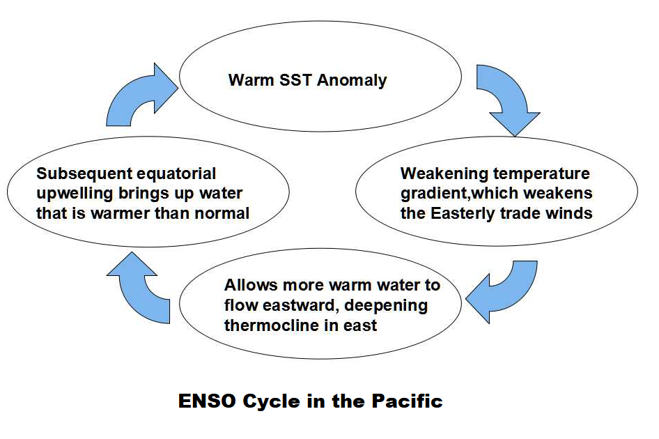
The analysis of the model time series of the SST anomalies shows that the El Niño event frequency is approximately the same in the model and data, but the model El Niños happen too regularly. Atmospheric response to the El Niño vents is also underestimated in the model by a factor of 1.5 with respect to the reanalysis data.

Conclusion

Based on the CMIP5 model INMCM4 the next version of the Institute of Numerical Mathematics RAS climate model was developed (INMCM5). The most important changes include new parameterizations of large scale condensation (cloud fraction and cloud water are now the prognostic variables), and increased vertical resolution in the atmosphere (73 vertical levels instead of 21, top model level raised from 30 to 60 km). In the oceanic block, horizontal resolution was increased by a factor of 2 in both directions.

The climate model was supplemented by the aerosol block. The model got a new parallel code with improved computational efficiency and scalability. With the new version of climate model we performed a test model run (80 years) to simulate the present-day Earth climate. The model mean state was compared with the available datasets. The structures of the surface temperature and precipitation biases in the INMCM5 are typical for the present climate models. Nevertheless, the RMS error in surface temperature, precipitation as well as zonal mean temperature and zonal wind are reduced in the INMCM5 with respect to its previous version, the INMCM4.

The model is capable of reproducing equatorial stratospheric QBO and SSWs.The model biases for the sea surface height and surface salinity are reduced in the new version as well, probably due to increasing spatial resolution in the oceanic block. Bias in ocean potential temperature at depths below 700 m in the INMCM5 is also reduced with respect to the one in the INMCM4. This is likely because of the tuning background vertical diffusion coefficient.

Model sea ice area is reproduced well enough in the Arctic, but is underestimated in the Antarctic (as a result of the overestimated surface temperature). RMS error in the surface salinity is reduced almost everywhere compared to the previous model except the Arctic (where the positive bias becomes larger). As a final remark one can conclude that the INMCM5 is substantially better in almost all aspects than its previous version and we plan to use this model as a core component for the coming CMIP6 experiment.

Summary

One the one hand, this model example shows that the intent is simple: To represent dynamically the energy balance of our planetary climate system.  On the other hand, the model description shows how many parameters are involved, and the complexity of processes interacting.  The attempt to simulate operations of the climate system is a monumental task with many outstanding challenges, and this latest version is another step in an iterative development.

Note:  Regarding the influence of rising CO2 on the energy balance.  Global warming advocates estimate a CO2 perturbation of 4 W/m^2.  In the climate parameters table above, observations of the radiation fluxes have a 2 W/m^2 error range at best, and in several cases are observed in ranges of 10 to 15 W/m^2.

We do not yet have access to the time series temperature outputs from INMCM5 to compare with observations or with other CMIP6 models.  Presumably that will happen in the future.

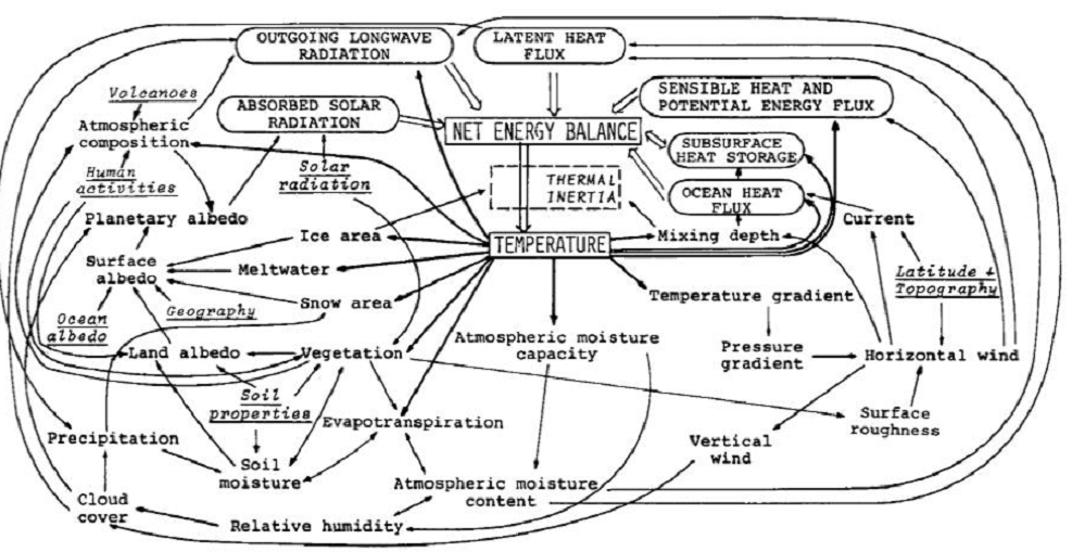
Early Schematic: Flows and Feedbacks for Climate Models

Degrees of Climate Truth

Previous posts have dealt with science as a mode of inquiry, and described the process of theory and observation by which scientific knowledge is obtained. This post presents work by Andy May to classify the degrees of scientific certainty or truth, and apply these to climate claims.

The essay Facts and Theories comes from his blog Andy May Petrophysicist.
Excerpts below with my bolds.

Categories of Scientific Knowledge

Newton provided us with his descriptive “Law of Gravitation.” Newton’s law tells us what gravity does and it is very useful, but it tells us nothing about how it works. For that we need Einstein’s theory of relativity. Theories and laws are not necessarily related in science. A law simply describes what happens without describing why. A scientific theory attempts to explain why a relationship holds true.

In the scientific community, for both a law and a theory, a single conflicting experiment or observation invalidates them. Einstein once said:

“No amount of experimentation can ever prove me right; a single experiment can prove me wrong.”

So, let’s examine our topics in that light. Newton’s descriptive law of gravity, based on mass and distance, are there any exceptions? Not to my knowledge, except possibly on galactic sized scales, black holes and probably on very, very small sub-atomic scales. In everyday life, Newton’s law works fine. How about Einstein’s theory of gravity (Relativity), any exceptions? None that I know of at any scale.

How about evolution? Species evolve, we can see that in the geological record. We can also watch it happen in some quickly reproducing species. Thus we could describe evolution as a fact. It happens, but we cannot describe how without more work. Early theories of the evolutionary process include Darwin’s theory of natural selection and Lamarck’s theory of heritable species adaptation due to external stresses. Due to epigenetic research we now know that Darwin and Lamarck were both right and that evolution involves both processes. For a summary of recent research into the epigenetic component of evolution see this Oxford Journal article. Thus well-established facts and scientific laws rarely change but theories do evolve. I might add that while facts and laws don’t often change, they are easily dismissed when contradictory data are gathered. The modern theory of evolution is a good example of where competing theories can merge into one.

Most scientific theories begin as hypotheses. A hypothesis is best described as an idea of what might be causing a specific event to occur. A proper scientific hypothesis, like a theory, must be falsifiable. That is, we must be able to design an experiment or foresee an observation that will make the hypothesis false. “Climate change” is not falsifiable, it is not a scientific hypothesis or a theory. “Man-made climate change” is a scientific hypothesis since it is falsifiable. Hypotheses and theories are evolving things, new facts and observations cause them to change. In this way we build the body of science. Science is mostly skepticism. We look for what does not fit, we poke at established facts and laws, at theories and hypotheses. We try and find flaws, we check the numbers. Worse, science done properly means we spend more time proving ourselves wrong than we do proving we are right. Life is tough sometimes.

So how does this fit with the great climate change debate. I’ve made a table of phrases and identified each common phrase as a fact, theory, law, hypothesis, or simply an idea. These are my classifications and certainly open for debate.

In Table 1 we can see that the comparison of man-made climate change and the possibility of a man-made climate catastrophe are not really comparable to the theories of gravity and evolution. Man-made climate change is more than an idea, it is based on some observations and reasonable models of the process have been developed and can be tested. But, none of the models have successfully predicted any climatic events. Thus, they are still a work-in-progress and not admissible as evidence supporting a scientific theory.

The idea of man-made climate change causing a catastrophe at the scale of Islamic terrorism is pure speculation. The models used to compute man’s influence don’t match any observations, this is easily seen in Figure 1 which is Dr. John Christy’s graph of the computer model’s predictions versus satellite and weather balloon observations. I should mention that satellite and weather balloon measurements are independent of one another and they are independent of the various surface temperature datasets, like HADCRUT and GHCN-M. All of the curves on the plot have been smoothed with five year averages.

The purple line going through the observations is the Russian model “INM-CM4.” It is the only model that comes close to reality. INM-CM4, over longer periods, does very well at hindcasting observed temperatures. This model uses a CO2 forcing response that is 37% lower than the other models, a much higher deep ocean heat capacity (climate system inertia) and it exactly matches lower tropospheric water content and is biased low above that. The other models are biased high. The model predicts future temperature increases at a rate of about 1K/century, not at all alarming and much lower than the predictions of the other models. (See Temperatures According to Climate Models)

One can consider each model to be a digital experiment. It is clear that the range of values from these digital experiments exceeds the predicted average temperature increase. This does not give us much confidence in the accuracy of the models. Yet, the IPCC uses the difference between the mean model temperature anomalies and observed surface temperatures since 1950 to compute man’s influence on climate.   (See Climate Models Explained)

In particular Soon, Connolly and Connolly (SCC15) believe that the IPCC chose an inappropriate model of the variation in the sun’s output (TSI or total solar irradiance). There are many models of solar variation in the peer reviewed literature and it is a topic of vigorous debate. Eight recent models are presented in Figure 8 of SCC15 (see Figure 3). Only low solar variability models (those on the right of Figure 3) are used by the IPCC to compute man’s influence on climate although just as much evidence exists for the higher variability models on the left. The scales used in the graphs are all the same, but the top and bottom values vary. At minimum, the IPCC should have run two cases, one for high variability and one for low. SCC15 clearly shows that the model used makes a big difference.

Any computer Earth model must establish a track record before it is used in calculations. The Earth is simply too complex and natural climate cycles are poorly understood. If natural cycles cannot be predicted they cannot be subtracted from observations to give us man’s influence on climate. The debate is not whether man influences climate, the debate is over how much man contributes and whether or not the additional warming dangerous. This observer, familiar with the science, would say the jury is still out. Certainly, the case for an impending catastrophe has not been made as this requires two speculative jumps. First, we need to assume that man is the dominant driver of climate, second we need to assume this will lead to a catastrophe. One can predict a possible catastrophe if the most extreme climate models are correct, but the record shows they are not. Only INM-CM4 matches observations reasonably well and INM-CM4 does not predict anything remotely close to a catastrophe.

In the study of the process of evolution the problem is the same. Some believe that the dominant process is natural selection and epigenetic change is minor. Some believe the opposite. Everyone believes that both play a role. As in climate science, figuring out which process is dominant is tough.

Recent climate history (the “pause” in warming) suggests that we have plenty of time to get our arms around this problem before doing anything drastic like destroying the fossil fuel industry and sending billions of people into poverty due to a lack of affordable energy.

Summary:  Scientific vs. Social Proof

In the IPCC reports certainty is presented in terms of social proofs. For example, an assertion is rated as Very High Confidence, or 95% Certain, meaning almost all consulted experts held that opinion. A claim rated as Moderate Confidence is in fact 50% Certain, meaning it is regarded as equally unlikely. Statements regarded as Low Confidence are thought to be so improbable that one wonders why they are presented. In any case, these are not scientific assessments, but rather opinion polling of people thought to be knowledgeable.

In contrast, Andy May demonstrates how scientific proof is obtained: A law or theory stands as along as no exceptions have been found. Or the law or theory is modified to stipulate more clearly under what conditions it operates. His classification of climate facts, theories and ideas sits well with me and helps to clarify what is presently known and unknown in this field.

As shown above, a theory or hypothesis falls if exceptions are observed.  Are there exceptions to the hypothesis of man-made global warming?  Yes, indeed there are many.  One of the most important disproofs (it only takes one) is actually provided by the climate models.

Figure 5. Simplification of IPCC AR5 shown above in Fig. 4. The colored lines represent the range of results for the models and observations. The trends here represent trends at different levels of the tropical atmosphere from the surface up to 50,000 ft. The gray lines are the bounds for the range of observations, the blue for the range of IPCC model results without extra GHGs and the red for IPCC model results with extra GHGs.The key point displayed is the lack of overlap between the GHG model results (red) and the observations (gray). The nonGHG model runs (blue) overlap the observations almost completely.

IPCC Assessment Reports show that the IPCC climate models performed best versus observations when they did not include extra GHGs and this result can be demonstrated with a statistical model as well.

Full explanation at Warming from CO2 Unlikely

For more on measurements and science see Data, Facts and Information


Sorry Climate Science

h/t Scottish Skeptic for referring to this article by James Delingpole in the Sun UK

How scientists got their global warming sums wrong — and created a £1TRILLION-a-year green industry that bullied experts who dared to question the figures

The summary puts the point clearly.  The scientists who produce those doomsday reports for the Intergovernmental Panel on Climate Change finally come clean. The planet has stubbornly refused to heat up to predicted levels.  Read the whole thing.  Favorite excerpts below with my bolds.

I’VE just discovered the hardest word in science.

Not pneumonoultramicroscopicsilicovolcanoconiosis (inflammation of the lungs caused by inhalation of silica dust). Nor palmitoyloleoylphosphatidylethanolamine (a lipid bilayer found in nerve tissue).

No, the actual hardest word — which scientists use so rarely it might as well not exist — is “Sorry”.

Which is a shame because right now the scientists owe us an apology so enormous that I doubt even a bunch of two dozen roses every day for the rest of our lives is quite enough to make amends for the damage they’ve done.

Thanks to their bad advice on climate change our gas and electricity bills have rocketed.

So too have our taxes, our car bills and the cost of flying abroad, our kids have been brainwashed into becoming tofu-munching eco-zealots, our old folk have frozen to death in fuel poverty, our countryside has been blighted with ranks of space-age solar panels and bat-chomping, bird-slicing eco-crucifixes, our rubbish collection service hijacked by hectoring bullies, our cities poisoned with diesel fumes . . .

And all because a tiny bunch of ­scientists got their sums wrong and scared the world silly with a story about catastrophic man-made global warming.

This scare story, we now know, was at best an exaggeration, at worst a ­disgraceful fabrication. But while a handful of reviled and derided sceptics have been saying this for years, it’s only this week that those scientists have fessed up to their mistake.

One scientist has described the ­implications of the new Nature Geoscience report as “breathtaking”. He’s right. What it effectively does is scotch probably the most damaging ­scientific myth of our age — the notion that man-made carbon dioxide (CO2) is causing the planet to warm at such dangerous and ­unprecedented speeds that only massive government intervention can save us.

For a quarter of a century now — it all really got going in 1992 when 172 nations signed up to the Rio Earth Summit — our politicians have believed in and acted on this discredited theory.

Doomsday was predicted, but midnight passed without disaster.

In the name of saving the planet, war was declared on carbon dioxide, the benign trace gas which we exhale and which is so good for plant growth it has caused the planet to “green” by an extraordinary 14 per cent in the last 30 years.

This war on CO2 has resulted in a massive global decarbonisation industry worth around $1.5trillion (£1.11trillion) a year. Though it has made a handful of green crony capitalists very rich, it has made most of us much poorer, by forcing us to use expensive “renewables” instead of cheap, abundant fossil fuels.

So if the science behind all this ­nonsense was so dodgy, why did no one complain all these years?

Well, a few of us did. Some — such as Johnny Ball and David Bellamy — were brave TV celebrities, some — Graham Stringer, Peter Lilley, Owen Paterson, Nigel (now Lord) Lawson — were ­outspoken MPs, some were bona fide scientists. But whenever we spoke out, the response was the same — we were bullied, vilified, derided and dismissed as scientifically illiterate loons by a powerful climate alarmist establishment which brooked no dissent.

Unfortunately this alarmist establishment has many powerful media allies. The BBC has a huge roster of eco-activist reporters and science “experts” who believe in man-made global warming, and almost never gives sceptics air time.

It comes as little consolation to those of us who’ve been right all along to say: “I told you so.”

In the name of promoting the global warming myth, free speech has been curtailed, honest science corrupted and vast economic and social damage done. That ­apology is long overdue.

Footnote:

For a short course in how climate science was exploited, Richard Lindzen provides details and names in this post Climate Science Was Broken

Tsonis Explains Oceans Making Climate


THE LITTLE BOY El Niño and natural climate change by Anastasios Tsonis is a newly published GWPF report discussing how the ocean drives climate fluctuations.  This adds to a continuing theme of this blog, Oceans Make Climate, coined by Dr. Arnd Bernaerts, also expressed as Oceans Govern Climate.  The whole PDF is worth reading.

My own effort to describe these ocean oscillations is Dynamic Duo: The Ocean-Air Partnership which discusses how several of these oscillations operate, including the ENSO (El Nino) cycle:
Other posts provide background on climate effects from oceans.

Climate Report from the Water World discusses the linkage of global temperatures to ocean temperatures (SST).

Empirical Evidence: Oceans Make Climate presents in situ measurements of the ocean-air heat exchange flux.

All essays on this theme are found in the Category: Oceans Make Climate

Autumnal Climate Change 2017


geese-in-v-formation

Seeing a lot more of this lately, along with hearing the geese  honking. And in the next month or so, we expect that trees around here will lose their leaves. It definitely is climate change of the seasonal variety.

Interestingly, the science on this is settled: It is all due to reduction of solar energy because of the shorter length of days (LOD). The trees drop their leaves and go dormant because of less sunlight, not because of lower temperatures. The latter is an effect, not the cause.

Of course, the farther north you go, the more remarkable the seasonal climate change. St. Petersburg, Russia has their balmy “White Nights” in June when twilight is as dark as it gets, followed by the cold, dark winter and a chance to see the Northern Lights.

And as we have been monitoring, the Arctic ice has been melting from sunlight in recent months, but will now begin to build again in the darkness to its maximum in March.

We can also expect in January and February for another migration of millions of Canadians (nicknamed “snowbirds”) to fly south in search of a summer-like climate to renew their memories and hopes. As was said to me by one man in Saskatchewan (part of the Canadian wheat breadbasket region): “Around here we have Triple-A farmers: April to August, and then Arizona.” Here’s what he was talking about: Quartzsite Arizona annually hosts 1.5M visitors, mostly between November and March.

Of course, this is just North America. Similar migrations occur in Europe, and in the Southern Hemisphere, the climates are changing in the opposite direction, Springtime currently. Since it is so obviously the sun causing this seasonal change, the question arises: Does the sunlight vary on longer than annual timescales?

The Solar-Climate Debate

And therein lies a great, enduring controversy between those (like the IPCC) who dismiss the sun as a driver of multi-Decadal climate change, and those who see a connection between solar cycles and Earth’s climate history. One side can be accused of ignoring the sun because of a prior commitment to CO2 as the climate “control knob”.

The other side is repeatedly denounced as “cyclomaniacs” in search of curve-fitting patterns to prove one or another thesis. It is also argued that a claim of 60-year cycles can not be validated with only 150 years or so of reliable data. That point has weight, but it is usually made by those on the CO2 bandwagon despite temperature and CO2 trends correlating for only 2 decades during the last century.

One scientist in this field is Nicola Scafetta, who presents the basic concept this way:

“The theory is very simple in words. The solar system is characterized by a set of specific gravitational oscillations due to the fact that the planets are moving around the sun. Everything in the solar system tends to synchronize to these frequencies beginning with the sun itself. The oscillating sun then causes equivalent cycles in the climate system. Also the moon acts on the climate system with its own harmonics. In conclusion we have a climate system that is mostly made of a set of complex cycles that mirror astronomical cycles. Consequently it is possible to use these harmonics to both approximately hindcast and forecast the harmonic component of the climate, at least on a global scale. This theory is supported by strong empirical evidences using the available solar and climatic data.”

He goes on to say:

“The global surface temperature record appears to be made of natural specific oscillations with a likely solar/astronomical origin plus a noncyclical anthropogenic contribution during the last decades. Indeed, because the boundary condition of the climate system is regulated also by astronomical harmonic forcings, the astronomical frequencies need to be part of the climate signal in the same way the tidal oscillations are regulated by soli-lunar harmonics.”

He has concluded that “at least 60% of the warming of the Earth observed since 1970 appears to be induced by natural cycles which are present in the solar system.” For the near future he predicts a stabilization of global temperature and cooling until 2030-2040.


For more see Scafetta vs. IPCC: Dueling Climate Theories

A Deeper, but Accessible Presentation of Solar-Climate Theory

I have found this presentation by Ian Wilson to be persuasive while honestly considering all of the complexities involved.

The author raises the question: What if there is a third factor that not only drives the variations in solar activity that we see on the Sun but also drives the changes that we see in climate here on the Earth?

The linked article is quite readable by a general audience, and comes to a similar conclusion as Scafetta above: There is a connection, but it is not simple cause and effect. And yes, length of day (LOD) is a factor beyond the annual cycle.

Click to access IanwilsonForum2008.pdf

It is fair to say that we are still at the theorizing stage of understanding a solar connection to earth’s climate. And at this stage, investigators look for correlations in the data and propose theories (explanations) for what mechanisms are at work. Interestingly, despite the lack of interest from the IPCC, solar and climate variability is a very active research field these days.

A summary of recent studies is provided at NoTricksZone: Since 2014, 400 Scientific Papers Affirm A Strong Sun-Climate Link

Ian Wilson has much more to say at his blog: http://astroclimateconnection.blogspot.com.au/

Once again, it appears that the world is more complicated than a simple cause and effect model suggests.

Fluctuations in observed global temperatures can be explained by a combination of oceanic and solar cycles.  See engineering analysis from first principles Quantifying Natural Climate Change.

For everything there is a season, a time for every purpose under heaven.

What has been will be again, what has been done will be done again;
there is nothing new under the sun.
(Ecclesiastes 3:1 and 1:9)

Original post in 2015 included this commentary with Dr. Arnd Bernaerts

ArndB comments:

Fine writing, Ron, well done!
No doubt the sun is the by far the most important factor for not living on a globe with temperatures down to minus 200°C. That makes me hesitating to comment on „solar and climate variability” or “the sun drives climate” (currently at NTZ – link above), but today merely requesting humbly that the claimed correlation should be based at least on some evidence showing that the sun has ever caused a significant climatic shift during the last one million years, which was not only a bit air temperature variability due to solar cycles that necessarily occur in correlation with the intake and release of solar-radiation by the oceans and seas.

Interestingly the UK MetOffice just released a report (Sept.2015, pages 21) titled:
“Big Changes Underway in the Climate System?” by attributing the most possible and likely changes to the current status of El Niño, PDO, and AMO, and – of course – carbon dioxide -, and a bit speculation on less sun-energy (see following excerpt at link)

Click to access Changes_In_The_Climate_System.pdf

From p. 13: “It is well established that trace gases such as carbon dioxide warm our planet through the “greenhouse effect”. These gases are relatively transparent to incoming sunlight, but trap some of the longer-wavelength radiation emitted by the Earth. However, other factors, both natural and man-made, can also change global temperatures. For example, a cooling could be caused by a downturn of the amount of energy received from the sun, or an increase in the sunlight reflected back to space by aerosol particles in the atmosphere. Aerosols increase temporarily after volcanic eruptions, but are also generated by pollution such as sulphur dioxide from factories.
These “external” factors are imposed on the climate system and may also affect the ENSO, PDO and AMO variations……

My Reply:

Thanks Arnd for engaging in this topic.

My view is that the ocean makes the climate by means of its huge storage of solar energy, and the fluctuations, oscillations in the processes of distributing that energy globally and to the poles. In addition, the ocean is the most affected by any variation in the incoming solar energy, both by the sun outputting more or less, and also by clouds and aerosols blocking incoming radiation more or less (albedo or brightness variability).  See Nature’s Sunscreen

The oscillations you mention, including the present El Nino (and Blob) phenomenon, show natural oceanic variability over years and decades. Other ocean cycles occur over multi-decadal and centennial scales, and are still being analyzed.

At the other end of the scale, I am persuaded that the earth switches between the “hot house” and the “ice house” mainly due to orbital cycles, which are an astronomical phenomenon. These are strong enough to overwhelm the moderating effect of the ocean thermal flywheel.

The debate centers on the extent to which solar activity has contributed to climate change over the last 3000 years of our current interglacial period, including current solar cycles.


Warming from CO2 Unlikely

Figure 5. Simplification of IPCC AR5 shown above in Fig. 4. The colored lines represent the range of results for the models and observations. The trends here represent trends at different levels of the tropical atmosphere from the surface up to 50,000 ft. The gray lines are the bounds for the range of observations, the blue for the range of IPCC model results without extra GHGs and the red for IPCC model results with extra GHGs.The key point displayed is the lack of overlap between the GHG model results (red) and the observations (gray). The nonGHG model runs (blue) overlap the observations almost completely. 

A recent post at Friends of Science alerted me to an important proof against the CO2 global warming claim. It was included in John Christy’s testimony 29 Mar 2017 at the House Committee on Science, Space and Technology. The text below is from that document which can be accessed here. (My bolds)

Main Point: IPCC Assessment Reports show that the IPCC climate models performed best versus observations when they did not include extra GHGs and this result can be demonstrated with a statistical model as well.

(5)  A simple statistical model that passed the same “scientific-method” test

The IPCC climate models performed best versus observations when they did not include extra GHGs and this result can be demonstrated with a statistical model as well. I was coauthor of a report which produced such an analysis (Wallace, J., J. Christy, and J. D’Aleo, “On the existence of a ‘Tropical Hot Spot’ & the validity of the EPA’s CO2 Endangerment Finding – Abridged Research Report”, August 2016 (Available here ).

In this report we examine annual estimates from many sources of global and tropical deep-layer temperatures since 1959 and since 1979 utilizing explanatory variables that did not include rising CO2 concentrations. We applied the model to estimates of global and tropical temperature from the satellite and balloon sources, individually, shown in Fig. 2 above. The explanatory variables are those that have been known for decades such as indices of El Nino-Southern Oscillation (ENSO), volcanic activity, and a solar activity (e.g. see Christy and McNider, 1994, “Satellite greenhouse signal”, Nature, 367, 27Jan). [One of the ENSO explanatory variables was the accumulated MEI (Multivariate ENSO Index, see https://www.esrl.noaa.gov/psd/enso/mei/) in which the index was summed through time to provide an indication of its accumulated impact. This “accumulated-MEI” was shown to be a potential factor in global temperatures by Spencer and Braswell, 2014 (“The role of ENSO in global ocean temperature changes during 1955-2011 simulated with a 1D climate model”, APJ.Atmos.Sci. 50(2), 229-237, DOI:10.1007/s13143-014- 001-z.) Interestingly, later work has shown that this “accumulated-MEI” has virtually the same impact as the accumulated solar index, both of which generally paralleled the rise in temperatures through the 1980s and 1990s and the slowdown in the 21st century. Thus our report would have the same conclusion with or without the “accumulated-MEI.”]

The basic result of this report is that the temperature trend of several datasets since 1979 can be explained by variations in the components that naturally affect the climate, just as the IPCC inadvertently indicated in Fig. 5 above. The advantage of the simple statistical treatment is that the complicated processes such as clouds, ocean-atmosphere interaction, aerosols, etc., are implicitly incorporated by the statistical relationships discovered from the actual data. Climate models attempt to calculate these highly non-linear processes from imperfect parameterizations (estimates) whereas the statistical model directly accounts for them since the bulk atmospheric temperature is the response-variable these processes impact. It is true that the statistical model does not know what each sub-process is or how each might interact with other processes. But it also must be made clear: it is an understatement to say that no IPCC climate model accurately incorporates all of the non-linear processes that affect the system. I simply point out that because the model is constrained by the ultimate response variable (bulk temperature), these highly complex processes are included.

The fact that this statistical model explains 75-90 percent of the real annual temperature variability, depending on dataset, using these influences (ENSO, volcanoes, solar) is an indication the statistical model is useful. In addition, the trends produced from this statistical model are not statistically different from the actual data (i.e. passing the “scientific-method” trend test which assumes the natural factors are not influenced by increasing GHGs). This result promotes the conclusion that this approach achieves greater scientific (and policy) utility than results from elaborate climate models which on average fail to reproduce the real world’s global average bulk temperature trend since 1979.

The over-warming of the atmosphere by the IPCC models relates to a problem the IPCC AR5 encountered elsewhere. In trying to determine the climate sensitivity, which is how sensitive the global temperature is relative to increases in GHGs, the IPCC authors chose not to give a best estimate. [A high climate sensitivity is a foundational component of the last Administration’s Social Cost of Carbon.] The reason? … climate models were showing about twice the sensitivity to GHGs than calculations based on real, empirical data. I would encourage this committee, and our government in general, to consider empirical data, not climate model output, when dealing with environmental regulations.

Summary

Planning requires assumptions because no one has knowledge of the future, only informed opinions.  Christy makes the case that our assumptions should be based on empirical data rather than models that are driven by theoretical assumptions.  When the CO2 sensitivity assumption is removed from climate models they come much closer to observed temperature measurements.  Statistical analysis shows that at least 75% of observed warming comes from factors other than CO2.  That analysis also correlates with the accumulated effects of oceanic circulations, principally the ENSO index.

Climate Hype Running Amok

The climate hype machine has switched into overdrive with the release of a draft US climate assessment report.  Read about it with caution, as explained in recent post Impaired Climate Vision.

Meanwhile a good synopsis of wrong-headed thinking about climate is provided by John Stossel in a review of Al Gore’s science fictions (here).  (Excerpts below with my bolds)

John Stossel: Al Gore and me — Don’t believe the hype

I was surprised to discover that Al Gore’s new movie begins with words from me!

While icebergs melt dramatically, Gore plays a clip of me saying, “‘An Inconvenient Truth’ won him an Oscar, yet much of the movie is nonsense. ‘Sea levels may rise 20 feet’ — absurd.” He used this comment from one of my TV shows.

The “20 feet” claim is absurd — one of many hyped claims in his movie.

His second film, “An Inconvenient Sequel,” shows lower Manhattan underwater while Gore intones: “This is global warming!”

My goodness! Stossel doubts Al Gore’s claim, but pictures don’t lie: The 9/11 Memorial is underwater! Gore is right! Stossel is an ignorant fool!

But wait. The pictures were from Superstorm Sandy. Water is pushed ashore during storms, especially “super” storms. But average sea levels haven’t risen much.

Over the past decade, they have risen about 1 inch. But this is not because we burn fossil fuels. Sea levels were rising long before we burned anything. They’ve been rising about an inch per decade for a thousand years.

In his new movie, Gore visits Miami Beach. No storm, but streets are flooded! Proof of catastrophe!

But in a new e-book responding to Gore’s film, climate scientist Roy Spencer points out that flooding in “Miami Beach occurs during high tides called ‘king tides,’ due to the alignment of the Earth, sun and moon. For decades they have been getting worse in low-lying areas of Miami Beach where buildings were being built on reclaimed swampland.”

It’s typical Al Gore scaremongering: Pick a place that floods every year and portray it as evidence of calamity.

Spencer, a former NASA scientist who co-developed the first ways of monitoring global temperatures with satellites, is no climate change “denier.” Neither am I. Climate changes.

Man probably plays a part. But today’s warming is almost certainly not a “crisis.” It’s less of a threat than real crises like malaria, terrorism, America’s coming bankruptcy, etc. Even if increasing carbon dioxide warming the atmosphere were a serious threat, nothing Al Gore and his followers now advocate would make a difference.

“What I am opposed to is misleading people with false climate science claims and alarming them into diverting vast sums of the public’s wealth into expensive energy schemes,” writes Spencer.

Gore does exactly that. He portrays just about every dramatic weather event as proof that humans have changed weather. Watching his films, you’d think that big storms and odd weather never occurred before and that glaciers never melted.

In his first movie, Gore predicted that tornadoes and hurricanes would get worse. They haven’t. Tornado activity is down.

What about those dramatic pictures of collapsing ice shelves?

“As long as snow continues to fall on Antarctica,” writes Spencer, “glaciers and ice shelves will continue to slowly flow downhill to the sea and dramatically break off into the ocean. That is what happens naturally, just as rivers flow naturally to the ocean. It has nothing to do with human activities.”

Gore said summer sea ice in the Arctic would disappear as early as 2014. Nothing like that is close to happening.

Gore’s movie hypes solar power and electric cars but doesn’t mention that taxpayers are forced to subsidize them. Despite the subsidies, electric cars still make up less than 1 percent of the market.

If electric cars do become more popular, Spencer asks, “Where will all of the extra electricity come from? The Brits are already rebelling against existing wind farms.”

I bet most Gore fans have no idea that most American electricity comes from natural gas (33 percent), coal (30 percent) and nuclear reactors (20 percent).

Gore probably doesn’t know that.

I’d like to ask him, but he won’t talk to me. He won’t debate anyone.

Critics liked “An Inconvenient Sequel.” An NPR reviewer called it “a hugely effective lecture.” But viewers were less enthusiastic. On Rotten Tomatoes, my favorite movie guide, they give “Sequel” a “tipped over popcorn bucket” score of 48 percent. Sample reviews: “Dull as can be.” “Faulty info, conflated and exaggerated.”

Clearly, Nobel Prize judges and media critics are bigger fans of big government and scaremongering than the rest of us.

Summary:  Al Gore is Jumping the Shark

“Jumping the shark” is attempting to draw attention to or create publicity for something that is perceived as not warranting the attention, especially something that is believed to be past its peak in quality or relevance. The phrase originated with the TV series “Happy Days” when an episode had Fonzie doing a water ski jump over a shark. The stunt was intended to perk up the ratings, but it marked the show’s low point ahead of its demise.

Impaired Climate Vision

We are entering the season where governments, especially the US are reviewing and finalizing Climate Assessments.  Whenever citizens or decision makers are presented with an assessment and recommendations, it is important to take the stance of a “reasonable person.”  That means one applies critical intelligence by asking if assertions are well-founded and logical.

In starting to read the draft Climate Assessment reports, it strikes me that the difference between alarmists and others is not so much in the data or facts, but in the perspective through which one sees and interprets the information.  From experience the last few years, I suggest that readers of these reports need to be alert for two errors that crop up often.  The general impairments are stated below followed by some examples for illustration.

  1. CO2 Alarm is Myopic: Claiming CO2 causes dangerous global warming is too simplistic. CO2 is but one factor among many other forces and processes interacting to make weather and climate.

Myopia is a failure of perception by focusing on one near thing to the exclusion of the other realities present, thus missing the big picture. For example: “Not seeing the forest for the trees.” AKA “tunnel vision.”

2. CO2 Alarm is Lopsided: CO2 forcing is too small to have the overblown effect claimed for it. Other factors are orders of magnitude larger than the potential of CO2 to influence the climate system.

Lopsided

Lop-sided refers to a failure in judging values, whereby someone lacking in sense of proportion, places great weight on a factor which actually has a minor influence compared to other forces. For example: “Making a mountain out of a mole hill.”

Correcting for Myopia and/or Lop-sidedness

Example of Greenland Ice Sheet

It was recently suggested to me that we should all be concerned about the Greenland ice sheet melting resulting in dangerous rising sea levels.  The evidence presented came from US climate.gov in the form of this chart.

On the NOAA page where it appears, they explain:

The ups and downs in the graph track the accumulation of snow in the cold season and the melting of the ice sheet in the warm season. The Arctic Report Card: Update for 2016 reported that between April 2015 and April 2016, Greenland lost approximately 191 gigatonnes of ice, roughly the same amount that was lost between April 2014 and April 2015. Though the April 2015–April 2016 mass loss was lower than the average April-to-April decline over the entire observation period, it continued the long-term melt trend: approximately 269 gigatonnes per year from 2002 to 2016.

Now that NOAA graph needs to be understood in context.  That means looking at the data in the largest relevant scope (test for myopia) and checking that conclusions are in proportion (not lop-sided) compared to the base reality.

First, it turns out that the years since 2002 are not representative.  From DMI (Danish Meteorological Institute Aerial photos from Greenland topple climate models

Between 1985 and 1992, Greenland experienced a large loss of ice mass because of dynamic ice-mass loss. But the glaciers stabilised and there was no dynamic ice-mass loss for more than ten years.

This loss started again in 2004 and has continued until today.

“We can see that the dynamic ice-mass loss is not accelerating constantly, as we had believed,” says Shfaqat Abbas Khan, a senior researcher at DTU Space – the National Space Institute.

“It is only periodically that the ice disappears as rapidly as is happening today. We expect that the reduction in Greenland’s ice mass due to the dynamic ice-mass loss will ease over the next couple of years and will reach zero again.”

And sure enough Greenland is making a surplus of ice this year

But the call for concern is also lop-sided in the context of the actual massiveness of Greenland’s ice sheet which has persisted for millennia. (That’s why they go there for ice cores.)

Doing the numbers: Greenland area 2.1 10^6 km2 80% ice cover, 1500 m thick in average- That is 2.5 Million Gton. Simplified to 1 km3 = 1 Gton

200 Gton is 0.008 % of that mass.

Annual snowfall: From the Lost Squadron, we know at that particular spot, the ice increase since 1942 – 1990 was 1.5 m/year ( Planes were found 75 m below surface)
Assume that yearly precipitation is 100 mm / year over the entire surface.
That is 168000 Gton. Yes, Greenland is Big!

Inflow = 168,000Gton. Outflow is 168,200 Gton.

So if that 200 Gton rate continued, an assumption not warranted by observations above, that ice loss would result in a 1% loss of Greenland ice in 800 years.

Seen in the proper perspective, there is no reason for panic.

Example: Movement of Ecological Life Zones

I have been referred to studies in places like Arizona finding that certain species are moving to higher altitudes because of warming to their native habitat.  The research seems solid and I do not doubt either that climate zones shift over time or that plant and animal life adapt.  But how serious is the problem?  The US Southwest has warmed in recent decades, while the US Southeast has cooled.  What is the global story on changing climate zones?

188767-004-6bde1150

Köppen climate zones as they appear in the 21st Century.

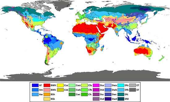
Fortunately we have a well-established framework classifying climate zones based upon temperature and precipitation patterns.  And researchers have addressed this question in this paper: Using the Köppen classification to quantify climate variation and change: An example for 1901–2010  By Deliang Chen and Hans Weiteng Chen Department of Earth Sciences, University of Gothenburg, Sweden

Hans Chen has built an excellent interactive website (here): The purpose of this website is to share information about the Köppen climate classification, and provide data and high-resolution figures from the paper Chen and Chen, 2013: Using the Köppen classification to quantify climate variation and change: An example for 1901–2010 (pdf). A synopsis is at my post Data vs. Models #4: Climates Changing.

Briefly, for this discussion, Chen and Chen presented tables and charts showing that most places have had at least one entire year with temperatures and/or precipitation atypical for that climate. It is much more unusual for abnormal weather to persist for ten years running. At 30-years and more the zones are quite stable, such that is there is little movement at the boundaries with neighboring zones.  Over time, there is variety in zonal changes, albeit within a small range of overall variation.

A Final Example: Rising Temperatures

A tv show in Australia illustrated how vision is impaired on this subject.  A typical graph was used to claim warming is alarming.  It came from the NASA Goddard Institute of Space Studies (GISS):

The graph shows no pause whatsoever.  This is accomplished by lowering the 1998 El Nino spike relative to 2015 El Nino. To see what is going on, here is a helpful chart from Dr. Ole Humlum at Climate4you.

It shows that indeed, GISS is showing 1998 peak lower than several years since, especially 2002, 2010 and 2016. In contrast, the satellite record is dominated by 1998, and may still be in that position once La Nina takes hold. The differences arise because satellites measure air temperature in the lower troposphere, while GISS combines records from land stations with sea surface temperatures (SSTs) to fabricate a global average anomaly, including adjusting, gridding and infilling to make the estimate of Global Mean Temperatures and compare to a 30-year average.

An insight into the adjustments is displayed below.  Dr. Humlum demonstrates that GISS is an unstable temperature record.

Dr. Humlum:

Based on the above it is not possible to conclude which of the above five databases represents the best estimate on global temperature variations. The answer to this question remains elusive. All five databases are the result of much painstaking work, and they all represent admirable attempts towards establishing an estimate of recent global temperature changes. At the same time it should however be noted, that a temperature record which keeps on changing the past hardly can qualify as being correct. (my bold)

All of these charts also suffer from lop-sidedness.  Considering the range of temperatures experienced by most Americans in a typical year, the following graph is more representative.

Why did GISS ignore the platinum standard satellite temperature dataset?  Why should the current graph be believed when it differs from previous ones, and maybe the next one?  Was not the 1C warming since 1850 a boon for civilization and the biosphere?  Should we wish for it to get cooler and start the slide into the next ice age?

Summary

There are a great many claims assembled in these Climate Assessments, all of them in support of policies like the Paris accord.  Reasonable people need to test for myopia and maintain a sense of proportion in order not to be taken in.