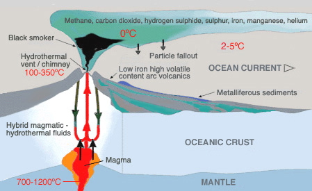
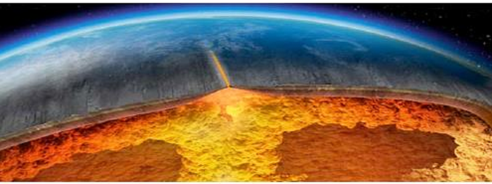
Global heat flux of the Earth combining heat flux measurements on land and continental margins with a thermal model for the cooling of the oceanic lithosphere. The Earth loses energy as heat flows out through its surface. The total energy loss of the Earth has been estimated at 46 ± 2 TW, of which 14 TW comes through the continents and 32 TW comes from the seafloor. By Jean-Claude Mareschal
From the Unsettled Science File (h/t to Paul Homewood for posting on this subject recently)
Little attention is paid to geothermal heat fluxes warming the ocean from below, mostly because of limited observations and weak understanding about the timing and extent of eruptions.
The existence of heat rising through earth’s crust is evident to all, and the large majority of vents are under the ocean. Consider the image above, and notice at the top center is the small black island off the east coast of Greenland, right on top of the orange mid-ocean ridge. Iceland produces more than 50% of its electricity from geothermal, as well as heating numerous buildings from the same source.

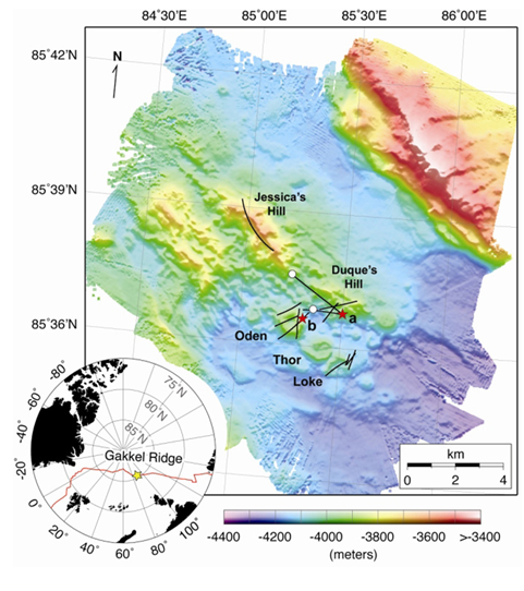
In addition, farther up under the north pole, scientists discovered an eruption of intense seismic activity beginning in Gakkel Ridge in January of 1999 and continuing for seven months. That happens to be about the time Arctic ice extent took a nosedive, stabilizing after 2007.
Researchers have considered the importance of this source of energy into the climate system from various points of view. Some abysmal studies (pun intended) were motivated to look in the ocean depths for the missing heat not appearing in the surface temperature records since 1998. Some warming was found but the case was weak since the Argo records showed no passage of heat between upper and lower ocean strata. Of course no thought was given to the seafloor being the warming source. However, much more serious and extensive research has been done by marine geologists wanting to better understand the cooling of the earth itself.

There appear to be three major issues around heating of the ocean from below through the seafloor:
1. Is geothermal energy powerful enough to make a difference upon the vast ocean heat capacity?
2. If so, Is geothermal energy variable enough to create temperature differentials?
3. Most of the ocean floor is unexplored, so how much can we generalize from the few places we have studied?
1. Some researchers conclude that geothermal heating of the oceans can not be ignored as trivial.
J. G. Sclater et al (here)
The total heat loss of the earth is 1002 × 10^10 cal/s (42.0 × 10^12 W), of which 70% is through the deep oceans and marginal basins and 30% through the continents and continental shelves. The creation of lithosphere accounts for just under 90% of the heat lost through the oceans and hence about 60% of the worldwide heat loss. Convective processes, which include plate creation and orogeny on continents, dissipate two thirds of the heat lost by the earth. Conduction through the lithosphere is responsible for 20%, and the rest is lost by the radioactive decay of the continental and oceanic crust.

Maqueda et al. (here)
Without geothermal heat fluxes, the temperatures of the abyssal ocean would be up to 0.5 C lower than observed, deep stratification would be reinforced by about 25%, and the strength of the abyssal circulation would decrease by between 25% and 50%, substantially altering the ability of the deep ocean to transport and store not only heat but also carbon and other climatically important tracers (Adcroft et al., 2001, Hofmann and Morales Maqueda, 2009, Mashayek et al., 2013). It has been hypothesised that interactions between the ocean circulation and geothermal heating are responsible for abrupt climatic changes during the last glacial cycle (Adkins et al, 2005).
Matthias Hofmann et al. (here)
Geothermal heating of abyssal waters is rarely regarded as a significant driver of the large-scale oceanic circulation. Numerical experiments with the Ocean General Circulation Model POTSMOM-1.0 suggest, however, that the impact of geothermal heat flux on deep ocean circulation is not negligible. Geothermal heating contributes to an overall warming of bottom waters by about 0.4◦C, decreasing the stability of the water column and enhancing the formation rates of North Atlantic Deep Water and Antarctic Bottom Water by 1.5 Sv (10% ) and 3 Sv (33% ), respectively. Increased influx of Antarctic Bottom Water leads to a radiocarbon enrichment of Pacific Ocean waters, increasing ∆14C values in the deep North Pacific from -269◦/◦◦when geothermal heatingis ignored in the model, to -242◦/◦◦when geothermal heating is included. A stronger and deeper Atlantic meridional overturning cell causes warming of the North Atlantic deep western boundary current by up to 1.5◦C
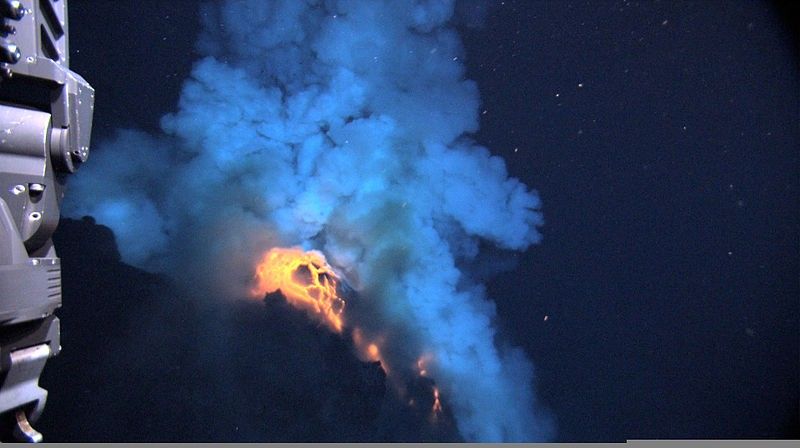
During the 2009 expedition, superheated molten lava, about 1,204ºC (2,200ºF) erupts, producing a bright flash as hot magma that is blown up into the water before settling back to the sea floor. Notice the front of the remotely operated vehicle (foreground, left). High resolution (Credit: Image courtesy of NSF and NOAA)
2. Seafloor eruptions are quite variable and unpredictable, and while localized, can influence ocean circulation patterns.
Jess F. Adkins et al. (here)
The solar energy flux of 200 W/m2 at the ocean’s surface (Peixoto and Oort, 1992) is much larger than the next largest potential source of energy to drive climate changes, geothermal heating at the ocean’s bottom (50–100 mW/m2 ) (Stein and Stein, 1992), but this smaller heat input might still play an important role in rapid climate changes.
It is clear that variations in the solar flux pace the timing of glacial cycles (Hays et al., 1976), but these Milankovitch time scales are too long to explain the decadal transitions found in the ice cores. Another, higher frequency, source of solar variability that would directly drive the observed climate shifts has yet to be demonstrated. Therefore, mechanisms to explain the abrupt shifts all require the climate system to store potential energy that can be catastrophically released during glacial times, but not during interglacials (Stocker and Johnsen, 2003).
At the Last Glacial Maximum (LGM), when the deep ocean was filled with salty water from the Southern Ocean, geothermal heating may have been an important source of this potential energy.
In modern ocean studies there is an increasing awareness of the effect of geothermal heating on the overturning circulation. As an alternative to solar forcing, Huang (1999) has recently pointed out that geothermal heat, while small in magnitude, can still be important for the modern overturning circulation because it warms the bottom of the ocean, not the top. Density gradients at the surface of the ocean are not able to drive a deep circulation without the additional input of mechanical energy to push isopycnals into the abyss (Wunsch and Ferrari, 2004). Heating from below, on the other hand, increases the buoyancy of the deepest waters and can lead to large scale overturning of the ocean without additional energy inputs. Several modern ocean general circulation models have explored the overturning circulation’s sensitivity to this geothermal input. In the MIT model a uniform heating of 50 mW/m2 at the ocean bottom leads to a 25% increase in AABW overturning strength and heats the Pacific by 0.5 1C (Adcroft et al., 2001; Scott et al., 2001). In the ORCA model, applying a more realistic bottom boundary condition that follows the spatial distribution of heat input from Stein and Stein (1992) gives similar results (Dutay et al., 2004). In both models, most of the geothermal heat radiates to the atmosphere in the Southern Ocean, as this is the area where most of the world’s abyssal isopycnals intersect the surface.
The area of the modern ocean is 350×10^6 km2 . The area of the Southern Ocean between 80–85S (the region around Antarctica) is 0.4×10^6 km2 . This factor of 1000 means that the focused geothermal heating of 50 mW/m2 is locally of the same order as the total heat exchange at high southern latitudes. The focusing effect of geothermal heating can cause this heat flux to be a significant fraction of the total heat loss in the crucial deep-water formation zones in the glacial Southern Ocean. This suggests that the geothermal heat is potentially relevant for determining the heat content of the abyssal waters.
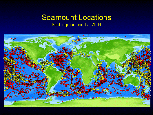
3. The number of hydrothermally active seamounts is estimated to be somewhere between 100,000 and 10,000,000.
Andrew T. Fisher and C. Geoffrey Wheat (here)
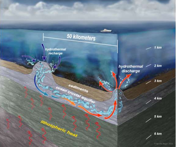
Thus, most of the thermally important fluid exchange between the crust and ocean must occur where volcanic rocks are exposed at the seafloor; little fluid exchange on ridge flanks occurs through seafloor sediments overlying volcanic crustal rocks. Seamounts and other basement outcrops focus ridge-flank hydrothermal exchange between the crust and the ocean. We describe the driving forces responsible for hydrothermal flows on ridge flanks, and the impacts that these systems have on crustal heat loss, fluid composition, and subseafloor microbiology.
Earth’s geothermal heat output is about 44 TW, with most heat loss occurring through ocean basins (e.g., Sclater et al., 1980; Pollack et al., 1993). Seafloor hydrothermal heat output is on the order of 10 TW, ~ 25% of Earth’s total geothermal heat output, and ~ 30% of the oceanic lithospheric heat output (Figure 1A). Only a small fraction of this advective heat output occurs at high temperatures at mid-ocean ridges; the vast majority occurs at lower temperatures (generally 5–20°C) on ridge flanks, suggesting an associated fluid discharge of ~ 10^16 kg yr-1 (Figure 1B) (C. Stein et al., 1995; Mottl, 2003; Wheat et al., 2003). This low-temperature flow rivals the discharge of all rivers to the ocean (4 x 10^16 kg yr-1), and is about three orders of magnitude greater than the sum of high-temperature hydrothermal discharges at mid-ocean ridges (~ 10^13 kg yr-1).
Networks of seamounts permit rapid fluid circulation to bypass thick and relatively continuous sediment across much of the deep seafloor. Fluid recharges into the crust as oceanic bottom seawater, being relatively cold and dense. As the fluid penetrates more deeply into the crust, it warms and reacts with the surrounding basalt, and interacts with the overlying sediments through diffusive exchange across the sediment-basalt interface. Fluid can flow laterally for tens of kilometers through the oceanic crust, with the extent of heating and reaction dependent on the flow rate, crustal age, and other factors. Weaker circulation systems can result in significant local rock alteration and heat extraction, but are unlikely to have a large impact on lithospheric heat loss on a regional scale.
The number of hydrothermally active seamounts is estimated to be somewhere between 100,000 and 10,000,000 , based on mapping and seamount population estimates by Wessel (2001) and Hillier and Watts (2007), and the observation that, of the seamounts and outcrops that have been surveyed, a significant fraction appear to be hydrothermally active (Fisher et al., 2003a, 2003b; Hutnak et al., 2008; Villinger et al., 2002).
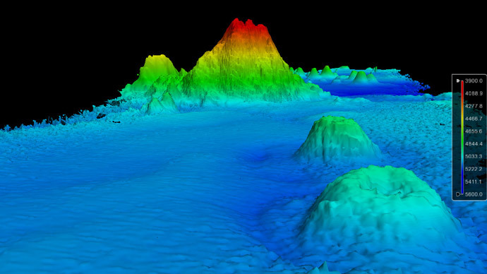
Monster mountain discovered lurking in depths of Pacific Ocean
Without seamounts and other basement outcrops, it would not be possible for ridge-flank hydrothermal circulation to mine a significant fraction of lithospheric heat once sediments become thick and continuous on a regional basis. Thus, ridge-flank hydrothermal activity would be very different on an Earth without seamounts
Analyses of satellite gravimetric and ship track data suggest that there could be as many as 1,000,000 seamounts having a radius of ≥ 3.5 km and height ≥ 2 km (Wessel, 2001), and perhaps 10^6 to 10^7 features > 100 m in height (Hillier and Watts, 2007). Given the ubiquity of these features on ridge flanks, it is surprising how little we know about which seamounts are hydrologically active—how many recharge and how many discharge.
The thermobaric capacitor has enough energy to overturn the water column, can be triggered by regular oceanic processes, and charges over a time scale that is relevant to the climate record.
Conclusion
This source of heat has been dismissed because it is poorly known, and because its eruptive events are unpredictable and can not therefore be represented in climate models. Despite geothermal eruptions having only localized effects, the impact on ocean circulations is significant.
John Reid (here)
Volcanic activity does not fit this neat picture. Volcanic behaviour is random, i.e. it is “stochastic” meaning “governed by the laws of probability”. For fluid dynamic modellers stochastic behaviour is the spectre at the feast. They do not want to deal with it because their models cannot handle it. We cannot predict the future behaviour of subaqueous volcanoes so we cannot predict future behaviour of the ocean-atmosphere system when this extra random forcing is included.
To some extent, chaos theory is called in as a substitute, but modellers are very reticent about describing and locating (in phase space) the strange attractors of chaos theory which supposedly give their models a stochastic character. They prefer to avoid stochastic descriptions of the real world in favour of the more precise but unrealistic determinism of the Navier-Stokes equations of fluid dynamics.
This explains the reluctance of oceanographers to acknowledge subaqueous volcanism as a forcing of ocean circulation. Unlike tidal forcing, wind stress and thermohaline forcing, volcanism constitutes a major, external, random forcing which cannot be generated from within the model. It has therefore been ignored.
But the science is advancing.

Maya Tolstoy (here)
Vast ranges of volcanoes hidden under the oceans are presumed by scientists to be the gentle giants of the planet, oozing lava at slow, steady rates along mid-ocean ridges. But a new study shows that they flare up on strikingly regular cycles, ranging from two weeks to 100,000 years—and, that they erupt almost exclusively during the first six months of each year. The pulses—apparently tied to short- and long-term changes in earth’s orbit, and to sea levels–may help trigger natural climate swings. Scientists have already speculated that volcanic cycles on land emitting large amounts of carbon dioxide might influence climate; but up to now there was no evidence from submarine volcanoes. The findings suggest that models of earth’s natural climate dynamics, and by extension human-influenced climate change, may have to be adjusted. The study appears this week in the journal Geophysical Research Letters .
The idea that remote gravitational forces influence volcanism is mirrored by the short-term data, says Tolstoy. She says the seismic data suggest that today, undersea volcanoes pulse to life mainly during periods that come every two weeks. That is the schedule upon which combined gravity from the moon and sun cause ocean tides to reach their lowest points, thus subtly relieving pressure on volcanoes below. Seismic signals interpreted as eruptions followed fortnightly low tides at eight out of nine study sites. Furthermore, Tolstoy found that all known modern eruptions occur from January through June. January is the month when Earth is closest to the sun, July when it is farthest—a period similar to the squeezing/unsqueezing effect Tolstoy sees in longer-term cycles. “If you look at the present-day eruptions, volcanoes respond even to much smaller forces than the ones that might drive climate,” she said.
We are left with a philosophical conundrum:
If heat comes from the seafloor and no one is around to measure it, does it make the ocean warmer?
The classic form of this question was first posed by Bishop George Berkeley (1685 – 1753), one of the Top Ten Philosophical Questions:
“If a tree falls in a forest and no one is around to hear it, does it make a sound?”
Updated by Steven Wright
If a tree falls in the forest and no one is around to see it, do the other trees make fun of it?
A variation from my personal experience:
If a man says something and his wife is not around to hear it, is he still wrong?
Steven Wright (on the urban cooling effect)
I turned my air conditioner the other way around, and it got cold out. The weatherman said, ‘I don’t understand it. It was supposed to be 80 degrees out today.’ I said, ‘Oops … ‘
Reference:
A complete presentation of Plate Tectonics Theory of Climatology is by James Edward Kamis (here)