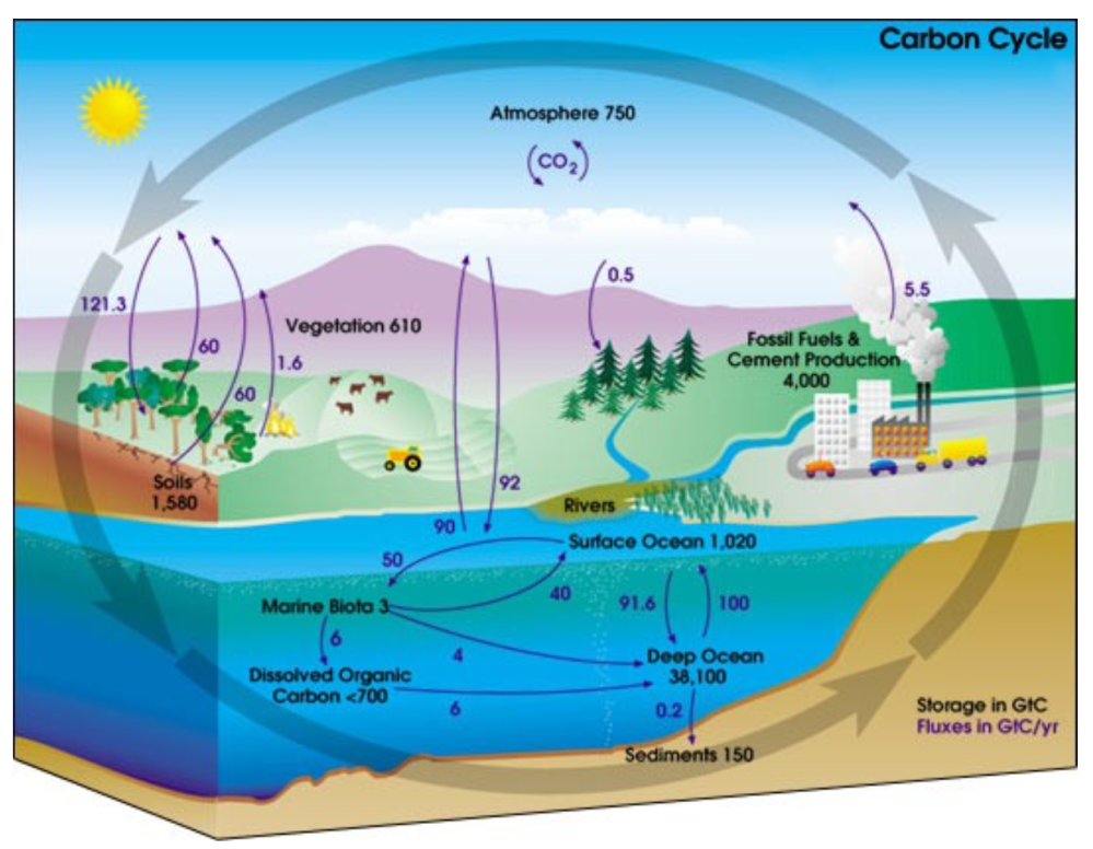
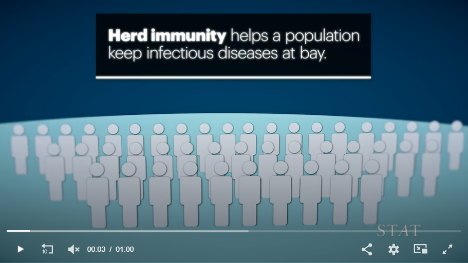
How Public Health Canceled Herd Immunity

//cdn.jwplayer.com/players/25iITzTK-jEuQjxp9.html

David Robertson writes at Stat News How we got herd immunity wrong.  Excerpts in italics with my bolds and added images.

Herd immunity was always our greatest asset for protecting vulnerable people,
but public health failed to use it wisely.

In March 2020, not long after Covid-19 was declared a global public health emergency, prominent experts predicted that the pandemic would eventually end via herd immunity. Infectious disease epidemiologist Michael Osterholm, who advised President Biden, opined in the Washington Post that even without a vaccine, SARS-CoV-2, the virus that causes Covid-19, would eventually “burn itself out as the spread of infection comes to confer a form of herd immunity.” The best strategy, he reasoned, was to “gradually build up immunity” by letting “those at low risk for serious disease continue to work” while higher-risk people sheltered and scientists developed treatments and, hopefully, vaccines.

Experts in the United Kingdom also spoke early on of herd immunity acquired through infection as a protective force that would ultimately end the epidemic. Planning on SARS-CoV-2 eventually becoming endemic, epidemiologist Graham Medley suggested that the U.K.’s initial strategy should be to “manage this acquisition of herd immunity and minimise the exposure of people who are vulnerable.” The U.K.’s chief scientific adviser, Patrick Vallance, explained that the goal was to flatten the curve and “build up some kind of herd immunity” in order to “protect those who are most vulnerable to it.”

Soon after this, some came to interpret the term as a do-nothing, “let it rip” strategy that would result in a huge number of avoidable deaths.

In response, policy quickly shifted to efforts to prevent all infections rather than targeting interventions at those at highest risk while accepting that a certain degree of viral transmission was unavoidable. Herd immunity in the absence of a vaccine soon became a dirty word. By May of 2020, a leading official in the World Health Organization announced that “humans are not herds” and that the term can lead to a “very brutal arithmetic.”

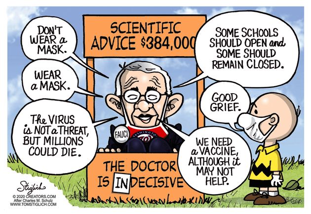
With the early arrival of vaccines in late 2020, prominent experts began promising that infection with SARS-CoV-2 was no longer inevitable. Herd immunity became defined as a percentage of immune individuals in a population that would stop transmission. Anthony Fauci captured this sentiment in May 2021 as a guest on “Face the Nation,” when he suggested that fully vaccinated individuals “become a dead end to the virus.” Once populations reached “the threshold of herd immunity,” he reiterated a month later, they would “see the infections almost disappear.”

Those mantras became the new plan: Get vaccinated to protect yourself, but also to protect those around you. Get to vaccine-induced herd immunity and the virus will virtually disappear from our communities.

As these failed to materialize, herd immunity has once again been dismissed as unachievable for Covid-19. As Fauci recently put it, SARS-CoV-2 will “find just about everybody.”

What went wrong?

The idea that vaccinating a certain percentage of the population would stop transmission of SARS-CoV-2 was a seductive but unhelpful description of herd immunity. This understanding comes from the so-called sterilizing immunity provided by infection or vaccination against diseases like measles. Sterilizing immunity means an individual can no longer be infected or infect others. Reach a certain percentage or “threshold” of this immunity in a population (around 95% for measles) and transmission comes to halt and the virus is eliminated.

This, however, is neither the exclusive nor even the most common understanding of herd immunity — and it is misleading for Covid-19.

SARS-CoV-2 is not like the measles virus, but more like influenza, a virus that does not produce sterilizing immunity, returning every season like clockwork. Yet scientists do speak of herd immunity against the flu, even in the absence of vaccination. As Danish epidemiologist Lone Simonsen explained in September 2020: “every [flu] pandemic we’ve ever looked at ended by herd immunity.”

Long before herd immunity came to be seen as an elimination threshold guiding mass vaccination campaigns, it explained why epidemics subside, reducing — but not eliminating — an individual’s risk of infection. Much like gravity pulls an object back to earth, herd immunity is the counterweight to sustained epidemic growth.

For SARS-CoV-2, herd immunity should not have been seen as an elimination threshold.

Instead, it should have helped us understand that as immunity accumulated in the population, whether from infection or vaccination, the epidemic would recede before everyone was infected. Acknowledging that we couldn’t stop all infections, policy should have focused on minimizing the exposure of those already known to be at enormously increased risk of severe disease, while also limiting the harms caused by prolonged restrictions.

In contrast to the notion of an elimination threshold, which arose relatively recently, herd immunity has been understood as a mechanism of epidemic abatement for nearly a century. In the aftermath of the 1918 flu pandemic, British epidemiologists recreated epidemics in caged mice populations as part of efforts to understand how the shifting ratio of susceptible and immune individuals fueled or restrained epidemics. They hypothesized that epidemic waves “fall because the average resistance of the herd is raised.” But this did not mean that a pathogen disappeared. “Another wave will follow it at a later date,” they continued, when waning immunity causes “the average herd immunity to fall below some critical level.” Herd immunity denoted a turning point in an epidemic that happened before every individual in a population had been exposed, offering the appealing possibility of preventing the infection of those at most risk of severe disease.

In October of 2020, the possibility of herd immunity without vaccines reentered public discussions following publication of the Great Barrington Declaration. In line with a long-established understanding of the concept, that document defined herd immunity as “the point at which the rate of new infections is stable” and stressed that as “immunity builds in the population, the risk of infection to all — including the vulnerable — falls.”

Like prominent experts at the beginning of the pandemic, the epidemiologists who wrote the declaration stressed the importance of protecting vulnerable people while herd immunity accrued among those at lower risk. They called for a strategy of “focused protection” of those at highest risk. Writing before the arrival of vaccines, they suggested increasing testing in care homes, minimizing the rotation of staff between such facilities and, where possible, using staff with acquired immunity. Elsewhere, they proposed that Social Security payments could facilitate paid leave to high-risk individuals in the community unable to work from home. There were further suggestions for focusing protection on specific risk groups, such as those living in intergenerational households.

Rather than engaging with the substance of these proposals,
major public health figures dismissed the declaration.

Fauci called it “ridiculous” and “total nonsense.” It was later revealed that he and Francis Collins, then the director of the National Institutes of Health, privately discussed launching a “quick and devastating published take down” of the declaration. WHO Director-General Tedros Adhanom Ghebreyesus labeled it “unethical.” The WHO even changed its online definition of herd immunity, temporarily erasing reference to immunity from infection. A letter signed by many prominent scientists published in The Lancet declared: “Any pandemic management strategy relying upon immunity from natural infections for Covid-19 is flawed.”

One unfortunate result of this period in the pandemic was that herd immunity became widely understood as exclusively referring to an elimination threshold achieved through vaccination. Short of that goal it became seen as dangerously inappropriate. Two weeks after the Great Barrington Declaration was published, Nature reported on “the false promise of herd immunity” for Covid-19. One virologist wrote that “herd immunity has never been achieved through naturally acquired infections.”

Drawing on the concept as it pertains to pathogens against which we have sterilizing immunity, such statements were misleading.

When experts — and the public — began to realize that neither previous infection nor vaccination produces lasting immunity against infection with SARS-CoV-2, many became pessimistic about the very possibility of herd immunity and the term once again became seen as irrelevant to Covid-19.

In the days before anyone knew how long it would take to develop effective vaccines, herd immunity could have helped us think strategically about targeting protections at those most at risk while reducing the considerable harms caused by restrictions intended to suppress transmission, such as school closures. This was essentially what Sweden did and, though mistakes were also made there, it navigated the pandemic with its children attending school in person and with substantially lower per-capita mortality from both Covid-19 and all causes than the European Union, the U.K., and the U.S.

“It’s not possible to stop everybody getting it,” Vallance cautioned the U.K. in mid-March 2020. As countries from Iceland to Australia are recognizing, he was correct. Yet in all of the confusion and false promises of elimination that followed his warning, public health strategies lost sight of how to leverage our herd immunity to protect vulnerable people, with or without a vaccine.
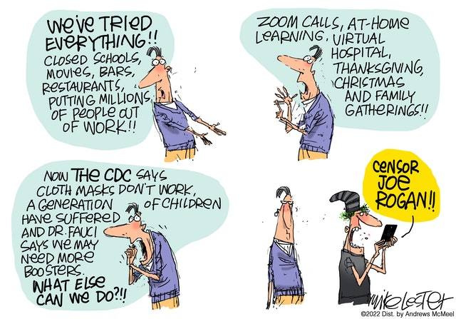
Don’t Fence Us In!

Dangerous Illusion: 2 Weeks to Flatten the Curve


Bruce Pardy explains in his Epoch Times article Back to the Future: ‘Two Weeks to Flatten the Curve’ Was a Dangerous Mistake From the Beginning.  Excerpts in italics with my bolds.

Editor’s note: COVID lockdowns and restrictions for “two weeks to flatten the curve” began two years ago in late March 2020. At the time, many pundits called it a dangerous mistake, one of whom was law professor Bruce Pardy. Two years later, as restrictions finally begin to ease, the federal government and many workplaces still maintain vaccination mandates. Below are prognostications (edited) from Pardy from April and May 2020.

Lenin once said that there are decades where nothing happens and weeks where decades happen. In this new era of the past few weeks, Canada has become less free. Lockdowns will eventually ease, but we have crossed a threshold. Canadians now want government to keep them safe—not just from foreign threats and violence, but from viruses and the vicissitudes of life. Authorities have enthusiastically seized the moment. Politicians have assumed unprecedented powers not subject to legislative oversight and have suspended civil liberties. For the first time ever, officials have confined citizens—with their approval—to their homes. Municipalities issue citations for walking through the park, police enforce rules that do not exist, and health authorities surveil the sick.

The situation that we are now in may be a shock, but it should not be a surprise. We have long been headed down this road. COVID restrictions may seem like an extreme change to daily life, but it is a difference of degree, not of kind. We were not a free country on March 22 that suddenly became unfree on March 23. We have an expansive administrative welfare state, which for a long time has driven the bus. It regulates everything. It subsidizes, taxes, supervises, and directs. The degree of infringement on civil liberties is more extreme now than it has even been for the general population in this country, but COVID rules are not differently intrusive, just more so. The lockdowns will ease, but the mandate that the government now has will remain. It will be difficult to put this genie back in the bottle.

It has worked like this: In Stage One, which we passed through a long time ago, the populace becomes convinced that it is the state’s role to keep them safe. In Stage 2, which began with the onset of the virus, they become fearful. Stage Three is necessity: if the virus is to be feared and the job of government is to keep us safe, then government must do whatever is necessary to protect us from the virus. Necessity provides the excuse for control, and control exacerbates dependence. What we have now is a dependent population, economically and psychologically.

There will not be rational debate about these policies. Governments do not adopt policies for logical and rational reasons. It is a mistake to believe that it is possible to engage in a civil conversation with the public and with government officials to figure out what works best. What has worked for governments in this circumstance is the promotion of fear. Concentrating on making rational policy recommendations based upon the premise that we are engaging in a good faith dialogue would be to miss the plot.

There will be court challenges, but the courts will not say that these policies are unconstitutional. The government can do what it is doing because the Charter of Rights and Freedoms does not provide the lines in the sand that we think that it does. Courts like to pretend that they are immune from public opinion, but they follow the culture as much as anybody else.

The charter will not protect us from the culture, and the culture now is one that demands safety, provided by the state.

Governments will be allowed to do indirectly what they could not do directly. Take the vaccine for example. If a vaccine is developed, they will not make the vaccine mandatory. Instead, they will say, make your own choice but if you do not have a vaccine you cannot come inside the building. You cannot come and renew your driver’s licence unless you can show us you have been vaccinated. Technically that is not mandatory, but practically it is. Contact tracing means that they are imposing upon you a requirement without admitting that what they are doing is locking you down if you decide not to do it. Governments will use means by which to achieve their objective without being so authoritarian that you cannot move.

The most disturbing thing about the COVID regime is not that governments are putting it in place, but that citizens support it, and indeed demand it.

COVID madness will not stop until a critical mass of people say that they have had enough. The way to turn this around is to get the population to reject the authority of experts, health officials, and governments to tell them what to do. Until we get to that, efforts to reverse these policies may prove to be a waste of time. Until people perceive that the purpose of government is to protect liberty instead of safety, everything else is fiddling around the margins.

Crises are an ideal time for the state to advance into territory from which it will not wish to retreat. In time, controls will loosen but old expectations have been swept away. In this new era, we will discover that leaders of all political stripes have more than a little Lenin in them.

Ukraine Is Elites’ Latest Propaganda Ploy

Ukrainian ambassador and flag waving at Biden State of the Union speech.

Lee Smith writes at Compact Ukraine Is the Ruling Class’s Latest Propaganda Ploy.  Excerpts in italics with my bolds and added images.

The war in Ukraine has been dominating headlines for more than a month, but it is still hard for most Americans to grasp what is going on. In part, that’s because most of what is coming out of Kyiv and Moscow is war propaganda. But it’s also because the US ruling class is once more waging information war—against domestic critics and internal enemies.

You can hardly blame the Ukrainians for inventing stories about fighter pilots who single-handedly downed scores of Russian aircraft. The country’s president, Volodymyr Zelenskyy, is trying to keep up morale on the home front while soliciting support from Western leaders to fend off Vladimir Putin’s onslaught. For those in power, lying is part of the logic of war.

What isn’t normal is the all-out effort to promote Ukraine’s cause in America—an effort grafted on to a long series of ongoing propaganda campaigns deployed by US institutions and industries against the same target: the American public. These campaigns have used the same methods, personnel, platforms, and even catchwords to deceive, harass, and punish working- and middle-class Americans to the benefit of the country’s increasingly powerful ruling oligarchy.

To help their chosen candidate, Joe Biden, unseat President Donald Trump, Silicon Valley giants blocked an October 2020 New York Post exposé about influence-peddling by Biden’s son Hunter. Fifty former top US intelligence officials characterized the Post’s reporting as Russian disinformation, a claim echoed unanimously and uncritically by prestige outlets. The New York Times repeatedly called the Hunter Files “unsubstantiated,” while National Public Radio’s managing editor for news, Terence Samuels, huffed that “we don’t want to waste our time on stories that are not really stories.”

Yet even as the Times acknowledged last week that the Hunter emails uncovered by the Post were indeed authentic, the same tech firms are banning videos and stories that contradict the US political establishment’s official Ukraine narrative for the same reason: American spies claim it’s Russian disinformation.

If you aren’t accused of serving Moscow, you are at least disloyal to the United States.

The media say that the Trump supporters who showed up to protest election irregularities at the Capitol building on Jan. 6, 2021, were there to wage an insurrection. This, despite mounting evidence, including the confessions of New York Times reporters, suggesting that law enforcement played a significant role in staging the day’s violence. Yet video of the events selectively edited by local police and the US Department of Justice and then released to the media has already solidified the official narrative: Anyone who didn’t vote for Biden is likely a domestic terrorist.

Or you are said to be endangering American lives with conspiracy theories.

That’s how the ruling class framed opposition journalists and researchers who questioned the origins of Covid-19, as well as doctors who noted the obvious fact that the vaccines didn’t work as promised—otherwise there would have been no need for boosters. The accused were banished from social media, hectored by their professional colleagues and institutions, and received scores of death threats. Americans who failed to comply with government efforts to rig the stock market by mandating Pfizer and Moderna shots were fired from work, expelled from school, and ostracized from their communities.

Fast-forward a few months: If you say out loud that you think there is something strange about a campaign involving Democrats and Republicans, the media, Big Tech, corporate giants, and US intelligence services to promote one side in a foreign war that doesn’t obviously touch on the daily concerns of most Americans, you’re pro-Putin.

That accusation has haunted the American public sphere going on six years.

For this is where the long campaign started, with Russiagate, the most destructive information operation ever waged against the nation. And unlike, say, the notorious Protocols of the Elders of Zion, its authors aren’t adversarial spy services, but fellow Americans, our own ruling class. Now the same journalists, foreign-policy experts, and retired US officials who lied in 2016 about Trump’s ties to Russia are front and center shaping public opinion about the war waged by Putin—the world leader our overclass put in the middle of an elite conspiracy theory designed to guarantee Hillary Clinton the presidency.

It would be useful to have insight into Putin’s thinking, especially now with a massive land war in the middle of Europe giving rise to a powerful anti-American bloc led by Russia and China. But don’t count on America’s national-security establishment to provide that insight. For they squandered their credibility with Russiagate. From former officials like ex-Ambassador to Russia Michael McFaul and retired spy chiefs like James Clapper and John Brennan to Biden deputies like National Security Adviser Jake Sullivan and the Pentagon’s top strategist, Colin Kahl, and the entire Democratic Party and its media apparatus, the lies of America’s political class left the republic vulnerable to destructive forces.

Why did they lie? Policymakers, spy chiefs, and military officials rightly deceive foreign powers to protect and advance the US national interest. But these men and women lied to the American people about the president they elected. Then they lied about everything. Public US institutions and private industries have spent the last six years mustering their formidable powers to break the US working and middle classes. Why?

Because lying is part of the logic of war,
and America’s oligarchy is at war with the American people.

Natural Covid19 Immunity Is Real (Fauci Admits, Finally)

Jeffrey Tucker writes at the Brownstone Institute  Fauci Finally Admits Natural Immunity.  Excerpts in italic with my bolds.

Yes, Fauci has never worried about consistency or even contradicting himself one day to the next, often without explanation. Too often his doling out “the science” has felt like performance art. Still, the record is that Fauci and all his compatriots either downplayed or denied natural immunity for two years. That has been the source of vast confusion.

In fact, this might have been the most egregious science error of the entire pandemic. It amounted to giving the silent treatment to the most well-established point of cell biology that we have. It was taught to every generation from the 1920s until sometime in the new century when people stopped paying attention in 9th-grade biology class.

There’s no question that this effort to deny natural immunity
was systematic and pushed from the top.

How has this changed? In February 2022, the CDC finally published on the topic that they could not forever deny. And now, Fauci himself let the following slip in an interview on March 23, 2022:

“When you look at the cases they do not appear to be any more severe [than Omicron] and they do not appear to evade immune responses either from vaccine or prior infection.”

What’s critical here is not his debatable claim about vaccines but rather his offhand remark about prior infection. It was tossed off as if: “Everyone knows this.” If so, it is no thanks to him, the CDC, or WHO.

To be sure, everything we’ve known since two years ago – if not 2.5 thousand years – is that immunity from prior Covid infection is real. Vaccines have traditionally been a substitute version of exactly that. Brownstone has assembled fully 150 studies that demonstrate that immunity through infection is effective, broad, and lasting.

Had that messaging been around during lockdowns, the attitude toward the virus would have been very different. We would have clearly seen the present reality from the beginning, namely that endemicity generally arrives in the case of a new virus of this sort due to exposure-induced population immunity. This is how humankind evolved to live in the presence of pathogens.

If we had widespread public awareness of this, the public-health priority would not have been locking down people who can manage exposure but rather alerting those who cannot to be careful until herd immunity in one’s own circle of contacts has been realized via meeting the virus and recovering.

To those who say that is dangerous, consider that mass exposure is precisely what happened in any case, stretched out over two years rather than occurring in a single season. This delaying of the inevitable might be what allowed for variants to emerge and take hold in successive rounds, each new one hitting naive immune systems in ways that were difficult to predict. Flatten the curve amounted to “prolonging the pain,” exactly as Knut Wittkowski predicted in March 2020.

A widespread understanding of natural immunity would have changed the entire calculus of public perception of how to manage one’s life in the face of a new virus. Instead of just running and hiding, people might have considered tradeoffs, as they had always done in the past. What is my risk of infection and under what conditions? If I do get the thing, what happens then? It might also have changed the priorities from disease avoidance and vaccine subsidies and mandates to thinking about the crucial thing: what should people do if they get sick? What should doctors recommend and prescribe?

The neglect of therapeutics figures into this very highly.

If people believe that locking down, staying away, masking up, stopping travel, and generally giving up all choices in life were the right way to make a pathogen magically disappear, plus they are under the impression that the risk of severe outcomes is equally distributed across the whole population, plus they believe that 3-4% of the population is going to die from Covid (as was suggested in the early days), you end up with a much more compliant people.

If natural immunity had been rightly seen as the most robust and broad form of immunity from the beginning, and we instead followed the idea of focused protection, the vaccine mandates would have been out of the question.

In other words, the silence of this topic was critical to scaring people all over the world into going along with an unprecedented attack on rights and liberties, thus losing up to two years of childhood education, closing millions of small businesses, and denying people basic religious liberties, in addition to the collapse of public health that resulted in record-breaking alcohol and opioid-related deaths, not to mention lost cancer screenings, childhood vaccinations, and general ill-health both physical and mental.

This stuff is not without consequence. Once might expect some contrition. Instead we get a passing comment and nothing more. After all, frank talk about this subject might be risky: it would imply that their entire mitigation strategy was wrong from the beginning and should never be attempted again.

SEC Agency Aims to Legislate US Climate Policy

Jay Clayton and Patrick McHenry explain in their Wall Street Journal article The SEC’s Climate-Change Overreach.  Excerpts in italics with my bolds and added images.

Congress shouldn’t palm off its responsibility for social and economic policy
on financial regulators.

The Securities and Exchange Commission will propose sweeping new rules this week requiring publicly traded, and perhaps even private, companies to disclose extensive climate-related data and additional “climate risks.”

Setting climate policy is the job of lawmakers, not the SEC, whose role is to facilitate the investment decision-making process.

Companies choose how best to comply and thrive under those polices, and investors decide which business strategies to back. That approach addresses many societal issues—think vaccines—and enhances global welfare. Taking a new, activist approach to climate policy—an area far outside the SEC’s authority, jurisdiction and expertise—will deservedly draw legal challenges.

What’s worse, it puts our time-tested approach to capital allocation, as well as the agency’s independence and credibility, at risk.

Understanding and addressing global climate change is one of the most complex and significant issues of our time. Some predict we face inevitable catastrophe, while others say the costs of the transition to a “net-zero world” outweigh the benefits  We know four things for sure.

♦  First, implementing an economywide emissions-reduction policy will have a profound impact on the domestic energy, labor, transportation and housing markets, among others. Many jobs will be destroyed while others are created. Some businesses will close while others will flourish. Even if the long-term benefits outweigh the costs, near-term stresses on working Americans are inevitable and will be distributed unequally.

♦  Second, leaving policy decisions this significant to a single regulator—or even a patchwork of regulators—has failed time and again. Tellingly, there is no indication that the SEC has meaningfully coordinated with any of the other relevant federal agencies and departments on the policy choices embedded in its proposed rules.

♦  Third, Russia’s war against Ukraine demonstrates again the clear and longstanding links between energy policy, global stability and competing national interests. America’s ability to lead on the global stage depends on our economic and military strength, and energy policy is a key to both. These issues are far outside a financial regulator’s depth and mandate.

♦  Fourth, the body that the Constitution prescribes for weighing the relevant trade-offs in this area is Congress. Congress, duly elected by and responsible to the people, is precisely where climate policy, in all its complexities and consequences, should be resolved. Yet over decades, elected leaders have pushed hard policy questions to federal agencies staffed by unelected bureaucrats, whose decisions are reviewed only by unelected judges.

This is at best bad for democracy and at worst unconstitutional.

Demanding that the SEC “act on climate change” allows politicians to say that they are working on their constituents’ behalf without accepting responsibility for the hard choices involved in crafting policy.

Executive branch and independent agencies, including the Environmental Protection Agency; the Transportation, Labor, State and Treasury departments; and other financial regulators, have a role to play. They should work to inform Congress during the policy-making process and then implement legislative mandates in their respective areas of expertise.

Unfortunately, because the SEC has decided to move forward unilaterally, the debate will shift not to Congress, where it belongs, but to the courts. The commission’s chosen path will allow the political buck-passing to continue and delay thoughtful, appropriate and democratically accountable policy.

If and until Congress acts on climate policy, the message to regulators must be clear: Stay in your lane.

Mr. Clayton served as SEC chairman, 2017-20. Mr. McHenry, a North Carolina Republican, is ranking member of the House Financial Services Committee.

See Background Post SEC Warned Off Climate Disclosures

Biden’s War on American Energy

From  zerohedge America’s energy policies, specifically those centered around oil and gas, are “bat shit crazy” and the Biden administration is doing nothing but creating “turmoil” in the oil markets, according to geologist and fossil fuel expert Dr. Marc J. Defant. More on Dr. Defant’s credentials at the end.  Excerpts in italics with my bolds and added images.

How did Biden’s policies impact the lower production of oil and gas?

By 2019, due primarily to fracking, the US became the number one producer of oil and gas in the world. In fact, we became a net exporter of oil and gas.

Prior to Biden entering office, oil production of oil shales reached over 12 million B/D. but fell more than 1 million B/D during 2021. During this time, Russia became the world’s largest exporter of oil which helped fund their war effort in the Ukraine.

Social Cost of Carbon

Under Obama, the government came up with a dollar value called the social cost of carbon. It is supposedly an estimate by the government as to the environmental damage from everything from rising sea level to wildfires and floods from the release of one ton of carbon dioxide via fossil fuel burning. But scientists are still completely uncertain about the direct impact the burning of fossils fuels may have on the environment. I hope this causes you to suspect the number may be related to magic.

But that never stopped the Obama administration from coming up with a solid amount of $57. Trump reduced the number to $7, but Biden revised the number to $51. The number is important because it gave the Biden administration the leverage to restrict oil and gas production based on supposed environmental and economic threats from greenhouse gasses (i.e., reduce permitting on federal lands).

As might be expected, gas-producing states fought back by challenging the social cost of carbon in court, and a judge issued an injunction preventing the administration from using the metric. But rather than submit to the judge’s ruling, the Biden administration simply decided to stop new permits on federal lands blaming the judge for the action – sigh. But Biden has been slow-walking permitting since he became President. He is the only President in 20 years not to have an onshore lease sale in a given year (2021).

Intentional Destruction of American Energy Production

We should not be surprised by Biden’s actions. During his campaign he promised to end drilling on federal lands to fight climate change. As much as 25% of oil and gas production comes from federal lands.

Finally in November of last year, the Department of the Interior, which is required by law to have quarterly lease sales, opened its first Gulf of Mexico oil lease auction which generated $190 million from oil companies. But alas, a green Obama-appointed judge vacated the auction after [environmentalists] Earthjustice out of San Francisco sued.

The ruling effectively ended new drilling in the Gulf, where some of the world’s environmentally friendly oil resides.

There are some state representatives that claim the Biden administration went ahead with the auction knowing full well it would be vacated. As you might imagine, the Department of the Interior will need a great deal of time to review the environmental impact of drilling in the Gulf (wink wink).

Bloomberg reported that an oil executive mused:

“Biden is signaling that his environmental goals trump energy security and consumer prices… that’s not lost on public companies or banks they rely on.”

Ultimately, investment in the oil industry increases when roadblocks to making a return on investment are removed. Biden’s actions have scared off many potential investors further reducing oil production. Press Secretary Jen Psaki’s oft repeated statement that 9.000 leases have been permitted is at the very least disingenuous considering the impediments to drilling the Biden administration has created.

Intentional Constriction of American Energy Supply

Psaki frequently claims that the Keystone XL Pipeline has no impact on oil prices because it will take two years to complete (only one year now if they had not shut it down). But Psaki is undermining (purposely in my opinion) the importance of the supply chain.

For example, the oil that would come through the pipeline has to be shipped by train. Recent train crashes demonstrate the danger of transporting oil via this method. And it obviously costs a lot more to ship via rail. But in a real head scratcher, Biden waved sanctions on the Nord Stream 2 pipeline from Russia to Germany. Why is this acceptable, but the XL is not? Russian oil is notoriously dirty (high sulfur content).

One would think Biden would be doing everything he could to send American oil and gas to Europe rather than making them more dependent on Russian oil.

Ultimately, the Biden administration has intentionally raised significant barriers in permitting supply of oil to the US. Infrastructure is extremely important to the supply of cheap and clean oil to the American economy.

The production of oil and gas in America is highly regulated – it’s the cleanest in the world both in lack of contaminants like sulfur which pollute and the way the industry protects against leaks.

The invasion of Ukraine by Russia created fears about the future of oil supplies which, in turn, pushed oil prices to record highs. And although the US buys less than 10 percent of its oil from Russia, Biden’s decision to stop buying oil from Russia, created more turmoil in the markets.

But perhaps the most irrational decision ever made by a President is Biden’s pursuit of [the] Iranian (and Venezuelan) nuclear deal to get access to Iran’s oil. They are the foremost sponsor of terrorism in the world and yet we are willing to sign a very one-sided treaty with them to gain oil which is extremely dirty (high sulfur).

We will pay them just as Obama did, with the helicopter carrying billions of dollars. And those payments will make it easier to develop delivery systems once they finally develop a nuclear bomb. On top of this, we are helping them build an nuclear power plant that will give them clean energy but not us.

Finally, I ask you to remember, gasoline prices were rising quickly way before the war in Ukraine broke out not only due to Biden’s interference in our oil production but also the inflation caused by his huge spending bills. Now we are going to buy oil from Iran instead of enabling our own industry to supply America’s needs. It is the very definition of “bat-shit crazy.”

Dr. Marc J. Defant is a professor of geology/geochemistry at the University of South Florida. He worked for Schlumberger Well Services and Shell Oil for three years, with two years at Shell working as an exploration geologist.  He has also been Editor of Geology and an Associate Editor of the Journal of Geophysical Research. Dr. Defant was also invited by the Chinese Government to be a keynote speaker at a symposium on the continental crust and has given invited talks at Massachusetts Institute of Technology, Columbia University, Universitè de Bretagne (Brest, France), University of California at Los Angeles, University of Georgia and Tennessee, and Woods Hole Oceanographic Institution, as well as many others.


Little Ice Age Warming Recovery May be Over

Figure 1. Graph showing the number of volcanoes reported to have been active each year since 1800 CE. Total number of volcanoes with reported eruptions per year (thin upper black line) and 10-year running mean of same data (thick upper red line). Lower lines show only the annual number of volcanoes producing large eruptions (>= 0.1 km3 of tephra or magma) and scale is enlarged on the right axis; thick red lower line again shows 10-year running mean. Global Volcanism Project Discussion

Update March 23, 2022

Recently I published an analysis showing how warming over the last four decades has driven a steady rise in atmospheric CO2 concentrations.  See Temps Cause CO2 Changes, Not the Reverse. 2022 Update

In discussion with Kip Hansen, it occurred to me that the process and equation could be explained by the steady recovery from the LIA (Little Ice Age).  That reminded me of this relevant discussion about the causes of the LIA, what ended it, and why the warming recovery from it may now be over.

Update August 2, 2019

University of Bern confirms in a recent announcement that volcanoes triggered the depths of the LIA (Little Ice Age).  Their article is Volcanoes shaped the climate before humankind. H/T GWPF.  However, they spin the story in support of climate alarm (emergency, whatever), rather than making the more obvious point that recent warming was  recovering to roughly Medieval Warming levels after the abnormal cooling disruption from volcanoes. Excerpt in italics with my bolds.

“The new Bern study not only explains the global early 19th century climate, but it is also relevant for the present. “Given the large climatic changes seen in the early 19th century, it is difficult to define a pre-industrial climate,” explains lead author Stefan Brönnimann, “a notion to which all our climate targets refer.” And this has consequences for the climate targets set by policymakers, who want to limit global temperature increases to between 1.5 and 2 degrees Celsius at the most. Depending on the reference period, the climate has already warmed up much more significantly than assumed in climate discussions. The reason: Today’s climate is usually compared with a 1850-1900 reference period to quantify current warming. Seen in this light, the average global temperature has increased by 1 degree. “1850 to 1900 is certainly a good choice but compared to the first half of the 19th century, when it was significantly cooler due to frequent volcanic eruptions, the temperature increase is already around 1.2 degrees,” Stefan Brönnimann points out.”

Bern seems preoccupied with targets and accounting, while others are concerned to understand the role of volcanoes in natural climate change.  A previous post gives a more detailed explanation, thanks to a suggestion I received.

The LIA Warming Rebound Is Over

Thanks to Dr. Francis Manns for drawing my attention to the role of Volcanoes as a climate factor, particularly related to the onset of the Little Ice Age (LIA), 1400 to 1900 AD. I was aware that the temperature record since about 1850 can be explained by a steady rise of 0.5C per century rebound overlaid with a quasi-60 year cycle, most likely oceanic driven. See below Dr. Syun Akasofu 2009 diagram from his paper Two Natural Components of Recent Warming.
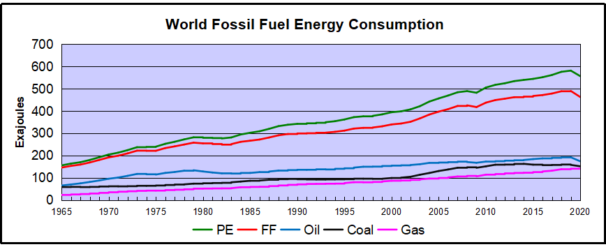
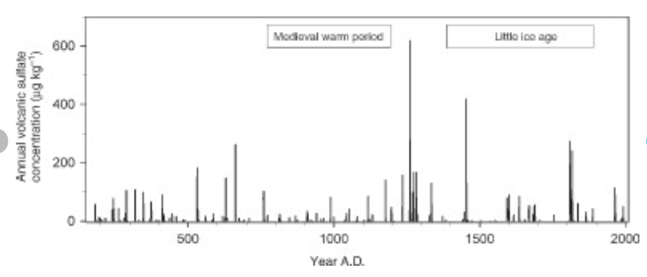
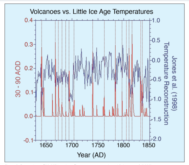
When I presented this diagram to my warmist friends, they would respond, “But you don’t know what caused the LIA or what ended it!” To which I would say, “True, but we know it wasn’t due to burning fossil fuels.” Now I find there is a body of evidence suggesting what caused the LIA and why the temperature rebound may be over. Part of it is a familiar observation that the LIA coincided with a period when the sun was lacking sunspots, the Maunder Minimum, and later the Dalton.

Not to be overlooked is the climatic role of volcano activity inducing deep cooling patterns such as the LIA.  Jihong Cole-Dai explains in a paper published 2010 entitled Volcanoes and climate. Excerpt in italics with my bolds.

There has been strong interest in the role of volcanism during the climatic episodes of Medieval Warm Period (MWP,800–1200 AD) and Little Ice Age (LIA, 1400–1900AD), when direct human influence on the climate was negligible. Several studies attempted to determine the influence of solar forcing and volcanic forcing and came to different conclusions: Crowley and colleagues suggested that increased frequency of stratospheric eruptions in the seventeenth century and again in the early nineteenth century was responsible in large part for LIA. Shindell et al. concluded that LIA is the result of reduced solar irradiance, as seen in the Maunder Minimum of sunspots, during the time period. Ice core records show that the number of large volcanic eruptions between 800 and 1100 AD is possibly small (Figure 1), when compared with the eruption frequency during LIA. Several researchers have proposed that more frequent large eruptions during the thirteenth century(Figure 1) contributed to the climatic transition from MWP to LIA, perhaps as a part of the global shift from a warmer to a colder climate regime. This suggests that the volcanic impact may be particularly significant during periods of climatic transitions.

Weighted annual average concentration of volcanic sulfate for the period of 176–2005 AD in a South Pole, Antarctica ice core (Cole-Dai, manuscript in preparation).


How volcanoes impact on the atmosphere and climate

Alan Robock explains Climatic Impacts of Volcanic Eruptions in Chapter 53 of the Encyclopedia of Volcanoes.  Excerpts in italics with my bolds.

The major component of volcanic eruptions is the matter that emerges as solid, lithic material or solidifies into large particles, which are referred to as ash or tephra. These particles fall out of the atmosphere very rapidly, on timescales of minutes to a few days, and thus have no climatic impacts but are of great interest to volcanologists, as seen in the rest of this encyclopedia. When an eruption column still laden with these hot particles descends down the slopes of a volcano, this pyroclastic flow can be deadly to those unlucky enough to be at the base of the volcano. The destruction of Pompeii and Herculaneum after the AD 79 Vesuvius eruption is the most famous example.

Volcanic eruptions typically also emit gases, with H2O, N2, and CO2 being the most abundant. Over the lifetime of the Earth, these gases have been the main source of the Earth’s atmosphere and ocean after the primitive atmosphere of hydrogen and helium was lost to space. The water has condensed into the oceans, the CO2 has been changed by plants into O2 or formed carbonates, which sink to the ocean bottom, and some of the C has turned into fossil fuels. Of course, we eat plants and animals, which eat the plants, we drink the water, and we breathe the oxygen, so each of us is made of volcanic emissions. The atmosphere is now mainly composed of N2 (78%) and O2 (21%), both of which had sources in volcanic emissions.

Of these abundant gases, both H2O and CO2 are important greenhouse gases, but their atmospheric concentrations are so large (even for CO2 at only 400 ppm in 2013) that individual eruptions have a negligible effect on their concentrations and do not directly impact the greenhouse effect. Global annually averaged emissions of CO2 from volcanic eruptions since 1750 have been at least 100 times smaller than those from human activities. Rather the most important climatic effect of explosive volcanic eruptions is through their emission of sulfur species to the stratosphere, mainly in the form of SO2, but possibly sometimes as H2S. These sulfur species react with H2O to form H2SO4 on a timescale of weeks, and the resulting sulfate aerosols produce the dominant radiative effect from volcanic eruptions.

The major effect of a volcanic eruption on the climate system is the effect of the stratospheric cloud on solar radiation (Figure 53.1). Some of the radiation is scattered back to space, increasing the planetary albedo and cooling the Earth’s atmosphere system. The sulfate aerosol particles (typical effective radius of 0.5 mm, about the same size as the wavelength of visible light) also forward scatter much of the solar radiation, reducing the direct solar beam but increasing the brightness of the sky. After the 1991 Pinatubo eruption, the sky around the sun appeared more white than blue because of this. After the El Chicho´n eruption of 1982 and the Pinatubo eruption of 1991, the direct radiation was significantly reduced, but the diffuse radiation was enhanced by almost as much. Nevertheless, the volcanic aerosol clouds reduced the total radiation received at the surface.

Crowley et al 2008 go into the details in their paper Volcanism and the Little Ice Age. Excerpts in italics with my bolds.

Although solar variability has often been considered the primary agent for LIA cooling, the most comprehensive test of this explanation (Hegerl et al., 2003) points instead to volcanism being substantially more important, explaining as much as 40% of the decadal-scale variance during the LIA. Yet, one problem that has continually plagued climate researchers is that the paleo-volcanic record, reconstructed from Antarctic and Greenland ice cores, cannot be well calibrated against the instrumental record. This is because the primary instrumental volcano reconstruction used by the climate community is that of Sato et al. (1993), which is relatively poorly constrained by observations prior to 1960 (especially in the southern hemisphere).

Here, we report on a new study that has successfully calibrated the Antarctic sulfate record of volcanism from the 1991 eruptions of Pinatubo (Philippines) and Hudson (Chile) against satellite aerosol optical depth (AOD) data (AOD is a measure of stratospheric transparency to incoming solar radiation). A total of 22 cores yield an area-weighted sulfate accumulation rate of 10.5 kg/km2 , which translates into a conversion rate for AOD of 0.011 AOD/ kg/km2 sulfate. We validated our time series by comparing a canonical growth and decay curve for eruptions for Krakatau (1883), the 1902 Caribbean eruptions (primarily Santa Maria), and the 1912 eruption of Novarupta/Katmai (Alaska)

We therefore applied the methodology to part of the LIA record that had some of the largest temperature changes over the last millennium.

Figure 2: Comparison of 30-90°N version of ice core reconstruction with Jones et al. (1998) temperature reconstruction over the interval 1630-1850. Vertical dashed lines denote levels of coincidence between eruptions and reconstructed cooling. AOD = Aerosol Optical Depth.

The ice core chronology of volcanoes is completely independent of the (primarily) tree ring based temperature reconstruction. The volcano reconstruction is deemed accurate to within 0 ± 1 years over this interval. There is a striking agreement between 16 eruptions and cooling events over the interval 1630-1850. Of particular note is the very large cooling in 1641-1642, due to the concatenation of sulfate plumes from two eruptions (one in Japan and one in the Philippines), and a string of eruptions starting in 1667 and culminating in a large tropical eruption in 1694 (tentatively attributed to Long Island, off New Guinea). This large tropical eruption (inferred from ice core sulfate peaks in both hemispheres) occurred almost exactly at the beginning of the coldest phase of the LIA in Europe and represents a strong argument against the implicit link of Late Maunder Minimum (1640-1710) cooling to solar irradiance changes.

Figure 1: Comparison of new ice core reconstruction with various instrumental-based reconstructions of stratospheric aerosol forcing. The asterisks refer to some modification to the instrumental data; for Sato et al. (1993) and the Lunar AOD, the asterisk refers to the background AOD being removed for the last 40 years. For Stothers (1996), it refers to the fact that instrumental observations for Krakatau (1883) and the 1902 Caribbean eruptions were only for the northern hemisphere. To obtain a global AOD for these estimates we used Stothers (1996) data for the northern hemisphere and our data for the southern hemisphere. The reconstruction for Agung eruption (1963) employed Stothers (1996) results from 90°N-30°S and the Antarctic ice core data for 30-90°S.

During the 18th century lull in eruptions, temperatures recovered somewhat but then cooled early in the 19th century. The sequence begins with a newly postulated unknown tropical eruption in midlate 1804, which deposited sulfate in both Greenland and Antarctica. Then, there are four well-documented eruptions—an unknown tropical eruption in 1809, Tambora (1815) and a second doublet tentatively attributed in part to Babuyan (Philippines) in 1831 and Cosiguina (Nicaragua) in 1835. These closely spaced eruptions are not only large but have a temporally extended effect on climate, due to the fact that they reoccur within the 10-year recovery timescale of the ocean mixed layer.

The ocean has not recovered from the first eruption so the second eruption drives the temperatures to an even lower state.

Implications for Contemporary Climate Science

In this context Dr. Francis Manns went looking for a volcanic signature in recent temperature records. His paper is Volcano and Enso Punctuation of North American Temperature: Regression Toward the Mean  Excerpts in italics with my bolds.

Abstract: Contrary to popular media and urban mythology the global warming we have experienced since the Little Ice Age is likely finished. A review of 10 temperature time series from US cities ranging from the hottest in Death Valley, CA, to possible the most isolated and remote at Key West, FL, show rebound from the Little Ice Age (which ended in the Alps by 1840) by 1870. The United States reached temperatures like modern temperatures (1950 – 2000) by about 1870, then declined precipitously principally caused by Krakatoa, and a series of other violent eruptions. Nine of these time series started when instrumental measurement was in its infancy and the world was cooled by volcanic dust and sulphate spewed into the atmosphere and distributed by the jet streams. These ten cities represent a sample of the millions of temperature measurements used in climate models. The average annual temperatures are useful because they account for seasonal fluctuations. In addition, time series from these cities are punctuated by El Nino Southern Oscillation (ENSO).

As should be expected, temperature at each city reacted differently to differing events. Several cities measured the effects of Krakatoa in 1883 while only Death Valley, CA and Berkeley CA sensed the minor new volcano Paricutin in Michoacán, Mexico. The Key West time series shows rapid rebound from the Little Ice Age as do Albany, NY, Harrisburg, PA, and Chicago. IL long before the petroleum-industrial revolution got into full swing. Recording at most sites started during a volcanic induced temperature minimum thus giving an impression of global warming to which industrial carbon dioxide is persuasively held responsible. Carbon dioxide, however, cannot be proven responsible for these temperatures. These and likely subsequent temperatures could be the result of regression to the normal equilibrium temperatures of the earth (for now). If one were to remove the volcanic punctuation and El Nino Southern Oscillation (ENSO) input many would display very little alarming warming from 1815 to 2000. This review illustrates the weakness of linear regression as a measure of change. If there is a systemic reason for the global warming hypothesis, it is an anthropogenic error in both origin and termination. ENSO compliments and confirms the validity of NOAA temperature data. Temperatures since 2000 during the current hiatus are not available because NOAA has closed the public website.

Example of time series from Manns. Numbers refer to major named volcano eruptions listed in his paper.  For instance, #3 was Krakatoa

The cooling effect is said to have lasted for 5 years after Krakatoa erupted – from 1883 to 1888. Examination of these charts, However, shows that, e.g., Krakatoa did not add to the cooling effect from earlier eruptions of Cosaguina in 1835 and Askja in 1875. The temperature charts all show rapid rebound to equilibrium temperature for the region affected in a year or two at most.

Manns Map

Fourteen major volcanic eruptions, however, were recorded between 1883 and 1918 (Robock, 2000, and this essay). Some erupted for days or weeks and some were cataclysmic and shorter. The sum of all these eruptions from Krakatoa onward effected temperatures early in the instrumental age. Judging from wasting glaciers in the Alps, abrupt retreat began about 1860).

Manns Conclusions:
1)Four of these time series (Albany, Harrisburg, Chicago and Key West) show recovery to the range of today’s temperatures by 1870 before the eruption of Askja in 1875. The temperature rebounded very quickly after the Little Ice Age in the northern hemisphere.

Manns ENSO Map

2)Volcanic eruptions and unrelated huge swings shown from ENSO largely rule global temperature. Volcanic history and the El Nino Southern Oscillation (ENSO) trump all other increments of temperature that may be hidden in the lists.

3)The sum of the eruptions from Krakatoa (1883) to Katla (1918) and Cerro Azul (1932) was a cold start for climate models.

4)It is beyond doubt that academic and bureau climate models use data that was gathered when volcanic activity had depressed global temperature. The cluster from Krakatoa to Katla (1883 -1918) were global.

5)Modern events, Mount Saint Helens and Pinatubo, moreover, were a fraction of the event intensity of the late 19th and early 20th centuries eruptions.

6) The demise of frequent violent volcanos has allowed the planet to regress toward a norm (for now).

The forecast above did not mention the January 15, 2022 major eruption of  Hunga Ha’apai volcano in Tonga.

Summary

These findings describe a natural process by which a series of volcanoes along with a period of quiet solar cycles ended the Medieval Warm Period (MWP), chilling the land and inducing deep oceanic cooling resulting in the Little Ice Age. With much less violent volcanic activity in the 20th century, coincidental with typically active solar cycles, a Modern Warm Period ensued with temperatures rebounding back to approximately the same as before the LIA.

This suggests that humans and the biosphere were enhanced by a warming process that has ended. The solar cycles are again going quiet and are forecast to continue that way. Presently, volcanic activity has been routine, showing no increase over the last 100 years. No one knows how long will last the current warm period, a benefit to us from the ocean recovering after the LIA. But future periods are as likely to be cooler than to be warmer compared to the present.

Ocean SSTs Down February 2022


The best context for understanding decadal temperature changes comes from the world’s sea surface temperatures (SST), for several reasons:

  • The ocean covers 71% of the globe and drives average temperatures;
  • SSTs have a constant water content, (unlike air temperatures), so give a better reading of heat content variations;
  • A major El Nino was the dominant climate feature in recent years.

HadSST is generally regarded as the best of the global SST data sets, and so the temperature story here comes from that source. Previously I used HadSST3 for these reports, but Hadley Centre has made HadSST4 the priority, and v.3 will no longer be updated.  HadSST4 is the same as v.3, except that the older data from ship water intake was re-estimated to be generally lower temperatures than shown in v.3.  The effect is that v.4 has lower average anomalies for the baseline period 1961-1990, thereby showing higher current anomalies than v.3. This analysis concerns more recent time periods and depends on very similar differentials as those from v.3 despite higher absolute anomaly values in v.4.  More on what distinguishes HadSST3 and 4 from other SST products at the end. The user guide for HadSST4 is here.

The Current Context

The 2021 year end report below showed rapid cooling in all regions.  The anomalies then continued in 2022 to remain well below the mean since 2015.  This Global Cooling was also evident in the UAH Land and Ocean air temperatures (Still No Global Warming, Cool February Land and Sea )

The chart below shows SST monthly anomalies as reported in HadSST4 starting in 2015 through February 2022.  A global cooling pattern is seen clearly in the Tropics since its peak in 2016, joined by NH and SH cycling downward since 2016. 

Note that higher temps in 2015 and 2016 were first of all due to a sharp rise in Tropical SST, beginning in March 2015, peaking in January 2016, and steadily declining back below its beginning level. Secondly, the Northern Hemisphere added three bumps on the shoulders of Tropical warming, with peaks in August of each year.  A fourth NH bump was lower and peaked in September 2018.  As noted above, a fifth peak in August 2019 and a sixth August 2020 exceeded the four previous upward bumps in NH.

After three straight Spring 2020 months of cooling led by the tropics and SH, NH spiked in the summer, along with smaller bumps elsewhere.  Then temps everywhere dropped for six months, hitting bottom in February 2021.  All regions were well below the Global Mean since 2015, matching the cold of 2018, and lower than January 2015. Then the spring and summer brought more temperate waters and a July return to the mean anomaly since 2015.  After an upward bump in August, the 2021 yearend Global temp anomaly dropped below the mean, driven by sharp declines in the Tropics and NH. Now in 2022 all regions remain cool and the Global anomaly remain lower than the mean for this period.


A longer view of SSTs

To enlarge image double-click or open in new tab.

The graph above is noisy, but the density is needed to see the seasonal patterns in the oceanic fluctuations.  Previous posts focused on the rise and fall of the last El Nino starting in 2015.  This post adds a longer view, encompassing the significant 1998 El Nino and since.  The color schemes are retained for Global, Tropics, NH and SH anomalies.  Despite the longer time frame, I have kept the monthly data (rather than yearly averages) because of interesting shifts between January and July.1995 is a reasonable (ENSO neutral) starting point prior to the first El Nino.  The sharp Tropical rise peaking in 1998 is dominant in the record, starting Jan. ’97 to pull up SSTs uniformly before returning to the same level Jan. ’99.  For the next 2 years, the Tropics stayed down, and the world’s oceans held steady around 0.5C above 1961 to 1990 average.

Then comes a steady rise over two years to a lesser peak Jan. 2003, but again uniformly pulling all oceans up around 0.5C.  Something changes at this point, with more hemispheric divergence than before. Over the 4 years until Jan 2007, the Tropics go through ups and downs, NH a series of ups and SH mostly downs.  As a result the Global average fluctuates around that same 0.5C, which also turns out to be the average for the entire record since 1995.

2007 stands out with a sharp drop in temperatures so that Jan.08 matches the low in Jan. ’99, but starting from a lower high. The oceans all decline as well, until temps build peaking in 2010.

Now again a different pattern appears.  The Tropics cool sharply to Jan 11, then rise steadily for 4 years to Jan 15, at which point the most recent major El Nino takes off.  But this time in contrast to ’97-’99, the Northern Hemisphere produces peaks every summer pulling up the Global average.  In fact, these NH peaks appear every July starting in 2003, growing stronger to produce 3 massive highs in 2014, 15 and 16.  NH July 2017 was only slightly lower, and a fifth NH peak still lower in Sept. 2018.

The highest summer NH peaks came in 2019 and 2020, only this time the Tropics and SH are offsetting rather adding to the warming. (Note: these are high anomalies on top of the highest absolute temps in the NH.)  Since 2014 SH has played a moderating role, offsetting the NH warming pulses. After September 2020 temps dropped off down until February 2021, then all regions rose to bring the global anomaly above the mean since 1995  June 2021 backed down before warming again slightly in July and August 2021, then cooling slightly in September.  The present level compares with 2014.

What to make of all this? The patterns suggest that in addition to El Ninos in the Pacific driving the Tropic SSTs, something else is going on in the NH.  The obvious culprit is the North Atlantic, since I have seen this sort of pulsing before.  After reading some papers by David Dilley, I confirmed his observation of Atlantic pulses into the Arctic every 8 to 10 years.

But the peaks coming nearly every summer in HadSST require a different picture.  Let’s look at August, the hottest month in the North Atlantic from the Kaplan dataset.

The AMO Index is from from Kaplan SST v2, the unaltered and not detrended dataset. By definition, the data are monthly average SSTs interpolated to a 5×5 grid over the North Atlantic basically 0 to 70N. The graph shows August warming began after 1992 up to 1998, with a series of matching years since, including 2020, dropping down in 2021.  Because the N. Atlantic has partnered with the Pacific ENSO recently, let’s take a closer look at some AMO years in the last 2 decades.


This graph shows monthly AMO temps for some important years. The Peak years were 1998, 2010 and 2016, with the latter emphasized as the most recent. The other years show lesser warming, with 2007 emphasized as the coolest in the last 20 years. Note the red 2018 line is at the bottom of all these tracks. The heavy blue line shows that 2022 started warm, and now is in the middle of the tracks.

Summary

The oceans are driving the warming this century.  SSTs took a step up with the 1998 El Nino and have stayed there with help from the North Atlantic, and more recently the Pacific northern “Blob.”  The ocean surfaces are releasing a lot of energy, warming the air, but eventually will have a cooling effect.  The decline after 1937 was rapid by comparison, so one wonders: How long can the oceans keep this up? If the pattern of recent years continues, NH SST anomalies may rise slightly in coming months, but once again, ENSO which has weakened will probably determine the outcome.

Footnote: Why Rely on HadSST4

HadSST is distinguished from other SST products because HadCRU (Hadley Climatic Research Unit) does not engage in SST interpolation, i.e. infilling estimated anomalies into grid cells lacking sufficient sampling in a given month. From reading the documentation and from queries to Met Office, this is their procedure.

HadSST4 imports data from gridcells containing ocean, excluding land cells. From past records, they have calculated daily and monthly average readings for each grid cell for the period 1961 to 1990. Those temperatures form the baseline from which anomalies are calculated.

In a given month, each gridcell with sufficient sampling is averaged for the month and then the baseline value for that cell and that month is subtracted, resulting in the monthly anomaly for that cell. All cells with monthly anomalies are averaged to produce global, hemispheric and tropical anomalies for the month, based on the cells in those locations. For example, Tropics averages include ocean grid cells lying between latitudes 20N and 20S.

Gridcells lacking sufficient sampling that month are left out of the averaging, and the uncertainty from such missing data is estimated. IMO that is more reasonable than inventing data to infill. And it seems that the Global Drifter Array displayed in the top image is providing more uniform coverage of the oceans than in the past.

uss-pearl-harbor-deploys-global-drifter-buoys-in-pacific-ocean

USS Pearl Harbor deploys Global Drifter Buoys in Pacific Ocean


Climate Change Chumps 2022

Definition “chump”: A foolish or easily deceived person.

Update March 21, 2022

In this overheated time of school kids in the streets and elected “adults” declaring emergencies without any understanding of what is or is not happening, it may help to know how we got here.

Why are so many people taken in by climate alarms? The question is often on my mind, especially when tens of thousands attend UN conferences like Glasgow, or when hearing the caterwauling in the media over the climate scare of the week. Recently while watching a football game, my escape from the issue was interrupted by a commercial break that included a flaming earth on the screen for a few seconds. It was an ad for Discovery Channel including the image above.

[Old joke:  I don’t know if they are using subliminal advertising, but yesterday I went and bought a tractor.]

And in a flash I realized how several factors are driving warming suckers into a fearful frenzy.

Firstly, The power of images over words and thinking.
A picture is worth a thousand words. (Sometimes attributed to Chinese)


The Asian attribution is doubtful, but Confucius did say something similar:

Second, We are immersed in imaging technology, entrancing the public. I have no interest in post modern philosophers, but in this sense they are onto something perverse: We are mistaking images for realities.

Third, Pied Pipers are using the media to put us under their spell.
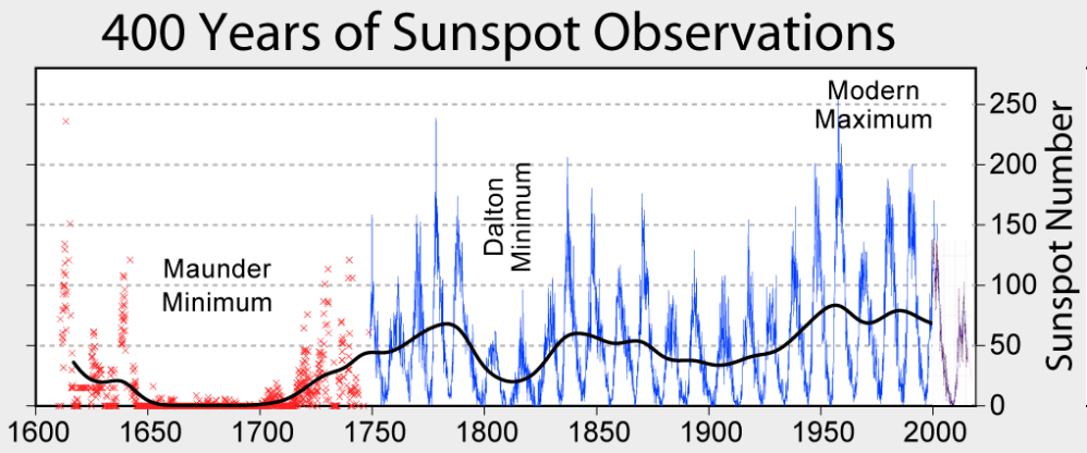
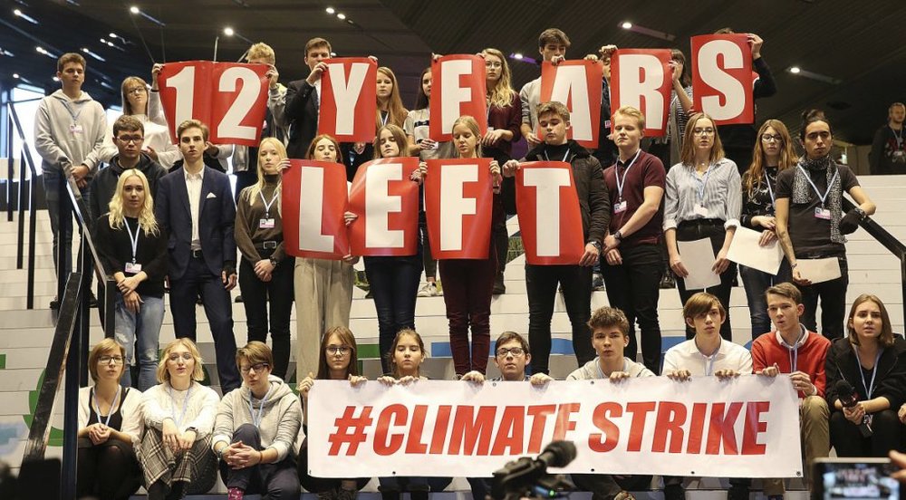
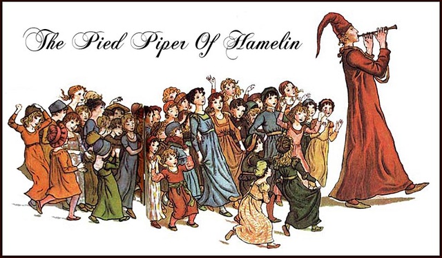
A key point in the fable is the piper’s ability to put a spell on the children, and thereby rob the village of their future.  And he did this to get leverage over the council when they refused to pay for exterminating the rats. Our children have been brainwashed with environmental activism since preschool, and educators have taken Confucius to heart:  The process goes beyond preaching, to videos, posters and projects.

Fourth, Our embrace of mass and social media makes us suckers for fake news, including climate claims.

Note that the majority are not confident to discern fake from real news.  Even worse, today’s “fact checkers” operate out of spin rooms.

Fifth, Social proof is now all that matters.

Climate lemmings rushing over the cliff.

Finally, the drumbeat of climate alarms imprints ever more deeply a false assumption.

It doesn’t matter if any particular climate claim is false or exaggerated, the communications continuously reinforce the underlying myth of the Garden of Eden:  Nature is perfect and eternal so long as humans don’t mess it up.

The reality is more subtle and complex.  Humans are also a force of nature, and with our self-awareness we have the ability and responsibility to add order and purpose to the rest of nature.  Go to Kyoto and watch the landscapers labor for hours to fashion an exquisite Japanese garden, the fruition of collaboration between humans, plants, water and rocks.  Humans can and do improve on nature by taming destructive natural forces to preserve and enhance living structures.

The UN IPCC process is a blind alley, a path to nowhere.  It plays upon fears and guilt feelings.  Worse, it distracts from rational programs of actual environmental stewardship.  I fear it will only get worse in the next 12  10  8 years:

See also Brits Run Con Game at Glasgow COP

Doomsday was predicted but failed to happen at midnight.

Temps Cause CO2 Changes, Not the Reverse. 2022 Update

Update March 23, 2022 

For a possible explanation of natural warming and CO2 emissions see Little Ice Age Warming Recovery May be Over

This post is about proving that CO2 changes in response to temperature changes, not the other way around, as is often claimed.  In order to do  that we need two datasets: one for measurements of changes in atmospheric CO2 concentrations over time and one for estimates of Global Mean Temperature changes over time.

Climate science is unsettling because past data are not fixed, but change later on.  I ran into this previously and now again in 2021 and 2022 when I set out to update an analysis done in 2014 by Jeremy Shiers (discussed in a previous post reprinted at the end).  Jeremy provided a spreadsheet in his essay Murray Salby Showed CO2 Follows Temperature Now You Can Too posted in January 2014. I downloaded his spreadsheet intending to bring the analysis up to the present to see if the results hold up.  The two sources of data were:

Temperature anomalies from RSS here:  http://www.remss.com/missions/amsu

CO2 monthly levels from NOAA (Mauna Loa): https://www.esrl.noaa.gov/gmd/ccgg/trends/data.html

Changes in CO2 (ΔCO2)

Uploading the CO2 dataset showed that many numbers had changed (why?).

The blue line shows annual observed differences in monthly values year over year, e.g. June 2020 minus June 2019 etc.  The first 12 months (1979) provide the observed starting values from which differentials are calculated.  The orange line shows those CO2 values changed slightly in the 2020 dataset vs. the 2014 dataset, on average +0.035 ppm.  But there is no pattern or trend added, and deviations vary randomly between + and -.  So last year I took the 2020 dataset to replace the older one for updating the analysis.

Now I find the NOAA dataset in 2021 has almost completely new values due to a method shift in February 2021, requiring a recalibration of all previous measurements.  The new picture of ΔCO2 is graphed below.

The method shift is reported at a NOAA Global Monitoring Laboratory webpage, Carbon Dioxide (CO2) WMO Scale, with a justification for the difference between X2007 results and the new results from X2019 now in force.  The orange line shows that the shift has resulted in higher values, especially early on and a general slightly increasing trend over time.  However, these are small variations at the decimal level on values 340 and above.  Further, the graph shows that yearly differentials month by month are virtually the same as before.  Thus I redid the analysis with the new values.

Global Temperature Anomalies (ΔTemp)

The other time series was the record of global temperature anomalies according to RSS. The current RSS dataset is not at all the same as the past.

Here we see some seriously unsettling science at work.  The purple line is RSS in 2014, and the blue is RSS as of 2020.  Some further increases appear in the gold 2022 rss dataset. The red line shows alterations from the old to the new.  There is a slight cooling of the data in the beginning years, then the three versions mostly match until 1997, when systematic warming enters the record.  From 1997/5 to 2003/12 the average anomaly increases by 0.04C.  After 2004/1 to 2012/8 the average increase is 0.15C.  At the end from 2012/9 to 2013/12, the average anomaly was higher by 0.21. The 2022 version added slight warming over 2020 values.

RSS continues that accelerated warming to the present, but it cannot be trusted.  And who knows what the numbers will be a few years down the line?  As Dr. Ole Humlum said some years ago (regarding Gistemp): “It should however be noted, that a temperature record which keeps on changing the past hardly can qualify as being correct.”

Given the above manipulations, I went instead to the other satellite dataset UAH version 6. UAH has also made a shift by changing its baseline from 1981-2010 to 1991-2020.  This resulted in systematically reducing the anomaly values, but did not alter the pattern of variation over time.  For comparison, here are the two records with measurements through February 2022.

CO2 observed and Global Temperatures observed up to 2022.

Comparing UAH temperature anomalies to NOAA CO2 changes.

Here are UAH temperature anomalies compared to CO2 monthly changes year over year.

Changes in monthly CO2 synchronize with temperature fluctuations, which for UAH are anomalies now referenced to the 1991-2020 period.  As stated above, CO2 differentials are calculated for the present month by subtracting the value for the same month in the previous year (for example June 2021 minus June 2020).   Temp anomalies are calculated by comparing the present month with the baseline month.

The final proof that CO2 follows temperature due to stimulation of natural CO2 reservoirs is demonstrated by the ability to calculate CO2 levels since 1979 with a simple mathematical formula:

For each subsequent year, the co2 level for each month was generated

CO2  this month this year = a + b × Temp this month this year  + CO2 this month last year

Jeremy used Python to estimate a and b, but I used his spreadsheet to guess values that place for comparison the observed and calculated CO2 levels on top of each other.

In the chart calculated CO2 levels correlate with observed CO2 levels at 0.9979 out of 1.0000.  This mathematical generation of CO2 atmospheric levels is only possible if they are driven by temperature-dependent natural sources, and not by human emissions which are small in comparison, rise steadily and monotonically.

Previous Post:  What Causes Rising Atmospheric CO2?

nasa_carbon_cycle_2008-1

This post is prompted by a recent exchange with those reasserting the “consensus” view attributing all additional atmospheric CO2 to humans burning fossil fuels.

The IPCC doctrine which has long been promoted goes as follows. We have a number over here for monthly fossil fuel CO2 emissions, and a number over there for monthly atmospheric CO2. We don’t have good numbers for the rest of it-oceans, soils, biosphere–though rough estimates are orders of magnitude higher, dwarfing human CO2.  So we ignore nature and assume it is always a sink, explaining the difference between the two numbers we do have. Easy peasy, science settled.

What about the fact that nature continues to absorb about half of human emissions, even while FF CO2 increased by 60% over the last 2 decades? What about the fact that in 2020 FF CO2 declined significantly with no discernable impact on rising atmospheric CO2?

These and other issues are raised by Murray Salby and others who conclude that it is not that simple, and the science is not settled. And so these dissenters must be cancelled lest the narrative be weakened.

The non-IPCC paradigm is that atmospheric CO2 levels are a function of two very different fluxes. FF CO2 changes rapidly and increases steadily, while Natural CO2 changes slowly over time, and fluctuates up and down from temperature changes. The implications are that human CO2 is a simple addition, while natural CO2 comes from the integral of previous fluctuations.  Jeremy Shiers has a series of posts at his blog clarifying this paradigm. See Increasing CO2 Raises Global Temperature Or Does Increasing Temperature Raise CO2 Excerpts in italics with my bolds.

The following graph which shows the change in CO2 levels (rather than the levels directly) makes this much clearer.

Note the vertical scale refers to the first differential of the CO2 level not the level itself. The graph depicts that change rate in ppm per year.

There are big swings in the amount of CO2 emitted. Taking the mean as 1.6 ppmv/year (at a guess) there are +/- swings of around 1.2 nearly +/- 100%.

And, surprise surprise, the change in net emissions of CO2 is very strongly correlated with changes in global temperature.

This clearly indicates the net amount of CO2 emitted in any one year is directly linked to global mean temperature in that year.

For any given year the amount of CO2 in the atmosphere will be the sum of

  • all the net annual emissions of CO2
  • in all previous years.

For each year the net annual emission of CO2 is proportional to the annual global mean temperature.

This means the amount of CO2 in the atmosphere will be related to the sum of temperatures in previous years.

So CO2 levels are not directly related to the current temperature but the integral of temperature over previous years.

The following graph again shows observed levels of CO2 and global temperatures but also has calculated levels of CO2 based on sum of previous years temperatures (dotted blue line).

Summary:

The massive fluxes from natural sources dominate the flow of CO2 through the atmosphere.  Human CO2 from burning fossil fuels is around 4% of the annual addition from all sources. Even if rising CO2 could cause rising temperatures (no evidence, only claims), reducing our emissions would have little impact.

Resources:

CO2 Fluxes, Sources and Sinks

Who to Blame for Rising CO2?

Fearless Physics from Dr. Salby

In this video presentation, Dr. Salby provides the evidence, math and charts supporting the non-IPCC paradigm.

Footnote:  As CO2 concentrations rose, BP shows Fossil Fuel consumption slumped in 2020

See also 2021 Update: Fossil Fuels ≠ Global Warming