NOAA Loses 1M km2 of Arctic Ice in July

Arctic2021185

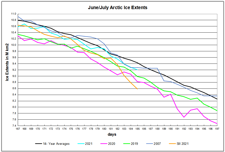
NOAA’s Sea Ice Index (shown in orange above) dramatically lost 1M km2 of Arctic sea ice extent in just the last four days.  Meanwhile MASIE from the National Ice Center (NIC) (cyan color) declined much less, ~400k km2, a more typical decline since the two datasets were nearly the same on June 30, 2021.  Note that extreme drops in ice extents can happen in July, as seen last year (purple line after day 190), so the issue bears watching. There is history of satellite difficulties discriminating between open water and surface melt water during both the melting and refreezing seasons.  A background post below explains differences between the two datasets.

Background from previous post Support MASIE Arctic Ice Dataset

MASIE: “high-resolution, accurate charts of ice conditions”
Walt Meier, NSIDC, October 2015 article in Annals of Glaciology.

Update February 4, 2017 Below

The home page for MASIE (here) invites visitors to show their interest in the dataset and analysis tools since continued funding is not assured. The page says:
NSIDC has received support to develop MASIE but not to maintain MASIE. We are actively seeking support to maintain the Web site and products over the long term. If you find MASIE helpful, please let us know with a quick message to NSIDC User Services.

For the reasons below, I hope people will go there and express their support.

1. MASIE is Rigorous.

Note on Sea Ice Resolution:

Northern Hemisphere Spatial Coverage

Sea Ice Index (SII) from NOAA is based on 25 km cells and 15% ice coverage. That means if a grid cell 25X25, or 625 km2 is estimated to have at least 15% ice, then 625 km2 is added to the total extent. In the mapping details, grid cells vary between 382 to 664 km2 with latitudes.  And the satellites’ Field of View (FOV) is actually an ellipsoid ranging from 486 to 3330 km2 depending on the channel and frequency.  More info is here.

MASIE is based on 4 km cells and 40% ice coverage. Thus, for MASIE estimates, if a grid cell is deemed to have at least 40% ice, then 16 km2 is added to the total extent.

The significantly higher resolution in MASIE means that any error in detecting ice cover at the threshold level affects only 16 km2 in the MASIE total, compared to at least 600 km2 variation in SII.  A few dozen SII cells falling below the 15% threshold is reported as a sizable loss of ice in the Arctic.

2. MASIE is Reliable.

2017029google

MASIE is an operational ice product developed from multiple sources to provide the most accurate possible description of Arctic ice for the sake of ships operating in the region.

Operational analyses combine a variety of remote-sensing inputs and other sources via manual integration to create high-resolution, accurate charts of ice conditions in support of navigation and operational forecast models. One such product is the daily Multisensor Analyzed Sea Ice Extent (MASIE). The higher spatial resolution along with multiple input data and manual analysis potentially provide more precise mapping of the ice edge than passive microwave estimates.  From Meier et al., link below.

Some people have latched onto a line from the NSIDC background page:
Use the Sea Ice Index when comparing trends in sea ice over time or when consistency is important. Even then, the monthly, not the daily, Sea Ice Index views should be used to look at trends in sea ice. The Sea Ice Index documentation explains how linear regression is used to say something about trends in ice extent, and what the limitations of that method are. Use MASIE when you want the most accurate view possible of Arctic-wide ice on a given day or through the week.

That statement was not updated to reflect recent developments:
“In June 2014, we decided to make the MASIE product available back to 2006. This was done in response to user requests, and because the IMS product output, upon which MASIE is based, appeared to be reasonably consistent.”

The fact that MASIE employs human judgment is discomforting to climatologists as a potential source of error, so Meier and others prefer that the analysis be done by computer algorithms. Yet, as we shall see, the computer programs are themselves human inventions and when applied uncritically by machines produce errors of their own.

3. MASIE serves as Calibration for satellite products.

The NSIDC Background cites as support a study by Partington et al (2003).  Reading that study, one finds that the authors preferred the MASIE data and said this:

“Passive microwave sensors from the U.S. Defense Meteorological Satellite Program have long provided a key source of information on Arctic-wide sea ice conditions, but suffer from some known deficiencies, notably a tendency to underestimate ice concentrations in summer. With the recent release of digital and quality controlled ice charts extending back to 1972 from the U.S. National Ice Center (NIC), there is now an alternative record of late twentieth century Northern Hemisphere sea ice conditions to compare with the valuable, but imperfect, passive microwave sea ice record.”

“This analysis has been based on ice chart data rather than the more commonly analyzed passive microwave derived ice concentrations. Differences between the NIC ice chart sea ice record and the passive microwave sea ice record are highly significant despite the fact that the NIC charts are semi-dependent on the passive microwave data, and it is worth noting these differences. . .In summer, the difference between the two sources of data rises to a maximum of 23% peaking in early August, equivalent to ice coverage the size of Greenland. (my bold)  For clarity: the ice chart data show higher extents than passive microwave data.

The differences are even greater for Canadian regions.

“More than 1380 regional Canadian weekly sea-ice charts for four Canadian regions and 839 hemispheric U.S. weekly sea-ice charts from 1979 to 1996 are compared with passive microwave sea-ice concentration estimates using the National Aeronautics and Space Administration (NASA) Team algorithm. Compared with the Canadian regional ice charts, the NASA Team algorithm underestimates the total ice-covered area by 20.4% to 33.5% during ice melt in the summer and by 7.6% to 43.5% during ice growth in the late fall.”

From: The Use of Operational Ice Charts for Evaluating Passive Microwave Ice Concentration Data, Agnew and Howell  http://www.tandfonline.com/doi/pdf/10.3137/ao.410405

More recently Walter Meier, who is in charge of SII, and several colleagues compared SII and MASIE and published their findings October 2015 (here).  The purpose of the analysis was stated thus:
Our comparison is not meant to be an extensive validation of either product, but to illustrate as guidance for future use how the two products behave in different regimes.

The abstract concludes:
Comparisons indicate that MASIE shows higher Arctic-wide extent values throughout most of the year, largely because of the limitations of passive microwave sensors in some conditions (e.g. surface melt). However, during some parts of the year, MASIE tends to indicate less ice than estimated by passive microwave sensors. These comparisons yield a better understanding of operational and research sea-ice data products; this in turn has important implications for their use in climate and weather models.

A more extensive comparison of MASIE from NIC and SII from NOAA is here.

4. MASIE continues a long history of Arctic Ice Charts.

Naval authorities have for centuries prepared ice charts for the safety of ships operating in the Arctic.  There are Russian, Danish, Norwegian, and Canadian charts, in addition to MASIE, the US version.  These estimates rely on multiple sources of data, including the NASA reports.  Charts are made with no climate ax to grind, only to get accurate locations and extents of Arctic ice each day.

Figure 16-3: Time series of April sea-ice extent in Nordic Sea (1864-1998) given by 2-year running mean and second-order polynomial curves. Top: Nordic Sea; middle: eastern area; bottom: western area (after Vinje, 2000). IPCC Third Assessment Report

Figure 16-3: Time series of April sea-ice extent in Nordic Sea (1864-1998) given by 2-year running mean and second-order polynomial curves. Top: Nordic Sea; middle: eastern area; bottom: western area (after Vinje, 2000). IPCC Third Assessment Report

Since these long-term records show a quasi-60 year cycle in ice extents, it is vital to have a modern dataset based on the same methodology, albeit with sophisticated modern tools.

Summary

Measuring anything in the Arctic is difficult, and especially sea ice that is constantly moving around.  It is a good thing to have independent measures using different methodologies, since any estimate is prone to error.

Please take the time to express your appreciation for NIC’s contribution and your support for their products at MASIE  home page.

Update February 4, 2017

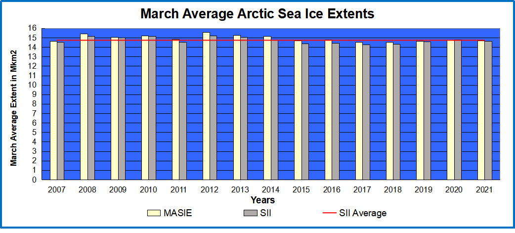
In the comments Neven said MASIE was unusable because it was biased low before 2010 and high afterward.  I have looked into that and he is mistaken.  Below is the pattern that is observed most months.  March is the annual maximum and coming up soon.

march-masie-sii

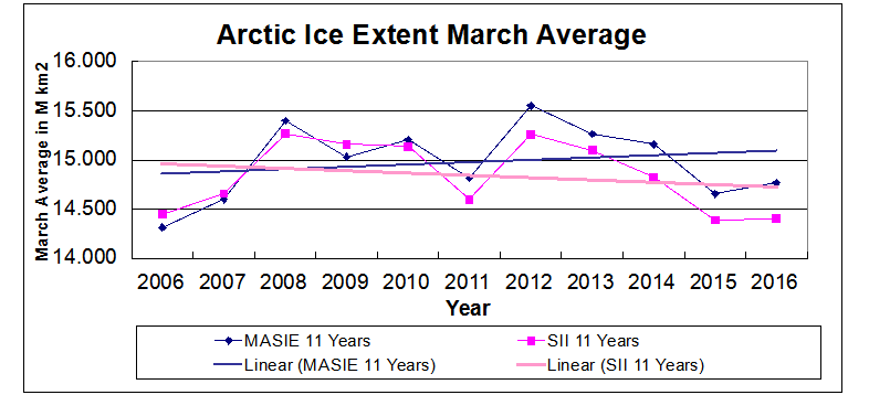
As the graph shows, the two datasets were aligned through 2010, and then SII began underestimating ice extent, resulting in a negative 11-year trend.  MASIE shows the same fluctuations, but with higher extents and a slightly positive trend for March extents.  The satellite sensors have a hard time with mixed ice/water conditions (well-documented).

More on the two datasets NOAA has been Losing Arctic Ice

Typical Arctic Ice Extents in June


Arctic2021181

Previous posts reported that Arctic Sea Ice has persisted this year despite a wavy Polar Vortex this spring, bringing cold down to mid-latitudes, and warming air into Arctic regions.  Then in May and now again in June,  the sea ice extent matched or exceeded the 14-year average several times during the month, tracking alongside until month end.  Surprisingly  SII (Sea Ice Index) showed much more ice the first week, similar extents mid- June, and then SII lost ice more rapidly the final week.  Yesterday both SII and MASIE day 181 were close to the same day in 2007.

Note that on the 14-year average, June loses ~2M km2 of ice extent, which 2021 matched, as did 2007.  Both 2020 and 2019 finished lower than average, by 500k and 400k respectively.  

Why is this important?  All the claims of global climate emergency depend on dangerously higher temperatures, lower sea ice, and rising sea levels.  The lack of additional warming is documented in a post Adios, Global Warming

The lack of acceleration in sea levels along coastlines has been discussed also.  See USCS Warnings of Coastal Floodings

Also, a longer term perspective is informative:

post-glacial_sea_level
The table below shows the distribution of Sea Ice across the Arctic Regions, on average, this year and 2007.

Region 2021181 Day 181 Average 2021-Ave. 2007181 2021-2007
 (0) Northern_Hemisphere 9644967 9741628  -96661  9672969 -28002 
 (1) Beaufort_Sea 999085 905769  93316  939209 59876 
 (2) Chukchi_Sea 760235 715065  45170  670088 90146 
 (3) East_Siberian_Sea 924474 1010406  -85932  901963 22511 
 (4) Laptev_Sea 578894 703006  -124112  658742 -79848 
 (5) Kara_Sea 527080 545919  -18839  657478 -130398 
 (6) Barents_Sea 129619 123601  6018  130101 -482 
 (7) Greenland_Sea 461815 501479  -39664  548399 -86584 
 (8) Baffin_Bay_Gulf_of_St._Lawrence 497237 504688  -7451  450461 46777 
 (9) Canadian_Archipelago 761843 778224  -16381  773611 -11768 
 (10) Hudson_Bay 736119 728550  7569  718441 17678 
 (11) Central_Arctic 3239262 3205301  33960  3218999 20262 
 (12) Bering_Sea 15316 4566  10750  981 14336 
 (13) Baltic_Sea 0 3 -3  0
 (14) Sea_of_Okhotsk 12919 13765  -847  2983 9936 

The overall deficit to average happened yesterday, being an extent 1% lower, and one day earlier than average.  The largest deficits to average are in East Siberian and Laptev Seas, along with Greenland Sea.  These are partly offset by surpluses elsewhere, mostly in Beaufort, Chukchi, and Central Artic seas.


June Arctic Ice Returns to Mean


Arctic2021159

A previous post reported that Arctic Sea Ice has persisted this year despite a wavy Polar Vortex this spring, bringing cold down to mid-latitudes, and warming air into Arctic regions.  Now in June, after tracking in deficit the sea ice extent is matching the 14-year average on day 159.  Note that SII (Sea Ice Index) since mid-May has been showing 200 to 400k km2 more ice than MASIE, and currently the two datasets have converged on a value of ~11.25 M km2.

Note that on the 14-year average, during this period ~1.7M km2 of ice extent is lost, which 2021 is matching, as did 2007.  Both 2020 and 2019 were much lower than average at this date, by ~600k and ~700k respectively.  

Why is this important?  All the claims of global climate emergency depend on dangerously higher temperatures, lower sea ice, and rising sea levels.  The lack of additional warming is documented in a post Adios, Global Warming

The lack of acceleration in sea levels along coastlines has been discussed also.  See USCS Warnings of Coastal Floodings

Also, a longer term perspective is informative:

post-glacial_sea_level
The table below shows the distribution of Sea Ice across the Arctic Regions, on average, this year and 2007.

Region 2021159 Day 159 Average 2021-Ave. 2007159 2021-2007
 (0) Northern_Hemisphere 11240999 11259536  -18538  11316498 -75500 
 (1) Beaufort_Sea 1019264 964689  54575  1000434 18830 
 (2) Chukchi_Sea 849650 820007  29642  828275 21375 
 (3) East_Siberian_Sea 1018939 1060847  -41907  1065467 -46528 
 (4) Laptev_Sea 719152 797804  -78652  750975 -31824 
 (5) Kara_Sea 786077 768820  17257  805583 -19506 
 (6) Barents_Sea 253238 260182  -6944  312729 -59491 
 (7) Greenland_Sea 664297 581528  82769  579724 84573 
 (8) Baffin_Bay_Gulf_of_St._Lawrence 755645 803058  -47412  811860 -56215 
 (9) Canadian_Archipelago 802846 802905  -60  783908 18938 
 (10) Hudson_Bay 1022997 1058859  -35862  1027039 -4042 
 (11) Central_Arctic 3233401 3215315  18085  3235047 -1646 
 (12) Bering_Sea 59415 70145  -10729  62751 -3336 
 (13) Baltic_Sea 0 8 -8  0
 (14) Sea_of_Okhotsk 54471 53989  482  51031 3440 

The main deficits are in Laptev and East Siberian Seas, Baffin and Hudson Bays, offset by surpluses in Beaufort, Chukchi and Greenland Seas.


Ordinary Arctic Ice Extents in May

Arctic2021151

A previous post reported that Arctic Sea Ice has persisted this year despite a wavy Polar Vortex this spring, bringing cold down to mid-latitudes, and warming air into Arctic regions.  Now in May, the sea ice extent matched the 14-year average on day 144, tracking alongside until month end.  Surprisingly  SII (Sea Ice Index) is showing ~400k km2 more ice, which is also ~70k km2 higher than the 14-year average for SII on day 151 (not shown in chart).

Note that on the 14-year average, May loses ~2M km2 of ice extent, which 2021 matched, as did 2007.  Both 2020 and 2019 finished lower than average, by 300k and 400k respectively.  In contrast SII shows a May loss of only 1.3M km2.

Why is this important?  All the claims of global climate emergency depend on dangerously higher temperatures, lower sea ice, and rising sea levels.  The lack of additional warming is documented in a post Adios, Global Warming

The lack of acceleration in sea levels along coastlines has been discussed also.  See USCS Warnings of Coastal Floodings

Also, a longer term perspective is informative:

post-glacial_sea_level
The table below shows the distribution of Sea Ice across the Arctic Regions, on average, this year and 2007.

Region 2021151 Day 151 Average 2021-Ave. 2007151 2021-2007
 (0) Northern_Hemisphere 11605537 11733260  -127723  11846659 -241122 
 (1) Beaufort_Sea 1034779 992955  41825  1059461 -24682 
 (2) Chukchi_Sea 900868 861978  38891  894617 6251 
 (3) East_Siberian_Sea 1051959 1065828  -13869  1069198 -17239 
 (4) Laptev_Sea 738294 831217  -92923  754651 -16357 
 (5) Kara_Sea 824068 831440  -7373  895678 -71610 
 (6) Barents_Sea 325745 322981  2765  323801 1944 
 (7) Greenland_Sea 615174 567365  47810  591919 23255 
 (8) Baffin_Bay_Gulf_of_St._Lawrence 812548 908759  -96211  934257 -121709 
 (9) Canadian_Archipelago 811040 811378  -338  818055 -7015 
 (10) Hudson_Bay 1084892 1098368  -13476  1077744 7148 
 (11) Central_Arctic 3232324 3219180  13144  3230109 2215 
 (12) Bering_Sea 89124 122512  -33388  112353 -23228 
 (13) Baltic_Sea 0 161 -161  0
 (14) Sea_of_Okhotsk 83572 97612  -14040  83076 495 

The overall deficit to average happened yesterday, being an extent 1% lower, and two days earlier than average.  The largest deficits to average are in Baffin Bay and Laptev Sea, along with Bering and Okhotsk.  These are partly offset by surpluses elsewhere, mostly in Beaufort, Chukchi, and Greenland Seas.


May 24, 2021 Arctic Ice Matches Average

Arctic2021144

A previous post reported that Arctic Sea Ice has persisted this year despite a wavy Polar Vortex this spring, bringing cold down to mid-latitudes, and warming air into Arctic regions.  Now in May, the sea ice extent matches the 14-year average.  In the chart above, MASIE has caught up to its average, while SII (Sea Ice Index) is showing 300k km2 more ice.  This is also 200k km2 higher than the 14-year average for SII on day 144 (not shown in chart).

Why is this important?  All the claims of global climate emergency depend on dangerously higher temperatures, lower sea ice, and rising sea levels.  The lack of additional warming is documented in a post Adios, Global Warming

The lack of acceleration in sea levels along coastlines has been discussed also.  See USCS Warnings of Coastal Floodings

Also, a longer term perspective is informative:

post-glacial_sea_level
The table below shows the distribution of Sea Ice across the Arctic Regions, on average, this year and 2007.

Region 2021144 Day 144 Average 2021-Ave. 2007144 2021-2007
 (0) Northern_Hemisphere 12146819 12145771  1048  12035185 111634 
 (1) Beaufort_Sea 1014946 1014623  323  1063324 -48378 
 (2) Chukchi_Sea 926443 884593  41850  925212 1232 
 (3) East_Siberian_Sea 1074468 1068410  6057  1061115 13353 
 (4) Laptev_Sea 847289 862328  -15040  797581 49708 
 (5) Kara_Sea 850992 857488  -6495  898743 -47750 
 (6) Barents_Sea 414971 371726  43245  302721 112250 
 (7) Greenland_Sea 621173 588159  33015  573583 47591 
 (8) Baffin_Bay_Gulf_of_St._Lawrence 861138 985037  -123899  962331 -101193 
 (9) Canadian_Archipelago 836025 824730  11295  828387 7638 
 (10) Hudson_Bay 1109942 1135136  -25194  1091181 18761 
 (11) Central_Arctic 3241735 3223613  18121  3231990 9744 
 (12) Bering_Sea 212840 196725  16115  190680 22160 
 (13) Baltic_Sea 0 1039 -1039  619 -619 
 (14) Sea_of_Okhotsk 133703 130236  3467  105796 27907 

The largest deficit to average is in Baffin Bay, with Laptev and Hudson Bay also starting to melt.  These are offset by surpluses elsewhere, mostly in Chukchi, Barents, and Greenland Sea.


Mid May 2021 Persistent Arctic Ice

ArcDay135 2007 to 2021


Typically in climate observations, averages are referenced without paying attention to the high degree of component variability from year to year, and over longer time periods.  Mid May is when the Spring melt is well underway, but with the Arctic core still frozen solid.  Yet the animation above shows on day 135 over the last 15 years, there are considerable differences as to how much ice is in which regions. 

On the bottom left is Bering Sea which had ice extents on this day ranging from a high of 682k km2 (2012) to a low of 38k km2 (2018).  The day 135 average for Bering is 293k km2, but with a standard deviation of 192k (65%).  Okhotsk center left is the next most variable, from 290k (2012) to 99k (2019), averaging 188k with std. deviation of 63K (33%).  Barents Sea center top has a large variability from 568k km2 (2009) to 223k (2012), averaging 422k km2 +/- 111 k km2.  Other Arctic regions vary little on this day from year to year.  For example, Hudson Bay is close to 1.2M km2 every year on day 135.

The effect on NH total ice extents is presented in the graph below for the period mid April to mid May, comparing the 14-year average with 2021 MASIE and SII, and some other years of interest.

Arctic2021135

Note on average this period shows an ice loss of 1.5M km2.  MASIE 2021 is about 200k km2 below average, 1.6% down, or having the same total extent 3 days ahead of average.  Interestingly, SII shows about 200k higher, matching the MASIE average for day 135.

The table below shows the distribution of sea ice across the Arctic regions.

Region 2021135 Day 135 Average 2021-Ave. 2007135 2021-2007
 (0) Northern_Hemisphere 12490666 12692542  -201876  12431928 58738 
 (1) Beaufort_Sea 1058904 1044067  14837  1057649 1255 
 (2) Chukchi_Sea 926504 921289  5215  953491 -26987 
 (3) East_Siberian_Sea 1083562 1081242  2320  1075314 8248 
 (4) Laptev_Sea 852338 881285  -28948  828738 23600 
 (5) Kara_Sea 858111 882730  -24619  876053 -17942 
 (6) Barents_Sea 396873 421592  -24719  351553 45320 
 (7) Greenland_Sea 669899 618664  51235  564865 105035 
 (8) Baffin_Bay_Gulf_of_St._Lawrence 892167 1093916  -201749  1018780 -126614 
 (9) Canadian_Archipelago 852422 838509  13913  830604 21818 
 (10) Hudson_Bay 1160950 1194448  -33497  1167310 -6360 
 (11) Central_Arctic 3242075 3223985  18089  3234305 7769 
 (12) Bering_Sea 271137 293222  -22085  298268 -27130 
 (13) Baltic_Sea 3752 7215 -3463  6368 -2617 
 (14) Sea_of_Okhotsk 220784 188072  32712  164833 55951 

Overall NH extent March 31 was below average by 200k km2,  equivalent to the deficit in Baffin Bay.  Elsewhere smaller deficits were offset with surpluses. The onset of spring melt is as usual in most regions.

April 2021 Resilient Arctic Ice


ArcApr2021 107 to 120

Previous posts noted how Arctic ice extents waxed and waned in response to the wavy Polar Vortex this year.  The animation above showed how the ice fluctuated over the last two weeks.  Okhhotsk upper left steadily lost ~225k km2, while Bering Sea lower left lost ~130k km2 in the first week then waffled around the same extent.  Barents at the top lost ~170k km2 early, then in the last 10 days gained back most of it. Greenland Sea middle right waffled down and up with little change up to yesterday.  Baffin Bay lower right produced the largest deficit on the Atlantic side ~180k km2.

The effect on NH total ice extents is presented in the graph below.Arctic2021120
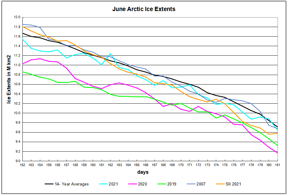
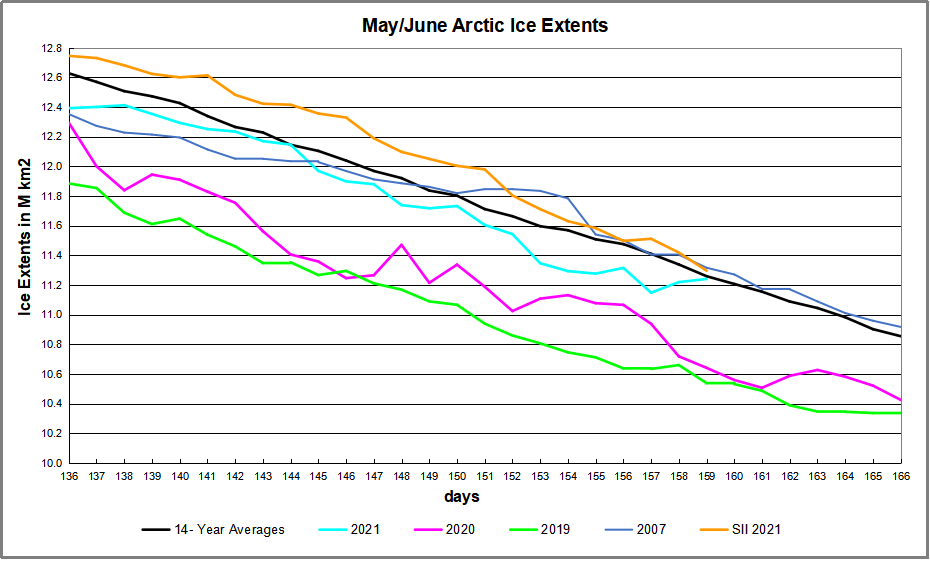
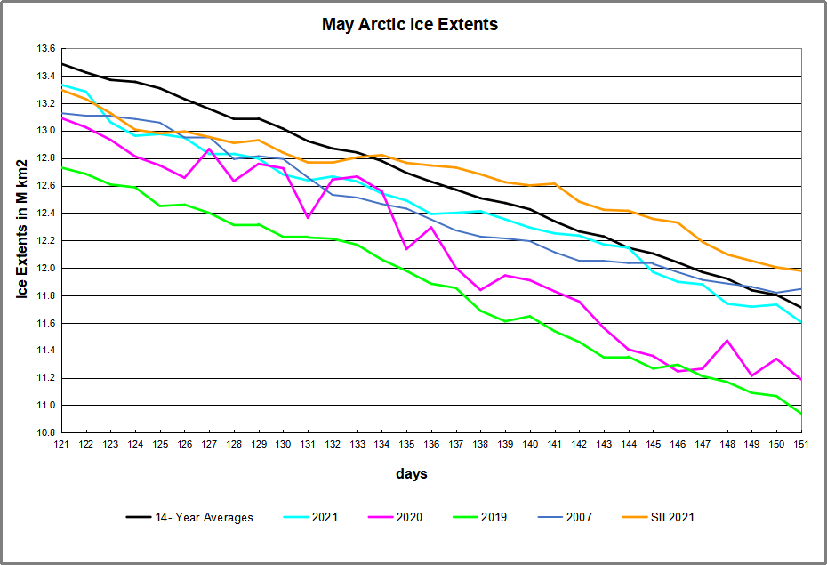
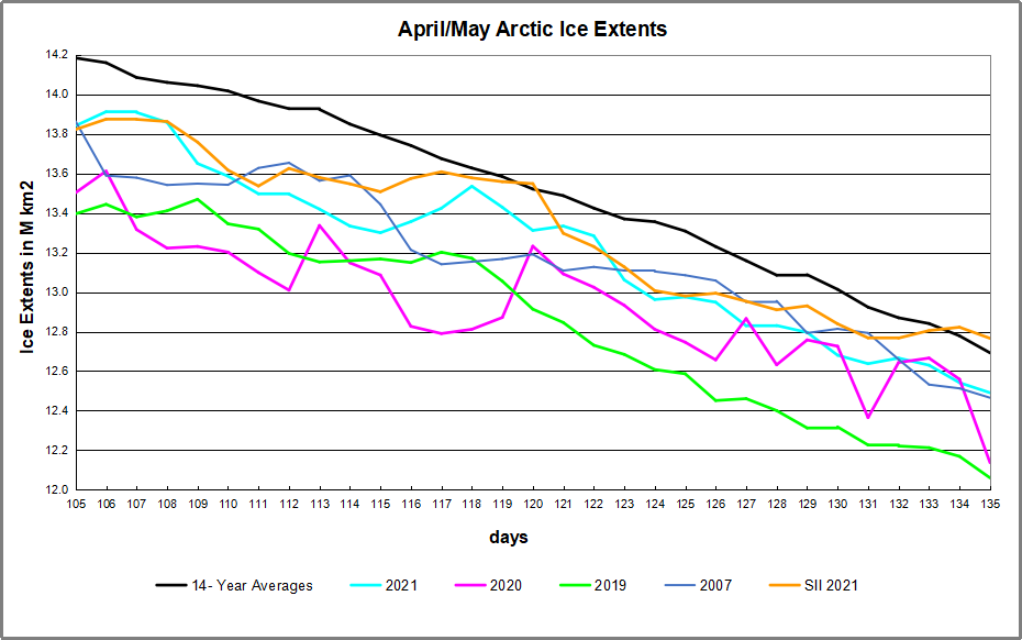
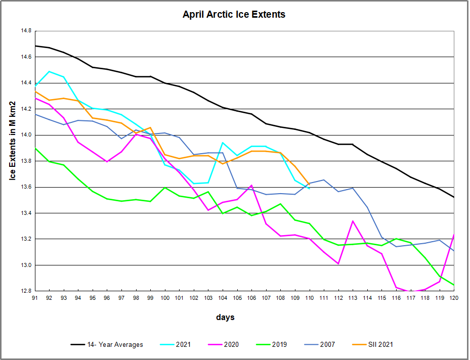
The graph above shows ice extent through April comparing 2021 MASIE reports with the 14-year average, other recent years and with SII.  The average April drops about 1.1M km2 of ice extent.  This year MASIE showed two sharp drops and two recoveries, the last one coming close to average day 118.  SII showed a less than average April loss of ~870k km2.  In the end MASIE 2021 matched 2020, and higher then 2007.

The table below shows the distribution of sea ice across the Arctic regions.

Region 2021120 Day 120 Average 2021-Ave. 2007120 2021-2007
 (0) Northern_Hemisphere 13311402 13551290  -239888  13108068 203334 
 (1) Beaufort_Sea 1058557 1068405  -9848  1059189 -632 
 (2) Chukchi_Sea 962680 954463  8217  949246 13434 
 (3) East_Siberian_Sea 1087137 1085503  1635  1080176 6961 
 (4) Laptev_Sea 897827 888936  8891  875661 22166 
 (5) Kara_Sea 915674 911257  4417  864664 51010 
 (6) Barents_Sea 572380 558256  14124  396544 175837 
 (7) Greenland_Sea 605335 649955  -44620  644438 -39103 
 (8) Baffin_Bay_Gulf_of_St._Lawrence 1004774 1231673  -226899  1147115 -142341 
 (9) Canadian_Archipelago 854597 848502  6095  838032 16565 
 (10) Hudson_Bay 1236512 1242200  -5687  1222074 14439 
 (11) Central_Arctic 3239759 3238255  1504  3241034 -1275 
 (12) Bering_Sea 426670 473606  -46936  475489 -48819 
 (13) Baltic_Sea 12293 20617.28786 -8324  14684 -2390 
 (14) Sea_of_Okhotsk 435360 376555  58804  295743 139617 

Overall NH extent March 31 was below average by 240k km2, or 2%.  With Bering deficit offset by Okhotsk surplus, the entire difference from average matches the Baffin Bay deficit. The onset of spring melt is as usual in most regions.

Cool 2021 Spring Continues

imagehy1p

Dr. Judah Cohen provides a weather outlook based upon his study of the Arctic Oscillation at his blog Arctic Oscillation and Polar Vortex Analysis and Forecast April 19, 2021.  Excerpts in italics with my bolds.

The PV is in its waning days of the 2020/21 cold season and will likely be nearly or completely disappeared by the next blog update. This seems to me to be a clear dynamically assisted Final Warming as vertical Wave Activity Flux (WAFz and is proportional to poleward heat transport) has been active for at least a week now and is predicted to remain active for the next two weeks. A dynamic Final Warming can result in some cooler weather across the mid-latitudes; and in my opinion the snow and possibly record cold temperatures predicted for the Eastern US this week is related to the dynamic Final Warming. The PV is being stretched from Siberia to Canada that creates cross polar flow from Siberia to North America that drives cold air south across Canada and the US east of the Rockies. I do believe that this is a short-term impact only and will not have an influence on the summer weather across North America.

Europe has had an impressively cool April, relative to recent Aprils (probably the coolest April since 2013 and maybe even since 2003), which is directly attributable to Greenland blocking that has also extended into the North Atlantic for much of the month. There are no strong signs that the Greenland blocking will disappear any time soon, and as long as it persists, Europe can experience relatively cool temperatures. I see no obvious signs that the Greenland blocking is tied to PV variability and it is therefore more challenging for me to anticipate how long it will last. But it is likely that the streak of cool weather is dependent on the persistence of the Greenland blocking. If and when the Greenland blocking abates, European temperatures could start to climb.

As noted in previous posts, when cold Arctic air pushes south, it is replaced by warmer air contributing to ice melting.  To be clear, sea ice melts primarily because of sunshine directly, and indirectly by intruding sun-warmed water, mostly from the Atlantic by way of Barents Sea. The Arctic in summer daily receives more solar energy than does the equator.  Warmer air is a tertiary contributing factor.

ArcApril 099 to 110

The animation shows Okhotsk upper left lost ~250k km2 of ice extent over the last 10 days.  Bering Sea lower left waffled with little change until losing ~60k km2 the last two days.  On the Atlantic side, Barents Sea upper right gained ~100k km2 over a week, then lost most of it ending about the same.  Greenland Sea middle right lost ~100k km2m, while Baffin Bay lower right waffled and lost very little.

Arctic2021110

The overall impact on NH sea ice is shown in the graph above.  Firstly a drop starting April 10, then recovering April 14 and holding firm to draw near to average, before another drop the last two days.

Background Previous Post  Spring 2021: Warm is Cold, and Down is Up

The cold Spring this year is triggering responses turning natural factors upside down and backwards, confusing causes and effects.  For example, this article at Science Daily Snow chaos in Europe caused by melting sea-ice in the Arctic.  The simplistic appeal to “climate change” is typical: “It is the loss of the Arctic sea-ice due to climate warming that has, somewhat paradoxically, been implicated with severe cold and snowy mid-latitude winters.”  In fact, as we shall see below, it is the wavy Polar Vortex causing both cold mid-latitudes from descending Arctic air, and melting ice from intrusions of warmer southern air.  Importantly, global warming theory asserts that adding CO2 causes the troposphere to warm and the stratosphere to cool.  What we are experiencing this Spring is an unstable Polar vortex due to events of Sudden Stratospheric Warming  (SSWs), not cooling.

Seasoned meteorologist Judah Cohen of AER shows the mechanism this way:

My colleagues, at AER and at selected universities, and I have found a robust relationship between two October Eurasian snow indices and the large-scale winter hemispheric circulation pattern known as the North Atlantic or Arctic Oscillation pattern (N/AO).

The N/AO is more highly correlated with or explains the highest variance of winter temperatures in eastern North America, Europe and East Asia than any other single or combination of atmospheric or coupled ocean-atmosphere patterns that we know of. Therefore, if we can predict the winter N/AO (whether it will be negative or positive) that provides the best chance for a successful winter temperature forecast in North America but certainly does not guarantee it.

He goes on to say that precipitation is the key, not air temperatures, and ENSO is a driving force:

As long as I have been a seasonal forecaster, I have always considered El Nino/Southern Oscillation (ENSO) as a better predictor of precipitation than temperature across the Eastern US. I think this is supported by the observational or statistical analysis as well as the skill or accuracy of the climate models.

There have been recent modeling studies that demonstrate that El Nino modulates the strength and position of the Aleutian Low that then favors stratospheric warmings and subsequently a negative winter N/AO that are consistent with our own research on the relationship between snow cover and stratospheric warmings. So the influence of ENSO on winter temperatures in the Mid-Atlantic and the Northeast may be greater than I acknowledge or that is represented in our seasonal forecast model.

Summary

As Cohen’s diagram shows, there is an effect from warming, but in the stratosphere. Global warming theory claims CO2 causes warming in the troposphere and cooling in the stratosphere. So whatever is going on, it is not due to CO2.

Cohen’s interview with the Washington Post.

its-easier-to-fool-people-than-to-convince-them-that-they-have-been-fooled


The current situation is described in Cohen’s most recent post at his Arctic Oscillation blog:

The stratospheric PV always disappear in the spring due to the increasing solar radiation in the polar stratosphere. However, during some springs in addition to the radiative warming of the polar stratosphere, there is also dynamic warming of the polar stratosphere due to the absorption of upwelling Wave Activity Flux (WAFz) from the troposphere. This occurred last spring, which did result in a cool May and even some rare snowfall in the Northeastern US. The predicted return of Ural blocking coupled with Northeast Asia/northern North Pacific troughing is conducive to more active WAFz. The latest PV animation (see Figure ii) shows the stratospheric PV filling (weakening) and meandering over the northern Asia in response to the more active WAFz. This could be the beginning of a dynamically assisted Final Warming that could result in a period of cooler temperatures in parts of the mid-latitudes.

imagesj5oh

Figure ii. Observed and predicted daily geopotential heights (dam; contours) and anomalies (shading) through April 21, 2021. The forecast is from the 00Z 5 April 2021 GFS ensemble.

Background is at post No, CO2 Doesn’t Drive the Polar Vortex 

graphic20-20polarvortex_explained_updated2001291920-204034x2912-1


Spring 2021: Warm is Cold, and Down is Up

The cold Spring this year is triggering responses turning natural factors upside down and backwards, confusing causes and effects.  For example, this article at Science Daily Snow chaos in Europe caused by melting sea-ice in the Arctic.  The simplistic appeal to “climate change” is typical: “It is the loss of the Arctic sea-ice due to climate warming that has, somewhat paradoxically, been implicated with severe cold and snowy mid-latitude winters.”  In fact, as we shall see below, it is the wavy Polar Vortex causing both cold mid-latitudes from descending Arctic air, and melting ice from intrusions of warmer southern air.  Importantly, global warming theory asserts that adding CO2 causes the troposphere to warm and the stratosphere to cool.  What we are experiencing this Spring is an unstable Polar vortex due to events of Sudden Stratospheric Warming  (SSWs), not cooling.

Seasoned meteorologist Judah Cohen of AER shows the mechanism this way:

My colleagues, at AER and at selected universities, and I have found a robust relationship between two October Eurasian snow indices and the large-scale winter hemispheric circulation pattern known as the North Atlantic or Arctic Oscillation pattern (N/AO).

The N/AO is more highly correlated with or explains the highest variance of winter temperatures in eastern North America, Europe and East Asia than any other single or combination of atmospheric or coupled ocean-atmosphere patterns that we know of. Therefore, if we can predict the winter N/AO (whether it will be negative or positive) that provides the best chance for a successful winter temperature forecast in North America but certainly does not guarantee it.

He goes on to say that precipitation is the key, not air temperatures, and ENSO is a driving force:

As long as I have been a seasonal forecaster, I have always considered El Nino/Southern Oscillation (ENSO) as a better predictor of precipitation than temperature across the Eastern US. I think this is supported by the observational or statistical analysis as well as the skill or accuracy of the climate models.

There have been recent modeling studies that demonstrate that El Nino modulates the strength and position of the Aleutian Low that then favors stratospheric warmings and subsequently a negative winter N/AO that are consistent with our own research on the relationship between snow cover and stratospheric warmings. So the influence of ENSO on winter temperatures in the Mid-Atlantic and the Northeast may be greater than I acknowledge or that is represented in our seasonal forecast model.

Summary

As Cohen’s diagram shows, there is an effect from warming, but in the stratosphere. Global warming theory claims CO2 causes warming in the troposphere and cooling in the stratosphere. So whatever is going on, it is not due to CO2.

Cohen’s interview with the Washington Post.

its-easier-to-fool-people-than-to-convince-them-that-they-have-been-fooled


The current situation is described in Cohen’s most recent post at his Arctic Oscillation blog:

The stratospheric PV always disappear in the spring due to the increasing solar radiation in the polar stratosphere. However, during some springs in addition to the radiative warming of the polar stratosphere, there is also dynamic warming of the polar stratosphere due to the absorption of upwelling Wave Activity Flux (WAFz) from the troposphere. This occurred last spring, which did result in a cool May and even some rare snowfall in the Northeastern US. The predicted return of Ural blocking coupled with Northeast Asia/northern North Pacific troughing is conducive to more active WAFz. The latest PV animation (see Figure ii) shows the stratospheric PV filling (weakening) and meandering over the northern Asia in response to the more active WAFz. This could be the beginning of a dynamically assisted Final Warming that could result in a period of cooler temperatures in parts of the mid-latitudes.

imagesj5oh

Figure ii. Observed and predicted daily geopotential heights (dam; contours) and anomalies (shading) through April 21, 2021. The forecast is from the 00Z 5 April 2021 GFS ensemble.

Background is at post No, CO2 Doesn’t Drive the Polar Vortex 

graphic20-20polarvortex_explained_updated2001291920-204034x2912-1


March 2021 Arctic Ice Persists

March Arctic ice 2007 to 2021

Previous posts showed 2021 Arctic Ice fell short of breaking the 15M km2 ceiling mid March due to a February Polar Vortex disruption.  As we shall see below, another smaller PV disruption is now occurring accelerating the normal spring melting season.  The graph above shows that the March monthly average has varied little since 2007, typically around the SII average of 14.7 M km2.  Of course there are regional differences as described later on.

Dr. Judah Cohen at AER provides an image of how this latest PV disruption appears:

gfs_animation_010hpa_20210322_20210407

The High pressure areas were forecast to warm over the Pacific Arctic basins, and extending over to the European side, while the cold Low area is presently extending down into North America, bringing some snow on April 1 in Montreal (no joke).  The effect on Arctic Ice is shown in the animation below:

ArcticMarch2021 080 to 090

Over the last 10 days, Okhotsk upper left lost 180k km2 while Bering lower left lost half that with a slight recovery yesterday.  Barents Sea upper right lost 145k km2 over the same period.  The effect on NH total ice extents is presented in the graph below.

Arctic2021090

The graph above shows ice extent through March comparing 2021 MASIE reports with the 14-year average, other recent years and with SII.  After drawing close to average by day 80, 2021 ice extents dropped sharply and at March end matched both 2020 and 2007.  Despite losses from this PV event, the 2020 March monthly average ended up comparable to other years, as seen in the chart at the top.  In fact, the SII dataset of monthly gains and losses shows March 2021 gained slightly over end of February, compared to a 200k km2 loss for the average March.


The table below shows the distribution of sea ice across the Arctic regions.

Region 2021090 Day 090 Average 2021-Ave. 2007090 2021-2007
 (0) Northern_Hemisphere 14266634 14692014  -425380  14222916 43718 
 (1) Beaufort_Sea 1070689 1070177  512  1069711 978 
 (2) Chukchi_Sea 966006 964100  1907  966006
 (3) East_Siberian_Sea 1087137 1086134  1003  1074908 12229 
 (4) Laptev_Sea 897827 896838  989  884340 13487 
 (5) Kara_Sea 935023 916581  18442  892157 42866 
 (6) Barents_Sea 602392 649566  -47174  441970 160422 
 (7) Greenland_Sea 620574 658050  -37476  686312 -65739 
 (8) Baffin_Bay_Gulf_of_St._Lawrence 1243739 1438412  -194673  1217467 26272 
 (9) Canadian_Archipelago 854597 852959  1638  850127 4470 
 (10) Hudson_Bay 1260903 1254727  6176  1229995 30908 
 (11) Central_Arctic 3192844 3234463  -41619  3242237 -49393 
 (12) Bering_Sea 549939 736829  -186890  814788 -264849 
 (13) Baltic_Sea 33543 608741 -27331  45897 -12354 
 (14) Sea_of_Okhotsk 942085 861234  80850  794657 147428 

Overall NH extent March 31 was below average by 425k km2, or 3%.  The bulk of the deficit is seen in Bering and Baffin, along with Barents Sea.  Okhotsk remains above average in spite of recent losses.  The onset of spring melt is as usual in most regions.